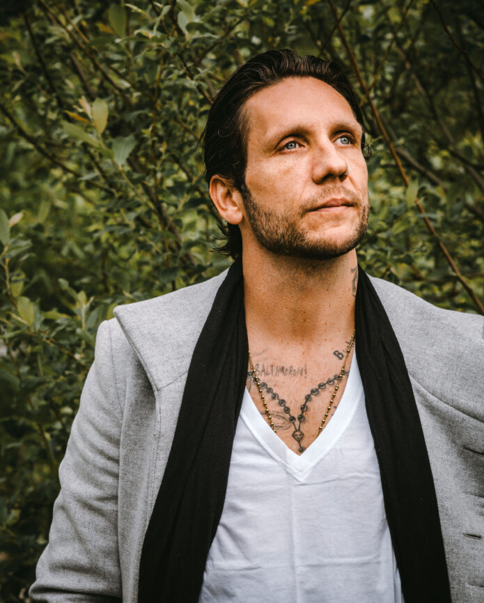
Brandon Novak’s tattoos look like a personal scrapbook that happens to cover both arms, his hands and much of his chest. The skateboarder, author and recovery advocate has a dense collection of lettering, symbols, portraits and rough illustrative work. Some pieces are clean and carefully shaded, while others have the loose, lived-in feeling of tattoos picked up during different chapters of a very public life.
That mix is what makes Brandon Novak tattoos worth studying. His collection isn’t built around one fashionable style or a perfectly matched sleeve. It carries memories, mistakes, faith, friendship and the visual language of skate culture. The strongest design lesson is simple: a tattoo can hold history without needing to look perfectly uniform.
Some stories behind individual pieces have been discussed publicly, including his large Jesus back tattoo and the lettering tied to his recovery. Other designs are easier to describe than to explain. This guide sticks with the visible work and turns it into practical ideas for anyone planning a sleeve, hand tattoos, chest lettering or a collection that grows over time.
His sleeve tattoos use dense blackwork with room for the details to breathe
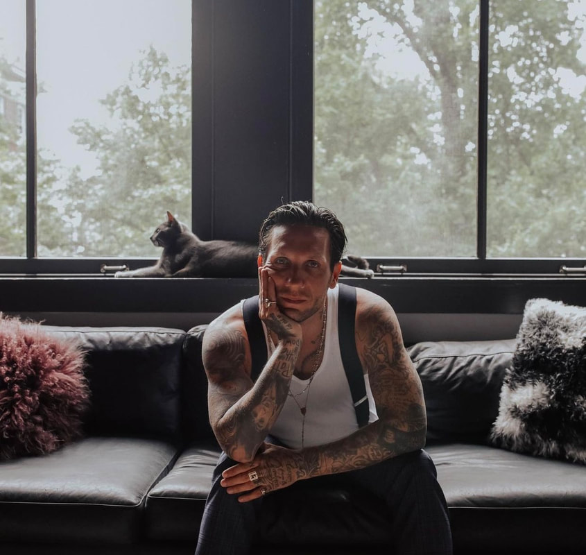
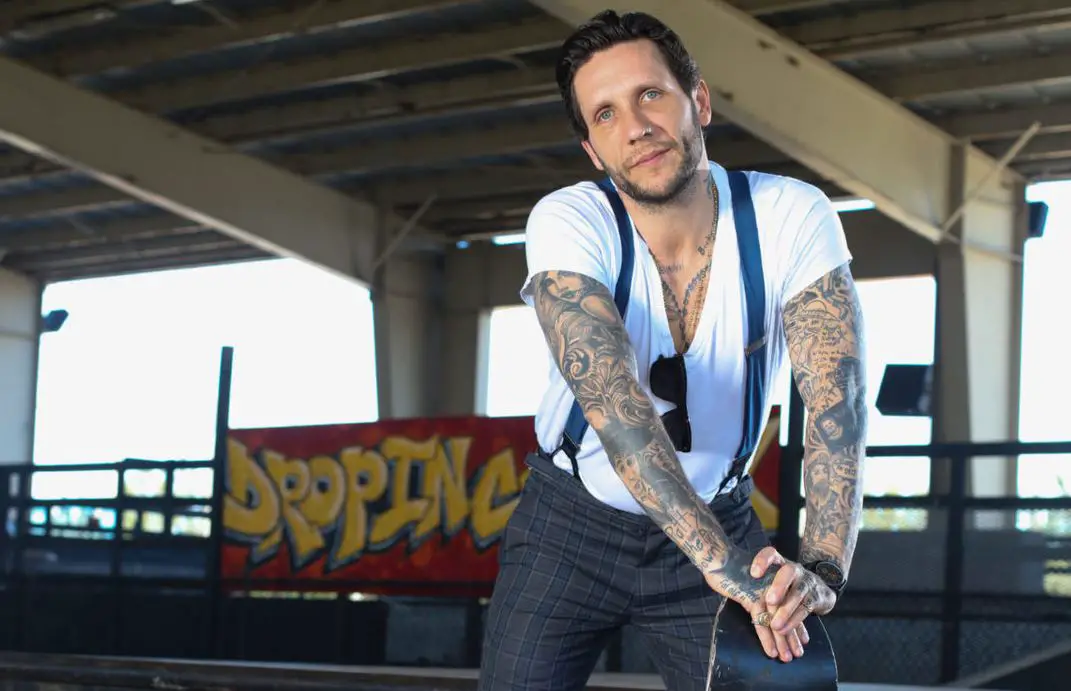
Novak’s arms are the clearest place to see how a crowded sleeve can still stay readable. Large shaded images sit beside lettering, small symbols and decorative filler. The overall effect is heavy, but the designs don’t all blend into one dark block. Skin breaks, changes in line weight and different levels of contrast keep the eye moving.
There’s a useful balance between big anchor pieces and smaller tattoos that act like punctuation. A large figure or bold pattern grabs attention first. Around it, compact marks fill awkward spaces near the elbow, wrist and inside arm. When a sleeve has a strong focal piece, the smaller tattoos can be more relaxed without making the whole arm look unfinished.
The grayscale palette also helps. Black and gray work gives the arms a connected base even when the subjects change. If you want a similar direction, choose a few repeat values before choosing every image. Soft gray shading, solid black shadows and occasional open skin can make separate tattoos feel like they belong in the same family.
Novak’s sleeves are a good reminder that matching doesn’t have to mean copying. Two images can share a shadow style or a similar outline while showing completely different subjects. That gives you space to add something personal later without breaking the mood of the arm.
Chest tattoos, lettering and religious imagery give the collection a personal center
The chest and upper-body work adds a quieter, more personal layer to the visible arm tattoos. Lettering sits across the chest and collar area, while religious imagery and pendant-like shapes appear around it. This placement naturally feels more intimate than a forearm because it moves with the body and only shows fully when the shirt opens.
Chest lettering needs more planning than people expect. The sternum, collarbones and pectoral muscles all pull the lines in different directions. A phrase that looks straight on paper may curve when it sits on the body. Novak’s ink shows why it helps to think about the full shape of the chest instead of treating every word as a separate sticker.
Religious imagery can also give a collection a visual anchor without forcing every tattoo to be spiritual. A cross, rosary, saint or figure can sit at the center, then the surrounding pieces can tell different parts of the story. The meaning can be private even when the image is familiar. What matters is choosing a scale that lets the central design stay clear.
If you’re planning a chest piece, decide first whether you want the lettering to be read from a distance or discovered up close. Bold block type has a different mood from thin script. Leave enough space around the words for the skin to move and for the design to age without turning into a dark blur.
Hand tattoos bring the rougher skate-punk energy into every gesture
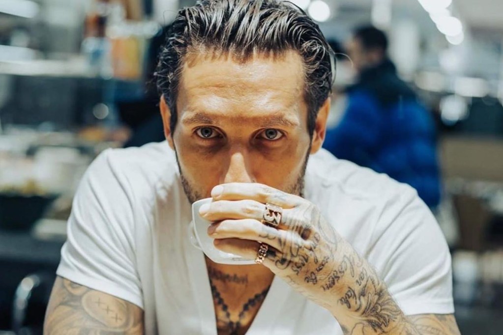
Novak’s hands are covered with the kind of visible ink that becomes part of daily movement. Lettering runs across the fingers and backs of the hands, while rings and small marks add even more texture. When he holds a coffee cup or rests his face on his hand, the tattoos stay in the frame. They are not background decoration. They are part of the pose.
Hand tattoos work best when the design is bold enough to survive constant use. The skin bends, sees a lot of sunlight and gets washed throughout the day. Fine lines can soften quickly, so simple letters, strong symbols and compact shapes are often safer than a tiny detailed portrait.
Always check how a hand tattoo reads when the fingers are open, relaxed and curled. A word that looks balanced in one position can stretch in another. Your artist should show you the placement from more than one angle before the needle starts. That is especially important for finger lettering, where even a small shift changes the spacing.
Novak’s hand work also connects naturally into the forearms. The lettering and dark marks create a visual bridge instead of making the sleeve stop at the wrist. You can use the same idea with one small design. Repeat a color, shape or line style near the wrist and the hand will feel connected without needing a full blackout treatment.
Older tattoos and new chapters can share the same body map
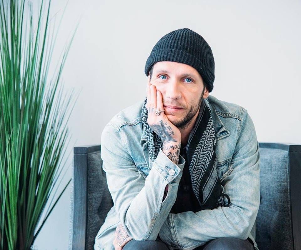
One of the most interesting things about Novak’s collection is the way it shows time. The tattoos don’t all look as if they were planned in one weekend. Some are darker and more settled, some are newer and sharper, and others carry the softer edges that come with years of wear. That unevenness gives the collection character.
A body map like this can be useful if you want tattoos that grow with you. Instead of trying to finish an entire arm immediately, choose one area and let the next design respond to what is already there. An older piece can become the visual starting point for a new background, a cover-up or a contrasting image placed beside it.
Novak’s tattoos also show why personal history does not have to be hidden just because your taste changes. A rough old piece can sit beside a cleaner new one. The answer is usually spacing and scale, not trying to make every tattoo look like it was drawn by the same person. Let the timeline show when it adds honesty to the collection.
If a tattoo carries a difficult memory, you still have options. You can keep the original and add context around it, soften it with new work or cover only the part that no longer feels right. A tattooer who understands composition can work with the existing lines instead of pretending the old piece isn’t there.
Recovery-era tattoos show how a large idea can change the tone of a collection
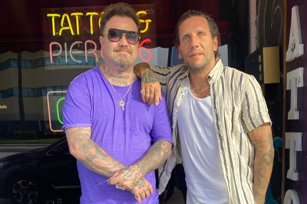
Novak has spoken about recovery as a complete change in his life, and that shift has also appeared in his tattoo story. Reports about the large Jesus back piece describe it as a marker of that new chapter. Even when the back isn’t visible in a portrait, the idea changes how the rest of the collection can be read. The tattoos become a record of movement rather than a fixed image of the past.
A large back piece can carry a big idea because the body gives it room. It can be a figure, a scene, a landscape or a set of symbols that would feel cramped anywhere else. The design doesn’t have to be visible every day to matter. In fact, the private placement can make the tattoo feel more personal.
There’s a practical lesson here too. If you want a major piece after a life change, don’t rush the design just because the feeling is strong right now. Write down what you want the tattoo to keep saying in five or ten years. Bring your artist the emotion, then let them help turn it into a shape that will age well. The best memorial or recovery tattoos leave room for the future instead of trying to freeze one exact moment.
Brandon Novak’s tattoos work because they feel lived in. The collection has arm sleeves, hand lettering, chest symbols, old rough pieces and newer images that point toward another chapter. You don’t need a perfect matching set to build a meaningful tattoo collection. Start with the designs you can stand behind, use placement to create flow and let each new piece earn its place.
Before your appointment, talk with your artist about healing, contrast, cover-up limits and how much skin you want left open. Show them the mood you like rather than asking for an exact copy of Novak’s tattoos. The goal is to borrow the honesty and energy while making the finished work unmistakably yours. Give the design a little time before you commit today.