codex

Maya Jama Tattoos: The Lion, Arabic Quote and Tiny Wrist Designs

Maya Jama has a small lion outline near her ankle, an Arabic phrase across her thigh and cartoon-like faces around her crossed wrists. The designs vary in size and mood, with some meanings clearer than others.

A recent Cape Town choice
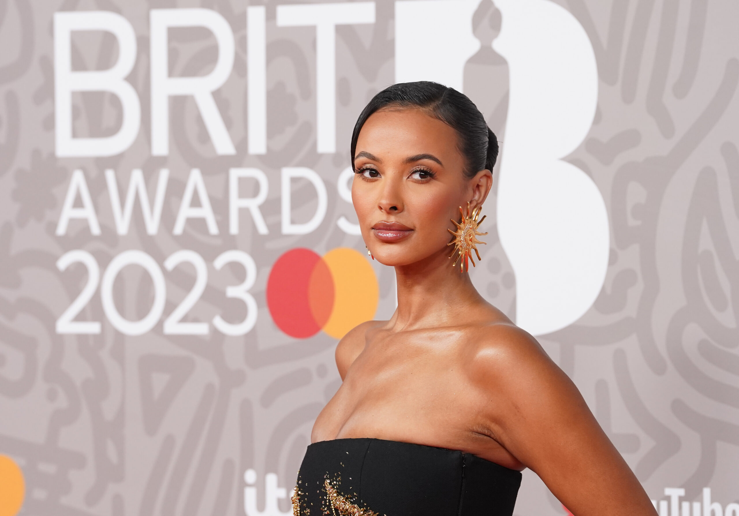
Maya Jama in a contextual photograph: inline; not tattoo evidence

The fine-line lion sits just above Jama’s ankle. She got it at Tomb Tattoo while visiting Cape Town with a friend, after a night out that left her hungover. She chose a lion because she’s a Leo.

The design is a small outline without a crown, heavy shading or extra lettering. The trip is part of the story too: Jama has described the tattoo as a spur-of-the-moment choice made with a friend.

A relaxed choice
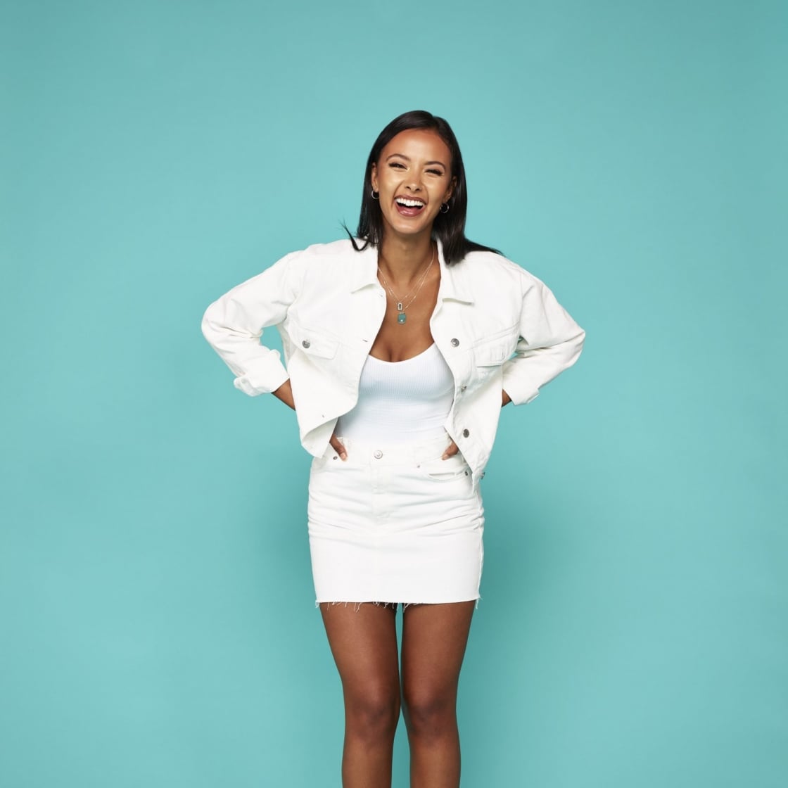
Maya Jama in a contextual photograph: inline; not tattoo evidence

Jama says she chose the lion because she’s a Leo. There’s no need to read a bigger personality statement into the symbol.

The phrase with more history
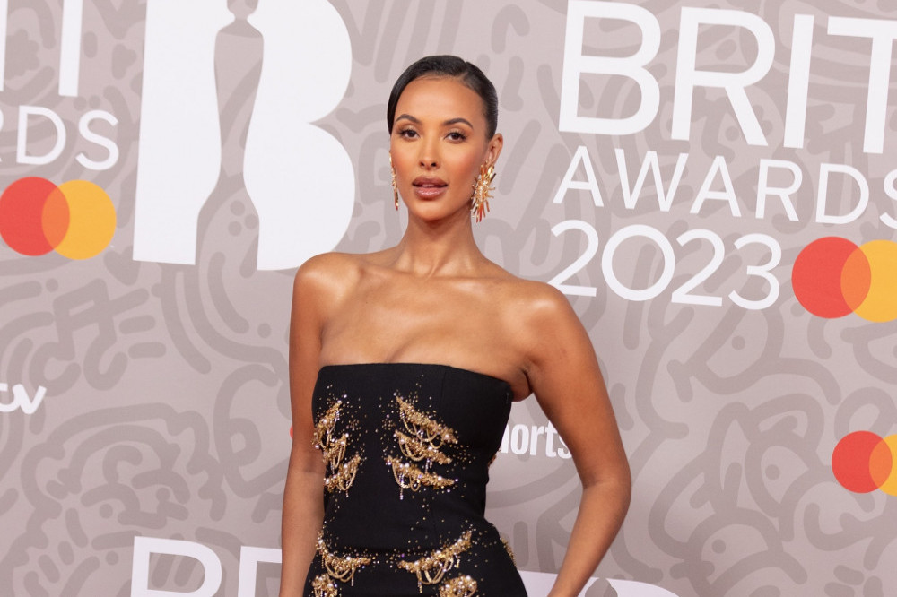
Maya Jama in a contextual photograph: inline; not tattoo evidence

Jama has spoken about an Arabic phrase across her thigh, roughly translated as “love like you’ve never been hurt, dance like nobody’s watching.” She got it as a teenager. The text carries a longer personal history than the newer ankle tattoo.

The thigh gives a longer line of text room and keeps it covered by many everyday outfits. Jama has said some of her tattoos are hidden until she isn’t dressed.

Why placement matters
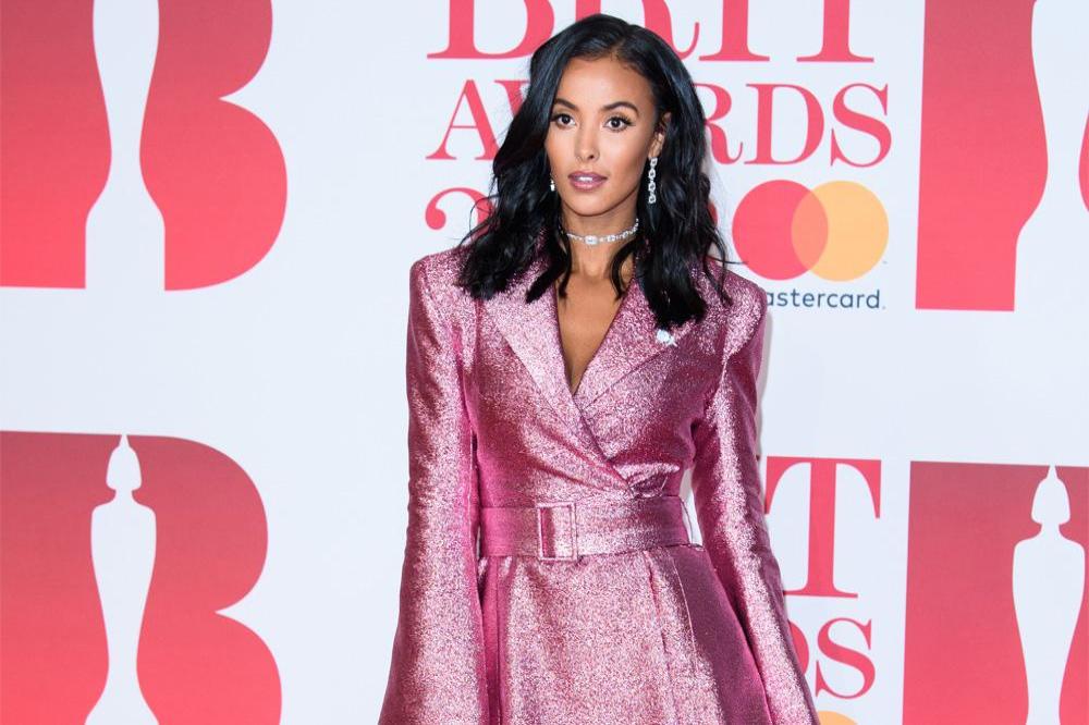
Maya Jama in a contextual photograph: inline; not tattoo evidence

The thigh can keep a longer tattoo private unless Jama chooses to show it. For anyone considering an Arabic phrase, the wording should be checked by a fluent speaker who understands the intended meaning. A copied online translation can miss spelling or grammar.

Small details
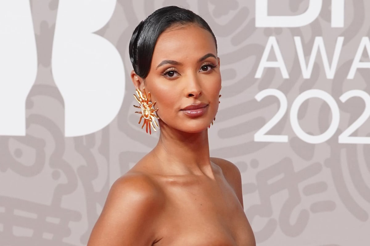
Maya Jama in a contextual photograph: inline; not tattoo evidence

Jama also has small cartoon-like faces around her crossed wrists. They’re more playful than the thigh text, and photographs show them alongside other fine-line pieces.

Small wrist designs are easy to see, but the skin moves and gets regular sun and friction. A simplified face can keep its expression more clearly than one packed with tiny details.

Different moods, one collection

The tattoos don’t follow one strict style. The lion is a sign-of-the-zodiac reference; the Arabic phrase is a long personal message; the wrist faces are playful. Photos sometimes show other small designs, but they aren’t always clear enough to identify. Jama works across radio, television, fashion and social media, and not every tattoo has to represent the same side of her life.

Good ideas without copying

If an animal design appeals to you, start with the connection it has to your own life rather than copying Jama’s outline. If you’re considering text, check the wording and look at the design at the size you plan to get before settling on its placement. A longer phrase needs room to stay readable.

The same tattoo collection can include a serious line of text and a playful drawing. The pieces don’t have to share one mood to feel personal.

A casual takeaway

The photographs show the placement and appearance of Jama’s tattoos; their meaning comes from what she has said about them, not from the images alone.

Final take on Maya Jama

Jama’s collection moves between a star-sign symbol, a long phrase and small playful drawings. She has given a reason for some pieces, while others are known mainly from photographs.

Watch the video below for more Maya Jama coverage.
More celebrity tattoo guides

Florence Pugh Tattoos: The Bee, Maypole and Tiny Symbols She Chose

Published accounts describe four small tattoos on Florence Pugh: a worker bee, a maypole linked to Midsommar, two arrows pointing toward a deer, and a matchstick with its name written beneath it. The bee has the clearest story from Pugh herself. The meaning of the other small designs is less certain.

Florence Pugh’s tattoo collection in one look

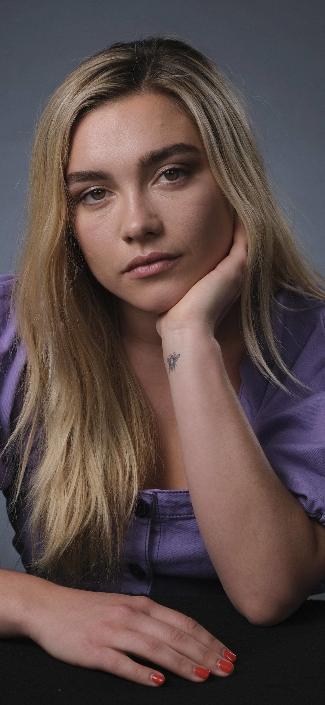
Florence Pugh tattoos: documented worker bee tattoo evidence, inner wrist view

This Vogue portrait sets the scene for Pugh’s understated style; it isn’t a close-up of her tattoos. The bee is better documented in Vogue’s interview about the day she got it.

Pugh walked into a New York tattoo parlour with her sisters without planning to get tattooed. She had first thought about a snail, then chose a bee instead. She wanted a view from above and a shape that felt “quite mathematical,” rather than a lifelike insect.

What the sources confirm

Florence Pugh in a contextual photograph: film-era contextual portrait, not tattoo evidence; not tattoo evidence

This portrait is film-era context, not evidence of a tattoo. The maypole is the piece linked to Midsommar: fans spotted it during one of Pugh’s Instagram Live cooking sessions, and Capital reported the connection to the film.

In Midsommar, the maypole is part of the summer celebration and Dani’s transformation. Pugh chose the image rather than a portrait or the film’s title. Reports place it on different parts of her arm, so wrist or forearm is the safest description.

How the collection changed

Florence Pugh in a contextual photograph: fashion contextual portrait, not tattoo evidence; not tattoo evidence

This fashion portrait is separate from the tattoo evidence. The reports describe the pieces in different ways: Vogue gives Pugh’s account of the bee, fans identified the maypole, and later roundups describe the arrows, deer and matchstick from photographs.

Those accounts don’t provide a complete timeline for how the collection developed. The bee’s unplanned origin is documented; the dates and reasons for the other pieces aren’t established here.

What remains uncertain

Florence Pugh in a contextual photograph: editorial contextual portrait, not tattoo evidence; not tattoo evidence

Contextual photo only – not tattoo evidence. PopSugar’s 2021 roundup describes a fine-line image of two arrows pointing toward a deer. Pugh hasn’t publicly explained its meaning, so it’s best to describe what is visible and leave the interpretation open.

The matchstick is easier to identify: a small lit match with the word “matchstick” beneath it. Pugh hasn’t explained that piece either. It’s visible in photographs, but its personal significance remains private.

Final thoughts

Florence Pugh in a contextual photograph: behind-the-scenes contextual portrait, not tattoo evidence; not tattoo evidence

Contextual photo only – not tattoo evidence. Pugh’s tattoos sit mostly around her wrists and lower arms. Small designs there can be covered for a role or shown in a close-up, depending on clothing and styling.

The inner wrist is visible and moves often, so a small fine-line design needs enough space to stay clear. The forearm offers more room for open shapes like arrows or a maypole. These are practical placement considerations, not claims about why Pugh chose each spot.

A relaxed collection, not a matching set

The bee, maypole, arrows and deer, and matchstick look different from one another. The bee has a direct account from Pugh; the film reference and other shapes are pieced together from public reporting and photos. The collection doesn’t need a single shared theme to be interesting.

Ideas to borrow without copying

If you like Pugh’s tattoos, borrow the approach rather than the exact artwork. Choose a symbol with a connection to your own life, keep the silhouette readable at the size you want, and ask a tattooer to adapt it for the placement.

A tiny design can lose detail if too much is squeezed into it. Pugh’s bee is a top-down outline, and the matchstick uses a simple shape with a short label; neither needs extra decoration to be recognizable.

The simple takeaway

The bee’s story comes from Pugh’s own interview. The maypole is linked to Midsommar in reporting, while the arrows-and-deer and matchstick have no confirmed personal meaning. The photographs show the ink; they don’t fill in what Pugh hasn’t shared.

More actor tattoo guides

Sophia Thomalla Tattoos: Wings, Portraits and Full-Sleeve Ink

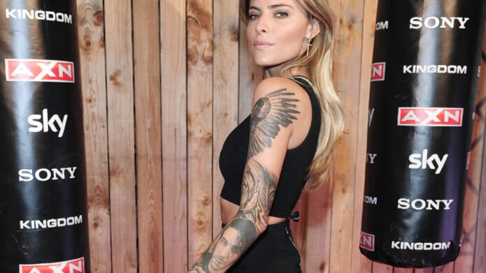
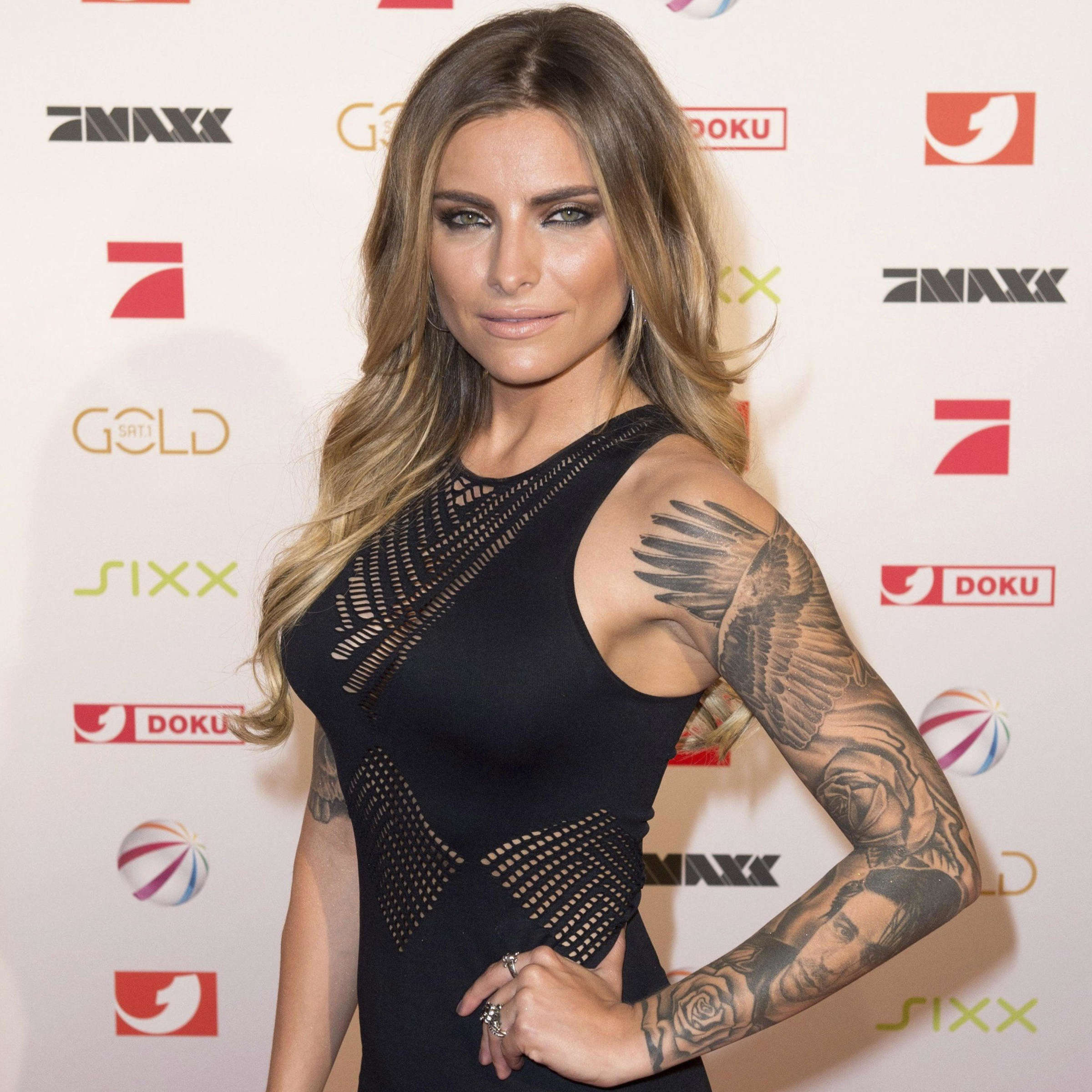
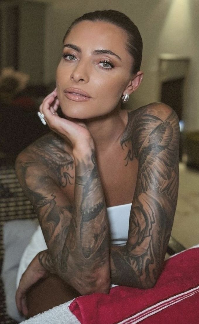
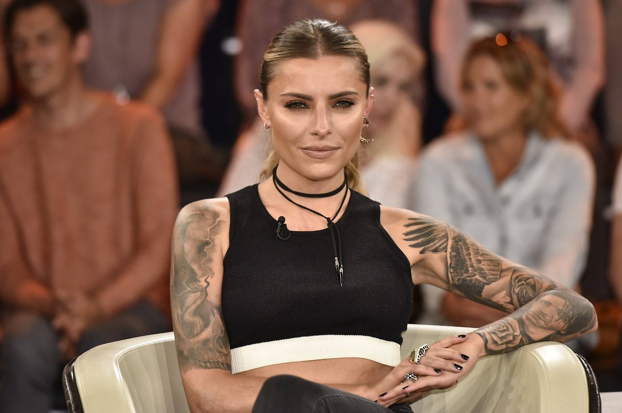
Sophia Thomalla has said she has around 20 tattoos, most of them visible across her arms. Wings, portrait work, roses, script and smaller designs sit together in black and gray. She has described the collection as personal, while also saying that not every tattoo needs a public explanation.

Sophia Thomalla’s tattoo style at a glance

Sophia Thomalla tattoos: verified tattoo photograph

The largest shapes sit across Thomalla’s shoulders and upper arms; portrait and floral details fill parts of the forearms. The photographs show soft black-and-gray shading rather than bright colour, with gaps of skin between some pieces.

The wing tattoos across her shoulders

Sophia Thomalla tattoos: verified tattoo photograph

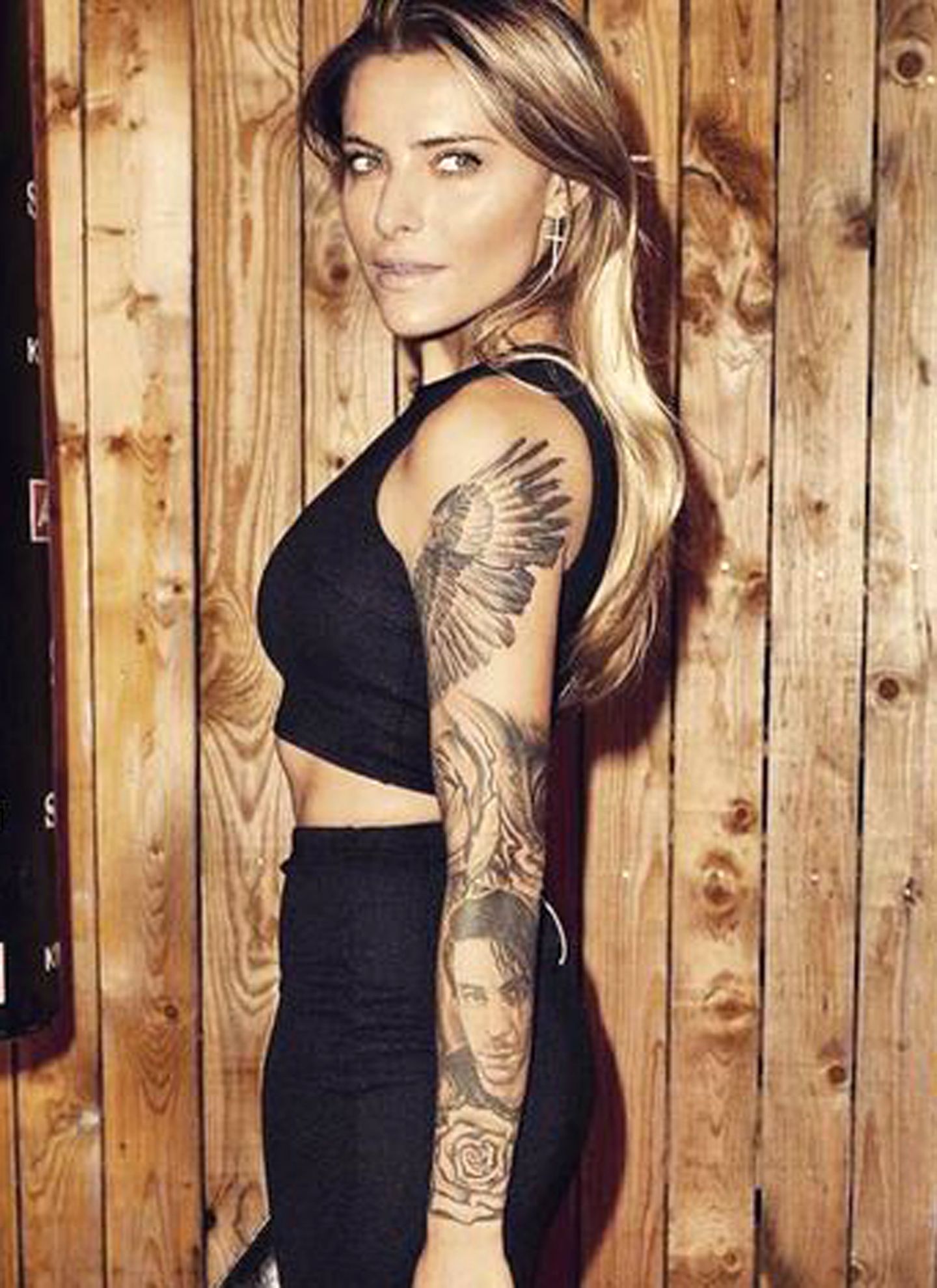
Large feathered wings spread across Thomalla’s shoulders and upper arms. Darker shading sits near the base, with lighter feather tips extending outward. The pattern follows the round of the shoulders, so the wings change shape as her arms move.

Wings are a familiar tattoo subject, but these photos show overlapping feathers and gradual shading rather than a simple outline. The meaning of the design hasn’t been clearly explained in the reporting used here.

The portrait tattoo and the story behind it

Sophia Thomalla tattoos: verified tattoo photograph

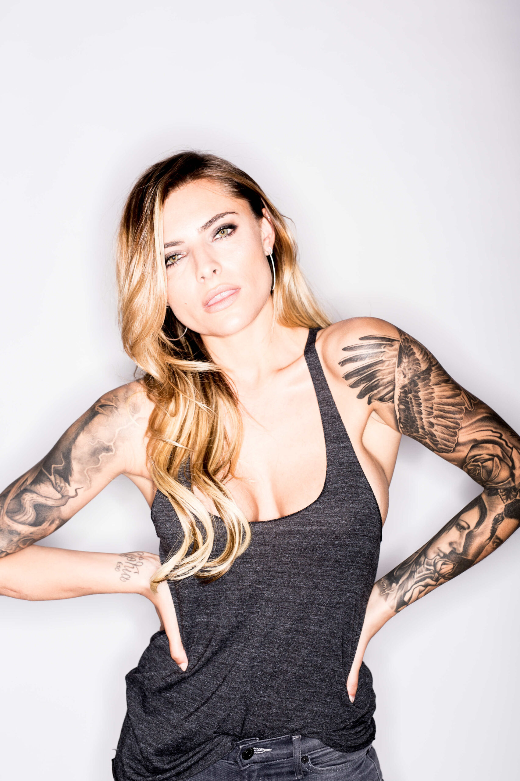
German entertainment coverage has identified the realistic arm portrait as Rammstein singer Till Lindemann, Thomalla’s former partner. She has said she doesn’t regret her tattoos. That’s the clearest public comment in the original reporting; the portrait’s meaning shouldn’t be reduced to relationship gossip.

The portrait sits among other sleeve work, including wings and roses. Its face draws the eye, while nearby shading helps it sit within the larger composition.

Roses, forearm shading and the smaller pieces

Sophia Thomalla tattoos: verified tattoo photograph

The roses add rounded petals and darker centers among the sharper wing shapes and portrait shading. Her forearms show both denser patches of black-and-gray ink and areas where more skin remains visible. Photographs also show script and smaller designs, but their details and meanings aren’t all documented.

The tattoo collection as a personal timeline

Sophia Thomalla tattoos: verified tattoo photograph

Thomalla has described her tattoos as pieces of her life and has said she has about 20. The designs don’t all share one subject or a single explanation. They sit together through their placement and black-and-gray shading, while each can mark a different time or preference.

That’s what separates a collection from a matching set: the pieces can have different moods and meanings. Some stories are public; others are hers to keep private.

What the sources confirm

The available reporting identifies wings, roses, portrait work, script and dense black-and-gray shading across Thomalla’s arms. Coverage connects the portrait to Lindemann, and she has said she doesn’t regret her tattoos. She has also appeared as host of the tattoo competition show Pain & Fame.

The photographs show the designs, but not why she chose each one. Where there isn’t a direct comment or reliable report, the meaning remains unknown.

Ideas to borrow without copying

If you’re planning a large arm piece, look at how the main shapes follow the shoulder and forearm, and leave room for skin between darker sections. A group of tattoos can grow over time; it doesn’t have to be designed in one sitting, but spacing and style can help later additions sit naturally.

A portrait or other personal image can also hold a different meaning as life changes. That doesn’t automatically make it a mistake. Choose the design for the reason it has now, while leaving the interpretation of Thomalla’s own tattoos to her.

More actor tattoo guides

Eva Victor Tattoos: A Tiny Window With a Big Story

Eva Victor’s best-known tattoo is a small four-pane window on their middle finger. It’s a little rough, and Victor has called it “janky.” They’re also fond of it. The story behind it is just as specific: a more detailed sketch, an Italian tattoo artist in France, and a design conversation that didn’t quite work.

Victor has also talked about a half-note rest on their foot and a blackberry they designed on an iPad during a difficult period. Each piece comes with its own story; there’s no need to make them fit one theme.

The window tattoo is the piece everyone asks about

Eva Victor tattoos: verified tattoo photograph

The window sits on Victor’s middle finger: a rectangle divided into four panes. In a Harper’s Bazaar interview, they said they had first drawn a more intricate version, complete with an awning, curtains and other details. They took that sketch to an Italian tattoo artist in France.

The artist spoke neither French nor English. Instead of the original design, she showed Victor a simple box crossed by lines. Victor agreed to it. They later described the finished tattoo as “janky,” but said they were obsessed with it.

The finished piece is much simpler than the first sketch. It’s also the version Victor chose to keep. The drawing, the conversation and the quick decision are all part of the story now.

Why the story matters more than the size

Eva Victor in a contextual photograph: contextual photograph — not tattoo evidence; not tattoo evidence

This is a contextual photograph from Victor’s Sorry, Baby coverage, not tattoo evidence. The window tattoo has since invited comparisons with the film, but Victor’s account of getting it came first: it began as an idea for a window on a trip to France, not as a symbol designed around the movie.

That order is worth keeping straight. A tattoo can take on another meaning later, but it doesn’t mean that meaning was part of the plan from the start. Here, the personal story and the public reading can sit alongside each other without one replacing the other.

A mark that came from miscommunication

Eva Victor in a contextual photograph: contextual photograph — not tattoo evidence; not tattoo evidence

This outdoor film still is contextual only; it doesn’t show another tattoo. Victor’s window story also offers a practical reminder: before an artist starts, make sure you both understand the drawing and where it will sit. That matters even more when you and the artist don’t share a language.
Take time with the stencil. Point to the details you want changed, ask the artist to show the design on your body, and don’t feel rushed into agreeing. Victor was happy with the simpler version, but the important part of their story is that the choice was theirs.

What the sources confirm

Eva Victor in a contextual photograph: contextual photograph — not tattoo evidence; not tattoo evidence

This New York Film Festival portrait is contextual only, not tattoo evidence. In a W Magazine interview, Victor said they got a half-note rest tattoo on their foot at 18 as a form of rebellion. They described its idea as a reminder to rest once in a while, take a beat and think. They also said they rarely see it.

Victor designed the blackberry tattoo on an iPad during what they called a “complete mental breakdown.” They told W Magazine they were in hospital because their stomach had “exploded,” but kept the appointment. They wanted the tattoo to remind them how bad they felt at the time.

Those are the meanings Victor has shared. The photographs here don’t establish any additional tattoo details, and there’s no need to guess at symbols they haven’t explained.

Ideas to borrow without copying

Eva Victor in a contextual photograph: contextual photograph — not tattoo evidence; not tattoo evidence

This reading scene is contextual only, not tattoo evidence. Victor’s examples suggest one simple starting point for your own design: choose a detail tied to a particular memory, whether it’s a place, an object or a moment you want to remember.

You don’t have to explain the tattoo to everyone who sees it. Its meaning can stay personal, and it can change as your own associations with it change.

What to borrow from Eva Victor’s approach

Start with the memory you want to keep, then work with an artist to find a shape that suits it. You don’t have to copy Victor’s window; the detail that makes a tattoo yours is the story you attach to it.

For a small design, ask the artist which lines will still read clearly as the tattoo ages. Finger and foot tattoos also get more friction and movement than many other placements, so talk through what that means for the design and any future touch-ups.

And leave room for the meaning to shift. Victor’s window began with a trip and a miscommunication; later, people connected it to their film. The tattoo can hold both associations without having been planned around either one.
Victor’s tattoo stories are memorable because they’re tied to real moments, including an idea that changed along the way. That’s more useful to take from them than copying the exact designs.
More actor tattoo guides

Aaron Pierre Tattoos: His Black-and-Grey Arm Sleeve Explained

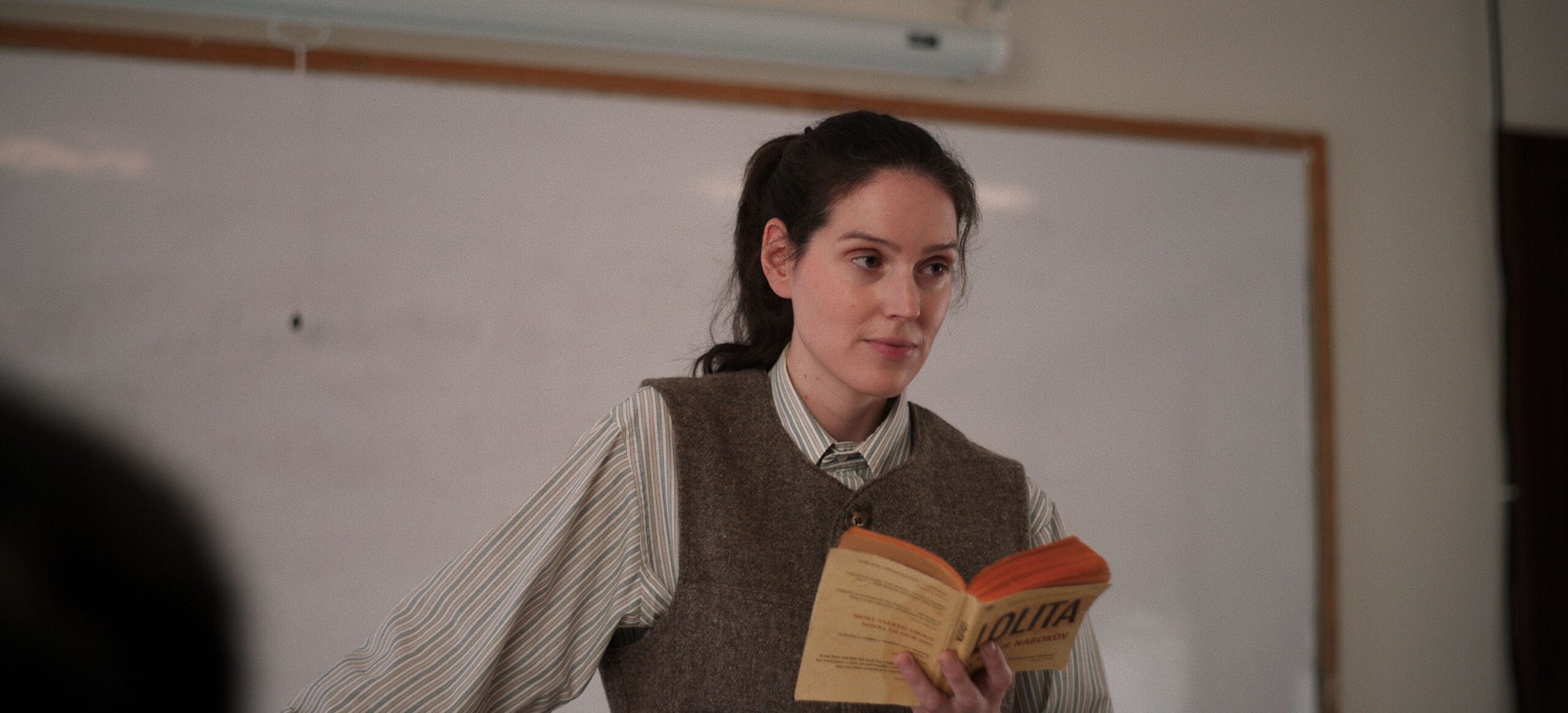
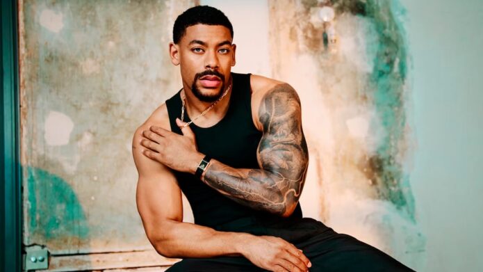
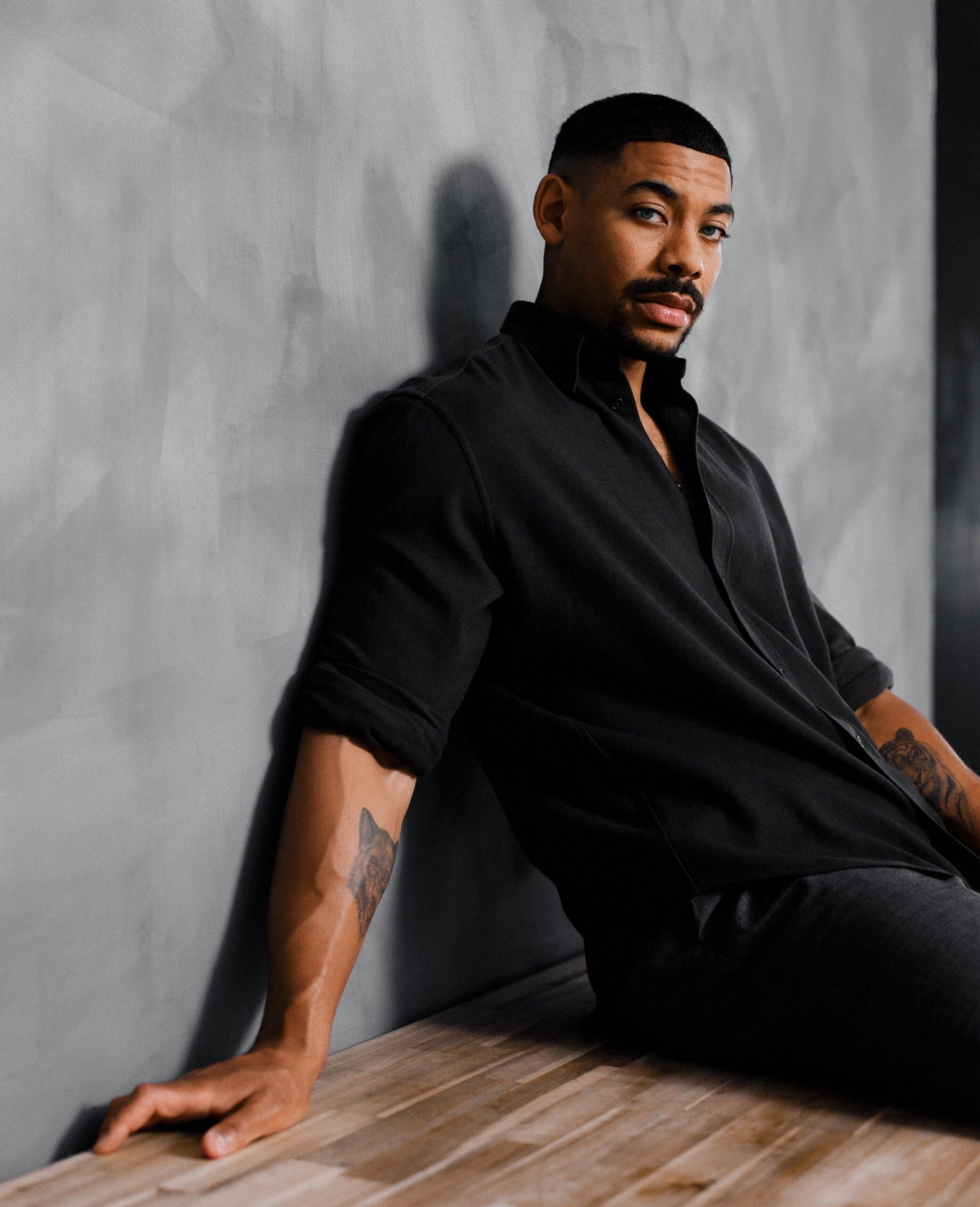
Aaron Pierre’s tattoos are easiest to see in the portraits from his Men’s Health cover interview, relaxed sofa photos and the Rebel Ridge press run. Most of the visible ink is on his right arm: black-and-grey work from shoulder toward wrist, with a smaller crescent-and-star design on the forearm in some images.

The photos show placement, shading and how the pieces connect. They don’t identify every shape or explain what it means, so this article sticks to what can be seen.

Aaron Pierre’s main arm sleeve

Aaron Pierre tattoos: inline

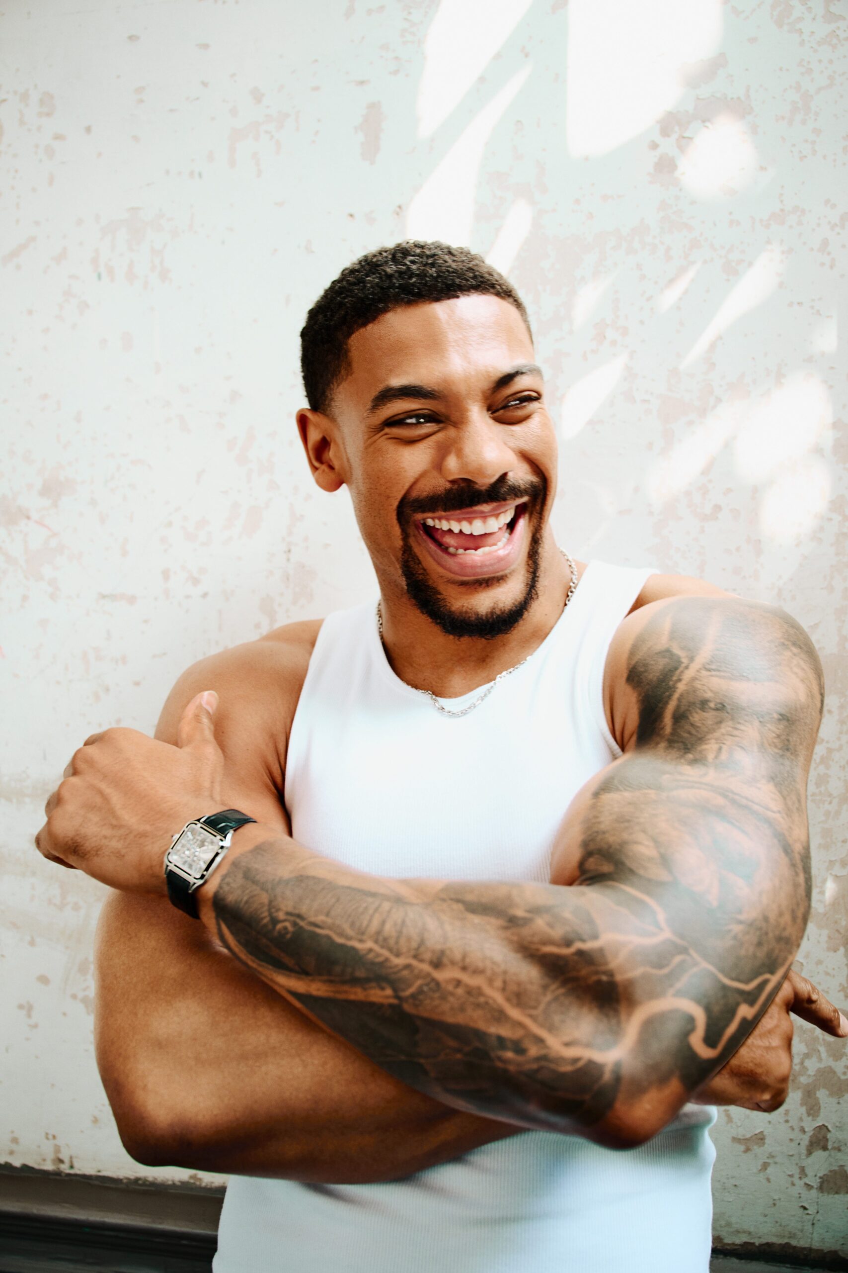
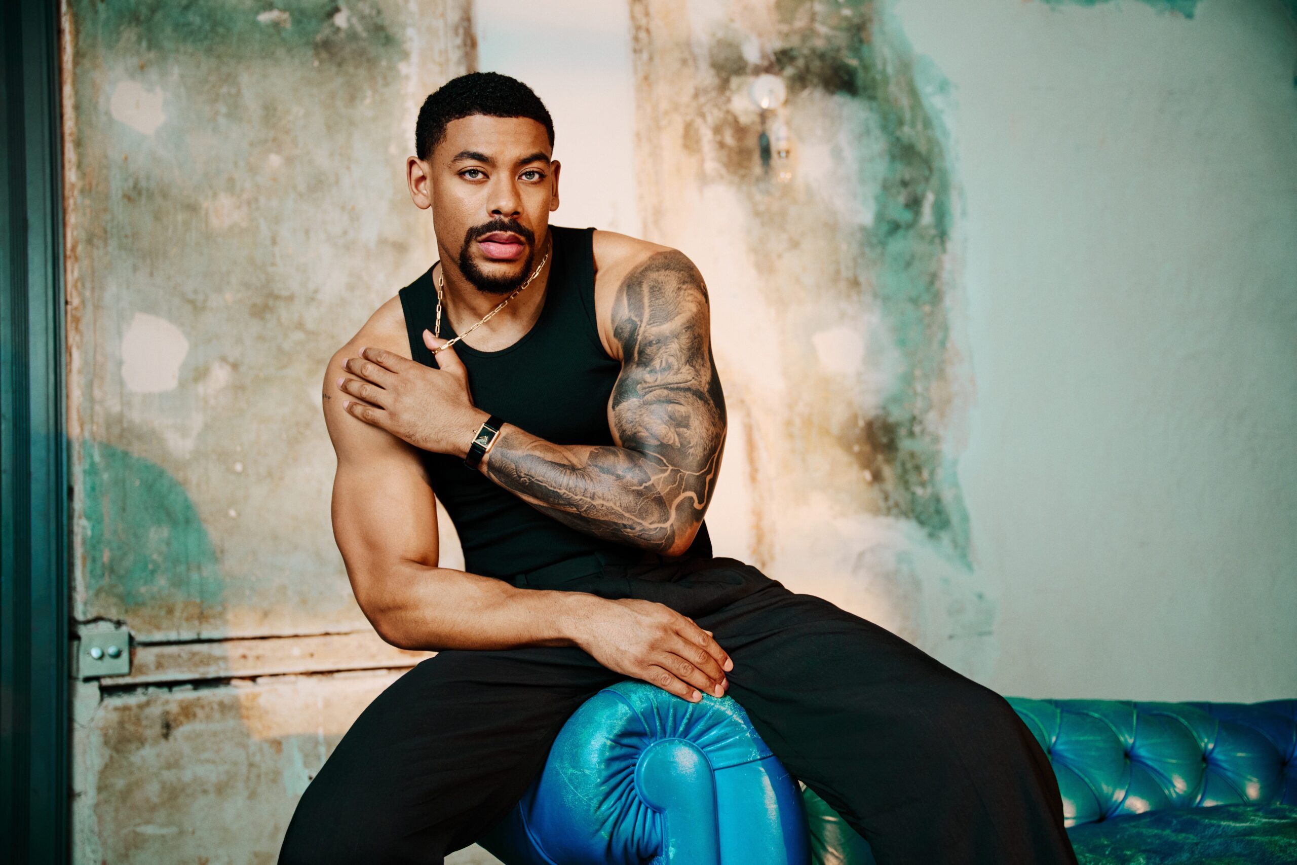
The largest piece covers Pierre’s right arm from the shoulder down across the upper arm and forearm. The photos show heavy black shading, grey wash and lighter gaps between the darker areas. The shapes follow the arm instead of sitting as a single rectangular panel.

In the Men’s Health cover photo, the forearm is close to the camera, which makes the contrast easier to see. Other portraits show how the design wraps around the arm. The exact forms aren’t clear enough in every photo to identify, but the sleeve reads as one connected black-and-grey composition.

The shoulder and upper-arm detail

Aaron Pierre tattoos: inline

The closer portrait gives a better look at the shoulder. Broad shaded shapes cover the rounded shoulder cap, with darker lines and smaller forms toward the centre. It’s still an editorial photograph, not a close-up of healed work, so some details remain indistinct.

Lighting changes how the grey tones read. In brighter photos, lighter wash is visible between the black areas; in darker portraits, the whole section can look almost solid. Both show different parts of the same tattoo.

The forearm section and flowing linework

Aaron Pierre tattoos: inline

Curved lines cross the forearm and link it visually to the upper sleeve. From a distance they can read as abstract shading; the available photos don’t show enough to name a particular image. Pale breaks in the skin interrupt the darker sections and keep the outline visible.

The forearm is also the most exposed part of the sleeve in short sleeves. It can be covered for a role or formal event, but it’s likely to show in everyday photos. That may matter if you’re planning a large piece in a similar spot.

A relaxed look at the sleeve

Aaron Pierre tattoos: inline

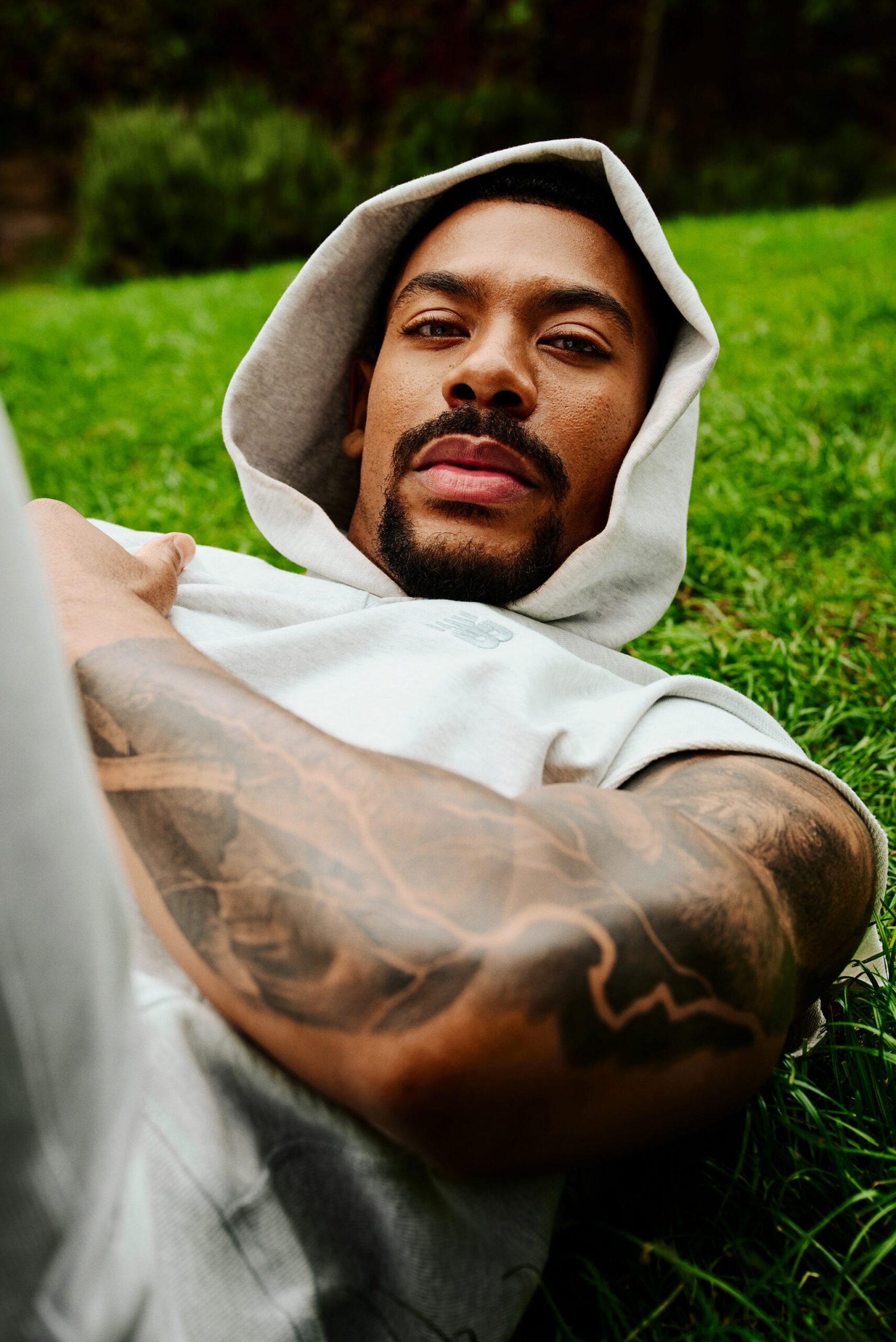
In the sofa photo, Pierre’s arm is bent, so the image shows how the ink crosses the elbow when he sits. Some darker shapes meet around the joint and shift with the angle. The sleeve doesn’t look the same in this pose as it does in a straight-on portrait.

The photo is useful for seeing the overall shape, though it isn’t clear enough to identify every small detail. The main impression is still the dense, shaded work that continues down the arm.

The smaller forearm tattoo

Aaron Pierre tattoos: inline

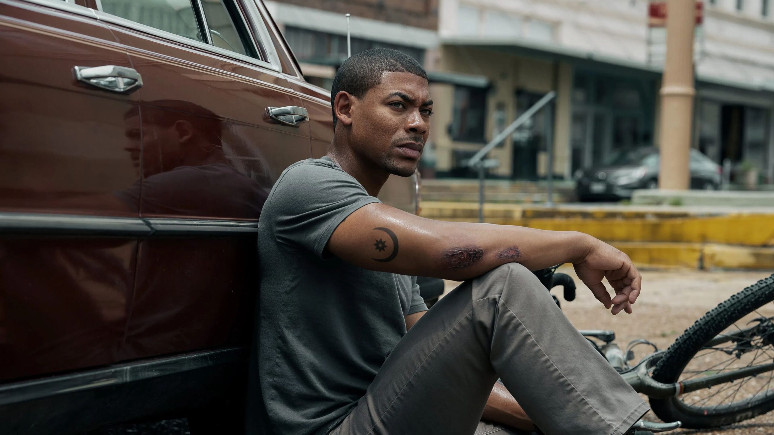
Some photos show a separate crescent-and-star shape on Pierre’s forearm. It sits apart from the larger shaded areas and has a simpler outline, making it easier to distinguish from the rest of the sleeve.

Pierre hasn’t publicly explained its meaning in the sources available here. A crescent and star can have different associations, so there’s no reason to assign one without his account. Visually, the smaller mark leaves a break between the larger sections of ink.

What Aaron Pierre’s tattoos say about his style

Across these images, the clearest pattern is black-and-grey shading and work that follows the shape of the arm. The photos don’t establish when each part was done or whether the sleeve was planned all at once. The available detail supports a description of its style and placement, not a timeline.

Could Aaron’s tattoos affect his acting work?

A large arm tattoo can be covered with makeup or clothing for a role. That takes time and continuity checks, particularly if a scene shows the same area from several angles. Whether to cover it depends on the character and production.

Good ideas to borrow from Aaron’s ink

If you’re planning a large piece, choose an artist whose black-and-grey work has the look you want, then talk through how separate areas will join. Leave some open skin so the design stays readable, and check how it sits with your arm both straight and bent.

Don’t copy a symbol because you think you know what it meant to someone else. Pierre’s crescent-and-star has no confirmed public explanation; your own design can start with a detail that matters to you.

Aaron Pierre discusses his work in this video interview.

More actor tattoo guides

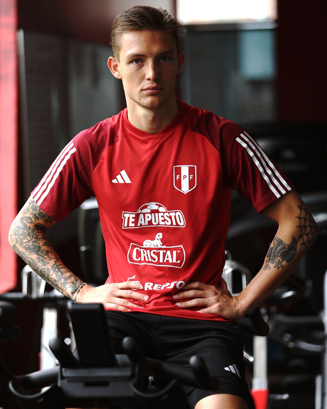
Oliver Sonne Tattoos: The Peru Crest on His Arm

Oliver Sonne’s clearest tattoo is the Peruvian coat of arms on his left forearm. He was born and raised in Denmark, and his Peruvian family roots come through his maternal grandmother, Elsa Christensen. After choosing to represent Peru, he got the crest as a permanent reminder of that decision.

Sonne has also said his tattoos mark family, dreams and places where he’s been happy. He doesn’t choose a design simply because it’s fashionable; he wants it to mean something to him.

Sonne’s Early Years

Sonne grew up in Denmark, with a connection to Peru through his grandmother. Playing for Peru made that family link part of his football career. The background helps explain why the national crest is personal to him.

In an interview reported by RPP, Sonne spoke about feeling welcomed by the team and hearing Peru’s national anthem. Those experiences sit alongside his family connection in his explanation of the tattoo.

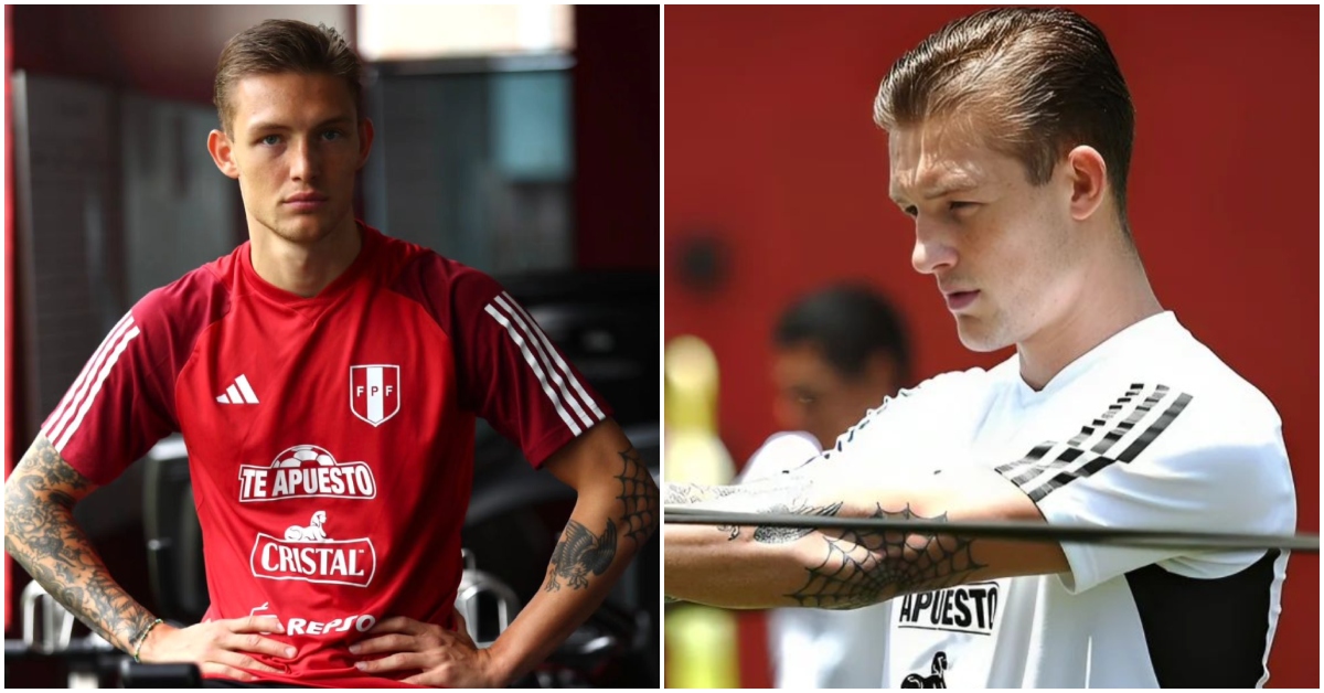
Oliver Sonne in a contextual photograph: contextual photograph, explicitly not tattoo evidence; not tattoo evidence

This is a contextual football photo rather than a close-up of the ink. It shows Sonne in the setting where the tattoos are often visible, but it doesn’t add detail about their designs.

The Peru Crest Tattoo

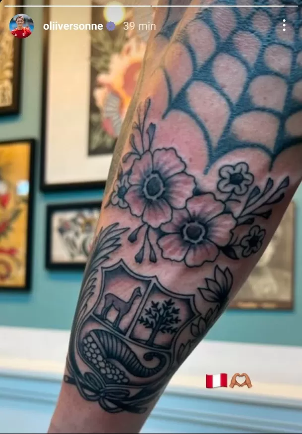
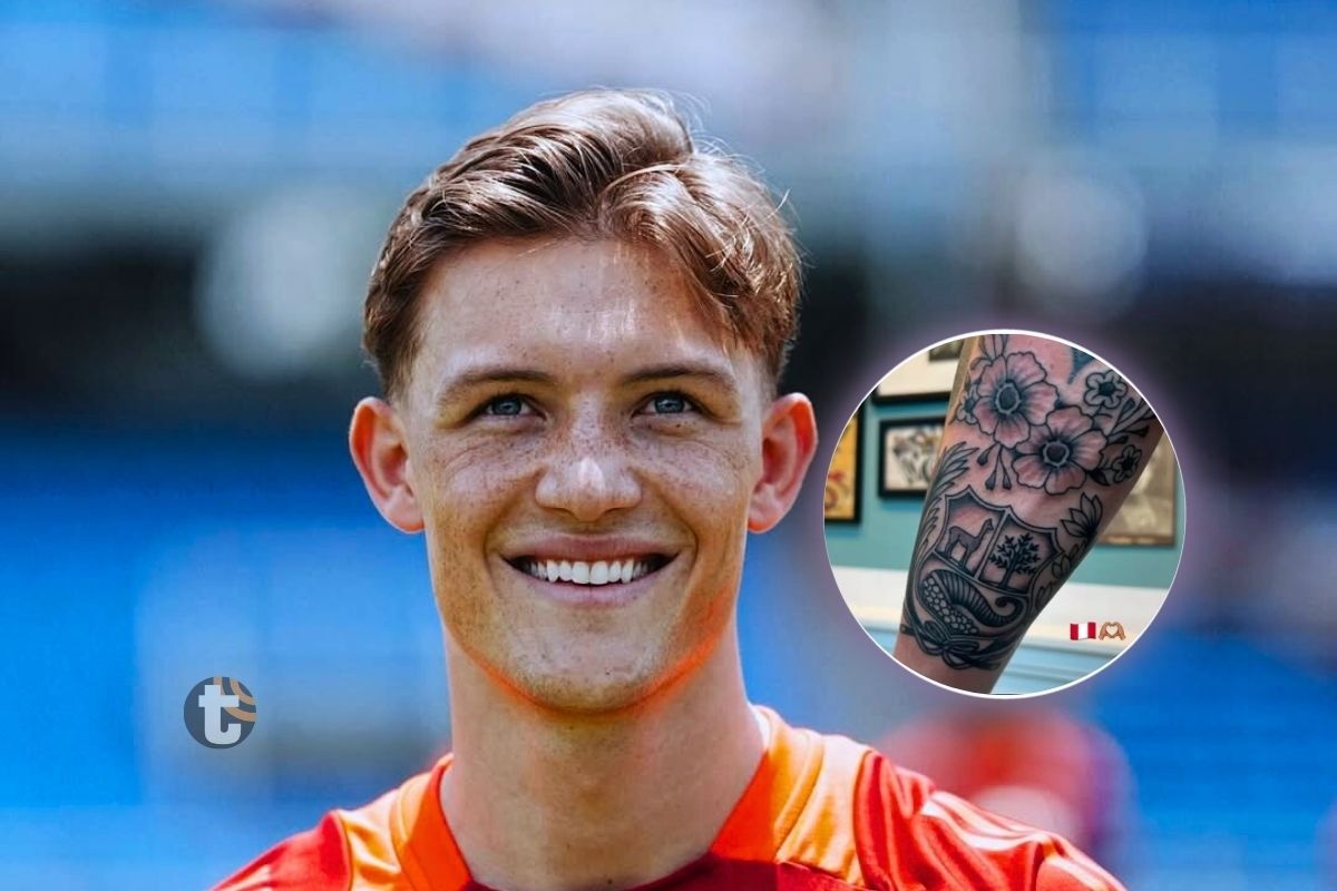
The main piece is Peru’s coat of arms on Sonne’s left forearm. In published photos, the crest is done in black and grey, with floral details around it and a web-like pattern closer to the elbow. The shield is the clearest part; the smaller shapes take a closer look.

Oliver Sonne tattoos: verified tattoo photograph

Peru’s coat of arms includes a vicuña, a cinchona tree and a cornucopia. The tattoo keeps those national symbols together in a compact design on his arm.

Sonne has said he got the piece after his first call-up. He described choosing Peru as a decision that came from the heart and said he wanted something lasting to remember that point in his life. That’s the meaning he has given the tattoo.

The Meaning Behind It

The official crest gives the tattoo a clear reference, while the flowers and fine lines add detail around it. That’s a visual reading of the design; Sonne’s own explanation is about his decision to play for Peru.

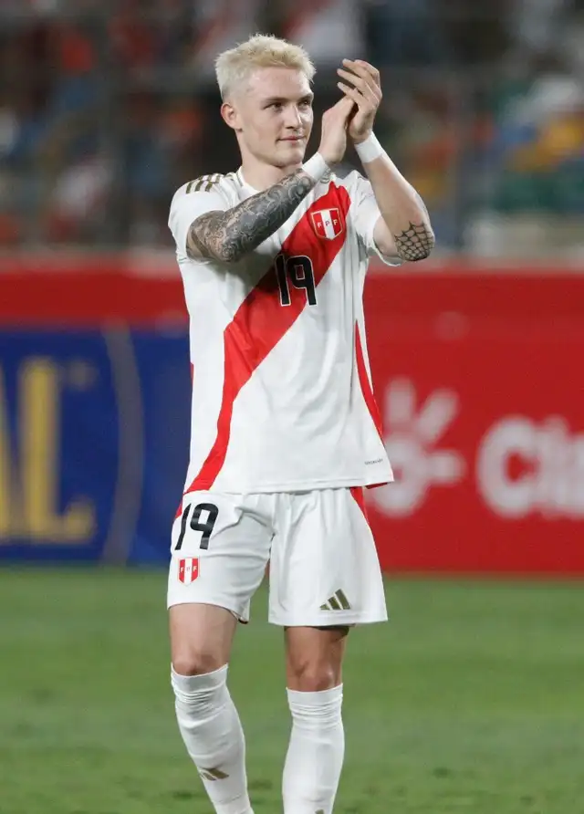
Oliver Sonne in a contextual photograph: contextual photograph, explicitly not tattoo evidence; not tattoo evidence

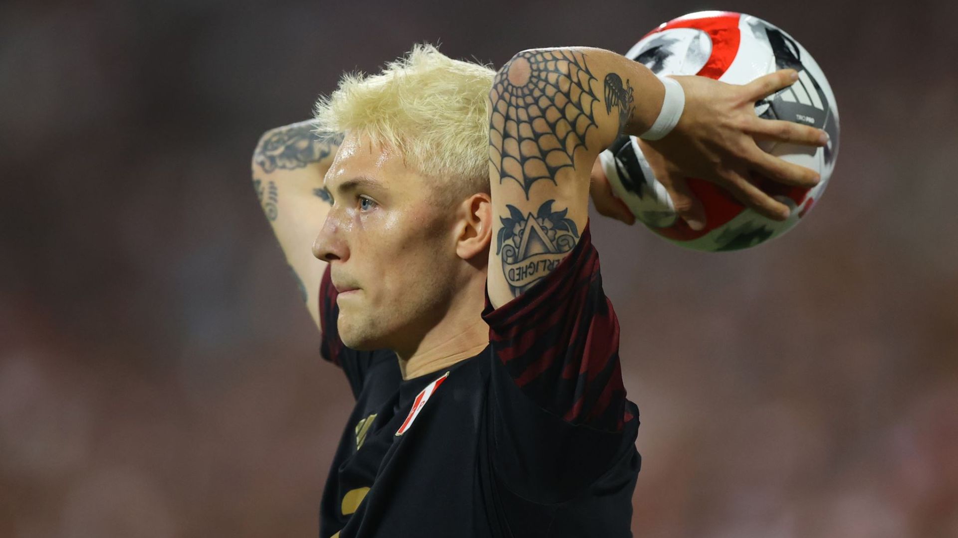
The forearm is easy to see when Sonne raises his arms, applauds or takes a throw-in. It appears in match photos, though there’s no public explanation of why he chose that placement.

The black-and-grey approach keeps the crest from relying on colour to read clearly. The shield and surrounding details remain visible against the rest of his arm work.

Other Visible Tattoos

Photos show more tattoos on Sonne’s arms, including dense shaded areas and a web-like pattern near the elbow.

Oliver Sonne tattoos: verified tattoo photograph

Sonne has tied the Peru crest to a particular moment; the rest can be described by appearance: darker work across the arm, geometric or web-like detail near the elbow, and smaller marks that show in some photos.

Photos catch different sides of the arm as Sonne moves, so a design may look different from one image to another. That’s a reason to be cautious about naming details that aren’t clearly visible.

A Personal Approach

The low-key approach to the collection is clear in the photos: the Peru crest sits alongside denser shading and smaller marks, with no public account that they were planned as one design.

Oliver Sonne in a contextual photograph: contextual photograph, explicitly not tattoo evidence; not tattoo evidence

Football, Family and Representation

Sonne’s story includes both his Danish upbringing and his Peruvian roots. The crest shows that Peru became important enough for him to choose its national team; it doesn’t cancel out where he grew up.

For supporters, the emblem is an easy-to-recognise sign of that commitment. Sonne has also given it a more specific context: he got it after his first call-up and wanted to remember the choice.

Oliver Sonne in a contextual photograph: contextual photograph, explicitly not tattoo evidence; not tattoo evidence

Final Take

The best-documented tattoo is the Peru coat of arms on Sonne’s left forearm. It marks his decision to represent the country, while the rest of the visible arm ink remains less clearly explained.

If you’re considering a football-inspired tattoo, choose a symbol tied to your own story and work with an artist to adapt it to your body. Sonne’s example is personal because it marks a decision he made, not just a team he supports.

Want more football tattoo ideas? Browse our athlete tattoo designs for more examples. If you’re planning a piece, use a clear reference photo that shows the detail you want to discuss with your artist.

Quick note: the match and close-up photos above show Sonne’s tattoos directly. The other images are contextual football photographs, included to show him in the settings where the designs are usually seen.

Take a clear reference to a professional tattoo artist and ask them to redraw it for your body and your skin.

Watch Oliver Sonne’s football highlights.

More athlete tattoo guides

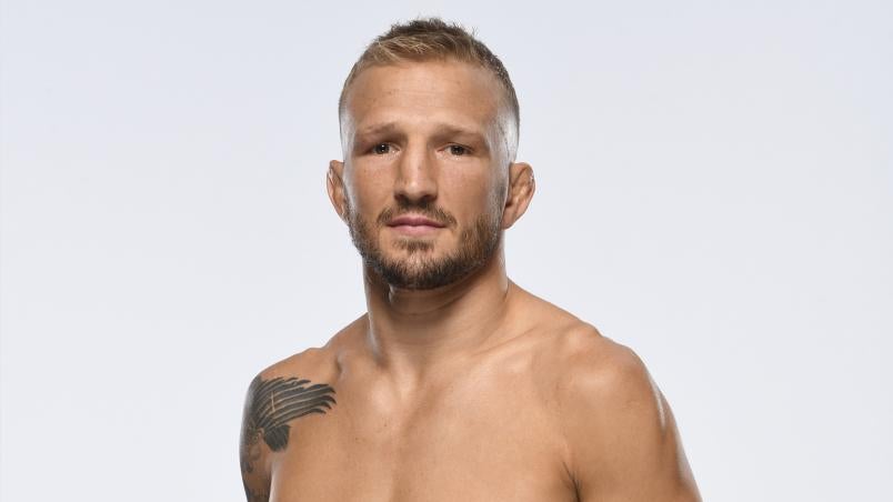
TJ Dillashaw Tattoos: Inside His Black-and-Gray Sleeve

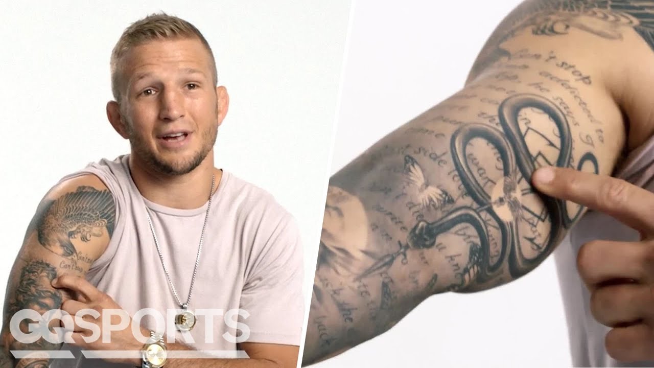
TJ Dillashaw’s sleeve is mostly black-and-gray work, with portraits, lettering, a rose and animal imagery woven through the arm. He described the designs in GQ’s Tattoo Tour, where he also explained that he waited until he could afford good work and choose an artist he trusted.

The photos show the sleeve from different angles. The larger shapes are easy to pick out; some of the smaller marks disappear into the shading unless the camera is close.

TJ Dillashaw’s Tattoo Style

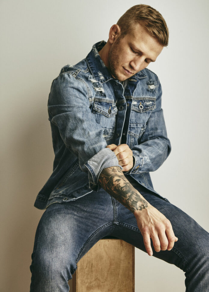
TJ Dillashaw tattoos: verified tattoo photograph

Shading does much of the work in Dillashaw’s sleeve. The black-and-gray realism mixes dark outlines with softer gradients, leaving lighter faces and lettering visible against the heavier areas.

Lighting changes what stands out. In bright photos the dark sections can look almost solid; softer light brings out more of the gray shading and smaller lines.

The Main Images

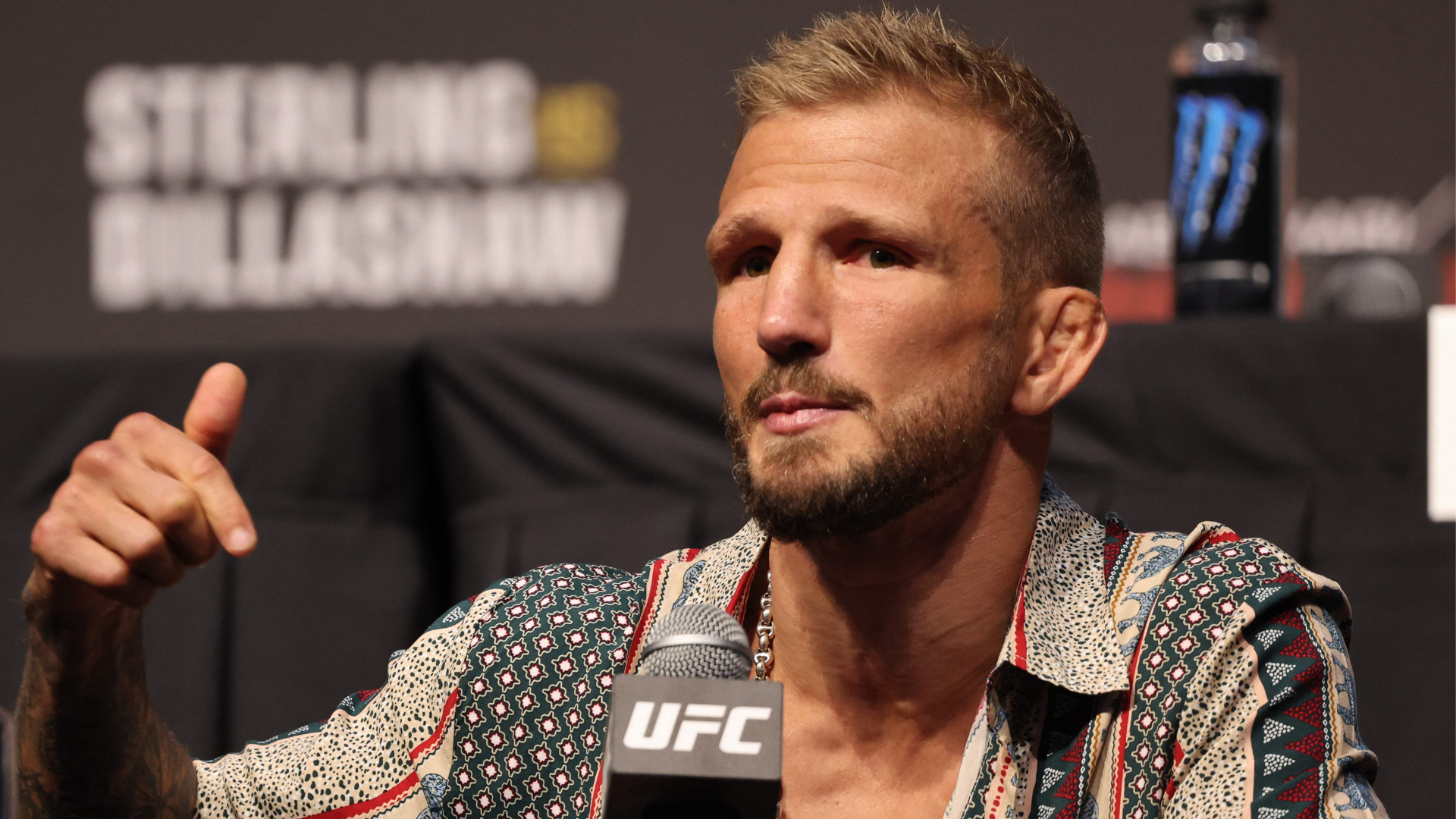
TJ Dillashaw in a contextual photograph: contextual career photograph, explicitly not tattoo evidence; not tattoo evidence

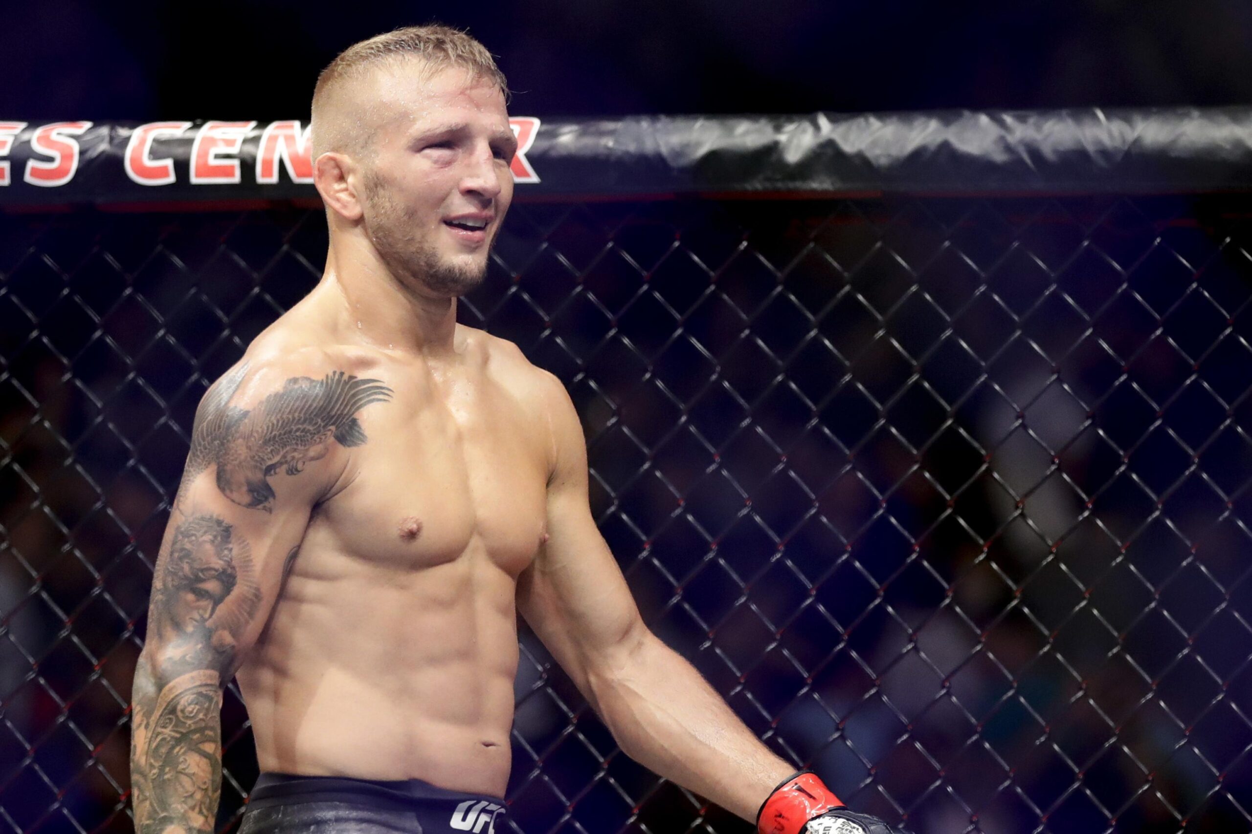
The sleeve runs from the shoulder down toward the wrist. A bird spreads across the upper shoulder, with script and portrait-style work lower on the arm. The upper shoulder bird gives that end of the sleeve a clear outline.

The bird’s wings reach across the shoulder; below it, the lettering and faces draw the eye down the arm. Dillashaw has described several of the images in GQ, which is a better guide to their meaning than guessing from a photograph.

Small Details

A rose sits among the darker sections of the sleeve. It gives the eye a smaller, more open shape between the larger images.

Script appears in several places, though not every line is readable in a photograph. The angle and distance matter: lettering that is clear in a close-up can fade into the shading from farther away.

Short lines and dark filler connect the larger pieces, so the sleeve doesn’t look like a row of unrelated images. The shadows also help the design hold together across the arm.

Building the Collection

TJ Dillashaw in a contextual photograph: contextual career photograph, explicitly not tattoo evidence; not tattoo evidence

In the GQ tour, Dillashaw says he waited until he was 30 so he could afford good work instead of choosing an artist on price alone. He settled on Oscar Akermo and says they built a relationship as the sleeve developed over separate sessions.

Akermo sometimes travelled to work with him. Dillashaw describes the sleeve changing over time, with the artist adjusting the design as they went rather than treating each visit as a separate, finished tattoo.

Some of the images connect to his fighting career, but the collection isn’t limited to one event. Dillashaw has said that a fight can mark the time when he added a piece, and he uses the tattoos to remember different stretches of his career.

Planning a Similar Project

TJ Dillashaw in a contextual photograph: contextual career photograph, explicitly not tattoo evidence; not tattoo evidence

If you like the look of Dillashaw’s sleeve, start with a style and an artist whose work you trust. For black-and-gray realism, talk through how the larger images will fit around your shoulder, elbow and forearm.

Plan the main shapes before filling every gap. Portraits, lettering and filler can be added in stages, leaving room to see how the design sits on your arm as it grows.

Bring clear references, but expect an artist to adapt them for your body and skin. Look at the design from the front, side and back, not just in one straight-on photo.

More athlete tattoo guides

Flocke Tattoos: CRIMINEL, LOVE and His Blackwork Collection

Kevin Platzer, known to German reality TV viewers as Flocke, has tattoos across his neck, chest, arms, hands and legs. The collection combines heavy blackwork with lettering, a chest figure and smaller hand designs.

In a 2025 interview with BLICK, he explained why several of the tattoos matter to him and how he chose others.

Who Flocke Is

Platzer first appeared as Flocke in Berlin Tag & Nacht in 2019. He later featured in First Dates Hotel, Temptation Island VIP, B:Real, The 50 and Forsthaus Rampensau.

The CRIMINEL Tattoo

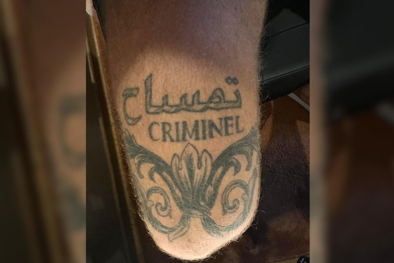
CRIMINEL covers his right thigh above dense ornamental blackwork. Flocke told BLICK it recalls his time on the streets of Berlin, when he spent time in circles he described as not always clean, sometimes criminal. He said he learned from that period; the tattoo marks his past without glorifying it.

Flocke tattoos: verified tattoo photograph

The thick lettering is easy to read, with dark ornament framing the word from below.

The BESTE LEBEN Tattoo

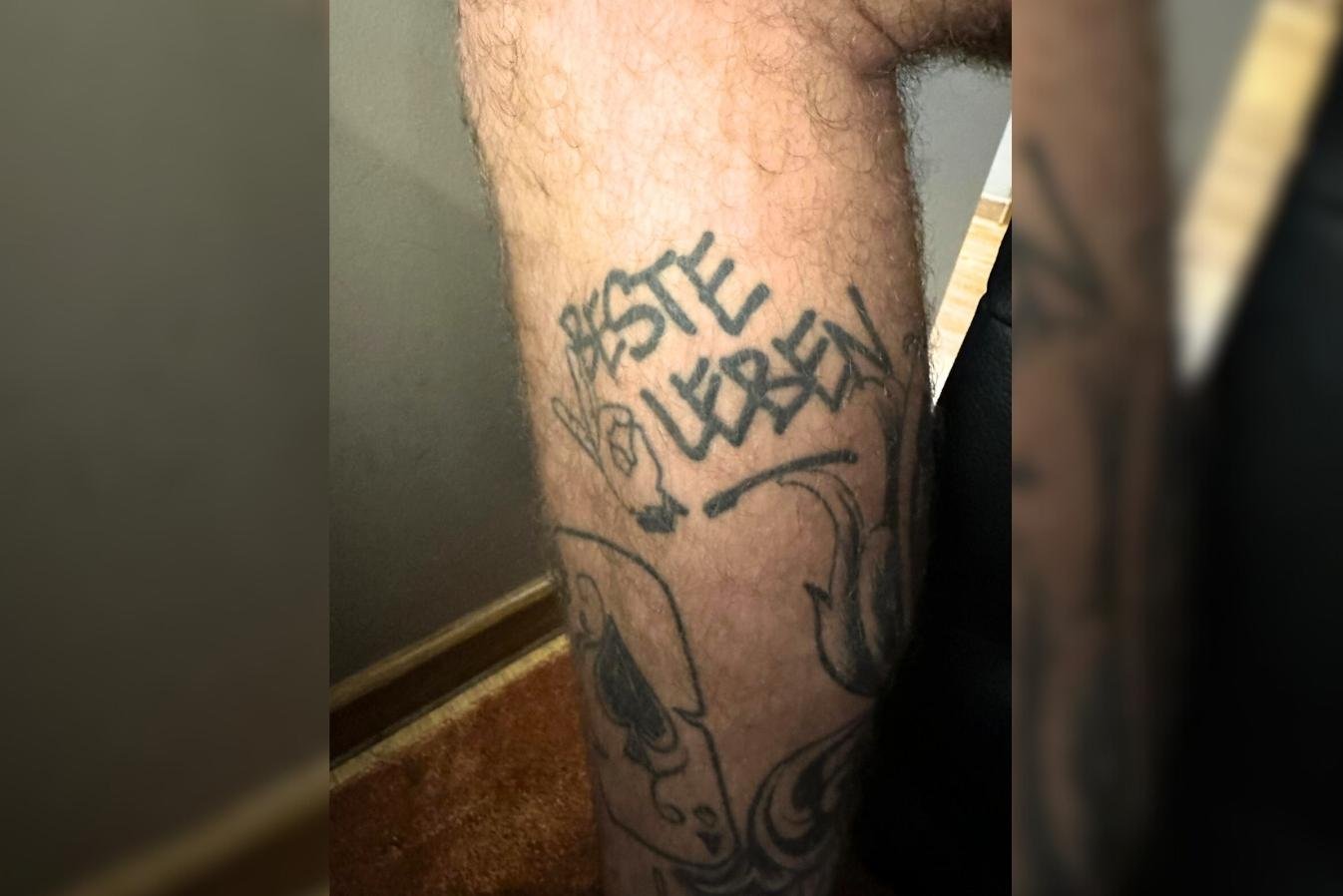
BESTE LEBEN sits on his lower leg. Flocke described it as a reminder to make the most of each moment and switch off from stress. When he looks at it, he imagines relaxing on a beach under a palm tree.

Flocke tattoos: verified tattoo photograph

The words sit inside larger blackwork on the leg, so the phrase is part of a wider collection rather than a stand-alone piece.

LOVE and the Hand Pieces

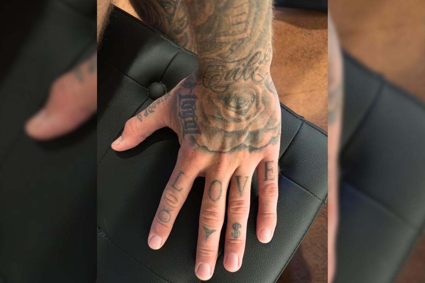
LOVE spans the fingers of his left hand. He calls it the most important word, a reminder of his love for family, friends and the work he does.

He said the dollar sign on his ring finger reflects his love of the U.S. The Ushuaïa logo on his middle finger recalls an Ibiza trip and nights out; the small tomato on his index finger was a spontaneous Mallorca tattoo.

Flocke tattoos: verified tattoo photograph

The close-up shows the lettering and symbols packed across the fingers. Some edges have softened, but the designs remain readable.

The Chest Figure

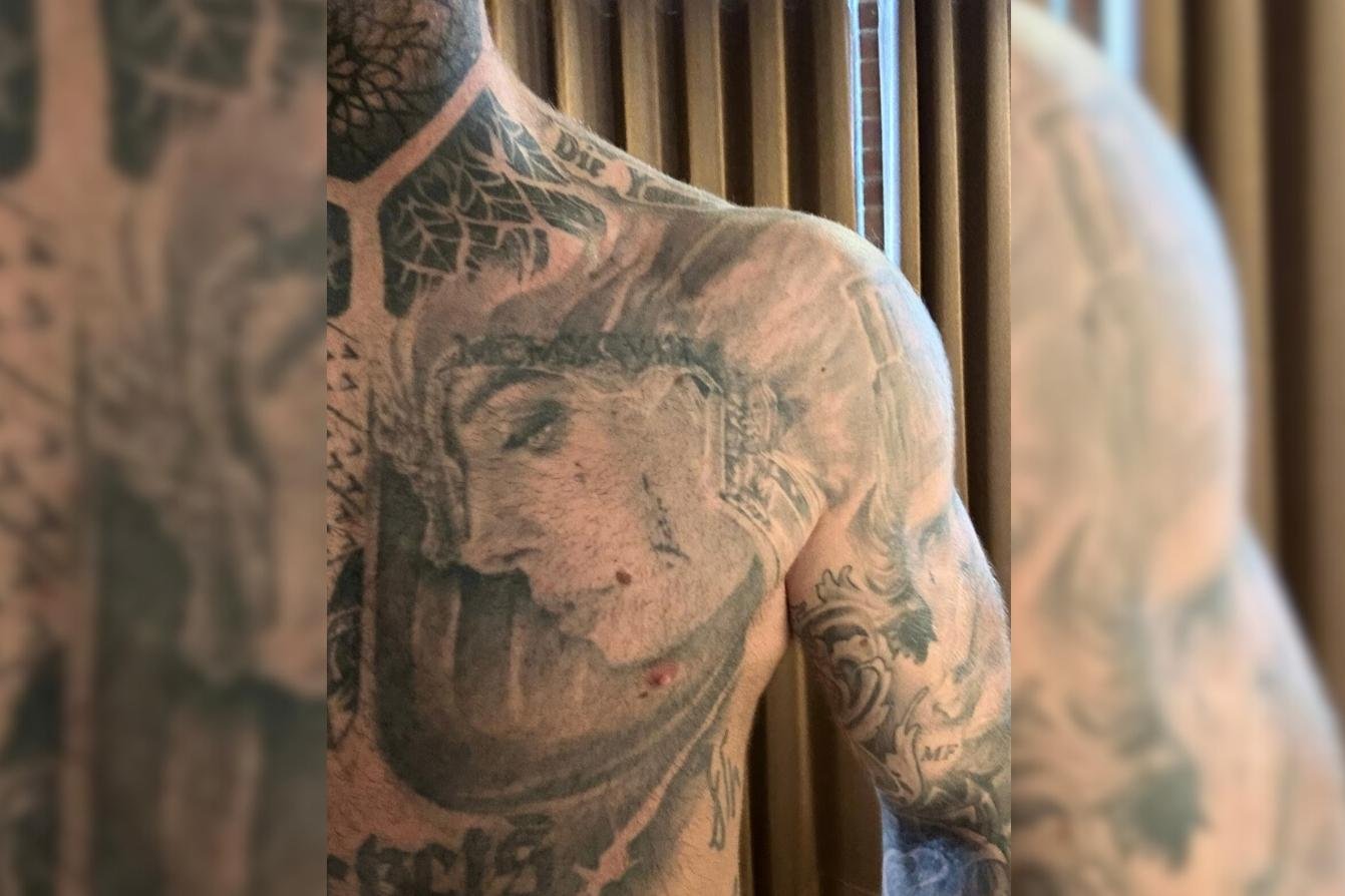
Flocke describes the large figure on his upper left chest as a warrior. It reaches toward his shoulder. He told BLICK he didn’t know who she was; he chose the design because he found her attractive. He also said it was about the moment and how it felt, not a deeper story.

Flocke tattoos: verified tattoo photograph

The face has softer shading, with heavier black shapes around it and older lettering farther down the chest.

What the Collection Says

Flocke in a contextual photograph: contextual celebrity photograph, explicitly not tattoo evidence; not tattoo evidence

The portrait here is contextual rather than a tattoo close-up. The other images show the work itself, from large areas of blackwork to short phrases and small hand designs.

Blackwork gives some pieces a visual link, but Flocke doesn’t describe every tattoo as part of one story. Some have a personal meaning; others were chosen for their look or the moment.

Final Take

For design ideas, notice the contrast: heavy blackwork covers large areas, while the words and small hand symbols stay readable.

More celebrity tattoo guides

Federico Valverde Tattoos: The Designs, Stories and Details Shown in Photos

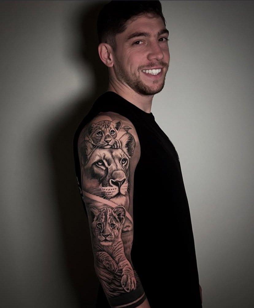
In 2025, El Observador reported that Federico Valverde showed new tattoos on his right arm. The images below mix a close-up of the design with wider football and portrait photos.

A documented family tattoo

The tattoo sits on Valverde’s right upper arm. El Observador reported lions and cubs and credited tattoo artist Alejandro Del Mazo. The grouping reads as a family design, although the report doesn’t include a personal explanation from Valverde.

Federico Valverde tattoos: A documented family tattoo

The close-up makes the realistic shading and overlap between figures easier to see.

Valverde on the pitch

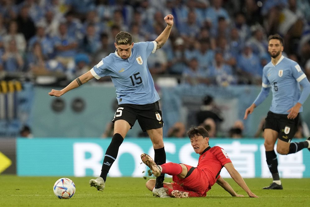
Federico Valverde in a contextual photograph: Valverde on the pitch; not tattoo evidence

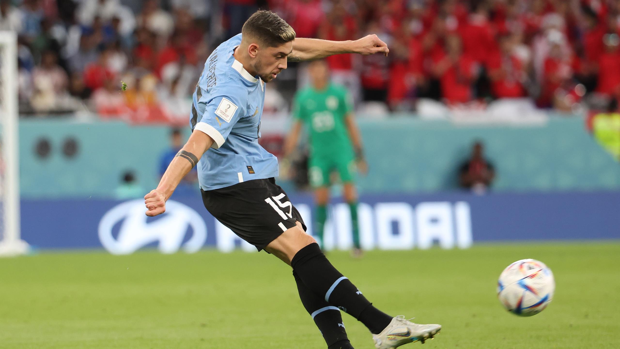
This match photo adds football context.

His football career

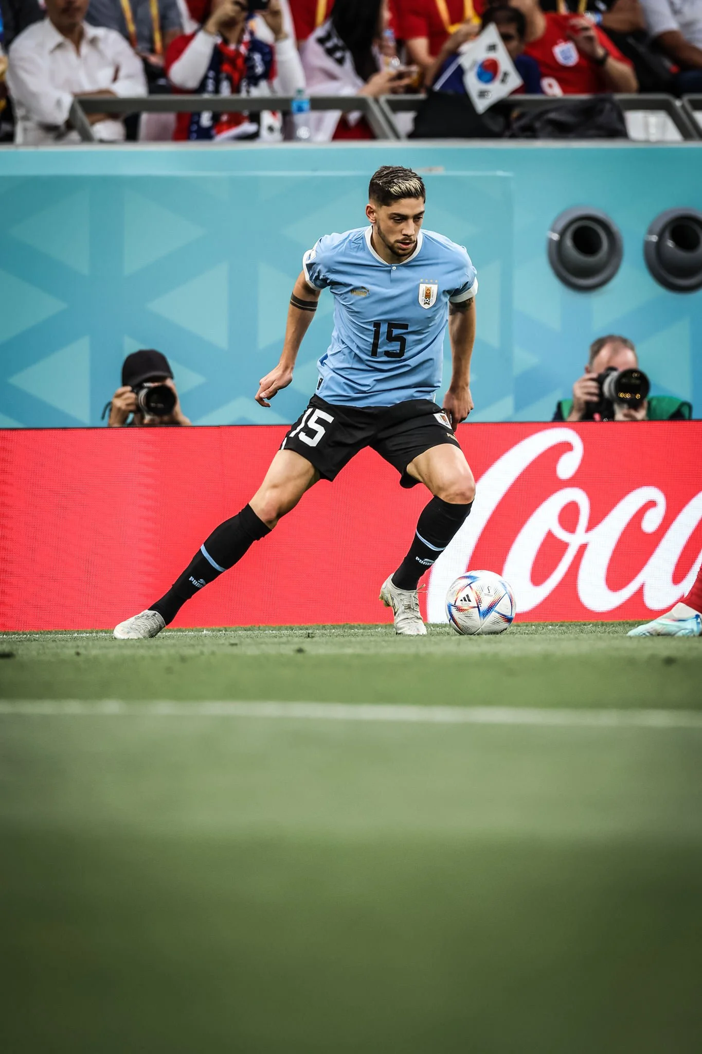
Federico Valverde in a contextual photograph: His football career; not tattoo evidence

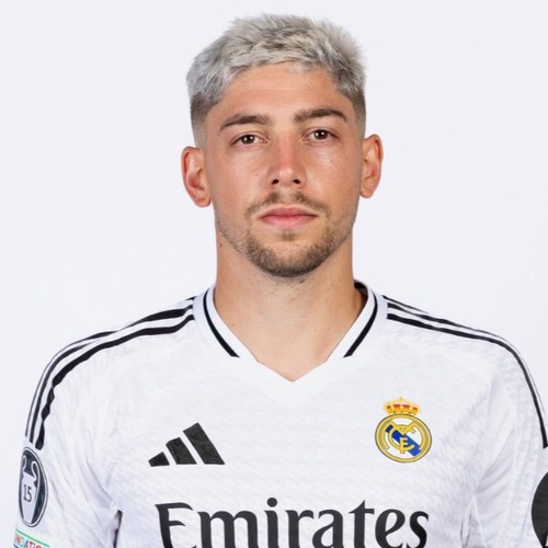
Valverde plays for Real Madrid and Uruguay.

A different reference photo

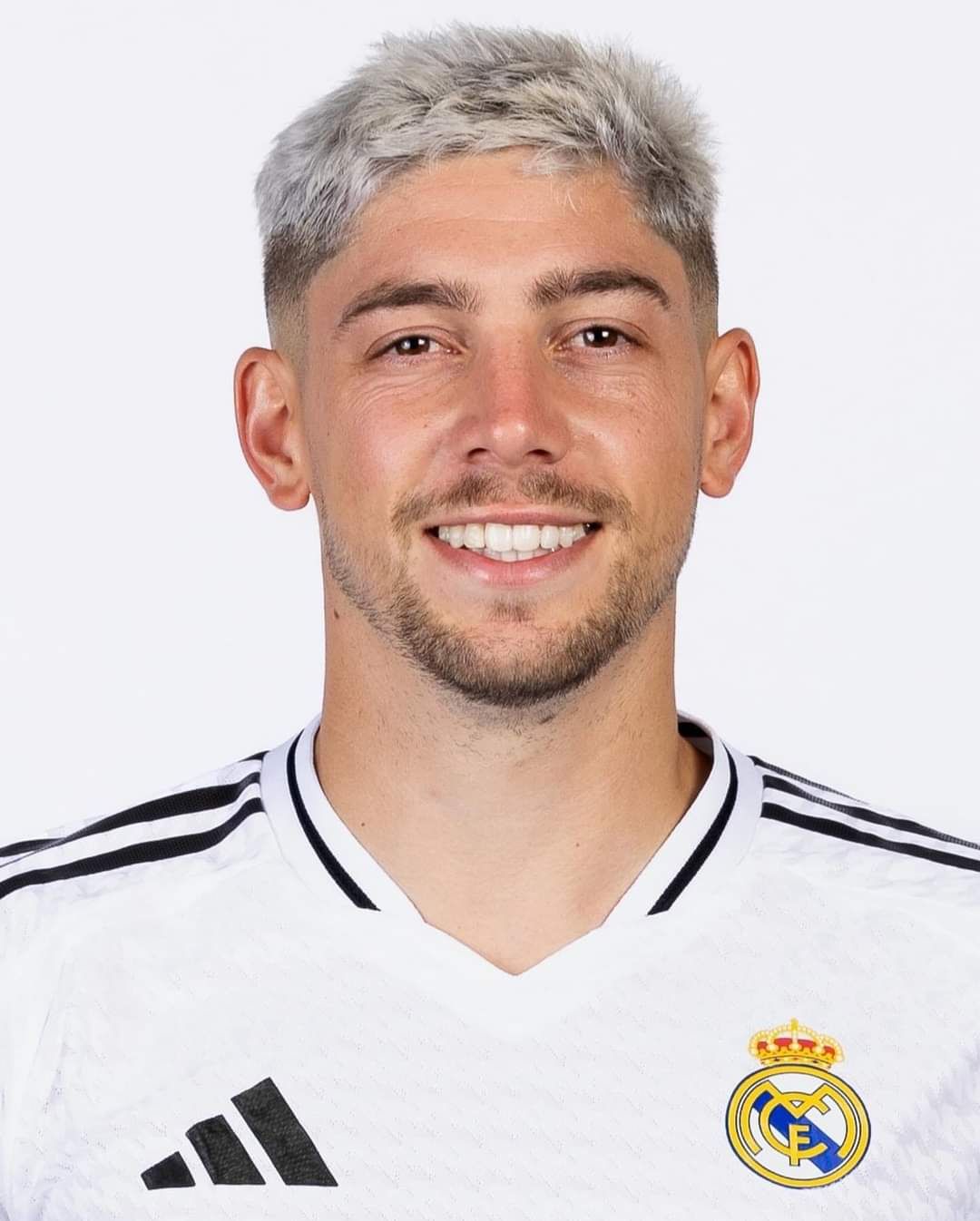
Federico Valverde in a contextual photograph: A different reference photo; not tattoo evidence

The player away from the pitch

Federico Valverde in a contextual photograph: The player away from the pitch; not tattoo evidence

Angles, clothing and light can change how much ink a photo shows. The close-up is the clearest view of the lion design; the other shots don’t support claims about additional tattoos or their meaning.

More athlete tattoo guides

Tommy Fury Tattoo: The Story Behind His First Piece of Ink

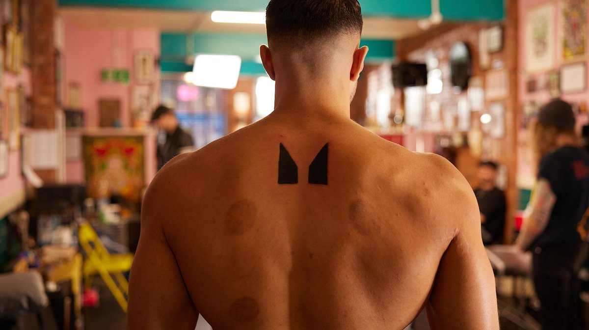
Myprotein filmed Tommy Fury getting his first tattoo during an interview at a tattoo studio. The footage shows a small black design high on his back, just below the neck.

What does Tommy Fury’s tattoo look like?

In the close shot, it appears to be two solid black, tapered shapes with a narrow strip of skin between them. The edges are bold and clean; there’s no visible lettering or fine detail.

Tommy Fury tattoos: Tommy Fury photographed from behind in the tattoo studio; two solid black pointed shapes are clearly visible high on the upper back.

Why was the first piece a surprise?

Myprotein noted that Fury had publicly said he didn’t like tattoos, including matching ones with Molly-Mae Hague. The interview was filmed as he got inked for the first time, which gives the piece its context. It doesn’t suggest that he was planning a sleeve or a larger collection.

A fighter outside the chair

The feature shows the finished design but doesn’t give a personal explanation for it. The clearest account is what the image shows: two black forms placed high on Fury’s back.

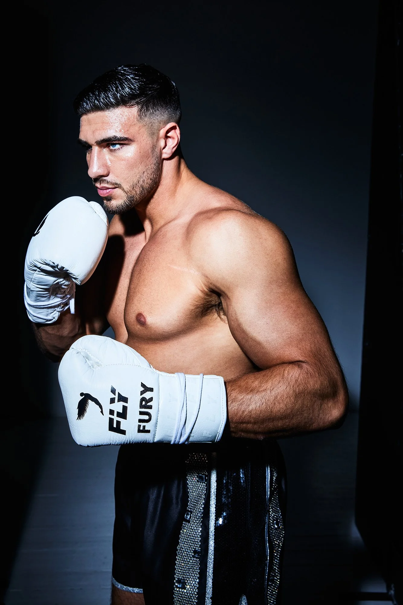
Tommy Fury in a contextual photograph: Contextual boxing portrait in gloves; not tattoo evidence.; not tattoo evidence

The timing around his boxing career

Myprotein published the interview in September 2023, before Fury’s October cruiserweight bout with KSI at Manchester’s AO Arena. He also talked about training and becoming a father to Bambi. The tattoo is one part of that conversation.

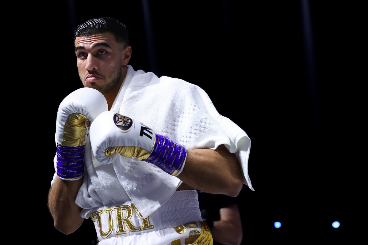
Tommy Fury in a contextual photograph: Contextual ring-walk image; not tattoo evidence.; not tattoo evidence

What the surrounding photos prove

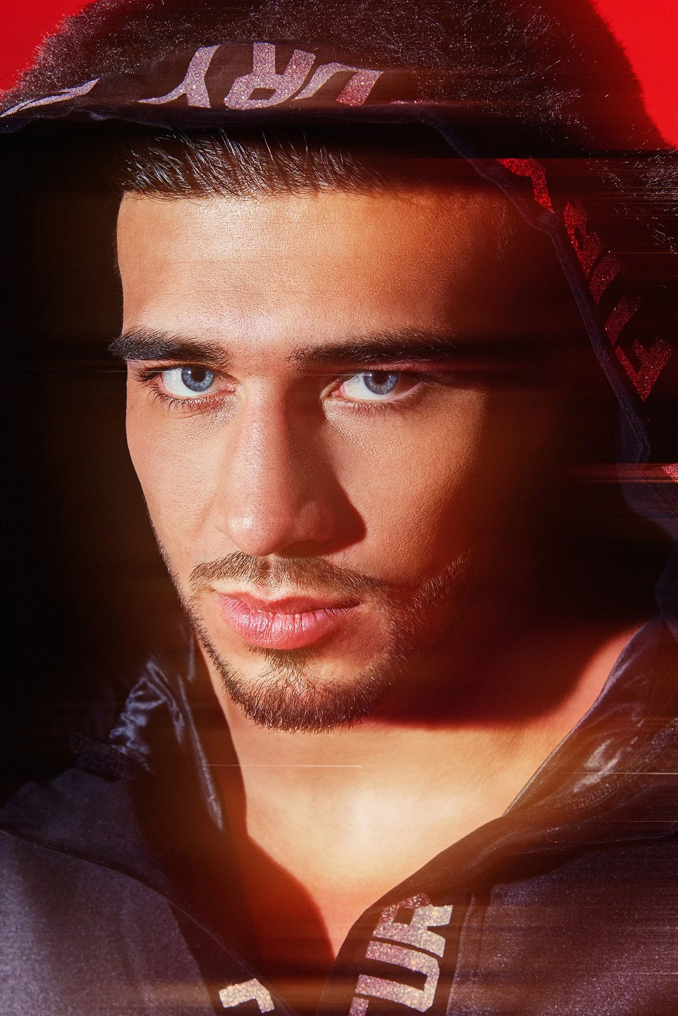
The portrait and fight-preparation photos add boxing context, but they don’t show the tattoo. The behind-the-back frame from the Myprotein interview is the only image here that lets readers see the design clearly.

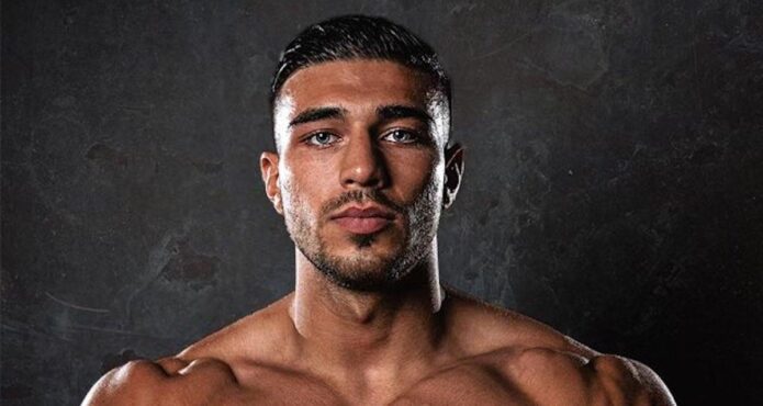
Tommy Fury in a contextual photograph: Contextual face-forward studio portrait; not tattoo evidence.; not tattoo evidence

The next chapter

The feature records Fury’s first tattoo, but doesn’t say whether he plans to get more. There’s no basis in the interview for predicting that this small piece will become part of a larger design.

Tommy Fury in a contextual photograph: Contextual fight-preparation image; not tattoo evidence.; not tattoo evidence

A simple takeaway

The Myprotein footage is useful because it shows the tattoo session itself. It gives a clear view of the design without attaching a meaning Fury hasn’t shared.

Tommy Fury talks while getting his first piece

Watch the Myprotein interview, filmed as Fury gets his first tattoo.

More athlete tattoo guides