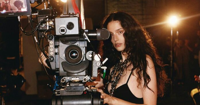
Eva Victor doesn’t have the kind of tattoo collection that needs a dramatic reveal. There’s no full blackout sleeve or giant back piece built for a red-carpet flash. What makes their ink interesting is almost the opposite: the designs are small, a little odd, and tied to very specific moments. The best-known example is a simple four-pane window on the middle finger. It’s not perfectly neat. Victor has called it “janky.” They’re also completely fond of it.
That combination says a lot about how Victor approaches tattoos. The point isn’t to create a flawless object that everyone else can approve of. It’s to keep a physical reminder of a place, a mood, or a decision that made sense at the time. Their tattoo stories are funny, but they also have that familiar edge of honesty. Sometimes a piece starts as a carefully imagined idea and ends up as something much simpler. Sometimes the imperfect version becomes the one you actually want to keep.
The window tattoo is the piece everyone asks about
Victor’s window tattoo sits on the middle finger and looks exactly like the kind of small symbol you might draw in the margin of a notebook. It’s a rectangle divided into panes, with no attempt to make it look like a detailed architectural illustration. In a Harper’s Bazaar interview, Victor explained that the original idea was much more elaborate. They had drawn a window with an awning, curtains and other fine details, then brought the concept to an Italian tattoo artist in France.
The artist didn’t speak French or English, and the design conversation didn’t go as planned. When Victor asked what could be done, the artist showed them a much more basic version: a box with lines through it. Victor agreed. That could have been the moment for regret. Instead, the rough translation became the tattoo’s whole charm.
There’s a useful lesson in that story for anyone who’s over-planning a first tattoo. A design doesn’t have to survive every stage of the process unchanged. The final mark still needs to be safe, legible and well placed, but it doesn’t have to be a perfect copy of the first sketch. Sometimes the unexpected edit is what gives it a personality.
The finger is a demanding spot, too. Skin moves constantly, details can soften, and the tattoo is hard to hide from your own view. A tiny window there works because its structure is clear even when the lines age. It’s simple enough to read at a glance, but strange enough that it doesn’t feel like generic flash.
Why the story matters more than the size

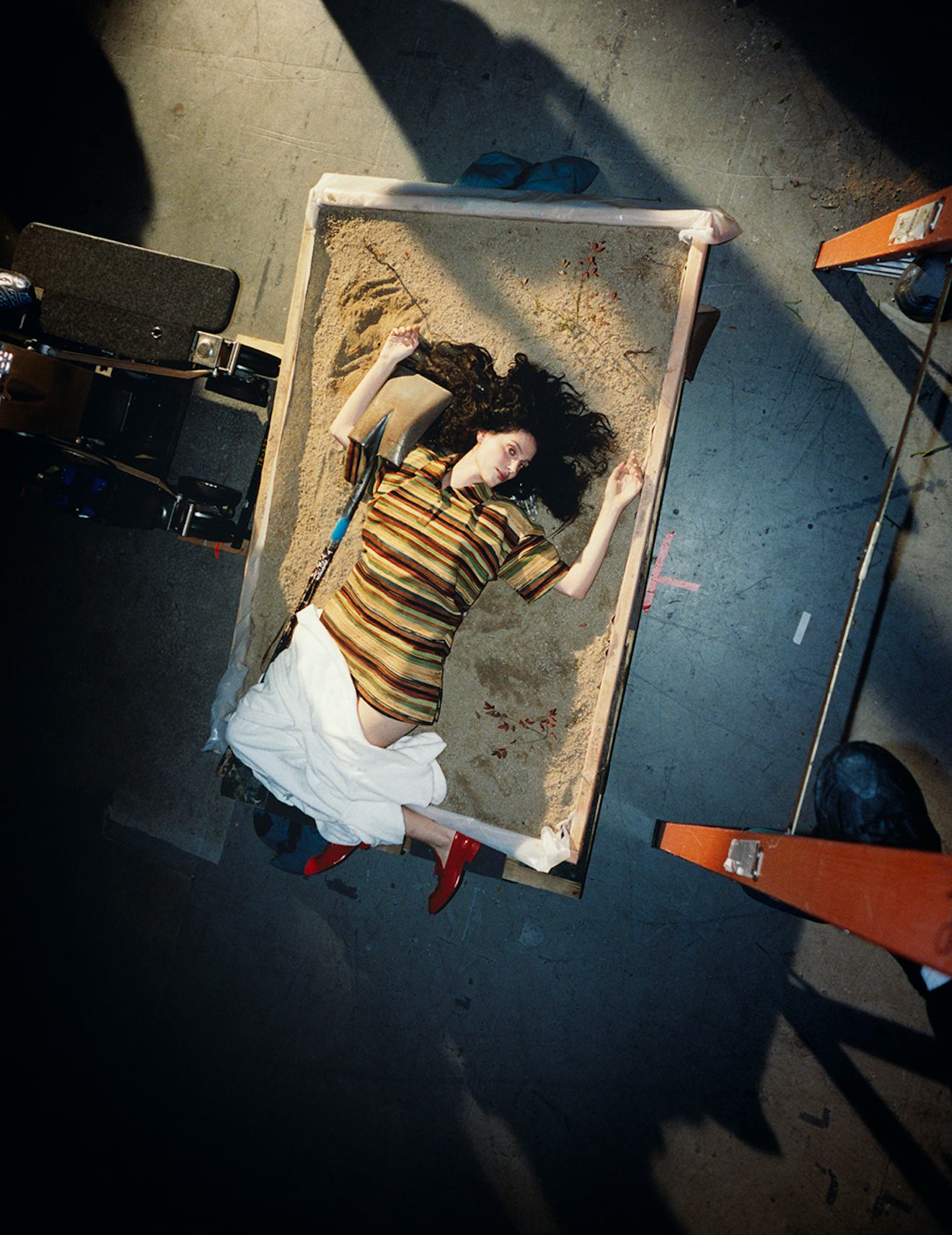
This is a contextual photograph from Victor’s Sorry, Baby coverage, not tattoo evidence. It’s included because the mood of their work helps explain why the window piece feels right for them. Victor’s public image is often built around small shifts in tone: a funny sentence that opens into something more serious, or an ordinary object that carries a private charge.
The window itself became a natural symbol to writers discussing Victor’s debut film, but the tattoo existed before the public metaphor. That distinction matters. It’s tempting to retrofit a celebrity’s tattoo so it neatly predicts their career. Real life is usually messier. Victor got a small window because of a strange afternoon in France. Later, audiences found a connection between the image and a film concerned with looking in, looking out, and finding a way to let light through.
That coincidence doesn’t make the tattoo less meaningful. If anything, it gives the piece room to change. A design can start as a travel memory and pick up a second meaning years later. It doesn’t need one official explanation forever. Tattoos can collect associations the same way people collect photographs, songs or phrases they repeat without remembering exactly where they first heard them.
A mark that came from miscommunication

This outdoor film still is contextual only, not proof of another tattoo. The useful detail here is the way Victor talks about the window piece without polishing the story. There’s no attempt to pretend the artist secretly understood a complicated concept and transformed it into a minimalist masterpiece. Victor wanted one thing, the artist offered another, and the decision happened quickly.
That’s a very tattoo-specific kind of comedy. People spend hours choosing a font, measuring a placement and saving references, then discover that the body, the artist or the appointment changes the plan. Communication matters, especially when you’re working across languages. A good consultation should leave enough time to make sure both people mean the same thing when they point at a line or describe a shape.
Victor’s story also shows why a tattoo can outgrow its origin. The piece began with an idea that didn’t translate. It became a record of the translation itself. The imperfect version is now more accurate to the memory than the original sketch would have been. It preserves the weirdness of the day instead of pretending the day was perfectly controlled.
If you like the look of a tiny geometric tattoo, take the practical part seriously. Keep the design bold enough to age, choose an artist who does clean small work, and make sure the stencil still makes sense on your actual hand. A reference photo can suggest the mood, but the final shape has to belong to your anatomy.
What the sources confirm
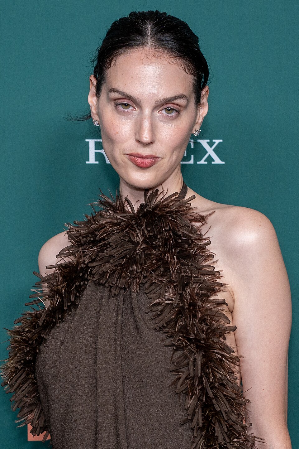
This New York Film Festival portrait is contextual only, not tattoo evidence. Victor has described other tattoos in interviews, including a half-note rest symbol on the foot. The idea behind it was simple: rest once in a while, take a beat, and think. It’s the kind of design that can be deeply personal without looking dramatic to anyone else.
Victor has also talked about a blackberry tattoo designed on an iPad during a difficult period. They were in the hospital after their stomach exploded but kept the tattoo appointment. The result became a marker of how bad they felt at the time. That isn’t the kind of story that turns a tattoo into a motivational poster. It’s more honest than that. The design doesn’t erase the moment; it remembers it.
Those pieces suggest a collection built around private jokes and personal timestamps. The tattoos don’t need to match one another stylistically. They connect because Victor knows why they are there. That’s an underrated way to build a collection. Instead of choosing one visual theme and forcing every future idea into it, you can let the common thread be your own memory.
It also makes the work harder to judge from a photograph. A viewer may see a tiny mark and assume it’s random. The wearer may see a trip, a difficult week, a friendship or a reminder to slow down. That gap is normal. Not every tattoo is meant to explain itself to strangers.
Ideas to borrow without copying
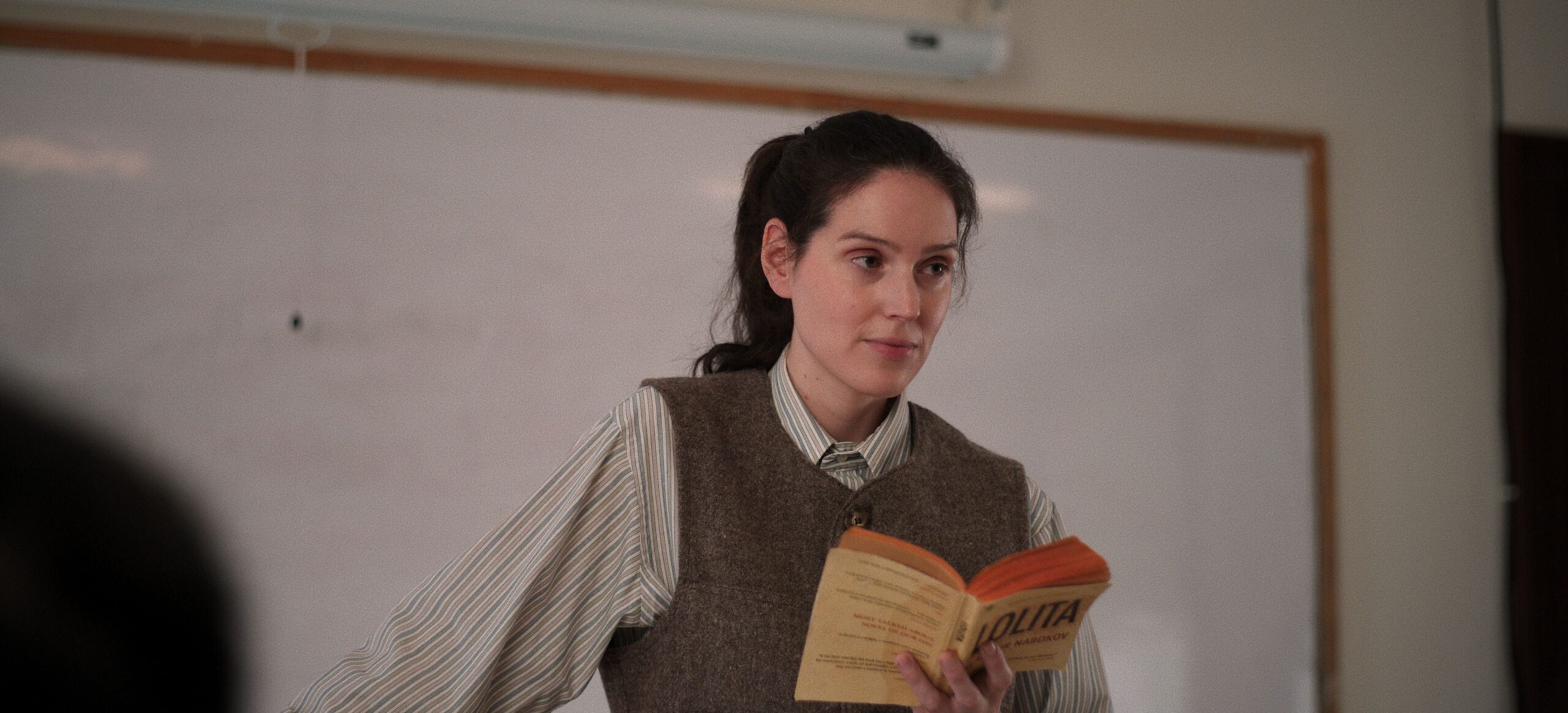
This reading scene is contextual only, not tattoo evidence. Victor’s tattoos still work as a visual collection, but the stories behind them are more important than building a recognizable “look.” The window isn’t there to make an outfit more rebellious. The half-note rest isn’t there because musical symbols are fashionable. The blackberry isn’t there because fruit tattoos are having a moment.
That makes the collection feel relaxed. A tattoo can be part of your image without being a brand strategy. It can sit quietly under a sleeve, appear when you reach for something, or stay hidden for months. When it does show, the person wearing it doesn’t owe anyone a full explanation.
For tattoo fans, that’s probably the most useful part of Victor’s approach. The designs are specific without being over-explained. They have enough personality to inspire an idea, but not so much polished symbolism that copying them would make sense. You can borrow the attitude: choose a mark because it means something to you, then let it stay a little rough around the edges.
What to borrow from Eva Victor’s approach
Start with the idea, not the image. Victor’s window is memorable because of the story around it, not because a four-pane rectangle is a revolutionary tattoo subject. If you want something similar, ask what moment you’re actually trying to keep. A travel memory might become a doorway, a receipt, a street sign or a badly drawn object from the day. The personal detail will make it yours.
Keep small designs readable. Fine line work can look gorgeous when it’s fresh and disappear into visual noise as it ages. Your artist can help decide which details are worth keeping and which ones need to be removed. Victor’s window benefited from becoming simpler, even if that wasn’t the original plan.
Think carefully about placement. Fingers and feet are expressive spots, but they’re also high-maintenance areas. They take friction, movement and sun. Go in knowing that touch-ups may be part of the deal. A tattoo that needs maintenance isn’t automatically a bad choice; it just needs realistic expectations.
Finally, leave room for the meaning to change. A piece can commemorate something difficult without trapping you inside that difficult moment. It can start as a reminder to rest, then become a reminder that you made it through. It can begin as a travel story, then turn into a private symbol for the person you became afterward.
Eva Victor’s tattoos are appealing because they don’t pretend to be perfectly planned. They’re small, personal and sometimes a little wonky. That’s the point. A good tattoo doesn’t need to look like it came from a mood board. It needs to feel like it belongs to the life that put it there.