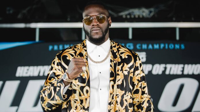
Deontay Wilder’s tattoos are hard to miss once his shirt comes off. The former heavyweight champion has a dense collection across his chest, shoulders, arms, neck and stomach, with big shaded forms sitting beside long lines of script. It is not a neat little set of matching symbols. The work feels layered, physical and built to be seen from a few steps away.
That scale is what makes Deontay Wilder tattoos useful inspiration. The strongest ideas are not tiny filler marks scattered at random. They use the body as a wide canvas, then mix heavy black shading with lighter lettering so the overall look still has movement. The photos also show why placement matters. His chest reads first, his arms widen the shape, and the long stomach lettering pulls the eye down the centre.
Wilder has spoken about the stories behind his tattoos, including the piece connected with his daughter and the road he took into boxing. The personal meaning matters, but the visual lessons are clear even when a smaller design has not been explained. Look at how the collection balances large areas, open skin and smaller details rather than trying to name every mark from one photograph.
Deontay Wilder’s chest tattoos set the tone
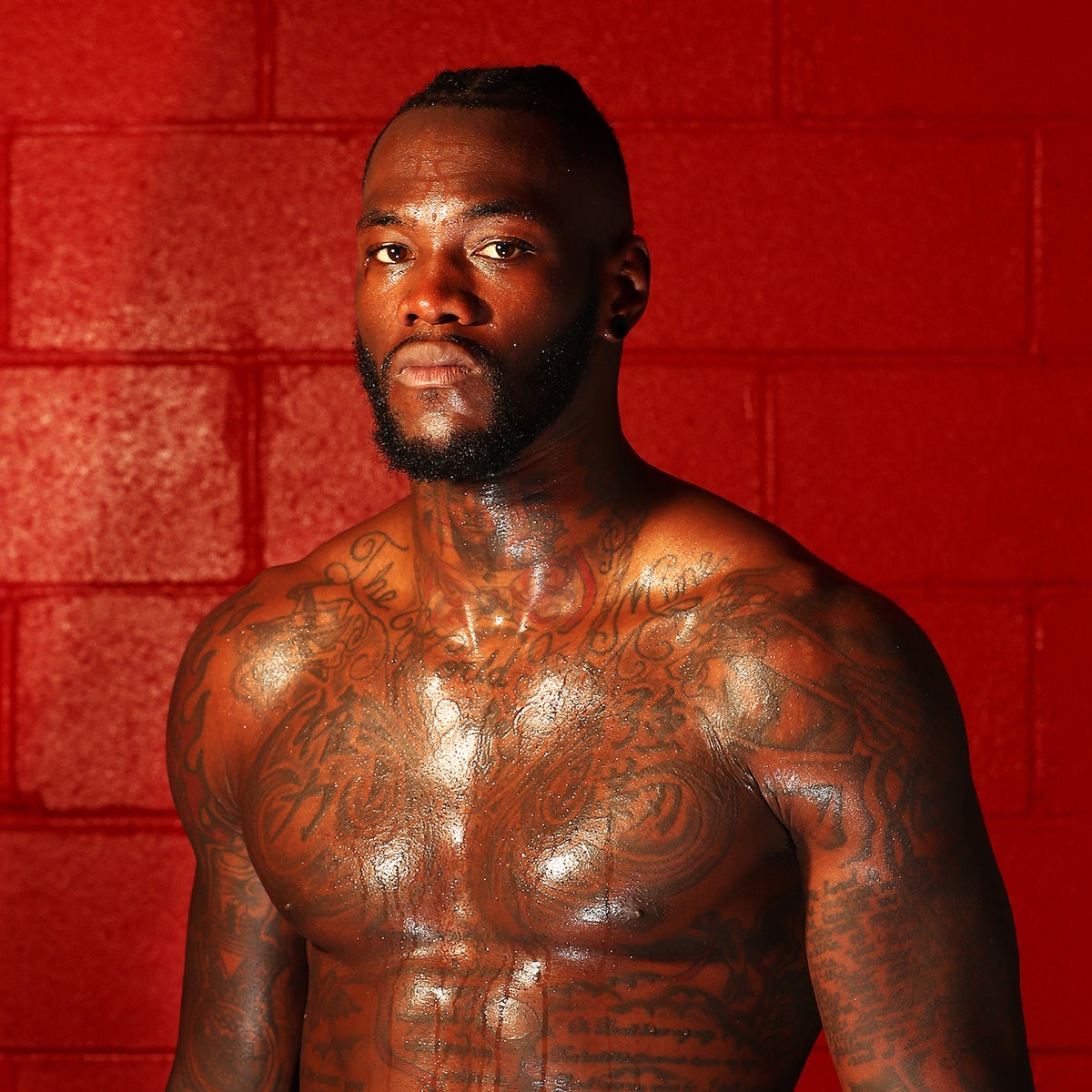
The chest is the anchor of Wilder’s collection. The ink spreads across both pectorals and rises toward the collarbones, giving the front of his body a strong, almost armour-like shape. There is plenty of shading, but it is not a single solid block. Lettering, curved lines and darker pockets sit next to one another, which keeps the surface readable when the light changes.
From a tattoo-design point of view, the useful idea is scale. A chest piece this wide needs room to breathe around the shoulders and centre line. Wilder’s photos show an approach where the main forms are bold enough to hold their own, while the smaller lines add texture when someone looks closer. That is a better lesson than copying one isolated shape.
If you like this direction, plan the centre first and decide how far the design should travel toward each armpit. A strong artist can leave a little negative space so the piece does not become one dark rectangle. The result can feel powerful without losing the shape of the chest underneath it.
His shoulder and arm tattoos build a full frame
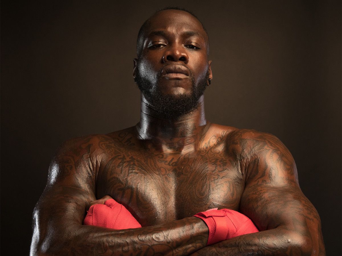
Wilder’s shoulders and upper arms make the chest look even larger. The ink rolls over the deltoids and continues down toward the elbows, so the front view has a rounded frame instead of a flat panel. When his arms are raised, the designs stretch and change with the muscle. That movement is part of the appeal.
The arm work also shows why a sleeve does not have to be one perfectly uniform pattern. Some areas look darker and more packed, while others leave small breaks between images and lettering. Those changes give the collection an older, lived-in quality. It looks like a body that has picked up pieces over time, not a computer mock-up designed in one sitting. The gaps are doing useful work instead of making the design feel unfinished.
For a similar project, think about how the shoulder will look with the arm relaxed, flexed and turned sideways. A tattoo that only works in one pose can feel awkward. Wilder’s coverage works because the main lines follow the round parts of the shoulder and the long planes of the upper arm.
The long script across Wilder’s chest adds a personal layer
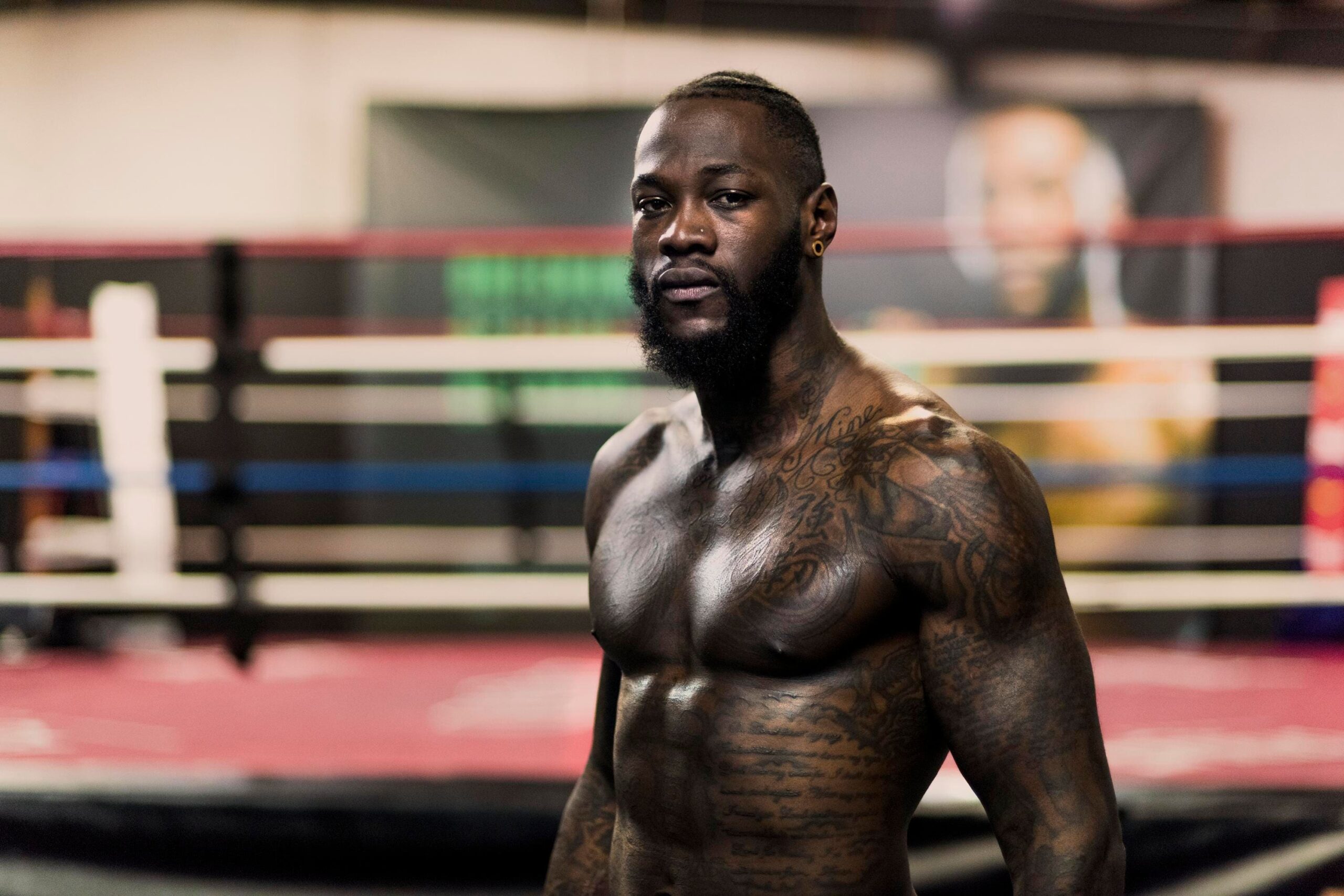
The long script running down the front of Wilder’s body gives the heavier chest work a softer counterpoint. From a distance it reads as a dark vertical rhythm. Up close, the separate lines and letters become easier to follow. That contrast stops the chest and stomach from looking like one solid wall of ink.
Script is difficult to get right because spacing, line weight and body movement all matter. The letters need enough room to stay open as the tattoo ages, especially on the stomach where the skin moves constantly. Wilder’s photos show the advantage of using a longer layout instead of forcing a whole message into one short line. Readable spacing matters more than squeezing in extra words.
There is also a useful emotional point here. Script can make a large tattoo feel personal without relying on an elaborate picture. If you are considering names, dates or a sentence, choose words you will still want to see years from now. The lettering should be readable, but the meaning should do the heavy lifting.
Wilder’s forearm tattoos stay visible when he is training
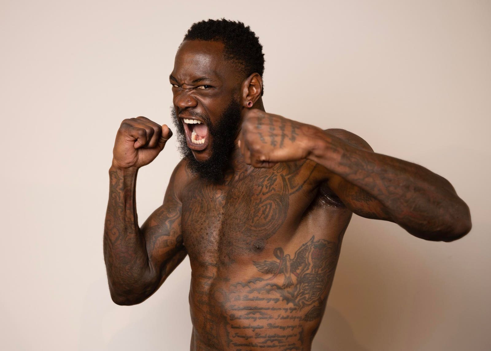
The forearms are where the collection becomes most noticeable in everyday boxing photographs. Wilder can be wearing gloves, wraps or training clothes and still have plenty of ink showing below the sleeves. Smaller script, dark shading and compact shapes fill the available space without taking attention away from the larger chest work.
Forearms are a practical place for visible tattoos, but they are also one of the easiest areas to overcrowd. Wilder’s images show several textures working together rather than one repeated pattern from wrist to elbow. The mix keeps the arm interesting when it is viewed close up, while the outer silhouette still looks clean from farther away.
If you want visible arm ink, consider how much of the design will be exposed at work or under a short sleeve. The best placement is not always the spot with the most room. It is the section that still looks intentional when the wrist turns, the elbow bends and the forearm disappears under clothing.
Neck lettering gives Deontay Wilder’s collection an edge
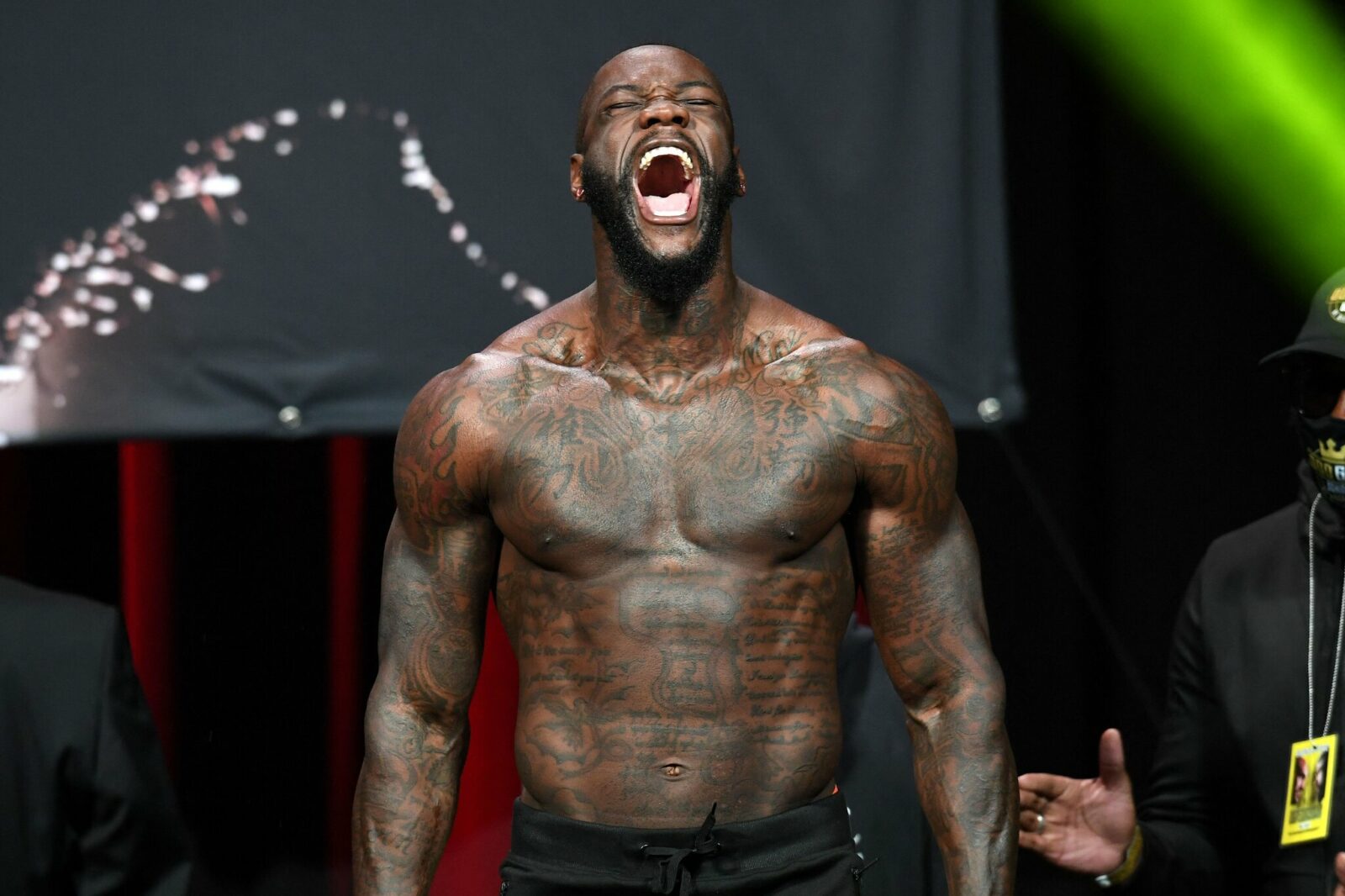
The neck tattoos connect the chest to the face and make the whole upper body feel more complete. In Wilder’s photos, lettering and shaded shapes rise from the collarbone area and sit against the strong line of his beard. That placement changes the mood immediately. Even a simple chest design would feel more intense once it reaches the neck.
Neck tattoos need extra care because the area is always visible and has less spare space than the torso. A design can look great in a straight-on photograph but feel crowded from the side. Wilder’s coverage shows why curved lettering works well there. It follows the shape of the neck instead of fighting it.
This is also a good example of choosing the right order. If the chest and shoulders are already heavily tattooed, a neck piece should help tie them together. Starting with the neck before planning the surrounding areas can leave the collection feeling disconnected. Build the larger map first, then use the neck as a strong finishing edge.
The side and chest tattoos fill the gaps around the torso
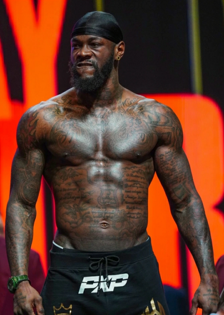
The final layer sits around the sides of the torso, where smaller designs and shading fill the gaps beside the central script. These marks are easy to miss in a tight portrait, but they become important in a full-body view. They stop the tattooed areas from ending in a hard straight line and make the collection feel more continuous.
Side-body work can be uncomfortable, and the ribs do not give an artist a flat surface. Wilder’s photographs show how flexible shapes and flowing lines can follow that movement. The ink does not need to be perfectly symmetrical. It only needs to feel like it belongs beside the chest, stomach and arm work already there.
That layered approach is probably the biggest takeaway from Wilder’s tattoos. Start with the pieces that matter most, leave room for the body to move, then add supporting designs where they improve the flow. A collection can be bold without every inch being filled. The strongest views still have a clear centre, readable lettering and enough contrast for each part to keep its own identity.
How to borrow the look without copying it
Wilder’s style works because the tattoos feel personal and connected to the shape of his body. If you want a similar energy, begin with one meaningful focal point rather than asking for a random sleeve. Choose whether that focal point belongs on the chest, arm or stomach, then let the supporting pieces grow around it.
Black-and-grey shading gives this kind of collection weight, while script adds direction and a human touch. Ask your artist to show the design on a body-shaped template and check it from the front, side and relaxed position. That small step can prevent a large tattoo from looking cramped once it wraps around the shoulder or ribs.
Most importantly, do not invent a story for a tattoo just because a photograph shows it. Pick imagery you can explain in your own words, and let the placement do some of the visual work. The best part of Deontay Wilder’s ink is not one isolated symbol. It is the way chest, arms, neck and stomach work together as one recognisable collection.
Wilder has described one design as The Road to Success, a phrase that gives the collection a personal centre without explaining every other mark. That is a useful way to think about tattoo planning: choose the pieces that carry real meaning, then let the rest support them.
Deontay Wilder talks about the stories behind his tattoos in the video below.