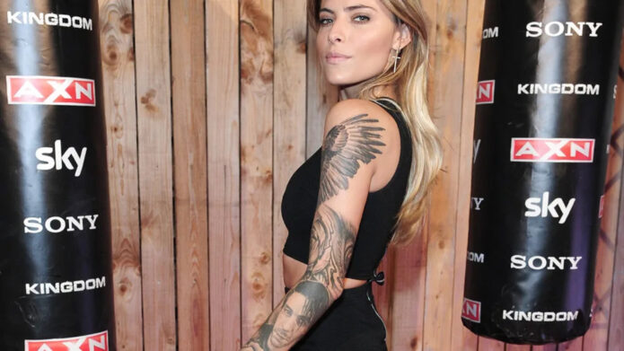
Sophia Thomalla’s tattoos are hard to miss. Her arms are covered in black-and-gray work, with wings, roses, portrait shading and smaller pieces filling the gaps. The collection feels deliberate without looking like one giant stencil. Some pieces are dramatic, some are personal, and some seem to exist because she simply liked the design.
That mix is what makes her ink interesting. Thomalla has talked about having roughly 20 tattoos and about the way each one connects to a part of her life. She has also been open about the fact that not every tattoo needs a public explanation. That’s a useful attitude if you’re looking at her work for ideas: you can appreciate the composition without pretending you know the private story behind every line.
Sophia Thomalla’s tattoo style at a glance
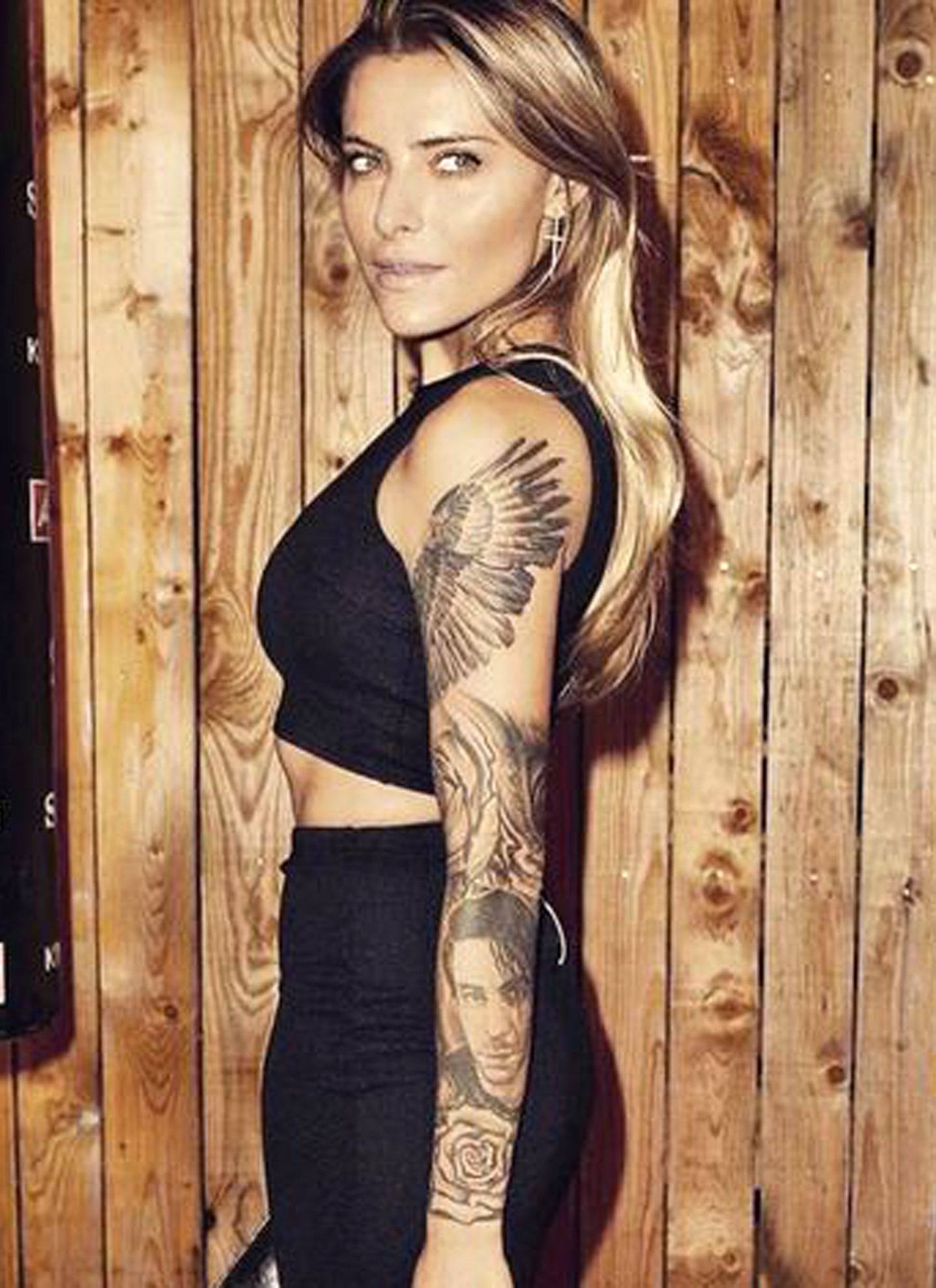
The easiest way to read Thomalla’s collection is as a set of connected black-and-gray panels. The wings around her shoulders create the broadest visual shape, while portraits and roses give the sleeves a more human, traditional anchor. The shading stays mostly soft and smoky, so the tattoos look substantial without relying on bright color.
Her placement also does a lot of the heavy lifting. The upper arms carry the biggest statements, the forearms hold portrait and floral details, and the spaces between them let the skin breathe. That keeps the sleeves from turning into an unreadable wall of ink. Even when several designs sit close together, you can still pick out the major subjects.
There’s a nice lesson here for anyone planning a large arm project. You don’t have to decide on one huge image and fill every inch around it immediately. A strong collection can grow in stages. The important part is choosing an overall visual language early enough that later additions don’t feel like they came from a completely different artist.
The wing tattoos across her shoulders
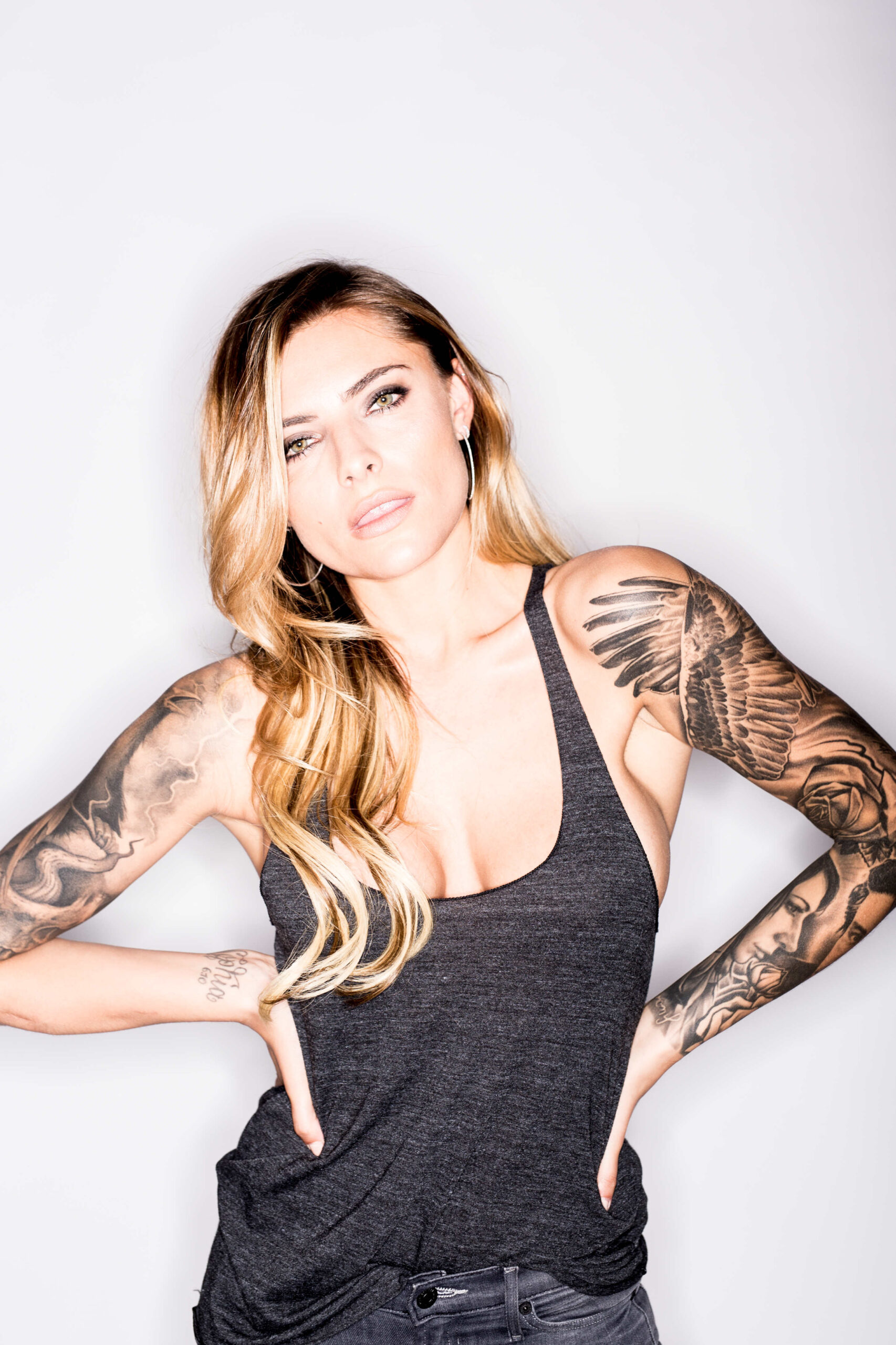
The wing work is the first thing most people notice. Large feather shapes spread across the shoulder and upper arm, with darker sections near the base and lighter feather tips moving outward. In photos, the wings frame her shoulders almost like a costume detail, but the tattoos still follow the anatomy instead of sitting flat on top of it.
Wings are common tattoo subjects, which means the execution matters. Thomalla’s versions avoid looking like a simple clip-art outline because the artist built depth through overlapping feathers and gradual shading. The darker interior makes the design readable from a distance, while the fine feather marks give it something to study up close.
The shoulder is a natural place for this design because it gives the image room to spread. It also lets the tattoo move when the arm moves. That matters more than people expect. A tattoo that looks perfect in a straight-on reference photo can feel awkward when the wearer walks, bends, or turns. Thomalla’s wing placement uses the shoulder’s round shape instead of fighting it.
If you’re borrowing the idea, focus on the flow rather than copying the exact feather arrangement. Ask your artist to sketch the wing while looking at your shoulder from several angles. A good version should still make sense when your arm is relaxed at your side.
The portrait tattoo and the story behind it
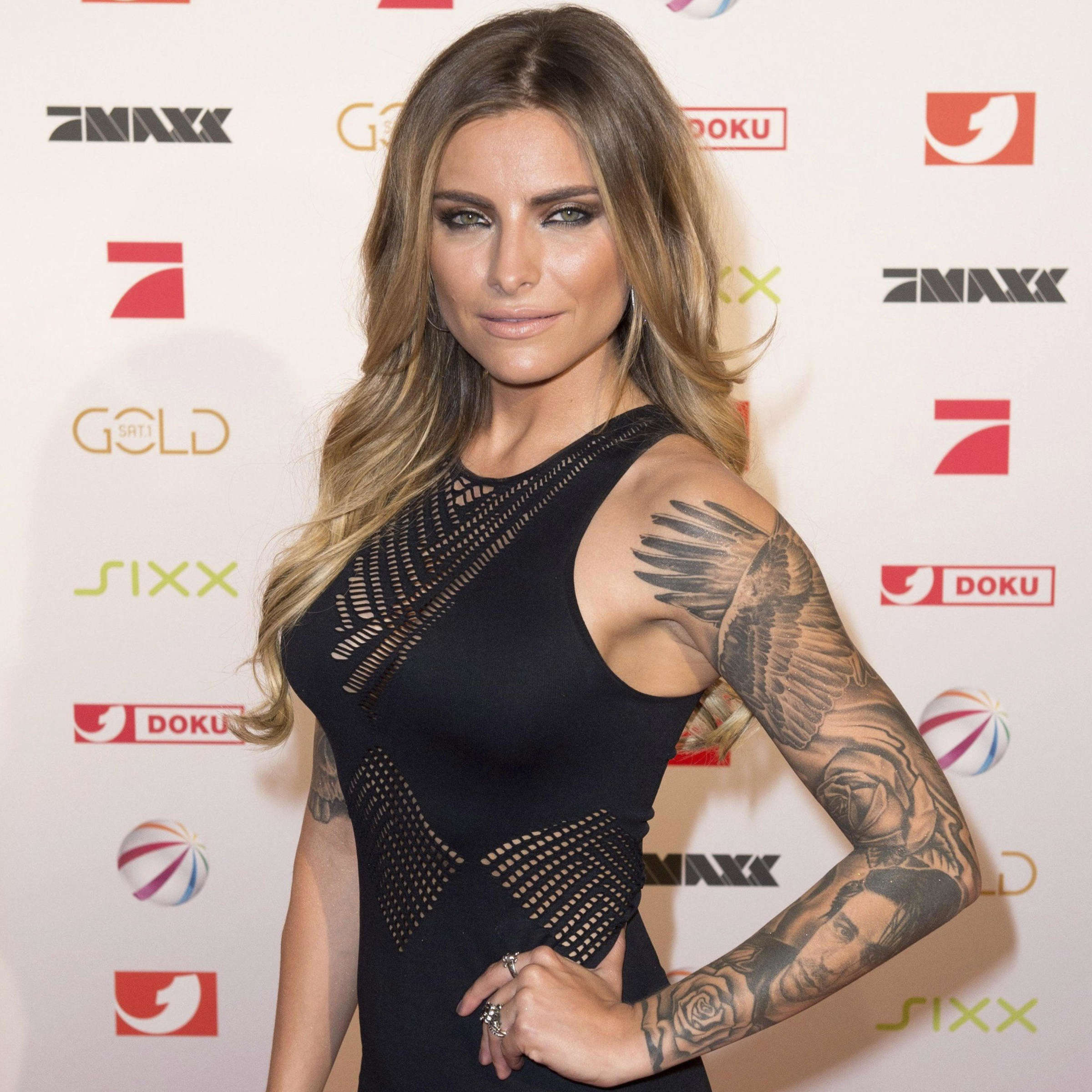
One of Thomalla’s most talked-about pieces is the realistic portrait on her arm. German entertainment coverage has connected the tattoo with Rammstein singer Till Lindemann, and Thomalla has spoken about the piece without treating it like a scandal. She has said she doesn’t regret her tattoos, which is a more interesting detail than the relationship gossip that often surrounds the image.
Portrait tattoos live or die on small decisions. The eyes need enough contrast to stay expressive, the nose and mouth need clean proportions, and the hair or surrounding shadows have to support the face instead of swallowing it. Thomalla’s portrait sits inside a larger sleeve, so it also has to work beside wings, roses and darker blocks of shading.
That’s one reason portrait pieces can be tricky to plan. The face is usually the focal point, but the rest of the sleeve still needs a rhythm. If everything around it is equally dark, the portrait loses its impact. If everything is too light, it can look pasted on. The best approach is to choose the portrait’s visual weight first, then build the neighboring tattoos around it.
There’s also a personal side to portrait work. A relationship can change, but the tattoo remains a record of a particular time. Thomalla’s relaxed attitude toward that fact is part of what makes the piece feel honest. Not every tattoo has to stay frozen in its original meaning forever.
Roses, forearm shading and the smaller pieces
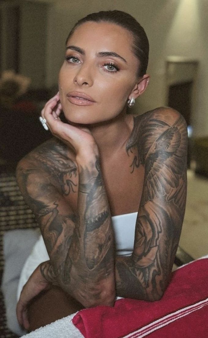
The roses help soften the sleeves. Their rounded petals and darker centers break up the sharper geometry of the wings and the realism of the portrait. In several photos, the floral work also acts as a bridge between larger pieces, filling space without competing with the main subjects.
Her forearms show another useful trick: repeat the same ink density without repeating the same image. Some areas are packed with dark shading, while others leave more skin showing through. That creates contrast even though the palette stays almost entirely black and gray.
Small tattoos don’t have to be filler. They can control the pace of a sleeve. A little symbol near the wrist can give the eye somewhere to stop after it follows a large portrait down the arm. A fine line can separate two heavy areas. A tiny detail can also make a big piece feel more personal without adding another headline image.
If you’re designing a sleeve, bring your artist references that show spacing as well as individual designs. A collection can look great in a close-up of one rose and still feel crowded when several tattoos are placed together. Thomalla’s arm work is a good reminder to judge the whole composition, not only the isolated flash.
The tattoo collection as a personal timeline
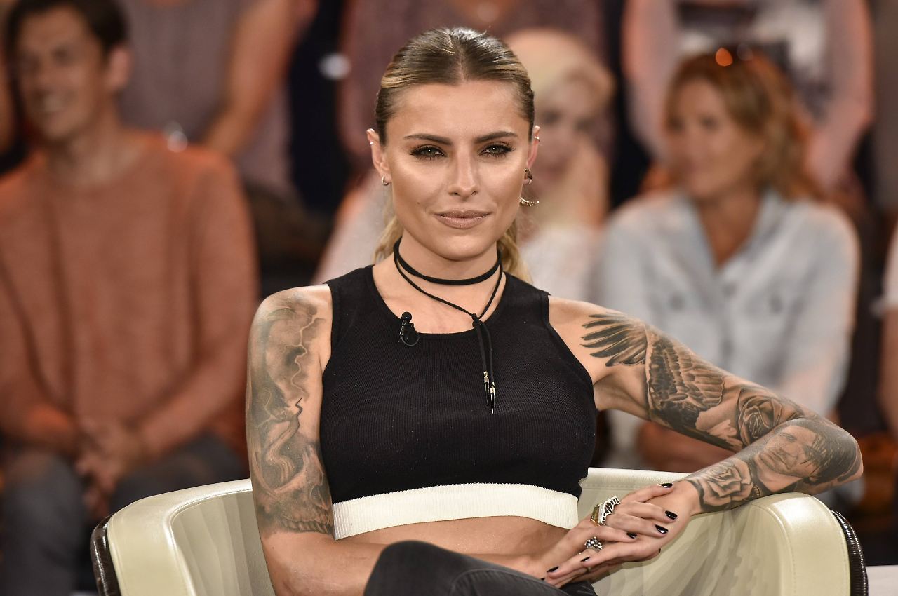
Thomalla has described her tattoos as pieces of her life, and the collection looks like it grew through different chapters rather than one single appointment. The subjects don’t all belong to one narrow style. They connect through placement, shading and the fact that they are recognizably hers.
That’s the difference between a collection and a matching set. A matching set is designed to look unified from the beginning. A collection can hold different moods. It might include a tribute, a design chosen for its shape, a joke, a memory, or a piece that was simply exciting at the time. The job is to give those choices enough breathing room that they can coexist.
There’s no need to invent a meaning for every tattoo you can see in a photograph. Thomalla has been clear that some explanations belong to her alone. That boundary is worth respecting, especially when a design is visible but the story behind it isn’t public.
What the sources confirm
The strongest reporting gives us a few clear facts. Thomalla has a large tattoo collection, she has spoken about the personal meaning of her pieces, and the portrait and wing work have been widely photographed. She has also been associated with the tattoo competition show Pain & Fame, which makes her interest in tattooing part of her public work as well as her personal style.
Beyond that, the safest approach is to describe what the photographs actually show. Her arms include wings, portrait work, roses, script and dense black-and-gray shading. Some popular online lists attach very specific explanations to individual designs, but those claims aren’t always supported by a direct interview. Good tattoo coverage should separate documented details from guesses.
Ideas to borrow without copying
Thomalla’s tattoos offer plenty of design ideas without requiring anyone to recreate her sleeve. Think about using one large subject as an anchor, then adding smaller motifs that echo its movement or shading. Wings can create a broad shoulder frame. Roses can soften a heavy section. Portraits can become the focal point if the surrounding work leaves them enough room.
It’s also worth planning for change. A tattoo can outlast a relationship, a job, a music obsession or a version of yourself that no longer feels current. That doesn’t automatically make the tattoo a mistake. It can simply become part of the timeline. If you choose a piece because it matters now, you don’t have to predict exactly how you’ll feel about it ten years from now.
Most of all, take the useful part of Thomalla’s approach: let the collection look like a collection. Keep the quality high, pay attention to spacing, and allow different tattoos to carry different levels of meaning. The result will feel more personal than a sleeve built from one trend.
Before booking a similar project, spend time looking at your own arm in motion. Raise it, turn it, bend the elbow, and notice where the skin folds. Bring those observations to the consultation. The best references are useful starting points, but the final stencil should belong to your body. That is how a familiar idea becomes a tattoo that feels natural instead of borrowed.