codex

Kate Cassidy Tattoos: 444, LP, Angel Wings and the Rose Tribute

Kate Cassidy’s tattoos connected to Liam Payne are small: a shared angel number, initials, wings, a four and a rose. She has said she is removing the 444 because its lines came out heavier than she asked for, and plans to have it redone.

Why the hand tattoo story matters

The 444 was an angel number Cassidy and Payne shared. She showed it on her hand after his death, and it became one of the clearest designs in her collection.

In July 2026, Cassidy said she was having the tattoo removed because the ink came out thicker and bulkier than the fine-line version she wanted. She said the meaning hadn’t changed and that she planned to have it redone by an artist with more experience in that style. Her explanation was about the result, not the number’s significance.

Fine-line work leaves little room for uneven spacing or heavy outlines. On a hand, where the skin moves and the design stays visible, line weight is worth settling before the session.
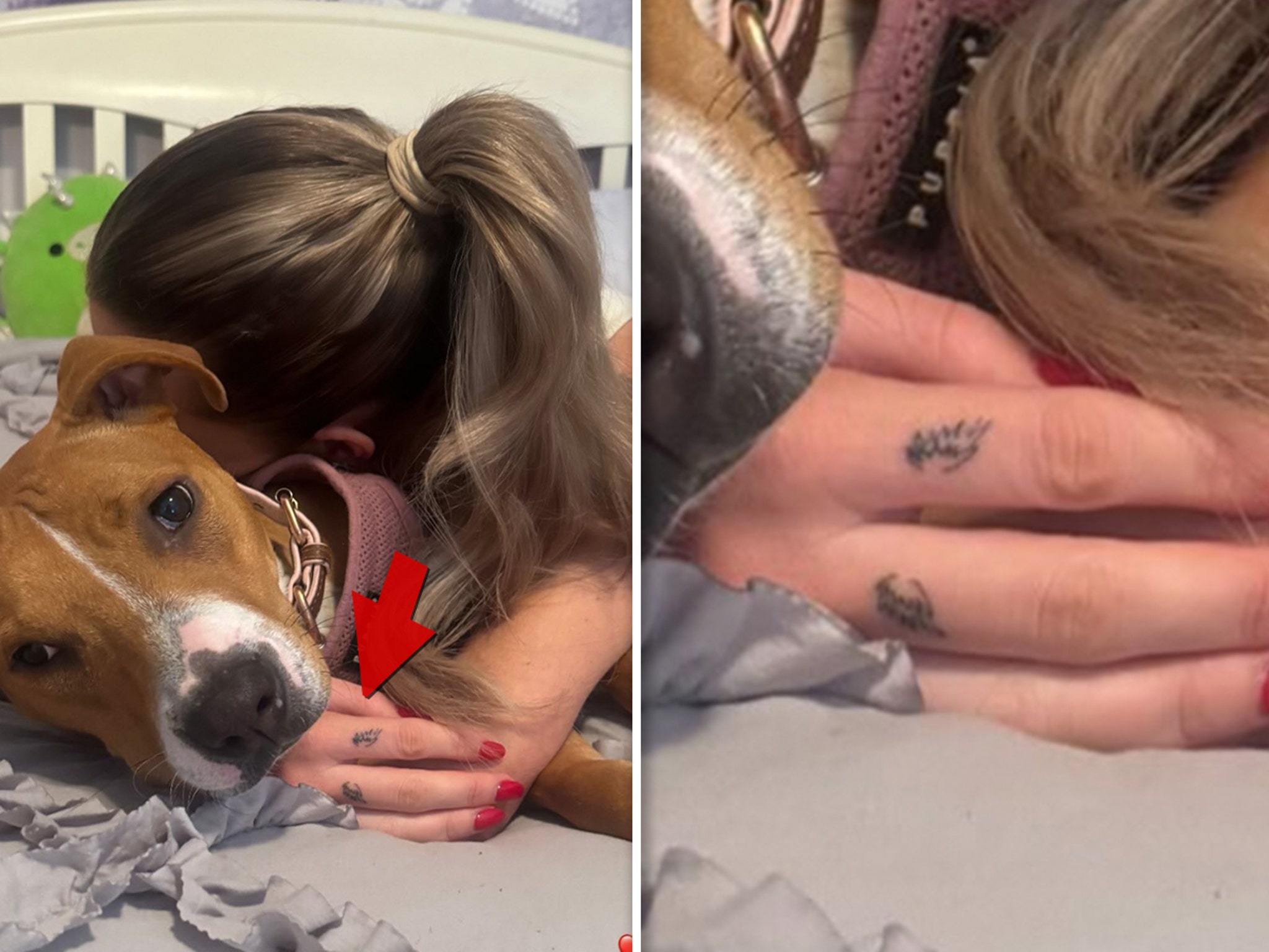
Kate Cassidy tattoos: Kate Cassidy's reported hand and finger tattoos

The two-finger placement is the key detail

Cassidy’s angel wings sit across her index and middle fingers, one wing on each. She first showed them in December 2024, a little over two months after Payne’s death, in a photo cuddling her dog with a red heart emoji. The timing and her description of Payne as her angel led entertainment outlets to connect the wings with him. Available photos don’t show every feather clearly, but the two-finger placement is consistent.

The wilted rose is a direct hand tribute
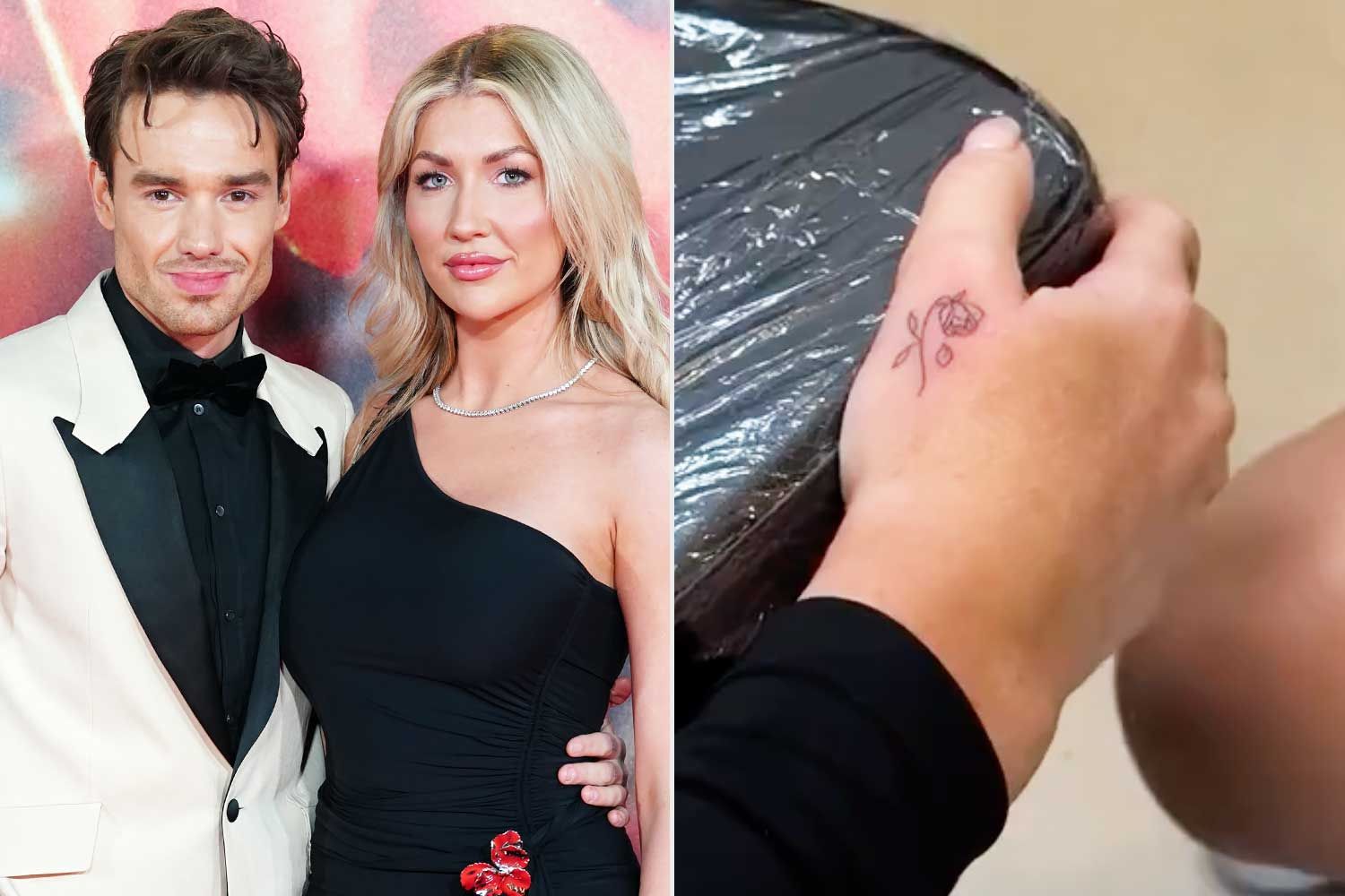
Kate Cassidy tattoos: Kate Cassidy's wilted rose hand tattoo

A wilted rose sits on the back of Cassidy’s hand below her thumb. Reports connect it to the rose Payne had tattooed on the left side of his neck. The two designs echo one another without being identical.

Hand tattoos are exposed to washing, movement and daily wear. If you’re considering a fine-line design there, look closely at the stencil and ask the artist how the small details may age.

The initials and single four keep the reference quiet

Cassidy also has LP on her wrist. Reports have described a separate 4 there, a smaller reference to 444. Both can sit beneath a watch or bracelet.

The pieces use different styles—letters, numbers, wings and a rose. Their connection is personal, rather than matching linework.

The public photos are part of the story
Kate Cassidy in a contextual photograph: Contextual portrait of Kate Cassidy; not tattoo evidence; not tattoo evidence

Many public images of Cassidy’s tattoos come from social posts, screenshots and entertainment coverage. Some show a hand close enough to identify a mark; others are portraits where the tattoos aren’t visible. This image is contextual, not tattoo evidence, so it can’t confirm the 444, initials or wings.

The photos also don’t establish the current state of every design. Cassidy has discussed removing and redoing the 444, but that doesn’t tell us whether the other tattoos have changed.

The removal appointment changes the conversation
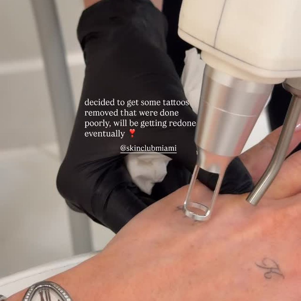
Kate Cassidy in a contextual photograph: Contextual laser-removal scene; not tattoo evidence; not tattoo evidence

This laser-removal image provides context for Cassidy’s update, but it doesn’t clearly show her tattoo. She said the 444 was too thick for the fine-line result she requested and that she planned to have it redone. Changing the artwork doesn’t mean she has let go of the number’s meaning.

The collection stays small and personal

The wings, rose, LP, four and 444 are all compact. The designs don’t share a style; Cassidy has connected them through people and memories. Her 444 update also shows that a tattoo’s meaning can stay even when the artwork changes.

Why the redesign detail matters

Small tattoos still need planning. Fine-line numbers need clear spacing, tiny lettering needs an artist who understands how it may age, and hand or finger tattoos need realistic expectations about wear and touch-ups. Cassidy’s account is a reminder to be specific about scale and line weight before the ink goes in.

The tribute doesn’t need a big visual footprint
Kate Cassidy in a contextual photograph: Contextual entertainment still of Kate Cassidy; not tattoo evidence; not tattoo evidence

This entertainment still is contextual and doesn’t show a tattoo. The designs can be hard to spot in wider photos, which fits their small scale and hand-and-wrist placements.

A final practical takeaway

The reported tattoos linked to Payne include angel wings across two fingers, LP and a four on the wrist, the 444 on Cassidy’s hand, and a wilted rose below her thumb. Their meanings are personal, and some details are clearer in photos than others.

If you’re using a small tattoo as inspiration, decide on the line weight and placement before the appointment. Ask how hand or finger skin may affect the result over time. Cassidy’s experience shows that a tribute can keep its meaning even if its first version needs changing.

A short update on the 444 redesign
Emma Chamberlain Tattoos: Bunny, Family Symbols and Tiny Arm Ink

Emma Chamberlain has said she prefers small, personal tattoos that she’s less likely to regret. Most sit across her arms as separate line drawings, with space between them rather than a single sleeve.

Vogue filmed Chamberlain talking about several pieces. My Imperfect Life also gathered details from her, her tattoo artist and a GQ video with Tucker Pillsbury. The meanings below stick to those explanations; a blurry photo doesn’t tell us what an unclear mark is meant to be.

Emma Chamberlain’s arm tattoo collection

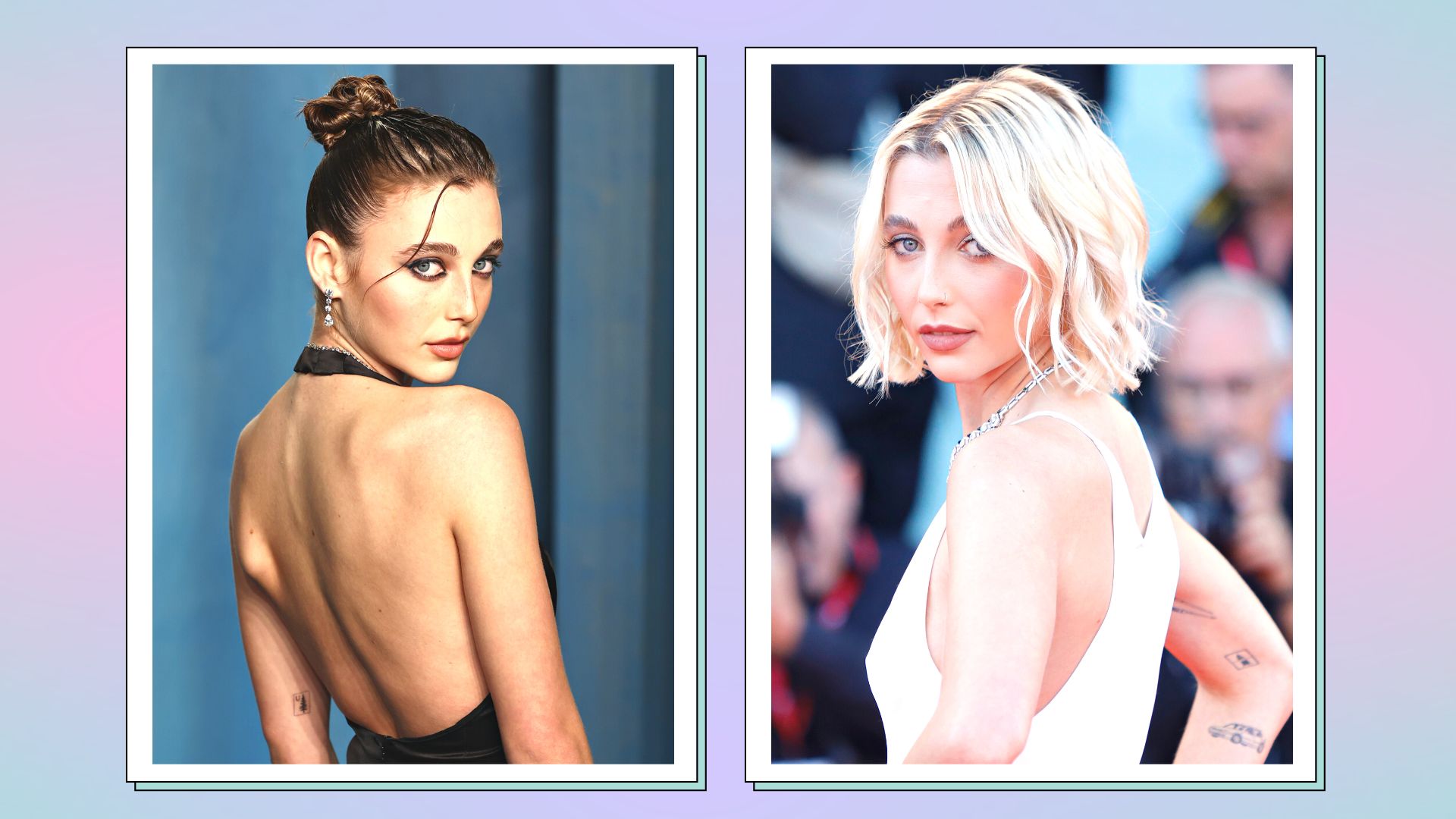
Emma Chamberlain tattoos: Two-photo red-carpet collage showing Emma and visible arm tattoos

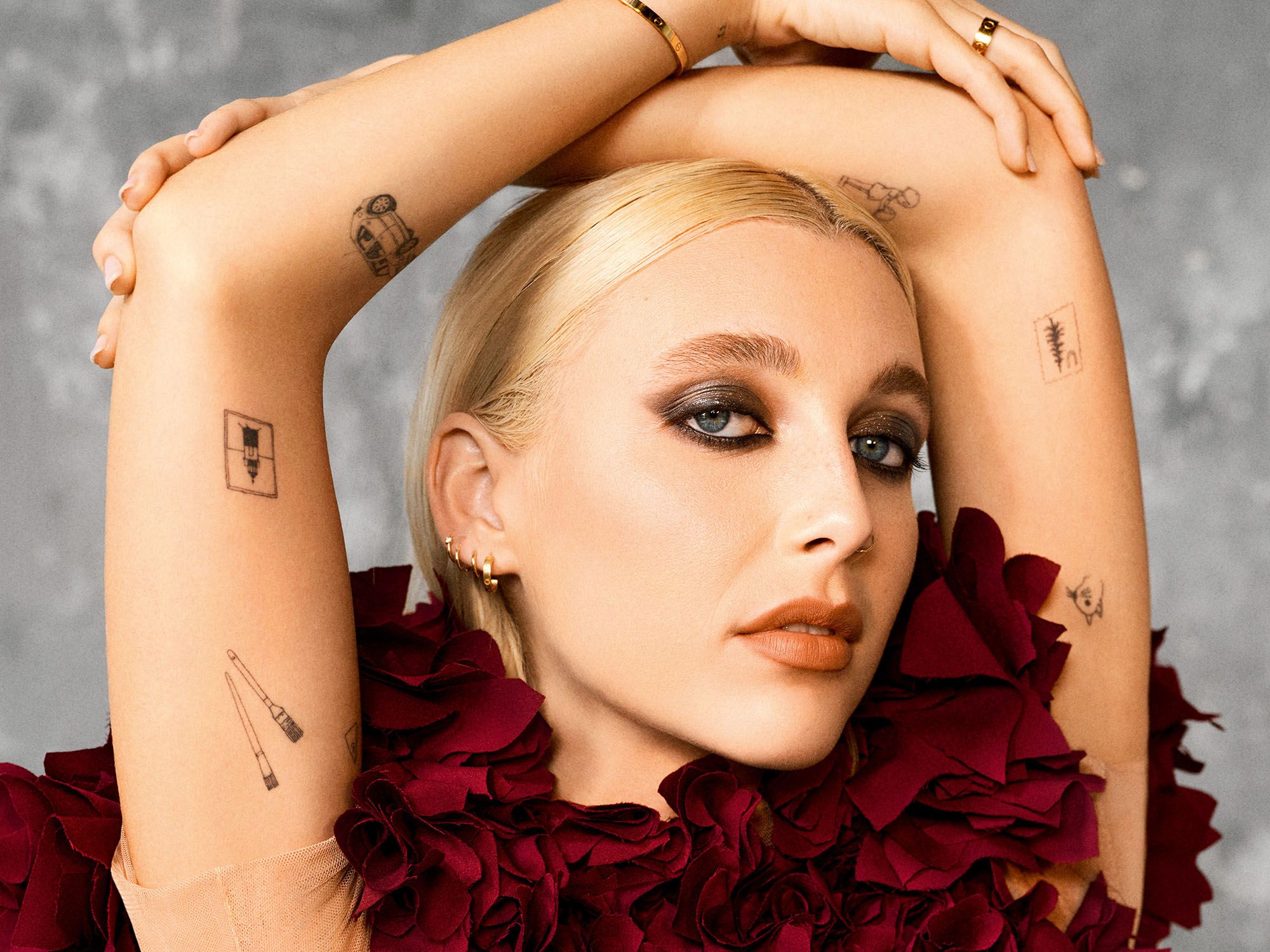
Her tattoos include a little car, a lighthouse, paintbrushes, the number 11, a squirrel and other small designs. Chamberlain has connected her right arm to her dad, who is a painter, and her left to her mom. The family references include paintbrushes, a button, a pine tree, a horseshoe and a stamp-like design.

The fine black outlines and open space give the pieces a patchwork look. They don’t need to match because the family references connect them.

The stuffed bunny tattoo

Emma Chamberlain tattoos: Close-up of the artist-posted bunny line art

Chamberlain showed a small stuffed-bunny tattoo in Vogue’s “24 Hours With” video and said it was based on the toy she had as a child. Her tattoo artist’s close-up shows the fine-line drawing and another small figure nearby.

The bunny has a clear outline and a few simple facial details. It reads as a remembered toy without needing extra decoration. At this scale, an artist can help simplify a reference so the lines have room to age.

The car, lighthouse, and paintbrush tattoos

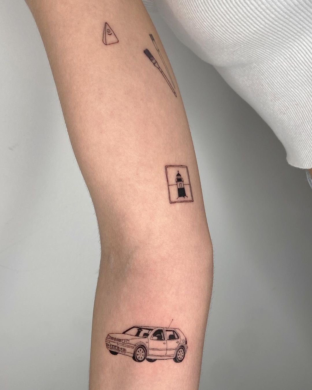
Emma Chamberlain tattoos: Close-up arm collage showing named line-art motifs

A close-up of Chamberlain’s arm shows several small drawings together, including a car, a framed lighthouse and paintbrushes. The car and brushes have a family connection: she has linked the car to her dad and the brushes to his work as a painter. The lighthouse sits inside a small rectangle, like a stamp or miniature picture.

These designs are simple enough to read without filling the arm. With small illustrations, keeping only the clearest details can make the subject easier to recognize.

The number 11 and family symbols

Emma Chamberlain tattoos: Red-carpet image with forearm tattoo visible

The number 11 has been described as a matching tattoo connected to Pillsbury, who performs as Role Model. The digits are easy to see; the relationship behind them comes from the reported context, not the photograph alone.

Chamberlain has also explained that other small designs refer to family, nicknames and objects from childhood. A button, pine tree or horseshoe can work as a personal reference without spelling out the story to everyone who sees it.

A red-carpet view of the style

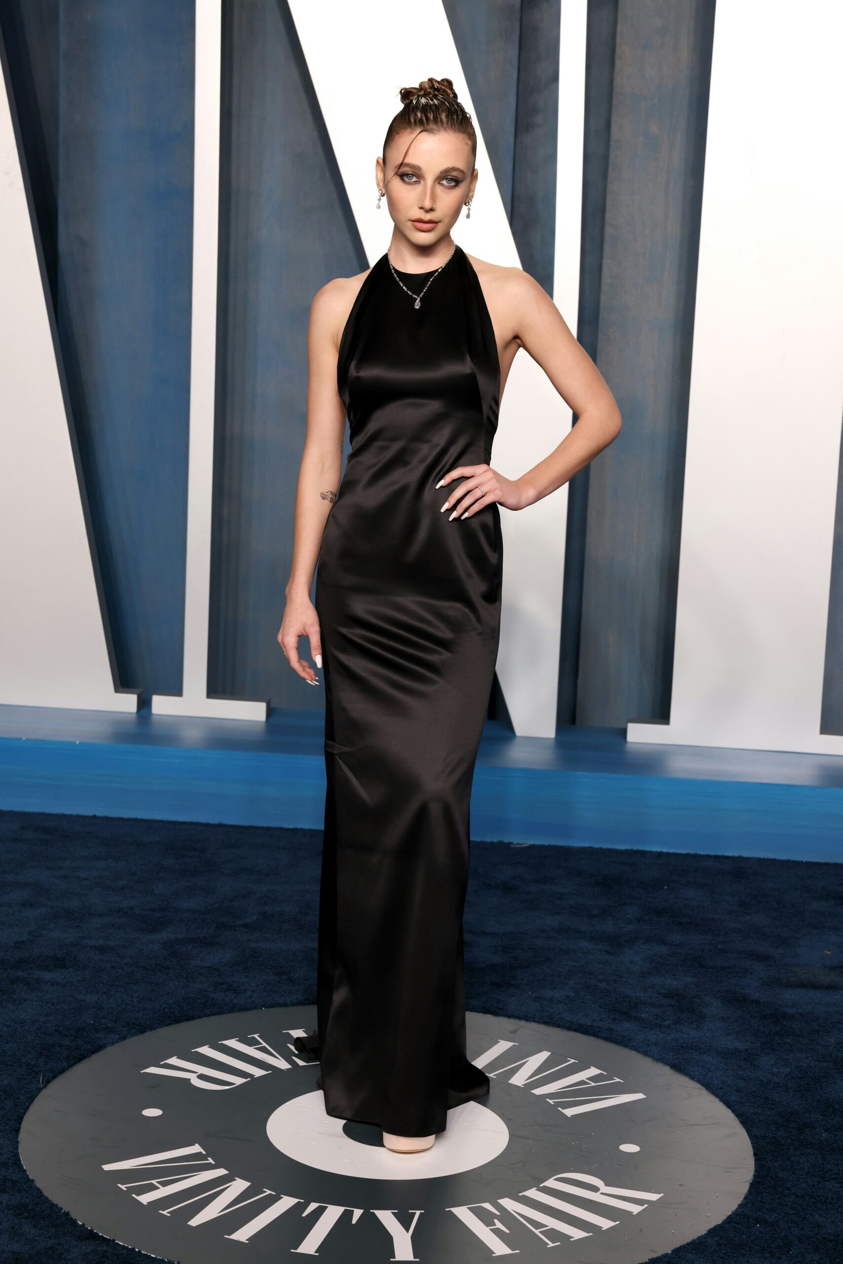
Emma Chamberlain in a contextual photograph: Contextual portrait only; not tattoo evidence; not tattoo evidence

This Vanity Fair event portrait is included for context, not as evidence of a particular tattoo. Its crop and clothing don’t provide a clear view of a design. A close-up can show the ink; a red-carpet photograph can show how the tattoos sit with an outfit, but the two kinds of images answer different questions.

Chamberlain’s collection stays light because the designs are small and spaced apart. Some show in sleeveless or rolled-sleeve looks, while others may be covered. There’s no need for every tattoo to appear in every photograph.

The useful idea to borrow is choosing a reference with a real connection before deciding how to draw it. Bring the artist a few clear examples, talk through the size and placement, and leave enough room if you want to add more pieces later. The bunny, car and family symbols are personal details first; their small scale is part of the style.

More model tattoo guides

Joey King Tattoos: Ladybugs, Hebrew Hummus and Tiny Personal Ink

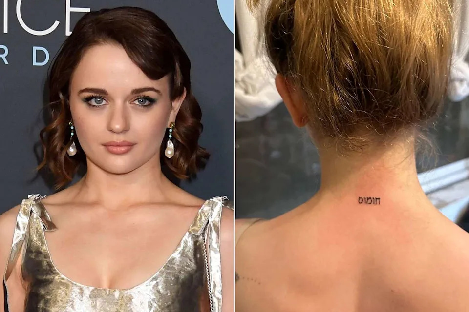
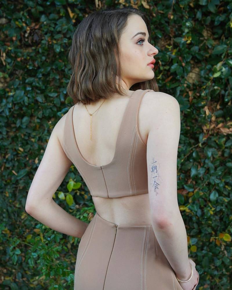
Joey King’s tattoos include matching ladybugs with her sister, a Hebrew “chummus” tattoo from a Tel Aviv trip, and a narrow line of Chinese characters on her upper arm. Reports also describe smaller designs on her wrist, hip and ankle. The pieces are spread around her body instead of forming one large sleeve.

The best-documented stories come from King and the people who worked with her. She and her sister Hunter got their ladybugs during a tattoo appointment linked to a donation for A21, an organization that fights human trafficking. Israeli artist Ronni Winkler did the lettering at the back of King’s neck. The Chinese-character photo confirms its placement, but the source doesn’t explain its meaning.

Joey King’s style is small, fine-line, and personal

Most of King’s reported tattoos are small. The ladybugs are linked by a dotted path; the Hebrew lettering is compact, and the other reported designs use simple outlines. Their placements range from the shoulder blades to the wrist, hip, ankle, upper arm and nape.

Each piece can sit on its own, with room around it. Fine lines still need enough space to stay legible as they age, so “small” works best when the artist keeps the details clear.

The matching ladybug tattoos with Hunter King

Joey King tattoos: matching ladybug tattoo evidence

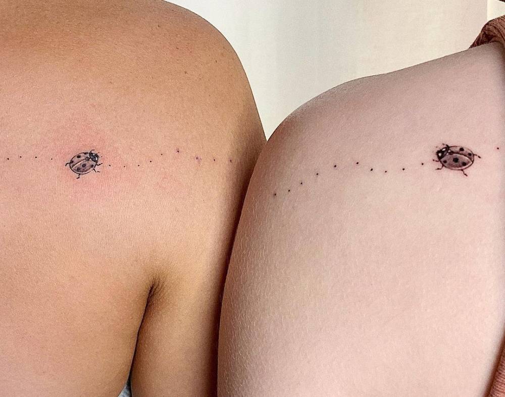
King and her sister Hunter have matching ladybugs on their shoulder blades. A dotted line runs between the two insects, so the tattoos form one image when the sisters stand together. Each bug has a black outline, darker spots and a little red in its body.

Tattoo artist Haney shared the sisters’ appointment and its connection to a donation for A21. The design can be read on its own or as a pair, and the cause gives the session a context beyond matching ink.

A few other details from the sister appointment

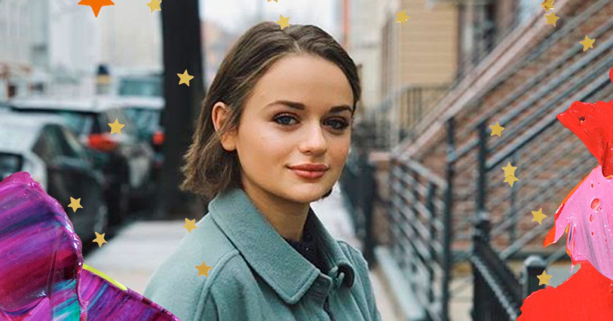
Joey King in a contextual photograph: context for Joey's small tattoo style; not tattoo evidence

Reports from the same appointment describe a flower and semicolon on King’s wrist, interlocking hands on her hip and a band-aid on her ankle. The subjects are different, but each is small enough to stay understated. The contextual portrait here doesn’t show those tattoos clearly; it shouldn’t be treated as proof of their details.

Interlocking hands need enough space between the fingers to remain readable. The band-aid is a more playful choice, while the semicolon gives the group a simple graphic shape. The available reports don’t attach a confirmed meaning to every piece.

The Hebrew “chummus” tattoo on the back of her neck

Joey King tattoos: Hebrew chummus tattoo close-up

King got the Hebrew word “chummus” on the back of her neck during a trip to Tel Aviv. Israeli artist Ronni Winkler did the small black lettering just below her hairline. Her hair can cover it when she wears it down.

King has described the word as a choice from that trip; there’s no larger symbol to decode. The placement leaves open skin around the lettering, but small text needs enough room for each character to stay distinct. If you’re considering a word in a language you don’t read, check the spelling and translation with a fluent reader before the stencil is applied.

A fine-line Chinese-character tattoo on her upper arm

Joey King tattoos: Chinese-character tattoo evidence

A photo shows a vertical line of Chinese characters on the back of King’s upper arm. They follow the length of the arm rather than sitting in a row across it. The image makes the placement visible, but the source doesn’t give a reliable explanation of the phrase, so its meaning remains unconfirmed.

The narrow layout leaves open space around the characters. For lettering in another language, that photo is a reminder to separate what an image shows—the design and placement—from what it can’t establish about the wearer’s reason for choosing it.
Why Joey’s choices work

Joey King in a contextual photograph: context for the meaning behind the sister appointment; not tattoo evidence

The collection doesn’t rely on one theme to hold together. The ladybugs connect two sisters; the neck lettering recalls a trip, and the smaller wrist, hip and ankle designs keep things playful. Separate placements give each mark room to read.

Small work can soften over time, and tightly packed details may blur together. A simple silhouette and enough spacing usually matter more than adding another tiny line. The contextual image above belongs to the appointment story, not to the evidence for any particular tattoo.

What to borrow from Joey King’s ideas

The useful ideas are about choosing and placing a design. For matching tattoos, give the pieces a link that still makes sense when each person is on their own. For a travel tattoo, pick a word or object that actually belongs to the trip. Think about whether the design should be easy to cover, then check its size and translation with the artist before booking.
King’s tattoos don’t need to form one perfect theme. A few personal marks can sit together without matching, as long as each design has enough room to read and the wearer knows what they want it to mean.
More actor tattoo guides

Tom Kaulitz Tattoos: The Heidi Initial, Hand Heart and Quiet Rock-Star Ink

Tom Kaulitz’s tattoos are easy to miss beside the hair, beard, lip ring and guitar. The Tokio Hotel guitarist’s best-documented pieces are small: an initial linked to Heidi Klum, a newer heart tattoo on his hand, and older marks that show up in photos.

The couple’s matching initials are reported as an H for Tom and a T for Heidi. More recent podcast coverage described a heart on Tom’s left hand that joins with Heidi’s matching half. The details are simple; the stories come from the link between the two designs.

Tom Kaulitz’s tattoo style is personal without being loud

The clearest reported tattoos are small and fine-lined. Older photographs also appear to show marks on Tom’s hands and fingers, but the images aren’t clear enough to assign a meaning to each one. Low-resolution photos can make a shadow, jewelry or temporary design look like permanent ink.
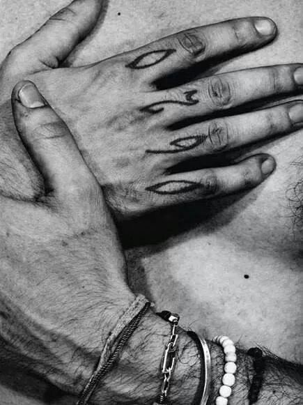
Tom Kaulitz tattoos: close-up reference for Tom's hand and finger tattoo details

The close-up gives a sense of the small hand details seen in older photos, but it doesn’t confirm every mark. Hand and finger tattoos have little room for crowded lines and get daily wear. If you’re considering one, ask the artist how the design may heal and whether it needs a little more space.

The matching H tattoo for Heidi Klum

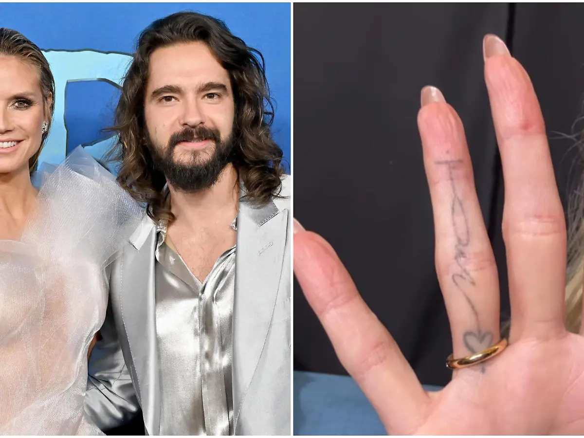
Tom Kaulitz tattoos: matching Heidi hand tattoo coverage

Coverage of the couple’s matching tattoos identifies Tom’s small H with Heidi and her corresponding T with him. The marks are simple black initials. They don’t need extra decoration to explain the connection.

A small initial can stay private most of the time, though its visibility depends on where it sits. The useful design choice is giving the character enough room and using lettering that suits the placement.

A softer detail in the couple’s story

Recent reports also describe a small heart on Tom’s left hand and a matching half on Heidi’s. When their hands meet, the two parts form a shared image. The report presents it as a pair, not as a standalone heart design.

Matching tattoos don’t have to be identical copies. Two pieces can each work on their own and make a fuller picture when the people wearing them are together. On the hand, even a simple outline needs to account for movement and wear.

What makes the couple’s approach work

The initials and reported heart are restrained, and their connection is clear without turning the relationship into a large public statement. Each tattoo can be seen separately; the pair adds another meaning when Tom and Heidi are together.

A small design may also give an artist more options if someone later wants to cover or rework it. That’s a general planning point, not a prediction about the couple.

A note about older photos

Fan pages have described a twin tattoo connected to Tom’s brother Bill, and older photos show other small marks on his hands and arms. The linework can look different with lighting and image quality, so those posts are visual references rather than a direct explanation from Tom or an artist.

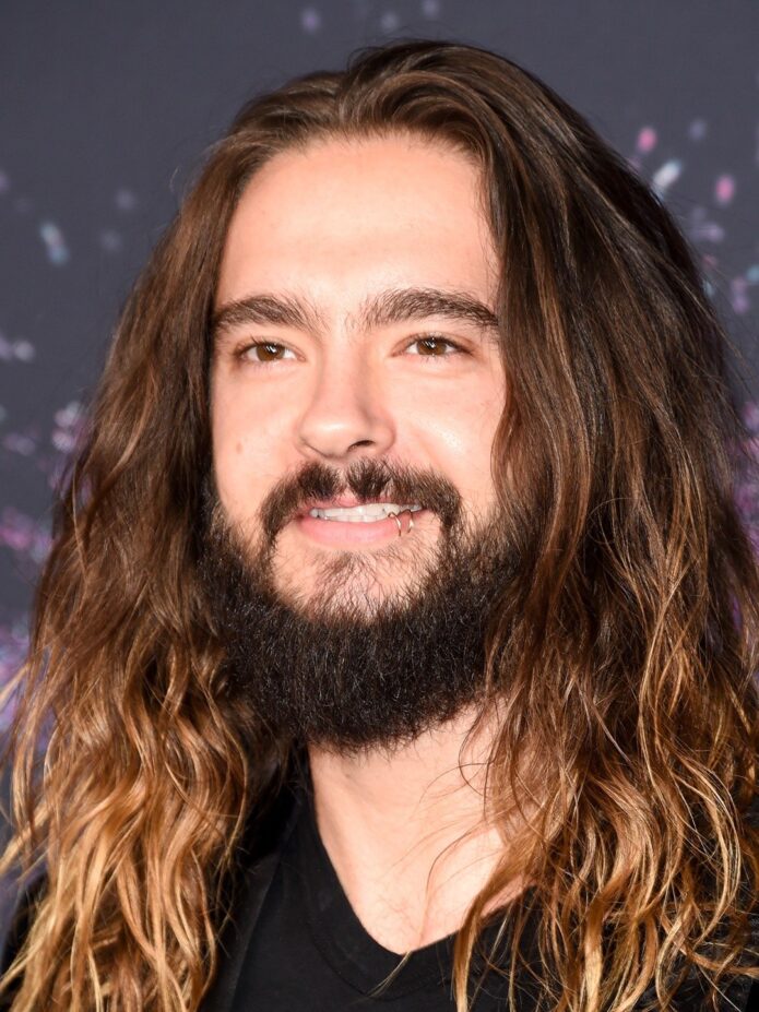
Tom Kaulitz in a contextual photograph: event context only; not tattoo evidence

This event photo is contextual only, not tattoo evidence. It shows Tom in a vest, jewelry and long hair on a bright set, but it can’t confirm a particular design. A tattoo can be visible in one photo and still have an unknown meaning; the distinction matters here.

Ideas to borrow from Tom Kaulitz’s placement choices

Hand and wrist tattoos are visible while a musician plays, holds a microphone or reaches for something. Think about how the design will look when your fingers bend, and whether you’re comfortable with it showing at work or in family photos.

Before settling on a small hand design, ask:

  • Will it still read clearly when your fingers move?
  • Are you comfortable with that level of visibility?
  • Would the design hold up better at a slightly larger size on the forearm?
  • Does the placement matter to you, or does it only look good in a photo?

Tom’s initial works because the reference is clear. Decide what you want the tattoo to say, then let an artist help with the lettering and scale.

Tom Kaulitz in a contextual photograph: HeidiFest context only; not tattoo evidence

This HeidiFest photo shows Tom in another setting, but it isn’t evidence of a specific tattoo. It helps place the article’s tattoo discussion alongside his public style without asking the image to prove more than it shows.

How to make the idea work

If two tattoos are meant to connect, decide how they meet before the appointment: a shared line, two letters or halves of one drawing. Print both at actual size and check the placement on the body. A design that looks spacious on a phone can feel cramped on a finger.

Hand tattoos are hard to hide and exposed to wear. Choose an artist with healed hand and finger work in their portfolio, and discuss whether the lines need to be bolder to hold up over time.

Tom Kaulitz in a contextual photograph: older couple-photo context only; not tattoo evidence

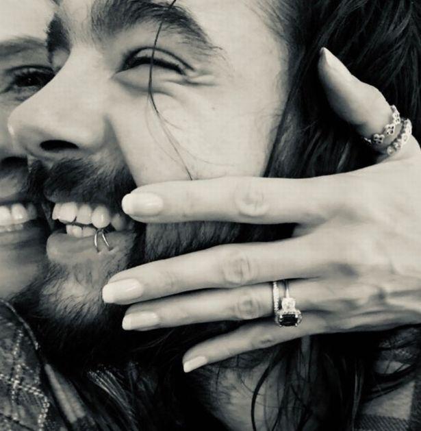
This black-and-white couple photo is contextual too. It shows their hands in the frame, but doesn’t identify a particular tattoo. Keeping that distinction clear helps the reported matching designs stand on the evidence available.

The takeaway from Tom Kaulitz’s style

The H linked to Heidi and the reported hand heart are small designs with a clear connection. Their scale keeps them quiet; the shared meaning comes from the people wearing them.

If you like the idea, start with a symbol that means something to you, then settle the lettering, size and placement with an artist. The tattoo doesn’t have to be large to be specific.

More musician tattoo guides

Lara Raj Tattoos: The Meaning Behind KATSEYE’s Fine-Line Ink

Teen Vogue’s breakdown counts 11 tattoos for KATSEYE’s Lara Raj, though several are only briefly visible in photos or performances. The designs include family words, zodiac symbols, a lyric written in her friends’ handwriting, and a small fairy. Some meanings come directly from Lara; others are known only from the source that documented the image.

Small, fine-line tattoos with a personal thread.

Most of the reported pieces are compact and spread across her ear, fingers, hand, wrist, ribs, shoulder, inner arm and chest. The collection mixes lettering with small symbols, and there’s open space around the designs rather than one large connected piece.

The scorpion behind Lara’s ear.

The scorpion behind her ear refers to Lara’s Scorpio sign. It’s a small placement that can stay covered by her hair or show when she pulls it back.

The “ZZZ” tattoo on her ring finger.

Lara has “ZZZ” on her ring finger, connected to the idea of three cats. It’s one of her smallest designs, but the hand placement makes it easy to notice. Fine lettering on fingers can fade with wear, so the simple three-letter shape has a better chance of staying readable than a detailed drawing.

The Taurus constellation on her hand.

The stars on Lara’s hand form a Taurus constellation. She has connected it to her late grandmother. The hand stars later sit near the “angel” tattoo, though the two designs use different styles.

“Love is life and life is free” on her wrist

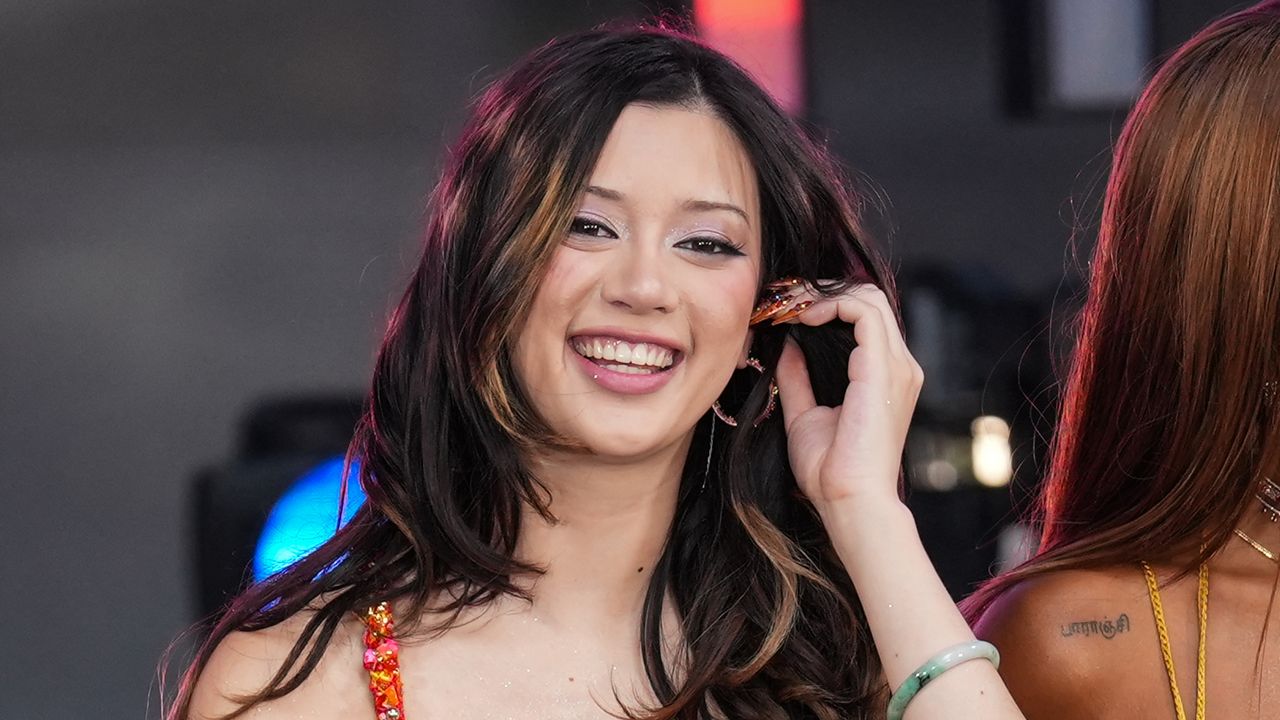
Lara Raj tattoos: Lara's wrist lettering tattoo

The phrase “Love is life and life is free” on Lara’s wrist comes from Erykah Badu’s song “Didn’t Cha Know.” The lettering is based on the handwriting of two of her close friends, which gives the quote a personal source as well as a musical one.

“Habibi” for her family.

Lara has “Habibi” on her upper forearm as a family tattoo. It’s a short word, and the placement can be shown or covered with a sleeve.

“Paranji” in Tamil for her grandfather.

Her shoulder tattoo reads “Paranji” in Tamil and is connected to her grandfather. The script gives the piece a different shape from the short English lettering elsewhere in the collection.

The Scorpio symbol and “APRIL V” on her ribs.

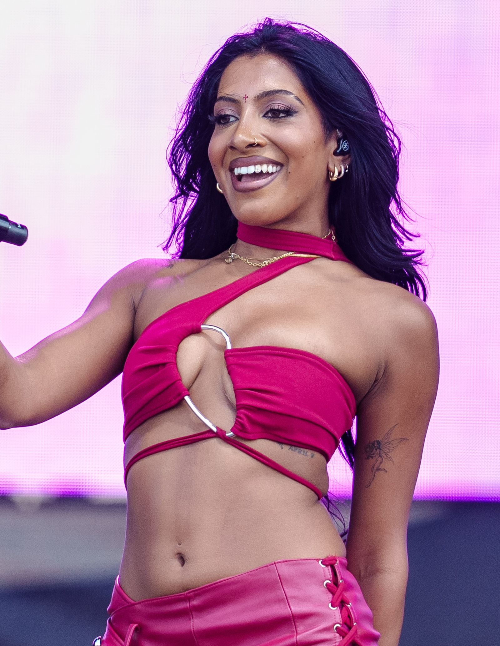
Lara also has a Scorpio symbol and “APRIL V” in Roman numerals on her ribs. The date marks her sister Rhea Raj’s birthday, April 5. Both designs can stay covered under clothing.

The fairy tattoo on her inner arm

Lara Raj tattoos: Lara's fairy tattoo

Lara’s fairy sits on her inner bicep. Tyler Dillon at The Fig Leaf Tattoo in Los Angeles did the piece; the artist and studio are also connected to her Taurus constellation. She showed it in a Weverse peek after the 2025 Kids’ Choice Awards and before Lollapalooza.

The inner arm lets the fairy stay out of view when Lara’s arm rests at her side, then appear when she lifts it or wears a different sleeve.

The Gothic “angel” hand tattoo.

The word “angel” is tattooed in Gothic lettering on Lara’s left hand, near the stars. The heavier type contrasts with the fine-line constellation. Both marks sit in an exposed area, where small details can fade or soften over time.

The Tamil name on Lara’s chest.

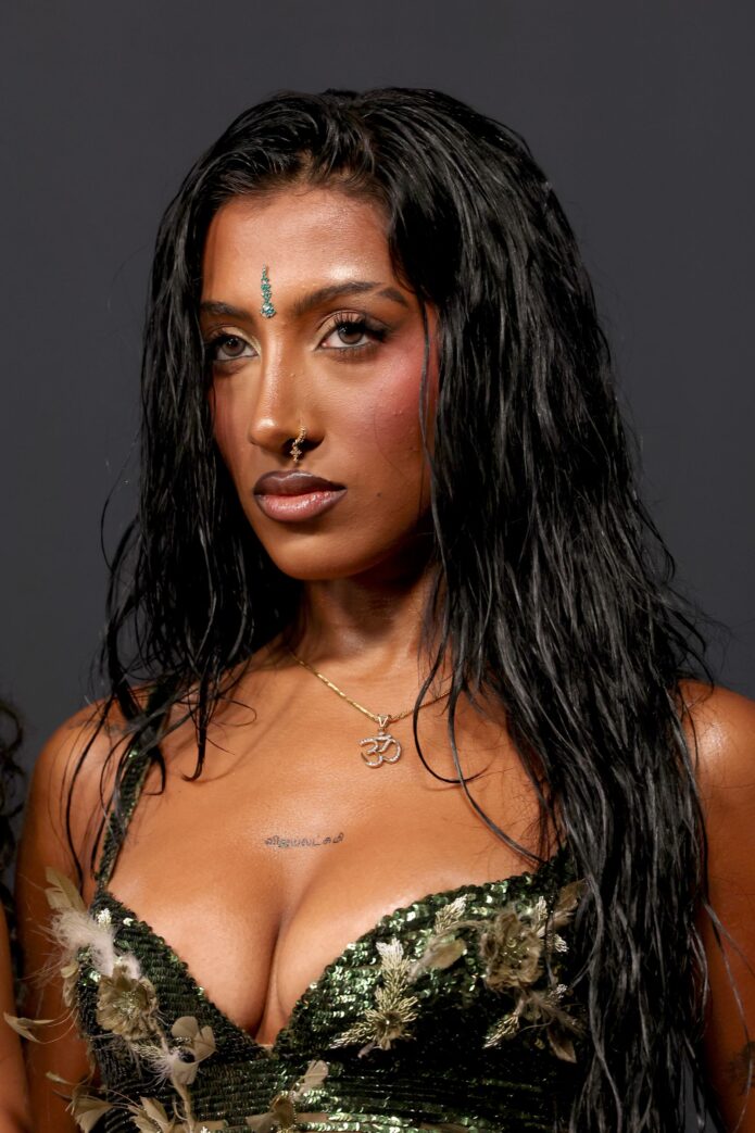
The latest tattoo in Teen Vogue’s breakdown is the Tamil name விஜயலட்சுமி, transliterated as Vijayalakshmi, on Lara’s chest or sternum. She shared it in January 2026 and showed it on the red carpet at a Spotify Best New Artist party before the 2026 Grammys. It sits centrally, above the neckline.

Tamil script has its own proportions and flow, so an accurate reference matters. The chest gives the lettering more room than the hand or fingers, while the sternum’s center line affects how it sits.

What makes Lara’s tattoo collection work.

The pieces point to specific people and references: her grandmother, grandfather, sister, family and friends, plus a lyric and her zodiac sign. They don’t need a single visual theme to fit together. The small scale and separate placements let each one keep its own character.

Lara’s stage context

Lara Raj in a contextual photograph: KATSEYE group portrait context only; not tattoo evidence
Lara Raj in a contextual photograph: Lara Raj visual context only; not tattoo evidence
Lara Raj in a contextual photograph: KATSEYE event context only; not tattoo evidence

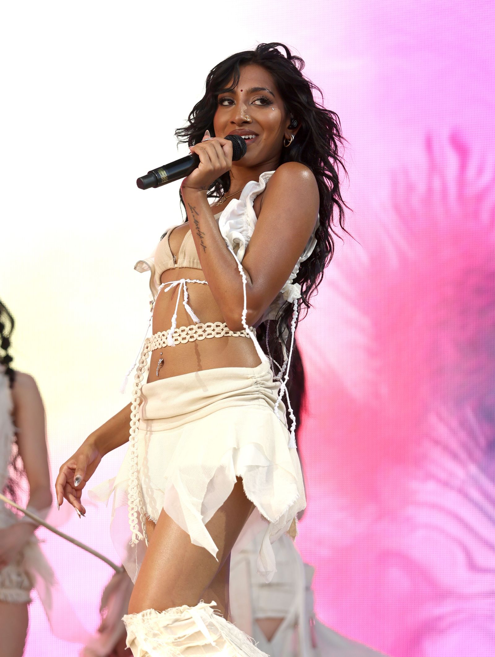
Stage photos catch some of Lara’s hand, arm and wrist ink while she’s singing or moving through choreography. The behind-the-ear and rib tattoos are less likely to appear. These three images are contextual portraits, not close-up evidence for a particular design.

Watch KATSEYE’s “Gnarly.”

Some tattoos also appear briefly in KATSEYE performances and videos, including “Gnarly.” Here’s the official choreography video:

More musician tattoo guides

Flavio Cobolli Tattoos: Hulk, Roma Tributes and the Meaning Behind His Ink

Flavio Cobolli’s tattoos connect AS Roma, close friends and moments on court. The clearest examples are a shirt-style 52 for Edoardo Bove, AmoR on his calf, and a Hulk tattoo tied to a Davis Cup celebration.

The 52 tattoo for Edoardo Bove

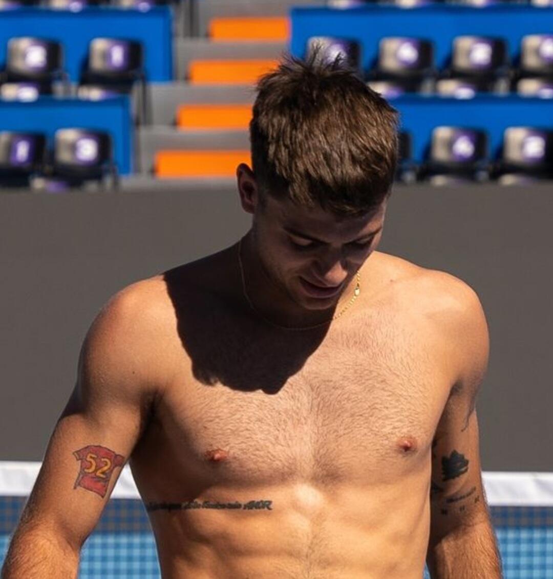
Flavio Cobolli tattoos: 52 tribute tattoo evidence

The 52 is on Cobolli’s right arm and recreates the number from the Roma shirt worn by Bove. They were connected through Roma’s youth setup and stayed friends as their careers went in different directions.

The upper-arm placement gives the design room and lets a tennis shirt cover it.

That choice of format matters. The red-and-gold jersey details keep “52” from reading as a date or lucky number; they tie it to Bove and Roma.

The AmoR calf tattoo and the Roma connection

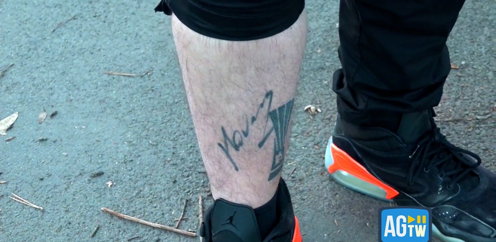
Flavio Cobolli tattoos: AmoR calf tattoo evidence

On Cobolli’s calf, AmoR is a compact Roma reference. The reversed spelling points to the phrase associated with Daniele De Rossi: “Sei tu l’unica mia sposa, sei tu l’unico mio amor.” Cobolli has spoken about admiring De Rossi, so the lettering connects to a particular player and club.

Short lettering needs room to sit well. The word follows the shape of the calf, and the close-up shows it beside Cobolli’s shoe and sock after a match. It’s a small design, not a polished club crest.

The two Roma tattoos use different forms: the shirt number for a friend and the phrase tied to De Rossi. The club links them, but the designs don’t repeat one another.

Other visible arm and torso ink

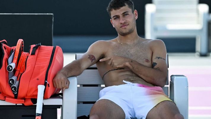
Flavio Cobolli tattoos: visible arm and torso tattoo evidence

Match and training photos show other marks on Cobolli’s arms and lettering along his side. Some are too small or blurred to identify confidently. A wolf symbol has been reported as an AS Roma reference; the remaining details are best left open unless a clearer source confirms them.

The visual rhythm is casual rather than over-designed. The tattoos sit apart instead of forming a symmetrical sleeve. Side lettering can stay under tennis clothes and show in a candid photo or celebration.

Cobolli’s Hulk-era court context

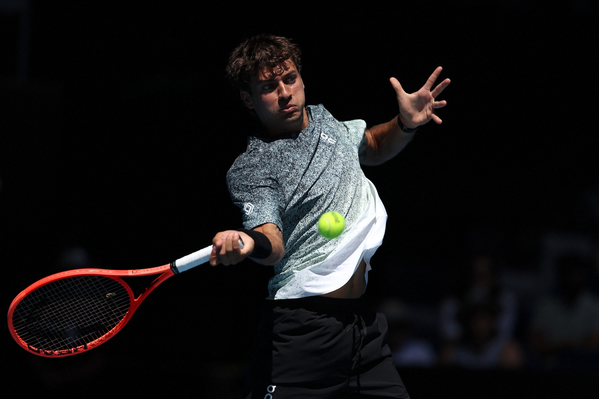
Flavio Cobolli in a contextual photograph: Hulk-era tennis court context; not tattoo evidence

The Hulk tattoo recalls Cobolli’s shirt-ripping celebration during Italy’s 2025 Davis Cup semifinal against Belgium. He saved seven match points against Zizou Bergs and won the deciding-set tiebreak, helping Italy reach the final.

After beating Terence Atmane at the 2026 Delray Beach Open, Cobolli showed the tattoo and said it was about two weeks old. He joked that he needed to feel like the superhero on court and linked the design to feeling powerful in that Davis Cup moment.

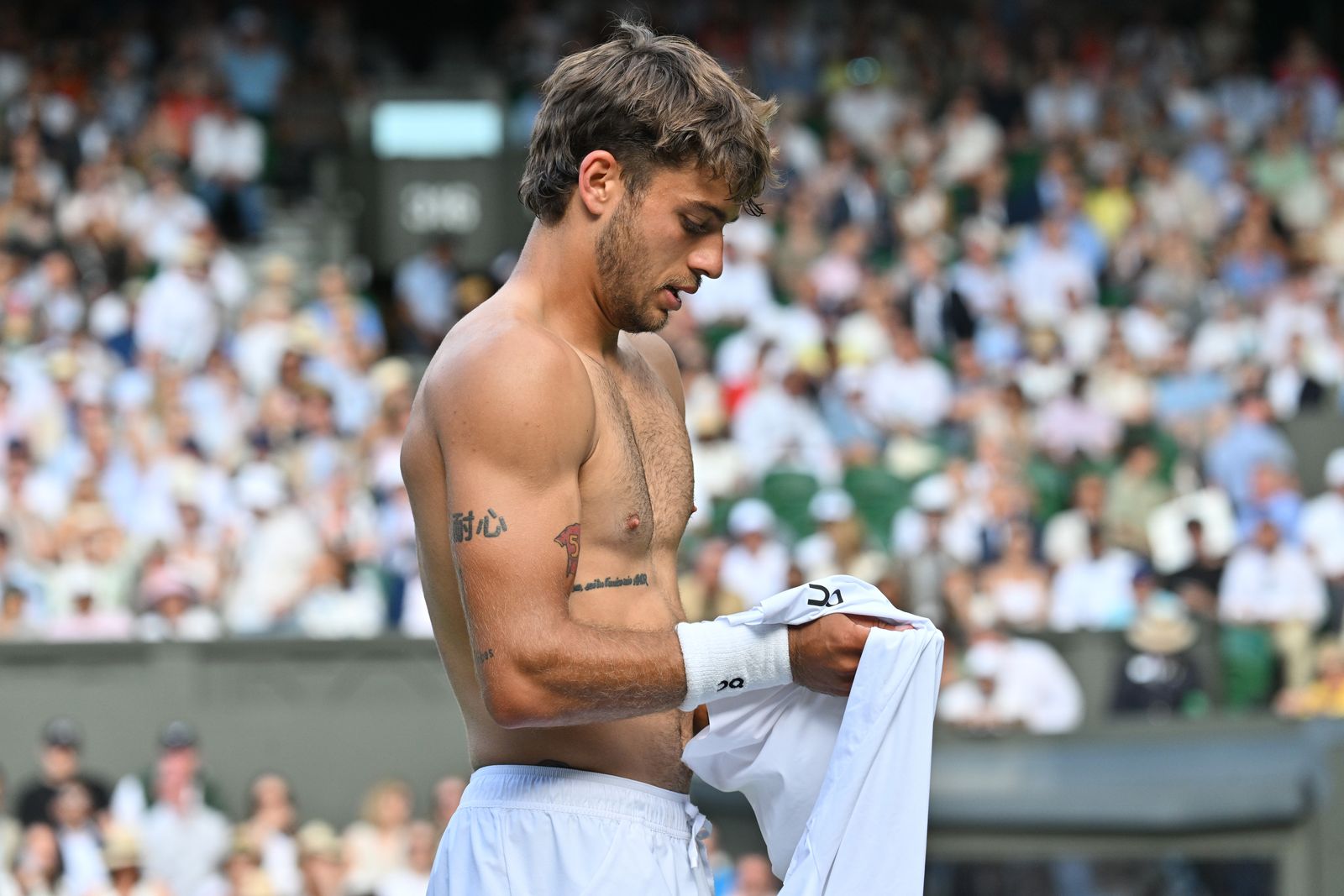
This court photo is context, not a close-up of the tattoo. Match images show how the ink appears alongside Cobolli’s celebrations; a clear tattoo photo is better for identifying the design itself.

The link between sport and ink is the point. The Roma pieces recall football and friendship; the Hulk refers to a tennis moment. Each comes from something Cobolli has actually experienced.

Why this collection works

Flavio Cobolli in a contextual photograph: Wimbledon tennis context; not tattoo evidence

A football shirt number, a phrase and a comic-book character don’t need to match visually. The thread is what each one refers to: Bove, De Rossi and a Davis Cup celebration. That context gives the collection a through line without forcing the designs into one style.

If you want a similar tattoo, start with a moment or person and choose the one detail that makes the reference yours. A number, short phrase or small symbol can be enough when it points to a real memory.

More athlete tattoo guides

Tini Younger Tattoos: Her Blue Crab and Arya Memorial Ink

Tini Younger’s two best-documented tattoos tell very different stories. A blue crab carries a cavatappi noodle, tying her Maryland roots to the mac and cheese that helped make her cooking videos famous. A small footprint, flower and name honor her daughter Arya.

Tini Younger’s blue crab and cavatappi tattoo

Tini Younger tattoos: genuine arm-tattoo view

Younger showed the blue crab on her right forearm to ELLE while talking about her cookbook and the recipe that changed her career. The crab holds a single cavatappi noodle, the corkscrew pasta she uses in her signature mac and cheese.

She spent years testing the recipe, and her cooking videos helped it spread online. The dish became so popular that people reported trouble finding cavatappi in stores. Younger grew up in Frederick, Maryland, where the blue crab is a familiar regional symbol. Pairing the crab with the noodle turns two real parts of her life into one small joke.

The hometown detail gives the joke a clear point. It’s a useful idea for a personal food tattoo: connect the thing you love to a place or memory that belongs to you.

The Arya memorial tattoo

Tini Younger tattoos: genuine arm-tattoo view

In January 2026, Younger shared a tattoo for her daughter Arya. She and her husband, Antoine Wright Jr., lost one of their twin daughters following a placental abruption. PEOPLE and Yahoo described the design as Arya’s name in cursive beside a tiny footprint and flower on Younger’s left upper arm.

Younger has said she wants Arya to remain part of the family’s story and for her surviving daughter to know she had a twin sister. The footprint refers to Arya as a baby, and her name makes the tribute specific. The upper-arm placement can be covered or shown when Younger chooses.

The lettering is soft and handwritten. If you’re considering a name tattoo, look at the artist’s healed script work as well as fresh photos; spacing that looks clear at first can blur if it’s packed too tightly.

What the visible photos show

Other photos show marks around Younger’s arms and upper body, but not clearly enough to identify them. Shadows, jewelry and image quality can make a shape look like ink. The crab and Arya memorial are the two designs described in detail by the cited coverage, so the rest should remain unconfirmed unless a clearer source appears.

Her cooking photos do show how a forearm tattoo appears while she reaches across a counter or holds a plate. That’s a practical part of the placement: the design enters the frame naturally in videos without needing to cover the whole arm.

Why the pairing works so well

The crab and noodle explain each other. The crab points to Maryland; the cavatappi points to Younger’s signature recipe. Neither element would carry the same personal reference by itself.

For a small novelty tattoo, one specific connection can do more than extra shading or decoration. Start with the object people recognize, then add the detail that makes it yours.

Why the memorial piece feels different

The memorial design names Arya and uses a footprint and flower. Its meaning is clear without a longer quote or a larger image. It was made for Younger and her family, so it doesn’t need to explain the loss to everyone who sees it.

Placement ideas inspired by Tini Younger

Tini Younger in a contextual photograph: contextual kitchen photograph; explicitly not tattoo evidence; not tattoo evidence
Tini Younger in a contextual photograph: cooking-show context; explicitly not tattoo evidence; not tattoo evidence
Tini Younger in a contextual photograph: family context photograph; explicitly not tattoo evidence; not tattoo evidence

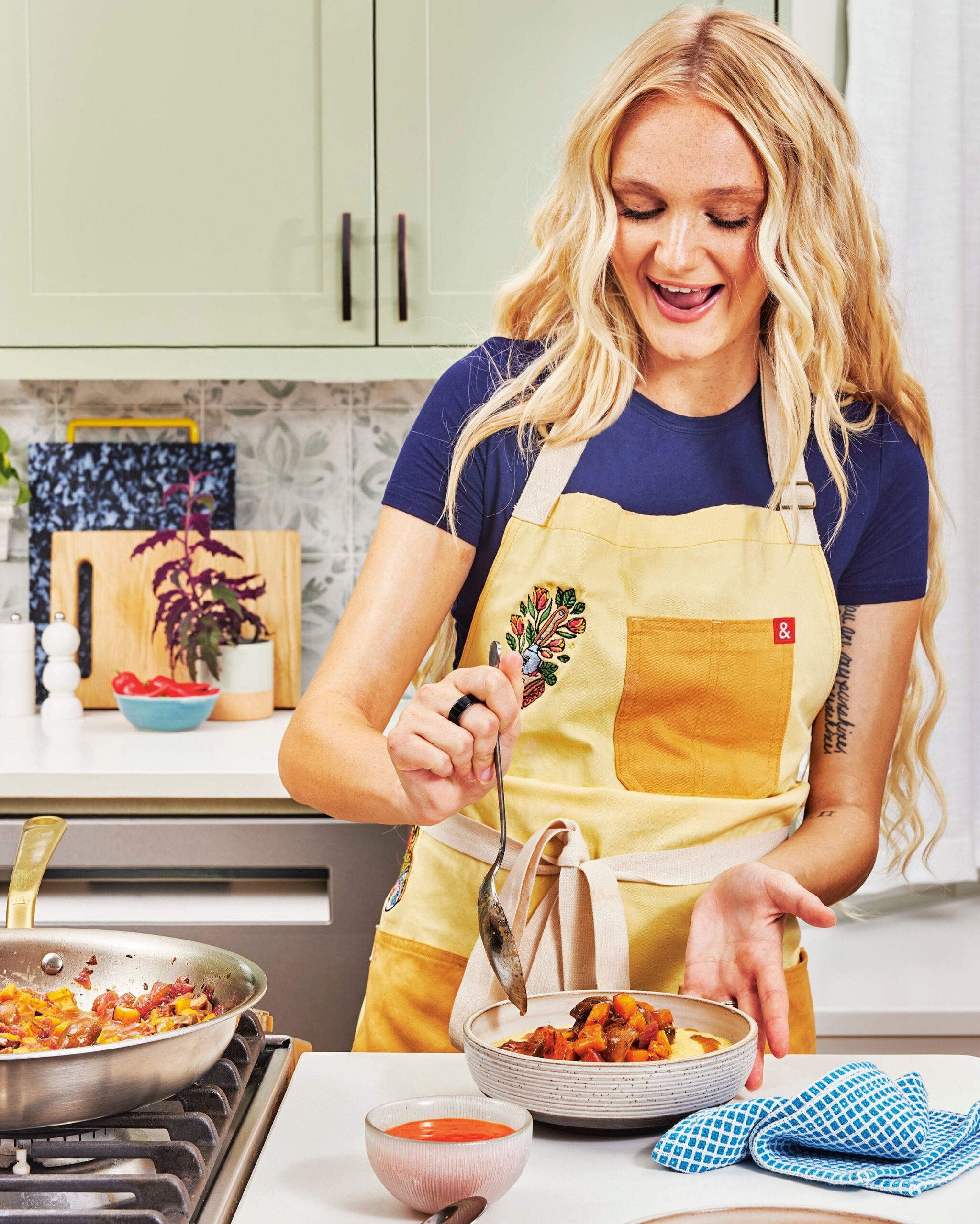
The forearm is visible and large enough for a small illustration, but a sleeve can cover it. The upper arm offers more privacy and space for script. These kitchen and family images are contextual; they don’t show the tattoos clearly enough to serve as evidence for a particular design.

Think about sunlight, friction and movement before choosing either spot. Forearms get washed and exposed to the sun; upper-arm skin shifts when the elbow bends and rubs against sleeves. An artist can size and place the design for how the body rests in ordinary life.

What Tini’s choices say about placement

The forearm crab appears naturally in cooking videos. The upper-arm memorial is easier to cover. The different placements give each tattoo its own level of visibility.

More celebrity tattoo guides

Danna Paola Tattoos: Grandmother Tribute, Red Kiss and Fine-Line Ink

Danna Paola’s tattoos include family tributes, short phrases, a crescent moon and a red kiss on her shoulder. Some meanings come from her own posts or interviews; for the smaller marks, the photos don’t always show enough to identify more than the design and placement.

Danna Paola Tattoo: Grandmother Tribute and Moon

Danna Paola tattoos: grandmother tribute tattoo

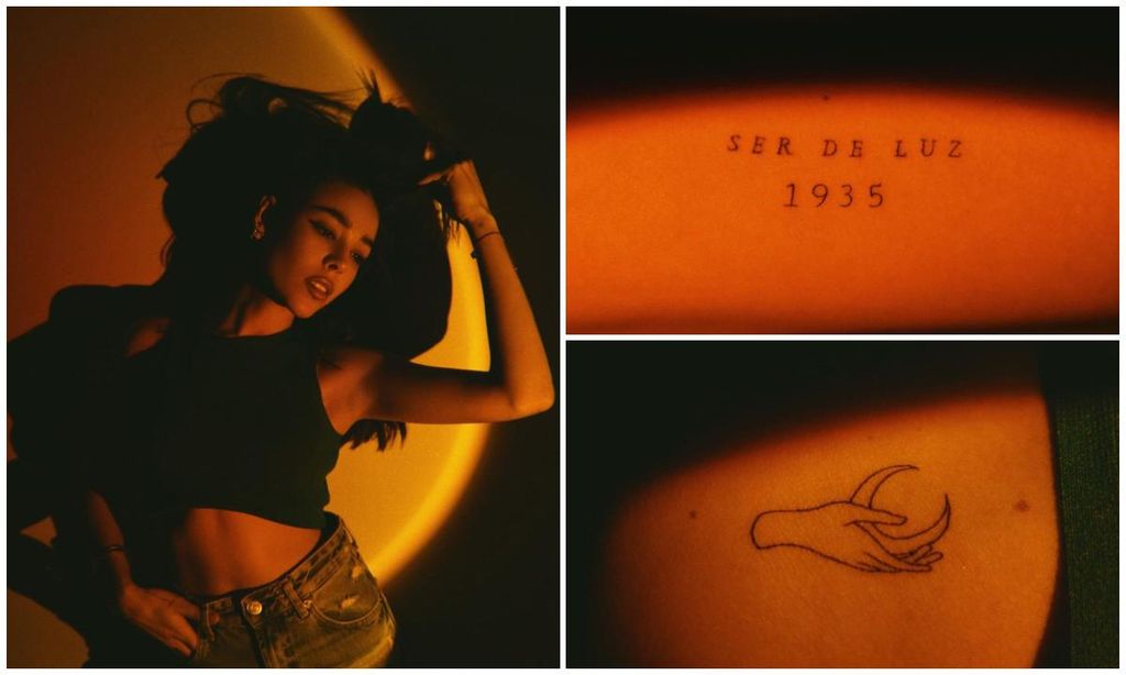
After her grandmother Chelo died, Paola got Ser de luz—“being of light”—with the year 1935, Chelo’s birth year. The fine lettering runs across Paola’s upper side, with space between the words and numbers.

A second design from that session shows a hand holding a crescent moon. Paola has described feeling close to the moon, calling it an energetic mother, confidante and witness to her wishes. That’s the context she gave the image; it doesn’t need extra symbols or shading to read as personal.

Danna Paola Tattoo: The Red Kiss

Danna Paola tattoos: red kiss tattoo close-up

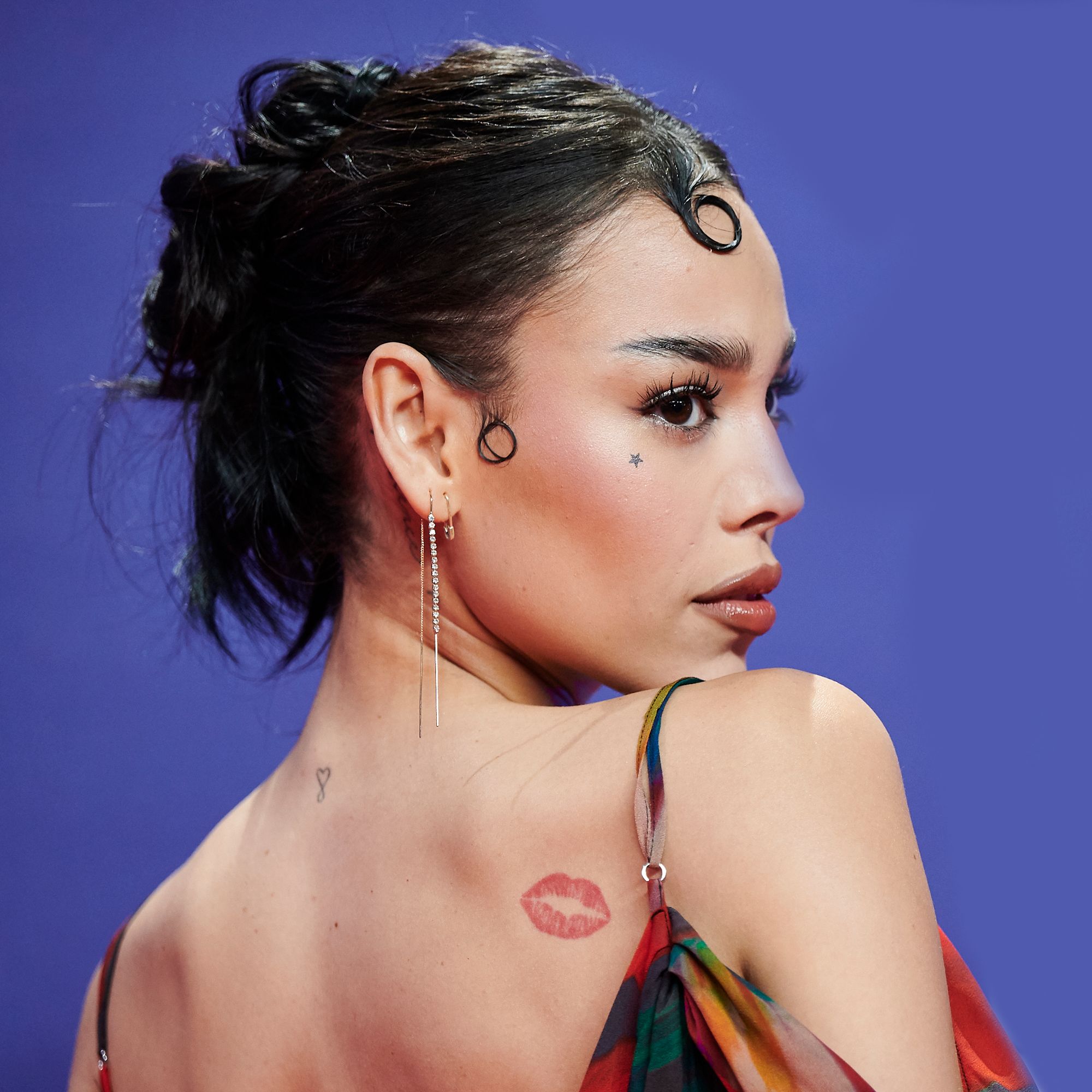
The red kiss high on Paola’s back near her shoulder is one of her most recognizable tattoos. It looks like a lipstick print, with the red shape doing most of the work. She first showed it when she was young, and entertainment coverage has called it one of her earliest tattoos.

It appears when she turns for a photo or wears an open-back look, then disappears in other frames. The placement gives it a small moment of its own. The color is another option for a tattoo that needs to read without a heavy black outline.

Danna Paola Tattoo: The Kiss in a Full Portrait

Danna Paola tattoos: red kiss tattoo full portrait

This wider portrait shows the kiss on Paola’s shoulder and a small star below her eye. The star is a separate, quieter detail; the photo doesn’t explain its meaning. The kiss follows the curve between her shoulder and upper back, while the facial mark sits in a more visible place.

A face tattoo is part of every close-up, so its visibility deserves a different kind of thought from a piece under clothing. The image confirms the star’s placement, not why Paola chose it.

Onstage Details

Danna Paola in a contextual photograph: editorial context portrait; not tattoo evidence

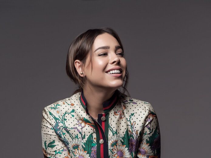
This editorial portrait is context, not tattoo evidence. Paola’s fashion and beauty work moves between polished looks and more experimental styling, which can change how the same small tattoo reads. Clothing, makeup and hair frame the ink; they don’t add meaning to it.

Fine-Line Placement in Everyday Life

Danna Paola in a contextual photograph: fine-line placement context; not tattoo evidence

Paola’s reported tattoos sit on the wrist, hand, nape, ribs, shoulder and behind the ear. Each placement changes who is likely to see the design: a wrist appears in close-ups, ribs stay under clothing, and hair can cover the nape or the mark behind her ear. This photo is also contextual, not proof of a particular tattoo.

The heart-and-infinity design she shares with her mother and sister appears in different placements on each of them. The tattoos are related without needing to be identical. A shared design can keep the same idea while fitting each person’s body.

Paola has also shown Fiorire, Italian for “to flourish”; My future is unlimited along her ribs; and Patiente behind her ear. The small “XX” marks were part of the group of additions she shared at the end of 2020. She presented them together during a difficult, unusually creative year, without attaching one grand explanation to each mark.

Fine-line ink needs room. Leave space between letters and don’t force detail into a spot too small to hold it. The lettering in Paola’s collection works because the words and placements stay simple.

Why These Small Details Feel Personal

The red kiss is playful; the moon and Ser de luz 1935 are tied to family and memory. The heart-and-infinity mark connects Paola to her mother and sister, while the words and “XX” record other parts of her life. The collection doesn’t need one visual theme to hold those details together.

If you’re using her tattoos for ideas, focus on the part that makes each one specific: a family member, a phrase you actually use, or a color and placement you’ll enjoy seeing. The same shape can mean something different on another person.

More musician tattoo guides

InkMonstarr Tattoos: 700+ Pieces, Face Ink and the Stories Behind His Collection

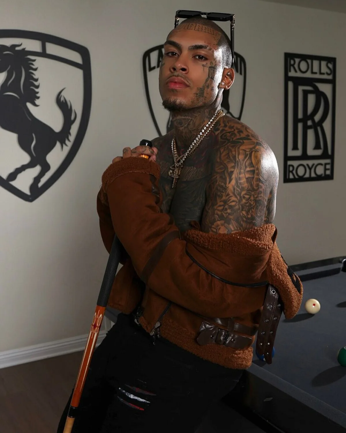
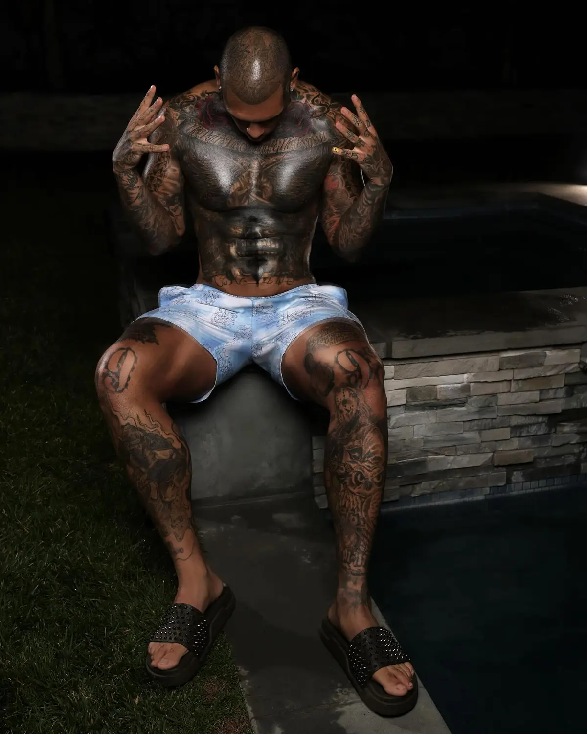
InkMonstarr has described tattoos as a way to wear his story. The artist, actor, model and musician says he has more than 700 tattoos. The first he discussed publicly was a group of stars for his mother; his face tattoos connect to belief and the people who support him. He hasn’t given a complete explanation of every design, so the visible details don’t all have confirmed meanings.

InkMonstarr’s first tattoo was for his mother

InkMonstarr tattoos: inline

The stars on InkMonstarr’s left hand were a tribute to his mother and the unconditional love he associates with her. The hand is hard to keep out of view, so the piece serves as a daily reminder as well as the start of a much larger collection.

In his Inked feature, the finger marks and lettering sit beside darker black-and-grey work on the backs of his hands. Hand tattoos take constant wear from washing, movement and sunlight; a clear shape has more room to hold up than a design packed with tiny detail.

The face tattoos are personal, not just shock value

InkMonstarr tattoos: inline

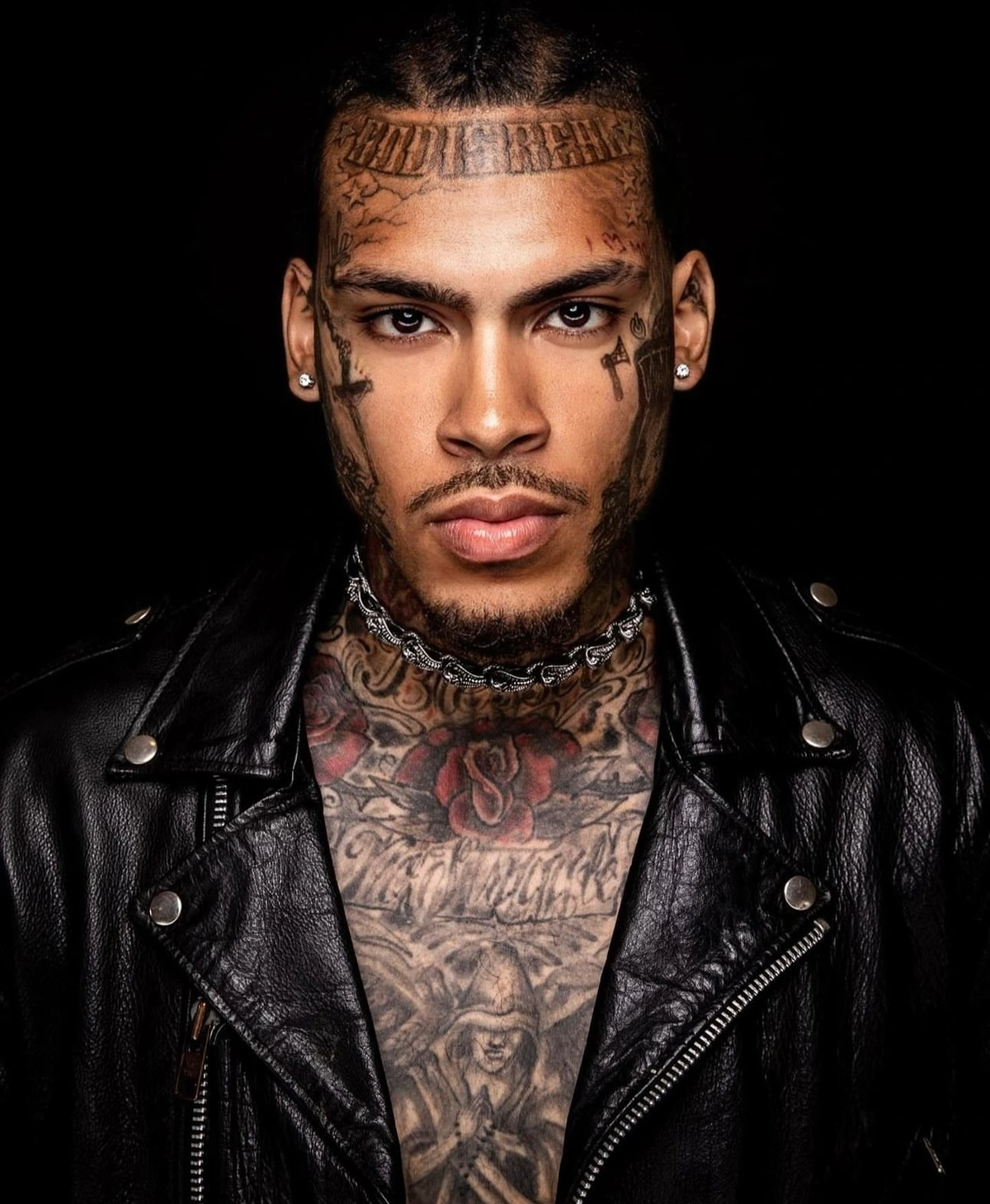
He has pushed back on the idea that the face tattoos are there just to provoke. InkMonstarr has said they mark his beliefs, his support system and periods when he decided to bet on himself. He also said they remind him to “dream bigger than big.” He hasn’t attached a public explanation to every symbol.

The forehead lettering follows his hairline, with smaller marks at the temples and cheek. A cross-like shape sits beside one eye, and the neck work continues toward the chest. The pieces connect across the area, though the full composition was built over time.

His hand and finger tattoos reward a closer look

InkMonstarr tattoos: inline

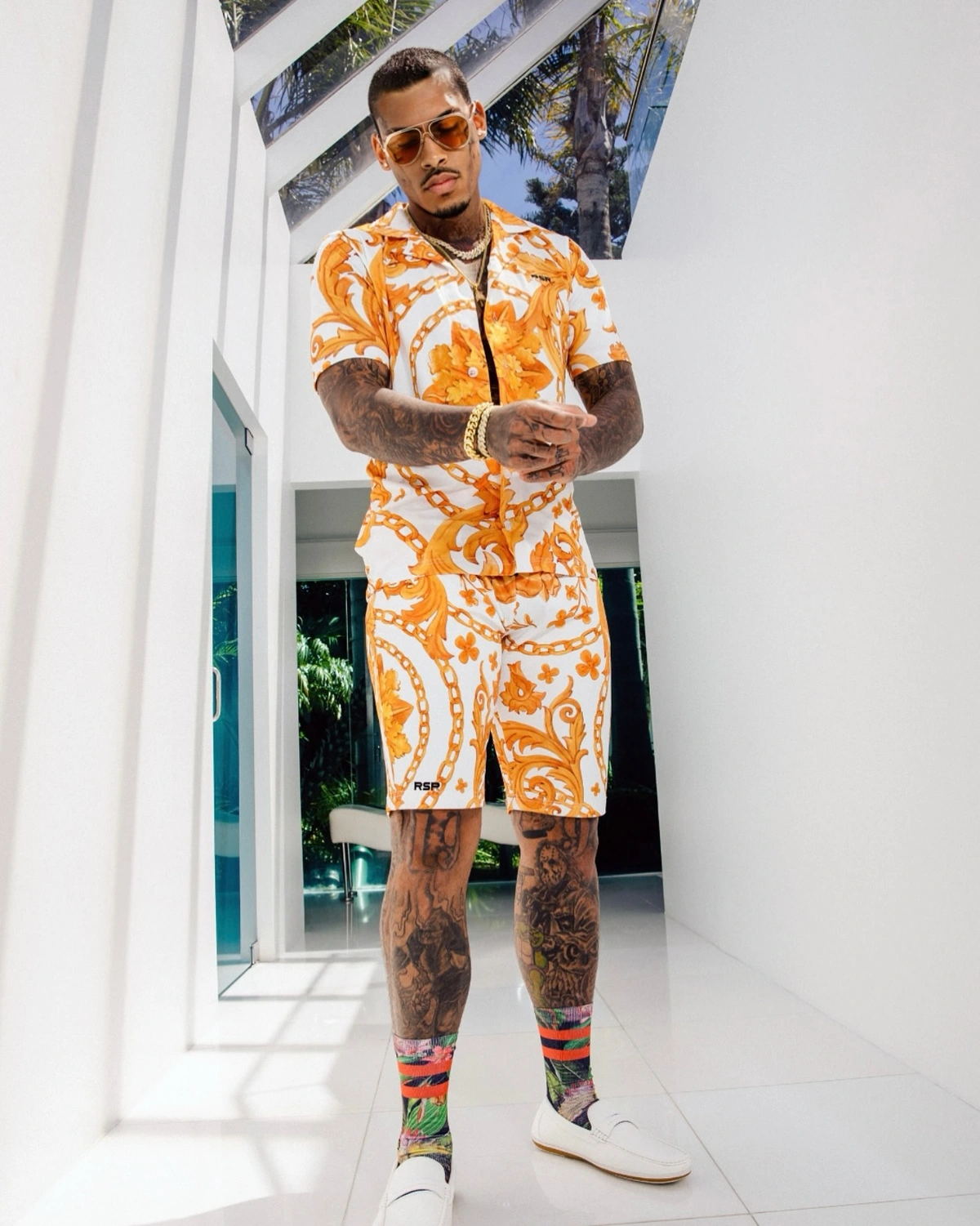
The fingers carry small symbols and lettering; the backs of the hands are darker and more layered. Some of the older marks sit alongside newer-looking work, but the photos don’t establish the date or meaning of each one.

The collection uses two scales: tiny marks that read like punctuation and heavier work that covers more of the hand. If you’re planning hand tattoos, think about how they’ll sit with rings and the creases of your fingers, and leave enough space for each shape to stay clear.

InkMonstarr’s chest and arm tattoos

InkMonstarr tattoos: inline

His chest, shoulders and arms are heavily covered, mostly in black and grey, with some red on the upper chest. Lettering crosses the chest; denser images fill the shoulders and sleeves. In photos, the designs follow the body rather than sitting as flat, separate patches.

The photographs show dark coverage, lettering, religious-looking symbols and portrait-like forms, but InkMonstarr hasn’t published a full inventory. It’s better to describe what’s visible than assign a name or story to each shaded area.

InkMonstarr’s leg tattoos

InkMonstarr tattoos: inline

Both legs are heavily tattooed from the knees toward the ankles. The photos show faces, dark outlines, layered shading and designs in several sizes. The overall coverage has a consistent weight, even though the pieces don’t look like one matching set.

In the interview, InkMonstarr said he was working on filling a few open spots on his legs. He didn’t name future designs or give a schedule, so those plans should stay open. The negative space is part of the current look, not a gap that has to be filled at once.

The placement makes the collection’s scale clear: face, hands and neck are the most visible; the chest, arms and legs give him more room to keep adding work. The first stars for his mother and the belief-related face tattoos sit in the same collection without sharing one style.

InkMonstarr has said tattoos gave him a voice before he learned to speak his truth. He described wearing his story on his skin instead of carrying it. He has also joked that he spent his first year of college financial aid on tattoos instead of books, then said he cleared it up.

Living with the ink is part of the story, but the tattoos don’t explain everything about him. In interviews, he has also talked about meditation, family, travel, comics and creative work. The photos show the designs; they can’t tell us what every one means.

He has described tattooing as a lifestyle rather than a phase. The collection is still growing, but its scale isn’t the only point: the stars honor his mother, and he has tied the face work to belief and support. Those are the meanings he has shared; the rest can remain personal.

More musician tattoo guides

Chelsea Gabriellee Tattoos: Horror-Inspired Ink, Full Sleeves and Ornate Body Work

Chelsea Gabriellee got her first tattoos at 15: stars on her hips, which have since been covered. The Florida-born tattoo model and content creator now lives in Los Angeles and has said horror movies she loved growing up inspired much of her ink. Her current work covers both arms, her chest and stomach, hands, thighs and back.

Some details are easy to see; others are private or too indistinct in photographs to name. Gabriellee has also discussed changing older work, including a rework of her left sleeve and planned knuckle blast-overs.

Chelsea Gabriellee’s horror-inspired tattoo collection

Chelsea Gabriellee tattoos: Chelsea Gabriellee’s horror-inspired tattoo collection

This front-facing photo shows dark ink over both arms, the upper chest and stomach, hands and thighs. The work mixes heavy black areas, illustrative lines and color; a red-and-black design stands out on the upper arm. Gabriellee’s horror influence comes from her own description, but the image doesn’t identify each tattoo as a particular character.

She once pictured stopping at a half sleeve. The collection has grown beyond that, with room left for further changes. Dark areas and skin breaks sit side by side, and the colored pieces add contrast without covering every inch.

Her full sleeves are the foundation of the look

Chelsea Gabriellee tattoos: Her full sleeves are the foundation of the look

Both sleeves run from the shoulders toward the hands, but they aren’t mirror images. The arm on the viewer’s right has warm red, green and orange accents among the black outlines; the other reads darker and more densely layered. The photos show work added over time rather than one matching design.

Gabriellee has said she’s reworking her left sleeve. A new piece can change how older tattoos fit together, so the finished look may keep shifting. A sleeve also has to read when the arm bends or turns, not just when it’s held straight.

The ornate stomach piece anchors the front

Chelsea Gabriellee tattoos: The ornate stomach piece anchors the front

The stomach tattoo has a pointed, symmetrical shape beneath the chest and a darker, face-like area lower down. Curves and scalloped lines spread across the upper stomach; the central lines follow the body rather than forming a rectangle. The photo isn’t clear enough to identify a named horror character.

Gabriellee has said horror influences her work, but that doesn’t confirm a movie or character for this image. A separate World Tattoo Gallery photo focuses on her back tattoo; it’s a different view and shouldn’t be used to describe this front piece.

Chelsea Gabriellee’s leg tattoos carry large pieces of their own

Chelsea Gabriellee tattoos: Chelsea Gabriellee’s leg tattoos carry large pieces of their own

Large illustrative designs cover both thighs, with figures and ornamental shapes running toward the knees. There’s more open skin around these pieces than around the stomach tattoo, so the images remain distinct. The lower edge of this photo shows more ink continuing down the legs, but not enough to identify every placement or subject.

Knees bend and change the way a design sits. A large leg piece needs to be considered from a standing, seated and bent-leg position before it’s placed. A full leg sleeve is another possible future step, though no design or timing is confirmed.

Her hands and fingers add a sharper finishing detail

Chelsea Gabriellee tattoos: Her hands and fingers add a sharper finishing detail

Gabriellee holds her hands near her neck in this portrait, making the ink across her fingers and the backs of her hands easy to see. The hand designs sit beside the sleeves and stomach work, while smaller marks and heavier lines appear together.

She has discussed plans to blast over her knuckles. A blast-over puts new ink across an existing tattoo while leaving parts of the old design visible. On hands, the artist needs to account for movement, sun and everyday wear; Gabriellee’s plan will depend on the design and how the older ink sits.

Why Chelsea Gabriellee keeps changing her ink

The stars on her hips were covered, and she has talked about reworking the left sleeve and knuckles. She also said she left home at 15, the same age she began getting tattooed. That gives some context for how long ink has been part of her life, but it doesn’t explain every design.

The collection has a horror influence without following one strict visual style. The sleeves, stomach piece, back work and hands use different compositions; the shared mood comes from dark, illustrated imagery. The exact meanings of many visible shapes haven’t been made public.

Ideas to borrow from her tattoo style

Think about the large areas first—sleeves, back, chest, stomach and legs—then decide where you want dark anchors, color and open skin. A half sleeve can grow, and older work can be changed, so leave room for that possibility before filling every gap.

Hand and knuckle tattoos are a bigger visibility commitment than ink under clothing. Choose an artist who can show healed work at that scale, and talk through how the design will sit as your hands move. Don’t assign a movie or character to a tattoo just because it looks familiar in a photo; Gabriellee’s own comments support the horror influence, not a title for every shape.

Her collection is still changing. The useful part to take from it is the way large areas, color and older pieces can be reworked over time without pretending every design has to be finished at once.

More model tattoo guides