codex

Makani Terror Tattoos: Wolf Back, Full Sleeves and Colourful Body Ink

Makani Terror is the professional name of Kathrin Tölle, a German tattoo model whose collection has developed over more than two decades. iNKPPL lists 60 tattoos; a Hyraw profile describes more than 80 percent tattoo coverage. Her work spans black-and-grey shading, bright color, lettering, animals and ornamental designs. Tattoo magazines have covered her work for years; fashion and alternative-culture brands have also used her look in shoots. She is connected to the Fallout Tattoo scene in Germany.

Tölle has said she once had tattoos she no longer liked and didn’t feel comfortable showing her back. She worked with tattoo artist Julian Siebert on a wolf cover-up. That redesign is one of the better-documented stories in a collection where many individual images have no public explanation.

Makani Terror’s back wolf is the clearest documented redesign
Makani Terror tattoos: documented wolf redesign and surrounding back coverage

In the Hyraw profile, Tölle says she sent Siebert a photo of her back and explained what she wanted. He designed the wolf that became a full cover-up of the older work.

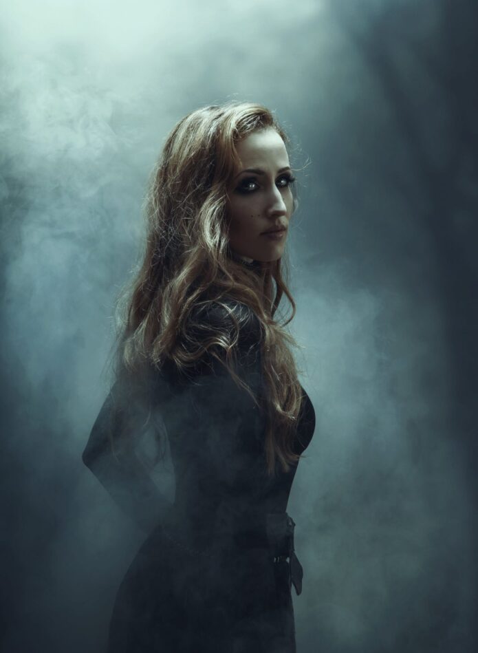
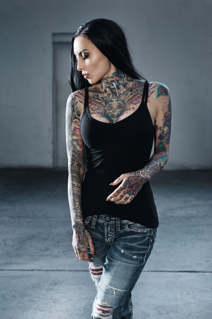
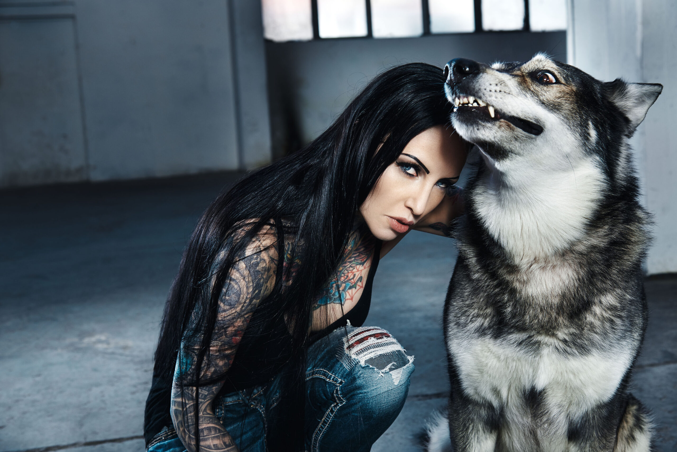
The photo here isn’t a close-up of the finished wolf. It shows how the back fits into the larger collection: the neck, chest and upper arms are visible while her hair and shoulder angle hide most of the design. A back piece meets the shoulders and sides, so the surrounding tattoos affect how it reads.

The source confirms the wolf motif and Siebert’s role, but doesn’t explain every line or shade. The redesign can be described without assigning the animal a private meaning.

The chest and neck work set the tone

Makani Terror tattoos: colourful chest and neck tattoo coverage

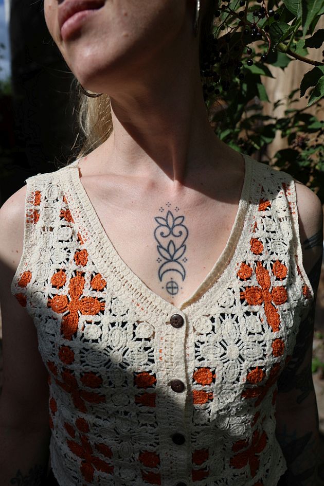
Ink rises from both shoulders onto Tölle’s neck and across her chest. A skull-like central figure sits below the throat, surrounded by wings, flowers, stars and curved ornaments. Blue, red, yellow and green accents break up the darker outlines.

The neck links the face to the rest of the body and remains visible with a black tank top. The chest image is dense, but the central figure gives the eye somewhere to land. The color appears in smaller areas rather than filling the whole design.

Her sleeves mix dense blackwork with colour
Makani Terror tattoos: dense blackwork and colour across the sleeves

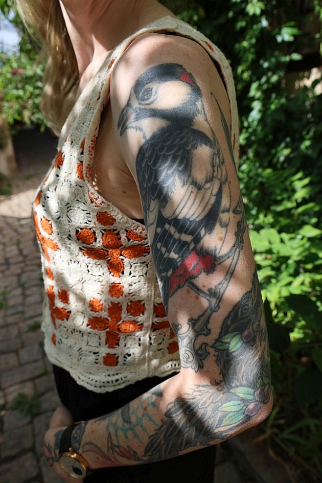
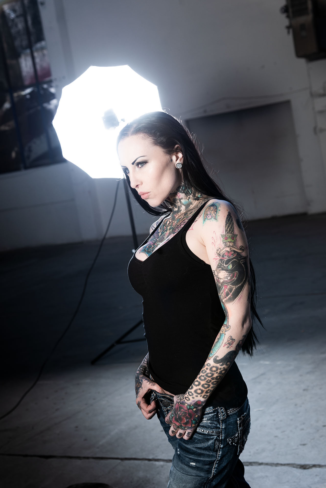
Both sleeves run from the shoulders toward the wrists. They use different arrangements: one has more red, green and orange among the black lines, while the other looks darker and more packed. Flowers, animals, ornamental borders and lettering sit beside heavier shading.

The sleeves don’t mirror each other, which fits a collection built over many appointments. In photos from different angles, the lines travel over the upper arm, elbow and forearm; the designs don’t depend on one straight-arm pose to read.

Makani’s hands and fingers make the close-up details count

Makani Terror tattoos: hand, finger and forearm tattoo details

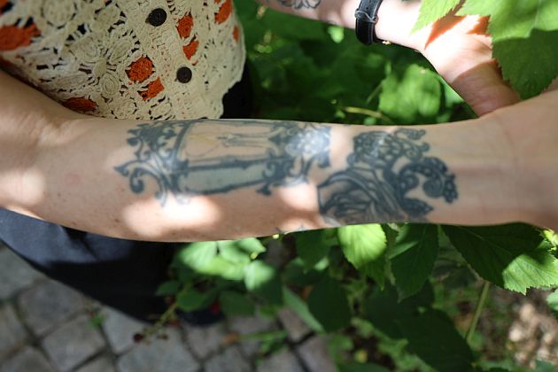
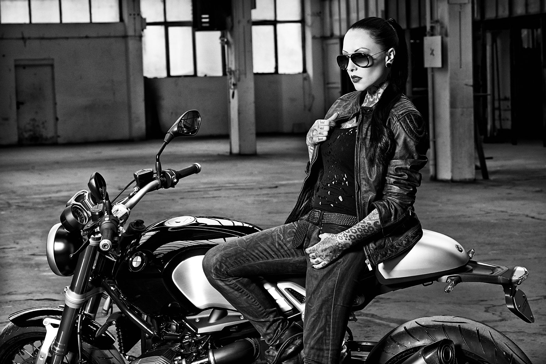
The backs of Tölle’s hands carry larger color and linework, with smaller marks on the fingers. In this motorcycle photo, her fingers curl around the handlebar and the sleeves catch the light at different angles. It shows how the tattoos look in a real pose, even if a studio close-up would reveal more detail.

Hand ink is exposed to movement, washing, sun and friction. Tölle’s smaller marks sit beside the wrist and forearm work rather than as isolated designs. She has also discussed covering her knuckles with a blast-over, which leaves parts of older ink visible beneath the new layer. The final design will depend on the existing work and the artist’s assessment of the skin.

The full-body tattoo effect comes from mixing old and new work
Makani Terror tattoos: wider view of arm and leg tattoo coverage

The wider view shows ink continuing from Tölle’s arms and hands across her neck, chest and legs. The subjects and colors vary, but the coverage gives the pieces a shared weight.

According to iNKPPL, her early tattoo was “PUNX 4ever” on her right ankle. Later work covered it. The old phrase is a small example of how the collection has changed rather than stayed fixed around its first choices.

The sources don’t give a meaning for every image. Some pieces may be private, some decorative, and others have been reworked as her taste changed. The photographs show a long process of adding and adjusting, not a finished inventory.

How to borrow the look without copying it

Plan how the larger areas connect before filling them in. A chest piece affects the neck and shoulders; sleeves change how a back design reads; hand tattoos appear in almost every close-up. Leave room for work to grow, and talk with an artist about how each section will meet the next.

The useful reference is the mix of dark shading, color and open space, not any single flower or animal. A design can change later, as Tölle’s back tattoo did. The photos don’t tell us why she chose every mark, and they don’t need to.
More model tattoo guides

Ricky Alvarez Tattoos: The ‘I Do Love You’ Collarbone Ink and More

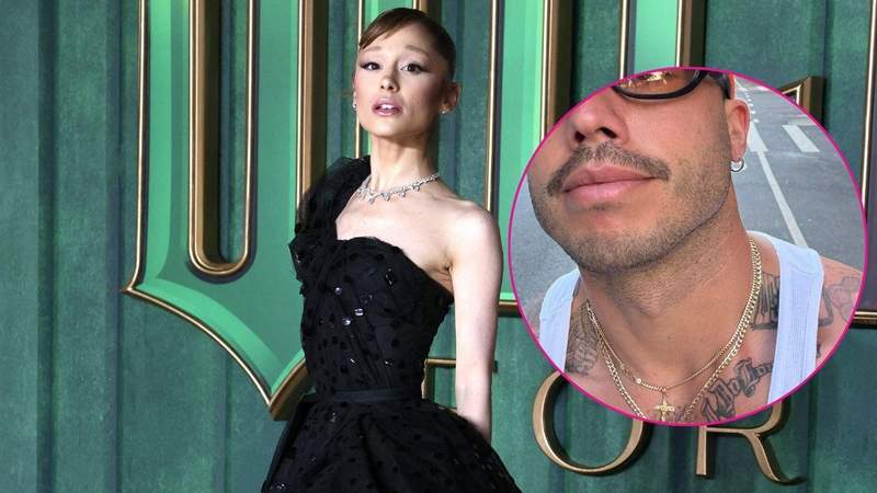
Ricky Alvarez hasn’t shared a public count of his tattoos or explained them all. The clearest is “I do love you” in dark script on his left collarbone. He posted a photo of it in July 2025; Ariana Grande showed the same words in finer script on her left collarbone at the opening of her London residency in August 2026. The lettering differs, and neither has said the tattoos were planned as a matching set. Photos also show ink on Alvarez’s hands, forearms, upper chest and neck, though some details are hard to make out.

The “I do love you” collarbone tattoo

Ricky Alvarez tattoos: The “I do love you” collarbone tattoo

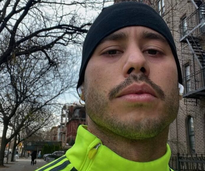
The phrase sits high on Alvarez’s left collarbone. Its dark, hand-drawn letters are heavier than Grande’s finer script. His first photo was a close-up selfie that partly cropped his face; it shows the words and placement, but not enough detail to judge every line.

Alvarez hasn’t said when he chose the phrase or who it refers to. Coverage linked it to Grande after her similar tattoo appeared and the two drew renewed attention, but the wording alone doesn’t explain why he got it.
A second view of Ricky’s hand and arm ink

Ricky Alvarez tattoos: A second view of Ricky's hand and arm ink

The phone hides part of this view, but dark lettering, shaded patches and larger black shapes are visible on Alvarez’s hand and forearm. The photo isn’t sharp enough to identify every small design. The arm ink looks denser than the open script on his collarbone; no public account explains the smaller marks.

The matching tattoo comparison

Ricky Alvarez tattoos: The matching tattoo comparison

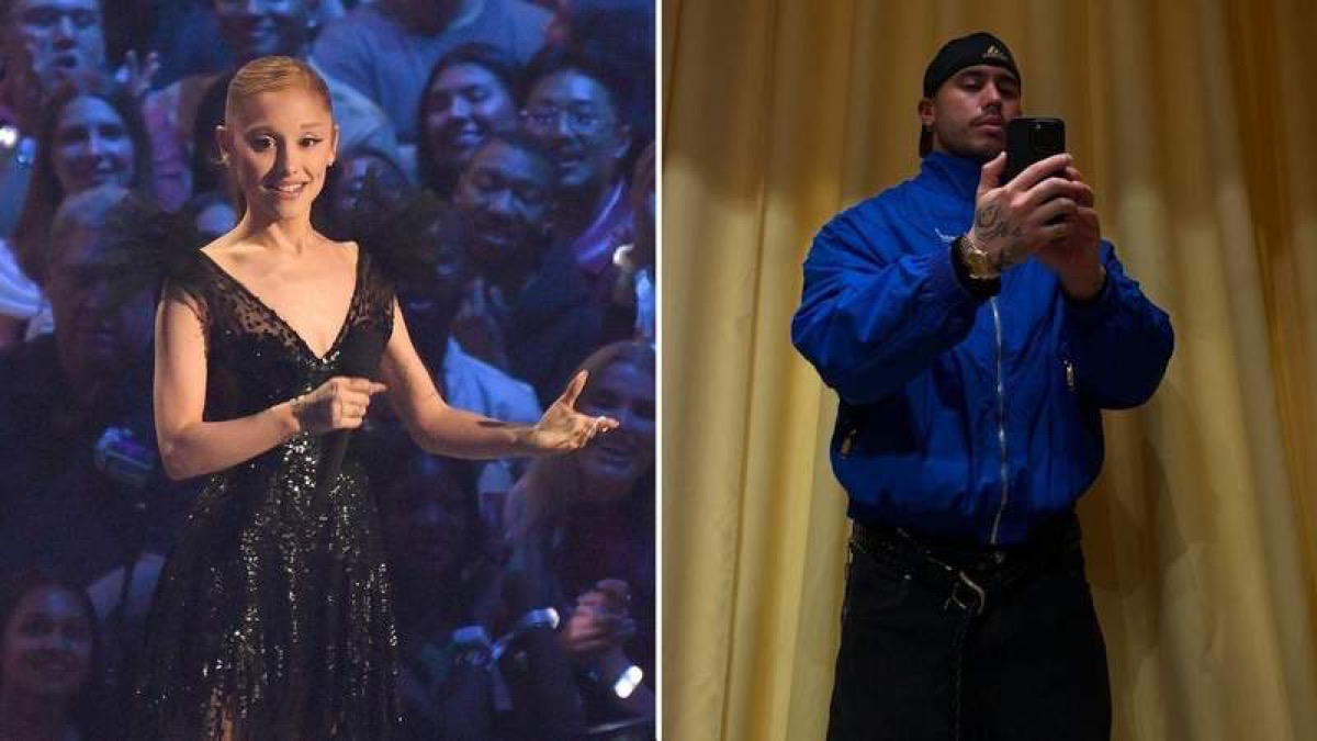
Fans compared the tattoos amid renewed interest in the pair. Grande tagged Alvarez in a series of photos, he was seen around her tour, and she changed the Ricky line in “Thank U, Next” during several performances. Those moments prompted speculation, but neither has said they chose the designs together.

The shared phrase and collarbone placement make the connection easy to see. Alvarez’s lettering is darker and heavier; Grande’s is finer. They’re similar, not identical.

The other tattoos visible in Ricky’s photos

Ricky Alvarez tattoos: The other tattoos visible in Ricky's photos

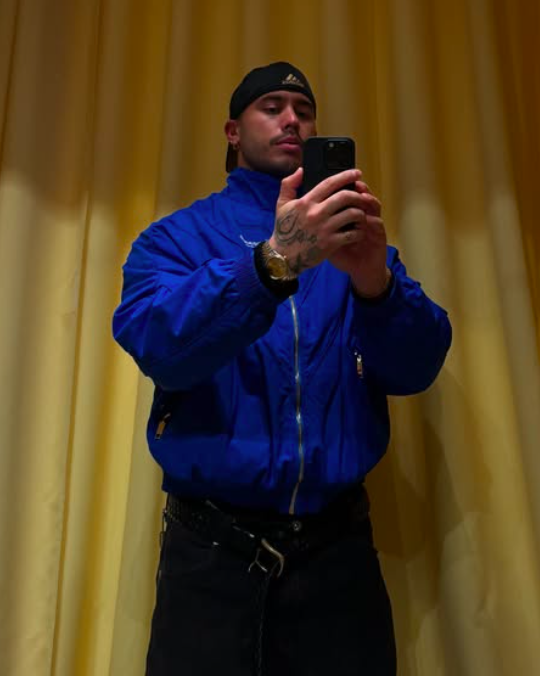
A mirror selfie shows ink across Alvarez’s fingers and hands, plus larger shaded work on his forearm. The phone and camera angle hide some edges. There also appears to be large lettering and a dark shape near his shoulder on the upper chest, but the image isn’t clear enough to read the text.

Ricky Alvarez’s hand tattoo in a casual selfie

Ricky Alvarez tattoos: Ricky Alvarez's hand tattoo in a casual selfie

In this mirror photo, Alvarez wears a blue jacket, black trousers and a black cap, with one tattooed hand raised. The jacket and phone cover most of the rest. Hand ink stays visible in this outfit; the collarbone phrase could sit beneath a crew neck.

Placement lessons for a personal phrase

The script follows the collarbone’s curve, which gives the short phrase a natural line. Its heavier letters read against the darker ink on Alvarez’s chest and arms. With a short inscription, line weight, spacing and where the text starts and ends do most of the work.

Should you copy the phrase?

You can borrow the placement without using Alvarez’s words. A line in someone’s handwriting or a phrase from a note can follow the same curve. Ask your artist to test the stencil with your shoulders relaxed and arms raised; the chest moves, and a line that sits evenly at rest may shift. Leave space between letters and think about where clothing will rub while it heals.

A quick visual summary

The photos clearly document the collarbone phrase and show other ink only in parts. They don’t establish a full tattoo count or explain the meanings of the smaller designs.

The “Thank U, Next” video is included below.

More celebrity tattoo guides

Laura Fella Tattoos: Faun Singer’s Folk Flowers, Birds and Sleeve Ink

Laura Fella has counted 19 tattoos, though she doesn’t explain every piece. The Faun singer has said she is superstitious and believes symbols can carry power and energy. Her collection mixes family references, birds, flowers and ornamental work, with an unfinished sleeve she plans to keep building.

Some details are visible in photos; others come from Laura’s own interviews. Keeping those separate matters: an image can show a design and its placement, but it can’t tell us a private meaning she hasn’t shared.

Laura Fella’s first tattoos: Hungarian folk flowers

Laura Fella tattoos: Laura Fella's first tattoos: Hungarian folk flowers

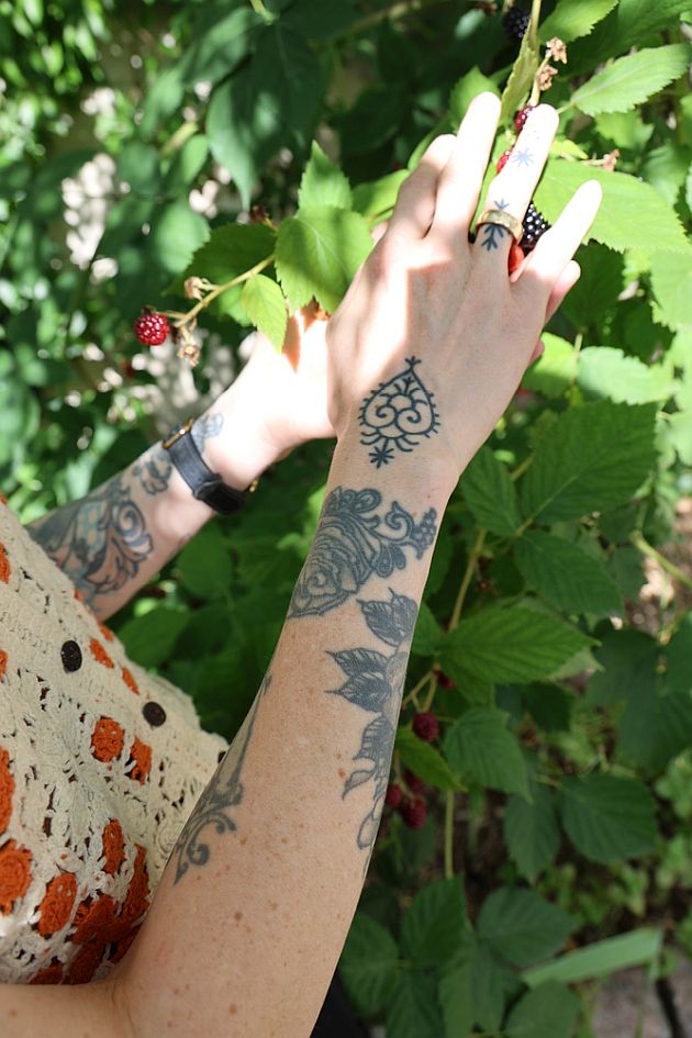
Laura says her first tattoos were two flowers in a traditional Hungarian folk style, drawn by her and placed on the insides of her wrists. She chose one for her mother and one for her father. Summers spent in Hungary with her grandmother are part of the story behind the style.

The close photo here shows one of the motifs from another angle: rounded petals, a narrow stem and small dots around a compact, symmetrical outline. The dark lines are easy to see, while the open space keeps the design light. Laura has described the family connection; the photograph shows the shape, not the story.

The bird on Laura’s left-arm sleeve

Laura Fella tattoos: The bird on Laura Fella's left-arm sleeve

One bird sits high on Laura’s left upper arm. The black-and-grey design has layered feathers and a darker wing; below it, leaves, flowers and ornamental curves bring in muted greens, reds and blue-grey shading.

Laura calls the arm an unfinished sleeve. She has talked about adding magnolias, Gothic symbols and possibly another bird, but hasn’t assigned a public meaning to every existing bird. She plans the work over time and chooses artists whose style feels right, leaving room for the sleeve to grow.

How the sleeve reads from the side

Laura Fella tattoos: How the sleeve reads from the side

This side view shows more of the forearm: framed, architectural-looking linework with scrolls, leaves and darker shapes running along the arm. The narrow borders and shading connect the larger pieces rather than separating them into boxes.

Laura has said she avoids inhuman or sadistic imagery because she believes tattoos carry strong energy. The visible work leans on birds, flowers and ornamental forms. If you’re planning a sleeve, this view is a reminder to think about the spaces between focal designs as well as the main image. Curves and shading can link pieces while leaving enough skin around them.

Laura Fella’s hand and wrist tattoo details

Laura Fella tattoos: Laura Fella's hand and wrist tattoo details

The hand photo shows a small circular motif on the back of her hand, scrolling blackwork and botanical shapes at the wrist, and a tiny mark on one finger.

Separately, Laura has described a tiny sun wheel above her heart as the tattoo that brought the strongest change in her energy and life. That story comes from her interview; this photograph shows the hand and wrist, not the sun wheel.

Hand tattoos move constantly, get washed often and see plenty of sun. An artist may need to leave extra space or use a slightly heavier line so small details remain legible as they heal and age.

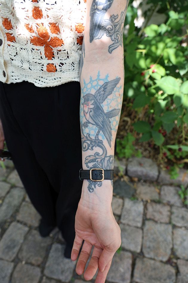
The blue-and-black bird on her forearm

Laura Fella tattoos: The blue-and-black bird on her forearm

A second bird sits on the lower forearm. It angles across a pale blue shape, with blue-and-black coloring framed by curling ornamental lines. The color and longer movement set it apart from the darker bird higher on the arm, while the scrollwork ties the two sections together.

Laura hasn’t said whether the birds stand for particular people or ideas. She has mentioned wanting another bird, but the designs can be appreciated without assigning each one a story. Repeating a subject doesn’t mean repeating the same silhouette or treatment.

Some stories remain private

Laura says an old-school anchor at her groin took four hours, her longest tattoo session. No photo in this feature shows it; the detail comes from her own account. She has also said she keeps some meanings private because she believes tattoos can hold power and energy.

She sometimes books sessions with her best friend, and they hold hands during difficult parts. For a first tattoo, Laura recommends finding an experienced artist, taking time with placement, paying attention to how you feel with the artist and remembering to breathe.

What ties Laura Fella’s collection together

Laura’s 19 tattoos span folk flowers, birds, ornamental blackwork, botanical color and small personal symbols. Family and nature recur, but the pieces don’t all follow one strict style. The sleeve is still in progress, and she has room to add to it without making every line match.

Her first flowers connect to her parents and her time with her grandmother in Hungary. Other stories are hers to share or keep. The photographs show part of the collection, not a complete record of what each mark means.

Ideas to borrow from Laura’s style

Start with a memory or image that belongs to you: a family symbol you drew yourself, a folk pattern tied to someone you know, or a bird or flower you want to keep close. Think about how its shape will sit on the body before settling on the details.

A sleeve can take years to finish. You can begin with one piece, leave room around it and decide later what belongs beside it. And if a tattoo has a private meaning, you can keep it private; no design needs a public explanation to matter to the person wearing it.

More musician tattoo guides

Jasmine Curtis-Smith Tattoos: The Meaning Behind Her Hebrew Back Ink

Jasmine Curtis-Smith’s visible tattoo is a narrow line of Hebrew script high on her back. It can show above a low neckline, then disappear under her hair or clothing. In an interview, she has discussed its personal meaning, though the photographs alone don’t establish a translation.

She hasn’t shared a large collection of visible tattoos to catalogue. The back piece is understated, and most of what can be said about it comes from the images and the context she has chosen to share.

Jasmine Curtis-Smith’s visible back tattoo

Jasmine Curtis-Smith tattoos: Jasmine Curtis-Smith's visible back tattoo

In the clearest public photo, Jasmine is turned away from the camera in a swimsuit. The lettering runs vertically along her upper back, slightly to one side of the spine. It forms a compact black line with open skin around it.

The image shows the placement and that the tattoo is Hebrew script, but not enough detail to confirm every character or provide a translation. Jasmine has spoken about its significance herself; visual guesses shouldn’t stand in for her explanation.

What the tattoo looks like in the PEP interview

Jasmine Curtis-Smith tattoos: What the tattoo looks like in the PEP interview

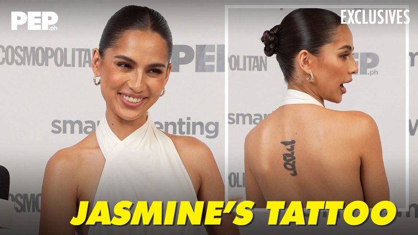
The PEP interview thumbnail pairs a front-facing shot with a view of Jasmine’s back. She wears a white halter-style top, and the black script stands alone without shading, a border or other decoration. The back view also shows how the tattoo sits above a low neckline.

Because the lettering is the whole design, spacing matters. Script that is too fine can soften as it heals, and tightly packed characters may lose definition. The photo offers a general view, not a close enough image to assess every line.

Why this piece feels personal

A small tattoo can matter without taking up much space or needing a public explanation. Jasmine has shared some of the idea behind this one while keeping its full story hers.

If you are considering text in a language you don’t speak, verify the wording with a fluent speaker before booking. A translation app may miss context or grammar; the artist can shape the lettering, but shouldn’t have to guess what it says.

Jasmine away from the close-up

Jasmine Curtis-Smith in a contextual photograph: Jasmine away from the close-up; not tattoo evidence

This GMA image shows Jasmine in a relaxed indoor setting, with flowers and soft daylight. It doesn’t show the tattoo; it gives a sense of how different most public photos are from the back-focused shots.

The upper-back placement lets her decide when the design is visible. It can sit under everyday clothes and appear with a backless top or swimsuit, without becoming the focus of every outfit.

The acting career behind the close-up

Jasmine Curtis-Smith in a contextual photograph: The acting career behind the close-up; not tattoo evidence

Jasmine’s work spans television, film and independent projects. This GMA portrait shows her with an acting award, shifting the focus from the tattoo to her career. It isn’t evidence about the ink, but it is a reminder that the small back piece is one detail in a much wider public life.

A script tattoo doesn’t have one standard meaning. The same style can hold a family phrase, a prayer or a private reminder. Jasmine’s choice of placement also makes it easier to cover when a role or outfit calls for it.

Placement and scale

Vertical lettering can follow the spine or another long line of the body, but each placement moves differently. Ask the artist to check the stencil while you stand naturally; posture and shoulder position can change the line across the back.

Keep enough space between characters for them to remain distinct, especially when the text uses an alphabet you don’t read. Bring a verified reference and check the exact lettering before it is transferred to your skin.

A closer look at Jasmine’s style

Jasmine Curtis-Smith in a contextual photograph: A closer look at Jasmine's style; not tattoo evidence

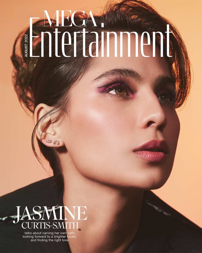
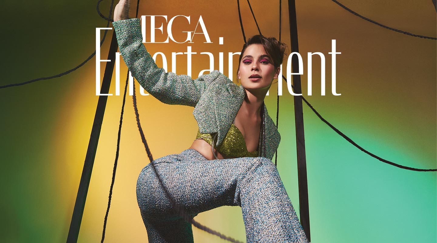
This MEGA editorial portrait shows Jasmine styled for a fashion feature. It doesn’t reveal the tattoo, but it places the quiet, permanent mark beside the changing hair, makeup and clothes of a public career.

The tattoo doesn’t need to match a particular look. Its simple lettering and open space let it stand on its own without extra symbols or shading.

What to borrow from Jasmine Curtis-Smith’s style

The useful idea is to decide what you want a tattoo to do before choosing its place. Should it be visible every day, or appear only with certain clothes? Jasmine’s upper-back placement offers that choice.

Take time over the words as well as the font. If the text is in another language, have it checked by someone who knows it. And keep the meaning private if you want to; a tattoo doesn’t need a public explanation to matter.

More actor tattoo guides

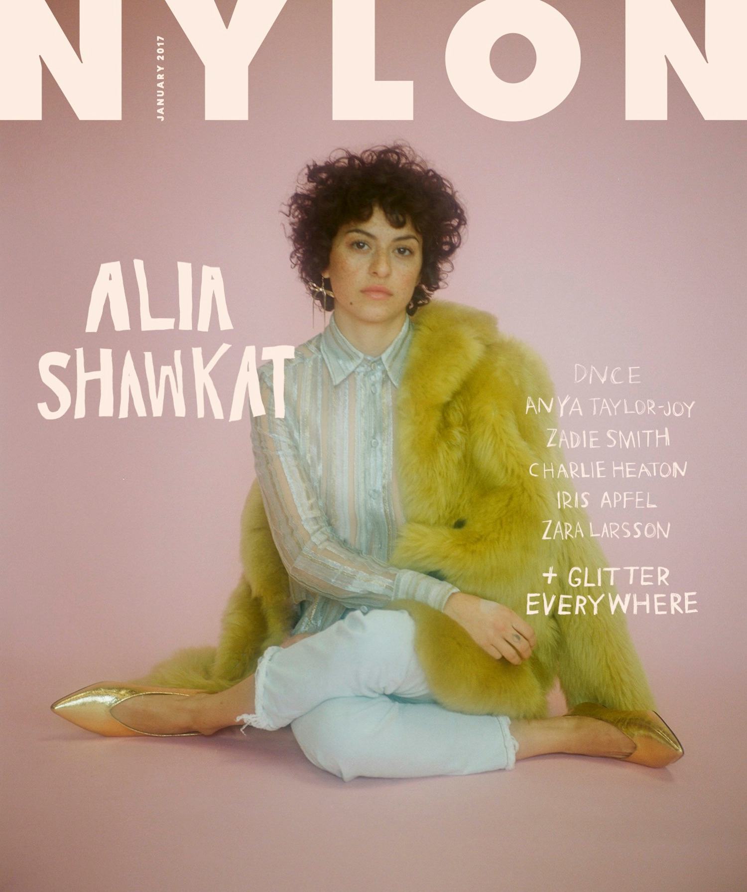
Alia Shawkat Tattoos: The Meaning Behind Her Personal Doodles

Alia Shawkat’s tattoos include loose forearm drawings and a small smiley on her chest. Some are playful; others are connected to people close to her. The pieces don’t follow one theme, and the photos show only part of their story.

The Two Forearm Doodles

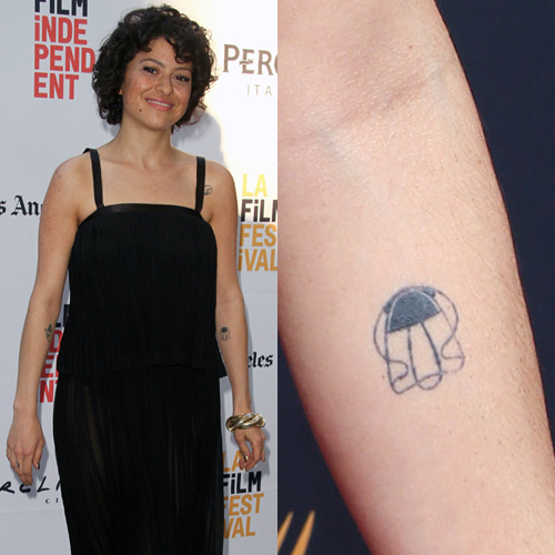
Alia Shawkat tattoos: genuine tattoo photograph showing Shawkat's loose abstract forearm doodle

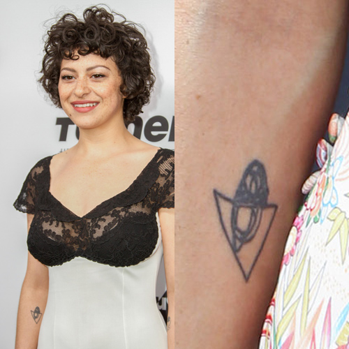
One forearm tattoo is a loose abstract doodle, made from uneven lines and a shape that reads more like a quick sketch than a shaded illustration. Another centers on a triangle with a small, rounded, acorn-like form inside. Both use black linework and leave the surrounding skin open.

The designs don’t try to look perfectly measured, which keeps them close to a hand-drawn source. Steal Her Style also identifies a third forearm doodle as the animated character “Mister Jones.”

If you like this kind of work, start with a drawing you want to keep looking at. An artist can adjust a line so it holds over time without removing the odd shape that made you like it.

Another Alia Shawkat Tattoo: A Triangle Doodle

Alia Shawkat tattoos: genuine tattoo photograph showing Shawkat's triangle and rounded-form forearm doodle

Shawkat has said she draws a tattoo idea herself, places it on her body more than once, and gets it because she likes the way it looks. She has also described keeping a regular studio practice and spending time with friends who make art.

She has written and co-written film projects, too, and speaks about acting as one part of a wider creative life. Different drawings can sit together without becoming a sleeve built around one theme.

Why Her Style Feels More Like a Sketchbook

Alia Shawkat in a contextual photograph: contextual photograph for the sketchbook and creative-life section; not tattoo evidence; not tattoo evidence

The forearm pieces use simple outlines and little shading; the lines do most of the work. In the available photos, they read quickly and keep a loose, hand-drawn look.

Small drawings still need enough room for their lines to remain clear as they heal. If you bring an original sketch to an artist, ask which details may blur and how much space the design needs. You can keep its uneven character while adjusting the size to suit the skin.

A Quiet Memory

Alia Shawkat in a contextual photograph: contextual photograph for the personal-memory section; not tattoo evidence; not tattoo evidence

The letters “AY” on Shawkat’s fingers and “lurker” on her arm are connected to Anton Yelchin. Friends got tattoos based on his initials after his death; “lurker” is tied to the way he remained present in the memories of people who loved him.

The initials and the word sit in different places, but both refer to the same friendship. Finger lettering is easy to see when her hands are uncovered, though the skin there moves and rubs against things throughout the day. Anyone considering finger ink should ask an artist how that placement may affect the lettering over time.

Alia Shawkat Beyond the Camera

Alia Shawkat in a contextual photograph: contextual photograph for the actor and creative-life section; not tattoo evidence; not tattoo evidence

Shawkat is known for playing Maeby in Arrested Development and Dory in Search Party, alongside her work in independent film, writing and painting. The contextual images here show her away from the tattoo close-ups; they aren’t evidence of additional designs.

Her forearm doodles are easier to see in everyday photos, while the chest smiley can stay covered by clothing.

More actor tattoo guides

Emma Stone’s Tattoos: The Story Behind Her Blackbird Ink

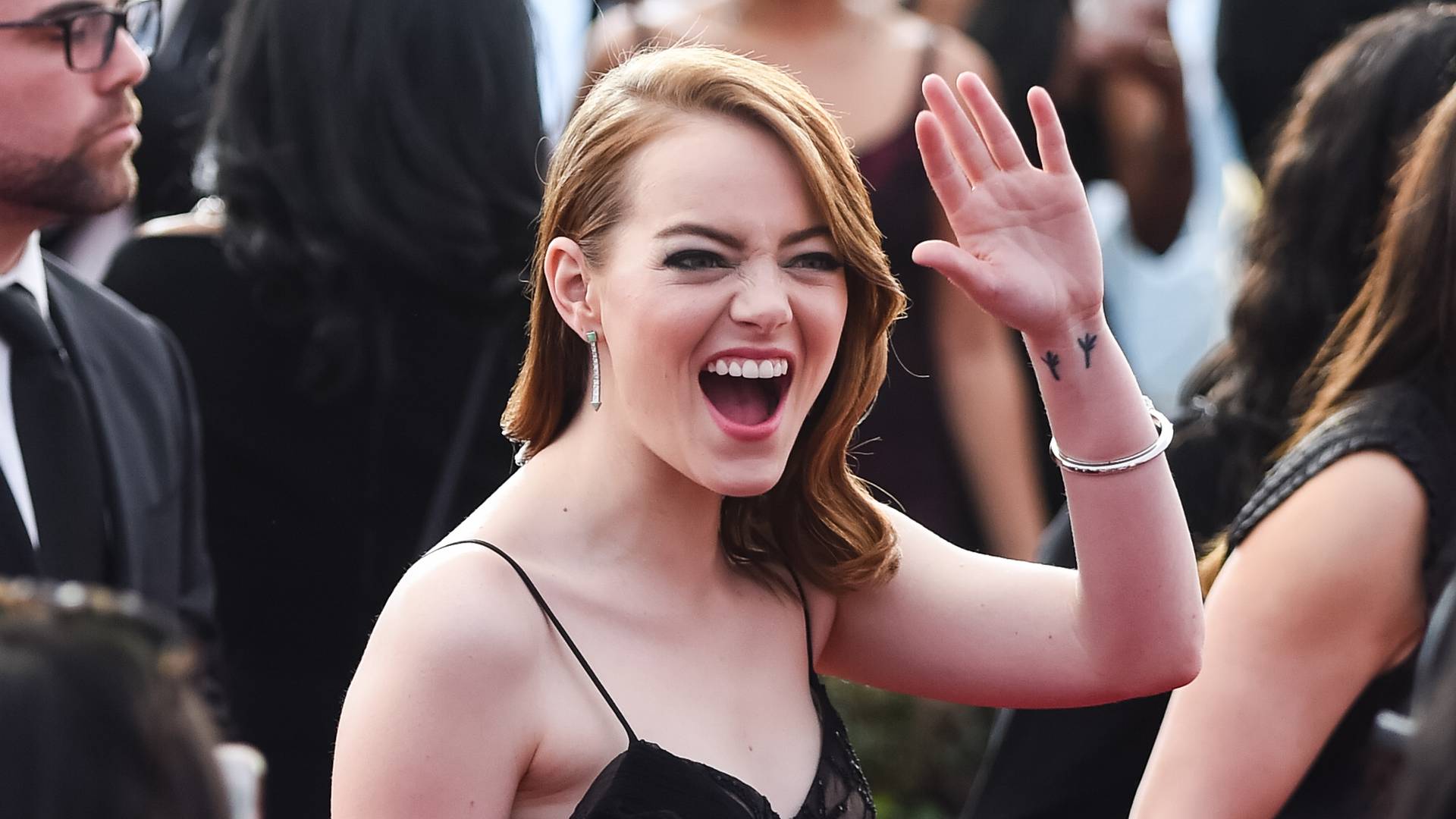
Emma Stone has one widely documented tattoo: two small sets of blackbird feet on her inner left wrist. She got the design with her family after her mother recovered from breast cancer. A song her mother loved helped them choose it.

The blackbird feet wrist tattoo

Emma Stone tattoos: Genuine tattoo evidence for the documented Blackbird family tattoo.

The two sets of feet sit on the inside of her left wrist, just above the hand. Thin black lines make up the design, with no shading or background. In photos, the marks can be easy to miss against her skin.

Stone has said the tattoo spread with time and that she covered it for work. The wrist moves throughout the day, and the lines have softened, but the shape still reads as two sets of bird tracks.

A tiny mark with a real family story

Emma Stone in a contextual photograph: Contextual portrait; not tattoo evidence.; not tattoo evidence

Stone has said her mother, father, brother and she all got matching versions after her mother’s recovery. The family wanted a mark of that moment, but chose an image instead of a name or date.

Without the story, someone might read the tattoo as two tiny sets of bird tracks. For the family, it refers to a hard period and the point when Stone’s mother came through it. The song gave them a shared reference they could keep close without writing out the whole story on their wrists.

What the family chose

Emma Stone in a contextual photograph: Contextual portrait; not tattoo evidence.; not tattoo evidence

Stone wrote to Paul McCartney, who wrote “Blackbird.” He sent a drawing of the bird feet for the family to use. Stone was young when she took his sketch to a tattoo shop.

“Blackbird” was her mother’s favorite song. Its line “Take these broken wings and learn to fly.” connected the design to her recovery. The tattoo is not a picture of a bird in flight; it is a small reference the family recognized.

Keep the proportions quiet

Emma Stone in a contextual photograph: Contextual portrait; not tattoo evidence.; not tattoo evidence

Stone has joked that her version was done badly, while the rest of her family went to better artists. She has been open about the uneven finish; the design still reads as two sets of feet.

With a small tattoo, spacing and line weight matter. Ask the artist how much room the marks need on your skin and how fine lines may change over time. The smallest possible version may not be the one that stays clear.

A personal piece, not a trend piece

Emma Stone in a contextual photograph: Contextual portrait; not tattoo evidence.; not tattoo evidence

Stone hasn’t built a public image around having lots of tattoos, and this small mark can be covered when she wants. The connection to McCartney is part of its history, but it isn’t visible in the design itself; a viewer needs her explanation to know the family story.

If you take inspiration from Stone’s tattoo, start with a song or memory that matters to you and find a simple image of your own. The bird feet are specific to her family, even if someone else could borrow the idea of keeping the design understated.

More actor tattoo guides

Kit Connor’s Tattoo: The Story Behind His Call On Me Ink

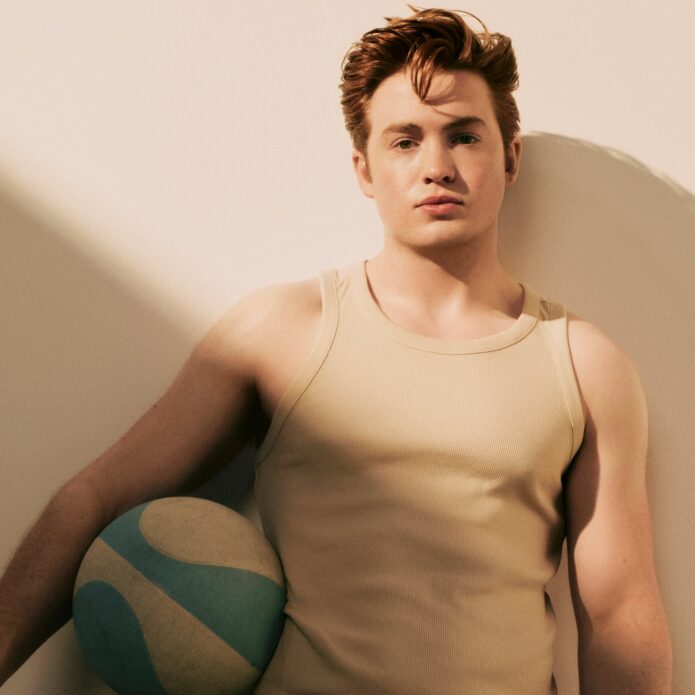
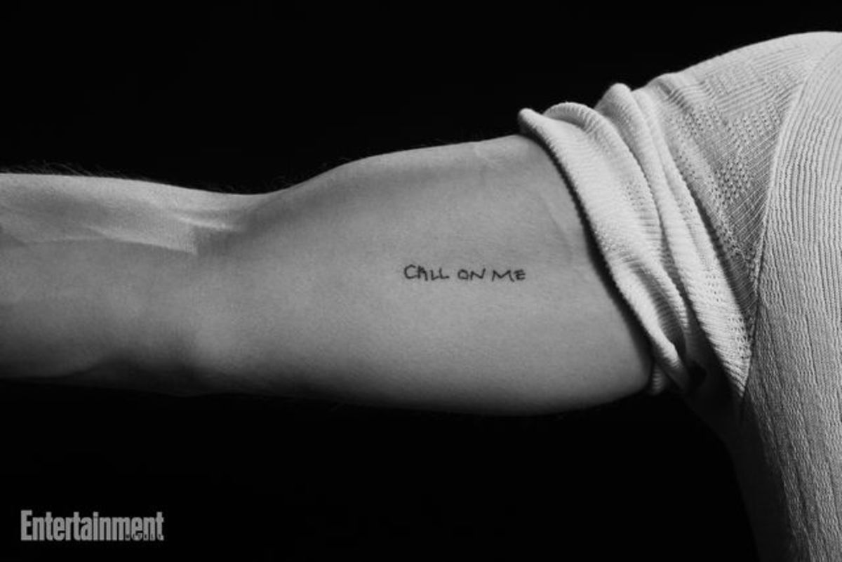
Kit Connor’s best-documented tattoo is the phrase “CALL ON ME” on his bicep. The available reporting ties it to Warfare; no second tattoo is clearly confirmed.

Kit Connor’s Call On Me bicep tattoo

Kit Connor tattoos: Genuine tattoo evidence for the documented Call On Me bicep tattoo.

A close-up shared by Entertainment Weekly shows the words running horizontally across Connor’s upper arm. The narrow uppercase letters look hand-drawn, with small differences between them rather than the even lines of a block font.

Connor confirmed the placement in a British Vogue interview with D’Pharaoh Woon-A-Tai. Connor pointed to his bicep; Woon-A-Tai said his version was on his upper thigh. The cast shared the phrase, but not one placement.

Short lettering still needs enough space to read clearly. “CALL ON ME” is eight letters, and Connor’s version leaves small gaps between them. An artist can advise on line weight and size so a phrase doesn’t close up as it heals.

Life inside the cast’s boot camp

Kit Connor in a contextual photograph: Contextual Warfare film still; not tattoo evidence.; not tattoo evidence

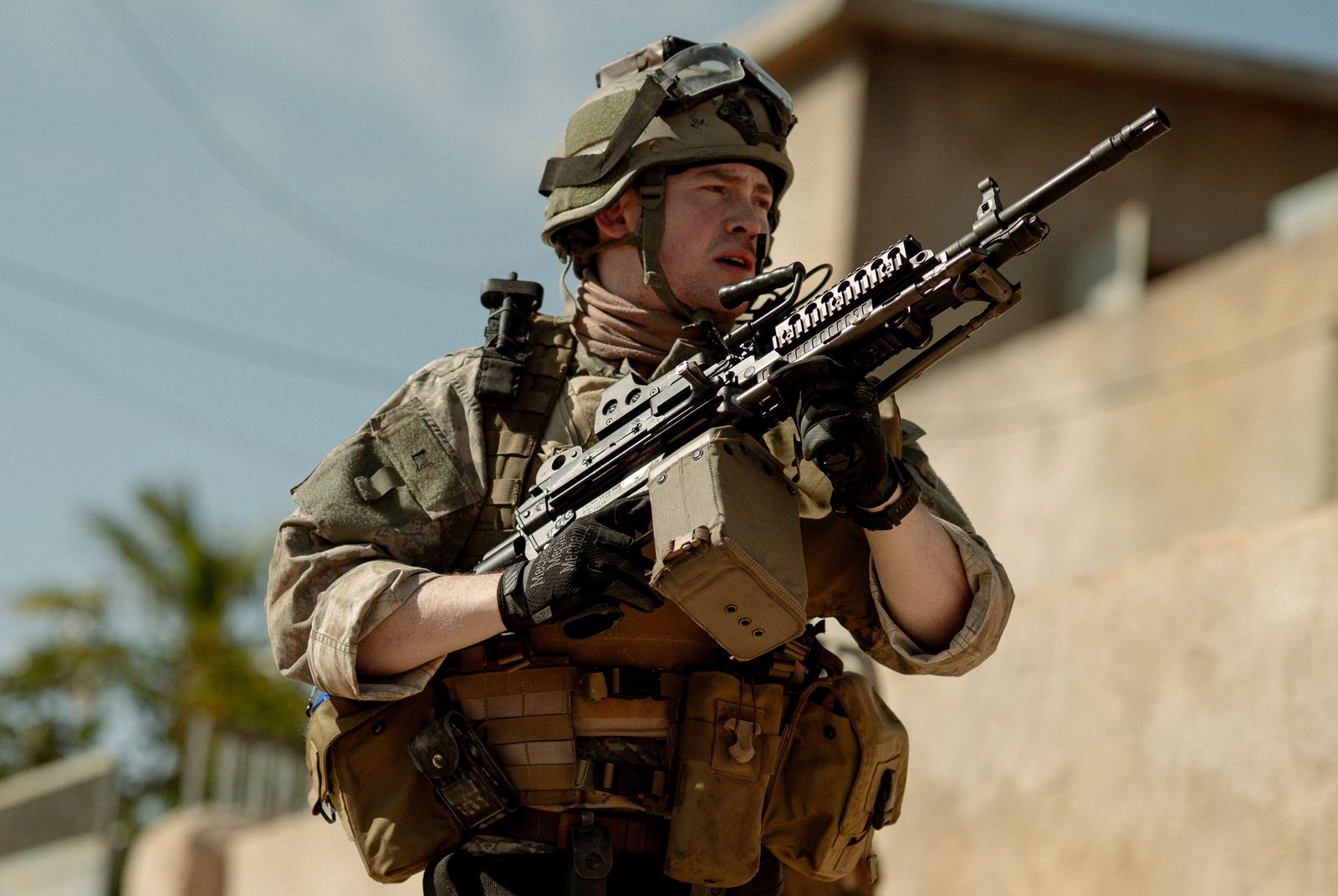
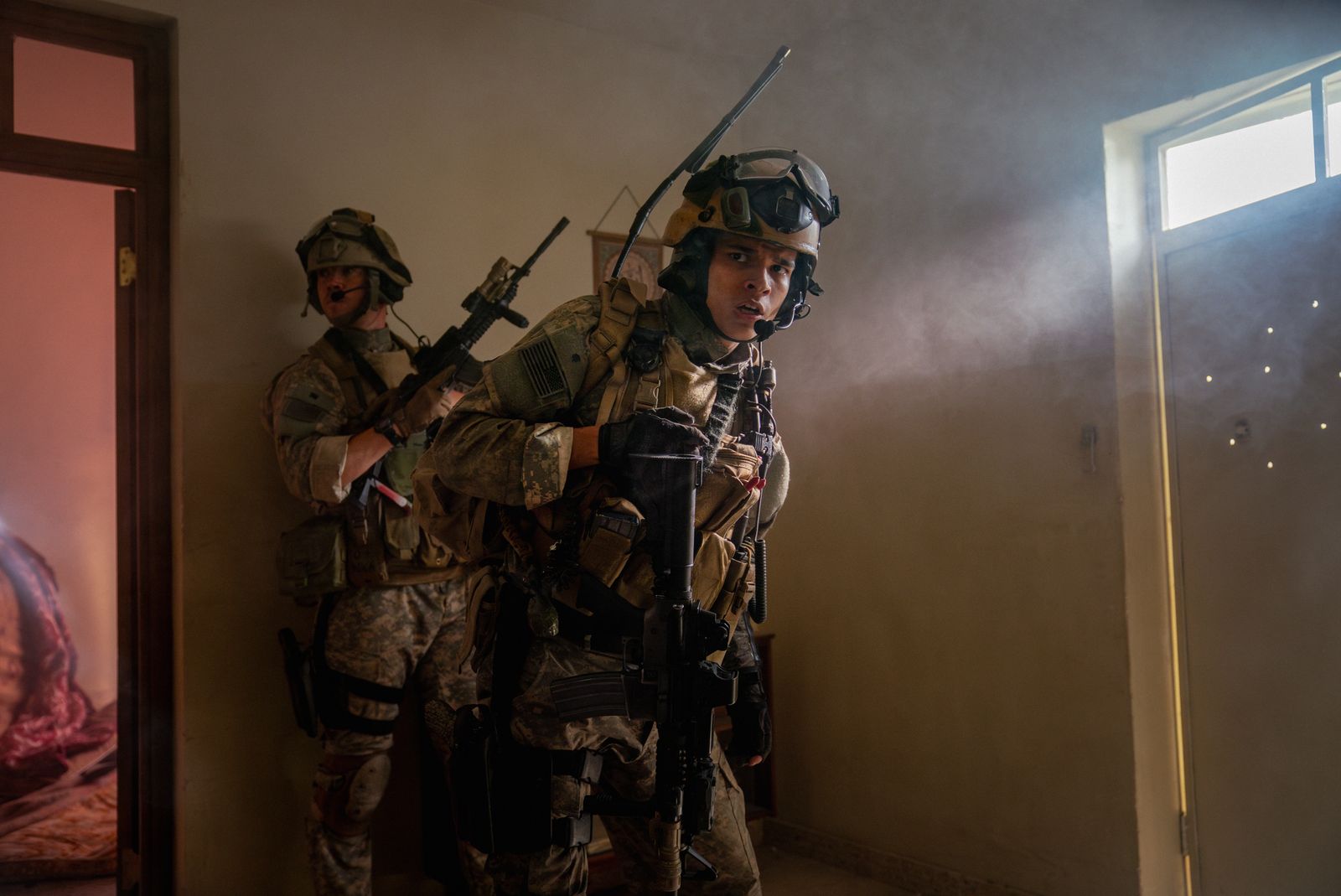
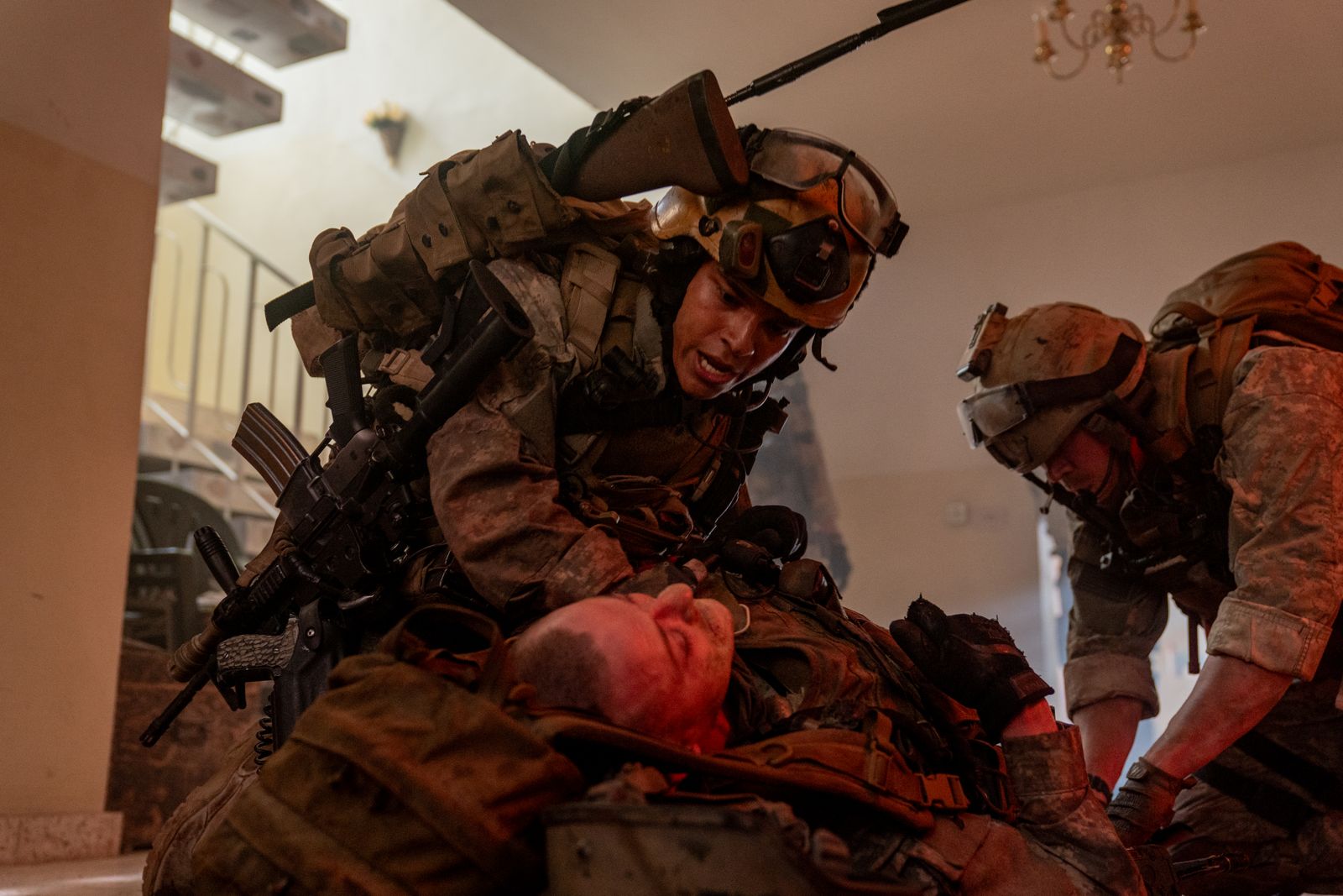
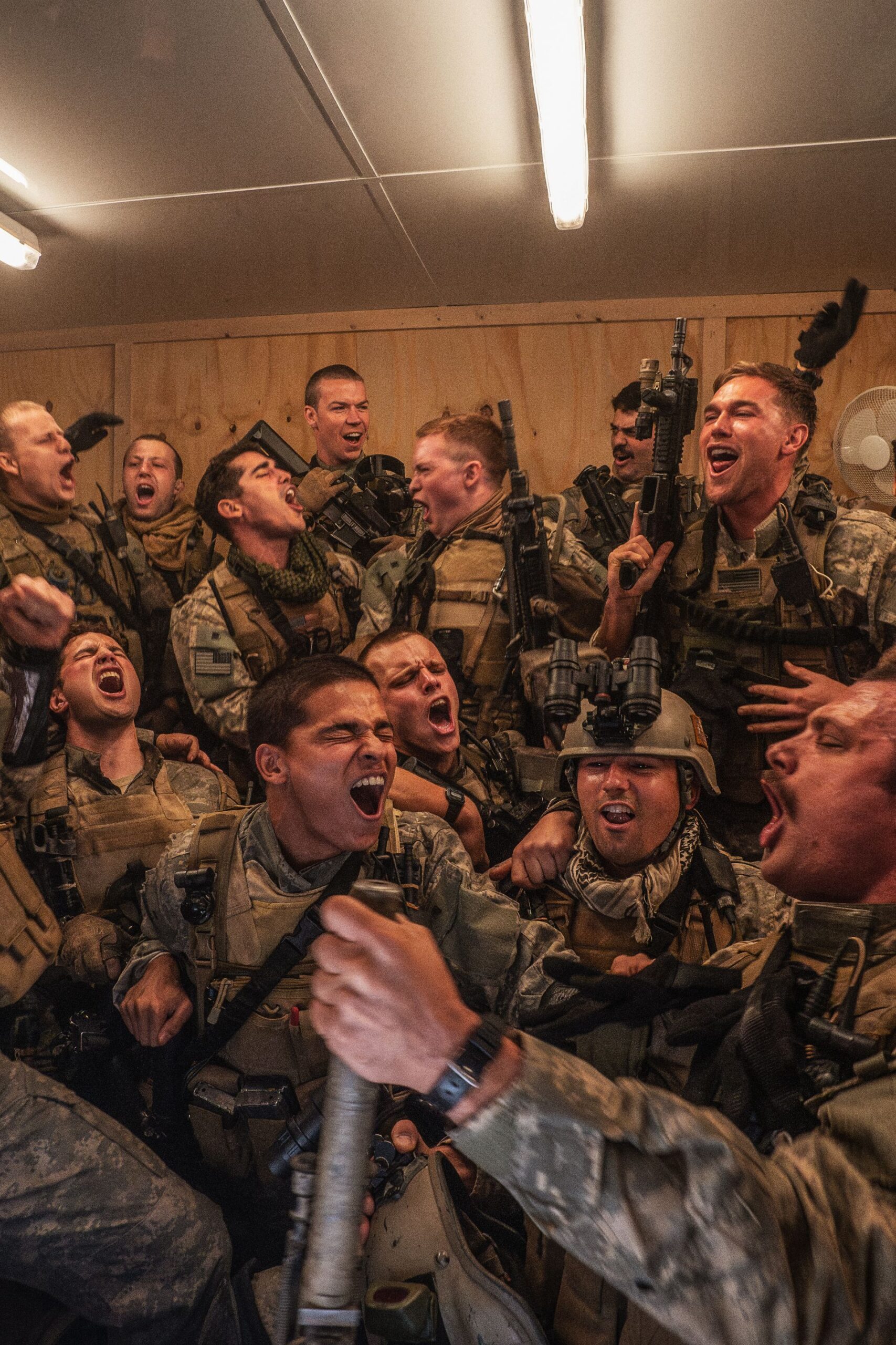
Warfare, directed by Alex Garland and Ray Mendoza, follows Navy SEALs during the Iraq War. Before filming, the cast went through a demanding training period focused on how to move and communicate as a group.

Charles Melton has described how closely the actors bonded during that preparation. He said the group shaved their heads and got matching tattoos. The ink followed months of training and time together; it was a small reminder of the people they had learned to rely on.

Why “Call On Me” became the right phrase

Kit Connor in a contextual photograph: Contextual Warfare film still; not tattoo evidence.; not tattoo evidence

The phrase comes from the opening of Warfare, where the SEALs watch the video for Eric Prydz’s 2004 song “Call on Me.” That gave the cast a reference from the film and words they could use among themselves.

Woon-A-Tai explained that “Call On Me” meant they could reach out to each other after the project. He acknowledged the promise could sound cheesy, but the phrase fit what the group wanted to remember: they would still be there for one another after filming ended.

A small phrase with a big cast connection

Kit Connor in a contextual photograph: Contextual Warfare film still; not tattoo evidence.; not tattoo evidence

Connor’s lettering has no film logo or military imagery around it. The design is just the phrase, so its connection to the movie and the cast comes from the story behind it.

His bicep placement lets him cover the line under a T-shirt or show it when his sleeve moves. The words don’t explain themselves to someone who sees them; the meaning belongs to the people who shared the training.

What to borrow from the idea

Kit Connor in a contextual photograph: Contextual cast image; group shot used only as context and explicitly not tattoo evidence.; not tattoo evidence

If you want a short phrase tattoo, make sure the words still mean something once they are out of their original context. Connor’s works because the cast had trained and worked together, and the phrase carries that memory for them.

For a matching tattoo, agree on the words and what they mean to the group, then let each person choose a size or location that fits. The shared part can stay the same without making everyone wear an identical design.

Thomas Rhett Tattoos: The Lauren Face Tattoo, First Ink and What’s Actually Confirmed

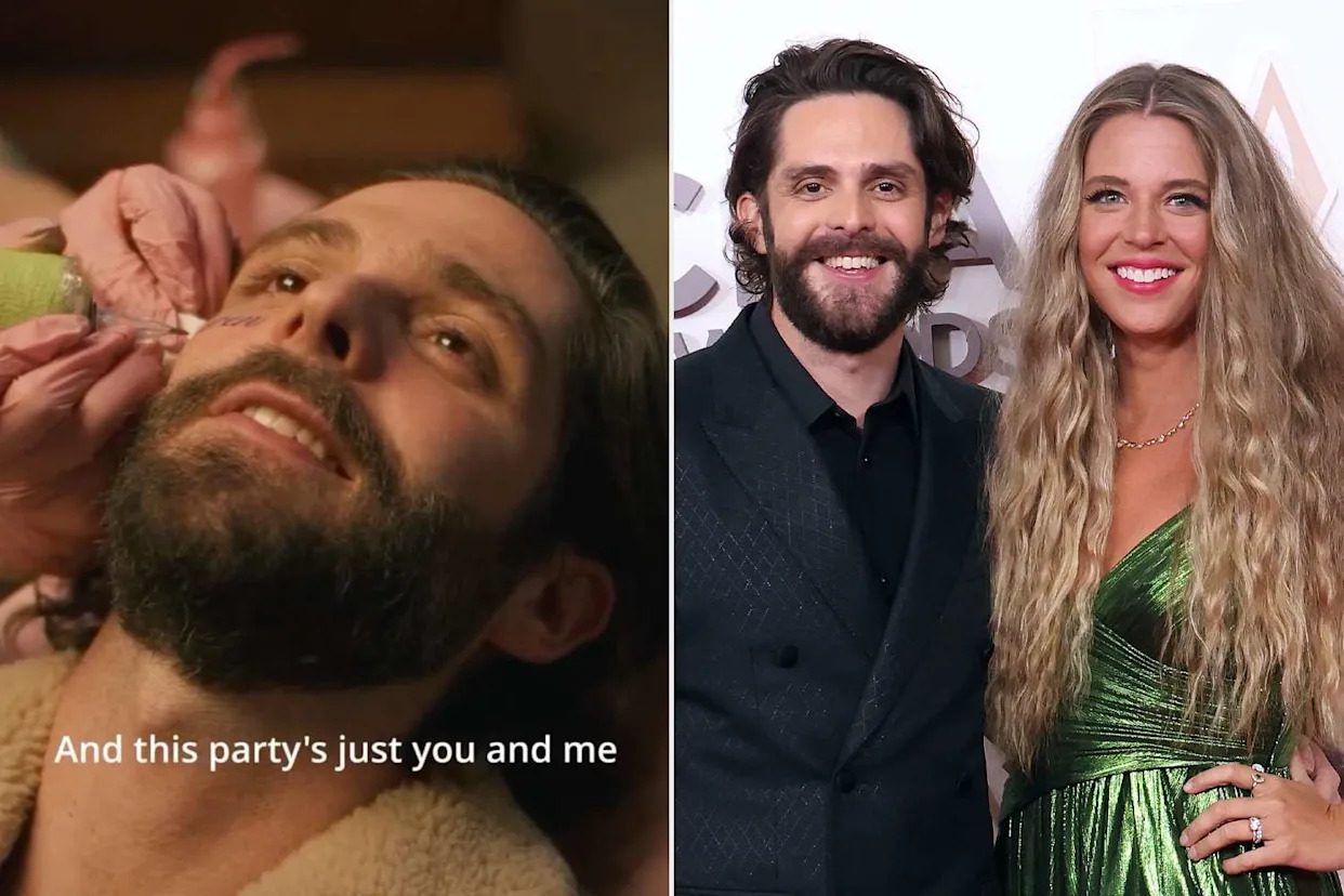
Thomas Rhett’s most visible tattoo story began with a clip of an artist writing “Lauren” across his right cheek. It looked permanent for a moment, but the video was made as a joke. A separate 2015 report confirms he got his first tattoo; it doesn’t identify the design.

Those are two different accounts: one is a temporary face-tattoo stunt, and the other is an early tattoo appointment with no confirmed image. The distinction matters when describing what Rhett has actually had inked.

A familiar look with one sharp surprise

Thomas Rhett in a contextual photograph: contextual photo; not tattoo evidence; not tattoo evidence

Rhett is usually photographed in caps, denim and stage clothes, with the focus on his performance rather than visible body art. The cheek lettering stood out because it changed the way his face read at a glance.

The Lauren face tattoo was a stunt, not a confirmed permanent tattoo

Thomas Rhett tattoos: verified tattoo photograph

In the February 2025 clip, Rhett reclines in a pink chair while an artist writes “Lauren” on his right cheek. He mouths the chorus of All the Bars Are Closed. The caption reads, “They said we needed content,” which makes the setup clear: the video was meant to surprise people and then land as a joke.

Reports described the lettering as temporary or playful, and there is no solid confirmation that Rhett permanently tattooed his wife’s name on his face. It is more accurate to call it a stunt than to list it as lasting ink. The word refers to Lauren Akins, but its visibility does most of the work: a name on the cheek can’t be mistaken for a private detail.

Why a name in plain sight gets such a big reaction

Thomas Rhett in a contextual photograph: contextual photo; not tattoo evidence; not tattoo evidence

Names are common tattoo subjects because they can stand for a partner, child, parent or friend. Rhett’s clip got a bigger response because the name was placed on his face, where a word is visible in nearly every expression and photograph.

The same name on an arm might read as a private tribute. Across the cheek, it takes over the face and is seen before anyone knows the story behind it.

Rhett’s first appointment matters more

Thomas Rhett in a contextual photograph: contextual photo; not tattoo evidence; not tattoo evidence

A 2015 report from WKDQ documents Rhett getting his first tattoo. It quotes an Instagram caption thanking the artist for not hurting him too badly and says Lauren was up next.

The report doesn’t name or show a design clearly enough to identify it now. That’s a real limit, not a gap to fill with a guess. The appointment is still useful context: it records Rhett’s first experience getting tattooed, while the viral cheek lettering was temporary.

Context matters more than a single close-up

Thomas Rhett in a contextual photograph: contextual photo; not tattoo evidence; not tattoo evidence

The performance images here show Rhett onstage in open shirts and caps. They give a sense of his usual look and movement, but they don’t establish additional tattoos. A screenshot can make a mark seem larger or more permanent than it is; lighting, makeup and the angle all matter.

Before treating a mark in a photo as ink, look for more than one view and check whether the source calls it temporary. A music-video still, social clip or red-carpet image can show something different from a healed tattoo.

What to borrow from the temporary stunt

The practical idea is to test a design before making it permanent. A temporary transfer, washable marker or stencil can show how lettering sits when you smile, talk and turn your head. Check it in a mirror and in ordinary photos, not only in the pose that made the design look exciting.

Ask to see the lettering at its actual size. A name can look neat when enlarged on a phone but feel cramped on skin. For a face placement, think about work and daily life as well as how the design looks in a single clip. A temporary version cannot predict healing, but it can reveal a scale or position you don’t want to keep.

The real Thomas Rhett takeaway

The available record supports a temporary “Lauren” cheek-tattoo stunt and a 2015 first-tattoo appointment whose design isn’t described. Those details don’t make a full catalogue, but they do show why the context around a photo matters.

If you’re drawn to the lettering, borrow the idea of testing it first and make the words your own. A face tattoo is a different commitment from a joke that disappears, and the design should still feel right after the clip stops getting attention.

More musician tattoo guides

Manon KATSEYE Tattoos: Femme Fatale, Fine-Line Ink and the Designs She Keeps Adding

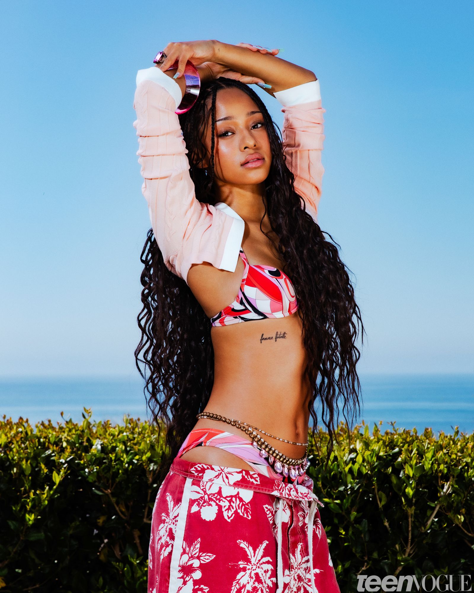
Manon Bannerman’s tattoos are mostly small pieces gathered over time. Teen Vogue counts more than ten, including finger dots, fine-line hand ink, words on her ribs, arm, foot and hip, matching stars with friends, and more pieces on her legs. The collection mixes personal details with designs that are only partly visible in public photos.

Teen Vogue provides the clearest inventory, though some designs are easier to identify than others. Its report names the tattoos that can be read or placed from photos; less clear details are noted cautiously below.

The Femme fatale rib tattoo is the easiest piece to place

Manon KATSEYE tattoos: Femme fatale rib tattoo reference

Manon’s Femme fatale lettering sits along her ribs, just below the edge of her top in the Teen Vogue cover photo. The black script is fine and slightly loose, running in a compact line with space around the letters. It is one of the clearest views of her tattoos.
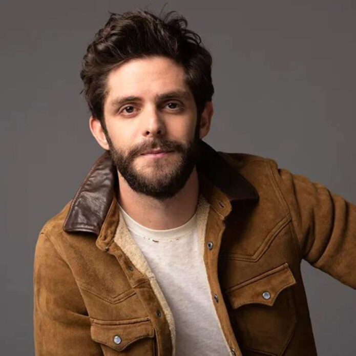
The placement keeps the phrase covered by an ordinary shirt and visible in a crop top or editorial look. The useful reference is its scale and position on the curve of the ribs. An artist can help size the letters for the body in motion, rather than copying what fits in a phone-sized crop.

A second view shows why the lettering stays delicate

Manon KATSEYE tattoos: Femme fatale rib tattoo reference

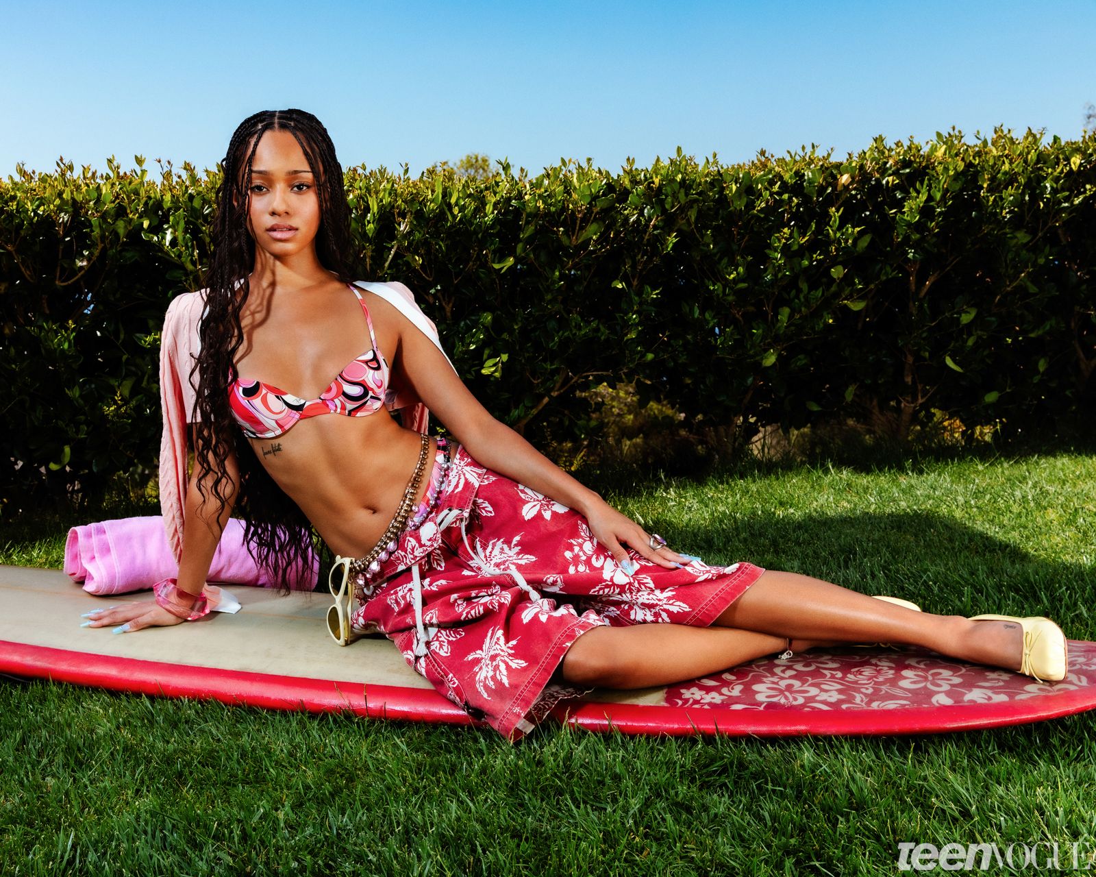
A wider Teen Vogue image shows the same tattoo alongside Manon’s face, braids and outfit. It helps put the phrase in proportion: the lettering is readable, but it remains a narrow detail on her ribs. A close view shows the line work; the wider photo shows how it sits with clothing and the rest of her look.

Those two views answer different questions. If you are collecting references, keep both a close image and a wider one so the lettering and placement are easy to compare.

Small details that repeat

Teen Vogue lists dots on Manon’s three middle fingers. They can disappear in a full-body photo, then stand out in a close-up. Finger tattoos also get more friction and washing than ink on the arm or torso, so tiny marks may soften or fade with time. Their spacing and size are worth discussing with an artist before settling on a stencil.

Fine lines that follow the body

Teen Vogue credits Los Angeles artist Arbel for a fine-line design around Manon’s ring finger and notes that it appeared in a Glossier campaign and in selfies. Later public appearances show more delicate motifs extending down her left hand. Together, the images suggest that the hand work developed over time rather than arriving as one finished piece.

Fine lines can connect a finger, knuckle and hand without filling the whole area. The design still needs enough space to remain legible as it heals; an artist can advise what detail will hold at the intended size.

A joke shared with friends

Manon has the word Ham on her inner bicep. Teen Vogue quotes her saying she got it “just bc I’m hot as a mf.” Three friends each wrote one letter, so their handwriting is part of the design. The inner-bicep placement also lets her cover the word with a sleeve or show it when she raises her arm.

Keeping the letters in their original handwriting ties the joke to the friends who made it with her.

A softer note in the mix

Above her elbow, Manon has cursive lettering that reads Bliss. Fans first noticed it in 2025, and it later appeared at public events. The short word sits apart from the denser hand designs and the rib phrase, with no extra frame or ornament around it.

The space above the elbow gives a small script tattoo room while keeping it easy to cover. The artist still needs to account for how the arm bends.

Reading the details carefully

Teen Vogue says a fine script tattoo on the side of Manon’s left instep is believed to read Sophie. The wording is cautious because the tattoo is small and the available views do not clearly confirm every letter.

The instep is exposed to shoes and daily friction, and the foot flexes as it moves. Anyone considering script in that spot should ask an artist about a legible size and an aftercare plan that works with their usual footwear.

Two later additions with different moods

Teen Vogue also lists Rockstar on Manon’s hip, where the word is mostly covered, and matching stars on her hand with close friends. The stars were reported in December 2025. One is a short word with a bit of swagger; the other is a shared mark in a visible part of her collection.

The stars sit near her finger dots and fine-line hand tattoos. That makes the hand a place where several small designs can be seen together, while the hip lettering stays more private.

Some details remain outside the frame

During an Instagram tattoo tour, Manon reportedly mentioned “a bunch” of leg tattoos. The available photos do not show enough detail to make a reliable list of them. That is as far as the public record goes for those pieces.

What makes Manon’s collection feel connected

Manon KATSEYE in a contextual photograph: Contextual photo; explicitly not tattoo evidence; not tattoo evidence

The collection moves between fine lines, short words, finger dots and matching stars. The designs do not all share one style, but most stay small and leave space around them. The contextual KATSEYE photo here sets the scene; it is not evidence of another tattoo.
For a reference of your own, focus on placement and scale rather than copying Manon’s exact designs. A short phrase can sit along the ribs, while hand tattoos can grow a little at a time. Leave enough room for the skin and the artist’s work.
Manon’s off-stage look is part of the reference

Manon KATSEYE in a contextual photograph: Contextual photo; explicitly not tattoo evidence; not tattoo evidence

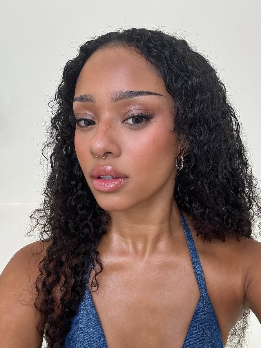
This portrait adds context, not tattoo evidence. Manon’s public styling ranges from curls to braids, editorial makeup and casual selfies. Clothing and hair can change what a photo shows, so one image is rarely a complete view of her ink.

The group setting around these photos

Manon KATSEYE in a contextual photograph: Contextual photo; explicitly not tattoo evidence; not tattoo evidence

The group photo places Manon with KATSEYE but does not show her tattoos clearly. The embedded tour diary offers context for the article; the individual designs above are described from the reporting and photos that identify them.

More musician tattoo guides

Luke Evans Tattoos: The Family Heartbeat Band and the Bird on His Thigh

Luke Evans has a thin line tattoo around his right forearm and a bird design on his thigh. The family band has a documented explanation; a distant beach photograph shows the bird but not enough detail to identify it.

The family heartbeat tattoo

Luke Evans tattoos: Family heartbeat band tattoo evidence

A thin black line circles Evans’s right forearm in the shape of a heartbeat trace. He says the peaks hide the initials D, Y and L for his parents, David and Yvonne, and himself, Luke. It was his first tattoo, made when he was around 39 or 40.

From a distance, it reads as a simple band; up close, the peaks become lettering. The wraparound line needs consistent spacing where it passes over the curve of the arm.

Why the line feels more personal than decorative

The design stays narrow, with no frame or extra imagery around the initials. The lettering is worked into the heartbeat line, so the tattoo does not need names or dates written beside it.

The bird tattoo on his thigh

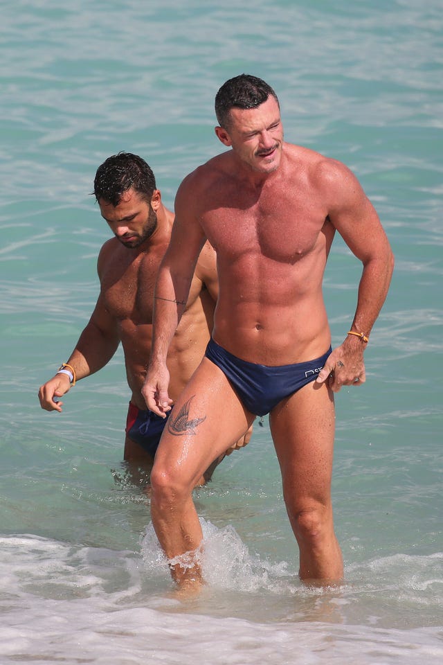
Luke Evans tattoos: Bird thigh tattoo evidence

A beach photograph shows a bird, possibly a swallow, on Evans’s upper thigh. It looks like a dark, traditional-style silhouette with its wings spread. The image is taken from a distance, so the exact species and any smaller details are hard to confirm.

The upper thigh gives the tattoo room for the wings and keeps it covered in most everyday clothes. A bird silhouette needs enough open space around the wings to stay readable at the chosen size.

Two pieces, two different kinds of privacy

The forearm line can show in short sleeves; the thigh bird is more likely to appear in swimwear or shorter shorts. Evans got the heartbeat band first, and the bird was added later.

The person behind the story

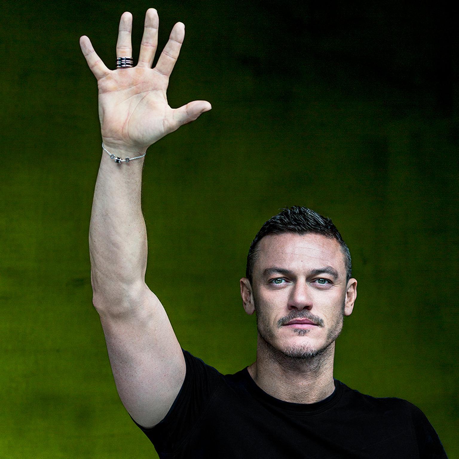
Luke Evans in a contextual photograph: Contextual portrait; explicitly not tattoo evidence; not tattoo evidence

This campaign portrait shows Evans’s face and raised arm, but it does not clearly identify another tattoo.

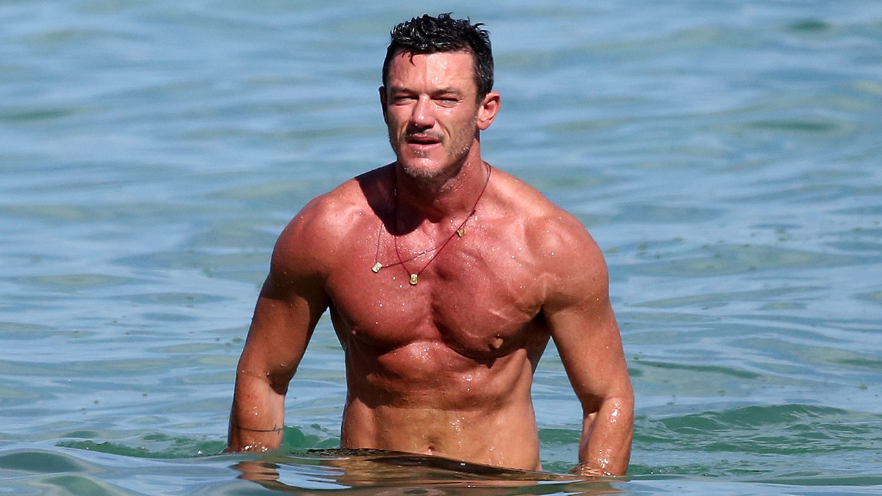
Luke Evans in a contextual photograph: Contextual beach portrait; explicitly not tattoo evidence; not tattoo evidence

The beach portrait shows more skin, but it is not a close view of his tattoos.

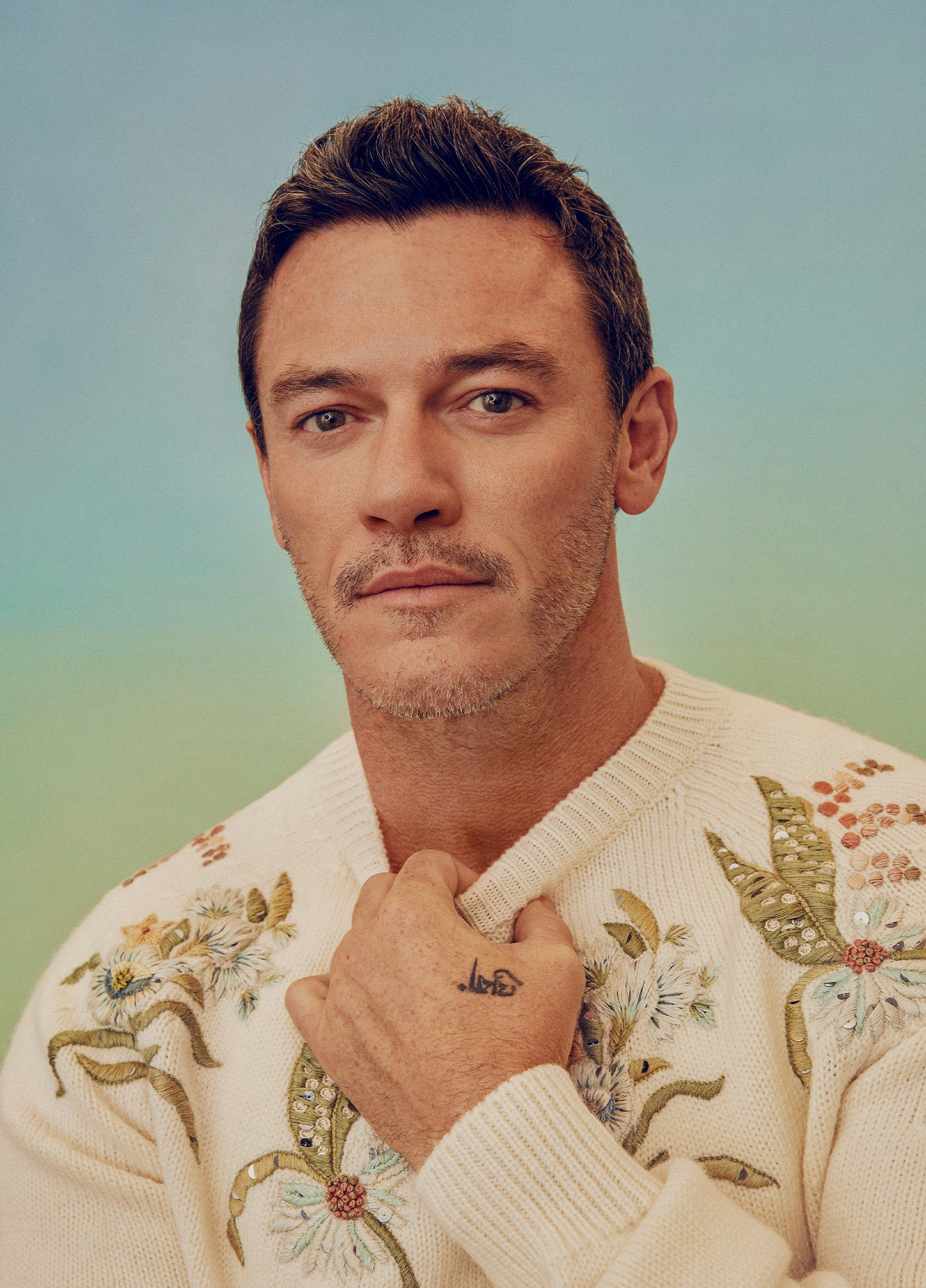
Luke Evans in a contextual photograph: Contextual beach photograph; explicitly not tattoo evidence; not tattoo evidence

In this wider image, the landscape and full-body view take up more space than any tattoo detail. The tattoo-specific photos are better references for the designs themselves.

What his choices suggest

The close-up images show line work; the wider photos show where each tattoo sits and how much of it is usually visible. If you are using them as references, take those details to an artist to redraw for your own arm or thigh rather than tracing the photo.

More actor tattoo guides