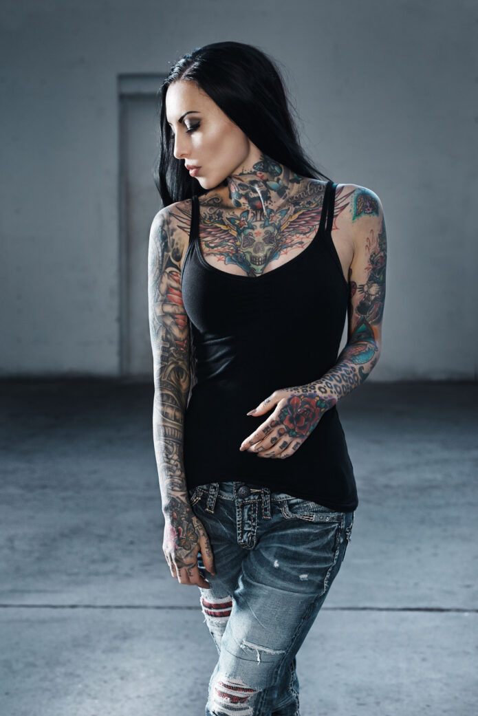
Makani Terror’s tattoos are impossible to read as a collection of small, separate pieces. The German tattoo model has built a heavily covered look over more than two decades, and the photographs make that clear straight away: dense sleeves, a packed chest, tattooed hands, bright colour, black-and-grey shading and a back piece that was redesigned when an older version no longer felt right.
Makani Terror is the professional name of Kathrin Tölle. Tattoo magazines have followed her work for years, while fashion and alternative-culture brands have used her distinctive look in their own shoots. She’s also connected to the tattoo scene beyond modelling, including work around Fallout Tattoo in Germany. iNKPPL’s model profile lists 60 tattoos, and a Hyraw profile describes more than 80 percent tattoo coverage.
That amount of ink can look chaotic if you only see one cropped photograph. Put the images together, though, and a pattern appears. Her tattoos move between bold traditional colour, dense black sections, illustrative faces and animals, lettering, ornamental shapes and smaller hand details. There’s no attempt to make every part match. The shared feeling comes from the coverage and the confidence of the placement.
Makani Terror’s back wolf is the clearest documented redesign
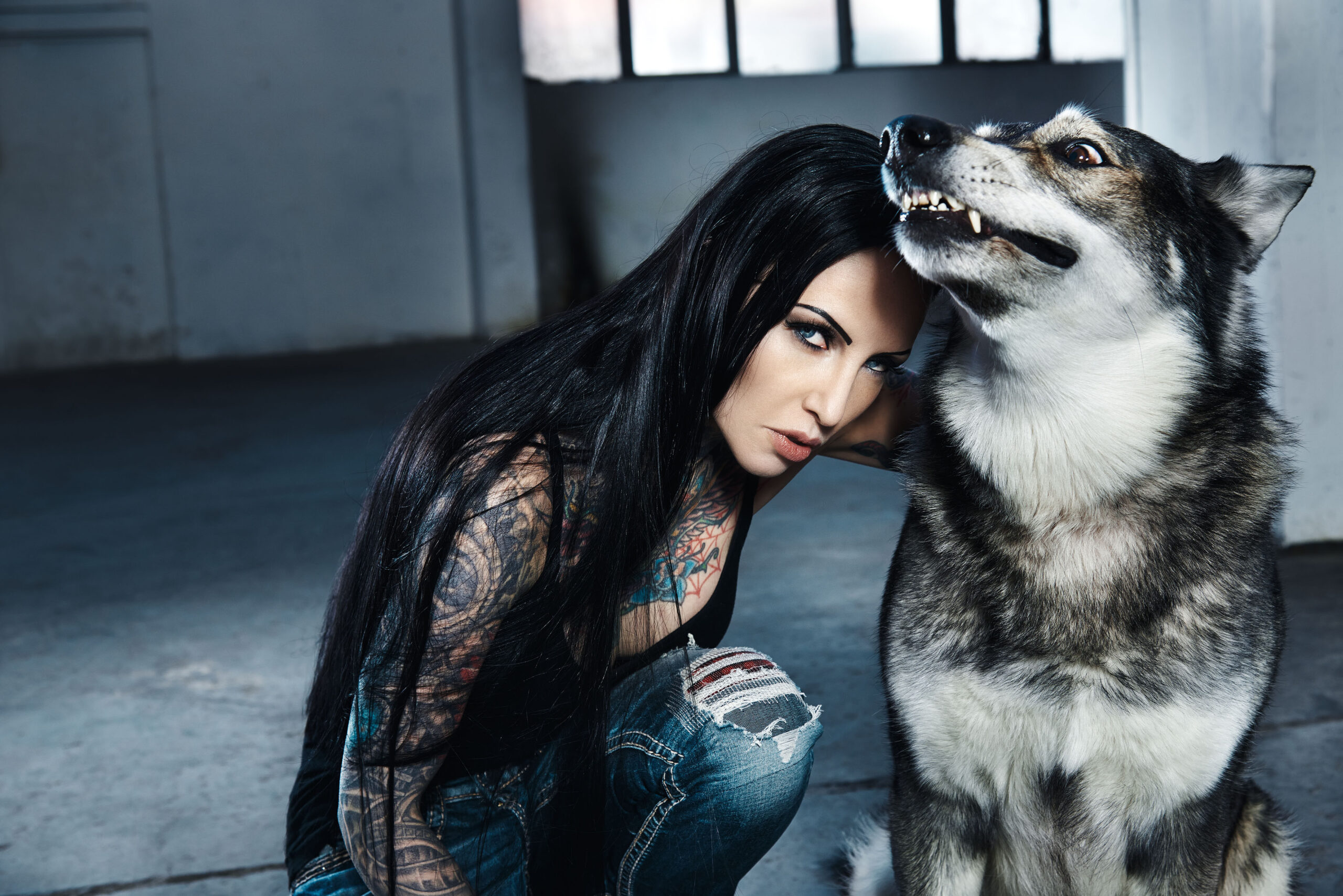
The back wolf is the most clearly documented piece in Makani Terror’s tattoo history. In the Hyraw profile, she explains that she had tattoos she no longer liked and didn’t feel comfortable showing her back. She sent a photograph of the area to tattoo artist Julian Siebert, explained what she wanted, and received a design that became a complete wolf cover-up.
The photograph above isn’t a close-up of the finished back, but it gives a useful look at how the redesign sits inside the wider collection. Her hair and shoulder angle hide most of the back while the neck, chest and upper arms stay visible. That matters because a large back tattoo doesn’t exist on its own. It meets the shoulders, wraps toward the sides and changes the way the sleeves read from behind.
There’s also a practical lesson in the decision to rework an older piece. Cover-ups aren’t always about erasing a mistake. Sometimes the original tattoo simply stops making sense beside the rest of the body. A new design can give an area a stronger centre and make the surrounding pieces feel less disconnected. Makani’s wolf is a good example of using one large image to reset the mood of an entire section.
The wolf itself should be described carefully. The source confirms the motif and the artist’s role, but it doesn’t give a long explanation of every line or shaded passage. It’s enough to say that the back was transformed into a wolf design. There’s no need to invent a private meaning or name the exact style of the animal’s expression from a single photograph.
The chest and neck work set the tone
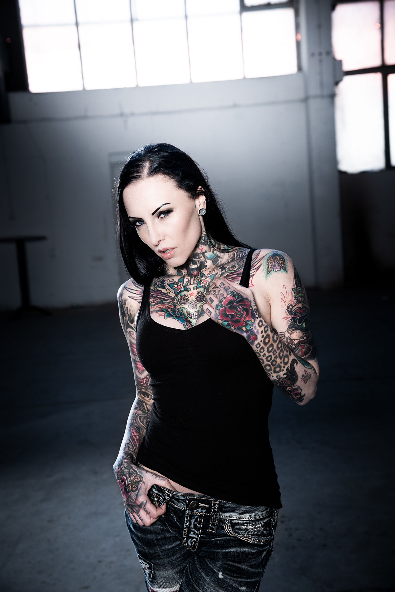
Makani’s chest and neck are where the collection becomes immediately recognisable. The ink rises from both shoulders into the neck, then folds across the upper chest in a dense, colourful arrangement. A skull-like central figure sits beneath the throat, surrounded by wings, flowers, stars and curved ornamental lines. The shapes overlap, but the central placement gives the whole section a steady point to look at.
Colour does a lot of work here. Blue, red, yellow and green accents break up the darker outlines, so the chest doesn’t become one flat block of black. The colour isn’t scattered randomly, either. It appears in small areas across the design, which helps the different pieces sit together without turning the tattoo into a single giant illustration.
The neck is a difficult place to tattoo because it’s always moving and rarely covered completely. Makani’s work uses that space as a bridge between the face and the rest of the body. When she wears a black tank top, the tattoos begin right at the clothing line and continue upward. The result is strong even when the rest of the body is outside the frame.
For anyone planning a chest tattoo, this is a reminder to consider the centre line before collecting individual designs. A symmetrical frame can make separate images feel more organised, while small gaps keep the ink from becoming unreadable. The best part of this chest piece is its structure. It has plenty of detail, but the eye still knows where to land.
Her sleeves mix dense blackwork with colour
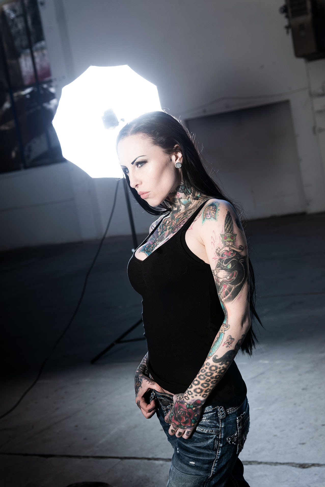
The sleeves carry most of the visual weight in Makani Terror’s portraits. Both arms are covered from the shoulders toward the wrists, and each one has its own rhythm. There are heavy black-and-grey passages, flowers, animals, ornamental borders, lettering and bright patches that stand out when the arm turns toward the light.
The left and right sleeves don’t look like copies of each other. One arm can feel darker and more packed, while the other lets a little more skin show between the motifs. That unevenness keeps the collection from looking like a matching set bought all at once. It feels built over many appointments, with new decisions made beside older ones.
A sleeve also has to work while the arm is moving. A design can look perfect with the elbow straight and then bunch up when the arm bends. Makani’s photographs catch the tattoos at several angles, so you can see how the lines travel over the upper arm, elbow and forearm. The pieces are still readable even when the pose changes, which is harder to pull off than a flat reference image suggests.
There’s a lot to borrow from the balance here without copying a specific flower or animal. Pick one or two darker anchor areas, leave some breathing room around the smaller work and repeat a colour only when it helps the sleeve feel connected. Good sleeve planning is less about filling every gap and more about deciding where the eye should slow down.
Makani’s hands and fingers make the close-up details count
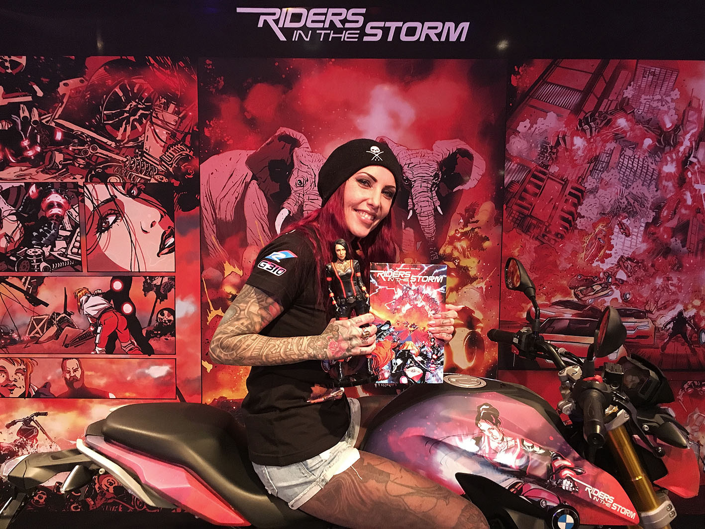
Makani’s hands add another layer to the look. The backs of her hands carry larger colour and linework, while the fingers have smaller marks that become visible when she grips a handlebar or raises a hand toward the camera. Those details may be less dramatic than the chest, but they change the way the whole collection feels in everyday photographs.
Hand tattoos are always exposed to movement, washing, sun and friction. They can fade differently from the work on an upper arm or back, and small lines have less room to spread before they start touching. Makani’s hand pieces work because they aren’t treated like isolated stickers. They sit beside the wrist and forearm work, so the smaller marks have a heavier frame around them.
The motorcycle photograph also shows how a pose can change the reading of a tattoo. Her fingers curl around the bike, her forearms angle forward and the sleeves catch the light in separate sections. A studio close-up would show more detail, but a real-life pose explains how the ink behaves when the body is doing something.
If you’re considering finger or hand ink, the practical decision comes before the design. Think about work, sun exposure and how much fading you can accept. The small marks can be the sharpest part of a tattooed look, but they’re also among the hardest to hide or maintain.
The full-body tattoo effect comes from mixing old and new work
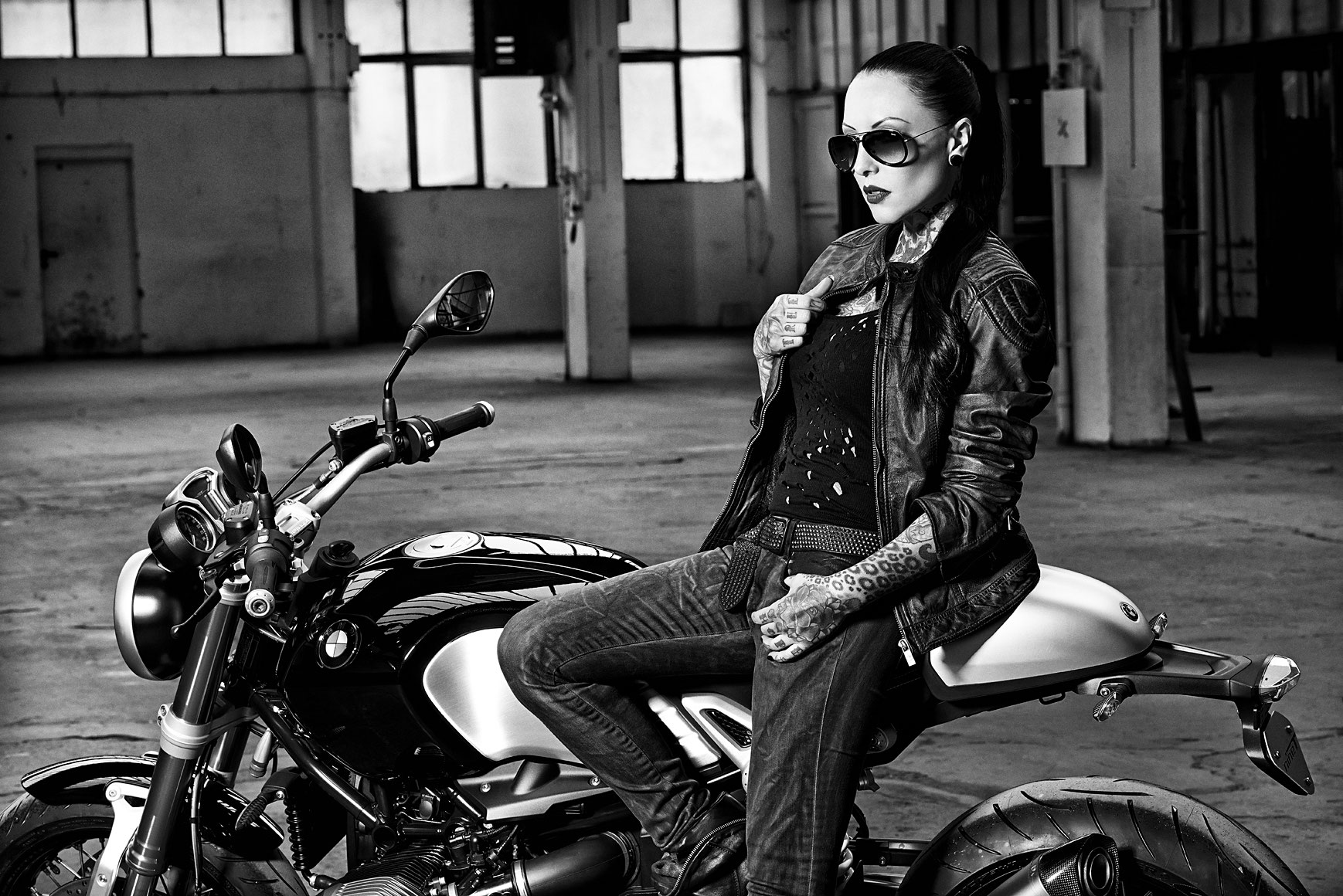
This wider image shows why Makani Terror’s tattoos read as a full-body style instead of a collection of sleeve ideas. Her arms are the most obvious focus, but the ink continues over the hands, neck, chest and legs. The pieces vary in colour and subject, yet the amount of coverage gives them a common visual weight.
Her early tattoo was the phrase “PUNX 4ever” on her right ankle, according to iNKPPL. That tattoo is no longer visible because later work replaced it. The detail is small, but it says something useful about her approach: the body is allowed to change. Older choices aren’t treated as permanent limits on what can come next.
That attitude is part of why the collection feels personal even when the photographs are fashion-led. Some tattoos are there for a private reason, some are body decoration and some have been changed because her taste moved on. The sources don’t assign a meaning to every visible image, and the photographs don’t need to do that job. They show a person who has kept adding, covering and adjusting for years.
How to borrow the look without copying it
Start with the areas you genuinely want tattooed, then think about how they’ll connect later. Makani’s work is a good reminder that a chest piece affects the neck and shoulders, a sleeve changes the balance of a back tattoo, and hand ink becomes part of every portrait. Leave room for the collection to grow.
It also helps to separate inspiration from imitation. You might like the mix of heavy blackwork and bright colour, or the way a large centre design holds several smaller pieces together. Those are useful ideas to bring to an artist. A direct copy of a tattoo that belongs to someone else is a different thing, and it usually loses the reason the original felt right in the first place.
Makani Terror’s ink stands out because it has been allowed to develop in public without pretending it was planned perfectly from day one. The back wolf came from changing an older design. The sleeves grew beyond the first pieces. The hands made the commitment more visible. That kind of slow, sometimes messy growth is what makes a heavily tattooed body feel lived in.