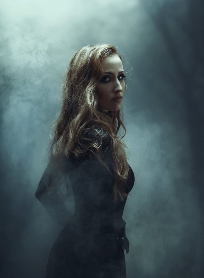
Laura Fella’s tattoos feel like a collection of small rituals rather than a fashion checklist. The Faun singer has counted 19 pieces, and the designs she talks about are tied to family, memories, symbols and the people who helped shape her. Some of the ink is easy to spot in a photograph. Some of it stays deliberately private.
That mix is part of what makes her collection interesting. She drew her first flowers herself, chose a Hungarian folk style because of her grandmother, and still talks about future work in terms of filling gaps in a sleeve rather than chasing a trend. Her tattoos have a clear visual personality, but the meaning comes first. The designs are personal before they are decorative.
Laura has also been careful about what she explains publicly. She says she is a little superstitious and believes symbols can hold power and energy, so not every design gets a full backstory. The useful line is simple: we can describe what appears in the photographs, and we can repeat what Laura has actually shared without turning guesses into facts.
Laura Fella’s first tattoos: Hungarian folk flowers
Laura says her first tattoos were two flowers in a traditional Hungarian folk style. She drew the designs herself and placed them on the insides of her wrists. That origin matters because these weren’t random flash designs picked from a wall. They started as her own sketches and carried a direct family connection: one flower for her mother and one for her father.
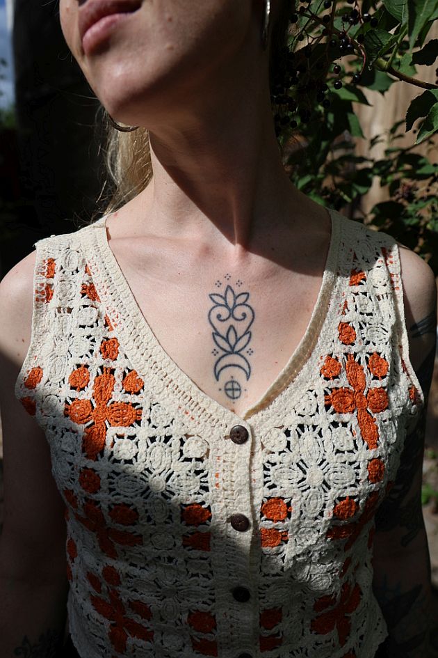
The close photograph in this feature shows one of the floral motifs in a different view, centered high on the torso. It has a compact, symmetrical shape with rounded petals, a narrow stem and tiny dot details around the outline. The black linework is strong enough to read clearly, but the design still feels light because there is plenty of open skin between the elements.
Laura connects those first tattoos to summers spent in Hungary with her grandmother. That gives the folk styling a personal place in her history instead of making it an aesthetic borrowed for atmosphere. Hungarian folk art has plenty of recognizable floral language, but the important part here is the connection she makes between the designs, her parents and her family memories.
Small floral tattoos like this can look simple on a screen and become surprisingly complicated once they are on the body. The spacing has to stay balanced, especially when the design is placed on a wrist that bends and moves all day. Laura’s flowers work because the shape is clean. There is a central line to follow, the dotwork has room to breathe and the outline does not rely on tiny decorative clutter.
The bird on Laura’s left-arm sleeve
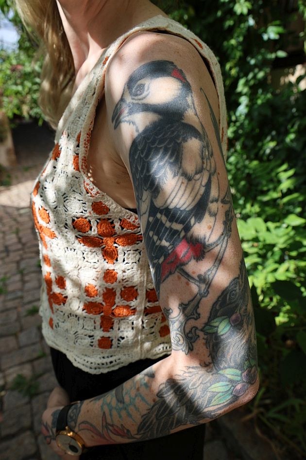
Laura describes her left arm as an unfinished sleeve that she would like to complete with more magnolias, Gothic symbols and possibly another bird. One of the existing birds is easy to see in this vertical photograph. It sits high on the upper arm in black and grey, with a rounded body, layered feathers and a darker wing that gives the piece real weight.
Below it, the sleeve shifts into a more colorful mix of leaves, flowers and ornamental curves. The transition isn’t a hard line. The black-and-grey bird anchors the upper section while the lower work moves through softer greens, muted reds and blue-grey shading. It gives the sleeve a lived-in feeling rather than the look of one perfectly matched set done in a single sitting.
Laura has not assigned a public meaning to every bird in the collection. That is worth keeping clear. The image proves the bird is there and shows how it sits within the sleeve, but it doesn’t prove a private story that she hasn’t shared. What she has said is that she wants more magnolias, more Gothic symbols and another bird as she continues filling the arm.
That plan says a lot about how she approaches tattooing. She isn’t trying to finish the arm as quickly as possible. She talks about planning appointments long-term and choosing artists whose work feels right. An evolving sleeve gives her room to add pieces when they make sense, while the gaps keep the earlier work from being buried under a wall of ink.
How the sleeve reads from the side
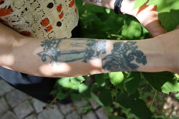
A second photo gives a wider look at the sleeve’s forearm section. From this angle, the black linework looks more ornamental. There is a framed, architectural-looking detail running across the arm, surrounded by scrolls, leaves and darker decorative shapes. The composition follows the length of the forearm instead of sitting in one isolated square.
This is the part of a sleeve that can be missed when every photograph focuses on the biggest image. Large designs get attention, but the smaller connections are what make an arm feel continuous. Laura’s forearm has narrow lines, curved borders and pockets of darker shading that pull the upper-arm bird toward the wrist.
The style also reflects her comments about symbolism. She says she avoids anything inhuman or sadistic because she believes tattoos can carry strong energy. The work shown in these photos is decorative and natural: birds, flowers, leaves and old-world ornamental shapes. Even when the symbols aren’t explained, the visual language feels consistent with the folk and nature-focused side of her personality.
For anyone planning a sleeve, this is a useful reminder to design for the whole arm. A strong focal tattoo can look disconnected if the filler is added as an afterthought. Curved leaves, small symbols and background shading can create a path between separate pieces. The best plan isn’t always a single giant image. Sometimes it is a group of tattoos that share line weight, movement and enough empty skin to stay readable.
Laura Fella’s hand and wrist tattoo details
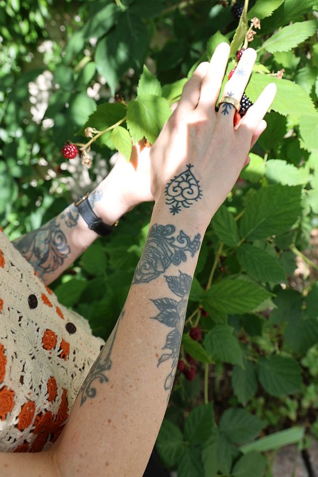
The hand-and-wrist photograph is one of the clearest views of Laura’s smaller ornamental work. A compact circular motif sits on the back of the hand, with a dark outline and small points around it. Below that, the wrist carries more scrolling blackwork and botanical shapes. A tiny mark on one finger adds another bit of detail without taking over the photo.
Laura has separately described a tiny sun wheel placed directly above her heart as the tattoo that produced the strongest shift in her energy and life. The photograph here should not be treated as proof of that chest placement. It is a close record of the hand and wrist work, while the sun-wheel story comes from Laura’s own interview answer. Keeping those two pieces of evidence separate is the honest way to read the collection.
Even without a complete explanation for every shape, the hand work shows how Laura mixes small symbols with larger flowing pieces. The wrist curves give the decoration somewhere to travel, and the darker outlines keep the details from disappearing next to the leaves and flowers farther up the arm.
Hand tattoos need a practical conversation with an artist before the design is finalized. Skin in that area moves constantly, gets washed often and sees plenty of sun. A design that looks perfect at stencil size may need a little more space or a slightly heavier line to age well. Laura’s pieces have enough separation that the motifs can still be read as individual marks instead of one blurred block.
The blue-and-black bird on her forearm
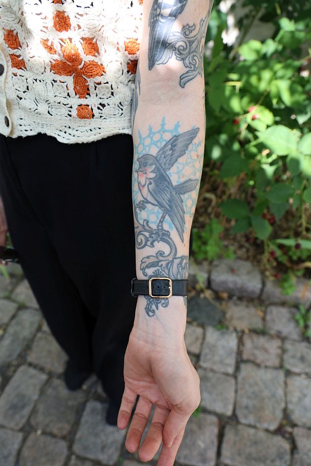
Another close view shows a different bird on the lower forearm. This one has a blue-and-black treatment, with the bird angled across a pale blue background shape and surrounded by curling ornamental lines. The color makes it stand apart from the heavier black-and-grey bird higher on the arm, but the scrollwork helps the two sections feel related.
There is a nice contrast between the bird’s soft blue fill and the darker border around it. The wings are easy to pick out, while the surrounding lines create a frame without boxing the tattoo in. The result is decorative, but it still has enough empty skin around the main shape to avoid looking muddy.
Laura has mentioned wanting another bird on the sleeve, though she hasn’t publicly explained whether each bird marks a particular person or idea. That restraint is useful. It leaves room to appreciate the design itself without forcing a symbolic reading onto it. A bird can carry a lot of meanings, but only the wearer knows which one applies.
Placed beside the black-and-grey upper-arm bird, this piece also shows how a sleeve can grow without repeating itself. One tattoo uses darker shading and a more compact silhouette. The other leans into color, open space and a longer horizontal movement. Repeating a subject doesn’t have to mean copying a design.
Some stories remain private
One of Laura’s more specific stories is about an old-school anchor at her groin. She says it was her longest tattoo session, lasting four hours. There isn’t a public photograph in this feature that shows the anchor, so it shouldn’t be represented by one of the arm images. The detail comes from her own answer, and the placement is private by design.
That fits the way Laura talks about tattooing overall. She says she will not share too much about certain pieces because she believes tattoos can carry power and energy. Her collection is public enough to study visually, but it isn’t an open inventory where every symbol has to be decoded. Some tattoos can simply belong to the person wearing them.
She also says she sometimes plans appointments with her best friend and that they hold hands during difficult sessions. Her advice for people getting their first tattoo is practical: choose an experienced artist, take time with placement, pay attention to the feeling between you and the artist, and breathe. It is less glamorous than a dramatic tattoo reveal, but it is probably more useful.
What ties Laura Fella’s collection together
Laura’s ink collection doesn’t depend on one strict style. There are folk flowers, birds, ornamental blackwork, colorful botanical details, Gothic symbols and small personal marks. The common thread is that she plans carefully and lets designs build up over time. The tattoos are connected by how she lives with them, not by making every line look identical.
Family is part of the foundation. Her first flowers honor her parents, and her memories of her Hungarian grandmother shaped the style. Nature appears in the birds, leaves, magnolias and the way she describes her relationship with symbols. The sleeve is still being finished, which means the collection can change without losing its earlier pieces.
The biggest lesson is that meaningful tattoos don’t need to be explained on demand. Laura can talk about the designs she wants people to know, keep other stories to herself and still have a collection that feels coherent. That is a healthier way to think about celebrity tattoos too. Public photographs show us a slice of the work, not the entire private history behind it.
Ideas to borrow from Laura’s style
If you like Laura’s look, start with the planning rather than copying a bird or flower. Think about a family symbol you drew yourself, a folk pattern connected to a relative, or a small natural image that feels personal. Let the shape fit the placement. Her flowers are compact, her birds have room to move and the sleeve follows the arm instead of fighting it.
It is also fine to leave a design open-ended. A sleeve can grow slowly. You can add a bird now and decide later whether the next piece should be a magnolia, a Gothic symbol or something completely different. A good artist can help the work connect without making every tattoo look like it came from the same flash sheet.
And if a tattoo has a private meaning, you don’t owe anyone the full explanation. Decide what you want to share, choose an artist you trust, check the stencil from a natural standing position and give the skin enough space to age well. Laura’s collection is a good example of what happens when the design, the memory and the body are allowed to develop together.