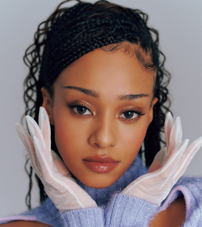
Manon Bannerman is one of KATSEYE’s most tattooed members, and her collection has the same easy, playful feel as her public style. Teen Vogue counts more than ten pieces, with ink spread across her fingers, hand, inner arm, ribs, foot, hip and legs. Most of the designs are small, fine and personal without looking like they were planned as one giant tattoo project.
That makes Manon’s tattoos fun to look at. There isn’t one dramatic back piece doing all the talking. Instead, there are little marks that appear in campaign photos, selfies, award-show outfits and tattoo-tour clips. Some are easy to read. Others are glimpses that need a careful look and a little restraint. The goal here is to stick with what has been reported or clearly shown, and leave fan theories where they belong.
The clearest public breakdown comes from Teen Vogue. It describes dots on three middle fingers, a fine-line ring-finger design by Los Angeles artist Arbel, the word Ham on Manon’s inner bicep, Femme fatale on her ribs, a script tattoo on the left instep believed to say Sophie, cursive Bliss above her elbow, Rockstar on her hip and matching stars on her hand with close friends. The same report says she has a bunch of leg tattoos that haven’t all been shown clearly.
The Femme fatale rib tattoo is the easiest piece to place
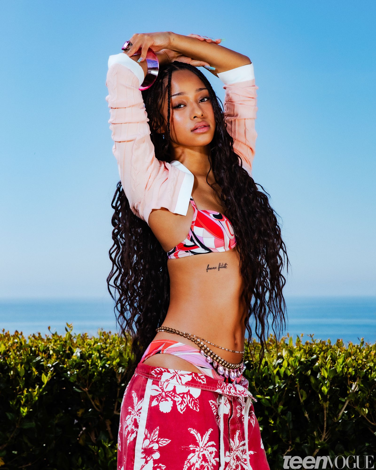
Manon’s Femme fatale tattoo sits along the rib area, just below the edge of her top. The lettering is black, fine and slightly loose rather than heavy or blocky. In the Teen Vogue cover photograph, you can see the full phrase without needing to zoom in too far, which makes it one of the most useful reference points in her collection.
The placement does a lot of the work. A rib tattoo can disappear completely under a normal shirt, then show up when the outfit leaves a strip of skin open. That gives a short phrase two different lives: private most of the time, visible when Manon chooses a crop top, swimwear or a styled editorial look. The design doesn’t need extra flowers, frames or ornamental lines to make the placement interesting.
Fine script in this area also follows the shape of the body well. The phrase runs in a compact line, and the lettering feels light enough to sit with the curve of the ribs instead of fighting it. If you’re using a reference like this for your own tattoo, the important part isn’t copying the exact words. It’s noticing how much breathing room the letters have and how the phrase is positioned relative to the waist.
Short lettering can look simple while still needing careful planning. The artist has to think about the size of each letter, the direction of the line and how the skin moves when the person bends or twists. A stencil that looks perfect while standing may sit differently when the body relaxes. Ribs are also a placement where comfort matters, so the appointment should be planned around the actual scale rather than a tiny phone screenshot.
A second view shows why the lettering stays delicate
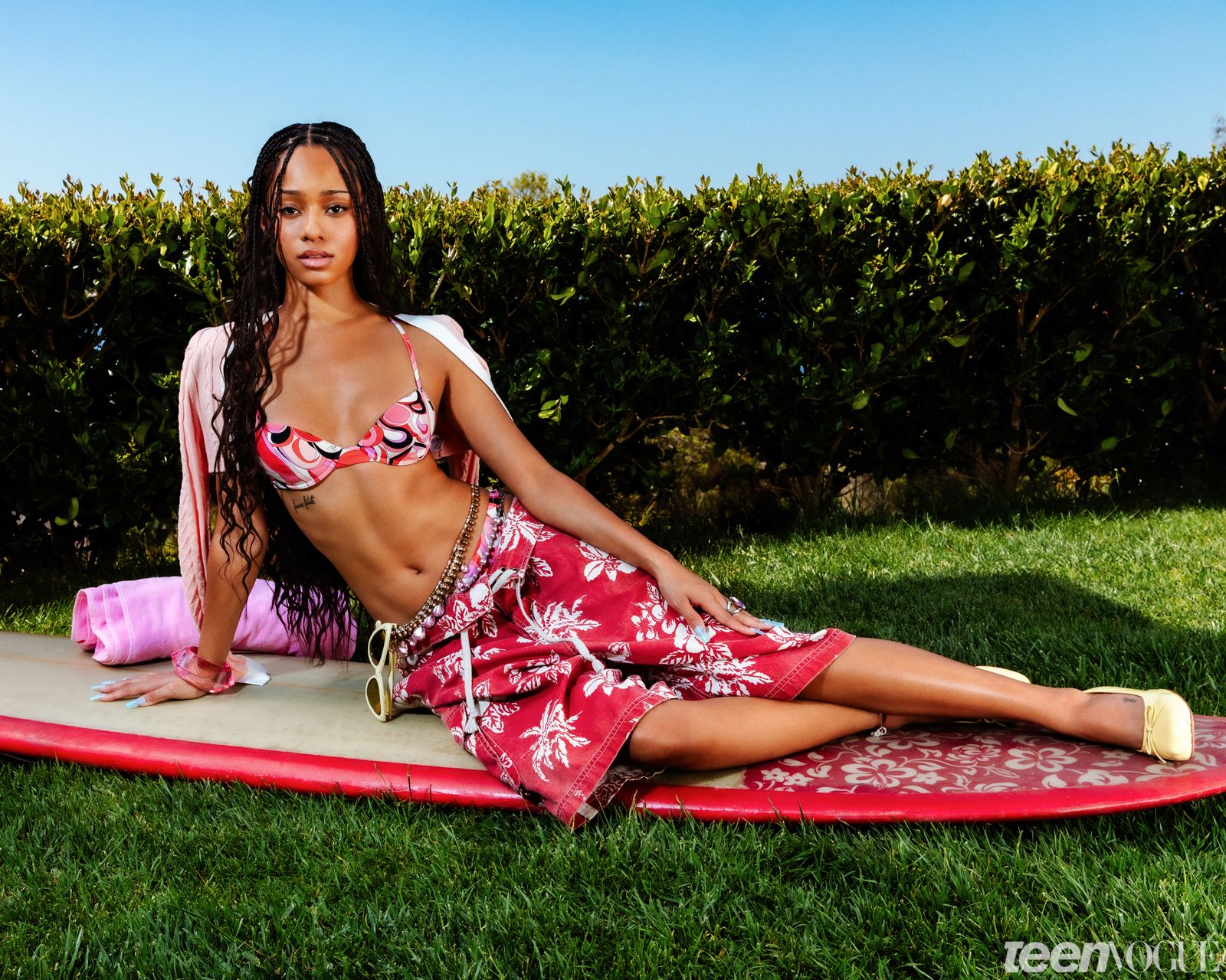
This wider Teen Vogue image shows the same rib tattoo from a different angle. Manon’s face, braids and full outfit are visible, while the phrase stays readable under the line of her top. That second view is useful because it shows the tattoo in proportion. In a close crop, Femme fatale can look like a bold statement piece. On her body, it is a narrow detail that works with the whole look.
The difference between the two photos is a good lesson for anyone collecting tattoo references. Save more than one view when you can. A tight image helps with lettering and line weight. A wider image helps with placement, scale and the way the design sits next to clothing. Both views are real information, but they answer different questions.
Manon’s rib phrase also shows how a text tattoo can have attitude without becoming loud. The words are direct, but the treatment is restrained. There is no oversized gothic type or thick outline. The confidence comes from the phrase and the placement. That balance is easy to lose if a design is made too large or decorated until the original idea gets buried.
Small details that repeat
Teen Vogue lists dots on Manon’s three middle fingers. They are the kind of tattoos that can vanish in a full-body photo and then become the first thing you notice in a hand close-up. Small finger marks work almost like punctuation. They don’t take over the hand, but they give the fingers a repeated detail that makes the rest of the styling feel more deliberate.
There is a practical side to this kind of ink. Finger skin sees constant washing, friction and movement, so tiny dots can soften or fade faster than tattoos on the arm or torso. That doesn’t make the placement a bad idea. It just means the wearer should understand that the fresh version and the healed version may not look identical. A good artist will talk through size, spacing and the possibility of future touch-ups.
The three-finger arrangement is also more interesting than putting one isolated dot on one finger. Repetition gives the marks a rhythm. From a distance, the pattern may read as part of the styling. Up close, it is clearly permanent ink. If you like minimal tattoos, this is a useful reminder that a few related marks can feel more intentional than one tiny symbol placed without a plan.
Fine lines that follow the body
Manon also has an intricate fine-line design around a ring finger. Teen Vogue credits Los Angeles artist Arbel and says the tattoo appeared in a Glossier campaign and in selfies. Later public appearances showed more delicate motifs extending down the left hand, making the original ring design feel like the start of a small hand composition rather than a finished circle that never changed.
That evolution is one of the most interesting details in her collection. Fine-line tattoos can be worn as tiny standalone pieces, but they can also create a path when small elements are added around them. The hand gives those lines a natural route: finger, knuckle, back of hand and wrist. The design can stay light while still becoming more noticeable over time.
The useful idea here is growth without clutter. A hand tattoo doesn’t have to arrive as a full glove. Starting with one carefully placed piece lets the wearer see how the line behaves, how often it is visible and how it works with rings or nail styling. Any future addition can respond to the existing tattoo instead of forcing a complete layout on day one.
Hand tattoos need an artist who understands how much detail the skin can hold. Lines that are too close together may blur as they heal, and small spaces can disappear faster than they look on a digital mockup. A clean stencil and a realistic size check matter more than squeezing every possible motif into the design.
A joke shared with friends
One of Manon’s more memorable tattoos is the word Ham on her inner bicep. The reason is exactly as casual as the word: Teen Vogue reports that she got it “just bc I’m hot as a mf.” The letters are also in the handwriting of three friends, with one person writing each letter. That gives the tattoo a joke, a group connection and a visual detail that a standard font couldn’t provide.
Inner-bicep placement keeps the word fairly easy to hide while still making it simple to show. It isn’t sitting on the most public part of the arm, but it can appear when a sleeve lifts or when Manon raises her arm. That fits the tone of the tattoo. The meaning is personal and funny, not something that needs to be announced across a room.
Handwriting is what makes the design work. Three different people writing three different letters creates a little unevenness, and that unevenness is the point. If every letter were redrawn to match, the tattoo would lose the evidence that friends were involved. Ham is a good example of letting the source material stay visible instead of polishing it into a generic script.
A softer note in the mix
Above her elbow, Manon has a dainty cursive tattoo reading Bliss. Fans first noticed it in 2025, and it was later visible at public events. The word is short, the script is light and the placement gives it a little separation from the larger visual impact of her hand and rib tattoos.
A word like Bliss can easily turn into a cliché if it is made huge or surrounded by too many decorative elements. Manon’s version stays small and straightforward. The cursive gives it movement, while the space above the elbow lets the phrase remain legible when the arm is relaxed.
That location is worth considering if you like the idea of an upper-arm word but don’t want a design sitting directly on the bicep. The elbow creates a natural break in the arm, so a short script piece can feel tucked into the anatomy. The artist still needs to account for bending and movement, but the placement has a built-in sense of proportion.
Reading the details carefully
Teen Vogue also points to fine script on the side of Manon’s left instep. The source says it is believed to read Sophie. That wording matters. The tattoo is small and not always shown at a clear enough angle to confirm every letter, so it is better to keep the description cautious than to turn a likely reading into a definite fact.
Foot tattoos have their own practical problems. Shoes, socks and daily friction can affect how fine lines settle, and the skin can be difficult to keep protected while it heals. A script tattoo on the instep also changes shape when the foot flexes. Anyone thinking about a similar placement should ask the artist how large the lettering needs to be and what kind of aftercare will fit their normal routine.
The possible name is still a good example of why reference photos need context. One image may suggest a word, but the wearer or original source is the only reliable way to confirm it. A tattoo guide should describe what is known, mark what is uncertain and avoid building a private story around a blurry line of script.
Two later additions with different moods
Manon’s tattoo list also includes Rockstar on her hip. That placement lets the word stay mostly private while still matching the energy of her performance career. The hip is a flexible spot for a short word because it gives the lettering room to sit away from the most active joints without making it feel disconnected from the body.
She has also shown matching stars on her hand with close friends. Teen Vogue reports that the stars appeared in December 2025. Matching tattoos don’t have to be identical in size or placement to work, but the shared symbol gives everyone a clear connection. In Manon’s collection, the hand placement makes the stars part of the same visible area as her finger dots and fine-line designs.
Those two pieces show the range in her tattoos. Rockstar is a word with a bit of swagger, while the stars are small marks tied to friendship. Neither needs a long explanation to make sense visually. They also show why counting tattoos can be tricky: one public appearance may reveal a new piece, while another only shows the older designs that are easier to spot.
Some details remain outside the frame
Teen Vogue says Manon mentioned “a bunch” of leg tattoos during an Instagram tattoo tour. That is useful context, but it isn’t a reason to invent a complete list. Until clear images or direct descriptions make those pieces identifiable, the honest answer is that her legs contain more ink than the commonly photographed designs reveal.
This wider KATSEYE image is contextual rather than tattoo evidence. It places Manon inside the group she performs with, but it doesn’t provide a close enough view to identify extra designs. Keeping that label clear matters. A contextual photo can help readers connect the person to the setting, but it shouldn’t be presented as proof of a tattoo that the picture doesn’t actually show.
What makes Manon’s collection feel connected
Manon’s tattoos feel cohesive because the collection leaves room for small decisions. There are fine lines, short words, tiny dots, a phrase on the ribs and details that can be glimpsed rather than read from across a room. The pieces don’t all use the same style, but they share a sense of scale and a willingness to let the body do some of the design work.
There is also a clear mix of humor, friendship and personal style. Ham is an inside joke carried in three friends’ handwriting. The matching stars mark a friendship connection. Bliss and Rockstar have different moods but the same compact word-tattoo approach. Femme fatale adds a sharper phrase in a placement that can stay hidden when she wants it to.
If you’re using Manon’s tattoos as inspiration, borrow the thinking rather than the exact artwork. Look at the way a design follows a rib, sits above an elbow or moves from a finger onto the hand. Think about whether a word should be visible every day or only at certain angles. If friends are involved, preserve their real handwriting. If a tattoo may grow later, leave enough open space for the next decision.
Most importantly, keep the source material honest. A short phrase may be confirmed, while a tiny foot script may only be believed to say one thing. A tattoo tour may mention leg pieces without showing them clearly. Those distinctions don’t make the collection less interesting. They make the guide more useful for anyone trying to understand what Manon actually wears on her skin.
Manon’s collection is still changing, which is part of the appeal. The designs are small enough to add to, visible enough to become part of her styling and personal enough that they don’t need a big explanation every time they appear. For tattoo fans, the best references are often like that: clear placement, believable scale and just enough detail to start a better conversation with an artist.
Manon’s off-stage look is part of the reference

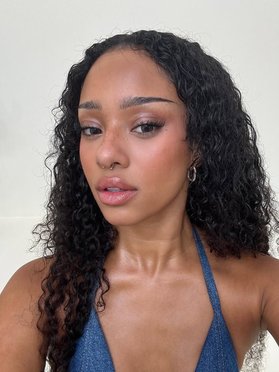
A close portrait gives the collection some useful context without pretending to prove a tattoo. Manon’s public styling changes from soft curls to braids, bright editorial makeup and casual selfies. That matters because ink is often seen through a moving set of looks, not a controlled catalogue. A line that disappears under hair or clothing in one photo may be obvious in another.
The group setting around these photos
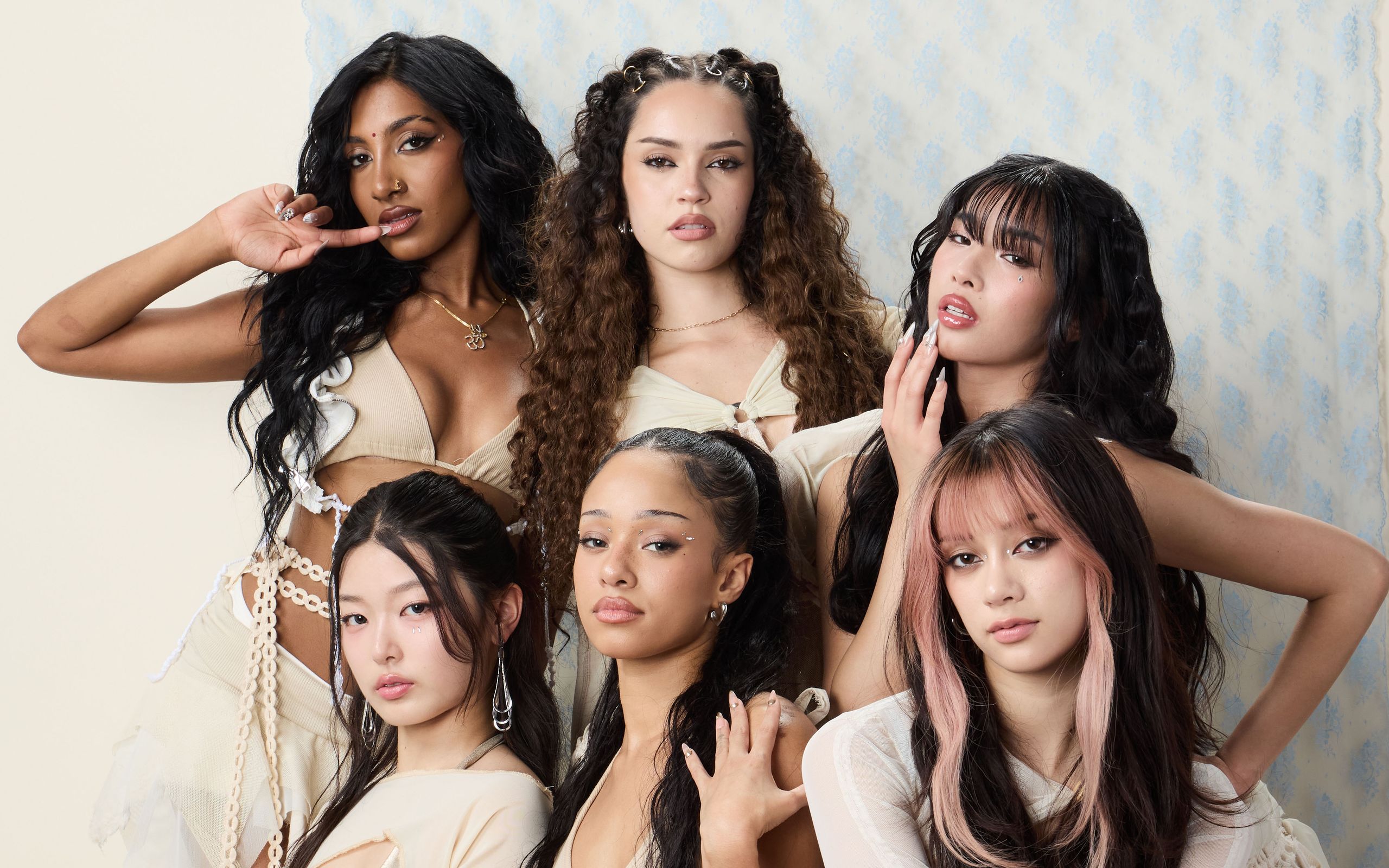
Manon’s tattoos also sit inside her work with KATSEYE. Group photos help explain the setting around the images, but they aren’t close enough to identify every design. This kind of context is useful for recognizing the person and the era of the photographs; it should stay separate from claims about which tattoos are visible.