codex

Mandy Moore Tattoos: The Sperm Tattoo, Mountain Ink and Tiny Personal Details

Mandy Moore’s best-known tattoos include three small pieces with distinct stories: a sperm design on her left foot, a mountain outline from her Mount Kilimanjaro climb, and a tiny initial she shares with her husband, Taylor Goldsmith. Two are on her feet, and all three can be easy to miss in a regular photo.

The tattoo story that started with a tour joke
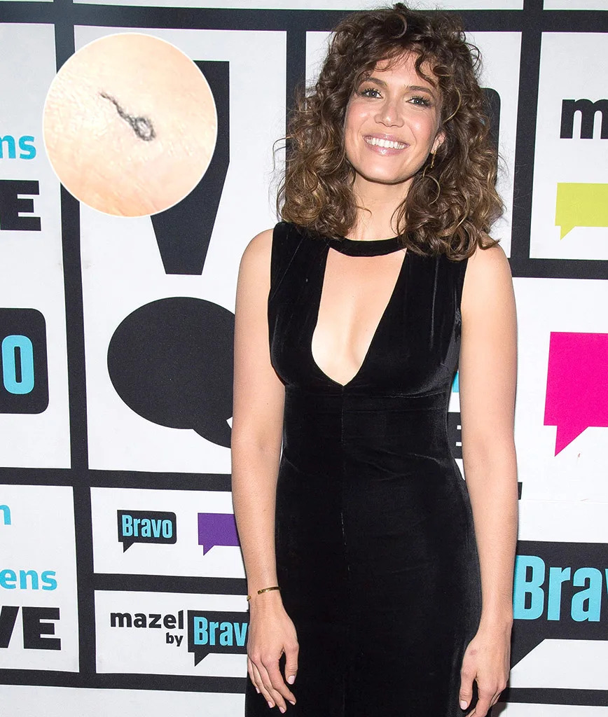
Mandy Moore tattoos: genuine sperm tattoo evidence in the opening tattoo section

Moore’s tiny sperm tattoo sits on the inside of her left foot near the heel. She told the story during an appearance with Seth Meyers. Years earlier, while she was touring with her band, Moore was the only woman in the group and had a separate day room and shower; the male musicians shared theirs.

The band joked about not wanting “Babies on My Feet,” then turned the phrase into a song they performed onstage. The joke eventually became a matching tattoo idea, and Moore joined in. The small black outline is simple enough to read, but its story is what makes it unusual.

At this size, a clean, open shape is easier to make out than a lot of tiny detail. The design keeps to a small head and curved tail, with room around the line.

Why a foot placement can feel more private

Shoes and socks usually cover the tattoo; it can show in a barefoot photo, at the beach or during a pedicure. Foot skin also gets friction and movement, which can affect fine lines as they heal and age. Anyone considering a similar placement should talk with an artist about where shoes rub and how much detail will remain readable.

The mountain memory behind the climb

Moore added a fine-line mountain profile after climbing Mount Kilimanjaro in Tanzania with Goldsmith and friends. The climb had been a long-held goal, and she said she wanted a permanent reminder of it.

The tattoo uses a few peaks without a frame or a block of text. That keeps the design focused on the mountain’s outline rather than trying to fit the whole trip into a small tattoo. Moore’s choice of a foot placement ties the mark to the climb without needing a larger scene.

The smaller stories around it
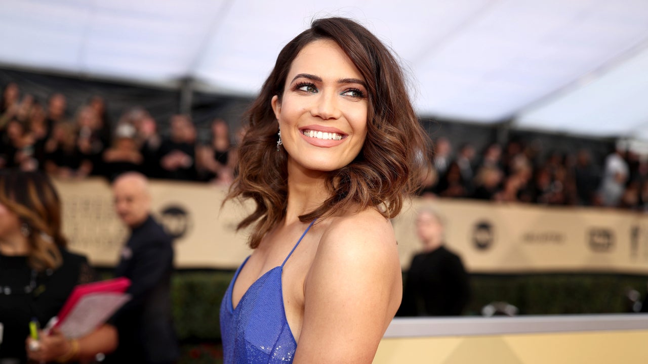
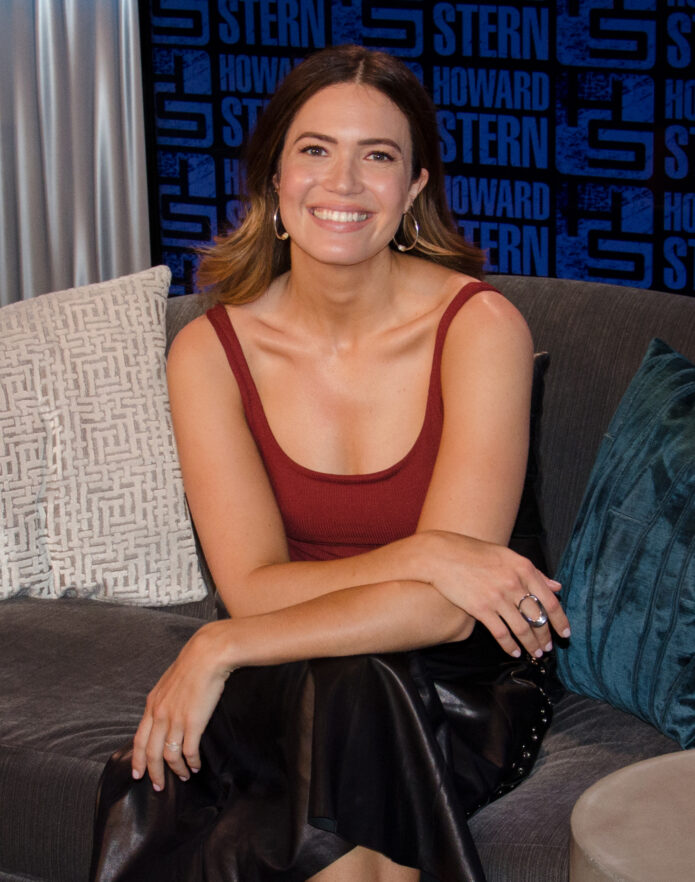
Mandy Moore in a contextual photograph: contextual event portrait for the initials section; not tattoo evidence; not tattoo evidence

Moore has a tiny “T” for Goldsmith, and he has an “M” for Mandy. The letters are understated and easy to overlook. They work as a paired reference without spelling out the relationship in a larger design.

A single letter leaves little room to hide an uneven line, so the font and placement matter. The event portrait above provides context, not a clear view of the tattoo.

Moore’s Kilimanjaro chapter, in pictures

Mandy Moore in a contextual photograph: contextual hiking photograph for the climb section; not tattoo evidence; not tattoo evidence

Photos from the climb show Moore in cold-weather gear with a pack. They document the trip, not the tattoo itself.

Mandy Moore in a contextual photograph: contextual landscape photograph for the climb section; not tattoo evidence; not tattoo evidence

The landscape gives a sense of the place behind the mountain outline. The photo does not show the ink closely.

Mandy Moore in a contextual photograph: contextual summit photograph for the climb section; not tattoo evidence; not tattoo evidence

This summit image adds another view of the climb, but it does not show the tattoo. The mountain outline itself is the clearest reference for the design.

What Mandy Moore’s choices reveal about personal meaning

For a tattoo based on a memory, decide which single detail will bring it back to you. The design can keep that detail without trying to explain the whole event.
Meredith Gaudreau Tattoos: Johnny’s Signature, Family Names and the Ink She Chose to Keep

Meredith Gaudreau has said she had no tattoos before Johnny and his brother Matthew died in August 2024. The pieces she has described since then are tied to her family: Johnny’s handwriting, her children’s names, Matthew’s nickname, and the date and words from her wedding vows.

The signature tattoo started the whole collection

Meredith Gaudreau tattoos: Johnny signature tattoo reference

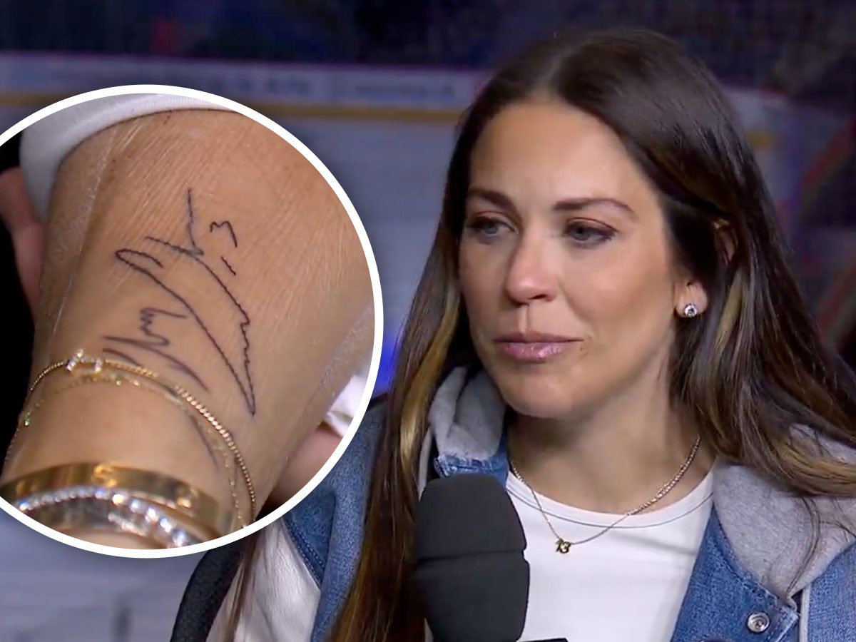
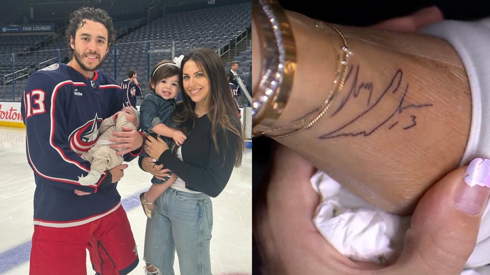
Meredith’s first tattoo was Johnny’s autograph on her right wrist or lower forearm. She used a photograph of a signature he had written for her when she needed it for a playoff jacket. The tattoo keeps the shape of his handwriting, with a long stroke and the number 13 worked into the line. Johnny wore 13 during his NHL career.

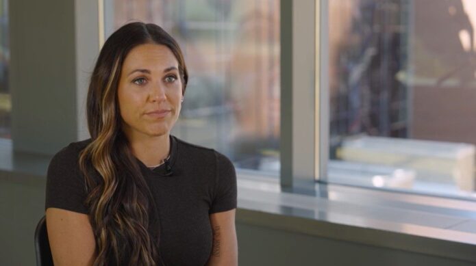
She first spoke about the tattoo during a return to Calgary, where Johnny’s professional career had taken off. The visit adds context to the story, but the design itself comes from his autograph.

Several photos show the same wrist tattoo differently

Meredith Gaudreau tattoos: Johnny signature tattoo close-up

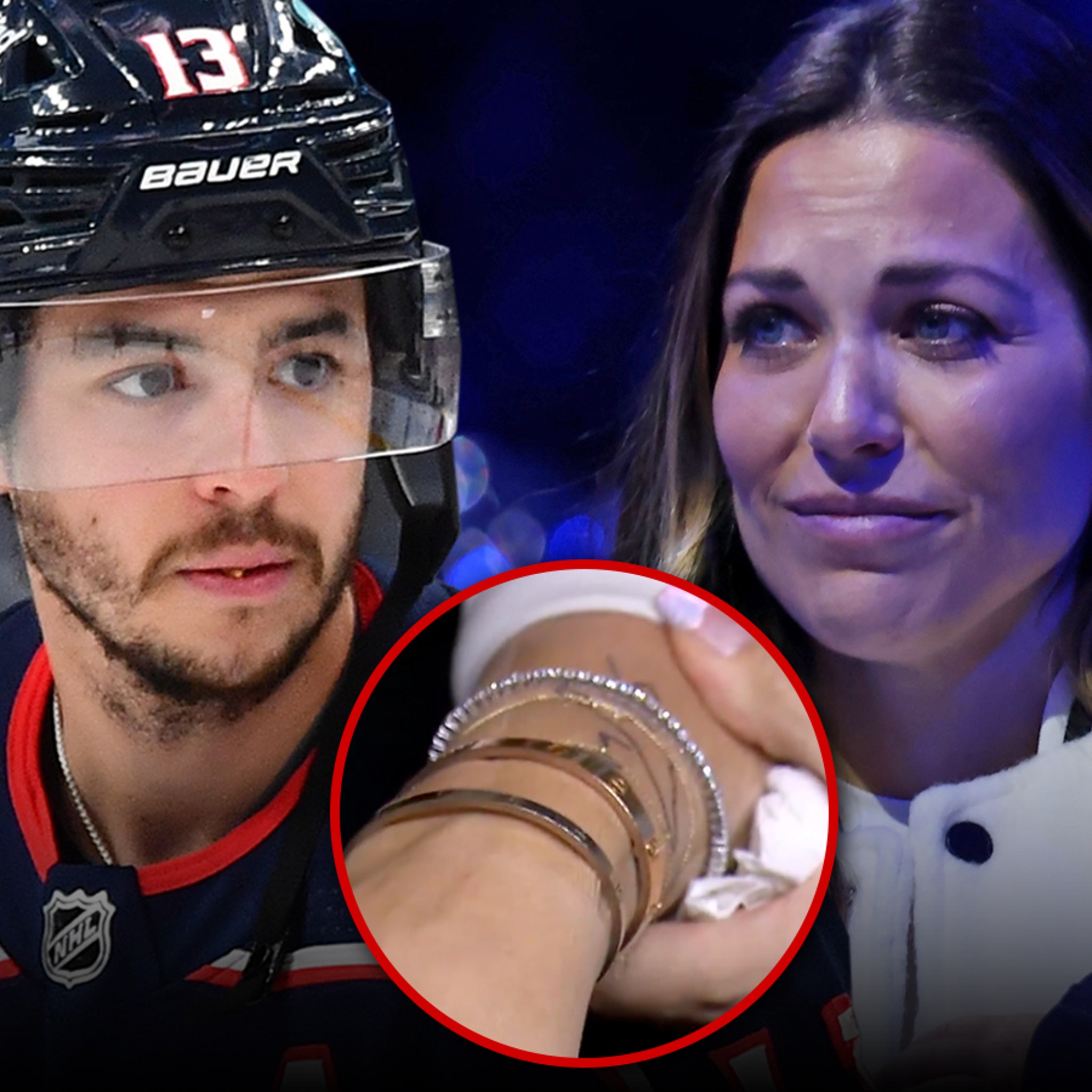
One interview photo shows Meredith pointing to the wrist tattoo; another catches it beside bracelets Johnny gave her. A close-up makes the thin strokes easier to see, while a wider frame shows how small the mark is on her arm.

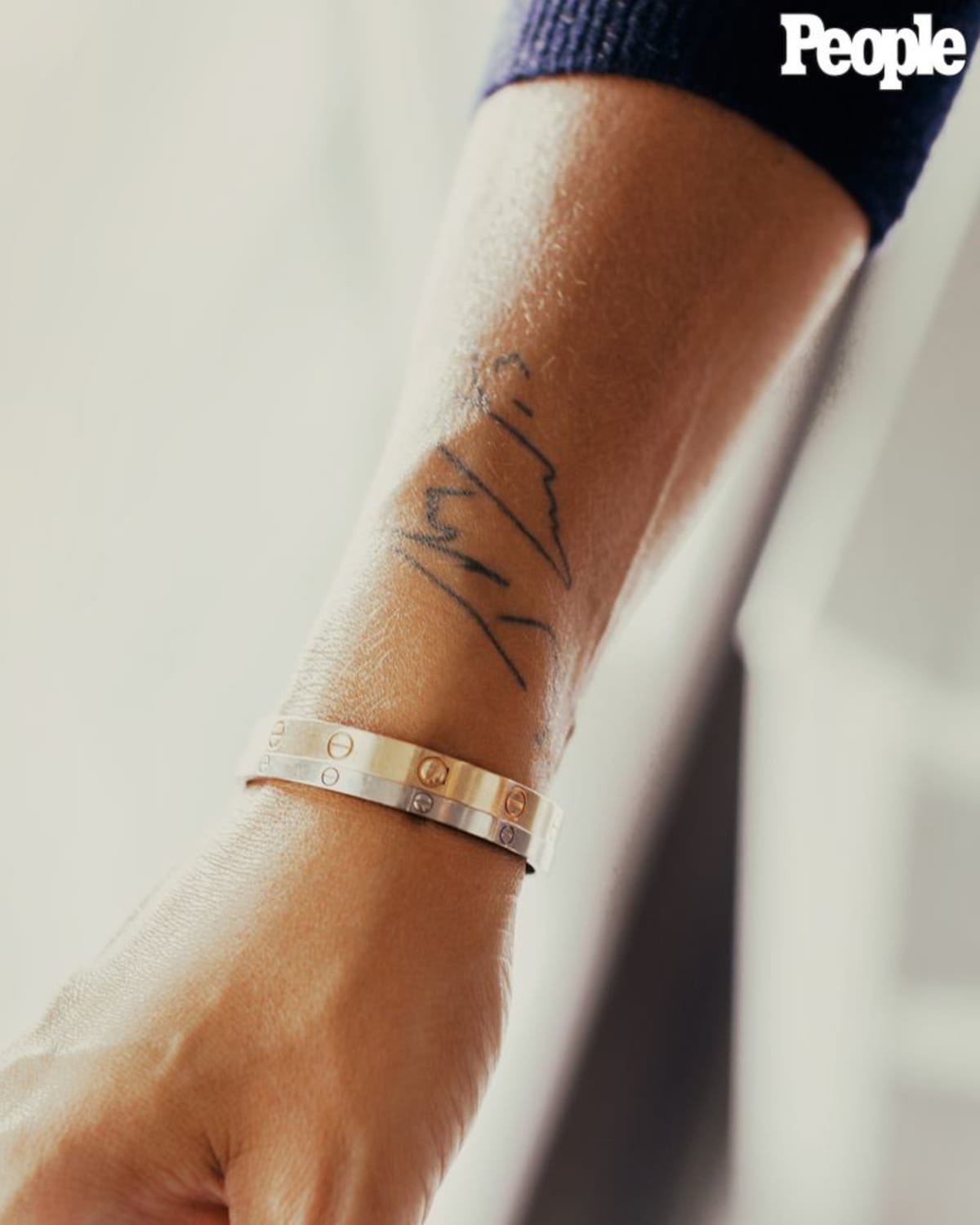
The People image below isolates the same signature against a pale background. It makes the number 13 easier to pick out, but it is another view of the wrist piece, not a separate tattoo.

The children’s names use a different kind of script

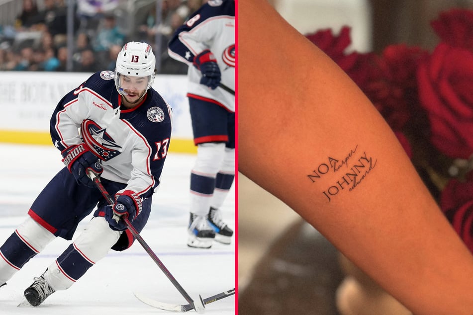
Meredith Gaudreau tattoos: children's names tattoo

On her other arm, Meredith has the names Noa Harper and Johnny Edward. Carter’s name was added after he was born in April 2025. Meredith has said some of Johnny’s ashes were mixed into the ink; that detail comes from her account and cannot be seen in a photograph.

The names are written in fine script with room between them. Carter’s addition expanded the tattoo while keeping the original idea intact.

A closer look at the wrist script

Meredith Gaudreau tattoos: People signature tattoo portrait

This People photo gives a clear view of Johnny’s signature and the number 13. The scale is easier to judge against Meredith’s wrist than in the tighter crop above.

One name can hold a whole family

Meredith also has a tattoo reading Matty, the nickname for Johnny’s younger brother, Matthew. She has explained that Matthew mattered to her and the children, and she wanted him remembered in his own right rather than disappearing into coverage focused on Johnny.

The word stands on its own. It does not need a portrait or a jersey number to identify the person it honors.

A wider view of the Calgary tribute

Meredith returned to Calgary with her family for a hockey ceremony honoring Johnny. The photo shows the wrist tattoo with the bracelets and clothes she wore that day; it gives event context, not evidence of another design.

Meredith Gaudreau in a contextual photograph: Calgary tribute context only; not tattoo evidence; not tattoo evidence

A small promise can change with time

An early finger tattoo read Forever. Reports said Johnny’s ashes were mixed into its ink, as they were for the names on her arm. Meredith later said the small piece wore off and she replaced it with JM, for Johnny and Meredith.

Finger tattoos get frequent movement, washing and friction, so the letters can fade. In Meredith’s account, the wording changed from a promise to a pair of initials; both versions are part of the tattoo’s history.

A private promise in the margins

On her left bicep, Meredith has the Roman-numeral date of her wedding to Johnny: September 3, 2021. Beneath it is a line from their vows, “All the days of my life.”

She said they never used the phrase “till death do us part.” That is the context she gave for choosing the wording beneath the date.

Why the collection feels cohesive without looking planned

The tattoos draw on different source material: an autograph, the children’s names, Matthew’s nickname, a finger tattoo that changed, and a date and line from the vows. Most use fine lettering, but each piece has its own reason and placement. They were added over time rather than designed as one matching set.
A few practical questions

For a handwriting or vow tattoo, bring the original sample and check every letter, date and numeral before the stencil is set. Ask the artist how the chosen size will hold up, especially for small script or a finger placement that gets more wear.

More celebrity tattoo guides

Mahmood Tattoos: Nefertiti, Family Triangle, Scarab and Phrase Ink

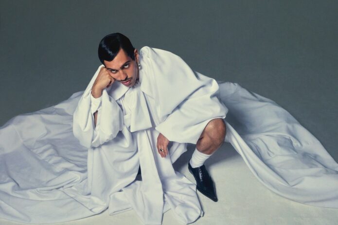
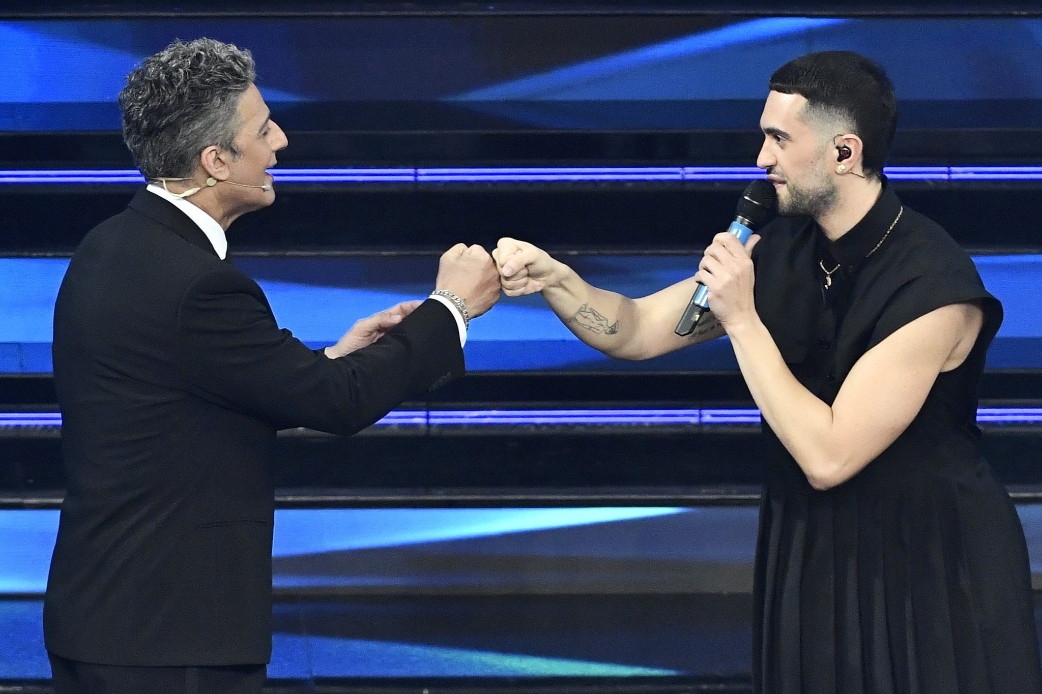
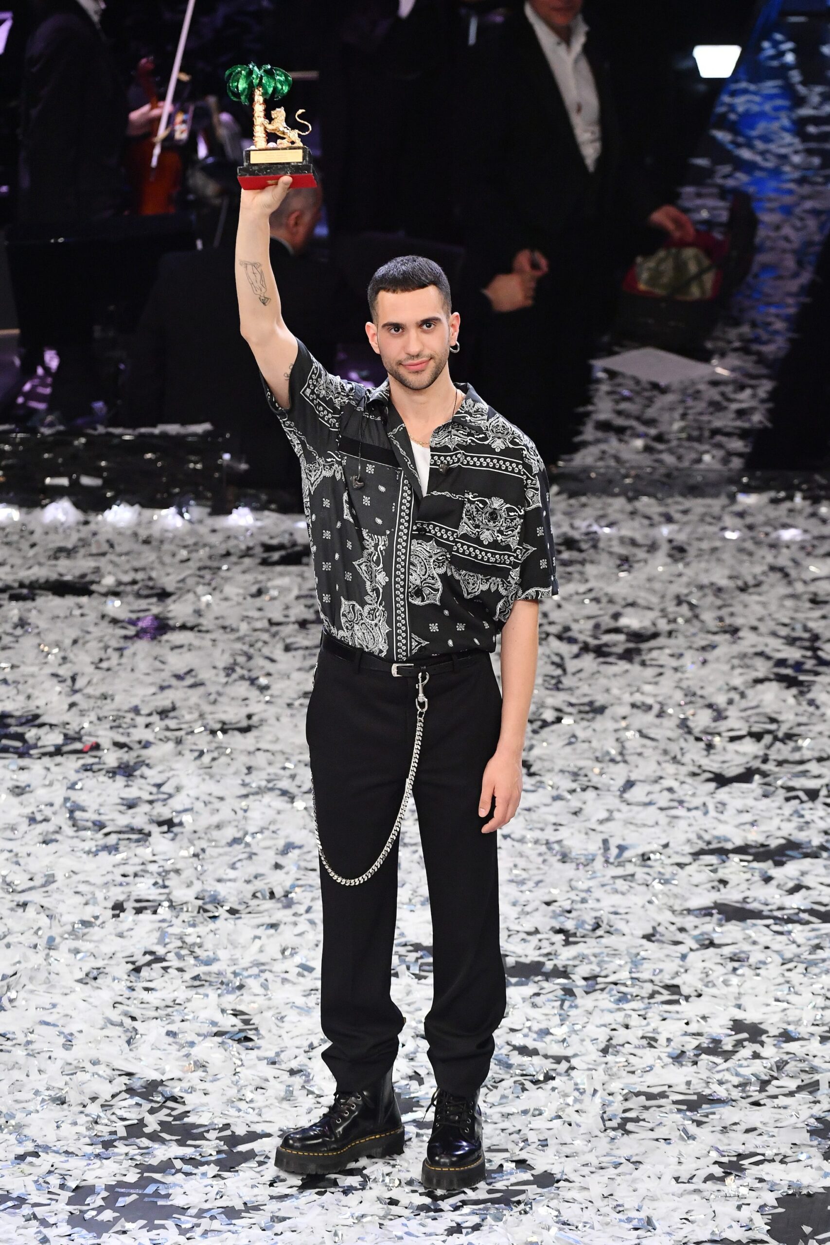
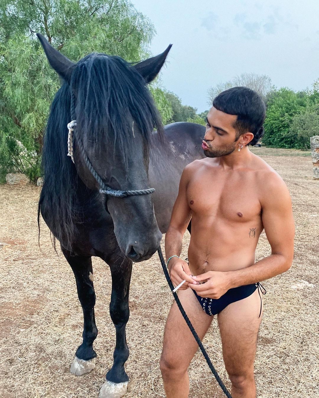
In a 2019 interview, Italian singer Alessandro Mahmoud, known as Mahmood, said he had four tattoos: Nefertiti, a triangle for his family, a scarab and a phrase. The pieces are small, and they show more clearly when he wears a vest or an open shirt onstage.

Photos help show their scale and placement, but not every image is clear enough to explain the details. For the meanings, the interview is the firmer source: Mahmood identified the triangle as a family symbol and named the other three designs.

Mahmood’s Nefertiti tattoo

Mahmood tattoos: Nefertiti tattoo

Nefertiti is the most recognizable of the four. The famous bust gives the portrait a strong profile and tall crown, but the available photos don’t show enough detail to treat it as a precise copy of the sculpture. It reads as a compact portrait rather than a full historical scene.

For anyone drawn to a similar portrait, the profile, crown or angle of the head may be enough to make the reference clear. A small design needs room around the lines; too many details squeezed together can blur as it heals and ages. In Mahmood’s collection, the portrait stays one detail among several.

Mahmood’s family triangle tattoo

Mahmood tattoos: family triangle tattoo

Mahmood said the triangle represents his family. That is the confirmed meaning; there’s no need to assign a separate person to each point or add a story the design itself doesn’t tell. In photos, the small shape can be easy to miss, which suits a private marker.

Geometric family tattoos can stay spare. If you’re using that idea for your own design, decide whether the lines should be crisp or hand-drawn, then check that the triangle still reads at its actual size. The family connection is the point; the symbol doesn’t need to explain every detail.

The scarab tattoo is small but distinctive

Mahmood tattoos: scarab tattoo

The scarab is another tattoo Mahmood named. Its oval body and wings give the insect a clear shape even at a modest size, so it can work without a pyramid, sun or other surrounding imagery. The interview doesn’t give a reason for this choice, so the beetle itself is what the record confirms.

The photo gives a sense of scale, but not enough to map every line or placement. If you like the motif, start with the outline and decide how much shell and leg detail will stay legible at the size you want. Fine lines and heavier blackwork give it different weight; neither needs extra symbols to feel complete.
The phrase tattoo stays close to the skin

Mahmood tattoos: phrase tattoo

Mahmood’s fourth reported tattoo is a phrase. In the photos, the lettering runs along his forearm, though the wording isn’t identified here. The placement follows the arm, so spacing matters as much as the type style.

Lettering needs enough room to stay legible as skin changes. A short phrase can leave space between letters; longer wording may need more room or deliberate line breaks. The forearm is visible in many situations, but a sleeve can cover it when he wants the tattoo out of view.

How the smaller tattoos read in motion

Mahmood tattoos: arm tattoo detail

His smaller pieces can disappear in performance photos; movement, lighting and clothes compete for the eye. A patterned shirt may cover them, while a sleeveless stage look brings the forearm lettering forward. They move in and out of view with the outfit.

The four designs don’t share one obvious theme: a portrait, a family symbol, a scarab and lettering. They can sit together without matching, and the gaps between them keep each mark distinct. His clothes and music remain part of the picture too.

What to borrow from Mahmood’s approach

Mahmood named four different designs, and the specific meaning he explained was the triangle for his family. That’s a useful distinction when looking at anyone’s tattoos: a photo may show the image, while the wearer’s own account tells you what they’ve said it means.

If you’re planning a tattoo, start with what you want to remember or express, then choose a shape that can carry the idea. Try the drawing at its real size and placement before settling on it. Mahmood’s photos show a compact collection; they don’t supply a private explanation for every piece.

More musician tattoo guides

Orville Peck Tattoos: Spiders, Knuckles and Animal Ink

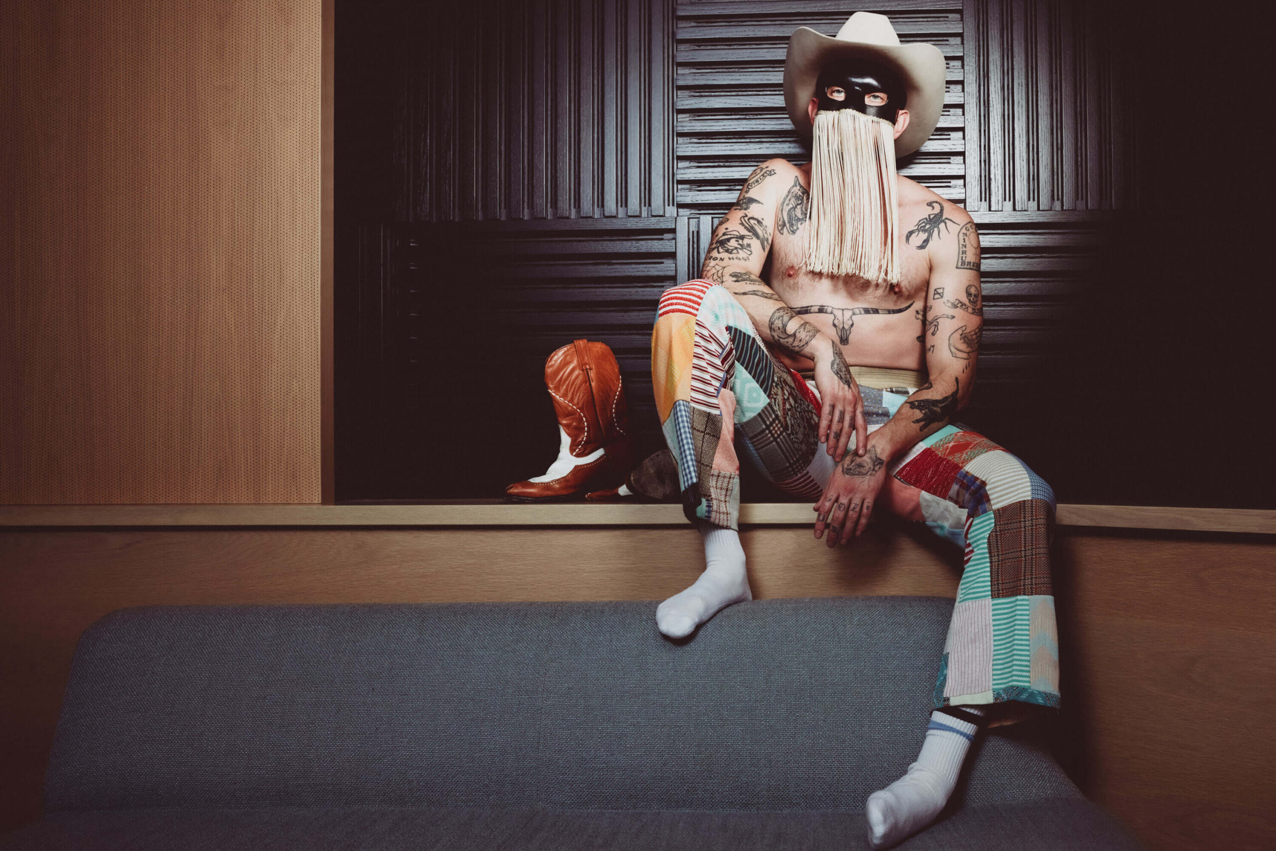
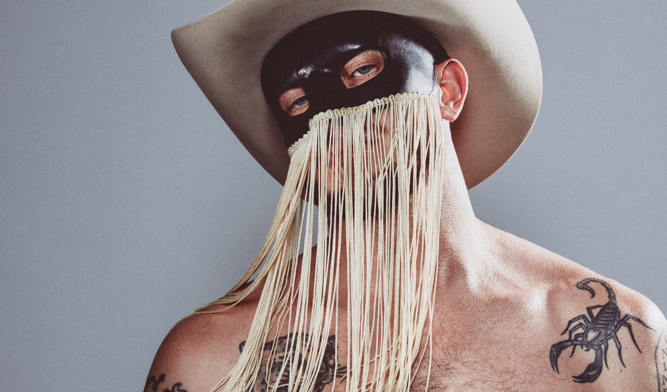
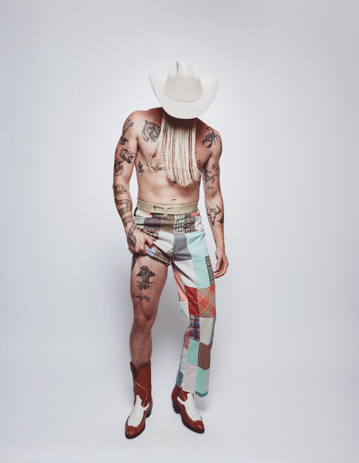
Orville Peck’s collection combines bold black ink with family references. His sister-in-law, tattoo artist Lauren Pitout, has done most of his tattoos. Many designs appear as separate pieces across his arms, chest and legs rather than one connected sleeve.

Onstage, Peck’s mask and fringe shape the silhouette; the tattoos show more clearly in photographs of his arms, chest and legs.

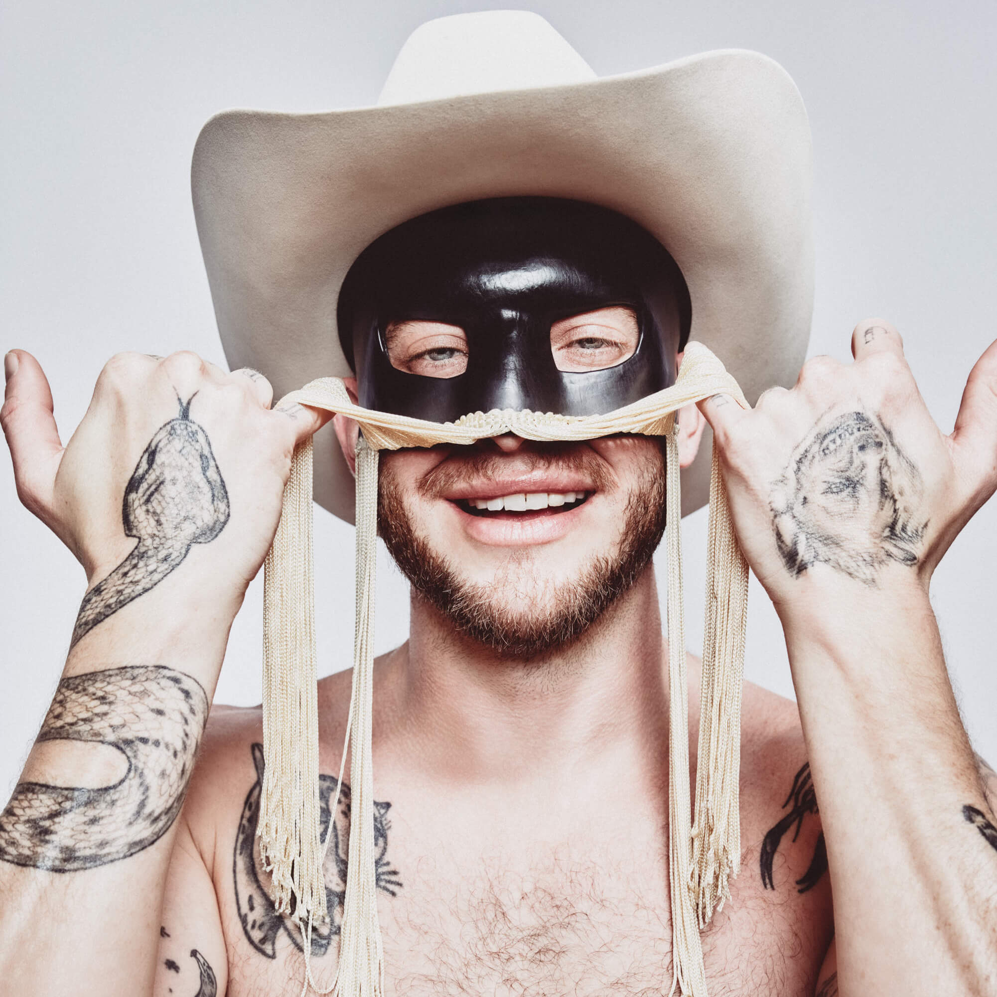
The animal-heavy arm collection

Orville Peck tattoos: clear arm and chest tattoo photograph

Photos show separate animal images across Peck’s arms. Each has its own outline, and the pieces do not blend into one continuous design.

For more examples, browse the celebrity tattoo ideas archive.

The golden orb spider on his shoulder

Orville Peck tattoos: shoulder detail showing the golden orb spider

The golden orb spider sits high on Peck’s shoulder. In the close-up, its legs spread along the shoulder line and its dark body gives the design a clear centre. The shape remains easy to recognize when the arm turns.

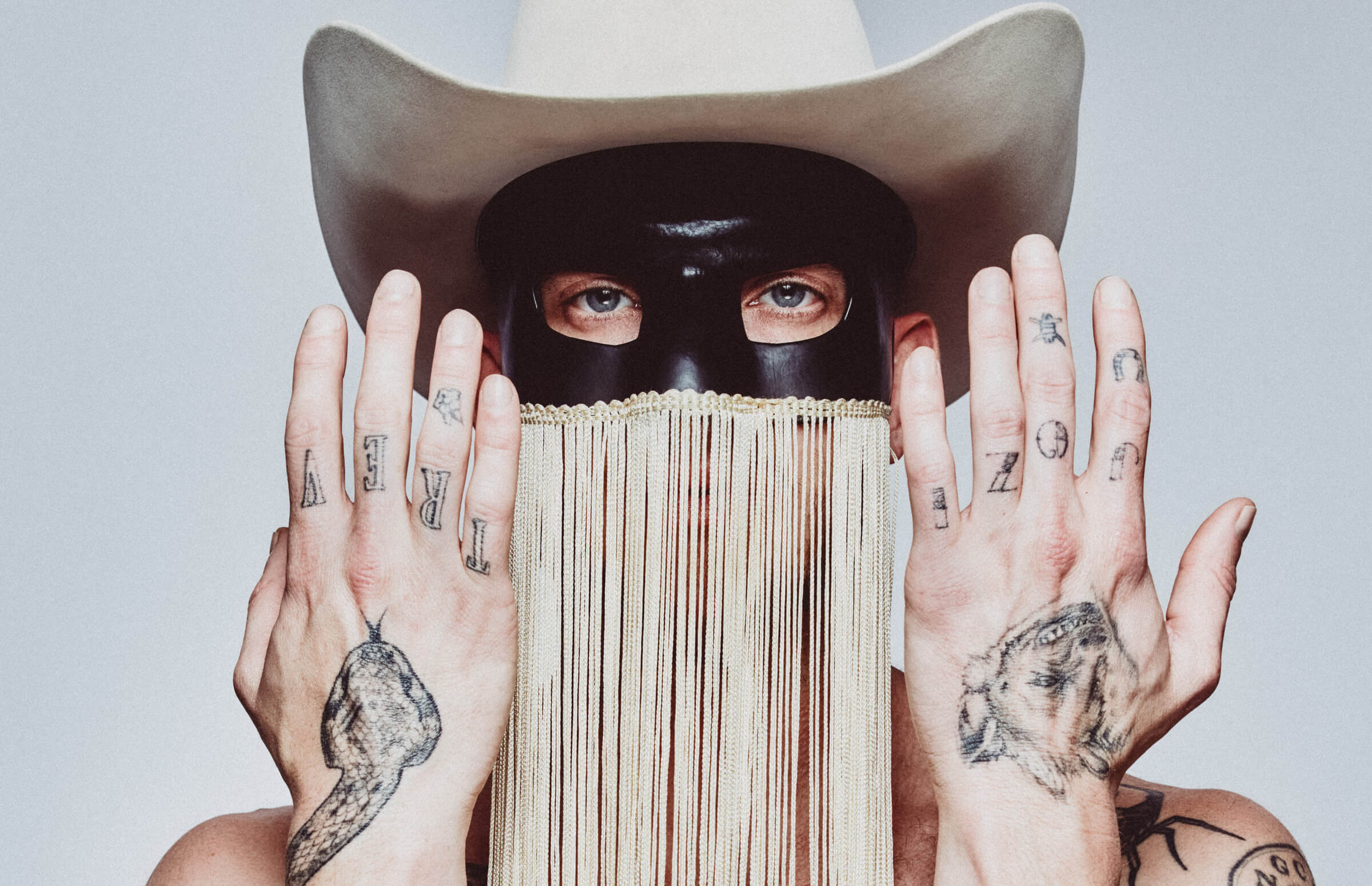
The TREV knuckle lettering

Orville Peck tattoos: close hand photograph showing the knuckle lettering

The four letters across Peck’s knuckles spell TREV, a shortened version of his father Trevor’s name. Unlike the animal images, the lettering is a direct family tribute, placed on the moving skin of his hand.

The wildebeest skull tribute

Orville Peck tattoos: close body photograph showing the animal collection

Peck has said the wildebeest skull is a tribute to his grandfather, Bill. The photo shows the animal clearly; the dedication gives the design its personal context.

The dancing bull, hyena and puff adder snake

The other named animals include a dancing bull, a hyena and a puff adder snake. The bull is shown in motion, while the snake’s long form contrasts with the shorter animal designs.

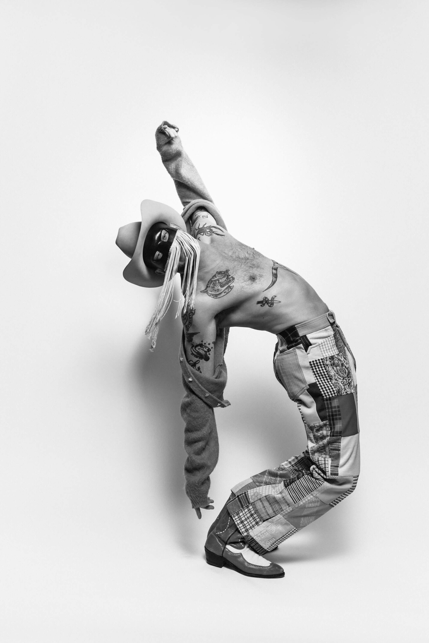
Chest pieces and the wider layout

Orville Peck tattoos: grayscale full-body tattoo photograph showing the layout across chest, arms and legs

The tattoos extend across Peck’s chest, both arms and legs, with open skin between many pieces. His mask hides his face, while the ink is visible across the rest of his body.

Why Orville Peck’s tattoos work so well

Orville Peck tattoos: full-length tattoo photograph showing the wider animal collection

The animal designs share bold outlines and open space, but they do not repeat one motif. TREV and the wildebeest skull bring family references into the mix, and the separate pieces remain legible in full-body photographs.

Good ideas to borrow without copying

If you want a similar collection, choose an image and a tattooer whose style suits it, then think about placement and how much you want the tattoo seen. Peck’s separate pieces show that a collection can work without a matching background or one theme.

More musician tattoo guides

Levi Hummon Tattoos: Bull Skull, Roses and Arm Ink

Levi Hummon says many of his tattoos connect to a person, place or memory, though not all were carefully planned. The collection includes family names, roses, a thistle for his mother’s organization, a tiger, city references and two palm trees from a Key West night he barely remembers.

The first arm and family emblem

Levi Hummon tattoos: Inline genuine tattoo photograph

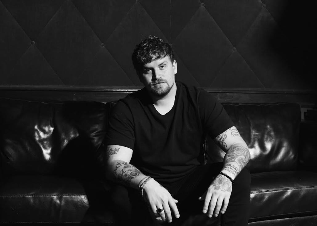
Hummon says his first tattoo was a large bull skull on his right ribs, surrounded by two red-tailed hawk feathers and his brothers’ names. He connects the skull to one at his father’s cabin on the Caney Fork River; the feathers reminded him of his mother. The portrait above shows his tattooed arms, not a close-up of the rib piece, so the details come from his account.

The arm tattoos and the pain of small spaces

Levi Hummon tattoos: Inline genuine tattoo photograph

Hummon has said his hands were the most painful place to tattoo, even though his first piece was on his ribs. His hand tattoos include two palm trees from a night in Key West that he barely remembers. That story has a different tone from the family tributes: it is a travel memory with a less deliberate start.

Roses and thistles with family meaning

Levi Hummon tattoos: Inline genuine tattoo photograph

The roses on Hummon’s arms honor his late grandparents. He also has a thistle for Thistle Farms, the organization his mother founded. Both designs are botanical, but each points to a different family connection.

A closer look at the arm work

Levi Hummon tattoos: Inline genuine tattoo photograph

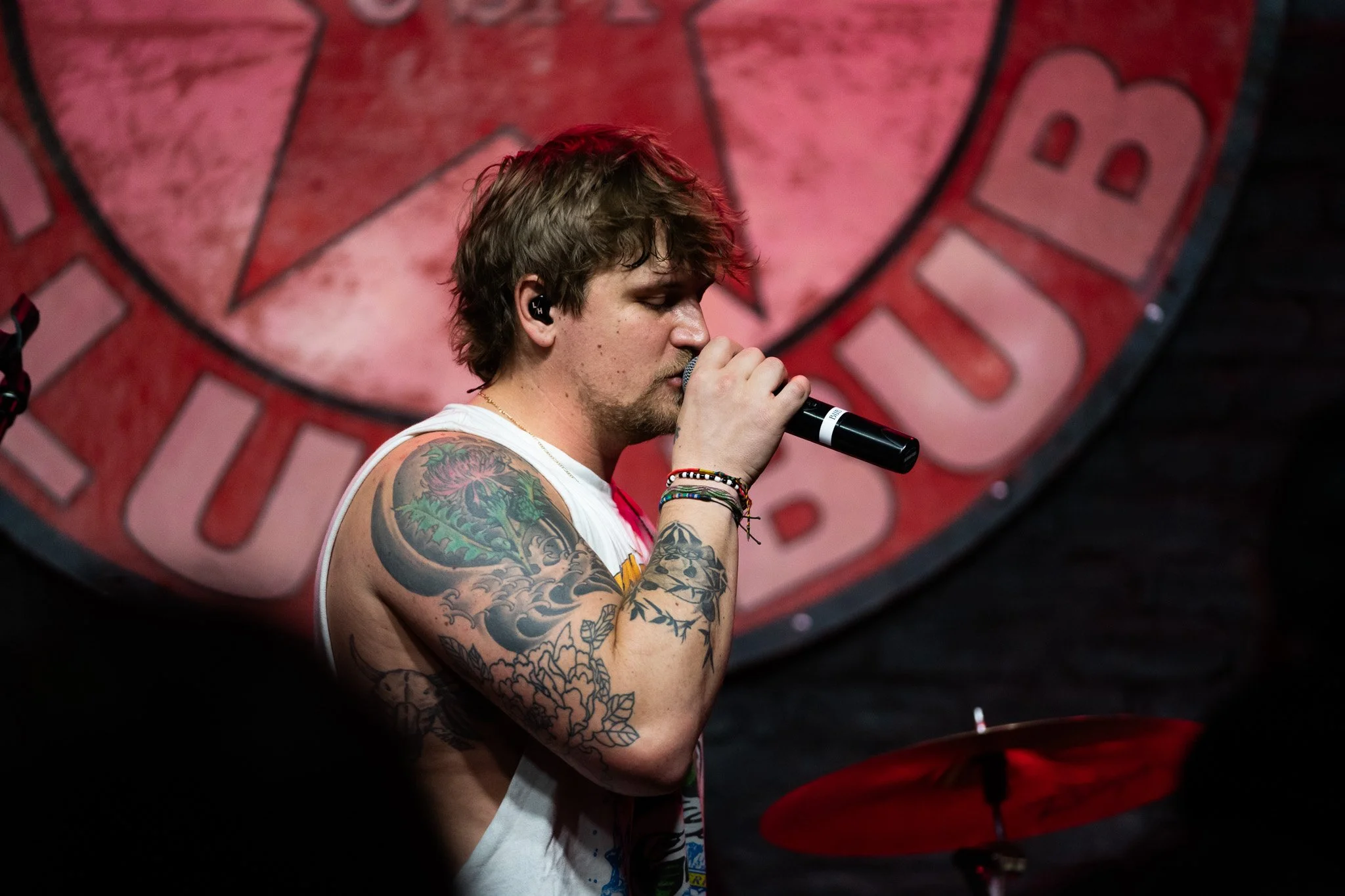
Hummon has said he asked a tattoo artist what they wanted to work on, and the artist chose a tiger for his arm. It was a different starting point from the family designs: he gave the artist room to pick a subject. The portrait shows the arm collection, though it doesn’t make every detail of the tiger clear.

Three cities and the tattoos that hold memories

Levi Hummon tattoos: Inline genuine tattoo photograph

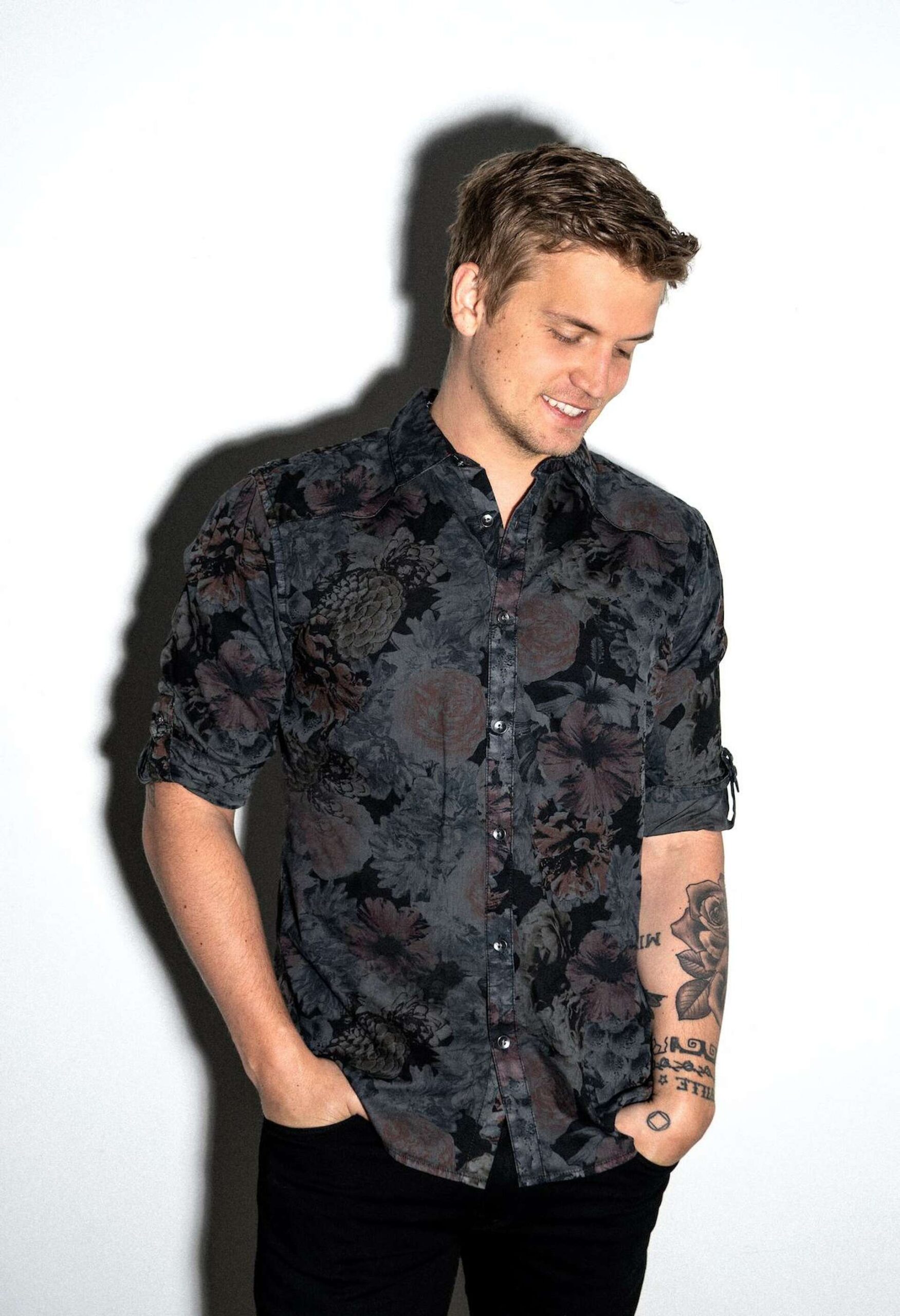
Hummon has described tattoos connected to three favorite places: Hawaii, Los Angeles and Nashville. The image offers a wider view of his tattoos peeking from under a white shirt sleeve, but doesn’t identify the designs connected to each place.

He has also said he began adding tattoos to his legs more recently, partly because ink helped him feel more comfortable with an area of his body he had felt insecure about.

How the collection keeps growing

Hummon has said he sometimes comes up with a tattoo idea and gets it done the same day. The collection therefore holds both planned family tributes and spur-of-the-moment choices. He doesn’t treat every piece as a serious statement; some are simply memories that stayed with him.

What to borrow from Hummon’s style

If you’re planning a tattoo, start with the person, place or idea you want to remember, then talk with an artist about how it can fit your body. Hummon’s collection shows how family tributes, travel memories and an artist’s own idea can sit together without a single theme tying them all to the same story.

More musician tattoo guides

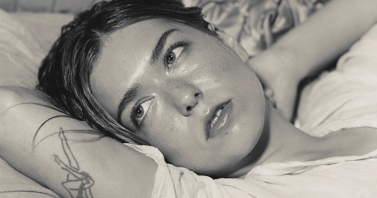
Snail Mail Tattoos: Cyborgs, Cupid and Arm Ink

Lindsey Jordan, who records as Snail Mail, has said she never expected to become someone with a lot of tattoos. Her collection grew in bits: cyborgs she got in a Toronto green room, Cupid, a small Valentine tied to her second album, and images connected to Elliott Smith, A Trip to the Moon and the Smashing Pumpkins. The designs don’t form one planned sleeve, and Jordan has said she’s getting more careful about where new pieces go as the space on her arms fills up.

Some tattoos came from a moment on tour; others were images she wanted to keep. Jordan has also been candid about getting pieces she doesn’t particularly like. Together, the choices make a collection that feels personal without spelling out every story.

The cyborgs that started the collection

Snail Mail tattoos: Inline genuine tattoo photograph

Jordan’s first tattoo was a cyborg on her right tricep. She got it in a Toronto green room after an artist offered to trade a tattoo for a guest-list spot at the show. It wasn’t the result of a long plan; she liked the artist’s work and had the chance while on tour.

She later got a cyborg on the other tricep. The pair gives her upper arms some balance without turning them into mirror images, and neither design dictates what the rest of the collection has to look like. Jordan has described the figures as a little awkward and futuristic, which suits their place among the stranger images on her arms.

Getting tattooed also meant telling her parents, who raised her in a Catholic household. During an early appointment, she nearly chose a devil design, then changed her mind. She came home with more than one new tattoo and still had to deal with their reaction. The cyborgs mark the start of the collection, even if the first appointment wasn’t as carefully planned as later choices.

Cupid, arrows and the tattoos that don’t need a grand explanation

Snail Mail tattoos: Inline genuine tattoo photograph

Cupid with his arrow is one of the more recognizable designs in Jordan’s collection. It sits among other arm tattoos rather than taking over the whole space. Jordan has said some of her tattoos carry meaning and others are images she simply likes. Cupid could suggest love or music, or it can just be a figure she wanted on her arm.

The scale is part of why the design works. A small character can stay readable with a clear outline and enough skin around it; it doesn’t need a large background. Jordan’s photos show how placement affects that: a small piece can disappear beside a larger tattoo if the space is too tight. Space is part of the design.

The Valentine tattoo and a piece of personal history

Snail Mail tattoos: Inline genuine tattoo photograph

Jordan has a small Valentine tattoo tied to the release party for her second album, Valentine. The word is simple enough to read on its own, but for Jordan it points back to the record and the people who were at the party.

It’s a lettering tattoo with a private reference, rather than a label that explains itself to everyone who sees it. Jordan’s connection to the word comes from her own experience; the design doesn’t need to carry the whole story on the skin.

A Trip to the Moon, Elliott Smith and the stranger tattoos

Snail Mail tattoos: Inline genuine tattoo photograph

Jordan’s arm tattoos include a piece connected to A Trip to the Moon and the Smashing Pumpkins. She has also described falling men based on the cover of Elliott Smith’s self-titled album. Those designs bring music and film imagery into a collection that doesn’t follow one subject or style.

She has mentioned another tattoo: a strange structure she got in England that she doesn’t particularly like. Not every choice has to become a lifelong favorite. That less-than-perfect piece is part of the collection too, alongside the images she chose with more thought.

The references range from album art to a film and an appointment on tour. What ties them together is the mix of odd figures and personal images, with space between the pieces.

Why Snail Mail is picky about arm placement

Snail Mail tattoos: Inline genuine tattoo photograph

Jordan has said she needs to be selective with her arms because she could run out of room by 30. She has worked with different tattooers and said that more recent pieces came from Kyle England. Different artists have given the collection a range of styles, so placement helps each design sit beside the next.

In concert photos, the tattoos spread from near her triceps to her forearms. They show while she plays guitar or reaches for a microphone, rather than appearing only in posed pictures. Jordan’s comment about running out of room captures the practical part of adding to an arm collection: every new piece changes what can fit around it.

How the collection looks together

Snail Mail’s tattoos don’t share one artist, palette or repeated symbol. The cyborgs sit near Cupid; album-cover figures share space with the Valentine word tattoo and the piece tied to film. The designs vary, but they all feel like choices Jordan made for herself.

That makes the collection a useful reference for a patchwork arm. You can draw from different interests without choosing one theme in advance. A loose connection—such as similar line weight, breathing room or a taste for unusual images—can help separate pieces feel at home together.

What to borrow from Snail Mail’s visual style

Jordan’s collection took shape over time instead of being planned as one sleeve. Some tattoos came from a record or an image she liked; the first came from an offer backstage on tour. If you’re considering a similar approach, choose an image you’ll still want to see after its original reference is less fresh, and ask an artist how it will read as a tattoo at a small size.

The pieces don’t all need the same meaning. Music, film, family history, jokes and images you simply like can share an arm. Jordan’s tattoos show that a collection can keep changing without every design having to explain the others.

More musician tattoo guides

Adria Arjona Tattoos: The Tiny Bix X From Andor

Adria Arjona’s only confirmed tattoo is a small X connected to Bix Caleen, the character she played on Andor. Her makeup artist gave her the stick-and-poke as the production ended. The mark is simple; the story behind it is tied to years spent with the cast and crew.

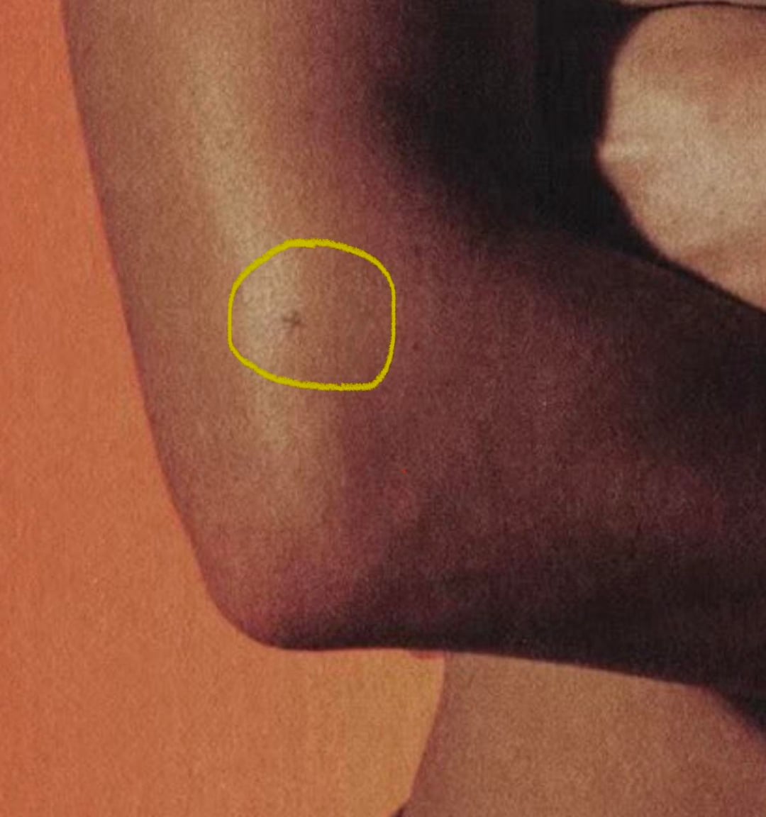
Arjona has described getting it during filming, while later reports place it in her trailer on the final day. She has also described the tattoo as being on her leg, though one fan-circulated close crop appears to show a mark on her arm. The image alone doesn’t settle the placement, so her account is the clearest guide to what the X means.

The Bix tattoo is a tiny X

The design is a small X for Bix Caleen, the mechanic and survivor Arjona played in Andor. In an interview with The Hollywood Reporter, she said her makeup artist did it as a stick-and-poke during a break in filming. She later described the tattoo as a small X on her leg, made in her trailer on the last day of the set. Those accounts differ on the exact moment, but both connect it to the end of her time playing Bix.

Adria Arjona tattoos: Adria Arjona Bix X tattoo close-up

A fan-shared close crop shows a tiny dark mark circled for viewers, though it appears to be on Arjona’s arm rather than the leg she described. It’s not a clear, posed tattoo photo, so the safest account of the design comes from Arjona herself: a small X for Bix.

A keepsake from the final day on set

The tattoo marked the end of a long project. Arjona has described Andor as a turning point in her career, and the X gave her a small reminder of Bix and the people she worked with. Its meaning comes from that experience, not from a literal image of the character.

Adria Arjona in a contextual photograph: Adria Arjona at an Andor event; not tattoo evidence

A more elaborate tribute could have used a tool, a Ferrix reference or Star Wars lettering. Arjona chose two crossing lines. The small mark reads as a private keepsake rather than official-looking merchandise, and it doesn’t need to explain the whole show to anyone who sees it.

Keeping a simple shape readable

A small symbol still needs clean lines and enough space to hold its shape. An X has a clear outline, but the strokes can blur together if the mark is too fine or cramped. Size and placement matter as much as the idea.

Adria Arjona in a contextual photograph: Adria Arjona at the Andor premiere; not tattoo evidence

The X is easy to recognize at a glance, while leaving room for someone else to read it as a simple graphic. A fine-line version will look softer; heavier strokes make it bolder. The right weight depends on how visible the wearer wants the design to be and how much room the artist needs to keep the lines distinct.

The Bix connection without the costume

Bix spends much of Andor repairing equipment and making decisions under pressure. Arjona’s tattoo doesn’t copy the character’s clothes or the machinery of Ferrix. It keeps the reference compact, tied to the role and the experience of making the series.

Adria Arjona in a contextual photograph: Adria Arjona promotional portrait; not tattoo evidence

In later interviews, Arjona has called Andor a before-and-after point in her career and discussed the show’s effect on her relationship with the audience. The X marks that part of her life without trying to sum up Bix’s whole story.

What the X leaves behind

The design needs no extra details to make the tribute clear. Its meaning comes from the role and the time Arjona spent on the show; the X itself stays easy to read.

Adria Arjona in a contextual photograph: Adria Arjona portrait; not tattoo evidence

A small idea with a long afterlife

Adria Arjona in a contextual photograph: Adria Arjona Vogue portrait; not tattoo evidence

A tribute can stay personal without taking up much space or turning every outfit into a conversation about the tattoo. Arjona’s X is a reminder of a role and a project that mattered to her, while remaining a small part of her day-to-day life.

For a similar design, start with the memory you want to keep, then see whether one clear symbol can carry it. Ask an artist about placement and size before settling on the smallest possible version. Fine lines can soften as a tattoo ages, and the design needs enough room to stay legible.

Arjona’s mark is spare, but its reference is specific: Bix, the Andor crew and the end of filming. Two crossing lines are enough to hold that memory without adding a costume-like portrait or a longer explanation.

More actor tattoo guides

Kate Madden Tattoos: Fine-Line Angel Wings Inspired by Her Mom

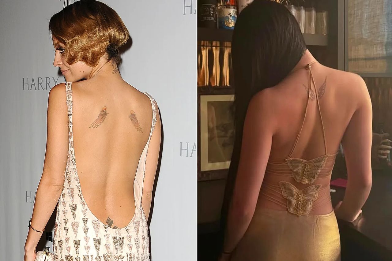
Kate Madden’s tattoo is a small pair of fine-line angel wings high on her back, a personal nod to her mother, Nicole Richie. Kate showed the design in an Instagram carousel in February 2026, captioned with a single angel-wing emoji. Nicole’s own upper-back wings are more colorful; Kate’s are lighter and more restrained.

What Kate Madden’s angel-wings tattoo looks like

The wings sit between Kate’s shoulder blades, close to the spine. A light outline and a few feather marks keep the shape simple, with enough open skin around it to make the design easy to read.

Kate Madden tattoos: Kate Madden fine-line angel-wings upper-back tattoo reference

This two-panel reference shows Kate’s tattoo on the right and Nicole Richie’s wings on the left. They’re separate images, so the left panel isn’t another view of Kate’s back. Kate’s photo shows the placement and scale: the wings are small, with clear space between the design and her shoulders.

Fine lines can blur if too many details are squeezed into a small tattoo. Here, the feather marks remain part of a clear wing shape instead of crowding the outline.

The Instagram reveal kept it simple

Kate posted a carousel: the first image shows her face, and the next turns to the tattoo. The angel-wing emoji was her only caption. The reveal itself was simple, and the design didn’t need a long explanation to make the family connection visible.

There’s no confirmed account from Kate that assigns the wings another meaning. The reporting connects them to Nicole’s tattoo; anything beyond that would be guesswork. Kate may also have liked the fine-line style, but she hasn’t said so publicly.

The upper-back placement lets Kate show the wings with a low-backed dress or strappy top and cover them with an ordinary shirt. It’s a private design she can reveal when she chooses.

Kate’s style around the reveal

Kate’s public looks have included black leather, long dark hair and makeup with a rock-and-roll edge. The small wings add a softer detail without turning her back into a larger display piece.

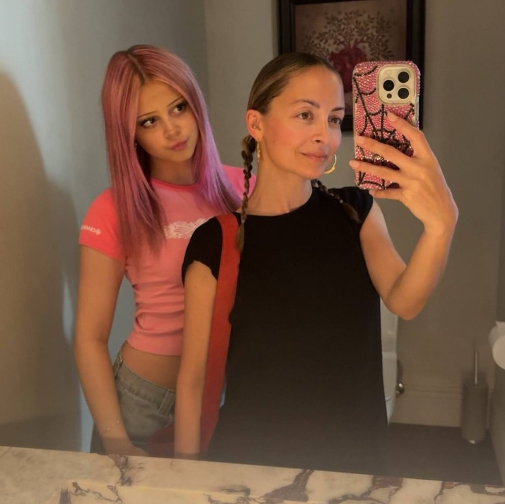
Kate Madden in a contextual photograph: Kate Madden and Nicole Richie mirror selfie; not tattoo evidence

This mirror selfie with Nicole Richie gives a casual look at Kate away from the red carpet. The wings aren’t visible, so the photo offers style context rather than evidence of the tattoo.

Angel wings can be ornate or heavily shaded. Kate’s are much quieter. For someone drawn to the idea but not a decorative look, a light outline and a few feather lines can keep the design understated.

The family reference stays personal

Nicole’s wings are more colorful and prominent; Kate’s are smaller, mostly black and almost sketch-like. The tattoos share an image, but they aren’t exact matches. Kate kept the family reference and chose a different treatment.

Kate Madden in a contextual photograph: Kate Madden family red-carpet photograph; not tattoo evidence

The red-carpet photo places Kate with her family, but the tattoos in it can’t be reliably read. The private reference behind her wings is clearer than anything this image shows.

For a family tattoo, people can start with the same idea and still choose different designs. One person might want color, another black ink, or someone else a small symbol. The connection doesn’t depend on identical tattoos.

Why the placement works

Wings suit the upper back because the center line gives them an anchor and the shoulder blades leave room to spread. The design can stay small and still follow the shape of the body.

The location is also easy to cover while a new tattoo heals, which can help limit sun and clothing friction. The artist’s aftercare instructions still matter. Placement gives the wearer some choice over when the tattoo is visible.

Kate Madden in a contextual photograph: Kate Madden at Coachella; not tattoo evidence

Kate’s Coachella photo doesn’t show the wings; it’s included as a glimpse of her public style. For a similar placement, ask your artist to check the stencil with your shoulders relaxed and again as you move. Small changes to the width or feather direction can make the shape sit more naturally.

How to borrow the idea without making it too obvious

If you like the idea but don’t want a direct copy, the design could use a single outline wing, two short feather shapes or a pair of curved marks that suggest wings together. Keep the image readable at the size you want.

The family reference can stay private. Kate’s tattoo reads as wings even if someone doesn’t know the Nicole Richie connection. That balance can work for a tribute to a parent, sibling, friend or chosen family member: the image can be simple while its meaning stays personal.

Kate Madden in a contextual photograph: Kate Madden outdoor portrait; not tattoo evidence

This outdoor portrait shows Kate in another setting, with the wings out of view. An upper-back design can stay out of sight in everyday clothes and appear when a neckline or pose reveals it.

Fine lines may soften as a tattoo heals and ages, especially when many details are packed together. An artist can simplify the feathers so the wings keep a clear shape. More detail isn’t always better; leaving open space helps the design read.

The family idea can stay small

Kate’s wings connect her to Nicole Richie, but the design remains her own: small, fine-line and easy to reveal or cover. It doesn’t need lettering or extra shading to carry that reference.

The tattoo stands on its own, whether or not Kate adds more ink later. For a similar tribute, choose the part of the story that matters and let the design stop there.

T.J. Perkins Tattoos: Full Sleeves, Chest Script and the Story in His Ink

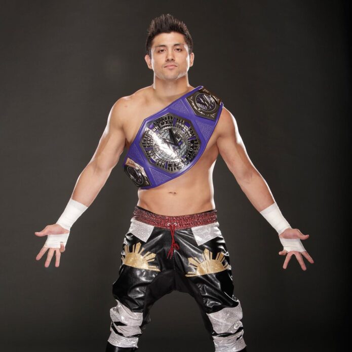
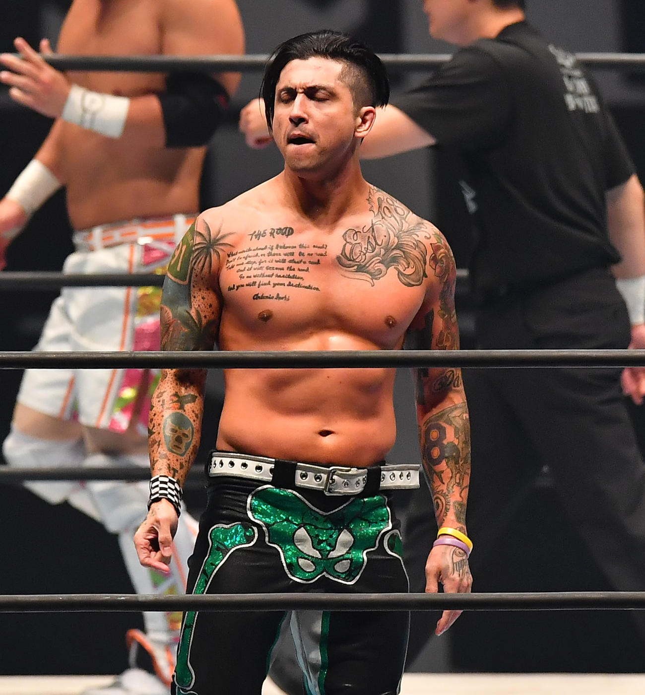
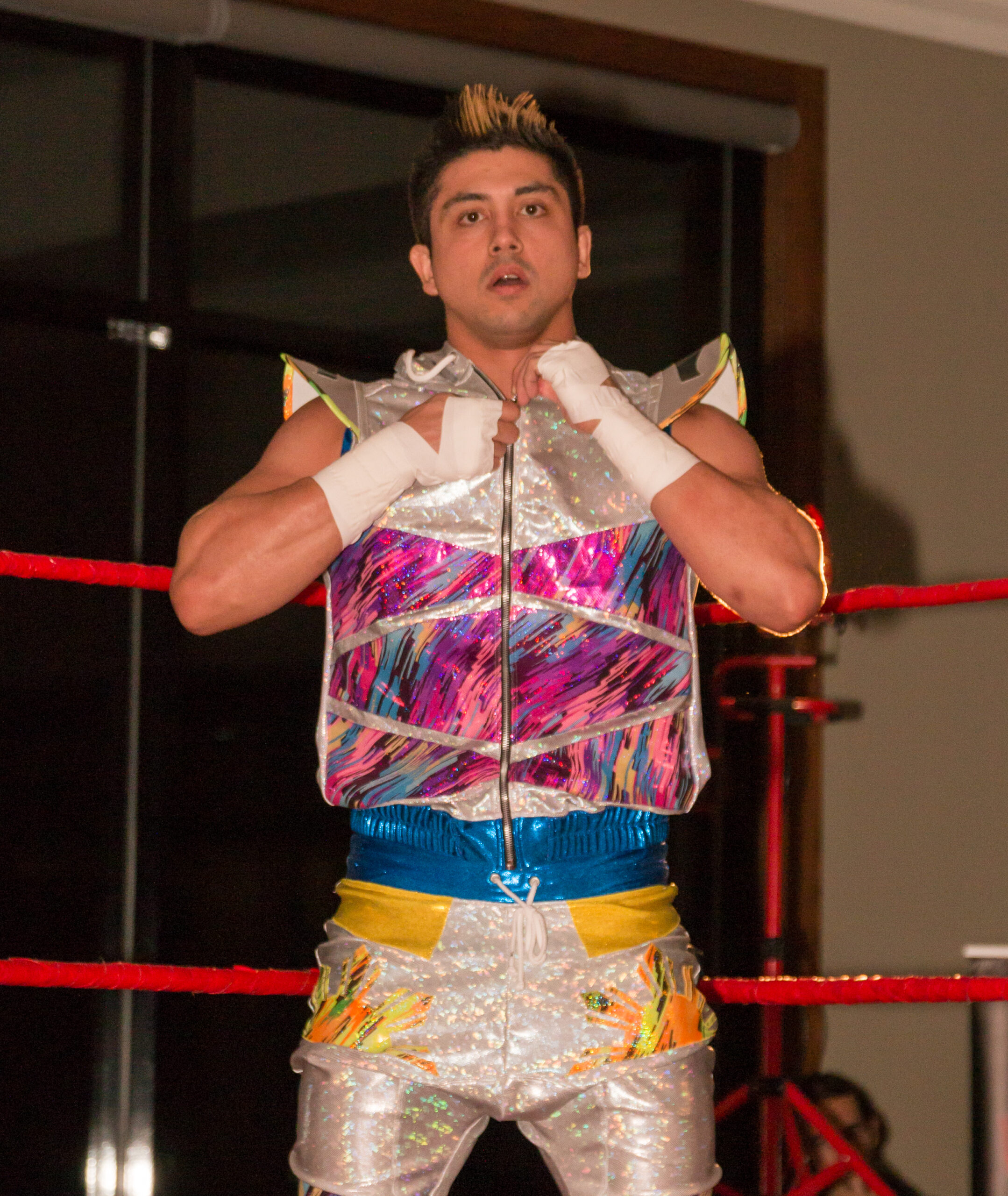
T.J. Perkins’s collection covers his chest and both arms, with script, colorful sleeves and smaller designs built up over time. He has wrestled as TJP, TJ Perkins and Manik; the tattoos are part of the look he shaped for himself.

What TJP’s tattoo story looks like

A New Japan Pro-Wrestling ring photo shows the chest script and both sleeves together. “THE ROAD” sits across the top of the chest, above smaller lines credited to Antonio Agosti. The passage reads like a reminder about enduring, learning and moving forward.

T.J. Perkins tattoos: genuine tattoo reference for chest script, shoulders and both sleeves

The sleeves mix large shapes, floral shading, color and smaller marks, with gaps of skin between some of the darker areas. One forearm has a skull-like figure; other details are difficult to identify from a distance. The pieces overlap, but don’t all use the same style.

The change happened later than people think

Perkins has said he spent years wanting tattoos while promotions asked him to keep his appearance consistent. During runs with Lucha Libre USA, Ring of Honor, TNA and other companies, visible ink could complicate costumes, toys or a character’s look.

By his time in WWE, he’d been thinking about tattoos for roughly a decade. He said he started during his last year there and sometimes covered fresh work while it healed. The sleeves came together in stages, rather than as one finished plan.

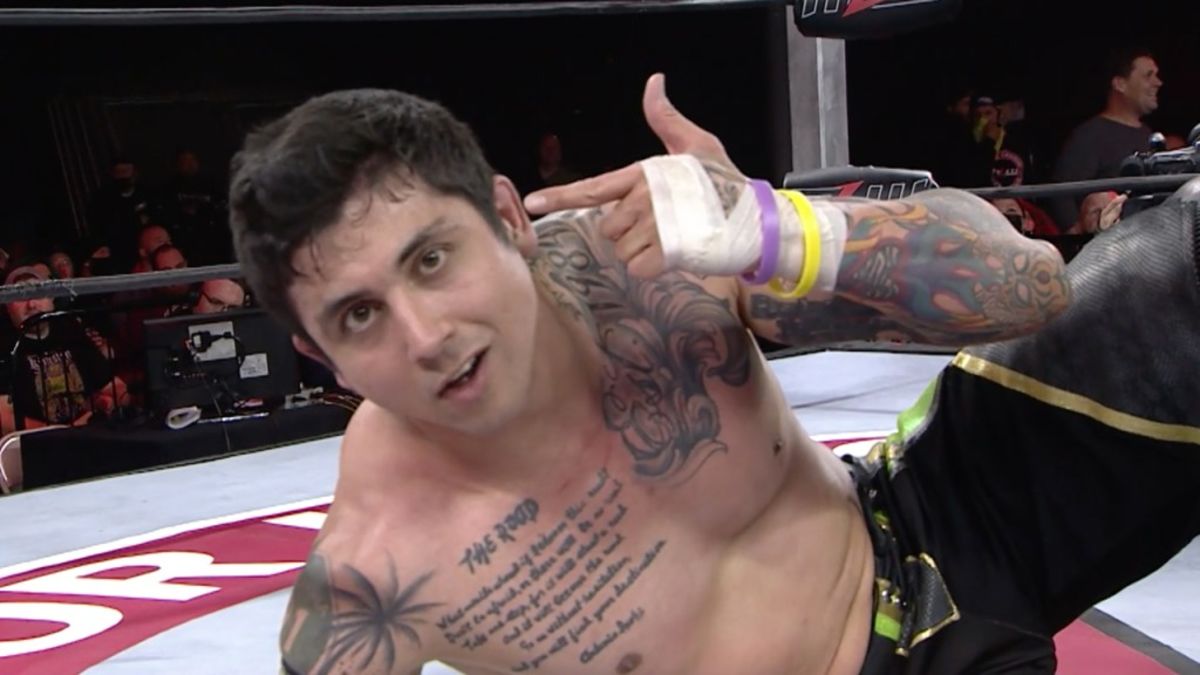
T.J. Perkins tattoos: second genuine view of the chest script and colorful sleeves

That gradual approach leaves room to make decisions as a larger piece develops. A sleeve can grow one section at a time, provided the placement still works as the arm fills in.

The road is written across his chest

Perkins has talked about the chest script in a fan AMA and a WrestlingInc interview. He connected the writing to his own story and to being judged by people who think they already know him. He also described the right side of his chest and arm as landmarks from his life and career.

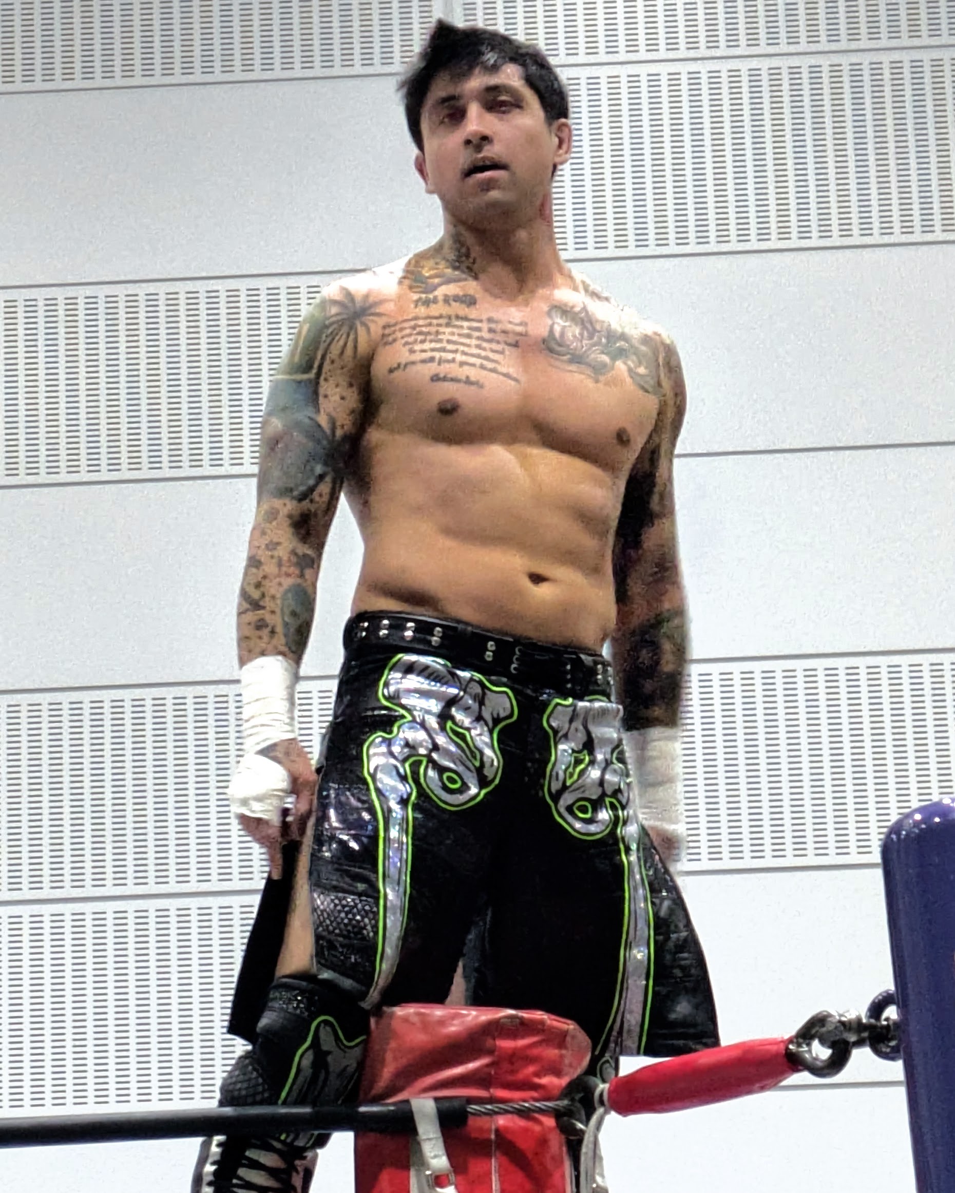
T.J. Perkins tattoos: genuine recent tattoo photograph showing the finished chest and sleeves

The larger words sit above several smaller lines, without a frame around them. Perkins’s explanation gives the text its context; the visible layout alone doesn’t tell the whole story.

How the ring setting changes what you see

Gear, gloves and entrance jackets cover different areas from one appearance to the next. A shirtless photo makes the chest and sleeves easy to see; a belt, camera angle or movement can hide part of the design. In one ring image, Perkins is celebrating a dab, and the turn of his body shows how the upper-arm work wraps around him.

That’s why one reference photo can be misleading. A sleeve may look flat in a standing shot, while another angle shows where the design bends around the shoulder or elbow. If you’re using a photo for a tattoo reference, more than one view can help you understand the placement.

His older look tells part of the story

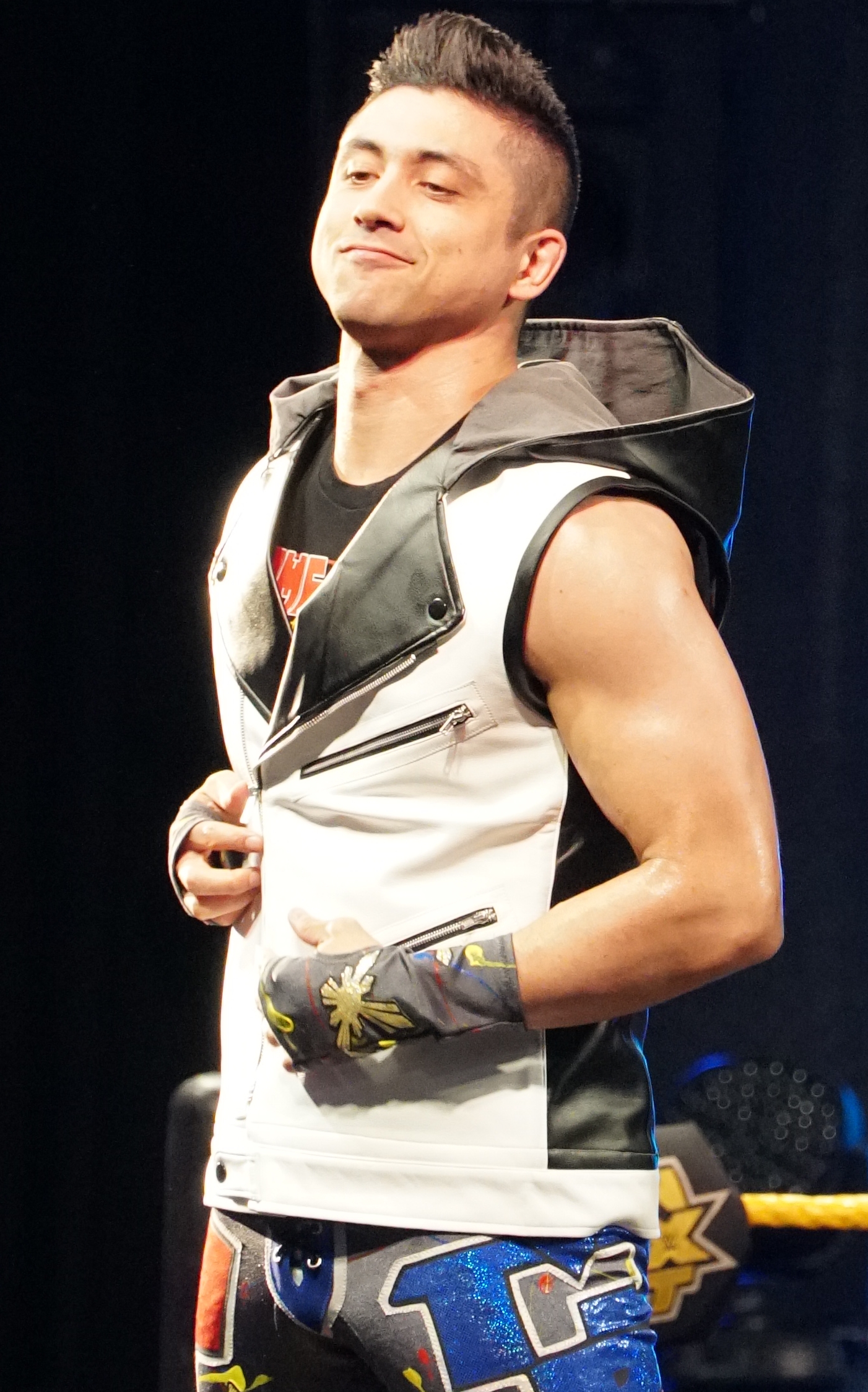
Some earlier photos show Perkins with bare arms and little visible ink. He has said that he waited until he had more control over his appearance, then began adding the pieces he’d considered for years. The change was gradual, not a single character reset.

The tattoos also sit alongside different versions of his public style. A title portrait, ring gear and a sleeveless shirt can all show a different side of the same collection; the ink doesn’t have to become the only thing people notice.

The Filipino and Los Angeles references

Perkins has worked in the United States, Mexico and Japan, and has spoken about his Filipino background. Some of his wrestling gear uses Philippine colors and imagery. Interviews also connect parts of his collection to Los Angeles and the route his career took.

T.J. Perkins in a contextual photograph: contextual event photograph; not tattoo evidence; not tattoo evidence

This earlier independent-wrestling photo shows Perkins in a theatrical setting, with most of the tattoos covered by his gear. It gives context for his wrestling identity, but it doesn’t show enough detail to identify the ink.

Cultural references don’t need to explain themselves at a glance. A color, symbol, phrase or memory can carry meaning for the person who chose it, even if other people don’t recognize the connection.

How to borrow the overall feeling without copying it

If you like the look of a full sleeve, start with the idea that matters most to you: a line of writing, a family reference, a character or a place. Give it room, then decide what belongs around it. Perkins’s collection shows how different styles can sit together without becoming a matched set.

T.J. Perkins in a contextual photograph: contextual independent-wrestling photograph; not tattoo evidence; not tattoo evidence

This earlier independent-wrestling photo is useful for body scale and posture, not for reading individual tattoos. If you’re planning a sleeve, leave enough open skin for each piece to stay legible as the collection grows.

More athlete tattoo guides

Kash Doll Tattoos: Flowers, Face Star, Wrist Rose and More

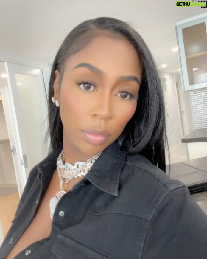
Kash Doll has said she has about ten tattoos. Photos and her tattoo-tour video show flowers across one shoulder, a small star near her eye, wrist designs, neck lettering, and smaller pieces that are harder to see. She has also said she regretted her first tattoo. The collection now ranges from tiny symbols to larger floral work.

Kash Doll’s upper-back flower tattoo

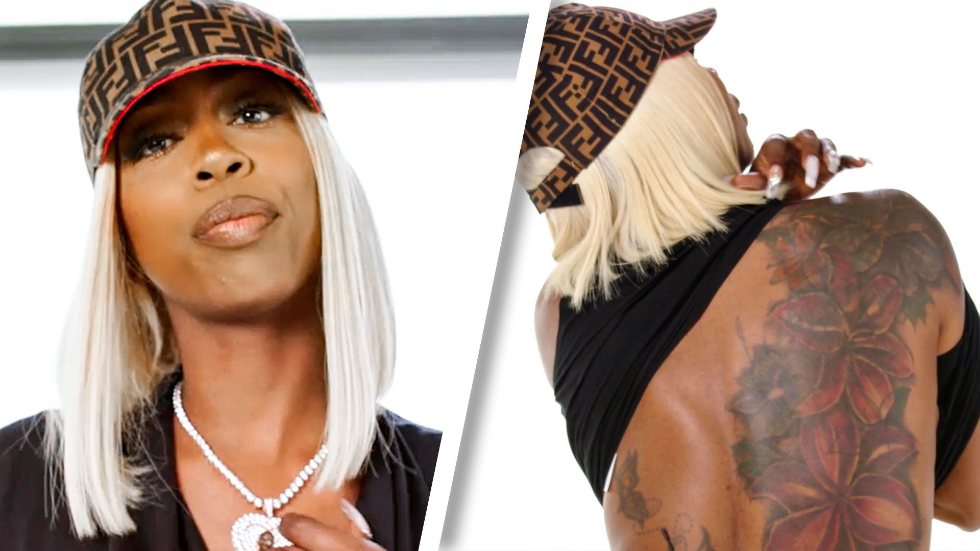
Kash Doll tattoos: Genuine high-resolution GQ tattoo-tour still showing Kash Doll's floral back and shoulder tattoo.

Photos from her GQ tattoo tour show flowers and leaves spread across the upper back and shoulder-blade area. The piece has more room than her wrist tattoos, but it stays focused around the shoulder rather than covering her whole back. Its outline and open spaces are easier to see in a close view than in a distant event photo.

The small star on Kash Doll’s face

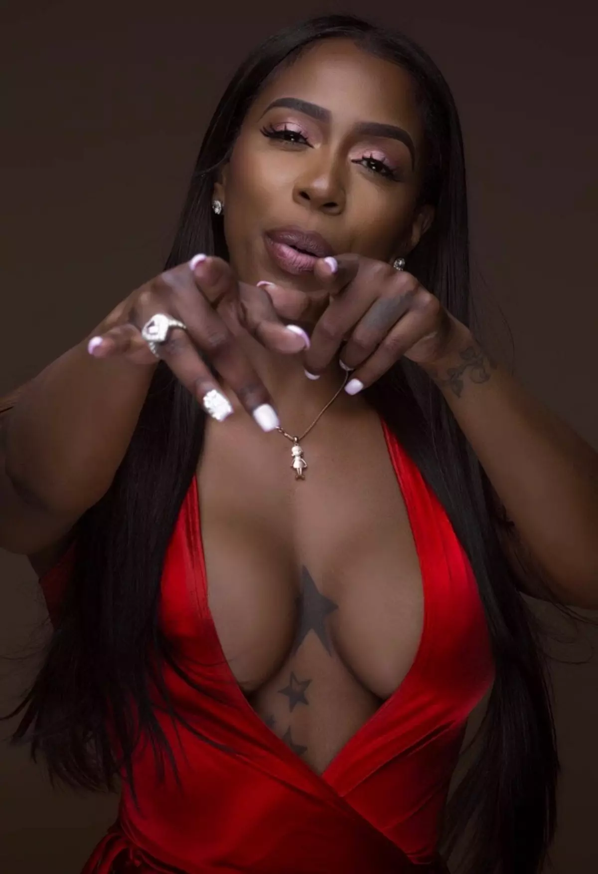
Kash Doll tattoos: Genuine high-resolution portrait with Kash Doll's star tattoos clearly visible on the chest.

A small star near her eye is one of the collection’s most visible pieces. It can disappear in a wide performance shot, but close portraits show its scale and simple outline. The design takes up little space, so it stands apart from the larger flowers without dominating her face.

Kash Doll’s wrist rose

Kash Doll tattoos: Genuine high-resolution red-carpet photograph showing the shoulder flower tattoo.

Kash Doll also has a rose with fine linework around her wrist and hand. The stem and surrounding marks give the flower a longer shape, and the lighter lines look different from the broader upper-back flowers. A closer photo makes the design easier to follow than a red-carpet or performance image.

The butterfly and “beauty” lettering at her neck

Kash Doll tattoos: Genuine high-resolution event photograph showing shoulder and chest tattoos.

At the back of her neck, a butterfly sits beside the word “beauty.” The two elements form a compact design: the butterfly gives it a clear shape, while the lettering makes it specific to her. Hair or a collar can cover the tattoo; when her hair is up, it is easier to see.

Kash Doll’s small wrist symbol

Kash Doll tattoos: Genuine high-resolution event photograph showing visible shoulder tattoos in context.

A second small mark appears around her wrist or hand. It is visible in a performance photo, but the shape is hard to identify without the close-up. Unlike the rose, it reads as a small standalone symbol; Kash Doll has not given a meaning for it in the material shown here.

The broader inventory includes small stars on her stomach, an ankle locket, butterflies on her lower back, a ring-finger tattoo and another wrist design described as “rain” lettering. Some are difficult to make out in a single photo, so their details are best left at that.

The collection shifts between scale and visibility: shoulder flowers cover more ground, while the face star and wrist symbol are small; hair can hide the neck piece. The tattoos don’t share one motif, but their placements give each a different presence. If one detail is useful as inspiration, consider where it sits as well as what it depicts—a flower on the shoulder reads differently from one on the wrist.

More musician tattoo guides