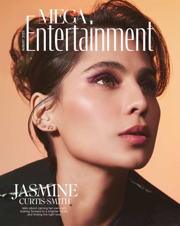
Jasmine Curtis-Smith has one of those tattoos that can look almost mysterious in a quick red-carpet photo. It sits high on her back, written vertically in dark lettering, so you might catch it for a second and then lose it under a dress strap or loose hair. When she was asked about it, though, she didn’t treat it like a fashion detail. She talked about the idea behind it, which gives the small piece a lot more weight than its size suggests.
The actress has kept her tattoo style pretty restrained in public. There isn’t a giant sleeve or a full collection of visible pieces to catalogue. What we can see clearly is the back tattoo, along with the way she chooses to talk about it. That makes Jasmine Curtis-Smith’s ink a good example of how a single design can feel personal without needing to be loud.
There are a couple of useful lessons here for anyone considering a script tattoo. Placement matters. The lettering has to work with the line of the spine, the size needs to stay readable, and the meaning should be settled before an artist starts drawing. Jasmine’s piece also shows why a tattoo can be important even when it doesn’t take up much space.
Jasmine Curtis-Smith’s visible back tattoo

The clearest public view shows Jasmine turned away from the camera in a swimsuit, with the tattoo running vertically down the upper part of her back. It appears as a compact column of black Hebrew script, placed slightly to one side of the spine rather than spread across the shoulder blades. The tattoo is narrow, clean and easy to read as a single symbol-like mark when seen from a distance.
That vertical placement gives the design a natural direction. Instead of competing with the width of the shoulders, the lettering follows the length of the back. It also leaves plenty of open skin around the tattoo, which keeps the small characters from getting visually crowded. This is one of those pieces where the empty space is doing some of the work.
The available photograph doesn’t show every tiny detail perfectly, so it would be a mistake to pretend the image can provide a definitive translation. What the public interview does establish is that Jasmine has discussed the tattoo’s meaning herself. The safest description is simple: it is Hebrew writing with a personal significance, not random decorative lettering.
What the tattoo looks like in the PEP interview
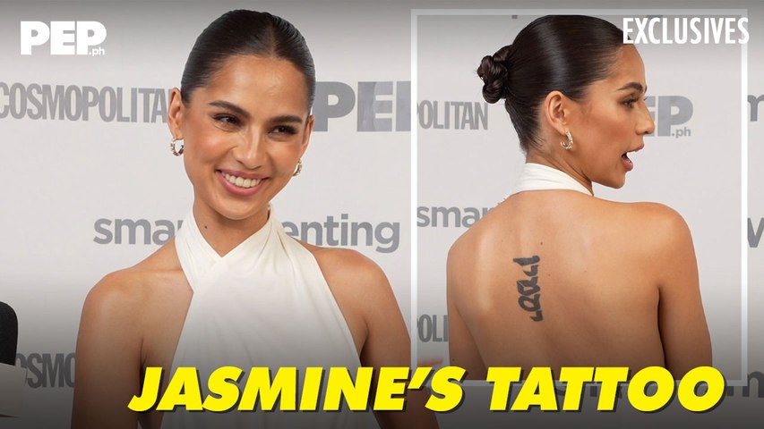
A PEP interview thumbnail gives another useful view. The image is built around two shots of Jasmine: one facing the camera and one turned around so the tattoo can be seen. The back view makes the placement easier to understand. It sits high enough to appear above a low neckline, but it isn’t so close to the neck that the letters disappear into the hairline.
The tattoo looks deliberately understated in this setting. Jasmine is wearing a white halter-style top, and the black script stands out against the skin without needing heavy shading or extra decoration. There are no flowers, borders or ornamental flourishes around it. The lettering is the whole design, which makes the meaning and the letterforms especially important.
Script tattoos can age in a few different ways. A very fine line may soften, while tight lettering can lose separation if the characters are packed too closely together. Jasmine’s tattoo has enough breathing room to remain legible in the available view. It also uses a simple black treatment, so the shape reads as text instead of turning into a dark patch.
Why this piece feels personal
It is tempting to judge tattoos by their size, especially when celebrity ink is often photographed as part of a dramatic outfit or a full-body look. Jasmine’s back piece works in the opposite direction. The design is modest, but the placement gives it presence. You notice it because it is isolated, not because it is huge.
Personal writing needs a little privacy. A word or phrase can be meaningful without being explained in a caption every time it appears. Jasmine’s choice to share the idea behind the tattoo gives readers enough context, while the design still belongs to her. That balance is worth remembering. A tattoo can be public in a photograph and private in its full story.
The use of Hebrew also makes accuracy important. Anyone considering lettering in a language they don’t speak should work with a trusted translator before booking the appointment. Online translation tools can miss grammar, direction, context or the difference between a phrase that sounds natural and one that is merely technically possible. The artist’s job is to tattoo the design cleanly; the wearer has to make sure the words are right first.
Jasmine away from the close-up
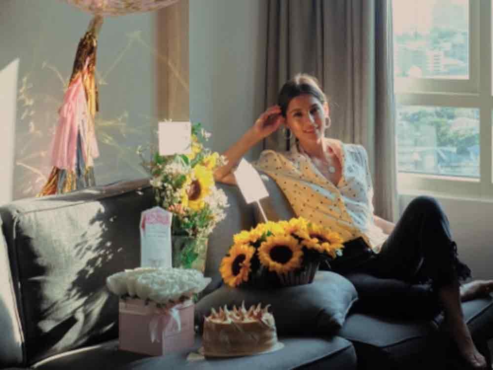
Most photographs of Jasmine don’t focus on her back at all. This GMA image shows her in a relaxed indoor setting, surrounded by flowers and soft daylight. It is a useful reminder that the tattoo is only one small part of her public image. The design doesn’t define her style every time she appears on camera, and it doesn’t need to.
That separation can be helpful when planning a tattoo of your own. Some people want ink that is visible in every outfit. Others prefer a placement that appears only when they choose a backless top, a swimsuit or a particular pose. The upper back gives Jasmine that flexibility. She can keep the tattoo covered for work or formal events and reveal it without making the piece feel hidden forever.
Placement also changes how a tattoo is experienced. A wrist piece is always in your peripheral vision. A back tattoo is harder to see without a mirror or a photograph, so its value isn’t tied to constant visual contact. It can function more like a private reminder than a daily accessory.
The acting career behind the close-up

Jasmine’s career has moved through television, film and independent projects, and the public images around her often focus on the work rather than the tattoo. In one GMA portrait, she is pictured with an acting award, which gives a different kind of context to the back piece. The tattoo is part of a person who has built a career around performance, not a costume detail added for a single appearance.
That matters because body art can get flattened into a style label. A script tattoo is not automatically edgy, minimalist or mysterious. On one person it might be a family phrase. On another it could be a line from a book, a prayer or a private reminder. The same visual category can hold completely different reasons.
Jasmine’s public image also shows why a small tattoo can be practical for an actor. It sits in a place that can be covered easily when a role calls for it. That doesn’t mean the tattoo is less personal. It just means the placement gives her more control over when it becomes part of the visual story.
Placement and scale
If you like the look of Jasmine Curtis-Smith’s tattoo, start by thinking about the body’s natural lines. Vertical lettering can work along the spine, on the ribs, behind the arm or down the calf. Each placement changes how the text stretches and how much the skin moves.
The upper back is a fairly forgiving area for a small script tattoo, but it still needs planning. The artist should check the stencil while you are standing naturally, not only while you are lying flat. Shoulders move, skin shifts and posture changes the line of the back. A phrase that looks perfectly straight on the stencil table may need a slight adjustment once the body is relaxed.
Size is another big decision. Tiny lettering can look elegant in a reference image and become difficult to read once it heals. If the text is in another alphabet, give the characters enough space to stay distinct. A good tattooer can help balance the visual weight of the phrase with the amount of skin available.
Don’t let the artist guess at the language. Bring a verified reference, talk through the meaning and ask for the exact lettering to be checked before it is transferred. It is much easier to correct a stencil than to correct a tattoo.
A closer look at Jasmine’s style
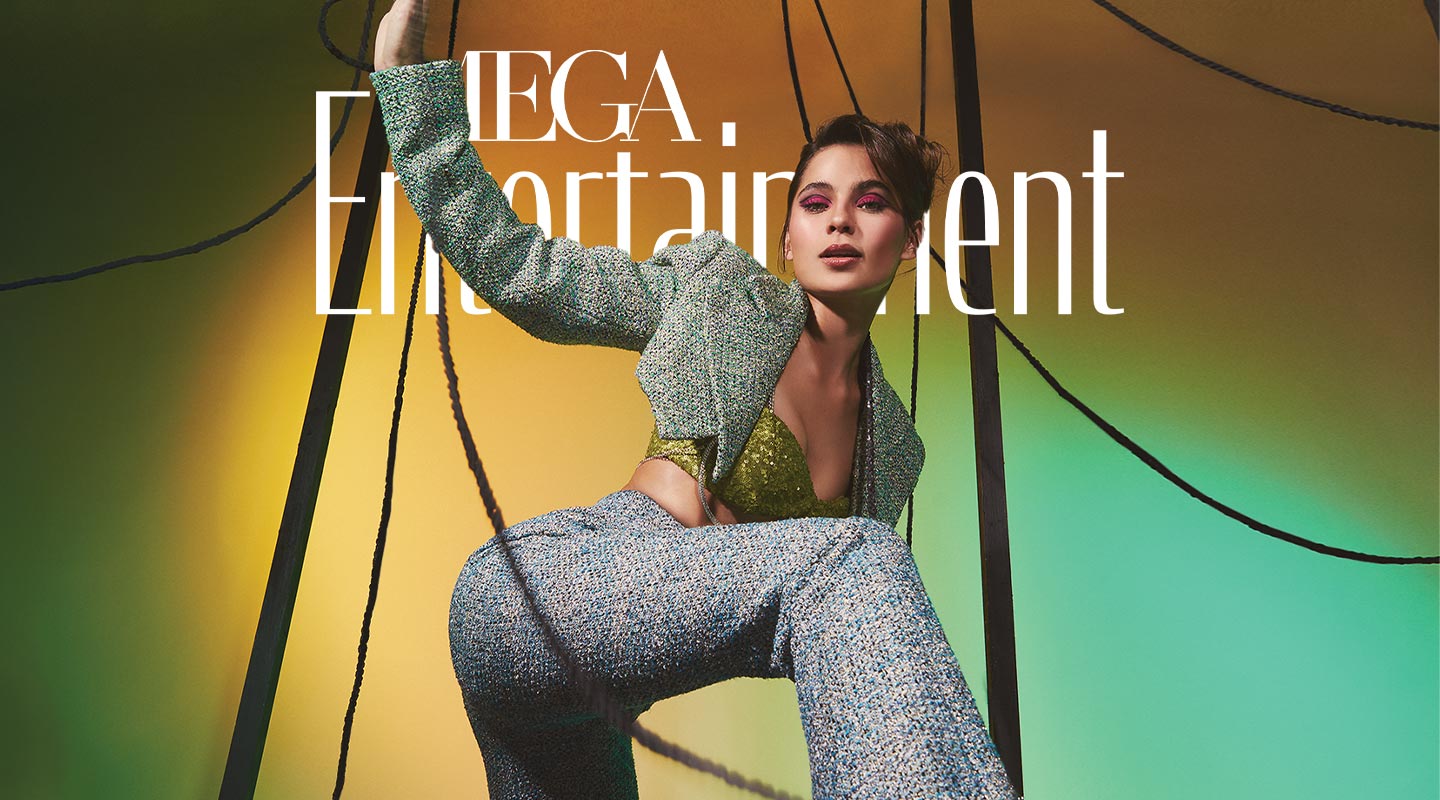
A MEGA editorial portrait shows Jasmine in a completely different setting, styled for a fashion feature. The image isn’t tattoo evidence, and it shouldn’t be used to claim that a hidden design is visible. It does show the kind of contrast that makes her back tattoo interesting: a quiet, permanent mark existing alongside polished styling, changing hair, dramatic makeup and different public roles.
That contrast is part of the appeal. The tattoo isn’t trying to match every outfit or announce a particular subculture. It is a personal detail that stays consistent while everything around it changes. In that sense, the piece feels less like a trend tattoo and more like a small anchor.
There is also a nice lesson in restraint. A single line of text can be enough if the words matter and the placement is right. Adding a frame, extra symbols or heavy shading might make the tattoo look more elaborate, but it could also distract from the reason it was chosen. Jasmine’s design keeps the focus on the writing.
What to borrow from Jasmine Curtis-Smith’s style
The obvious takeaway is the use of vertical script on the upper back, but copying the placement isn’t the point. The better idea is to think about what you want the tattoo to do. Do you want to see it constantly? Keep it for yourself? Reveal it only with certain clothes? The answer should guide the location.
Choose words that still feel right when the excitement of getting tattooed has worn off. If the phrase comes from another language, check it with someone who actually speaks that language. Look at several type styles, but remember that a beautiful font is still a bad choice if the letters are too close together to age well.
Most of all, leave room for the tattoo to be personal. You don’t have to turn every piece into a public explanation. Jasmine’s tattoo is visible enough to discuss, but it still has a private quality because the meaning belongs to her. That is a good reason to like it. The design is clean, the placement is flexible and the story doesn’t need to be louder than the ink.
Jasmine Curtis-Smith’s back tattoo is a small piece with a clear point of view. It uses simple black lettering, a vertical layout and enough open space to stay readable. More importantly, it shows how a meaningful design can sit quietly in the background while the rest of a person’s life keeps moving.