codex

Lottie Moss Tattoos: Ribcage Birds, Lover Face Ink and More

Lottie Moss’s tattoos range from small, easy-to-hide pieces to the cursive “Lover” beneath her right eye, which she later began removing. Teen Vogue documented three birds across her ribs and matching hearts she got with her friend Thea Roberts. In a Los Angeles Times interview, Moss said a small heart on her right wrist was her first tattoo.

The designs have different stories, and the face tattoo changed meaning for her over time. The photos and interviews make some details clear; they don’t explain every mark.

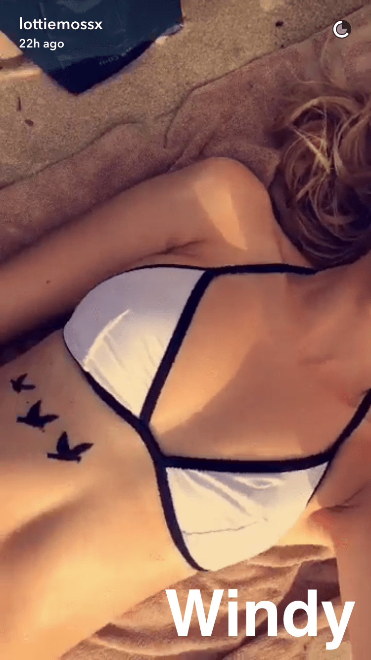
Lottie Moss’s three bird tattoos climb across her ribcage
Lottie Moss tattoos: Ribcage bird tattoo evidence for the opening tattoo section

Teen Vogue photographed three black bird silhouettes running across Moss’s ribcage. They grow in size along the skin and follow its long shape, with enough space around each bird to keep the group light.

The change in scale gives the row a sense of movement without adding a background or fine interior detail. It’s also a placement most clothes cover, though a cropped top or swimwear can reveal it.

A friendship mark came first

The same Teen Vogue report mentioned matching stenciled hearts Moss got with her friend Thea Roberts. The report doesn’t assign the hearts a larger meaning; the shared design is the point.

The hearts and birds use familiar shapes in different ways: one mark shared between friends, and a row arranged across one person’s ribs. Matching tattoos can stay simple. A small change in placement or line weight can make each one feel personal without making the design hard to recognise.

The first piece was easy to hide

In a Los Angeles Times interview about a PacSun collection, Moss said the small heart on her right wrist was her first tattoo. It’s compact, but the wrist is visible in everyday gestures and short sleeves.

A clean outline suits the limited space. If you’re considering a wrist design, look at it with your hand relaxed and turned in different directions; the angle changes how visible it is.

“Not Yours / Never Was” is a hidden phrase

The Los Angeles Times also reported a script tattoo reading “Not Yours / Never Was” on Moss’s butt. She said the phrase inspired a T-shirt after a breakup. Its placement keeps the words private most of the time.

With script, spacing and letter shapes matter as much as the wording. Check the phrase at its intended size and position so it remains balanced on the body, not only in a design file.

The famous Lover face tattoo was impulsive by design
Lottie Moss tattoos: Close-up evidence for the Lover face tattoo section

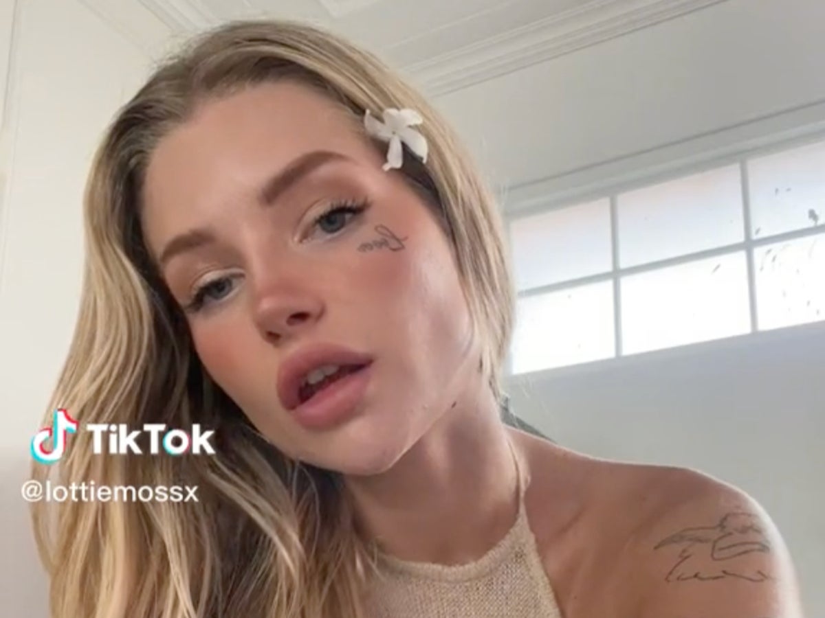
Glamour reported that Moss got the cursive Lover beneath her right eye in Bali. She described the decision as impulsive and connected it to feeling free after years of being controlled. The tattoo was one word, but its placement made it hard to miss.

In 2022, Moss spoke about it as an expression of freedom. A few years later, she began having it removed. Those accounts can both be true: a tattoo can fit a moment in someone’s life and later stop feeling right.

The face ink sat alongside smaller body tattoos
Lottie Moss tattoos: Close face-visible tattoo portrait showing Lottie Moss's Lover tattoo and the surrounding facial placement

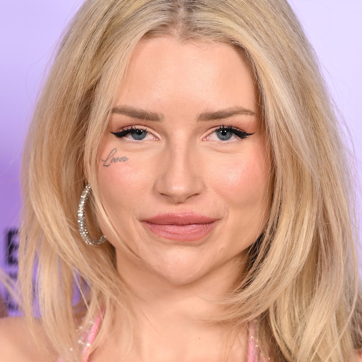
An Independent portrait shows the face tattoo with fine-line work on Moss’s shoulder and upper arm. The word below her eye draws attention first, while the other visible pieces are smaller and less prominent.

Some marks in the photo are too small or cropped to identify, so it’s safer to leave them unnamed. Tattoos can sit together without matching exactly; placement and spacing help a mixed collection feel considered.

The face tattoo was documented while it was being inked
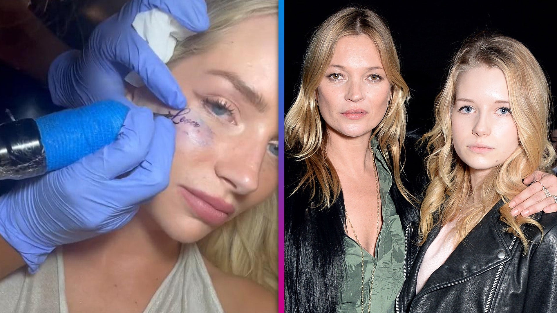
Lottie Moss tattoos: Tattoo-inking evidence for the face tattoo process section

ET’s collage includes a panel of an artist working beneath Moss’s eye. A separate panel shows a family photo, which is contextual and not tattoo evidence. The tattoo-specific image documents the process and the lettering’s position near her eye and cheekbone.

For facial ink, check the stencil from several angles and give yourself time before committing. A word can look different when you smile or turn your head than it does in a still photo.

The fading tattoo changed the look of the face
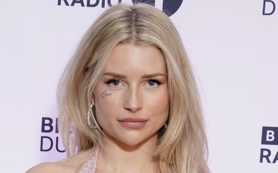
Lottie Moss tattoos: Later red-carpet evidence showing the fading face tattoo

A Standard red-carpet photo shows the Lover tattoo after it had begun to fade. The script is lighter than in earlier close-ups but still visible. Lighting, makeup and camera distance can also change how the same ink appears, so the two images show different points in its timeline.

Fine lettering can lose contrast as it fades. That doesn’t mean every faded tattoo needs removal, but it’s part of what to consider when choosing thin lines and a highly visible spot.

The decision changed place in her story

The Daily Beast reported that Moss began a public removal process in 2024, including treatments for the face tattoo and some arm designs. By 2026, the Lover tattoo appeared to be gone. Moss also said she didn’t love any of her tattoos, putting the face tattoo in the context of her wider collection.

Removal is part of the story too. The birds, hearts and script can be considered on their own, without copying the circumstances around the face tattoo.

Practical takeaways from the collection

Moss’s tattoos show how much placement changes a design: the ribcage birds can stay hidden, the wrist heart is visible in daily life, and the word beneath her eye became part of every close-up. If you like a design but not its visibility, choose a different spot.

Use references for scale, spacing and line weight, but don’t assign a meaning to a symbol unless the person wearing it has explained one. Think through how the tattoo will look as it heals and ages, and take time with a choice that will be difficult to hide.
More model tattoo guides

Jenna Dewan Tattoos: The Side by Side Foot Ink and Upper-Back Wings

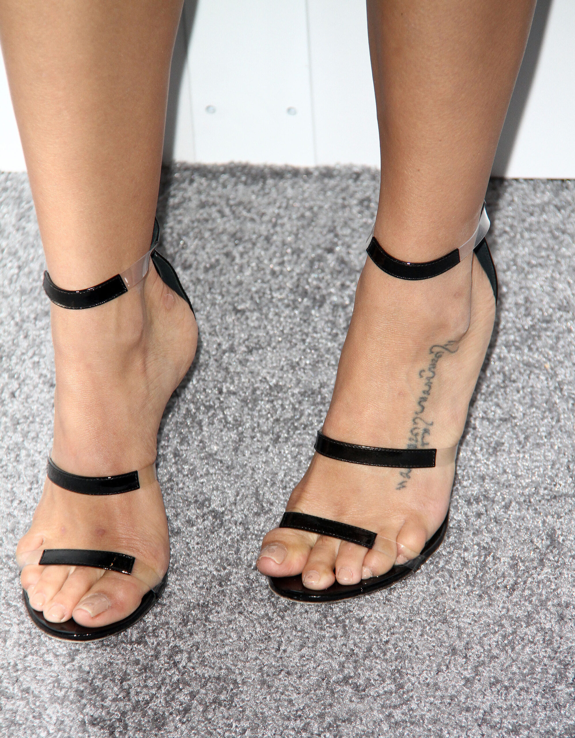
Jenna Dewan has two small tattoos that are well documented: matching “Side by Side” script on her left foot and a pair of outline wings high on her back. SELF reported that she and Channing Tatum got the matching phrase during their 2009 honeymoon in Bali. The wings appear in photos too, though Dewan hasn’t given a definitive explanation for them.

The tattoos differ in placement and story. The foot lettering was part of a shared vow; the wings are a quieter design whose meaning is her own.

The Side by Side foot tattoo

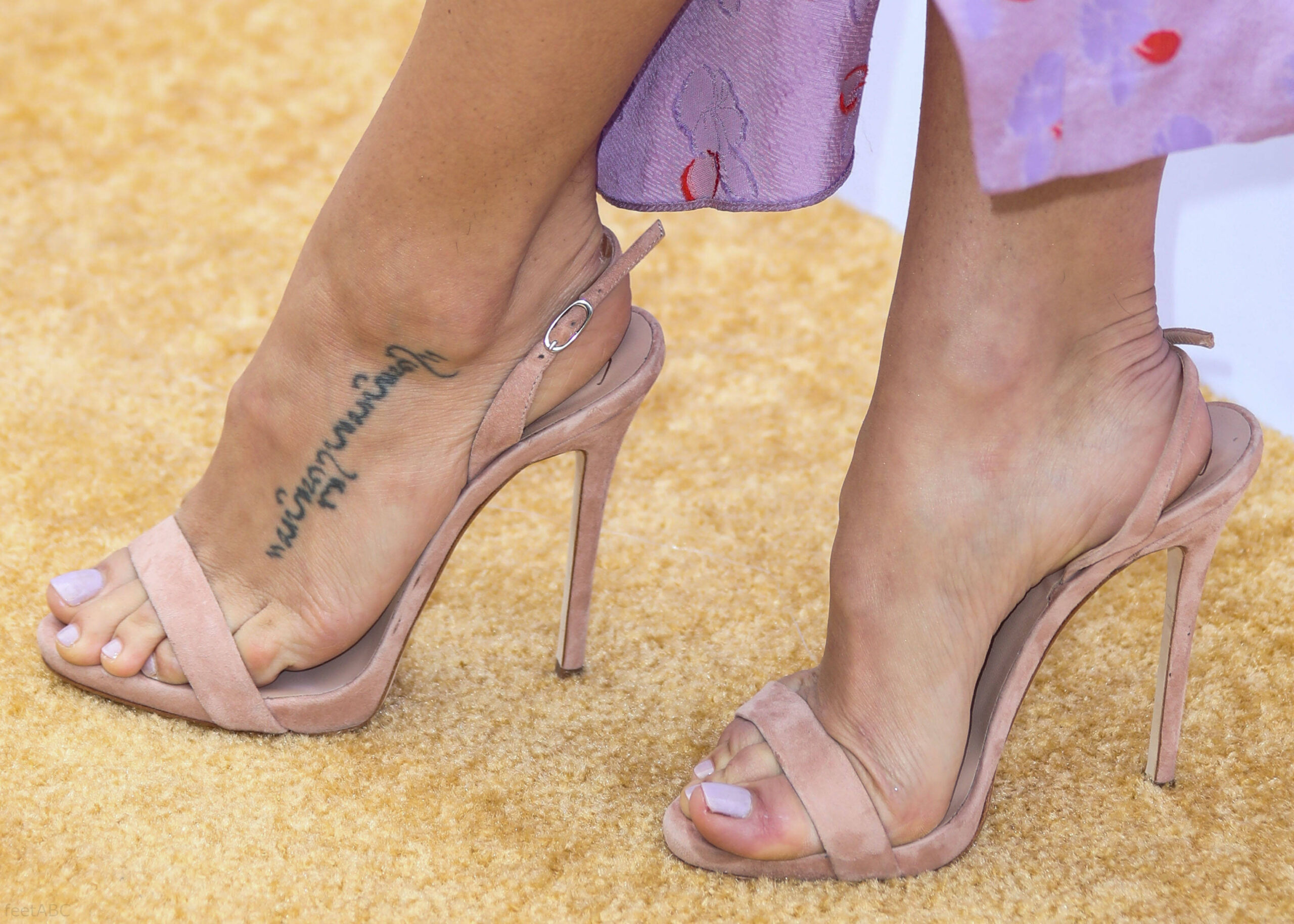
Jenna Dewan tattoos: tattoo evidence for the documented Side by Side foot tattoo
Jenna Dewan tattoos: second tattoo evidence view for the documented Side by Side foot tattoo

The script runs along the top of Dewan’s left foot, just above the toes. It follows the length of the foot and is easy to cover with shoes, though sandals and barefoot photos show it clearly.

SELF reported that Dewan and Tatum got matching tattoos on their Bali honeymoon in 2009. Their phrase is commonly described as the Balinese or Bahasa wording for “side by side.” Dewan placed hers on her foot; Tatum’s is on his ribcage. The lettering is simple black script, without color, shading or extra symbols.
The short phrase came from the vows they shared. A line can hold a specific memory without spelling out a name, date or portrait, and the words can mean more to the wearer than the photo reveals.

A second design in the collection

Dewan also has a small pair of outline wings high on her upper back. The available crop shows mirrored wings with a narrow space between them and fine black lines. The sources identify the design and placement, but don’t give a confirmed meaning. There’s no need to assign wings a story about freedom or protection without her saying so.

The open outline keeps a familiar motif light. If you’re considering a similar design, scale and line weight matter more than adding a banner or background.

Why the foot design feels so personal

A photo shows the lettering, but the honeymoon and vows explain how the phrase became a matching tattoo. Dewan’s foot version and Tatum’s ribcage version aren’t usually shown together; the connection comes from the reporting.

The body in motion

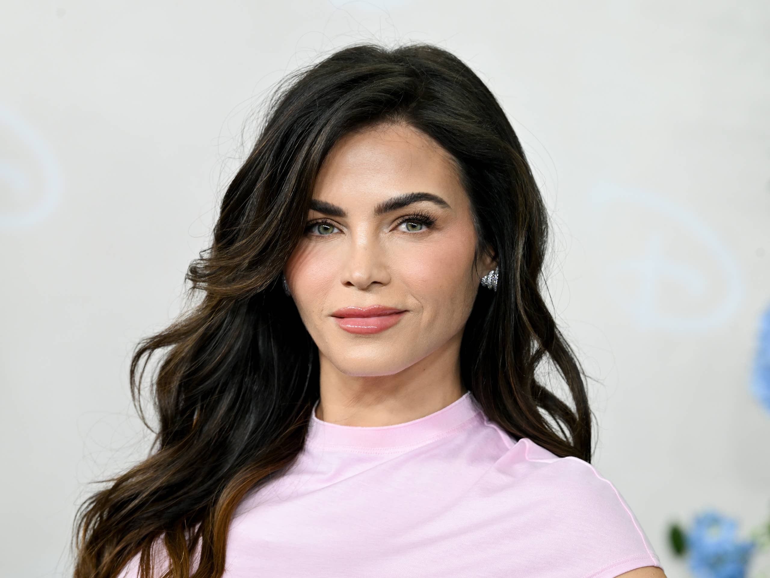
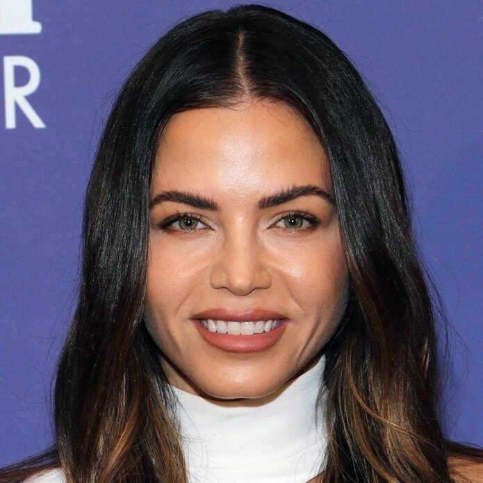
Jenna Dewan in a contextual photograph: contextual portrait only, not tattoo evidence; not tattoo evidence

Dewan’s dance career makes movement a useful part of looking at these placements, though there’s no claim that the tattoos were designed as choreography. The script follows the foot, which changes shape as she walks. The wings sit where the shoulders and back frame them.

If a tattoo will sit on a part of the body that bends or moves, check the stencil while standing, sitting and moving naturally. Script that looks clear on a screen can feel cramped on skin, especially on a small, high-friction area like the foot.

A personal choice

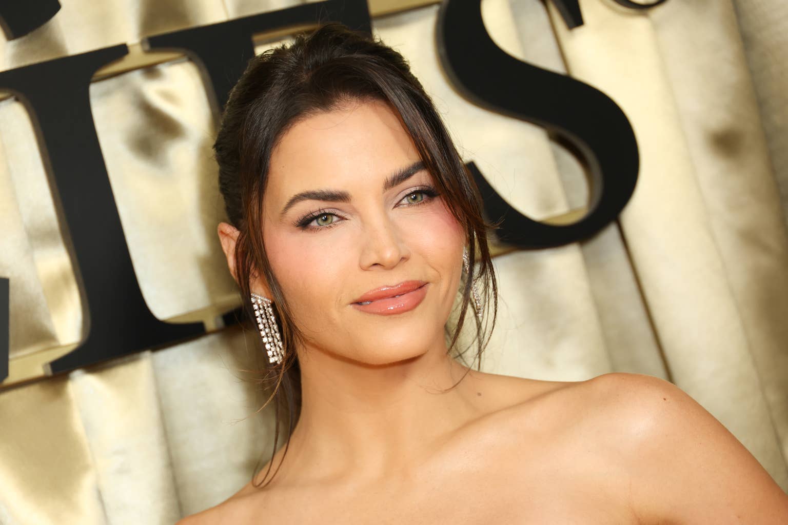
Jenna Dewan in a contextual photograph: contextual portrait only, not tattoo evidence; not tattoo evidence

The foot tattoo has appeared in public photos for years without taking over Dewan’s look. It can show in sandals or barefoot shots and disappear in most shoes. The wings are covered by everyday clothes but can show with an open-back outfit. Both placements let the wearer choose when the tattoos are visible.

How to borrow the idea without copying it

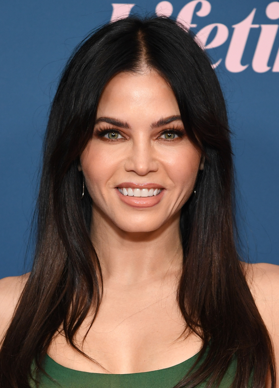
Jenna Dewan in a contextual photograph: contextual portrait only, not tattoo evidence; not tattoo evidence

Treat the tattoos as references for scale and placement, not designs to trace. For a matching tattoo, choose a short phrase that already matters to both people. Keep enough space for the script to remain legible, especially on the foot, where shoes can rub against it.

For wings, decide which part you like—the outline, symmetry or open space—and ask an artist to draw a new version for you. Think about how the area moves, how clothing covers it and whether you want the tattoo visible at work.

Why this small collection sticks

The foot phrase has a documented story; the wings have a clear shape and placement but no confirmed explanation. That difference is a useful reminder when looking at celebrity tattoos: a photograph can show the ink, while the meaning belongs to the person wearing it.

Saif Ali Khan Tattoos: The Kareena Name Ink and the Trishul Cover-Up

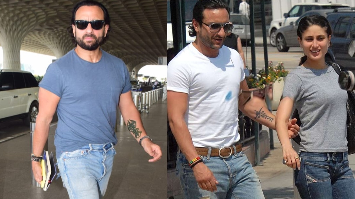
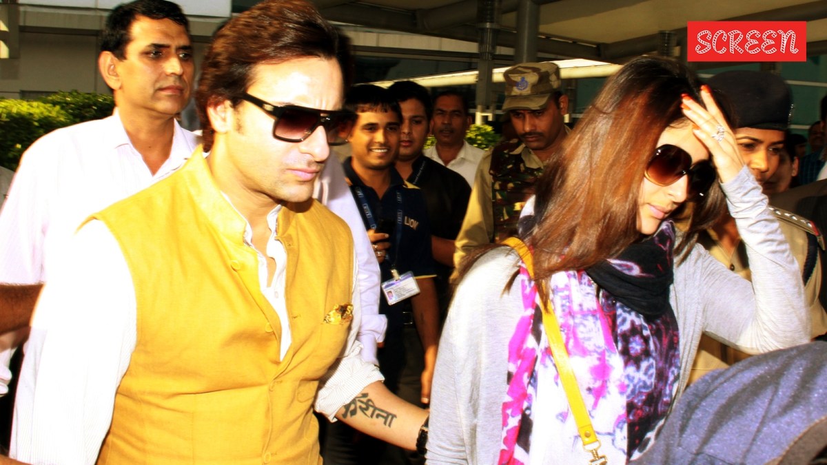
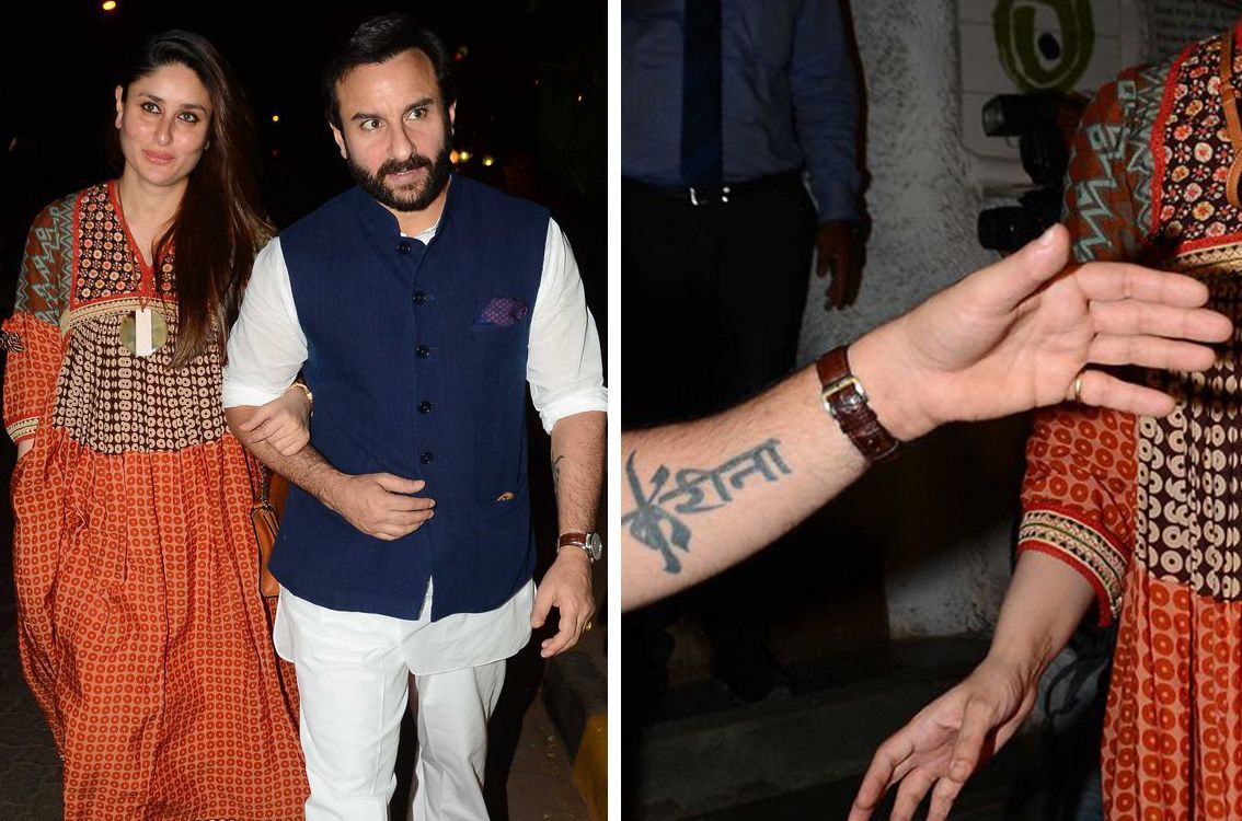
Saif Ali Khan’s most familiar tattoo was Kareena Kapoor’s name in Devanagari across his left forearm. He got it in 2008, early in their relationship. In 2024, photographs appeared to show a dark trishul-style design over the same area. Reports call it a cover-up, but neither its permanence nor its meaning has been confirmed publicly.

Khan has said he first imagined something smaller and more discreet, then chose a much more visible design. The original lettering is well documented; the newer mark is harder to read in the available photos.

Saif Ali Khan’s Kareena forearm tattoo and the trishul cover-up

Saif Ali Khan tattoos: tattoo evidence for the reported cover-up

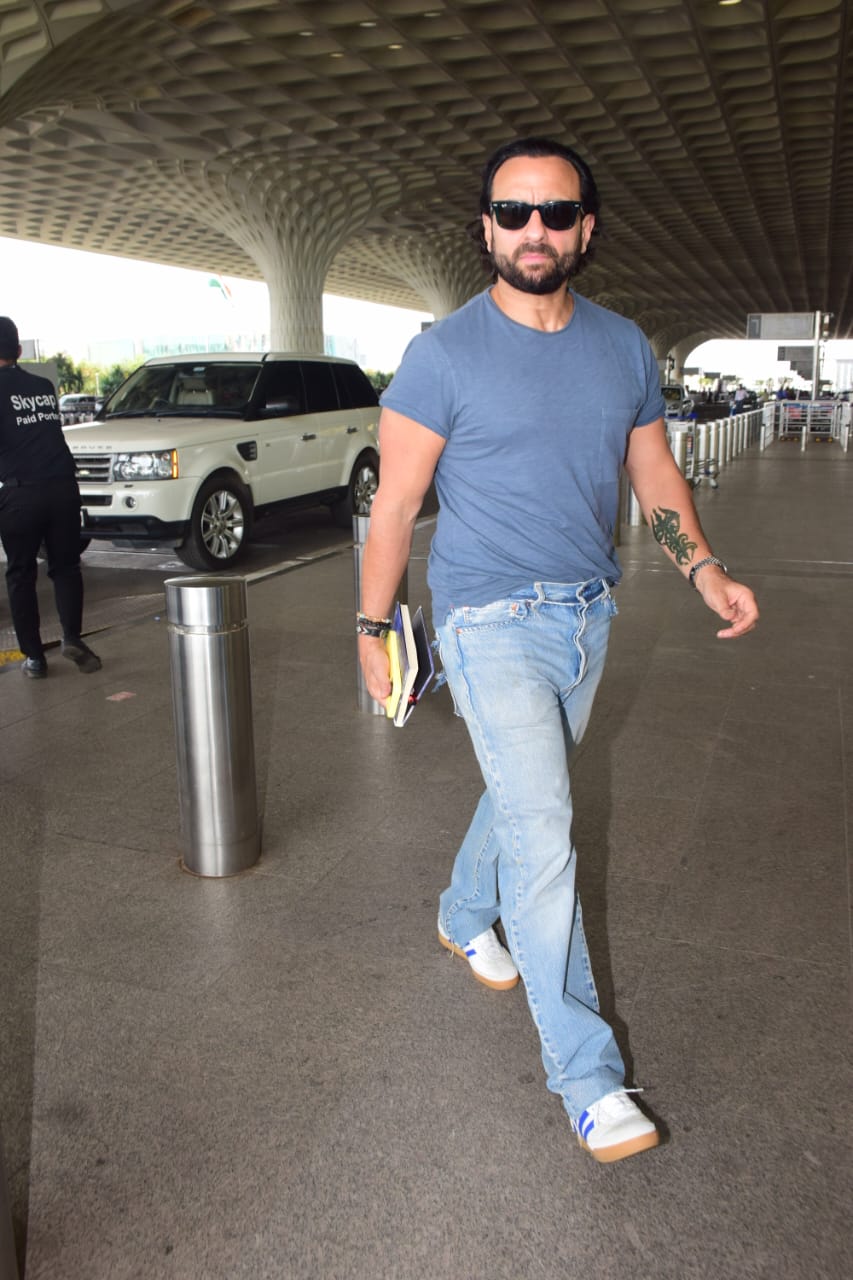
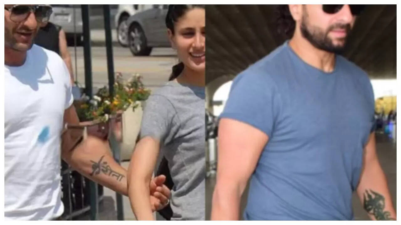
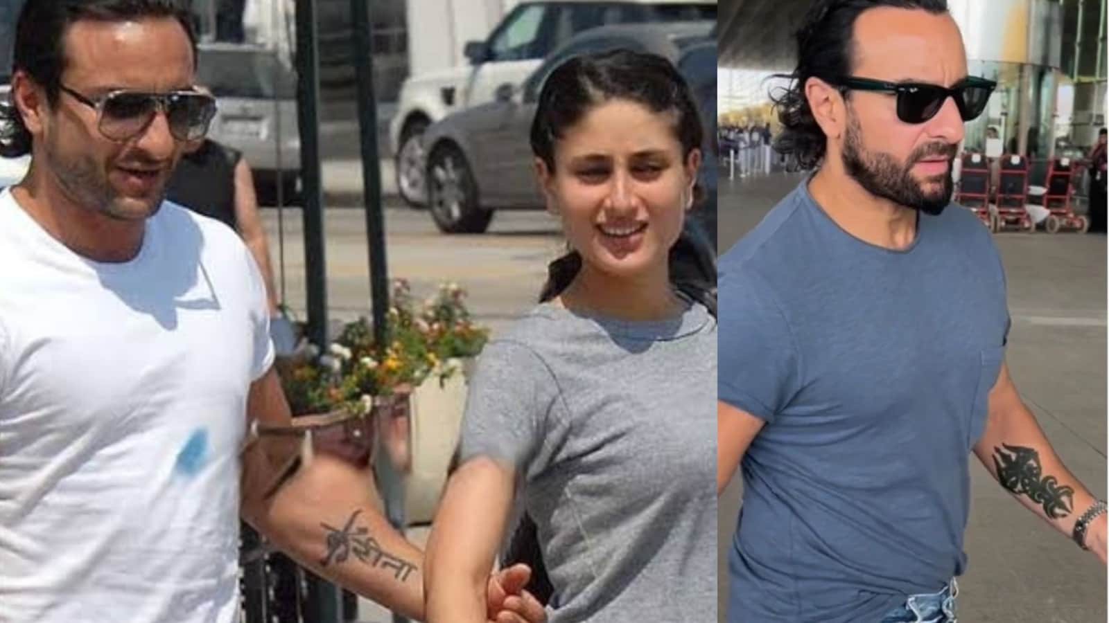
Recent airport photos show dark linework around the lower part of Khan’s left forearm. A pointed shape has been described as trishul-like, but the photos aren’t studio close-ups, and the angle makes individual lines difficult to identify.

The pictures show that the area looks different from the earlier lettering. Reports describe a cover-up, but there’s no public confirmation of when the new design was made or whether it’s permanent. “Apparent trishul-style cover-up” is the most careful description.

Saif Ali Khan tattoos: close tattoo evidence for the reported cover-up

This second view places the design below the elbow. The dark, compact shape has more visual weight than the narrow script that was there before. If it is a cover-up, that heavier ink could help obscure the old letters; the photos don’t confirm the process.

Saif Ali Khan tattoos: original name tattoo evidence

Older pictures show Kareena’s name more clearly in Devanagari across the same forearm. One widely circulated photo shows Khan walking beside Kareena with the lettering visible. He later said he’d first considered a small shoulder design, but the idea grew into her name on his arm.

Saif Ali Khan tattoos: additional placement evidence for the original name tattoo

A Vogue India photo offers another view of the original tattoo, though it isn’t close enough to judge the lettering in detail.

Placement lessons from a changing design

Saif Ali Khan tattoos: tattoo evidence for forearm placement and cover-up shape

The forearm gives a design a long surface and keeps it visible. It also turns and bends throughout the day, so lettering should be checked from more than one angle. Khan’s name tattoo followed the arm; the newer mark appears denser and more vertical.

If you’re considering Devanagari or another script you don’t read, have a native speaker or trusted language expert check the wording and stencil before the appointment. Connected letters and lines can lose clarity when squeezed into a small space. A translation app isn’t enough for something permanent.

Cover-ups have their own limits. Dark existing ink may call for heavier shading, a larger design or several sessions. The artist has to work with the old lines, not just the shape in a reference photo.

Why the original design was so memorable

Saif Ali Khan tattoos: tattoo evidence for comparing the original and reported cover-up designs

The first tattoo used Kareena’s name, not an initial, date or symbol. That made its meaning clear to anyone who recognised the script, and kept it visible on the forearm.

Khan said the idea grew from something more discreet into a larger gesture. One visible design now sits at two points in their story: the original lettering and the later mark reported over it. If you’re considering a partner’s name, think about whether you’d still want the tattoo if other people stopped reading it as a romantic statement—and where a future cover-up might fit.

A wider look at Saif’s public image

A trishul can have religious or cultural associations, or simply be part of a design, but Khan hasn’t explained what this particular mark means to him. Some reports suggested the tattoo might be for a film role; that possibility also remains unconfirmed.

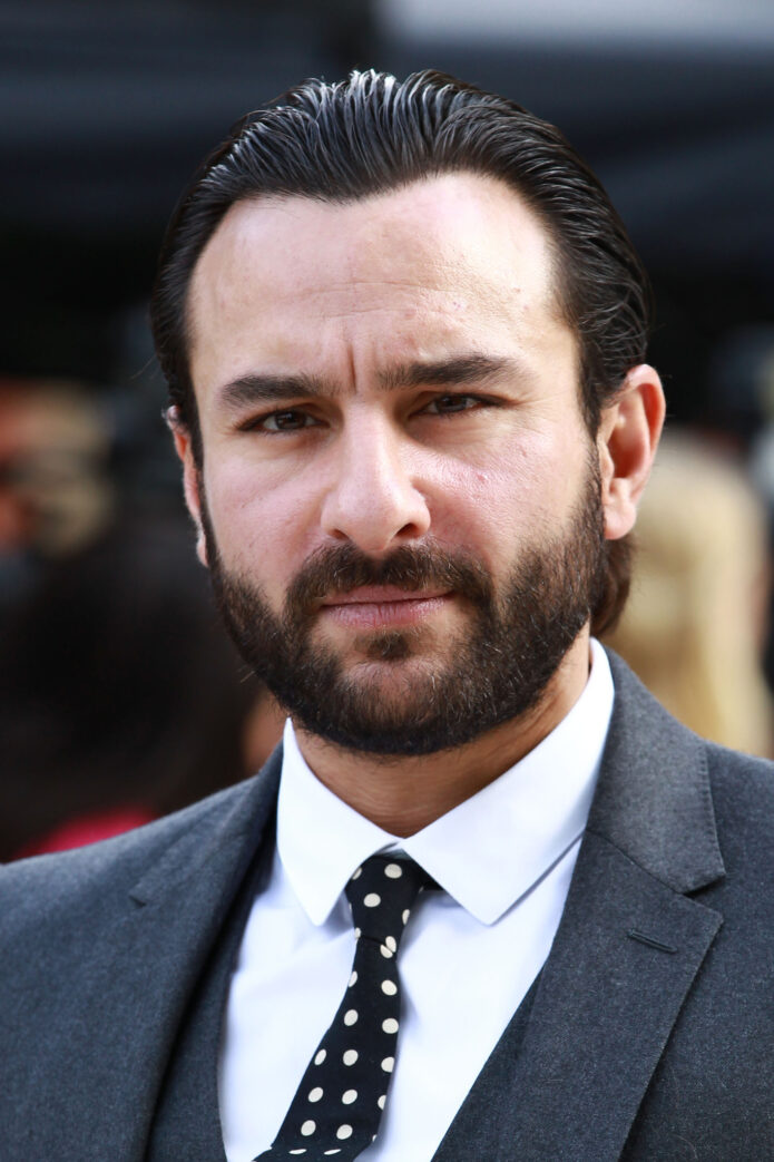
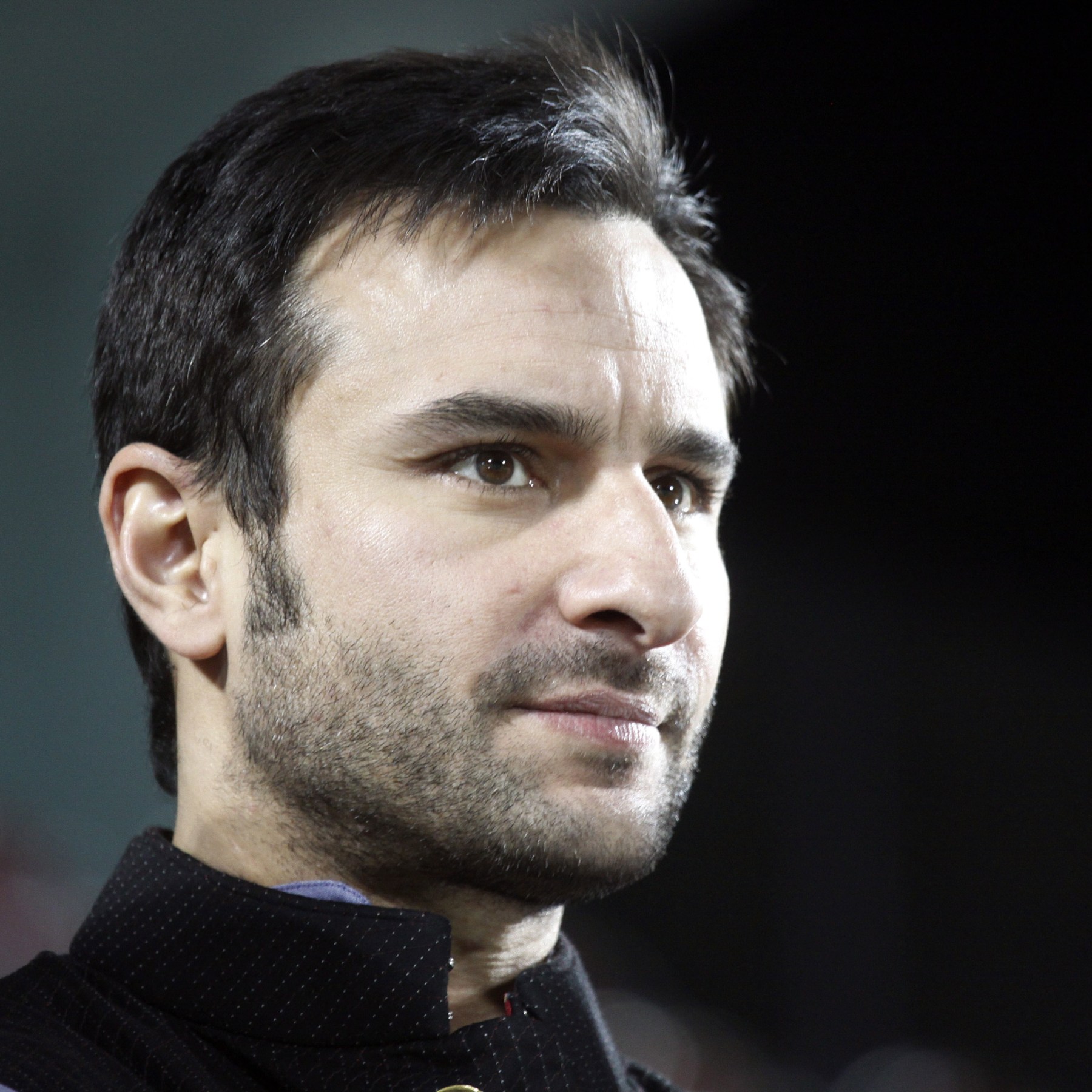
Saif Ali Khan in a contextual photograph: contextual portrait only; not tattoo evidence

This portrait is contextual and shows no tattoo. Khan’s appearance has changed across different film roles and public settings, but the photo doesn’t explain the forearm design.

A second contextual look at Saif’s style

Saif Ali Khan in a contextual photograph: contextual portrait only; not tattoo evidence

There’s no tattoo visible in this portrait either. Other public photos catch Khan’s forearm briefly under a rolled sleeve or beside a watch; those glimpses helped make the ink recognizable, but they don’t replace a clear tattoo photograph.

What this story leaves you with

The photographs document the old lettering and the darker design that followed. They don’t tell us what the newer mark means; that part is Saif’s to explain.

More actor tattoo guides

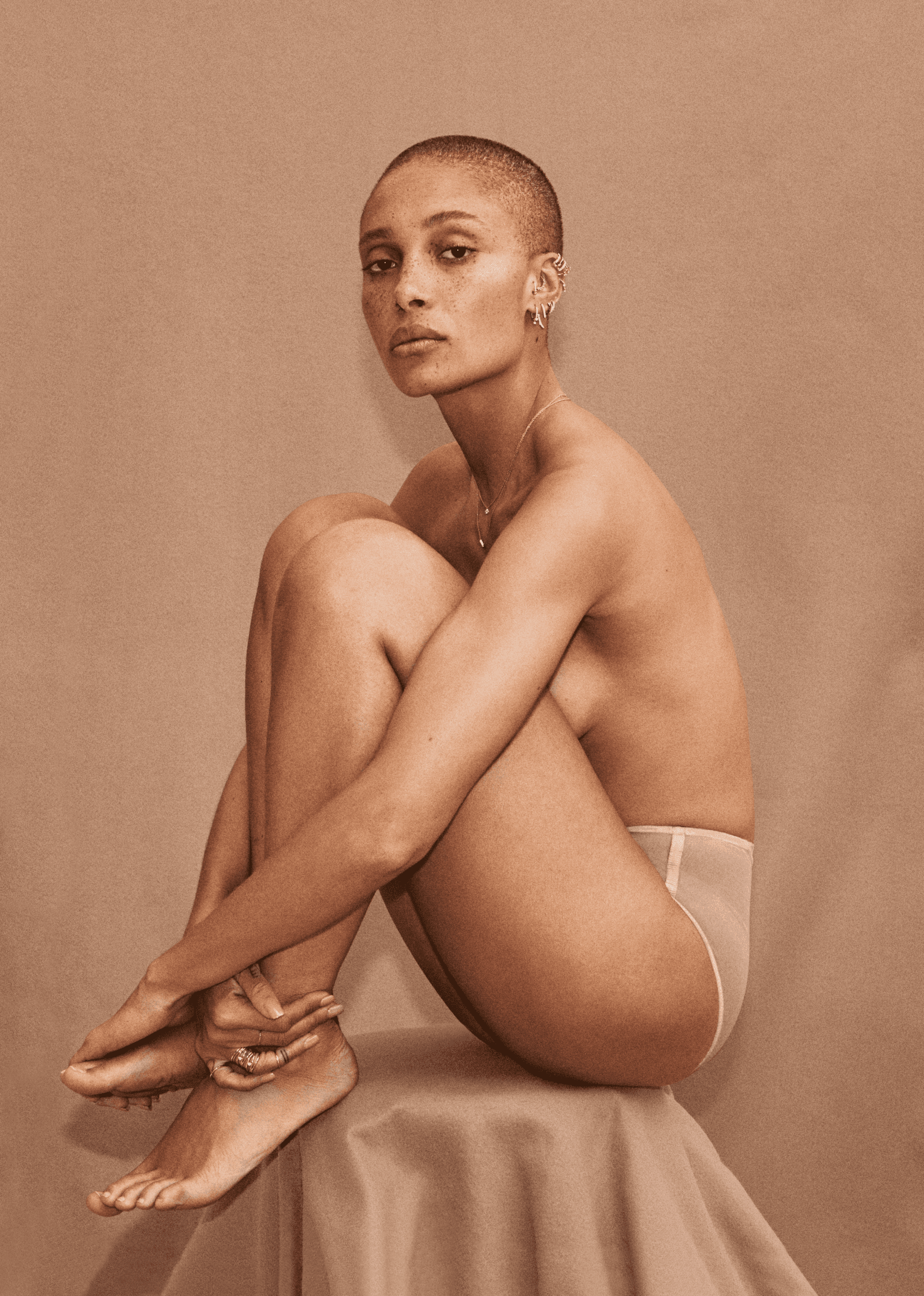
Adwoa Aboah Tattoos: Gurl Power, Wrist Quote and the Ink Behind Her Style

Adwoa Aboah’s tattoos are small and scattered across her hands, fingers and wrist. Some mark people close to her; others connect to feminism, mental health or a line of poetry. She has explained several of them herself, including “Gurl Power,” the number 3, a small “J” a friend did, her sister’s birthday and the words “All the women. In me. Are tired.”

The pieces don’t form one matching set. They read more like separate notes from different parts of her life, and the photos don’t always show every detail clearly.

Adwoa Aboah’s “Gurl Power” hand tattoos

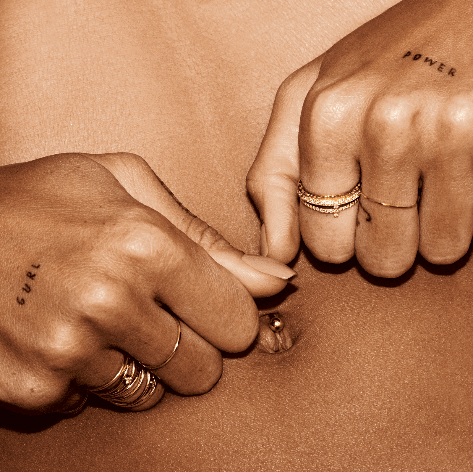
The words “Gurl” and “Power” are split across Aboah’s hands. She told Teen Vogue she got the tattoo while working on a series with Vice and i-D. Vogue Germany reported that Jon Boy did the hand ink.

Adwoa Aboah tattoos: Adwoa Aboah Gurl Power hand tattoos

Hand lettering appears in ordinary gestures, then disappears when Aboah moves or covers her hands. The small, dark script is direct and easy to read. The message connects with the work she does through Gurls Talk, but Aboah hasn’t described the tattoo as a logo for the organization.

The small marks on her fingers and hands

Aboah has other small marks across her fingers and hands. One she discussed with Teen Vogue is a little “J” that a friend did. She has also described her tattoos as markers of different stages in her self-discovery.

Adwoa Aboah tattoos: Adwoa Aboah small hand and finger lettering

The collection mixes letters, numbers and small symbols instead of following one planned design. That leaves room for new pieces, and it means individual tattoos don’t have to match.

What the number 3 means to Adwoa Aboah

Aboah told Teen Vogue she got the number 3 with her friends and that it’s her number. Vogue France also linked the mark with mental-health awareness. The small numeral sits among other hand tattoos and can be easy to miss in a wider photo.

Adwoa Aboah tattoos: Adwoa Aboah number 3 tattoo editorial view

The two explanations should stay distinct: Aboah described it as her number and said she got it with friends; Vogue France supplied the mental-health connection.

A tattoo for her sister’s birthday

Aboah has said she got her sister’s birthday tattooed. The exact placement and style aren’t clear in the available editorial photos, so there’s no need to guess at how it looks.

Adwoa Aboah tattoos: Adwoa Aboah sister birthday tattoo context

A date can be a family marker without being legible to anyone else. Aboah has described it as one of several tattoos tied to people and moments she wants to remember.

“All the women. In me. Are tired.” wrist tattoo

The wrist phrase reads, “All the women. In me. Are tired.” It comes from Nayyirah Waheed’s book Nejma, and the periods break the line into short beats.

Adwoa Aboah tattoos: Adwoa Aboah wrist quote tattoo context

Allure has shown the tattoo close up, and Vogue Germany described it as minimalist script on her hand or wrist. The words are longer and more reflective than “Gurl Power,” but the small lettering keeps the piece understated.

Why her tattoos look so good in fashion photographs

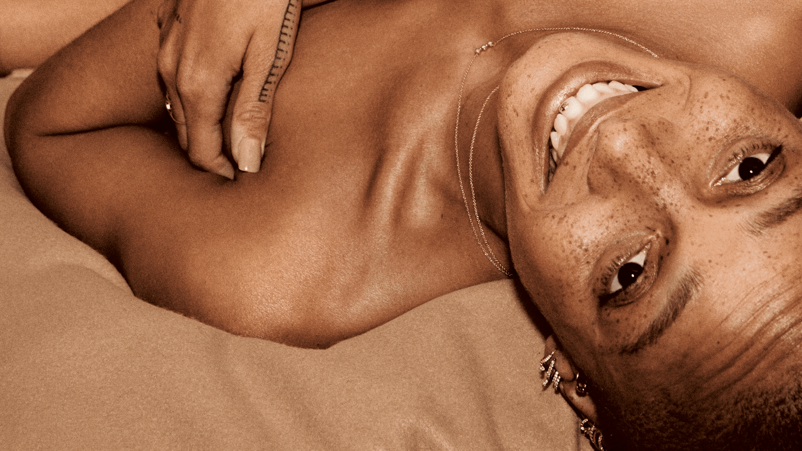
Aboah’s small tattoos can disappear under sleeves or gloves, then show when a shoot exposes her hands. That gives an editor room to frame her face or clothes without making the ink the whole subject.

Adwoa Aboah tattoos: Adwoa Aboah visible small tattoo details in fashion photography

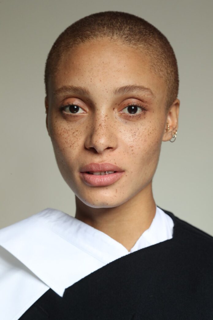
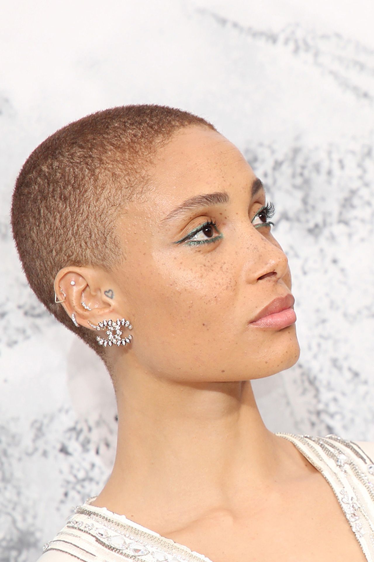
Her shaved head, freckles and piercings are also part of the look. The tattoos sit alongside them rather than taking over the frame.

Adwoa Aboah’s tattoo style in one sentence

Aboah’s collection is small hand and wrist ink with references to friends, family, feminism and poetry. It includes lettering and numbers, but the pieces don’t need to match to belong together.

Adwoa Aboah tattoos: Adwoa Aboah tattoo style editorial view

The useful idea is to choose tattoos for their own reasons, not to make a perfectly coordinated set. Small words need enough room to stay readable, and a collection can grow over time.

Watch Adwoa Aboah talk about Gurls Talk

More model tattoo guides

Babish Tattoos: The Designs, Stories and Details Shown in Photos (CETEG

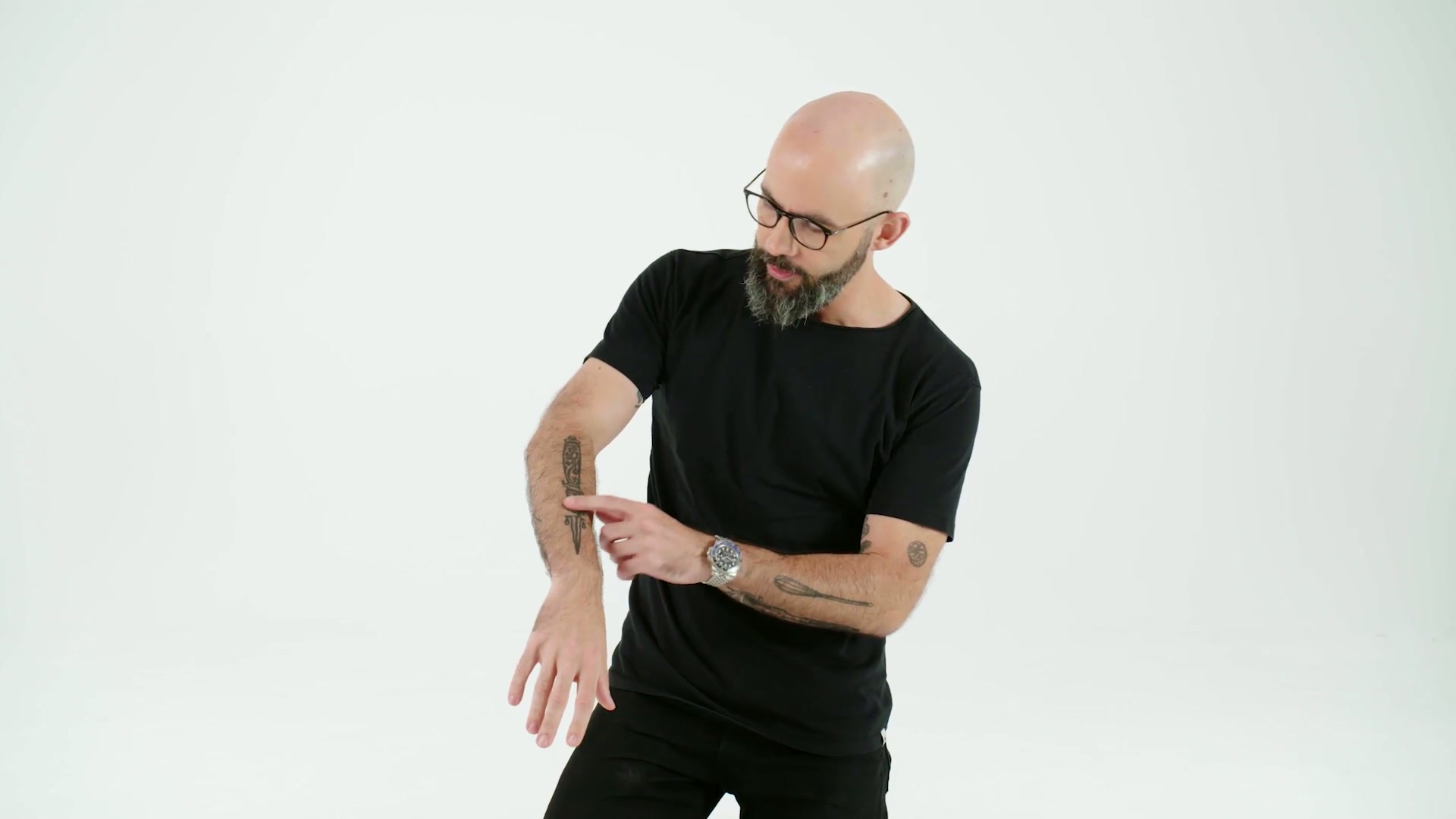
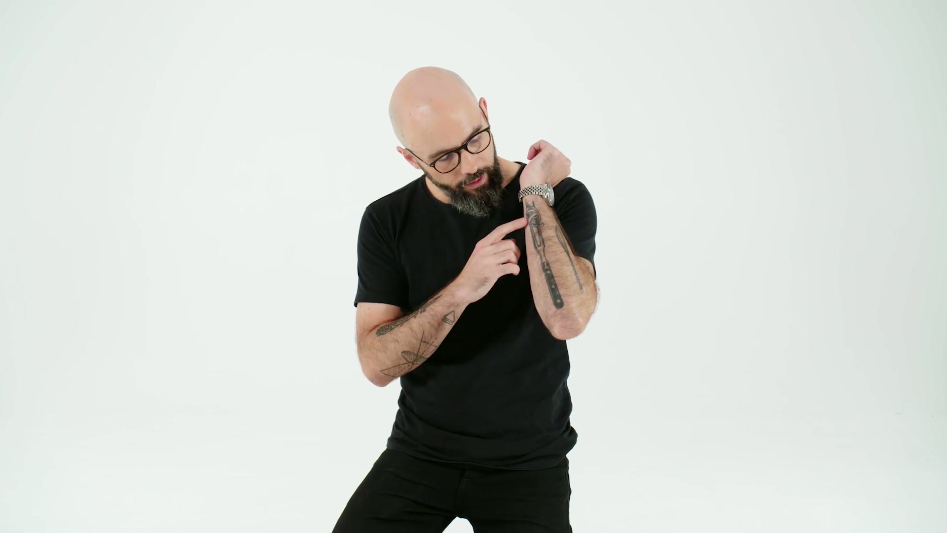
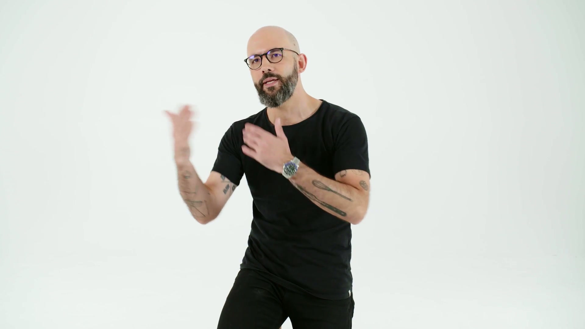
Andrew Rea’s tattoos cover food, films, television, music and people he knows. They’re spread across his arms rather than planned as one formal sleeve, and Rea has explained many of the references himself. A tiny whisk can sit beside a film reference; a personal mark can share space with a food joke.

The overall food-and-film arm collection

Babish tattoos: wide view of the documented food-and-film forearm collection

Rea’s forearms hold a loose group of small black designs, with skin left between them. Among the food tattoos are a whisk, cilantro and a joke about the restaurant phrase “soup, salad, and breadsticks.” He has said he dislikes cilantro because of a genetic aversion, turning an ordinary ingredient into a joke that fits a cook’s life.

The film and television references include a Seattle skyline based on Frasier’s opening credits, a switchblade connected to 12 Angry Men, a lens-refraction diagram, an editing symbol and a fork-and-spaghetti design tied to Chef. The arm mixes kitchen tools with images and stories Rea returns to.

How Babish’s tattoos work as a visual scrapbook

Babish tattoos: mid-shot of the mixed tattoo collection as a visual scrapbook

The scrapbook comparison fits because the tattoos record unrelated things: food, shows, music, friends and points in Rea’s life. They don’t need one visual style to sit together. The connection comes from why he chose each design.

Rea has talked about tattoos he regrets a little, but he hasn’t treated every rough edge as something that needs to be covered. Some pieces mark a particular time, even if his taste changes later. The smaller designs and open skin leave room for the collection to keep growing.

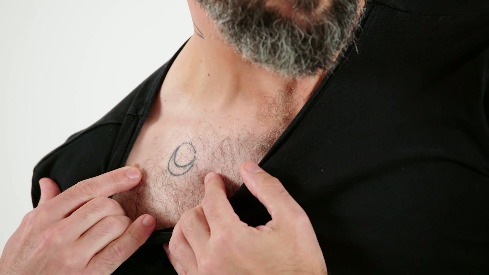
The Whole of the Moon chest tattoo

Babish tattoos: close view of the Whole of the Moon crescent on the upper chest

A small crescent sits on Rea’s upper chest. He has linked it to the song “The Whole of the Moon.” The design is quiet and easy to miss under a T-shirt, and the song reference carries the meaning without needing a larger illustration.

The Diarrhea Planet DP diamond tattoo

Babish tattoos: close view of the DP diamond logo on the lower abdomen

The DP diamond sits on Rea’s lower abdomen. It is the band Diarrhea Planet’s logo, which he identified in his tattoo tour. Its initials sit inside a geometric outline. From a distance it reads as a neat emblem; the band name supplies the joke and the personal reference.

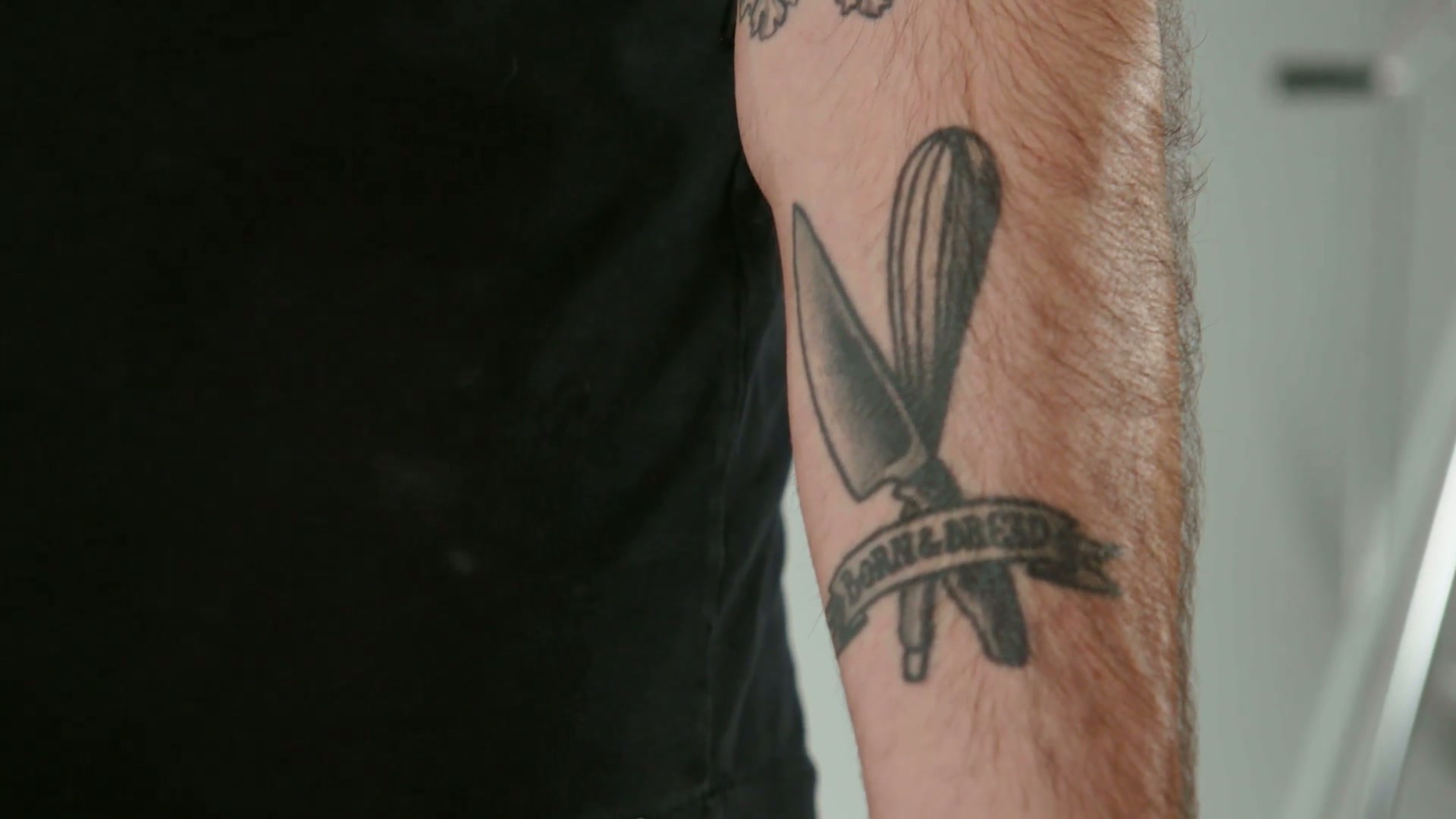
The knife, whisk, and BORN & BREAD forearm tattoo

Babish tattoos: close view of the knife, whisk, and BORN & BREAD forearm piece

A knife and whisk frame a banner reading BORN & BREAD. The old-school flash style ties the kitchen tools to Rea’s work and to the Babish identity he built around food. It’s one of the clearest places where the collection connects his cooking career with his sense of humor.

Other tattoos point to the people and references around him: the Eastman Kodak logo; a spork for his solidarity with Josh Scherer; a gavel for Oliver Babish, the West Wing character behind his adopted name; Hot Ones; wagon-wheel pasta; and the fluorescent-light design from Einstein on the Beach. His first tattoo was a code connected to Katrina and New Orleans, from before Babish became a public identity.

The collection is less a template than a record of what Rea has cared about. A food joke, a band logo or a skyline can each stand on its own; they don’t need to match to belong on the same arm.

More celebrity tattoo guides

Maggie Q Tattoos: The Phoenix and Five Personal Pieces

Among Maggie Q’s five documented tattoos are a phoenix on her left hip, writing along her side and forearms, and a small cross. She has linked the phoenix to starting over after a difficult relationship; the other marks have less complete public explanations.

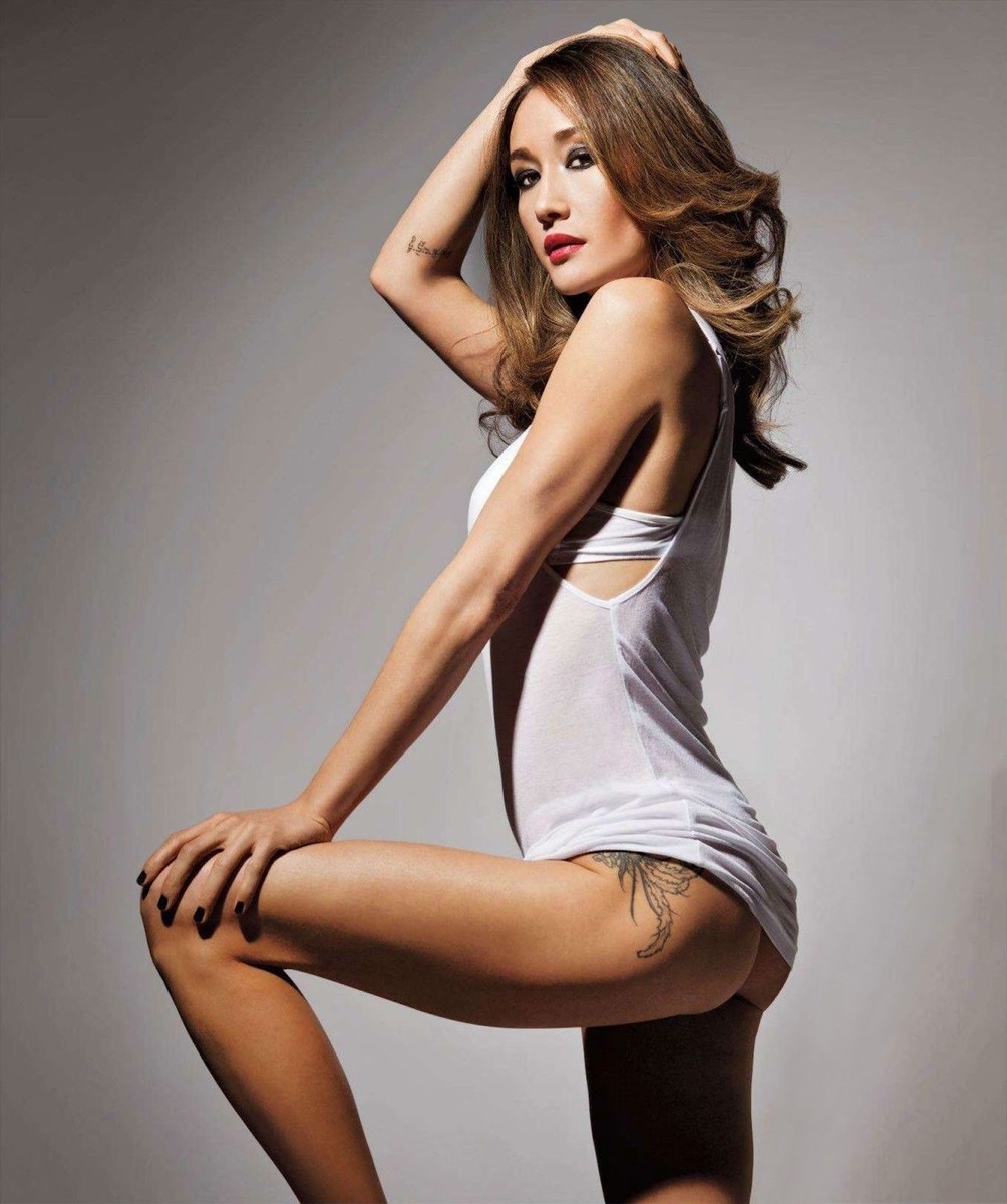
Maggie Q’s Phoenix Hip Tattoo

Maggie Q tattoos: Maggie Q left hip phoenix tattoo

The large phoenix runs from Maggie Q’s left hip toward her upper thigh. In the clearest image, the black-and-gray feathers follow the curve of her leg, with open skin around the lines so the shape stays readable.

She has said she got it in her early twenties, after a difficult relationship, and connected the bird with starting again and becoming stronger. The hip placement lets the design stay covered under everyday clothes.

The “Umuntu Ngumuntu Ngabantu” side tattoo.

The phrase umuntu ngumuntu ngabantu runs along her left side in narrow script. It is commonly translated as a person becoming who they are through other people, and is associated with the Southern African philosophy of ubuntu. The lettering follows the line of her torso and can be easy to miss.

If you’re considering a phrase in another language, check its spelling and context with someone qualified to read it. A translation can look right on a screen and still be wrong for the meaning or setting.

The Script and Cross on Maggie Q’s Arm

Maggie Q tattoos: Maggie Q visible arm script and cross tattoos

The Sanskrit tattoo on her right forearm. A small group of dark Sanskrit characters sits high on the inside of her right forearm. It’s compact enough to miss in a wider photo. Some coverage links her writing tattoos with Buddhist practice and years of study, though it doesn’t establish a definitive meaning for each piece.

Small scripts need room to stay distinct as the skin changes. Have a fluent reader check the final stencil, and work with an artist who understands the characters before setting the size.

The Chinese Characters on Her Left Forearm

Maggie Q tattoos: Maggie Q compact forearm lettering and triangle

The opposite forearm has a wider line of Chinese characters followed by a small triangle. Tattoo coverage has linked the characters to the name of a friend who died; the available photos don’t provide a translation. The triangle breaks up the line without taking attention away from the writing.

The cross on Maggie Q’s right forearm. The small cross has a soft, slightly worn look and sits where a sleeve can cover it or a rolled cuff can reveal it. Maggie Q hasn’t given a definitive explanation for the symbol, so it’s better to describe its shape and placement than assign it one meaning.

What Makes the Collection Feel Cohesive

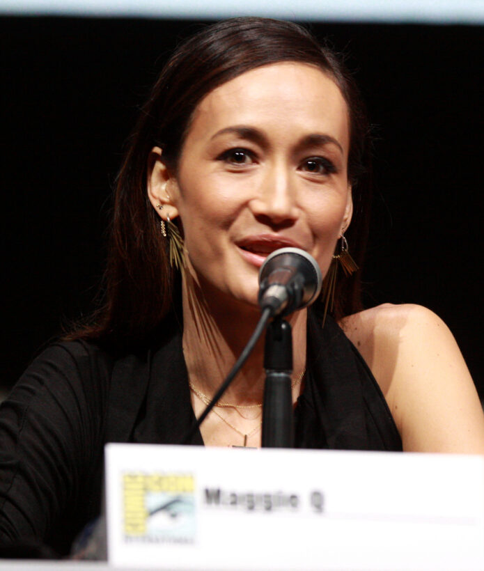
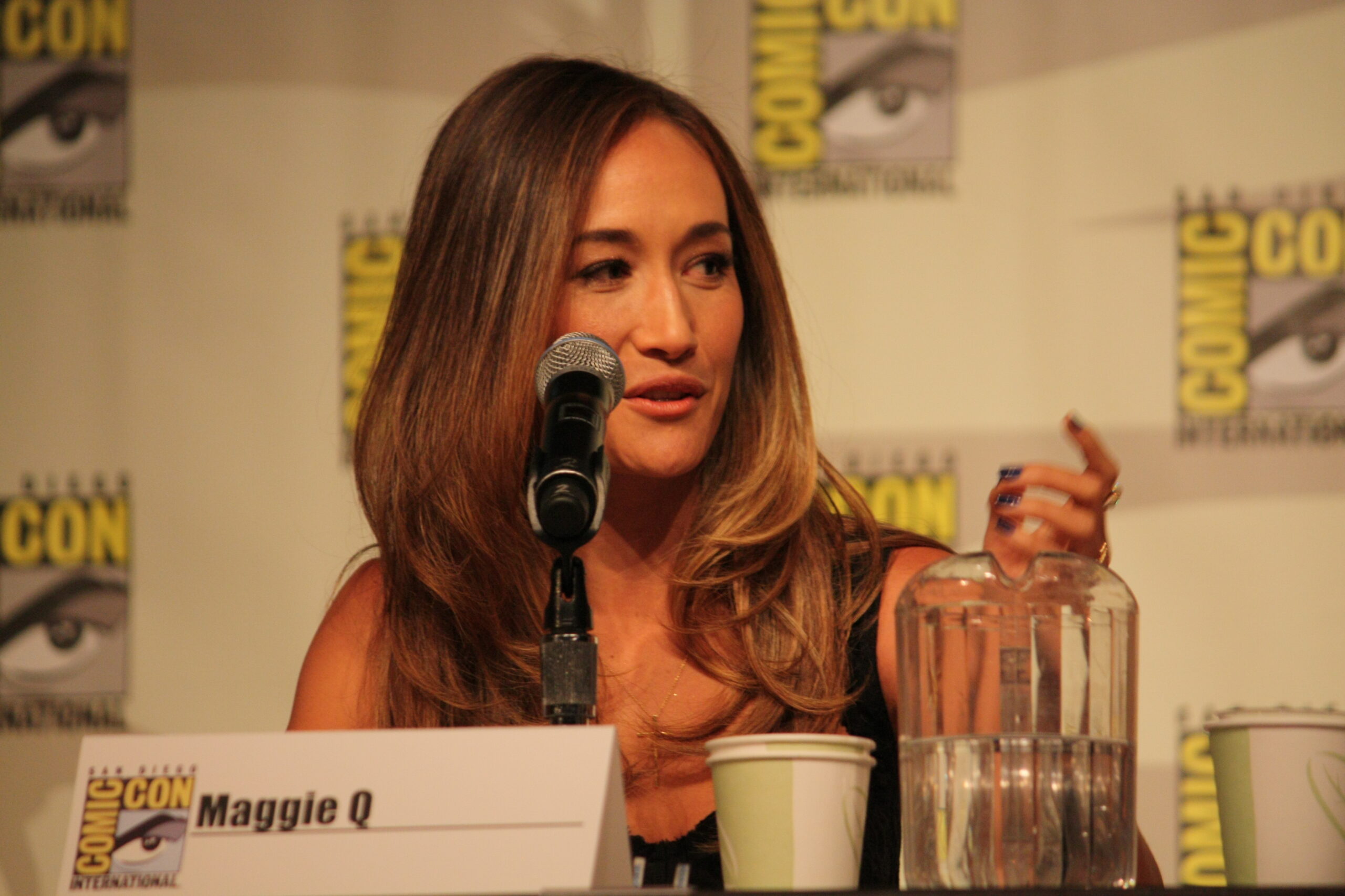
Maggie Q in a contextual photograph: contextual career portrait; not tattoo evidence; not tattoo evidence

The tattoos vary in size and style: a large phoenix, several pieces of writing and a small cross. They also sit in different places—her hip, side and forearms—so some can stay private while others show in photos or on screen. There’s no single sleeve tying them together.

During her run as Nikita, Maggie Q said productions sometimes needed to cover or write around her real tattoos. They are part of her life outside a role, even when a costume department has to account for them.

A Few Practical Notes

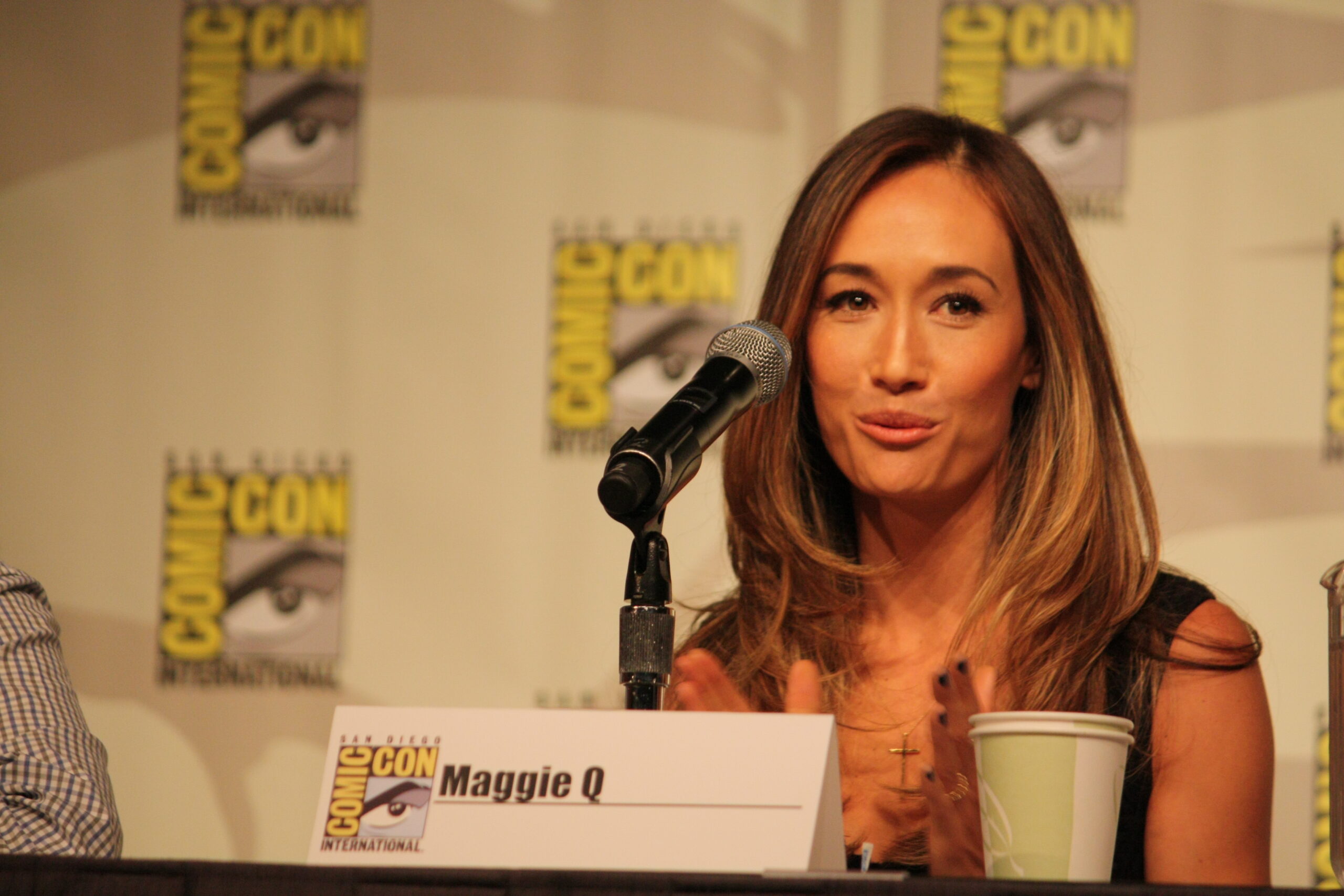
Maggie Q in a contextual photograph: contextual career portrait; not tattoo evidence; not tattoo evidence

Use the designs as references for scale and placement rather than tracing them. A phoenix can be drawn around the curve of your own leg; a line of script should be checked by a fluent reader and sized so it remains legible. If you’re choosing a visible spot, think about how clothing and movement will expose or cover it.

For more about Maggie Q’s work, this interview comes from the press run for The Protégé.

More actor tattoo guides

Sebastián Yatra Tattoos: Dharma, the Ankle Ink That Vanished, and What We Can Actually Confirm

Sebastián Yatra has two tattoos that are clearly documented: “Dharma” on his right wrist and small symbols by his ankle tendon. He has explained the wrist lettering and the 2022 album connection. In 2024, he said the ankle design had almost disappeared within about two weeks.

The tiny ankle tattoo that disappeared

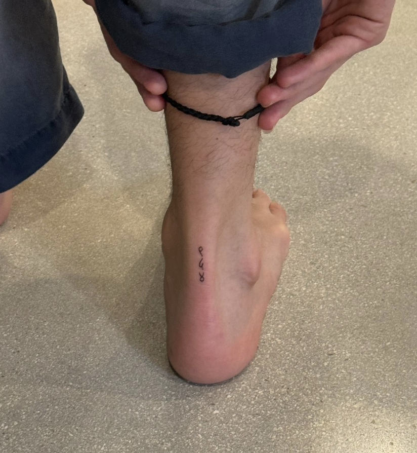
Sebastián Yatra tattoos: Genuine tattoo evidence for the small ankle symbols before they faded.

Yatra shared this close-up in July 2024. It shows a narrow line of small black symbols just above his foot, beside the ankle tendon. La Vanguardia reported that about two weeks later he said the tattoo had almost disappeared and warned people to think carefully before choosing that area. He didn’t describe it as a regret; the fine lines simply didn’t hold as he expected.

The ankle moves constantly, and shoes and socks can rub against it while it heals. The design was also small and light, leaving little ink if some faded. Yatra hasn’t said the symbols had a hidden meaning, so the practical point is the one he made himself: placement matters.

A practical note on small pieces

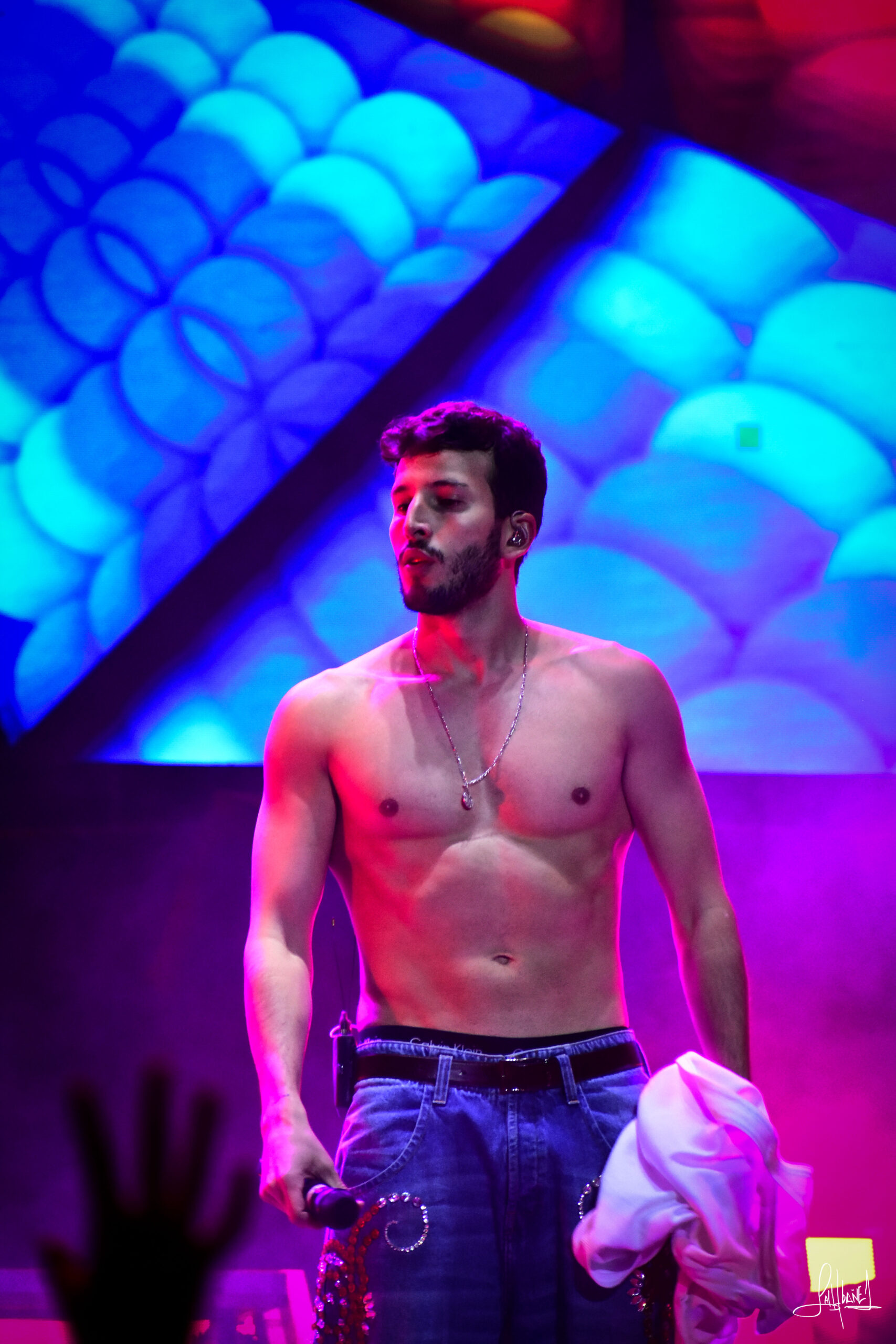
Sebastián Yatra in a contextual photograph: Clean concert portrait; no tattoo is visible, so this is contextual only.

This concert portrait is contextual; it doesn’t show another tattoo. For an ankle design, ask an artist how movement, friction and healing affect the size and line weight. A small mark may need more spacing or a slightly heavier line to stay readable.

Dharma on the right wrist

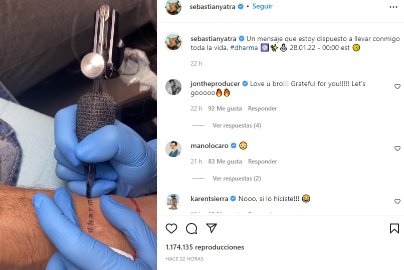
Sebastián Yatra tattoos: Genuine tattoo evidence showing the Dharma lettering being tattooed on Yatra’s right wrist.

The word Dharma runs vertically along Yatra’s right wrist. He got it in January 2022, around the release of his third album, also titled Dharma. A process photo shows an artist tattooing the simple lowercase lettering.

Yatra explained that the word is about accepting reality and the feelings that come with it—sadness, happiness, anxiety, excitement, regret or peace—instead of trying to force one emotion to stay. He described the tattoo as a message he was willing to carry for life.

The wrist is visible when he performs or reaches for a microphone, and close enough for him to see. The narrow lettering keeps the design simple without extra symbols or framing.

A note about that period

Sebastián Yatra in a contextual photograph: Clean stage portrait; no tattoo is visible, so this is contextual only.

This stage photo places Yatra in the album era but doesn’t show a tattoo. He described Dharma as a collection of experiences, with songs moving through romance, loss, nostalgia, excitement and recovery. That context helps explain why he chose the word without reducing it to one fixed definition.

The photos around the story

Sebastián Yatra in a contextual photograph: Clean performance photograph; no tattoo is visible, so this is contextual only.

This performance photo is also contextual; no additional tattoo is visible. The public images support the wrist and ankle details above, but there isn’t a clear basis here for adding more designs to the list.

A personal way to use the idea

Yatra’s wrist tattoo works as a word he has explained in connection with an album and a period of his life. If you’re considering lettering, choose a word you’ll still understand after the moment that inspired it has passed. Ask the tattooer to draw it for the actual skin and placement instead of tracing a celebrity photo.

What we can actually confirm

The right-wrist “Dharma” tattoo is documented and explained by Yatra. The ankle symbols appeared in his 2024 post, and he later said they had almost vanished in about two weeks. The other photos here provide context, not evidence of more tattoos.

More musician tattoo guides

Robbie G.K. Tattoo: The ‘Koovy’ Guitar Pick and What the Photo Shows

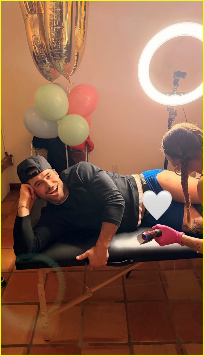
Robbie G.K.’s new tattoo is a guitar-pick outline with “Koovy” inside it, high on his thigh.

The Koovy tattoo starts with a guitar pick

Robbie G.K. tattoos: inline

The pick frames the lettering instead of leaving it to sit alone on the skin. The design is compact, and the shape gives it a music reference without claiming it stands for a particular band or song.

A second angle keeps the design simple

Robbie G.K. tattoos: inline

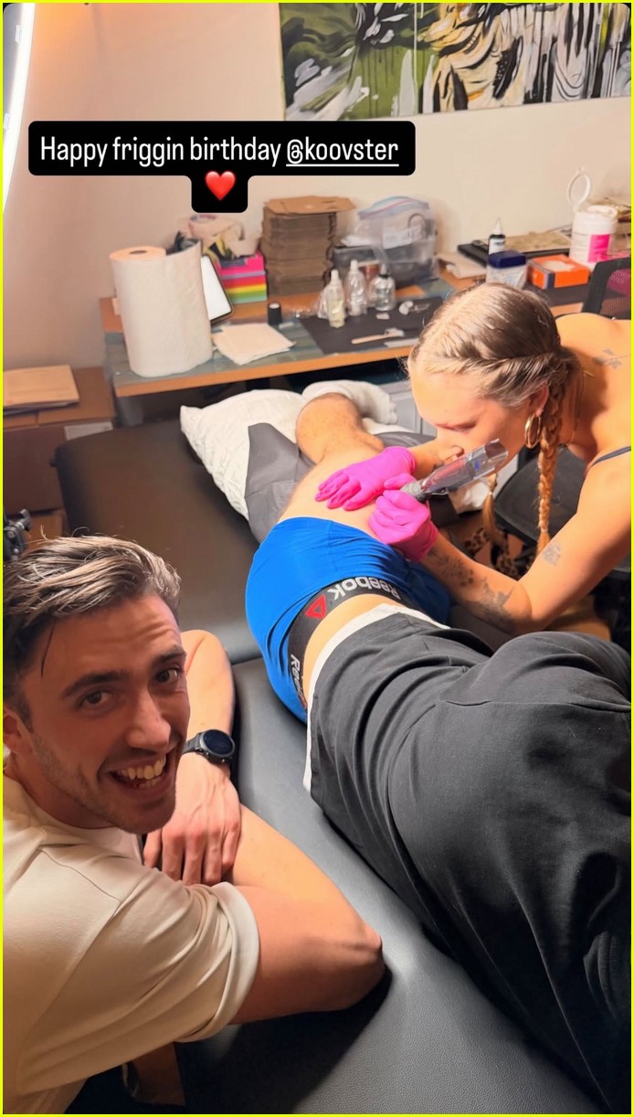
The second session photo shows the artist and people around the table. It catches the tattoo mid-appointment on a curved part of the thigh, so it doesn’t prove every line of the finished piece.

A quieter part of the story

The session photos also include a birthday message and social handle. The scene feels like a shared occasion; the pick and name are the small part of it that became visible publicly.

The reveal lands in a much bigger public moment

Robbie G.K. in a contextual photograph: inline; not tattoo evidence

After Heated Rivalry brought Robbie to a wider audience, the tattoo appeared in a casual session photo rather than a red-carpet portrait. This Stagecoach image is contextual and doesn’t show the tattoo. The appointment photos offer a different kind of glimpse, but they don’t tell us more about who “Koovy” is.

His public style is polished, but the new piece is personal

Robbie G.K. in a contextual photograph: inline; not tattoo evidence

This GLAAD Awards portrait is also contextual. Robbie’s public photos range from fitted suits to campaign and fan portraits; the small thigh tattoo stays out of view in most of them. That contrast is part of the design’s privacy.

The placement is easy to keep private

Robbie G.K. in a contextual photograph: inline; not tattoo evidence

The upper thigh is easy to cover with trousers and can show with shorts or swimwear. It also gives a small word more room than a finger or wrist. If you’re considering a framed name or nickname, ask the artist to fit the lettering to the curve of the leg.

What we can and can’t say about “Koovy”

The available coverage describes the tattoo as seemingly a tribute to a friend. Robbie hasn’t explained who “Koovy” is or what the name means, so the reporting doesn’t establish the relationship or the full story.

How to borrow the idea without copying it

The useful combination is an object and a word. Choose something that belongs to your own memory—a recipe card, bus ticket, chess piece or small camera—and pair it with lettering that matters to you. Keep both simple enough to read at the actual size, and have your artist redraw the design for your body.

Keep the idea small

The pick and one word make a complete design. The rest of the story can stay personal.

More actor tattoo guides

Matt Damon Tattoos: The Family Names, Lucy Tribute, and Heath Ledger Line

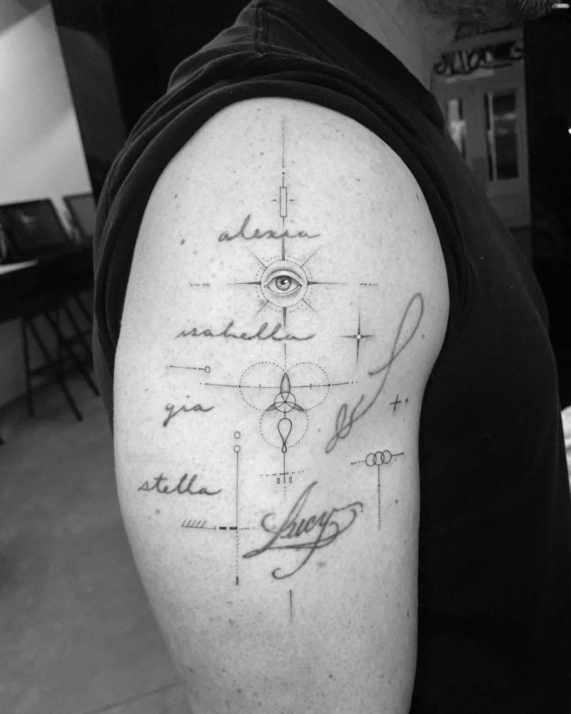
Matt Damon’s best-documented tattoos are on his right arm: his wife’s nickname, his four daughters’ names and a small line that a tattoo directory attributes to Heath Ledger. The lettering is easy to miss under a sleeve. Reports about tattoos seen during The Odyssey’s production are less conclusive, so they don’t belong on a permanent-tattoo list without confirmation.

What Damon’s collection actually includes

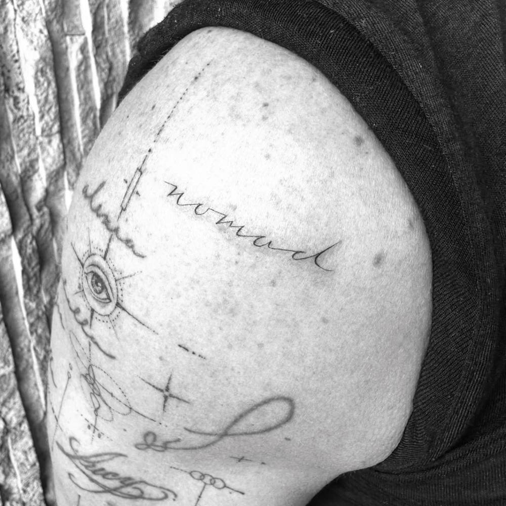
The clearest report covers the family lettering Damon got in 2019: “Lucy,” his nickname for Luciana Barroso, beside the names of their four daughters. A separate tattoo directory identifies a thin, irregular line on his right arm as a tribute to Heath Ledger, near sparse geometric marks and a circular eye-like shape. Damon hasn’t publicly explained the line’s exact design.

In 2026, The Odyssey coverage also discussed bicep tattoos as Damon prepared to play Odysseus. Those could be costume or temporary designs; the reports don’t establish that they’re new permanent ink.

The family-name bicep tattoo

Matt Damon tattoos: Matt Damon's family-name bicep tattoo

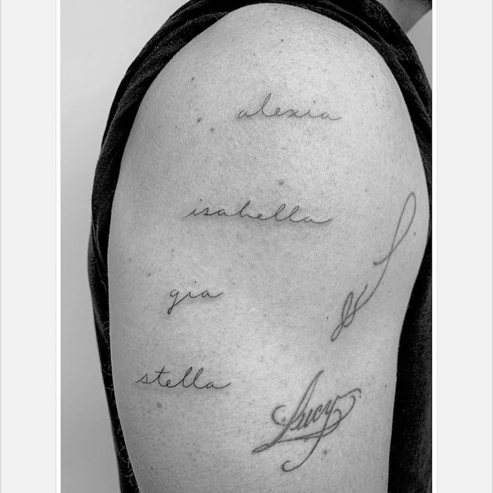
The names Alexia, Isabella, Gia and Stella run down Damon’s right upper arm in fine cursive. Each sits on its own line, with enough space to read without turning the group into a large panel.

“Lucy” sits nearby in larger, looser lettering. Together, the words make one family piece without dates, portraits or extra symbols. A T-shirt sleeve can cover most of the tattoo when he wants it out of view.

Why the lettering still looks clean

Matt Damon tattoos: Matt Damon's family lettering and Lucy tattoo close-up

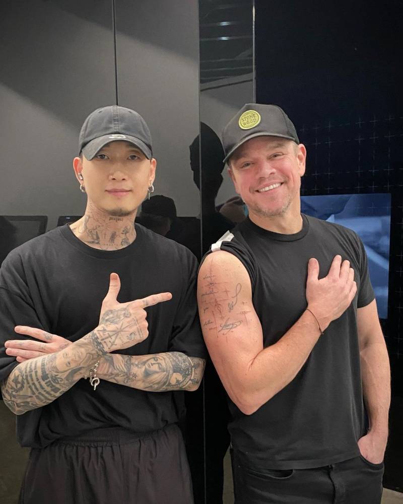
Los Angeles artist Daniel Stone, known professionally as Winter Stone, did the family tattoo. The 2019 photos show light strokes and open spacing. The names don’t need heavy shading to stay distinct.

Script on a moving arm should be checked in a relaxed position as well as when the muscle bends. The lines follow the bicep without wrapping sharply around it, which keeps the words readable in a close view.

The Lucy tattoo beside the names

Matt Damon tattoos: Matt Damon's Heath Ledger tribute line

Damon had “Lucy” tattooed for Luciana before the four daughter names were added beside it. The arm grew into a family tribute over time rather than being designed as one large piece from the start. The different lettering gives it a little movement while keeping the words connected.

If you expect a tattoo to grow later, leave room in the layout. Adding names to a crowded gap can make script hard to read.

The Heath Ledger arm tattoo tribute

Matt Damon tattoos: Matt Damon tattoo artist session photo

Tattoofilter describes an irregular line on Damon’s right arm as a tribute to Heath Ledger. The close-up shows it above a small circular eye motif and thin geometric marks. The listing gives the Ledger connection, but not a detailed account from Damon about the line’s shape.

A small mark can carry a private tribute without spelling out the whole relationship. Here, the attribution is all the available source supports; there’s no reason to add a story he hasn’t shared.

What the Odyssey reports do and don’t prove

Damon’s arms drew attention in 2026 while he promoted The Odyssey. Reports mentioned bicep tattoos during his preparation for the role, but a design seen during production may be makeup or character ink.

Matt Damon in a contextual photograph: Matt Damon role context, not tattoo evidence; not tattoo evidence

This image provides film context, not evidence of another permanent tattoo. His family lettering and the Ledger line are documented in older photos; the role-related images shouldn’t be mixed into that collection without a statement from Damon or the production team.

Why Damon keeps his collection low-key

Damon’s pieces use thin lettering and small linework. They’re visible in short sleeves and easy to cover for a role or a formal event. This portrait is contextual and doesn’t show the tattoos.

Matt Damon in a contextual photograph: Matt Damon public-image context, not tattoo evidence; not tattoo evidence

That limited scale leaves the family names and the Ledger tribute distinct without turning his arm into one continuous design.

Ideas worth stealing from Damon’s approach

For family lettering, decide how many names you may want to add and give each one enough space. A tattooer can draw the lines to follow your arm and keep them legible when it bends.

The Ledger tribute is a reminder that a memorial mark can be a small private reference. And if a tattoo appears during a film shoot, wait for confirmation before treating it as part of the actor’s permanent collection.

More actor tattoo guides

Janhvi Kapoor Tattoos: A Handwritten Tribute and a Tiny Evil Eye

Janhvi Kapoor’s most consistently documented tattoos are a handwritten message from her mother, Sridevi, and a small evil eye that Vogue India said appears to match her sister Khushi’s. The rest of the article sticks to those two designs; other online claims aren’t supported by the same clear photos and reporting.

A quick look at the collection

The clearest reports describe two pieces:

  • “I love you my Labbu” on Janhvi’s arm, copied from Sridevi’s handwriting.
  • A small evil-eye tattoo on the inner wrist, reported as a match with Khushi Kapoor’s.

There are also online rumours about other marks and initials, but a photo of something on skin doesn’t establish what it means.

The Sridevi handwriting tattoo

Janhvi Kapoor tattoos: genuine forearm tattoo close-up

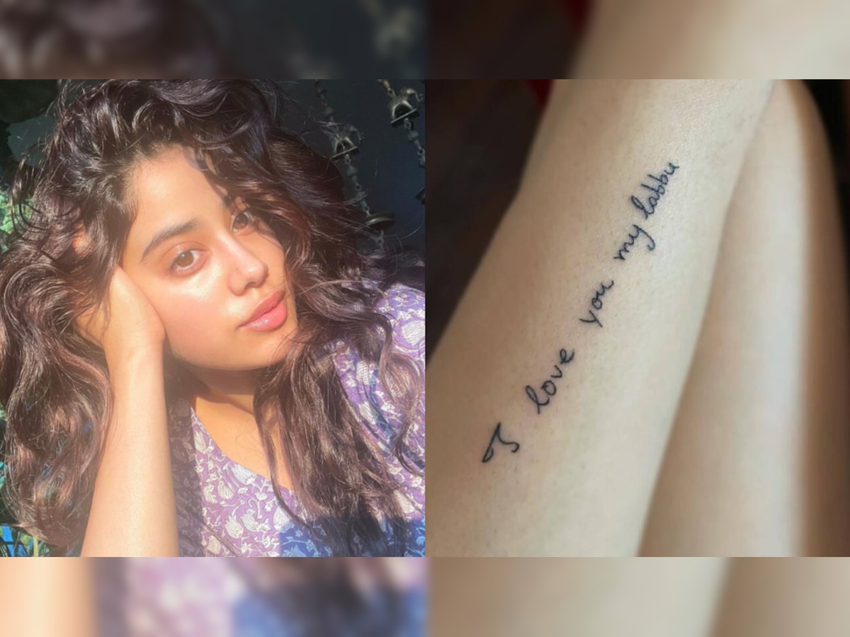
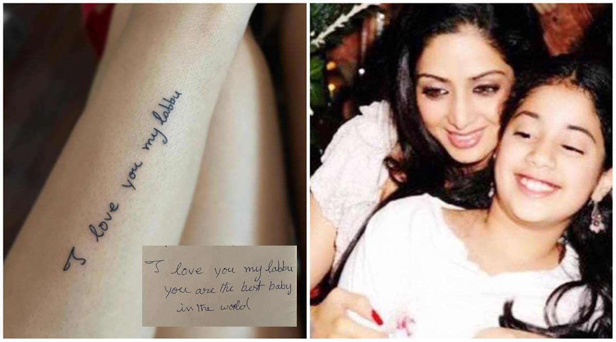
The phrase “I love you my Labbu” is written in Sridevi’s handwriting on Janhvi’s forearm. Reports from 2021 identified “Labbu” as the affectionate name Sridevi used for her daughter. Janhvi had shared a longer handwritten note from her mother around the death anniversary before the tattoo appeared.

The lettering keeps the loose shape of the original writing. It reads like a line from a personal note, not a phrase copied from a font. The tattoo preserves Sridevi’s words as she wrote them.

What the tattoo looks like up close

Janhvi Kapoor tattoos: second genuine view of the Sridevi handwriting tattoo

In close photos, the script forms a narrow line with open space around it. The letters have small variations that make the handwriting recognizable. The source writing is part of the design, not just the backstory.

If you’re planning a handwriting tattoo, bring the actual note, card or signature to the artist. Decide how much of it to use, then check the stencil at its real size so the lettering has enough room to age clearly.

The moment behind the tribute

Janhvi has also shared a photo from the tattoo session. She is masked and flinching as the artist works. It shows the process behind the finished lettering and supports that it was a fresh tattoo, not a temporary mark for a photo shoot.

The small evil-eye tattoo

Janhvi Kapoor tattoos: genuine evil-eye tattoo evidence

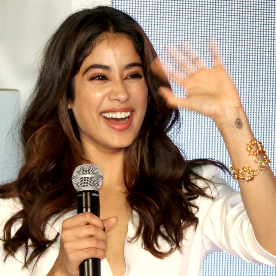
The second documented design is a small evil eye on Janhvi’s inner wrist. Vogue India described it as appearing to match Khushi’s tattoo. In the available close-up, the symbol has a dark centre and several simple rings.

The evil eye is a familiar protective motif, though its meaning can vary by wearer. Here, the reported link to Khushi gives the symbol a sibling connection. The inner wrist keeps it small and visible when the hand turns.

Why these two pieces feel connected

Janhvi Kapoor in a contextual photograph: contextual event portrait; not tattoo evidence; not tattoo evidence

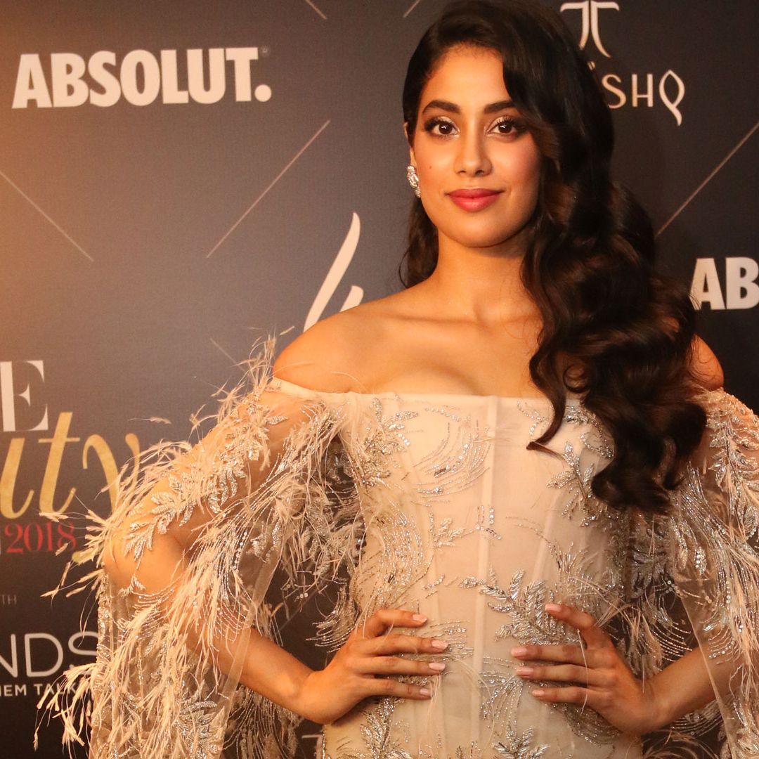
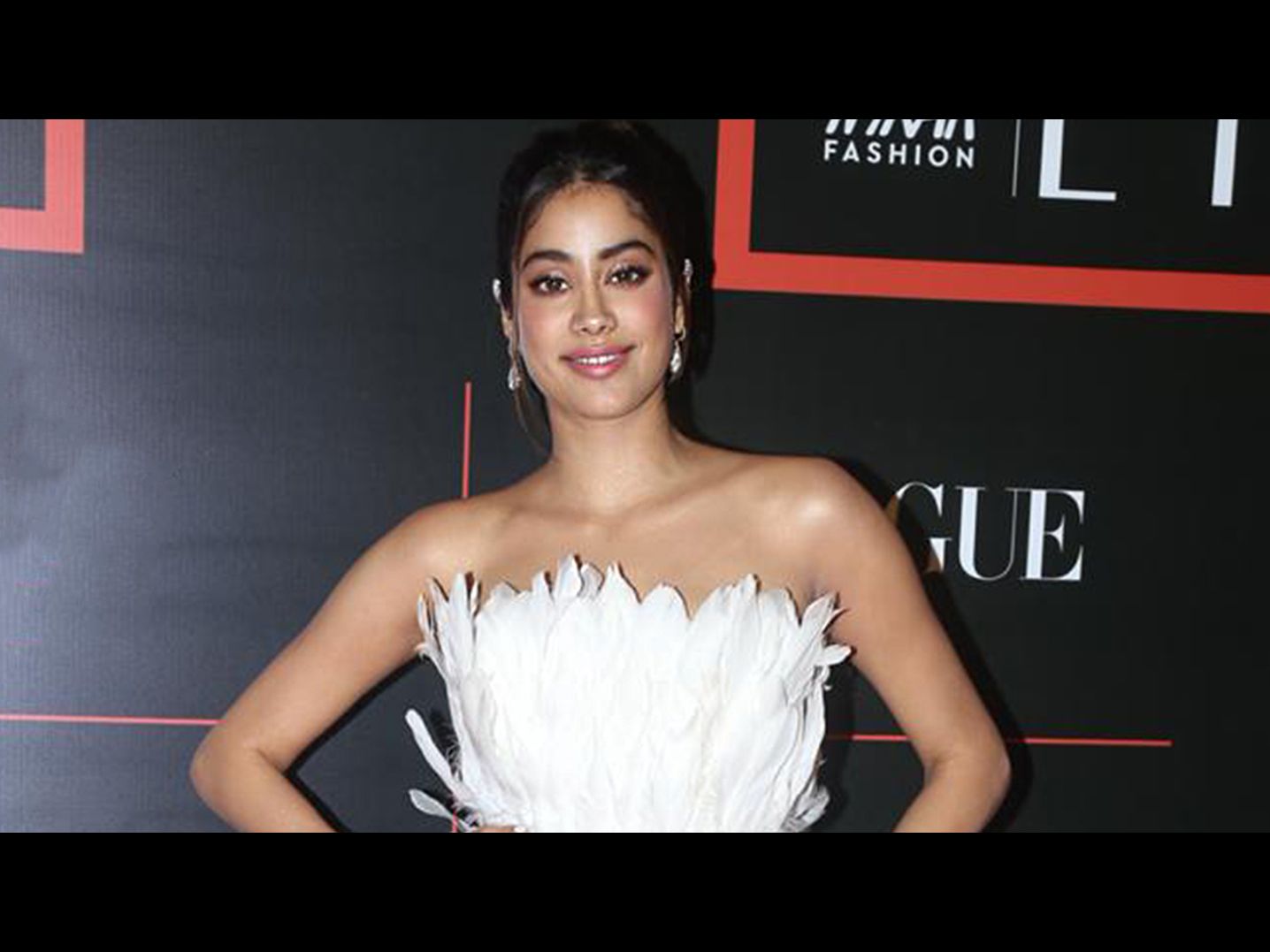
This event portrait is contextual; it doesn’t show either tattoo. The designs use different forms—handwriting and a symbol—but both connect Janhvi to family: one to her mother, the other to her sister.

What to borrow from Janhvi’s ideas

Janhvi Kapoor in a contextual photograph: contextual event portrait; not tattoo evidence; not tattoo evidence

For a handwriting tattoo, start with the real note and keep the details that make it look like that person’s hand. For a matching symbol, decide what should stay the same and leave room for each person to make the rest their own.

Think about placement and size before booking. Wrist and forearm designs can be easy to see and easy to cover, but small writing still needs enough space to stay legible as the skin changes.

Final take

The handwriting keeps Sridevi’s voice close; the small evil eye links Janhvi and Khushi. Both tattoos start with a specific relationship, which is more useful to borrow than the exact designs.

More actor tattoo guides