
Danna Paola’s tattoos are small, personal and easy to miss when she’s dressed for a red carpet. That’s part of the charm. Her collection isn’t built around one giant sleeve or a single dramatic back piece. It’s a loose group of fine-line marks, tiny words, a red kiss and a few symbols that sit close to the places she wants them. Some are playful. Others are family keepsakes. A couple came from a rough year and ended up feeling like quiet reminders to keep moving.
There’s a clear pattern in Danna’s ink: simple shapes, delicate lettering and placements that work with the body instead of shouting over it. Her tattoos also change the way she styles herself. A backless dress turns the kiss on her shoulder into a flash of red. A swept-up hairstyle reveals the small mark behind her ear. When she wears a crop top, the words along her ribs become part of the look. The best Danna Paola tattoo ideas are understated but still have a point of view.
Some details have been confirmed by Danna’s own posts or by interviews with the publications covering them. Others are only visible in photographs, so it’s better to describe what can actually be seen than to invent a meaning. That matters with fine-line work, especially when a small symbol is photographed at an angle or softened by stage lighting.
Danna Paola Tattoo: Grandmother Tribute and Moon
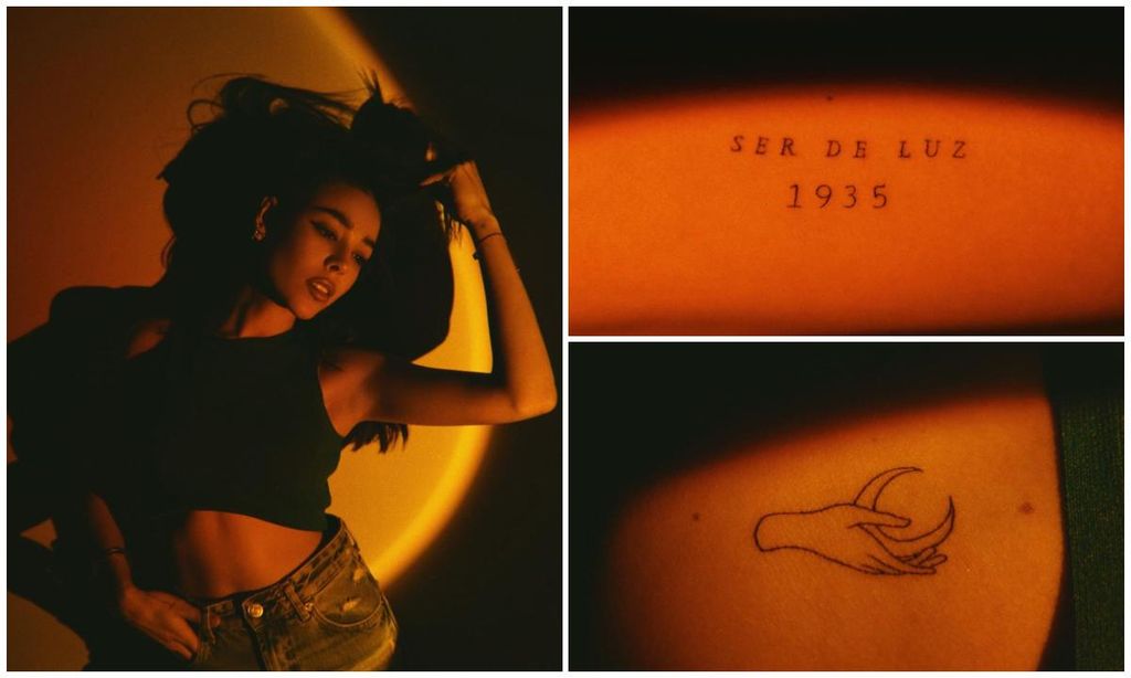
Two of Danna’s most emotional tattoos arrived after the death of her grandmother Chelo. One is the phrase Ser de luz, followed by the year 1935. The words mean being of light, and the year marks her grandmother’s birth. In the photograph, the lettering runs in a neat, widely spaced line across the side of Danna’s upper body. It’s not oversized, but the spacing gives it enough room to breathe.
The second design from that session is a fine-line hand holding a crescent moon. Danna has spoken about feeling a strong connection to the moon, describing it as a kind of energetic mother, confidante and witness to her wishes. That explanation makes the piece feel less like a random celestial tattoo and more like a personal image she already had in her head. The hand-and-moon composition is also a nice example of how a very simple outline can carry a lot of atmosphere without needing shading or heavy blackwork.
For anyone looking at the design as tattoo inspiration, the important detail is the balance. The hand is delicate, the crescent is open and the lines aren’t crowded together. A tattoo artist would need to leave enough negative space for those fingers and the moon to stay readable as the ink settles. It’s the kind of small tattoo that benefits from a calm placement and a little patience during the design stage.
Danna Paola Tattoo: The Red Kiss
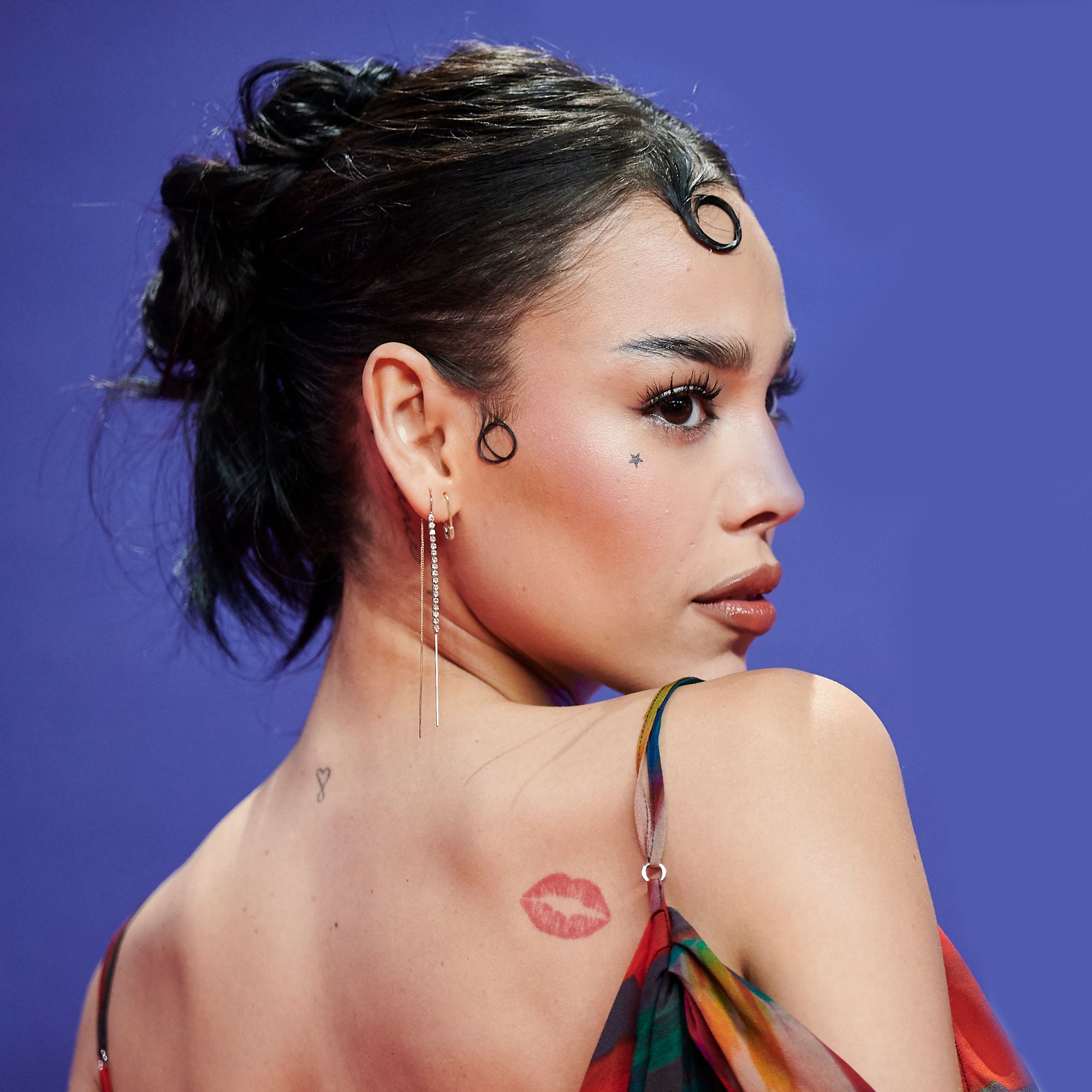
The red kiss tattoo is probably Danna’s most recognisable piece. It sits high on her back near the shoulder and looks like a lipstick print stamped onto the skin. The colour does most of the work. Against bare skin, that warm red shape reads immediately, even when the rest of the outfit is simple. It’s flirty, a little theatrical and completely in keeping with Danna’s pop-star style.
She first showed the design when she was young, and entertainment coverage has described it as one of her earliest tattoos. That history helps explain why it has stayed so visible in her styling. It isn’t hidden away as a private mark; it appears whenever she turns for a photo or wears an open-back look. The placement gives the tattoo a bit of performance built into it. You don’t see it in every frame, but when it appears, it changes the whole picture.
Technically, the shape is a good reminder that a small tattoo doesn’t need to be black to have impact. The lips have a soft, slightly blurred edge rather than the hard outline you’d expect from a symbol tattoo. Anyone borrowing the idea could keep the same placement and colour while changing the shape to fit their own style. A tiny red bow, a cherry or a simple heart would create a similar flash of colour, but the kiss works because it feels connected to Danna rather than chosen from a generic list of symbols.
Danna Paola Tattoo: The Kiss in a Full Portrait
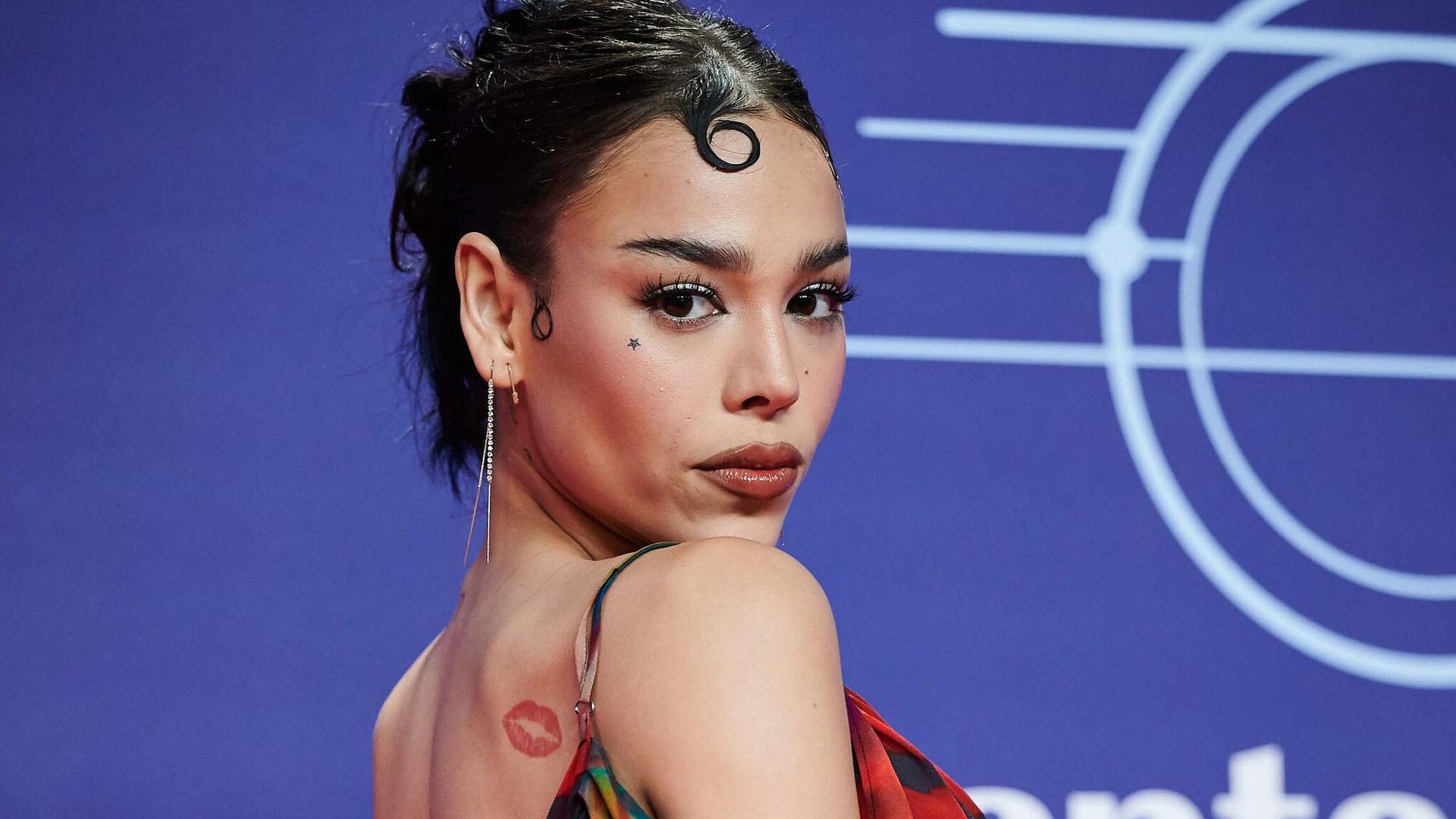
A wider event photograph shows just how well the kiss tattoo sits on Danna’s shoulder. From a distance, it works almost like a beauty mark or a small piece of styling. Up close, the lipstick shape is still clear, and the placement follows the curve between her shoulder and upper back. The same image also shows the small star below her eye, another tiny detail that can disappear when her makeup is heavy.
The face star gives her tattoo collection a slightly sharper edge. It’s much quieter than the red kiss, but it changes the mood of her face without taking over. This is why scale matters so much in Danna’s choices. The kiss is a colour accent on the body. The star is a point of punctuation on the face. Neither one needs to be large, and neither one competes with the other.
When planning a visible tattoo like the star, the practical questions matter more than the trend. A face tattoo will be seen in every photograph, so the design needs to be something the wearer can live with through different hairstyles, jobs and personal eras. Danna’s star is small enough to stay subtle, but it still gives her a recognisable detail that follows her from one look to the next.
Onstage Details
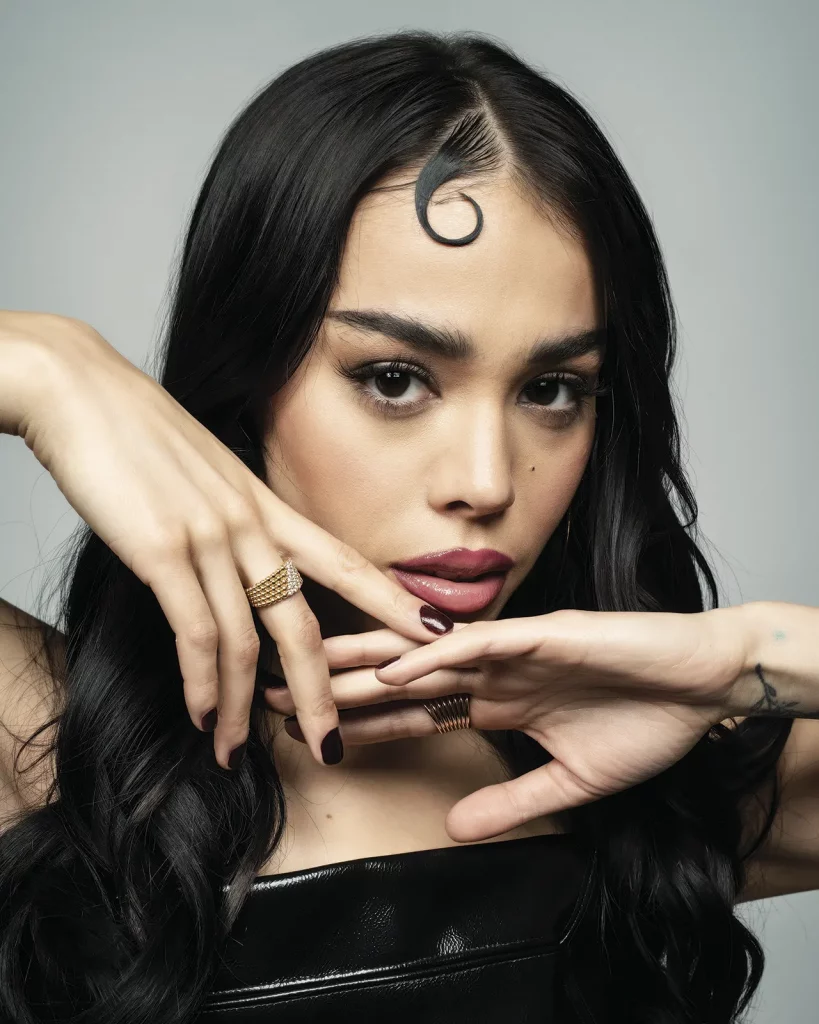
Danna’s fashion and beauty work provide useful context for her tattoos, even when a particular photograph isn’t being used as tattoo evidence. Her looks often move between polished glamour and a more experimental pop feel. That range makes the small marks more interesting because they aren’t locked to one costume or one era. The same red kiss can look playful in a bikini photo, elegant with a backless gown or slightly rebellious against a dark stage outfit.
Her tattoo choices also sit comfortably beside bold makeup. A bright lip, graphic eyeliner or a dramatic hair colour can change the mood around a tiny tattoo without changing the tattoo itself. That’s a useful lesson for anyone choosing delicate ink: the design doesn’t have to do all the talking. Clothing, hair and jewellery can frame it differently over time.
There’s something refreshing about a celebrity collection that hasn’t been treated like a complete body project. Danna has added small pieces as particular moments came up, whether the reason was family, a private phrase or simply liking the look of a red kiss. The result feels collected rather than planned as one giant visual statement.
Fine-Line Placement in Everyday Life

Fine-line tattoos need good placement because there isn’t much heavy shading to hide a wobble or a crowded composition. Danna’s collection shows several placements that make sense for small work: the wrist, hand, nape, ribs, shoulder and area behind the ear. Each one gives the tattoo a different amount of privacy. The wrist and hand appear often in close-ups. The ribs stay personal until she chooses a cropped look. The nape can disappear under hair in seconds.
Her family designs are a good example of how matching tattoos don’t have to be identical in size or position. The heart-and-infinity mark was shared with her mother and sister, but the three women placed their versions differently. That keeps the idea connected without forcing every person to wear the same exact composition. Shared meaning doesn’t require identical placement. It’s a smart approach for anyone thinking about a family tattoo.
Danna has also used words as a kind of private shorthand. Fiorire, the Italian word for flourishing, was part of the group of tattoos she revealed at the end of 2020. She also has the phrase My future is unlimited along her ribs and the word Patiente behind her ear. Those pieces don’t need a complicated image to work. The lettering, language and location do enough.
The small XX marks she showed on her wrist were also tied to that 2020 group. Rather than forcing one grand explanation onto every mark, it’s fairer to say that Danna presented them together as a set of new additions during a difficult, unusually creative year. The designs are tiny, but the collection shows how a few small tattoos can make a wrist or hand feel very personal.
Fine-line ink rewards restraint. Leave space between the letters. Keep the design readable. Don’t squeeze a detailed illustration into a spot that can’t support it. Danna’s tattoos are a good reference for that kind of editing. They’re not trying to fill every inch of skin, and that’s exactly why each mark gets a chance to register.
Why These Small Details Feel Personal
It’s the mix of mood and memory. The red kiss is cheeky and instantly visual. The moon and “Ser de luz 1935” tribute are softer and more reflective. The family heart links her to her mother and sister. The small words and XX marks feel like snapshots from a particular period in her life. Together, they make a collection that’s easy to recognise without being overly branded.
That’s also why copying one of the designs exactly misses the point. The appeal isn’t only the shape of the kiss or the curve of the moon. It’s the way each tattoo fits a person, a placement and a moment. If you like Danna’s style, take the useful part: keep the lines clean, choose a location you’ll actually enjoy seeing, and give the design a reason to exist beyond looking good in one photo.
Danna Paola’s ink is a reminder that a tattoo collection can grow quietly. A few small pieces can cover family, ambition, grief, humour and self-expression without turning the body into a single theme park of symbols. Sometimes the most memorable tattoo is the one that only appears when the wearer turns a certain way.