
Tom Kaulitz’s tattoos are easy to miss when the hair, beard, lip ring, and guitar are doing their usual work. Look a little closer, though, and the Tokio Hotel guitarist has a small collection built around family, shared symbols, and a very recognizable bit of relationship ink. It isn’t a wall-to-wall sleeve story. The appeal is in the details: a matching initial, a newer hand tattoo, and older marks that show up when he wears short sleeves or puts his hands in front of a camera. The small scale is part of the point.
Tom’s best-documented tattoo story is tied to Heidi Klum. The couple have matching ink, with Tom wearing an “H” connected to Heidi and Klum wearing the corresponding “T.” More recently, reports from their podcast coverage described a small heart tattoo on Tom’s hand that works with Heidi’s matching half. Those are simple designs, but they don’t feel generic. They work because the meaning sits in the connection between two people rather than in an elaborate picture that needs a paragraph of explanation.
That makes Tom’s collection useful inspiration if you like tattoos with a personal hook. You don’t need a giant chest piece or a dense blackwork sleeve to make a mark feel specific. A tiny letter, a shared line, or a symbol placed where you naturally see it can carry plenty of weight. Meaning does the heavy lifting here.
Tom Kaulitz’s tattoo style is personal without being loud
Tom’s public image has always leaned rock and roll, but his ink doesn’t simply repeat that styling. The pieces that are easiest to verify are small and fine-lined, especially the matching tattoos connected to Heidi. That contrast is part of what makes them interesting. His clothes, jewelry, and hair can change the whole mood of a photo, while the tattoo stays quiet underneath.
There are older photographs and fan-archived images that appear to show more hand and finger tattoos, including tiny linework and lettering. I wouldn’t attach a meaning to every visible mark without a clear source from Tom himself. Tattoos get misread in low-resolution photos, and old images can make temporary designs, shadows, or jewelry look permanent. The safer read is that Tom has a few small hand details alongside the clearly reported matching pieces.
For anyone planning similar ink, that restraint is worth paying attention to. Small hand tattoos need clean spacing because there isn’t much room for a design to hide. A letter can blur if it is too fine, especially on a finger that gets washed, bumped, and exposed to the sun every day. A good artist will talk through scale, placement, and how the design may age before the needle comes out. Placement is doing as much work as the drawing.
The matching H tattoo for Heidi Klum
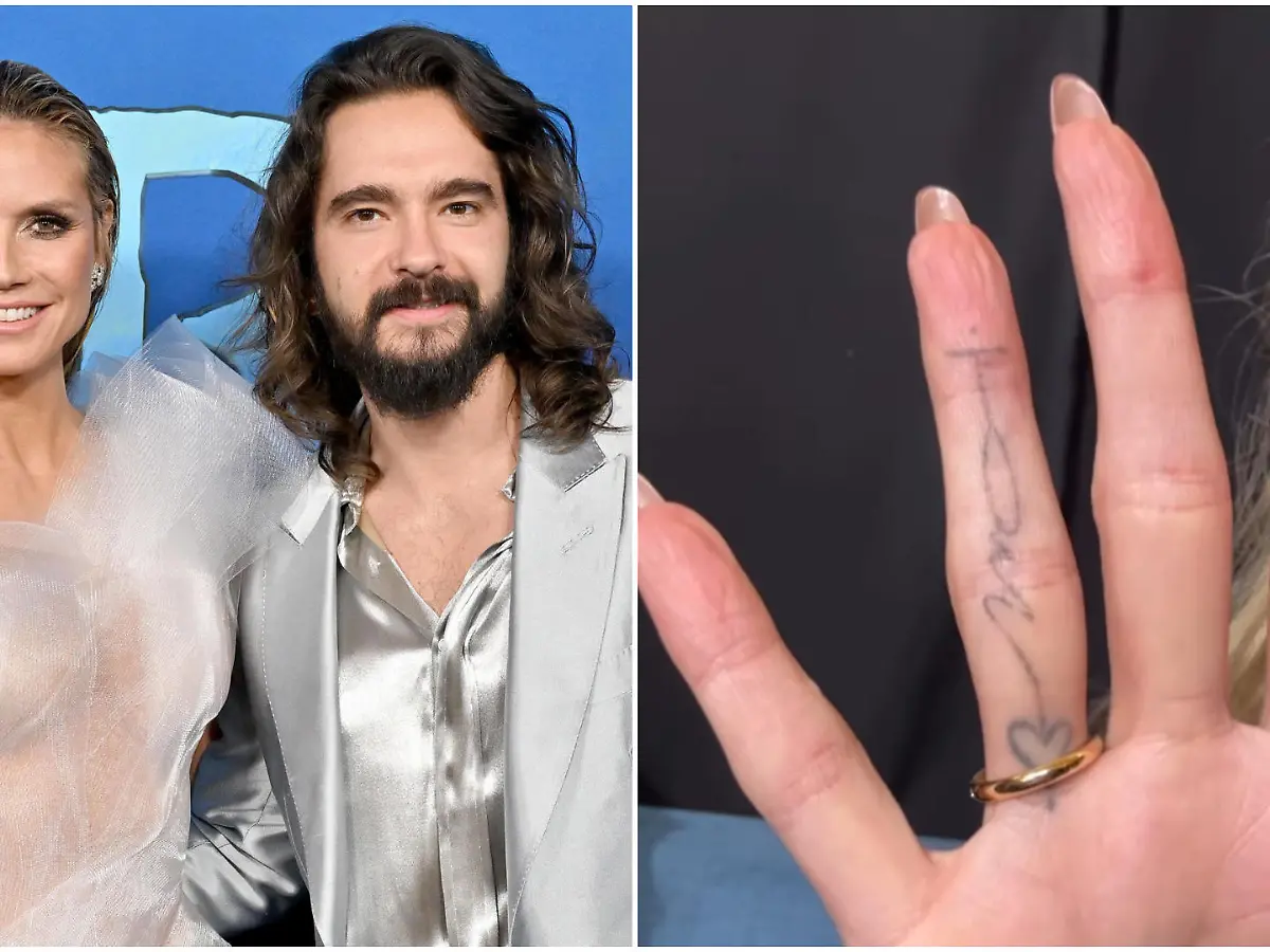
The most recognizable Tom Kaulitz tattoo is the small initial associated with Heidi. Coverage of the couple’s matching tattoos has shown Tom with an H, while Heidi has a matching T. The designs are deliberately simple. They read as tiny black marks rather than decorative pieces, which keeps them intimate instead of turning the relationship into a billboard.
Placement matters here. A wrist or hand tattoo can be hidden under a watch or a sleeve, but it is still visible when the wearer reaches for a guitar, holds a microphone, or rests a hand on a table. That gives the tattoo a private-public quality. Tom doesn’t have to explain it every time someone sees it, but the person it refers to knows exactly what it means.
The visual lesson is straightforward: initials work best when the lettering has enough room to breathe. A tattooist can make a single character feel more finished with a deliberate font, a slight curve, or a line weight that suits the placement. It doesn’t need flourishes. In fact, the cleanest version is probably the strongest one.
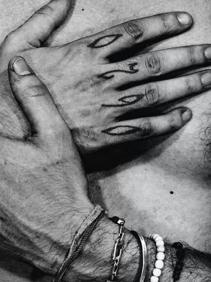
This close-up is useful for seeing the kind of small-scale hand detail often associated with Tom’s older tattoo photos. It isn’t a key to every symbol in the frame, and the meanings of those marks haven’t been confirmed in the sources I checked. Still, the image makes the practical point clear: finger tattoos are compact, graphic, and instantly noticeable when the hands are close to the camera.
A softer detail in the couple’s story
More recent coverage added a softer detail to the story. Tom reportedly showed a small heart tattoo on his left hand as part of another matching design with Heidi. Rather than treating it as a standalone flash piece, the couple use the two tattoos together. When their hands meet, the design forms a shared image.
That kind of matching tattoo is less about copying the exact same picture and more about making two pieces that only make full sense together. It is a smart route for couples who want matching ink without having identical tattoos on identical body parts. Each person gets a piece that can stand on its own, then the meaning becomes clearer when the designs are side by side.
Small hearts are common tattoo ideas, so the placement and execution do most of the work. A simple outline can feel modern and understated. A filled heart will read more strongly from a distance. On the hand, either version needs a little extra planning because the skin moves constantly and the tattoo will be exposed to plenty of wear. A clean outline gives the symbol room to stay readable.
The reporting around this design is useful as context, but it still doesn’t prove every tiny detail visible in a low-resolution frame. The clearest point is that the couple use the two pieces together, rather than treating the ink like an isolated stock graphic.
What makes the couple’s approach work
Couples’ tattoos can go wrong when the design only works as a public announcement. Tom and Heidi’s approach is quieter. Their initials are personal, and the newer heart idea adds a little visual play without needing a dramatic symbol. The tattoos can be seen separately, but they gain another layer when the couple are together.
There is also a practical advantage to choosing a small design. If a relationship tattoo ever needs to be covered or reworked, a discreet initial or outline gives an artist more options than a huge, heavily shaded portrait. That isn’t a prediction about Tom and Heidi; it is simply a reason many people choose restrained matching ink in the first place.
If you like the idea but don’t want to use a partner’s initial, the same structure can work with a shared place, a tiny date, a pair of symbols, or two halves of one drawing. The important part is that the design has a reason for being split. Otherwise, you may as well get the complete tattoo on one person and call it done.
A note about older photos
Tom has been photographed with small marks on his hands and arms for years. Some fan pages describe a twin tattoo connected to Bill Kaulitz, and older images show linework that looks different depending on the lighting and camera quality. Those photos are useful visual references, but they aren’t the same thing as a direct interview or an artist’s explanation.
That distinction matters when writing about celebrity tattoos. A design can be clearly visible while its meaning remains private. It is better to say “the tattoo appears to be” or “the piece is visible in older photos” than to turn a guess into a fact. The same rule applies when you are planning your own tattoo. You don’t need a public explanation for a private design to be worthwhile.

This is a contextual event photo only. It gives a sense of how Tom’s ink disappears into a full outfit: the vest, jewelry, long hair, and bright set all compete for attention, while any small tattoo detail stays secondary. That’s a useful reminder that tattoos don’t have to dominate a look to be part of it.
Ideas to borrow from Tom Kaulitz’s placement choices
The obvious takeaway is the hand and wrist. Those placements make sense for a musician because the hands are already part of the performance. If you play guitar, piano, or drums, you may want to think about how a tattoo will sit while your hands are moving rather than judging the design only while your arm is relaxed.
There are a few questions worth asking before choosing a similar spot:
- Will the design still be readable when your fingers bend?
- Are you comfortable with the tattoo being visible at work, on stage, or in family photos?
- Does the idea need a tiny scale, or would it age better on the forearm?
- Are you choosing the design because it means something, or because the placement looks cool in one photo?
Tom’s small initial works because the reason behind it is stronger than the decoration. If you have the meaning first, an artist can help you find the right lettering and placement. If you start with a random font from a screenshot, the tattoo can feel finished before you have decided what it is actually saying.

This solo-context frame is included to show Tom in a different setting and pose. It isn’t evidence for a specific tattoo. Context photos like this are most useful when they help explain how a tattoo fits into a person’s public style without pretending that a partly hidden mark proves a particular design.
How to make the idea work
Start with the relationship between the two designs. Do they share a line, meet at the middle, or use two letters that only make sense together? Draw both pieces at actual size and place the paper on the body. A design that looks elegant on a phone screen can become cramped on a finger.
Next, talk honestly about visibility. Hand tattoos are hard to hide, and touch-ups can be more complicated than with a piece on the upper arm. That doesn’t make them a bad choice. It just means you should go in knowing what daily life with the tattoo will be like. Choose an artist who has plenty of healed hand and finger work in their portfolio, not only fresh studio shots.
Finally, leave room for the tattoo to age. Fine lines can soften, and fingers take a beating. A slightly bolder design usually survives better than an ultra-delicate one that looks perfect for the first week. A good tattooer will help you balance the look you want with the reality of skin, movement, and time.
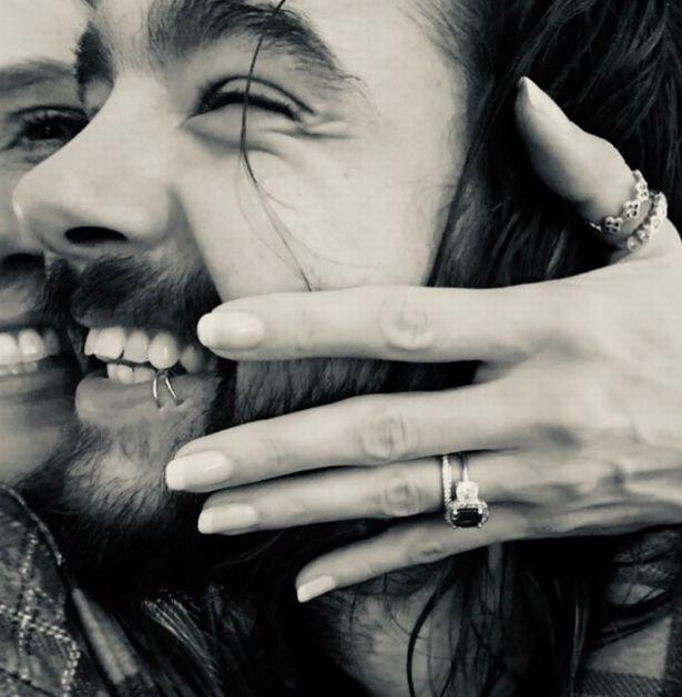
This black-and-white couple photo is also contextual only. It shows the kind of close, candid image where hands and wrists can become part of the frame, but it doesn’t identify a particular tattoo. Keeping that distinction clear makes the actual matching-ink evidence easier to trust.
The takeaway from Tom Kaulitz’s style
Tom Kaulitz’s most interesting tattoos aren’t the biggest ones. They are the small designs with a clear connection: the H associated with Heidi, the newer hand heart, and the compact marks that sit close to the way he plays, dresses, and moves through the world. They feel personal without needing to be loud.
If you are looking for tattoo ideas, the useful part isn’t copying the exact letter or heart. It is the thinking behind the choices. Pick a symbol that means something to you, make sure it works at the size you want, and give the placement enough thought that you will still like seeing it years later. A simple tattoo can carry a lot when the reason is real.