InkMonstarr isn’t the kind of person who treats tattoos like accessories he can swap out when the mood changes. The artist, actor, model and musician has built a collection of more than 700 pieces, and he talks about the work with a pretty clear idea of why it matters. The ink arrived before he felt comfortable saying everything out loud. Now it sits on his skin as a record of the people, beliefs and hard chapters that shaped him.
That makes his collection interesting even if you’re not planning to cover every inch of your own body. There’s a lot to look at, but the strongest ideas aren’t random. His first tattoo was a small tribute to his mother. His face tattoos are tied to beliefs and the people who support him. His arms, chest, hands and legs are packed with different styles, and the collection keeps moving as he finds more room to work with.
InkMonstarr’s first tattoo was for his mother
The first piece InkMonstarr has discussed publicly is a group of stars on his left hand. It was a tribute to his mother and the unconditional love he associates with her. That detail matters because the placement is impossible to ignore. A hand tattoo is always in view, so it doesn’t feel like a private keepsake hidden under a sleeve. It’s a daily reminder, and it also became the start of a collection that eventually grew far beyond one design.
There’s a useful lesson here for anyone considering a first tattoo. The design doesn’t need to be huge to carry weight. A few simple stars can do the job when the reason behind them is real. The hand is a demanding place to tattoo, too. Skin there gets washed, bent, rubbed and exposed constantly, so a clean, readable idea is usually smarter than a tiny pile of unnecessary detail.
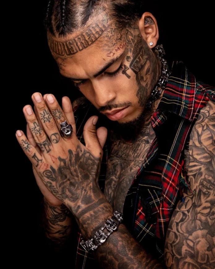
In the photos from his Inked feature, the hand work reads as part of a larger black-and-grey vocabulary. His fingers carry small symbols and lettering, while the backs of his hands blend into heavier shading. It feels collected rather than copied from a single flash sheet. That’s the difference between a tattoo that simply fills space and one that looks like it belongs to the person wearing it.
The face tattoos are personal, not just shock value
Face tattoos are the part of InkMonstarr’s collection people notice first, but he has pushed back on the idea that they’re there just to provoke a reaction. He has described them as markers of his beliefs, his support system and the chapters when he chose to bet on himself. He also said they remind him to dream bigger than big.
That doesn’t mean every symbol has a public translation. It’s tempting to stare at a celebrity’s face tattoos and invent a neat explanation for each line, letter or shape. That’s not useful, and it usually isn’t accurate. The confirmed point is broader: the face work is part of a personal declaration. It says these values are important enough to live in the most visible place possible.
Visually, the pieces create a strong frame around his face. The forehead lettering runs along the hairline, while smaller marks sit around the temples and cheek. A cross-like symbol is visible beside one eye, and the neck work carries the composition down toward the chest. The tattoos aren’t floating separately. They connect, so the whole area reads as one intense portrait even though it was built over time.
His hand and finger tattoos reward a closer look
InkMonstarr’s hands are crowded with small designs, which makes them a good example of how a tattooed area can build character through repetition. The fingers include compact lettering and symbols. The backs of the hands are darker and more layered, with older marks sitting beside newer-looking work. Some details are easy to miss in a full-body photograph, which is why the closer hand view is more useful than a distant red-carpet shot.
For design inspiration, the main takeaway isn’t “copy this exact hand.” It’s the way the small pieces share a visual language. If you want finger tattoos, think about how they’ll sit next to rings, movement and the natural creases of your hands. If you want a larger hand piece, leave enough breathing room for the design to stay readable as it ages. His collection shows both approaches: tiny marks that act like punctuation and heavier work that works almost like a glove.
InkMonstarr’s chest and arm tattoos
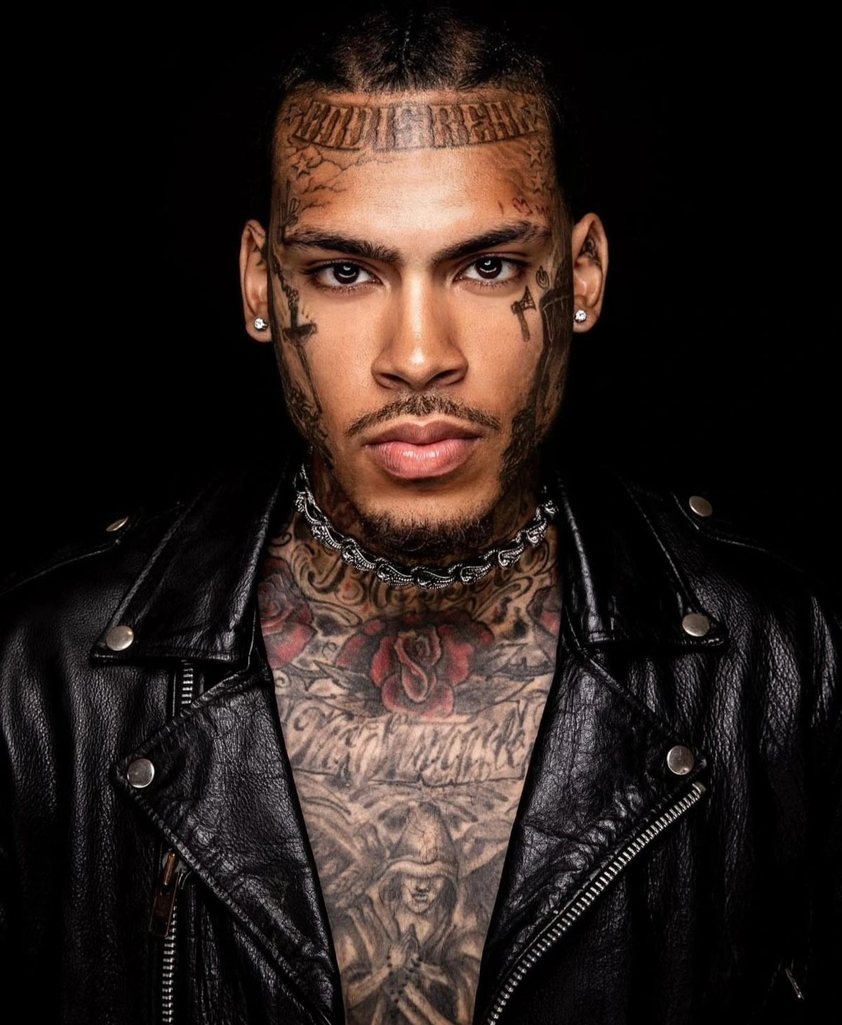
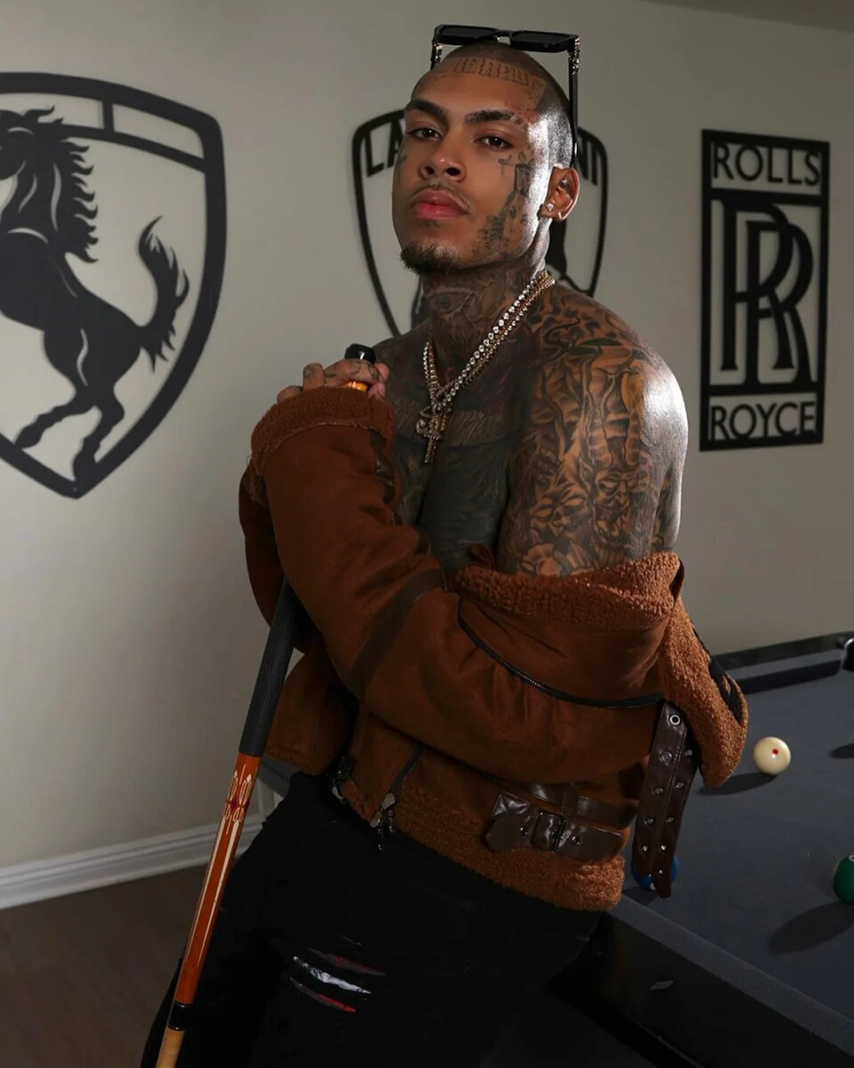
When his jacket is off, the scale of the collection becomes clearer. His chest, shoulders and arms are heavily covered, mostly in dark black-and-grey work with some red showing through the upper chest. Lettering crosses the chest, while the shoulders and sleeves carry denser imagery. The result has the visual weight of a full suit, but it still leaves enough variation for individual tattoos to peek through.
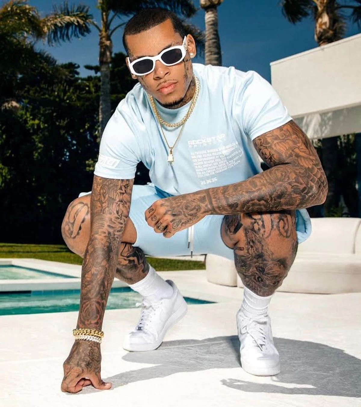
The arm work looks especially dense around the shoulders and forearms. You can see how the tattoos follow the body instead of sitting like stickers on a flat page. The darker areas settle into the elbow and inner arm, while lighter gaps help separate one section from the next. That kind of planning matters when a collection gets this large. A good sleeve can handle a lot of ink, but it still needs rhythm.
He hasn’t published a complete inventory of every image in the collection, so it’s better to describe what the photographs show than to attach invented names to every patch of shading. Black-and-grey coverage, chest lettering, religious-looking symbols, portrait-like forms and layered hand work are visible. The exact story behind each one isn’t always public, and there’s no reason to pretend otherwise.
InkMonstarr’s leg tattoos
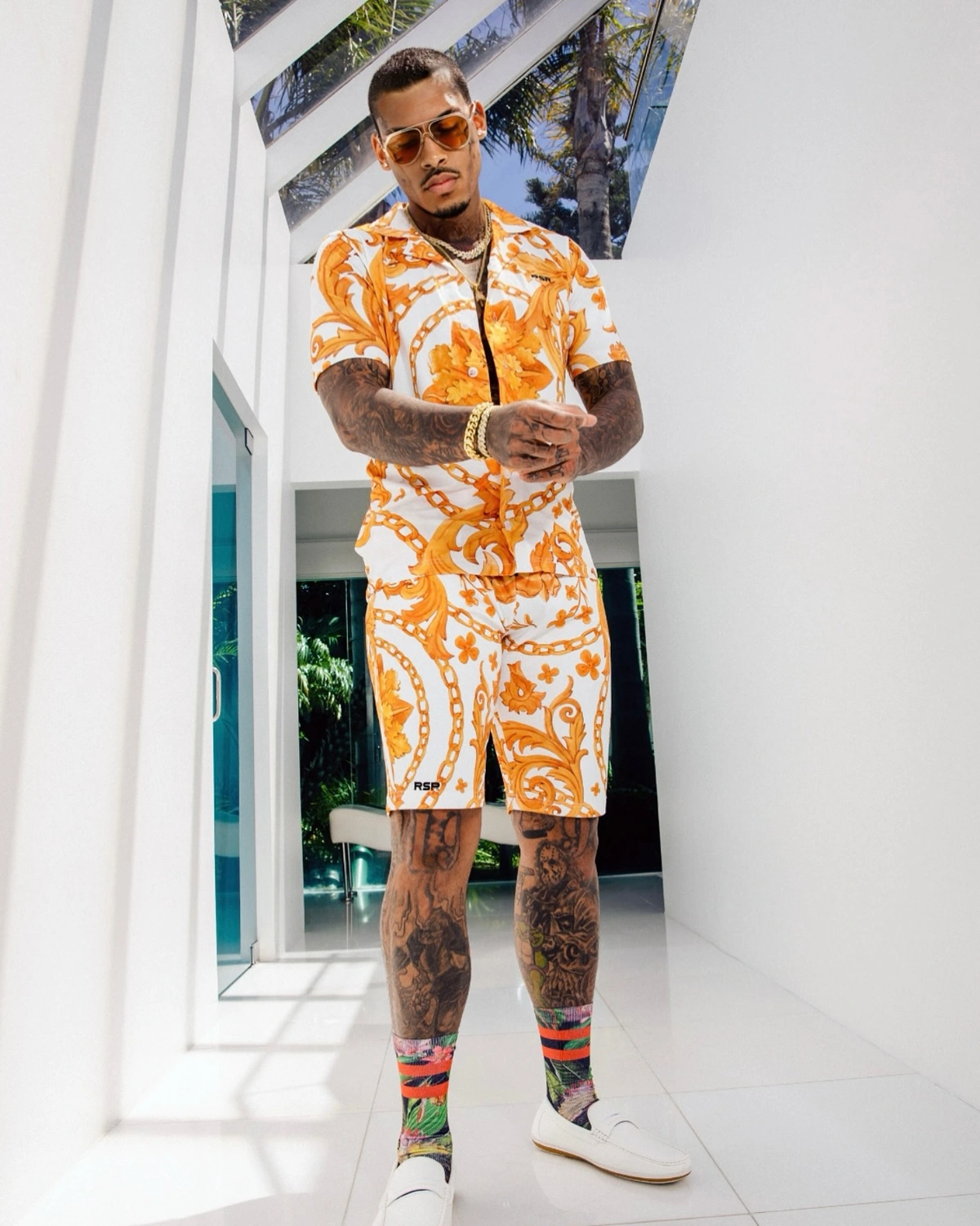
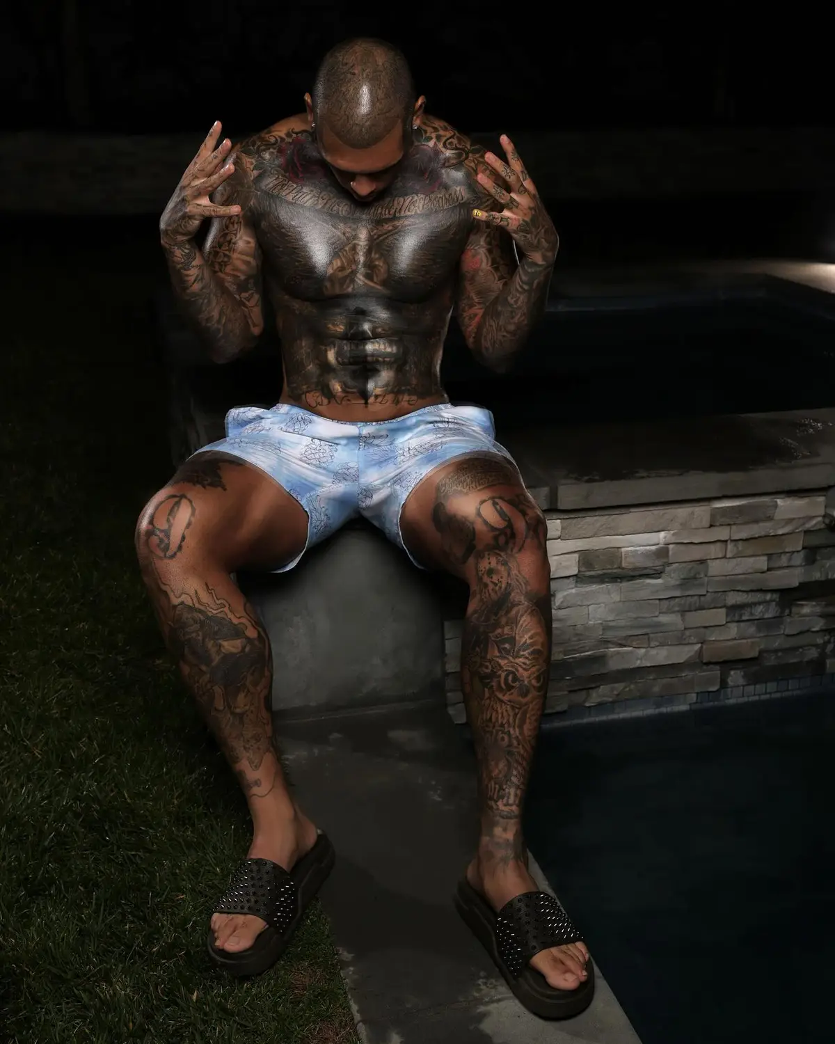
One of the more interesting details from InkMonstarr’s interview is that the collection isn’t finished. He said he was working on filling a few open spots on his legs. That sounds simple, but it says something about how he approaches a body covered in tattoos. Even with hundreds of pieces already in place, he still sees negative space as part of the design rather than a problem that has to be filled immediately.
The leg photos show heavy coverage on both legs, running from the knees down toward the ankles. There are visible faces, dark outlines, layered shading and several different scales of work. The tattoos don’t all look like one matching set, but the amount of black keeps the collection from feeling scattered. If you’re building a leg sleeve, that’s a practical idea to steal: let the overall density create the connection, then use placement to keep each design readable.
He hasn’t named the future designs, so the sensible thing is to leave them open. “Filling in a few spots” doesn’t mean a specific tattoo is guaranteed or that the whole leg will be finished on a schedule. Tattoo plans change. Artists change. Skin changes. The interview only supports the fact that he intends to keep working on the open areas.
Placement is one of the clearest lessons in the collection.
InkMonstarr’s collection is a lesson in commitment more than a single style recommendation. His most visible areas carry the boldest message. The hands and face are impossible to hide, while the chest, arms and legs create the large visual field where the collection can expand. That order makes sense: start with the pieces that feel personal, then let the rest of the body become the place where you explore.
There’s also a clear difference between looking at an individual tattoo and looking at the whole collection. A small symbol might not be dramatic on its own, but hundreds of small decisions create a texture that becomes unmistakable. The face, hands and neck give the collection its identity. The torso and legs provide the scale. Together, they make him recognizable even before you know who you’re looking at.
If you like the idea of a heavily tattooed look but don’t want to rush, his approach gives you permission to work in stages. Start with a design that has a genuine reason behind it. Give the placement time to prove itself. Then add around it only when the next piece makes sense. The goal isn’t to recreate someone else’s collection. It’s to make sure your own still feels right when it becomes much larger than the first tattoo.
Living with the ink is part of the point, not a footnote.
His comments about tattoos are unusually direct. He said tattoos gave him a voice before he learned how to speak his truth, and that instead of carrying his story he could wear it. That explains why the collection feels more like a visual diary than a trend board. It also explains why the first tattoo for his mother and the face tattoos about belief sit comfortably in the same overall picture.
He has also joked that he used his first year of college financial aid on tattoos instead of books, then quickly added that he cleared it up. The joke works because it sits beside a more serious point: people may look at the tattoos and assume they understand him, but the collection doesn’t tell the whole story. He has talked about meditation, family, travel, comics and creative work as parts of his life that don’t always show up in a tattoo photograph.
That’s probably the best way to read his ink. Notice the design, respect the placement and enjoy the visual impact, but don’t assume every meaning is available to the public. The confirmed details are enough: stars for his mother, face tattoos tied to beliefs and support, and a huge collection that keeps growing because tattooing has become part of how he expresses himself.
The final take is simple: InkMonstarr’s tattoos are bold because of the amount of skin they cover, but the collection doesn’t start with spectacle.
It starts with a small tribute on the left hand. From there, the work expands through the face, neck, chest, arms and legs, adding more visual weight without losing the personal thread.
The useful ideas are easy to take away. Keep the first tattoo tied to something that won’t stop mattering. Treat visible placement as a real commitment. Let negative space do some work. Don’t invent a meaning just because a symbol looks familiar. And if you keep adding, make sure the new piece improves the area around it instead of simply filling a gap.
InkMonstarr has described tattooing as a lifestyle rather than a phase, and his collection backs that up. It’s an ongoing project, with old pieces, new plans, open spots and enough history to make every close-up feel different. The strongest part isn’t the number alone. It’s the sense that the ink is being used deliberately: to honor family, mark belief and keep a record of the person he’s becoming.