Musicians

Tattoo guides for singers, rappers, DJs and musicians, with photographs, documented meanings and the stories behind their designs.

Hozier Tattoos: The Stories Behind His Two Latin Phrases

Hozier has described two small tattoos, both short Latin phrases. “Noli timere” is tied to Seamus Heaney’s last text to his wife, Marie; “sine qua non” was inked with Hozier’s father and brother for his father’s 60th birthday.

The first phrase is visible on Hozier’s left arm in the Movement artwork, and he has explained how he got it. He has confirmed the second tattoo in an interview, but its placement and appearance aren’t documented as clearly.

“Noli timere”: the words on Hozier’s left arm
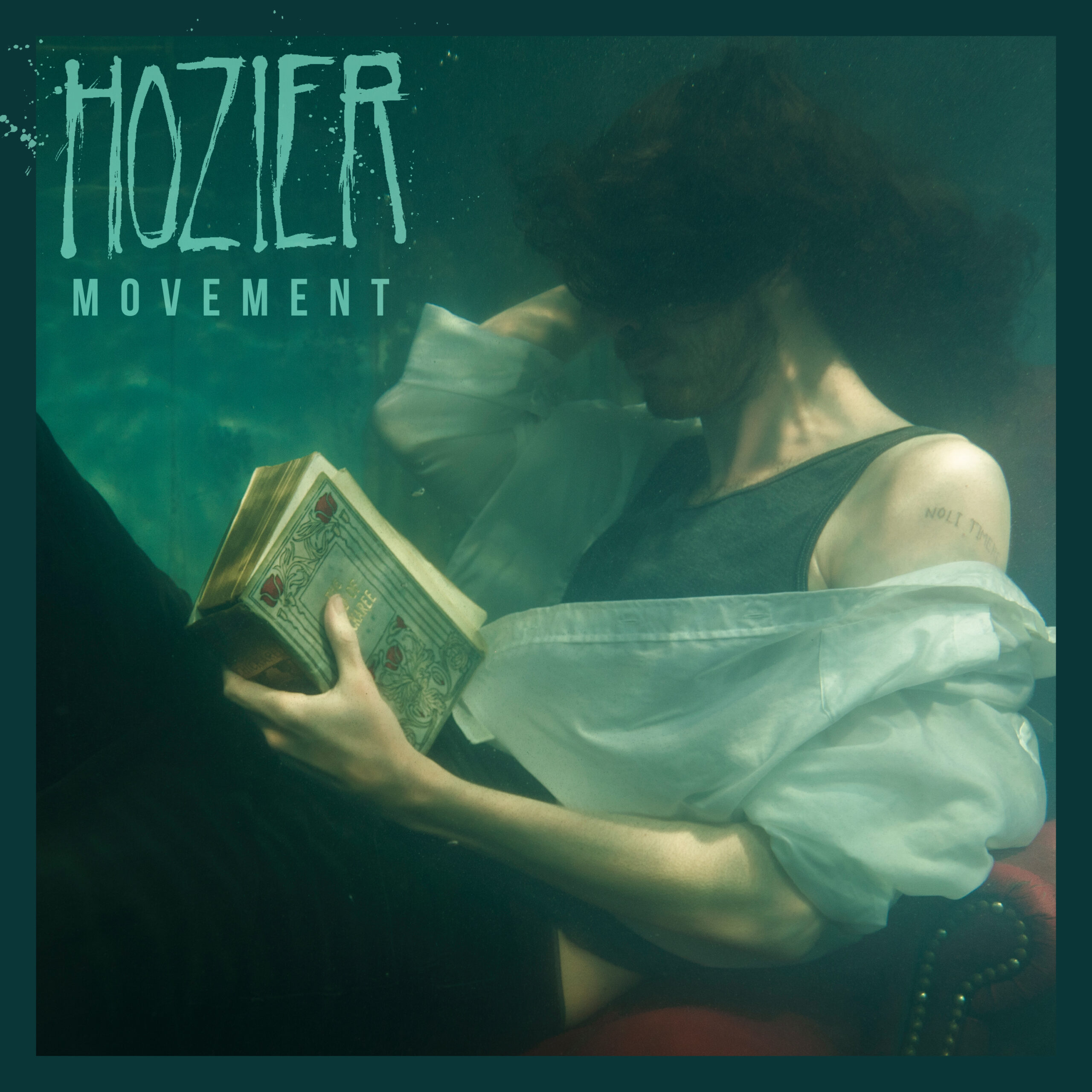
Hozier tattoos: Noli timere lettering clearly visible on Hozier’s shoulder in the Movement artwork

“Noli timere” means “do not be afraid.” Hozier said the phrase was the last message Seamus Heaney sent his wife, Marie, in a text before he died. He admired Heaney’s writing and chose the words for their source and the story around them.

Hozier has described himself as a devoted reader of Heaney. The poet’s attention to place, memory and the natural world is often compared with Hozier’s writing, but the wider literary connection is background; Hozier’s own account is what anchors the tattoo’s meaning.

Hozier said his close friend Stevie Appleby, a writer, musician and artist, did the stick-and-poke tattoo during his first tour. In a separate Q&A, he said he chose someone he liked to make a mark he intended to keep. He also recalled returning home and spending a long evening with a friend doing another tattoo with a needle, thread and ink. That’s his recollection of the occasion, not a recommendation of the technique.

A phrase from Heaney, not a Hozier lyric

The phrase isn’t a Hozier lyric, album title or line he wrote. He has said it comes from Heaney’s message to Marie. Hozier called the story “beautiful and tragic”; that is his response, and the public account doesn’t ask us to assign the tattoo a wider meaning.

Movement as a visual frame

In the Movement artwork, Hozier reclines underwater with a book, and the lettering appears high on his arm. The cover is the clearest public image of the tattoo, but its dreamlike setting tells us about the artwork, not a separate meaning for the words.

Hozier has described the placement as his left arm; the cover shows it near the shoulder. That’s why both descriptions appear. The image doesn’t establish the lettering’s exact size or when it was made.
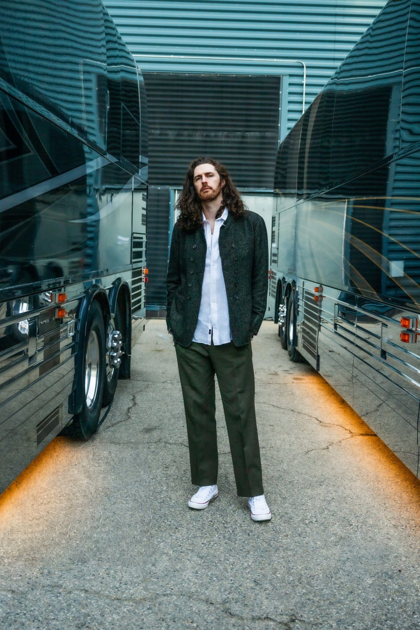
Hozier tattoos: Contextual Hozier portrait between tour buses; this photograph does not show tattoo evidence

A family milestone behind “sine qua non”

The second phrase Hozier has discussed is “sine qua non.” He got it with his father and brother for his father’s 60th birthday.

He glossed it as “without this, nothing follows.” The phrase is also used for something essential or necessary; this was the wording Hozier chose when he explained it.

The sources here don’t show where the tattoo is, what the lettering looks like, or whether the three family members have matching versions. The phrase and the occasion are confirmed; those visual details aren’t.
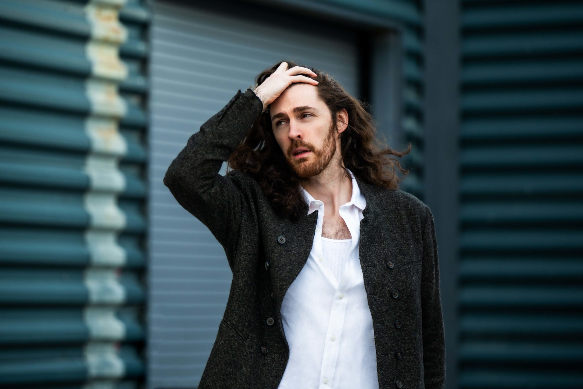
Hozier tattoos: Contextual portrait of Hozier; this photograph does not show tattoo evidence

A pair of personal stories

Both tattoos use Latin, but they point to different relationships: Heaney’s message to Marie, and a birthday shared with Hozier’s father and brother. In the interviews cited, those are the two tattoos he has discussed.

There’s no public catalogue of a larger collection here. Fan tributes to Hozier can be mistaken for his own ink, so it’s safer to stop at the tattoos he has identified.

The public record is different for each phrase: “Noli timere” can be seen in the Movement artwork; “sine qua non” is confirmed in Hozier’s account, without a comparable image in the sources reviewed.
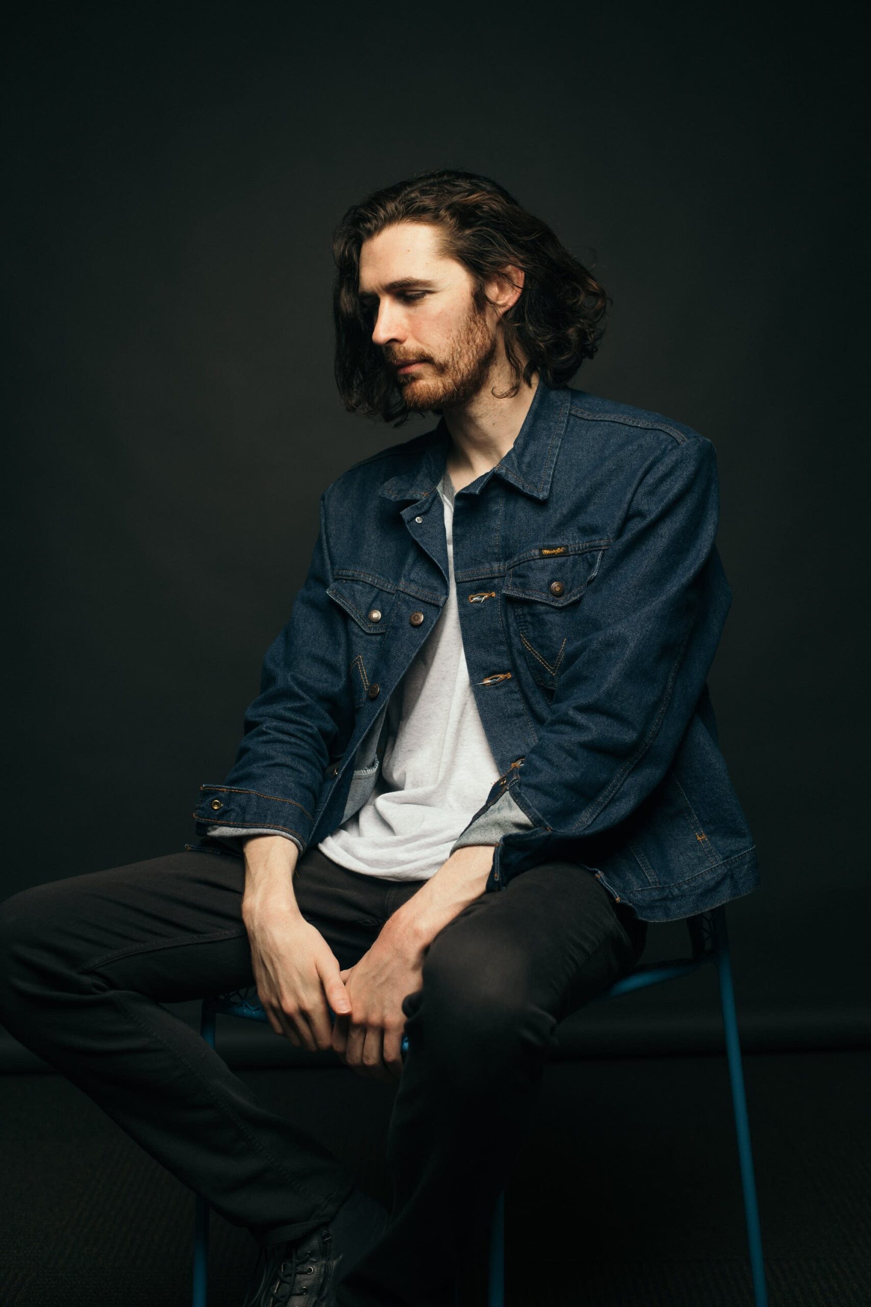
Hozier tattoos: Contextual seated studio portrait of Hozier; this photograph does not show tattoo evidence

What is confirmed, and what remains unknown

The sources here confirm two tattoos, not a complete catalogue. Beyond their Latin wording and the stories Hozier has shared, the public record leaves the second tattoo’s appearance and any other designs open. A clear photo or Hozier’s own account would be needed to say more.
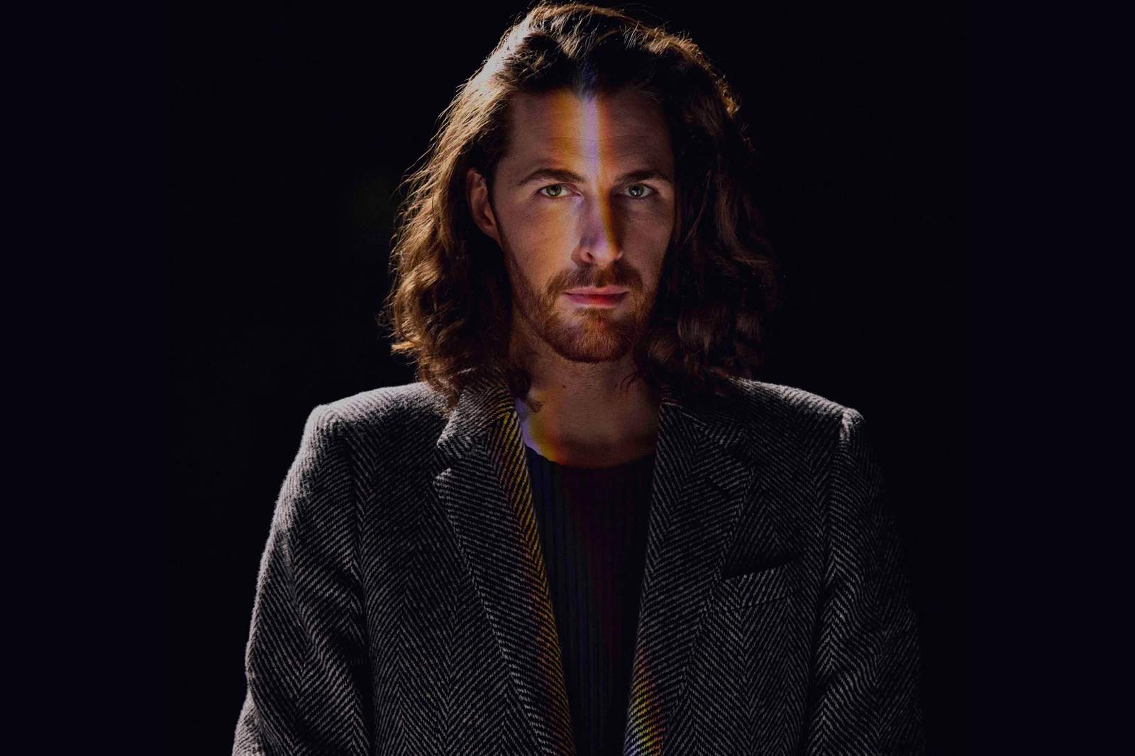
Hozier tattoos: Contextual studio portrait of Hozier; this photograph does not show tattoo evidence

Watch Hozier’s “Movement”

More musician tattoo guides

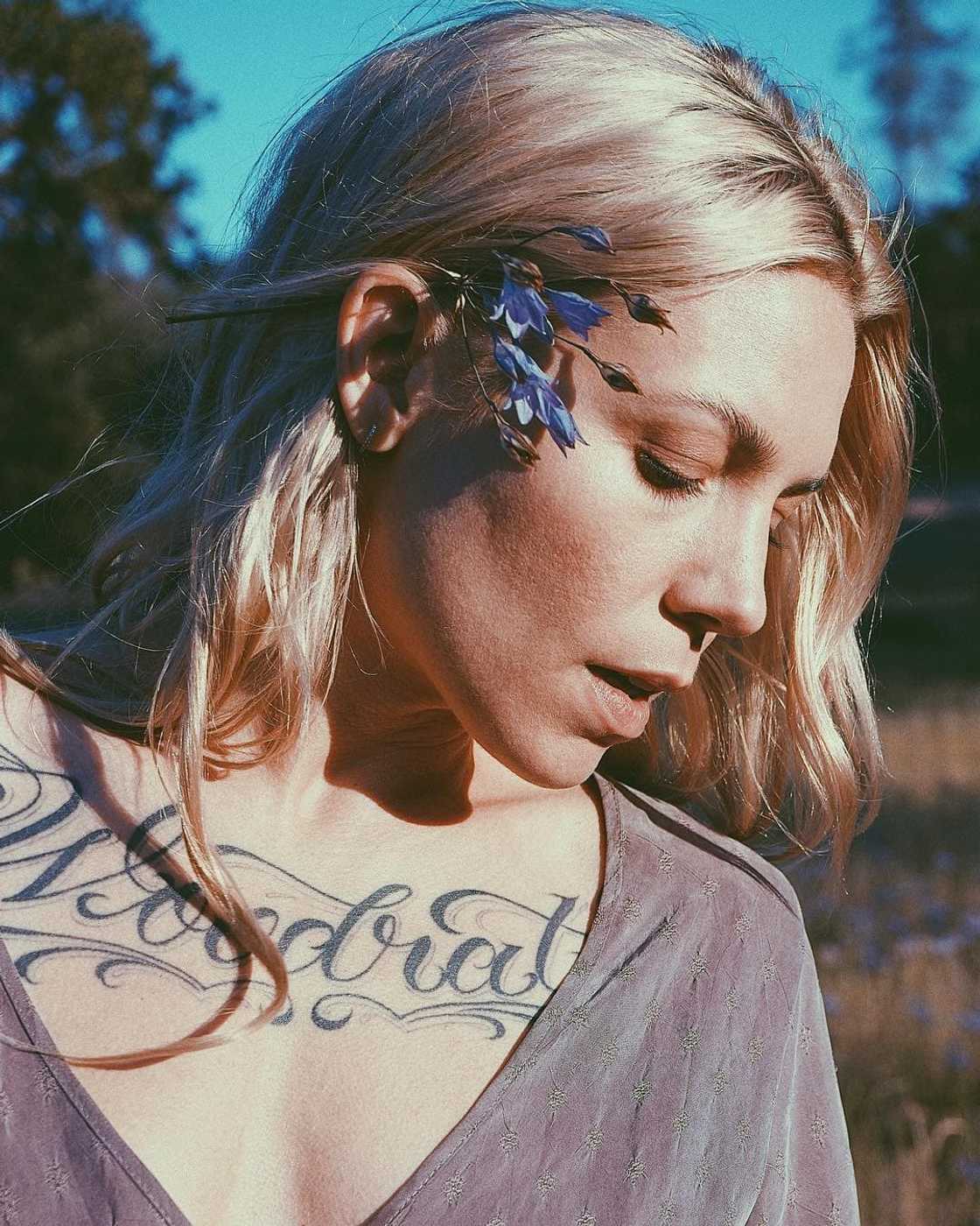
Skylar Grey Tattoos: Woodrat, Woodland Ink and the Stories Behind Them

Skylar Grey has spoken about tattoos tied to the woods, difficult years and how she feels in her own skin. “Woodrat” is written across her chest; a woodland scene covers her arm. She has also talked about what several hand and forearm pieces mean, and why she may remove one.

Woodrat on her chest ties the collection to the woods

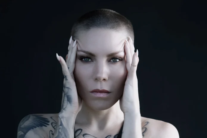
Skylar Grey tattoos: Large chest-script photograph; the visible Woodrat lettering and adjoining shoulder ink are clear

Grey’s upper-chest script reads Woodrat. In her INKED tattoo tour, she said the name grew from her relationship with the woods and became a logo. She traced it to a period living in an Oregon cabin, when she felt broke, low and unsure of herself. Later, she said that time became a test: she wanted to prove she could get through hard conditions and manage on her own.

For Grey, the word marks that stretch and what she learned she could handle. Someone seeing it might take it for a nickname or band name; her account points to the cabin years and self-reliance.

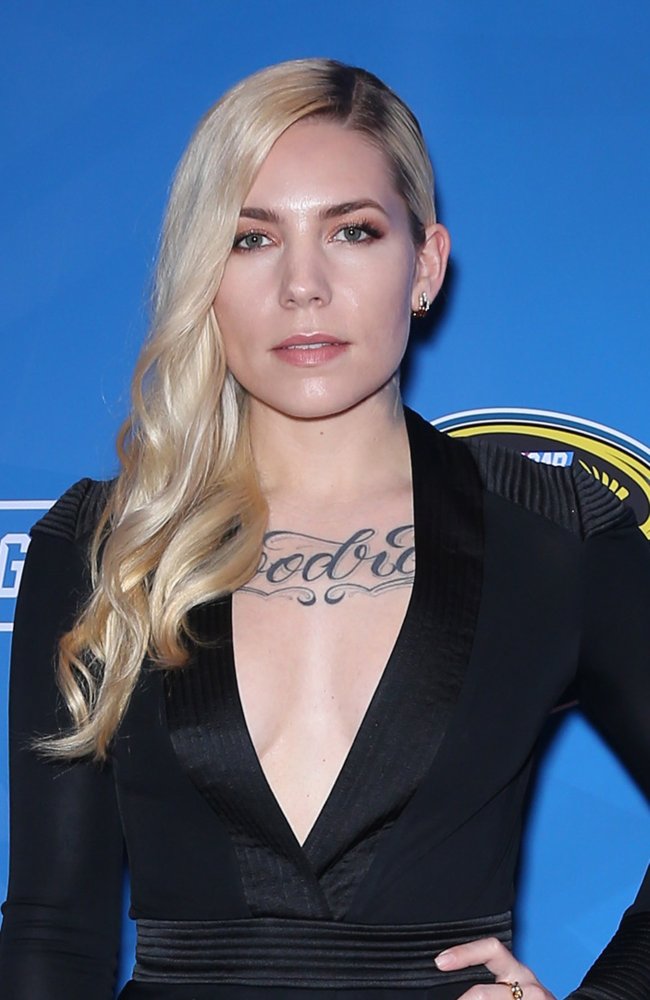
Skylar Grey tattoos: Separate red-carpet chest-script photograph showing the Woodrat lettering at a different angle

She has connected those cabin years to the perspective behind Love the Way You Lie, which she wrote before it became a hit for Eminem and Rihanna. Grey made that connection herself; the tattoo is a personal marker, not album artwork.

The chest lettering is direct and easy to read, set among denser black-and-gray work that climbs over her shoulder and arm. Mister Cartoon did the chest piece. The photos show where it sits; Grey’s interviews supply the story behind the word.

Skylar Grey tattoos: Wide outdoor profile showing chest script and arm tattoos in a distinct composition

Woodrat is easy to spot in portraits, while the arm work takes a closer look. The lettering sits near the center of her chest; Grey tied it to a personal memory as well as its later use as a logo.

Her arm and hand tattoos turn wilderness into a changing scene

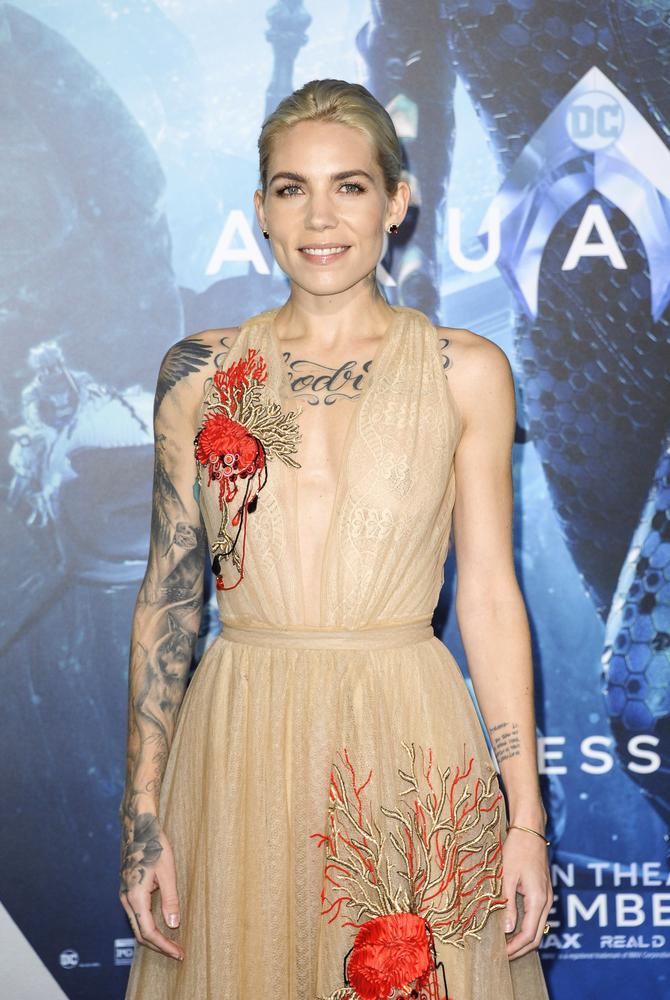
Grey’s arm is the collection’s most detailed area. Tye Harris created a woodland sleeve with a jackalope, snake, bear, eagle, mountains and wolf, with the phrase “The journey is the reward” worked into the scene. Grey has described the forest as the overall setting; she hasn’t assigned each animal its own symbolic meaning. The woods connect it back to Woodrat.

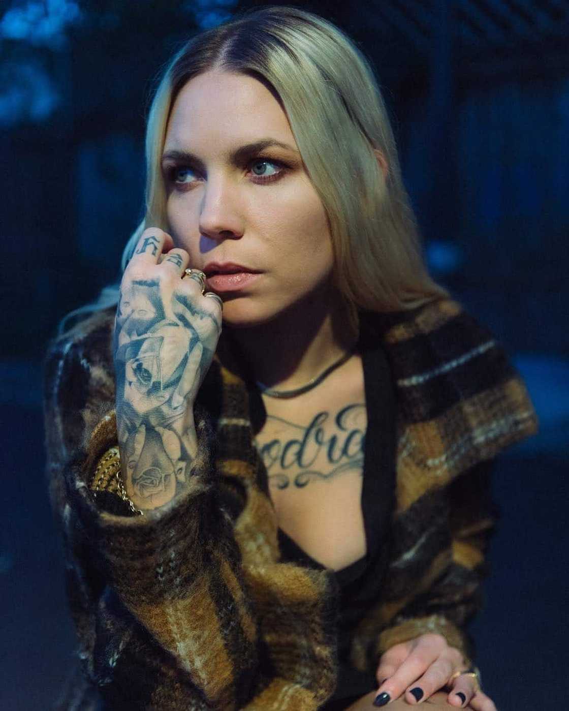
Skylar Grey tattoos: Plaid portrait showing dense hand and forearm tattoo work alongside chest lettering

Smaller work continues from her forearm to her fingers. In the INKED tour, Grey talked about a rose on the back of her hand; she said it helped balance feminine and masculine elements in her tattoos. She also discussed GREY across her knuckles, which she connected with the unknown possibilities ahead.

Other pieces reach beyond the arm. Grey said she likes owls as birds of the night and has one on her side. A thigh tattoo draws on Aubrey Beardsley’s 1893 illustration The Peacock Skirt, and a Japanese phrase meaning “Save the whales” sits on her foot. Those designs move from wildlife to literature and an environmental message.

Skylar Grey tattoos: Aquaman premiere portrait showing the shoulder-to-wrist tattooed arm and chest lettering

Grey has said she may remove the Deathly Hallows tattoo on her forearm because she thinks it was poorly done. She recalled getting it while drunk in Las Vegas. She speaks about it as a choice she views differently now: some tattoos have a story, others are visual choices, and a few may no longer suit her.

Conclusion

In INKED, Grey linked her tattoos to being sensitive and wanting to feel tougher and less easily pushed around. She also spoke about assumptions people make about tattooed women. That is her experience, not a claim about what tattoos do for everyone.

She said Angel With Tattoos came from a real feeling of being judged by her fiancé’s family. The song gives that experience a public form, but it doesn’t mean every tattoo is a shield or maps directly onto the song.

The collection includes chest lettering, woodland art, hand and knuckle marks, a literary image, an environmental phrase and a tattoo she may remove. Grey has described different reasons for different pieces: some carry memories, some were visual choices, and feelings about a design can change. For readers looking for inspiration, the useful point is that a tattoo can hold a place, a feeling, a preference or a complicated memory without sharing one universal meaning.

Watch the official Angel With Tattoos video below for another view of the visual world she built around the song.

Josie Man Tattoos: Her Tiger, Hand Ink and Cat-Devil Design

Josie Man has tattoos across her hands and fingers, a large tiger on her leg and a colorful cat-devil design by tattooer Adam Ruff.

The tiger tattoo on her leg

Josie Man tattoos: A distinct outdoor photograph showing the colorful tiger on her leg along with hand and arm tattoos.

Man has linked the tiger on her leg to being born in the Year of the Tiger. She has described it as one of her larger pieces and among her favorites. In photos, its bright colors stand out from the smaller marks around her fingers.

That is the explanation she has given for it. She hasn’t described another symbolic meaning, so anything beyond its connection to her birth year would be guesswork.

Her hand and finger tattoos

Josie Man tattoos: A separate editorial portrait with both palms raised; floral and face motifs on the palms and small finger tattoos are clear.

Her palms and fingers carry fine black lines, floral shapes and a butterfly-like face. Man has identified two personal details among the designs: Chinese names shared by her and her sister, and a small finger tattoo she calls a reminder of self-love. She hasn’t mapped each design to a specific finger publicly, so it’s best not to assign meanings she hasn’t given.

The tiny heart behind her ear came from matching with friends. In a 2021 interview, Man joked that it looked a little silly and called it the tattoo she might remove if she had to choose.

The cat-devil tattoo by Adam Ruff

Josie Man tattoos: Close view of the bright traditional cat-devil woman’s face tattoo with flames, inspected at full resolution.

Tattooer Adam Ruff did the colorful design of a woman’s face with devil-like details and flames. In 2023, Man called it her newest tattoo at the time, said she had wanted one of Ruff’s designs for years and liked how the color had healed. She hasn’t described a personal story behind the image.

Meaningful pieces and tattoos she simply likes

Josie Man tattoos: A different seated photograph showing several visible tattoos together, including the tiger and hand ink; not a crop or rescale of the outdoor shot.

Man has said tattoos make her feel more comfortable in her body. In one interview, she described them as a way to “decorate her outer self” and said they make her less likely to hide. She hasn’t tied every piece to a personal story.

Her estimates of the collection grew from about 20 tattoos in 2020 to roughly 40 in 2023. Those are counts she gave at the time, not a current inventory. The photographs here show examples of visible tattoos rather than a complete catalogue.

Traditional tattoo styles and changing plans

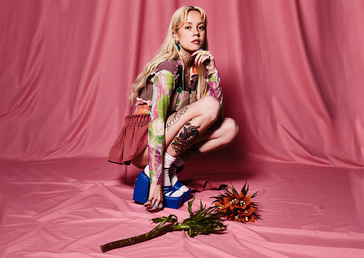
Josie Man tattoos: A separately staged pink-background editorial photograph; distinct colorful leg tattoos and additional arm ink are visible.

Man has said she likes both traditional color and black-and-white work. In a 2023 Tattoodo interview, she said she tries to wait about six months after coming up with an idea. There’s limited room, so she wants to be sure she still wants the design.

In 2021, she said she hoped to get a full back piece after lockdown and had connected with an artist through shared sound-healing sessions. Later that year, she said she still hoped to work with the artist and knew the tattoo would hurt.

She also said in 2023 that she wanted a traditional dog’s head but was waiting to book and give her body a break. Man hasn’t confirmed that either planned tattoo was completed.

More musician tattoo guides

Duki Tattoos: The Stories Behind His Face and Hand Designs

Duki’s face tattoos get attention first, but he has also explained family references on his arms and smaller pieces tied to friends and places. His interviews give meaning to some designs; photographs show where others sit.

He has discussed his collection in an Esquire tattoo tour, on Spanish television and in interviews reported by Spanish and Argentine outlets.

Duki’s face tattoos: wings, balance and a deliberate choice

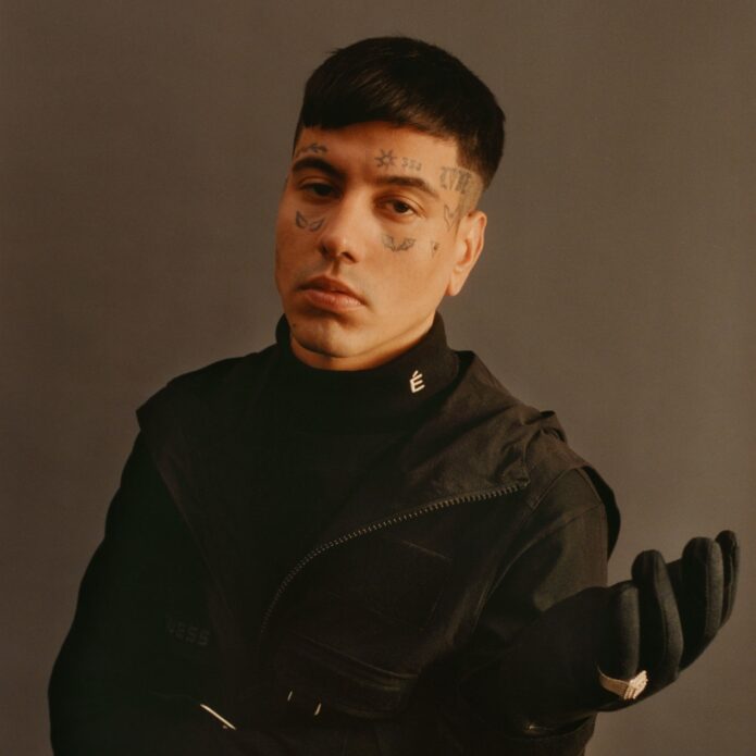
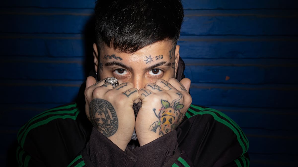
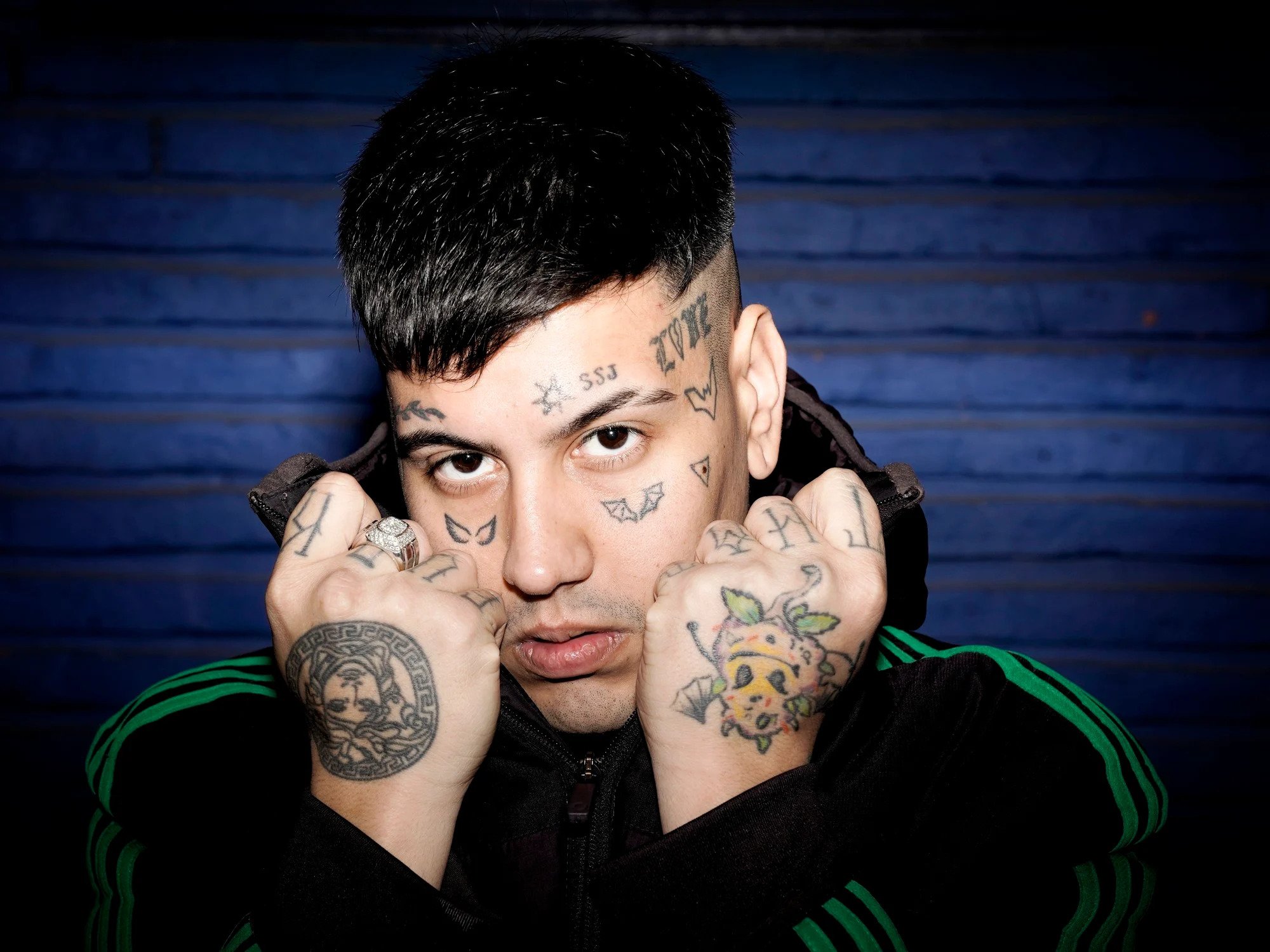
Duki has called the pair of wings beneath his eyes his favourite tattoo. He said he first thought about them as a teenager and got them at around 21 or 22. To him, they hold the good and bad sides of a person together, much like yin and yang.

Duki tattoos: Face wings and hand tattoos in a direct portrait

In a 2025 interview, he said he had considered face tattoos for years. Fantasy, anime and the idea of wearing a superhero-like suit shaped the choice; he wanted the ink to be seen. That doesn’t mean every mark carries the same message. The wings, in his account, are about balance.

The separate marks around his eyes and temples don’t form one connected mask. In photos, pose, hair and shadows can hide one side; the two images here are different views.

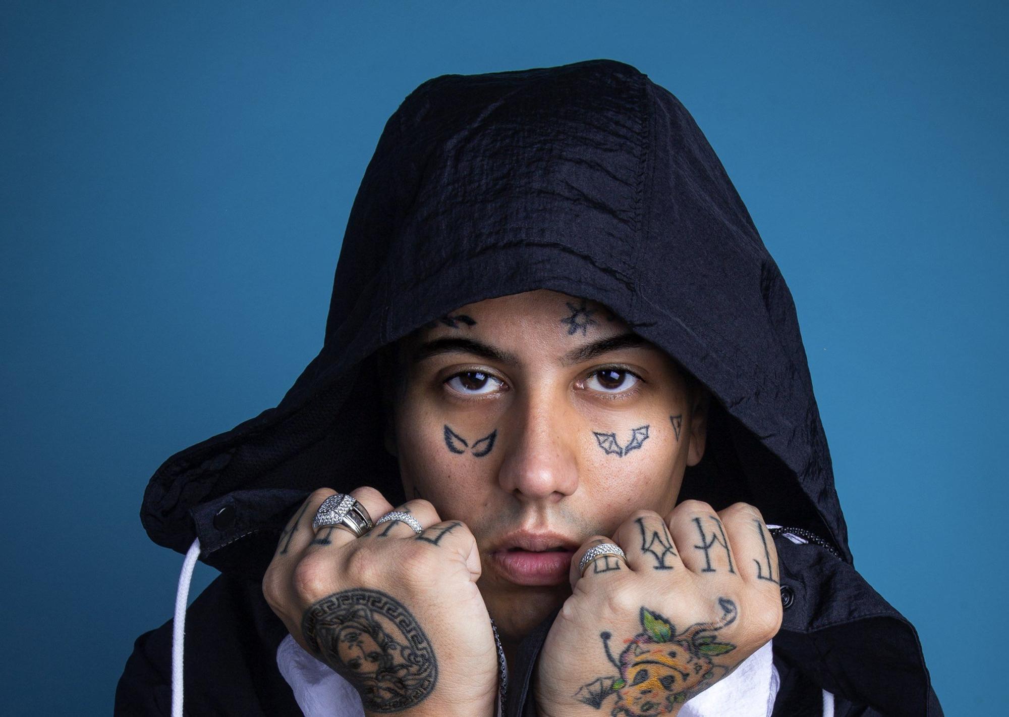
Duki tattoos: Forehead SSJ and sun with hand designs visible

Forehead and cheek tattoos: SSJ, the sun and familiar symbols

Reports on his forehead tattoos list a sun, SSJ, a short Japanese phrase and an olive branch. Europa FM’s 2023 account says Duki connected the sun with light and the branch with victory. He linked SSJ to his album Super Sangre Joven and the Dragon Ball Super Saiyan idea. Coverage translates the Japanese phrase as “devil side,” based on his reported explanation.

Duki tattoos: Separate portrait showing face symbols and two hand designs

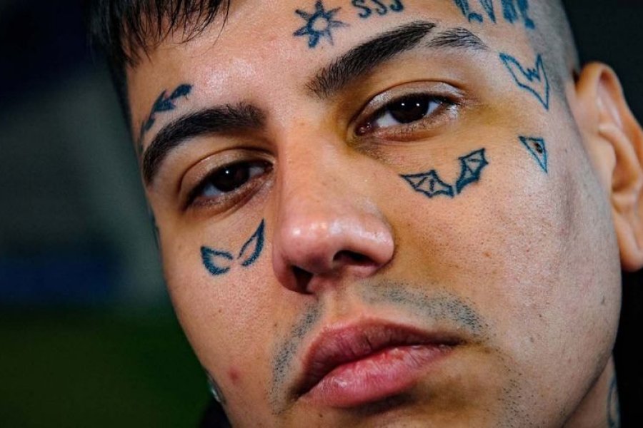
Other small designs include LOVE, a Batman symbol, a Spider-Man mark and a triangle with a dot. Reports differ on which side some appear, and mirrored photos can make placement hard to judge, so it’s safer to name the symbols without assigning sides.

Duki tattoos: Close view of the wing and cheek symbols

The character symbols fit the fantasy and superhero references he has discussed, but not every tattoo has a published explanation. Europa FM also reports that he once had an Instagram verification badge tattooed and later removed it. Photos from different years, then, won’t show exactly the same collection.

Hand and lower-arm tattoos: family, friends and places

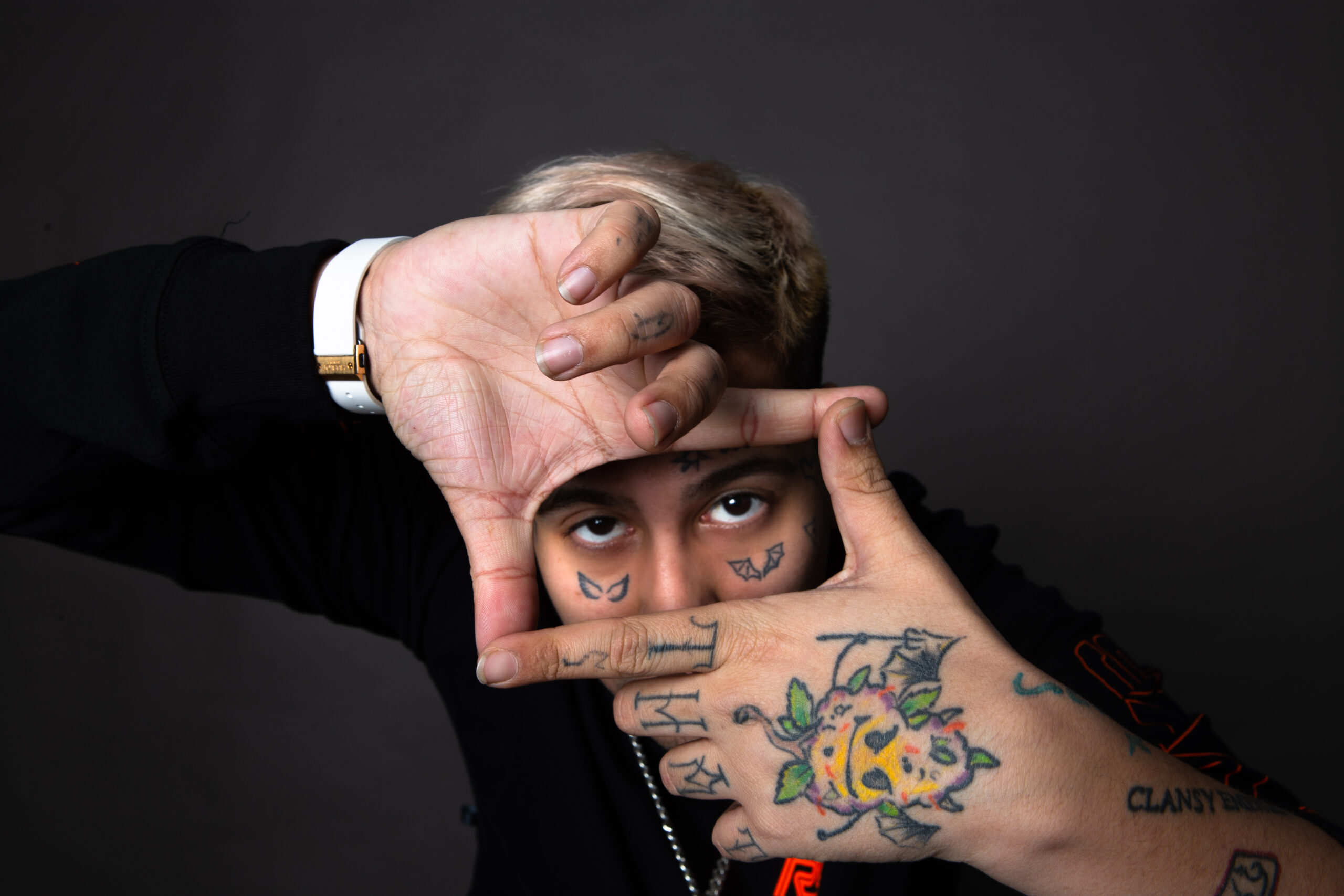
His hands have brighter colour and denser detail than the fine marks around his eyes, with lettering and images across the fingers and backs of the hands.

Duki tattoos: Distinct framing pose showing hand and finger tattoos

AS recounts Duki’s description of a lower-arm playing-card design: a king and queen with his parents’ initials, Sandra and Guillermo, in place of the usual letters. He said the pair represented both parents and called them his king and queen.

He also linked the numbers 0600 and 0800 to a producer and a jeweller friend, saying he got them during an afternoon in Córdoba. Another story involves a tattoo connected to an Argentine artist he admired. Duki said he associated the design with “Medusa,” then later realised the word was also linked to Versace.

Esquire’s 2023 tattoo tour described more than 30 pieces; AS later reported Duki estimating that he had around 30 or 31. Those are interview snapshots, since tattoos can be added, covered or removed.

Duki has recounted that his mother cried when she first saw his face tattoo and worried about his looks and future work. In a 2025 account, he said his parents had first seen the change on social media before he visited them. The interviews describe the timing differently, but both report that the visible decision surprised her.

His interviews explain the wings, some forehead symbols, the family cards and the numbers. The photographs help show where the rest sit; some marks have no public explanation.

More musician tattoo guides

Sierra Ferrell Tattoos: Face Ink, Floral Hands and Americana Style

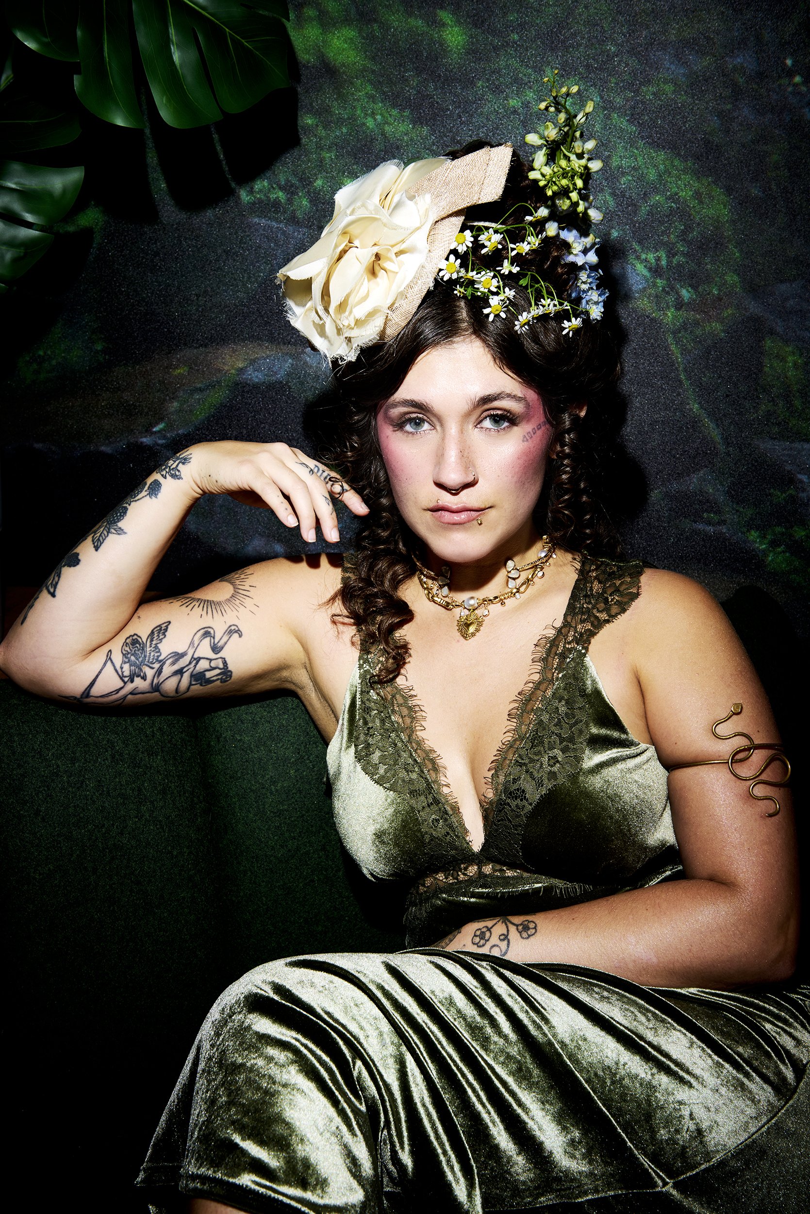
Sierra Ferrell’s tattoos sit across her hands, arms and face, with loose black lines that suit her old-time country look. Her ink appears in glimpses beside a hat brim, under a sleeve or between rings and bracelets. Flowers, leaves and short lettering give the collection a hand-drawn feel.

The pieces don’t follow one matching flash style. Some are small enough to miss in a stage photo; others are easy to spot when she reaches for her instrument or turns toward the camera. Together they look collected over time, rather than planned as one full-body design.

Sierra Ferrell’s face tattoo is small, clear and instantly recognisable

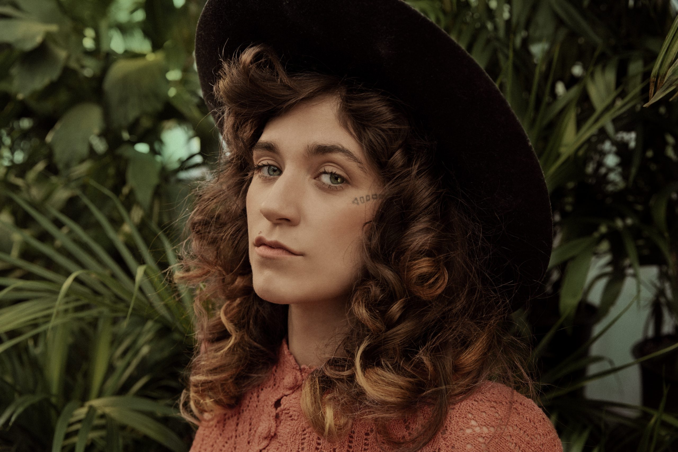
A short line of block lettering sits beside Ferrell’s eye, close to the cheekbone. Its dark, simple shape stays legible in portraits, even when her curls or a wide hat frame her face.

Sierra Ferrell tattoos: botanical arm linework

This photo turns to the botanical work on her arm. The finer lines have more room there than the lettering beside her eye. Face tattoos are harder to keep private, so placement and scale deserve thought before settling on a design.

Her floral hand tattoos bring a soft detail to a working musician’s look

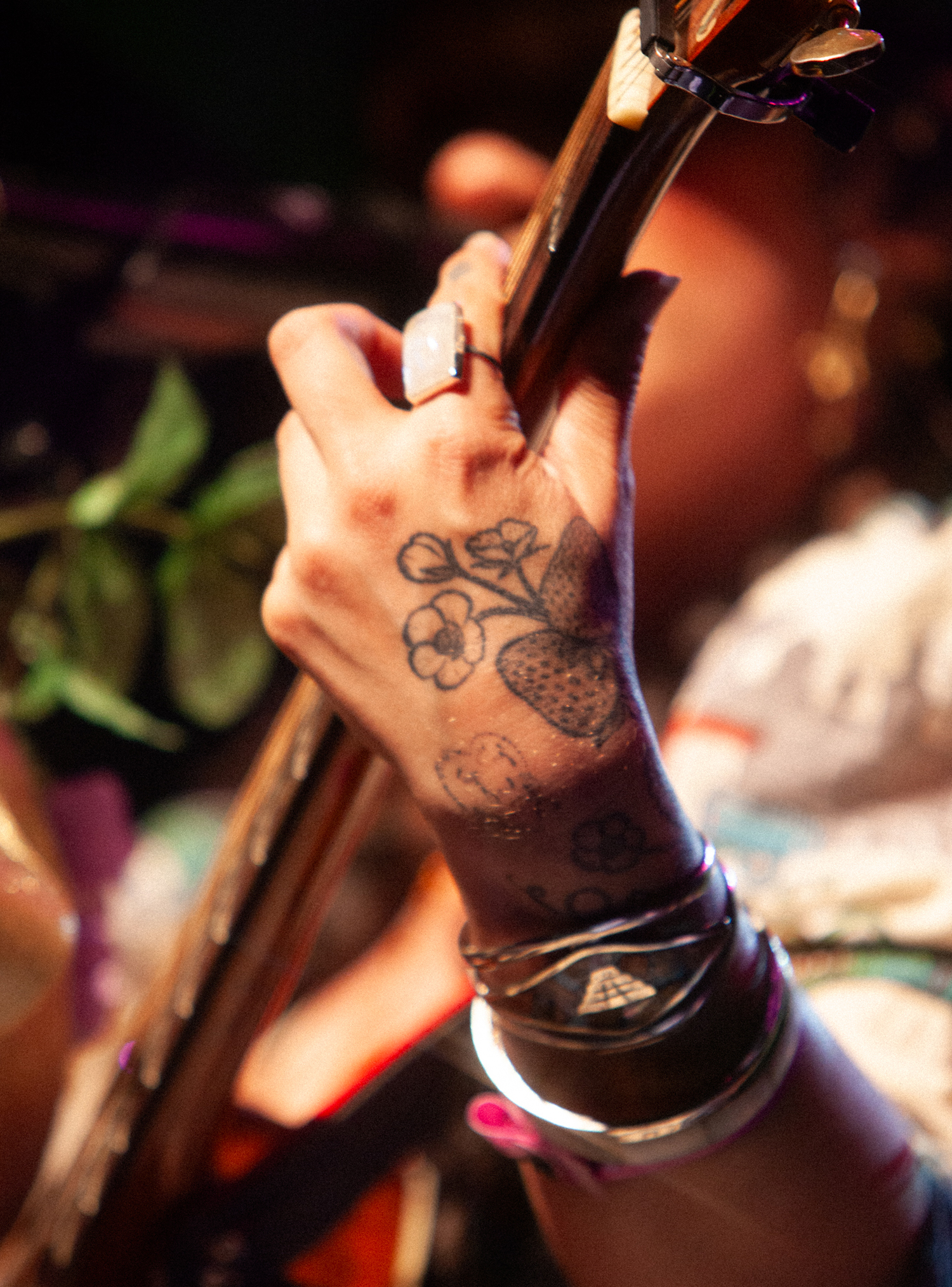
In a close concert shot, Ferrell grips her instrument with flowers and a strawberry-like shape visible across her hand. Rings and bracelets frame the ink, but the rounded outlines still read under the stage lights.

Sierra Ferrell tattoos: floral hand tattoo close-up

The small drawings have a folk-art feel: simple petals and rounded forms, with space between them. Hand tattoos take more wear from sun, washing and friction than ink in protected spots, so keeping the main shapes clear can help them stay readable.

Loose arm linework gives her tattoos an old-timey botanical mood

A portrait with a flower crown shows leaves and blooms scattered across Ferrell’s arms. They don’t form a solid sleeve; open skin separates the pieces and keeps the arrangement light.

Sierra Ferrell tattoos: open botanical arm collection

The botanical lines sit naturally with her vintage clothes, but don’t depend on them. The gaps matter as much as the flowers. If you’re planning several small designs, leaving room between them can keep each one distinct instead of filling every space with background.

Her hand lettering adds a little attitude without taking over the design

Another close view shows compact lettering across Ferrell’s fingers as she holds her hand near her face. The letters have an informal, slightly rough look rather than the feel of a polished logo.

Sierra Ferrell tattoos: finger lettering and hand details

The words sit beside the floral pieces, so the hand mixes lettering with softer shapes. Finger ink can blur or fade faster than designs in less exposed areas; short text and clear spacing give small letters a better chance of staying legible.

The face, hand and arm pieces work because they share a loose line quality

A wider portrait brings several areas together: the face lettering, smaller hand designs and open artwork on her arms. The pieces don’t match exactly, but their simple outlines give them a common feel.

Sierra Ferrell tattoos: face, hand and arm overview

Stage clothes, jewelry and lighting change from photo to photo. The tattoos remain a mix of larger figures, small marks and open linework rather than one continuous sleeve. That variety is part of how the collection reads as personal.

A relaxed way to build a personal collection

Ferrell’s ink leaves room for different subjects to sit together. The link between them is loose linework, not a single theme. If you like that approach, start with a design that matters to you and choose an artist whose work suits its scale and placement.

Take time between pieces and consider how the lines may age and heal. The collection feels unforced because each tattoo has space around it, and no one design has to explain all the others.

More musician tattoo guides

Fishball Tattoos: Flowers, Geometric Patterns and Her Family Tribute

Fishball’s tattoos pair large colour pieces with dense black pattern: flowers at her neck, a dagger across her chest, geometric work down one arm and onto her hand, and two roses low on her abdomen.

She is Italian model and musician Felisja Piana. Her designs range from soft petals and script to a decorated skull and repeated geometric forms.

The photographs document her tattoos during her modelling years, not a current count.

Flower tattoos around Fishball’s neck

Fishball tattoos: Large flowers and leaves wrapping front of neck

Large flowers cover the front of Fishball’s throat, with leaves and smaller shapes filling the spaces around them. Their thick outlines keep the petals clear even when her hair crosses part of the design.

Colour photos show warm tones in the petals and green leaves. In a black-and-white view, the outline takes over and makes it easier to see how the flowers wrap around her neck.

The flowers stay visible above most necklines, while a chest tattoo can be covered by a shirt. They meet the chest piece near the collarbones but keep distinct shapes: the flowers spread out and up; the dagger points down. Fishball hasn’t given a specific meaning for the neck flowers in the interviews cited here.

The dagger tattoo across her chest

Fishball tattoos: Downward dagger with ornamental handle and radiating petal/leaf forms

At the centre of Fishball’s chest is a large downward-pointing dagger. Its decorated handle sits just below the neck flowers, and the blade runs toward the middle of her chest. An oval detail in the handle gives it the look of an ornamented object rather than a plain triangle.

Leaf- and petal-like forms spread to either side, widening the design across her upper chest while leaving the blade as its main vertical line. Dark outlines separate the shapes; colour and shading fill them in.

The tattoo can look different from one photo to another. A low neckline shows more of the handle and blade, while hair can cover one side. Fishball’s reason for choosing the dagger isn’t established in the material here, so there’s no basis for attaching a story about betrayal or protection to it.

The memorial skull and Nosy Be lettering on her arm

Fishball tattoos: Decorated Mexican skull and Nosy Be script

The skull on Fishball’s left upper arm is a tribute to her father. In a November 2017 interview with Snap Italy, she said he died of cancer and called the Mexican skull the tattoo with the most important meaning to her.

The skull has a broad dark grin, patterns across its face and a flower-like arrangement on the forehead. An Om symbol sits inside a circular detail near the top. Those ornaments give the image a decorative look rather than a simple anatomical one.

Below it, the script Nosy Be names the island in Madagascar where her father lived for several years, she explained. The lettering is separate from the skull, with enough space between them to read each design clearly.

Her explanation covers the tribute and the place name; it doesn’t tell us why she chose every ornament around the skull.

Geometric forearm and hand tattoos

Fishball tattoos: Repeating polygons and radial floral shapes continuing over hand

Fishball’s forearm is covered in repeating geometric shapes: angular outlines, nested forms and star-like flowers. Some sections are dark and dense, while others leave skin visible between the lines.

The pattern continues over the back of her hand, rather than stopping at a straight edge on the wrist. As the space narrows, larger forearm shapes give way to a tighter arrangement.

A flower-like centre stands out from the surrounding polygons. Its softer petals keep a radial shape, and the colour echoes warmer tones in the neck and chest pieces.

The skull and lettering have distinct subjects and text; this part of the arm is built around spacing and repeated forms. The forearm-to-hand continuation makes the pattern feel like one connected piece.

Rose tattoos across her lower abdomen

Fishball tattoos: Paired red-toned and blue-toned roses with leaves

Fishball has two large rose tattoos on her lower abdomen, one on either side of the centre, above the waistband. Leaves extend around the blooms. In the colour photograph, one rose reads as red-toned and the other as blue.

Each flower has a small centre, layered petals and dark outlines that separate the folds. The leaves give the pair an uneven edge, rather than making them look like two identical round badges.

Some lettering appears between the roses, but the angle and clothing make it hard to read accurately. It’s better to leave it unidentified than to guess at a word.

The roses sit apart, leaving open skin between them; the chest dagger, by contrast, runs down the centre. Fishball hasn’t given a personal explanation for the roses in the interviews cited here, so familiar associations with love or remembrance shouldn’t be presented as her meaning.

For a look at Fishball in her music career, here’s the official video for FREAKY with sedd.

More musician tattoo guides

Sinéad O’Connor Tattoos: Face, Chest and Arm Ink Explained

Sinéad O’Connor’s tattoos are direct and hard to miss. The neck lettering, chest medallion, arm script and hand ink stand out in photos of her moving, performing or speaking. They don’t rely on a bright palette; placement and the size of the lettering do much of the work.

One close portrait can’t show how the whole collection sits together. A collar may hide part of the neck piece, stage light can flatten the chest design, and a microphone can cover the hand. Looking across several photos helps separate a clear tattoo detail from a shadow, a fold of clothing or a camera angle.

This article looks at the placements that show up most clearly: the neck phrase, hand and forearm pieces, chest medallion and long arm script. It also considers how these choices shape her performance look, without treating any single photograph as a complete record.

Sinéad O’Connor’s neck lettering tattoo

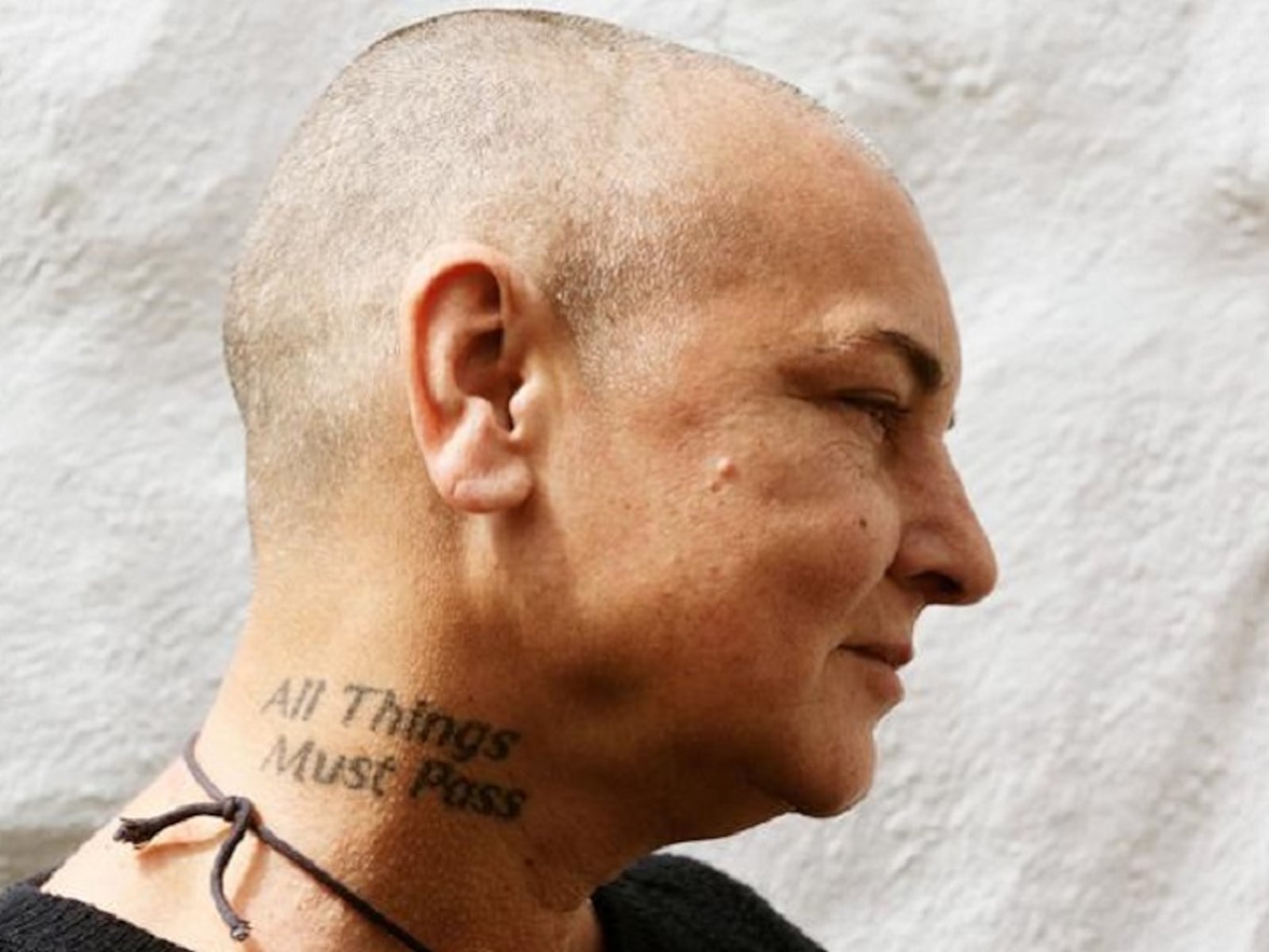
The phrase “All Things Must Pass” sits on Sinéad’s neck, above the collar and below her face. It follows the curve instead of running as a straight strip. In side-profile photos, the lettering becomes part of the line from her head to her shoulders, which helps it stand out without needing oversized letters.

Neck lettering stays visible from the side and behind, and people can see it during ordinary conversation. A short phrase may fit on a stencil but feel cramped once it follows the curve. Font matters too: thick letters read quickly, while finer script needs enough space to remain clear over time.

Her tattoo shows how a line can follow the body rather than fight it. If you’re considering something similar, ask to see the stencil with your head relaxed and turned both ways. Check how the words read while you move, not only in one still pose.

Sinéad O'Connor tattoos: Sinéad O'Connor All Things Must Pass neck tattoo, selected because the named tattoo area is clearly visible in a distinct high-resolution photograph

Sinéad O’Connor’s face and hand tattoos

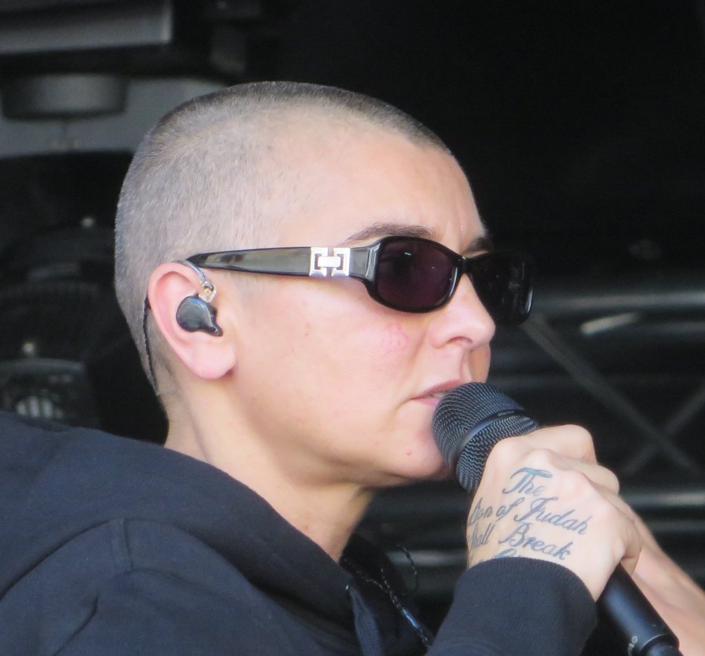
In the hand photos, small lettering and marks near Sinéad’s fingers and the back of her hand are easy to see. When she holds a microphone or gestures, the ink is part of what the audience sees. It has a different feel from the larger chest piece because the hands are constantly moving through a performance.

Hands get washed often, move all day and see plenty of sunlight. Fine lettering can soften, and tiny details may lose their shape in a narrow space. A short word or simple symbol is usually easier to read than a small, intricate picture. Ask an artist to show healed work as well as fresh photos.

Placement changes how public the design feels. The back of the hand is visible from more angles than the inside of the wrist, while a finger tattoo is hard to miss. Try the idea temporarily and look at it while making your usual gestures. Visibility affects both how a tattoo reads and how often you live with it.

Sinéad O'Connor tattoos: Sinéad O'Connor hand lettering tattoo, selected because the named tattoo area is clearly visible in a distinct high-resolution photograph

Sinéad O’Connor’s chest medallion tattoo

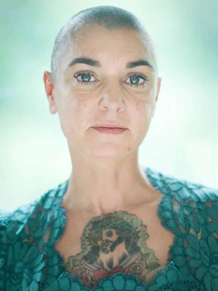
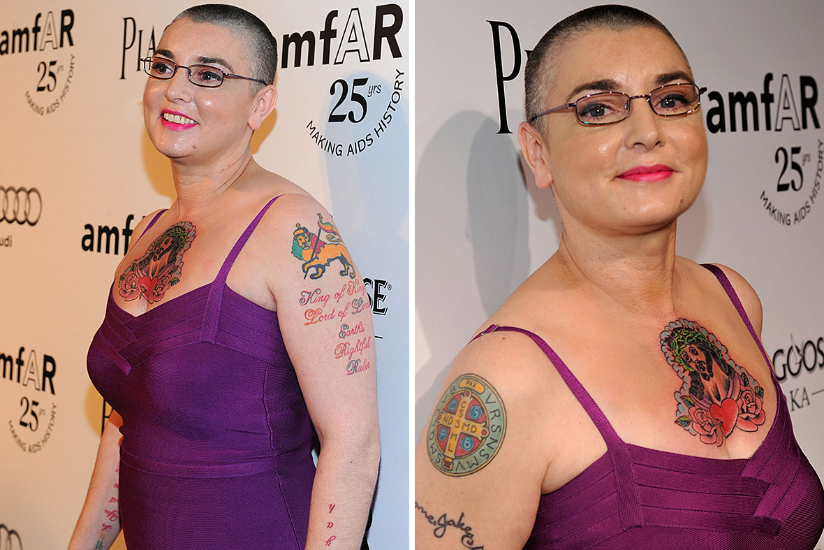
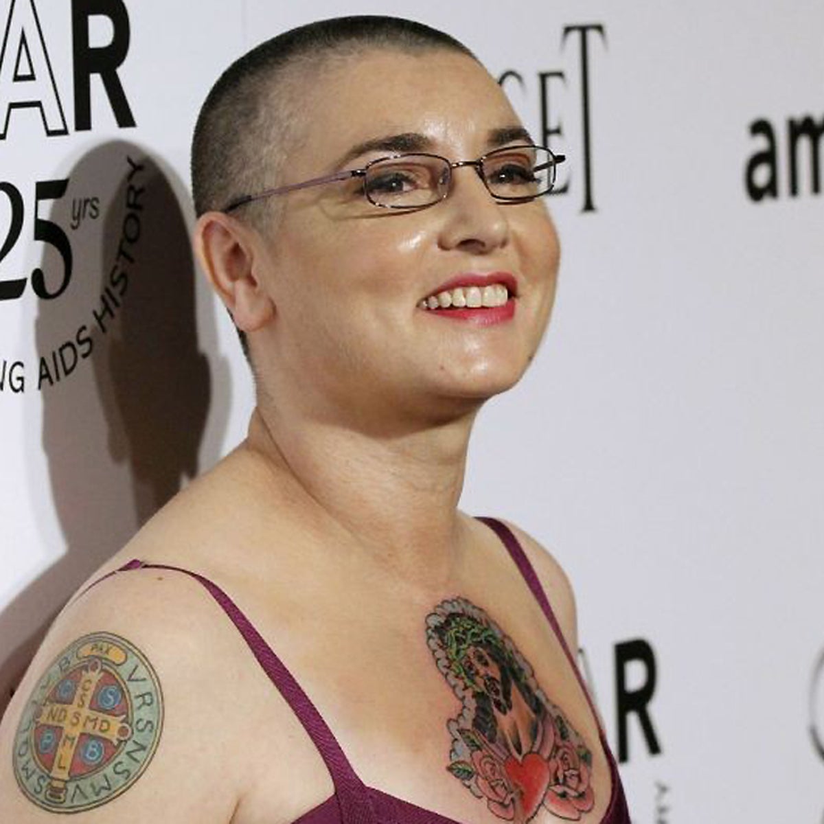
Photos from the amfAR period show a central medallion or figure on Sinéad’s chest, with lines and shapes around it. The main image reads first, and the broad placement gives it more room than a narrow strip would.

Posture changes the way a chest tattoo sits. Standing, sitting, raising your arms and taking a deep breath all pull the skin differently. Check a stencil in several positions so you can see whether the center stays where you expect it to. The same applies to a sternum piece, where a slight turn can change how symmetrical it looks.

The chest design is easier to read because the surrounding details support the central image. If you’re planning a large piece, decide what you want the eye to find first. A clear focal point can keep the smaller details from competing with one another.

Sinéad O'Connor tattoos: Sinéad O'Connor chest and upper-arm tattoos, selected because the named tattoo area is clearly visible in a distinct high-resolution photograph

Sinéad O’Connor’s arm script and figures

Photos of Sinéad’s upper arm show long lines of script, including “King of Kings Lord of Lords Earth’s Rightful Ruler.” The words take up real space and follow the length of the arm, so the eye travels along them instead of stopping at a small emblem.

Long lettering needs room for line breaks, spacing and the direction of the arm. A sentence that looks balanced in a flat reference can bunch up when the elbow bends. Check the stencil with the arm hanging naturally, bent and raised overhead.

Script is easier to live with when the words remain readable. A dramatic font can look good in a photo but feel crowded if the letters are packed together. Leave breathing room between lines and keep flourishes that help the letters, not ones that obscure them. Readability matters more than a trendy font.

Sinéad O'Connor tattoos: Sinéad O'Connor arm script and chest tattoo, selected because the named tattoo area is clearly visible in a distinct high-resolution photograph

Sinéad O’Connor’s tattooed performance style

Photos don’t show one fixed arrangement of Sinéad’s tattoos. Hair, clothing and camera angle change which pieces stand out. The neck lettering is a steady visual marker; her hands and arms come into view as she gestures. That movement ties the tattoos to her presence onstage.

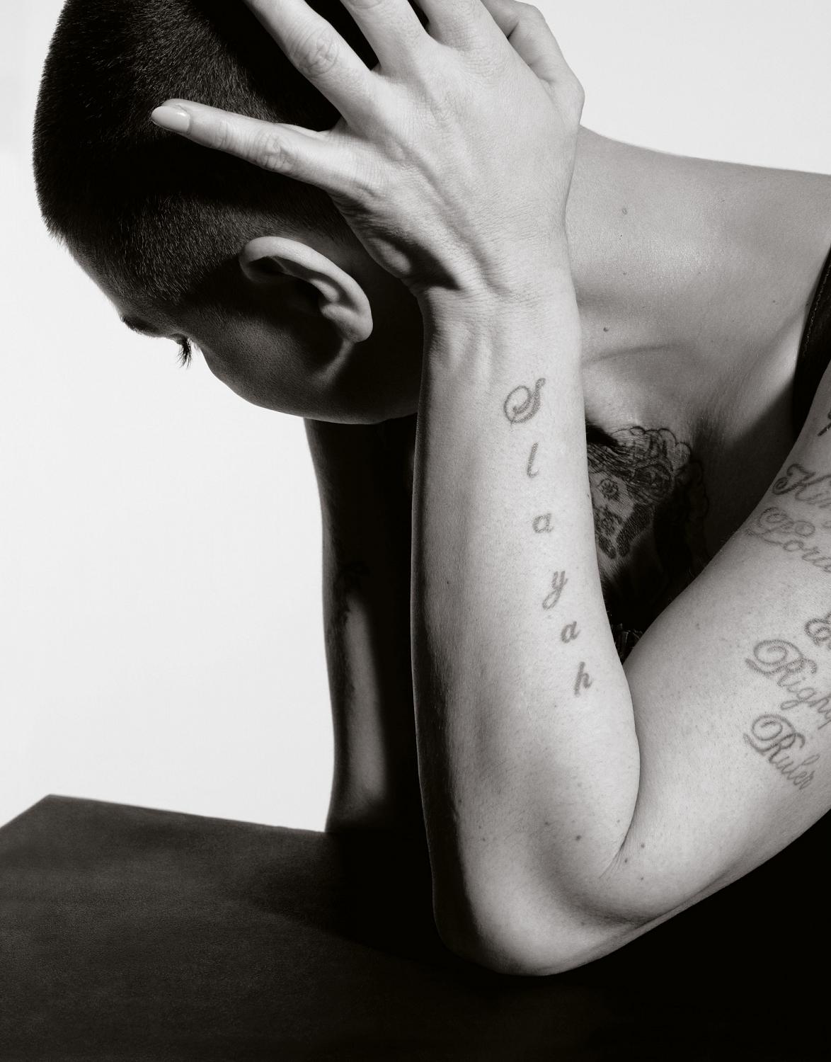
The black-and-white portrait makes it easier to follow the forearm script and see how the lines sit beside the folds of her arm. Without bright color, spacing and line weight are easier to notice. It can be a useful way to study a design even if your own tattoo will use color.

If you’re planning several pieces, think about how they’ll meet your clothes and routines. A shoulder tattoo may sit at a sleeve edge, a wrist design beside a watch, and a neck tattoo may be the first thing people see. Each placement creates a different everyday relationship with the ink. Consider how it will look at work, in different weather and during ordinary conversations.

Sinéad O'Connor tattoos: Sinéad O'Connor forearm script tattoos, selected because the named tattoo area is clearly visible in a distinct high-resolution photograph

What her collection teaches about commitment

Sinéad’s tattoos bring together clear placement and visible lettering. You don’t need a full collection to consider the same choices. Identify what you like about a reference—the wording, the weight of a medallion, script that follows an arm or a placement that stays visible—and explain that to your artist instead of asking for a copy.

Words deserve careful checking. Confirm spelling, punctuation and the exact quote before the stencil goes on. Read it in a mirror, and ask someone else to look too. Decide whether the lettering should feel formal, handwritten, heavy or quiet. With a phrase tattoo, the typeface is part of its voice.

Think about visibility as well. Face, neck and hand tattoos appear in many outfits and photos. Chest and upper-arm pieces give you more control over when they’re seen. Visible ink isn’t automatically a problem; it just changes what people see first in settings like work or family events.

Give fresh work time to heal before deciding what to add beside it. New black ink can look very dark, and swelling can change how large a design seems. Follow your artist’s aftercare directions, protect healed tattoos from strong sun and judge the piece when the skin has settled. Open skin may look better than adding another tattoo straight away.

Sinéad’s tattoos feel connected to her voice and to how she chose to be seen. You can take inspiration from their confidence without using the same words or layout. Choose a design that still feels like yours after the reference photo is gone.

More musician tattoo guides

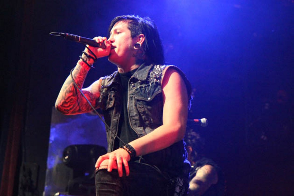
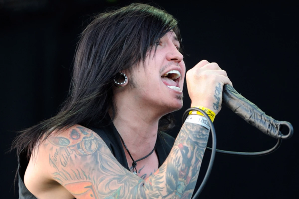
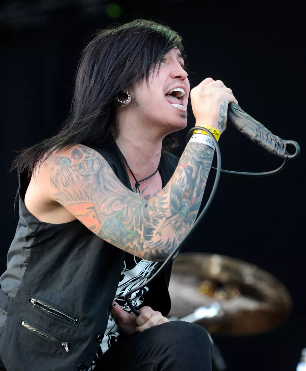
Craig Mabbitt Tattoos: Full Sleeves, Hand Ink and Stage Style

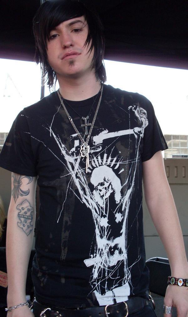
Craig Mabbitt’s tattoos are easy to spot in Escape the Fate stage photos. Dense black and color work covers his arms, with smaller pieces on his hands, neck and chest that show when his clothes shift. The collection looks as if it grew over time, giving it a lived-in feel.

Photos show full sleeves, lettering, shaded faces, patches of color and smaller marks. Some shapes are clear; others blur under red lights or movement. This look at the collection sticks to what the photos show and to the way scale, contrast and placement work together.

The tattoos share a heavy visual feel even when the designs differ. The arms do most of that work, while the hand and neck pieces carry the ink into more visible spots. If you’re drawn to Mabbitt’s style, pay attention to the balance rather than copying an exact design.

His upper arms use large color blocks and strong contrast

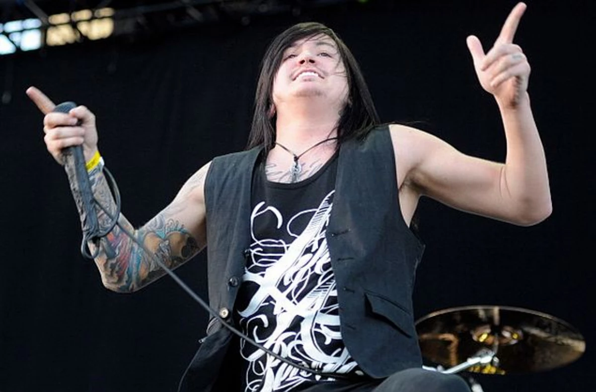
Craig Mabbitt tattoos: wide high-resolution performance photograph showing the tattooed upper arms and chest

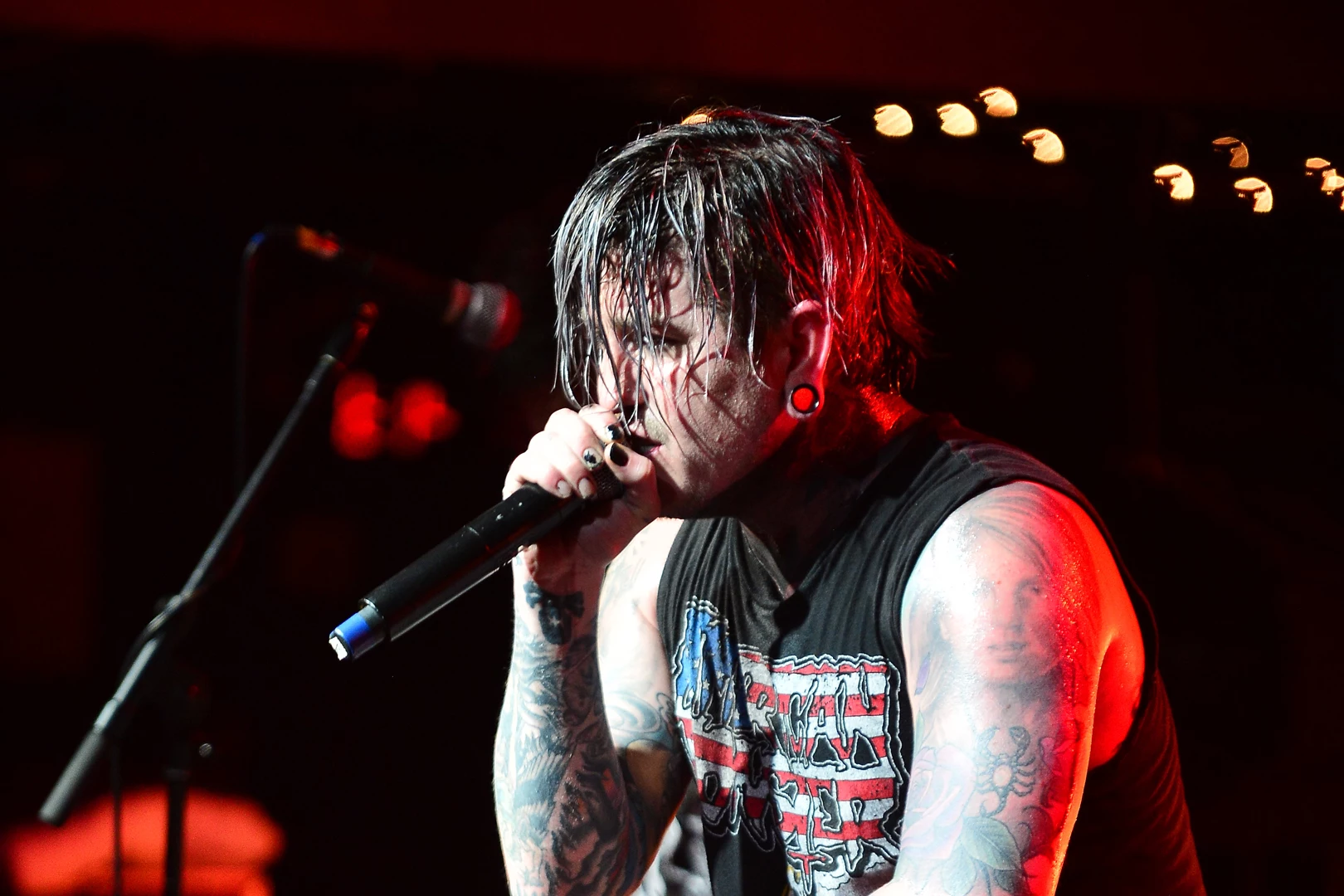
Large shapes and dark shading dominate the clear upper-arm photos. Color appears in selected areas instead of covering the whole arm evenly, so the outline still reads from a distance. The sleeve is busy, but darker and brighter patches give it a rhythm.

On Mabbitt’s left arm, the visible work runs from shoulder toward elbow in overlapping sections. Rounded forms, lettering and dark outlines sit together, and the arm reads as one field during a show rather than a single image surrounded by blank skin.

If you like a sleeve made of separate pieces, decide which one should catch the eye first. An artist can connect the rest with shading, similar line weight or a few shared colors. The connection can be quiet; the designs don’t need matching frames or logos.

Stage photos show how that scale holds up while Mabbitt moves, grips the microphone and leans toward the crowd. The main shapes remain visible from changing angles. Fine details alone would be harder to follow under stage lights.

Dense forearm coverage keeps the collection connected

Craig Mabbitt tattoos: sharp red-lit close view showing layered forearm and upper-arm tattoo coverage

The forearm is packed with images and shading, making it look darker than the upper arm in some photos. A close performance shot shows the designs continuing around the limb instead of stopping at a flat panel.

That wraparound shape matters because forearms are seen from several directions. Mabbitt’s tattoos turn with his arm as he reaches for the microphone, bends his wrist or faces the camera from another angle.

Red and other warm colors appear within the darker work, with small areas of bare skin separating the pieces. If every patch used the same saturation, the sleeve could read as one block. Those breaks help the motifs stay distinct.

Leave some open skin before filling every gap. It gives the strongest shapes room, helps around joints and cuffs, and leaves space for future additions. A dense sleeve still needs places for the eye to rest.

Hand and wrist tattoos bring the details closer to view

Craig Mabbitt tattoos: distinct stage photograph showing wrist, forearm and sleeve tattoos while he sings

The marks on Mabbitt’s hands and wrists are smaller than the sleeve pieces, but they show up in his gestures. A microphone, cable or raised hand can put the ink at the center of a photograph.

Hands are washed, exposed to sunlight and constantly moving, so fine detail can soften sooner than it might on a covered area. The bold shapes and lettering visible in his stage photos stay recognizable even when the hand is angled or partly hidden.

A wrist tattoo can join the hand to the forearm sleeve without creating a hard edge. One compact mark near the thumb or inside the wrist may be enough; there’s no need to fill every finger. The design just needs to fit the weight of the ink above it.

Try a hand design with the fingers open, curled and relaxed. Skin shifts in each position, so a word that looks level in a fist may slope when the hand opens. Plan for the movement as well as the photograph.

Chest and neck pieces frame the face and microphone

Craig Mabbitt tattoos: close performance photograph showing tattooed arms, neck and chest near the microphone

The chest and neck pieces are less dominant than the sleeves, but they frame Mabbitt’s face in performance photos. They sit near the collar, ear jewelry and microphone, and show more clearly when he wears a vest or sleeveless shirt.

A chest tattoo doesn’t have to be one enormous image. Several medium-sized pieces can carry the same visual weight if they’re spaced well. In the photos, the ink works with the neckline rather than crowding it. That can be useful if you want a design you can cover with a shirt.

The neck is hard to hide, so clear shapes matter. Fine detail can disappear under hair, shadow or stage lighting. If you’re considering that placement, check how the design reads from the front, side and three-quarter view.

The same subject can feel different in a different place. A skull or line of script on the upper arm may read casually; near the throat, it can feel more confrontational. Mabbitt’s mix keeps the upper body direct without making every piece oversized.

Stage photos show how the sleeve moves with him

Craig Mabbitt tattoos: separate high-resolution action photograph showing the sleeve wrapping around the arm in motion

A posed portrait can make a sleeve look flat. Stage photos show Mabbitt reaching, leaning, gripping the microphone and turning his shoulders while he sings. The designs shift across those movements, so the ink feels part of the performance.

Different angles bring out different pieces. One photo may show a broad patch of color; another catches a wrist detail or the back of a hand. Several images give a better sense of the layout than one close-up.

Stage lighting changes how colors appear. Red light can blend warm ink into the background, while a cool spotlight can sharpen the black outlines. Compare references in daylight and indoor light before deciding how you want color to look against your skin and clothes.

The collection’s consistent features are heavy outlines, dark shading, compact symbols and visible placement. The designs are not identical, but they sit in the same visual world. That direction can be built gradually: choose an anchor piece, decide how much color or dark coverage you want, then let later tattoos work with it.

There’s no need to guess the story behind every mark. Some are easy to see; other details remain private or unclear in photos. It’s enough to describe what is visible and leave the rest to the person wearing the tattoos.

Think about scale before your first appointment. A large upper-arm piece needs room, and a dense forearm design has to wrap cleanly. Smaller wrist and hand tattoos can bridge the areas instead of looking like add-ons. Planning the layout early leaves more options later.

If you like the rough alternative feel, bring references that show what you respond to—red color, heavy black shading, old-school forms, portraits, lettering or a particular stage look. Talk with the artist about your skin, work and how visible you want the tattoos to be. The design should fit your life as well as the reference.

Mabbitt’s sleeves show that a full collection can grow over time and still feel considered. Strong placement, recurring contrast and room between some shapes keep the pieces readable. Start with a design you’d still want years from now, then build around it patiently.

Borrow the energy, not the exact artwork. An artist can adjust the scale for your arm and make a new composition that fits your skin. That’s how a reference becomes your tattoo instead of a duplicate.

More musician tattoo guides

Yeat Tattoos: His Arm Symbols, Lettering and Blackwork

Yeat’s tattoos are easiest to spot on his arms and hands, even when a mask, dark glasses, or stage clothes hide much of his face. Black lettering, symbols, portraits, and loose figures sit at different points along both arms. The mix has a futuristic edge, though the pieces also look like they were added over time.

Oversized clothes, gloves, and masks can cover the ink in ordinary photos. In sharper portraits and stage shots, the arms are more exposed and individual designs are easier to see.

Yeat’s arm tattoos are the centre of his look

Yeat tattoos: both arms lifted with visible tattoos

The hallway portrait shows tattoos at different heights along both arms. Some areas are dense, while open skin remains between other pieces. The two sides aren’t mirror images: one has tall dark marks and lettering; the other shows smaller pictures, curved outlines, and shapes that continue toward the wrist.

The ink is mostly black, with bold outlines and patches of shading. Some designs are filled heavily, while others stay lighter. Their shared roughness ties them together without making them look like parts of one uniform sleeve.

A full-arm view also makes the spacing clear. The designs have room around them, so even a busy collection doesn’t become one flat patch. Later additions can fit into the open areas without crowding every existing tattoo.

The forearms mix symbols, numbers, and personal marks

Yeat tattoos: forearm symbols and wrist ink

Close photos of Yeat’s forearms show geometric shapes, repeated lines, small pictures, and marks that resemble a private alphabet. Some are easy to recognize; others are abstract. A photograph shows their form more clearly than their meaning.

Yeat has talked about communicating through numbers and symbols, which fits the way some of the marks read. They don’t always form conventional sentences; a blocky character beside a curved shape can look like a code or personal sign. The exact meaning may be known only to him.

Some public references connect particular tattoos to his music or people close to him. Fans have identified one portrait as his grandfather, though Yeat hasn’t explained that interpretation in detail. Other symbols have been linked by fans to different album eras. Those readings are best treated as speculation unless he confirms them.

The designs are visible, but their meanings aren’t all public. The symbols, numbers, and personal marks can stay private even when they’re part of a public image.

His lettering and block shapes make the ink feel futuristic

Yeat tattoos: close forearm lettering and symbols

Yeat’s lettering is often tall, squared, or stretched along the arm. Rather than traditional script, some of the marks resemble signs or logos, which fits the futuristic clothing and metallic jewelry he wears.

The larger blocks remain visible in wider shots, while smaller details show up close. In the Rolling Stone photo, he raises his forearms beside his face, making the tattoos part of the pose rather than something sitting off to the side.

Arms bend and turn, so lettering can shift with the skin. Bold shapes stay legible from more angles than very fine lines. The open skin around them also helps the dark marks keep a clear edge. The gaps between the tattoos are part of the layout.

The newest Yeat tattoos push into heavy blackwork

Yeat tattoos: upper arm blackwork and purple figure

An Inked Magazine photo shows larger black symbols, a purple figure, curved lines, and darker patches reaching toward Yeat’s shoulder. These sections look heavier than the more isolated marks in the earlier close-ups, like part of a sleeve taking shape.

A large filled-in area can draw the eye quickly, so the outlines and lighter figures around it help keep the arm from reading as one solid mass. Here, the darker work sits alongside outlined shapes and lighter sections.

The sharp lines, symbols, and unusual figures sit comfortably beside Yeat’s masks and machine-like styling. The tattoos don’t need to share one subject; recurring outlines and contrast give them a similar visual feel.

Yeat tattoos change with motion on stage

Yeat tattoos: tattooed arms during a live performance

In a live photo, Yeat’s arms move through a darker stage light. A tattoo can disappear when the elbow bends and show again as he reaches toward the crowd. The shifting view makes it easier to see how the ink sits on a moving arm.

His hands, bracelets, microphone, and tattoos share the frame, but the larger shapes remain recognizable when smaller lines blur in the lighting. The bold linework reads quickly, even from a distance.

The tattoos are part of the visual look he brings to a performance: raised arms, covered hands, a masked face, and heavy ink. Photos can exaggerate shading or catch old work before it was changed, so it’s safer to describe the overall pattern than assign a meaning to every mark. The clearest through-line is the arm coverage, with lettering, symbols, and figures layered over time.

More musician tattoo guides

Landon Barker Tattoos: Chest Wings, Floral Arms and Face Ink

Landon Barker’s tattoos are part of the look he brings onstage and in portraits. Some are easy to spot through a tank top or open jacket: wing shapes and lettering across his chest, flowers on his arms, and smaller marks near his face. The collection mixes fine lines with darker sections, so it changes depending on the photo and pose.

Coverage has linked some designs to family, faith, and relationships, though the meaning of every tattoo has not been explained publicly. The photos are clearer about placement than private intent, so the visible details are the best place to start.

Landon Barker’s chest tattoos mix wings, lettering, and roses

Landon Barker tattoos

A Highsnobiety portrait shows fine lettering across the upper chest, wing-like shapes spreading toward the shoulders, and floral lines around them. Most of the work is black and grey. The softer shading gives it a worn-in look instead of the bright, hard-edged feel of traditional flash.

The pieces follow the shape of the chest. The lettering sits low, while the wings reach outward and the lines near the collarbone move with the body. The open skin keeps the flowers and script distinct; the darker outlines tie them together. The wings connect the centre of the chest to the floral work on the arms.

Some tattoo coverage describes the chest lettering as a personal phrase, but the photos alone don’t establish what every word means. What they do show is a narrow script, balanced placement, and imagery that reaches toward the shoulders. If you’re planning a similar piece, the body’s shape is a useful starting point before filling in smaller details.

His arm tattoos use floral linework and strong black outlines

Landon Barker tattoos

An E! portrait catches Landon with his forearms crossed, showing the small marks on his hands and larger designs near his wrists. The pieces don’t form a uniform sleeve. Flowers, fine shapes, and heavier outlines sit at different points along the arms and become clearer as he turns toward the camera.

The open skin gives each floral design room. The hand tattoos are smaller and harder to make out from a distance, but they add to the layered look of the arms. A bent elbow also changes what the photo reveals: some forearm ink falls into shadow while the hands come forward.

That is why a sharp close-up can tell you more than an event photo. Blur can turn a fine flower into a dark patch; a clearer portrait shows the lines and gaps around it. With fine-line tattoos, a clean image matters as much as the size of the design.

The useful idea here is the balance between fine floral lines and stronger outlines. It leaves space for additional pieces and gives an artist options for connecting them without making every tattoo look the same.

The face and neck marks keep the look recognisable

Landon Barker tattoos

In a black-and-white IMG Models portrait, a small cross sits near Landon’s eye and light lettering runs along his neck beneath the jaw. The marks are small, but their position makes them easy to notice when his hair or jacket covers other tattoos.

There is little room for error with a face tattoo, and even a tiny symbol becomes part of someone’s everyday appearance. The cross stays close to the eye without taking over the portrait. The neck lettering sits lower and can disappear beneath a raised collar.

The restrained scale leaves his features visible while adding a punk edge. A small mark can change the frame of a face more than a much larger design elsewhere.

Some coverage identifies the neck words as a phrase connected with prayer, but the exact story behind each mark isn’t always public. Visually, the lettering is short and close to the jaw; the small cross acts as a distinct detail near the eye.

The shoulder and upper arm tattoos bring in hearts and stars

Landon Barker tattoos

A Flaunt portrait, lit in red and blue, shows a heart-like image near the shoulder, roses on the upper arm, and outlined stars farther down. Dark lettering follows the curve at the back of the shoulder. The lighting makes exact ink colours hard to judge, but the shapes and placement remain visible.

The rounded petals sit beside open star outlines, with the shoulder design adding a denser patch of ink. The stars leave some room around the larger work, so the arm doesn’t read as one solid piece. It looks like separate designs added in layers.

This mix can work when you want several tattoos to feel related without matching exactly. A larger piece can anchor the shoulder while simpler outlines fill space below it. Leaving skin open keeps the designs distinct and leaves room for later additions.

The back and arm work show how the collection grows

Landon Barker tattoos

A Distractify portrait gives a quieter view of Landon’s upper body. It shows the chest lettering, shoulder designs, and floral work on his arms without the bright lighting and styling of the Flaunt photo, making it easier to see how the pieces sit together.

The flowers sit high on the arms, with stars continuing toward the elbows. More detail gathers near the shoulder, then the design opens up lower down. Across the photos, larger images sit near the chest and shoulders while smaller marks appear on the hands and face. Some meanings have been reported; others are visible designs whose stories Landon has kept private.

The collection is easier to read as a set of pieces placed around the body than as one matching sheet of designs. If you like its pop-punk feel, black-and-grey lines, open stars, floral shading, and short lettering offer a direction to explore. The exact placement and symbols can be your own.
More musician tattoo guides