Musicians

Tattoo guides for singers, rappers, DJs and musicians, with photographs, documented meanings and the stories behind their designs.

Dominic Fike Tattoos: Face Marks, Chest Ink and Sketchy Arm Designs

Dominic Fike’s tattoos range from small face marks to a red chest cross, loose arm drawings, hand ink, and larger pieces across his torso. In some photos the collection looks playful; in others, the heavier black work gives it a more serious feel.

The designs don’t follow one style. A fine-line figure sits near the cross, while a small apple and forehead lettering show up in close-ups. His arm tattoos include a speech bubble and cartoon-like figures. The pieces look collected over time, not planned as one matching sleeve.

The clearest portraits show where the tattoos sit and how their lines and spacing work together. Some meanings have been publicly reported, but many are best described by what the photos show.

Dominic Fike’s chest tattoos balance a red cross and fine-line figures
Dominic Fike tattoos: red cross, chest figure, shoulder lettering, and arm artwork

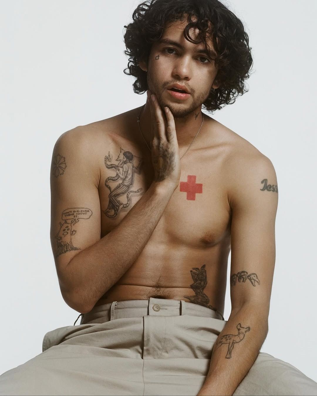
A clear portrait shows a bright red cross high on the right side of Fike’s chest and a detailed black figure on the other side. The contrast is immediate: the cross is a solid, graphic shape, while the figure uses lighter lines that curve and overlap.

The cross gives the chest one strong focal point. Nearby lettering and open skin add detail without crowding it. The larger figure has the feel of a small drawing, which makes an interesting counterpoint to the simple shape of the cross. The contrast between the two is the point.

If you’re considering a similar layout, it helps to plan the pieces together without making them one large design. One image can anchor the chest; finer work can add movement around it. Spacing keeps each tattoo readable.

His shoulder and upper-arm tattoos have a sketchbook feel
Dominic Fike tattoos: fine-line chest figure, shoulder outline, and visible hand ink

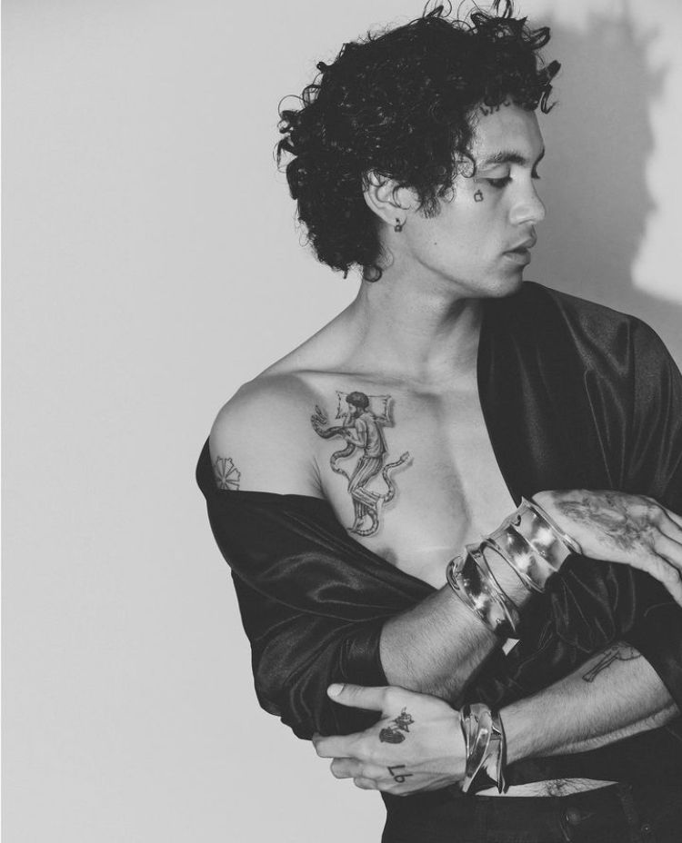
A black-and-white portrait shows the fine-line figure continuing from the upper chest toward the shoulder, with a small flower-like outline near the top of the arm. The loose drawing style gives the work a sketchbook feel.

The chest figure has more detail than the simple shoulder outline. That shift in scale keeps the area from looking flat, and the open space between them lets each one read on its own. A jacket or a turned shoulder can hide part of the work, so the same tattoos look different from one photo to another.

The pieces don’t need to match to sit together. A detailed figure, a simple outline, and space around each can feel more relaxed than a set of designs in one uniform style.

The face tattoos are tiny but instantly recognisable
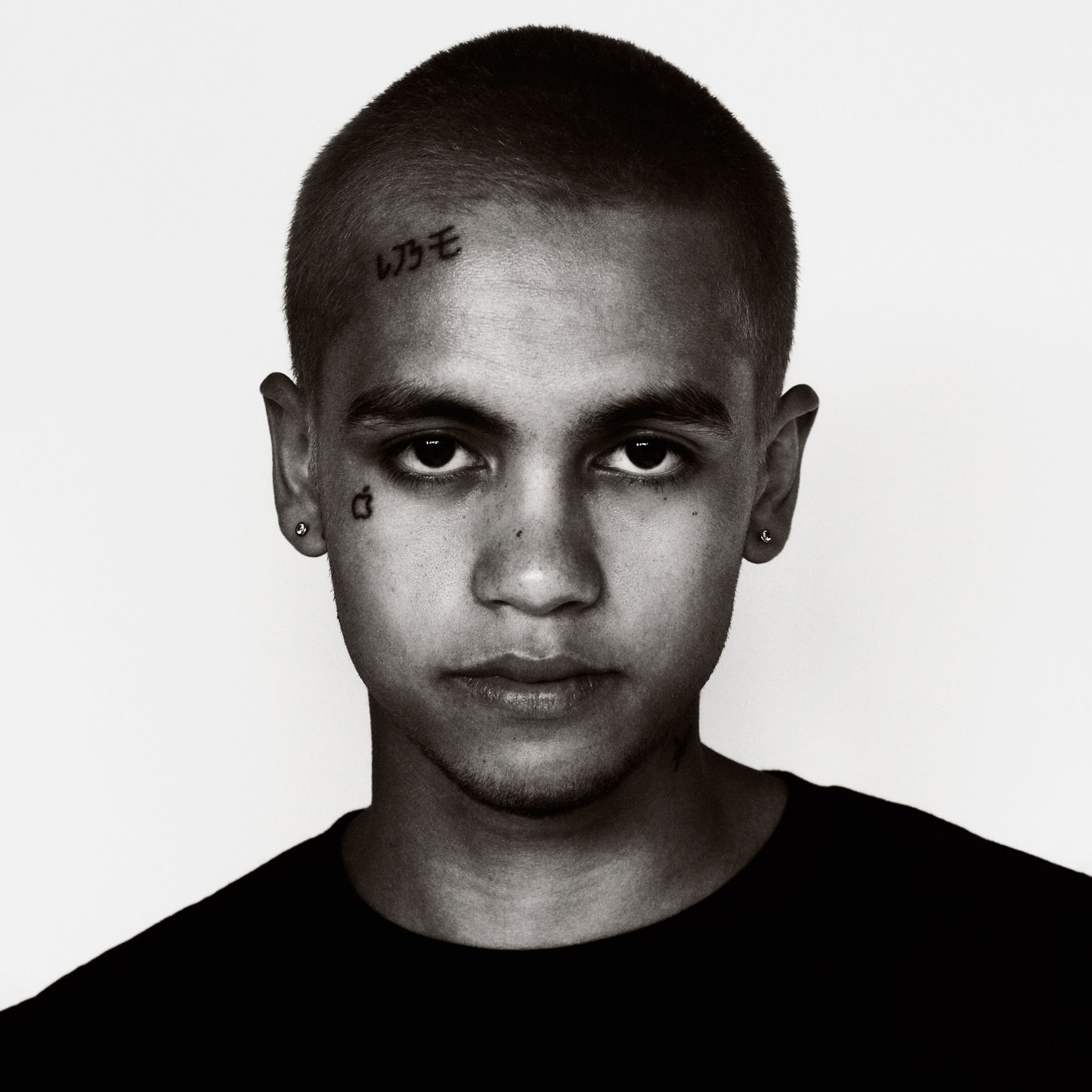
Dominic Fike tattoos: apple tattoo, forehead lettering, and small eye-area marks

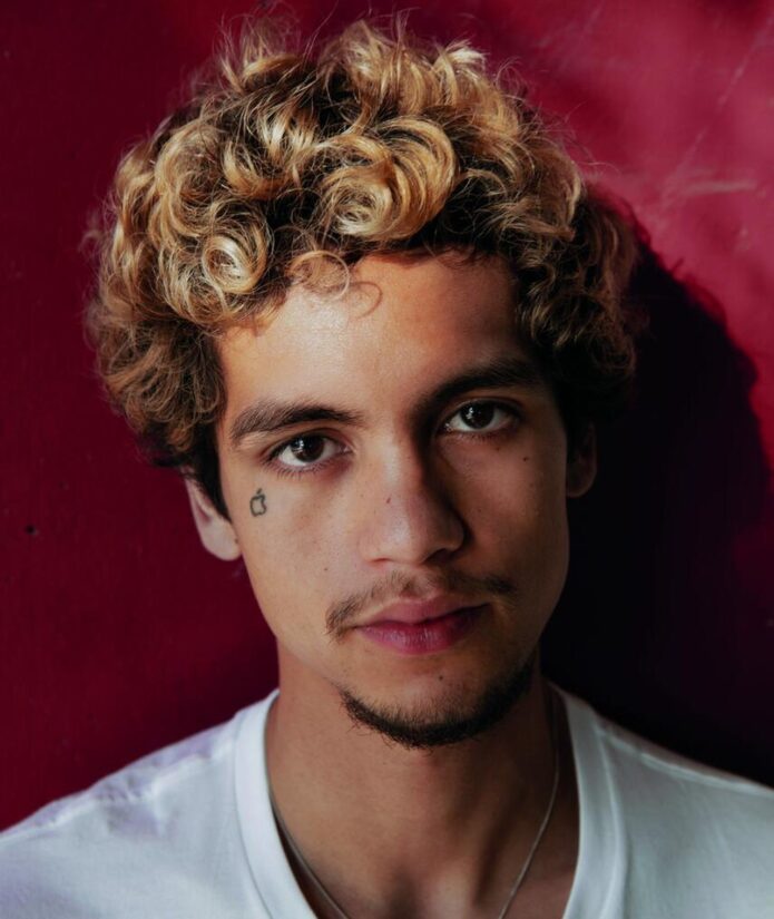
Close-up portraits show a small apple beneath one eye, short characters high on the forehead, and, in some photos, a mark near the other eye. Each tattoo takes up little space, but its position makes it noticeable.

The apple has a compact outline; the forehead lettering runs across the hairline area. Together, the different placements frame the face without filling it. The open space around the marks keeps his features clear.

Face tattoos are harder to conceal than arm or chest work, so a small design still changes someone’s everyday appearance. Fike’s marks are relatively light, leaving his eyes and other features easy to see. Small symbols can have plenty of presence when they’re placed where people look.

If you’re collecting ideas, pay attention to spacing as much as the symbols themselves. A small shape needs to stay readable and sit comfortably beside the eye or brow.

His arm and hand tattoos mix cartoon lines with loose lettering

Dominic Fike tattoos: flower-like shoulder design, speech bubble, figures, and forearm ink

In performance photos, sleeveless tops show a flower-like shoulder design, a speech bubble on the upper arm, small figures, and ink extending toward the forearm. The tattoos sit at different angles with skin between them instead of forming one continuous sleeve.

The speech bubble has a hand-drawn outline and block lettering. It looks closer to a doodle than formal type, in keeping with the casual lines of the other small designs.

Movement changes what a photo reveals. A bent elbow can hide part of the forearm while bringing the hand closer to the camera. Stage lights soften some fine lines, but the larger shapes still show. The open gaps give the smaller pieces room to read.

For a similar arrangement, one or two larger designs can sit among smaller marks. Lettering needs enough space around it to stay distinct from nearby ink.

The full torso layout shows how the tattoos build over time
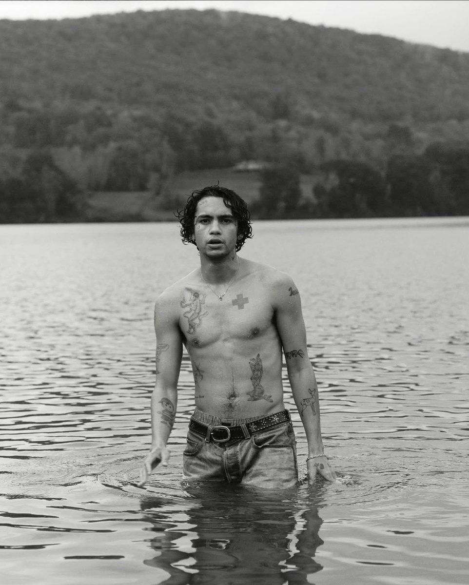
Dominic Fike tattoos: chest cross, torso figure, forearms, hands, and asymmetrical placement

A black-and-white lake portrait shows the red cross, chest figure, shoulder outlines, forearm designs, lower-torso work, and smaller marks near the hands in one view. It makes the relationship between the tattoos easier to see than a close crop of any single design.

The strongest contrast sits across the chest, with darker illustrative work lower on the torso and smaller marks on the arms. The sides aren’t mirrored; each has a different amount of ink. That uneven layout makes the collection feel as if it grew piece by piece.

Some areas hold larger images while others carry smaller tattoos. You don’t need to fill both sides equally for a body layout to feel balanced; the size and position of each design can do that work. The lines also vary from one tattoo to another, but the open, hand-drawn look gives them something in common.

Fike’s collection puts the smallest marks on the face, clusters of casual drawings on the arms, and the clearest statement pieces on the chest. The designs aren’t perfectly coordinated, yet the different areas each have their own role. That loose approach leaves room for new work without forcing every tattoo into the same style.
More musician tattoo guides

Nessa Barrett Tattoos: Fine-Line Scripts, Butterflies and Arm Ink

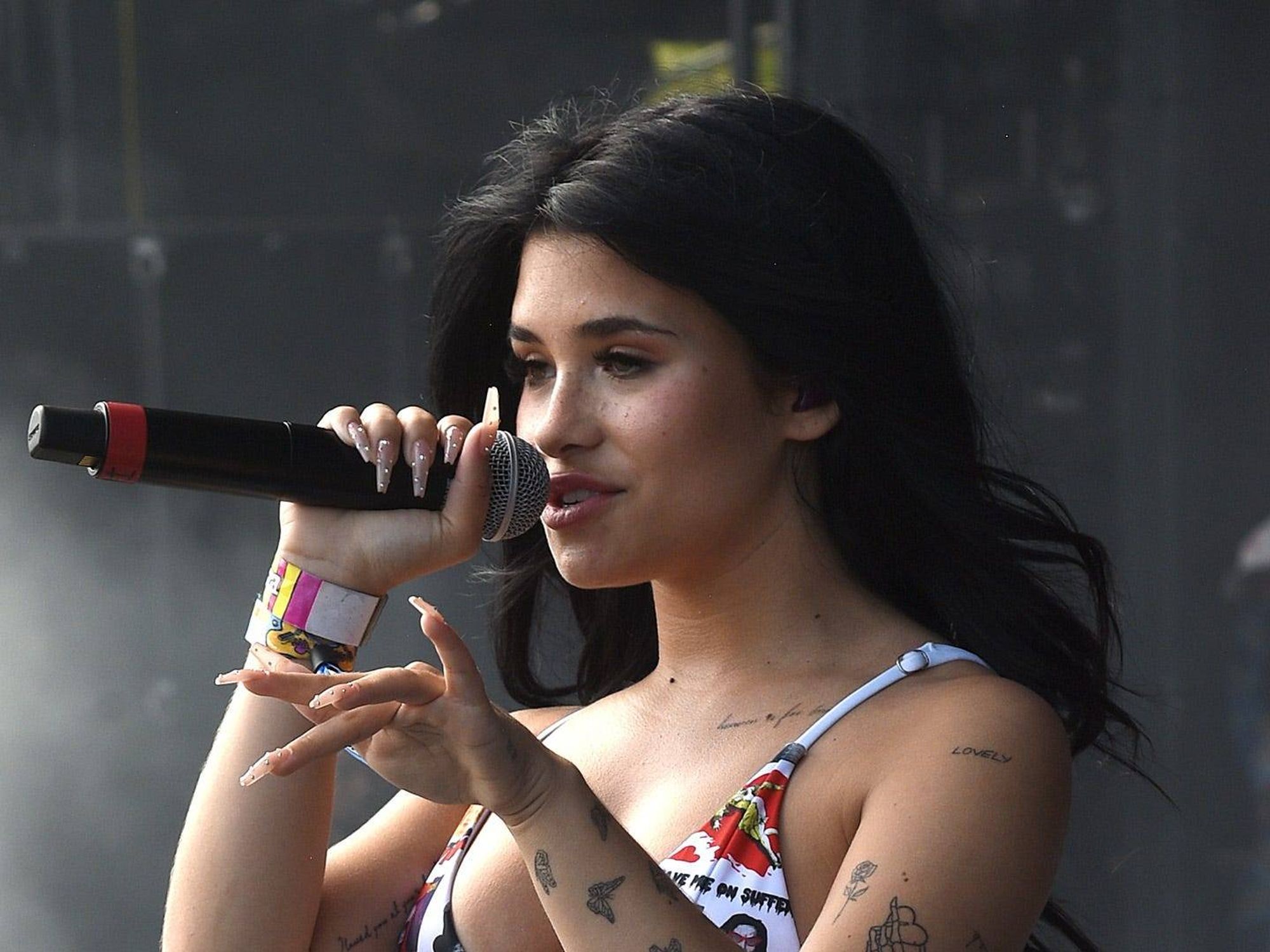
Nessa Barrett’s tattoos are mostly fine-line designs: short scripts near the collarbone, butterflies and flowers on the arms, small hand symbols, and a skeletal hand on the forearm. In a close portrait the details look delicate; under concert lights, the marks read as a larger pattern when she moves.

The pieces leave plenty of skin open, so they don’t form one solid sleeve. Some meanings may be personal, but the photos show placement more clearly than intent. The descriptions below focus on what can be seen in portraits and performance shots.

Nessa Barrett’s collarbone tattoos use tiny script and open skin

Nessa Barrett tattoos: collarbone lettering, shoulder flower, and fine-line chest marks

A close selfie shows thin lettering just below Nessa’s collarbone and another short script mark near the shoulder. A small flower-like design sits nearby. The tattoos follow the line of the upper chest instead of filling it with a dark block.

The words can be easy to miss beneath a neckline or necklace, but stand out when the chest is uncovered. The open skin keeps the separate marks clear. That matters with fine script, since tiny letters can soften over time.

For a similar placement, follow the collarbone’s curve and keep the phrase short. A little flower or symbol can sit beside it without crowding the area.

Her shoulder tattoos mix butterflies with small floral details

Nessa Barrett tattoos: butterflies, floral outlines, and shoulder symbols

A performance portrait shows small butterflies, a flower outline, and other light symbols across Nessa’s upper arm. Each design is modest in size, but together they form a pattern when she raises the microphone or brings a hand toward her chest.

Butterfly wings give a fine-line tattoo a shape that’s easy to recognise. The nearby flowers and symbols add detail without taking attention from the butterflies. Concert lighting can soften the lines, while close photos bring out their outlines.

The designs shift as her shoulder moves. A few separated pieces can cover the area without becoming a dense patch of ink.

Her forearm tattoos include a skeletal hand, teeth, and tiny symbols

Nessa Barrett tattoos: skeletal hand, tooth, birds, and small forearm symbols

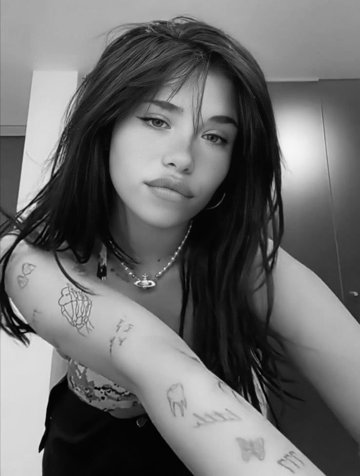
A monochrome selfie shows a skeletal hand among small birds, a tooth-like shape, and other simple marks on Nessa’s forearm. They sit at different heights rather than in neat rows, giving the arm a collected look.

The skeletal hand is the clearest piece, with a stronger outline than the smaller symbols around it. That gives the eye a place to land; the lighter marks add detail above and below. One distinct design can hold a group of smaller tattoos together.

The forearm offers a long strip for arranging pieces, but they don’t have to line up or match the other arm. Leaving gaps also makes it easier to add tattoos later without crowding the existing work.

The hand tattoos keep the collection personal and easy to spot

Nessa Barrett tattoos: arm lettering, butterflies, hand symbols, and wrist ink

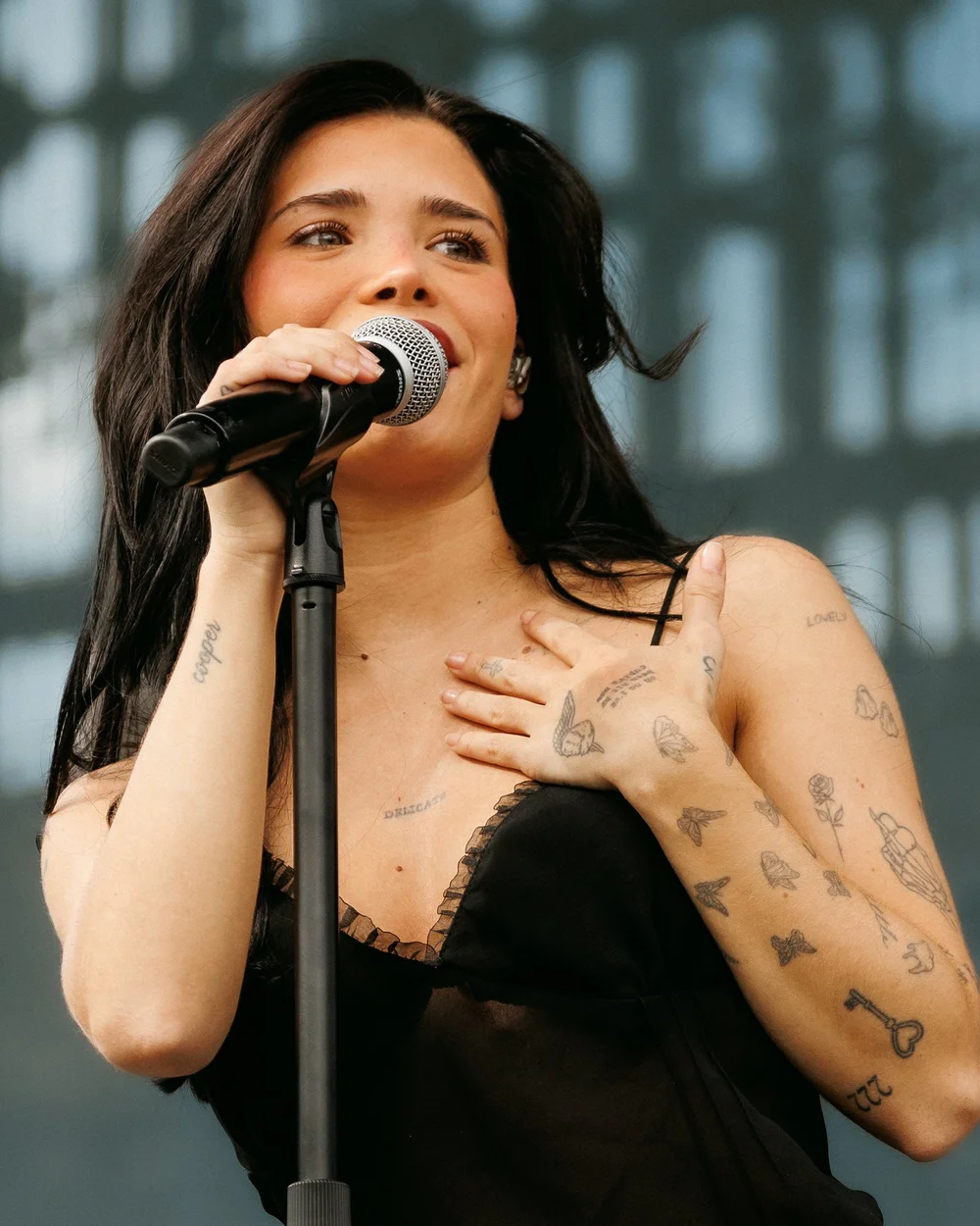
Concert photos show thin marks across Nessa’s fingers and the back of her hand, with more ink near the wrist. The small designs aren’t always sharp enough to identify from a distance, but their placement is visible when she lifts the microphone or reaches toward the audience.

Hand tattoos move with the fingers. A mark across a knuckle shifts when the hand closes, and a butterfly can look different when the fingers curl. Nessa’s light designs don’t form a solid band of ink.

Some lines continue toward the wrist, while other pieces stop before the joint. Those small breaks keep the hand and forearm from blending into one busy area.

Fine details on hands can be hard to read in motion and may blur over time. Simple shapes and clear spacing are easier to make out than crowded lettering.

Her full arm and leg layout shows how fine-line ink grows over time

Nessa Barrett tattoos: fine-line arm collection, script, butterflies, and leg tattoos

A tour photo shows the broader layout: script, butterflies, small objects, and larger patches run from Nessa’s shoulders toward her wrists. The same image shows tattoos on her legs, extending the collection beyond her arms.

Some areas of each arm are more crowded than others. Those clusters sit beside open sections that give the eye a break. The leg pieces use larger, darker shapes, so they look different from the fine-line work above.

The collection isn’t symmetrical. One arm can carry more small symbols while the other stays quieter; script and butterflies don’t need to mirror each other to fit together. Each part of the body has its own mix of designs.

Across the photos, the recurring choices are fine lines, compact shapes, and room between pieces. The tattoos look different beneath a stage outfit or in a close selfie, and concert lighting can obscure details that a sharp portrait shows. Together, the different views give a more useful sense of their placement.

More musician tattoo guides

Lea Michele Tattoos: Imagine, Finn, I Believe and More

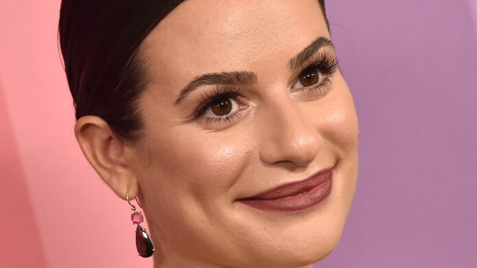
Lea Michele’s tattoos are small and easy to miss in red-carpet photos. Close-ups show script on her feet, wrist, and ribs, along with butterflies, music notes, and a cross. Some designs connect to Broadway and Glee; others are tributes to family and people close to her.

The collection has changed over time. Michele’s earlier foot lettering was later covered by butterflies, and other tributes were added years apart. Looking at the placement and the dates helps distinguish what is current from older tattoo lists.

Lea Michele’s Imagine foot tattoo came from her Glee years

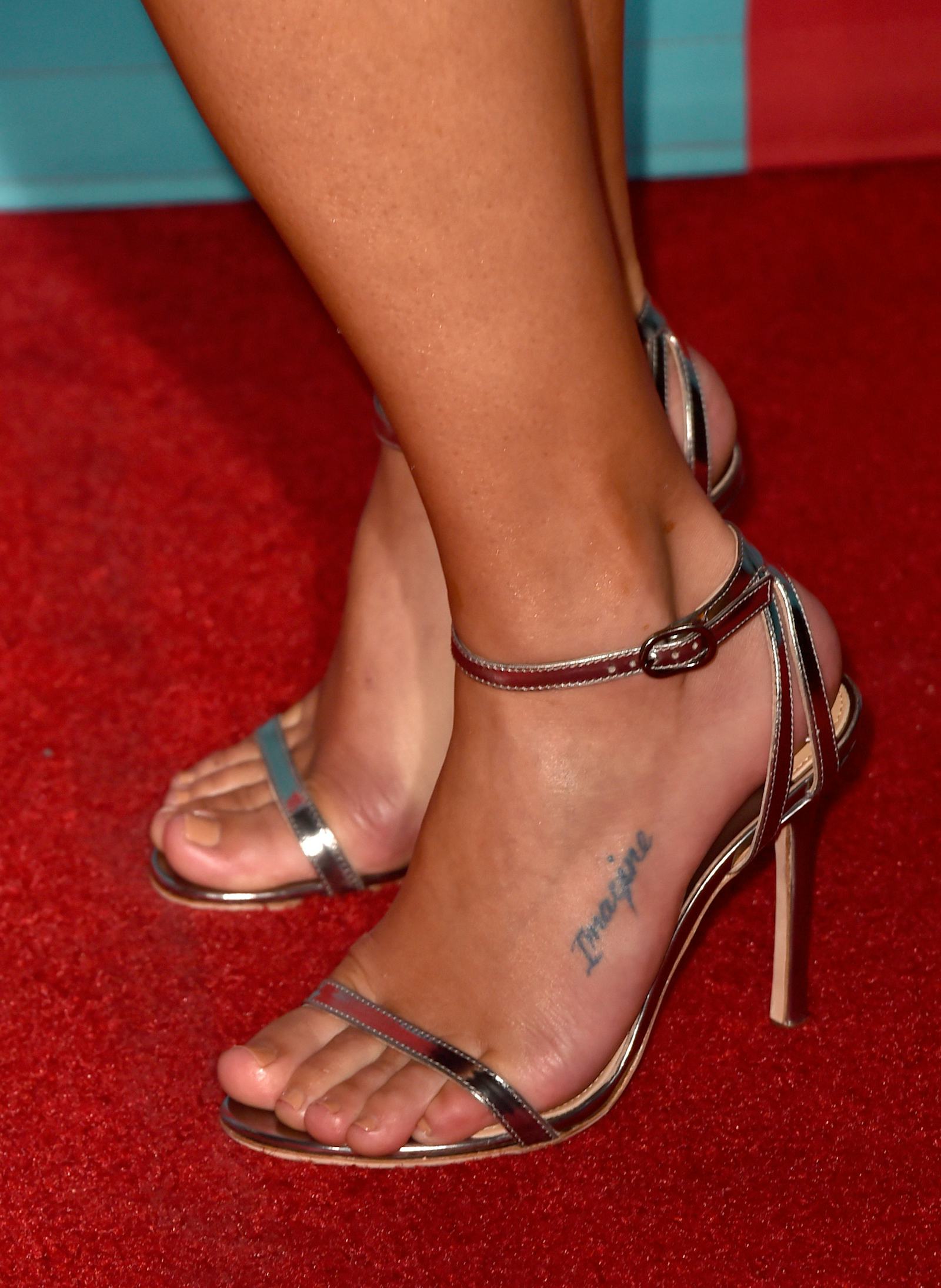
Lea Michele tattoos: Imagine foot tattoo

Imagine is written in cursive along the side of Michele’s left foot. She got it with members of the Glee cast. The word refers to the Beatles song and to the period when the cast and show were part of her life.

The lettering is small and follows the curve of the foot. It is visible with sandals or bare feet, but doesn’t dominate the rest of the look.

There was also “Our City, Our Love” lettering on her other foot; that tattoo was later covered by butterflies. Older lists may show both designs, though only one remains visible today.

The word Imagine is a simple piece of script connected to a particular time and group of people. There is no need to add a larger story beyond the song and cast connection Michele has shared.

The My Angel Now rib tattoo adds a family tribute

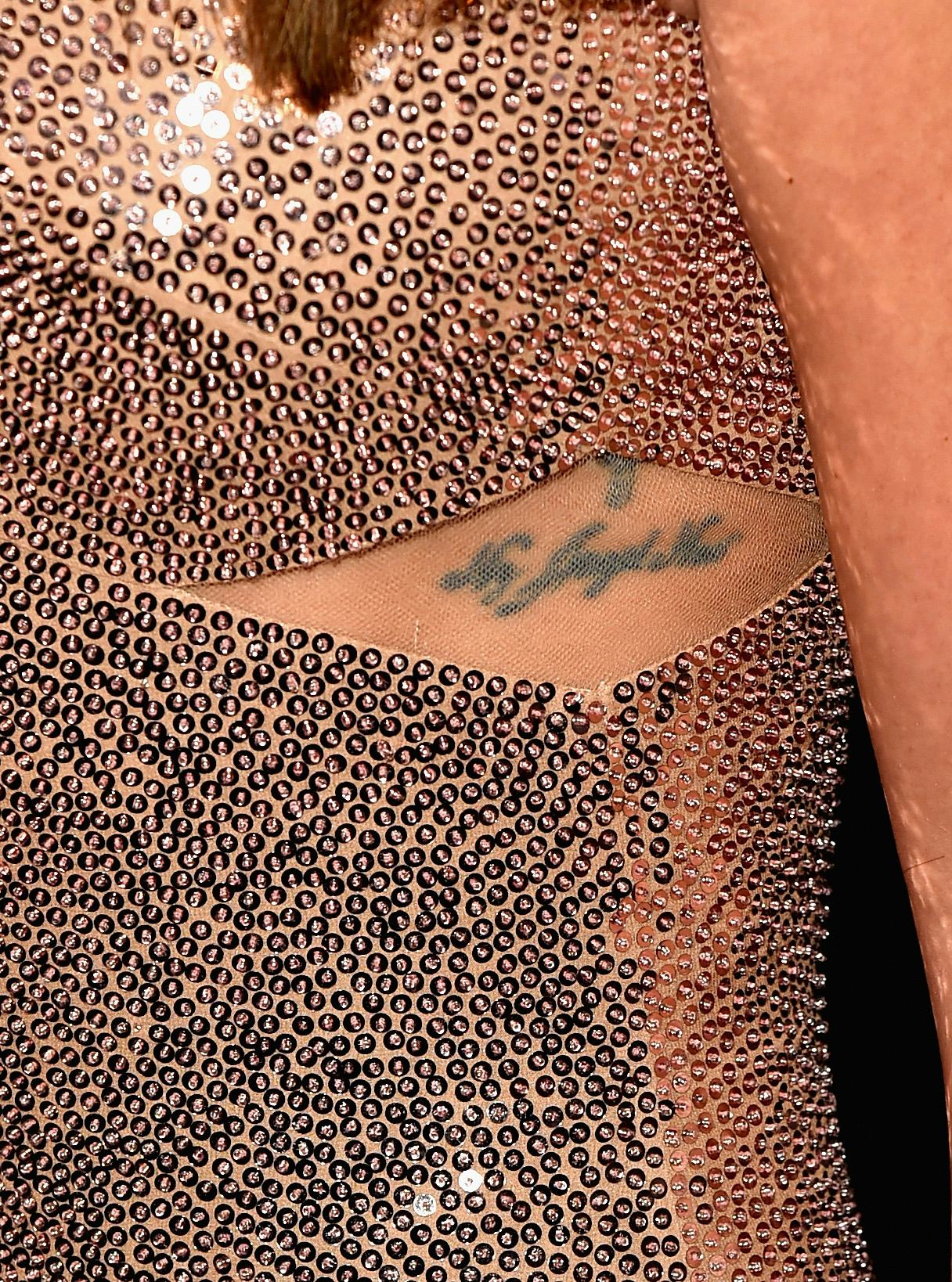
Lea Michele tattoos: My Angel Now rib tattoo

The words My Angel Now sit below a small cross on Michele’s side. Coverage has connected the phrase to the loss of her grandmother. Michele has also spoken about family being central to her tattoo choices.

The script follows the ribs and is usually covered by everyday clothes. The cross is simple; the words carry most of the message. The photo shows the lettering and placement, while the family connection comes from reporting about its meaning.

The design sits among other tattoos connected to people in Michele’s life, including later tributes to Cory Monteith. It is one of several short phrases and familiar symbols in the collection.

The small music notes tattoo keeps Lea’s stage life close

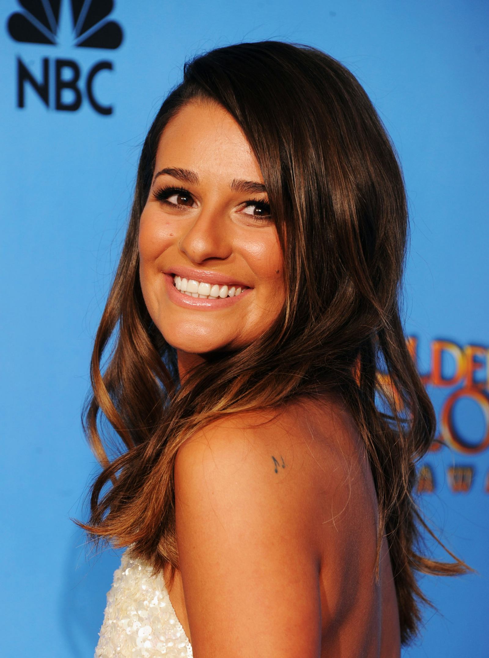
Lea Michele tattoos: Music notes shoulder tattoo

Two small music notes sit on Michele’s left shoulder, just below the shoulder blade. They can be hard to see in a full-length photo, but fit with her work in Broadway, Glee, and as a solo singer.

The notes are small and can be covered by a strap or hair, depending on the angle. A turned shoulder or close-up makes them easier to spot.

They are a broad reference to music, unlike more specific tattoos such as Imagine and I Believe. The design is simple enough to sit alongside the lettering and tributes elsewhere in the collection.

I Believe is Lea’s Broadway tattoo in a soft teal style

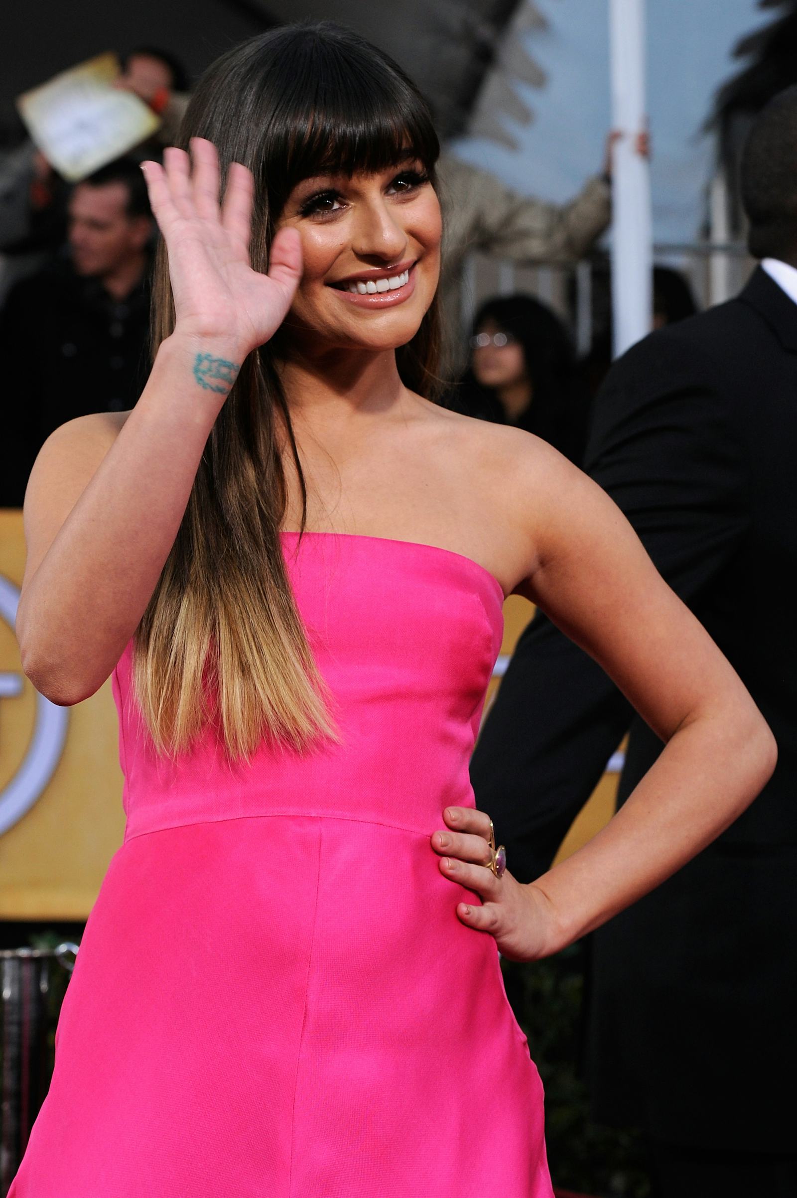
Lea Michele tattoos: I Believe wrist tattoo

I Believe is written on the inside of Michele’s right wrist in teal-colored script, with fine vine details around the words. The phrase comes from the Broadway musical Spring Awakening, which was part of her early career.

The wrist is visible when she lifts a hand or holds a microphone. The colored lettering is more decorative than the plain script on her foot, while the vines frame the words without taking up much space.

The Spring Awakening connection is the specific reference attached to this tattoo. A photo shows the words and color; any meaning beyond that belongs to Michele unless she has explained it.

If You Say So is Lea’s most personal rib lettering

Lea Michele tattoos: If You Say So rib lettering

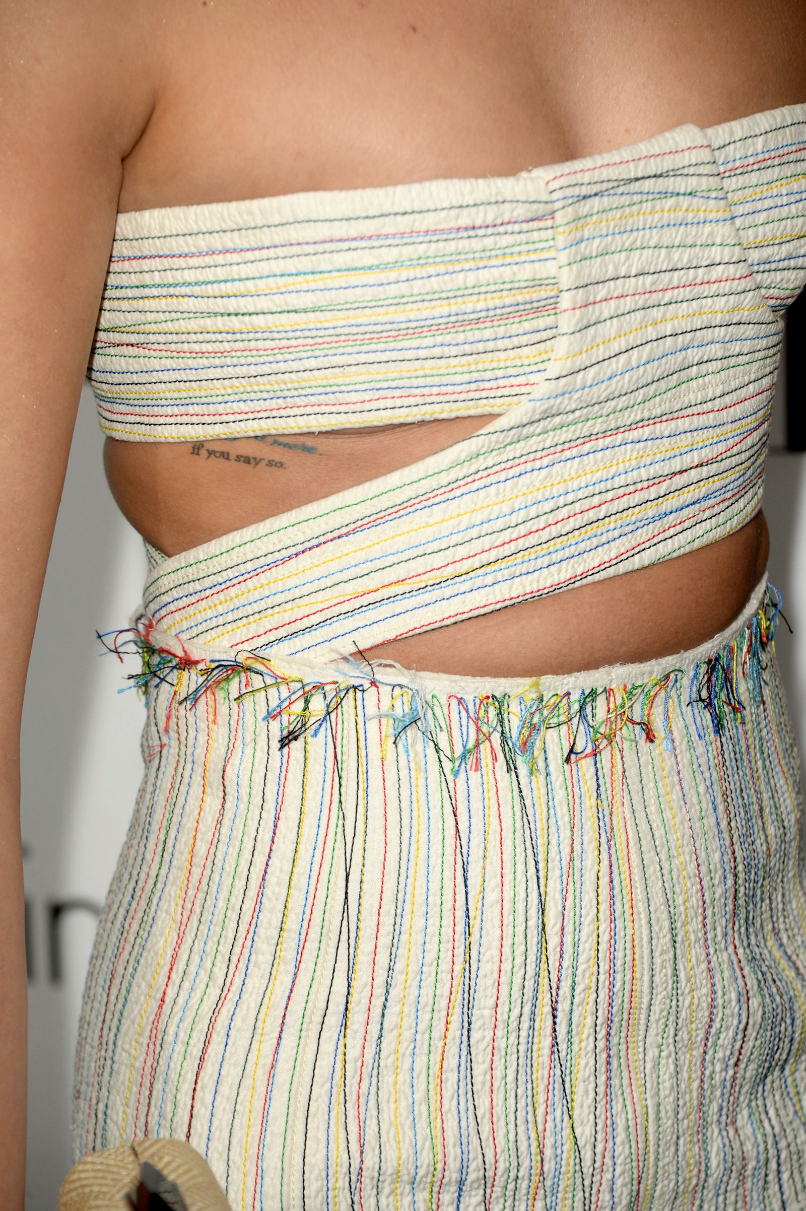
If You Say So appears along Michele’s ribs beside the words I love you more. The phrases connect to Cory Monteith and the last conversation she has described having with him. She later used If You Say So as the title of a song on her first solo album.

The lettering is fine and mostly hidden by clothing. The rib placement keeps the words out of view in many everyday settings, unlike the wrist tattoo.

The connection to Monteith comes from Michele’s public account and the song, not from the photograph itself. The image shows the words and where they sit; the reported story explains why they matter.

The two lines are longer than most of the other phrases in Michele’s collection, but use the same understated script. The Finn tattoo is another Monteith-related detail. Along with “If You Say So,” it connects memories of him to her personal life and music.

More musician tattoo guides

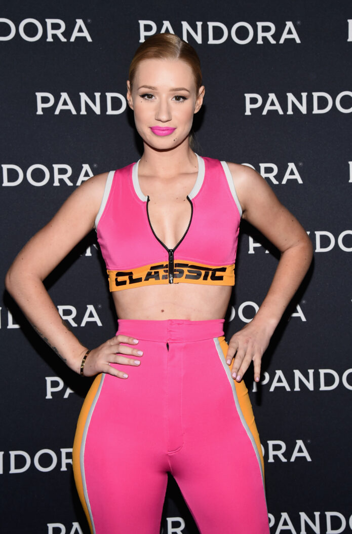
Iggy Azalea Tattoos: Arm Sleeve, Finger Ink and Meaning

Iggy Azalea’s tattoos have changed over time. Her right arm now has a larger group of designs, with cover-ups shaping how the sleeve looks. Photos also show smaller phrases on her forearm and foot, plus album lettering on her fingers.

Some meanings have been explained by Iggy; others are easiest to describe by what appears in the pictures. The order matters here: an older tattoo may have been covered or changed since the photo was taken.

Iggy Azalea’s “Trust Your Struggle” forearm tattoo

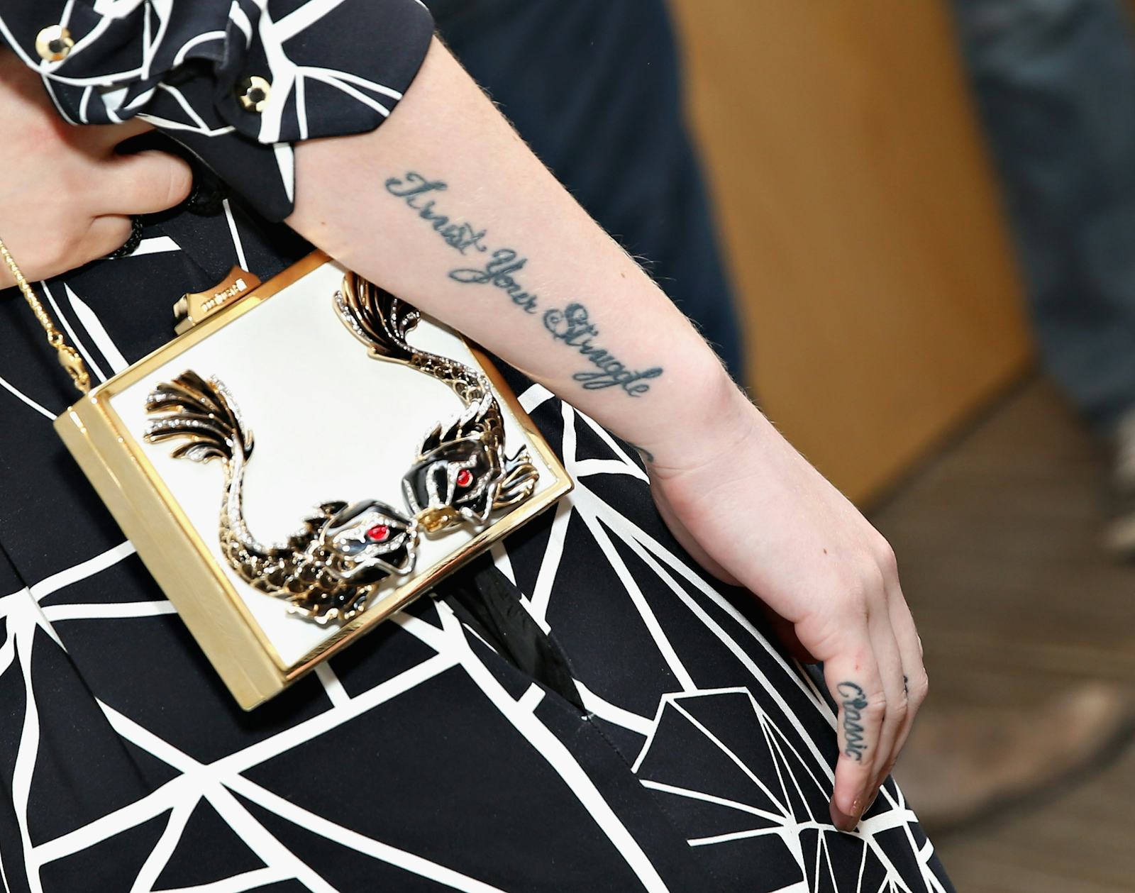
Iggy Azalea tattoos: Trust Your Struggle forearm tattoo

“Trust Your Struggle” runs in script along Iggy’s right forearm. She has said the words came from graffiti she saw after moving to Los Angeles, and that she got the tattoo quickly because the phrase spoke to where she was in life.

The handwritten lettering follows the arm and stays visible in photos even when other parts are covered. Iggy has also connected the phrase to the hard parts of building a career. Its meaning is one she has explained herself, rather than something inferred from the image.

The script sits beside smaller hand and finger marks. It wasn’t large enough to occupy the whole arm, leaving space for the later sleeve work around it.

The Colour Me Free foot tattoo keeps a simple message

Iggy Azalea tattoos: Colour Me Free foot tattoo

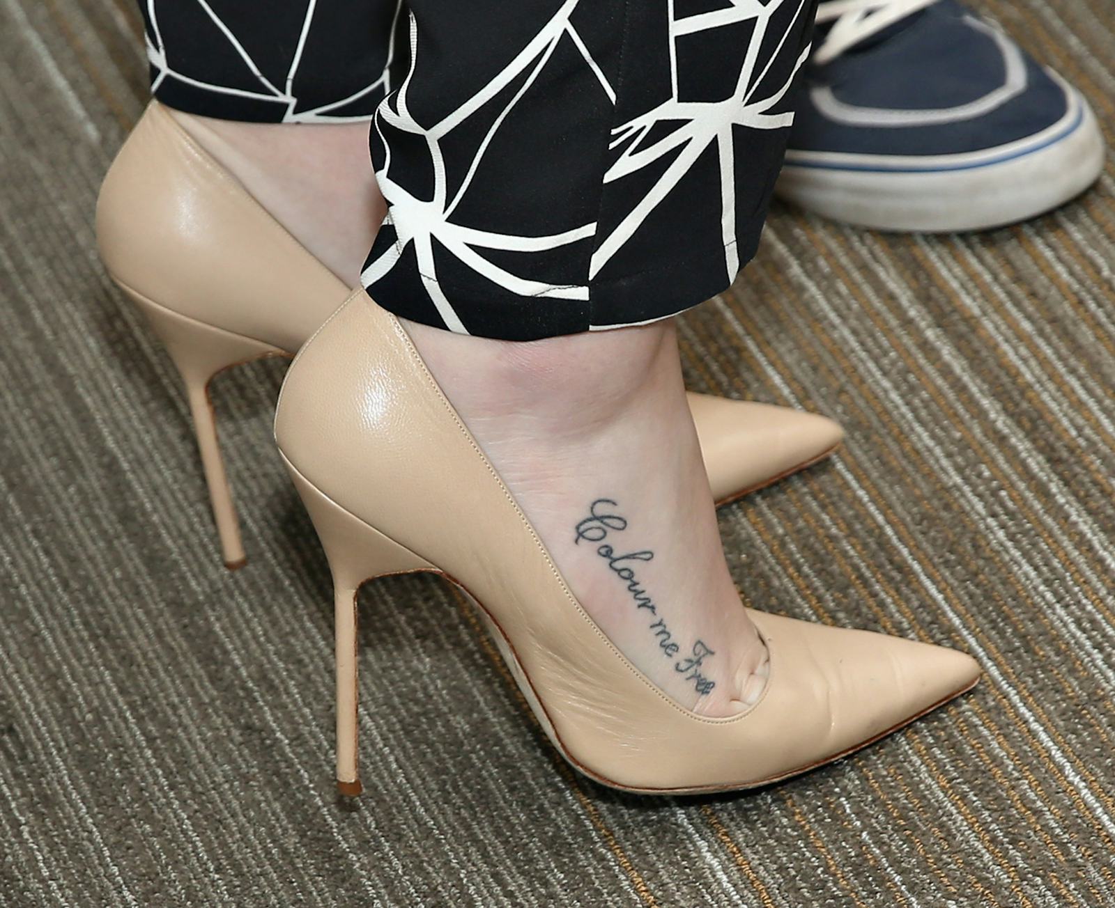
“Colour Me Free” is written in cursive along the side of Iggy’s foot. It is small and usually hidden by shoes, so it appears mainly in close photos or when she is barefoot.

Coverage has linked the phrase to Iggy’s admiration for Joss Stone and to the idea of freedom. The move from Australia to the United States to pursue music is also part of the context reported around the tattoo. The words are visible in the photo; the explanation comes from coverage, not from the image alone.

There is no portrait or large field of shading here. The tattoo is made up of the phrase and the way the letters follow the foot. It belongs to an earlier stage of the collection, before the right arm grew into a larger sleeve.

Iggy’s Birth of Venus cover-up changed the arm story

Iggy Azalea tattoos: Birth of Venus forearm tattoo

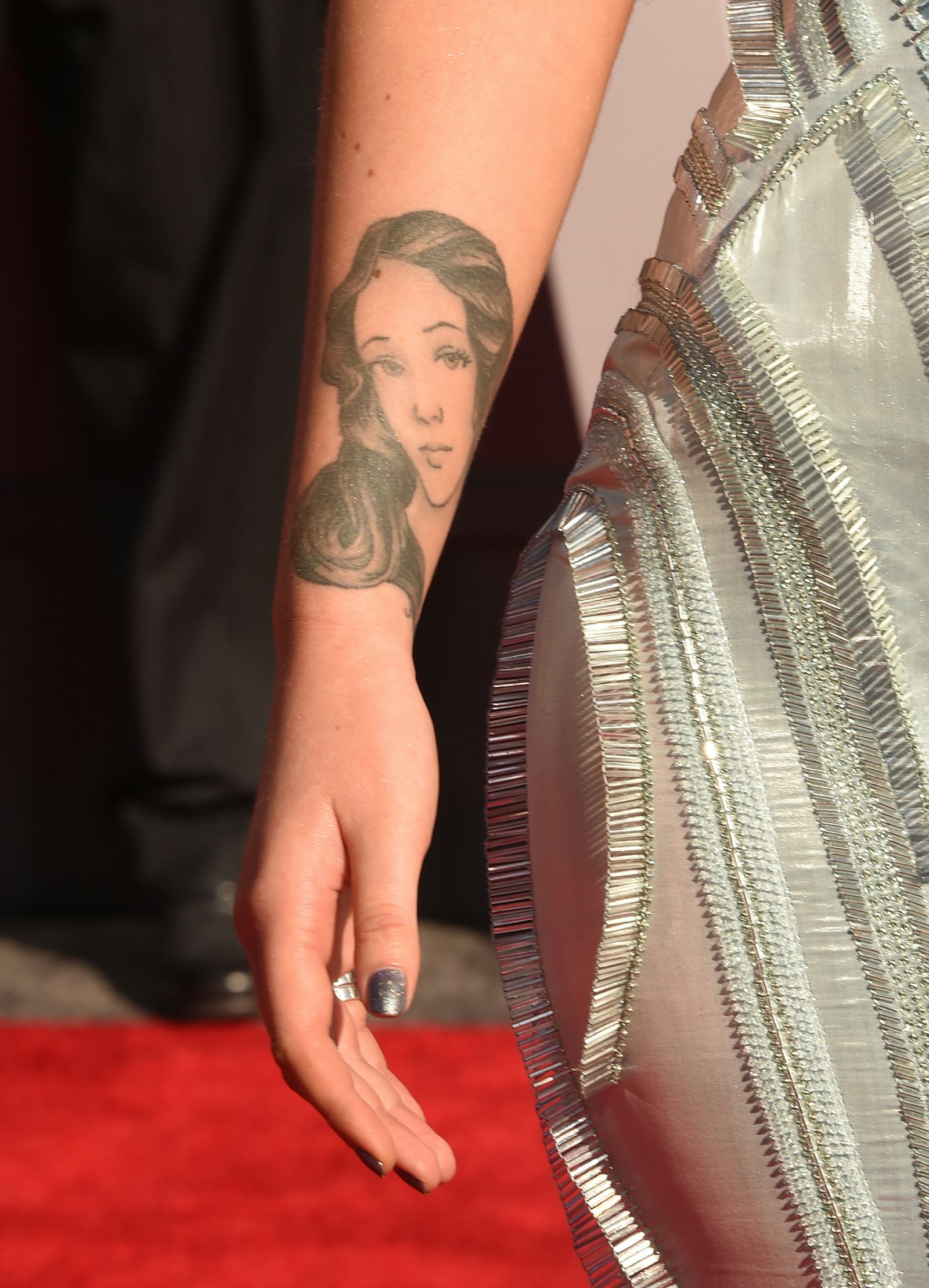
The Birth of Venus portrait marks a turning point in Iggy’s right-arm tattoos. It depicts the goddess from Botticelli’s painting and covers an older rose that Iggy had grown tired of. She has described the new image as a playful, “Disney-fied” take on the classical figure.

The portrait’s face, hair, and shading need room, and it became one of the main images on the arm. A horse tattoo was later placed nearby, with its mane flowing around the portrait so the pieces connect in the larger composition.

The rose is part of the tattoo’s history, but it is no longer the current design. Earlier photos and lists may show it before the cover-up. That timeline also helps explain how the original forearm lettering fits with later work.

Iggy liked Botticelli’s painting, but the tattoo has its own cartoon-like line and expression. It is a personal take on the image rather than a direct copy of the original artwork.

The floral sleeve and hand tattoo make the right arm feel bigger

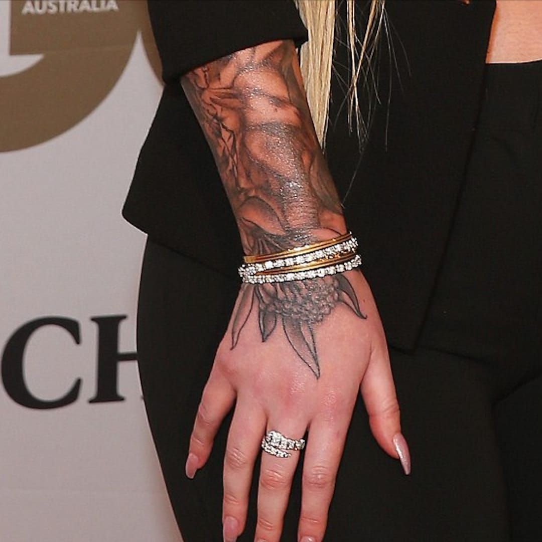
Iggy Azalea tattoos: Floral sleeve and hand tattoos

Later photos show flowers, leaves, and darker shading extending from Iggy’s forearm toward the back of her hand. Compared with early photos of separate pieces, the arm now looks more connected, though it is not completely covered.

Coverage has linked the floral work and bird imagery to Australia, including the waratah, the New South Wales state flower where Iggy grew up. The botanical shapes connect the larger pieces; not every leaf or small mark needs a separate explanation.

The design reaches onto the hand, so it remains visible when a sleeve stops at the wrist. Rings and bracelets can cover parts of the tattoo, but the floral shapes show when her hand is raised or holding a microphone.

The portrait and flowers use different kinds of shading. In different lighting or styling, the arm can look more or less dense, but the mix of forms remains visible.

Finger lettering tied Iggy’s tattoos to her music eras

Iggy Azalea tattoos: Finger lettering and music-linked tattoos

Iggy has used her fingers for music-related lettering. The New Classic appeared across the fingers of her right hand for her debut album; Digital Distortion was tattooed on the other hand when that project was planned. She also showed STS on her knuckles for Survive the Summer.

The album titles make the connection direct. But the lettering changed over time: “Live Love A$AP” was crossed out and later removed, and other finger designs were altered as her music moved on.

Finger tattoos are small, exposed, and affected by movement and fading. In a close-up, one word may be clear while the next finger is turned away. Photos can show what was there at a given time, but not always the current state of every letter.

Together, the phrases document different points in Iggy’s music career, including choices that were later changed. The finger lettering is one part of a collection that has been edited rather than kept in its first form.

Iggy’s tattoos make the most sense as a timeline. “Trust Your Struggle” and “Colour Me Free” belong to the earlier phrase tattoos; the Venus portrait covered a rose, and later floral work connected the arm to the hand. Album lettering on the fingers marked projects that changed over time.

For a newer photo, start with the placement—forearm, foot, portrait, hand, or fingers—and compare it with images from the same period. That helps distinguish tattoos still visible from older designs that were covered or removed.

More musician tattoo guides

Mac Miller Tattoos: Hands, Sleeves, Knuckles and Meaningful Ink

Mac Miller’s tattoos appear across his hands, arms, neck, and fingers. Photos show a mix of lettering, symbols, portraits, and floral work, with pieces added at different times rather than one matching sleeve.

Some meanings are clear from Mac’s public comments or the words themselves; other details are harder to identify in old stage photos. Where a design hasn’t been explained, it is better to describe what can be seen than guess at its meaning.

Mac Miller’s tattooed hands and finger ink

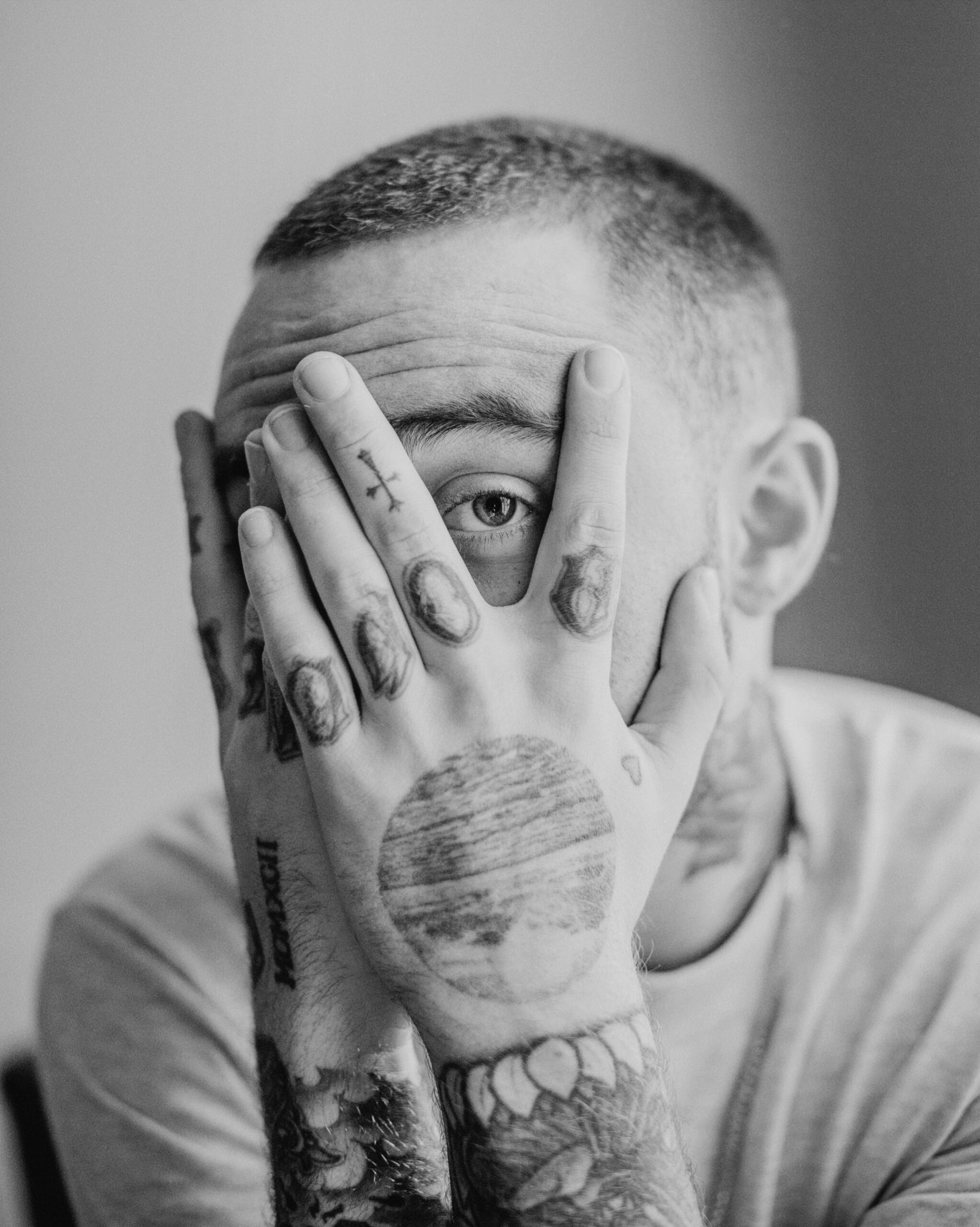
Mac Miller tattoos: tattooed hands and finger ink

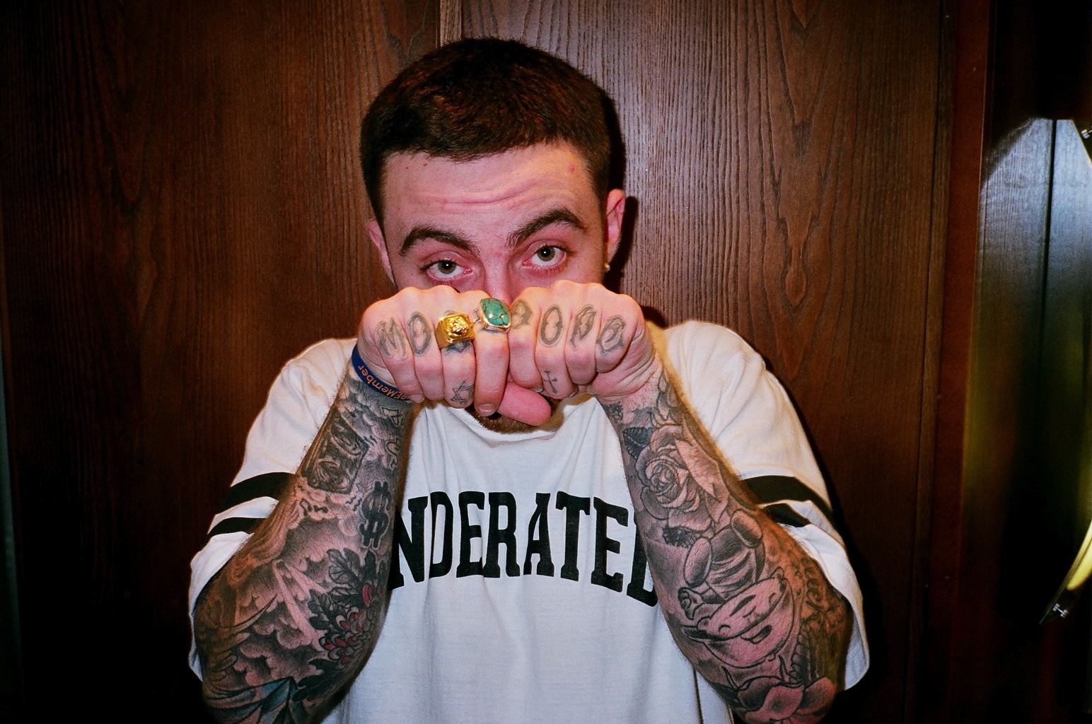
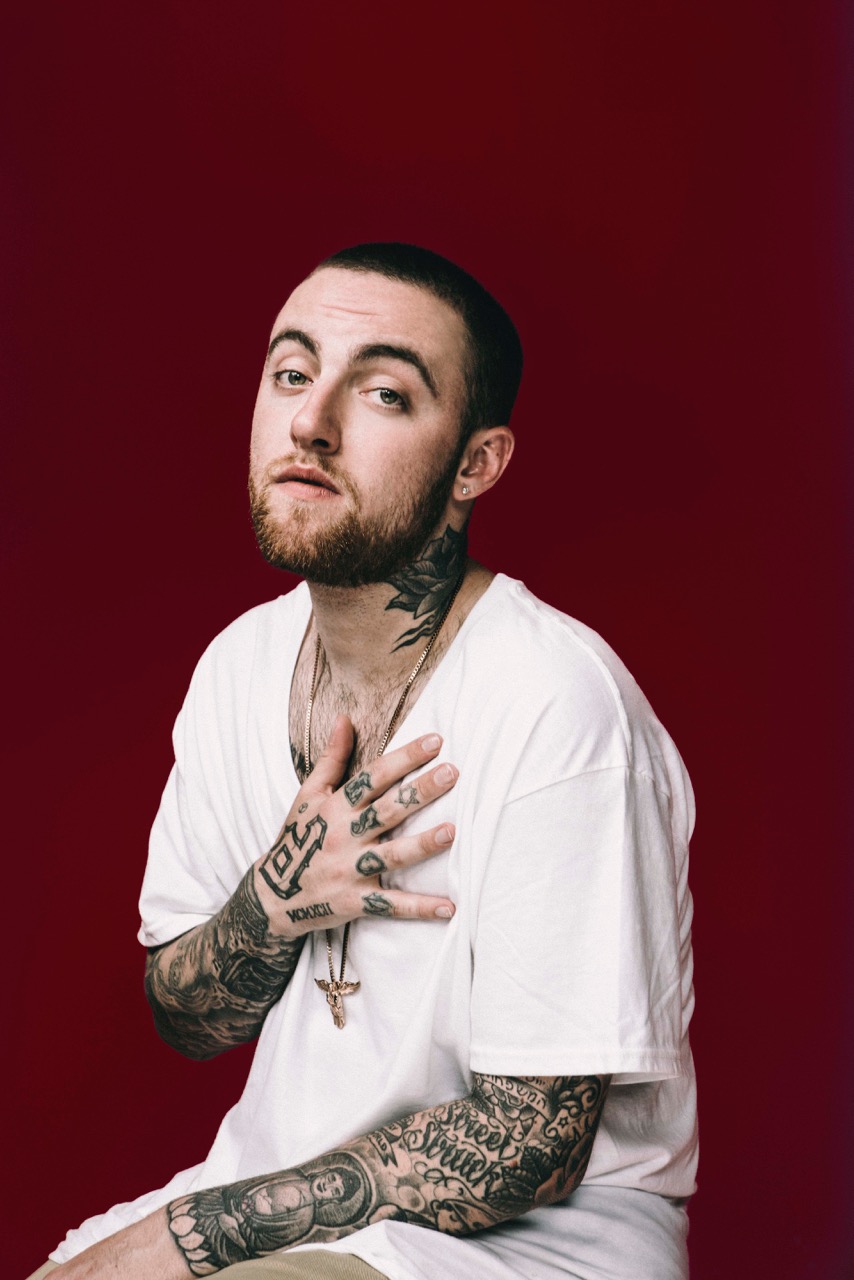
Mac’s hands are among the most visible parts of his collection. Small finger marks, lettering, and symbols show up when he holds a microphone or brings his hands near his face.

His hands were part of the performance photos and everyday images, so the tattoos moved with the gestures. They changed the look without needing one large image at the centre.

Finger skin has little room and sees regular friction. A short word or simple shape is easier to read at that size than a detailed picture. Placement across the fingers, side of the hand, or wrist changes how visible it is.

Mac Miller’s arm sleeves and floral tattoos

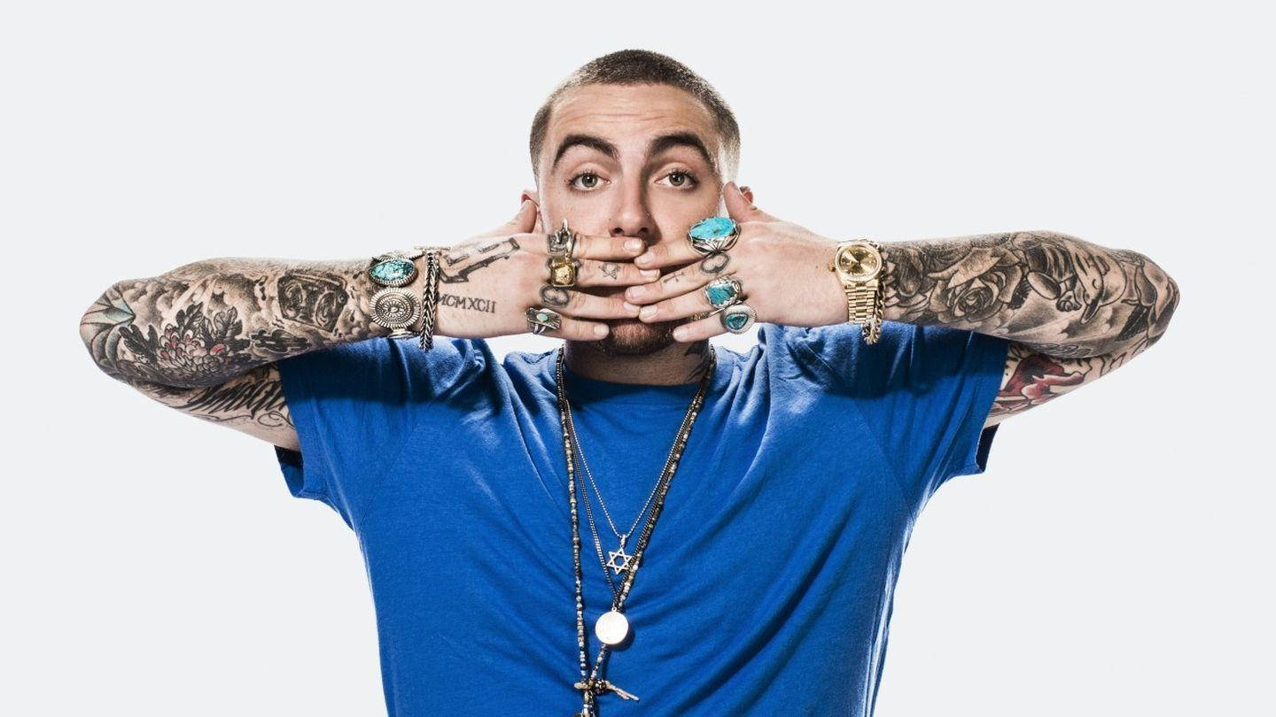
Mac Miller tattoos: arm sleeves and floral tattoos

Mac’s arms hold the largest group of tattoos. Photos show layers across the upper arms and forearms, with some finer designs beside heavier outlines and blackwork.

Flowers add a softer shape among the other pieces. They can frame lettering or sit between larger designs, but the specific meaning depends on the person wearing them.

The sleeve appears to have grown over time rather than coming from one session. Some pieces share a palette or line weight; others differ. The styles don’t all need to match for the arm to feel personal.

Mac Miller’s neck and hand tattoos

Mac Miller tattoos: neck and hand tattoos

Neck tattoos sit close to the face, so even a small mark changes the way a portrait looks. Mac’s neck ink appears alongside his hand and arm tattoos in photos, linking the visible areas without forming one uniform design.

Neck placement is hard to cover with ordinary clothes. The shape also changes as the head turns, so a stencil should be checked from more than one angle. A clear outline can remain readable without filling the whole area.

The hand and neck pieces appear together in some photos, but that doesn’t mean every tattoo has to share a theme. Scale and spacing can help separate designs while keeping them balanced in one frame.

Mac Miller’s MOST DOPE knuckle tattoos

Mac Miller tattoos: MOST DOPE knuckle tattoos

“MOST DOPE” across Mac’s knuckles is one of his best-known tattoos. The phrase connects with the language around his music and public identity. In photos, the letters stand out when his hands are near his face or microphone.

Knuckles offer little room, so short words are easier to read than longer phrases. The spacing and letter style need to suit the size of the hand; thicker lettering can look more direct, while thinner script may need extra room.

The phrase doesn’t need a complicated explanation. It is a compact piece of lettering that fits Mac’s vocabulary. Words feel more natural as tattoos when they sound like the person wearing them.

Mac Miller’s forearm lettering and portrait ink

Mac Miller tattoos: forearm lettering and portrait ink

Photos show portraits and lettering together on Mac’s forearms. The portraits draw the eye; the words add smaller details around them. The pieces read as parts of a collection rather than one continuous image.

A portrait depends on a clear reference and an artist who can keep the expression recognizable. For a forearm piece, the inside and outside offer different levels of visibility: the inside is easier to see yourself, while the outer arm appears more in photos.

The forearm offers more room than the fingers for a phrase or a detailed image. One portrait or line of text can act as a focal point, with smaller designs added around it later. Leaving space can make each piece easier to see.

Making the idea yours

Mac’s collection includes visible hand lettering, layered arm work, portraits, and smaller symbols. Those are different ways to build a personal group of tattoos; the images themselves belong to his story.

Start with one design you expect to care about over time. For lettering, live with the phrase for a while. For a portrait, choose a clear reference. If you like the mixed-sleeve look, show the artist several examples and discuss how they could fit together.

Consider how visible the placement will be and how it will sit beside existing tattoos. Hands and neck are difficult to cover; arms offer more room and can be hidden by sleeves. Ask about size, healing, and how the design may change over time.

Mac’s tattoos appear to have been added at different points in his life. A collection can develop the same way: choose a first piece carefully, then give future designs a reason to be there.

More musician tattoo guides

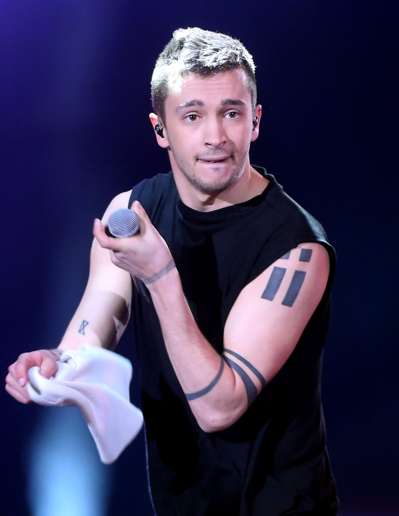
Tyler Joseph Tattoos: Symbols, Bands and Chest Geometry

Tyler Joseph’s tattoos use rectangles, narrow bands, and small black symbols, often with open skin around them. Some designs are linked to faith and Twenty One Pilots; others have meanings that fans have tried to interpret from photos.

The shapes and their placement are easier to confirm than every story attached to them. The sections below describe what appears in published images and keep reported meanings separate from confirmed details.

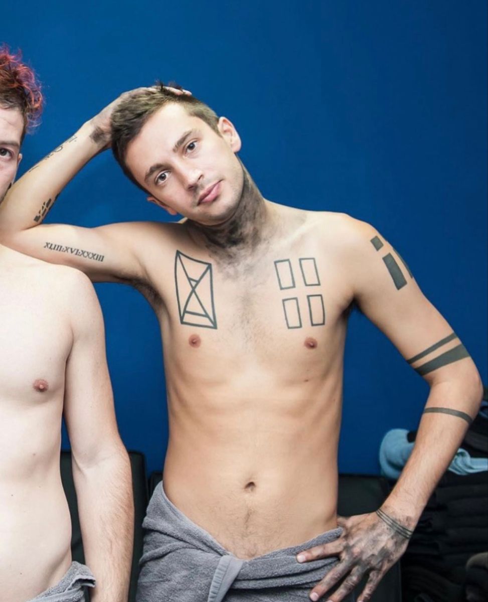
Tyler Joseph’s chest rectangle tattoos

Tyler Joseph tattoos: chest rectangle and hourglass tattoos

Several open rectangles sit on one side of Joseph’s chest. A geometric shape on the other side has an X-like centre and is often described as an hourglass. The lines stay open rather than filling the forms with black, so the skin inside remains part of the design.

Some fans and tattoo writers read the arrangement as windows, structure, or a personal framework. Those are interpretations; the photos clearly show rectangular outlines across the chest, arranged in a balanced composition.

The empty space is what keeps the forms distinct. Consistent line weight and room between the shapes can help a geometric design stay readable as the chest moves.

Tyler Joseph’s Columbus C/X bicep tattoo

Tyler Joseph tattoos: Columbus C/X bicep tattoo

A compact C-and-X symbol on Joseph’s bicep is among his best-known tattoos. Body Art Guru and other tattoo write-ups connect it to Columbus, Ohio, the hometown he shares with Josh Dun. The matching design is small enough to stay understated in a sleeveless shirt.

The mark combines a rounded letter with crossing lines. It reads quickly, but has more shape than a plain initial. For a personal emblem, the letters or shapes need to remain clear when reduced to the size you want.

Its upper-arm placement makes the symbol visible in some clothes and hidden in others. The same design would read differently on a wrist or neck, where it would be harder to cover.

Tyler Joseph’s symbolic forearm tattoos

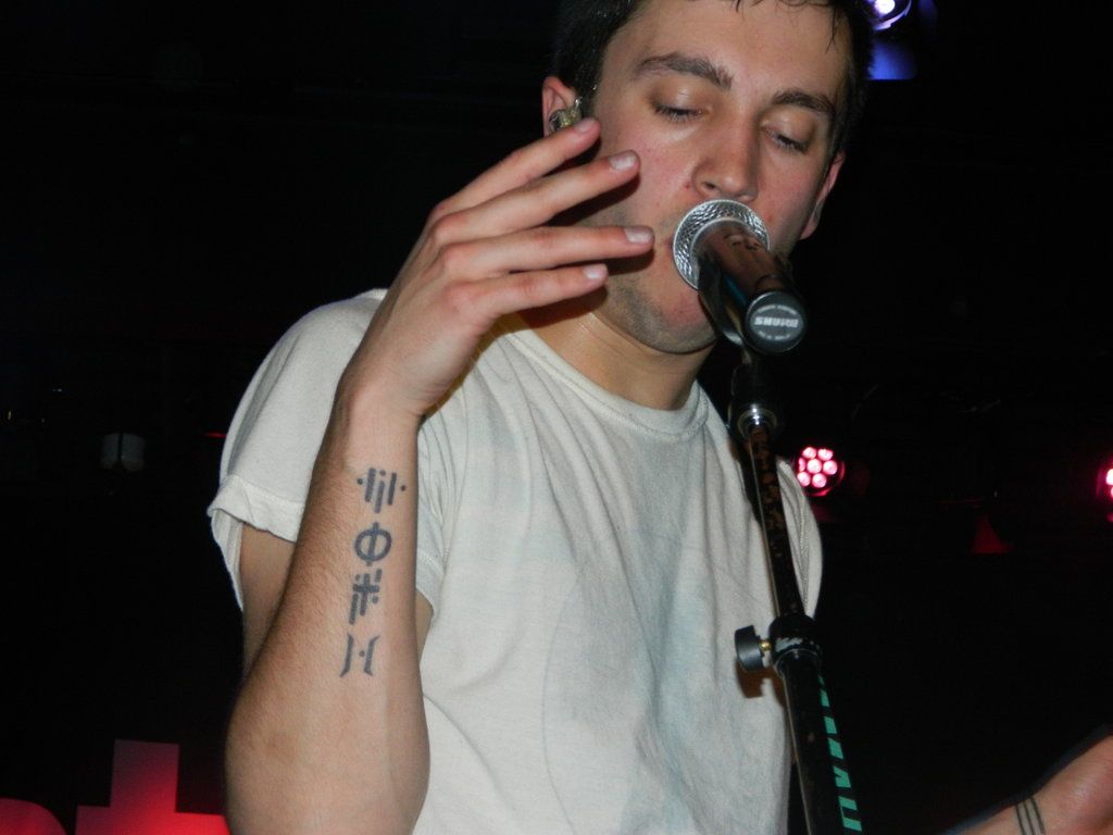
Tyler Joseph tattoos: right forearm symbol sequence

A sequence of small black symbols runs along Joseph’s forearm. Some writers and fans have read it as a coded phrase or lyric, but the full meaning hasn’t been explained in a complete public statement. The arrangement is visible; the private key is not.

Another group of blocky shapes has been read as Carpe Noctem, or “seize the night.” That interpretation is often linked to Joseph’s writing about difficult nights and anxiety, but should still be treated as a reading rather than a confirmed explanation.

The marks work like a visual alphabet, with angles and gaps instead of ordinary letters. The symbols can hold a meaning without explaining it to everyone who sees them. Clear spacing also helps small shapes remain legible over time.

Tyler Joseph’s wrist band tattoos

Tyler Joseph tattoos: shoulder and wrist shape tattoos

Thin lines wrap around Joseph’s wrist, with small dots visible in some photos. The design is simple: parallel marks that follow the natural edge of the wrist.

Fan discussions have associated the bands with a difficult period in Joseph’s life and with rubber bands used as a coping reminder. That explanation has circulated more widely than a detailed first-person account, so it is safest to describe it as an association rather than a confirmed meaning.

A band tattoo needs even spacing around a relaxed wrist. Checking a stencil with the hand bent can show how the lines shift. The narrow stripes and small dots give the design a different rhythm without adding much detail.

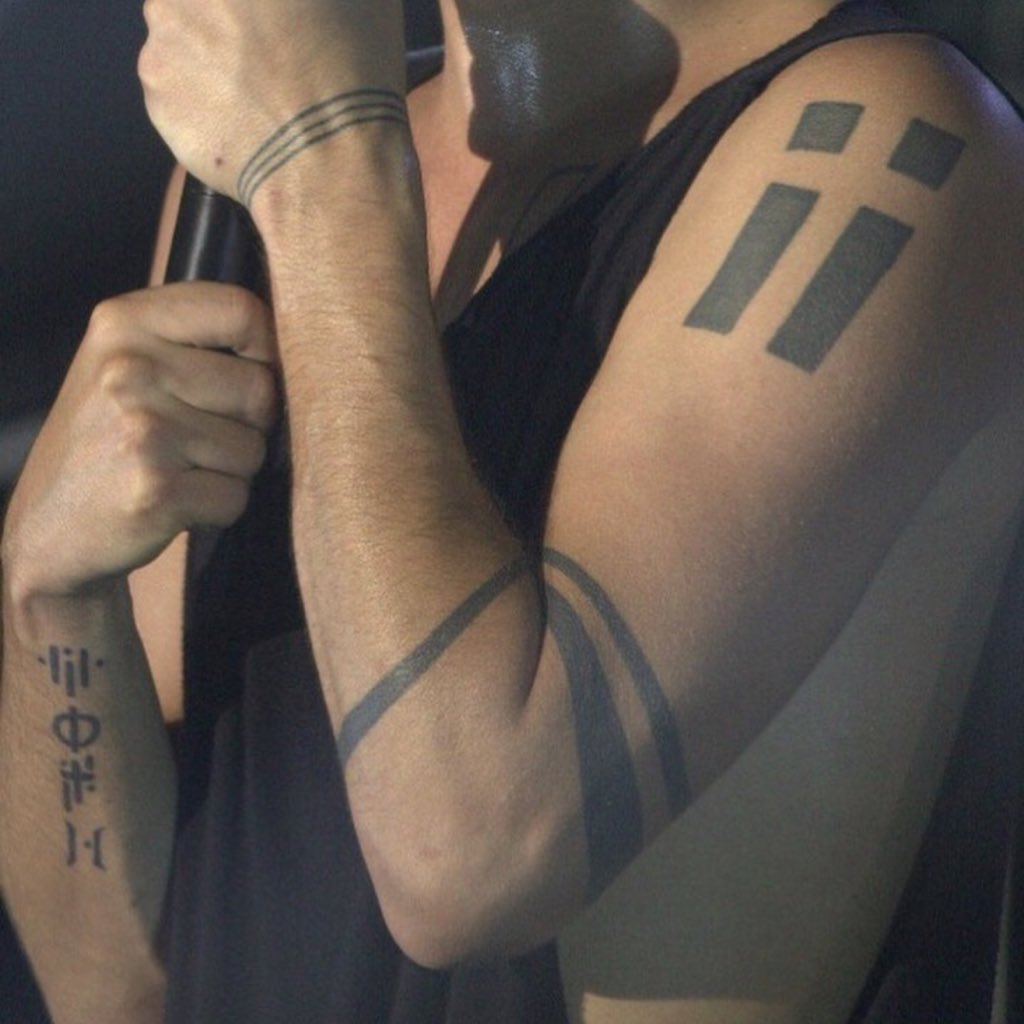
Tyler Joseph’s solid arm band tattoos

Tyler Joseph tattoos: solid arm band tattoos

Dark filled bands on Joseph’s arm contrast with the open chest rectangles and smaller forearm symbols. Some tattoo references describe three bands. In performance photos, the solid shapes remain visible as the arm moves under stage lighting.

Solid bands can mean different things to different people, including memorials or personal reminders. The photos show the dark bands, but don’t confirm a specific story behind each one.

Width affects how much attention the bands draw. A stencil can help check the spacing against other tattoos and the shape of the arm. Filled geometric shapes also show small changes in the edges, so the outline needs to be even.

Reading the collection as a whole

Joseph’s collection repeats a few visual ideas: chest rectangles, wrist and arm bands, and groups of small symbols. The Columbus mark and the name tattoo connected to Josh Dun add more direct personal references among the abstract forms.

The designs don’t need one theme to sit together. Similar line weight, black ink, and open space can connect pieces added at different times. Some meanings remain private, even when the tattoos themselves are visible.

The main pattern is clear without decoding every mark: simple forms, careful spacing, and different levels of visibility across the body. The photos show the placement; interpretations should stay qualified unless Joseph has explained them himself.

More musician tattoo guides

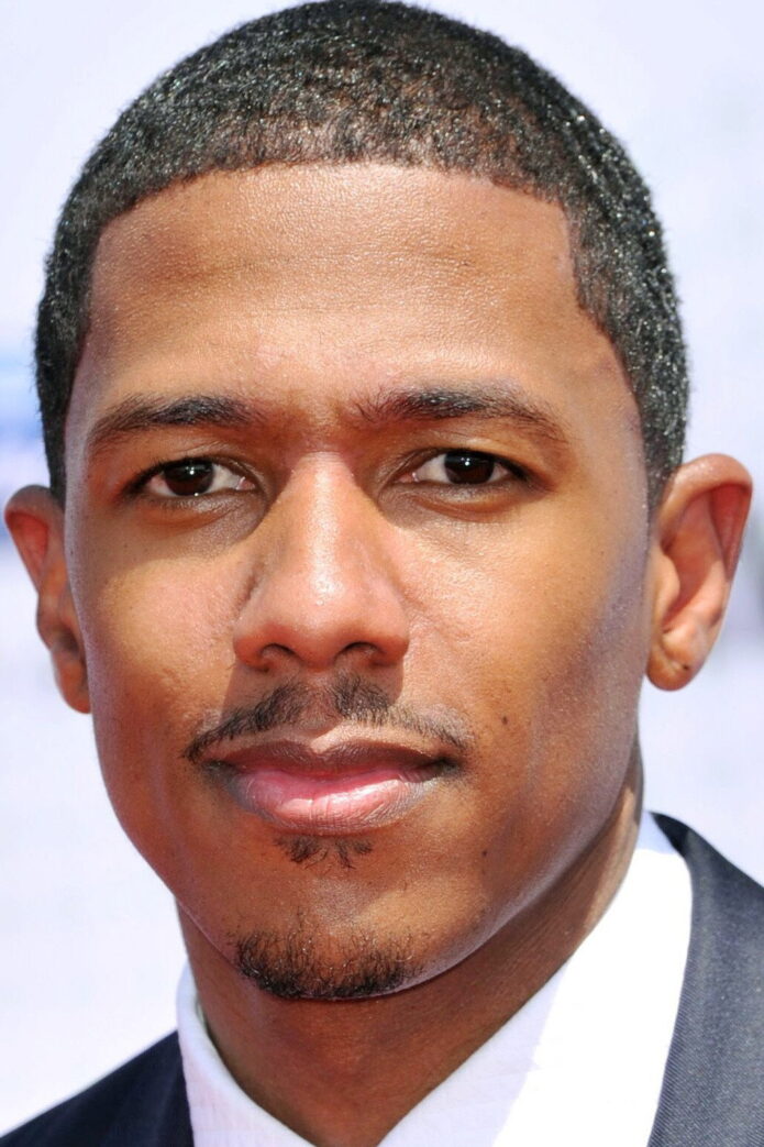
Nick Cannon Tattoos: Compass, Cover-Up and Sleeves

Nick Cannon’s tattoos cover his chest, back, arms and neck. They include a chest compass, hometown lettering, large sleeve work, and a back piece that covered an older tattoo of Mariah’s name. He has described tattoos as taboo in his childhood home, then later used them to mark different parts of his life.

The pieces don’t all share one style. Some are personal references; others follow the separate themes Cannon has described for his arms. The photos show both the larger designs and the smaller marks around them.
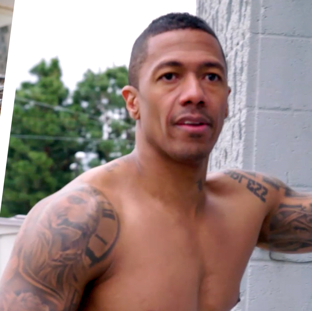
Nick Cannon’s chest and shoulder tattoo coverage

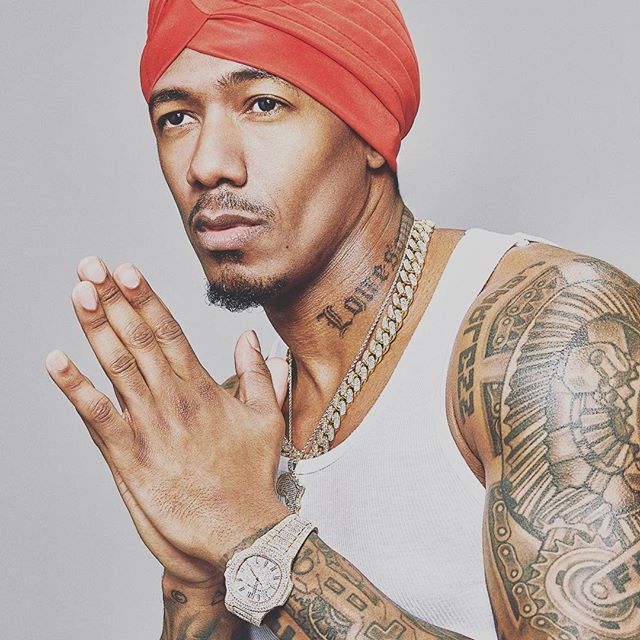
Nick Cannon tattoos: shirtless chest, shoulder and arm tattoo coverage in a clear fitness portrait

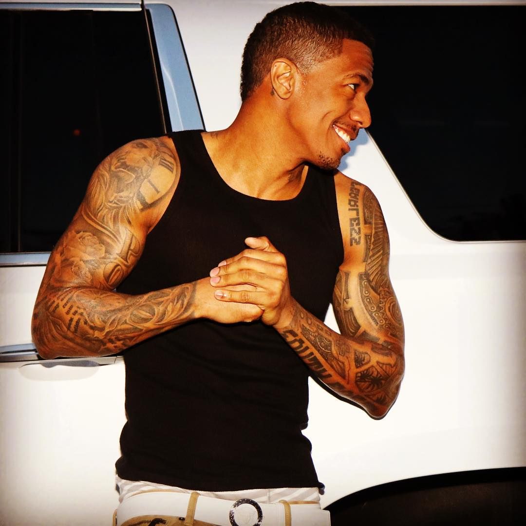
A compass sits in the centre of Cannon’s chest. It has a traditional face and circular outline, with lines continuing toward the neck and shoulders so it reads as part of a larger layout.

Cannon has described the compass as a reminder of direction, balance, and staying grounded through change. He has also connected it to his path from southeast San Diego into music, comedy, television, business, and family life.

The chest gives the circle room for its cardinal points and smaller markings. A stencil should be checked while standing and moving, since the chest and shoulders shift as you breathe and raise your arms. A map line, star, or date can add a personal detail without crowding the compass.

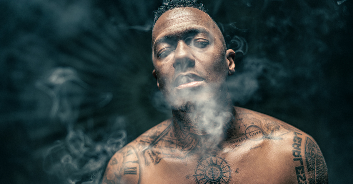
The 2021 chest-and-neck session at Inked NYC

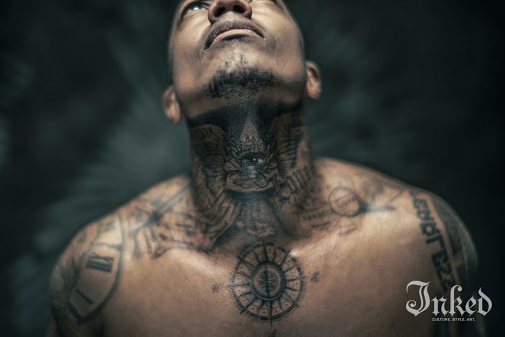
Inked’s 2021 coverage identifies Maria Garza and Sherri Austria-Portela as the artists who worked on Cannon’s chest and neck over two days. Cannon described the compass as a symbol of direction, balance and staying grounded. The photographs from that session show how the compass connects with the surrounding neck work.

Read Cannon’s own explanation in his Inked interview.

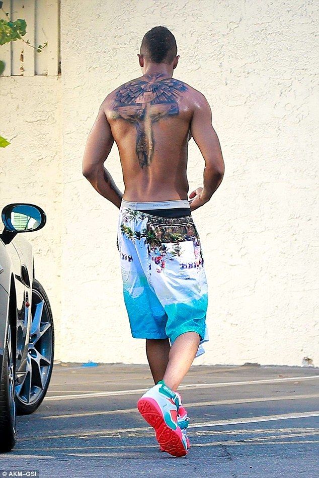
Nick Cannon’s full back crucifix and cover-up tattoo

Nick Cannon tattoos: full back crucifix and winged cover-up tattoo photographed after the old name ink was replaced

Earlier photos show the name Mariah across Cannon’s back. After their relationship ended, he covered it with a large religious design showing Jesus on the cross, wings, and layered shading across the upper back.

A cover-up has to work over the old lettering, not on blank skin. The cross, wings, and shading needed enough scale and contrast to cover the previous tattoo. That is why the replacement design extends across most of the upper back.

For a cover-up, an artist needs clear photos of the old work and its touch-ups. The existing ink affects which shapes and sizes will work. The new design may need to be larger than the original.

Religious imagery can be handled in many styles. Cannon’s piece is a large, shaded composition; a smaller cross, wings, or scripture can make a different design with the same subject.

Nick Cannon’s layered arm sleeves and hometown lettering

Nick Cannon tattoos: full arm sleeve with layered portraits, lettering and ornamental shading

Cannon’s arms combine portraits, shaded figures, lettering, clocks, ornamental shapes, and darker blocks. He has talked about the words “South East” on his forearm, a reference to the part of San Diego where he was born and raised.

The place name gives the sleeve a direct link to his hometown. Larger images and shading sit alongside it, with different sizes and textures keeping the arm from reading as one uniform patch.

The photo shows how the lettering and larger images fit together. A place name or phrase can act as one anchor in a sleeve, with other designs arranged around it. Open space helps the small text remain readable as the arm bends.

Nick Cannon’s chest and neck lettering tattoos

Nick Cannon tattoos: visible neck tattoo and layered upper-chest ink in a sharp event portrait

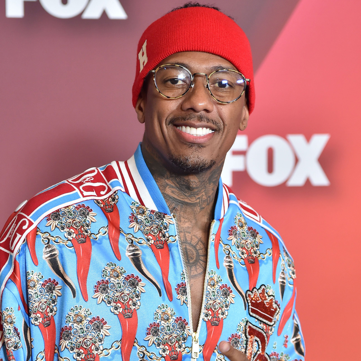
The upper chest carries larger symbols, while the neck has bold lettering and ornamental shading. The word “LOST” is often visible around the neck, beside lines that link the compass with the upper-body work.

Neck tattoos are harder to cover than arm pieces. The skin curves and moves, so lettering needs to remain readable at a normal distance. Cannon’s dark shapes make the word visible in close portraits; a high-chest placement offers a similar area with more coverage.

The compass gives the lettering and surrounding lines a point of reference. A short phrase can follow the curve of the neck and collarbones, but it doesn’t need to copy Cannon’s wording or layout.

Nick Cannon’s digital and analog arm tattoo themes

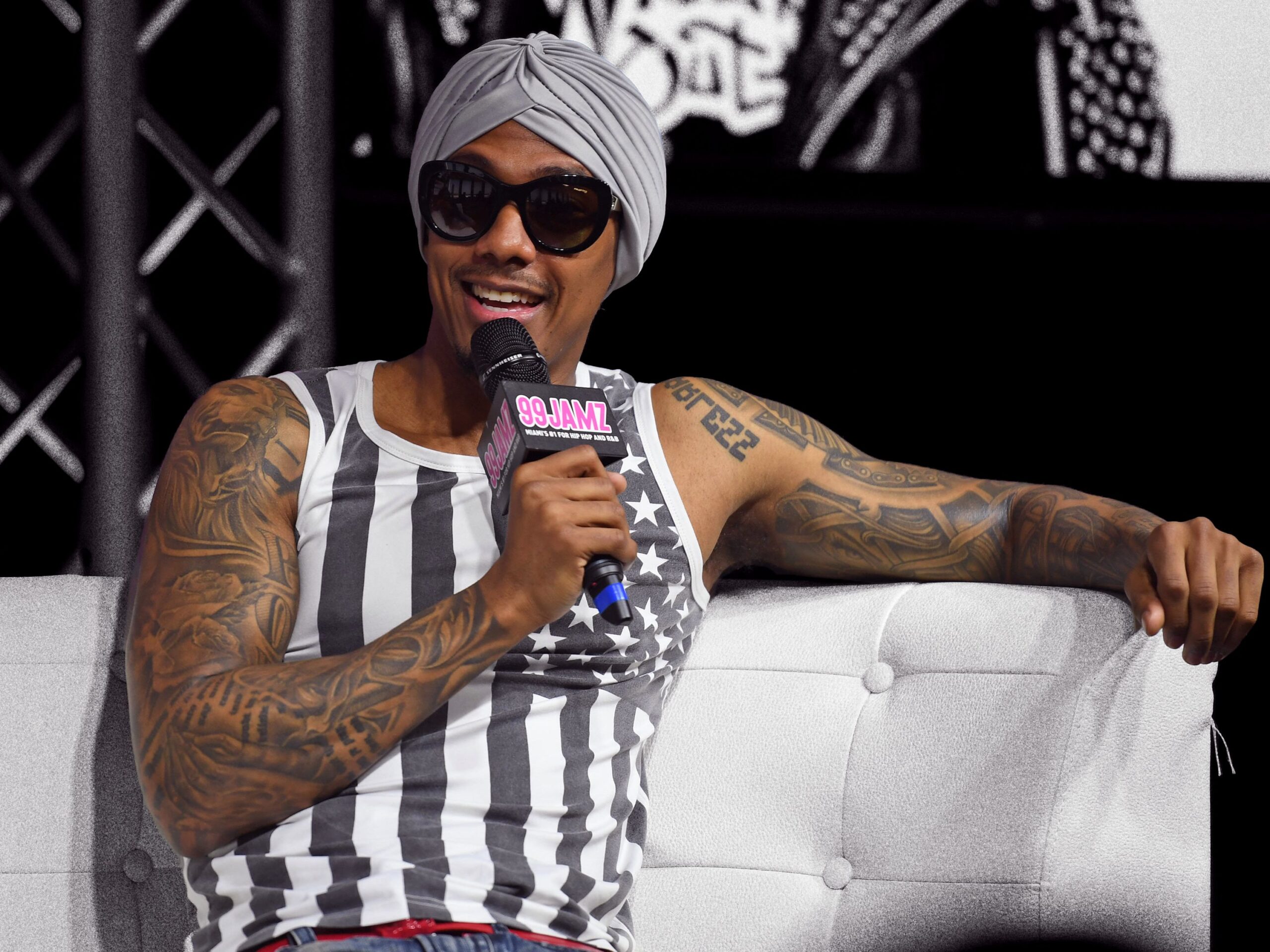
Nick Cannon tattoos: wide event portrait showing the extensive arm tattoos that support his digital and analog sleeve themes

Cannon has described the two arms as having different themes. One side is more artistic, historic, and analog; the other includes digital references such as time displays, Nintendo controllers, the Terminator, and mechanical gears.

A theme can connect designs without making them all the same. For a pair of sleeves, the organizing idea might be two different interests or parts of a life. It can guide choices even if other people don’t recognize it.

The digital side includes recognizable objects and machinery; the other can use portraits, maps, or traditional imagery. Different subjects can sit together when the layout has a plan.

Cannon’s explanation makes the concept clearer than trying to infer a theme from one photo. His collection combines several distinct images, while each arm has a direction that he has described.

The chest compass, back cover-up, “South East” lettering, and two arm themes point to different parts of Cannon’s life. The designs don’t need to match for their placement and meaning to connect them.

More musician tattoo guides

More photographs of Nick Cannon’s tattoos

Nick Cannon’s chest compass and neck work in an Inked portrait.
A second Inked portrait shows the chest-and-neck composition from a different angle.
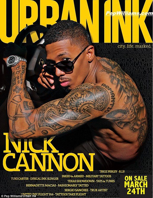
Nick Cannon’s tattooed arms on an Urban Ink magazine cover.
Nick Cannon’s arm and neck tattoos in an earlier portrait.

Justin Timberlake Tattoos: Cross, Guardian Angel and NSYNC-Era Ink

Justin Timberlake’s tattoo photos show both permanent ink and temporary designs he wore for the film Alpha Dog. The movie tattoos made him look more heavily inked than he is in everyday life. His permanent designs are spread across his upper arm, back, lower legs, and ankles, with separate references to faith, family, and *NSYNC.

The pieces came from different periods rather than one large sleeve. Distinguishing the film makeup from the tattoos he kept makes the photos easier to read.

Justin Timberlake’s cross tattoo on his upper arm

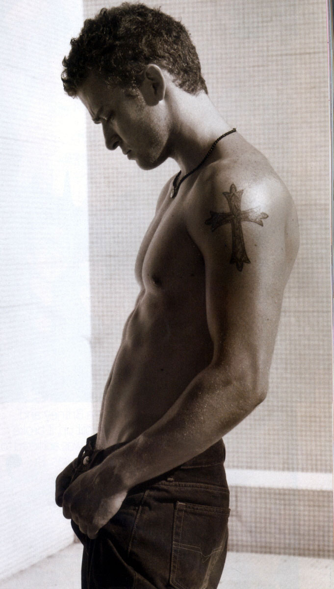
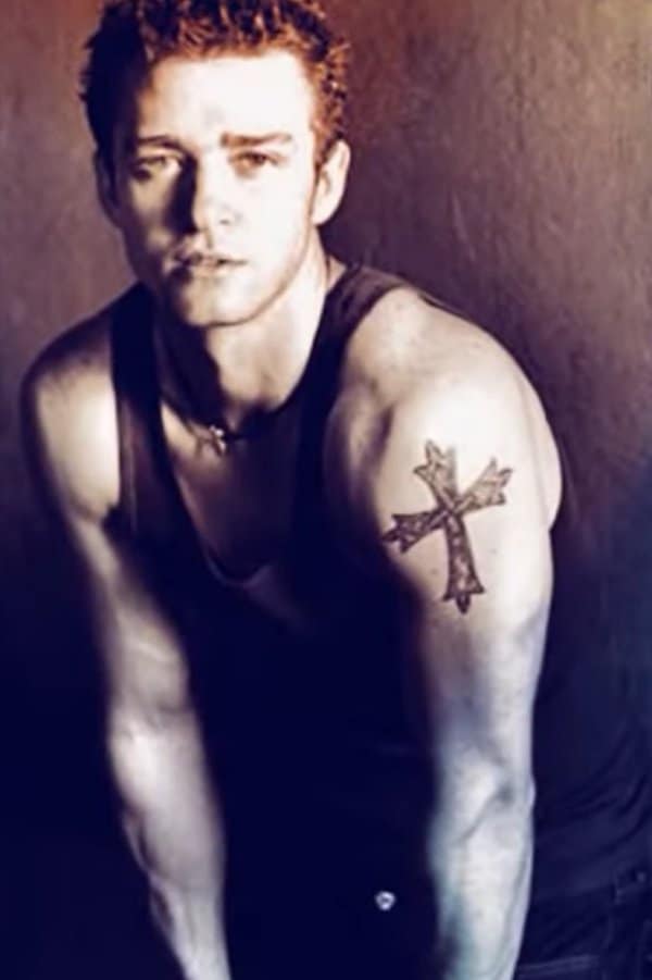
Justin Timberlake tattoos: upper-arm cross with clear traditional outline

The cross on Timberlake’s upper left arm is one of his most recognizable tattoos. Its dark outline keeps the traditional shape clear in photos without filling the whole area with black.

Tattoo guides commonly connect it to the Christian faith he grew up around in Memphis. That context is often reported as part of the tattoo’s meaning, though it is best not to present it as a direct quote from Timberlake unless he has explained it himself.

The design relies on a clear silhouette rather than added decoration. The upper arm gives it a natural frame, and clothing can cover it when needed. A small cross can lose detail over time, while a larger one can dominate the shoulder, so scale is a key choice.

The chest and arm tattoos from Alpha Dog

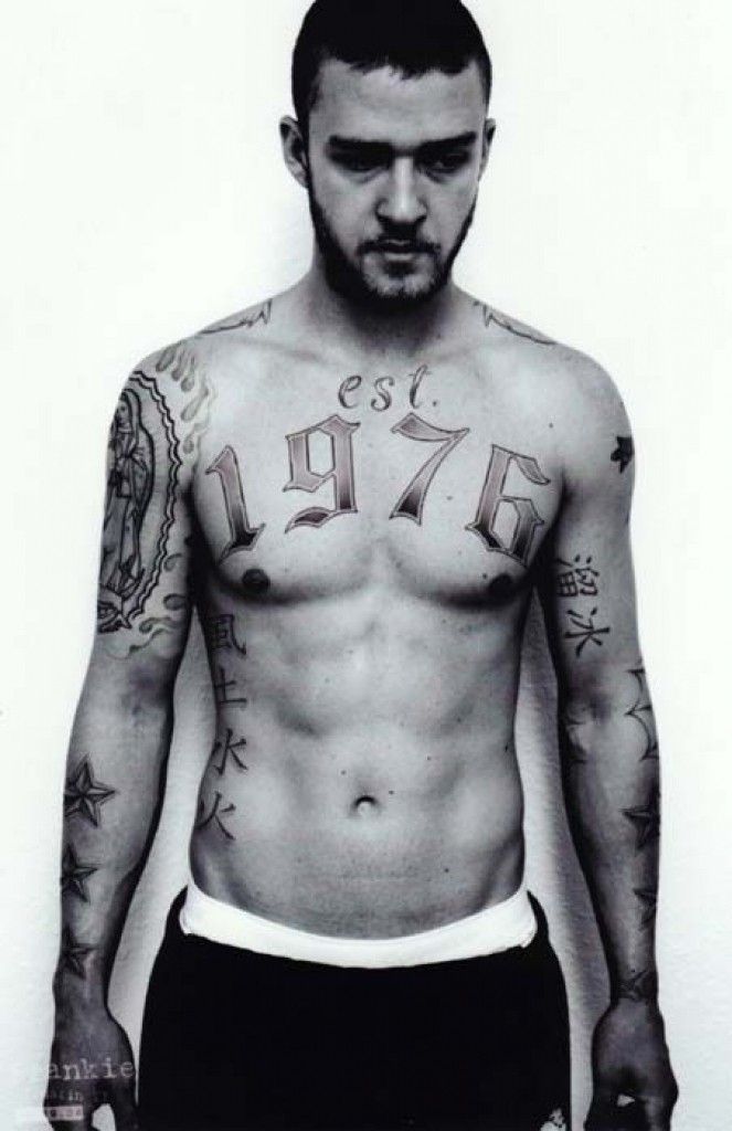
Justin Timberlake tattoos: Alpha Dog temporary chest lettering and character ink

The chest lettering and extra arm work in this photo are temporary tattoos Timberlake wore as Frankie Ballenbacher in Alpha Dog. Special-effects artist Christien Tinsley designed the look to make the character appear heavily tattooed.

The “est. 1976” chest design, large religious image on the arm, and Chinese characters were part of the film look. Tattoo For A Week also reported that one temporary character tattoo was first translated as “ice skating” before it was corrected. These images are part of Timberlake’s tattoo history, but they aren’t evidence that those designs remain on his body.

The chest lettering is wide and high-contrast, built to read quickly on camera. As a permanent tattoo, the same amount of lettering would need careful spacing because the chest moves with the shoulders and rib cage. A temporary film design can create a full character look without the long-term commitment.

Justin Timberlake’s ankle band and music symbol

Justin Timberlake tattoos: lower-leg astral band and Chinese music symbol

Tattoo references commonly describe a Chinese character near Timberlake’s left ankle as meaning music or song. On the other leg, an astral or zodiac-style band is associated with Aquarius. Both are small designs compared with the film tattoos.

The character’s translation should be checked with a fluent speaker before using it as a reference. Online lists can repeat a meaning without explaining where it came from. A treble clef, waveform, or word in a language you know can make a more direct music tattoo.

The band wraps around the leg, so it changes as the ankle turns. Checking the stencil while standing, sitting, and walking can show whether it sits level on the body. Socks and shoes also rub the area, making simpler shapes easier to read.

The NSYNC flame, velvet rope, and JRT tattoos

Justin Timberlake tattoos: early upper-arm star detail in a clear full-body tattoo photograph

This photo shows an early star tattoo on Timberlake’s upper arm. The flame logo, rope, and initials discussed below are separate designs on his lower leg.

Timberlake’s *NSYNC-era tattoos include a flaming logo on his right lower leg and red velvet-rope imagery beneath it. Reports connect the rope to the group’s red-carpet success. The initials JRT, for Justin Randall Timberlake, appear toward the front of the lower-leg design.

The flames add movement, while the rope and initials turn the piece into a reference to a particular part of his career. A symbol, texture, and initials can work together without becoming one large logo.

The lower leg gives a long vertical area, but each image still needs room around it. Leaving small gaps makes the separate marks easier to see and leaves options for later additions. Color was part of this *NSYNC design; other tattoos in the collection use different styles.

The marionette tattoo and the No Strings Attached idea

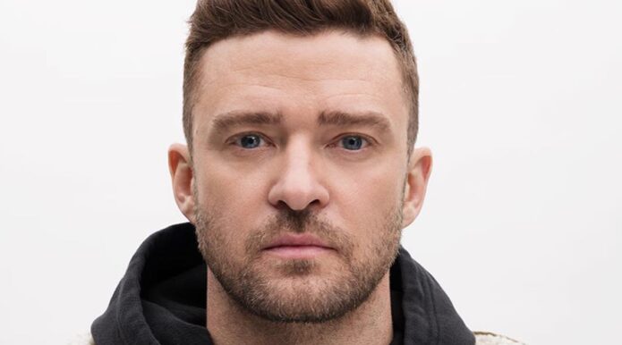
Justin Timberlake tattoos: clear upper-arm cross tattoo close-up

Tattoo guides also list a marionette on Timberlake’s lower leg, linking it to the puppet imagery around *NSYNC’s No Strings Attached era. The videos for “Bye Bye Bye” and “It’s Gonna Be Me” used puppet imagery, which gives the reference a clear connection to that period.

A marionette can be difficult to fit into a small area because strings, joints, and a face all need definition. A clear silhouette and a few recognizable details can work better than trying to include every feature at miniature size.

The image shown here is a close-up of Timberlake’s upper-arm cross; it does not show the marionette design. The marionette reference is still part of the tattoo guides’ account of his collection, but the photograph and description refer to different tattoos.

No Strings Attached offers a theme that can be interpreted in different ways, but the specific tattoo reference is tied to *NSYNC’s puppet imagery. The pieces do not need to touch to share a story.

What Justin Timberlake’s style says about placement

Timberlake’s permanent tattoos use several styles: a traditional cross, smaller ankle designs, an illustrative guardian angel, and *NSYNC-related imagery. The temporary work for Alpha Dog is a separate part of the photo record and shouldn’t be confused with tattoos he kept.

The designs are spread across different areas rather than built into one sleeve. A clear symbol can work on the upper arm, while smaller references fit the lower leg or ankle. Placement changes how often a tattoo is seen and how much room it has.

Before using a celebrity tattoo as a reference, check whether it is permanent and whether its meaning is supported. Think about how the design will fit your clothes and routine, and whether the area gives the lines enough room to age clearly.

Timberlake’s tattoos connect to different periods of his life: faith, family, the band, and a film role that called for temporary ink. The useful idea is to choose a story first, then decide what symbol and placement still feel right to you.

More musician tattoo guides

James Arthur Tattoos: Sleeves, Hand Ink and the Designs Behind His Music

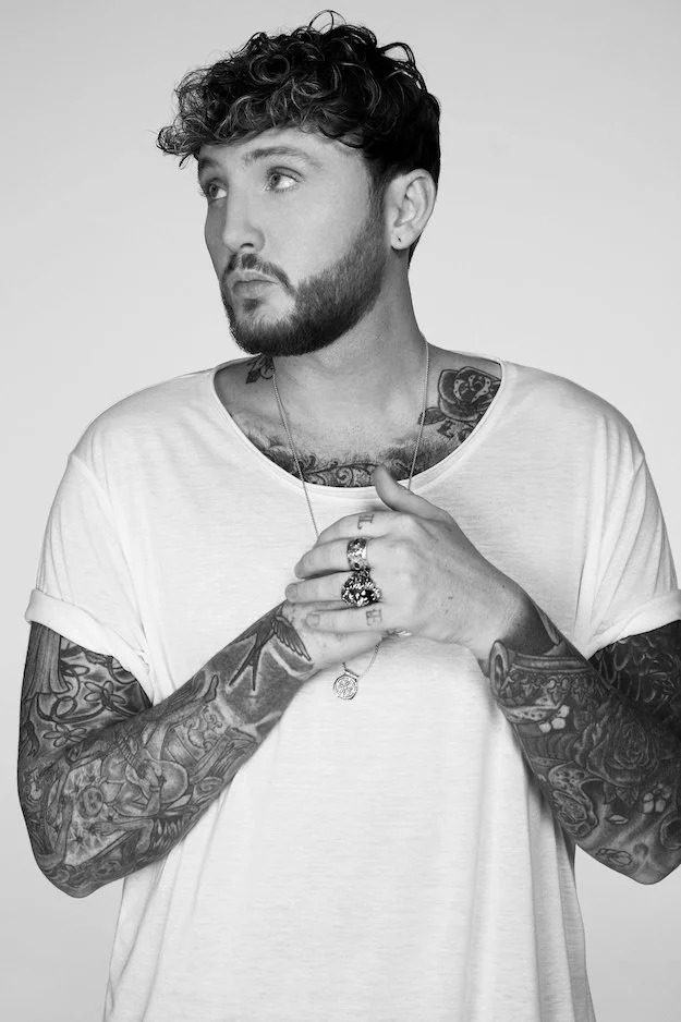
James Arthur’s tattoos include two sleeves, finger lettering, hand and neck ink, a small mark near his eye, and a chest design that is often covered by a T-shirt. The collection mixes colorful, old-school images with black-and-grey work.

Arthur has said that some tattoos were simply designs he liked, rather than pieces with a larger story. The photos show different stages of the collection, and older images don’t always reflect what remains after later edits or removal.

James Arthur’s hand tattoos mix lettering with small symbols

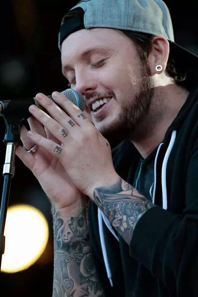
His fingers show lettering and small marks when he grips a microphone. Rings and bracelets add to the layered look, and the designs are not arranged as one perfectly uniform set.

James Arthur tattoos: finger lettering and wrist tattoos visible during a live microphone performance

The live photo shows several finger tattoos alongside darker work on the wrist. The marks are small compared with the sleeves, but they are visible whenever his hands move on stage.

Finger skin gets washed and rubbed often, so fine details can soften. Short lettering or simple shapes are easier to read at that size than a tiny, detailed image. The placement and letter spacing matter as much as the design.

The crowned hand tattoo gives the collection an old-school centre

A close portrait shows a crowned figure on the back of Arthur’s hand, with dark outlines above the knuckles. The traditional-style image has a strong silhouette that stays clear when the hand bends.

James Arthur tattoos: crowned hand tattoo and detailed wrist linework in a close portrait

The other hand and arm tattoos are softer and less emblem-like, so the crown stands out as a distinct piece. The surrounding lines connect it to the wrist work without making it look like a separate sticker.

Arthur has not given a public explanation for every tattoo. The photo shows the central crowned figure, dark outline, and wrist linework; the rest of its meaning is not confirmed.

His black-and-grey sleeve is packed with overlapping pieces

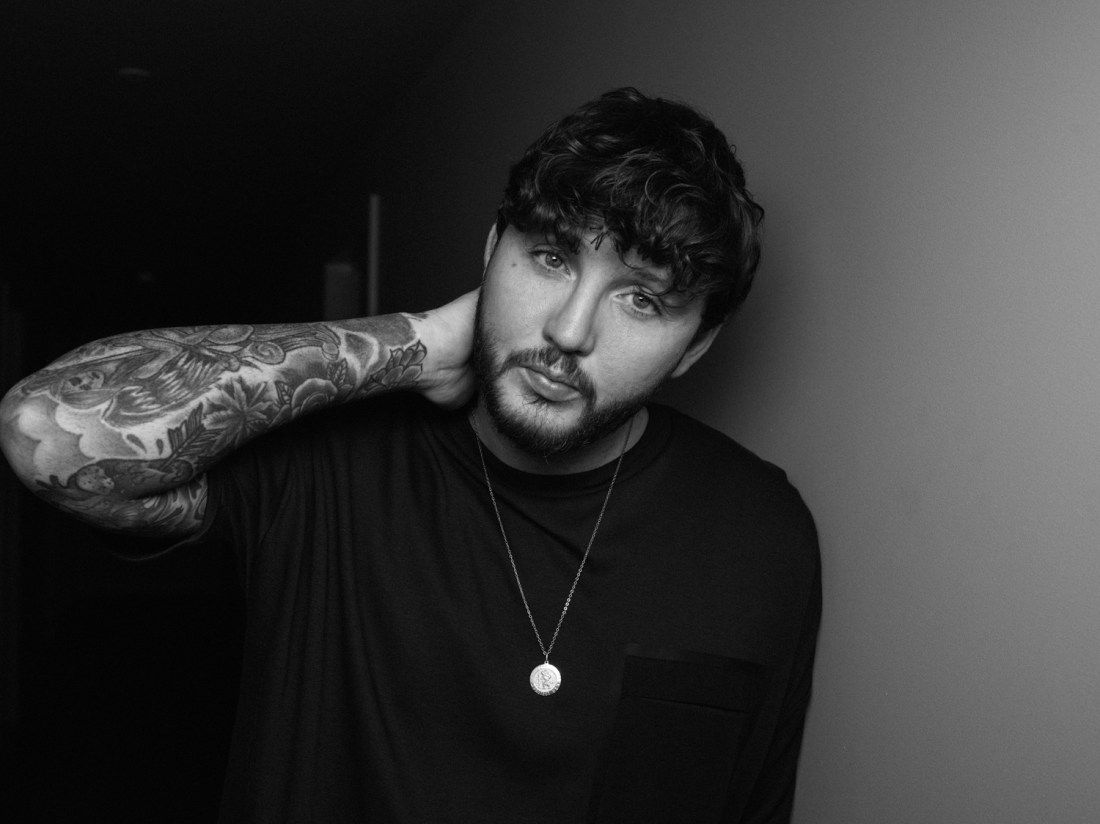
In a black-and-white portrait, Arthur’s arm shows flowers, curved shapes, figures, and shaded sections layered together. The sleeve is dense, but different lines and textures keep the pieces visible.

James Arthur tattoos: black-and-grey sleeve with flowers, curved forms and overlapping shaded pieces

His arm is bent behind his neck in the photo, so some pieces stretch while others bunch near the elbow. Tattoos can look different as the arm turns; one image won’t show every section in the same way.

The black-and-grey work uses softer shading beside darker shapes. It appears to have been added over time, not as one design in a single style. The sleeve feels layered because the pieces have different textures.
The shapes and shading help the designs transition into one another. The arm is busy without every section having the same amount of detail, and the larger forms remain visible in a wider view.

The colourful sleeve brings flowers and bold panels into the mix

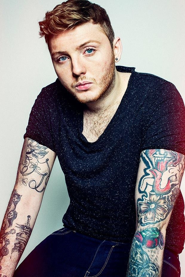
Another portrait shows a brighter sleeve, with blue, red, green, and pale highlights in separate sections. Flowers and rounded shapes sit inside strong outlines, making the arm look colorful even in a plain studio portrait.

James Arthur tattoos: both forearms with colourful flowers, bold outlines and bright sleeve panels

The two arms have different looks: one is mostly black and grey; the other uses more color. The contrast helps the sleeves remain distinct rather than blending into one dark shape.
Muted shading sits beside brighter areas, while the outlines separate the flowers and panels. Not every tattoo has a confirmed meaning; the color and composition are clear in the photo.
Stage lighting can change how red, blue, and green appear. A clear portrait shows the separate color areas more accurately than a dim performance shot.

Older photos show how James Arthur’s tattoos have changed

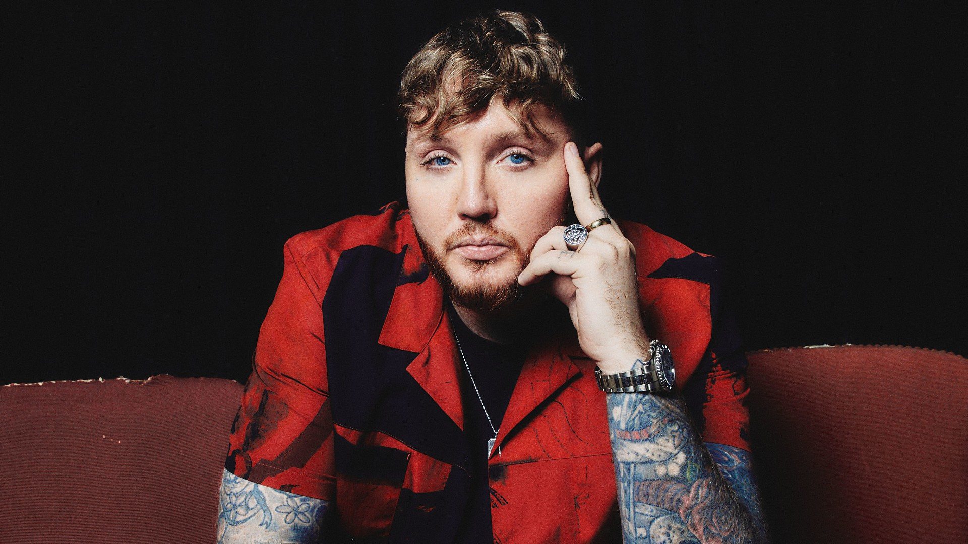
Comparing photos from different years shows changes in Arthur’s sleeves and the amount of skin left open around them. His hand tattoos can also look different depending on the angle, light, and how his fingers sit around a microphone.

James Arthur tattoos: later portrait view of forearm, hand and the wider public tattoo look

A close portrait can show lines that disappear in a wide stage photo. Lighting, distance, and editing all change how much detail is visible; a darker image doesn’t necessarily mean the tattoo itself has changed.

Arthur’s small facial mark is easier to see in a front-facing close-up than in a wide performance shot. The neck tattoos also show when his collar is open and disappear beneath a higher neckline.

He has spoken about tattoo removal and changes to the work on his hands, so older photos aren’t a full record of what remains today. The broad picture is more reliable: he has extensive ink across both arms, with additional tattoos on his hands, chest, neck, and face.

The collection includes traditional shapes, script, flowers, and dark shading without one single theme tying every tattoo together. Comparing photos from different years shows how later work sits beside earlier pieces and how the collection has changed.

More musician tattoo guides

Miyavi Tattoos: Kanji, Script and a Guitarist’s Ink

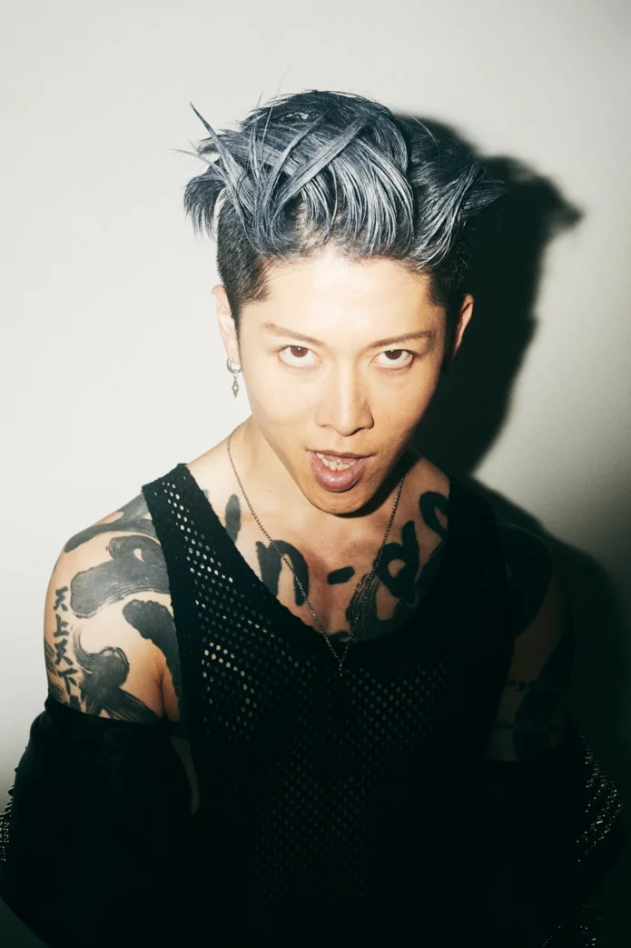
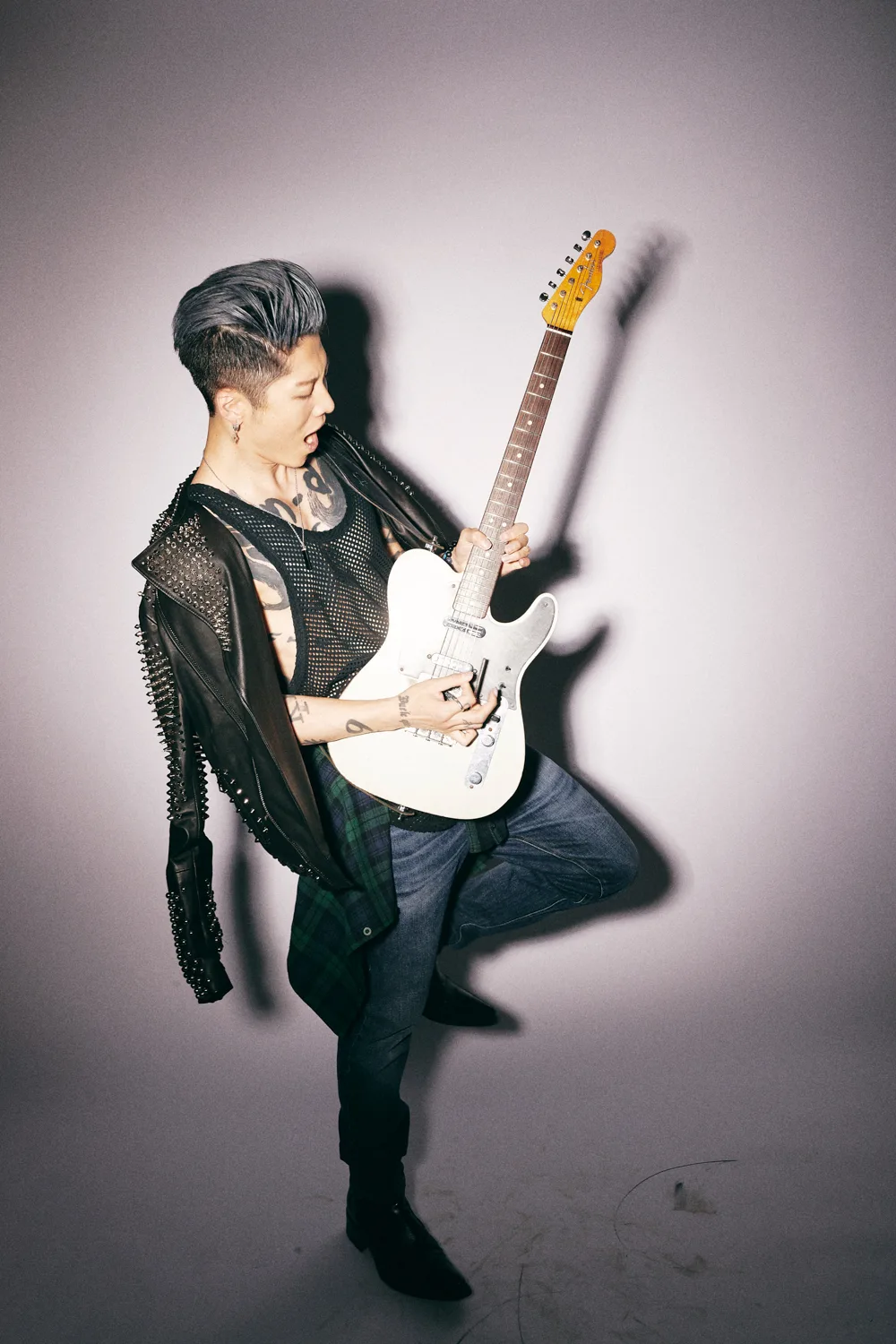
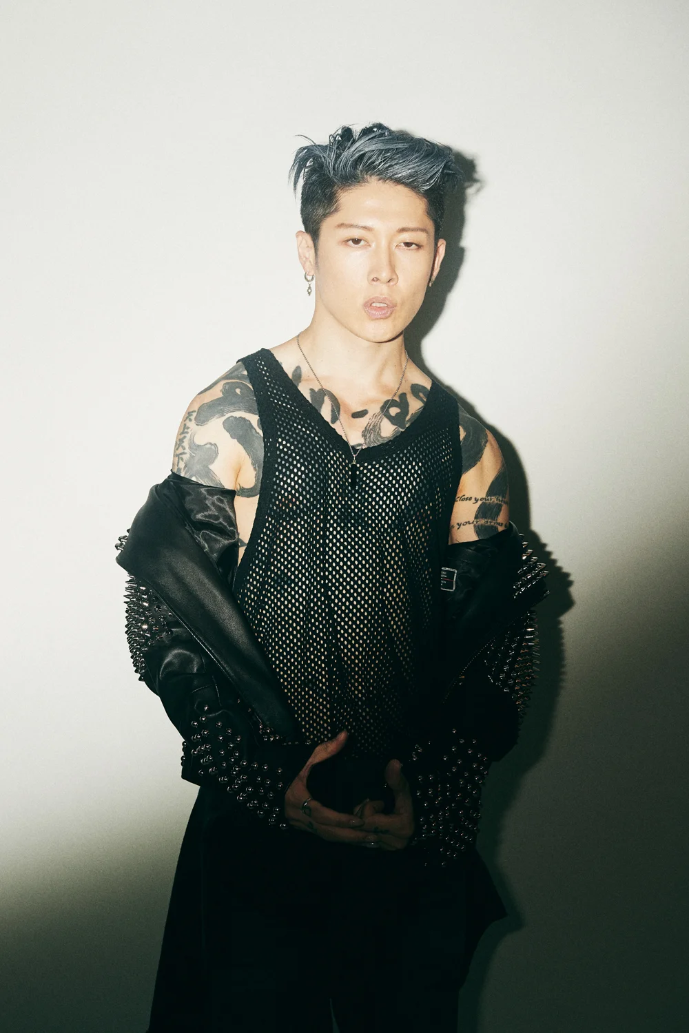
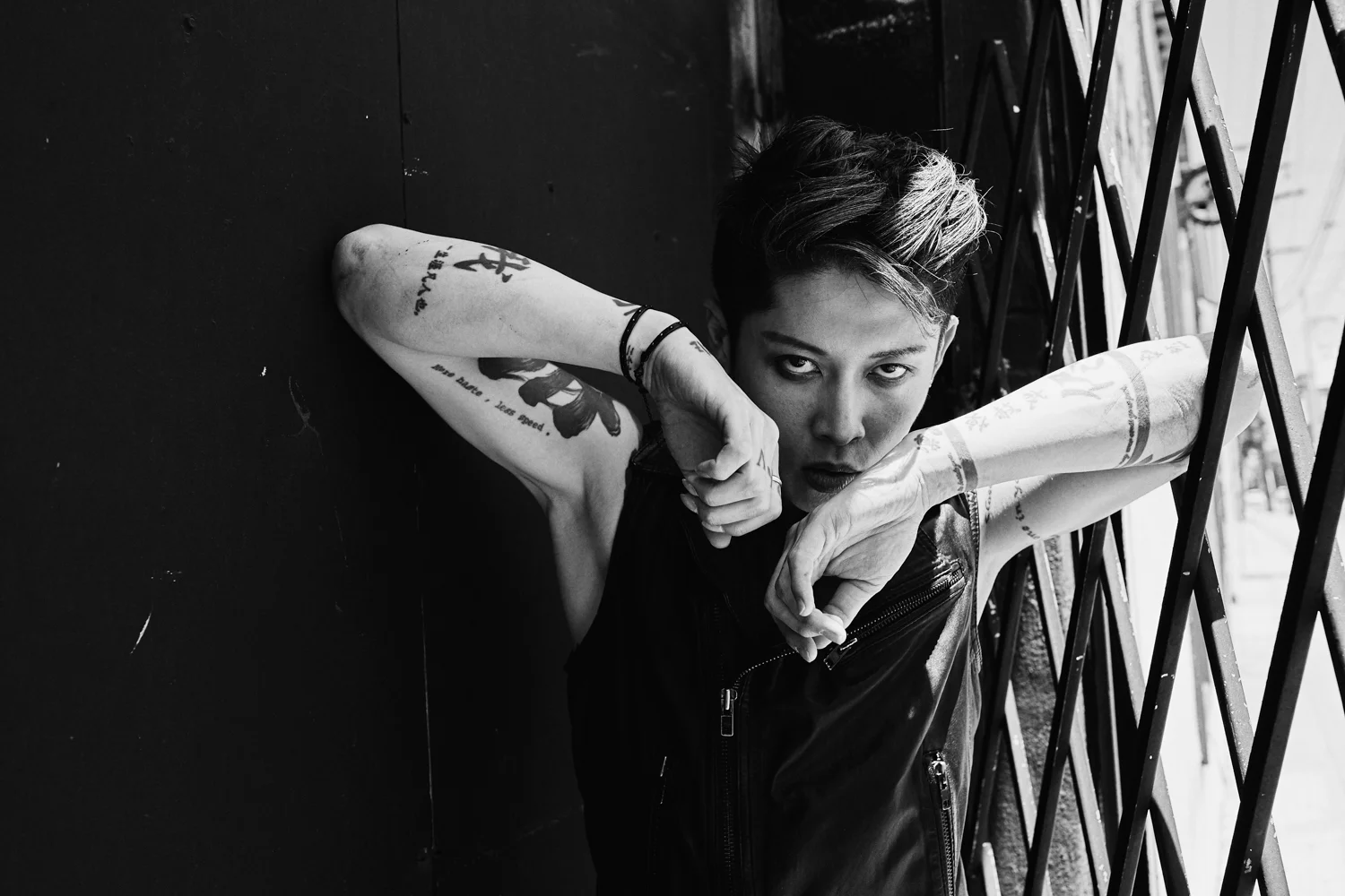
Miyavi’s tattoos use black ink, brush-like shapes, characters, and short phrases. The largest designs sit across his chest and shoulders; smaller marks run along his arms, wrists, and hands. They are visible when he reaches for a guitar or microphone.

The collection doesn’t form one matching sleeve. Large characters create broad shapes, narrow bands break up the forearms, and English lettering adds smaller details. The work varies in size while leaving skin visible between pieces.

The chest kanji gives the collection its centre

Miyavi chest kanji and guitar tattoos

Heavy black characters stretch across Miyavi’s chest, set between broad brush-like forms. A guitar crosses the lower part of the photo, but the chest design remains the main shape.

The characters are large and the surrounding marks give them weight. A design across the chest also has to fit around the collarbones, ribs, and the edges hidden by clothes.

Brushwork across the shoulders keeps the ink loose

Miyavi brushwork chest and shoulder tattoos

From the front, dark brush-like shapes spread from the chest over the shoulders. They don’t form a tidy geometric pattern. Their outline changes as Miyavi moves and turns, which is especially clear in performance photos.

The shoulder changes shape as the arm lifts, bends, and rotates. Looking at placement from several angles shows how the tattoo sits beyond a still, front-facing pose.

His arms mix big characters with narrow bands

Miyavi arm script and band tattoos

The arms shift to a narrower rhythm: tall characters sit beside bands and short script closer to the skin. A phrase is visible on the inner arm, while wider black bands leave some space around the lettering. The designs differ, but their scale and black ink give the arms a related look.

One large mark can sit beside smaller words or symbols. Thin lettering needs enough space to remain clear as it heals.

The wrist and hand marks are small but easy to spot

Miyavi hand, wrist, and kanji tattoos

Bands sit above Miyavi’s wrists, characters run down his forearms, and smaller marks appear on his fingers and hands. The designs are visible when he plays, grips a microphone, or reaches toward the crowd.

Hands and wrists move constantly, and small lines can soften with wear. Lettering and characters need enough space to remain legible over time.

The guitar photos show how the tattoos move with him

Miyavi playing guitar with visible chest and wrist tattoos

With a guitar in the frame, Miyavi’s hands, wrists, forearms, and chest are all in motion. A wrist band appears as the hand turns; the chest design is visible between the strap and shirt; forearm lettering shifts as he plays.

The tattoos become part of the performance because of where they sit. Their visibility changes with the position of the instrument and his hands.

How to borrow the layout without copying Miyavi

Miyavi’s collection uses different scales for different areas: broad chest shapes, narrower arm lettering, and compact hand marks. The designs feel related without repeating one image.

If a tattoo uses characters in another language, have the wording and context checked by someone qualified to read it. Look at healed examples as well as fresh work, and leave space between pieces if you plan to add more later.

The chest carries the largest forms, the arms shift with movement, and the hand tattoos stay close to the work Miyavi does onstage. The placement is as much a part of the look as the drawings themselves.

More musician tattoo guides