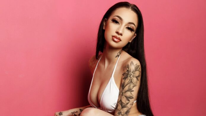
Bhad Bhabie’s tattoos have grown into a busy mix of flowers, script, symbols and small hand marks. They show up differently depending on the outfit. A red-carpet dress can leave one shoulder bare, while a mirror selfie can reveal the chest, neck and hands all at once. The collection feels personal because it has been built in pieces rather than presented as one perfectly matched sleeve.
The clearest photos also show why tattoo guides need more than one angle. Her shoulder rose is easy to spot in a side portrait, but it sits beside other work that only appears when her arm turns. Her back has larger lines and a long spine design, while the front carries script and small symbols. This guide separates those areas so the visible details do not get mashed into one generic description.
The front and back view shows how her tattoo style wraps around the body
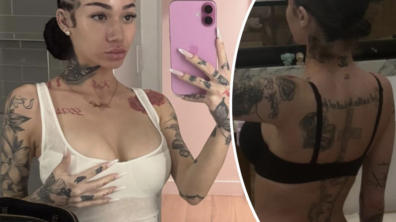
A front and back mirror image gives the best sense of the overall layout. From the front, you can see script across the upper chest, neck designs and ink running down both arms. From the back, a large cross sits along the spine while lettering stretches across the shoulders. The two views belong together because neither side explains the collection on its own.
The back piece has a tall, central shape that follows the line of the spine. It creates a strong vertical anchor, then the shoulder script spreads out to either side. That composition works well visually because the centre stays clear and the words act like a frame. It also gives the wearer options. A low-back top can show the spine cross, while a jacket can cover it completely.
Her arms are more floral and illustrative. Large petals sit beside smaller leaves and darker shaded areas, with gaps that keep the sleeve from reading as one flat block. The hand tattoos are much smaller and more graphic. They bring the ink toward the fingertips without competing with the bigger shapes on the upper arm. The floral sleeve stays readable because the petals have room around them.
This is a good example of why a collection can feel cohesive without using one style everywhere. The spine design is bold and central. The floral work is softer and spreads across curved areas. Script fills the gaps and gives the eye somewhere to pause. Those three jobs make the set look intentional even when the tattoos were added at different times.
A useful planning lesson is to decide how a tattoo will look from behind as well as from the front. A back piece can be dramatic when the wearer is walking away, but it should still sit comfortably with shoulder and arm work. Bhad Bhabie’s photos show that the surrounding pieces help the cross feel connected instead of isolated.
The shoulder rose is one of her clearest standalone tattoo ideas
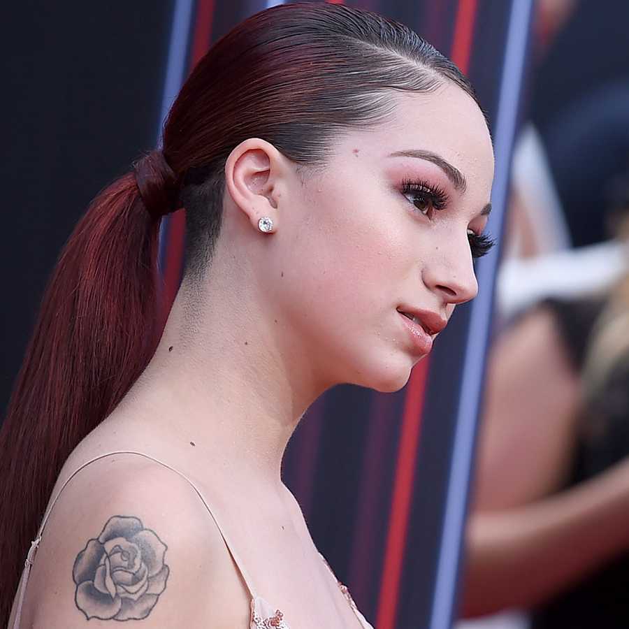
The rose on Bhad Bhabie’s shoulder is one of the easiest pieces to identify in a single photograph. The petals have a traditional outline and soft grey shading, while the placement gives the flower room to read against the upper arm. It is large enough to be visible from a distance, but still simple enough to understand in a clean side portrait.
A rose is a familiar tattoo subject, yet the placement changes the feel. On the shoulder, the flower moves with the arm and can be shown under a strapless dress or sleeveless top. The rounded shape also works with the curve of the shoulder rather than fighting it. This is why shoulder flowers continue to be popular: the body gives the design a natural frame.
In Bhad Bhabie’s case, the rose sits near other line work, so it does not feel like a random sticker placed on bare skin. The nearby script adds a personal note, and the arm tattoos extend the image downward. When the arm is relaxed, the flower is the clear focal point. When she raises her arm, the surrounding designs become part of the same composition.
Photos from different years can make the rose look darker or lighter. That does not necessarily mean it was replaced. Camera exposure, makeup, distance and skin tone all affect how grey shading appears. The sharpest event portrait is useful for seeing the outline, while the wider images explain how it sits with the rest of the arm.
If you want a similar idea, decide whether the rose should be the hero of the upper arm or the first piece in a future sleeve. Leave a little space around the petals if you want a clean look. If you already have flowers nearby, an artist can echo the leaf shape or line weight so the new design feels related without becoming a copy.
Her neck, chest and hand ink adds smaller details around the sleeve
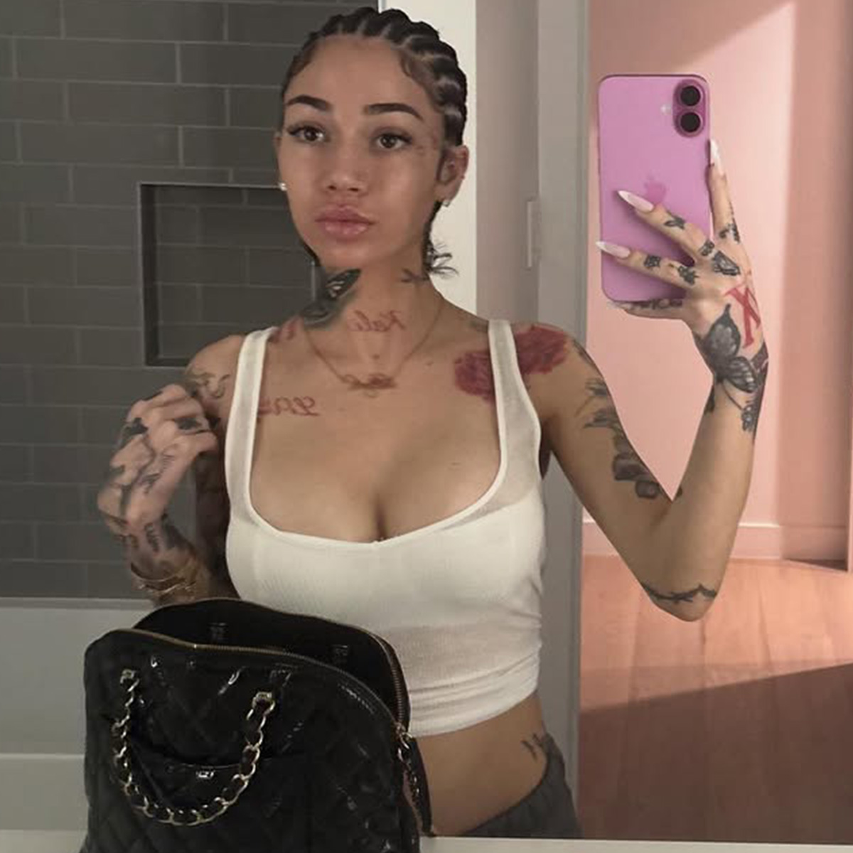
The smaller tattoos are where the collection gets its texture. A mirror photo shows marks on the neck, script across the chest and dark designs on the fingers and hands. None of these pieces is as large as the floral arm work, but they change the way close-up portraits read. The face and neck stay visually active even when the shoulders are covered.
Neck tattoos are especially powerful because they remain visible with everyday clothing. Bhad Bhabie has used the area for small symbols and line work that sit close to the jaw and collarbone. Those marks can look delicate in one photo and much heavier in another, depending on the angle of the head and the direction of the light.
The chest script brings a different mood. It lies across a flat stretch of skin, so the letters can be read as a phrase instead of a shape. Some close photos show the writing clearly, while others leave parts hidden beneath a strap or necklace. The honest way to describe it is to note the placement and visible lettering without inventing a private story behind every word.
Hand tattoos add a little edge. Small symbols, letters and dark patches can be seen on the fingers, back of the hand and wrist. Hand ink fades and softens faster than many other placements, so images from different years may not match perfectly. That is normal. It is also a reminder that tiny designs need enough line weight to survive constant movement and washing.
The smaller pieces balance the sleeve. Large flowers create the main silhouette, while neck and hand marks give a close portrait more detail. That balance keeps the style from feeling heavy everywhere. If you are building a similar collection, start with one visible small piece and see how it changes your overall look before adding a second set of hand or neck tattoos.
The floral arm tattoo carries the boldest visual weight
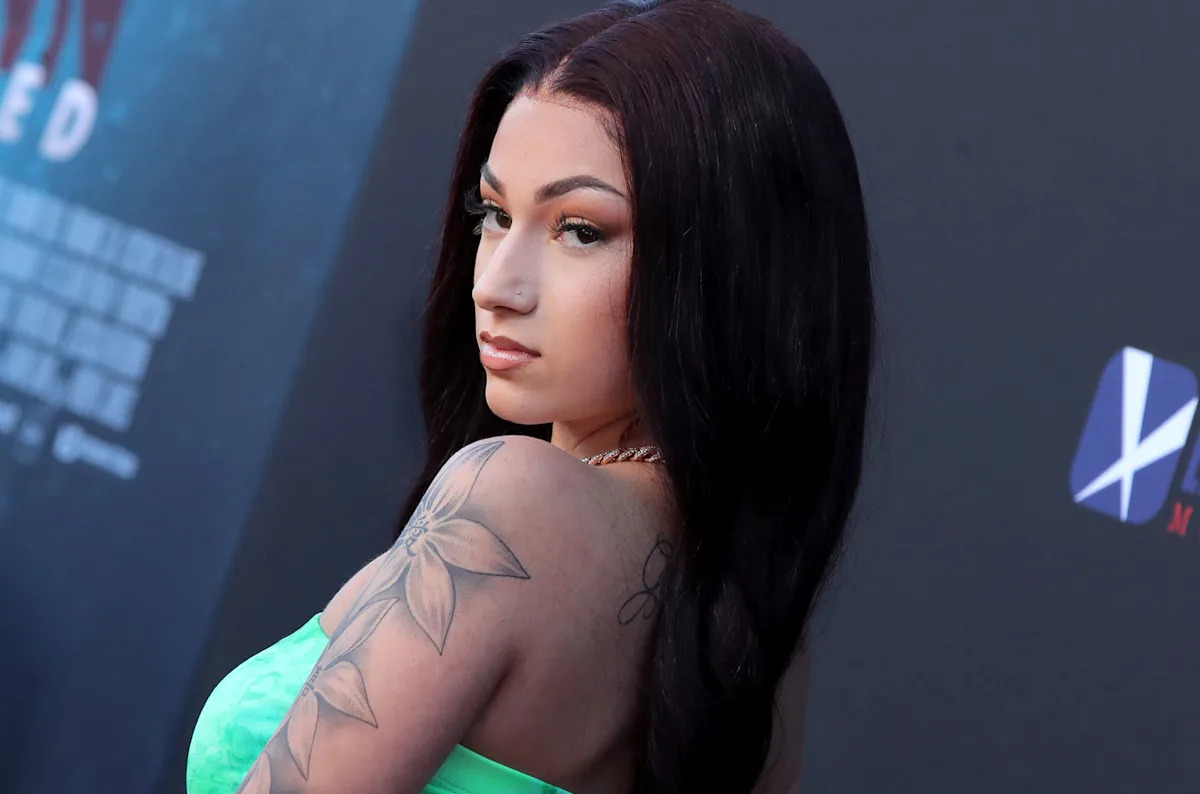
The floral arm work is the biggest visual statement in the collection. A large flower sits high on the arm, with leaves and additional blooms running toward the forearm. The lines are dark enough to hold up in a red-carpet photo, while the open petals keep the piece from becoming a solid black sleeve.
Floral tattoos work well on an arm because the design can follow the length of the limb. A central flower gives the eye a clear starting point, then smaller leaves guide the shape around the shoulder and elbow. Bhad Bhabie’s photos show that the tattoo is not just a single bloom. It is a group of connected forms with different sizes and levels of shading. The large shoulder flower does most of the visual work.
The outfit changes how much of the sleeve is visible. A strapless dress can reveal the shoulder and upper arm, while a tank top exposes more of the lower flowers. Hair can cover part of the back edge too. That means two photos may show different sections without either one being misleading.
The contrast between the floral tattoo and her hair or clothing is another reason it stands out. Dark ink reads clearly against pale fabric and bright colours, while a black outfit can make the same lines blend into the overall look. The tattoo still has a strong outline, but the styling around it changes the emphasis.
A floral sleeve does not have to mean every inch is filled. The open skin between petals is what keeps the design readable. If you are planning something similar, think about the path from shoulder to wrist before choosing individual flowers. Repeating a leaf shape or keeping one consistent line weight can tie different sessions together.
The rose and script combination makes the upper arm feel personal
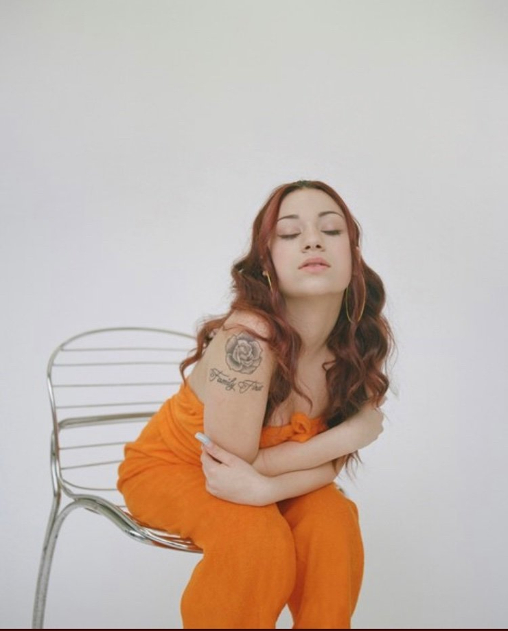
A studio portrait shows the quieter side of Bhad Bhabie’s arm work. The rose sits above a script phrase, creating a simple vertical stack instead of a full wall of ink. That pairing is effective because the flower supplies the image and the words add the personal note. Neither element has to overpower the other.
Script tattoos are difficult to judge from a distant photo. The letters need to be large enough to stay legible and spaced far enough apart to age well. In this close portrait, the phrase can be seen as lettering beneath the rose, even though the exact small details are not something a reader should guess at from a compressed image.
The placement also gives the wearer control over visibility. The upper arm can be covered for a more understated outfit, then shown in a tank top or sleeveless dress. That is different from face or hand ink, which appears in almost every close photo. It makes the arm a good place for a tattoo that matters personally but does not need to be visible every minute.
There is a nice rhythm in the combination: round petals above, narrow letters below. That kind of contrast is easy to carry into a custom design. A soft image can sit over a phrase, a date or a name, as long as the artist leaves enough breathing room between the two. The result feels deliberate without needing lots of extra filler around it. The rose and script pairing is simple, but it has a clear visual hierarchy.
Looking across the whole collection, the same idea keeps returning. Bhad Bhabie uses large flowers for shape, script for identity and small symbols for texture. Her back gives the body a strong centre line, while her hands and neck keep portraits from feeling blank. The tattoos are different in size and mood, but they work because each placement has a clear job.
The back and arm photographs also show why tattoo quality should be judged at full size. A tiny social crop can turn a rose into a dark blur and make a script phrase look like a random line. A large original image lets you see the petal edges, the gap between letters and the way the design sits on the body. Those details matter if you are using a celebrity tattoo as an idea for your own piece.
It is also worth allowing the collection to change. Bhad Bhabie’s ink looks different across years because the tattoos fade, new pieces arrive and styling exposes new areas. A design that is obvious in one mirror photo may be covered in the next. That is part of having tattoos in real life. They live with the body instead of staying frozen like a drawing on a page.
If you like this style, choose one main image first. A rose, a cross, a script phrase or a spine design can anchor the plan. Then decide whether you want supporting pieces to repeat the same theme or simply match the line weight. Avoid cramming every idea into one appointment. The space between designs is what lets the main piece keep its shape.
Bhad Bhabie’s tattoos are a good example of personal style built from different scales. The spine cross brings drama, the floral arm work creates the strongest silhouette, and the smaller neck, chest and hand marks add detail in close-up. None of the photos needs a production note or a long list of sources to make the point. The body art speaks through its placement, line work and the way it moves with her clothes.
“Bhad Bhabie tattoos” is a useful starting phrase, but the designs should still be chosen for the person wearing them.