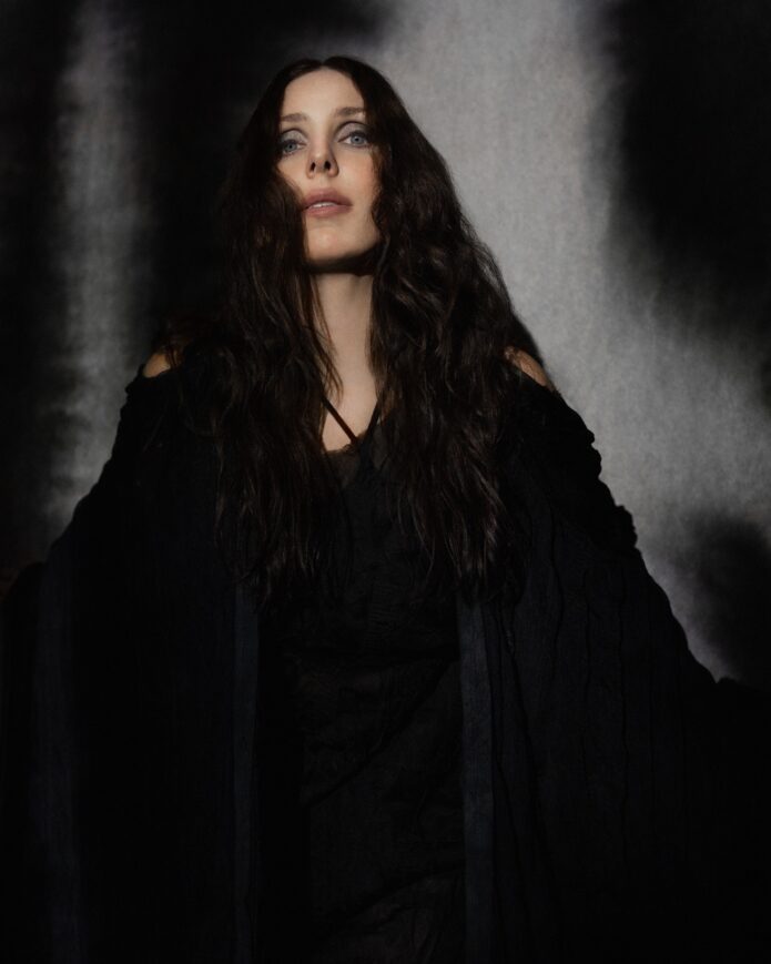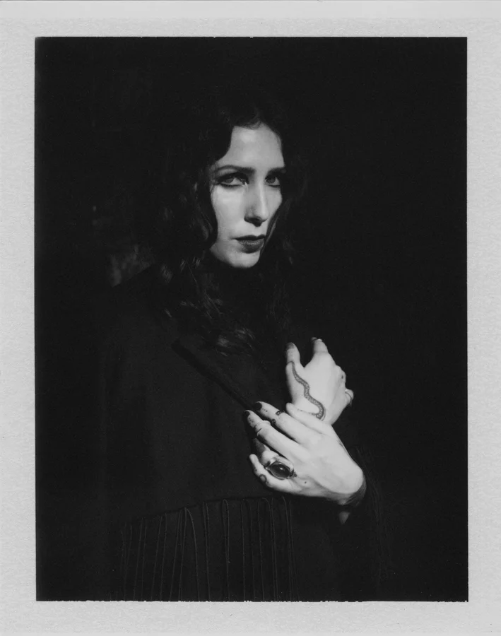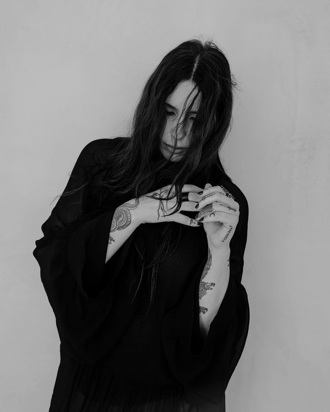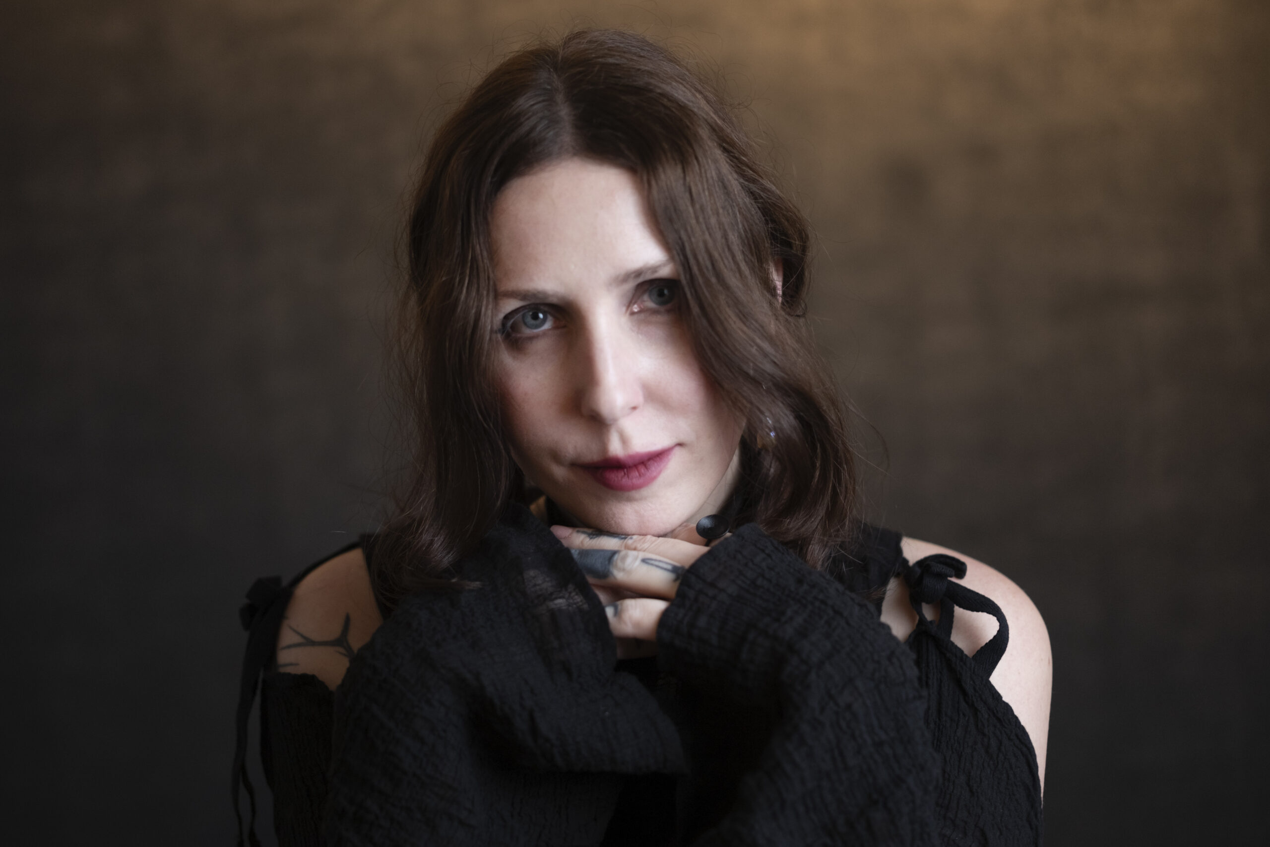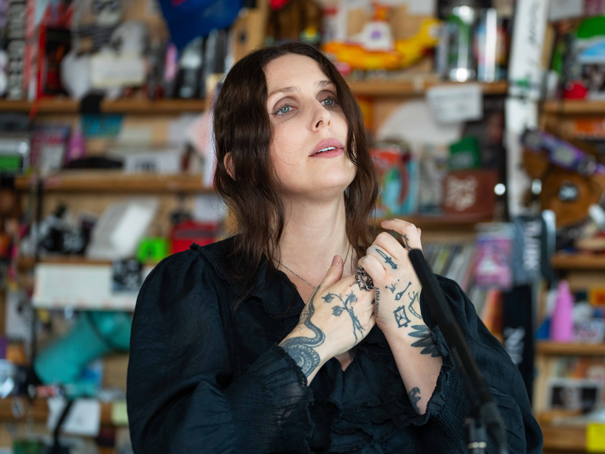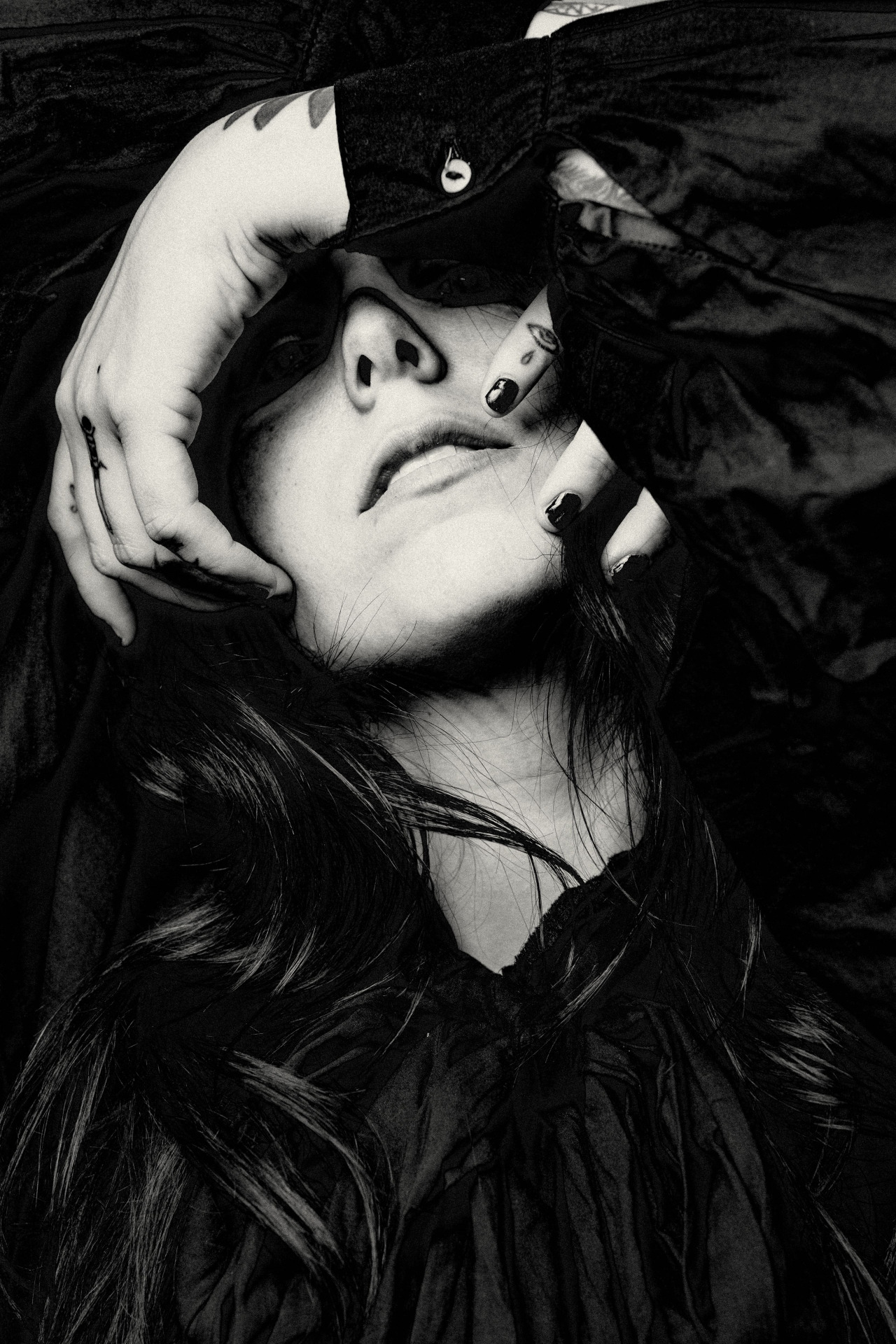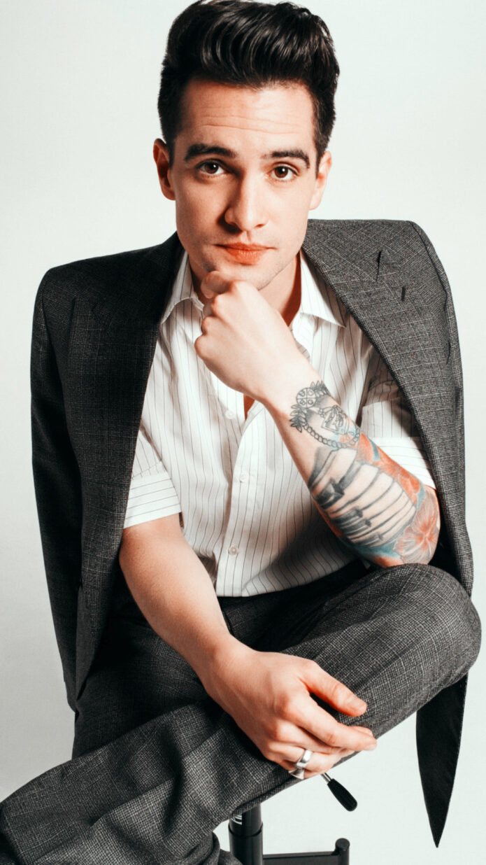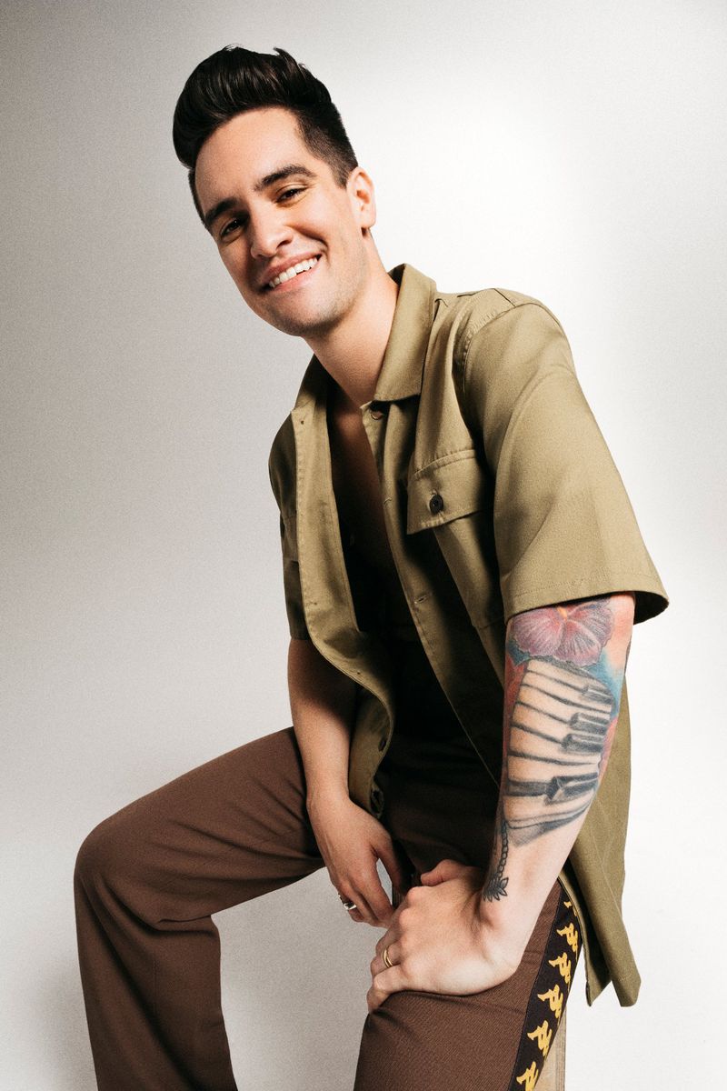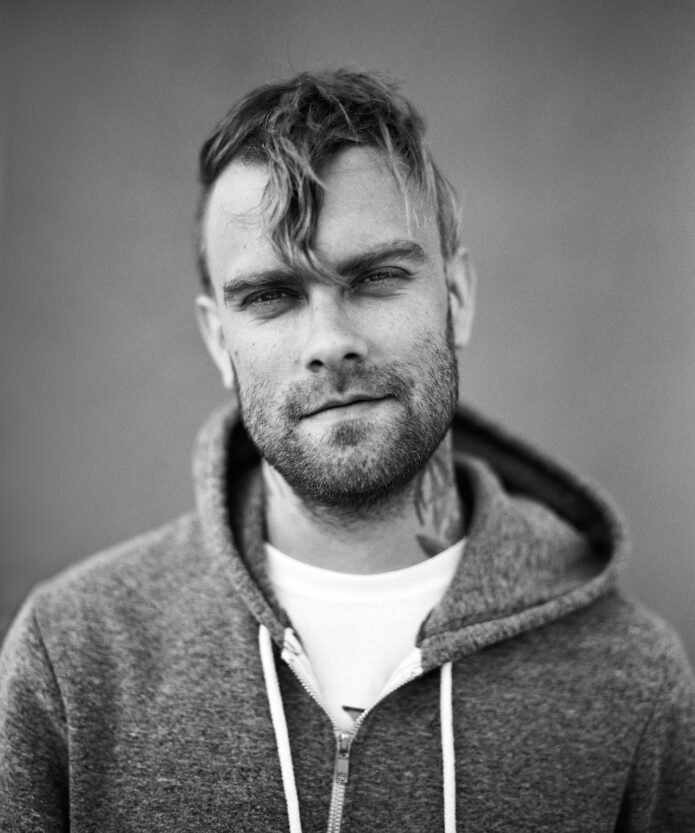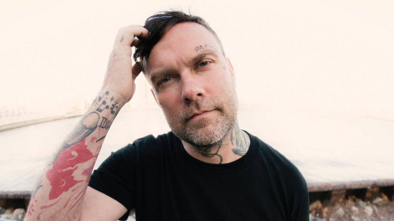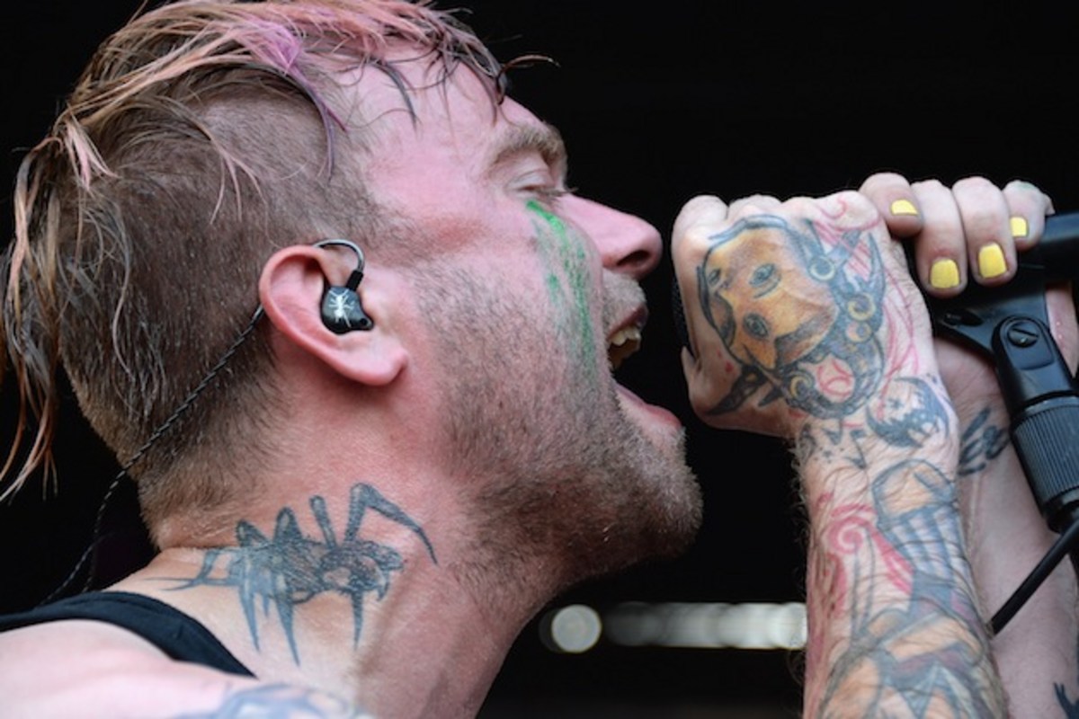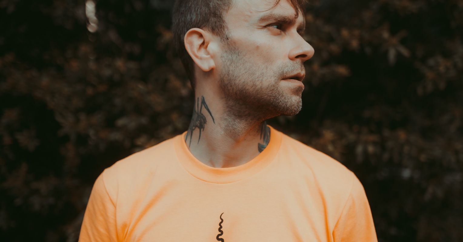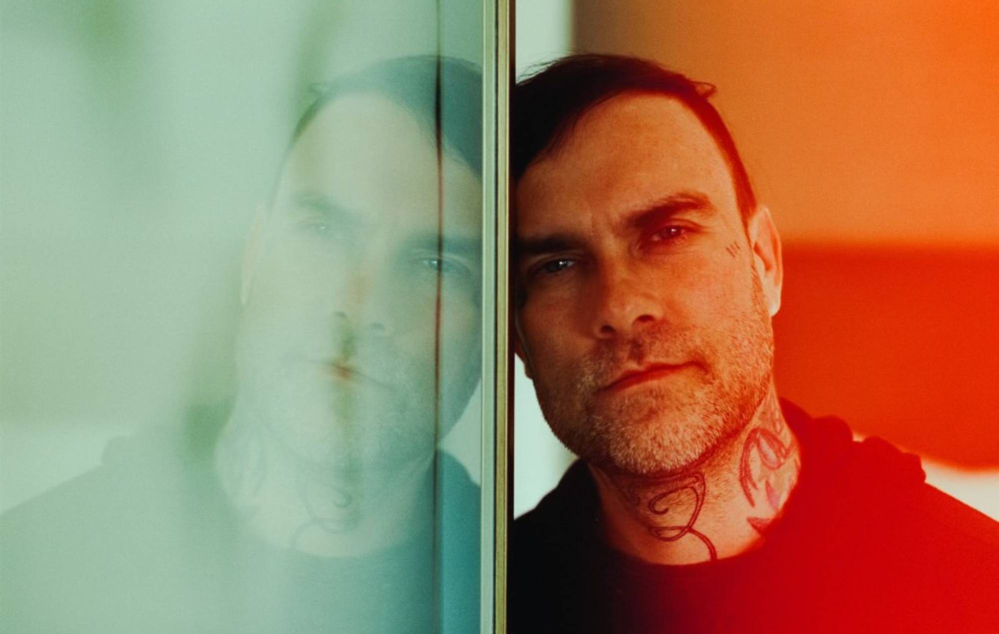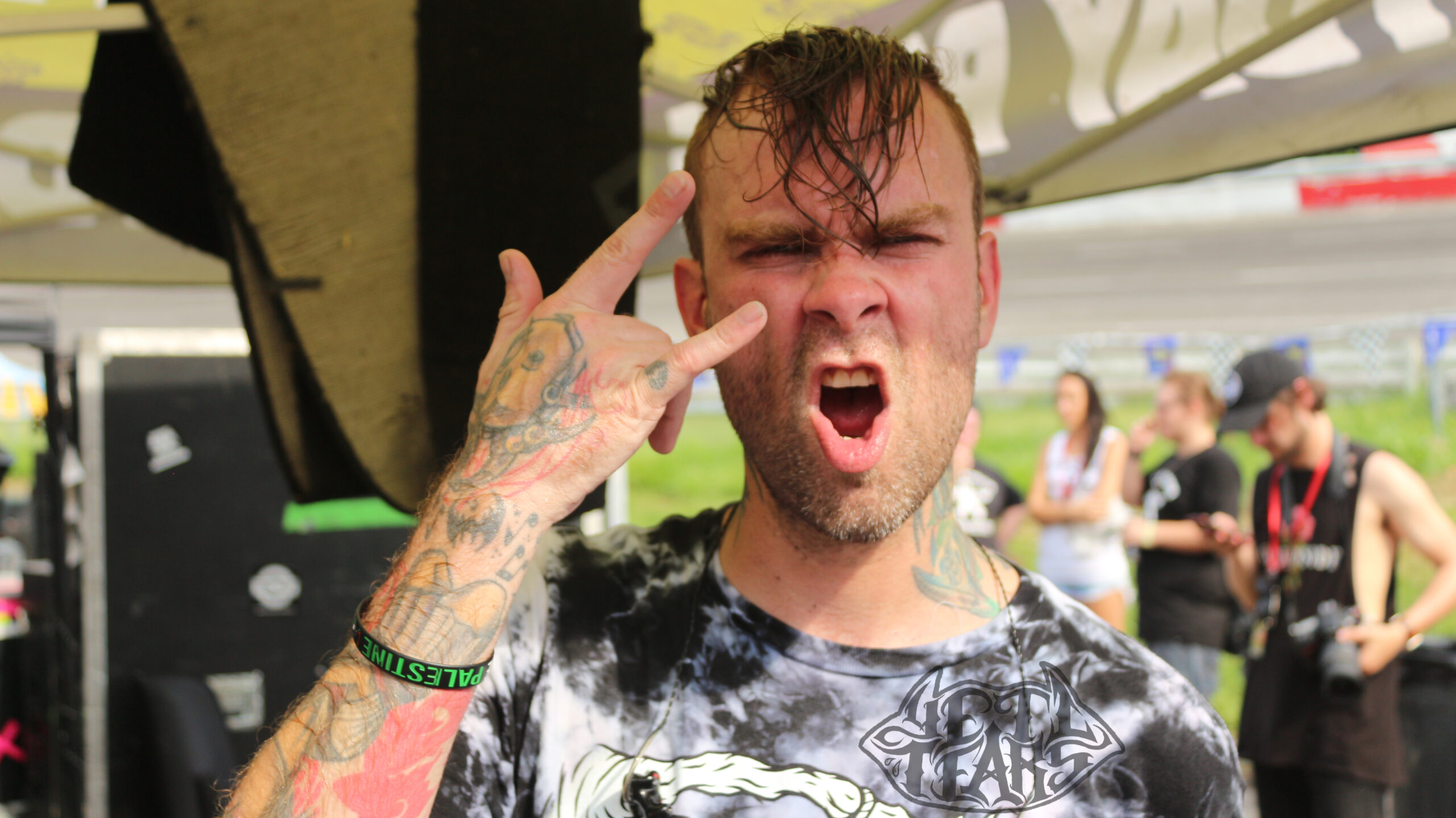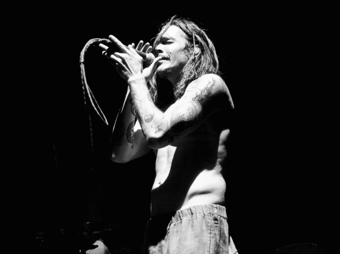
Brandon Boyd’s tattoos have always made sense beside his art. They are expressive without looking like a matching set, and they carry the same loose, hand-drawn energy that shows up in his paintings and notebooks. The arms do most of the talking, with large black-and-grey pieces, lettering, symbols, and plenty of linework that rewards a closer look.
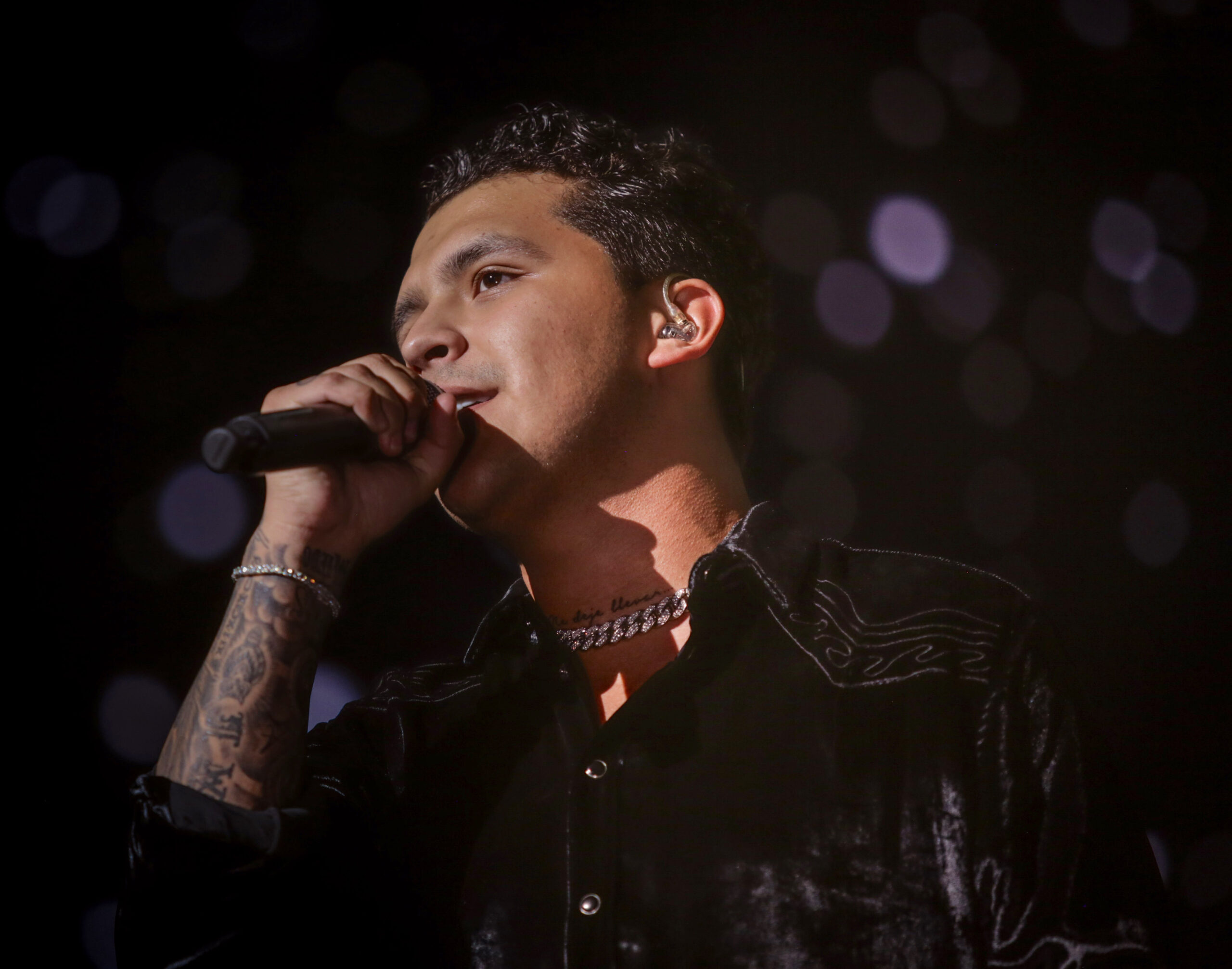
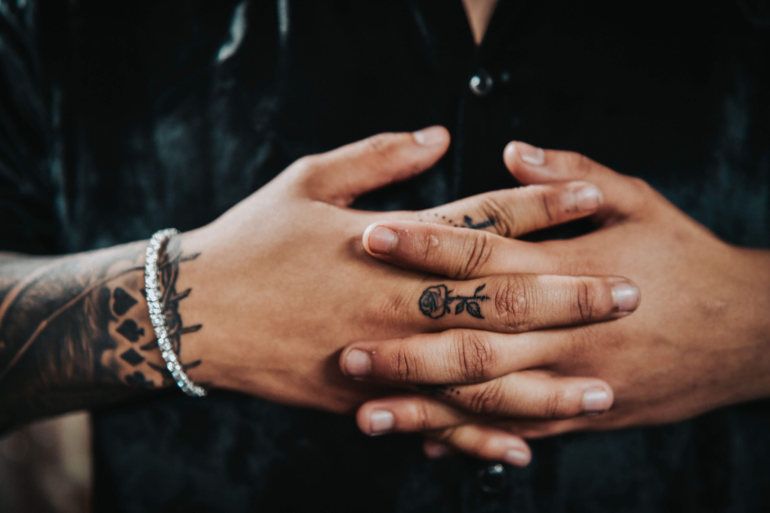
His collection also feels lived in. Some pieces are easy to spot from the stage, while others only appear when a sleeve is pushed up or a hand turns toward the camera. That mix gives Brandon Boyd tattoos a relaxed quality. They look like ideas gathered over years, not one huge appointment designed to make a single statement.
This guide focuses on tattoo details that are clear in close performance photos and published tattoo coverage. A visible image can show placement and style, but it cannot prove a private meaning. Where the story is not confirmed, it is better to talk about the design itself and leave the personal part to Brandon.
The forearm collection is the clearest starting point
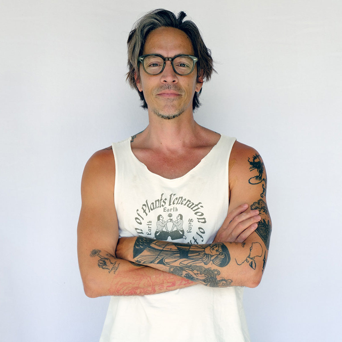
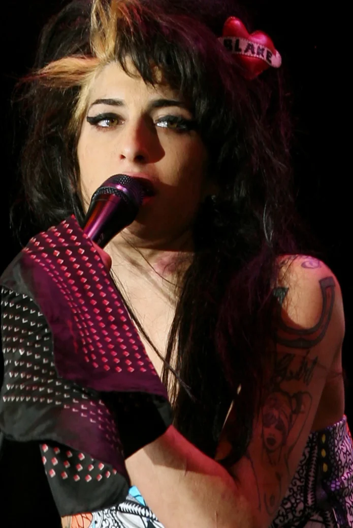
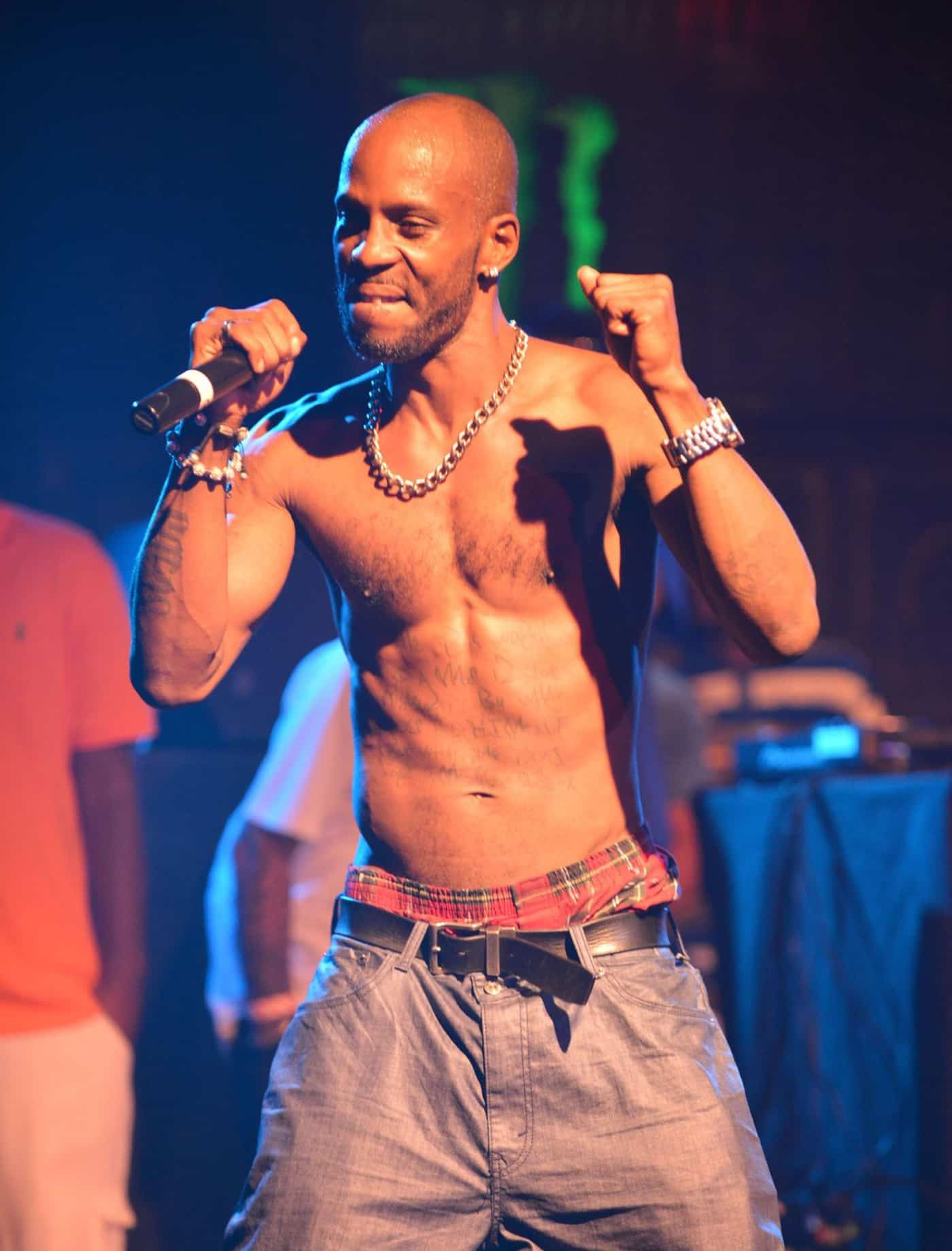
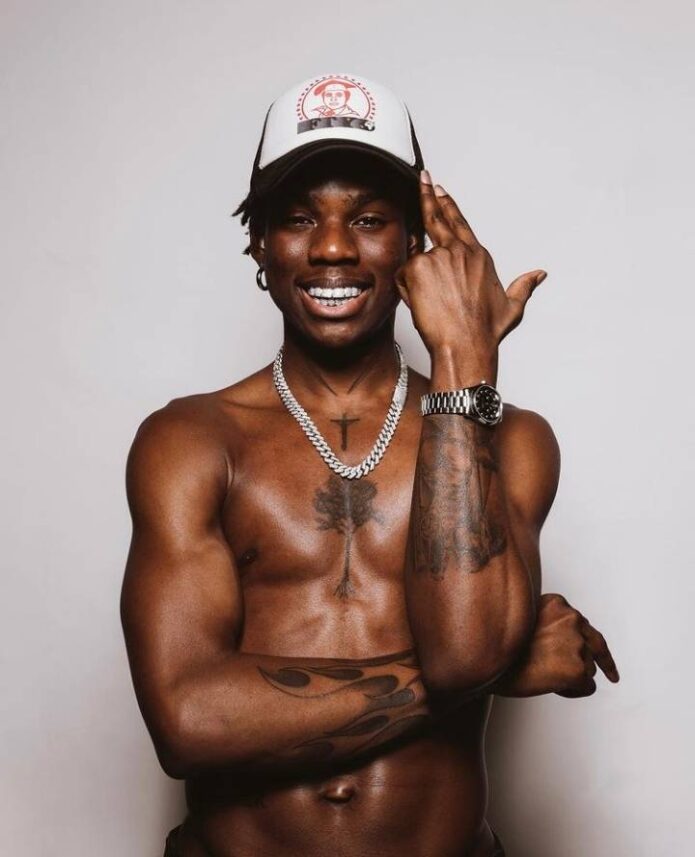
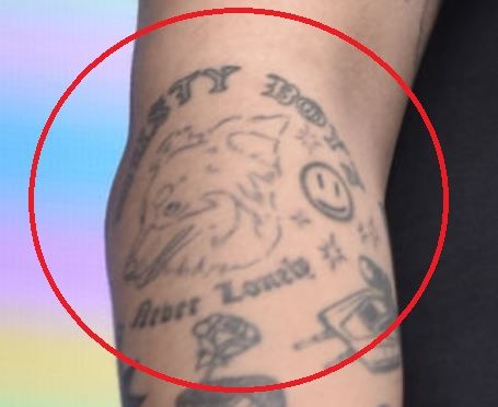
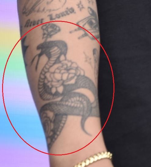
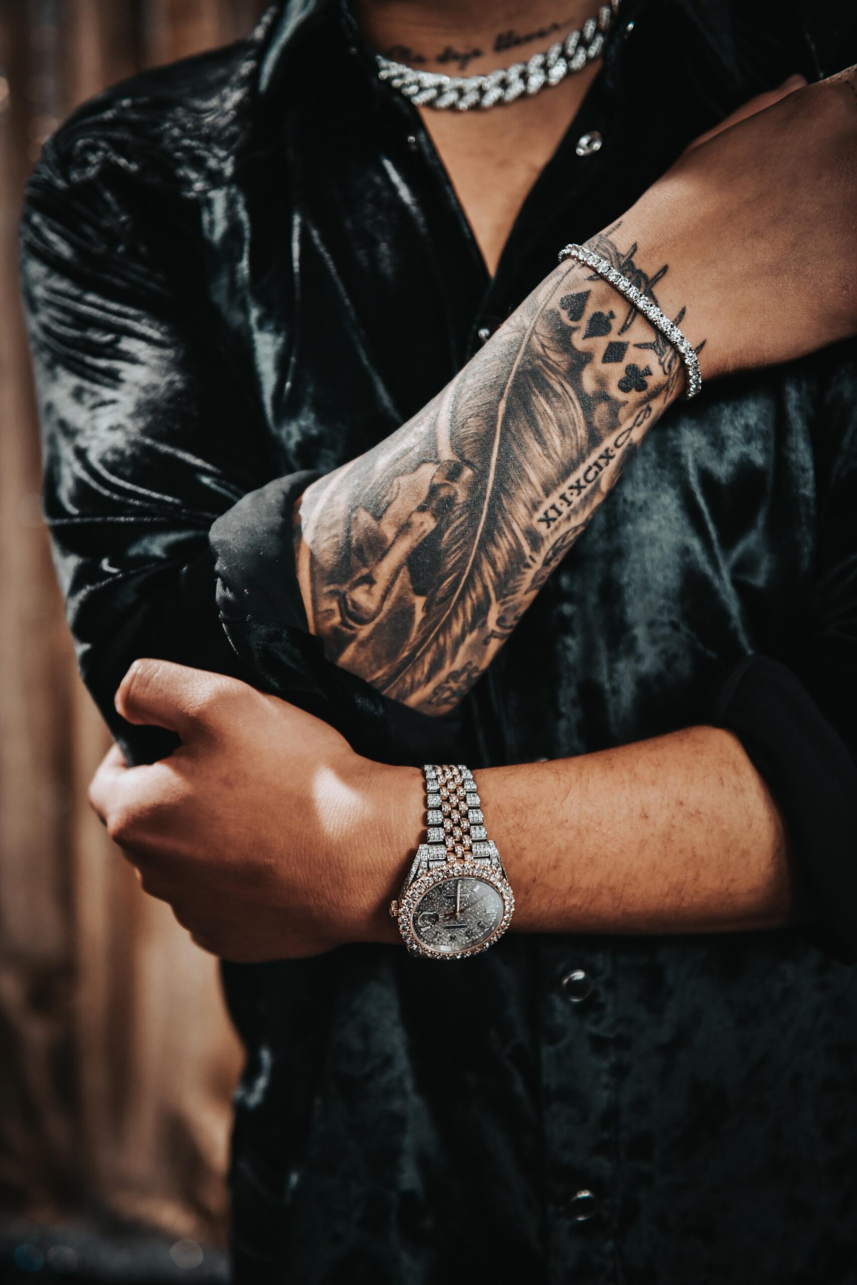
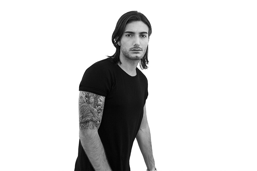
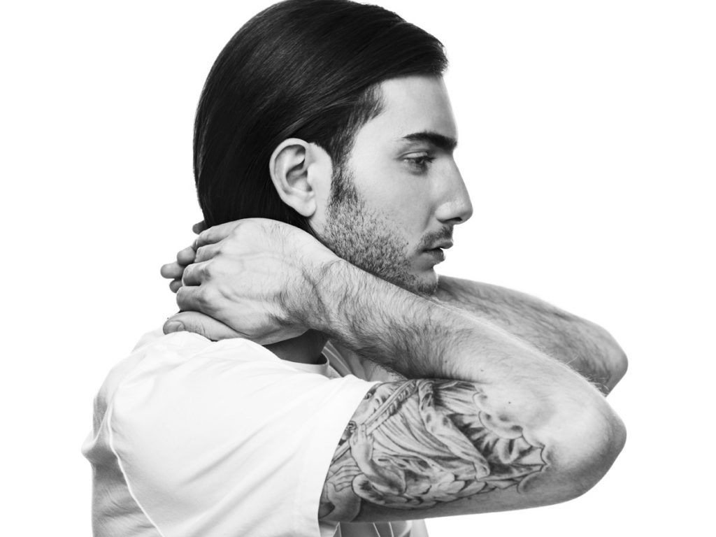
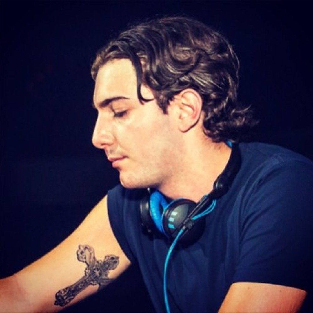
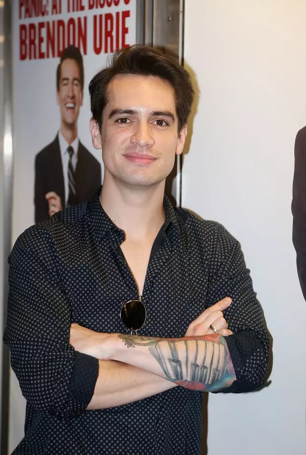
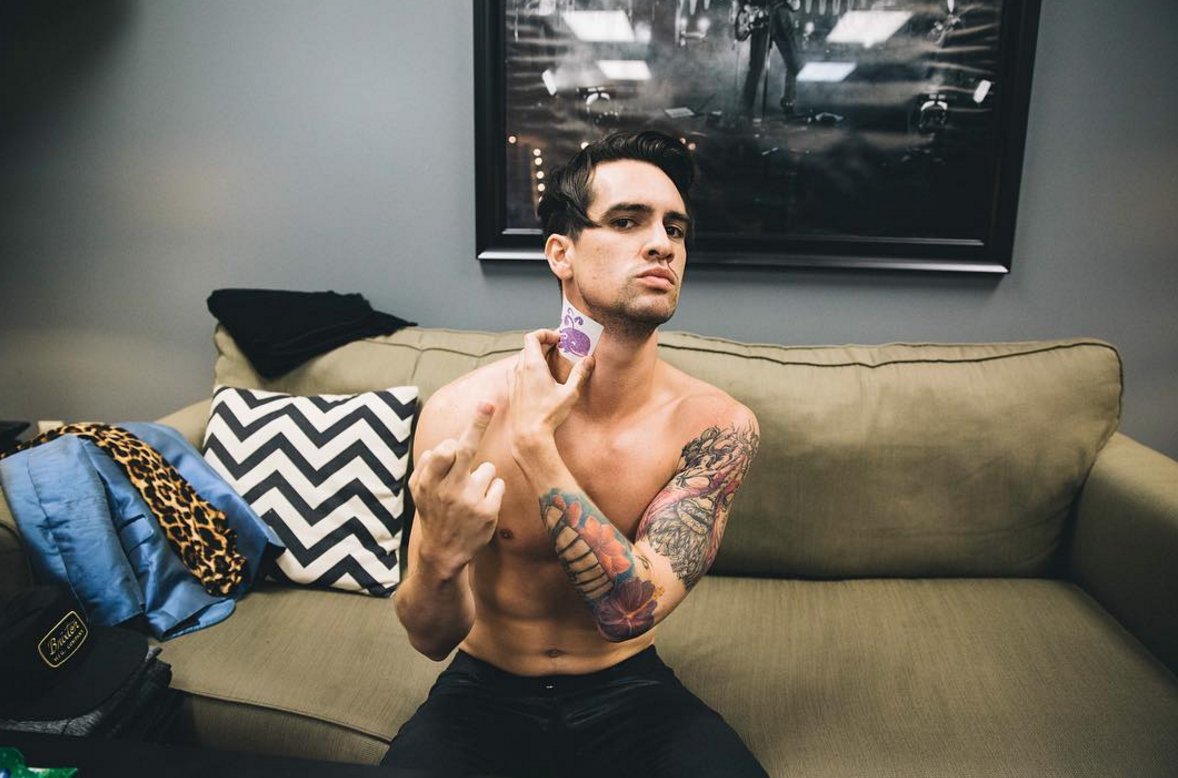
The left forearm sleeve is the piece that pulls the rest of the collection together. From the elbow down toward the wrist, the arm carries a mix of bold dark shapes, curved lines, and illustrative details. It does not read like a single flat panel. The artwork changes scale as it moves around the arm, which gives the sleeve a natural sense of motion.
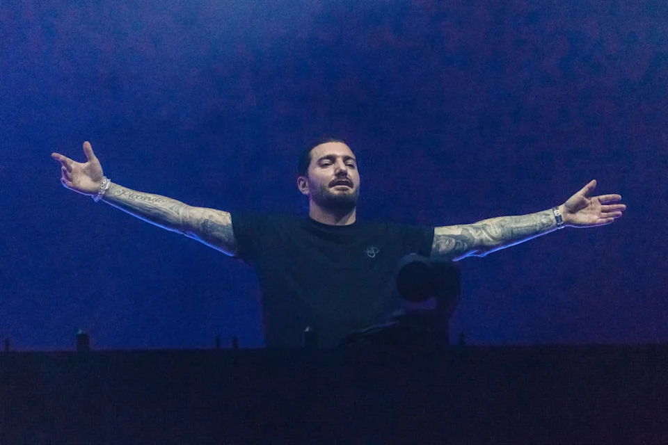
That movement matters on a singer who is constantly turning, reaching, and gripping a microphone. A tattoo can look perfect in a straight-on photo and lose its shape when the arm bends. Brandon’s sleeve has enough directional linework to keep working from the side. The large forms stay visible, while the smaller textures reward anyone standing closer to the stage.
The style is mostly illustrative rather than photorealistic. You can see the artist leaning on contour, dark fills, and a few strong focal shapes instead of trying to render every surface with tiny shading. That keeps the work readable as it ages and helps the sleeve hold its own under stage lighting.
The main lesson is to plan the arm as a moving object. Start with the piece that matters most, then ask how its lines will travel around the elbow and wrist. That simple step can make separate tattoos feel like one collection.
It is also a useful reminder to leave room for future work. A sleeve does not have to be finished in one sitting. Empty skin can give a large design more impact, and it lets later ideas join the arm without looking squeezed into a leftover gap.
The back piece changes the scale
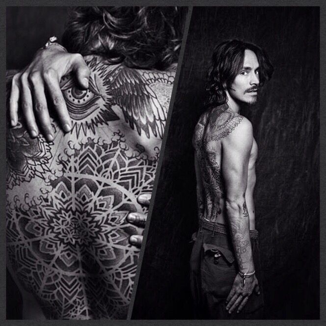
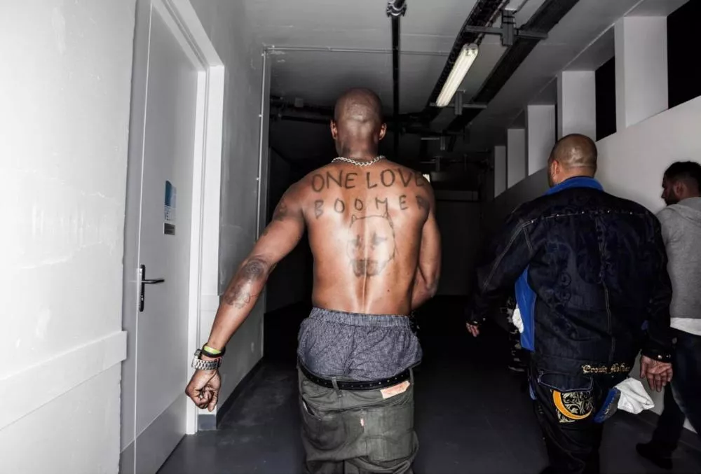
When you move from the arms to Brandon’s back, the tattoo work opens up into a much wider canvas. The geometric shapes have space to stretch across the shoulders and spine, so the design reads as a connected field instead of a stack of small marks.
That wider placement changes how you plan the reference. A back tattoo needs to look good from a distance, but it also needs enough structure to hold up when the body bends and turns. Strong shapes do most of the work here, while smaller textures fill the gaps.
The back image also shows why open skin matters. The negative space gives the darker sections room to breathe and keeps the piece from becoming a flat block of ink.
If you like this kind of large-scale work, start with the main flow before picking every little detail. Decide where the eye should travel across the shoulders, then let the artist build the smaller marks around that path.
Large pieces do not have to be loud in every part. A calm layout with a few strong focal areas can feel more lasting than a design that tries to fill every inch.
The back and arm pieces feel like one collection
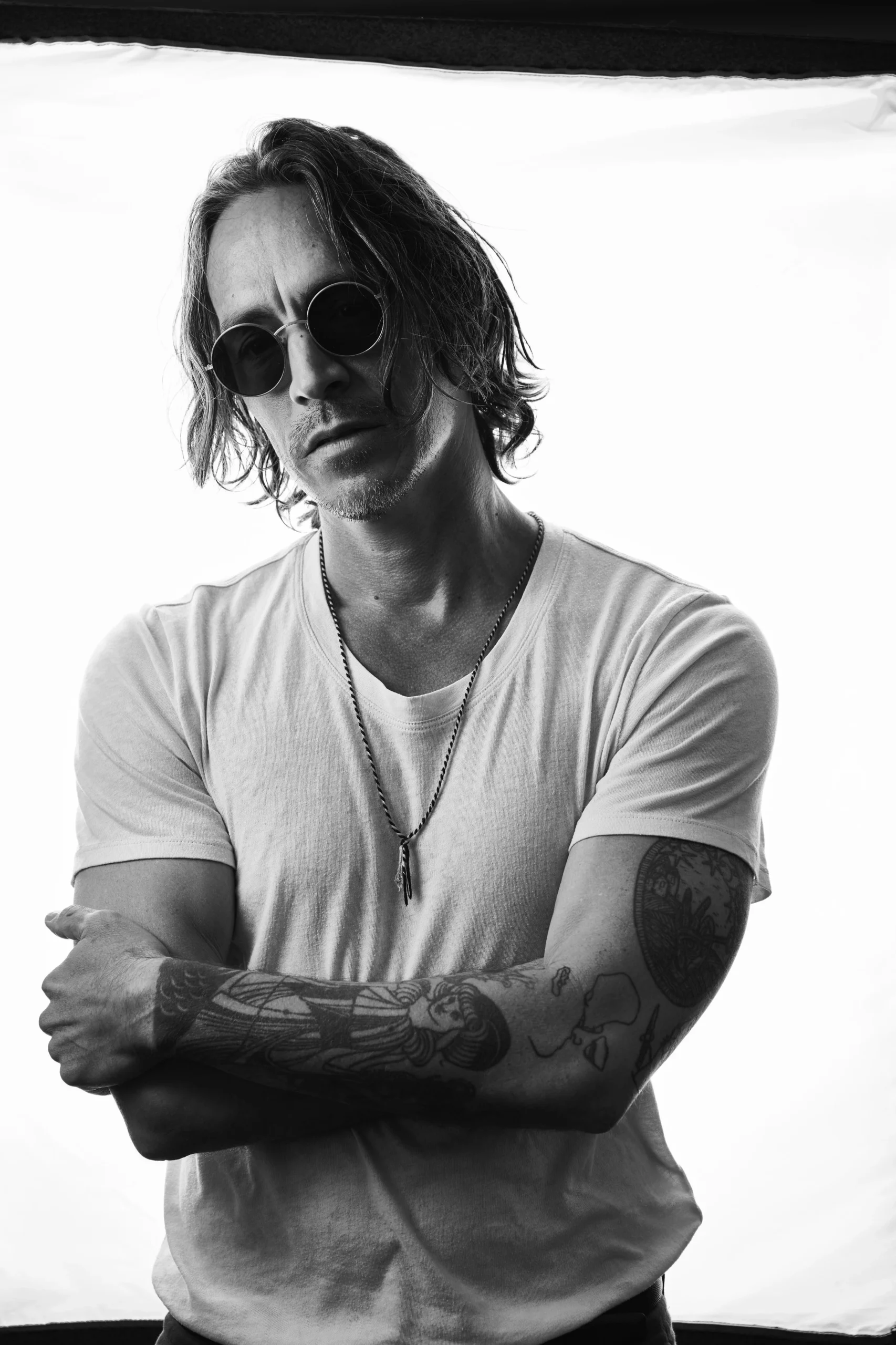
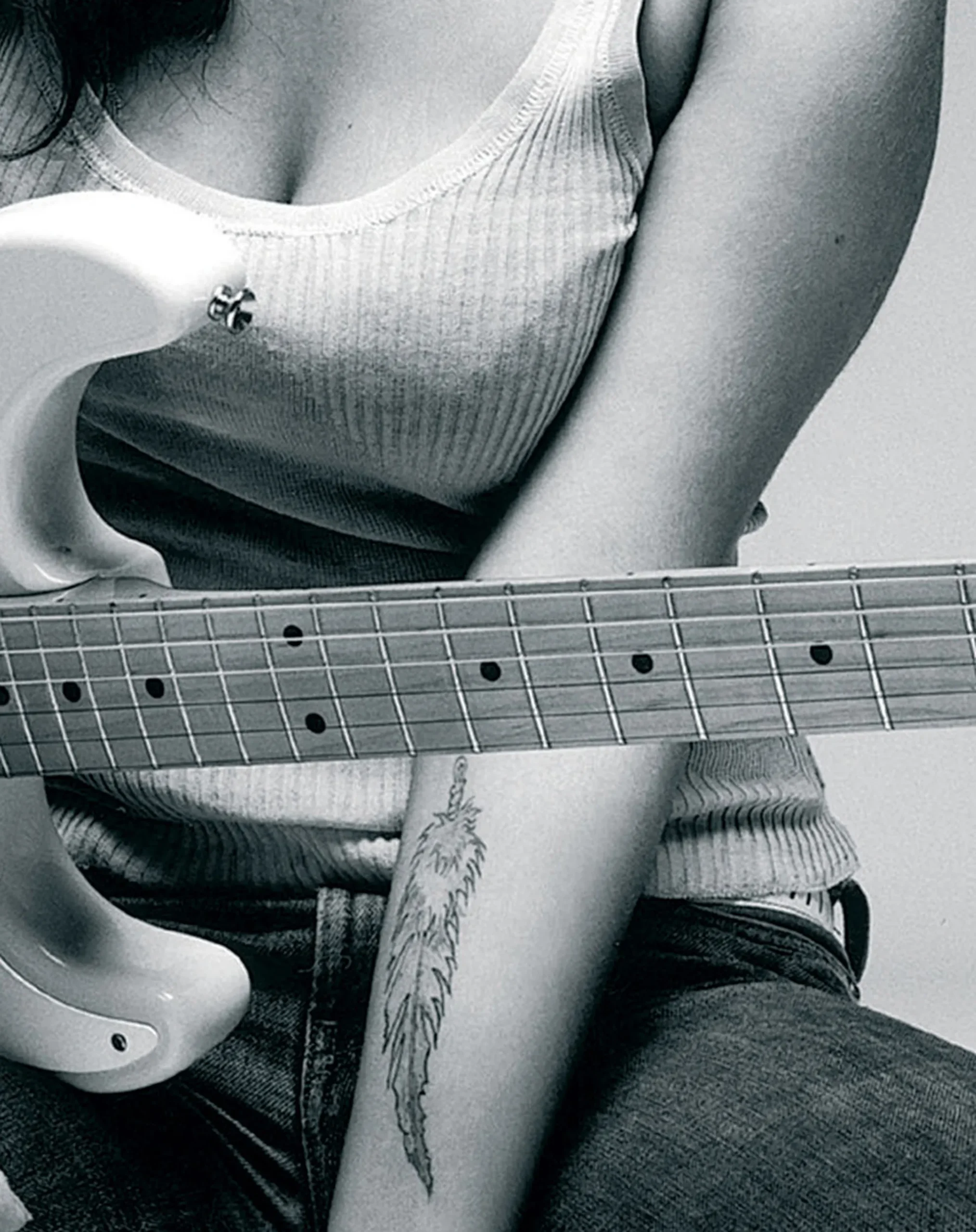
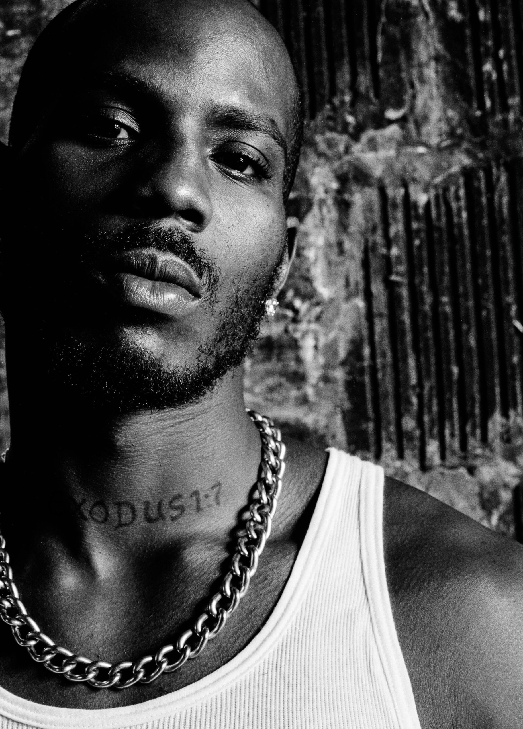
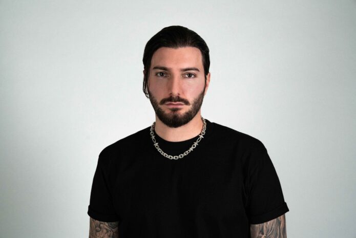
The black-and-white back-and-arm view makes the relationship between placements easier to see. The pieces do not need to match exactly. Shared line weight and a similar graphic mood can be enough to make the body feel connected.
That is useful if you are building a collection over time. Start with one area, watch how the lines point toward the next, and leave room for the artist to respond to the shape of your body.
The best collections usually have contrast. Some areas are dense, some stay open, and some designs are more illustrative than geometric. That change keeps the eye moving.
Arm tattoos also change with posture. A piece can look compact with the arm relaxed, then open up when the shoulder turns or the elbow bends. The design needs to work in those ordinary positions, not only in a posed photo.
That balance between structure and movement is a big part of the appeal. The tattoos feel planned, but they do not look like a uniform.
The portrait work gives the sleeve its human center
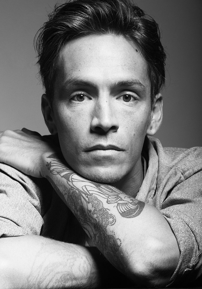
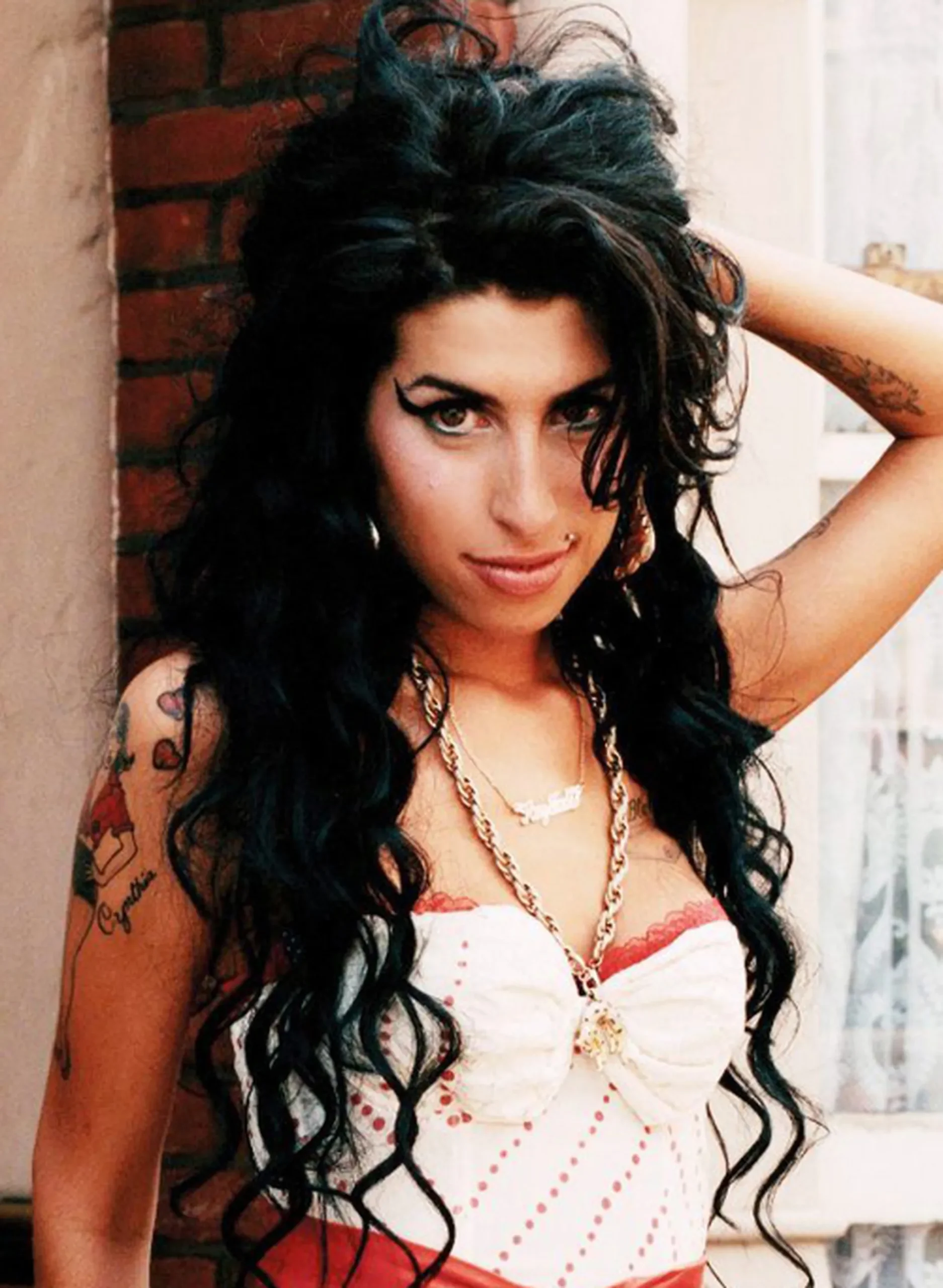
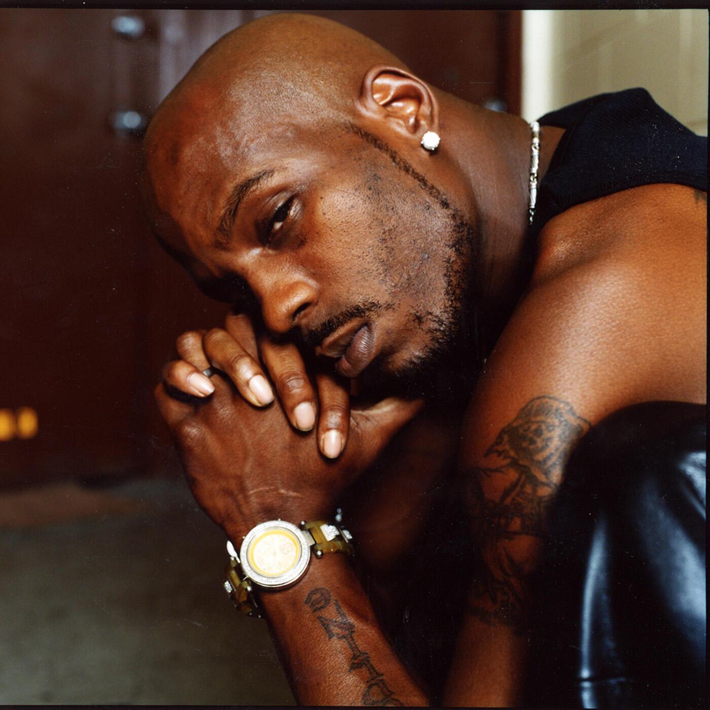
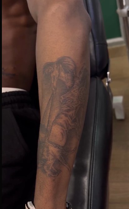
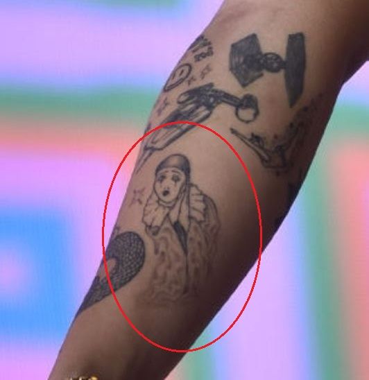
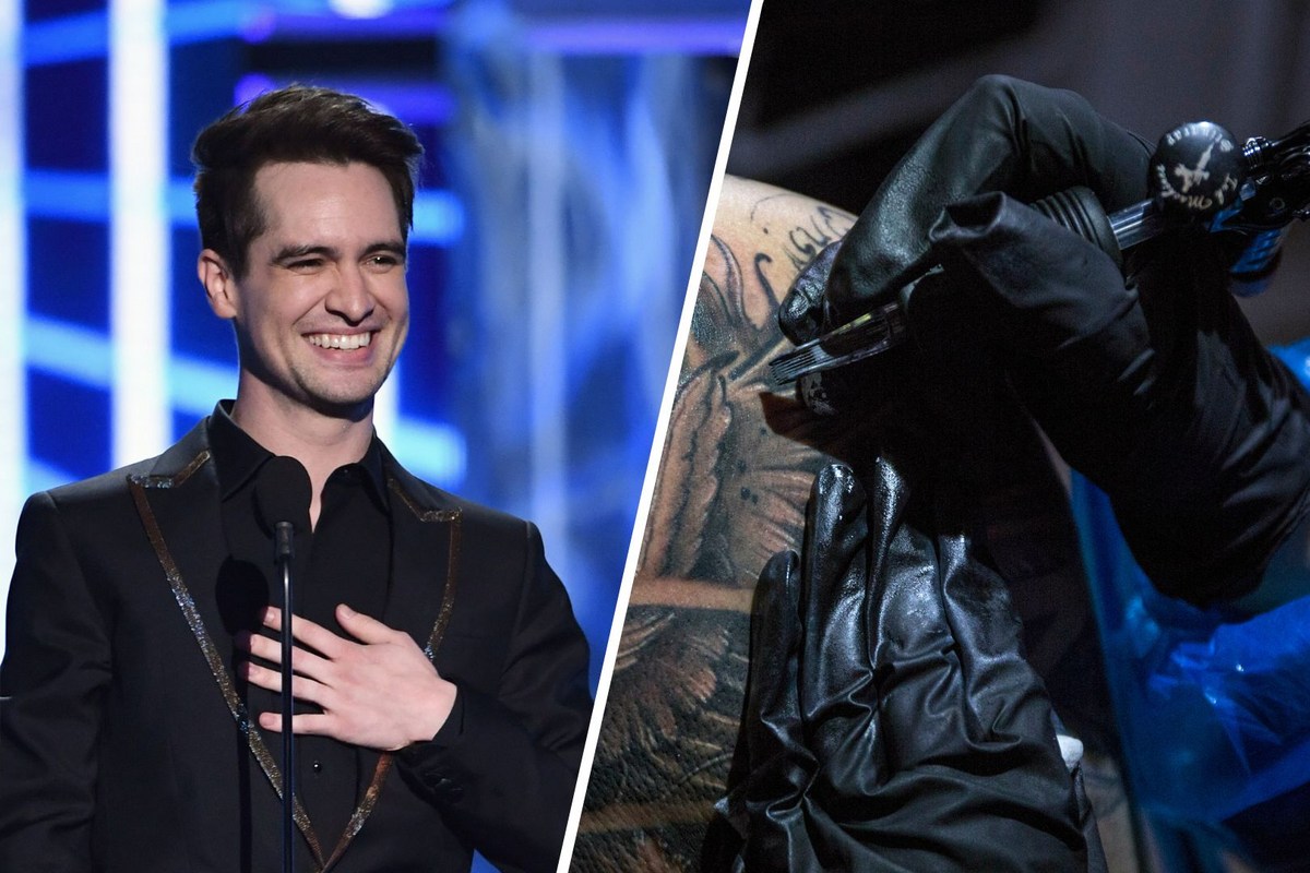
Among the heavier lines and abstract shapes, the portrait-style elements give Brandon’s sleeve a human center. Faces and figures naturally pull the eye because we are wired to look for them. Even when the surrounding work is loose and graphic, a portrait can anchor the composition and make the arm feel like a story rather than a pattern.
Portrait tattoos need a clear silhouette before the detail is added. The expression, angle of the head, and main shadow areas have to work from a distance. Brandon’s visible arm work leans into strong shapes, so the portrait elements can sit beside other designs without disappearing into the background.
If you are thinking about a portrait tattoo, choose the reference carefully and talk through the size before deciding on placement. A face that looks perfect on a phone screen may need more room on skin. Hair, hands, and clothing can become useful framing shapes, but too much detail in a small area can make the result age badly.
The best part of this section is the contrast. The sleeve can be rough around the edges and still contain a focal point that feels careful. That is a good reminder that expressive does not have to mean careless.
Black-and-grey portrait work can also sit comfortably beside color. The eye reads the face first, then moves into the surrounding marks. That order keeps the arm from becoming visually flat, even when several styles share the same space.
The full forearm shows how the pieces move together
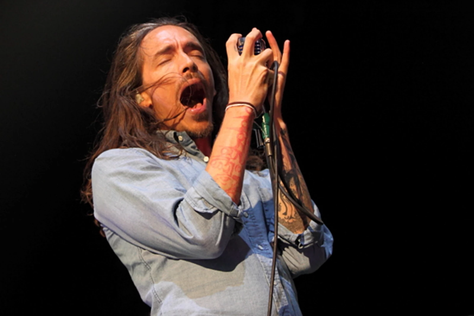
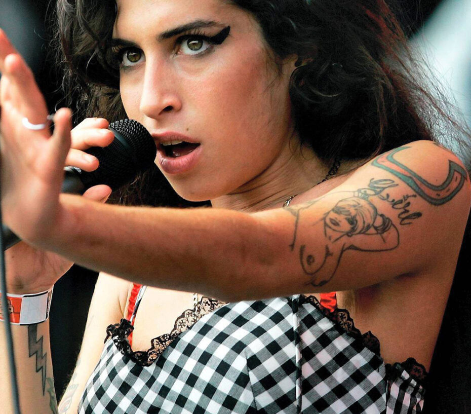
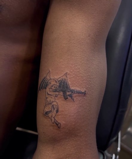
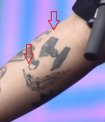
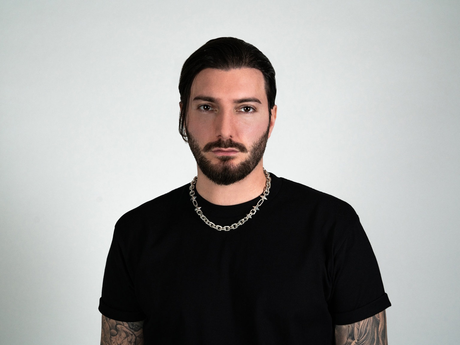
A wider view makes the overall plan easier to see. Brandon’s forearm is not built around one repeating icon. It mixes different subjects, line weights, and pockets of open skin. The unifying element is the movement of the composition and the way each new piece responds to the shapes already there.
That kind of collection is useful inspiration if you want tattoos that grow with you. You can begin with one design that has real meaning, then add nearby work only when it improves the flow. There is no need to fill every gap on the first day. In fact, a little patience usually gives the later tattoos more room to breathe.
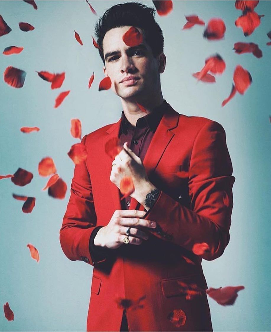
Color is another part of the balance. Even when most of the work is dark, a small amount of red, blue, or muted tone can change the rhythm of the whole arm. The color does not have to be everywhere. A few controlled accents can make a black-and-grey sleeve feel warmer without turning it into a rainbow patchwork.
A good sleeve looks connected without looking cloned. Choose a shared mood, let the sizes vary, and keep checking the design from the angles people will actually see in everyday life.
Placement matters as much as the drawing. A mark can feel totally different when it wraps toward the inner arm, sits beside the wrist bone, or stays visible when the hand is relaxed.
That is what makes Brandon Boyd tattoos stand out. They feel artistic, personal, and open to change. The collection has enough structure to read clearly, but it still leaves room for rough edges and new ideas. If you are using his work as inspiration, borrow that freedom. Pick subjects that mean something to you, give the artist room to draw in their own voice, and let the sleeve become a record of where you have been.
Before booking a similar project, bring references that show the kind of movement and texture you like, not just a celebrity photo. Talk through how the design will wrap, which parts should stay bold, and how much empty skin you want to keep. Those choices will matter long after the first glance at the finished tattoo.