codex

Arcángel Tattoos: The Memorial Chest Mural and His Full-Torso Ink

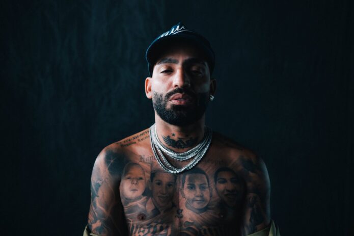
Arcángel’s chest and stomach carry a black-and-grey mural centered on four portraits of his late brother, Justin Santos. LOS40 reported that the portraits show Justin at different ages; Canal 1 quoted Arcángel saying he wanted to see his brother whenever he looked at his reflection.

Bold lettering, religious details and darker imagery continue below the faces. The photographs show how the work spans his torso; the interviews are the source for the memorial’s meaning, while the surrounding symbols aren’t all explained publicly.

The memorial portraits are the heart of Arcángel’s chest tattoo
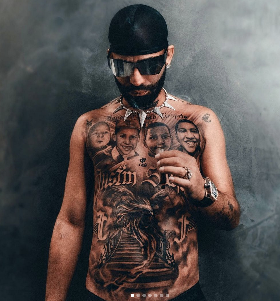
Arcángel tattoos: Tattoo evidence: seated view of the four memorial portraits and lower chest work.

Four faces span the upper chest, each with a different expression and age. That variation reads like a family record rather than four repeated headshots. They sit above the script and denser work below.

In wider photos, the portraits remain the first thing you see when Arcángel opens his arms. Closer views make their expressions easier to pick out. The space around the faces keeps them distinct from the lettering beneath.

The lettering gives the full-torso piece a strong middle line
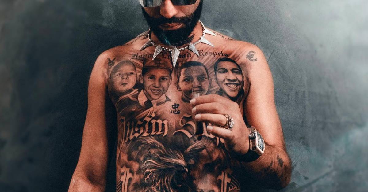
Arcángel tattoos: Tattoo evidence: close torso crop showing memorial portraits, lettering and shading.

Large lettering forms a strong line across the torso beneath the portraits. It links the upper-chest faces to the lower imagery instead of reading as a separate text tattoo. Its dark strokes also stand apart from the softer portrait shading.

That horizontal band helps the mural read in stages: the faces above, lettering through the middle, and darker work below. The article doesn’t identify the words, so their visual role is clearer than their wording.

The lower section turns the chest mural into a full-torso composition
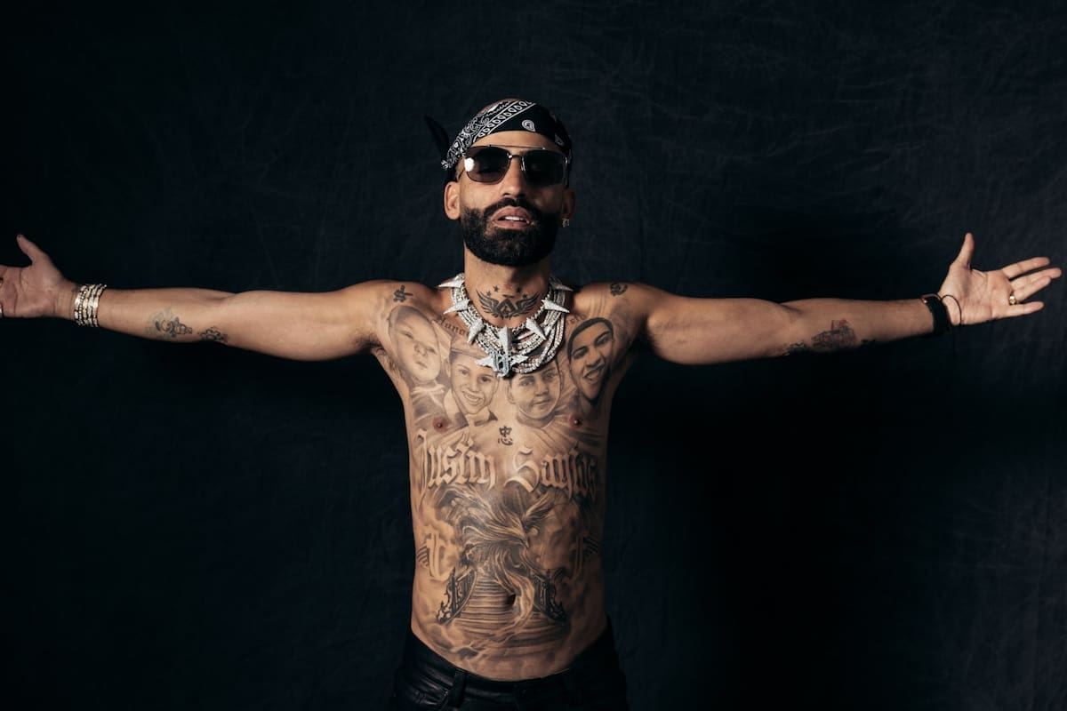
Arcángel tattoos: Tattoo evidence: wide arms-open portrait showing the mural from shoulders to abdomen.

The mural continues below the lettering, across the abdomen. Darker imagery, ornamental shapes and a central subject give the lower section a different feel from the portraits. The shading deepens and draws the eye down the body.

A wide photo with Arcángel’s arms open shows the design spreading from shoulder to shoulder before narrowing toward his stomach. The images connect the chest and abdomen, with no blank strip between them. It’s a specific memorial composition, not a rule that every torso piece has to cover the whole area.

Religious details and symbols add another layer to the memorial
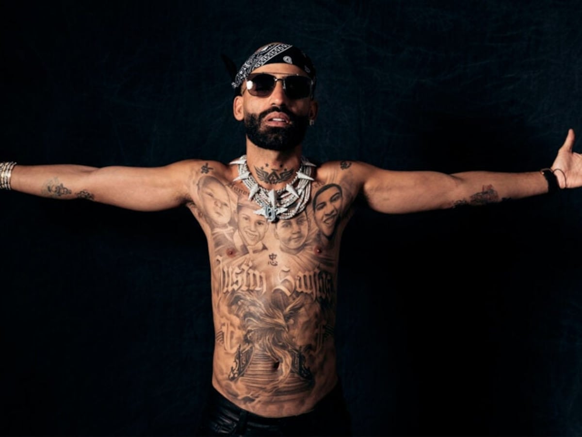
Arcángel tattoos: Tattoo evidence: stage portrait with chest portraits, script and symbols visible.

GQ México’s Tattoo Tour describes Arcángel’s collection as a mix of portraits, biblical figures, religious symbols, historical references and animals. In these photos, those details surround the portraits of Justin. Arcángel has explained the memorial, but the public account doesn’t assign a meaning to every other shape.

The black-and-grey treatment lets the mural shift between soft portrait shading, darker forms and bold script. Those textures keep a large area from reading as one flat block, while the faces remain the clearest point of focus.

The tattoo looks different in recovery photos, and that matters
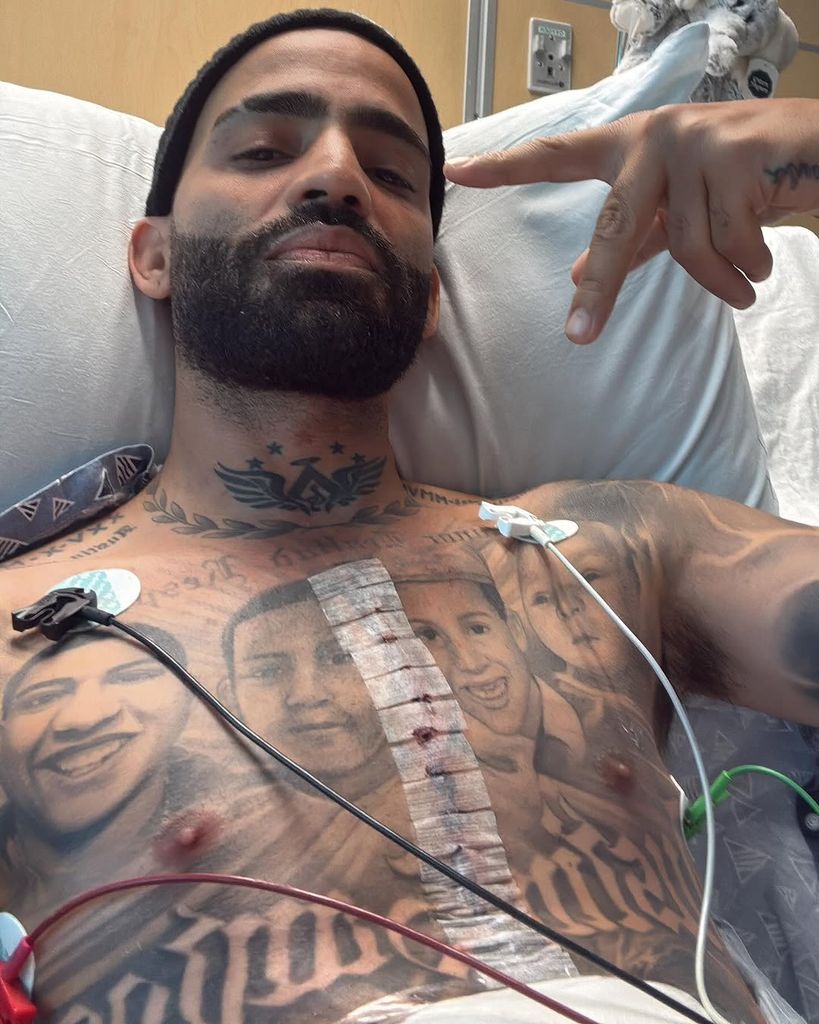
Arcángel tattoos: Tattoo evidence: recovery selfie showing the portrait mural around the surgical dressing.

A recovery photo after heart surgery shows medical tape and monitoring leads across Arcángel’s chest, with the tattoo visible around the dressing. He has spoken about worrying that the mural could be damaged. The close angle and cables obscure parts of the work, though the image shows how it sits around the center of his chest.

A chest piece moves with breathing and the arms. This photo is useful context, but it isn’t the clearest guide to fine details; the wider portraits show the overall layout more clearly.

What to borrow from Arcángel’s full-torso tattoo

The clearest design choice is the order: Justin’s portraits lead, lettering connects the upper and lower work, and the darker imagery carries the mural down the torso. That keeps the memorial visible within a much larger composition.

If you’re planning a memorial tattoo, decide which image should draw the eye first, then plan how text and background will sit around it. A large project can be built over time, but it helps to leave a path for connecting later work.
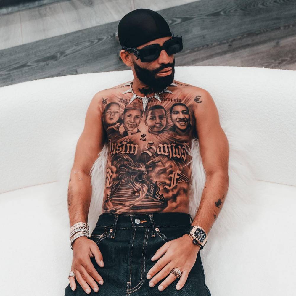
Arcángel tattoos: Tattoo evidence: full-torso seated view showing the four memorial portraits, lettering and lower composition.

The portraits are tied to Arcángel’s brother and family. The layout can be a visual reference, but its subject and story are his. Browse the celebrity tattoo archive for other collections, and look at how the full composition fits together rather than judging one cropped symbol on its own.
More musician tattoo guides

Scotty Sire Tattoos: The Bear, Cheshire Cat Cover-Up and More

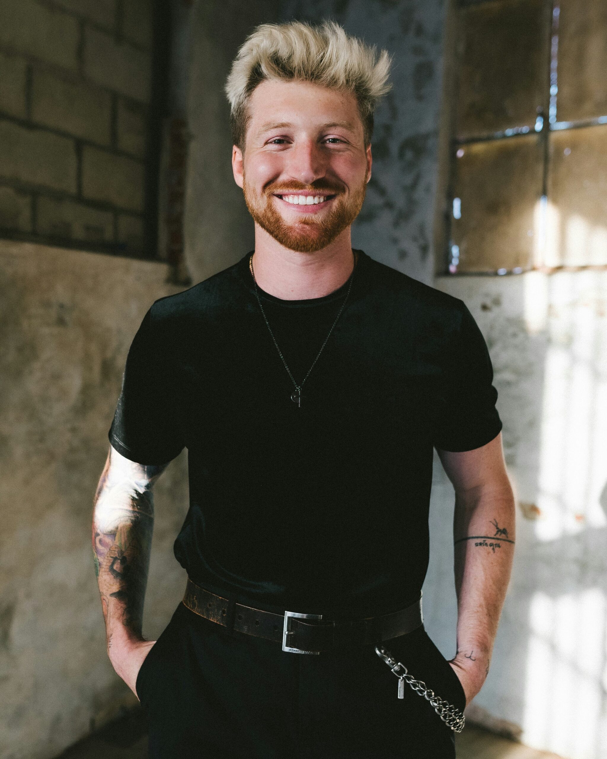
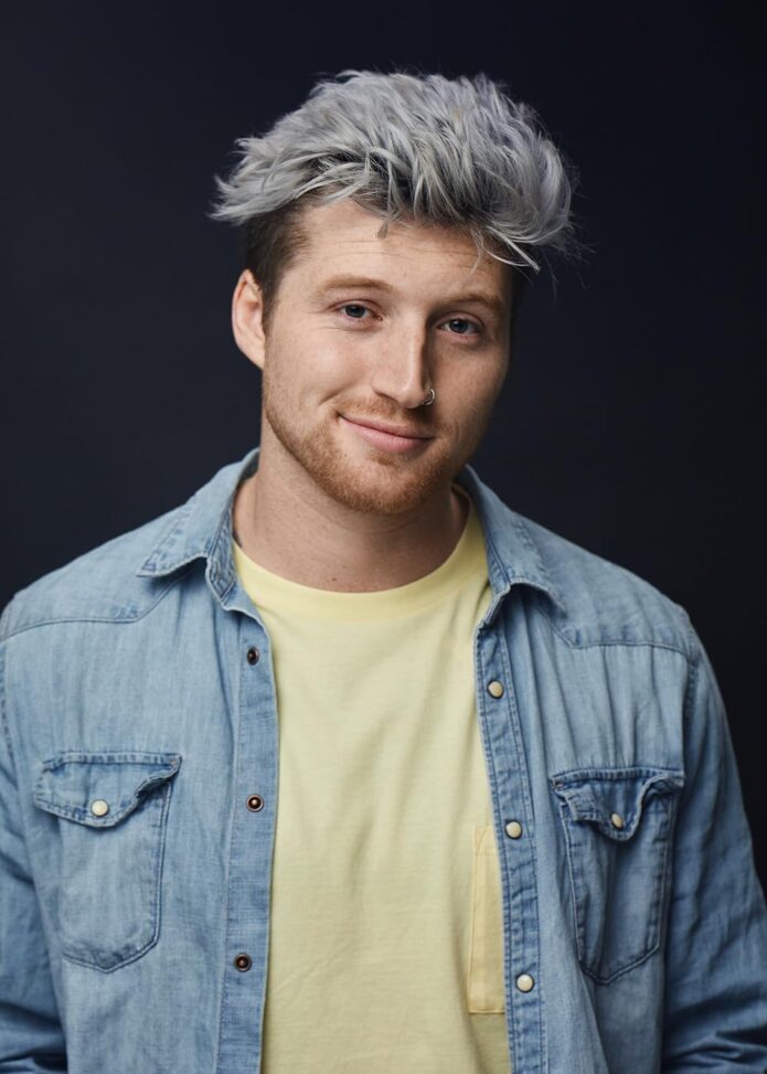
Scotty Sire’s tattoos include a large bear on his side, a Cheshire Cat cover-up on his abdomen, a portrait of David Dobrik, and dense chest and arm work. The collection is easy to recognize, but it wasn’t planned as one matching sleeve.

Sire first became known through Vine and YouTube before moving into music. His tattoos include jokes, friends and other pieces he liked enough to keep. Inked has documented the collection in an interview and tattoo-tour video; its YouTuber roundup also describes the bear, cat cover-up and Dobrik portrait.

The bear, cat and chest tattoos make the collection easy to spot

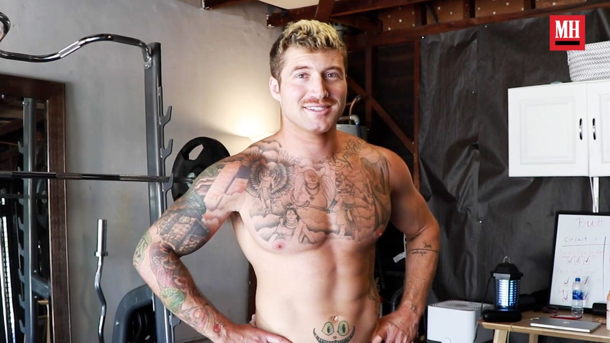
Scotty Sire tattoos: Tattoo evidence: shirtless Men’s Health portrait showing the chest, sleeves and the cat-face cover-up on the abdomen.
Sire told Inked that he got his first tattoo at 18, while he was still in high school. The large bear on his side contains several smaller references: a four-leaf clover, a CD eyepatch, a fish with legs, an anchor, and a chain bearing the words “The Kids Want Techno.”
The bear reads as a collage rather than one symbol. You notice the animal first, then the smaller references. They don’t have to point to one shared meaning.

His tattoos get a real stage test

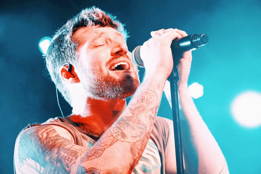
Scotty Sire tattoos: Tattoo evidence: live tour photograph showing both tattooed arms in a distinct performance setting.

Inked’s photographs show how the work sits across Sire’s upper body. His chest has a dense mix of linework and shaded images, while his left arm is darker and more compact. Wide shots don’t reveal every detail, but they do show the overall coverage.

The pieces share space without forming one continuous design. There are gaps between images on the chest, while the arm reads as a heavier block of ink. That contrast is visible in the tour photo and helps explain how the collection looks in motion, not just in close-up.

A busy collection isn’t the same as a finished sleeve. Sire’s tattoos vary in scale and placement, which reflects how a collection can build over time.

The arm tattoo sleeve carries the darker work

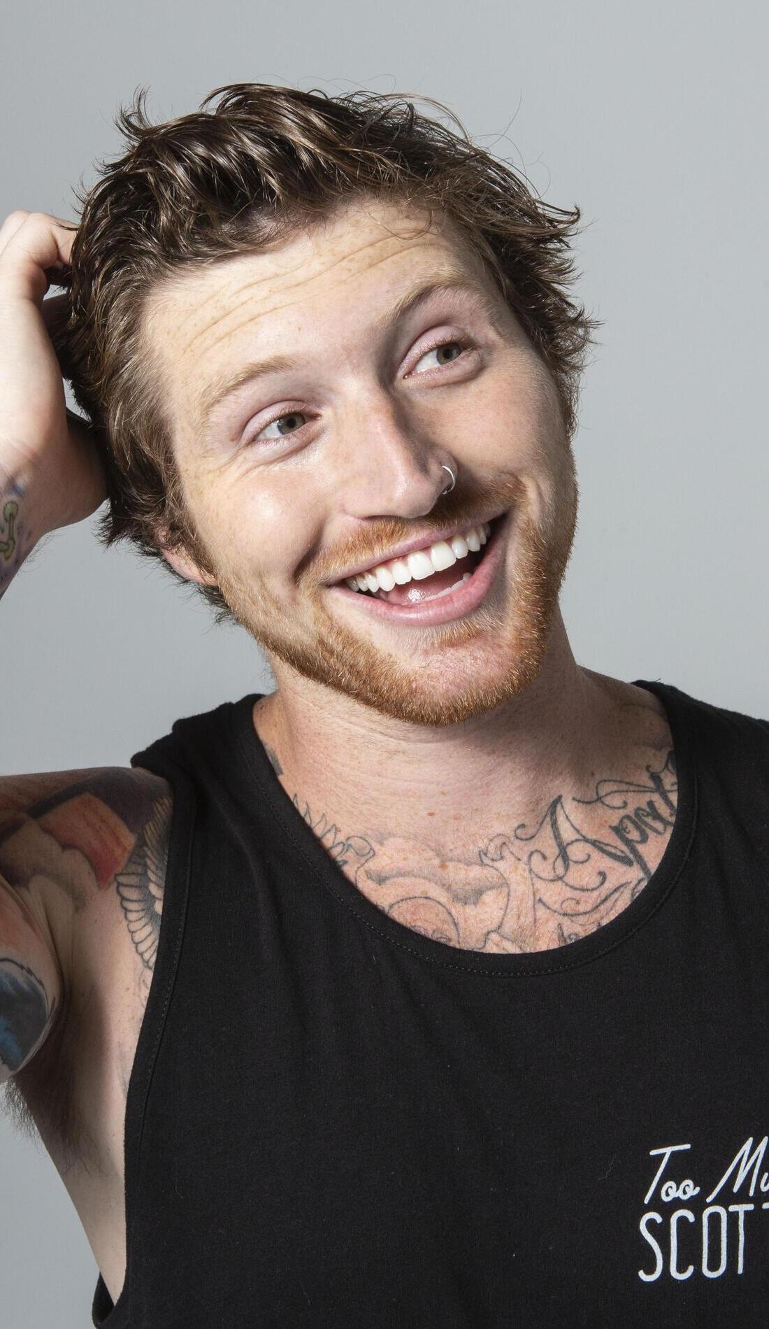
Scotty Sire tattoos: Tattoo evidence: separate high-resolution editorial portrait showing the tattooed arm and smaller wrist pieces.

Sire has said his favorite tattoo is a badly drawn smiley face on his stomach that eventually became a Cheshire Cat. Inked’s YouTuber tattoo roundup also identifies it as a cover-up on his lower abdomen. The finished cat turns the earlier mark into part of the design instead of trying to hide every trace of it.

A cover-up has to work with the lines already on the skin. In this case, the cat’s face gives the artist a strong shape to build around. The stomach also moves and folds, so a clear expression is easier to follow there than a design packed with tiny rigid details.

Scotty’s tattooed arm work changes with the setting

Scotty Sire tattoos: Tattoo evidence: distinct close concert photograph showing the forearm and upper-arm work under colored light.

One of the portraits in Sire’s collection is of fellow YouTuber David Dobrik. It links the tattoo to the people and work around Sire’s early online career, rather than to a traditional family or memorial portrait.

Portraits depend on the reference. A clear photograph and enough room for the face matter, especially on an arm that bends and turns. The placement can change how the likeness reads from different angles.

Newer tattoo work sits inside a bigger collection

Scotty Sire tattoos: Tattoo evidence: high-resolution promotional close portrait showing the chest and shoulder ink in a separate pose.

In the Inked interview, Sire says his most recent tattoo at that time was one he got in Thailand. The piece is mentioned without a detailed explanation, so there’s no confirmed story to add to it.

In portraits and performance photos, the chest and arm work are visible alongside his clothes and overall look. The collection includes the first bear, a cover-up, a friend’s portrait and a Thailand tattoo; the pieces don’t all follow one plan.

What makes Scotty Sire’s tattoos worth borrowing from?

The useful idea is that a tattoo collection can grow from separate choices. Sire’s designs range from a crowded bear collage to a stomach cover-up and an arm portrait. Each has its own story, and the photos show how those pieces sit together now.

More musician tattoo guides

Siiickbrain Tattoos: Face Ink, Horseshoe and Full-Body Designs

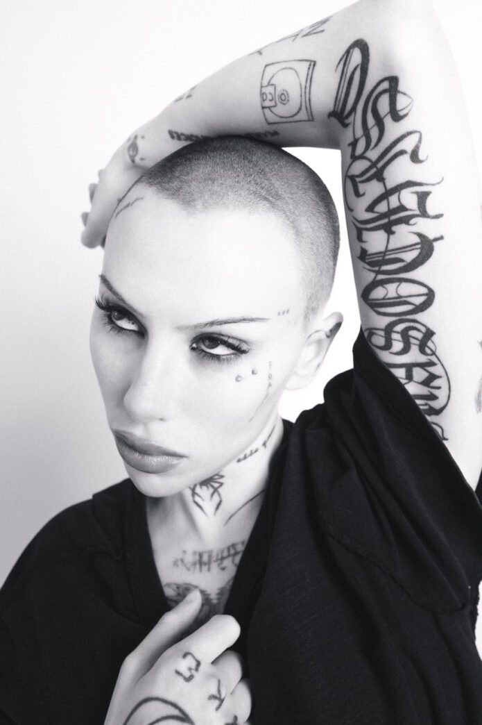
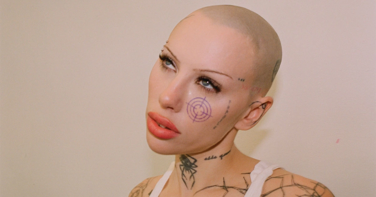
Before turning to music, Caroline Miner used makeup, clothing and other visual work to make sense of difficult feelings. She performs as Siiickbrain, and her tattoos have grown alongside that visual style. PAPER describes ink running from her buzzed head to her toes; Kerrang gives some of the early timeline, while portraits in Revolver and GATA show different parts of the collection. Some marks are clear in the photos, while others are too obscured to identify with confidence.

Face and neck tattoos give Siiickbrain her sharpest signature

Siiickbrain tattoos: Siiickbrain face, cheek and neck tattoo

The purple, target-like tattoo on Siiickbrain’s cheek is the clearest feature in Revolver’s portrait. Fine marks sit near her eye and temple, lettering follows the hairline, and darker work runs down her neck toward the collarbone. The round cheek design stands apart from the looser lines below it.

The cheek mark reads even in a cropped portrait, while the smaller lines need a closer look. The tattoos sit alongside her makeup and piercings, but photos don’t explain what every mark means; the visible shapes are the surest guide.

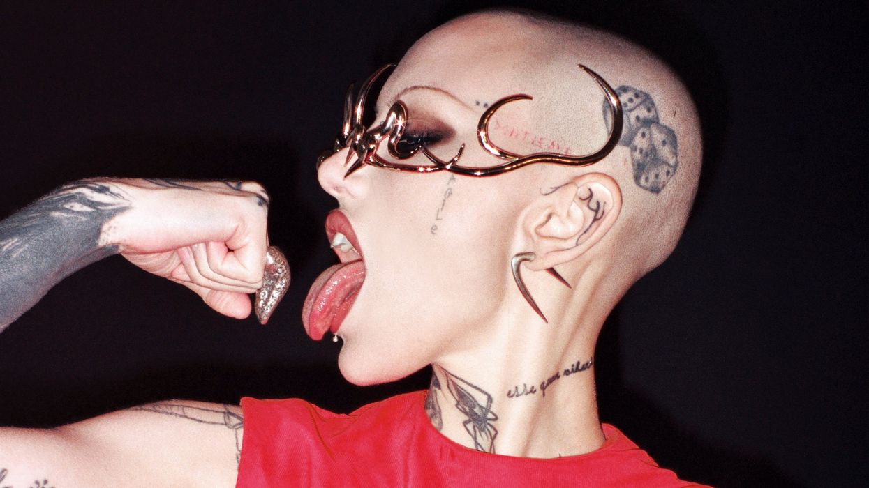
Scalp, ear and neck tattoos build the side profile

Siiickbrain tattoos: Siiickbrain scalp, ear and neck tattoo

PAPER’s side-profile photo shows ink across the shaved scalp, a small design near the ear, fine cheek marks and darker shapes on the neck. Some are partly lost in the angle, so this image doesn’t show every detail.

The scalp has more open space, the ear carries a small mark, and the neck is denser. Kerrang’s interview says Siiickbrain shaved her head after years of damaged hair and let her look develop over time, rather than planning it as a costume.

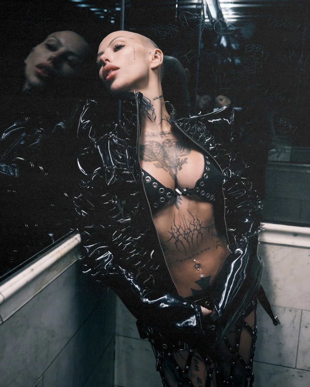
Chest and torso tattoos turn the body into a moving canvas

Siiickbrain tattoos: Siiickbrain chest and torso tattoo coverage

GATA’s open-jacket portrait gives the fullest view of Siiickbrain’s chest and torso. Linework crosses the chest around a large central image; denser marks cover the stomach and continue toward her legs. The pieces vary in size, with open skin between some of the heavier areas.

Chest and stomach designs curve with her body, and the open spaces keep the heavier marks from running together.

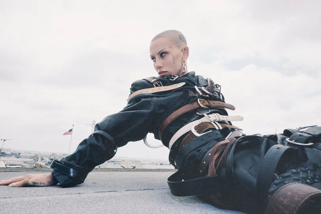
Hand and face tattoo details change the mood of a portrait

Siiickbrain tattoos: Siiickbrain hand and face tattoo details

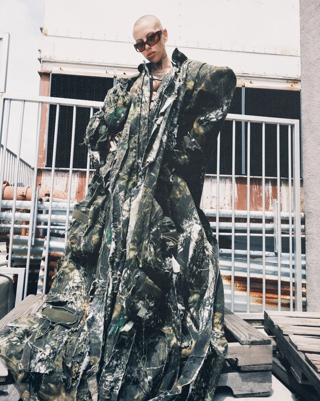
In this low-angle fashion portrait, Siiickbrain lies against the sky with one hand on the ground and her face turned toward the camera. The pose shows her shaved scalp, marks around the eyes and temple, and a hand tattoo that would be easy to miss in a tighter headshot.

Talking to PAPER about the horseshoe on her neck, her first tattoo at 18, she said, “I wanted to get a tattoo as soon as I possibly could.” She wanted the ink long before it became part of her public image.

Arm, hand and neck tattoos keep the collection connected

Siiickbrain tattoos: Siiickbrain arm, hand and neck tattoos

A second GATA portrait shows Siiickbrain in loose camouflage. Most of her torso is covered, but the ink around her neck, face and hands stays visible. Her neck lettering sits near the collar line, so it changes with the outfit; the face and hand pieces remain on display.

Dark lines and shading recur across these areas, giving them a shared look without one continuous sleeve.

Why Siiickbrain’s visual style works

The collection’s look comes from how the tattoos sit across Siiickbrain’s face, head and body, not from one repeated motif. Her photos show which marks stay visible with everyday clothes and which appear when she wears an open jacket. Some details remain unclear when the image cuts them off or hides part of the design.

If you’re using the photos for tattoo ideas, look at how size and placement work together. Face and hand ink stay in view in most poses; torso designs come and go with clothing. Treat the images as placement references, not templates for copying a design.

More musician tattoo guides

Dion Dawkins Tattoos: Chest Ink, Hand Pieces and His New Back Tattoo

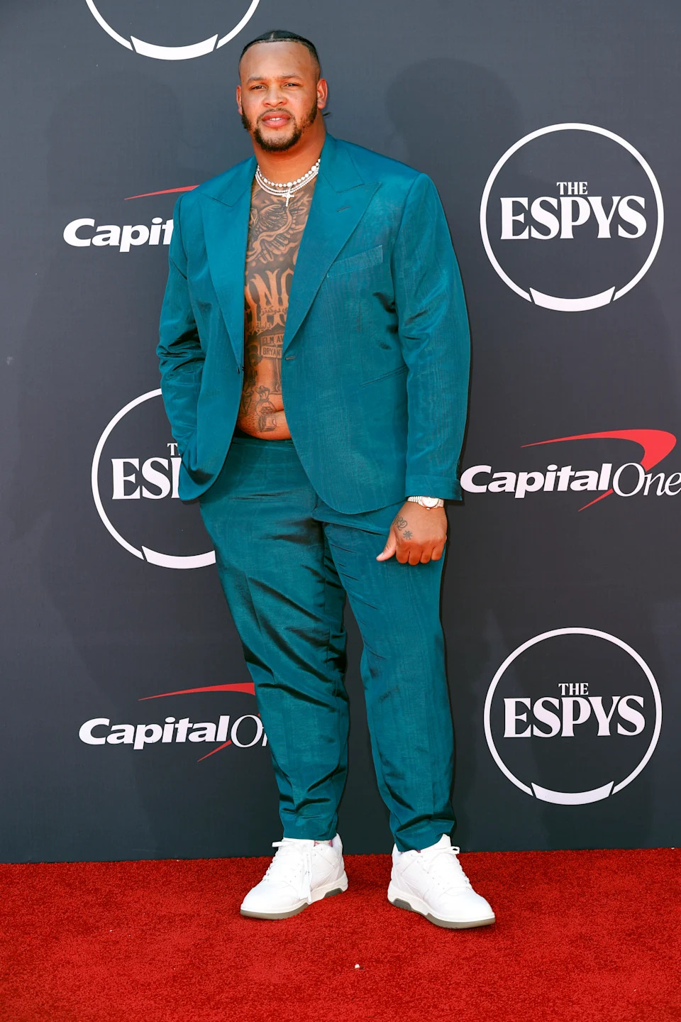
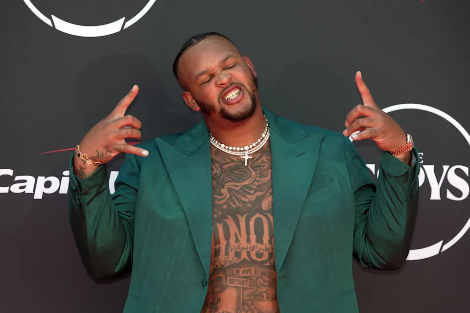
Buffalo Bills left tackle Dion Dawkins has dense black-and-gray tattoos across his chest and stomach, plus smaller pieces on his hands. Red-carpet photos show the front of the collection, including bold center lettering and smaller drawings around it. A separate 2026 report describes a new full-back piece tied to his family, Shnow Motorsports and football. The front and back are documented in different ways: most widely shared photos show his front, while the back details come from the report.

Dion Dawkins’ chest tattoos are impossible to miss

Dion Dawkins tattoos: inline

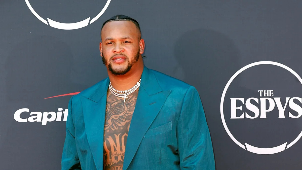
In the ESPYs photos, the chest work reaches toward Dawkins’ shoulders and continues under his open jacket. Heavy black shading gives the upper section a dark look, while patches of open skin separate the individual shapes.

The jacket changes how much of the tattoo is visible. When it hangs close, the ink sits like a dark panel beneath the lapels; when he pulls it open, more of the separate pieces show.

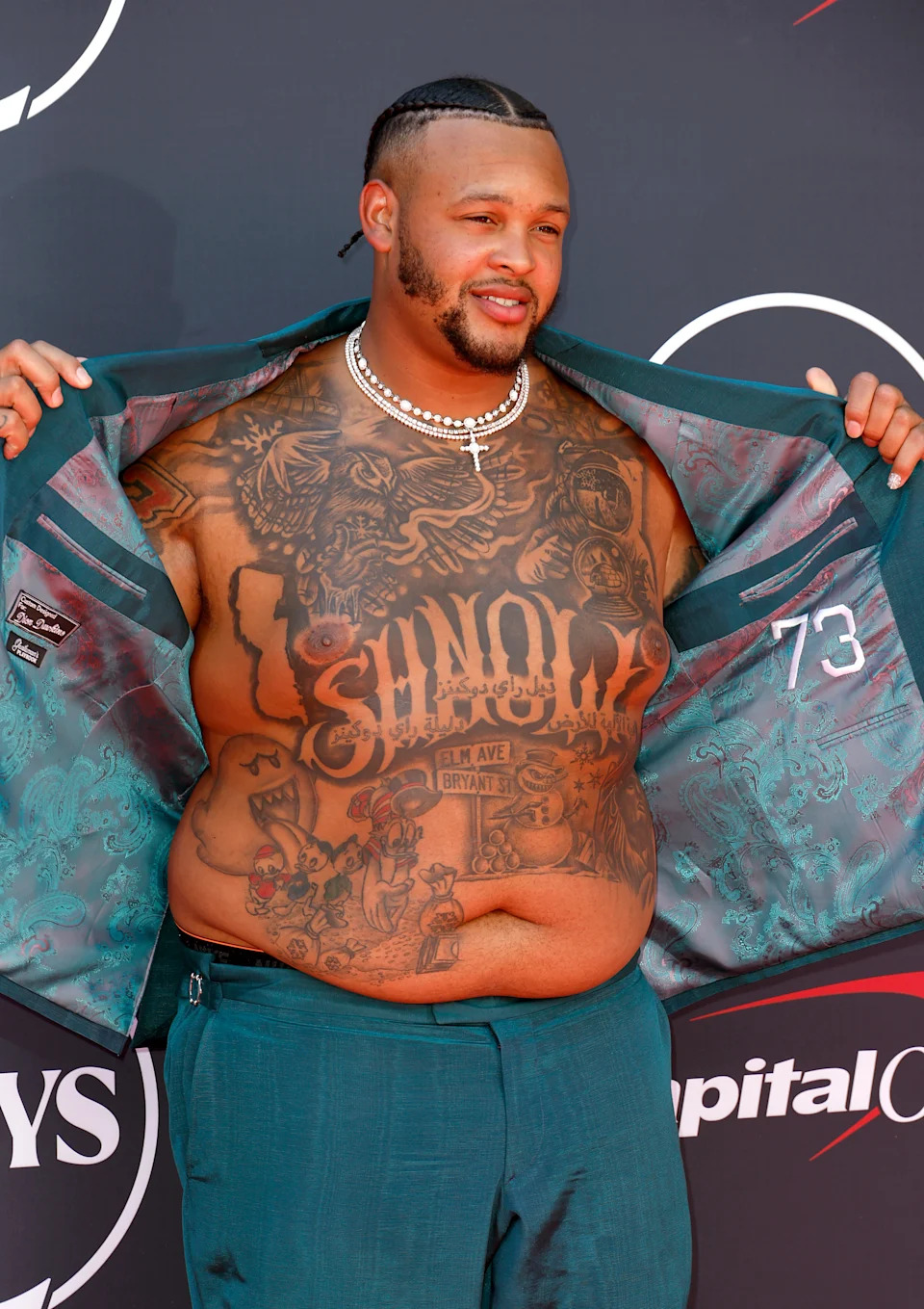
The chest lettering is the anchor

Dion Dawkins tattoos: inline

Large lettering runs down the center of Dawkins’ torso. The wide, dark letters read from a distance and give the surrounding script, symbols and shading a clear center.

The open-jacket photos frame the lettering instead of hiding it. A closer view shows smaller marks around the main words, but the central line is still the first thing that catches the eye.

His tattoos run down into the stomach

Dion Dawkins tattoos: inline

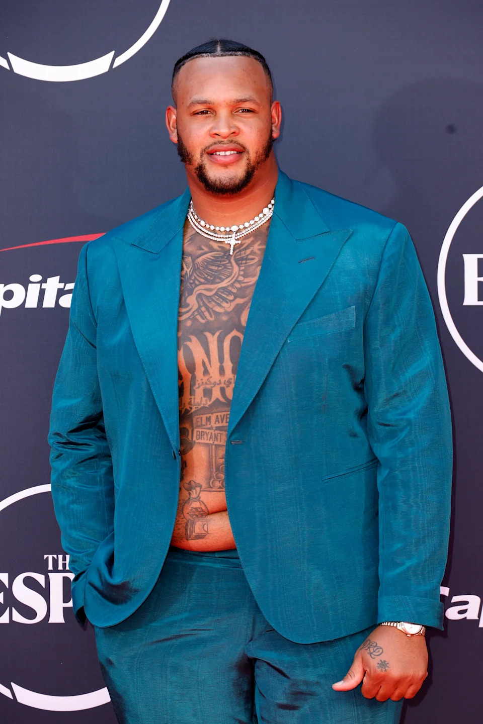
The tall portrait shows how far the front work continues. Script, small figures, shaded shapes and more lettering run from the chest across the stomach; the ink doesn’t stop at a neat line below the chest.

Some of the smaller shapes aren’t identified in the available photos. The images do show a mix of darker shading and open skin, with separate elements filling much of the front of his torso.

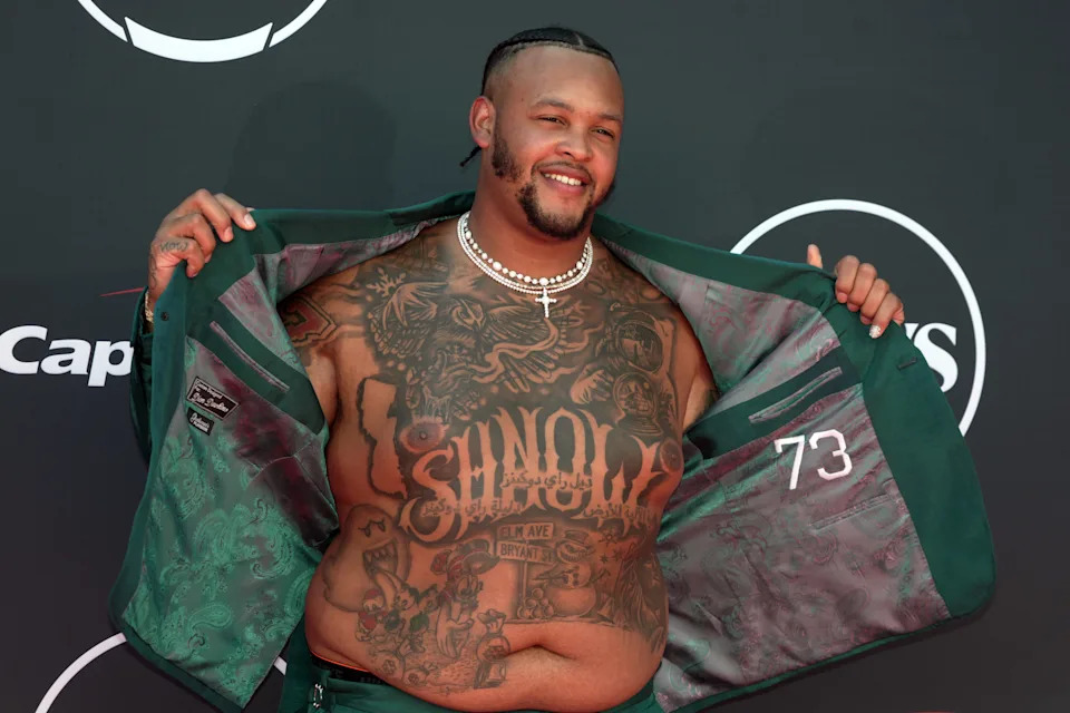
The close-ups show a mix of tattoo styles

Dion Dawkins tattoos: inline

The horizontal close-up makes the different textures easier to see: packed shading and illustrative lines across the upper chest, bold lettering in the center, and smaller drawings and symbols below.

The pieces don’t all use one strict style. They vary in size and density, but the larger lettering gives the front a consistent center.

His hands carry smaller details

Dion Dawkins tattoos: inline

The hand tattoos are smaller than the chest and stomach work, so they’re easy to miss when the torso is in view. In closer red-carpet frames, the pieces show up as Dawkins moves his hands.

That size difference gives the collection some contrast: the torso carries the broad, dark coverage, while the hand pieces stay compact.

A full-body view puts the front tattoo work in context

Dion Dawkins tattoos: inline

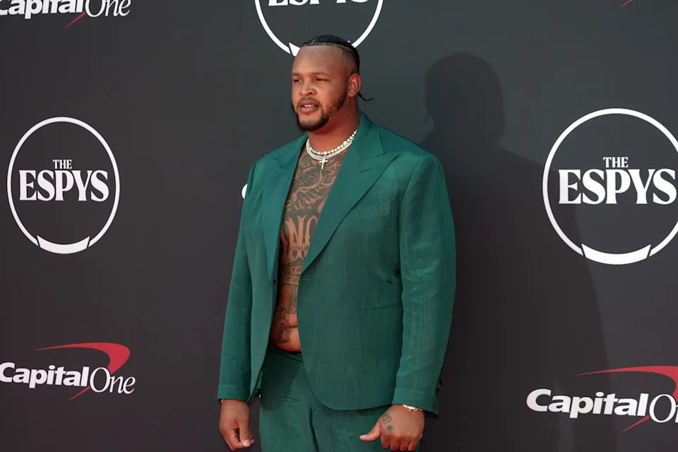
A wider solo photo shows the chest and stomach work in proportion to Dawkins’ body. His open teal suit frames the ink, and the red carpet backdrop keeps the dark shapes easy to see.

Close-ups make each mark look larger. In the full-body photo, the central dark area stands out first; the smaller details come into view when you look closer.

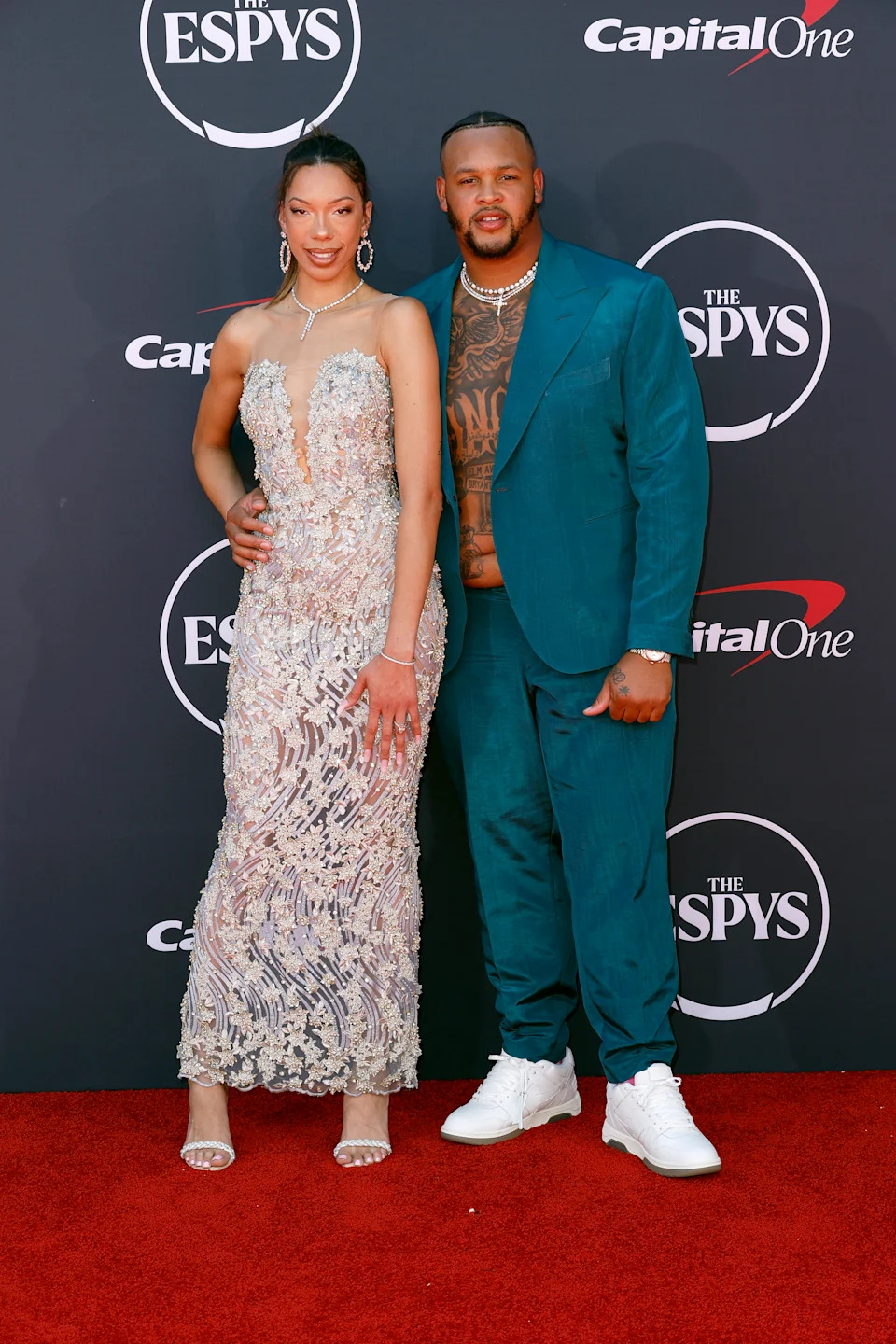
Different poses reveal different parts of the tattoo collection

Dion Dawkins tattoos: inline

In the three-quarter pose, Dawkins’ jacket covers part of his stomach while the upper chest remains visible. The angle also shows the side of his body and a glimpse of the hand ink. It’s the same collection, with some parts hidden by the fabric and posture.

The two views help explain why a single photograph can miss details. What appears symmetrical from the front may wrap toward the side, and lighting can make the shading look heavier or softer.

Beyond the red carpet

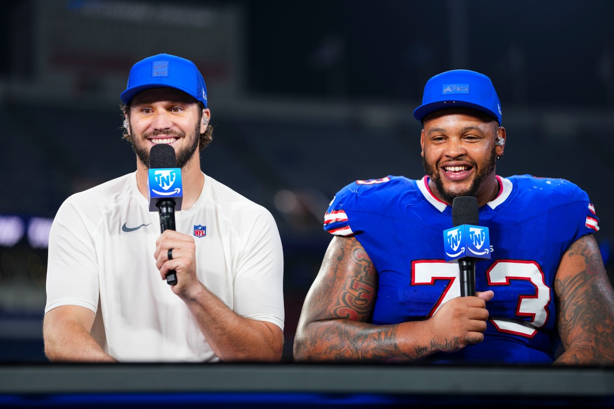
Dion Dawkins in a contextual photograph: contextual; not tattoo evidence

Contextual sports photo. It does not show Dion Dawkins’ full-back tattoo.

A 2026 report describes a newer tattoo covering Dawkins’ back. It includes a car connected to Shnow Motorsports, portraits of his children, the quote “Success doesn’t care what road you take to get there,” and a Top 100 detail with 96 crossed out beside 42. The report connects those images to his family, business and NFL career.

The red-carpet photos don’t show the back piece. The football photo above is also contextual; it shows Dawkins in uniform, not the new tattoo.

The Josh Allen rumor wasn’t about Dawkins

In 2025, a viral image was presented as evidence that Dawkins had tattooed one of Josh Allen’s famous plays on his body. Dawkins said the person in the clip wasn’t him and that he would never tattoo his quarterback on himself.

That image isn’t a reliable reference for Dawkins’ tattoos. The documented front work and the reported back piece are separate from the rumor.

Why Dion Dawkins’ collection works

Dawkins’ front collection has a clear center in the large chest lettering, with smaller images and shading continuing down his stomach and compact pieces on his hands. The photos also show how much the suit, pose and camera angle change what’s visible.

The back tattoo has a separate subject, according to the 2026 report: his children, Shnow Motorsports and his football career. Keeping those descriptions tied to their sources gives a clearer picture of the collection without treating front-facing photos as proof of the back design.

More athlete tattoo guides

Josh Brolin Tattoos: Lighthouse Back Tattoo, Waves and Mermaid Ink

Josh Brolin’s tattoo history includes the “jailhouse” ink he described from his younger years, tattoos for film roles, and a shoulder tattoo he later had removed. In late 2025, photos from Santa Barbara showed him surfing with a large new design across his back.

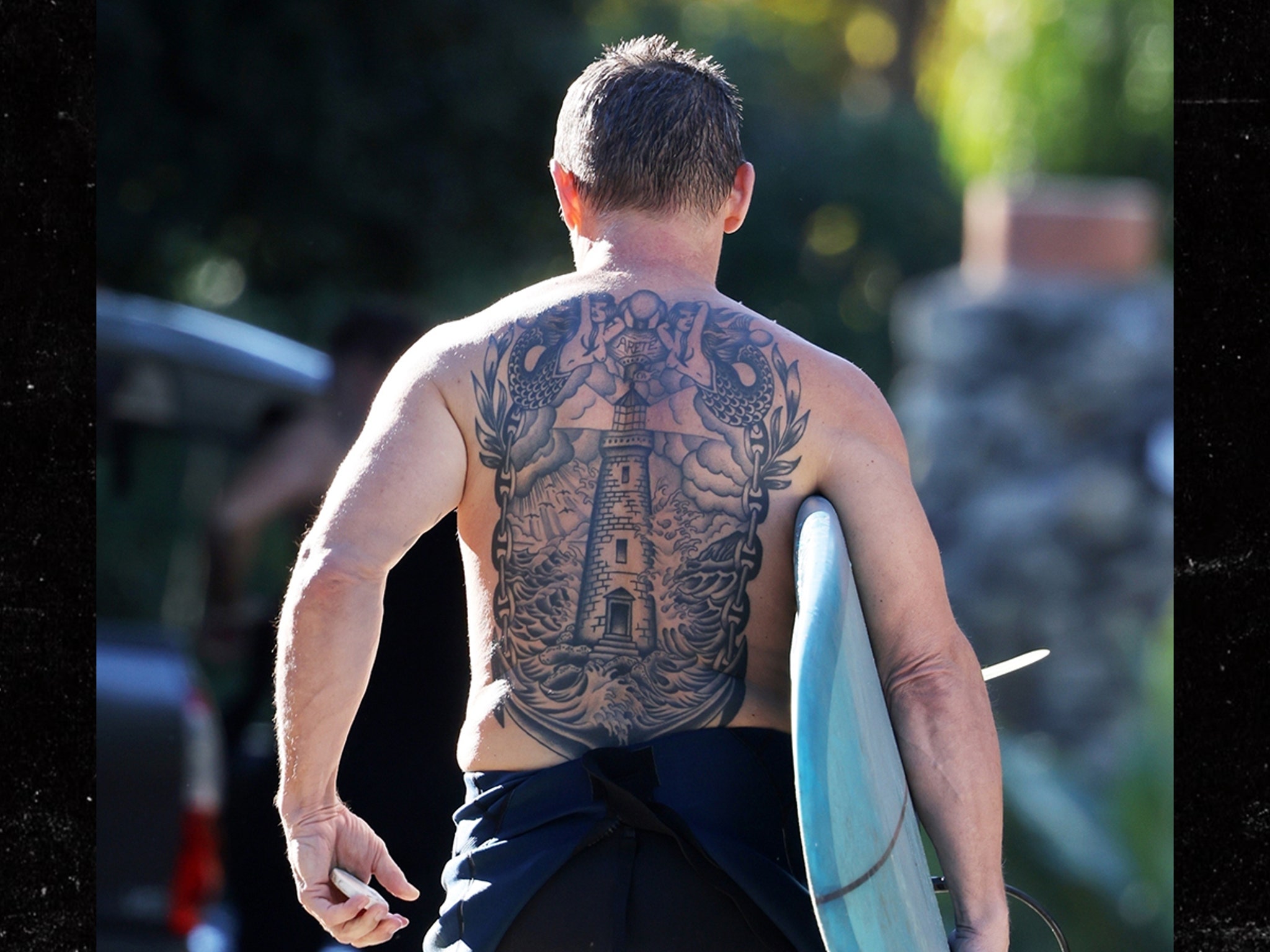
A lighthouse rises from rough water at the center, with two mermaids at the sides and the word aretê between his shoulder blades. The back-facing photos show a black-and-gray piece with a lot of linework. Brolin hasn’t publicly explained the personal meaning of the word.

Josh Brolin’s lighthouse back tattoo

Josh Brolin tattoos: inline

The clearest photo shows the lighthouse running down the middle of Brolin’s back, with waves filling the lower section and mermaids extending the scene across his shoulders. The figures blend into the surrounding lines, so they read as part of one composition. Open skin breaks up the darker shading.

Look closer at the layout

With a surfboard tucked under one arm, Brolin faces away from the camera. The tower narrows as it follows the center of his back, while the water gets darker and busier below. Windows, ledges and the beam give the lighthouse some architectural detail; the curved waves set it apart from the straight lines of the tower.

There’s enough open skin between the shapes to keep the black ink from becoming a solid panel. The mermaids sit outside the tower’s center line, filling the wider parts of the back without crowding the lighthouse.

A small detail

The word between Brolin’s shoulder blades is aretê, a Greek term translated as excellence, virtue or fulfillment. TMZ described it in terms of fulfillment and virtue. It’s a small inscription above the main image, but its purpose beyond that isn’t public: Brolin hasn’t said why he chose it.

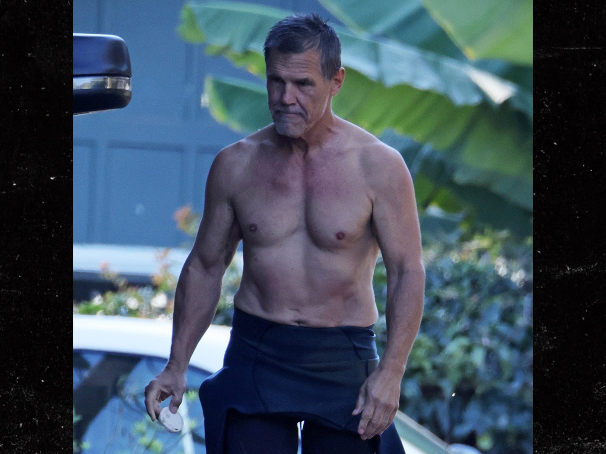
The front photo sets the scene

Josh Brolin in a contextual photograph: inline; not tattoo evidence

This surf-day photo shows Brolin from the front with his back turned away. It helps place the tattoo sighting in context, but it doesn’t show the lighthouse design. The back-facing TMZ photo is the one that documents the ink.

Shape and contrast

The tower gives the scene a vertical center, while the water and side figures spread it across the back. Straight architectural lines meet curved waves, and the gaps of open skin keep the darker areas readable. For a smaller version, a lighthouse, short horizon and a few waves would keep the main silhouette without the full scene.

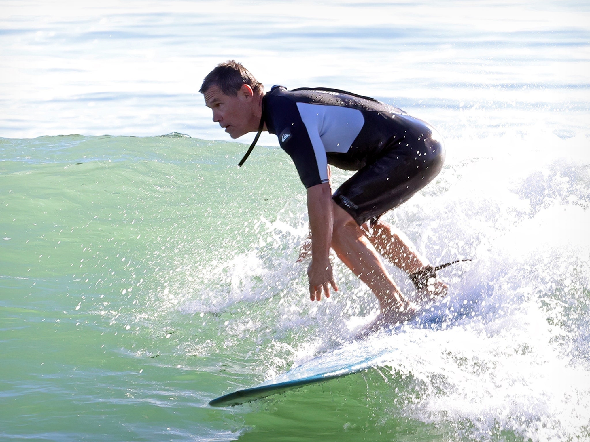
The sea photos add context

Josh Brolin in a contextual photograph: inline; not tattoo evidence

These two images show Brolin around the water; one is from a profile that pictures him on a boat with a surfboard. They fit the article’s setting, but neither is a view of the back tattoo. Their nautical feel shouldn’t be treated as evidence of what inspired the design.

A separate timeline

Josh Brolin in a contextual photograph: inline; not tattoo evidence

In a 2014 Guardian interview, Brolin said he no longer had tattoos and recalled having “jailhouse tattoos” when he was younger. He also described people reacting to them in business meetings. Photos from the Whalefall period show nautical designs made for his character, including ships; those were makeup, not part of his personal collection.

ComicBook reported in 2021 that Brolin got a personal tattoo connected to Dr. Woo and a child’s drawing. He also discussed having a shoulder tattoo removed before the new back piece appeared. These are separate points in his tattoo history, not explanations he has given for the lighthouse.

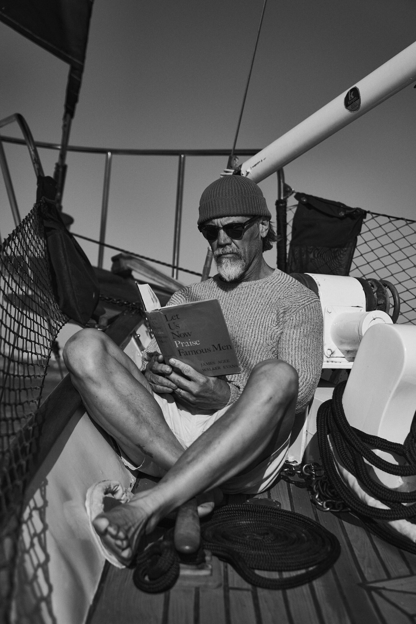
Keep the timeline straight

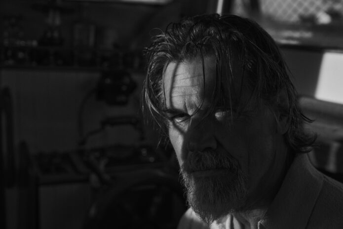
Josh Brolin in a contextual photograph: inline; not tattoo evidence

This black-and-white portrait is an editorial image, not a clear view of Brolin’s current personal tattoos. The marks visible in photos from that period were tied to a character role. Of the images here, the back-facing TMZ shot is the one that shows the lighthouse; the others provide surfing or editorial context.

Ideas to take to your artist

If you like the composition, start with the shape and placement: a central image that follows the back, with details that spread toward the shoulders. A smaller piece could keep the lighthouse and water; a larger one has room for side figures and lettering. Use a coastline, figures or word that mean something to you instead of copying Brolin’s scene.

Brolin discussed the back tattoo on Jimmy Kimmel Live in this late-2025 segment.

More actor tattoo guides

Marciano Brunette Tattoo: J and Heart Wrist Ink for Jessi Draper

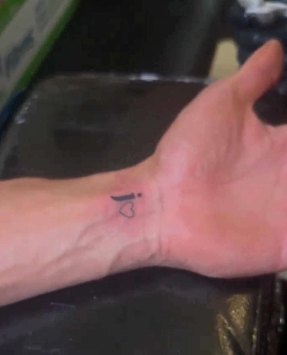
Marciano Brunette has a small black J above an outlined heart on the inside of his left wrist. He got the tattoo as a dedication to Jessi Draper.

The design appeared in a video posted in August 2026. Draper came in covering her eyes and asked, “Does it have anything to do with me?” When she saw the tattoo, she covered her mouth, dropped down in disbelief, then got up to kiss him.

The ink is simple. Its personal detail is the J, which Marciano connected to Draper’s Utah hair salon, JZ Styles. Here’s what the reveal and close-up show, along with a few practical details about adapting a small design for skin.

Marciano Brunette’s J and heart wrist tattoo

Marciano Brunette tattoos: inline

The tattoo is a black J over an open heart, with no shading or extra ornament. Marciano said the J uses the same font as the J in JZ Styles. That gives the familiar initial-and-heart pairing a specific reference tied to Draper’s business.

The inner wrist is easy to see and can be covered with a watch or sleeve. The close-up is the clearest view of the fine outline and how the two marks sit together. At this size, spacing and a readable shape matter more than extra detail.

The moment around the surprise

Marciano Brunette in a contextual photograph: inline; not tattoo evidence

The video gives the tattoo a story beyond a wrist photo: Marciano arranged the reveal as a surprise for Draper. After she saw it, he said, “It’s too late now. I can’t go back.” He also explained the JZ Styles font, so the letter choice was part of the reveal.

The footage shows her reaction and the dedication Marciano chose to make public. It doesn’t tell us everything about their relationship, and there’s no need to treat the tattoo as proof of rumors around them.

What the J actually stands for

Marciano connected the J to JZ Styles, Draper’s salon. The letter points to her, but also to something she built and is publicly associated with. That source makes it more personal than an initial picked without context.

The same idea can work in other designs: use a letter from a sign, a partner’s handwriting, a family monogram, or a shape from someone’s artwork. A clean sans serif, script, or block letter will each give a small tattoo a different feel. The open heart keeps the design easy to read even if someone doesn’t know what the J refers to.

Marciano Brunette’s public style

Marciano Brunette in a contextual photograph: inline; not tattoo evidence

A tiny tattoo still needs careful placement. On the wrist, there’s little room to hide uneven lines or cramped lettering. Here, the J and heart form a short vertical stack that follows the inside of the wrist, while the open outline leaves some skin visible.

Small lettering and fine lines can soften over time, especially on a part of the body that gets used every day. Keep the drawing clear at the size you want; trying to fit a sentence into a few centimetres can make it hard to read later.

Marciano Brunette beyond the reveal

Marciano Brunette in a contextual photograph: inline; not tattoo evidence

Marciano is known to viewers through reality television, including Vanderpump Villa. That helps explain why a wrist tattoo reveal became entertainment news. The show provides context for the public attention, but the design itself is still a J and an outlined heart.

Keep the details grounded

Marciano Brunette in a contextual photograph: inline; not tattoo evidence

The documented details are specific: the tattoo is on the inside of Marciano’s left wrist, it pairs a J with an outlined heart, he said the letter uses the JZ Styles font, and he presented it as a dedication to Draper. The reveal and close-up support those points; they don’t establish a full inventory of his tattoos or what any other ink might mean.

When you use a celebrity tattoo as a reference, look for a close-up that actually shows the design. A contextual event photo can help identify the person or date, but it isn’t evidence of ink that can’t be seen.

How to make a personal gift feel right

If you like this idea, borrow the personal reference rather than copying Marciano’s tattoo. Start with a detail that belongs to the person or relationship: a handwritten initial, a flower from a meaningful bouquet, a coordinate, or a shape connected to a shared place.

You can keep the heart or choose another simple symbol, such as a star, lock, match, or wave. Think about placement too: the wrist is easy to show, while the ribs or upper arm are more private. A finger leaves very little room, so the design usually needs to stay simple.

Bring lettering examples to your artist, but let them adjust the drawing for skin. A font that looks clear on a screen may lose its shape at tattoo size. Ask how large the design needs to be to stay readable.

Personal style ideas without copying a celebrity

These small changes keep the general idea while making it your own:

  • Use two initials in a stack, with a small dot or star between them.
  • Pair a handwritten letter with the outline of a meaningful object.
  • Swap the open heart for a tiny lock, key, crescent moon, or birth flower.
  • Hide the initial inside the symbol for a more private reference.
  • Use a date or coordinate in the same visual style instead of a letter.

A personal reference can carry the meaning without filling every bit of space. Marciano’s design stays compact: one letter, one heart, and a font choice linked to Draper.

For the reveal and the surrounding relationship context, watch the short video below.

More celebrity tattoo guides

Brooke Shields Tattoos: Matching Ladybugs, High Heels and More

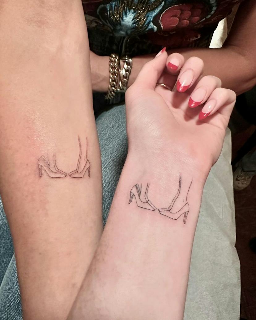
Brooke Shields’ best-known tattoos are small and tied to family. She and older daughter Rowan share a ladybug; she and younger daughter Grier share a drawing of two pairs of high heels.

Brooke has also spoken about a lily of the valley for her mother, a matching tattoo with husband Chris Henchy, and a prayer tattoo she got in Thailand and later planned to remove after it bled. The details for those pieces come from what she has shared.

Brooke Shields’ matching ladybug tattoo with Rowan

Brooke Shields tattoos: inline

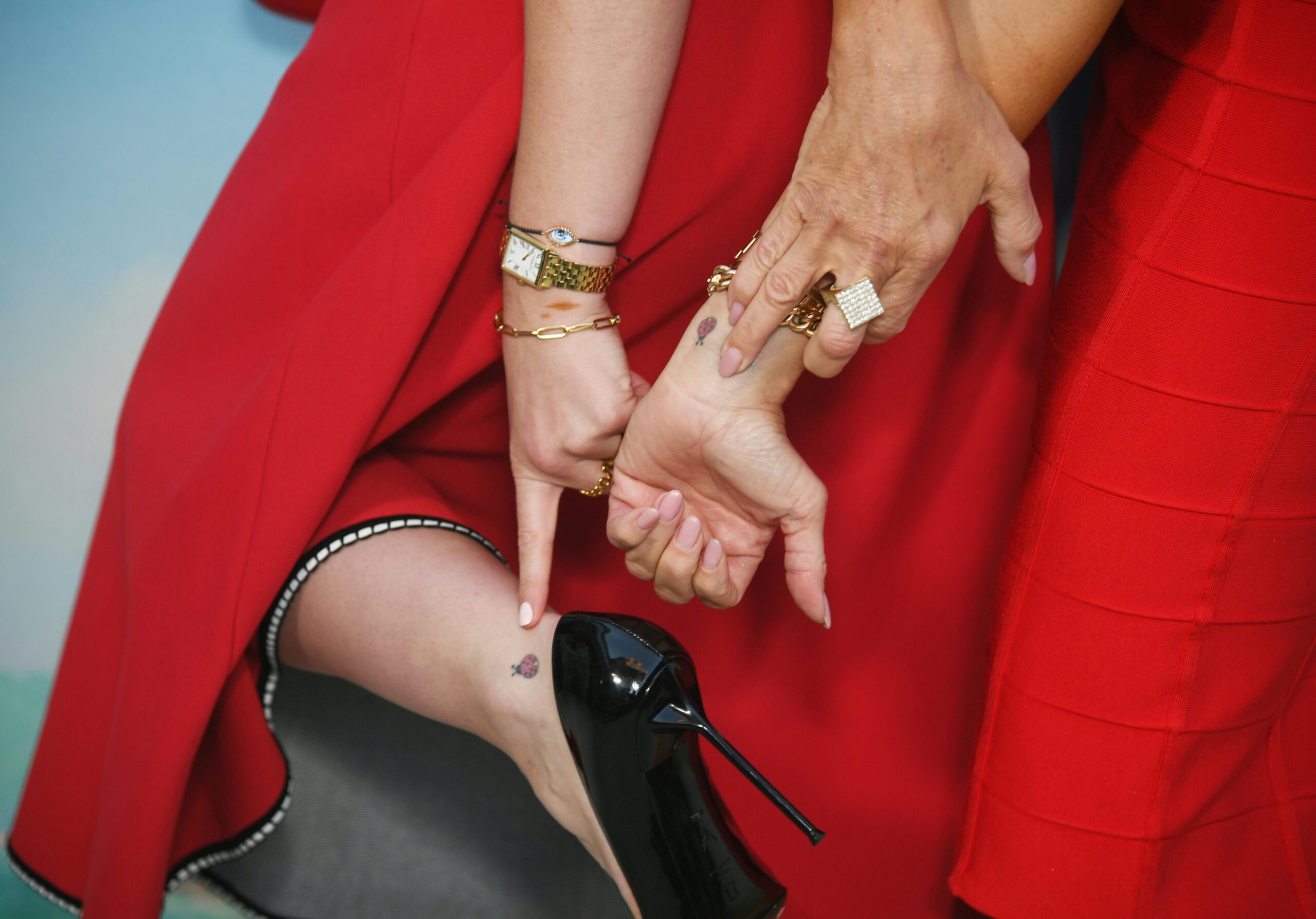
Brooke and Rowan got matching ladybug tattoos in 2021, around Rowan’s high school graduation. ABC News reported that they went to Stefano’s Tattoo Studio in New York City; Brooke called it a special graduation gift and a memory they made together.

Brooke wears her ladybug near the inside of her wrist, while Rowan has hers on her ankle. They share the same image but chose different placements. Brooke has also called Rowan her “bug,” giving the small insect a connection to their family nickname as well as the graduation.

The ladybug reads clearly at a small size: a rounded body and a few spots do the work. It doesn’t need much detail to be recognizable.

The high-heels tattoo is a tiny step into Brooke’s shoes

Brooke Shields tattoos: inline

Brooke’s matching tattoo with Grier shows two pairs of feet in high heels, one adult-sized and one smaller, with the child’s feet not quite filling the shoes. Brooke has it on her forearm; Grier wears hers on her wrist.

Grier asked for the tattoo for her 18th birthday. Brooke told Entertainment Tonight that Grier used to put on her high heels when she was little. Allure described the drawing as a woman’s feet in heels facing a child’s feet in oversized heels. The proportions make the childhood memory visible without a portrait or a long inscription.

The shoes carry the story. It’s a small scene from their life together, turned into line art.

Brooke’s family photos show the scale

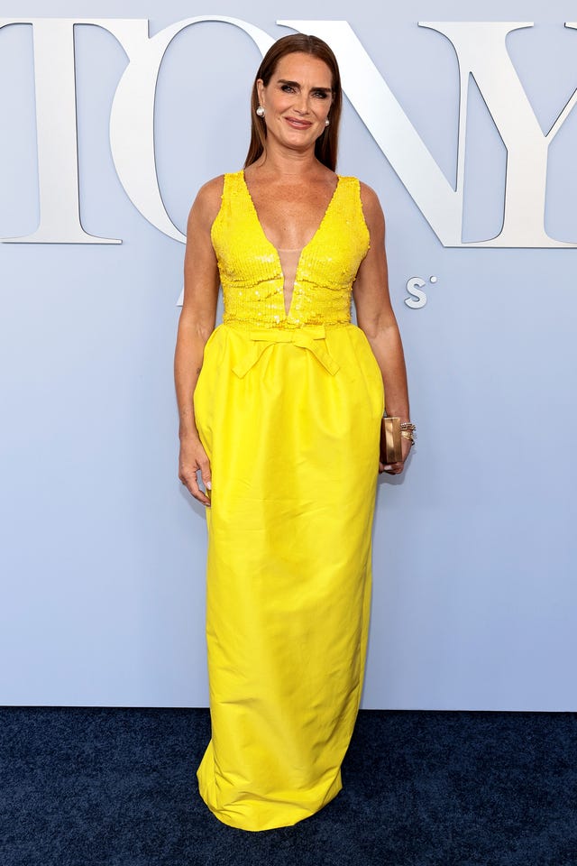
Brooke Shields in a contextual photograph: inline; not tattoo evidence

The image here is an event-context photo, not a close-up that establishes tattoo details. The reported designs themselves are modest: a ladybug near the wrist and the heel drawing on Brooke’s forearm. They’re easy to show when she chooses, but neither takes over the arm.

Matching tattoos don’t have to sit in the same place or be identical in size. Brooke and Rowan share a ladybug, while Brooke and Grier share the heels; each pair put the design where it suited them.

A red-carpet look gives the family story some room

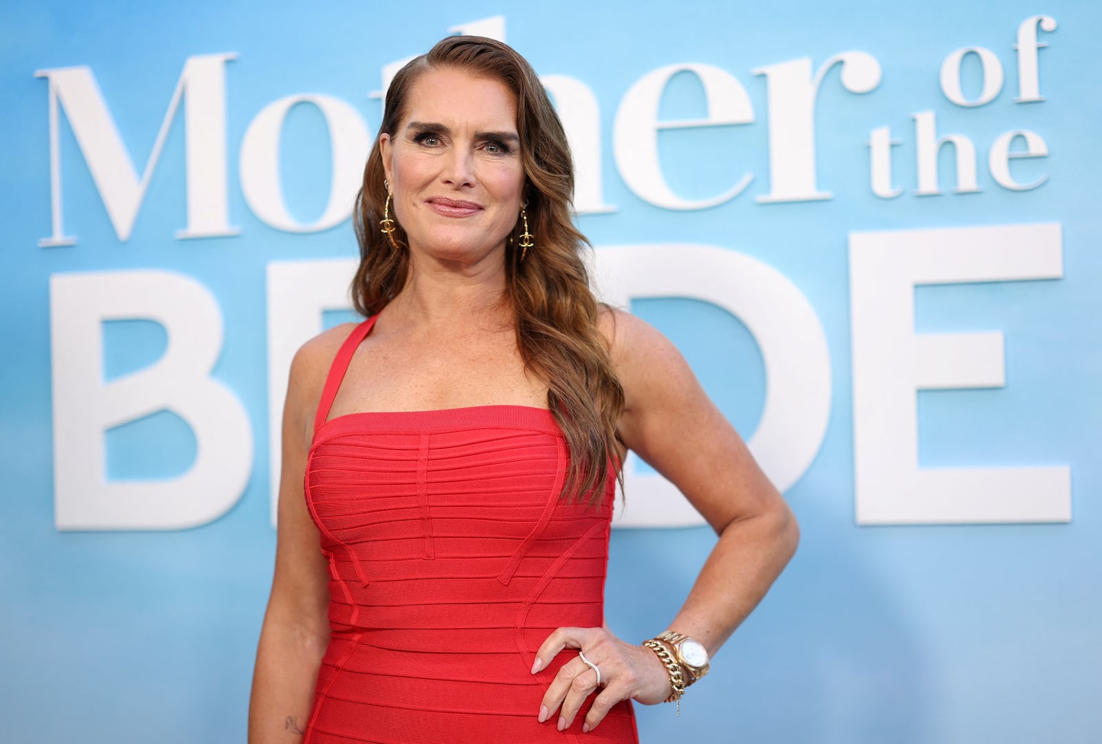
Brooke Shields in a contextual photograph: inline; not tattoo evidence

Brooke’s wrist and forearm tattoos are visible, but easy to cover with a sleeve or bracelet. They can appear in an event photo without becoming the focus of her look. The placements also leave room for each daughter to make her version feel comfortable.

Wrist and forearm skin gets sun and movement, so fine lines can soften over time. A tattoo artist can adjust a reference drawing for the size and placement instead of tracing every line from a photo.

Her event style stays polished and relaxed

Brooke Shields in a contextual photograph: inline; not tattoo evidence

The family designs start with specific memories: Rowan’s graduation and the nickname Brooke uses for her, and Grier wearing her mother’s shoes as a child. They weren’t chosen as general symbols of motherhood; the meaning was already there before the tattoos.

That’s a useful way to plan matching ink. Keep the image recognizable between you, then decide together whether the size, placement, or color should match exactly. A shared idea can stay personal even when each person makes small changes.

The other pieces stay private

Brooke Shields in a contextual photograph: inline; not tattoo evidence

On the Go Ask Ali podcast, Brooke described a lily of the valley on her ankle in honor of her mother. She also mentioned a small matching tattoo with Chris Henchy near her bikini line; his corresponding design is on his arm.

She has described another tattoo as a prayer she got in Thailand. It bled, and she said she was having it removed. The account gives the reason she planned to remove it, but not a detailed visual description.

The ladybug and heels are easier to describe because reports and photographs show the designs. For the other pieces, it’s better to stick to what Brooke has said than guess at details that aren’t visible.

If you’re planning a family tattoo, start with a real memory and find a simple object or symbol that brings it back. It might be shoes, a book from graduation, or something used in a family ritual. Decide whether you want an exact match or just one shared feature, then let the artist size and redraw it for skin.

For Brooke and Grier’s account of the matching tattoo, watch the segment below.

More actor tattoo guides

Dorothy Martin Tattoos: Her Visible Ink and Planned Sleeve

Musician Dorothy Martin has talked about religious imagery in her tattoos, ankle lettering and a sunset-and-flowers design she is having removed. She has also mentioned wanting a traditional Japanese-style sleeve; that plan is still ahead, not finished.

Photos show ink on her forearms, hands and lower legs, but not every mark is readable. Inked has reported names and placements that fill in some of the picture. Keeping those accounts separate from what the photos show makes the limits clear.

Dorothy Martin’s visible forearm and ankle tattoos

Dorothy Martin tattoos: Inline genuine tattoo photograph

A full-body portrait shows tattoos across Martin’s forearms, hands and lower legs. It’s useful for seeing how widely the ink is spread, but it isn’t close enough to identify every small mark.

Inked has reported “Holy Ghost” lettering on her ankles, a Jesus tattoo behind her leather pants and angels on her back. The photo shows her ankle and leg ink in general; those specific names and placements come from the reporting.

The religious imagery she’s talked about

Martin has described an early sunset with flowers as a bad tattoo and said she has been lasering it away. She plans to cover that area with a sleeve. The cover-up is a larger project than a touch-up, and the new design will have to work with whatever ink remains.

She has mentioned traditional Japanese sleeves as a style she’d like to explore. Until the old tattoo is treated and a sleeve is actually done, that remains her intended direction rather than a completed design.

The old design she plans to cover

Dorothy Martin tattoos: Inline genuine tattoo photograph

Martin’s leather, fur, vintage references and dramatic black clothes fit naturally beside the visible ink. The photo here is a fashion portrait, not tattoo evidence; it shows the setting and clothing rather than a close view of her designs.

Clothes also change which tattoos are visible. Boots and a longer hem can hide ankle lettering; sleeveless looks and a hand on the microphone bring other pieces forward. One portrait can’t show the whole collection.

A rock wardrobe with room for leather

Dorothy Martin in a contextual photograph: Inline contextual photo; not tattoo evidence; not tattoo evidence

Martin has said she likes traditional Japanese sleeve work. A sleeve is planned around the arm as it bends and turns, rather than treated as a row of unrelated designs. With existing ink and a cover-up to consider, that kind of planning could help the new work connect across the arm.

Japanese tattooing has its own history and visual language. The photos don’t show a finished design for Martin, so there’s no basis for guessing which symbols or background she’ll choose. Her public comments identify the style she likes, not the sleeve itself.

Why a future Japanese sleeve could work

Dorothy Martin tattoos: Inline genuine tattoo photograph

A clean portrait gives a clearer view of the small black spade on Martin’s hand. It’s a simple shape that reads quickly in the close-up, unlike the finer details that blur in wider photos.

Hand tattoos are exposed to movement, washing and friction, so scale matters. The spade’s uncluttered outline suits the small area; adding more detail would change how easily it reads.

The small spade on her hand

Dorothy Martin tattoos: Inline genuine tattoo photograph

Martin’s tattoos are easier to identify when a photo is framed for them. A full-body image shows the spread of the ink but not the fine lines; a close portrait can show the hand or neck while leaving the arms and legs out of frame.

The Inked headshot works as a portrait and shows her neck ink. The separate photos provide views of the forearms, hand and lower legs. None of them supplies a complete inventory, and unclear shapes should stay unnamed.

What the photos reveal, and what they don’t

Dorothy Martin in a contextual photograph: Inline contextual photo; not tattoo evidence; not tattoo evidence

The sunset-and-flowers tattoo is the piece Martin has said she wants removed before a cover-up. Laser treatment and new tattooing take time, with the skin needing to heal between stages. It’s a process, not a quick correction.

If she still wants a sleeve, it makes sense to tell the artist that before planning the first cover-up session. The old design, any ink left after treatment and the arm’s existing tattoos all affect what can be built next. Her plan may change as the work progresses.

When an old idea stops fitting

Martin’s collection includes visible forearm and hand ink, reported ankle lettering and religious designs, plus an old tattoo she is removing. A Japanese-style sleeve is a plan she has discussed, not a finished addition.

The photos show only parts of the collection. The reported details add context, but there’s no need to fill in the pieces that remain unclear.

Final take on Dorothy Martin’s style

Dorothy Martin’s tattoos have the same tension as her music and styling: dramatic, personal, and still willing to get a little messy. The visible forearm, hand, and ankle ink gives her photos a strong edge. The reported Holy Ghost lettering, Jesus tattoo, and angels add a religious thread. Then there’s the old sunset with flowers, which she’s having removed before building toward a larger sleeve.

The collection isn’t finished, and that’s the point. A tattoo can be a favorite design, a private reference, an old mistake, or the first layer of something much bigger. Martin’s story includes all of those possibilities. If you’re looking for ideas, take the useful parts: choose a placement that works with the way you dress, give a cover-up room to breathe, and let the design grow from your own history instead of copying a photo. That long view matters more than a quick flash of inspiration.

Most of all, look closely before making a claim. Some of Dorothy’s ink is easy to see. Some of the named pieces come from her own reported descriptions. Some details disappear in the frame. Keeping those categories clear makes the collection feel more real, not less. Her tattoos don’t need a made-up explanation or a forced grand meaning. The visible ink, the planned rework, and the choices still ahead already give the story plenty of shape.

More musician tattoo guides

Macaulay Culkin Tattoos: The Story Behind His One Spoon Tattoo

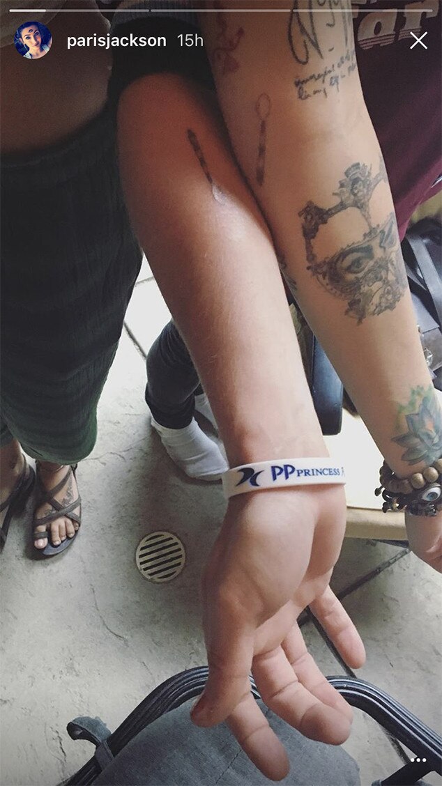
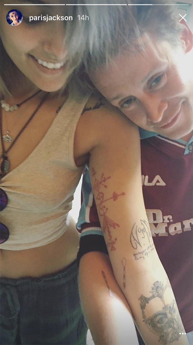
Macaulay Culkin has one clearly documented tattoo: a small striped spoon on his right inner forearm. His goddaughter Paris Jackson has a matching design.

Macaulay Culkin’s single spoon tattoo

Macaulay Culkin and Paris Jackson showing their matching spoon tattoos in a close-up tattoo photo
Macaulay Culkin and Paris Jackson with their matching spoon tattoos visible on their forearms

Culkin’s spoon is fine black linework, with narrow stripes across the bowl and handle. It stays an outline rather than trying to look like a realistic utensil.

Culkin and Jackson got the tattoos in July 2017 at Tattoo Mania in West Hollywood, and Jackson shared photos afterward. The story behind the pieces is that Culkin used to take her spoon during meals, so they turned the habit into a matching design.

Jackson’s version is on her inner forearm too, making the match easy to see when they compare arms.

This is the one tattoo clearly documented for Culkin. Photos of his face, clothes or surroundings don’t establish a larger collection.

A public afternoon with Paris

Photos from that period place them together in a casual street setting, away from a formal tattoo reveal. Culkin became famous as a child actor and later stepped back from the usual publicity cycle; these pictures show a quieter moment with Jackson.

That kind of ordinary setting can help when you’re looking for a personal tattoo idea. A routine, nickname or running joke may matter because of who shared it, even if it sounds small to anyone else.

The low-key style of the day

Culkin’s look in the photos is understated, so the small forearm tattoo stays a detail rather than taking over the frame.

Fine-line work at this scale leaves little room for crowded details. The bowl, handle and stripes need enough space to stay distinct, especially as the tattoo settles.

A friendship built on odd little rituals

The spoon gives their matching design a particular story. It recalls a shared joke, not a broad statement about how close two people are.

He is Jackson’s godfather, and the tattoo keeps the tone of their joke instead of making a grand declaration.

A heart can stand for many things. This spoon points to one particular story, which is why it feels personal.

The most relaxed kind of celebrity photo

Celebrities’ clothes and gestures can invite more interpretation than a photo supports. Here, the matching spoons and the story shared about them give the images enough context.

For someone choosing a first tattoo, a small inner-forearm design can be shown or covered without building an entire look around it. Culkin’s piece stays modest in the photos and easy to recognize up close.

Why the tiny spoon works

The spoon works because its outline is familiar and the stripes add detail without obscuring the shape. It’s still recognizable at a glance.

If you want a similarly personal reference, look for an everyday object tied to someone or a routine in your own life. It can hold a story you explain, or keep to yourself.

Keeping the idea small

If Culkin’s tattoo appeals to you, borrow the idea behind it rather than copying the spoon. Keep the image simple, give it enough room, and choose a reference that means something to you.

Ask the artist how fine lines and narrow gaps are likely to heal. Healed examples can show how much detail will remain clear, and the artist can size the design to suit your skin.

Matching tattoos don’t need identical measurements or mirrored placement. The shared decision matters more than making the two arms look like a set.

Mark Hoppus Tattoos: The Grim Reaper Ink He Got After Beating Cancer

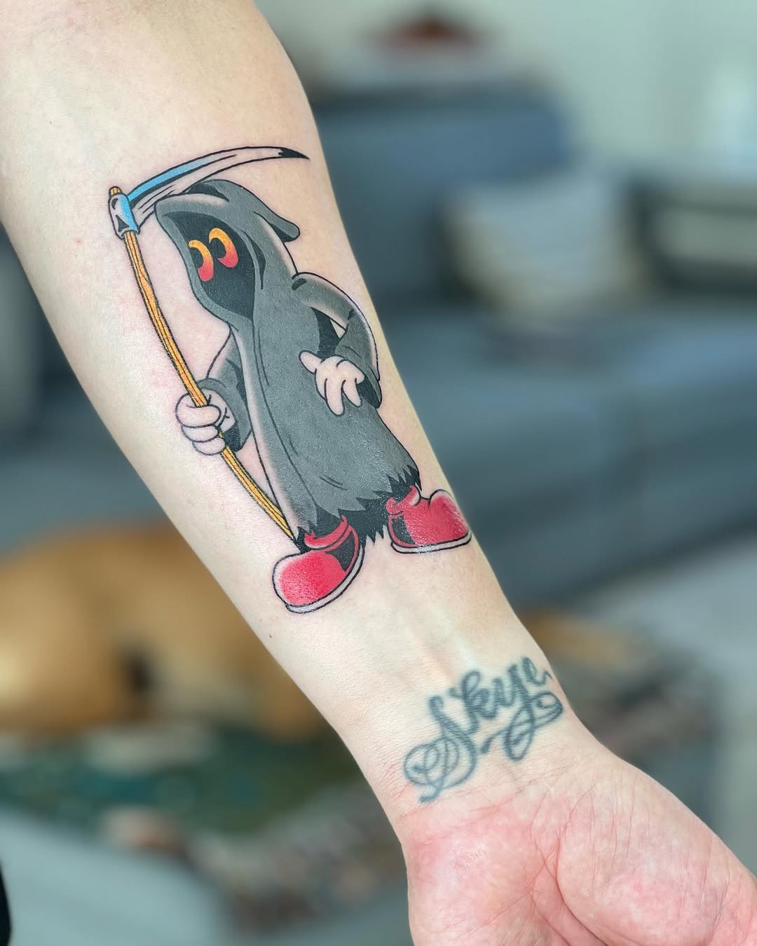
Mark Hoppus’s forearm tattoos tell two different stories: a cartoon grim reaper linked to his cancer recovery and the name “Skye,” for his wife. The designs sit close together but have little in common visually.

The small collection behind the big story

Mark Hoppus in a contextual photograph: music performance contextual photograph, no tattoo evidence; not tattoo evidence

Mark Hoppus performs with Blink-182.

The coverage of Hoppus’s tattoos centres on the reaper and the Skye lettering. Dabs Myla designed the reaper, and Dan Smith tattooed it. Hoppus shared the finished piece after his cancer treatment; the artists also posted about the collaboration.

The second design is Skye, his wife’s name. Hoppus and Skye Everly have been together for decades. In the photo, the loose script sits lower on the arm, separate from the larger figure.

One is a colorful illustration; the other is a handwritten name. They share an arm without needing matching styles.

The cartoon grim reaper on his forearm

Mark Hoppus tattoos: documented tattoo evidence, forearm close-up

Mark Hoppus’s cartoon grim reaper and Skye lettering.

The close-up shows a gray hooded figure with a curved scythe, pale hands, yellow details and bright red shoes. The script tattoo sits below it.

The reaper doesn’t look frightening. Its rounded face, wide eyes and red shoes give it a cartoon feel; the scythe keeps the familiar link to mortality.

The open shapes leave the hood, face, arms and scythe easy to distinguish. There’s room for the figure to read as a character instead of a mass of small details.

Why the reaper fits the story behind it

Hoppus announced his lymphoma diagnosis in 2021 and later said he was cancer-free. iHeart’s report describes the reaper as a way to mark his recovery. Dabs Myla’s message, “Not this time, DEATHY!” gives the image its defiant, joking tone.

The cartoon doesn’t make the illness itself funny. It puts an absurd face and red shoes on the reaper, turning a grim subject into a character Hoppus chose to carry with him.

The humor sits beside the meaning, not in place of it. The tattoo can mark a hard chapter without looking like a monument.

Hoppus’s visual world outside the stage

Mark Hoppus in a contextual photograph: concert contextual photograph, no tattoo evidence; not tattoo evidence

Mark Hoppus on stage with his bass.

The performance photos put Hoppus in his pop-punk setting, but they’re context, not close-up evidence of the tattoos. The two designs discussed here don’t rely on a band logo: one is a cartoon figure, the other a name.

The forearm gives the reaper room for its face and scythe, while the lettering stays smaller. Different scales let each design keep its own character.

Color that keeps a character readable

Mark Hoppus in a contextual photograph: performance contextual photograph, no tattoo evidence; not tattoo evidence

Mark Hoppus performing in black and white.

The reaper uses mostly gray, black and muted tones. The yellow scythe handle and red shoes provide the brightest color, so the figure stays readable without every detail competing for attention.

For a colorful character tattoo, decide where you want the eye to land, then let the other shades support it. A limited palette can keep the image clear.

The outer line separates the figure from the skin, while lighter marks show the cloak’s folds. That contrast gives it shape without filling every space with heavy black.

The right tone for a serious story

Mark Hoppus in a contextual photograph: face-visible contextual portrait, no tattoo evidence; not tattoo evidence

A portrait of Mark Hoppus.

Hoppus’s reaper connects a serious experience to an image with humor. If you’re planning a tattoo about recovery, choose a tone that feels like you; it doesn’t have to look solemn to matter.

Give a character enough space for its face, hands and small objects to stay legible. An artist can simplify a reference and adjust its proportions instead of squeezing every detail into a small area.

The same principle applies to lettering: consider whether the words will still mean something beyond the moment that inspired them. Hoppus’s Skye tattoo is tied to a long relationship, not a passing trend.

A small collection with a lot behind it

The public coverage here focuses on two tattoos on Hoppus’s forearm. The reaper marks a chapter he spoke about publicly; the Skye script is a name tied to his marriage.

They can sit together without becoming a matching set. One is bright and cartoonish, the other quiet and personal.

More musician tattoo guides