
Macaulay Culkin’s tattoos are a good reminder that a small idea can carry a lot of personality. He doesn’t have a huge collection documented in public, and there isn’t a full sleeve to decode. The confirmed piece is a tiny striped spoon on his inner forearm, matched with one on Paris Jackson’s arm. It came out of a close friendship, a running joke, and the kind of private meaning that doesn’t need a paragraph of symbolism attached to it.
That’s what makes the design interesting. A spoon sounds almost too ordinary to be a memorable tattoo subject. It isn’t a lion, a dagger, a rose, or a line from a film. It’s an everyday object. On Culkin, that plainness is the point. The image connects to a habit he has talked about, while the matching version links him to Jackson in a way that feels playful instead of staged.
There’s also a useful lesson here for anyone collecting ideas. A meaningful design doesn’t have to look dramatic from across the room. It can be narrow, simple, and a little weird. Sometimes the detail that makes a tattoo feel personal is the fact that most people would never guess why it’s there.
Macaulay Culkin’s single spoon tattoo
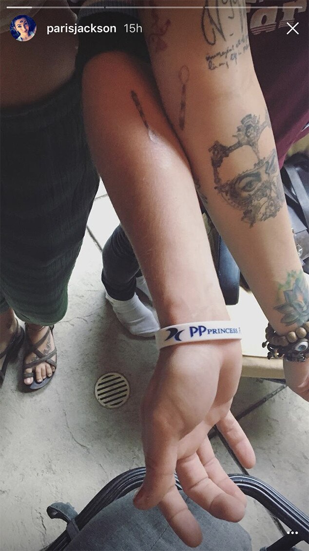
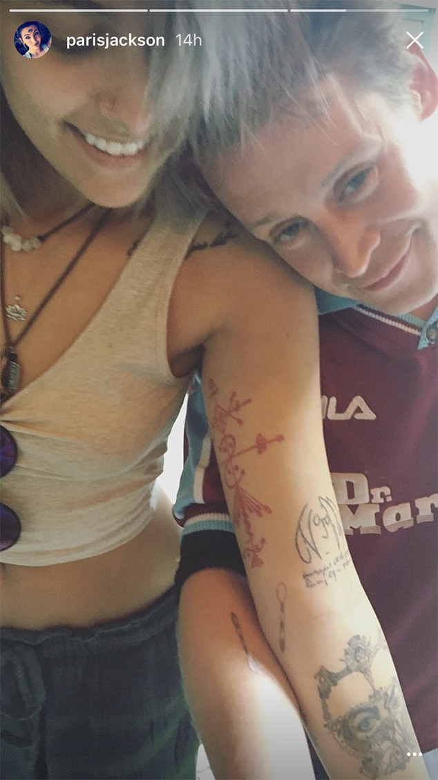
The one confirmed piece is a small spoon in fine black linework on Culkin’s right inner forearm. The spoon has narrow stripes across the bowl and handle, giving a very basic outline a little extra character. It isn’t shaded like a realistic kitchen utensil, and it doesn’t take up much space. The design reads quickly: a spoon, reduced to a few clean marks.
Culkin and his goddaughter Paris Jackson got the matching pieces in July 2017 at Tattoo Mania in West Hollywood. The pair shared the news through Jackson’s social media, and the public photos show the two of them comparing their new work. The tattoo is usually described as a reference to Culkin’s habit of taking Jackson’s spoon when they eat together. That small bit of everyday mischief became the idea they decided to put on skin.
Jackson’s version is on her inner forearm too, which makes the connection easy to see when they put their arms side by side. Matching designs can sometimes feel overly planned, especially when they use huge names, dates, or matching symbols that announce the relationship before anyone asks. This one is more relaxed. It’s a tiny shared object tied to a specific joke between two people.
The location works well for that kind of design. The inner forearm gives a fine-line image enough flat space to stay readable, but it’s still easy to cover with a sleeve. It can be shown when Culkin wants to talk about it and ignored when he doesn’t. A spoon doesn’t need a massive canvas, and putting it somewhere visible at close range keeps the scale honest.
It’s important not to turn the public photos into evidence of a larger collection. Culkin’s spoon is the piece that has been clearly reported and connected to a meaning. Other images of him can show his face, clothes, or the setting around him, but they shouldn’t be used to claim extra work that hasn’t been documented.
A public afternoon with Paris
The photos from that period are part of the appeal because they don’t look like a polished campaign. Culkin and Jackson appear together in a casual street setting, with the kind of loose body language you see when friends are more interested in the conversation than the camera. The shared spoon is the headline detail, but the surrounding mood matters too. It makes the story feel like a real afternoon that happened to become public.
Culkin has always had an unusual relationship with fame. He became one of the most recognisable child actors in the world, then stepped away from the usual publicity cycle and built a quieter adult life. That history makes an ordinary image of him feel more revealing than a perfectly arranged red-carpet shot. He looks like a person spending time with someone he trusts, not someone presenting a new identity.
That low-pressure feeling is worth keeping in mind when you’re choosing reference material for a small design. The best idea might come from a meal, a nickname, a bad joke, or a shared habit that would sound completely unimportant to anybody else. You don’t need to borrow the spoon. You need to notice the sort of detail that belongs to your own life.
The low-key style of the day
Culkin’s look in the street photographs is understated, which suits the scale of the spoon. There’s no sense that every detail has been coordinated around being photographed. That helps explain why the little forearm design doesn’t feel like a publicity prop. It sits inside a normal day rather than taking over the frame.
Small black linework often works best when the rest of the visual language is allowed to stay simple. A tiny image can disappear if it’s surrounded by too much detail, or it can start to feel louder than intended if every nearby element is competing for attention. The spoon has enough room around it to remain a small private joke even when it’s visible.
That doesn’t mean minimal designs are automatically easy. A short line, a curve, or a narrow gap has nowhere to hide. If the proportions are off, the whole image can look wrong. With a spoon, the artist has to make the bowl, handle, and stripes clear without adding so much detail that the design becomes muddy after healing. The simplest version usually takes more editing than people expect.
Placement matters just as much. Inner forearm skin is a popular spot because it gives an artist a clean working area and lets the wearer control visibility. It also gives a matching pair a practical way to compare placement. The designs don’t have to be perfectly identical to feel connected, but the same general scale and position help the idea land.
A friendship built on odd little rituals
The spoon story works because it’s specific. “We’re close” would be a broad statement. A spoon says something else: we have eaten together, we tease each other, and one of us keeps stealing the other person’s cutlery. That kind of detail gives a matching design a real starting point.
Jackson has spoken warmly about Culkin, and the two have been photographed together in a way that feels more like family than a celebrity pairing. He is her godfather, but their relationship also has its own easy sense of humour. The matching pieces don’t try to turn that bond into a grand public statement. They preserve a joke and let the joke stay a joke.
That’s a useful distinction when people talk about meaningful designs. Meaning doesn’t always have to be serious. A funny reference can last just as well as a memorial date or a line of poetry. In some cases, humour makes the design more durable because it keeps the memory connected to an actual person and a real moment.
It also explains why the spoon is more memorable than a generic symbol would be. A heart can stand for hundreds of things. A spoon can stand for one very particular story. The less obvious image gives the wearer more room to explain it in their own words, or to keep the explanation private.
The most relaxed kind of celebrity photo
Celebrity photos can make even ordinary clothes and ordinary gestures look like part of a larger message. With Culkin, the calmer images work better. They show why a small piece suits him: he doesn’t need a loud visual cue to be recognisable, and the design doesn’t need to compete with the rest of his appearance.
That’s especially true for anyone who wants a first piece that won’t dominate their style. An inner forearm design can be shown, covered, photographed, or left alone depending on the day. A small object also gives you a little more freedom with clothing and work. It doesn’t force every outfit to become a styling exercise.
There’s a practical side to the choice too. A spoon has a simple silhouette, so it can still read when viewed quickly. The stripes add a personal touch without turning it into a miniature illustration packed with tiny texture. If the artist keeps the line weight consistent and leaves breathing room between the marks, the image has a better chance of staying clear as it settles.
Why the tiny spoon works
The design lands because it balances three things: a recognisable shape, a private reference, and a placement that keeps the scale modest. Remove the story and it’s still a spoon. Remove the spoon and the story loses its visual anchor. Put the same image in a much larger format and it might start to feel like an illustration instead of a personal marker.
The striped detail is a smart middle ground. A completely plain outline might look unfinished, while a realistic spoon would be too busy for the idea. A few horizontal lines give the bowl and handle some texture without changing the basic mood. It remains playful and quick to understand.
For a similar approach, start with an object you use all the time. Think about the thing connected to a specific person, place, or routine, not the object that simply looks good in a flash book. A bus ticket, a chipped mug, a game piece, a key, or a particular snack can carry more weight than an impressive symbol chosen at random.
Keeping the idea small
If you like the feel of Culkin’s piece, don’t rush to copy its exact shape. Think about what makes it work. The image is simple enough to age without relying on a lot of tiny decoration. The placement gives it room. The meaning comes from a relationship, not from a definition you found online. Those are the parts worth borrowing.
Fine-line work still needs care. Ask the artist how they expect the design to settle, especially if you’re considering a very narrow outline or small stripes. Look at healed examples rather than only fresh photos. A good artist will also adjust the size to your skin and the amount of detail the design can realistically hold.
Matching pieces deserve their own conversation. You don’t have to make every measurement identical, and you don’t have to place them on mirrored arms. Sometimes the best pair keeps the same image but lets each person choose the spot that feels natural. The connection comes from the shared decision, not from making the two photos look like a product set.
Most of all, give yourself permission to choose something a little silly. The spoon isn’t trying to sound profound. It remembers a habit, a person, and a laugh. That’s enough. A small design can be meaningful without looking solemn every time you see it.
Macaulay Culkin’s only clearly documented piece is easy to describe, but the reason behind it is more interesting than the outline. It’s a matching spoon made for a shared joke with Paris Jackson, placed on the inner forearm and kept small enough to feel like an everyday secret. That combination is hard to fake, which is probably why the design has stayed memorable.