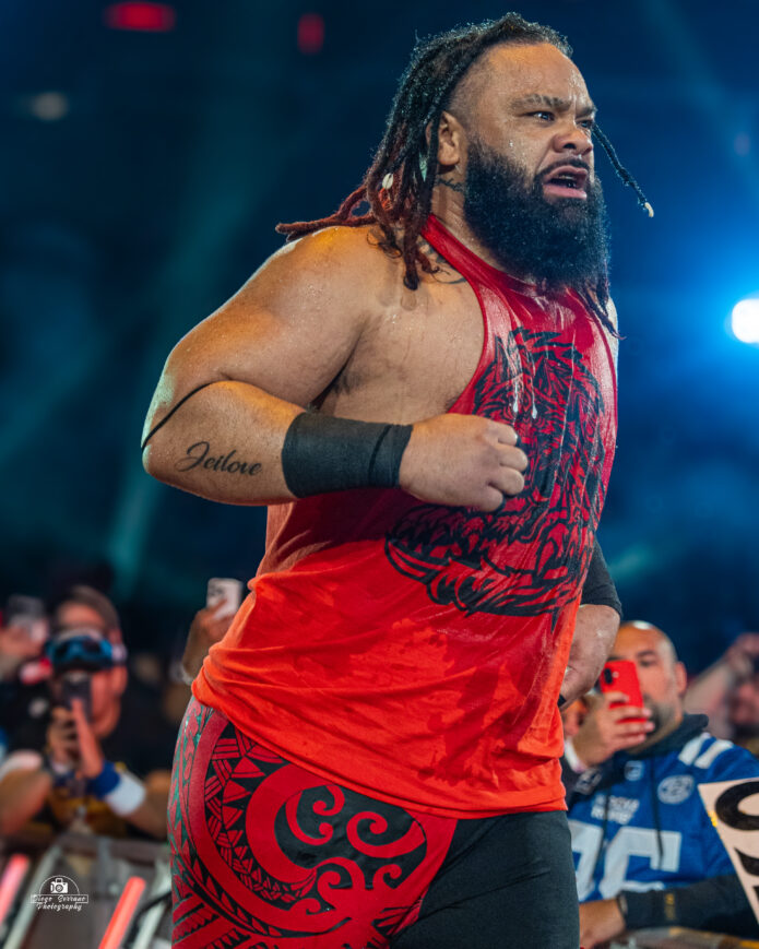
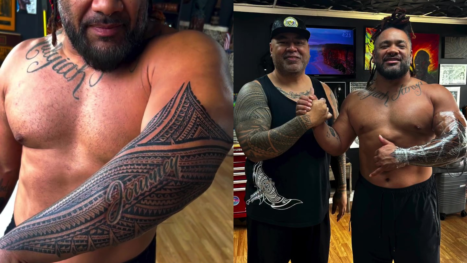
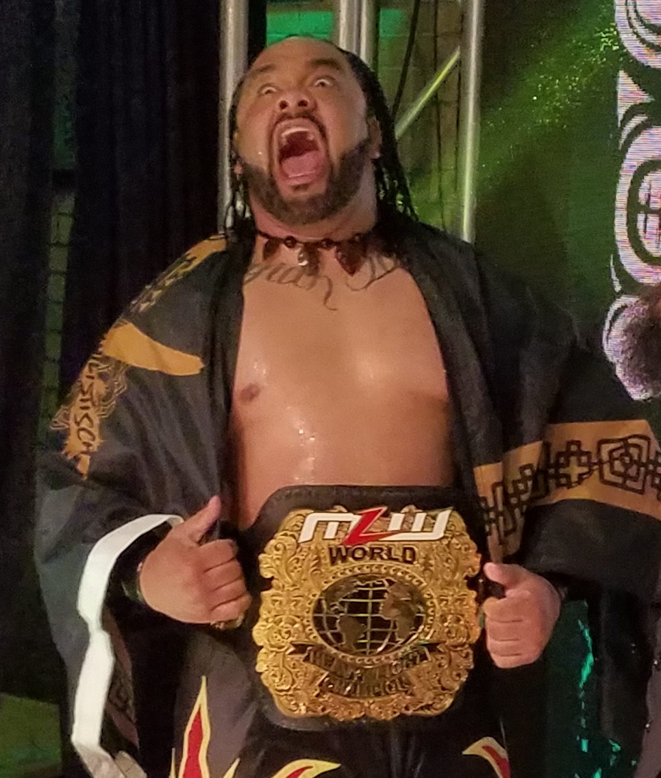
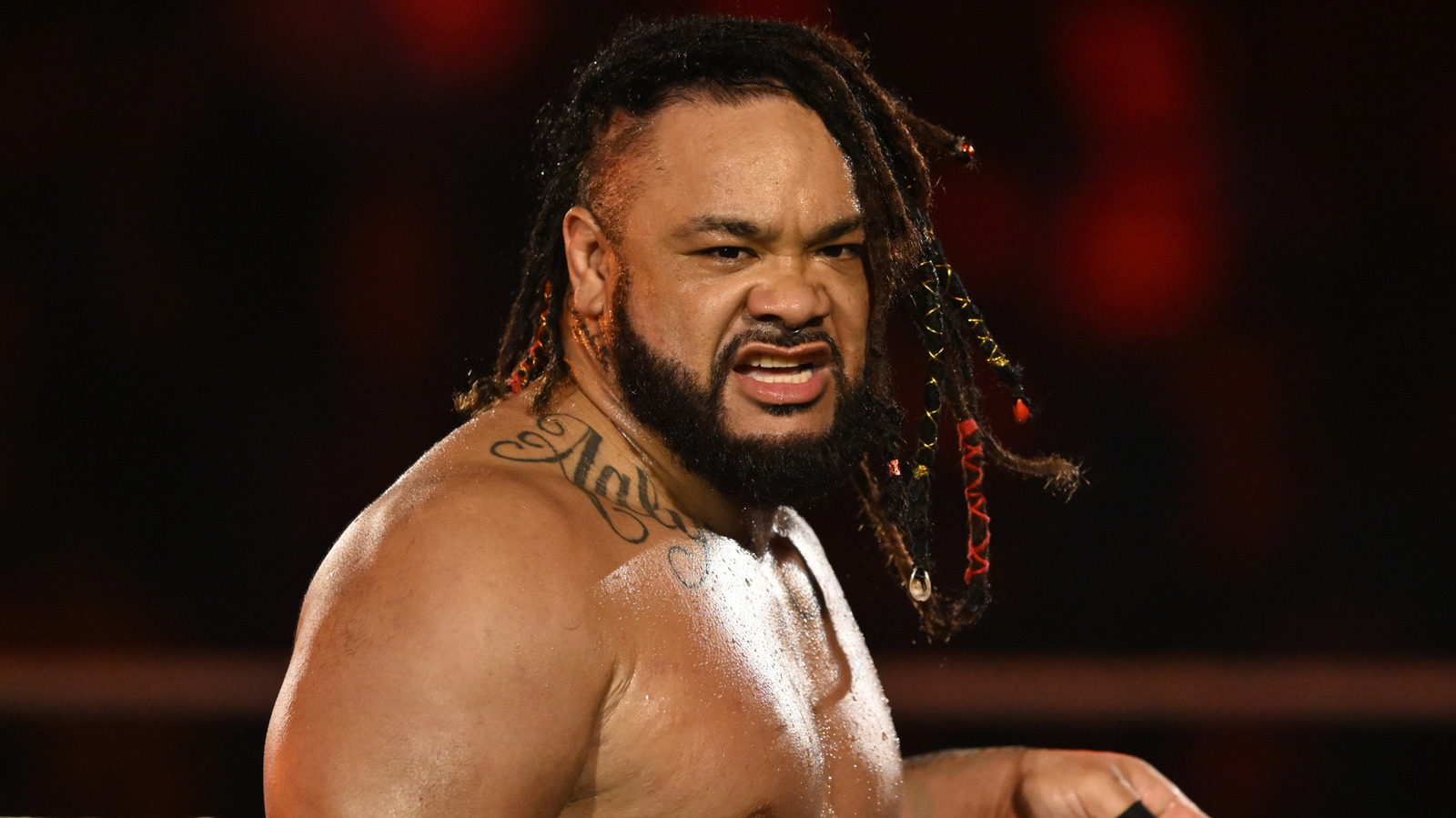
Jacob Fatu’s newest tattoo is a large black pattern on his left arm. Tattoo artist Michael Fatutoa, known as Samoan Mike, shared photos of the finished work.
Jacob Fatu’s Samoan tattoo style
The new work follows the outside of Fatu’s left arm and bends around the older “Journey” lettering, leaving the words visible as part of the larger design.
The close-up shows parallel bands, zigzag edges, diamonds and rows of small marks. Their repetition guides the eye along the arm without one large symbol taking over.
When Fatu raises his arm or reaches for an opponent, the pattern follows the muscle and changes shape. It’s visible in movement as well as in a still photo.
How the patterns read under arena lights
Ring lights, sweat and quick movement can flatten small details. Fatu’s bold black sections hold their shape at a distance, while open skin keeps them from merging into one dark patch.
Most fans will first see the tattoo during an entrance or a match, not in a studio close-up. From farther away, it reads as a clear graphic shape; up close, the smaller geometry comes through.
Why placement matters on a wrestler’s body
The outside of the arm gives the pattern a vertical route. An artist can plan how repeated shapes travel around an arm or shoulder, rather than placing them as separate patches.
For a sleeve, repeated shapes can follow the body while open skin breaks up the darker areas. Planning that route first helps the sections work together.
A style that looks built, not pasted on
The same black-and-skin contrast runs across the new work, so its parts read as one system. The heavier shapes suit the scale; delicate marks might disappear against the arm and from the distance of a ring entrance.
The design gets its interest from repetition and balance rather than a string of unrelated symbols.
Fatu’s older chest lettering adds a softer, handwritten line beside the harder geometry on his arm. The two styles give his upper body different textures.
What to borrow from Jacob Fatu’s look
When you plan a larger tattoo, decide which existing details should stay visible and show them to your artist before settling on the new layout.
Close-up photos help you study the geometry; ring photos show how the pattern looks as the arm bends and the lighting changes. They answer different questions about detail and scale.
You don’t have to fill the whole area at once. Decide how much coverage you want, and leave room to continue later if that still feels right.
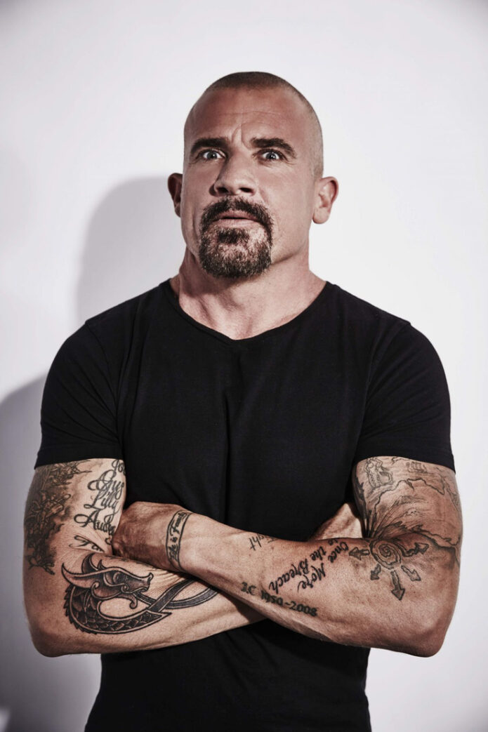
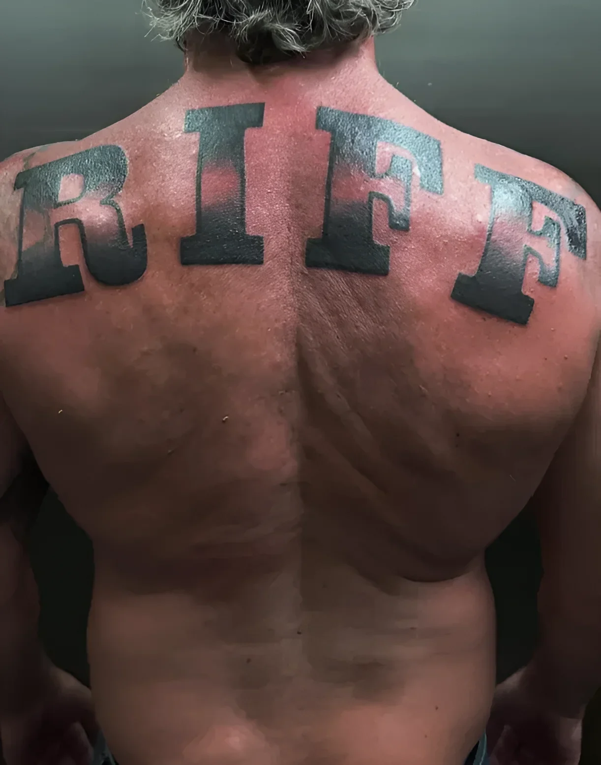
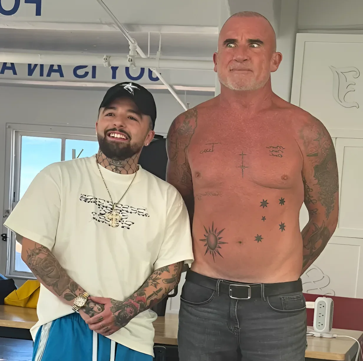
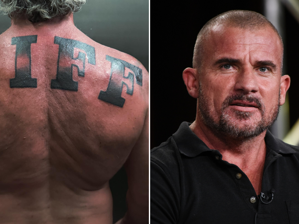
Dominic Purcell’s collection mixes bold lettering with smaller symbols and family references. The latest addition is a large “RIFF” across his upper back, tied to Penrith, the Western Sydney suburb where he spent much of his childhood.
The RIFF back tattoo is pure Penrith pride
The RIFF letters run across the shoulder blades in a broad, dark type style. Their simple shape keeps the word readable from a distance, without extra decoration around it.
Purcell shared the tattoo with a caption about Penrith, New South Wales, the 1970s and 1980s, and his pride in where he came from. “Riff” is a local nickname; read without that context, it could sound like a music reference.
7NEWS and The Nightly identify Los Angeles tattoo artist Jamie Gene Lopez as the artist. The piece was done at Joy Studio in downtown Los Angeles.
The newer chest work leans into Australian symbols
The chest and abdomen work takes a different approach. Instead of one large word, the newer Australian-themed tattoos are smaller symbols spaced across the body: cross shapes, star-like forms associated with the Southern Cross, and a radiating sun.
The open spacing leaves each mark visible as its own design rather than combining them into one mural. The symbols suggest an Australian theme without using a flag or a literal map.
Tatufoto’s September 2026 report links the new pieces to the country where Purcell grew up and identifies Jamie Gene Lopez in its accompanying coverage.
A shared subject can connect separate designs even when their sizes and outlines differ.
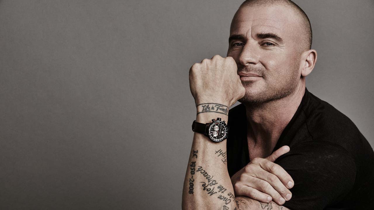
The Fail Better quote keeps the arm lettering direct
Older photos show Purcell’s arm lettering, including the line from Samuel Beckett’s Worstward Ho! often shortened to “Fail Better.” The full quote reads: “Ever tried. Ever failed. No matter. Try again. Fail again. Fail better.” On his arm, the script is stacked and follows the limb’s shape.
The letters have a loose, lived-in look rather than a polished logo finish. It stands apart from the block lettering on his back, but the dark ink ties the pieces together.
Life is Forever wraps around the wrist
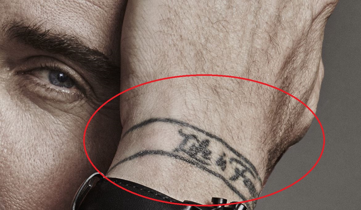
On Purcell’s wrist, a band-like tattoo reads “Life is Forever.” The hand-lettered words circle the wrist like a bracelet, and their short length makes them easy to catch in a photo.
Wrist tattoos bend and disappear under a watch or sleeve. This phrase is bold enough to remain legible as the arm moves, while the placement lets him cover it when he wants.
Near the arm lettering is an outlined anchor with a clear shape and an open interior. Anchor tattoos are often associated with stability, loyalty or home, but Purcell hasn’t publicly explained his own meaning, so those readings shouldn’t be assigned to him.
Other reported pieces include family names and dates, plus a large compass-style tattoo on his shoulder. Body Art Guru describes initials connected with his children at the compass points, with dates around it; other lettering is described as a tribute to his father.
What makes Dominic Purcell’s tattoos work
The collection is easy to read because each tattoo has a clear shape and place. RIFF needs room across the back; the wrist phrase circles the wrist; the anchor sits near the arm lettering without getting lost.
Purcell’s tattoos have accumulated over time, and they don’t all share one style. That leaves family names, script, symbols and large lettering with their own character.
Several newer pieces point to Australia, while the older compass and family tattoos add other references. A collection can carry a common thread without repeating the same image.
Final take
RIFF is the clearest reference to Purcell’s hometown. His chest symbols, Beckett quote, wrist phrase and reported family tattoos add other parts of the story without needing to match.
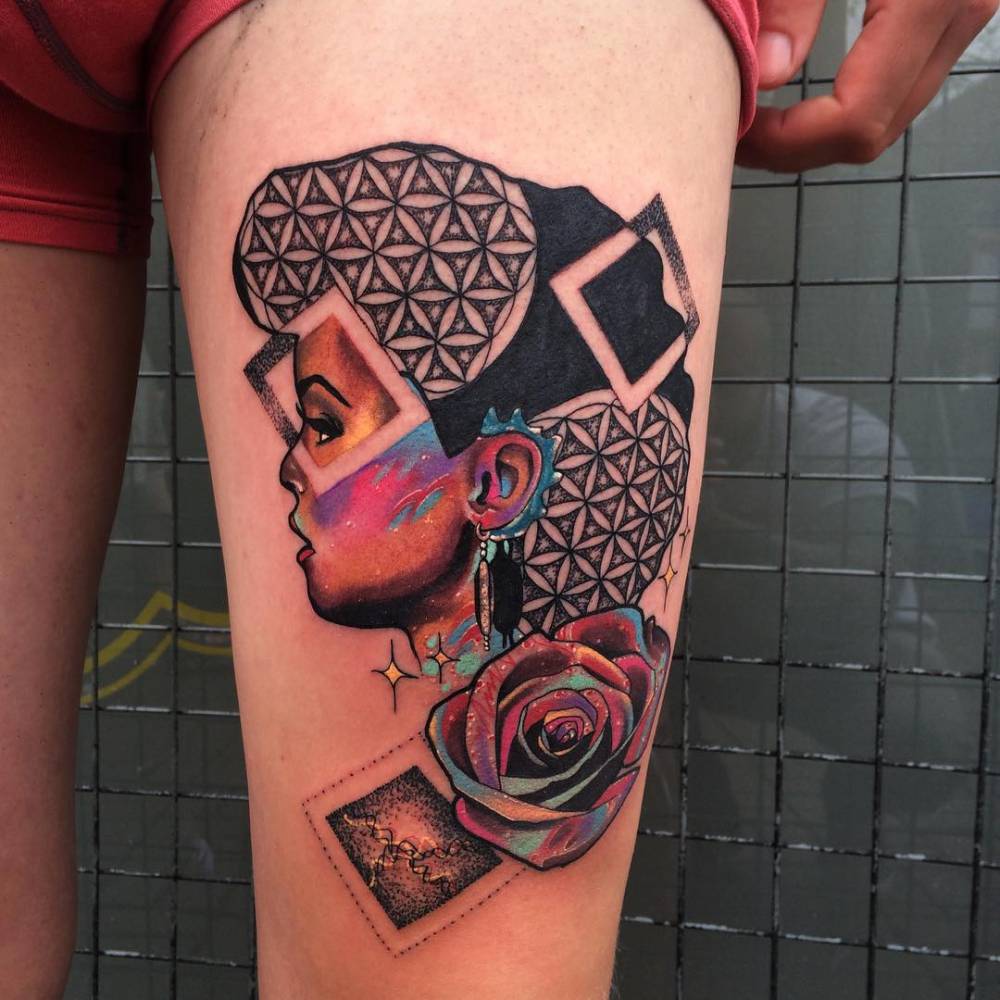
A close-up of Janelle Monáe’s thigh tattoo shows a flower-of-life pattern around a side-profile portrait, a rose and angular black shapes. The mix is dense, but each element has its own space.
Janelle Monáe’s abstract thigh tattoo
Repeated petals fill the top and sides of the design. The flower-of-life pattern breaks around the portrait and dark areas instead of sitting in a separate, untouched panel.
The profile draws the eye first. Reds, blue accents and deep shadows give the face a painted look; a long earring drops beside the neck, and a rose sits below it.
The geometry is regular, while the face and flower have softer shapes. Broad black areas break up the pattern and frame the colored parts.
If you like this kind of composition, choose one main subject and let the geometry support it. A crowded background can make a face or flower harder to read.
Why the placement works
The thigh gives a large design room to spread in both directions. The pattern sits behind the portrait, with the rose below it and dark areas guiding the eye around the leg.
A thigh tattoo can be covered or shown depending on clothing. The placement also lets a large design follow the leg’s curve instead of reading as a square panel.
Before committing to a portrait or large composition, check the stencil from more than one angle. Stand, sit and turn slightly so you can see where the face, flower and main lines land.
Color, linework and the black shapes
The warmest colors sit in the portrait, with red and orange around the features and cooler blue and green nearby. The rose echoes those warm tones without repeating them exactly.
Most of the geometric pattern stays black and gray, with small gaps of skin between the shapes. Those openings keep it from becoming a solid block; the dark angular sections frame the portrait.
When planning a large tattoo, decide where the strongest contrast should go. Here, color draws attention to the face and rose while the repeated geometry gives them structure. Fine lines, broad fill, smooth color and stippling can work together when each has a clear job.
Monáe’s style and the role of contrast
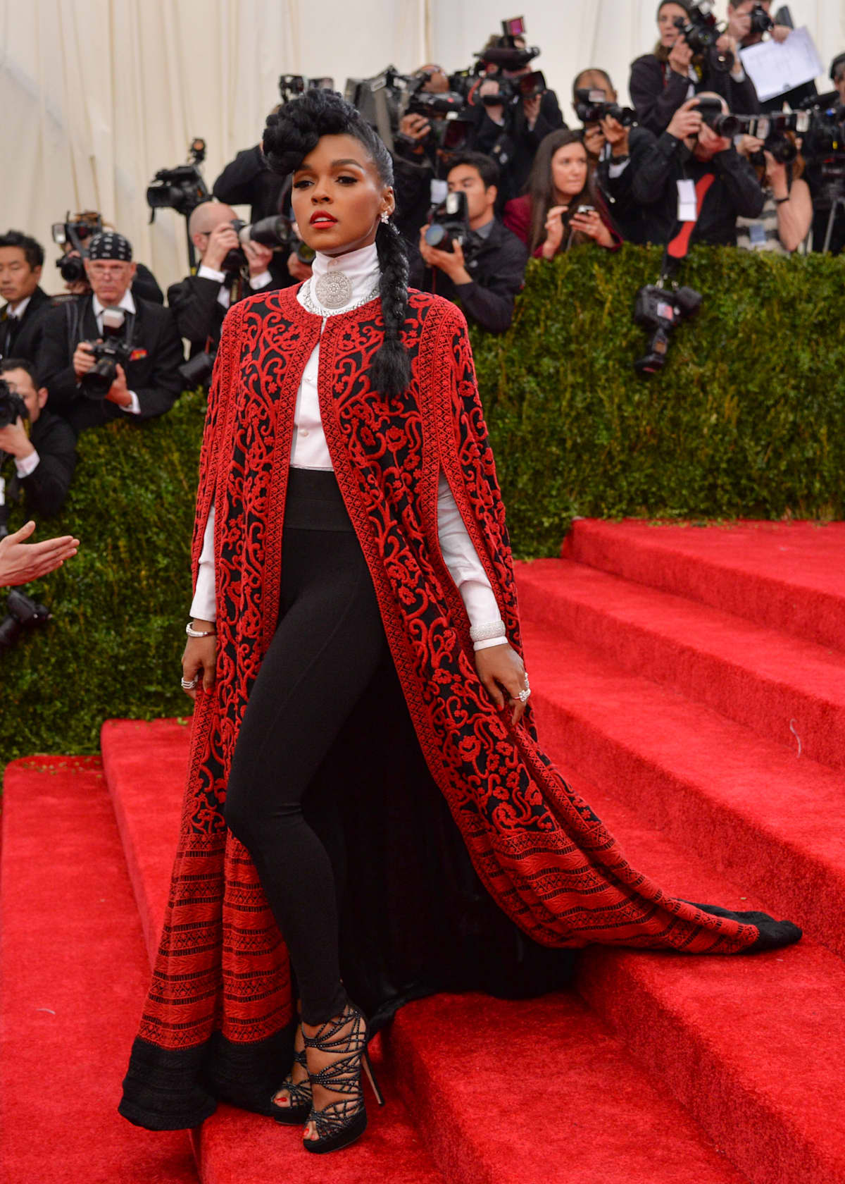
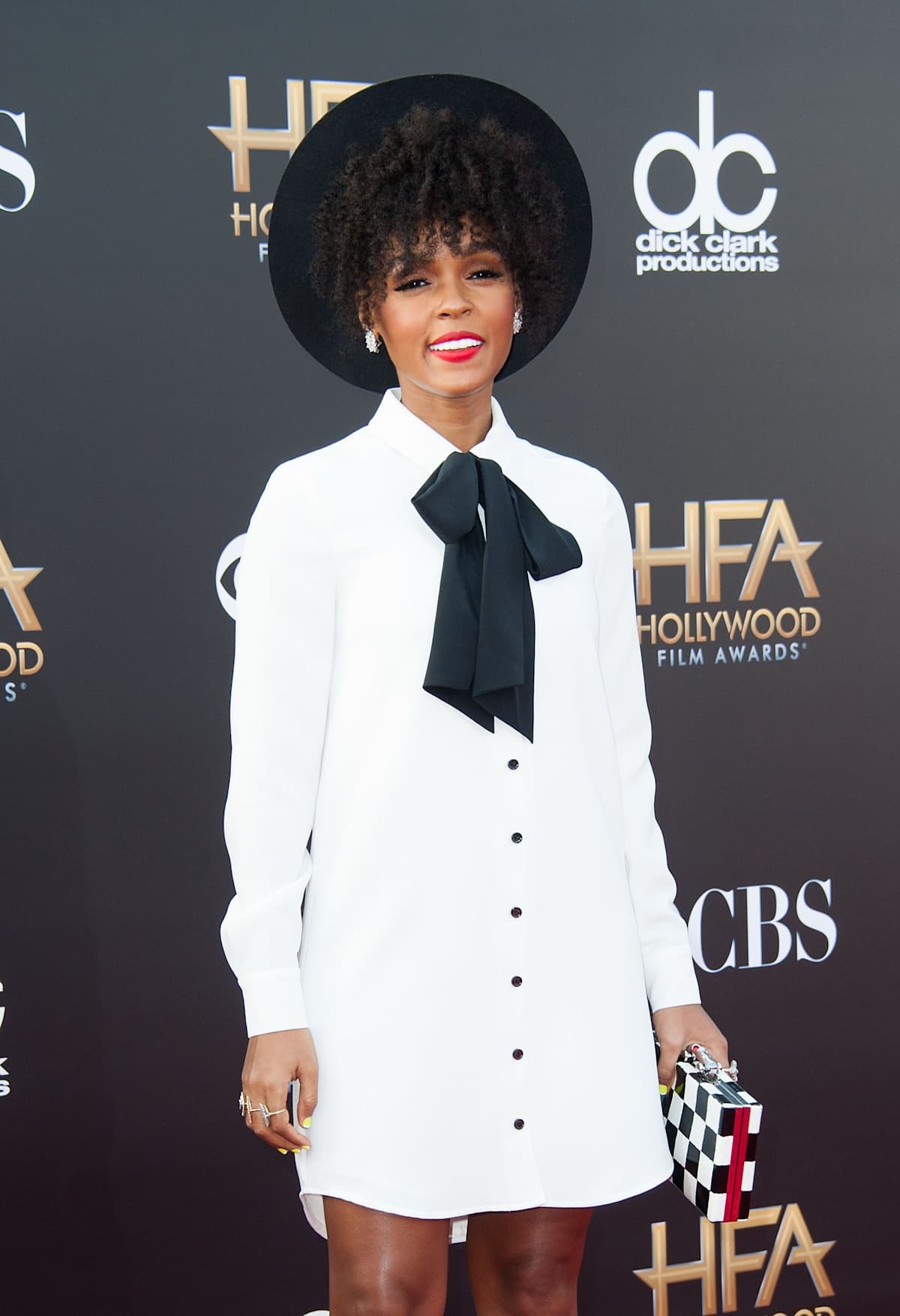
Monáe’s public style often pairs tuxedos, a black-and-white palette and flashes of red with futuristic details. The thigh tattoo uses a similar balance between precise geometry and an expressive portrait.
A 2015 interview with her stylist mentions hand tattoos but doesn’t identify their designs or meanings. Hand ink is exposed to washing, sun and friction and moves constantly, so small details can fade; a simple shape is easier to read at a glance.
Different placements don’t need to match. Repeating graphic shapes or strong black framing can connect tattoos without turning them into one continuous mural.
Reference portrait
The portrait is stylized rather than a strict copy of a photograph. That gives the artist room to shape the face with color and line while keeping the profile clear.
A profile has a strong outline from forehead to chin. The long earring adds a vertical accent, and the rose gives the lower part of the composition weight.
If you’re planning a portrait tattoo, bring references for both the expression and the lighting. Talk with the artist about what should carry into the tattoo and what can be simplified.
Scale matters too. Small facial details need room to heal clearly; a graphic portrait may work better than a tiny photorealistic face.
What to borrow from the design
The strongest idea is how each part has a job. The repeating pattern provides rhythm, black shapes frame the portrait, and the rose gives the eye another place to land. Negative space keeps those parts separate.
Use the visual relationship as a reference instead of copying Monáe’s exact tattoo. If you want the portrait to lead, keep the background quieter; if you prefer a softer design, give the floral element more room.
Ask the artist to show healed work in a similar style. Fresh ink can make lines look sharper and colors brighter than they will later. Healed examples show how the geometric gaps and color hold up.
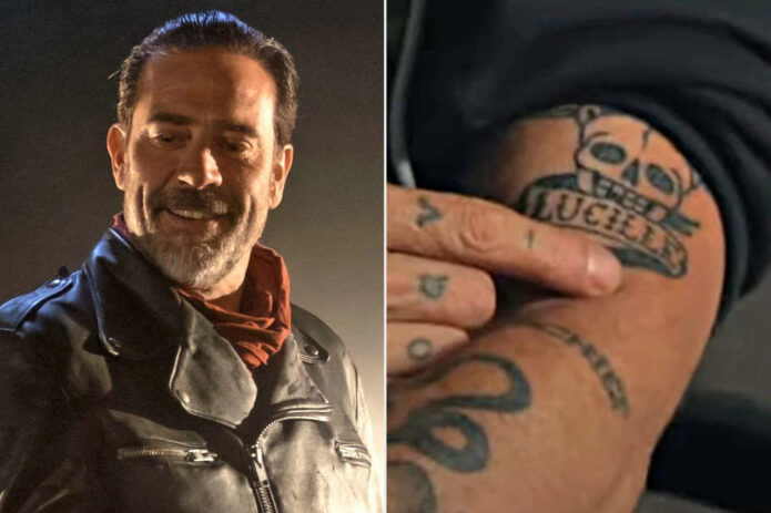
Most of Jeffrey Dean Morgan’s tattoos are black ink, and they don’t form one large sleeve. The best-known is “Lucille,” a nod to Negan’s barbed-wire bat in The Walking Dead. Photos also show smaller designs on his hands and forearms, including “Bisou,” which public tattoo coverage links to a personal loss, and ink shared with friends.
The forearm pieces may peek out from a rolled sleeve, while hand tattoos are harder to hide. A character reference also reads differently from a private word.
The “Lucille” tattoo has a very specific connection
The script “Lucille” is the clearest character reference in Morgan’s collection. It points to Negan’s barbed-wire baseball bat in The Walking Dead. In the close-up, the lettering sits beside a skull and barbed wire, so the reference reads without a portrait or the show’s title.
That’s a practical way to handle a role tattoo: one recognisable name, supported by a few related details. The lettering has a relaxed, slightly old-school look that suits the rough imagery. If you’re drawing from a character or object, a couple of clear cues can carry the idea without crowding the skin with tiny scene details.
His hand and forearm ink has a looser feel
Studio photos show script and small illustrative marks across Morgan’s fingers, hand and lower arm. They don’t form one continuous panel; each piece has its own space.
Hands get washed, exposed to sun and rubbed against things every day. Small letters and fine lines can soften, and too many details can blur together. Simple shapes with room around them are easier to read. Placement changes with movement too: ink may disappear when fingers curl, then show when the hand turns toward a camera.
The matching tattoo session with Jensen Ackles
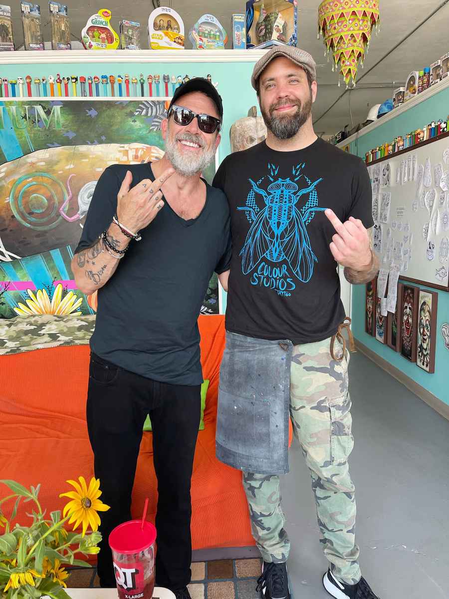
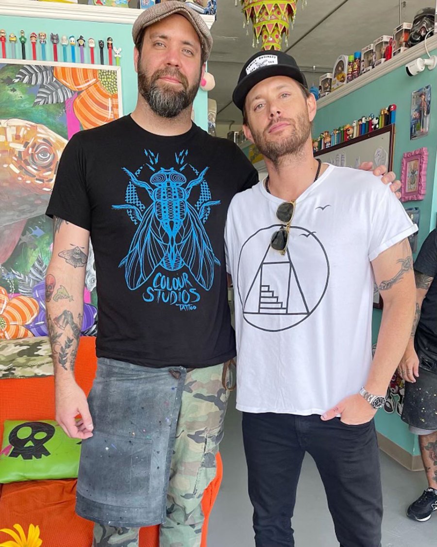
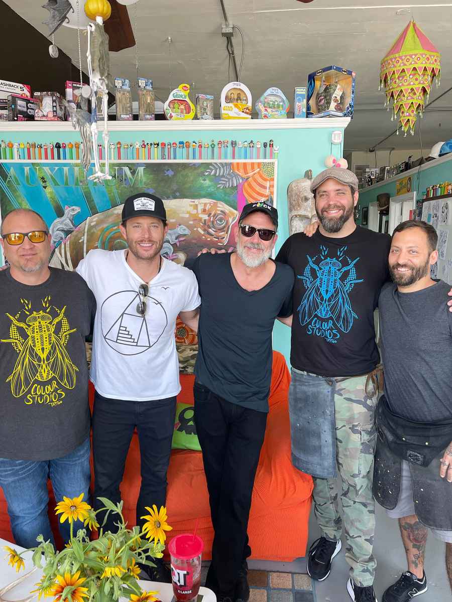
Morgan and Jensen Ackles worked together on Supernatural: Morgan played John Winchester and Ackles his son, Dean. Photos later showed them at a tattoo session at Colour Studios in Tulsa in June 2022.
The public images establish the session and who was there, but don’t clearly show every detail of the matching tattoos. There’s no need to fill those gaps with an invented meaning. An earlier tattoo outing around Morgan’s wedding period also involved Ackles and Jared Padalecki, with Mike Lucena of Flyrite Tattoo credited in reports.
Those pictures put the tattoos in the context of long-running friendships and shared time. If you’re getting matching ink, decide what you want to remember about the day as well as what the design should look like.
His forearm tattoos are easier to spot in event photos
At events, Morgan’s sleeves often cover most of his ink. A red-carpet photo with his shirt rolled up offers a clearer view of the forearm pieces. They look like separate tattoos that happen to share the same area, rather than one large statement design.
That placement is easy to show and easier to cover for a role, with wardrobe or makeup. It also lets the larger “Lucille” reference and smaller marks read in different ways; not every tattoo needs to follow one visual theme.
A quiet memory can carry a lot
The script “Bisou” on Morgan’s forearm is linked in public tattoo coverage to the loss of a pet. The French word means “kiss,” a simple choice with a softer tone than the imagery around Lucille. The reported connection gives the tattoo a personal note without needing a more elaborate design.
If you’re considering script for a memorial, make room for the lettering instead of shrinking a chosen font to fit. A tattooer can work from handwriting or another reference while adjusting the spacing so the word remains readable.
The room around the appointment matters too
A studio photo can preserve the people and place around an appointment, not just the finished tattoo. Other portraits show only the ink visible in that moment. Read each image for what it actually documents; a picture alone can’t explain why a design was chosen.
What to borrow from the placement
Think first about how visible you want the tattoo to be. Forearm ink is easy to show and can sit under a sleeve; hand tattoos are harder to conceal and become part of everyday appearance. A character reference, memorial word or friendship symbol may each feel right in a different spot.
Check the design while your wrist and fingers are moving, not only in a flat stencil photo. Hand and finger tattoos are washed, exposed and stretched often, so small lettering can lose crispness. Keep the shapes clear at the size they’ll actually be, and ask your artist how much detail can hold up there.
Making the idea your own
Borrow the approach, not the exact artwork. For a character reference, pick the detail that carries it. For a friendship tattoo, choose something that means the same thing to both people and can suit each person’s body. For a pet memorial, a word, small outline or familiar gesture may feel closer to your own memory than a generic symbol.
Set the size before the design gets crowded. Ask the artist which details will still read after healing, and let them adjust line weight, spacing and proportions. Different tattoos can have different moods; the reason behind them is enough to connect them.
What the collection gets right
Morgan’s tattoos bring together a role, friendships and a quieter personal memory without forcing them into one style. The collection feels like it grew over time rather than following a single visual plan.
The useful lesson is to start with a reference or memory that matters, then choose a design and placement that work at their real size. His ink feels collected, not arranged to match.
Among Slayyyter’s tattoos are a black-and-grey Jesus portrait, “Paradise” across her right-hand knuckles and “Starfucker” on her left inner forearm. Mark Mahoney did the portrait at Shamrock Social Club in West Hollywood; Interview documented the session in 2024. Pitchfork has connected the lettering to her first two albums.
The Jesus Portrait on Her Left Bicep
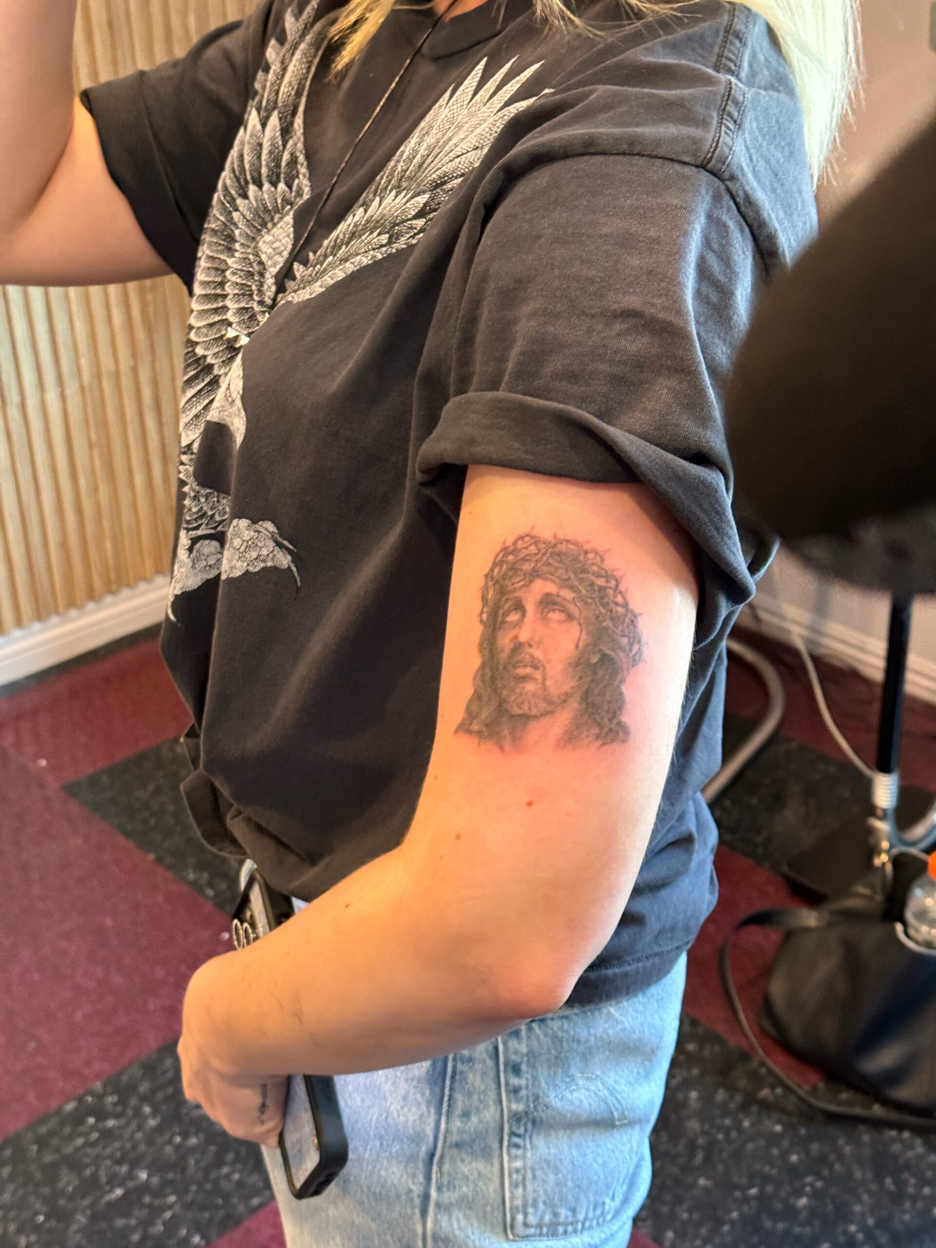
Slayyyter’s Jesus tattoo is a compact black-and-grey portrait on the outer upper left arm. His face angles upward, with a crown of thorns framing it; soft shading keeps the features clear. Interview’s close-up shows the portrait below her rolled T-shirt sleeve. It reads as one self-contained piece, not the start of a sleeve. Mahoney did the tattoo at Shamrock Social Club, where religious imagery is part of his work.
In the feature, Slayyyter says her next album would use a lot of Catholic imagery and calls Jesus one of the most recognizable faces in history. Those comments help explain her interest without reducing the portrait to just a religious symbol or a pop reference.
A portrait depends on the reference and expression. Here, the upward gaze, crown and restrained shading carry the design without extra decoration.
Inside the Studio
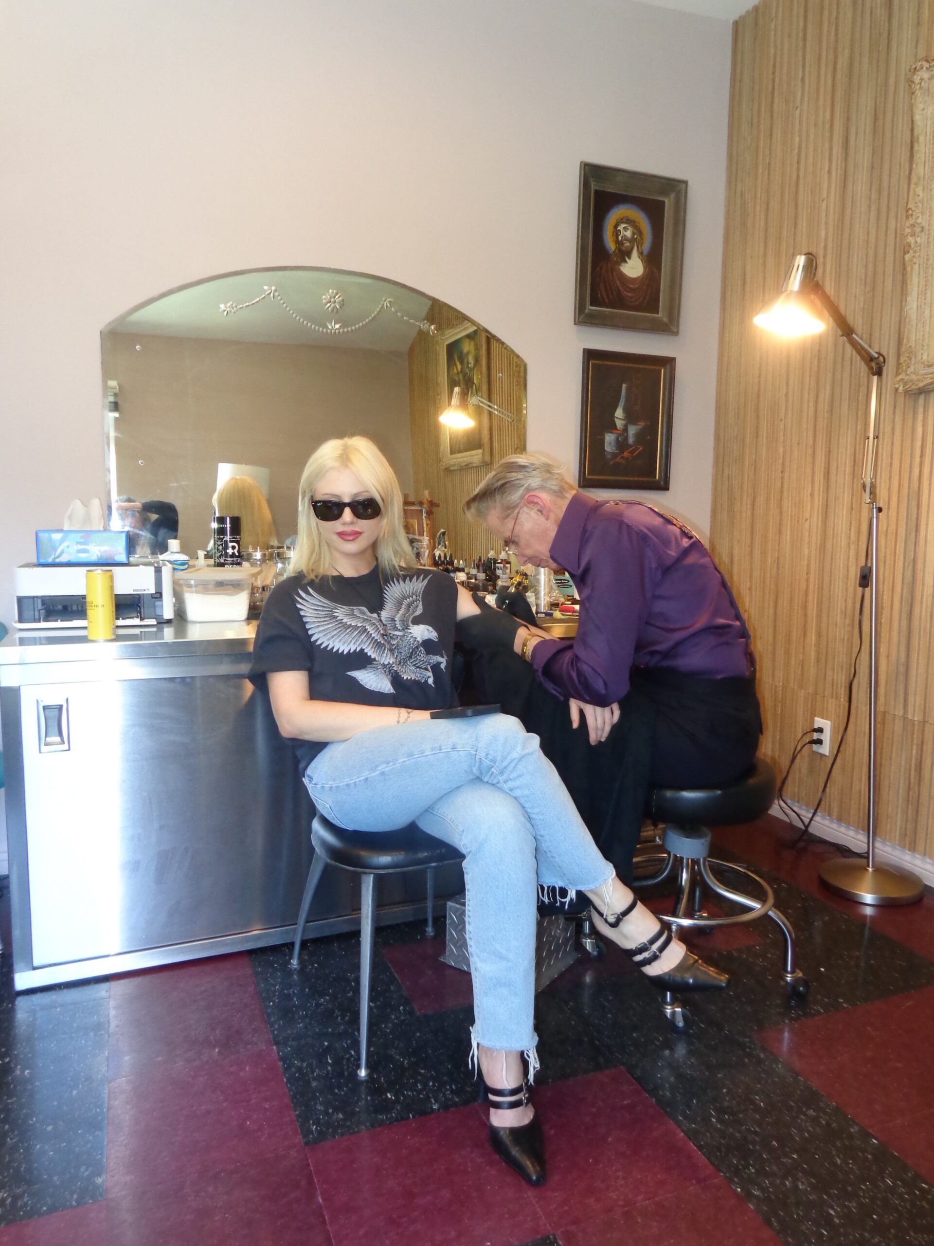
Interview’s photos give a sense of Mahoney’s studio, too. Slayyyter is pictured in a black T-shirt and sunglasses, with the artist, tattoo equipment and framed religious pictures around her. The wider shot adds setting; it isn’t a close-up that shows tattoo detail.
The room has an old-school Los Angeles tattoo-shop feel, with framed art, wood and polished floors. That setting suits the portrait’s reference to traditional religious art.
Slayyyter has described getting tattooed as a chance to sit, talk and connect with an artist. The Interview conversation moves through religion, punk, old Hollywood, film noir and the way celebrity clients pass through Mahoney’s studio. Those details give the session its own context beyond the finished image.
When Album Titles Become Permanent
Pitchfork links the gothic “Paradise” lettering across Slayyyter’s right-hand knuckles to her 2021 debut album, Troubled Paradise. The word is hard to miss in that spot; it shows whenever she gestures or holds a microphone.
The word sounds gentle against the heavy lettering. That contrast suits her music’s glossy pop surface and darker humor.
Slayyyter has said she got tattoos tied to her first two studio albums. After WOR$T GIRL IN AMERICA, she said she wouldn’t get another album tattoo because she worried the pattern might make her next record flop.
The other album-related piece is “Starfucker,” written across her left inner forearm and linked to the 2023 album. Pitchfork describes the lettering as resembling an A-lister’s hurried signature. The forearm is easier to cover than the knuckles, though the phrase shows when she wears short sleeves. The title also punctures the celebrity fantasy the album plays with.
The Catholic Thread Running Through Her Visual World
Slayyyter has said the strict religious environment around Catholic school made her uncomfortable, even as she remained drawn to Catholic art’s imagery, language and drama. Her comments point to a complicated connection, not a straightforward statement of devotion.
In the Interview feature, she compares Jesus to a rock star. The portrait draws on a familiar religious image while making room for her own pop-cultural reading of it.
How the Visual World Fits Together
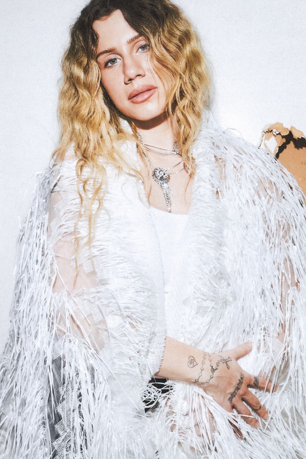
In the early SoundCloud days, Slayyyter’s public image leaned on Y2K gloss, webcam photos, fake glamour and a certain mystery around who she was. Later, she began directing videos, making stage clothes and building visual settings around her songs.
The Jesus portrait has a documented studio story, while the hand lettering and forearm script appear alongside different album eras. They don’t come across as props for a single release; each is a piece she chose to keep.
Building a Collection That Fits
Before borrowing a design, decide what you want your own tattoo to refer to. An album title, religious image or phrase only works if it means something to you, too; you can take the idea without copying the exact artwork.
Then think about visibility. An upper-arm portrait can be covered, knuckle lettering will show in most everyday gestures, and inner-forearm script sits between the two. Choose a placement that fits how you want to live with the tattoo, not just how it looks in a photograph.
The official “DANCE…” video below gives a sense of the visual world around her music.
Kaia Gerber Tattoos: Tiny Fine-Line Designs and Their Meanings
Kaia Gerber’s tattoos are mostly small: a number, ankle lettering, flowers and fine-line drawings. Some stories are public; others are partly hidden. Teen Vogue connects her tiny 23 to the start of her career, while other designs mark family or friendships.
Kaia Gerber’s tiny 23 tattoo
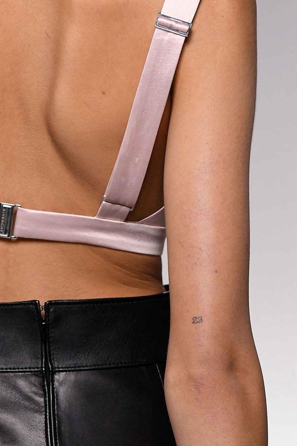
The small 23 near Kaia’s elbow is one of the clearest pieces in her collection. Teen Vogue linked the number to the beginning of her career. It can disappear when her arm is relaxed and show when she bends her elbow or wears a sleeveless top.
The digits are simple enough to read at a small size. Their spacing matters: too close and they may blur together as the tattoo ages. The elbow also moves, so the design can look a little different with the arm straight or bent.
The ankle lettering is easy to miss
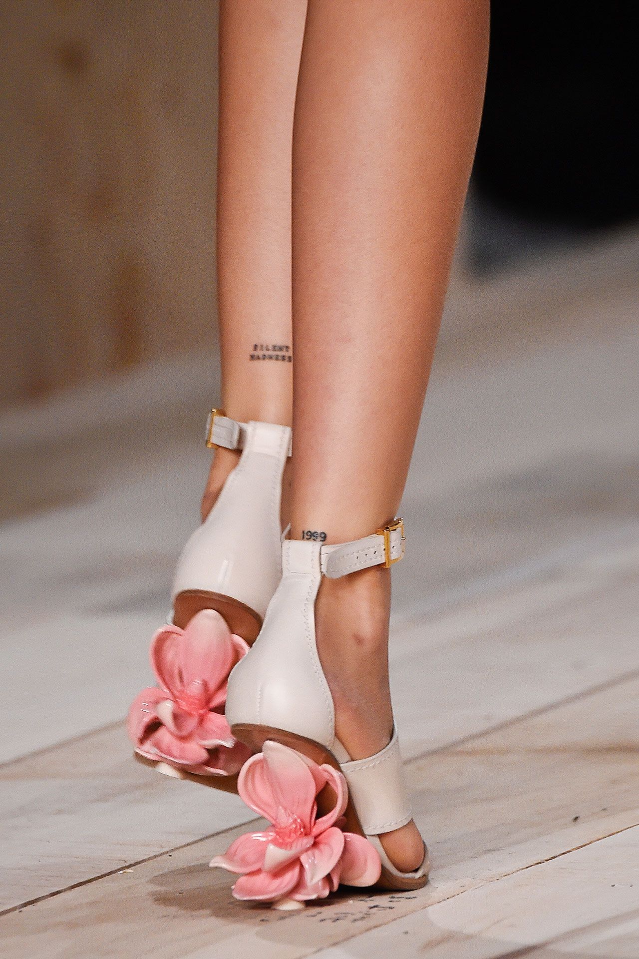
Kaia has small lettering near her ankles, including SILENT MADNESS and 1999. Trousers, socks or shoes can cover the words, which sit low on the leg.
Small text needs enough room to stay legible. A tattooer can help size the letters and place them where the ankle and footwear will not crowd the design.
A small flower on the wrist
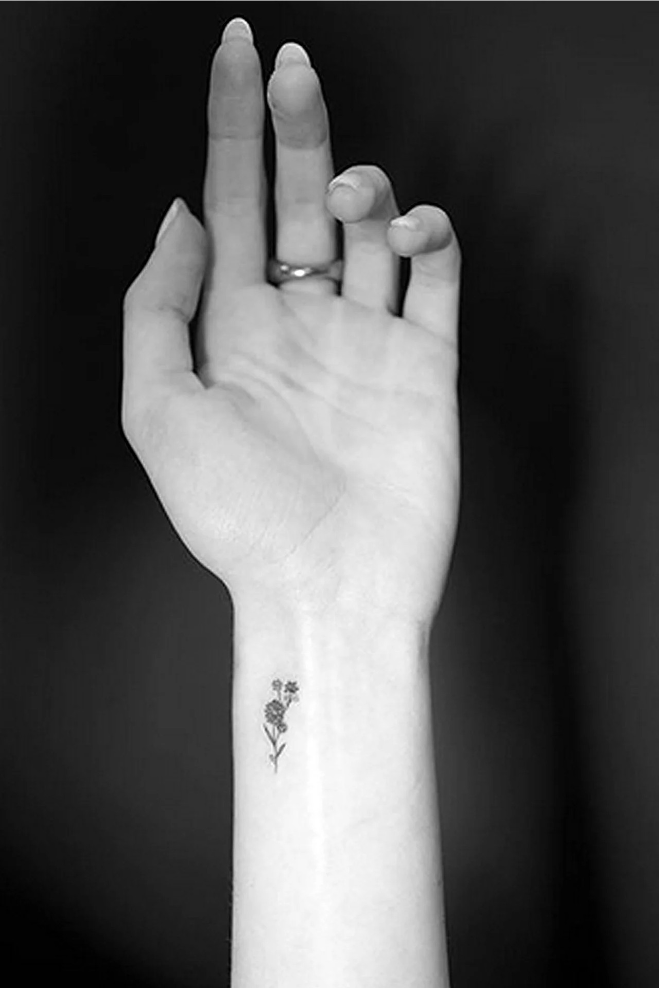
One wrist tattoo is a small flower sprig made from fine stems and petals. The open space around it keeps the shape readable, and its size lets it sit beside a watch or bracelet without taking over the wrist.
The design uses a few lines instead of a fully shaded bouquet. With fine-line work, leaving room between the marks helps the small details stay distinct.
The female torso tattoo with a personal edge
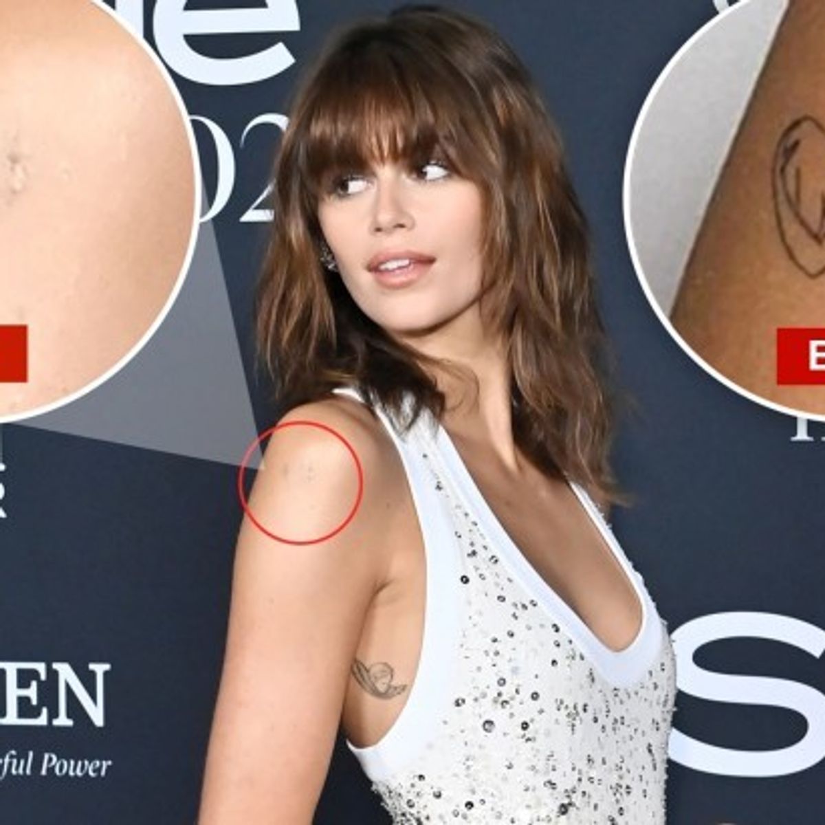
In a 2020 studio session, Kaia got two small designs connected to her brother Presley: flowers on her wrist and a female torso outline on her arm. The figure’s folded arms form a heart. Its single-line look is closer to a quick drawing than a detailed portrait.
Later coverage showed the torso design in the context of possible removal. The photos document what was visible at the time; they do not establish that it remains unchanged today.
Why the small scale works
The number, flower and ankle words each use a different placement. A small tattoo can still be noticeable on a wrist or elbow, while ankle lettering is easy to cover. The location changes how often a design appears, even when the tattoo itself stays modest in size.
Matching ideas with Cara and Ayo
Kaia and Cara Delevingne have solemate tattooed along the arches of their feet. The placement makes the word a private joke unless their feet are visible.
E! also reported that Kaia got a matching tattoo with Ayo Edebiri, but said Kaia was keeping the design hidden. Its motif and placement have not been confirmed, so there is no clear detail to add.
The details she keeps quieter
Teen Vogue has also reported a tiny angel on Kaia’s ribcage and Jordan, her middle name, on her arm. She has discussed crossed-out I know tattoos in connection with Tracey Emin’s neon work, and Vogue referenced never rush in a 2024 profile.
These reports document designs from different moments. A photo can show what was visible then; it is not a complete map of what Kaia has now.
The visual language around her work
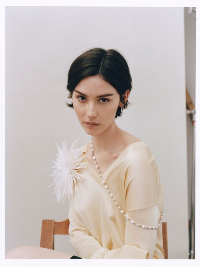
This editorial photo gives context for Kaia’s styling, but it is not evidence of a tattoo. Her small designs can sit alongside different outfits without taking over the look; the close-up tattoo photos are more useful for judging line quality and placement.
What to borrow for your own idea
If you are using Kaia’s tattoos as references, focus on the size and placement rather than copying the exact design. Check text against the original source, and ask an artist how much spacing a fine-line piece needs to stay legible on your skin.
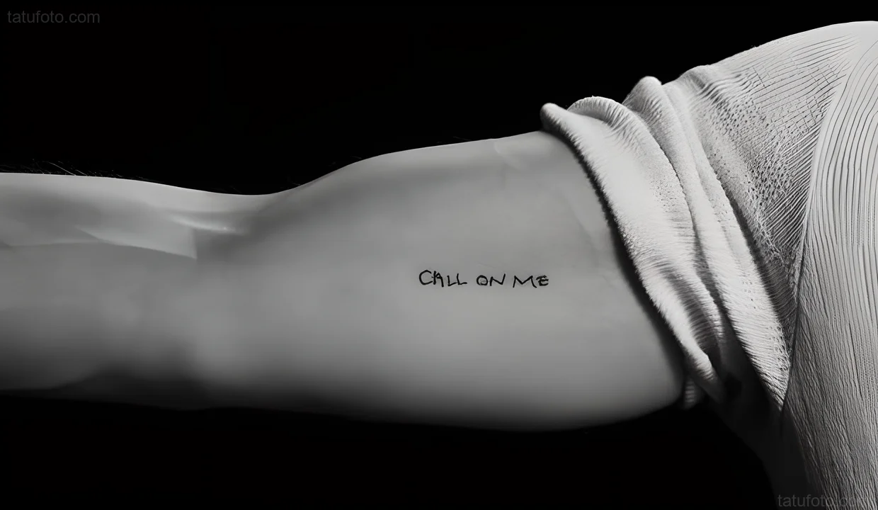
Charles Melton and several Warfare castmates got matching “Call On Me” tattoos after filming.
Reporting confirms the shared design, but the available close-up does not show whose arm is pictured. It cannot establish Melton’s exact placement.
Charles Melton’s “Call On Me” Tattoo
The close-up shows “CALL ON ME” in dark, slightly loose handwriting. The lettering is the clearest visual reference for the shared design.
Castmates, Pressure, and Trust
The film follows Navy SEALs during a chaotic operation, and the cast went through demanding preparation together. Its opening uses Eric Prydz’s “Call on Me.” After working together, the actors turned that song reference into a shared tattoo; in the context of the film, the words also read as an offer of support.
With the Cast
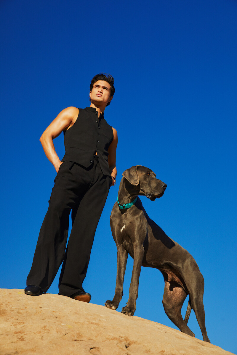
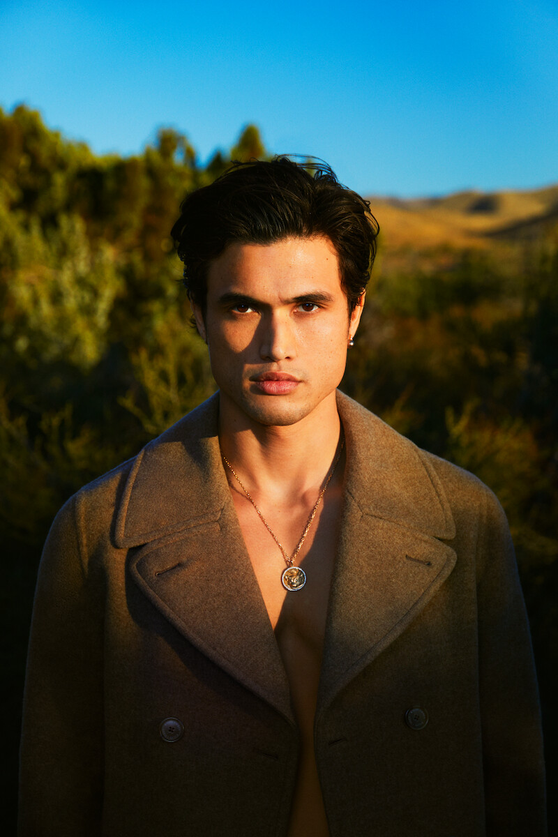
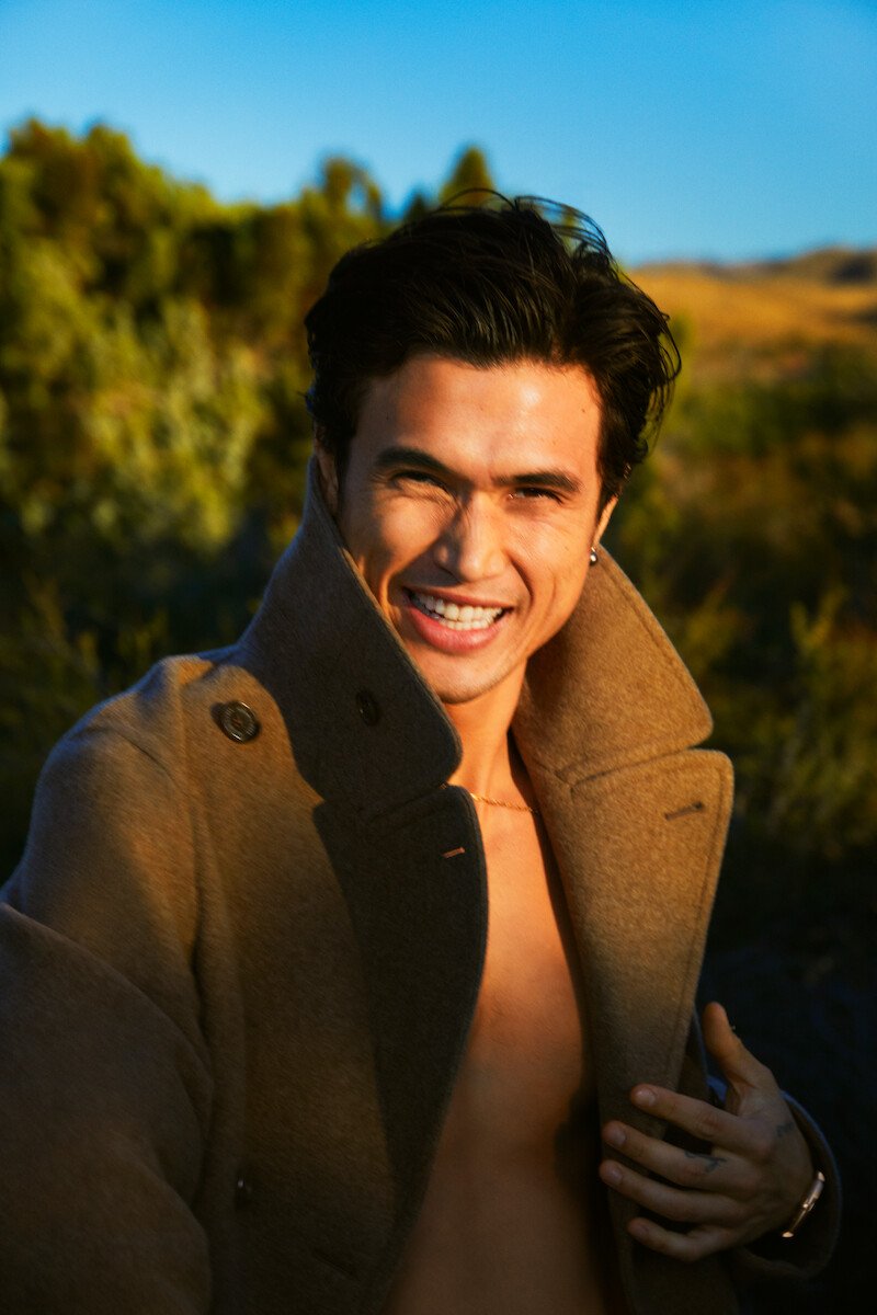
The portrait above is contextual; it does not show the tattoo. Cast interviews explain why the group chose the words.
On Set Together
Melton has also spoken about matching tattoos after another cast experience. That gives some context for the choice, but the Warfare design has its own reference: the cast’s shared time on the film and the song in its opening.
After the Shoot
The lettering stays small and readable, with no extra symbols around it. For anyone considering a short script tattoo, the key is to leave enough room between letters for the words to stay clear as the ink ages.
Away From Work
The phrase still reads as an offer of help to someone who has never seen Warfare. The film is the source of the cast’s shared reference, but the words also work on their own.
A Look at Charles Outside the Film
The gallery portraits are contextual images, not additional tattoo evidence. They show Melton in outdoor and editorial settings; the reported close-up remains the only image here that clearly shows the design.
For more celebrity tattoo ideas, browse the actors tattoo archive. If you are considering a shared phrase, choose words that matter to everyone involved and make sure the lettering has enough room to stay legible.
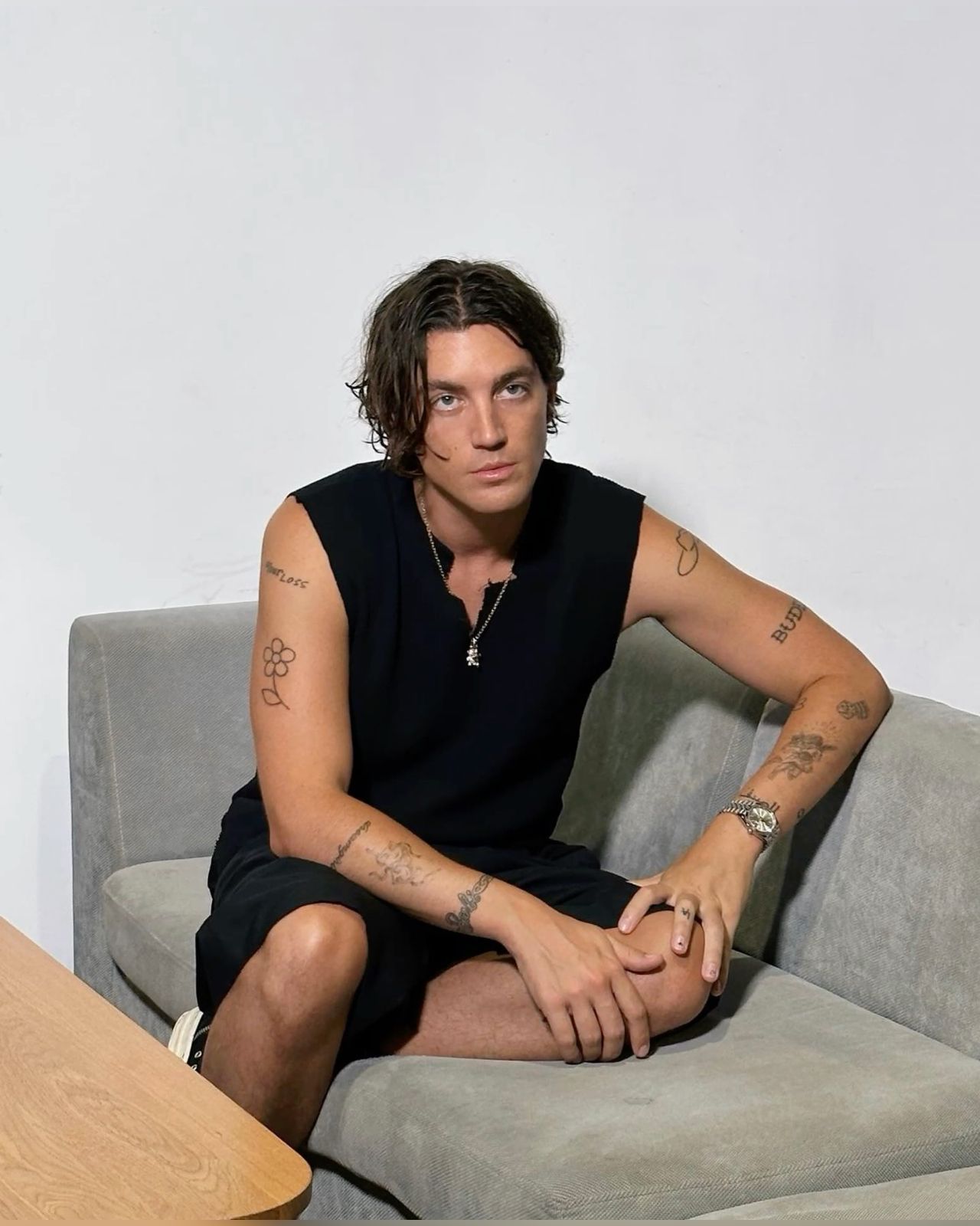
Paul Klein’s tattoos read like a collection gathered over time. There’s a number tied to an old LANY apartment, a whale connected with childhood, tally marks for John Mayer shows, family lettering, and a few spare words. Most use thin black lines and sit apart rather than forming one continuous sleeve.
In GQ’s Tattoo Tour, Klein points out the number 9, a heart, seven tally marks, the LA finger tattoo, a magnet, a whale, the date tattoo he got with Halsey, and several smaller symbols. The pieces share a scale more than a single theme.
That loose layout keeps each design easy to read. The stories are different, and some details are personal.
Paul Klein’s tattoo style in one look
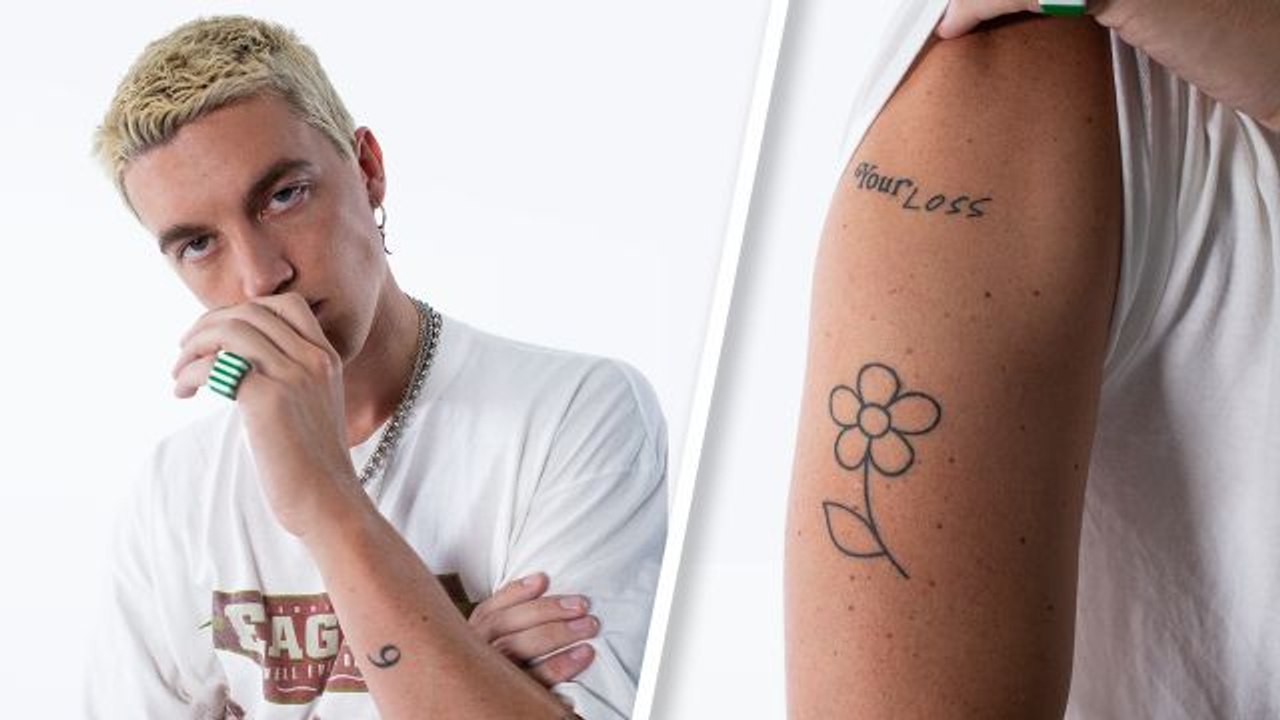
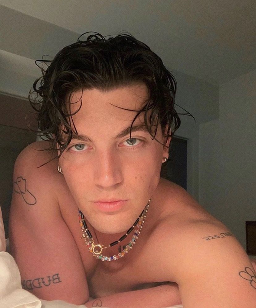
The flower and “Your Loss” lettering on Klein’s upper arm make one of the clearest pairings in the collection. The flower is an open black outline with rounded petals and a narrow stem. The words sit above it in loose handwriting; neither design relies on dense shading.
GQ describes the flower as part of LANY’s visual language. In the photo, the two pieces remain separate and readable. The image shows what the phrase looks like, but doesn’t establish a personal story behind it.
Paul Klein’s small black-line tattoos
A wider portrait shows small marks across both arms, including the flower, lettering and several compact outlines. The photo isn’t clear enough to identify every shape, but it shows how Klein leaves space between the pieces.
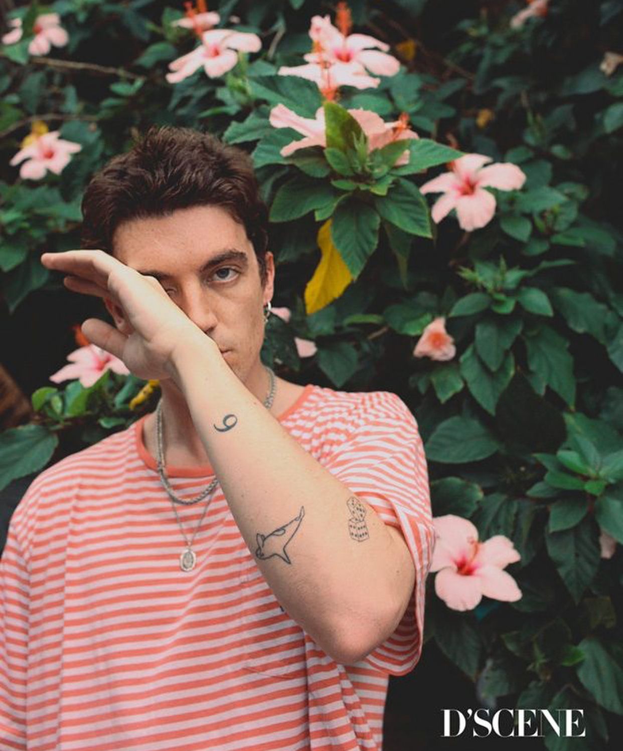
The whale is drawn with a fine outline; the LA tattoo and heart are small, simple marks. Klein told GQ that the whale is his favorite animal and connects to childhood memories of Free Willy and a Michael Jackson song. He described the magnet as a reminder that people had called him magnetic, and as a symbol of drawing good things toward him.
Paul Klein’s 9, whale, and simple black-ink tattoos
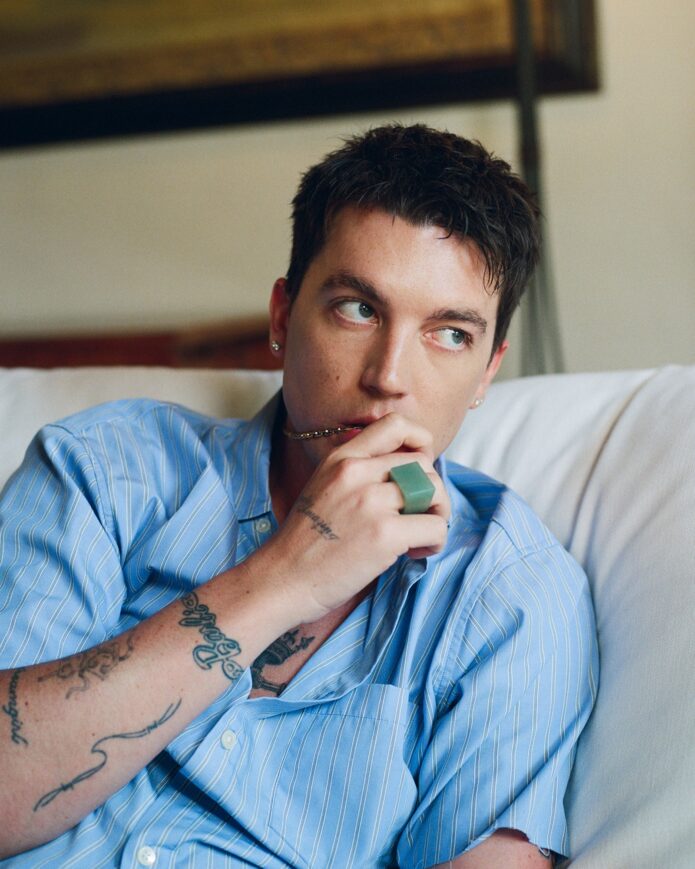
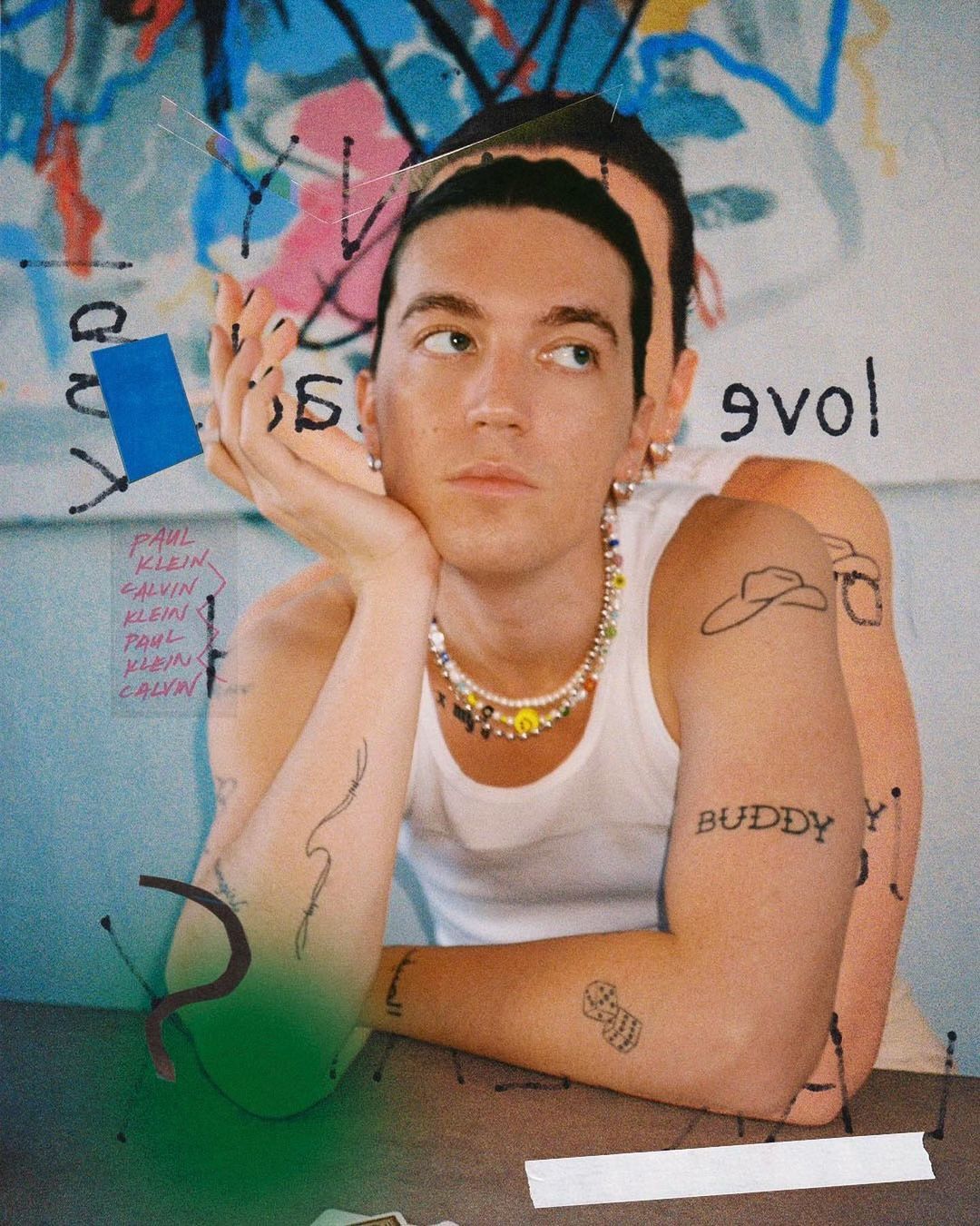
In this seated portrait, the gaps between the tattoos are easier to see. Klein told GQ that the number 9 refers to the apartment where LANY lived and wrote some of its early EPs. It’s a small mark with a clear link to the band’s early years.
The seven tally marks record seven John Mayer arena dates. Klein also has a tiny LA tattoo on one finger. He said the original faded after too much sun exposure in Malibu and had to be redone. Finger tattoos get plenty of sunlight, washing and friction, so their placement can mean more upkeep than a larger arm design.
The Buddy tattoo and the personal pieces
Klein told GQ that “BUDDY,” lettered on his forearm, honors an uncle who served as a stand-in grandfather. The word is direct and easy to read, leaving the relationship at the center of the tattoo.
Another piece reads “thx” in Klein’s own cursive. He described it as a gratitude tattoo; the handwriting makes it look like a short note rather than set lettering. If you’re considering a word tattoo, writing it by hand first can give an artist a more personal reference than a stock font.
Klein and Halsey also got matching date tattoos connected to a November 5 show; they got the tattoos on the sixth. The numbers mark a specific shared event.
Paul Klein’s flower and “Your Loss” tattoos
An outdoor portrait offers another view of the layout. The 9 sits near Klein’s wrist, with a small whale-like outline farther up his forearm. The flower and “Your Loss” are visible too, but the photo adds little about their meaning; it mainly shows how the separate designs sit on the arm.
What makes Paul Klein’s collection work
The tattoos don’t need matching subjects to feel related. Their modest scale, open black lines and spacing give them a loose patchwork look. A number, animal, handwritten word and flower can each keep its own character without filling the whole arm.
That space is part of the design. It lets a new piece sit beside the older ones without turning them into one crowded image.
Ideas to borrow without copying
Klein’s tattoos are better used as references for approach than as designs to copy. Start with a detail that belongs to your own life: a place, a family nickname, a stretch of time or an animal tied to a memory. A short word in your handwriting can feel different from the same word in a typeface.
Think about placement after you know what the design needs. A finger is exposed and can fade; the inner wrist moves and catches sun; the upper arm gives an artist more room and is easy to cover. A tattooer can help set the size, but you can decide whether you want a quiet detail or something you’ll see often.
If a celebrity tattoo catches your eye, borrow the quality you like—the spare line, simple shape, handwriting or open space—and build a design around your own reason for getting it.
The simple takeaway
Klein’s collection holds together through its small scale and open linework, while each tattoo keeps a separate story. The space between the pieces is as much a part of the look as the ink itself.
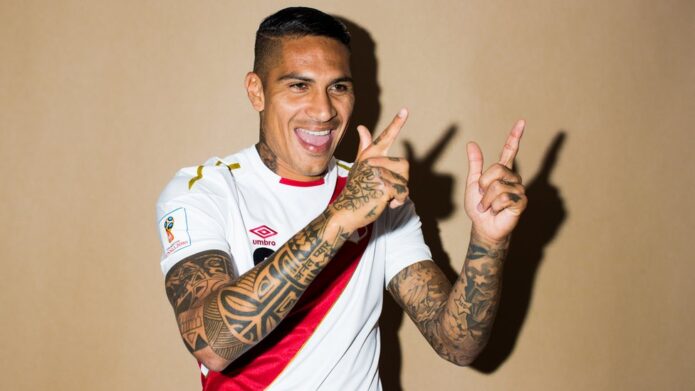
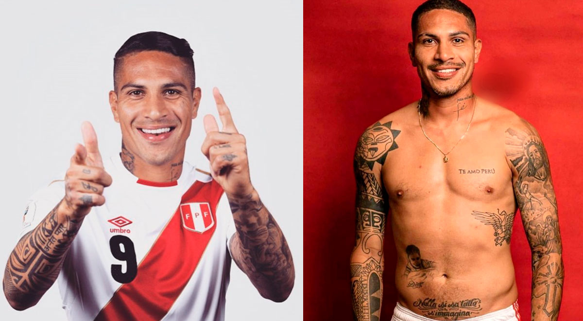
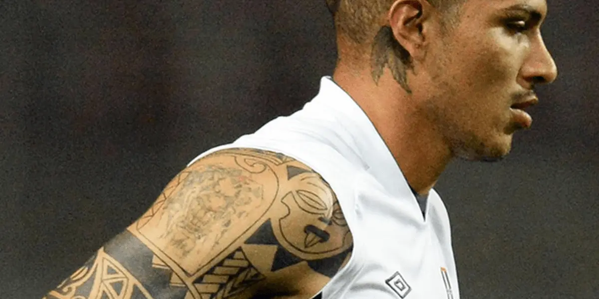
Paolo Guerrero’s tattoos mix heavy black geometry with lettering, religious imagery and shaded portraits. In photos, the designs cover his chest, arms and neck, with some details tied to Peru and football. The collection spans several styles rather than following one repeated motif.
The useful reference is how the pieces sit together: dense black sections, open skin and smaller marks share the same body without becoming one design. Their personal meanings aren’t all spelled out, so the visible details are the clearest place to start.
The “Te Amo Perú” chest tattoo
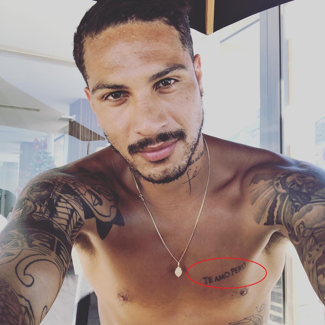
The words “Te Amo Perú” cross Guerrero’s chest in clear lettering. The phrase fits his long association with Peru’s national team and his role as its number nine. Its direct placement across the pectoral gives the text room to read.
If you’re considering chest lettering, think about how the phrase will follow the width of the body. A short line tied to a place or person is easier to keep legible than a long quote, and the artist can help set the spacing and size.
Blackwork geometry across the arms
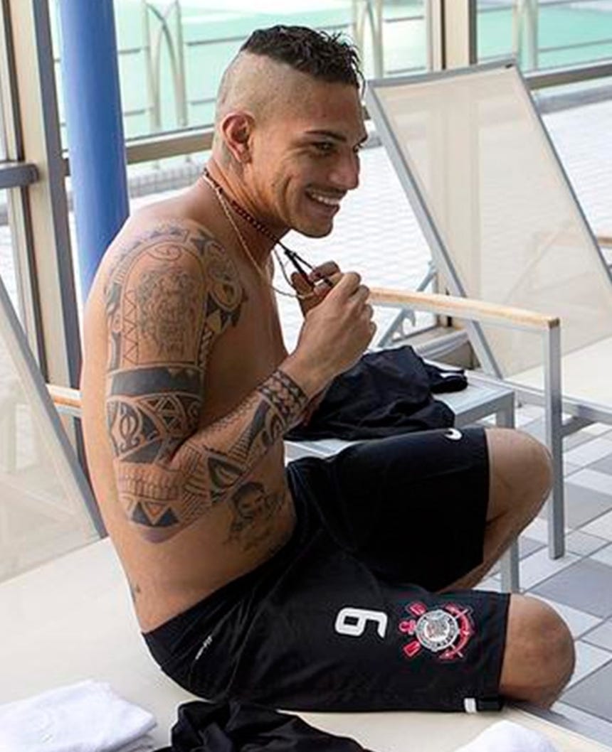
Guerrero’s arms carry bands, angular shapes, repeated patterns and broad areas of dark fill. The images show a strong blackwork style, though the designs themselves vary. Similar line weight and contrast help the separate pieces read together.
Lighter gaps of skin break up the dark areas, so the arms don’t become a single solid block. That spacing is part of the layout, alongside the black shapes themselves.
Religious imagery and portrait realism
Photographs also show religious figures, faces and shaded imagery across Guerrero’s torso and arms. The smoother portrait work contrasts with the harder-edged geometry and gives the collection a different texture.
A realistic tattoo needs a reference and enough room for its details. Before choosing an image, consider where it can sit on the body; the placement affects how the artist can shape the composition.
The neck tattoos add a sharper edge
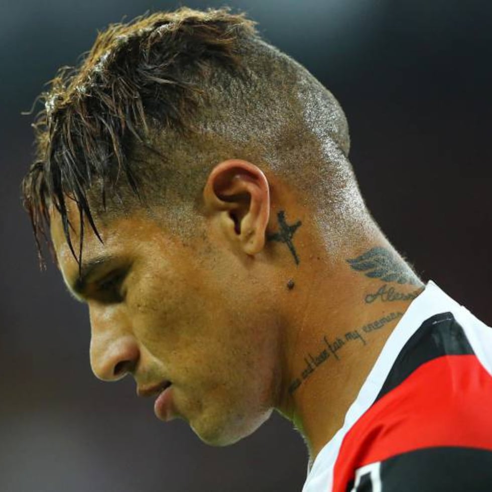
Guerrero has a small script mark and darker symbols near his jawline and behind his ear. They are compact, but their position makes them part of his everyday appearance in a way that an upper-arm tattoo may not be.
Profile photos show why it helps to look at a neck design from more than one angle. A stencil that seems balanced from the front can feel crowded from the side, so check it while turning your head naturally.
How football and identity show up in the collection
Guerrero’s football career is part of how people read his tattoos. Photos of him in Peru’s national kit put the ink beside the country he has represented; not every design needs to be a team badge to carry that context.
For a sports tattoo, a number, date, stadium outline or small flag detail can point to a team or place without copying a logo. The reference can leave room for the person’s own story.
Shoulder and profile details
Some of Guerrero’s shoulder work follows the curve of his upper arm, so parts of the design come into view as he turns. The full-body photo shows how placement changes what you can see from each angle.
Main takeaways from Paolo Guerrero’s collection
The collection brings together geometric blackwork, chest lettering, religious imagery and portrait shading. The styles differ, but their contrast and placement let each piece keep its own shape. The article connects the tattoos with Peru, family, faith and football, while many individual designs are shown more clearly than their meanings are explained.
Before you book a piece
Decide how visible you want a tattoo to be before settling on placement. Chest lettering can stay covered under a shirt; neck and hand tattoos are much harder to hide. Bring your tattooer a short brief that says what you like in a reference—the contrast, linework, lettering or way it follows the body—instead of asking for a direct copy.
Look at the stencil from the front, side and back, especially for work on the neck or shoulder. Fine script and pale shading can change differently as they age than bold black lines, and large blackwork or portrait tattoos may take several sessions. Your artist can explain the healing time and adjust the design after seeing how the first pass settles.
Gracie Abrams’ tattoos are small and rarely dominate a photo. The clearest are an outlined star on her forearm and the word “River,” written in Joni Mitchell’s handwriting. Abrams has said the latter is a tribute to Mitchell’s song.
Other tiny designs appear in portraits, but most aren’t clear enough to identify. The photos offer glimpses, not a full inventory.
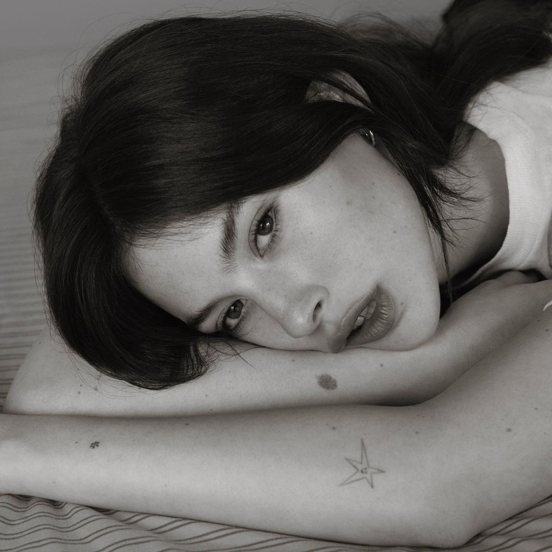
Small star tattoo visible on Gracie Abrams’ forearm
The black-and-white close-up clearly shows a small outlined star on Abrams’ forearm. It confirms the design and placement, but not when she got it or what it means to her.
The “River” tattoo is a separate piece on the inside of her forearm. Abrams has described it as a tribute to a favourite song by Joni Mitchell and used Mitchell’s handwriting for the word. Mitchell later saw a photo of the tattoo.
The soft-focus editorial look
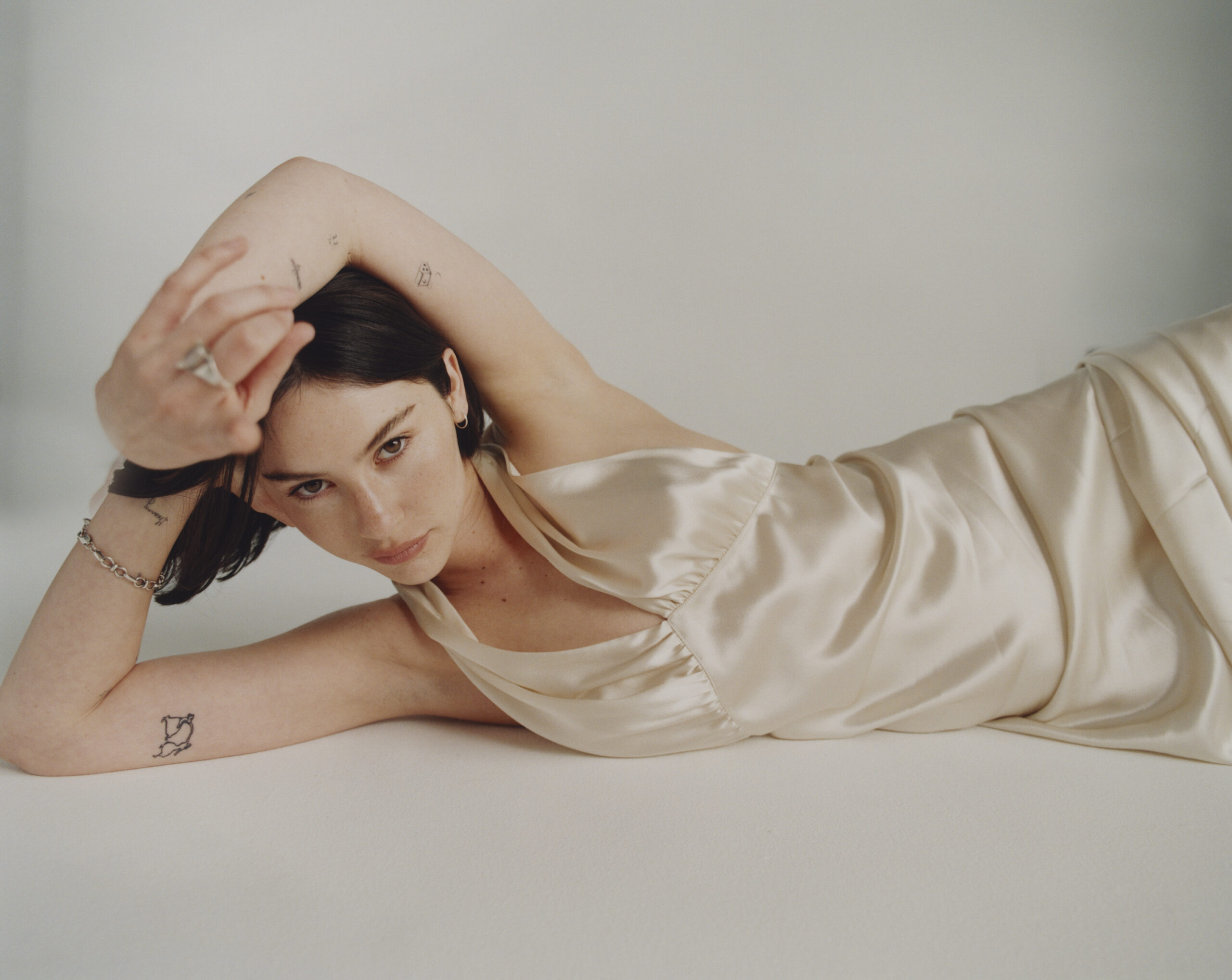
The interview describing the “River” piece says it sits among other small tattoos, and editorial photos show several minimalist marks across Abrams’ forearms. Most are too soft or small in the images to identify with confidence.
The look comes from scale and spacing. Small designs can sit alongside one another without turning into a single sleeve, but the photos don’t show whether Abrams planned them as a group.
How she keeps things understated
The Forty-Five described Abrams turning her elbow to show a recent tattoo during an interview. It’s a brief account of one piece, not a list of the rest.
In portraits, the tattoos appear when an arm turns or a sleeve moves. A photo can show that a mark is there without telling us its date or meaning, so the visible details are more reliable than guesses about the whole collection.
Why the collection feels low-key
Abrams’ small tattoos don’t take over a portrait or outfit. Their size leaves room for each design to stand on its own, and the collection can grow without every new piece having to match the last.
Very fine lines can soften or blur over time. An artist can help choose a size and placement that leave the design readable as it heals and ages; making it larger isn’t always the only answer.
Why a complete map is hard to make
The “River” tattoo has a stated story, the outlined star is visible in a close-up, and The Forty-Five mentioned a recent piece. That’s what the available reporting confirms. The other marks in editorial photos are too difficult to read to turn into a reliable list.
Small-ink ideas worth borrowing
If you want a tattoo inspired by a song, a short phrase in the writer’s real handwriting can make the reference specific. For a group of small designs, choose separate ideas that matter to you and leave enough space for each one to stay clear. Use Abrams’ tattoos as a reference for scale or placement, not as a set to copy.