codex

Jay Putty Tattoos: Compass, Rosewood and Fine-Line Ideas

Jay Putty told V13 that he waited until 30 to get his first tattoo. When he started, he chose designs tied to a song, his father and a close group of friends. The interview covers four tattoos, though the photos make only some of them easy to see.

The compass is linked to his song “On My Way.” A rose and lettering carry the names “Rosewood” and “Jaybird,” with family and friendship behind them. Putty has said he prefers minimal, fine-line work.

Jay Putty’s compass tattoo is tied to “On My Way”

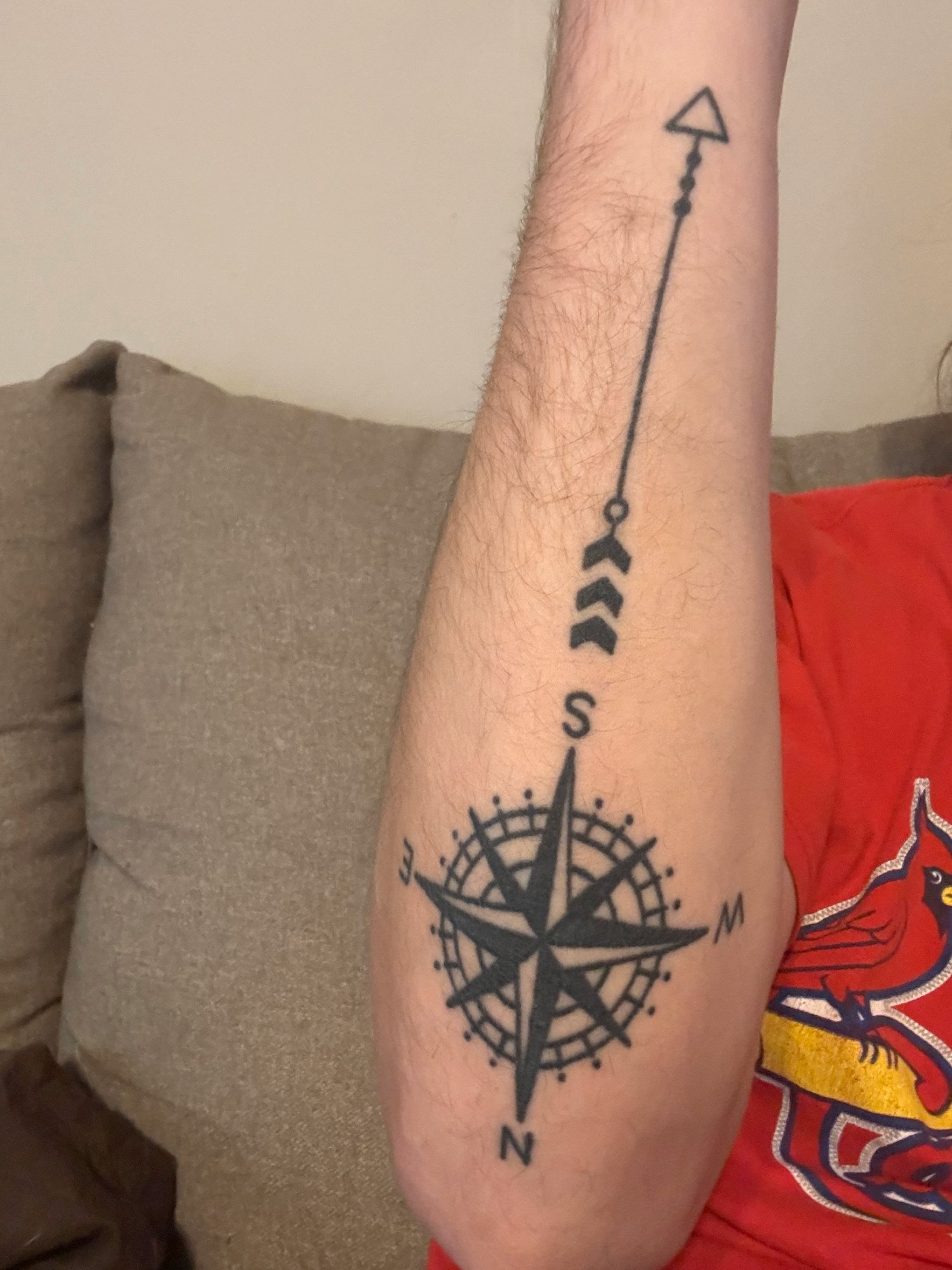
Putty’s forearm compass has a dark centre, a circular frame, cardinal letters and a long arrow. He told V13 it was based on the compass in “On My Way.” He got it after the song spent 20 consecutive weeks on Billboard’s Adult Airplay chart, marking a specific career moment.
Jay Putty tattoos: Jay Putty's compass tattoo is tied to “On My Way”

The photo shows the design running lengthwise up his arm: the arrow extends beyond the compass circle, so it doesn’t read as a round piece of flash. The song connection is personal to Putty; the design doesn’t need a title or lyric added to explain it.

The Rosewood and “Jaybird” tattoos keep family close

Another forearm piece pairs an open linework rose with “Rosewood” lettering and “Jaybird” in his father’s handwriting. Putty said his father called him Jaybird. Rosewood was the name of a friend group he shared with his closest friends back home; after his friend Brendan died, the group got the symbol to remember him and stay connected.
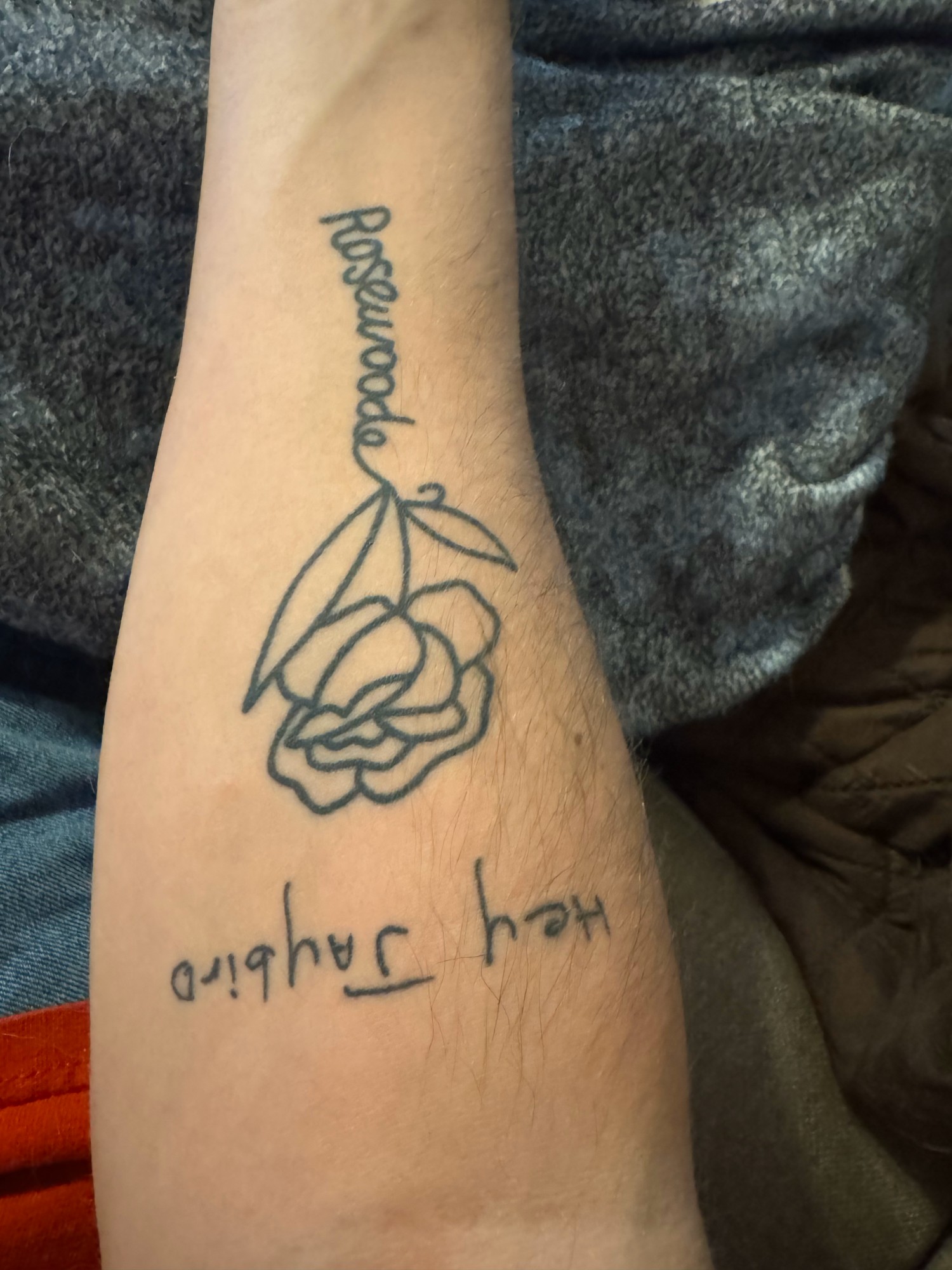
Jay Putty tattoos: The Rosewood and “Jaybird” tattoos keep family close

Putty has called the “Jaybird” tattoo his favorite because seeing it brings his father’s voice to mind. The rose and lettering stay separate enough to read, and the open lines keep the piece light. He also noted that small lettering needs enough space to remain clear as it ages.

Why his collection feels connected to music

The compass is the tattoo Putty directly linked to a song. The other accounts he shared are about his father and friends. Together, they show how a design can connect to a person or a moment without turning into a lyric or a band logo.
Jay Putty in a contextual photograph: Why his collection feels connected to music; not tattoo evidence

Someone seeing the rose might read it as a botanical design or a memorial. Putty’s account gives it a more specific history, while the photos alone cannot show that meaning.

Why simple line work can stay readable

Putty told V13 that he likes minimalist, fine-line tattoos and that Snappy Tats did his pieces. In the photos, the rose uses thin outlines, while the compass has a darker centre surrounded by open lines. Both leave room for the designs to read clearly.
Jay Putty in a contextual photograph: Why simple line work can stay readable; not tattoo evidence

Fine-line work can soften, especially where skin gets sun or repeated friction. A tattooer can adjust a reference for the chosen size and placement: tiny compass points may need simplifying, and handwritten letters may need more room. The goal is to keep the parts that make the design recognizable.

The quiet look of Putty’s collection

The compass is the darker, more graphic piece; the rose and lettering are lighter. They don’t match as a set, but their scale and fine-line details let them sit together without covering the arm.
Jay Putty in a contextual photograph: The quiet look of Putty's collection; not tattoo evidence

What to borrow from Putty’s approach

Start with the memory or relationship you want to keep, then decide what part needs to appear in the design. Putty’s compass doesn’t spell out the song title; the symbol carries the connection. The “Jaybird” tattoo uses a family nickname, while Rosewood keeps a shared friendship in view.

Jay Putty in a contextual photograph: What to borrow from Putty's approach; not tattoo evidence

In the V13 interview, Putty said he had four tattoos and planned to get more. If you’re building a collection, you can leave space for that next idea instead of designing the whole arm at once. Bring an artist a clear reference and explain what matters—the linework, symbol or placement—so they can draw a piece that fits you.
More musician tattoo guides

Samara Weaving Tattoos: Small Animals, Tiny Lettering, and a Plant Tattoo

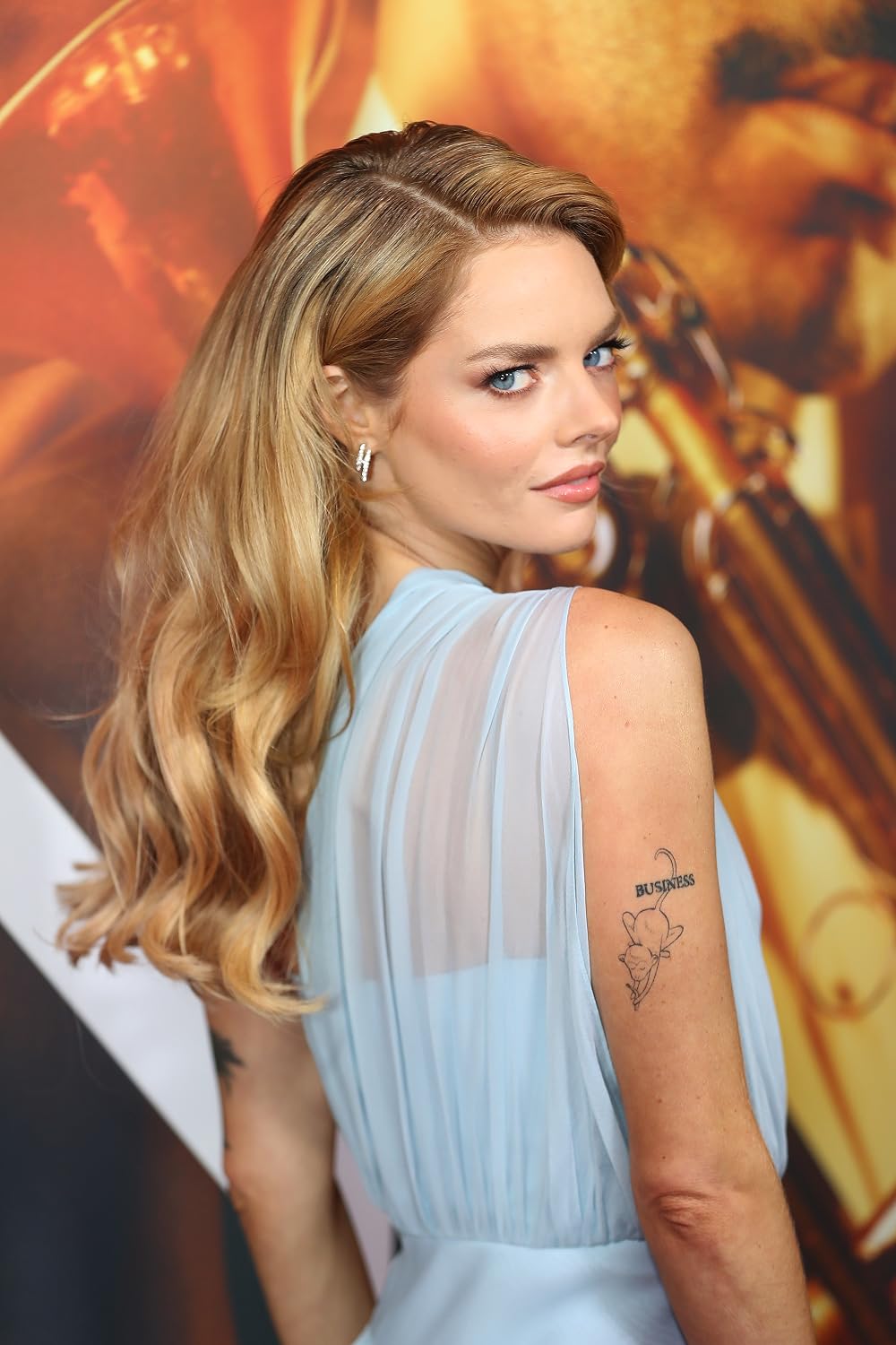
Samara Weaving’s tattoos are small and spread across her arms, wrists, fingers and ankle. A 2017 W profile described a black cat on her wrist, a small moon on one finger and an elephant on the inside of her wrist. Weaving joked, “My body is a jungle!” Later photos show a BUSINESS doodle on her upper arm, a dark animal shape on her forearm and a little potted plant. The available images don’t explain every design.

The BUSINESS tattoo on Samara Weaving’s upper arm

Samara Weaving tattoos: Genuine tattoo photograph showing BUSINESS lettering and the small drawing beneath it

A photo shows the word “BUSINESS” above a small black line drawing on the back of Weaving’s upper arm. The compact lettering and doodle read as one playful design, though the image doesn’t explain what the word or figure means to her.

The upper-arm placement leaves room for both parts and can be covered by a sleeve. If you like text paired with an image, keeping each element clear at its actual tattoo size matters more than adding extra detail.

The black animal silhouette on her forearm

Samara Weaving tattoos: Genuine tattoo photograph showing the black animal silhouette on the forearm

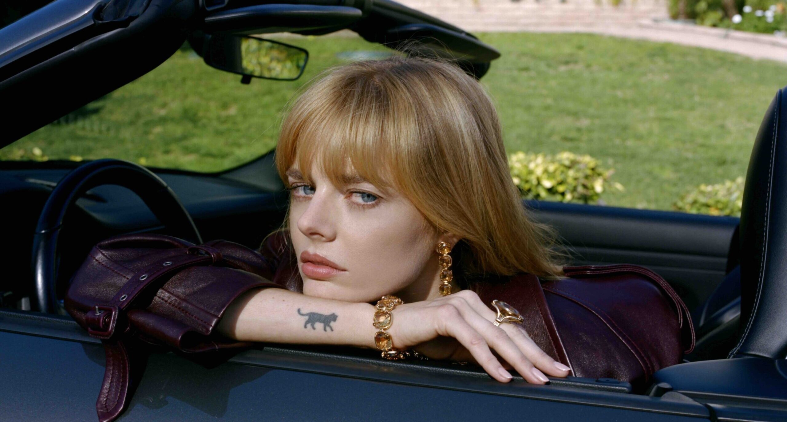
A close-up shows a compact black animal shape on Weaving’s forearm, with four legs, a tail and a low, prowling stance. The photo doesn’t establish whether it is the cat mentioned by W Magazine or a separate tattoo, so it’s safest to describe what’s visible.

The solid silhouette has little interior detail; its posture gives the animal its direction. That is enough to distinguish it from the smaller cat shown in other photos.

The cat wrist tattoo

Samara Weaving tattoos: Genuine tattoo photograph showing the small black cat on the forearm

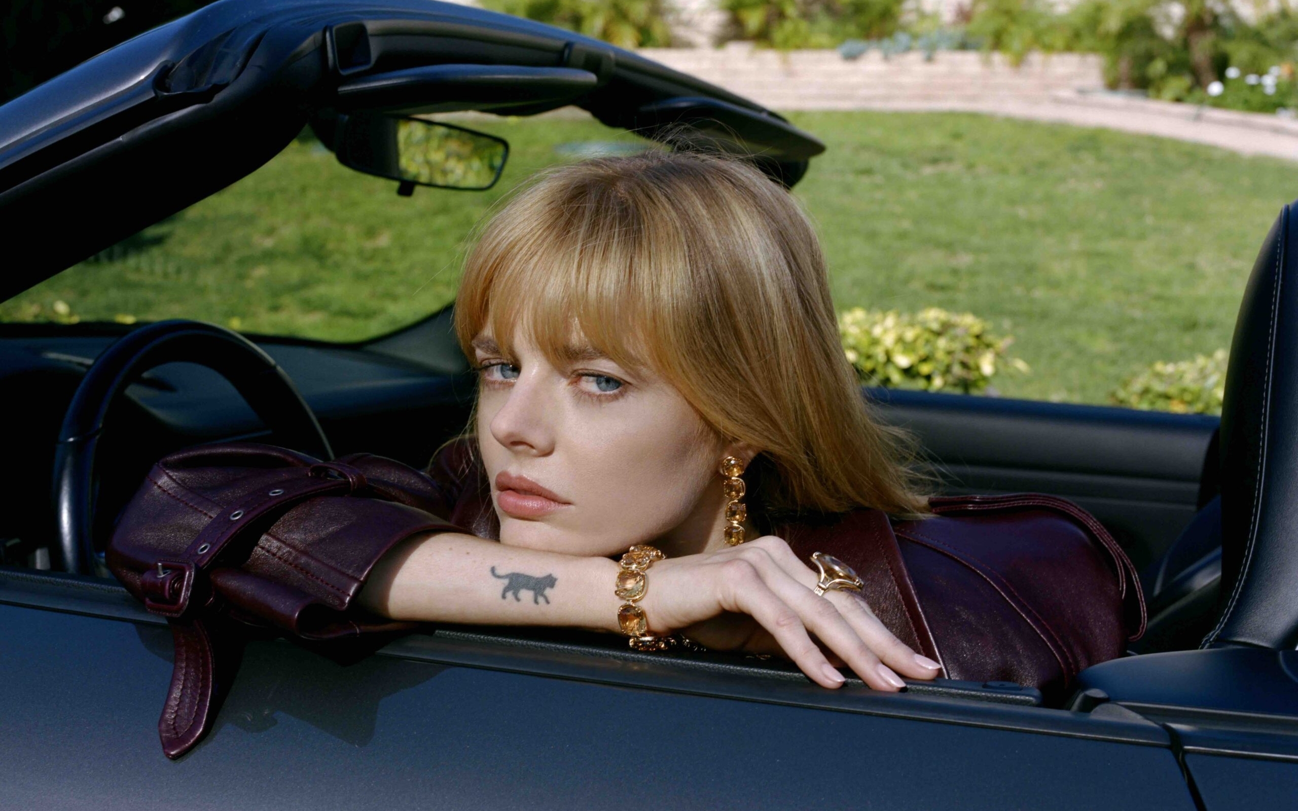
In this casual photo, Weaving rests her face in her hands, and a small black cat is visible on the inside of her wrist. W Magazine also identified a black cat tattoo there, making this a strong match between a reported design and a photograph.

Neither source gives its date or personal meaning. The design is small but clear enough to read without a caption, and the wrist position makes it visible when her hand turns upward.

The moon, elephant, and tiny collection around them

The W Magazine profile also mentioned a dainty moon on one finger and an elephant on the inside of a wrist. Finger skin gets frequent movement and wear, so tiny lines may soften. An elephant needs enough space between its trunk, body and ears to remain legible at a small size.

These reported designs add to the cat and the later photographs, but the profile doesn’t give a full list or a meaning for each one. The tattoo ideas are recognizable; the reasons behind them aren’t all public.

The small plant tattoo visible in a Vogue portrait

Samara Weaving tattoos: Genuine tattoo photograph showing the small potted-plant tattoo on the upper arm

A Vogue portrait shows a small potted plant on Weaving’s upper arm. The drawing has a pot, stem and leaves, with more open linework than the solid animal silhouette. The photograph makes the placement visible, though it doesn’t add a story for the plant.

Another candid view of the cat tattoo

Samara Weaving tattoos: Genuine tattoo photograph showing the same small black cat on the forearm in a second view

A second candid image shows the same cat low on Weaving’s forearm, near the wrist, as she sits in a convertible. It gives a wider sense of the tattoo’s scale and placement; it isn’t a separate design.

Why the collection feels easy

Weaving’s tattoos include lettering and a doodle, a cat, a moon, an elephant, an animal silhouette and a potted plant. The designs don’t form one theme, but their small scale and simple shapes let them sit together. The “jungle” joke from the W profile fits that loose mix better than a complete catalogue would.

There are limits to what the photos confirm. The cat and the plant are identifiable, while the forearm silhouette can’t be matched with certainty to the cat in the profile. The sources don’t supply meanings for most of the marks.

More actor tattoo guides

Ellie Goulding Tattoos: Fine-Line Geometry, Hand Details and More

Ellie Goulding’s tattoos range from a geometric rib design to small hand marks and an outlined triangle on her forearm. The images show several placements and styles; interviews give context for some pieces, while others are best described by what’s visible.

Goulding has worked with Los Angeles tattooer Dr. Woo, whose fine-line style suits the smaller designs. She has also described tattoos connected to meaningful moments, including music and time on the road.

Ellie Goulding’s geometric rib tattoo

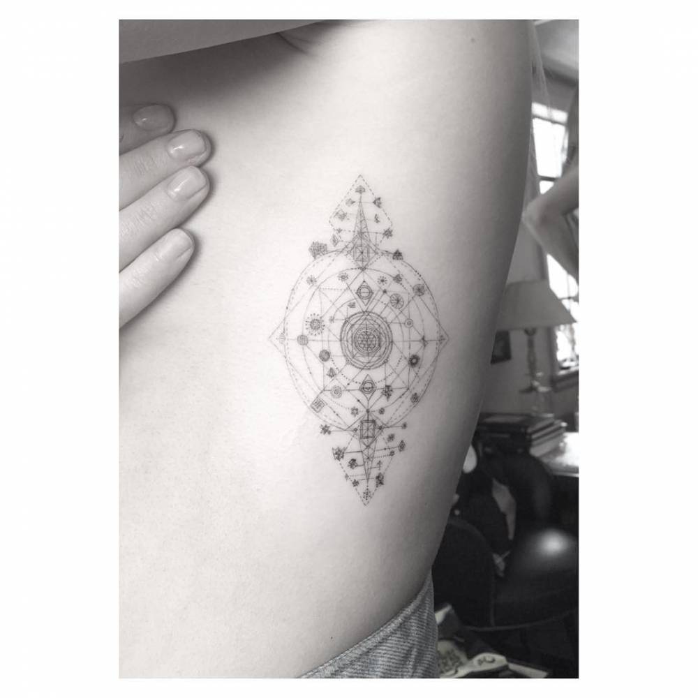
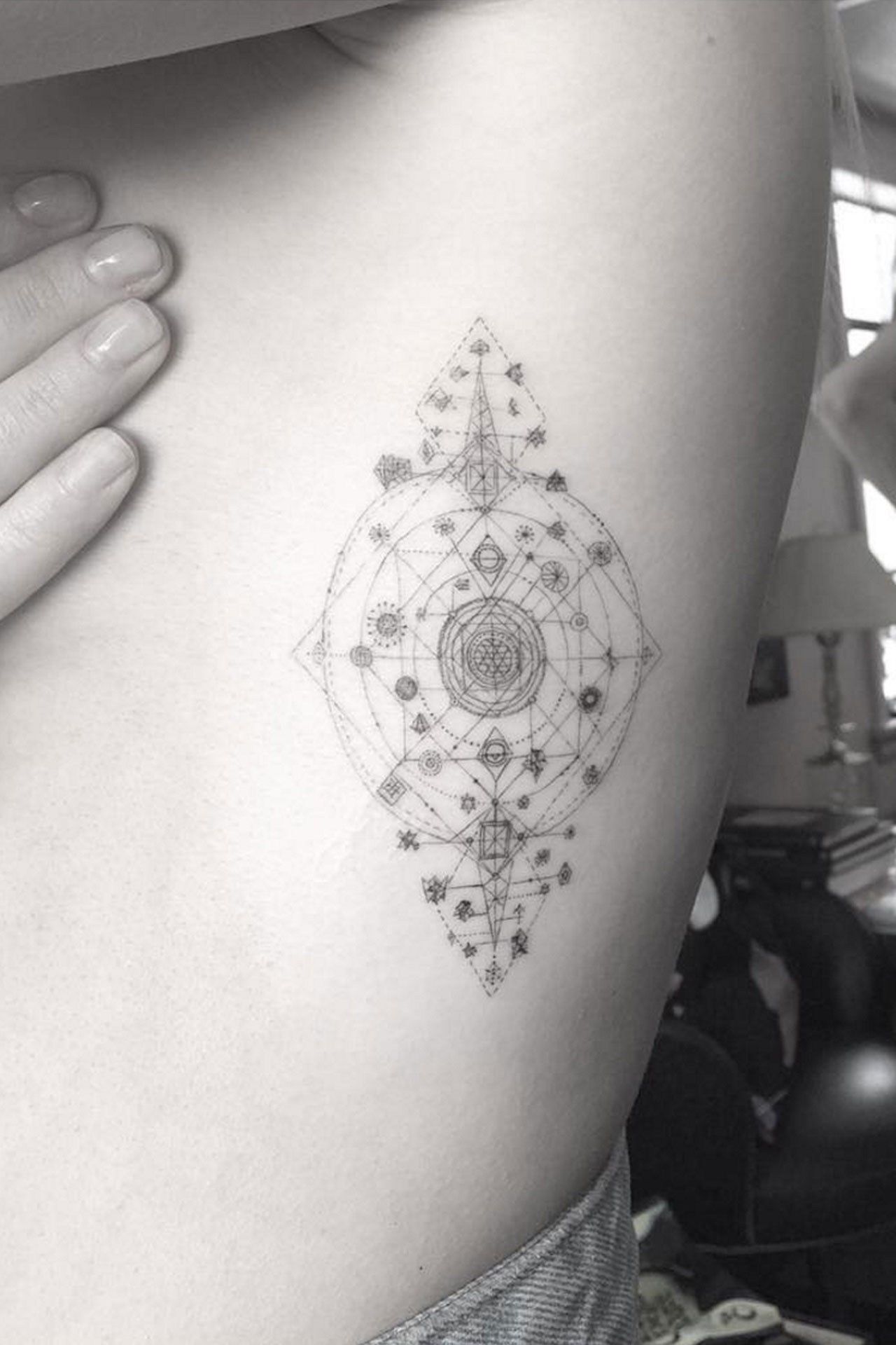
The rib tattoo is a tall, fine-line composition with a layered circle at its centre, grids and small symbols around it, and pointed sections above and below. Its long shape follows the ribcage, while the open lines keep the detail from reading as a solid patch of ink.

Ellie Goulding tattoos: Ellie Goulding's geometric rib tattoo

The curve of the body changes how the design reads from a flat drawing. A tattooer can adjust the proportions for the wearer’s ribs instead of copying the photograph exactly.

Ellie Goulding’s tiny hand symbols

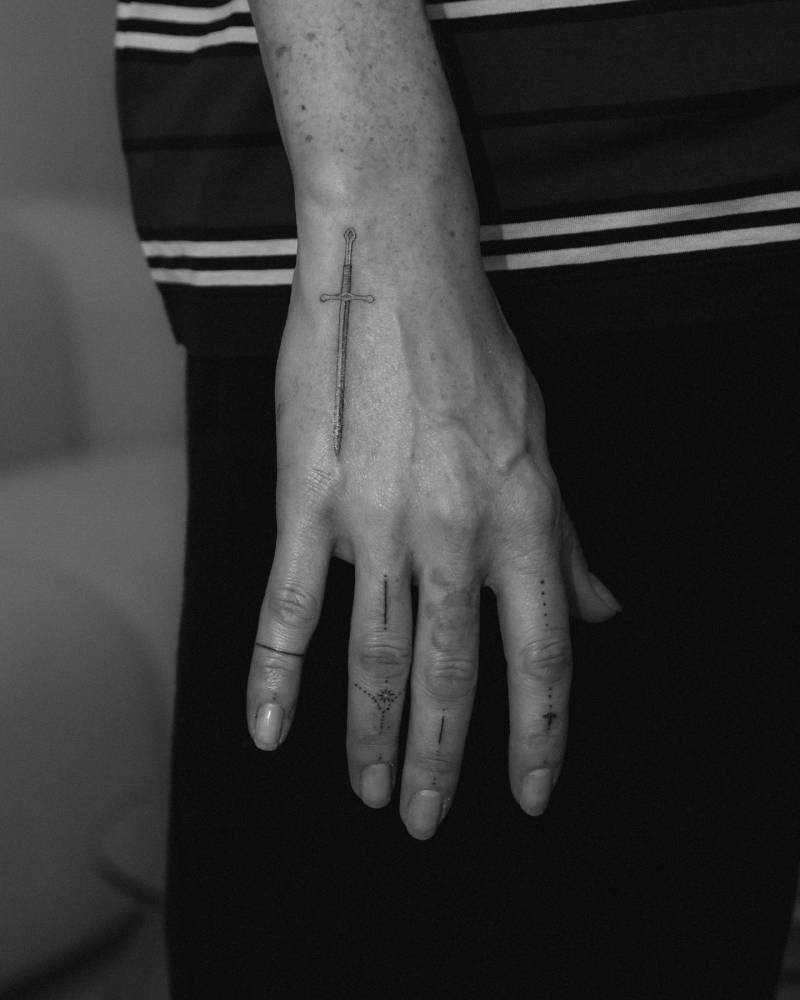
Photos show a narrow sword along the back of Goulding’s hand, with small dots, short strokes and ornamental marks on or between her fingers. The sword is fine and understated; the smaller marks sit around it without filling the hand.

Hand and finger tattoos get constant movement, washing and friction, so fine lines may soften sooner there. The small scale works best when the main shape is clear and the surrounding details have enough space.

Ellie Goulding tattoos: Ellie Goulding's tiny hand symbols

Ellie Goulding’s triangle tattoo

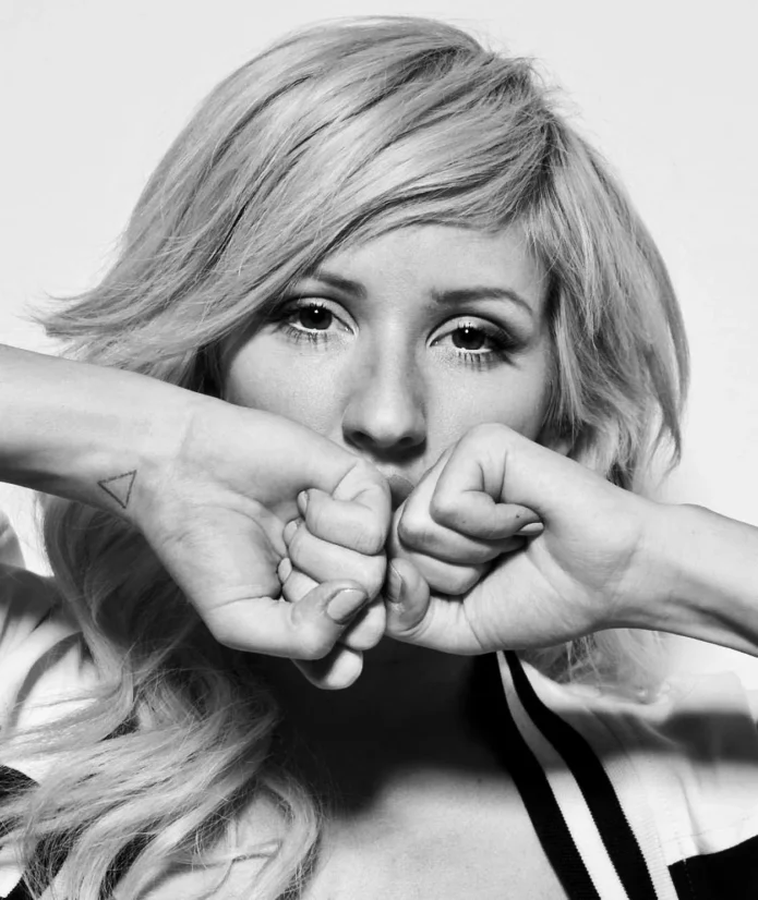
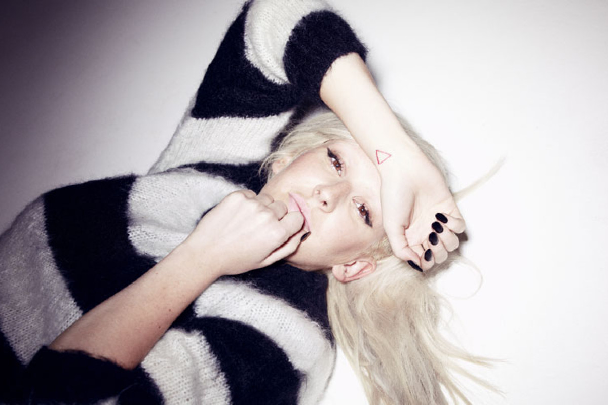
One of Goulding’s early, recognizable tattoos is a small open triangle on her forearm, drawn in a thin red line. Most of the designs discussed here are black or grey, so even that small amount of colour gives this one a different look. The image shows a simple outline without shading or a frame.

Ellie Goulding tattoos: Ellie Goulding's triangle tattoo

The forearm gives the shape a clear surface, but the triangle could be rotated or paired with another small mark. The useful reference is its scale and clean outline, not an exact copy of the photo.

The details that make her style work

Goulding’s tattoos appear in different ways in photographs. The rib piece is usually covered; the hand and forearm marks show when she moves or changes sleeves. The placements give the collection a mix of private and visible designs.

Ellie Goulding in a contextual photograph: Ellie Goulding editorial portrait; not tattoo evidence

The pieces don’t use one subject, but share fine lines and a relatively small scale. A geometric rib design, a sword and a triangle can sit in the same collection without becoming a matching set.

Why her choices feel so personal

Goulding has spoken about tattoos connected to meaningful moments, including music and time on the road. She has also described getting several designs from Dr. Woo after being introduced to his work at Coachella. Those are the clearest personal details attached to the collection; the photos alone don’t explain every mark.

Ellie Goulding in a contextual photograph: Ellie Goulding Glamour portrait; not tattoo evidence

A small tattoo doesn’t need a public explanation to matter to its owner. The image can stay simple while its reason belongs to a particular period or experience.

Ideas to borrow without copying

If you like Goulding’s style, pick the quality you want to carry over: the rib piece’s geometry, the scale of the hand marks or the triangle’s red outline. Then ask an artist to draw a version for your body and the size you have in mind.

Hand tattoos need extra thought because they wear differently from designs on the arm or thigh. For any fine-line piece, check that the main shape remains clear at its final size, and consider how it will sit beside jewellery, sleeves or a watch.

Final thoughts on Ellie Goulding’s collection

Goulding’s tattoos show how different designs can share a light line and small scale without following one theme. Use the photos to identify what you like, then build a design around your own placement and reason for getting it.

More musician tattoo guides

Julia Wolf Tattoos: Twilight Knuckles, Ghostface and Dark Pop Ink

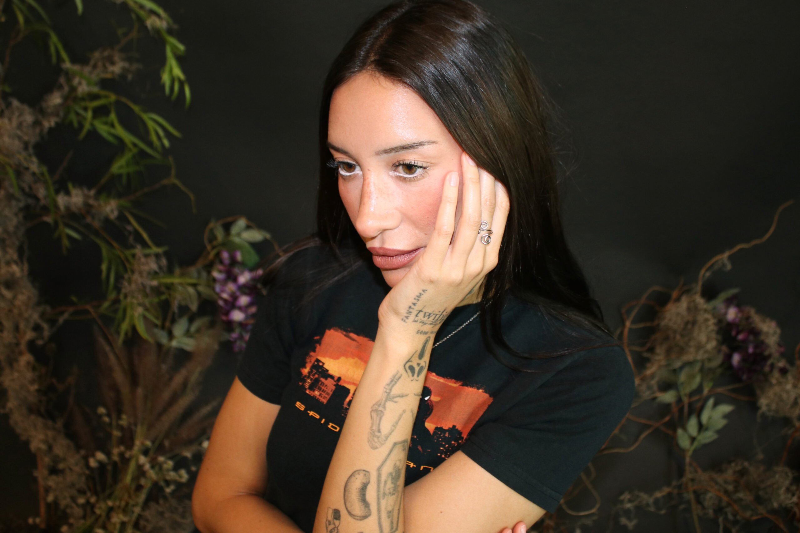
Julia Wolf’s tattoos mix pop-culture references, horror imagery and lettering. The Los Angeles Times described her arms as a mosaic, while photos show a Twilight logo and a dagger near her hand. Her knuckle phrase, “Twilight is my drug,” is perhaps the clearest example of the collection’s humor.

The Twilight knuckle tattoo and Julia Wolf’s arm collection

Julia Wolf tattoos: inline

The curled lettering “Twilight is my drug” stretches across Wolf’s fingers. The placement makes the joke hard to miss, and the decorative script gives the phrase a dramatic look.

The Los Angeles Times described other arm tattoos as a mosaic: Ghostface, Zero and a skeleton in a casket. Wolf has also been photographed with a Twilight logo and a dagger near her knuckles. The references range from horror to fantasy, with no single design system described across the collection.

Julia Wolf tattoos: inline

The visual world around Julia Wolf

Julia Wolf in a contextual photograph: inline; not tattoo evidence

These portraits add context to the dark, fantasy-leaning imagery around Wolf’s music. They don’t show tattoos, so the descriptions of her ink rely on the close-up photos.

A flash-sheet beginning in Australia

The story behind Wolf’s Twilight tattoo starts with a flash sheet at her first show in Australia. The promoter arranged the tattoo session, and she chose the design as a souvenir of the trip.

A flash sheet can be a good place to find an artist’s own drawings. If a design already catches your eye, you can ask about small changes to fit your placement instead of starting with an image you found elsewhere.

Placement, attitude, and the rest of the look

Knuckles are a visible, high-wear placement. Wolf’s lettering makes that visibility part of the joke, but hands can need more upkeep than tattoos on less exposed skin. A wrist or forearm can give a similar view with more room and a little more flexibility.

Character tattoos also need enough space for their outlines to stay clear. Ghostface, Zero and the dagger each have a different silhouette; that variety helps the pieces remain distinct. At a smaller size, an artist may need to simplify details rather than crowd them together.

Making a favorite reference your own

Start with a film, character or image you still care about, then decide which part matters: the subject, the mood, or the way it’s drawn. Show the artist a clear reference and explain what you want to keep and what you want changed.

Consider size and aging before choosing a spot. Small lettering needs room between the letters, and finger tattoos may need touch-ups. A design can keep its reference while changing scale or placement to suit your body.

A collection that keeps its humor

Wolf’s knuckle phrase is playful, while the arm pieces bring in horror and fantasy. Together they read like references collected over time, with the humor left in rather than polished away.

More musician tattoo guides

Camila Cabello Tattoos: Tiny Meaningful Ink, Finger Quotes and a Sweetgrass Neck Design

Camila Cabello’s small tattoos connect two memories: a movie line and pinky promise with her mother, and a book about nature and reciprocity.

Camila Cabello’s small tattoos and the meaning behind them

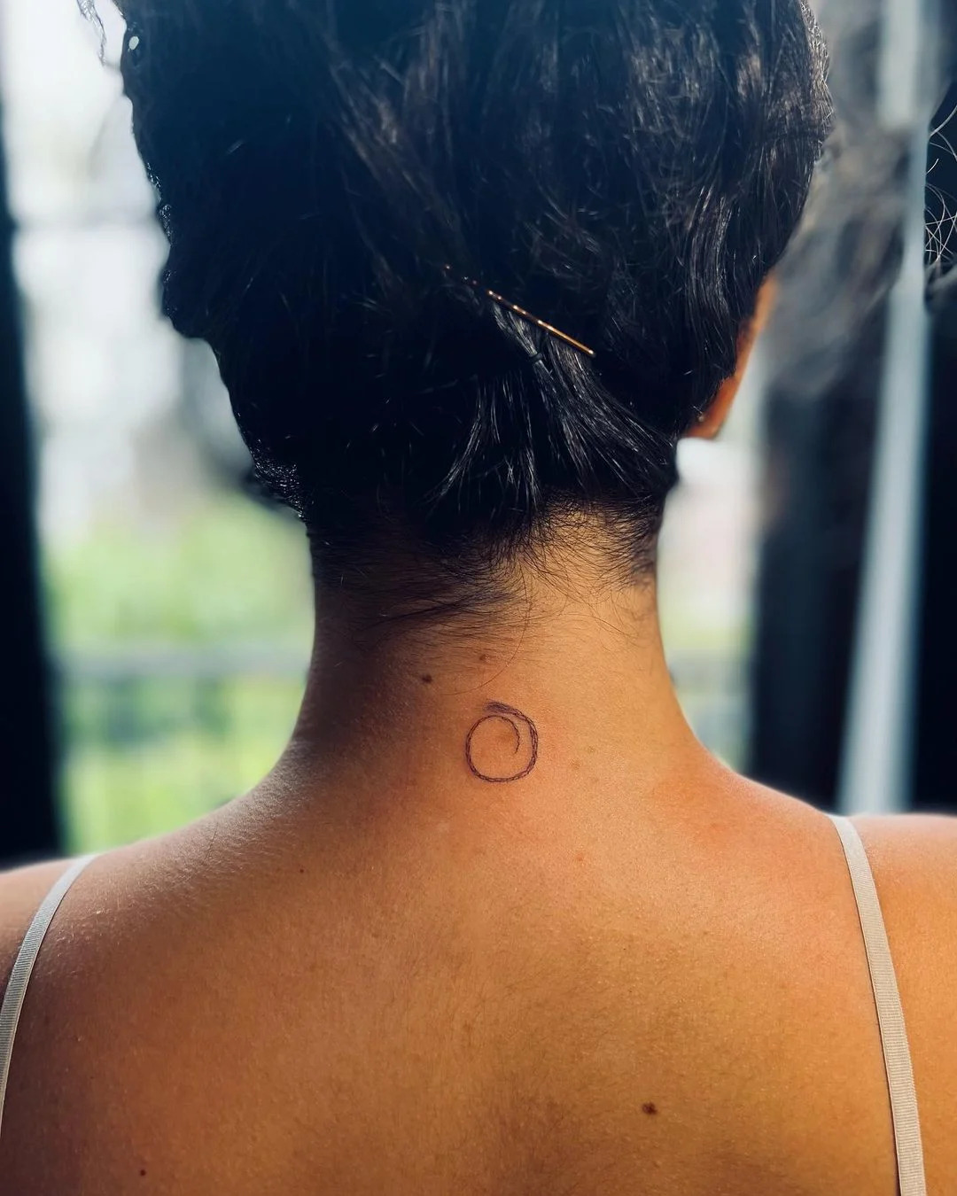
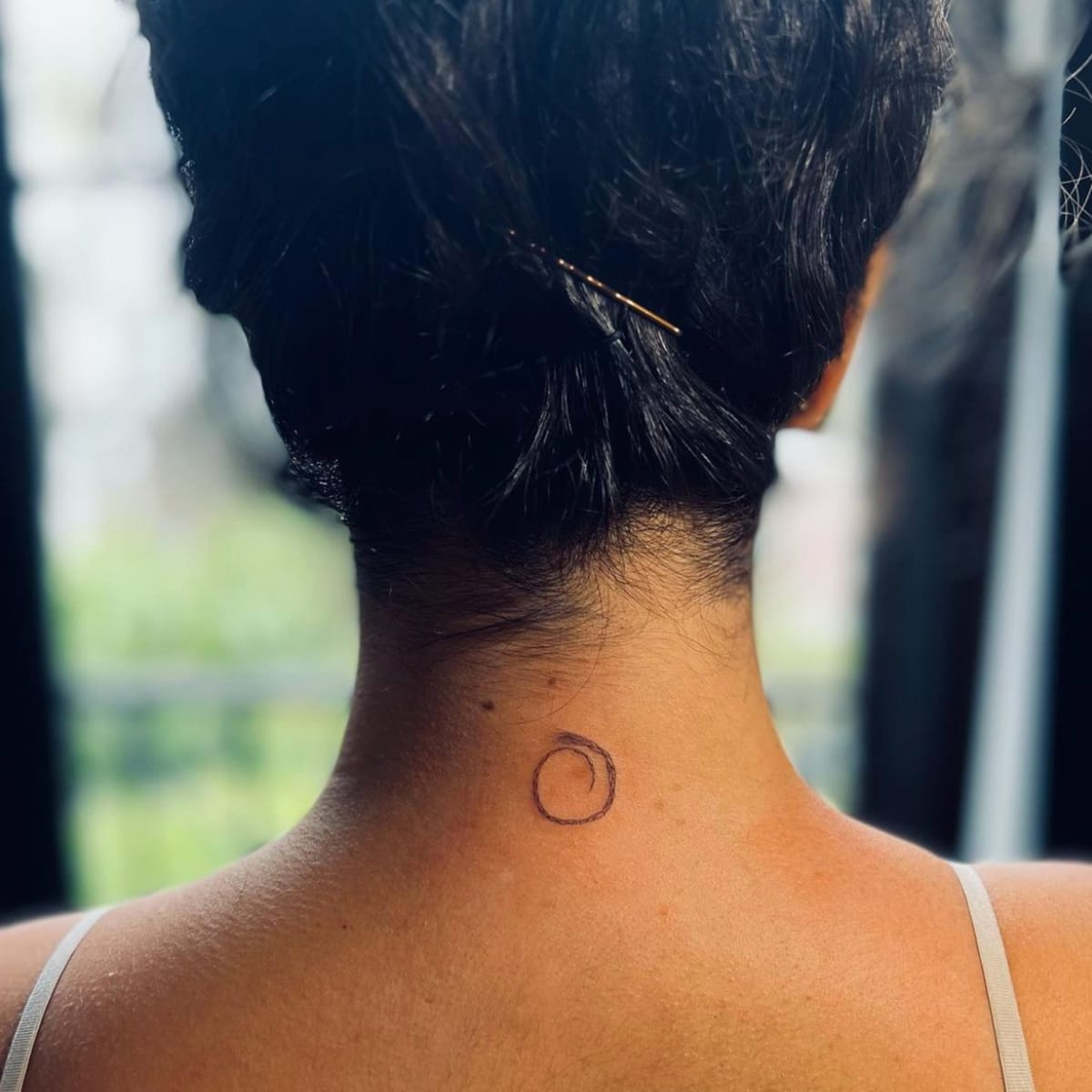
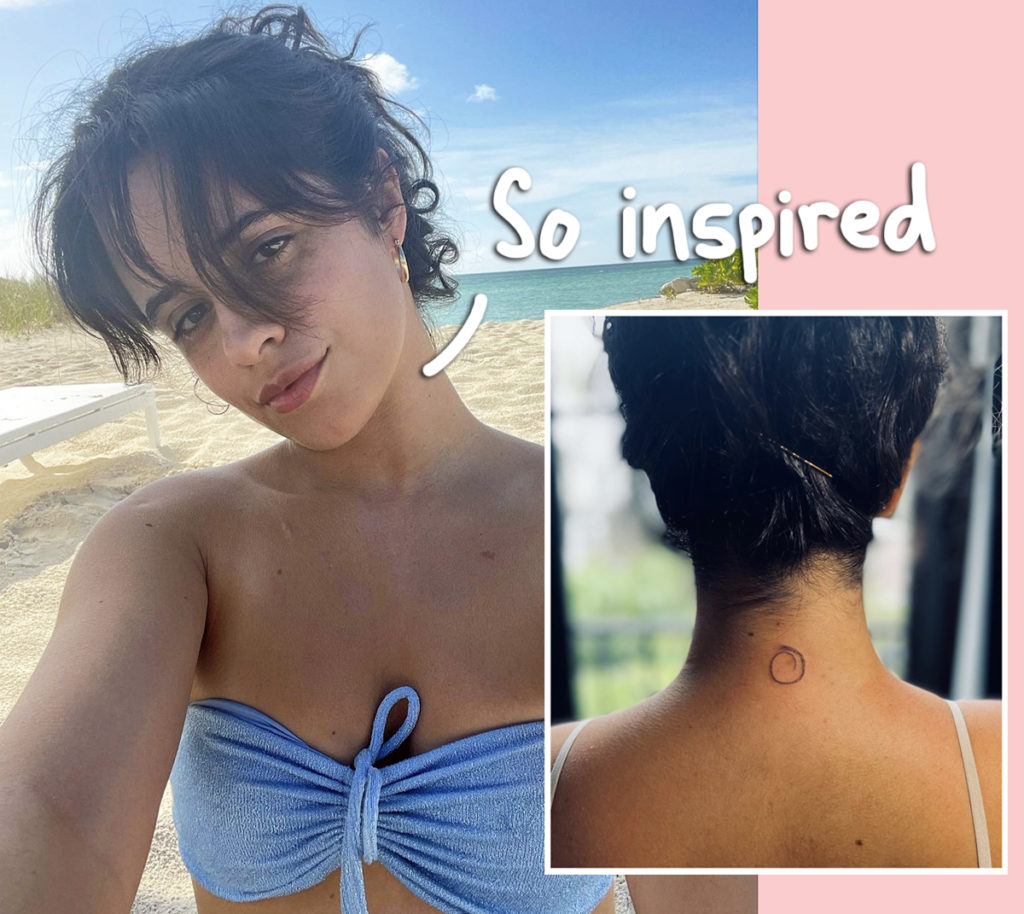
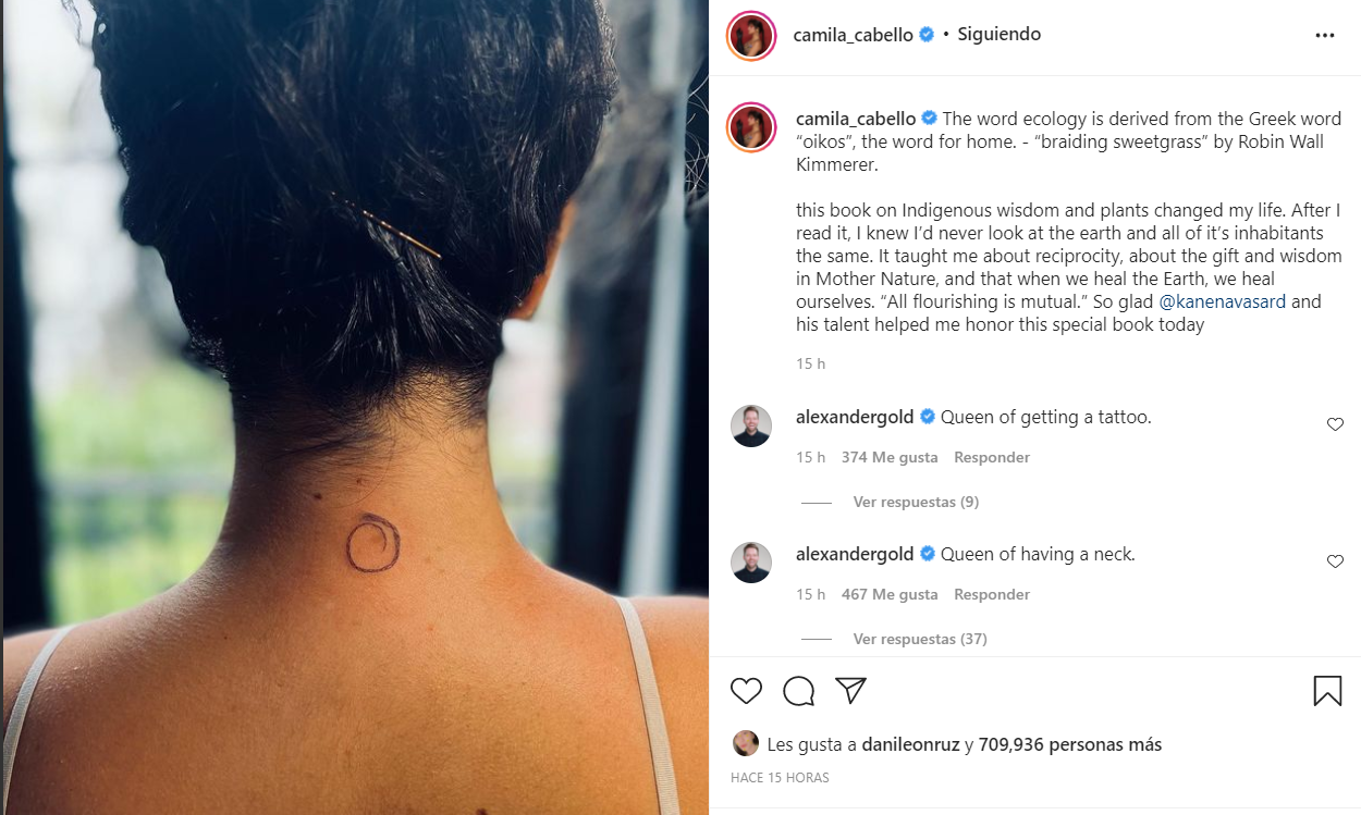
Cabello’s nape tattoo is a loose circular braid. She said it came from Braiding Sweetgrass, which changed how she thinks about nature, Indigenous wisdom and reciprocity. She connects the design to caring for the Earth as a way of caring for ourselves. The tattoo is small enough that photos show a ring more than a detailed braid; the reference carries the story.

Camila Cabello tattoos: inline

The nape lets her cover or show it by wearing her hair down or tied up.

Camila Cabello tattoos: inline

Its circular outline has no obvious top or bottom, and the loose woven lines keep it from reading as a plain ring.

Camila Cabello tattoos: inline

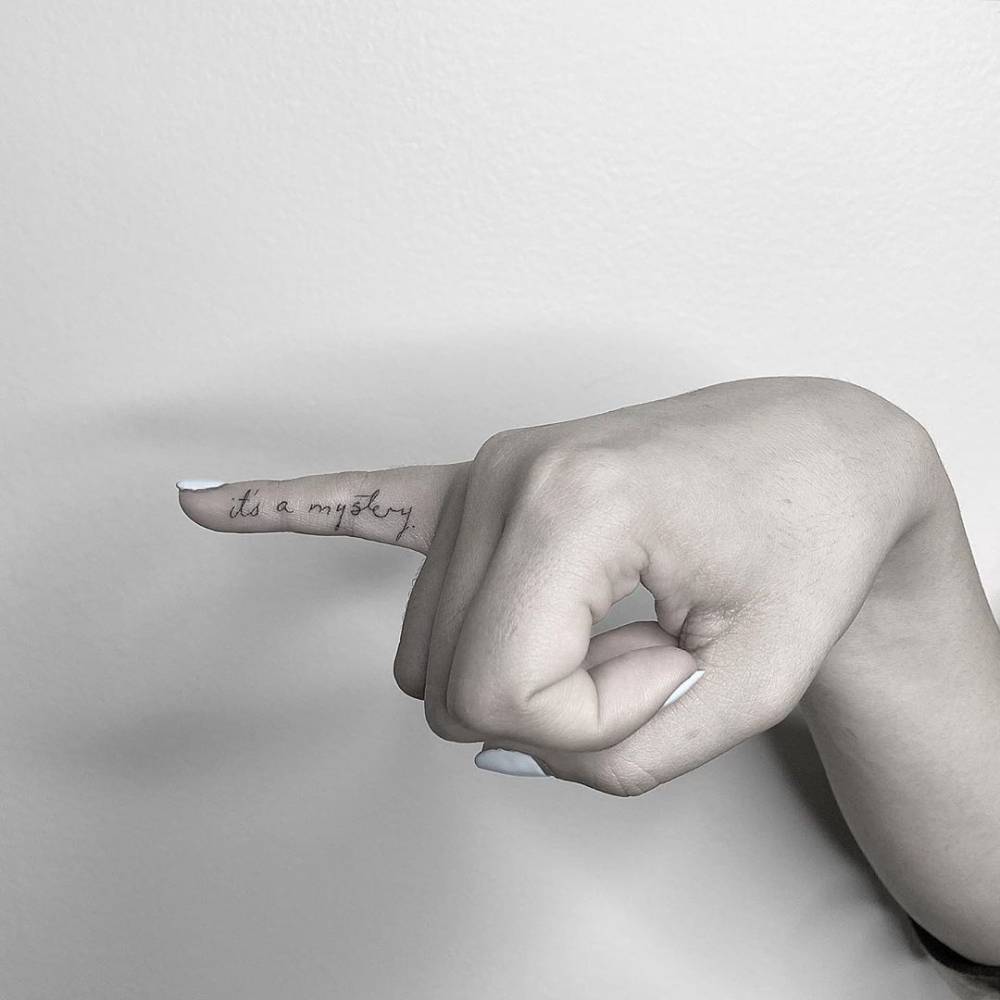
Her first tattoo is cursive lettering, “it’s a mystery,” along the inside of her right little finger. Cabello has said it comes from Shakespeare in Love, a film she loves. In the scene, the line reassures someone that things can work out even when the path is unclear. She has also described it as a pinky promise connected to her mother.

Camila Cabello tattoos: inline

Finger tattoos get frequent washing and friction, and Cabello has said the phrase faded. Fine script needs enough room and may require a touch-up, so that upkeep is part of choosing the placement.

Camila Cabello tattoos: inline

Why the movie quote feels more personal than a basic phrase

If you’re considering a quote, start with the memory attached to it. A short line can stay meaningful because of the person or moment it recalls, not because it sounds profound on its own.

A personal detail

A book can hold more ideas than a small tattoo can show. Cabello chose the braid as a reference instead of trying to illustrate the whole message, leaving room for the design to mean more than one thing to her.

Small ideas inspired by Camila Cabello’s style

If you like the approach, start with a reference that matters and reduce it to the detail you want to keep: a plant or symbol from a book, or one handwritten word tied to a family promise. Ask to see the design at actual tattoo size so the letters and lines have enough room. Fine cursive, serif type or a simple drawing can all work if the image stays readable.

The nape lets a tattoo stay covered or show with a change of hairstyle; the finger is more exposed and harder on fine lettering. The inside wrist, upper arm, ankle or ribs offer more room. For more examples of celebrity ink, browse our celebrity tattoo archive.

The low-key appeal of her collection

Both designs stay compact. One points to a movie and a promise with her mother; the other to the ideas she found in Braiding Sweetgrass.

More musician tattoo guides

Kendall Jenner Tattoos: Tiny Hearts, White Ink, Meow and a Cowboy Boot

Kendall Jenner’s tattoos stay small: a white dot, matching finger hearts with Hailey Bieber, “meow” inside her lower lip, and a fine-line cowboy boot at her ankle.

Kendall Jenner’s low-key visual style

Her collection isn’t a sleeve or a coordinated set. Tattoo artist JonBoy said Jenner wanted her first tattoo to be subtle and cared about “the little things.” He also said the white ink kept the dot from distracting from her modeling work. Small designs and discreet placements leave the tattoos easy to cover between different looks.

Kendall Jenner’s tiny heart tattoos

Kendall Jenner tattoos: inline

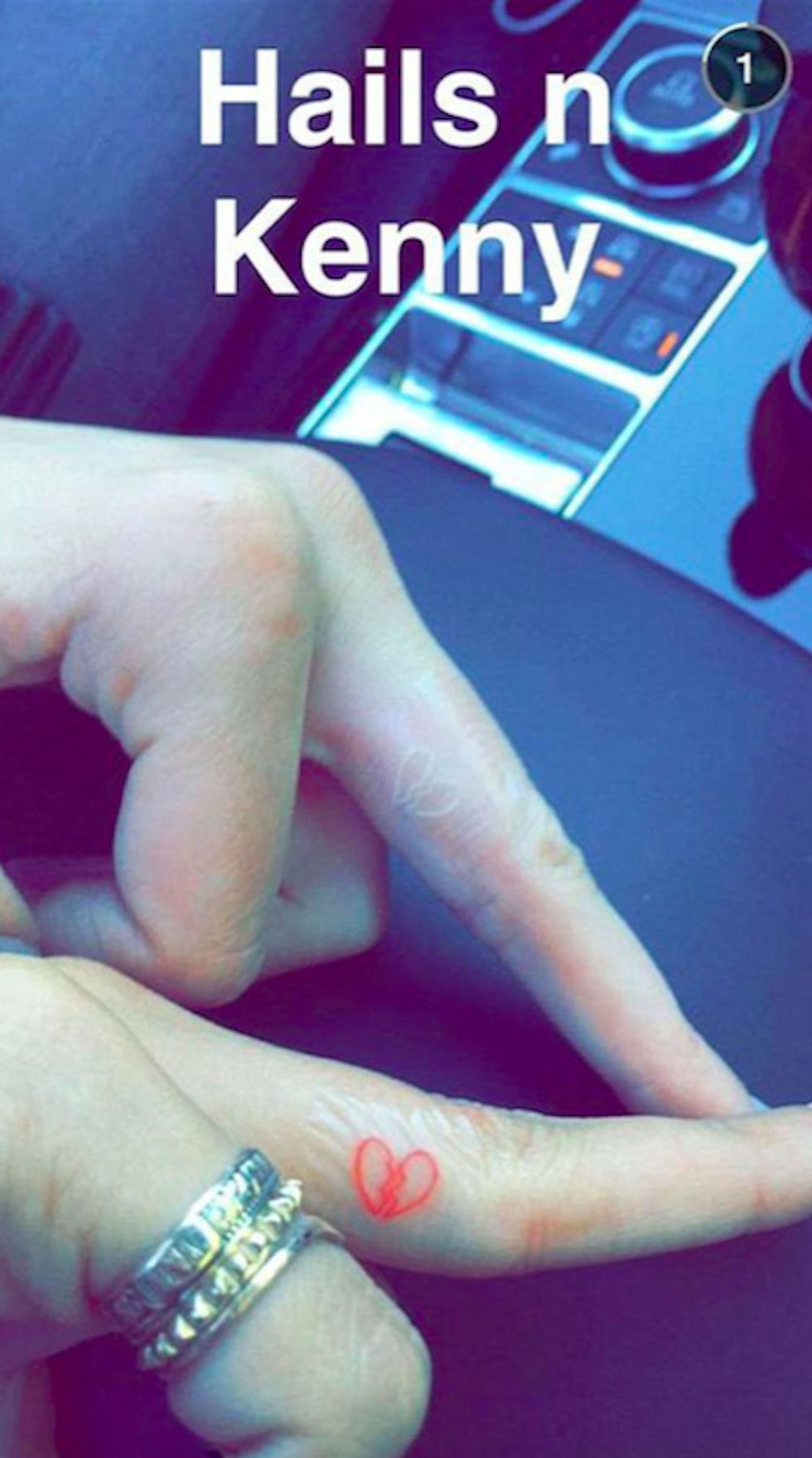
Jenner and Hailey Bieber got matching heart tattoos on their fingers. Bieber’s is red; Jenner’s is white. Jenner has said the full heart represents her angel side and the broken heart on her other hand her devil side. The color ties the pair together, while the split design gives hers a different meaning.

The white dot: the smallest piece in the collection

The white dot on Jenner’s finger came before the hearts and the lip tattoo. It is easy to miss, in keeping with what JonBoy said she wanted. White ink can fade, blur or settle differently depending on the skin and placement. With a micro tattoo, even a small change in the line is noticeable, so ask an experienced artist how the pigment may age before choosing a spot.

Why subtle choices work with fashion

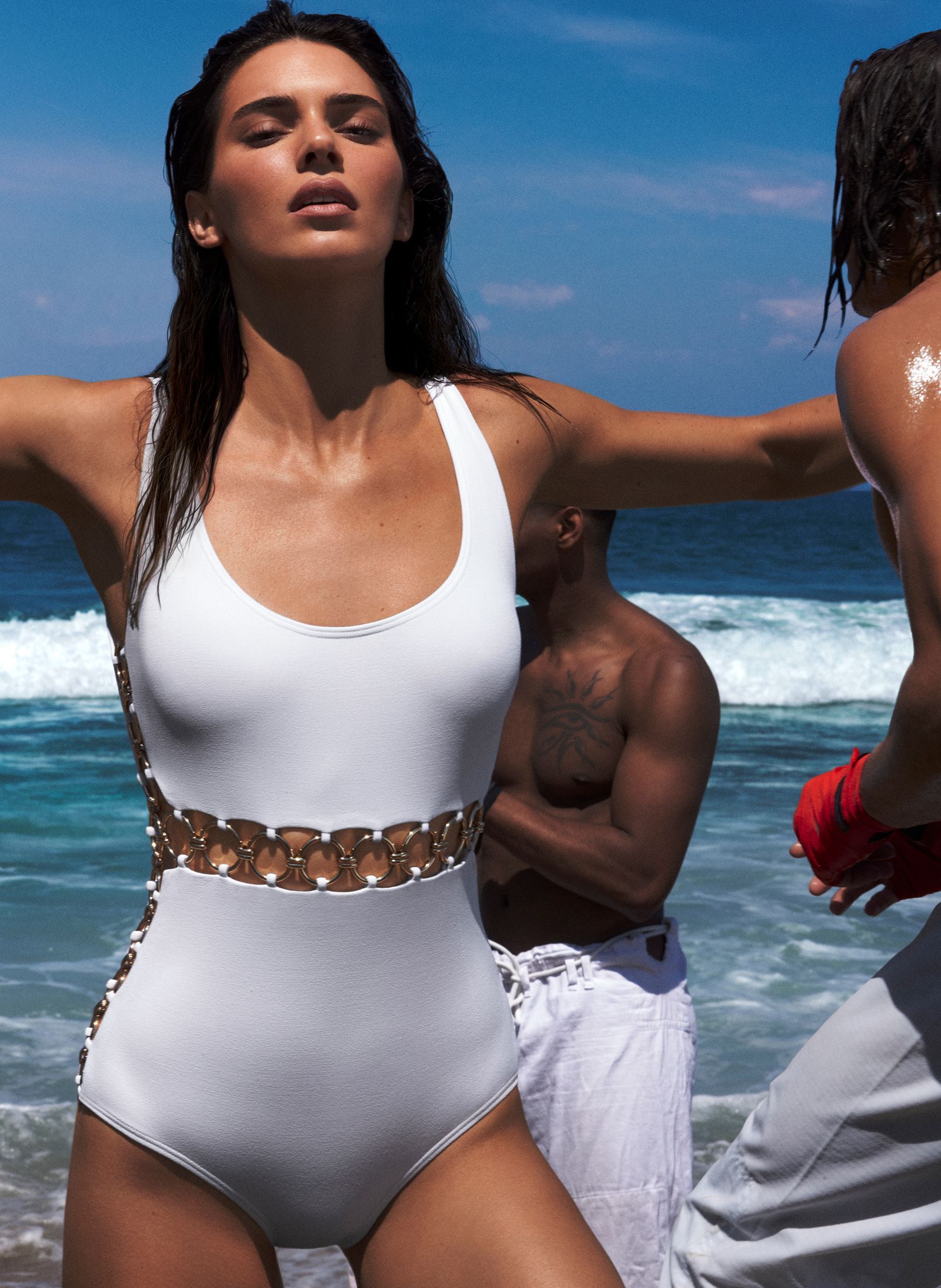
Kendall Jenner in a contextual photograph: inline; not tattoo evidence

The different placements give Jenner some choice about when the ink shows. Her finger hearts appear as her hands move; the lower-lip tattoo stays hidden unless she points it out; the ankle boot can show with sandals and disappear under boots. That flexibility suits a job where her look changes from shoot to shoot.

The playful side of a private joke

Jenner said “meow” was the first word that came to mind when she decided to get a tattoo inside her lower lip. She later said it was the only one she regretted. Hidden there, it reads like a private joke; the placement decides who sees it and when.

A little Western energy

Kendall Jenner in a contextual photograph: inline; not tattoo evidence

Tattoo artist Kate McDuffie, known as The Ghost Kat, shared the small cowboy boot on Jenner’s inner ankle. Jenner posted it with the caption “when at the rodeo.” The design appeared while she was spending time in Wyoming and leaning into a ranch-inspired look; it works as a small snapshot of that moment.

The boot has a clear outline that suits its size, and the ankle gives its shape room to follow the curve of the leg. For a tattoo of your own, keep the main silhouette readable instead of crowding it with details that may blur together.

A strong point of view in a small detail

Kendall Jenner in a contextual photograph: inline; not tattoo evidence

The tattoos don’t share one subject: the dot is quiet, the hearts connect Jenner to a friend, “meow” is a joke, and the boot recalls a Western look. Their small scale is enough to make the separate pieces feel like part of one collection; they don’t need to match.

Make the idea your own

Kendall Jenner in a contextual photograph: inline; not tattoo evidence

Start with the part of Jenner’s style you actually like: small scale, fine lines, white ink or a hidden placement. A friendship tattoo can use related symbols without making them identical. A private joke works best if the word still amuses you years later. White ink needs its own planning, so ask the artist about healing, fading and touch-ups. You can explore more celebrity ink in our tattoo photo archive.

Follow the artist’s aftercare advice and wait for the tattoo to heal before judging the final look.

More model tattoo guides

Franklin Jonas Tattoos: His Matching Ponyo and Sosuke Design

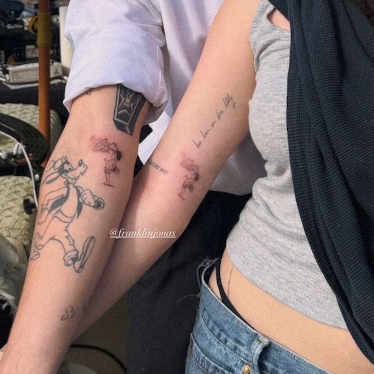
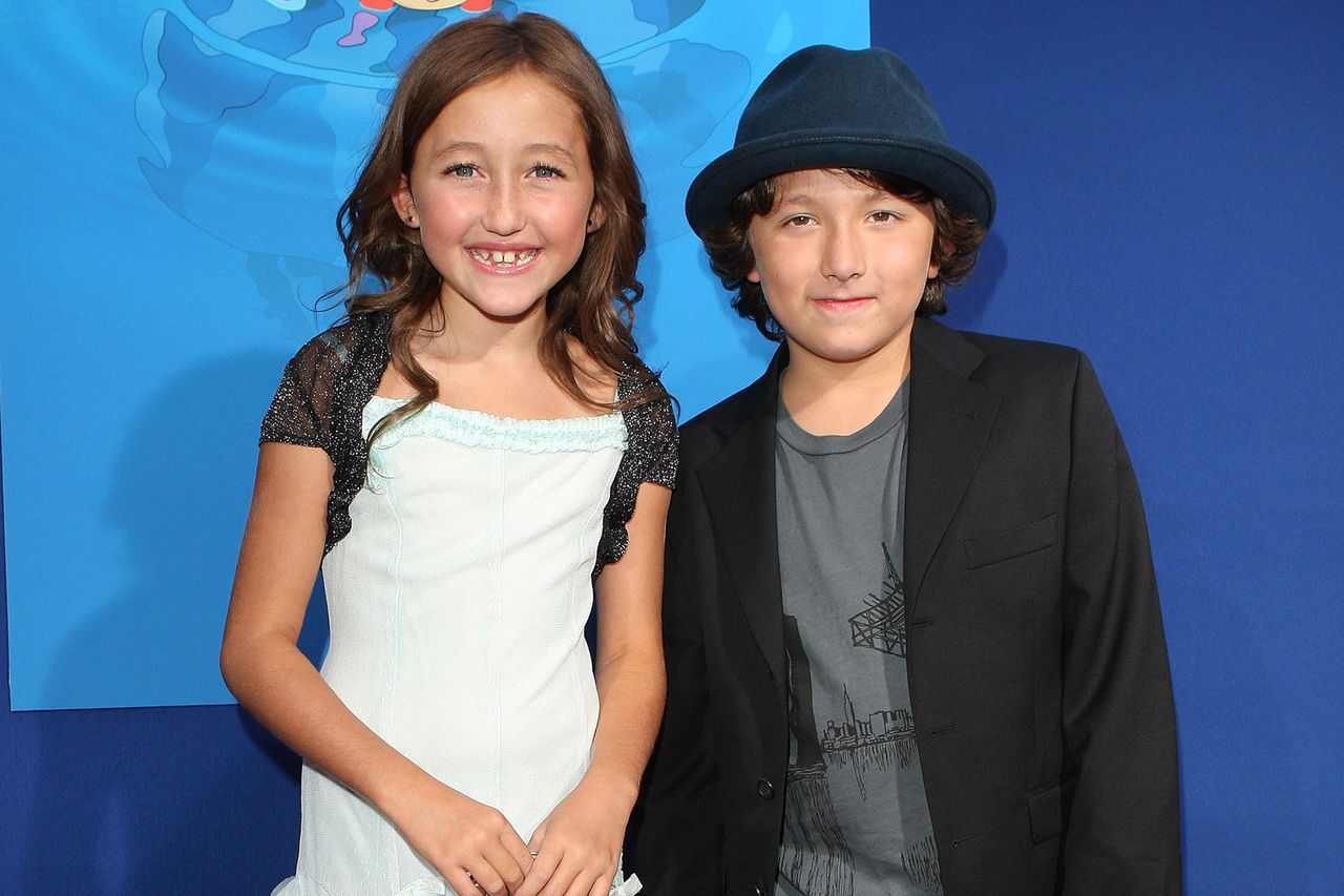
Franklin Jonas and Noah Cyrus got a small matching tattoo of Ponyo and Sosuke on their inner forearms. It’s a movie reference with a direct link to Jonas’s own work.

The matching Ponyo and Sosuke tattoo

Franklin Jonas tattoos: The matching Ponyo and Sosuke tattoo

Each inner forearm has the same small black-outline scene: Ponyo and Sosuke leaning toward each other. The caption accompanying the reveal translates as “Ponyo loves Sosuke.” There is open skin around the figures, so the faces and simple lines have room to read without a lot of shading.

Why the reference matters to them

Each forearm carries the complete scene, so neither tattoo needs the other to make sense. The shared image connects them without adding initials or a date.

The Ponyo connection

Jonas voiced Sosuke in the English-language version of Ponyo. In the film, Ponyo is a magical fish who wants to become human; she and Sosuke look after each other as the story unfolds. The tattoo chooses one small moment between them instead of trying to summarize the whole film.

A clear gesture or expression often carries more than a crowded scene. An artist can simplify the background or small details so the characters stay recognizable at tattoo size.

Franklin Jonas in a contextual photograph: Current Franklin Jonas and Noah Cyrus contextual portrait; not tattoo evidence

This portrait of Jonas and Cyrus provides context; it isn’t evidence of the tattoo. The close-up above shows the ink itself.

Franklin and Noah before the new drawing

Jonas and Cyrus have known each other since they were young. The movie reference sits within that longer history without spelling it out on their skin.

Franklin Jonas in a contextual photograph: Childhood contextual portrait; not tattoo evidence

A matching tattoo can mark a shared history without needing to explain every part of it.

Franklin’s style outside the reveal

Franklin Jonas in a contextual photograph: Franklin Jonas contextual graduation portrait; not tattoo evidence

This graduation portrait is also contextual, not proof of another tattoo. The Ponyo design’s inner-forearm placement gives it room while letting Jonas cover it with a sleeve or show it by turning his arm. Since the forearm rotates, an artist should check how the image looks from different angles.

Keep the line work simple and give two faces enough space to stay clear. Ask to see the design at its actual tattoo size; a frame that looks detailed on a screen may need to be simplified for skin. Follow the artist’s aftercare advice and protect the tattoo from unnecessary sun while it heals.

Rinku Singh Tattoos: The Clock, Family Ink and God’s Plan

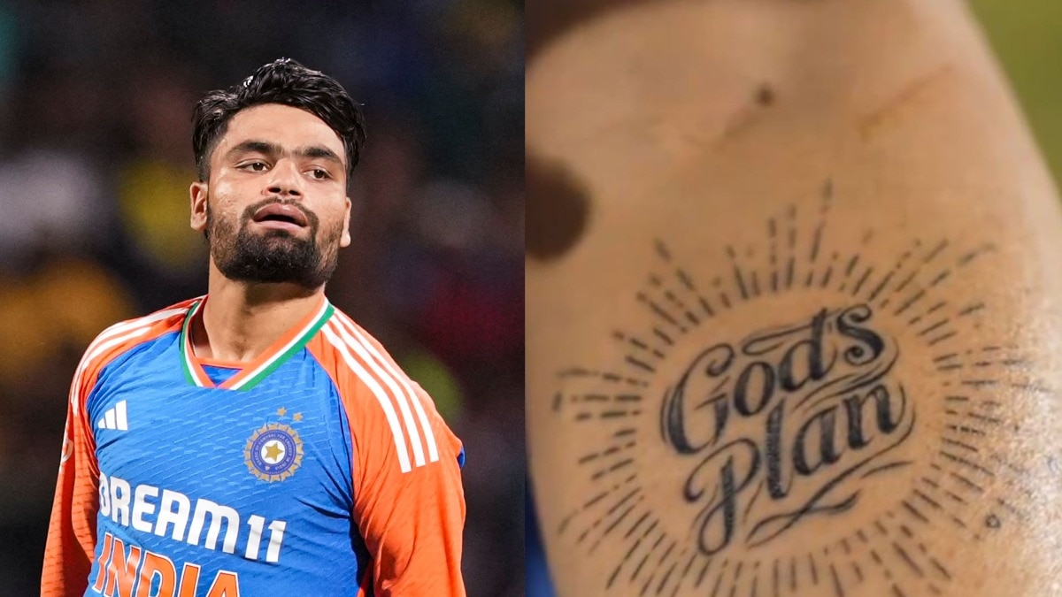
Rinku Singh’s forearm tattoos include a clock, a dove, a rose, the word “Family,” a small phrase about peace and flight, and a separate “God’s Plan” design. He has linked the larger pieces to the 2018 IPL auction and the five sixes he hit against Gujarat Titans in 2023.

The clock, dove and Family tattoo

Rinku Singh tattoos: clock, dove and Family tattoo evidence

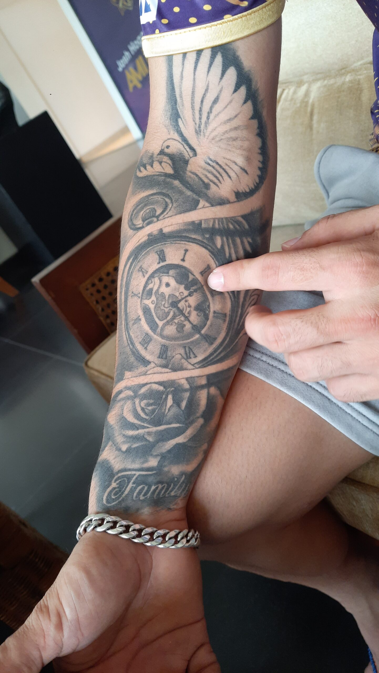
The black-and-grey piece on Singh’s right forearm brings several images together: a clock, a dove above it, the word “Family” in script below, and a rose among the surrounding details. The clock hands appear to show about 2:20 or 2:21; accounts differ on the exact minute. Singh has connected the time to the 2018 IPL auction, when Kolkata Knight Riders picked him for 80 lakh rupees. He has said that money changed life for his parents and siblings, giving the family a home and easing a difficult period. The script sits at the base of the composition and is heavier than the fine detail around it.

Why the dove and rose matter

Rinku Singh tattoos: dove and rose tattoo evidence

Singh has described the rose as a sign of blooming and the start of a better life. The dove’s wings spread across the upper part of the tattoo. He has also talked about “peace” and “udaan,” or taking flight, when discussing some of his other ink. Those ideas fit the image, though photographs alone don’t explain every detail.

Rinku Singh’s God’s Plan tattoo

Rinku Singh tattoos: God’s Plan tattoo visual detail

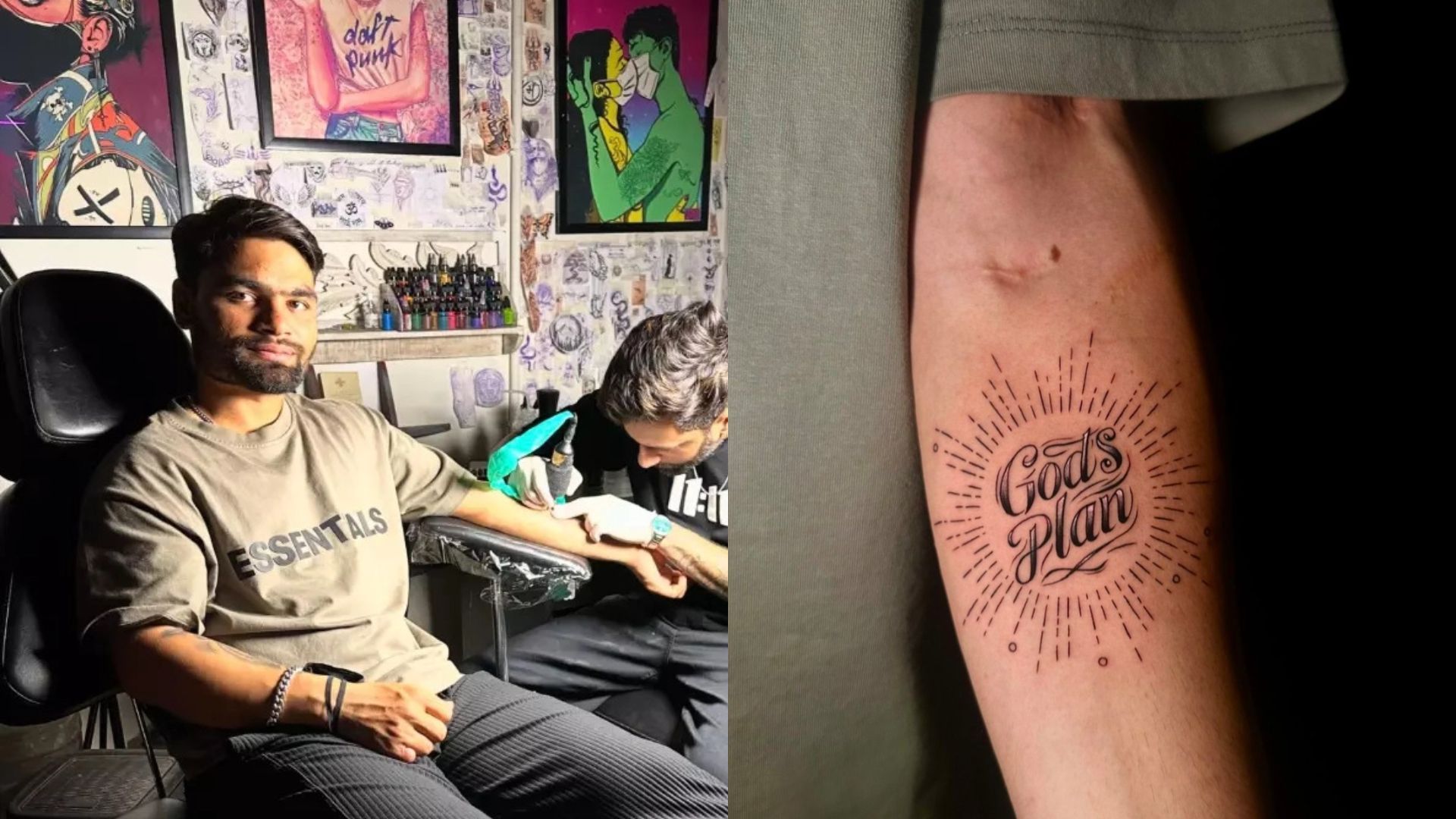
On his other forearm, “God’s Plan” sits in large black script inside a burst of short rays. Singh has linked the design to the five sixes he hit in the final over against Gujarat Titans in IPL 2023. He described the straight lines around the words as a reference to the directions of those shots.

The phrase is easy to read, and the lines are spaced apart rather than packed around it. That open layout lets the lettering stand out without turning the design into a solid block.

Different views of the same forearm ink

Rinku Singh tattoos: both forearms tattoo placement reference

The clock-and-dove composition uses shading and more detail; “God’s Plan” is lighter, with open space between its rays. A wider view shows how the two designs sit on separate arms, while close-ups make the lettering and line spacing easier to see. Most of the ink can be covered by a sleeve and appears when he raises or turns his arms.

The smaller words: peace and taking flight

Rinku Singh tattoos: forearm tattoo placement reference

Singh has mentioned the phrase “thodasa peace and udaan,” roughly referring to peace and taking flight. The smaller writing is hard to make out in every photo, so it’s better not to guess at every letter. The phrase’s broad idea fits the dove and the sense of movement in the larger pieces.

What makes the collection feel connected

The tattoos vary in style: shaded imagery, larger script and an open burst of lines. Their shared thread comes from the events and ideas Singh has attached to them—family, faith, the auction and the five sixes—rather than one uniform look.

Placement and style takeaways

The forearm gives the clock and lettering room to sit at different angles, but the skin curves and moves as the wrist turns. Check a design from more than one angle before settling on placement. The contrast between the shaded clock and the open rays also keeps the arm from feeling equally dense everywhere; readable words need enough space to age.

Why the collection hangs together

For a tattoo inspired by Singh’s, start with the moment you want to remember. Decide whether a few words, an image or both carry it best, then keep the main detail clear enough to read on skin.

More athlete tattoo guides

Leigh-Anne Pinnock Tattoos: Believe, Butterflies and the Ink Behind Wings

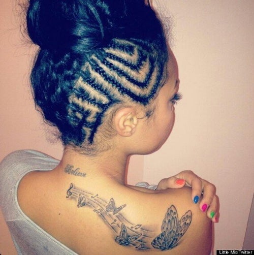
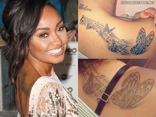
Leigh-Anne Pinnock has two well-documented tattoos: “Believe” in cursive at the back of her neck, and a music-and-butterfly design across her upper back and right shoulder blade.

The “Believe” tattoo on Leigh-Anne’s neck

Leigh-Anne Pinnock tattoos: inline

The small cursive word sits just below Pinnock’s hairline. It is readable in close-up, and her hair can cover it when worn down. There isn’t a reliable account tying “Believe” to one specific life event, so the clearest description is the word and its placement.

The musical notes and butterflies across her back

Leigh-Anne Pinnock tattoos: inline

The larger piece starts near the middle of Pinnock’s upper back and reaches toward her right shoulder blade. A treble clef and sheet music run beneath four butterflies that grow larger across the design. Open skin between the lines keeps the composition from reading as one dark block.

Pinnock credited her friend Hannah Lisa with drawing it. Lisa was studying fine art at Arts University Bournemouth at the time. Pinnock later joked that there had been a lot of squealing during the tattoo session.

Are the butterflies part of the Little Mix story?

Four butterflies invite a Little Mix reading: the group had four members, and “Wings” is one of their songs. No confirmed explanation says each butterfly represents a particular member, so the link is plausible rather than settled.

The clef and notes make the music link visible even without the “Wings” interpretation. The butterfly connection can remain open to more than one meaning.

Leigh-Anne and the Little Mix years

Little Mix formed on The X Factor in 2011, and the back tattoo appeared during the group’s years together. Its music notation gives the design a clear tie to Pinnock’s career without using a band name or logo.

Leigh-Anne Pinnock in a contextual photograph: inline; not tattoo evidence

This photo is included for context, not as evidence of another tattoo. For comparison, Jade Thirlwall’s tattoos range across more placements, including an Arabic spine tattoo, an ankle heart and a Little Mix tribute. The two collections draw on different parts of the same group history.

The style Leigh-Anne carries into her solo era

Pinnock’s tattoos remain relatively small and easy to cover as her work moves beyond Little Mix. The neck word is direct; the back piece uses several images and a longer path across the body. They differ in scale but share a personal connection to her life and music.

Leigh-Anne Pinnock in a contextual photograph: inline; not tattoo evidence

This portrait also provides context; it doesn’t show a tattoo. The back design is easiest to read when the shoulder and the full line of butterflies are visible, though the body’s curve can make it look different from one angle to another.

Design lessons from Leigh-Anne’s layout

Leigh-Anne Pinnock tattoos: inline

The butterfly sizes give the back piece a clear direction. If you’re planning a shoulder or upper-back design, decide what should catch the eye first, then let the rest follow the body’s shape. Have the artist check the stencil as you move your shoulders; a layout that looks level while standing still can shift when you lift an arm.

For the neck script, keep enough space between letters for the word to remain legible. Delicate lettering needs to be drawn for the actual area, not just reduced from a larger design.

A small collection, plenty of personality

The neck piece stays simple; the back design follows a line of music into four butterflies, leaving room for more than one reading.

Jeremy Allen White Tattoos: The Real Ink Behind Carmy’s Look

Jeremy Allen White’s real tattoos are smaller and quieter than the heavy ink worn by Carmy Berzatto on The Bear. White worked with tattoo artist Benny Shields to create Carmy’s designs, but his own chest triangle was also worked into an earlier role on Shameless.

Jeremy Allen White’s real triangle tattoo

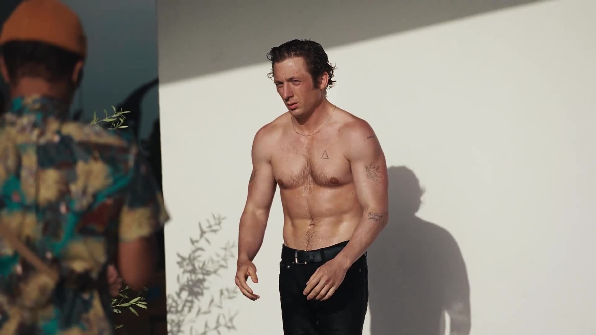
Jeremy Allen White tattoos: Jeremy Allen White’s real triangle tattoo

The triangle sits high on the left side of White’s chest. The GQ España campaign image shows its open outline and the raised texture around it. White has said he got the tattoo at 17 and that it was done badly enough to leave the skin raised. He has connected it to a friendship and his younger years, but hasn’t assigned it a more specific symbolic meaning.

Makeup artists tried to cover the triangle when White played Lip Gallagher on Shameless. Its texture made that difficult, so the show worked the real tattoo into Lip’s look. The old mark became part of a character, even though it belonged to White first.

What White’s personal collection looks like

White has at least six known tattoos, though the number can vary with what a photo shows. They include a heart pierced by an arrow with “Buddy & Billie” on his upper forearm; a hummingbird with a banner reading “Ezer”; “R.W.” on a shoulder; “EZ” on an inner bicep; and a two-word phrase beginning with “sweet” on the opposite shoulder.

The hummingbird and Ezer banner are commonly linked to his daughter. The heart-and-arrow has been reported as a tribute to Addison Timlin, while White hasn’t explained every initial or phrase. Those connections should stay qualified.

Jeremy Allen White in a contextual photograph: What White’s personal collection looks like; not tattoo evidence

This portrait gives context; it isn’t evidence of another tattoo. White’s visible pieces vary in size and style, from script and initials to a small illustration.

The actor beyond the role

Carmy’s tattoos are a separate design from White’s own collection. White worked with tattoo artist Benny Shields on the character’s heavy, scattered ink. In an interview with TheWrap, White said Shields could look at a stranger’s tattoo and make an educated guess about when and where it was done. That knowledge helped them make Carmy’s pieces feel chosen over time rather than added at random.

White’s favorite Carmy tattoo was a knife going through a hand. He described it as a reminder of how close the character is to damaging what he’s trying to build. That reading belongs to Carmy’s story, not White’s personal tattoos.

Jeremy Allen White in a contextual photograph: The actor beyond the role; not tattoo evidence

How the production built the look

White’s raised triangle also affected how makeup handled the role. For The Bear, NewBeauty’s behind-the-scenes account says the crew covered White’s existing tattoos before applying Carmy’s temporary designs. The production had to keep the character’s ink consistent through long kitchen scenes, movement and close-up shots.

Carmy’s tattoos vary in age and finish, which makes them look like marks gathered over time. The real triangle shows why texture matters too: the skin itself can make a flat-looking reference harder to reproduce.

Jeremy Allen White in a contextual photograph: How the production built the look; not tattoo evidence

A style that leaves room to breathe

White’s own tattoos mix a small outline, lettering and a few illustrations. They don’t follow one strict visual rule, and each piece has its own history. If you’re planning a collection, choose the reason first, then match the size and detail to the place on your body. A small triangle can stay simple; a bird needs enough room for its shape; script needs space between letters.

The personal tattoos aren’t a blueprint for Carmy’s heavier designs. Borrow the line work or scattered placement if you like it, but keep the character’s fictional story separate from White’s.

Jeremy Allen White in a contextual photograph: A style that leaves room to breathe; not tattoo evidence

The clean version of the story

The triangle is the one clear overlap: White got it for himself as a teenager, and it later became part of Lip’s look. Carmy’s heavier ink belongs to a different story.

More actor tattoo guides