
Samara Weaving’s tattoos are small, a little odd, and easy to miss until you know where to look. That’s the appeal. Her collection isn’t built around one giant sleeve or a single polished theme. It’s a handful of tiny drawings and bits of lettering scattered across her arms, wrists, fingers, and ankle. Some are playful. Some are personal. All of them feel like they belong to a person who’d rather collect little ideas than plan one perfect visual statement.
A 2017 profile in W Magazine described a black cat on her wrist, a dainty moon on one finger, and an elephant on the inside of her wrist. The same piece quoted Weaving joking, “My body is a jungle!” That line gets at the mood better than any neat tattoo list could. Her ink has a loose, lived-in quality, with small designs that don’t need to match to sit comfortably together.
Later photos give us a clearer look at a few pieces, including the word BUSINESS above a tiny line-drawn figure, a black animal silhouette on the forearm, and the cat tattoo in a relaxed close-up. There’s also a small potted-plant design visible in a Vogue portrait. The collection is cute without becoming sugary, and minimal without looking overly precious.
The BUSINESS tattoo on Samara Weaving’s upper arm
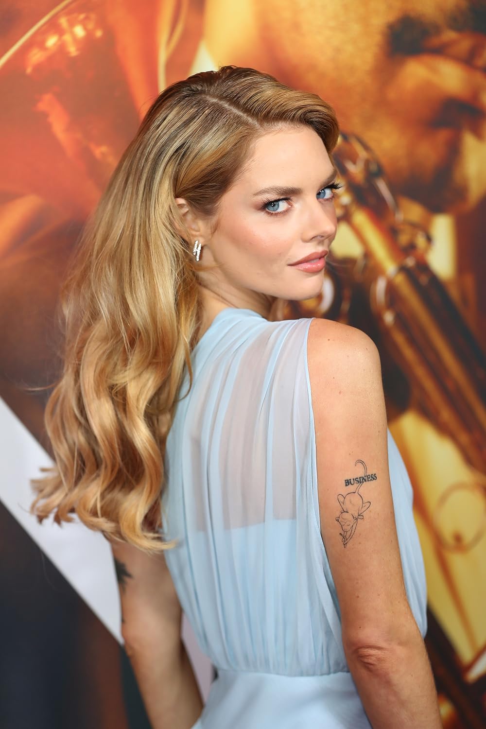
This is one of the easiest pieces to read in a photograph. The word BUSINESS sits above a small black line drawing on the back of Weaving’s upper arm. The lettering is compact and slightly playful, while the little illustration underneath gives it a visual punch. It doesn’t look like formal script or a carefully balanced quote. It feels more like a private joke that happened to become permanent.
The placement helps. The back of the upper arm gives the tattoo enough room to stay legible, but it can still disappear under a sleeve. That makes it a useful spot if you want something visible in a tank top or dress without having it dominate every outfit. The design also reads well from a three-quarter angle, which is why it shows up so clearly in a red-carpet photo.
There’s a nice lesson here for anyone considering a tiny word tattoo: the lettering doesn’t have to carry the whole design. A short word can sit above a small image, with the two parts working together like a label and a doodle. Keep the word short, give it breathing room, and don’t shrink the lettering so far that it turns into a dark line after a few years.
The little figure underneath matters just as much as the text. It keeps the tattoo from feeling like a slogan. Even if you borrowed the basic idea of a word above an illustration, the drawing should come from your own sense of humour. A tiny object, animal, or character can make familiar lettering feel much more personal.
The black animal silhouette on her forearm

Another photo catches a small black animal silhouette on Weaving’s forearm. It’s a simple shape: a compact body, four legs, a tail, and a low, prowling stance. The image doesn’t establish whether this is the black cat mentioned in earlier reporting or a separate design, so it’s better to describe what’s visible instead of forcing the two pieces into one.
That distinction is useful because small black tattoos can look very different depending on the light. A silhouette may read as a cat in one photograph and a panther or other animal in another. The cleanest description stays with the shape and placement. It’s a dark little figure on the forearm, photographed at close range, with enough contrast to make the outline easy to see.
Silhouettes are popular for a reason. They hold up without tiny interior details, they can be scaled down without losing the main idea, and they work in a lot of placements. If you like the look but don’t want a realistic animal, a solid silhouette gives you a graphic result with less visual fuss. The trade-off is that the outline has to be right, because there’s no shading to hide a weak pose or awkward proportions.
Weaving’s version is small enough to feel like a passing detail, but it still has a clear direction. The animal is moving rather than sitting flat on the skin. That little bit of posture gives it more personality than a generic black blob. When you’re designing a similar tattoo, think about the gesture first. A lifted tail, a turned head, or a bent leg can do more than extra decoration.
The cat wrist tattoo
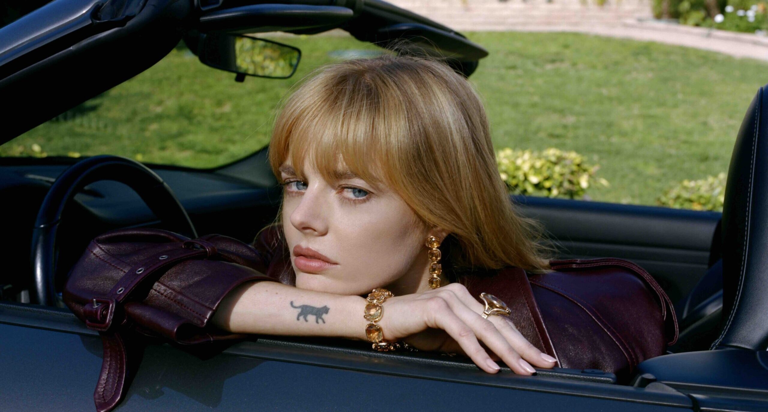
The cat tattoo is the piece that best matches Weaving’s playful side. In a casual photo, she rests her face in both hands while the small black cat sits clearly on the inside of her wrist. The design is compact and solid, with enough shape to read even in a busy restaurant setting. It doesn’t need a caption. You can see the animal at a glance.
W Magazine also identified a black cat on her wrist, so this is one of the stronger matches between reporting and a visible photograph. The image doesn’t tell us when Weaving got it or why that particular cat matters. That’s fine. A tattoo can be confirmed without its entire backstory being public, and the simple design leaves space for the meaning to stay hers.
The inside-wrist placement makes the tattoo easy to show when she wants to, while still allowing it to disappear when her hand is turned over or covered by a sleeve. It’s a spot that changes with movement. You might see the whole cat when the hand is lifted, then only a dark patch when the wrist bends.
For a small animal tattoo, that location also keeps the design feeling intimate. It’s close enough to be noticed during ordinary gestures, but it isn’t the first thing people see across a room. The size does a lot of the work. A tiny cat can look charming without needing cartoon eyes, colour, or a decorative frame.
The moon, elephant, and tiny collection around them
W Magazine’s description adds two more details: a dainty moon on one finger and an elephant on the inside of a wrist. Those pieces fit the rest of the collection because they’re recognisable without being oversized. A moon can be reduced to a clean crescent. An elephant can be drawn with just enough outline to suggest the shape without filling the whole wrist.
Finger tattoos need a little extra thought because the skin gets a lot of movement and wear. Fine lines can soften, and tiny shapes may need a touch-up sooner than a design placed on a flatter area. The moon works visually because it doesn’t depend on a complicated pattern. Its basic outline can stay clear even if the edges mellow over time.
An elephant is a different challenge. The ears, trunk, and body need enough separation to keep the animal readable at a small scale. If you’re borrowing the idea, ask your artist to show you the design at the size it will actually be tattooed. A drawing that looks detailed on a phone can turn into a dark knot once it’s reduced.
The fact that these pieces are spread between fingers and wrists keeps the collection from becoming one crowded block. Each tattoo has a little room around it. That open skin is part of the look. You don’t need to fill every gap just because there’s space available.
The small plant tattoo visible in a Vogue portrait

This portrait gives a useful look at how Weaving’s smaller designs sit with her clothes and styling. The black-and-white photo shows a little potted plant on the upper arm. It’s a simple drawing with a stem, leaves, and a small pot, placed where the top edge of a strapless outfit leaves it visible.
The plant has a different feel from the animal silhouettes. It’s lighter and more open, with a little more interior detail. Even so, it stays within the same general scale. Nothing is trying to take over the arm. The designs feel like separate snapshots of taste rather than pieces from a single flash sheet.
That’s a good reminder that a collection can have a shared mood without sharing one subject. Weaving has animals, a moon, lettering, and a plant. The connection is the size, the straightforward line work, and the willingness to let each tattoo stand alone. You can build a similar mix around your own interests without making every design look like it came from the same artist’s portfolio.
Plants are also forgiving tattoo subjects. A tiny pot and a couple of leaves can be simplified in lots of ways: clean line work, a solid silhouette, or a slightly sketchier illustration. The important part is deciding what needs to stay readable. If the pot is the part that makes the design yours, give it enough space. If the leaves matter more, don’t bury them under heavy shading.
Another candid view of the cat tattoo
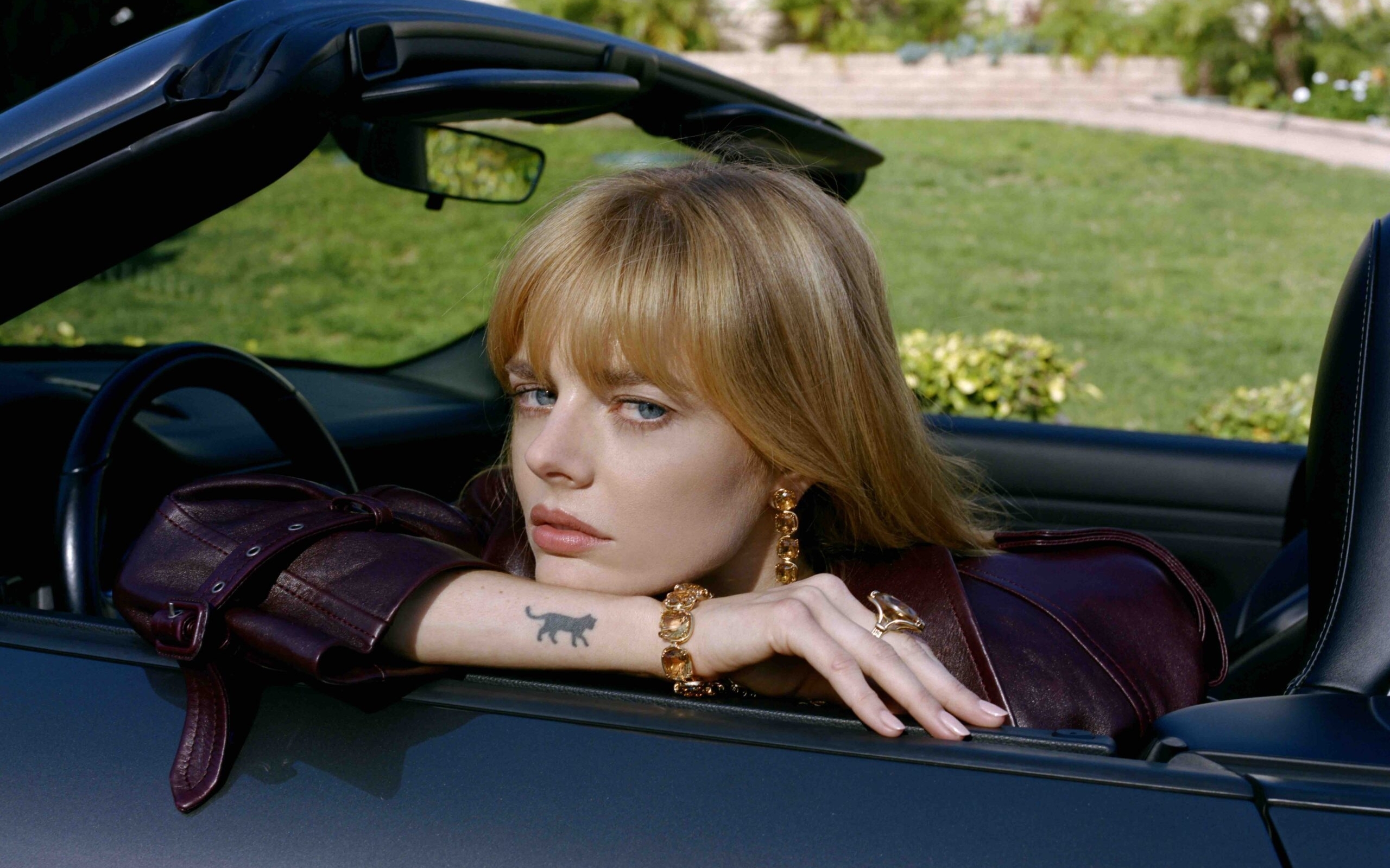
A second candid photograph catches the same little cat in a different setting, this time on Weaving’s forearm as she sits in a convertible. The crop is wider and the pose is more relaxed, but the solid animal shape is still easy to read. Seeing it in more than one photograph makes the placement clearer: it sits low on the forearm near the wrist, where a bracelet or sleeve can partly cover it.
That kind of repeat view is useful when you’re studying a small tattoo. One close-up can make the design look larger or darker than it is. A second angle gives you a better sense of scale, body position, and how the ink looks in ordinary light.
Why the collection feels easy
The first thing is scale. Most of the designs are small, so they can sit on the body without fighting one another. The second is variety. A cat doesn’t need to match a moon, and lettering doesn’t have to share a style with a plant. The collection feels more like a shelf of small objects than a single mural.
The third is placement. Wrists, fingers, forearms, and the upper arm all give the tattoos different levels of visibility. Some are easy to show. Others disappear with a sleeve or a change in posture. That mix keeps the collection from feeling like a uniform set of stickers.
There’s also a bit of humour in the choices. A tiny animal and the word BUSINESS don’t feel like designs selected only for visual balance. They feel like ideas that made Weaving laugh or stuck in her head. That’s often where the best small tattoos start. The design doesn’t have to make sense to everybody else if it makes sense to you.
If you’re planning a similar collection, start with one piece you’d still want if nobody else ever saw it. Choose a placement that fits your daily life, then let the next tattoo happen later. Matching everything on the first visit can make a collection feel finished before it has had time to become personal.
Small tattoos do need careful planning, though. Fine lines can spread, fingers can fade, and a design that looks charming at one centimetre may need more room than expected. Bring reference images, talk through the age of the design, and ask your artist what details will survive at the final size.
Weaving’s ink isn’t a rulebook. It’s a good example of how a tattoo collection can stay loose. You can mix animals, lettering, plants, and tiny symbols as long as the choices feel like yours. Leave some skin open. Let one design be silly. Let another stay private.