
Jay Putty’s tattoos are small, personal and easy to miss if you’re only looking for a full sleeve. The Nashville musician has built a young collection around fine lines, family memories and a few symbols that connect back to his music. Nothing feels thrown on just to fill space. Even the pieces that look simple have a reason behind them.
That makes his ink a good reference point if you like tattoos that feel lived-in instead of overly planned. Putty told V13 that he waited until he was 30 to get his first tattoo. When he finally started, he went for designs that could carry a memory: his father’s handwriting, a symbol shared with close friends and a compass tied to one of his songs.
There are four tattoos in the collection he discussed in that interview, although only some of them have been explained in detail. The photographs give us a clear look at two of the designs. The rest of the story comes from what Putty actually said, not guesses about what every line might mean. That distinction matters with small tattoos. A rose can be a rose, but the reason someone chose it can make the piece feel completely different.
Jay Putty’s compass tattoo is tied to “On My Way”
The strongest visual in Putty’s collection is the compass on his forearm. It is a bold black compass rose with a circular navigational frame, cardinal letters and a long arrow running up the arm. The design has a classic travel and direction feel, but it isn’t a generic flash compass pulled from a wall. Putty said it was based on the compass from his song “On My Way.”
He got the tattoo after the song reached 20 consecutive weeks on Billboard’s Adult Airplay chart. That timing gives the image a nice bit of weight. It isn’t just a symbol about finding your direction; it marks a particular moment in his career when an independent artist hit a milestone that meant something to him.
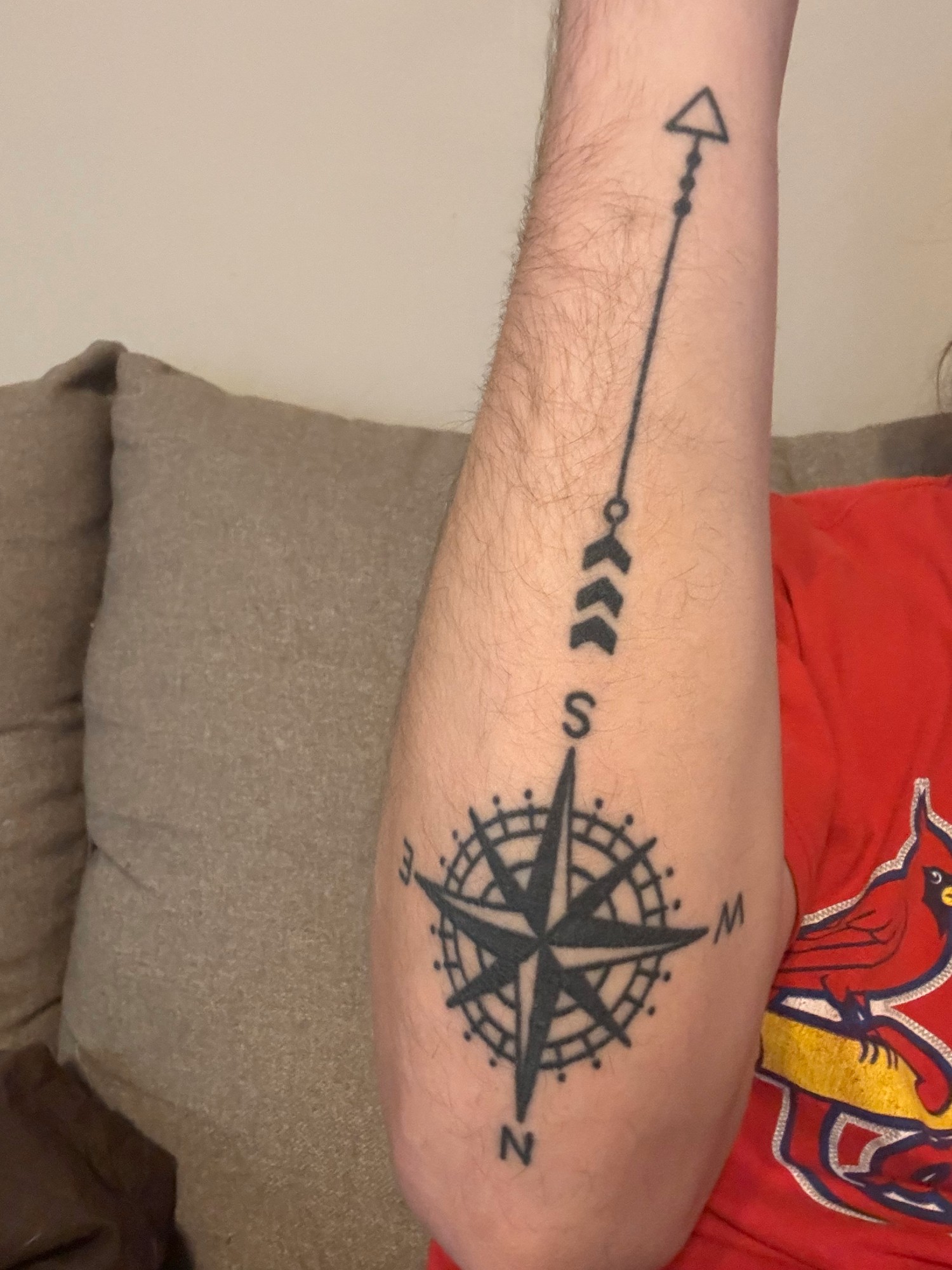
The design also works because of the way it travels up the arm. The compass sits near the lower part of the photo, while the arrow and small marks extend above it. That gives the piece a vertical rhythm instead of making it look like a round sticker placed on the forearm. The letters around the compass keep the shape readable, and the dark centre gives the eye a clear anchor.
If you like compass tattoo ideas but want something that feels less predictable, the useful part to borrow is the connection between the symbol and a real turning point. A compass can stand for travel, a new job, recovery, a relationship or simply a promise to keep moving. The personal detail doesn’t have to be obvious to anyone else. It only has to make sense when you look at it.
Placement is worth thinking about too. A forearm gives a long design room to breathe, which is why the arrow doesn’t have to be squeezed into the circle. A tattooer could make the compass smaller, simplify the cardinal letters or let the arrow run in a different direction. The basic idea would still work while fitting your own arm.
The Rosewood and “Jaybird” tattoos keep family close
Putty’s other photographed tattoo has a softer look. It combines a simple linework rose with handwritten lettering on the forearm. The image shows the word “Rosewood” running above the flower, with “Jaybird” also worked into the piece. The rose is open and uncomplicated, with thin outlines and a few clean interior curves rather than heavy shading.
Putty explained that “Hey Jaybird” was what his father called him. He also got the Rosewood symbol because it was the name of the friend group he shared with his best friends back home. After his friend Brendan died, the group got the symbol as a way to remember him and stay connected.
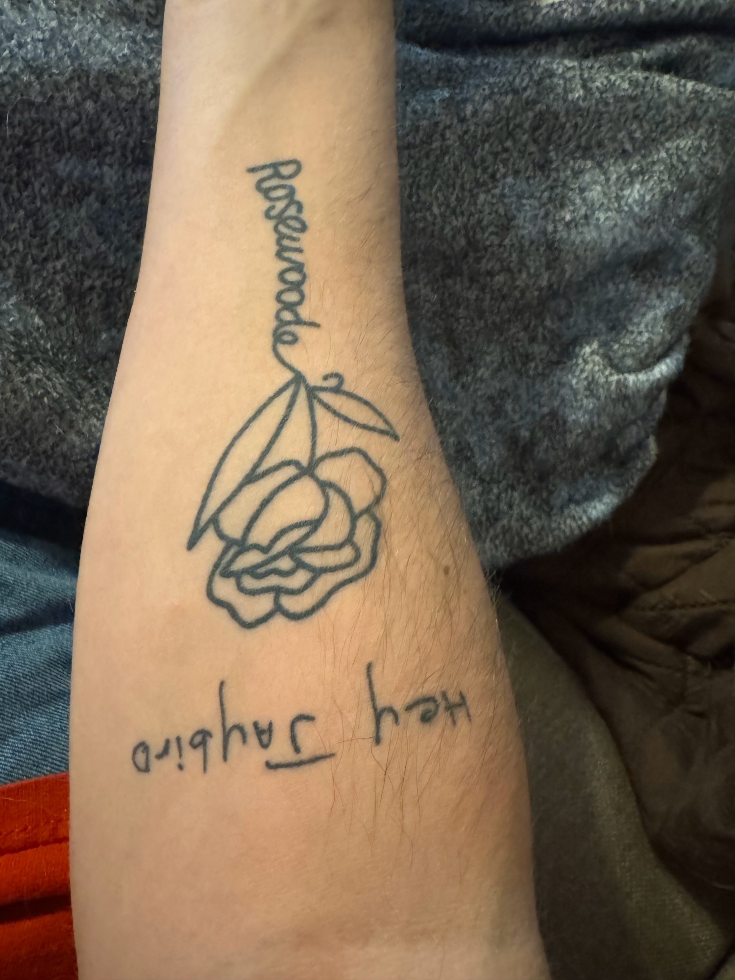
That is a lot of meaning to carry in a small tattoo, but the design doesn’t look crowded. The lettering and flower have enough separation to stay readable. The rose adds an image to what could have been a plain text tattoo, while the handwriting keeps it from feeling like a standard typeface. It looks more like a note turned into body art.
Putty has said that “Hey Jaybird” is his favorite tattoo because every time he sees it, he hears his father saying it. That is the kind of explanation that makes a simple tattoo land harder than a complicated one. The design doesn’t need a long visual history. The handwriting is already the point.
Handwritten tattoos need a little care during the design stage. A tattooer can use the original note or signature, but the lettering still has to be sized so it ages well. Tiny loops and close lines can soften over time. Keeping the words open and letting the flower do some of the visual work helps the piece stay clear without losing the personal feeling.
Why his collection feels connected to music
Putty’s tattoos aren’t separate from his work as a songwriter. The compass connects directly to “On My Way,” while the family and friendship pieces reflect the memories he writes about. His music often deals with love, loss and the small moments people carry around after something changes. The tattoos come from the same place, just in a more permanent form.

That doesn’t mean every new tattoo has to be a lyric or an album reference. The better lesson is that a design can sit beside your creative life without turning into merch. Putty’s compass isn’t covered in a song title. It is a familiar object that he connected to a specific achievement. That keeps it personal instead of making it look like a logo.
The family tattoo works the same way. Someone seeing the rose might read it as a memorial design, a friendship piece or simply a small botanical tattoo. Only Putty knows the full story at a glance. That private layer is part of the appeal. A tattoo can be visually simple and still hold a whole timeline underneath.
Why simple line work can stay readable
Putty told V13 that he likes minimalism and fine-line work. All of his tattoos had been done by Snappy Tats, and the photographs fit that description. The rose uses a narrow outline. The handwritten letters are light enough to leave plenty of skin showing. Even the compass balances a heavier centre with open lines around the outside.

Minimal doesn’t mean unfinished. It means each part has to earn its place. The compass needs the circular frame and the arrow because those details explain the shape. The rose needs the lettering because the text gives it a reason to exist. Remove too much and the tattoo becomes vague. Add too much and the personal idea gets buried.
This is also why fine-line references need to be shown to a tattooer rather than copied directly. The amount of detail that works in a photograph depends on size, placement and skin. A tiny compass may need fewer points. A handwritten phrase may need more space between letters. A good artist will keep the mood of the reference while redrawing it for the body.
Fine-line work can soften faster in places that get constant rubbing or sun exposure, too. That doesn’t make it a bad choice, but it does mean you should think about how often the area gets washed, covered by a watch or exposed outdoors. Putty’s forearm pieces are readable because the shapes are clear. That kind of editing helps a small tattoo keep its identity as it settles.
The quiet look of Putty’s collection
Putty’s public photos have a relaxed feel, and that carries over to the way the tattoos read. They aren’t trying to dominate his appearance. A tank top reveals the arm designs, but the pieces still look like part of a person rather than the whole point of the image.

That balance is useful if you want visible tattoos without turning every outfit into a tattoo reveal. A small forearm piece can show when you want it to and disappear under a sleeve when you don’t. A handwritten design can be meaningful without needing to be explained every time someone notices it. The tattoo is there, but it isn’t performing for the room.
There is also a natural difference between the two photographed pieces. The compass is darker and more graphic, with a strong central shape. The rose and lettering are lighter and more intimate. They don’t match like a planned set, but the fine-line approach gives them enough common ground to sit together.
If you are building a small collection, that is a better goal than making everything identical. Pick a shared quality such as line weight, scale or open space, then let the subject change. One tattoo can mark a creative milestone while another keeps a family phrase close. The collection will feel more honest when it grows from actual life instead of a single aesthetic board.
What to borrow from Putty’s approach
The easiest idea to borrow is the habit of starting with the memory. Putty didn’t begin with a random list of trendy objects. He began with his dad’s nickname, a friend-group symbol and a song milestone. Those starting points gave the tattooer something real to translate into line work.
For a compass, think about the direction or moment it represents. Maybe it marks a move, a return home or a decision to keep going. For handwriting, use a real note if you can. The tiny irregularities are what make the design yours. For a memorial rose, you might add a date, initials or a symbol shared with the people who knew the person being remembered.
Then edit the idea. A personal tattoo doesn’t have to include every detail from the story. Putty’s “Jaybird” piece doesn’t need a paragraph written around it. The handwriting does enough. His compass doesn’t need the full title of the song across the arm. The symbol carries the connection without explaining everything to strangers.
It is also worth leaving room for future tattoos. Putty had four pieces when he spoke to V13 and said he planned to get more. A small collection can grow naturally when you don’t fill every available patch of skin at the start. Open space makes each tattoo easier to see, and it gives later pieces somewhere to land.

Jay Putty’s tattoos are a good reminder that a meaningful collection doesn’t need to be huge. A compass can hold a career milestone. A rose can carry a friendship and a father’s voice. Fine-line lettering can keep a private nickname close without turning it into a loud statement. Those ideas are simple, but the reasons behind them aren’t.
Start with the memory, keep the design clear and let the tattoo grow at its own pace. That is the thread running through Jay Putty’s collection, and it is a solid way to approach your next piece.