
Jacob Fatu’s newest tattoo fits him almost too well. It’s big, black, heavily patterned, and impossible to miss when he walks into a wrestling ring. But the interesting part isn’t just the size. The new Samoan design wraps around an older “Journey” piece on his left arm, so it looks less like a random add-on and more like the next section of a tattoo that’s been growing with him.
The first close looks at the finished work came through tattoo artist Michael Fatutoa, also known as Samoan Mike. The photos show a traditional Polynesian approach built with solid black bands, repeating triangles, sharp borders, and small areas of skin left open to keep the pattern readable. It has the weight you’d expect from a large arm piece, but the spacing stops it from turning into one flat block of ink.
Jacob Fatu’s Samoan tattoo style
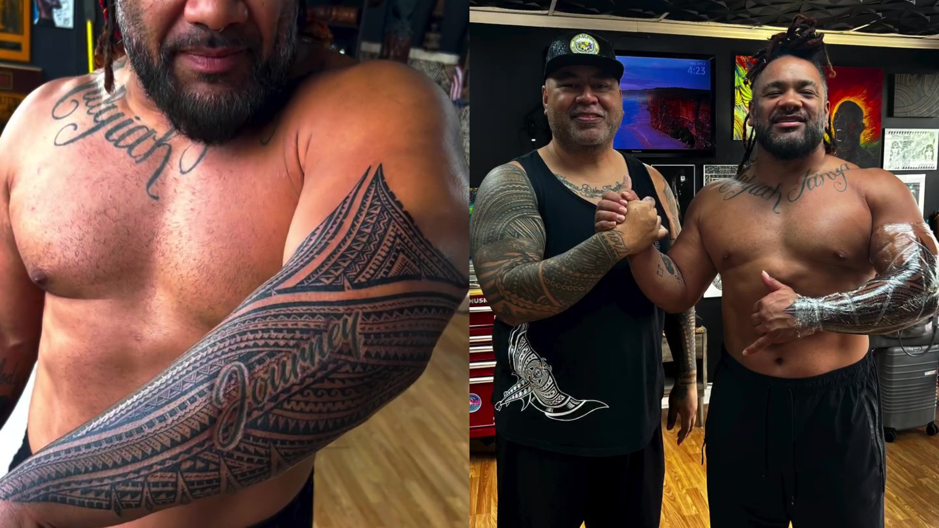
The new work runs along the outside of Fatu’s left arm and folds around the existing lettering. That wrap is what gives the design its impact. Instead of ending at the edge of the old tattoo, the new pattern creates a border around it, almost like the older piece has been pulled into a larger sleeve.
You can see the structure in the close-up: parallel bands, zigzag edges, diamond shapes, and rows of tiny marks that repeat across the arm. The lines are clean and confident, but the design still has movement. Polynesian tattooing often relies on rhythm more than one central picture, and this piece uses that rhythm well. Your eye keeps moving along the arm instead of stopping at one symbol.
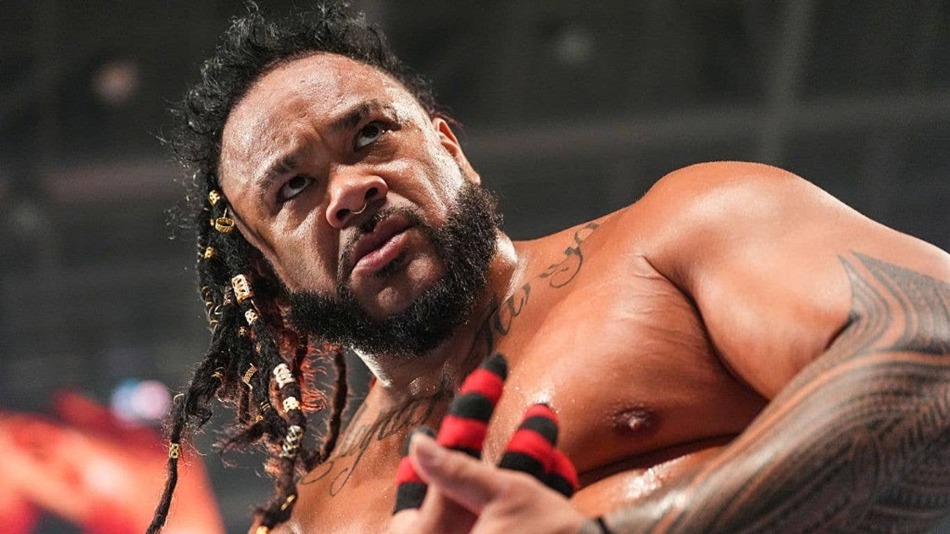
The tattoo also sits in a spot that works hard on camera. When Fatu raises his arm or reaches for an opponent, the pattern stretches across the muscle and changes shape with it. That makes the piece feel active. It isn’t just something you see when he stands still for a photo. It becomes part of the movement, which is exactly what a wrestling tattoo needs to do.
How the patterns read under arena lights
Ring lighting can flatten tattoos. Bright overhead lamps, colored LEDs, sweat, and fast movement tend to erase small details. Fatu’s work handles that problem by using strong contrast. The black sections stay bold at a distance, while the lighter gaps keep the pattern from becoming a dark blur.

That contrast matters because most fans won’t first see the tattoo in a studio. They’ll see it during an entrance, a match, or a quick close-up after a big move. From a few rows back, the sleeve reads as a clear graphic shape. On a closer shot, the smaller geometry starts to appear. That’s a useful balance for anyone thinking about a larger tribal or Polynesian-inspired piece.
There are plenty of tattoo ideas that look impressive in a still image and disappear once the person starts moving. Fatu’s design avoids that. The main bands give it a strong outline, and the smaller patterning adds texture without taking over. It has enough visual weight to match his build, but it still has an actual layout.
Why placement matters on a wrestler’s body
Fatu’s tattoos work because they follow the shape of his body rather than fighting it. The outside arm gives the new design a natural vertical path. The bands can travel around the muscle, and the older lettering remains part of the composition instead of getting swallowed by fresh ink.

That idea is easy to borrow without copying the exact design. If you like the look of a sleeve but don’t want one giant solid image, think about how a pattern can travel. A good artist can build a route around the arm, shoulder, or chest using repeated shapes and negative space. The result can feel full without looking crowded.
It also helps to leave room for the tattoo to grow. Fatu’s new piece is a good example of why a first tattoo doesn’t always have to fill an entire area. The “Journey” lettering had a life of its own before the new pattern arrived. Because the later work was planned around it, both parts still have breathing room.
A style that looks built, not pasted on
There are a few reasons this tattoo feels convincing. The first is consistency. The same black-and-skin contrast appears across the arm, so the new work doesn’t feel like it came from a completely different visual language. The second is scale. Small delicate marks would have disappeared against Fatu’s existing body art and on a televised ring entrance. The heavier pattern makes sense for the space.

The third reason is restraint. Even though the design is dense, it doesn’t rely on a dozen unrelated images. The interest comes from repetition, balance, and the way the bands turn around the arm. That’s a smart route for anyone who wants a tattoo that looks strong years later. You don’t always need more symbols. Sometimes the better move is to make one system of shapes work harder.
Fatu’s older chest lettering adds another layer to the overall look. It brings a softer, handwritten contrast to the hard geometry on his arm. That mix keeps the tattoos from feeling too uniform. The lettering is personal and direct, while the Samoan pattern is architectural. Together, they give his upper body different textures instead of one repeated style.
What to borrow from Jacob Fatu’s look
The obvious takeaway is that Polynesian-inspired work can be bold without being messy. Strong bands, repeating marks, and intentional gaps can create a sleeve with real structure. But the more useful lesson is the planning behind it. The new tattoo doesn’t pretend the old one isn’t there. It uses the existing piece as an anchor.
If you’re collecting ideas for your own tattoo, start with the part of the design that has to stay visible. Maybe it’s a name, a date, or a small piece you’ve had for years. Then ask an artist to build outward from that point. The best result may not be a perfect copy of Fatu’s sleeve. It may be a pattern that borrows the same logic: bold outer lines, smaller details inside, and enough skin showing through to keep everything legible.
Think about how the tattoo will look in normal life too. A ring entrance gives Fatu’s ink dramatic lighting and a lot of movement, but the design still works in a regular photograph. That’s a solid test. If a piece only looks good under one kind of lighting, the problem may be the spacing or the contrast. Clear silhouettes and deliberate negative space usually hold up better.
And don’t rush the “full sleeve” idea. Fatu’s tattoo shows how a new section can make an older tattoo feel more finished without erasing what was already there. Leave room for the next chapter, especially if your taste changes or another meaningful design comes along.
Jacob Fatu’s latest tattoo lands because it feels connected to the person wearing it. The Samoan geometry matches his presence, the placement works with his movement, and the new pattern gives his older “Journey” lettering a stronger frame. It’s a good reminder that the best large tattoos aren’t just big. They have a plan, and you can still see that plan when the wearer is moving, sweating, and throwing someone across a ring.
That plan is also why this is a useful reference for people who like tribal tattoo ideas but don’t want a design that feels stuck on top of the skin. The shapes are doing a few jobs at once. They create a border, fill open space, guide the eye around the arm, and keep the older lettering in the conversation. Nothing has to shout over everything else.
For a custom piece, the consultation would be just as important as the final drawing. Bring the artist the tattoos you want to keep, explain which parts of your background matter to you, and be honest about how much space you actually want covered. A good design isn’t just a collection of attractive symbols. It should fit the body, the story, the time you can spend in the chair, and the way you want the tattoo to age.
Fatu’s sleeve also shows why a clear reference photo can help without becoming a template. The close-up makes the geometry easy to study, while the ring photos show how the design behaves when the arm bends and the lighting changes. Those are two different kinds of information. One helps with detail. The other helps with scale and placement.
If you’re drawn to the same balance, ask for a layout that has a strong outside shape and smaller internal marks. Leave breaks between the darkest sections. Let the natural lines of your arm decide where the pattern turns. Most of all, give the artist room to make the design yours. The strongest tattoo ideas usually start with a reference, then become something more personal once they meet the person who will actually wear them.
That kind of patience pays off with a large piece. The cleaner the plan is before the needle starts, the easier it is to keep every section working together. Fatu’s new ink feels finished because the pattern has a clear route around the arm, and because the older lettering still has space to breathe. That’s the part to remember when you’re saving references: look at the decisions, not just the final image.