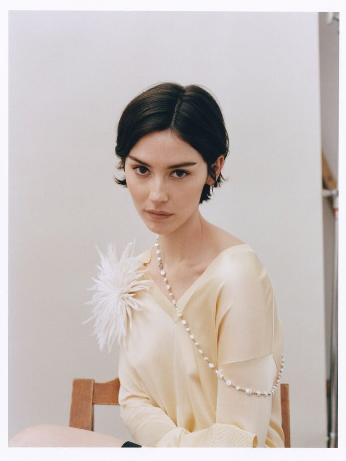
Gracie Abrams’ tattoos are easy to miss, which is part of what makes them feel so personal. She doesn’t have one giant piece that dominates every photo. Instead, the ink shows up in small flashes: a tiny mark on the forearm, a few minimalist designs in a fashion portrait, and lettering that only becomes clear when she turns an arm toward the camera.
The best-documented piece is the word River, written in Joni Mitchell’s handwriting. Abrams has described it as a tribute to her favourite song, and Mitchell later saw a photo of the tattoo. That detail gives the collection a clear emotional centre, but it doesn’t mean every little mark needs a grand explanation. Abrams’ tattoos feel more like a quiet notebook than a planned-out sleeve.
Small star tattoo visible on Gracie Abrams’ forearm

This close-up clearly shows a small outlined star on Abrams’ forearm. The black-and-white image also gives a good sense of how quietly the design sits against the skin: there’s no frame, text, or extra decoration competing with it. The image is useful for confirming the visible star, but it doesn’t establish when the tattoo was done or what personal meaning Abrams gives it.
That small star is separate from the better-documented River tattoo, which sits on the inside of Abrams’ forearm and uses Joni Mitchell’s handwriting. Abrams has connected the piece to Mitchell’s song, calling it a favourite. She didn’t just borrow a phrase in a random font; she used the handwriting of the person who wrote it. The result sits somewhere between a music reference and a keepsake.
The story got an especially nice extra detail when Mitchell saw a photograph of the tattoo. It’s unusual for a fan’s tribute to travel back to the artist who inspired it, and that small exchange helps explain why the piece matters. The ink isn’t trying to look dramatic. It’s a reminder of a song, a voice, and a connection Abrams clearly values.
For tattoo ideas, the useful lesson is simple: handwriting can carry more feeling than a polished typeface when the source is meaningful. If you’re thinking about a lyric or a short phrase, the handwriting of the person who wrote it can make the design feel much more specific. It also keeps the visual language soft, which suits Abrams’ small collection.
The soft-focus editorial look

The River piece doesn’t sit alone. The same interview describes it as being surrounded by other tiny inkings, and clear editorial photographs show several small minimalist tattoos across Abrams’ forearms. Most of them are deliberately difficult to read at a glance. They look like the kind of marks you notice after seeing the same photos a few times, rather than symbols designed to announce themselves.
That scattered layout gives the tattoos a relaxed feel. There’s no obvious attempt to make every piece match, but the small scale creates a natural rhythm. A tiny star or line can sit beside lettering without making the arm look crowded. The collection feels built over time, with each addition allowed to keep its own shape.
It’s important not to turn every blurry detail into a confident claim. Small tattoos are easy to misread in red-carpet photos, especially when a hand, sleeve, or shadow covers part of the design. The safest descriptions stick to what can be seen clearly and what Abrams has discussed publicly. That leaves some mystery, but it’s better than inventing a meaning for a mark that may not even be readable.
The visual effect is still easy to borrow without copying a specific tattoo. Keep the designs small, use a little breathing room between them, and let different ideas live together. One person might choose a star, another might choose a word, and a third might want a tiny drawing. The shared feeling comes from scale and placement, not from forcing everything into one theme.
How she keeps things understated

A separate interview is useful because it shows how Abrams treats the tattoos in conversation. The Forty-Five describes her twisting her elbow to show a latest tattoo. That’s a very different energy from a staged reveal. She isn’t presenting a giant finished collection; she’s letting one small detail appear when the conversation turns there.
That kind of casual reveal fits the rest of the evidence. Abrams’ ink is usually visible in motion or at an angle. You catch it when her arms are raised, when she leans into a portrait, or when a close-up gives the forearm enough space in the frame. The tattoos feel connected to everyday gestures rather than separated from her life as a special costume.
The available photographs show a handful of forearm designs, but they don’t prove a complete catalogue. That distinction matters. A photo can confirm that a small tattoo is present without confirming its exact meaning, date, or relationship to another design. For an accurate tattoo breakdown, it’s better to describe the visible pattern and keep the claims narrow.
There’s a nice design idea in that restraint. Tattoos don’t have to be built around one central image. A few small pieces can create their own composition simply by following the natural shape of the arm. When the work is fine and minimal, placement becomes part of the style. The gaps matter just as much as the ink.
Why the collection feels low-key
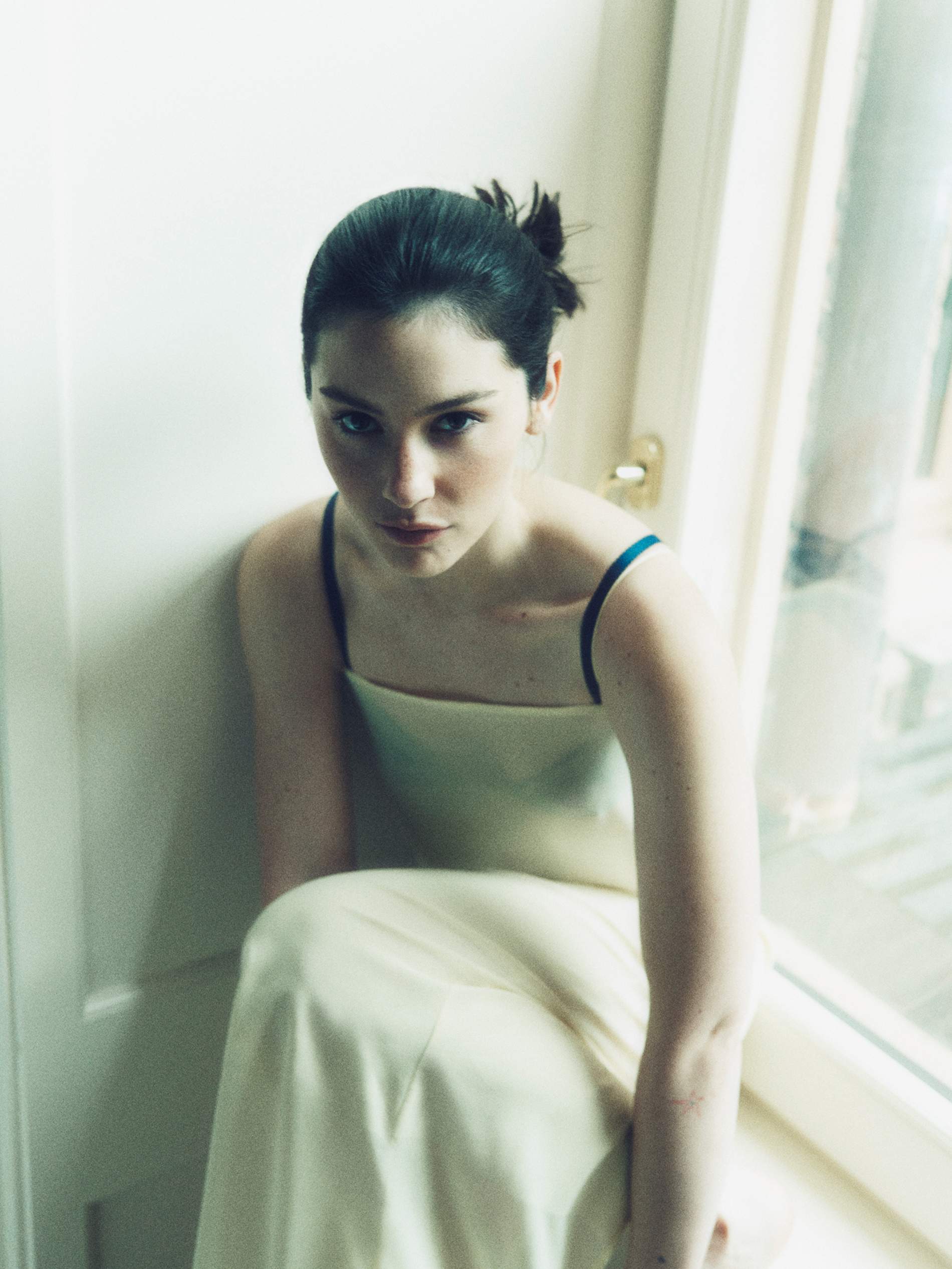
Abrams’ public style is often quiet, and the tattoos follow the same line. Even when a photo is made for a magazine, the ink doesn’t read like a separate performance. It’s there, but it doesn’t take over the outfit or the portrait. That makes the collection useful inspiration for anyone who wants tattoos that can move between private and visible.
Small tattoos also give you more flexibility with placement. A word can sit along the forearm without needing a whole panel around it. A tiny symbol can be left alone instead of being folded into a sleeve. If the design is meaningful, it doesn’t need scale to prove its importance.
The other advantage is that this approach leaves room for change. Abrams’ tattoo collection doesn’t appear to have been planned as one finished statement. New pieces can join the group without having to match a strict colour palette or illustration style. That’s a practical way to build a collection: start with something that matters, then let the next decision happen later.
The downside is that tiny tattoos can blur or disappear faster than larger work, especially if the lines are very fine. A good artist can talk through scale, placement, and how the design will age. The answer isn’t automatically making the tattoo bigger. It’s making sure the smallest version still has enough space and contrast to stay readable.
Why a complete map is hard to make

When people search for Gracie Abrams tattoos, they often want a complete list. That’s understandable, but the available reporting is more fragmentary than a clean checklist. The River tattoo has a clear explanation. Other tiny forearm designs are visible in photos. The Forty-Five interview points to a latest tattoo. Beyond that, it’s safer to avoid presenting guesses as confirmed facts.
That’s not a weakness. It actually makes the collection feel more real. Most people don’t walk around with a caption under every tattoo, and a musician’s press photos aren’t meant to document every inch of skin. Some marks will be covered, some will be too small for a camera, and some may only make sense to Abrams and the people close to her.
For anyone planning a similar set of tattoos, the takeaway is to choose a few strong ideas rather than chasing a crowded patchwork. A favourite song can become one line in a trusted handwriting style. A tiny symbol can mark a moment without explaining it to everyone. Several small designs can build a look over time, especially when the placement gives each one room.
Small-ink ideas worth borrowing
There are three useful directions in Abrams’ ink. The first is personal handwriting. Using a real person’s writing makes a short word feel tied to a specific memory, and it keeps the design from looking like a stock quote. The second is scale. Tiny tattoos can be meaningful without becoming the first thing people notice. The third is patience. You don’t need to design an entire arm on day one.
If you like the River idea, think about what song or line has stayed with you for years. Keep the phrase short enough to work as a tattoo, then look at handwriting samples before settling on a version. If you prefer the scattered forearm look, choose a couple of separate ideas and leave clean space between them. That blank skin will help the collection breathe as it grows.
Most of all, don’t copy a tattoo just because it appears in a good photo. Abrams’ pieces work because the references have a reason behind them. The handwriting, the song, and the small marks all feel connected to her own life. Your version will be stronger when the starting point belongs to you.