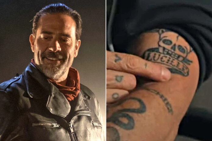
Jeffrey Dean Morgan’s tattoos fit him pretty well: a little rough around the edges, mostly black ink, and easy to miss until you get a clear look. He isn’t covered in a single giant sleeve, but the pieces that have been documented have real personality. There’s the “Lucille” tattoo tied to Negan’s barbed-wire bat, small hand and forearm designs, a script “Bisou” piece connected to a much more personal loss, and matching ink made with longtime friends.
That mix makes Morgan’s collection more interesting than a simple celebrity tattoo gallery. Some of the ink belongs to characters and work. Some of it marks friendships. Some of it is private enough that the meaning matters more than the design. The photos also show how much placement changes the mood: a word on the forearm reads differently from a small hand mark, and both feel different again when they’re glimpsed under a rolled-up red-carpet sleeve.
The “Lucille” tattoo has a very specific connection
The most recognisable piece in Jeffrey Dean Morgan’s tattoo collection is the script-style “Lucille” ink on his arm. The name refers to Negan’s barbed-wire baseball bat in The Walking Dead, the weapon that became inseparable from the character. In the close-up image, the lettering sits alongside a skull-and-barbed-wire motif, so the reference isn’t vague. You can see the character connection straight away without needing a huge portrait of Negan.
That’s a smart way to handle a role-based tattoo. Morgan played Negan for years, and Lucille is one of those fictional objects that carries as much recognition as the character himself. A name and a few hard-edged supporting details are enough to bring the whole thing back. The design doesn’t need the show title, a quote, or a full scene. It works through shorthand.
The lettering has a relaxed, slightly old-school feel instead of looking like a clean piece of computer text. That suits the subject. Lucille is meant to look like a real object with a nasty history, not a polished logo. Pairing the script with the skull and wire gives the tattoo some grit and keeps it from reading as a plain name tattoo.
If you’re planning a tattoo based on a character or prop, that’s a useful idea to borrow. Pick the detail that fans will recognise first, then build a small frame around it. A single word can be enough when the surrounding symbols make the reference clear. It also gives the tattoo room to age without relying on a dozen tiny details that may blur together later.
His hand and forearm ink has a looser feel
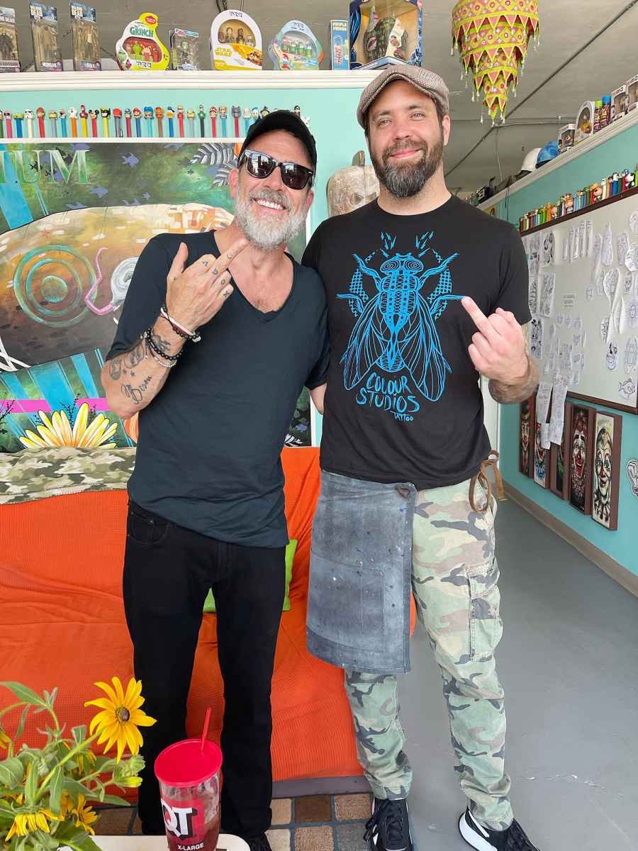
Morgan’s hand and forearm tattoos are easier to read in the tattoo-studio photos. The image shows him with script and small illustrative marks spread across the fingers, hand, and lower arm. They don’t look like one perfectly planned panel. Instead, the collection feels built over time, with each mark occupying the space that suited it.
That kind of scattered layout can look casual, but it still needs a good eye. Hand tattoos live in a small, high-use area. Lines have to be bold enough to survive washing, sun, movement, and everyday friction, while the overall composition needs to avoid becoming a dark knot. Morgan’s visible pieces have enough separation that you can look at them individually.
Small script is especially dependent on scale. Lettering that looks sharp in the artist’s stencil can soften once it heals, and fingers don’t give a tattooer much spare room. Morgan’s hand ink shows why simple marks often work better than crowded detail in that spot. There’s a directness to the designs. You see the shape, then move on to the next one.
The placement also changes how the tattoos appear in photographs. A hand tattoo can disappear when the fingers are curled or the hand is turned away. It can suddenly become the main detail when someone reaches for a microphone, rests an elbow on a table, or rolls up a sleeve. That little bit of movement makes hand ink feel more lived-in than a design that’s always presented flat to the camera.
The matching tattoo session with Jensen Ackles
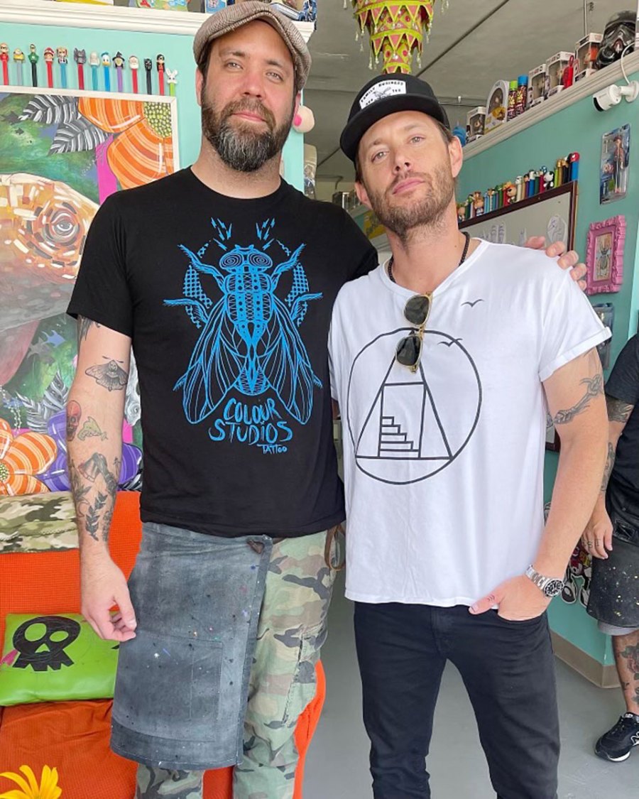
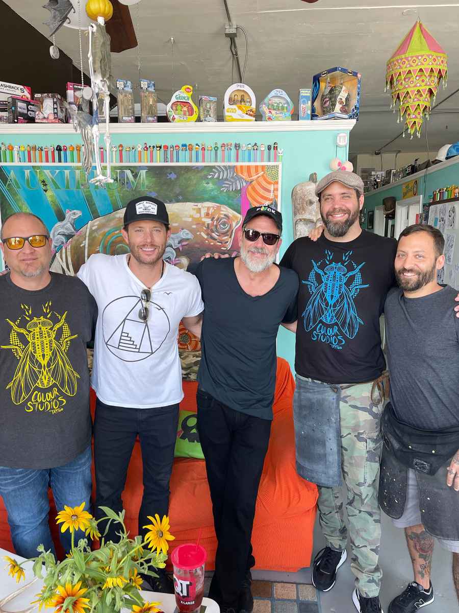
Morgan’s tattoo history is tied to a few long-running friendships, especially his connection with Jensen Ackles. The two actors worked together on Supernatural, where Morgan played John Winchester and Ackles played his son, Dean. They later appeared together in photos from a tattoo session at Colour Studios in Tulsa in June 2022.
The matching tattoos are part of a wider friendship story, but the exact design shouldn’t be over-explained when the public photos don’t clearly establish every detail. What is documented is the session, the people involved, and the fact that the tattoos were made together. That’s enough. Matching ink doesn’t need a made-up symbol dictionary attached to it.
There was also an earlier tattoo outing connected to Morgan’s wedding period, with Ackles and Jared Padalecki involved and Mike Lucena of Flyrite Tattoo credited in the reporting. That detail gives the group tattoos some context: this isn’t just a random celebrity photo-op. Morgan’s matching ink overlaps with a network of friendships that has lasted well beyond a single production.
The shop photos are useful reference material because they show the atmosphere around the tattoo rather than only presenting a finished crop. You can see Morgan as a person in the room, with his existing ink visible around the new work. For anyone planning a matching tattoo, that’s a good reminder that the appointment itself can matter as much as the final design. The shared day, artist, and memory may be the part you keep thinking about years later.
His forearm tattoos are easier to spot in event photos
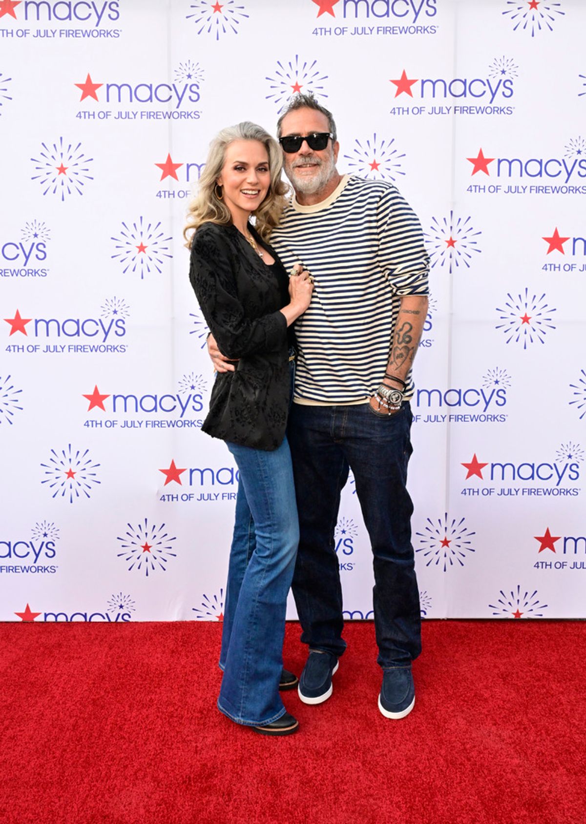
When Morgan is dressed for an event, most of his tattoos stay under sleeves. The separate red-carpet photo makes the forearm ink easier to see because the shirt is rolled high enough to expose it. The designs look less like a single statement piece and more like a collection of marks that happen to share the same stretch of skin.
That’s a practical look for someone who works in film and television. Forearm tattoos can be shown when Morgan wants them visible, but wardrobe and makeup teams can cover them when a role calls for clean skin. The placement offers more flexibility than a tattoo on the neck or hand, even though the ink is still easy to show in everyday life.
There’s also a nice contrast between the public-facing “Lucille” piece and the smaller marks nearby. The role tattoo has an obvious explanation. The rest of the forearm reads more privately. A collection like that doesn’t have to follow one visual theme. The common thread can simply be that each tattoo arrived for a different reason.
A quiet memory can carry a lot
A separate piece often associated with Morgan is the script-style “Bisou” tattoo on his forearm. Public tattoo coverage connects the word to a pet he lost. “Bisou” means “kiss,” which gives the design a quiet, intimate feeling compared with the aggressive imagery around Lucille.
The difference between the two tattoos is part of what makes the collection feel human. One points toward a character and a fictional weapon. The other is a small word carrying a private goodbye. Both are simple on the surface, but they invite completely different readings. You don’t need a complicated illustration to make a tattoo emotionally specific.
Script tattoos are often judged by the lettering first, but the placement matters just as much. A word on the forearm has enough space to breathe, and it can be kept readable without making the design oversized. If you’re considering a memorial word tattoo, give the artist room to draw the letters instead of squeezing a favourite typeface into a space that’s too tight. Handwritten references can be cleaned up without losing the personal feel.
The room around the appointment matters too
Looking at Morgan’s tattoos as one collection, the strongest pattern is variety. The ink covers character tribute, friendship, personal memory, and small marks that don’t need a public explanation. They aren’t all in the same style, and that’s fine. A person’s tattoo history usually makes more sense as a timeline than as a brand identity.
That’s especially true for actors. A role can become a major part of someone’s life without needing to define every tattoo that comes after it. Morgan’s Lucille piece acknowledges a character that fans immediately recognise, while the matching tattoos connect him to people he has known and worked with for years. The “Bisou” piece sits in a different emotional lane altogether.
From a design point of view, the loose collection also keeps the ink from feeling too staged. You can see words, small shapes, larger arm coverage, and pieces that appear at different times. There’s no pressure for every tattoo to match the last one. The result looks more like a real person making decisions than a character building a coordinated sleeve in one afternoon.
What to borrow from the placement
If you like Morgan’s tattoo style, start with the way the designs use visibility. A forearm tattoo can be shown easily but covered for work. A hand tattoo is more exposed and tends to become part of your everyday appearance. A character reference can sit in the more visible area, while a memorial word or friendship mark can stay somewhere that feels closer to you.
Think about how the design will look while your arm is relaxed, not only when it’s held out for a photograph. The skin bends, the hand changes shape, and sleeves move. A tattoo that looks balanced in one pose may feel crowded when the wrist turns. Good reference photos show more than a flat close-up, which is why Morgan’s mix of shop and event images is helpful.
Also be realistic about hand and finger ink. Those areas take a beating. They’re washed, touched, exposed, and stretched every day. Small lettering can lose crispness, and fine lines may need a touch-up. That doesn’t mean avoiding the placement, but it does mean choosing a design that still reads when it settles. Morgan’s ink offers several examples of keeping shapes direct enough to work at a small scale.
Making the idea your own
The easiest way to take inspiration from Morgan’s tattoos is to borrow the thinking, not the exact artwork. If a fictional object matters to you, find the one detail that carries the reference. If you’re marking a friendship, look for a symbol that belongs to both people instead of forcing identical artwork that doesn’t fit either person’s body. If you’re remembering a pet, a word, small outline, or familiar gesture may feel more personal than a generic paw print.
Keep the first sketch honest about the size you want. A tattooer can simplify an image, but they can’t make a tiny placement hold unlimited detail. Ask what will still be readable after healing. Let the artist adjust line weight, spacing, and proportions. That’s how a tattoo ends up looking deliberate instead of like a miniature illustration that was pushed past its useful size.
You can also let different tattoos have different moods. Morgan’s collection works because the Lucille tattoo doesn’t have to match “Bisou,” and the matching studio ink doesn’t need to look like the forearm script. Meaning gives the pieces a relationship even when the visual language changes.
What the collection gets right
Jeffrey Dean Morgan’s tattoos are a good example of a collection that grew around real life instead of a single aesthetic plan. The Lucille tattoo carries a recognisable piece of Negan’s world. The matching tattoos connect him to longtime friends and castmates. The “Bisou” script holds a more private memory. His hand and forearm marks fill in the spaces between those bigger stories.
That’s the useful part to take away. A tattoo can be bold without being huge, personal without being explained, and connected to a role without turning into merchandise. Start with the memory or reference you actually care about. Then choose a symbol that can survive being simplified, place it where you’ll enjoy seeing it, and give the artist enough room to make the lines work.
Morgan’s ink doesn’t look like a finished catalogue. It looks collected. For most people, that’s a better goal anyway.