Musicians

Tattoo guides for singers, rappers, DJs and musicians, with photographs, documented meanings and the stories behind their designs.

Kevin Gates’ Ink Comes From Pain: The Soldier Sign, Elvis and the House Tattoo

Kevin Gates has a lot of tattoos, and he doesn’t keep them tucked away. The ink runs over his face, chest and arms, with more pieces showing in photos where he’s shirtless. Some are easy to catch in a music video; others need a clear close-up before the lettering or smaller marks come into view.

Gates has said his tattoos are connected to real parts of his life. Talking about his face ink, he put it plainly: “They all come from pain.” That gives the collection a personal thread, but it doesn’t mean every design has one grand explanation. Some pieces have stories attached, some are symbols he wanted nearby, and some are designs he liked.

The best way to make sense of Kevin Gates’ tattoos is to look at them one by one. The forehead mark, teardrops, Elvis portrait, house, PR2 lettering and chest figures do not all point to the same idea. They share space because his body has become a record of different moments and interests.

The forehead soldier sign is often mistaken for a cross
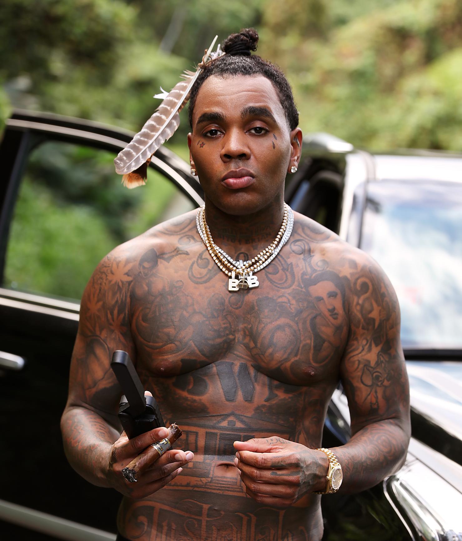
Kevin Gates forehead tattoo and face tattoos

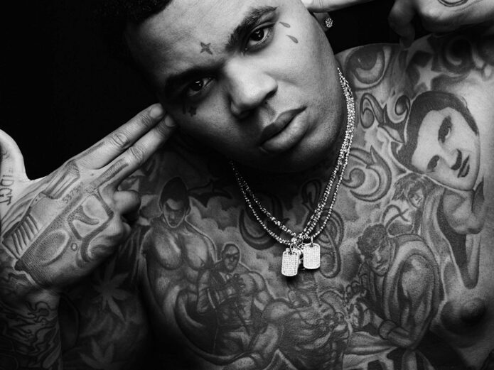
The small mark between Gates’ eyebrows is one of the first details people notice. It is often called a cross, but Gates has described it as a soldier sign. The shape can look a little different depending on the angle and lighting, which may be why the two descriptions get mixed up.

It is not a huge tattoo, but it carries a lot of visual weight. Face ink tends to do that: even a modest symbol can change the whole feel of a portrait when it sits between the eyes. On Gates, the forehead mark works with the tattoos around his eyes instead of reading like a separate logo.

There is no need to attach a bigger meaning than the one he has given it. Calling it a soldier sign stays close to his explanation. Its size is modest, but its placement makes it one of the most recognisable pieces in the collection.

His teardrops come with a very direct explanation

Kevin Gates teardrop face tattoos

The teardrops are another part of Gates’ face tattoos that people tend to read before hearing his explanation. He has said they mean “forever in sorrow.” It is a brief answer, but it gives the marks a clear feeling without inventing a backstory.

They are easy to miss in a wide shot. Up close, they sit beside his eyes and change the mood of the whole image. The small details need a sharp photo to show clearly; in a soft or distant frame, readers are left trying to make out shadows.

Other close-up photos show star-like marks and lettering on his face. Not every small line has a public explanation, so it makes sense to describe what is visible and reserve the confirmed meaning for the teardrops. That leaves the rest of the design open instead of pretending every mark has a secret code.

Elvis on the chest is one of his best-known portraits

Kevin Gates Elvis chest tattoo and upper body tattoos

The portrait of Elvis on Gates’ chest is probably his best-known tattoo after the face work. In an interview, Gates summed it up with his usual bluntness: “I got Elvis on my chest.” He has also linked the portrait to a story from his time in prison, giving it a personal connection beyond the famous face.

The piece is large, though different photos bring out different details. A stage shot may show the outline and nearby lettering, while a closer image makes the portrait’s shading easier to see. It sits amid other designs across his chest and shoulders, so it is part of a larger spread of ink.

Gates has said he tattoos people and things he naturally loves or respects. That makes Elvis feel connected to his own taste and history, rather than like a random rock-and-roll reference. It fits the way he talks about his tattoos: some mark memories, interests or people that mattered to him at the time.

The house on his stomach is a separate, personal symbol
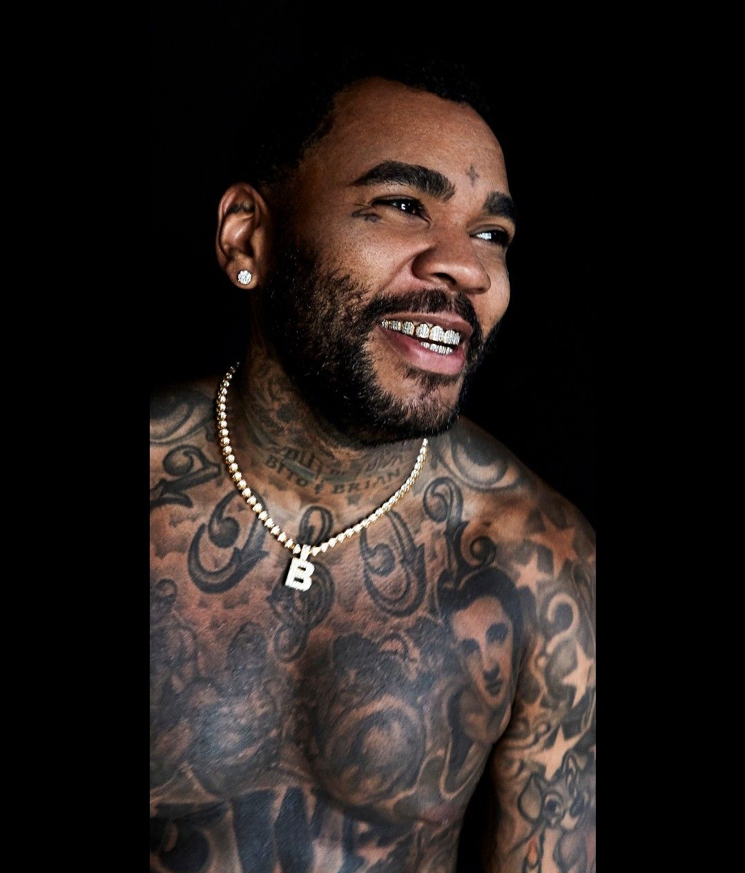
Kevin Gates house tattoo on stomach

Further down, Gates has a house tattoo across his stomach. Clothing hides it, so it is easiest to see in a full shirtless photo. In tighter portraits, the house can blend into the other work on his torso; a wider frame shows its position and how the lines sit beside the surrounding tattoos.

Reports and tattoo features describe the house as meaningful to him, though the personal story has not been explained as consistently as the soldier sign or teardrops. The cautious description is also the clearest one: it is a home, treated as a personal symbol rather than a bit of filler.

Visually, the house gives the collection a different shape. The face tattoos are small, Elvis is a portrait, and the house is an architectural image with straight lines and a familiar outline. Gates brings together portraits, words and symbols without making them look as though they came from one matching set.

PR2 and the chest lettering sit inside a much bigger piece
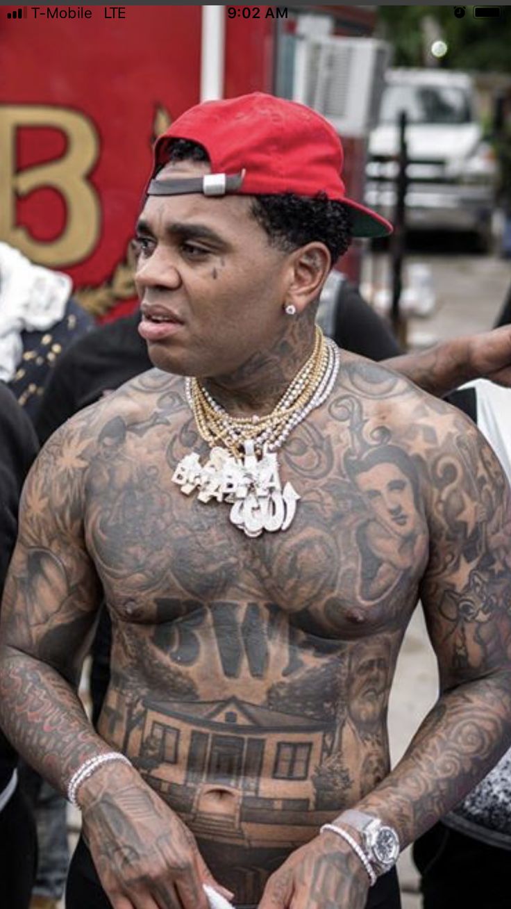
Kevin Gates chest lettering and torso tattoos

PR2 appears across Gates’ chest in performance photos, surrounded by lettering and other images. From a distance, it can read as one bold label. Up close, it is part of a layered chest rather than an isolated word. Chains, microphones, movement and stage lighting can hide sections of it.

The chest also has figures and faces that have come up in interviews and profiles. Gates has talked about having Street Fighter characters tattooed there, bringing a pop-culture interest into the mix. He has not described the collection as if every piece were chosen for one polished theme. They are more like things he wanted to carry with him.

That helps explain why the torso can look busy without seeming random. The designs come from different interests, but they share the same space. A photo of the full chest is useful because it shows PR2 alongside the portraits and figures; a tighter crop might reveal one detail while hiding the way the pieces fit together.

The arms and smaller marks fill in the rest of the picture
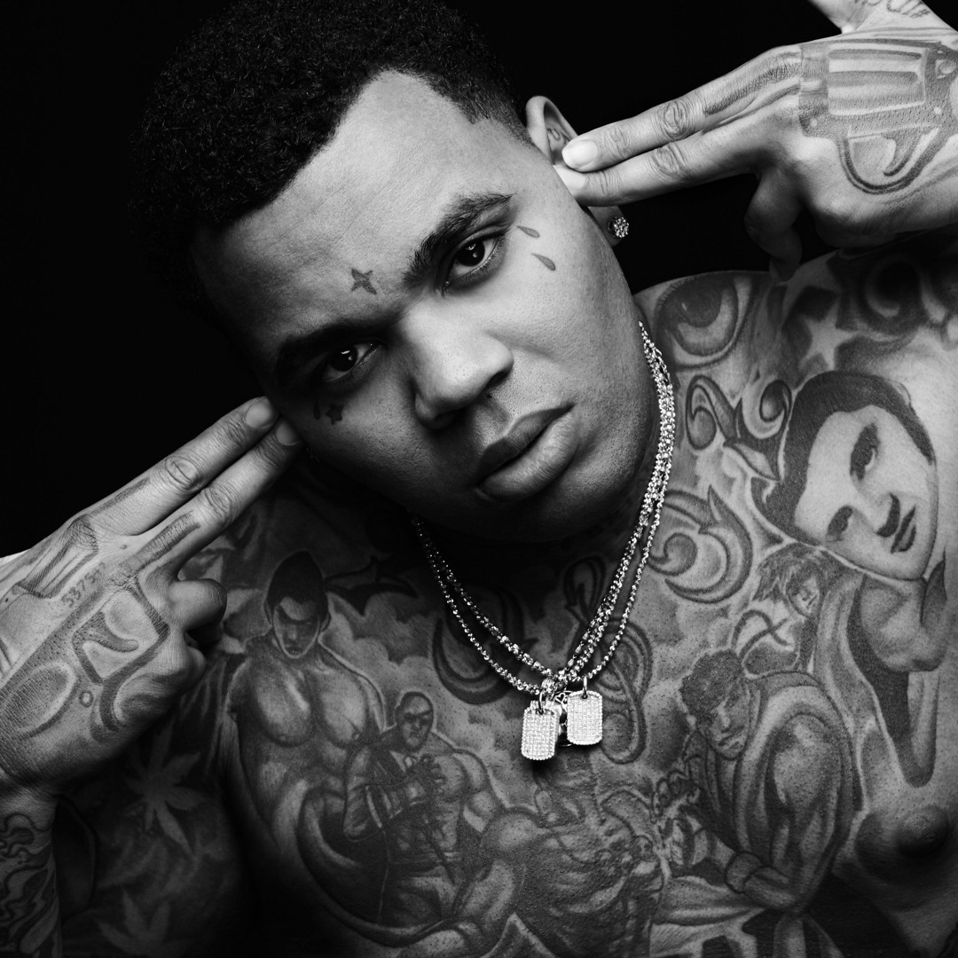
Kevin Gates arm tattoos and body ink

There is plenty more on Gates’ arms: lettering, symbols and smaller images that show when his sleeves are pushed back or he performs shirtless. These tattoos are harder to sum up than the forehead mark or Elvis portrait because they stretch across several areas and appear in photos taken at different points in his career.

Close shots also reveal smaller marks on his face and hands. Some look like stars, symbols or compact lettering. It is tempting to identify every dark patch, but that would turn an inventory into guesswork. The smaller pieces matter because they fill the gaps around the headline tattoos and change how the larger chest work reads.

Gates has talked about drawing and creative expression, and about being naturally drawn to tattoos. That comes through in the variety: the soldier sign, sorrow marks, Elvis, the house, gaming characters, chest lettering and smaller details across his arms.

Why the collection feels tied to pain, memory and taste
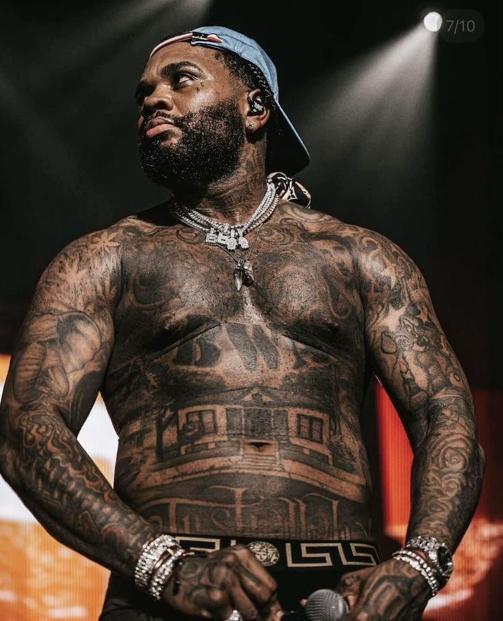
Kevin Gates full tattooed torso

Gates’ own comments give the collection a loose thread without forcing every piece into one explanation. He has tied the face tattoos to pain and sorrow. Elvis connects to a prison story, the house appears to be a personal symbol, and PR2 and the Street Fighter figures reflect his music and interests.

That mix is what makes the tattoos worth a closer look. They were added over time, not designed as a matching set in one sitting. Each new piece had to find room beside older work. Some parts stand out immediately; others only show in a sharp photo taken from the right angle.

It helps to stay specific: the soldier sign, teardrops, Elvis portrait, house, PR2 and Street Fighter references. Where Gates has explained a design, his own words are the best guide. Where a photo only shows a small mark, it is better to leave it open than make up a story.

Seen that way, the collection feels like a record of what Gates has carried with him. There is pain in the face work, memory in the portrait, a home in the house tattoo and personal taste in the chest and arm designs. It is a lot of ink, but the pieces start to make sense once they are allowed to mean different things.
More musician tattoo guides

Kelly Clarkson’s Ink Is Full of Little Reminders: Wrist Words, Puzzle Pieces and More

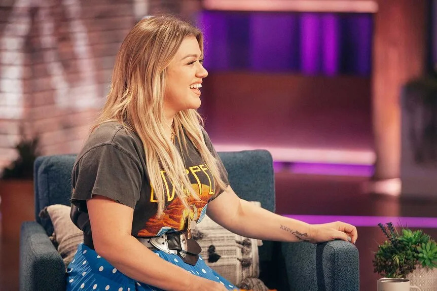
Kelly Clarkson has more tattoos than many people notice at first. They are not all big sleeves that dominate a photo; some only come into view when she lifts a microphone, wears open shoes or turns her hand toward the camera. The ink is spread across her wrists, hands, feet, back and ribs, mixing small reminders with brighter, more playful designs.

She has described many of the tattoos as reminders. In one interview, she said she can be forgiving and loyal to a fault, then added, “I like to believe in the good of humanity, but it doesn’t always work out.” That gives the collection a thread without requiring every small mark to carry a profound story.

Several different photos are needed to see the range. The Love Them More wrist lettering needs a close-up; the sunflower sits near her ankle; the puzzle piece is on her back; and the Morse-code lyric runs along her ribs. One red-carpet portrait could never show all of that.

“Love Them More” sits beside a small cross

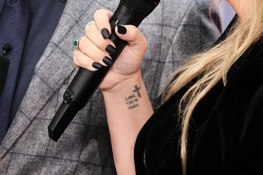
Kelly Clarkson Love Them More wrist tattoo

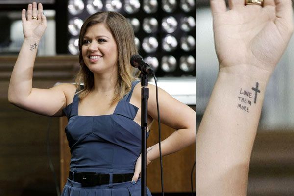
The wrist lettering that reads “Love Them More”, with a small cross beside it, is one of Kelly’s best-known tattoos. She has said the phrase came from advice she heard growing up: meet difficult people with compassion instead of letting anger take over.

It is a simple design, but the words are easy to see. Kelly wears them on her wrist, where they are visible as she works, performs or reaches for a microphone. That makes the tattoo feel like a reminder she can use day to day, rather than a phrase chosen just to fill a space.

The small cross can disappear in a distant photo, while a close wrist shot shows how it sits beside the words. A sharp image also makes clear that the phrase is “Love Them More”, not one of the slightly different versions sometimes repeated in captions and fan posts.

The matching wrist details are easy to miss on stage

Kelly Clarkson wrist cross tattoo close-up

There are other small designs around Kelly’s hands and wrists. Some photos show a heart-shaped kite on her left wrist; other views catch the cross and lettering nearby. With tattoos this small, the position of her hand can make all the difference.

Onstage, a bracelet, microphone or sleeve can cover the exact spot. Two wrist photos can therefore show different details rather than repeat the same view: one may catch the inside of the wrist, another the side of her hand or the lettering as she turns her arm.

The designs have different moods. The cross and phrase are direct and readable, while the heart-shaped kite has a more playful outline. Together they make the wrist tattoos feel personal without looking overly coordinated.

The wrist phrase has appeared in several different photos

Kelly Clarkson Love Them More stage wrist tattoo

The phrase has shown up in performance and interview photos, and it can look a little different from one image to another. Stage lights may soften the black ink; an indoor close-up can bring the lettering into sharper focus. A change in lighting does not mean the tattoo itself has changed.

Kelly has talked about tattoos as reminders of lessons she wants to keep close. This one is short enough to read in a glance. It does not need a long explanation whenever someone notices it; it can simply nudge her toward patience and generosity.

That everyday quality suits the placement. It is not a large piece meant to become the centre of an outfit. It is there for Kelly to look at, explain if she feels like it, and then get on with her day.

The sunflower tattoo sits down by her ankle

Kelly Clarkson sunflower ankle tattoo

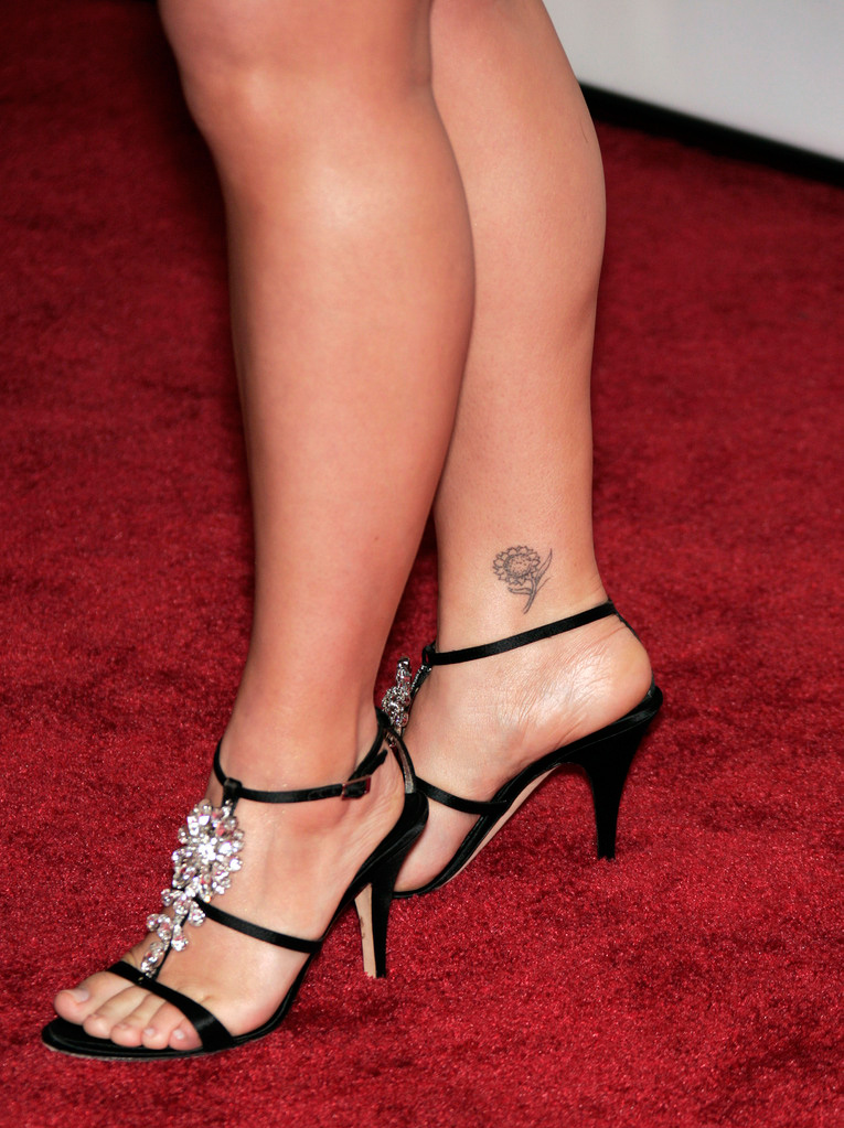
Kelly has a sunflower tattoo on her ankle, smaller and more delicate than the colourful puzzle piece on her back. It is easiest to spot when she wears sandals or open shoes. In a full-length red-carpet photo, the dress and shoes often draw the eye first, and the ankle design can disappear.

The sunflower adds a touch of colour and is easy to recognise at a glance. Its petals and centre make a clear shape, while the low-key placement keeps it from taking over the collection. Several of Kelly’s tattoos have that balance: visible in the right moment, but not always pushed to the front.

A close photo does more here than a cropped press image. A portrait may show Kelly, but it cannot tell readers much about an ankle tattoo. The detail shot lets the design speak for itself.

The four-leaf clover is made from tiny heart shapes

Kelly Clarkson four leaf clover heart hand tattoo

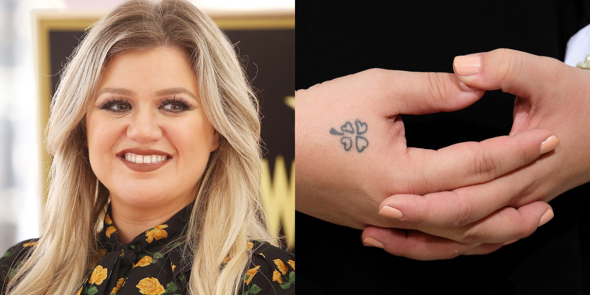
On her hand, Kelly has a small four-leaf clover made from heart-shaped leaves. It can look like a dot or a tiny bit of decoration until a close-up brings out the shape. The heart leaves give it a softer feel than a standard clover, and the design has been linked to her Irish family background.

It is small enough to sit naturally beside rings and stage jewellery. The contrast with her wrist lettering is nice: the phrase asks to be read, while the clover is a detail people may only notice when they look closer.

There is no need to load the clover with every possible meaning. The design is identifiable, the family connection has been discussed, and its placement is clear. That is enough to make it interesting on its own.

The colourful puzzle piece covers part of her back

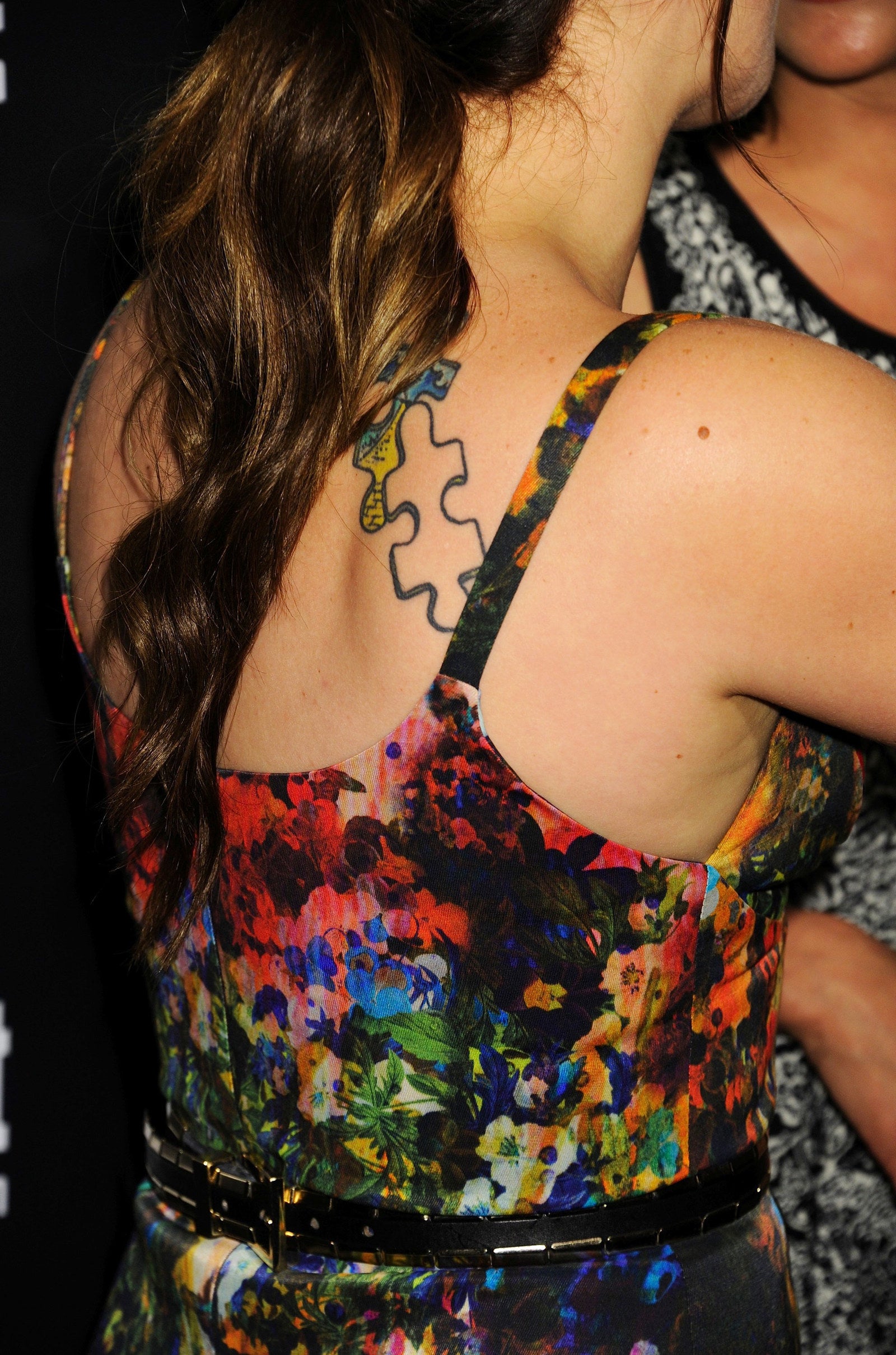
Kelly Clarkson colourful puzzle piece back tattoo

Kelly’s puzzle piece tattoo on her upper back is one of the collection’s bolder designs. It uses colour and a dark outline, standing apart from the smaller black-ink pieces on her wrists and ankle. The tattoo has been connected to her song “Piece by Piece”, and people online have also speculated about autism awareness.

Those theories should not be repeated as confirmed fact without a direct statement from Kelly. The clear description is simpler: it is a colourful puzzle design on her back, and people have connected it with the album and song because of the timing and wording.

A back tattoo needs a useful photo. A shoulder-level portrait might show only the top edge, while a view from behind, with the hair moved aside, gives a better sense of its shape and colour. A generic publicity image would not show readers what they came to see.

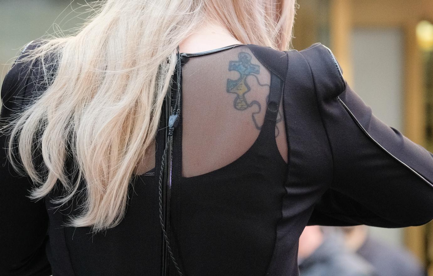
The colourful puzzle piece has a second look in another photo

Kelly Clarkson puzzle shoulder blade tattoo second photo

Another personal design is the Morse-code tattoo linked to “What Doesn’t Kill You”. The wording connects it to Kelly’s song and to her habit of using tattoos as reminders. In Morse code, it looks like a line of dots and dashes until someone explains what they spell.

It sits along her ribs, an area clothing usually covers. A side-on photo can flatten the design, so it is not easy to capture casually. The phrase is documented, but that does not mean every nearby mark belongs to the same message.

It fits the rest of Kelly’s collection. Some tattoos spell out a phrase, others use symbols or code. They do not all need to share a style; the common thread is what she wants to remember.

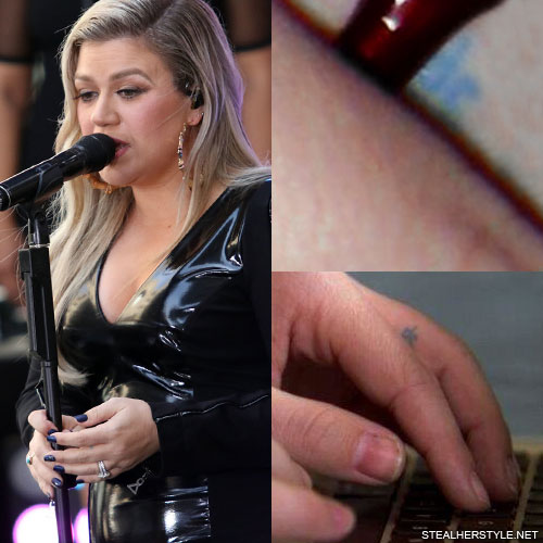
The tiny blue finger tattoo is still a mystery

Kelly Clarkson blue finger tattoo

Lists of Kelly’s tattoos mention other small pieces across her hands, feet and body. Some are lyric references, some relate to family, and she has explained others in interviews. They can be difficult to track because shoes, stage clothes and jewellery often cover them.

Kelly has said many of her tattoos connect to things she does not want to forget: advice, a song, a person or a moment that mattered to her. That does not mean every mark is a serious life lesson. Some designs can simply be fun, which is part of their appeal.

The collection feels lived-in, not arranged to match perfectly. A colourful back piece sits beside a tiny hand symbol; Morse code runs along her ribs, while the sunflower is down by her ankle. Each tattoo can have its own purpose.

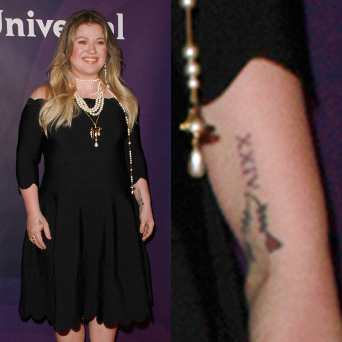
Roman numerals and foot lettering fill in the smaller details

Kelly Clarkson XXIV Roman numeral forearm tattoo

Kelly’s tattoos tend to have practical, personal meanings. “Love Them More” is a reminder she can use; the Morse code keeps a lyric close; and the puzzle design is naturally connected with her music, even if some online interpretations go beyond what is confirmed.
That leaves room for the tattoos to matter without making each one about a crisis. The sunflower can be there because she likes the flower. The heart-shaped clover can reflect family. The small cross sits beside a phrase that helps her keep perspective.

Together, the designs show someone who has added tattoos over time without turning her body into one grand theme. Some are colourful; others are easy to miss. That is why separate photos and clear captions help more than one generic picture at the top of a page.

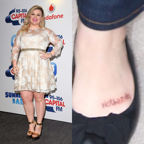
The Nothando tattoo sits on her foot

Kelly Clarkson Nothando foot tattoo

One of Kelly’s smaller tattoos sits on her foot and reads “Nothando”, a word commonly translated as “she loved us.” Foot lettering is easy to miss in interview and stage photos, but it adds another family-minded detail to the collection. It is also a reminder that the best image for a wrist tattoo will not show a foot or ankle design.

Alongside the Roman numerals, the foot lettering gives the collection a quieter feel. These are not oversized statement pieces, but they help show the mix of private reminders and playful symbols running through Kelly’s tattoos.

More musician tattoo guides

The Game’s Tattoos Go Way Beyond N.W.A.: LA Ink, Compton, Portraits and G-Unot

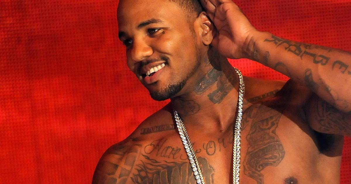
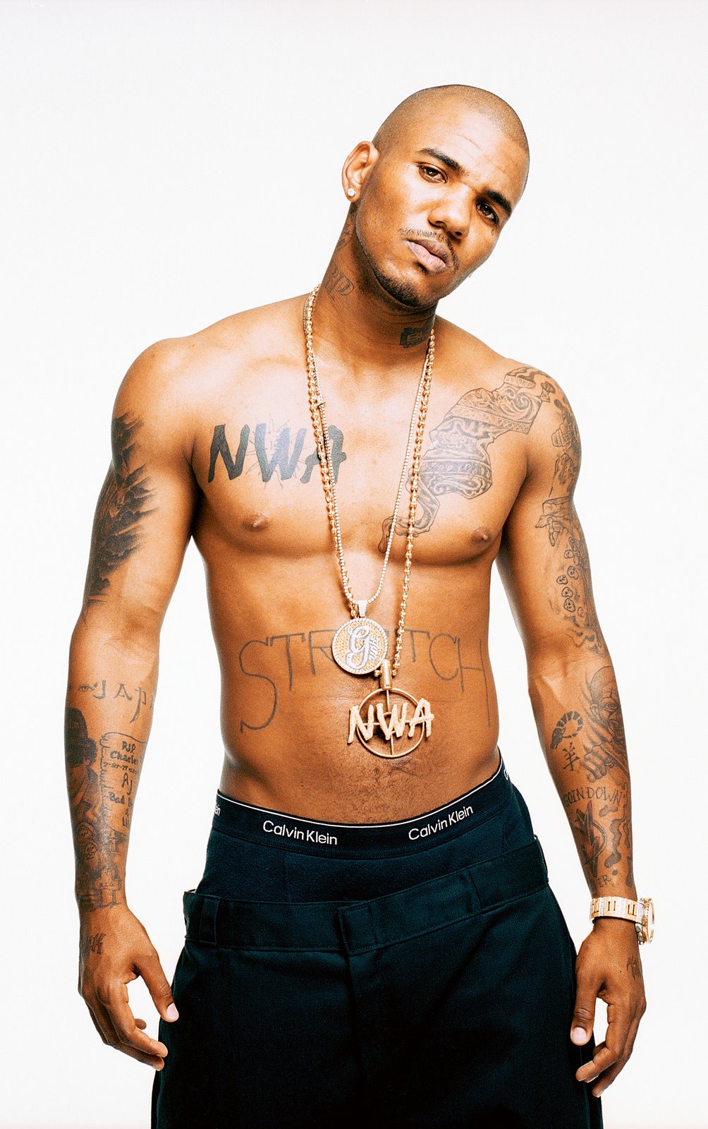
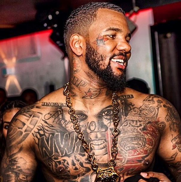
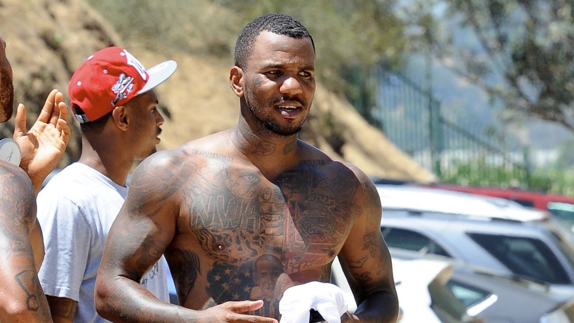
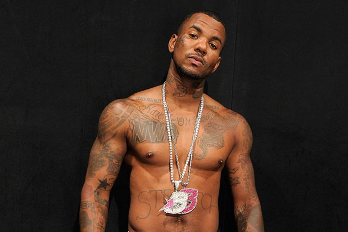
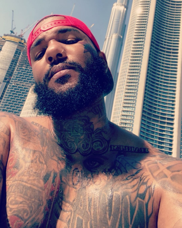
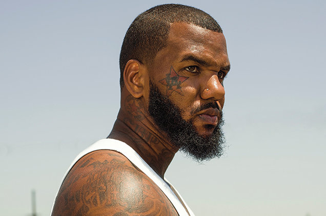
The Game’s tattoos are easy to recognise, but they do not form one continuous wall of ink. Jayceon Terrell Taylor has added them over time: a red LA mark on his cheek, a teardrop below his eye, N.W.A. across his chest, Compton on his stomach, portraits of artists he respects, and smaller designs around his arms and neck.

A single photo cannot show the whole collection. A close-up helps with the face tattoos; a shirtless image shows the chest and stomach. Older pictures capture designs before they were changed, while newer ones show how additions and cover-ups sit together. The focus here is on pieces that are clearly visible or documented, rather than guessing at every blurry mark.

It is easiest to follow The Game’s tattoos one piece at a time. The LA design, N.W.A. lettering and Compton mark point to home and music. The portraits connect him to artists he has spoken about with respect, and the smaller tattoos fill in the spaces between.

The red LA tattoo replaced an earlier butterfly

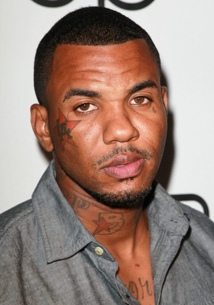
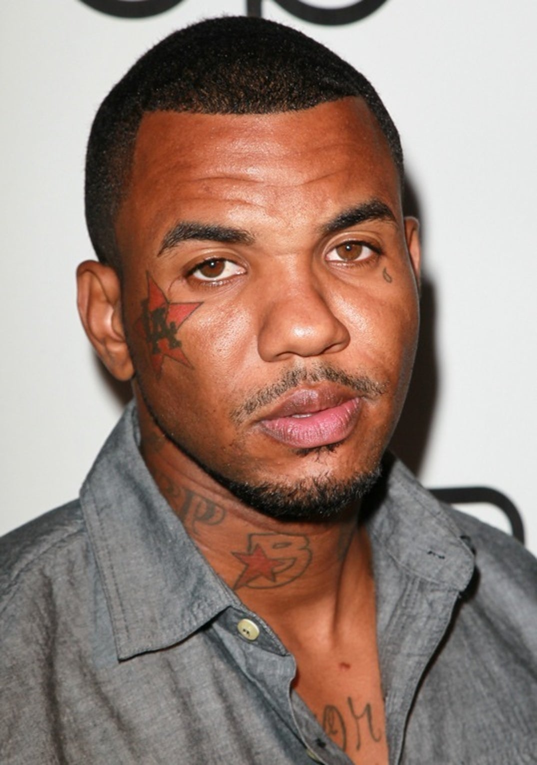
The Game red LA cheek tattoo and teardrop

The red LA tattoo on The Game’s cheek is usually the first piece people notice. It sits beside his eye and has become part of his familiar look. The design is generally described as a Los Angeles mark, fitting his Compton roots and the city he represents in his music.

That spot used to hold a small butterfly. It was described as a symbol of “new life”, before The Game covered it with the LA design. A red star was added behind the letters as well, turning the earlier, smaller mark into something much bolder.

The change is part of the tattoo’s story. The cover-up did not simply remove the first design; it replaced a personal symbol with one tied to home, music and the image he wanted to put forward.

The teardrop sits just below the eye

The Game teardrop tattoo under his eye

Under the other eye, The Game has a small teardrop tattoo. It is tiny beside the chest pieces, but it changes the feel of a close portrait. Face tattoos do not need much space to become the detail everyone sees.

The mark appears in both older and newer photos, though the colour and clarity vary with lighting. It is safest to describe it as a teardrop rather than attach a story he has not clearly confirmed. The LA lettering and star already give his face a strong Los Angeles look.

Photos from different years also help show when a design appears and how it looks in that moment. The face tattoos do not look identical in every image, so a clear close-up is more useful than trying to fill in details from a blurry one.

N.W.A. is stamped across the chest

The Game NWA chest tattoo

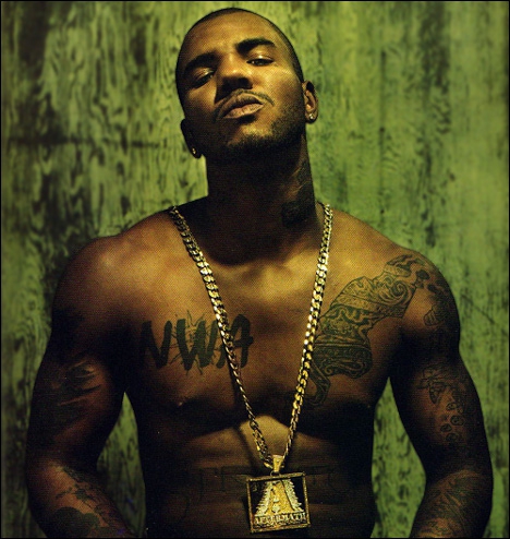
The N.W.A. tattoo on The Game’s chest is one of the clearest pieces in his collection. The letters sit on the right side of his chest and stand out whenever he appears shirtless. It is a direct nod to the group that shaped West Coast rap, in keeping with his Compton roots and ties to California.

The block letters are easy to read even in a wide shot, but the rest of the chest is much more layered. Portraits, script and other symbols sit around the N.W.A. tattoo, while chains or clothing can hide the lower edges. A useful photo needs to show more than just his face.

There is a clear contrast between the simple lettering and the detailed portraits nearby. One reads at a glance; the others ask for a closer look. Together they show how The Game combines direct symbols with more intricate work.

Compton and The Chronic take over the stomach

The Game Compton and The Chronic stomach tattoos

Across his abdomen, Compton is tattooed across The Game’s abdomen. Below it is artwork connected to Dr. Dre’s The Chronic, tying the area to both his city and his musical influences. “Compton” stretches across the stomach like a banner rather than a small hidden tribute.

A shirt can cover this whole section. A red-carpet photo may show his face and upper chest, while a shirtless image reveals the full arrangement: N.W.A. above, Compton across the middle and the album reference beneath it.

The tattoos are direct and prominent. Place and music sit right on his body, which fits the rest of The Game’s best-known ink.

The Obama portrait brought politics into the artwork

The Game Obama chest portrait and surrounding tattoos

The Game also had a portrait of Barack Obama tattooed on his chest. Reports at the time described it as a White House portrait positioned above the Compton lettering. Tattoo artist Carlos Macedo did the work.

With a portrait tattoo, it is best to be clear about what can be seen and where it sits. The choice connected The Game’s public image with a political figure he wanted to honour, but a photo cannot tell us every private reason he had for choosing it.

The Obama portrait brings another subject into the chest piece. N.W.A. points to rap history, Compton points home, and Obama adds a political figure. Those themes can sit together; they reflect different parts of The Game’s life.

Nate Dogg and other West Coast portraits sit nearby

The Game portrait tattoos across his chest and arms

Tribute portraits are a big part of The Game’s collection. His ink includes Nate Dogg, as well as portraits connected to Eazy-E and Tupac Shakur. These faces link him to artists and influences he has spoken about as important to West Coast rap.

It can be hard to take in all the portraits in one full-body image because designs overlap across his chest and arms. One angle may show a face clearly but hide nearby lettering; another may catch the arm portraits and miss the stomach.

The names are worth calling out separately. Nate Dogg, Eazy-E and Tupac each connect The Game to a different part of the music he came up around.

The old G-Unit tattoo became G-Unot

The Game G-Unit and G-Unot tattoo area

The Game’s falling-out with G-Unit left a mark on his tattoos, too. He once had a G-Unit tattoo, then altered it to read “G-Unot” after the split. It is a clear case of a tattoo changing as the story around it changed.

The original lettering belonged to one period of his career; the revised wording signalled a different mood. A photo from the earlier years may show the first version, while a later shot captures the updated message.

Like the LA butterfly cover-up, G-Unot shows how The Game has used tattoos as public statements. Not every piece is a quiet tribute. Sometimes the ink is blunt, a little cheeky and meant to be seen.

CBP and the Converse mark fill the neck area

The Game CBP and neck tattoos

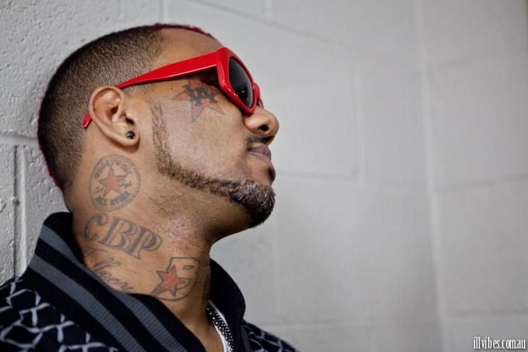
Smaller lettering sits around The Game’s neck and the side of his face. The initials CBP have been linked to Cedar Block Piru, and a Converse All-Star logo has also been noted beneath his ear. A high collar, chain or cap can make these designs hard to spot.

They show how the collection extends beyond the headline pieces. N.W.A. and Compton are obvious from a distance; CBP and the Converse mark need a closer look because they sit in tighter spaces around the jaw and neck.

The red LA star catches the eye first, the teardrop sits beneath the other eye, and the smaller marks fill out the sides of his head. There is no need to turn them into mystery symbols; they are part of a busy group of visible tattoos.

The forearms carry more tribute work

The Game forearm and arm tattoos

The Game’s forearms carry more portrait and tribute work tied to his musical influences. Eazy-E and Tupac are often mentioned when people discuss his arm tattoos. The placement also means these pieces can show up in photos, performances and interviews.

A portrait changes shape as the arm moves. It may look complete with the forearm relaxed, then break up when he bends his elbow. Sleeves, watches and bracelets cover parts of the work, too. That does not mean a new tattoo has appeared; it is the same ink on a moving surface.

The arm designs balance the larger chest pieces. His chest holds some of the biggest statements, while the forearms bring in more faces and smaller details.

The star and LA lettering became part of his public image

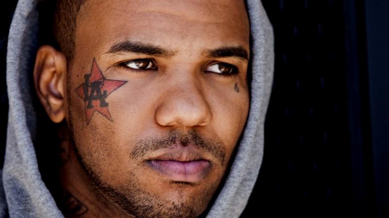
The Game LA star cheek tattoo and facial ink

In a close-up, the red star and LA letters do much of the work. They frame his cheek, sit beside the teardrop and make his face recognisable. That is one reason the face tattoos have stayed part of his public image even as his hair, clothes and beard have changed.

Much as A$AP Rocky’s A$AP LIFE lettering connects a phrase with the artist’s world, The Game’s LA mark puts his hometown into the way he presents himself. The comparison is about placement and identity; it does not mean the tattoos have the same meaning.

A sharp close-up is more useful here than a dramatic wide shot. Readers should be able to make out the edge of the star, the LA letters and the teardrop without having to enlarge a blurry thumbnail.

There are lots of smaller pieces around the main work

The Game smaller face neck chest and arm tattoos

Beyond N.W.A., Compton and the LA cheek tattoo, The Game has plenty of smaller marks. Some are lettering, some are symbols around his shoulders and arms, and some only appear in photos from a particular year or at a particular angle.

It is better to leave an uncertain mark unnamed than to turn a shadow into a fact. The clearer inventory already includes the butterfly cover-up, LA star, teardrop, N.W.A., Compton, The Chronic reference, Obama, Nate Dogg, Eazy-E, Tupac, G-Unit changed to G-Unot, CBP and the Converse mark. There is a lot to take in before counting the smaller pieces.

That variety is part of the appeal. His tattoos move between hometown pride, rap history, political imagery, personal statements and old feuds. They do not look as though they were designed to match all at once; newer work has found room beside older pieces.

His calf portraits deserve their own look

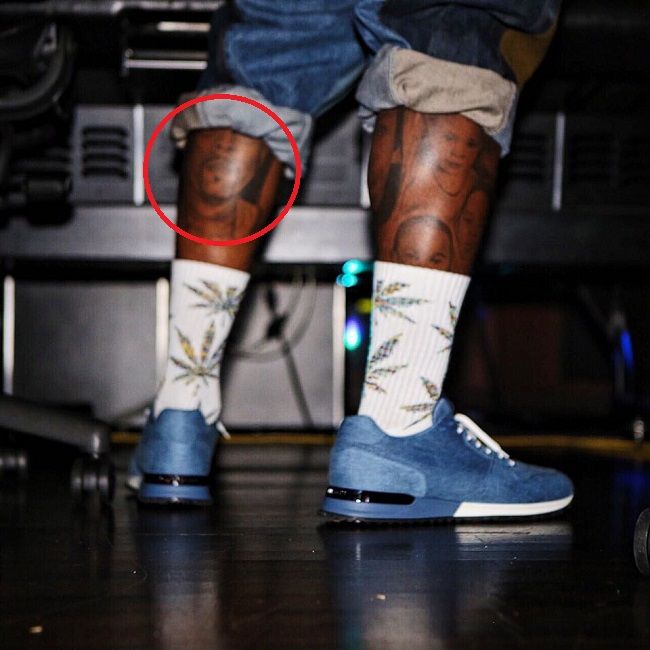
The Game Nate Dogg calf portrait tattoos

The portraits on The Game’s calves are easy to miss in waist-up photos, but they have the same tribute feel as the work on his chest and arms. They sit on the lower legs and connect to the people and music he values.

A portrait has to follow the curve of the calf, so the expression and shading can look different when he stands, sits or turns. A photo of the actual tattoo is more useful than a vague description because it shows how the design sits on his leg.

These pieces also show how much of his body is tattooed. The face and chest tend to get the attention because they show in interviews, but the legs add another layer that a typical press photo will miss.

That is easy to overlook if you only see the face and chest shots. The ink continues down his body, and the smaller pieces give the larger tributes room around them. A calf portrait, an arm inscription or a neck logo may not dominate a red-carpet image, but each belongs in the full picture.

The collection is much bigger than N.W.A. and the red LA star. It also holds hometown pride, rap history, changing friendships, portraits, politics and the occasional public feud. The tattoos do not all match, and they do not have to: each new chapter has found its place beside the older ones.

YBN Nahmir’s Ink Runs From 90s Baby Nostalgia to Neck Symbols

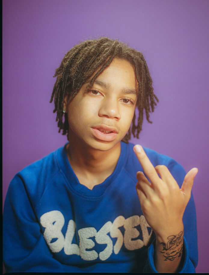
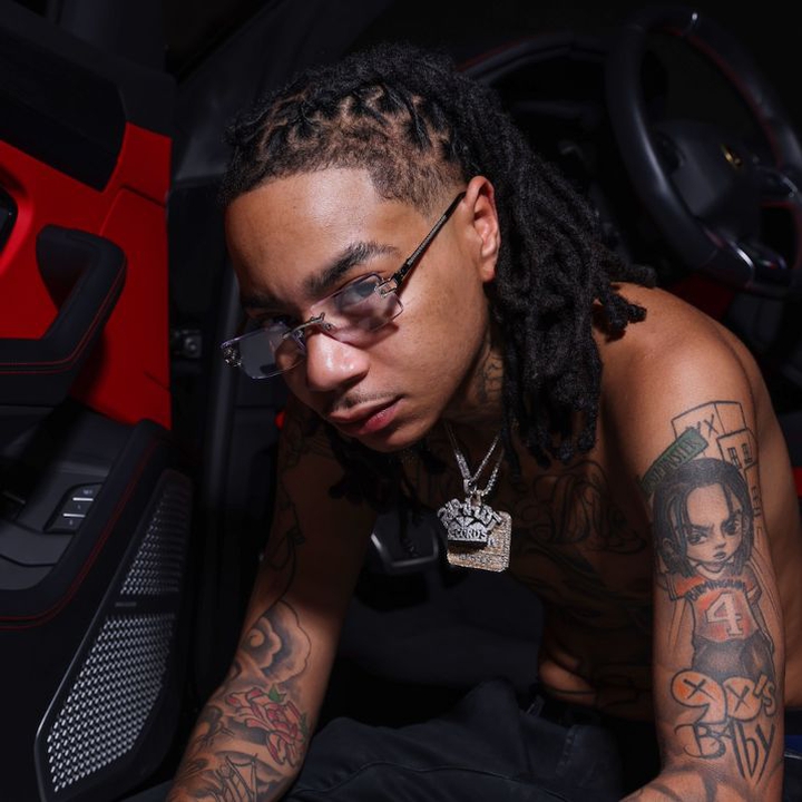
YBN Nahmir’s tattoos are more than filler. He has described them as drawings and memories tied to growing up in Birmingham, and the GQ Tattoo Tour gives him room to explain what some of the pieces mean. That makes it easier to separate his own comments from guesses based on a photograph.

His first tattoo was his mother’s name. Since then, the collection has grown to include cartoon and sports references, family tributes, religious imagery and neighbourhood details. Nahmir has also said he thinks about how the pieces fit together: each arm has its own feel, and the neck helps carry the design across the body.

The 90s Baby arm piece carries his cartoon and sports influences

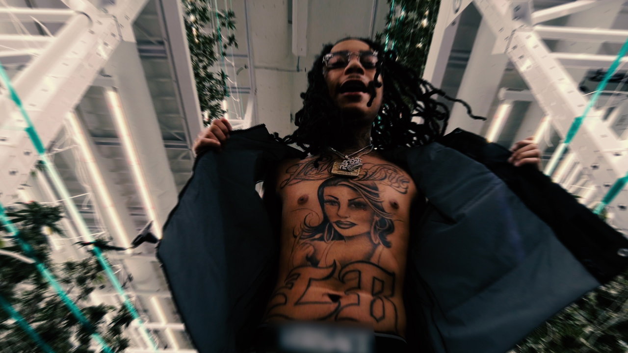
YBN Nahmir chest tattoo portrait showing the large woman design

The neck work mixes protection with Birmingham details

YBN Nahmir shirtless showing arm and neck tattoos

The tattoos on Nahmir’s neck form a close group. He identifies an angel, an Eye of Providence, Converse imagery and numbers linked to his block and street. GQ’s close-up shows why these designs are easier to describe from nearby: hair, chains and clothes can hide their edges, while a straight-on concert shot may turn them into dark shapes.

Nahmir describes the neck work as protective. He says the angel and Eye of Providence represent something watching over him when he is outside, on the block, making music or going about his day. Some of the numbers and street references are personal, too. The symbols can be named without guessing at every association behind them.

The Converse mark brings an everyday object into the group. Nahmir does not present it as an isolated shoe design; he names it alongside the block numbers and street references. Those details share the same visual language: familiar objects and local markers tied to where he grew up.

Why the neck works as a connector. Nahmir says the neck helps bring the two arms together. He talks about placing a reference from one side beside something from the other, so the tattoos flow toward the middle of his body. That explains the layout without claiming he planned every piece at the same time.

Nahmir credits tattoo artist Hershel with the work on his neck and arms. He says Hershel is the only artist he lets tattoo him, and mentions that he has also worked on Blueface and Lil Skies. The artist’s line work gives the collection a common feel even though the subjects vary.

Nahmir says he does not regret the tattoos. He says he got them at the right times and in the right places, and there is no name he wants covered. He wants future work to connect through the centre of his neck but has ruled out tattooing his face. The collection is still developing, with childhood references on the arms, protection and neighbourhood details at the neck, and family ties running through it.

Family names and arm pieces keep the personal side close

YBN Nahmir seated with both tattooed forearms visible

Nahmir’s own explanations make the collection easier to follow. The 90s Baby design holds cartoon and sports memories; Saint Mary, his mother’s name and geisha imagery bring family into the arm work. The angel, eye, Converse mark and block references give the neck its own set of local and personal details. His comments add context without asking readers to invent stories he has not told.

Nahmir’s tattoos lean into quick, graphic shapes. The 90s Baby piece brings a childhood reference onto his arm, while the neck work shifts toward symbols and small marks that are clearer in a close-up. A tour photo can establish placement, but lighting may hide fine lines, so a sharp image is the better guide.

The angel and Eye of Providence are easy to recognise by sight, but the designs alone do not establish every personal meaning. The article can name the symbols and their locations while keeping the interpretation measured. The Converse mark adds a pop-culture touch without needing to connect it to every other tattoo.

The collection is best seen as a changing set of references, not one composition planned all at once. Different photos reveal different pieces, and dates matter when newer neck or arm work appears beside older lettering.

Dated photos also help with the smaller neck marks. A symbol that looks separate in one Tattoo Tour frame may sit beside newer lettering in a later portrait. Makeup and lighting can hide a fine outline, so it helps to say which image shows which design instead of treating every photo as proof of the same moment.

Nahmir’s tattoos are more interesting as a mix than as one big statement. Cartoon memories, sports details and spiritual imagery appear beside lettering. Some designs are easy to identify, while their personal meanings are less certain. Keeping that distinction clear gives the collection room to be varied without overstating what is known.

The most useful descriptions stay close to the photos. A sharp arm image can support a design name and its placement; a softer neck photo may only confirm that a mark is there. That kind of care stops a guessed translation or assumed meaning from being repeated as fact. There is already plenty of variety in the tattoos Nahmir has discussed.

Reading the neck details in dated photographs

The neck marks are easiest to misread in stage lighting. A close portrait shows more than a distant performance shot, and later images may reveal additions that were not there before. Keeping those dates separate makes the visual record easier to follow.

How the arm and neck pieces read together

YBN Nahmir on stage with his tattooed forearm visible

Nahmir’s arm and neck tattoos are easier to understand when they are kept in their own groups. The arm work holds the cartoon and sports references; the neck sits closer to his face and changes how a portrait reads. A close-up can identify a symbol, but it cannot supply its meaning by itself.

Different eras also explain why online lists do not always match. New lettering may appear beside an older design, while a soft concert photo can hide a line that is clear in a later portrait. That is not necessarily a contradiction; it is a reason to date each image and avoid claiming a permanent count.

The collection does not need invented backstories to be interesting. Cartoon memories, Birmingham identity and spiritual-looking symbols share the same overall layout, but not every piece has an equally clear explanation. Showing what is known and what is uncertain makes the guide more useful.

Small neck designs can disappear or stand out depending on hair, lighting and the angle of his head. The clearest description gives the reader the location and the best available photograph, then stops where the evidence stops.

YBN Nahmir performing with visible forearm tattoos

Nahmir’s tattoos have a collected feel. Cartoon references sit beside sports imagery, lettering and symbols from different parts of his life. That looks more believable than saying every design was planned as one sleeve. The strongest descriptions focus on pieces that can be named and shown, leaving unclear marks labelled as uncertain.

The images should stay close to the sections they support. That way, readers can see an arm, neck or wrist detail as they read about it instead of searching through an unrelated gallery.

The 90s Baby piece also captures Nahmir’s age and influences when it was made. It is a different kind of statement from the neck lettering or eye symbol. Keeping those ideas separate helps readers see the difference between a named phrase, a graphic mark and a design whose meaning has not been discussed publicly.

Show photos can confirm that a tattoo exists, but they often do a poor job of showing its detail. Coloured lights flatten black ink, motion blurs thin lines and a microphone can cover the wrist. The closer images give the article a better visual reference than a generic portrait.

Nahmir’s collection reads as memories and references gathered over time. The cartoon work, sports details and neck symbols do not need one grand theory. They are interesting because they are different, and the guide gives each confirmed group its own space.

The phrase “90s Baby” can be read directly from the design, while the meaning of some smaller symbols remains less certain. Keeping those different levels of certainty visible helps the reader know what is clear and what is not.

Big Boi’s Ink Tells the Story in Pieces

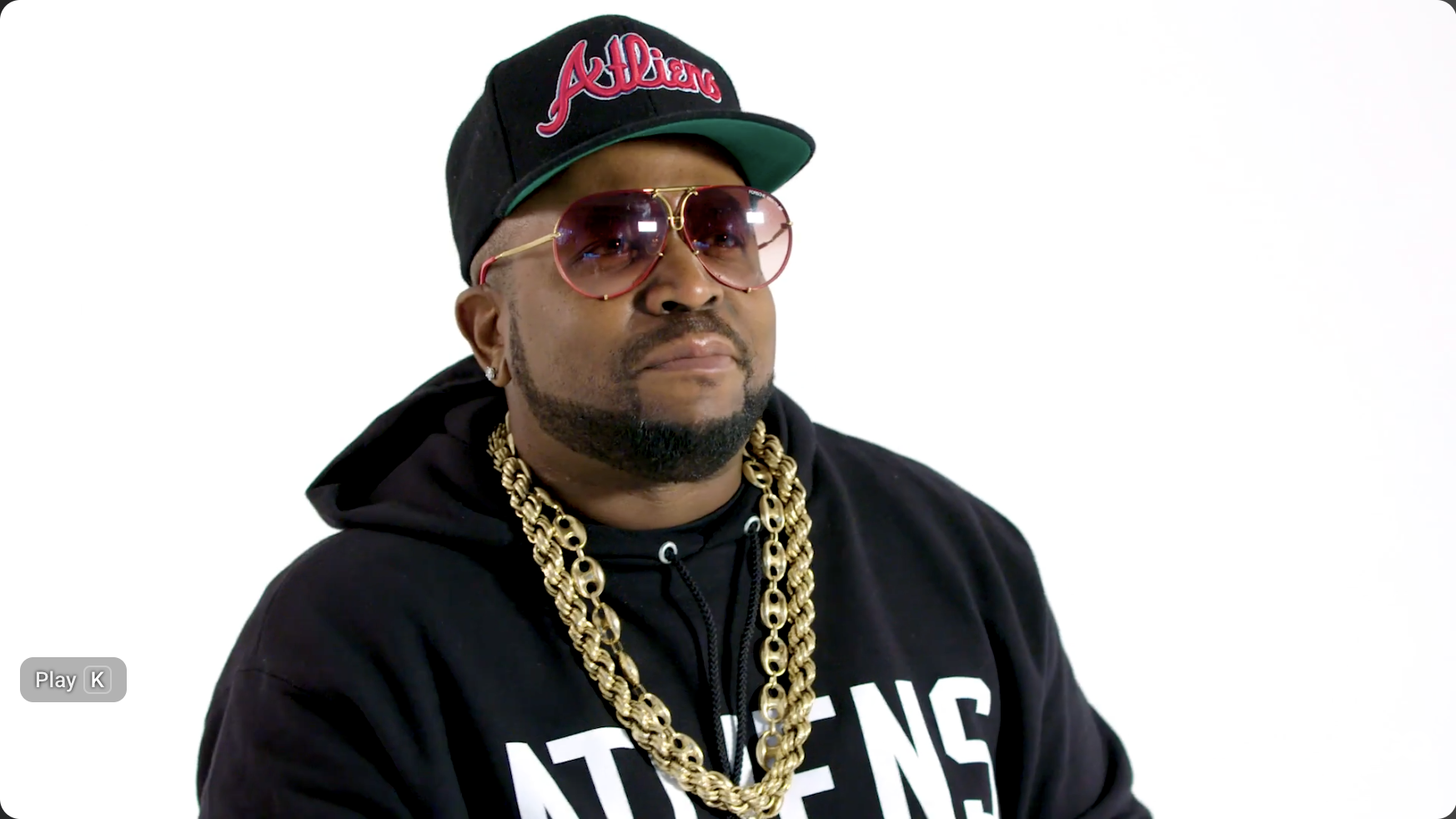
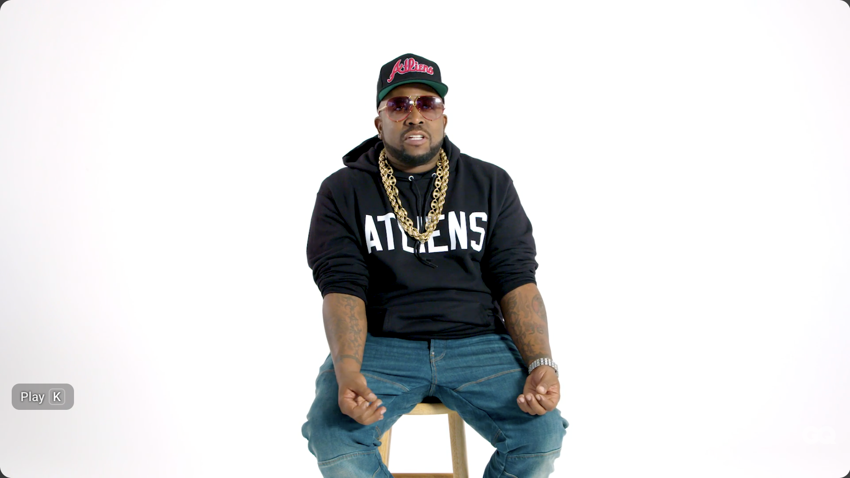
Big Boi’s tattoos are tied to the names and places that have shaped his life: his Southern roots, OutKast and the Dungeon Family, his family, faith and personal memories. He has talked about several designs himself, which makes their stories easier to follow than a list built from blurry photographs.

The collection mixes lettering, a heart banner, a lion, handcuffs, crew references, family names, religious wording, cherubs and a portrait of his first pit bull, Carlito. The tattoos do not look like one giant sleeve planned in advance. They appear to have grown alongside his life and career.

The first tattoo was a heart banner built around “Twan”

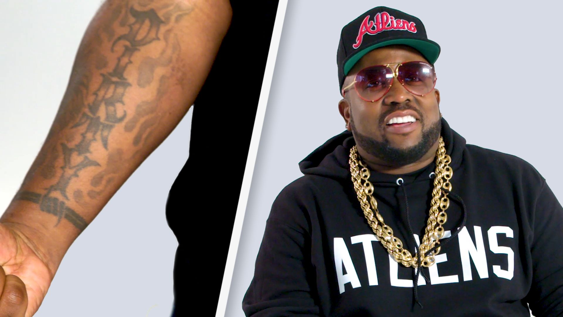
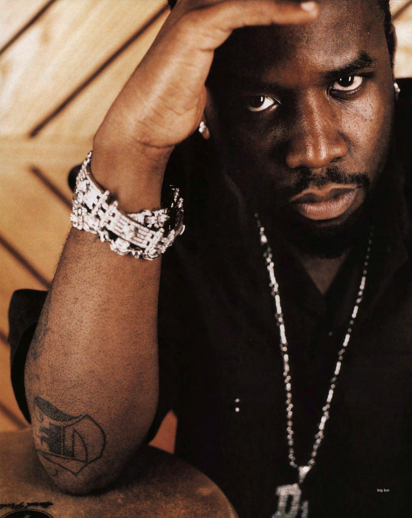
Big Boi Dirty South and forearm tattoos

Big Boi has said his first tattoo arrived when he was 17. It is a heart-and-banner design with the name “Twan”, the nickname he used at the time. Unlike the pieces he added later, after music became his full-time world, it began as a personal name rather than a branding idea.

The heart gives the lettering a familiar old-school frame. The name remains the focus, but the banner gives the design more weight than plain script would have on its own.

A lion followed the first tattoo, bringing an animal image into the early collection. It marks a shift from a name toward larger symbols. A lion can invite speculation about strength or status, but Big Boi has not attached an elaborate theory to every design. The useful timeline is simpler: the heart banner came first, and the lion arrived after it.

That order matters. The tattoos were not all created in one polished session. Smaller pieces were already there before the larger work appeared. In photographs, they can look like parts of a finished plan, but Big Boi’s account suggests a more natural process: he added designs as different parts of his life became important.

The banner also shows how the collection can feel personal and public at once. A nickname carries private meaning, while its placement makes it visible to anyone looking closely. That balance returns throughout the tattoos: some speak to music or home, others to people and beliefs he wanted close.

There is no need to turn the first tattoo into a hidden code. “Twan” is the name, the heart is the frame, and the design marks the beginning of the tattoo story. The lion adds a stronger image, but the original piece keeps its personal feel.

Southern pride and the Dungeon Family sit close to the music

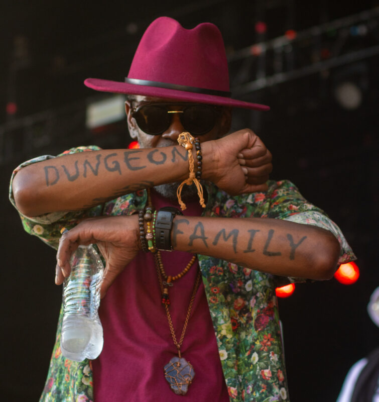
Big Boi Dungeon Family tattoos across his forearms

The words “Dirty South” make one of the clearest links between Big Boi’s tattoos and where he comes from. The phrase gives the collection a regional stamp, but it is not detached from the rest of his story. It sits alongside Atlanta music, OutKast and the Dungeon Family circle that shaped his career.

The lettering is direct; it does not need a mystery attached to it. “Dirty South” is a plain statement of identity, pointing to the culture and sound Big Boi helped bring to a much wider audience while keeping the phrase tied to its Southern home.

Open handcuffs appear among the designs, adding a harder visual note than the heart banner or family lettering. They can look like a symbol of release, but the photograph only confirms what they look like. Without a clear explanation from Big Boi, the broader meaning can stay open.

The Dungeon Family tattoo points to a more specific musical connection. The collective brought together OutKast and other Atlanta artists, so the mark recalls the people and environment around the records. It says something different from “Dirty South”: one is about a region and its culture, the other about a particular creative circle.

That distinction is worth keeping. The Southern lettering can stand for home, the Dungeon Family design for collaborators, and the handcuffs can remain a striking image without a definite explanation. Not every tattoo needs to fit one theme.

Good photographs help with small lettering and symbols. Compressed images can blur a word or hide a mark beside it. A clear close-up lets readers see the lines, spacing and placement instead of relying on a vague description.

These designs sit between the personal and the public. They show where Big Boi comes from and who he worked with, while also carrying parts of his own history. That makes the collection feel lived-in rather than carefully branded.

Carlito gives the collection its most personal portrait

Big Boi showing a forearm tattoo

The portrait of Carlito, Big Boi’s first pit bull, brings a personal memory into the collection. It is not just an animal chosen for its looks. Carlito was part of his life, and the tattoo gives the portrait a memorial quality distinct from the music-related designs.

Animal portraits can lose detail in a distant photo. A stage image may show only the outline; a close-up brings out the expression and shading. The portrait deserves to be shown on its own rather than treated as a small detail in a generic photo of Big Boi.

It also adds a quieter note. “Dirty South” and the Dungeon Family mark speak to public identity; Carlito points to a relationship away from the stage and music business. That contrast makes the collection feel more personal.

Other symbols, including the handcuffs and smaller arm tattoos, appear around it. They should not be folded into the portrait or assigned meanings Big Boi has not given them. The portrait is Carlito’s tattoo, and its strongest supported story is the connection to his first pit bull.

Different photos can change the way the piece looks. Lighting shifts the contrast, and the curve of the arm can make the portrait seem flatter or darker from one angle. That does not mean the tattoo changed; the camera is showing a rounded surface differently.

This is easy to miss when people try to count tattoos from red-carpet photos. A jacket, chain or shirt can cover part of a design, while a tattoo-tour close-up may show much more. The clearest view is the best evidence; one image cannot prove the entire collection.

Carlito’s portrait sits naturally beside the family names and faith lettering, though each group says something different. The dog represents a memory, the names represent family, and the scripture is a statement of belief and protection. Keeping them distinct gives each piece room to make sense.

Family names bring the focus back home

Big Boi tattooed forearms during a GQ tattoo tour

Big Boi’s children’s names add another layer to the neck and chest tattoos. The names do not need an elaborate explanation, but a clear image matters: the spelling, direction and exact placement can be hard to see when a collar or chain gets in the way.

Family lettering differs from the Dungeon Family mark, even though both refer to people. One points to a creative circle and shared music history; the other to the people closest to him at home. Keeping that distinction prevents every name from being flattened into the same broad idea of “family.”

The neck tattoos can look inconsistent across photos from different years. Big Boi may have a different collar on, stand at another angle or show only one side. A later picture may reveal more than an earlier one without indicating that a new tattoo was added. Sometimes the view is simply better.

Cherub or angel imagery also appears among the larger collection, adding a softer note beside darker symbols and strong lettering. It can be described as part of the visible work, but a specific private meaning should not be attached unless Big Boi has explained it.

The names bring the focus away from the stage and back toward the people Big Boi wanted to carry with him. Clothing can still hide part of the design, so more than one photo helps show how the names sit on his body.

The timeline offers another way to read the pieces. The heart banner and lion belong to the early years; the Southern and Dungeon Family tattoos connect to his music career; the children’s names show the collection continuing as his life changed. The designs need not form a perfect chronology for that progression to be clear.

A guide should also say when it cannot read a detail. If fabric covers a letter or a low-resolution image blurs it, describing the visible placement is better than guessing. That keeps the family section accurate without leaving it empty.

Isaiah 54:17 is the clearest protective statement

Big Boi forearm tattoo close-up during a GQ tattoo tour

The Isaiah 54:17 tattoo is one of the clearest pieces to explain because Big Boi has shared both the reference and its purpose. The verse is associated with “no weapon formed against me shall prosper”, and he has described the tattoo as a form of protection.

Here the words carry the meaning. Placement and lettering still matter, but the scripture is the heart of the design. It sits beside the personal banner, music references and family names while making a direct statement of faith.

The verse also marks how the collection has changed over time. It began with a nickname, then expanded to Southern identity, collaborators, children and belief. Isaiah 54:17 feels like a tattoo about protection, not performance, even though it is part of a very visible collection.

Big Boi has also spoken about facial tattoos and how they can affect his appearance and work. It is easy to over-name small marks in distant portraits, so the safer list is the set of designs that can be seen and discussed: the heart banner, lion, “Dirty South,” handcuffs, Dungeon Family mark, Carlito, his children’s names, cherubs and the Isaiah verse.

Together, the tattoos tell a pretty straightforward story: a first nickname, Southern identity, a music family, a much-loved dog, his children and a verse he sees as protection. The details are enough without a grand theory.

The photos need to appear beside the sections they support. One image cannot show the lettering clearly, give the dog portrait room, establish where family names sit and reveal the full verse all at once. Each section needs its own visual evidence.

That is the clearest way to read Big Boi’s tattoos: start with what the photo shows, add meanings he has actually shared and leave uncertain details open. It gives the collection its full story without turning it into a legend.

More musician tattoo guides

Sexyy Red’s Tattoos: Face Ink, Roses, Flames and More

Sexyy Red’s tattoo style is hard to miss. Her face ink, bright hair, bold clothes and large jewellery all belong to the same visual world, but the tattoos are not one single design. She has small marks on her face, work across her neck and chest, repeated lettering, roses and leg tattoos that show differently with each outfit.

Her GQ tattoo tour is useful because she talks about some of the pieces herself. She mentions flames and roses, and says she likes certain ideas in threes. The photos show where the designs sit. Where the story is not clear, it is better to stick with what can be seen.

The neck and chest ink is part of her whole look

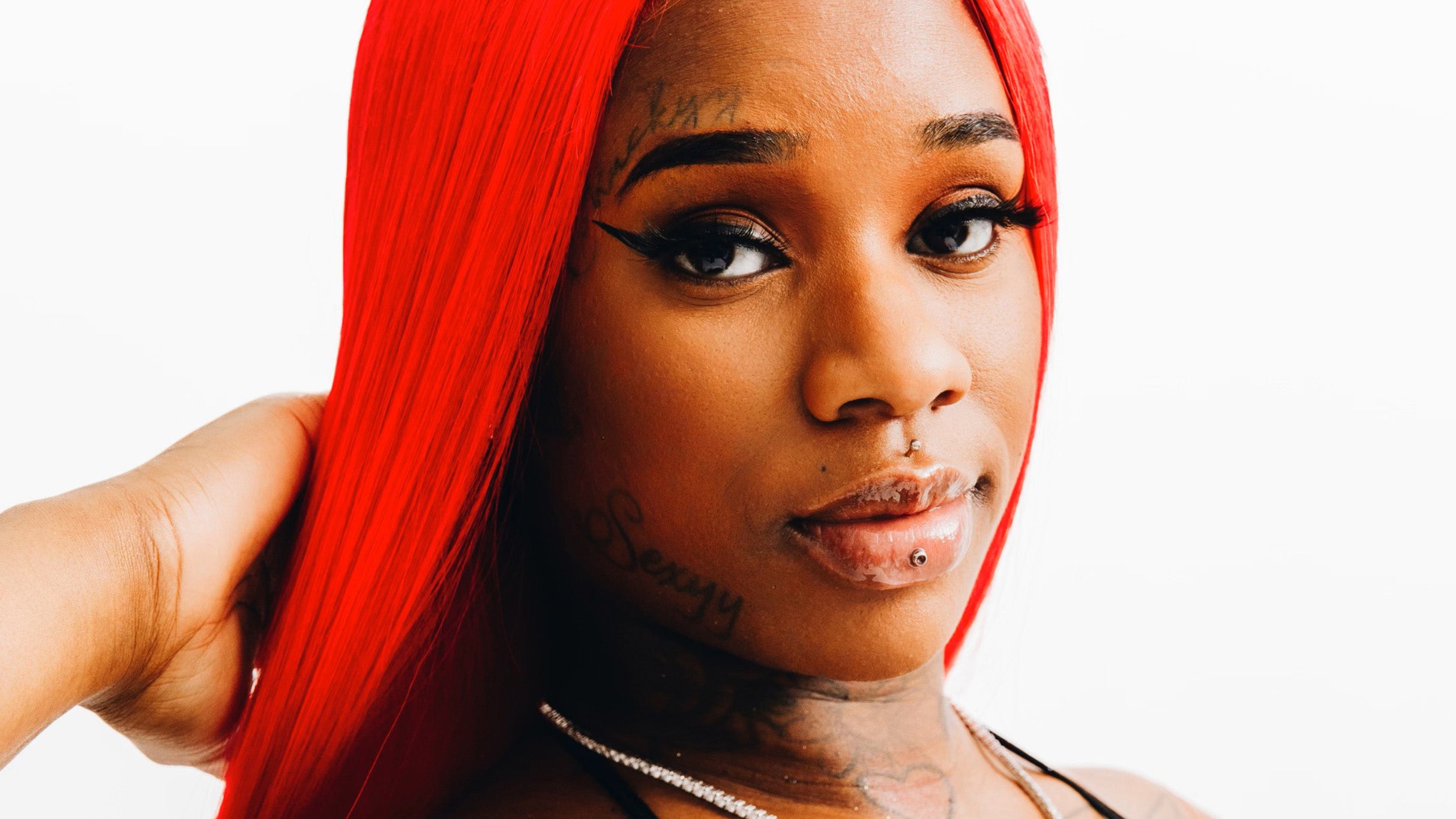
Sexyy Red tattoos: close portrait showing the neck and upper-chest tattoos

Sexyy Red’s tattoos are closely tied to how she presents herself. Her bright hair, big glasses and jewellery sit alongside the face ink, so the neck and chest pieces feel like part of the overall look. Clear photos show several small marks around her neck and upper chest, with larger shapes lower down that disappear under tops or chains.

That placement affects when the tattoos show. Neck ink appears in red-carpet photos, music videos and quick social posts, even when the picture was not taken to highlight it. Some marks are sharp enough to describe; others blend into the lighting and should not be given invented names.

Her chest tattoos also change with her clothes. A sheer top can reveal more than a cropped hoodie, while a large pendant may cover the centre entirely. The most useful images are the ones where hair, glasses and jewellery do not hide the edges of the designs.

Sexyy has also played with repetition. In her GQ tattoo tour, she talks about sets of three, including three different “Sexyy” tattoos and groups of roses. The repeated number gives the collection a fun thread without making every piece look alike.

Her face tattoos are small, bold and impossible to miss

Sexyy Red tattoos: close-up showing the dollar sign and forehead lettering

The face ink is usually the first thing people notice. Close-up photos show a small dollar sign beneath one eye and script above the brow. Neither mark is large, but the face is a small canvas, so a few lines can change the whole expression.

The dollar sign fits the money-focused imagery around Sexyy Red, but a photo cannot tell us every reason she chose it. It is fair to place it in the context of how money and success appear in her public image, but a private story needs to come from her.

The brow script is much easier to see in a close portrait than in a concert shot. Makeup, glasses or hair can cover it in an instant. That is why this close-up helps more than a generic picture at the top of the page.

Face tattoos can change in appearance over time. Lines soften, new work may appear beside older ink, and makeup can make a tattoo look lighter. A careful guide should date its photos where possible instead of treating one image as a permanent count.

The thigh tattoo brings flames and bigger leg imagery into the mix

Sexyy Red tattoos: full stage photograph showing the visible thigh tattoo

Sexyy Red has said she got flames on her leg because she liked the look. That is one of the clearest explanations she has given. The design suits her bold stage style, but it also works as a straightforward tattoo: energetic shapes in a spot that shows with shorts or a short skirt.

Stage photos make the thigh piece easy to spot because the leg is uncovered and the lights catch its outline. Under different colours or in a backstage photo, the same tattoo can look softer or darker. A shift in lighting does not mean the ink itself changed.

The leg work has a different rhythm from the small facial marks. The face tattoos are tight and graphic; the flames have room to move and read from farther away. That contrast keeps the collection from looking like one flat field of ink.

Entertainment and fan coverage mentions other small designs on her leg, but the clearest detail is the flame work and what Sexyy has said about it. There is no need to identify every faint mark to explain why the leg tattoo stands out.

The wider body shots show how the tattoos sit with her stage style

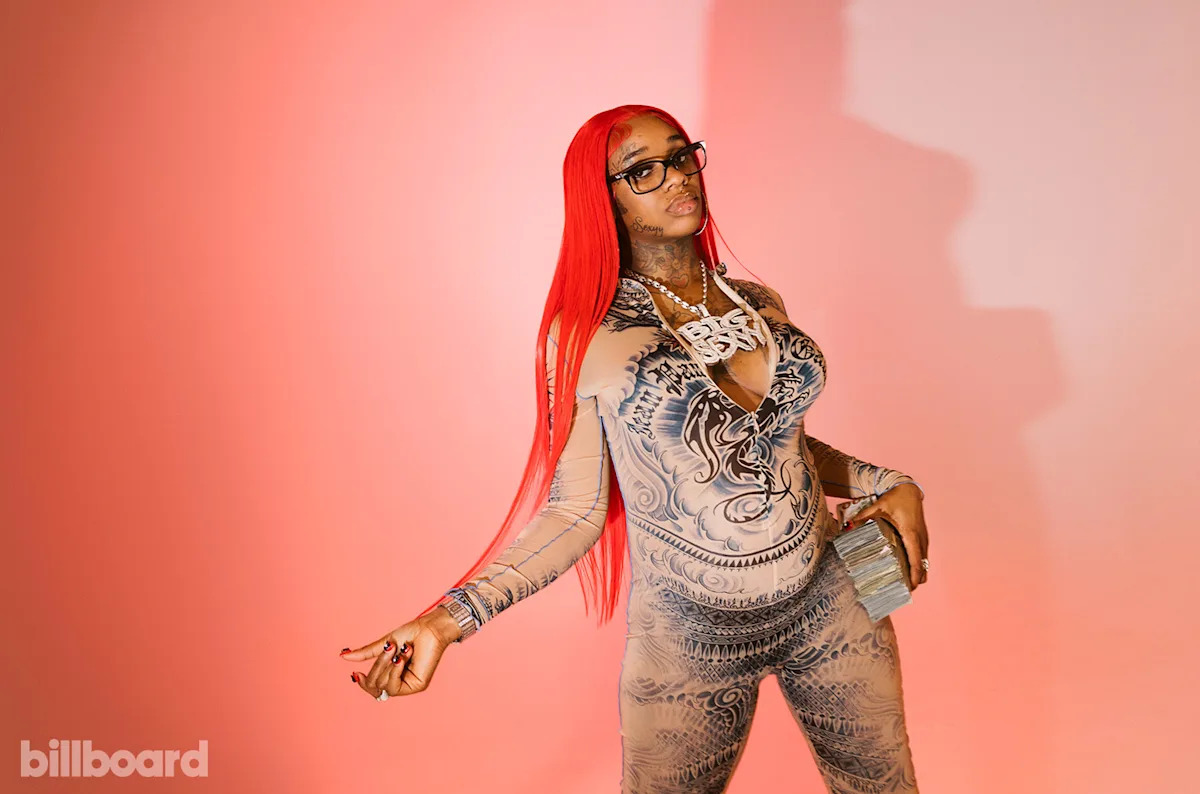
Sexyy Red tattoos: wide studio photo showing the tattooed bodysuit area and visible ink

A wide studio image shows how the ink works with the rest of Sexyy Red’s styling. The tattoos do not sit apart from the patterned clothes, oversized chains, bright hair and playful attitude she brings to a shoot.

The GQ tour gives more context than a standard press photo. Sexyy talks about roses, repeated “Sexyy” lettering and her fondness for ideas in threes. That makes the descriptions stronger than a list built from old captions: the detail comes from her own comments.

The roses show how decoration and identity can overlap. A flower can look soft, but several roses across different areas become a pattern of their own. Photos establish their shape and placement; her interview explains the repetition. Any further meaning should be clearly presented as interpretation.

Bright photoshoot clothes can make body tattoos look like fabric prints. Close images help separate ink from patterns, shadows and jewellery. This wide photo is useful for the overall composition, not as proof of a particular face or thigh design.

The stage photos show how the ink changes from one outfit to the next

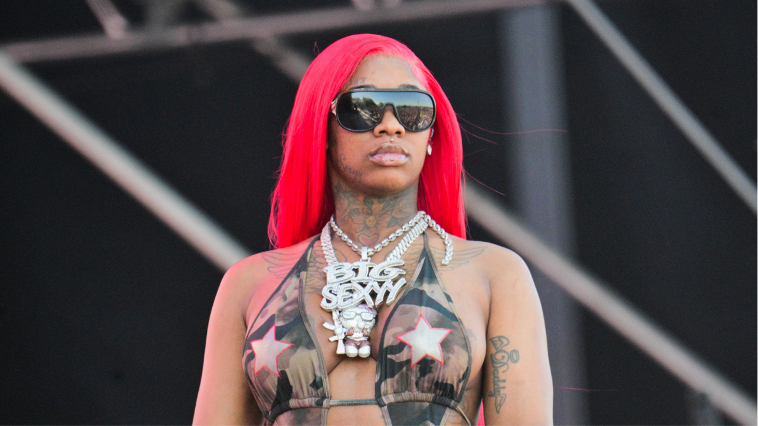
Sexyy Red tattoos: separate stage photograph showing the neck, chest and visible arm ink

Sexyy Red’s stage clothes reveal different tattoos at different times. A crop top shows the neck and chest; shorts bring the leg ink forward; a jacket may leave only the face visible. The tattoos stay the same, while the view changes with each outfit.

Movement matters too. One frame can catch a neck tattoo clearly, then a turn or microphone can cover it. That is normal in performance photos, and it is not a reason to count the same mark as a new design every time the camera catches it from another angle.

There is a playful side to the collection. The repeated “Sexyy” pieces, the roses and the flames fit the confident persona she brings to music and live shows. They do not need a serious symbolic explanation to be interesting; sometimes the design simply looks good and suits the person wearing it.

The clearest summary is that Sexyy Red has a mix of face tattoos, neck and chest marks, repeated lettering, roses and visible leg work. Some pieces have a story from her own tattoo tour; others are best described from the photos. Keeping those levels separate makes the guide honest while still giving readers plenty to look at.

The range in scale is part of the fun. A tiny mark beneath the eye can have as much impact as a larger thigh design because it sits on the face. Roses and repeated words create a pattern, while the flames bring movement. Each piece contributes something different.

There is no need to invent hidden meanings for every line. Her comments explain some designs, and the photos show the rest. Together they present an artist who treats tattoos as part of her style, alongside her hair, clothes, music and attitude.

The smallest marks deserve careful photos too. A face tattoo can be only a few lines wide and still change a close-up. The dollar sign sits where people spot it immediately; the brow script can disappear behind her glasses or hair. These close shots show the ink without asking a distant stage photo to do a job it cannot.

The same is true of the leg and body pieces. Flames may stand out in a full-stage frame, but their edges and nearby marks are easier to judge in a bright, high-resolution image. The roses and repeated words also read better as their own designs. One photo can establish the overall style, but it cannot prove every tattoo on the page.

More musician tattoo guides

Rita Ora’s Tattoos: Aphrodite, Birds, Roses and Family Ink

Rita Ora’s tattoo collection reaches well beyond a few small celebrity designs. There is a large woman-and-rose piece on her ribs, a Greek goddess on her arm, family references, short phrases, fine-line figures, birds and smaller marks on her hands and wrists. Ora has explained some of the tattoos herself, which helps distinguish known stories from assumptions.

The photographs are part of the story too. Hair can hide a neck design, clothes can cover a rib tattoo and stage lighting can change how an arm piece looks. Looking at each prominent tattoo alongside a clear image makes the collection easier to understand.

The zog neck tattoo is a small family story

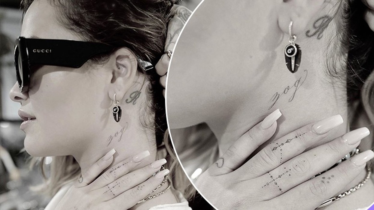
Rita Ora tattoos: close photograph showing the cursive zog tattoo below the ear

One of Ora’s best-known tattoo stories is tucked just below her ear. “zog” means bird in Albanian, and she has said her mother used it as a childhood nickname. It is a small design with a very particular family connection, rather than an explanation guessed from a photograph.

The fine lettering sits discreetly and can be hard to spot when her hair is down. In this close-up, the script is clear and the thin lines are easier to make out. It shows how a tiny tattoo can hold a personal reference without taking up much space.

Its position fits that private feel. The word can be seen when Ora wears her hair up, then covered by her hair or a collar. The photo makes the lettering visible, and Ora’s own account explains why it is there.

The same photos show a few other small marks on her hands and fingers, including a little heart. Those details are separate from the “zog” tattoo and are best described on their own.

The pin-up girl and rose take up real space on the ribs

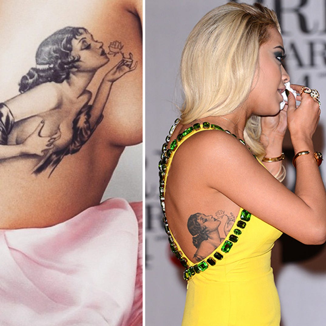
Rita Ora tattoos: profile photograph showing the large woman-and-rose rib tattoo

One of Ora’s most striking designs is the rib tattoo along her left side. It features a vintage-inspired woman with a rose. The profile view gives a better sense of its size: the artwork follows the curve of her ribs instead of sitting like a small, flat motif.

The pin-up style feels quite different from the fine lettering on her neck. There is more shading and movement in the figure, while the rose adds a softer detail. That is why the design is usually described as both a woman and a flower, rather than just a portrait.

Rib pieces are not always easy to capture in a photograph. Clothing, hair and the angle can hide parts of the design. This image shows enough to discuss its placement and overall look without suggesting every detail is visible in every public photo.

Other photos show smaller tattoos around Ora’s arms and wrists. The larger rib work does not mean those marks were done together; her collection has developed over time and with different artists.

The arm tattoos mix portraits, words and small symbols

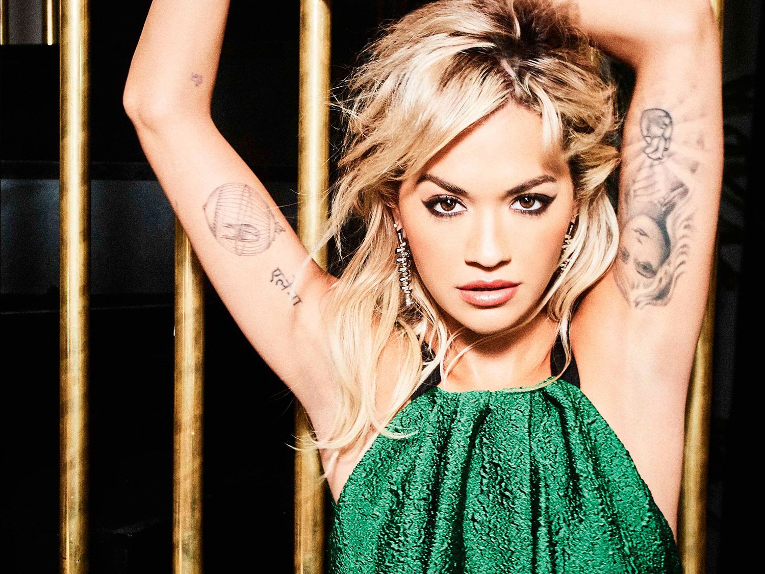
Rita Ora tattoos: wide portrait showing the separate tattoos on both inner arms

Ora’s arms bring together several styles instead of forming one continuous sleeve. Photos show a fine-line ballerina on her upper arm, small lettering, a wishbone, the phrase “Love Me” and family names in Hindi. The tattoos sit in different places, leaving plenty of skin between them.

The ballerina is easiest to see in a sleeveless look. Its delicate lines come through better in a clear, well-lit portrait than in a dark concert shot. The light treatment also contrasts with the larger goddess image elsewhere on her arm.

The writing and names add a more personal note. Her siblings’ names have been reported in Hindi, and the short phrases on her wrists read like small reminders. A photograph can show where the words sit, but it cannot explain every private reason behind them.

Small symbols appear alongside the lettering as well. In a sharp image, a wishbone, feather and other fine-line marks can be distinguished as separate designs. It is helpful to count each visible tattoo once, even when another photo shows the same line from a new angle.

The Aphrodite tattoo is her biggest obvious statement piece

The large design on Ora’s inner left arm is often identified as Aphrodite, the Greek goddess of love. She holds a heart, and the tattoo fills much of the arm when Ora raises it on stage. Ora has spoken about relating to the goddess, giving the image some context beyond what fans can infer from a photo.

Reports have connected the work to tattoo artist Keith “Bang Bang” McCurdy and a long sitting. Its scale and shading make clear that this is a full illustration, with a figure and heart that remain visible from a distance, rather than a small flash tattoo.

The stage image also shows how much clothing affects what can be seen. A sleeveless top exposes the inner arm; a jacket can cover nearly all of it. The design stays the same, even when an event photo only catches part of it.

The heart in the goddess’s hands echoes other love-related details in Ora’s collection, including the short “Love Me” phrase. That connection does not mean all the nearby tattoos share one meaning. It helps explain why the goddess stands out as a central image among her smaller marks.

The dove on the back of the neck changed the collection again

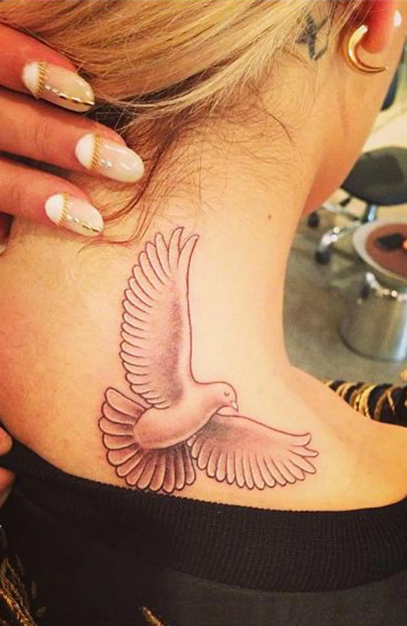
Ora has also revealed a dove tattoo at the back of her neck. Its wings are spread, with soft shading that sets it apart from the small “zog” script elsewhere on her neck. Both designs involve birds, but they are distinct tattoos.

The dove was shown in a tattoo-studio reveal, where the camera could capture it more clearly than a typical red-carpet shot. With her hair swept away from the nape, the whole design is visible; when her hair is loose, it can disappear from view.

Bird imagery has appeared in Ora’s collection for years. The Albanian “zog” is tied to her mother’s nickname for her, while the dove is a larger visual design. Her comments confirm the family story behind the word, but there is no need to assign the dove an unreported personal meaning.

Alongside the neck script, rib portrait, arm lettering and goddess, the dove shows the range of Ora’s tattoos. Some are small and personal, while others change the look of an outfit when they are visible. That variety makes more sense when each design is considered separately.

Reports also mention smaller pieces, including a Shakespeare quotation, a reversed triangle, a wishbone and family names. They can be easy to miss beside the larger tattoos, and a single full-body image rarely captures all of them.

Rita Ora tattoos: studio photograph showing the dove tattoo on the back of the neck

Ora’s collection moves between glamour and private memory. The goddess and pin-up figure make a bold impression, the bird designs connect to family and heritage, and the short phrases add a personal touch to her arms. Each mark can speak for itself; the photographs show how differently the designs fit her body.

The smaller tattoos also offer clues to how the collection has grown. A newer word at the neck can sit near an older bird design, while arm portraits and family lettering appear in pictures taken years apart. That does not mean the tattoos were all added at once. The placement and design are clear, while dates and stories are best included when a source confirms them.

Good photographs make a real difference on a page like this. A wide red-carpet image can show that Ora has tattoos yet hide the rib figure or blur the writing on her wrist. A close-up clarifies a small design; a wider portrait shows how several pieces sit together. Both views help, and neither has to show every tattoo.

Taken together, Ora’s tattoos pair large artwork with small reminders. The bigger pieces catch the eye first, while the brief phrases and family references give the collection a more personal character.

More musician tattoo guides

Trippie Redd’s Tattoos: Face Ink, Love Scars and 1400/800

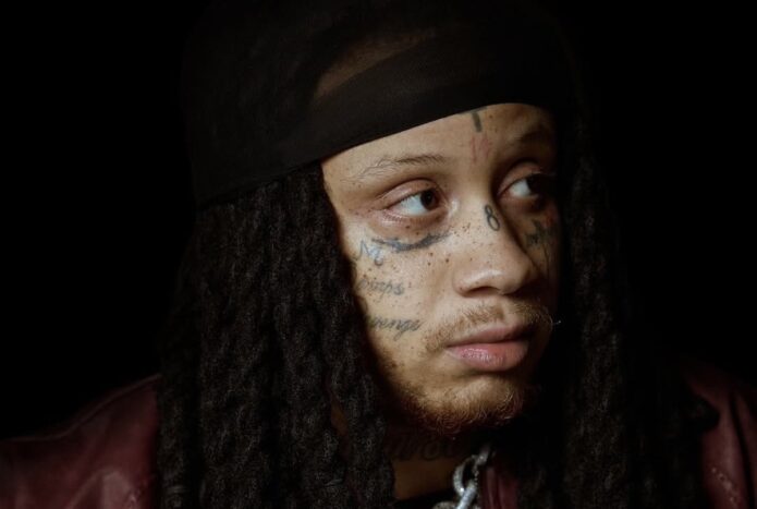
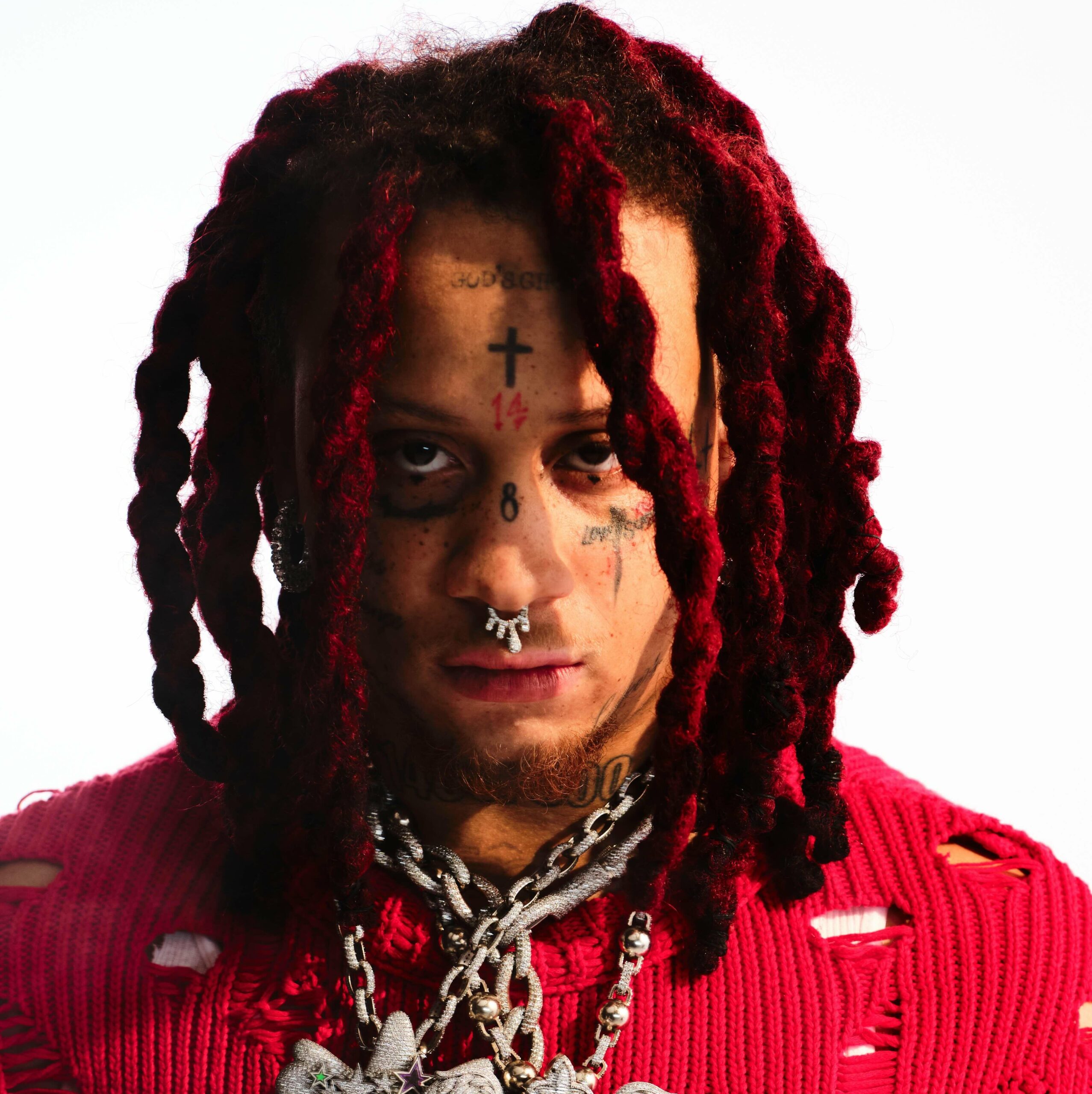
Trippie Redd’s face and neck tattoos have become a signature part of his look. The cross, numbers, LOVE SCARS lettering and 1400/800 marks sit close together, with smaller symbols filling the spaces around his eyes and cheeks. His hair and styling shift from one photo to another, so the same tattoos can appear quite different.

This guide looks at the main groups separately, using different photographs to show each view. The ink is easy to see, but its meaning is not always public. Where Trippie or a reliable source has shared context, it belongs here; when an image only shows a mark, the description sticks to its appearance and position.

The cross and numbers set the tone for his face tattoos

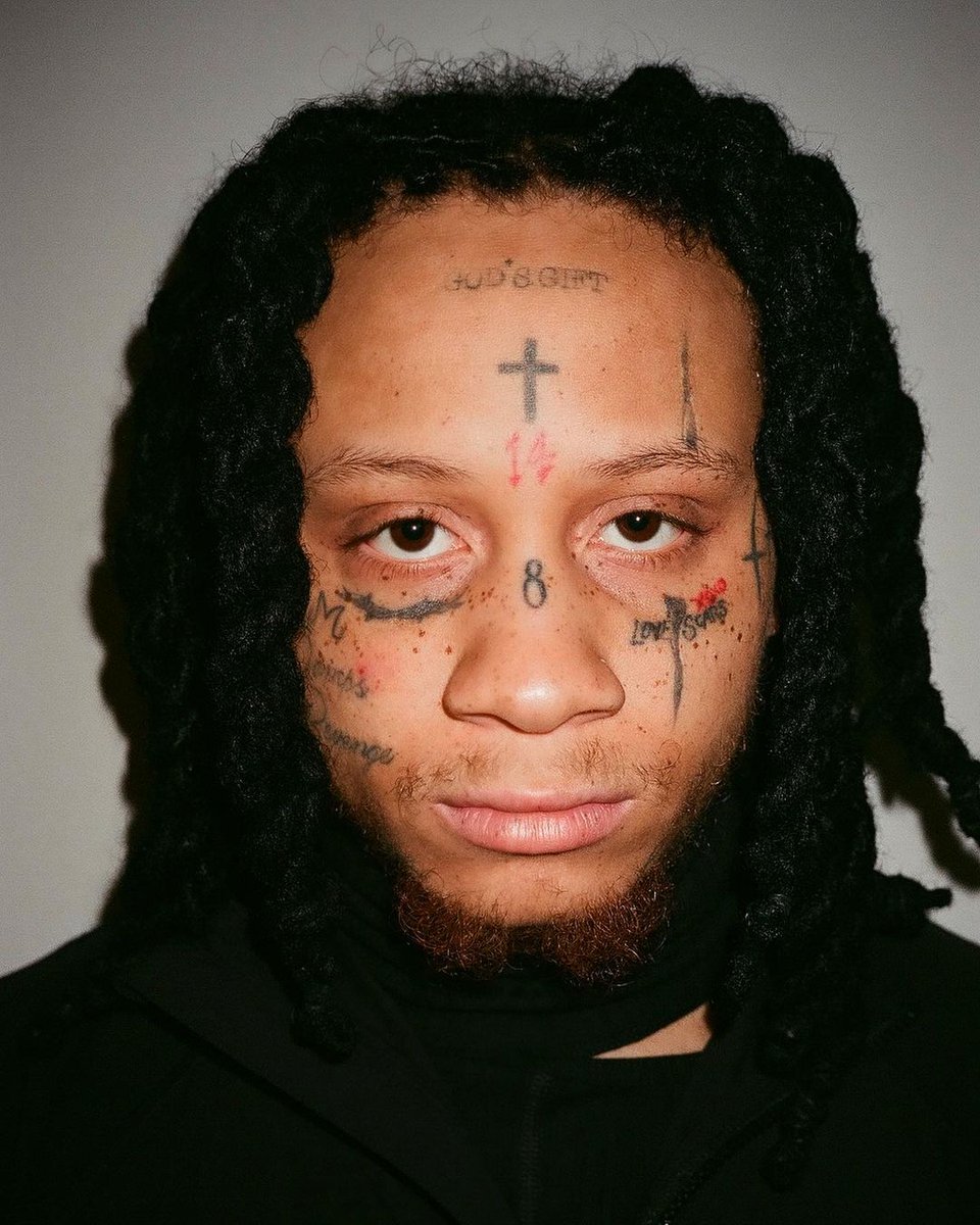
Trippie Redd tattoos: close portrait showing the crosses, numbers and script around the face

Trippie Redd’s face tattoos are hard to miss. A small cross high on his forehead anchors the group, with numbers, short marks and script around his eyes and brows. The designs sit close together, but the close-up still helps pick out their main shapes.

The red 14 is among his most familiar marks. A blue or dark 8 appears between his brows or nearer the nose, depending on the photo and when it was taken. Older and newer images do not always agree on colour or exact placement, so the date and camera angle are worth keeping in mind.

A face is a tight space for tattooing. Even a small number can change the way someone looks, which gives Trippie’s ink an immediate presence. The cross, numbers and lettering are out in the open, showing up in interviews, music videos and event photos.

A photo cannot confirm what every number means to him. There is plenty to describe in the designs themselves, so this guide avoids turning each mark into a hidden code.

The 1400 and 800 numbers continue down onto the neck

Trippie Redd tattoos: separate portrait showing the neck numbers and lower-face lettering

The ink continues below Trippie’s jaw. He has 1400 and 800 lettering on his neck, visible in several photos beneath the face tattoos. The numbers are closely tied to his music identity, making them feel different from a purely decorative mark.

The neck numbers stand out most in a straight-on portrait with his hair pulled back. From the side, dreadlocks can cover much of the lettering and make the tattoo group look smaller. A separate neck image gives the design room, instead of leaving it as background to a face close-up.

These numbers connect the neck tattoos to the rest of his public style. His jewellery, hair and clothes change, while the lettering stays in place as a steady visual feature. It is bold enough to read in a performance shot and close enough to the jaw to feel like part of the overall face design.

There are more marks around the neck, including script and symbols, but reliable coverage does not identify every line. It is fair to say the area is heavily tattooed without guessing at writing that is too blurred to read.

LOVE SCARS and the cheek lettering make the face read like a diary

Trippie Redd tattoos: separate close-up showing the LOVE SCARS lettering and cheek ink

The words LOVE SCARS sit beneath one of Trippie’s eyes in many photos and have become one of his most recognised tattoos. The phrase fits the emotional tone of his music, and it also makes a strong visual mark: short, legible letters placed where the camera catches them.

More writing and small symbols appear across his cheeks and near his eyes. Some pictures seem to show a heart-like shape, numbers or extra words, though shadows and facial hair can make them hard to distinguish. Those details can be described as visible or reported without claiming a perfect count from one image.

Because the tattoos sit so close together, they can feel more personal than a large chest design. They show up in nearly every portrait. His expression may change, but the lettering stays in place and has become part of the face fans know.

It is best to keep the phrase in perspective. It is a visible tattoo and a familiar part of his style. A photograph cannot explain every feeling or event behind it, so the description stays with the words, their placement and the connection listeners make with his music.

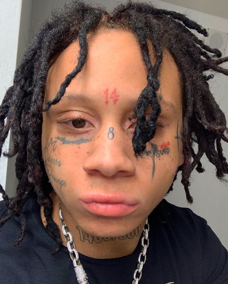
A different portrait shows how the same tattoos change with hair and light

Trippie Redd tattoos: different indoor portrait showing the forehead cross, nose number and neck ink

A separate indoor portrait is useful because it shows the same general tattoo groups in different conditions. His dreadlocks fall around the forehead, the light is softer and shadow covers part of the neck. The view changes, even though the tattoos themselves have not.

The cross remains visible, along with the numbers near the centre of his face. The nose and cheek designs look darker in this lighting, while the neck lettering blends into the background. It is a good reminder not to base a description on one especially clear portrait.

His hairstyle changes the view as well. Trippie has worn red, green, dark and lighter dreadlocks, which can hide the temples or the sides of his face. Hair pulled back makes placement easier to see; a more relaxed portrait shows how the tattoos look in everyday public settings.
It also helps to distinguish a genuinely different image from a duplicate. Two photos may show the same tattoos while still offering different angles. A crop or zoom of one photo is not new evidence, but another view can help clarify placement without implying a new tattoo.

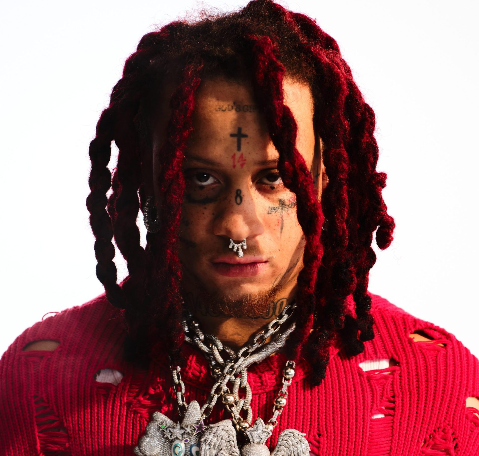
The red-dread portrait gives the clearest wide view of the tattoo layout

The large promotional portrait brings Trippie’s face and neck together in one frame. The cross, numbers, eye lettering and neck marks form a clear line, with his red dreadlocks framing either side. It gives the best overall view in the article, while the close-ups remain more useful for individual designs.

His tattoos have developed along with his career. New lettering appears, colours are refreshed and some marks become easier to spot as his styling changes. A current portrait shows the present layout; older social photos can help explain why people describe the same area differently.

The face and neck ink is part of his stage image, alongside vivid colours, heavy jewellery, red hair and emotional song titles. That larger look gives the tattoos context, while each design still has its own shape and placement.

A clear starting point is the cross, the 14, the 8, LOVE SCARS, 1400/800 and the smaller marks around them. Anything beyond those details needs a sharp image or a direct explanation before it should be stated as fact.

Trippie Redd tattoos: large promotional portrait showing the forehead, eye and neck tattoo groups

Smaller designs also appear around the main pieces, and some may have been added since these photos were taken. That is part of following a heavily tattooed musician. The clearest details can be named and shown with different photos, while a blurry patch by the hairline should not be called a confirmed new tattoo.

Together, the cross, numbers, LOVE SCARS and neck lettering give his face a strong visual rhythm. They make a bold impression, with enough detail to reward a closer look. Several tattoo photos help show the collection better than one generic portrait could.

The face works best when you take it in layers: the forehead catches your eye first, the cheek lettering adds its own note, and the neck carries a larger group that ties the look together. The tattoos sit at different distances from the camera, but they belong to one overall layout.

Photos from different years can make the ink look surprisingly different. Hair covers the temples, chains fall across the neck and colour grading changes how dark the lines appear. Comparing placement is more useful than counting every new angle as another tattoo; the same cross can look sharper or softer without having changed.

The script around his eyes is another reason a wide portrait is not always enough. A full-face view gives the overall layout, but a close-up can show whether a mark is a number, a word or a shadow. That detail is what turns a general celebrity profile into a useful tattoo guide.

That care also keeps the description honest. When the lettering is clear, it can be named and placed. When hair or a hard shadow blocks it, it is better to leave the detail uncertain than fill the gap with a guess. The strongest descriptions stay specific about what the photographs show.

More musician tattoo guides

Action Bronson Tattoos: Daughter’s Name, Cars, Castles and Chaos

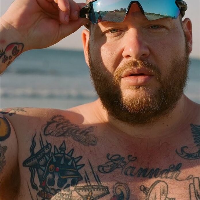
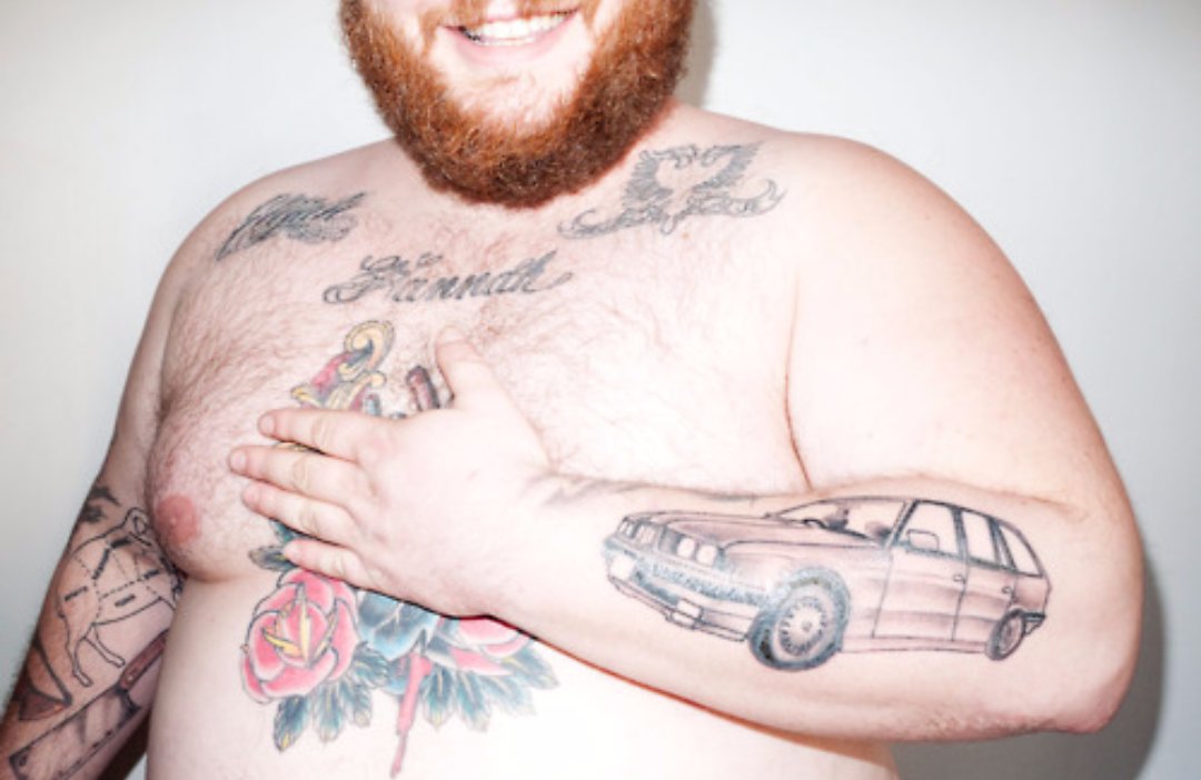
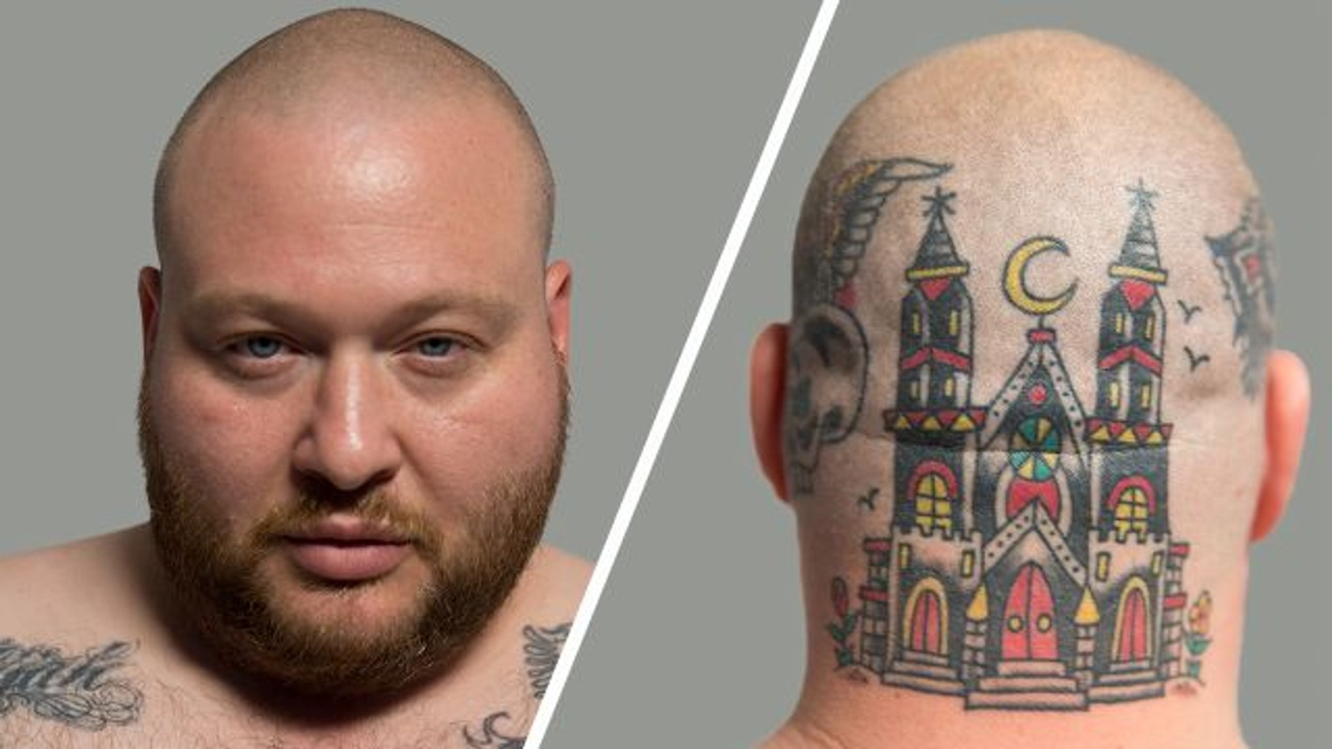
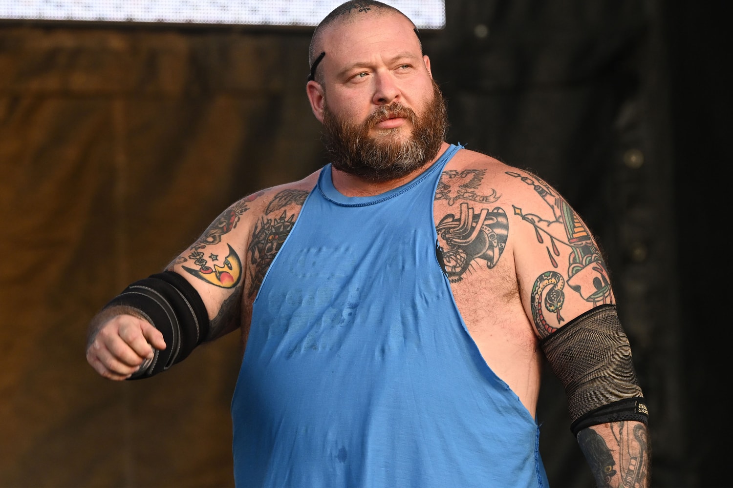
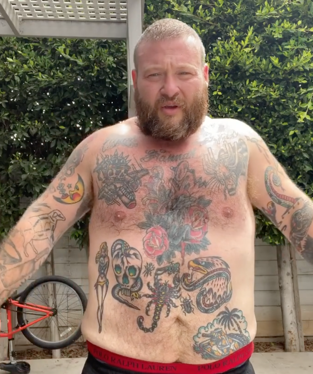
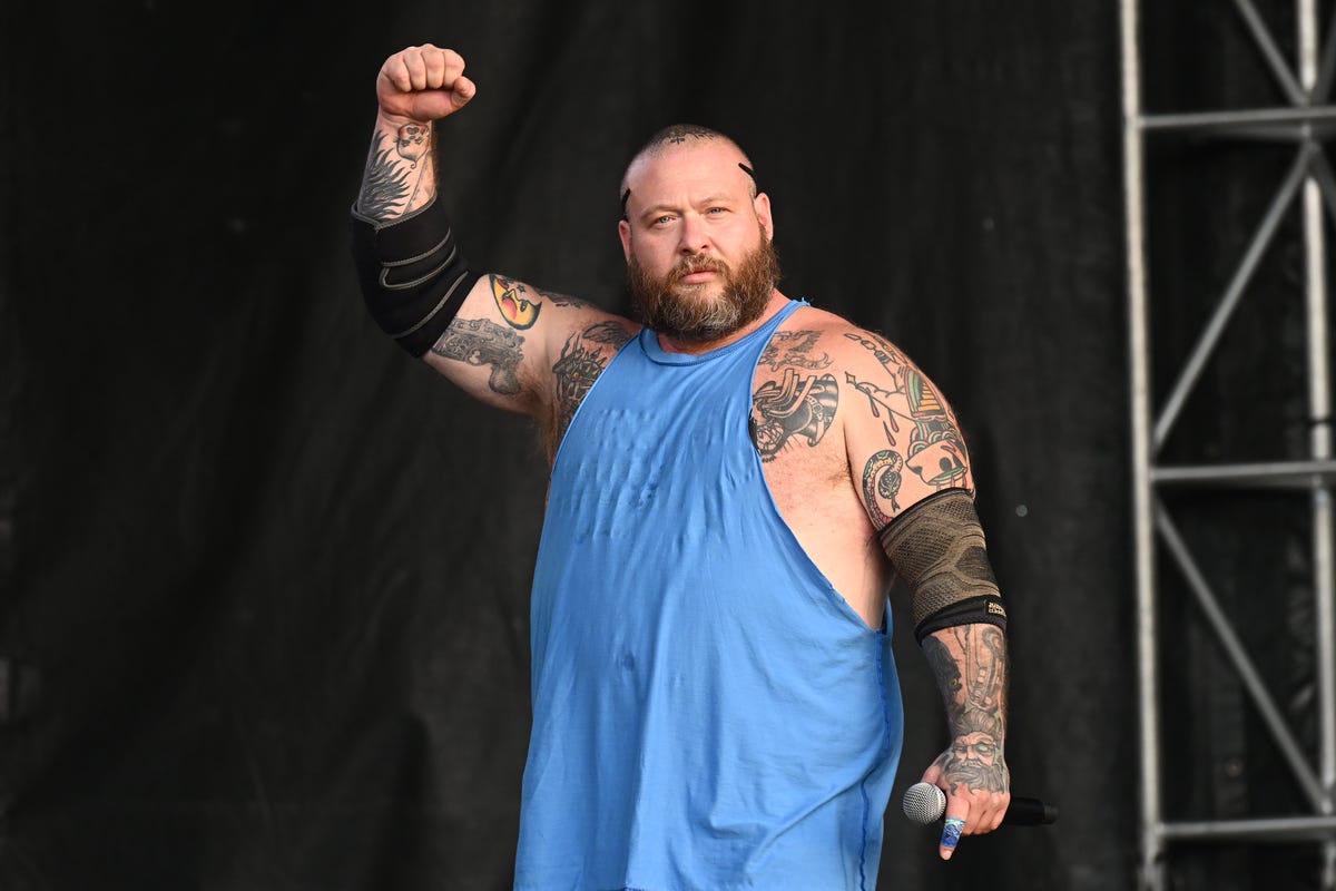
Action Bronson’s tattoo collection is hard to take in from a single photo. His daughter’s name crosses his chest, a 1995 BMW sits on his forearm, a huge castle covers the back of his head, and his legs hold a mix of animals, sports references and jokes. He has also spoken candidly about designs he loves, ones he covered and tattoos he considers bad decisions.

GQ’s tattoo tour gives the clearest personal detail. XXL repeats some of those stories and adds context around the head tattoo and gorilla cover-up, while an older GQ.co.uk interview identifies the BMW and smaller hand pieces. The descriptions below stick to those sources: a visible tattoo does not automatically come with a meaning Bronson has never given it.

His daughter’s name was the first tattoo

Action Bronson tattoos: 1995 BMW 5 Series forearm tattoo

His daughter’s name was the first tattoo Bronson chose, giving his chest a clear starting point. It is a direct family reference rather than an abstract symbol. The name sits where it can be seen in a shirtless photo, while later work has grown around it. That first choice was personal before the skulls, flowers and traditional designs filled out his torso.

Bronson has said he waited several years after getting his daughter’s name before he began collecting more tattoos. The timing is useful: the chest lettering was not the start of a carefully planned bodysuit. It came first, and the larger collection followed through different interests, artists and stages of his life.

The chest is also a good example of why the tattoos deserve separate descriptions. Roses, hearts, skulls and animals can sit close together without sharing one meaning. Bronson explained the story behind his daughter’s name; the nearby designs can be described by their appearance and location without assigning them a private message.

The BMW 5 Series keeps a career milestone on his forearm

Action Bronson tattoos: chest and stomach tattoo group

The BMW 5 Series on the forearm is one of the most specific tattoos in Bronson’s collection. He has connected it to the first car he bought with money from rap. It marks a real point in his career, when music let him buy and modify a car he had long been interested in.

The forearm is a practical spot for the design: it can be seen without taking off a shirt and appears while Bronson performs, cooks or speaks to a camera. A close photo makes the outline easier to read than a full-body shot. His explanation tells us why this model matters; the image shows where it is and what can be seen.

Bronson often talks about engines, suspension and older cars, adding context to this tattoo. That does not mean every other automotive detail on his body has the same origin. It is best to keep this design tied to the explanation he gave rather than turn it into a theory about the whole collection.

The castle and skull designs cover the head and neck

Action Bronson tattoos: castle and skull head tattoos

The castle on the back of his head is his most dramatic tattoo by placement. Video coverage shows a large, colourful structure across his scalp and neck, with towers, windows and a moon-like shape. It reads like a fantasy scene rather than a small emblem. A rear view is essential because the design disappears when Bronson faces the camera.

Head tattoos change what a photo can show. A front-facing image may capture Bronson’s face and chest but miss the castle; a rear shot reveals the castle while hiding his hand tattoos. The eagle, skull and wolf mentioned in coverage should be described as separate pieces, not rolled into one vague head design.

The eagle has been discussed as a symbol of freedom, while the skull and wolf are mostly supported by visual descriptions. That distinction matters. Bronson’s own explanation is the best guide to a design’s meaning, but a clear photo can still show the colour, outline and placement of a piece he has not discussed at length.

Gorilla, Arabic lettering and hand tattoos tell smaller stories

Action Bronson tattoos: tattooed arm during performance

The gorilla is a cover-up, and Bronson has been candid about it. He disliked the tattoo beneath it enough to cover the spot with a gorilla. That history gives the design two parts: the original choice and the later decision to hide it. A cover-up should not be described as untouched original work.

His hands have smaller designs, including an alligator or crocodile and a Zeus. An older interview also mentions Arabic lettering and a tiny moustache on one finger. The marks can disappear when Bronson moves his hands or wears gloves, so a sharp close-up is more helpful than a stage photo. They also show that he has kept imperfect tattoos instead of making the collection fit a polished theme.

The hand tattoos are hard to date precisely. Bronson has added, changed and covered designs over the years. If a mark is missing from one photo, that does not prove it was removed; a dark spot near a knuckle is not enough to confirm a new design. The safest account sticks to what a clear photo or interview supports.

The leg tattoos carry dragons, wolves, eagles and a strange pizza tribute

Bronson’s legs are where the collection gets especially playful. Reports describe a DMT-style archer, a traditional dragon, a wolf, a bat with a skull, and an eagle on his knee that he jokes about as “Kneagle.” There is also a Godzilla-versus-Barkley tattoo tied to a poster he kept at home. The subjects draw from fantasy, sports, movies and humour.

A pin-up holding his dog Coco has also been described as a personal design. The relationship behind the image is the useful detail, rather than some universal meaning attached to pin-up tattoos. The photo shows the pose and placement; Bronson’s comments connect it with his girlfriend and dog.

The pizza tattoo is a different sort of joke. It combines Bronson’s face and his love of food in a deliberately silly design, pairing his likeness with a slice of pizza. It is easy to dismiss as a novelty, but it also fits the way he mixes cooking, rap, cars and humour in public.

Each tattoo works best as its own decision. Bronson’s ink ranges across family, cars, animals, music history and jokes. The clearest descriptions name a design, identify its location and use a source when explaining why it is there.

The variety comes through most clearly in the photos. His daughter’s name is legible, the BMW can be recognised as a specific model, and the head tattoo changes the outline of a portrait. The smaller hand marks and leg pieces call for closer views, especially when clothes or stage lighting hide part of them.

Action Bronson tattoos: Action Bronson portrait and pizza leg tattoo

That is why there is no single permanent count here. Bronson’s tattoos span his chest, forearms, hands, head, stomach and legs, and photos from different years show different stages. A later cover-up can change what is visible without erasing the fact that an earlier design was there.

The most useful descriptions stay concrete: name the tattoo, say where it sits, include the documented reason and show a genuinely different photograph. That keeps the writing lively without turning uncertain details into confident claims. Bronson’s own humour brings enough personality.

A tattoo can matter to Bronson and still be difficult to photograph. The daughter’s name matters because he has explained it; the model of the car is easy to identify. A tiny moustache or hand symbol might be visible without a confirmed backstory. That does not make it irrelevant; it just calls for a visual description.

The older interview is useful for the same reason. Bronson jokes about designs he regrets, while also confirming that a cover-up happened and that he remembers the original tattoo. The timeline can stay accurate without losing the humour; readers get both the funny detail and the factual one.

His tattoos reflect how he moves between different worlds. Bronson is a rapper, cook, television host and car enthusiast, and his designs borrow from all of those interests. They do not need to fit a single genre. Their variety is the story.

The page is easiest to follow by moving from chest to forearm, head, hands and legs. Each area adds a different side of Bronson, and each photo gives readers a better chance to see a real design rather than a generic portrait.
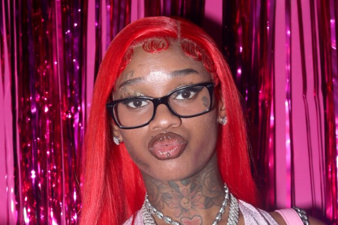
More athlete tattoo guides

Corey Taylor’s Tattoos: Sun, Moon, Lyrics and Slipknot Ink

It is easy to underestimate Corey Taylor’s tattoos if you have only seen him in a shirt. The Slipknot and Stone Sour frontman has large work on his chest, lettering across his back, patterns on his arms, symbols on his lower abdomen and smaller pieces near his neck and wrists. Looking at each area separately keeps the photos and reported stories from blending into one vague list.
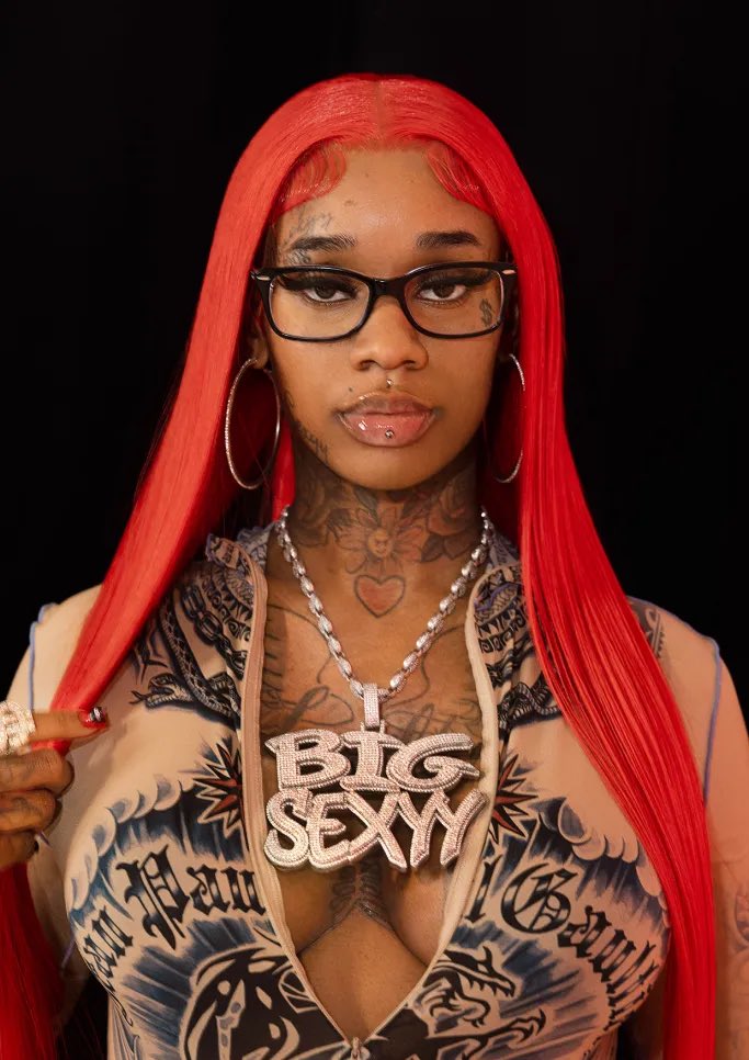
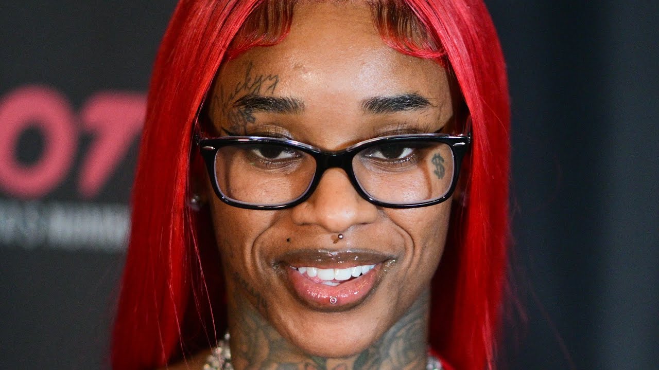
Some details come from interviews and tattoo features; others are visible in photographs. Taylor has also added and changed over many years, so an old concert photo should not be mistaken for a complete current inventory.

The sun-and-moon chest piece is the centre of the collection

Corey Taylor tattoos: tattooed arms during a live performance

Taylor’s chest draws the eye first: the main tattoo is broad and dark, far larger than a small flash design. Photos show a split sun-and-moon design across his upper torso, with the two halves meeting near the centre. It has the hard, unsettling look associated with Paul Booth’s work, but that connection should stay with this chest project rather than be extended to every tattoo Taylor has.

Older coverage sometimes called the piece unfinished, though it does not look like an abandoned outline. Black shapes, faces and colour already come together as a substantial image. Later additions and the edges make it feel like a work that developed over time. A stage photo can flatten or darken the chest compared with a studio portrait, so the image matters when describing the line work.

Taylor has spoken about the time and pain involved in large sessions, and the chest tattoo fits that account. It is not a small mark added in an afternoon. It covers enough of his torso to sit above the abdomen designs and change the look of his whole front when he performs shirtless. The sun and moon give the collection a strong visual anchor without requiring an invented meaning for every ray or shadow.

The chest piece sits among other tattoos rather than on its own. Photos show his arms around it, lettering below and small yellow faces closer to the waist. A close crop proves the central design clearly, but a wider frame is needed to show how Taylor placed different styles around it.

The back lettering, numbers and Slipknot imagery need a wider view

Corey Taylor tattoos: neck and arm tattoos during a live performance

Some of Taylor’s most distinctive lettering is on his back. Photos identify “Infant” and “Finite” around an infinity-like mark, with the red number “24601” below. The number is commonly linked to Jean Valjean’s prisoner number in Les Misérables. It is a specific reference, unlike the vague meanings sometimes attached to tattoos in unsourced lists, but visible text should still be kept separate from claims about every private reason behind it.

The upper-back work also connects with his band history. Coverage has associated the infinity symbol with Slipknot, while other photos show a panther-like image above the words and more lettering near his neck. Hair, stage lights and body angle can hide parts of the design. A view of the back, shoulders and spine is more useful here than a front-facing concert shot.

Farther down, reports and tattoo catalogues describe a dragon head, a suited figure and other black-and-grey illustrations. Those are useful visual descriptions, not confirmed personal explanations. Taylor’s interest in theatrical imagery, horror and literature is well known, but a photo cannot tell us whether each creature represents a specific part of his life.

The back also makes a single tattoo count unreliable. Older photos show fewer additions; later ones may reveal deeper shading, more lettering or a different hairstyle. A careful guide names what can be identified, gives its location and dates the photo when possible instead of implying the collection has remained fixed.

His arms carry tribal lines, symbols and working-musician scars

Corey Taylor tattoos: sun-and-moon chest tattoo and lower-abdomen lettering

Taylor’s arms are busy but do not read as matching sleeves. Photos show black tribal-style bands, illustrative figures, lettering and coloured shapes running from his shoulders toward his forearms. Microphones and short sleeves can hide sections, which is why several angles are more useful than one general portrait.

The two arms are not exact mirrors. One is more heavily filled, while the other leaves space around smaller symbols and words. Close concert photos help distinguish a broad dark area from a separate small mark. It is tempting to name every patch, but a motif should be identified only when the photo is clear enough to support it.

Tattoo inventories also list words such as “Truth” and “Dogma” on Taylor’s forearms, along with symbols linked in coverage to his family and music. These labels can help readers find the designs, but they do not amount to a biography. Photos establish that the lettering and symbols are there; they do not explain every line.

Taylor’s forearms have a practical history, too: he performs in sleeveless shirts and moves constantly on stage. Sweat, coloured lights and motion blur can make the same tattoo look different in separate images. A still portrait usually gives the clearest view; a concert photo shows how visible the designs are while he is performing.

The smiley faces, Sanskrit and smaller symbols change the tone

Corey Taylor tattoos: full torso showing the chest, arms and abdomen designs

Near Taylor’s lower abdomen are two bright smiley-face tattoos with writing between them. The yellow faces add a strange, almost cartoonish note to a collection otherwise dominated by skulls, tribal lines, dark lettering and dramatic chest work. One face has been described as pierced or marked by a projectile, giving the cheerful image a harsher edge.

The Sanskrit lettering between them is often translated in tattoo coverage as “darkness,” though translations need care. The writing is visible, but its exact wording depends on the source and whoever supplied the translation. The photo supports its shape and placement; it does not prove an English meaning on its own.

Smaller tattoos also appear on Taylor’s stomach, wrists and neck. Some are clear in a close-up; others blend into surrounding designs. Writing and symbols on his neck can disappear when he turns his head or wears a high collar. They change the overall feel, but should not be counted again every time a different angle reveals another line.

This mix gives Taylor’s collection a personal feel without imposing one style on everything. The chest leans into theatrical imagery, the back uses words and numbers, the arms mix patterns with illustrations, and the abdomen brings humour and script. The designs can be discussed individually; their variety is the point.

What can be confirmed about Corey Taylor’s tattoos?

The clearest record includes the split sun-and-moon chest piece, the back lettering and numbers, the different arm patterns, and the smiley faces with script on the lower abdomen. Other marks show in photos but have less explanation. That distinction makes the guide more useful: it can say what a picture shows and leave unconfirmed meanings open.

There is no need to turn every symbol into a secret message or claim one artist created the whole collection. Taylor’s tattoos came over time, through different sessions and visual ideas. The big pieces shape the body art; smaller words and symbols add details that stand out when a clear photo catches them.

Small designs also sit between the headline pieces. A wrist symbol may look like part of an arm pattern in a concert photo, while a close portrait separates it from the darker bands. The same goes for the neck writing and marks beside the chest and back work. They can be described without a made-up backstory: when an image is clear, note the shape, position, colour and date; when it is not, keep the wording modest.

Taylor’s collection also makes more sense as the work of a touring musician than as one perfectly planned sleeve. The tattoos arrived at different times, and photos range from stage lights to backstage mirrors, interviews and older publicity shots. That is why the article uses several views: one shows the chest, another the back, and another makes the smaller arm or abdomen work easier to see.

More musician tattoo guides