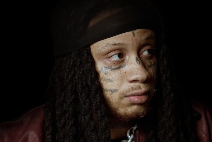
Trippie Redd’s face and neck tattoos have become a signature part of his look. The cross, numbers, LOVE SCARS lettering and 1400/800 marks sit close together, with smaller symbols filling the spaces around his eyes and cheeks. His hair and styling shift from one photo to another, so the same tattoos can appear quite different.
This guide looks at the main groups separately, using different photographs to show each view. The ink is easy to see, but its meaning is not always public. Where Trippie or a reliable source has shared context, it belongs here; when an image only shows a mark, the description sticks to its appearance and position.
The cross and numbers set the tone for his face tattoos
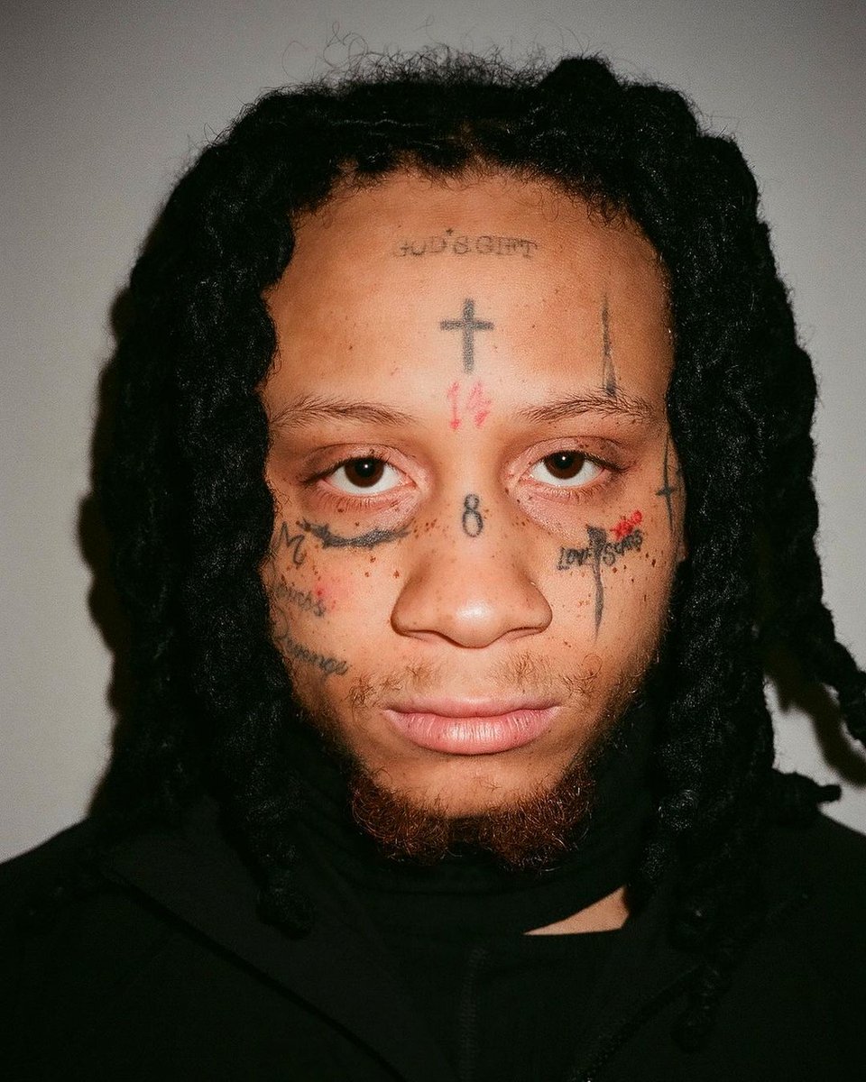
Trippie Redd’s face tattoos are hard to miss. A small cross high on his forehead anchors the group, with numbers, short marks and script around his eyes and brows. The designs sit close together, but the close-up still helps pick out their main shapes.
The red 14 is among his most familiar marks. A blue or dark 8 appears between his brows or nearer the nose, depending on the photo and when it was taken. Older and newer images do not always agree on colour or exact placement, so the date and camera angle are worth keeping in mind.
A face is a tight space for tattooing. Even a small number can change the way someone looks, which gives Trippie’s ink an immediate presence. The cross, numbers and lettering are out in the open, showing up in interviews, music videos and event photos.
A photo cannot confirm what every number means to him. There is plenty to describe in the designs themselves, so this guide avoids turning each mark into a hidden code.
The 1400 and 800 numbers continue down onto the neck
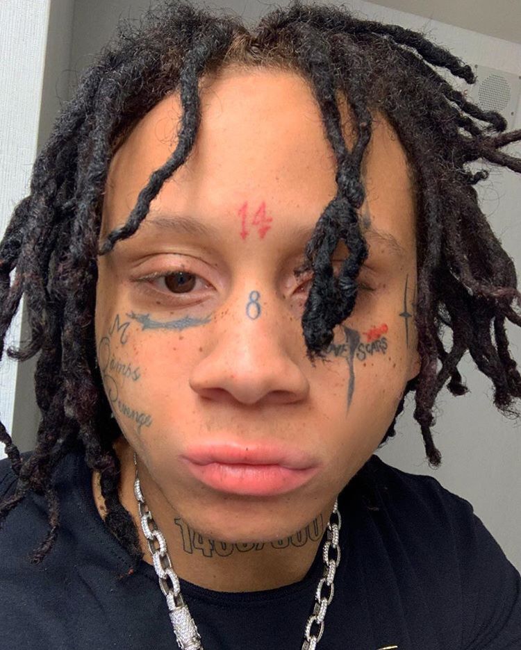
The ink continues below Trippie’s jaw. He has 1400 and 800 lettering on his neck, visible in several photos beneath the face tattoos. The numbers are closely tied to his music identity, making them feel different from a purely decorative mark.
The neck numbers stand out most in a straight-on portrait with his hair pulled back. From the side, dreadlocks can cover much of the lettering and make the tattoo group look smaller. A separate neck image gives the design room, instead of leaving it as background to a face close-up.
These numbers connect the neck tattoos to the rest of his public style. His jewellery, hair and clothes change, while the lettering stays in place as a steady visual feature. It is bold enough to read in a performance shot and close enough to the jaw to feel like part of the overall face design.
There are more marks around the neck, including script and symbols, but reliable coverage does not identify every line. It is fair to say the area is heavily tattooed without guessing at writing that is too blurred to read.
LOVE SCARS and the cheek lettering make the face read like a diary
The words LOVE SCARS sit beneath one of Trippie’s eyes in many photos and have become one of his most recognised tattoos. The phrase fits the emotional tone of his music, and it also makes a strong visual mark: short, legible letters placed where the camera catches them.
More writing and small symbols appear across his cheeks and near his eyes. Some pictures seem to show a heart-like shape, numbers or extra words, though shadows and facial hair can make them hard to distinguish. Those details can be described as visible or reported without claiming a perfect count from one image.
Because the tattoos sit so close together, they can feel more personal than a large chest design. They show up in nearly every portrait. His expression may change, but the lettering stays in place and has become part of the face fans know.
It is best to keep the phrase in perspective. It is a visible tattoo and a familiar part of his style. A photograph cannot explain every feeling or event behind it, so the description stays with the words, their placement and the connection listeners make with his music.
A different portrait shows how the same tattoos change with hair and light
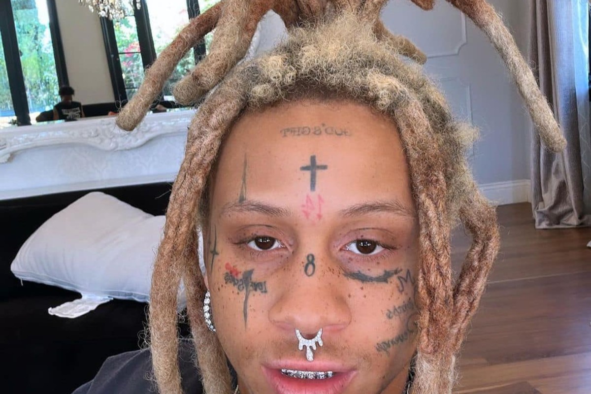
A separate indoor portrait is useful because it shows the same general tattoo groups in different conditions. His dreadlocks fall around the forehead, the light is softer and shadow covers part of the neck. The view changes, even though the tattoos themselves have not.
The cross remains visible, along with the numbers near the centre of his face. The nose and cheek designs look darker in this lighting, while the neck lettering blends into the background. It is a good reminder not to base a description on one especially clear portrait.
His hairstyle changes the view as well. Trippie has worn red, green, dark and lighter dreadlocks, which can hide the temples or the sides of his face. Hair pulled back makes placement easier to see; a more relaxed portrait shows how the tattoos look in everyday public settings.
It also helps to distinguish a genuinely different image from a duplicate. Two photos may show the same tattoos while still offering different angles. A crop or zoom of one photo is not new evidence, but another view can help clarify placement without implying a new tattoo.
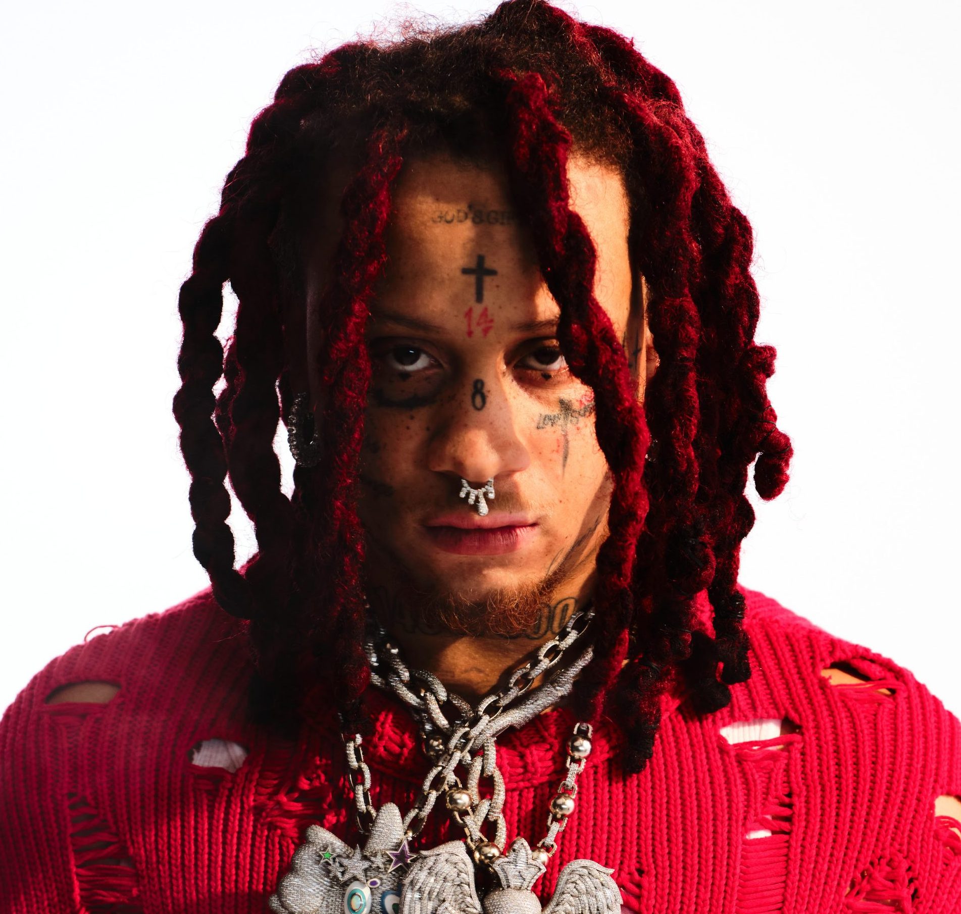
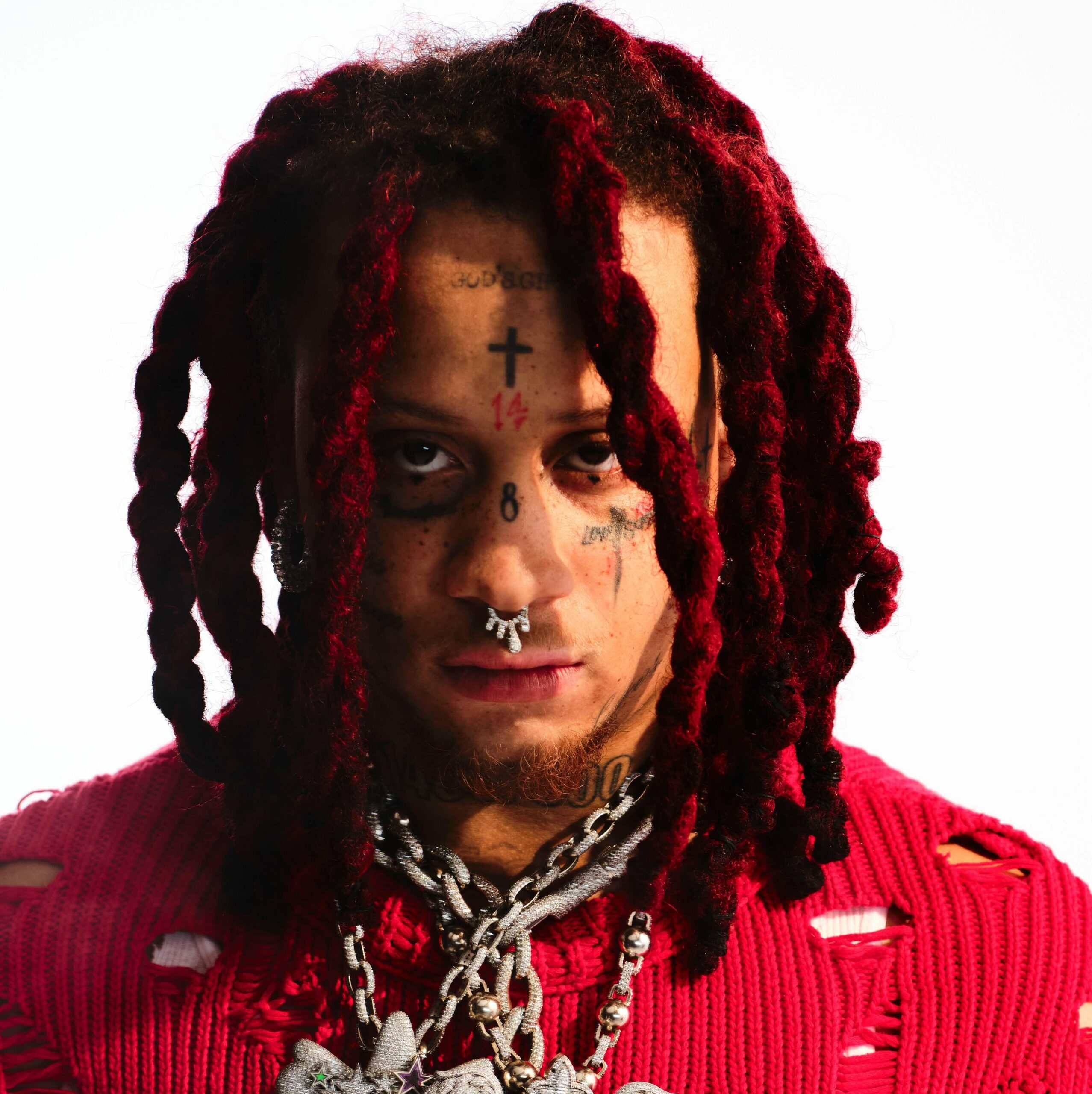
The red-dread portrait gives the clearest wide view of the tattoo layout
The large promotional portrait brings Trippie’s face and neck together in one frame. The cross, numbers, eye lettering and neck marks form a clear line, with his red dreadlocks framing either side. It gives the best overall view in the article, while the close-ups remain more useful for individual designs.
His tattoos have developed along with his career. New lettering appears, colours are refreshed and some marks become easier to spot as his styling changes. A current portrait shows the present layout; older social photos can help explain why people describe the same area differently.
The face and neck ink is part of his stage image, alongside vivid colours, heavy jewellery, red hair and emotional song titles. That larger look gives the tattoos context, while each design still has its own shape and placement.
A clear starting point is the cross, the 14, the 8, LOVE SCARS, 1400/800 and the smaller marks around them. Anything beyond those details needs a sharp image or a direct explanation before it should be stated as fact.
Smaller designs also appear around the main pieces, and some may have been added since these photos were taken. That is part of following a heavily tattooed musician. The clearest details can be named and shown with different photos, while a blurry patch by the hairline should not be called a confirmed new tattoo.
Together, the cross, numbers, LOVE SCARS and neck lettering give his face a strong visual rhythm. They make a bold impression, with enough detail to reward a closer look. Several tattoo photos help show the collection better than one generic portrait could.
The face works best when you take it in layers: the forehead catches your eye first, the cheek lettering adds its own note, and the neck carries a larger group that ties the look together. The tattoos sit at different distances from the camera, but they belong to one overall layout.
Photos from different years can make the ink look surprisingly different. Hair covers the temples, chains fall across the neck and colour grading changes how dark the lines appear. Comparing placement is more useful than counting every new angle as another tattoo; the same cross can look sharper or softer without having changed.
The script around his eyes is another reason a wide portrait is not always enough. A full-face view gives the overall layout, but a close-up can show whether a mark is a number, a word or a shadow. That detail is what turns a general celebrity profile into a useful tattoo guide.
That care also keeps the description honest. When the lettering is clear, it can be named and placed. When hair or a hard shadow blocks it, it is better to leave the detail uncertain than fill the gap with a guess. The strongest descriptions stay specific about what the photographs show.
3 thoughts on “Trippie Redd’s Tattoos: Face Ink, Love Scars and 1400/800”