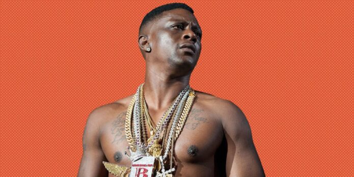
Boosie’s tattoos make the most sense when you look at the people they name. His chest is covered in script, and his arms carry portraits and more lettering. Most of the visible work is black and grey, but it doesn’t feel like a wall of unrelated designs. Names, dates and tributes keep bringing it back to family and memory.
In photos, Boosie BadAzz tattoos can look like one dense collection. Up close, the pieces are more individual: a child’s name, his father’s birth date, a friend remembered in ink. The script and shading vary, but each tattoo has room to read as its own choice.
Boosie has said he got tattoos for pain rather than decoration. Whatever the reason behind each piece, the placement keeps the ink in view: across the chest and shoulders, down both arms. Here are the designs and details that give the collection its shape.
Family names make Boosie BadAzz’s chest tattoos personal
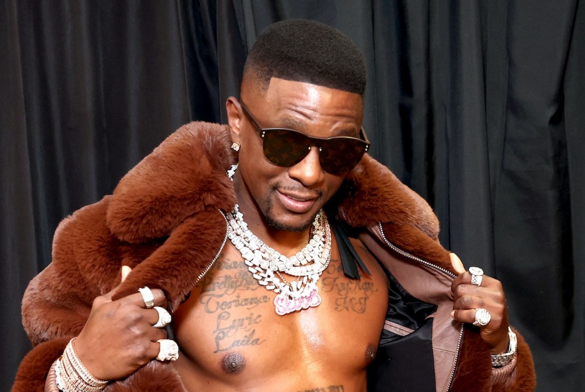
The names “Torrence,” “Lyric” and other family references run across his upper chest in broad cursive. They take up space instead of being packed into one line, which keeps the letters readable even with chains and pendants over them.
The chest changes shape as a person moves, so long script has to follow that curve. Boosie’s lettering spreads across the pectorals rather than sitting like a straight label. From the front, the words read as one wide piece.
The family names are the main subject, so the design can stay simple. The placement does some of the work: the words sit where they’re visible when he wears an open shirt, while still disappearing under clothing.
Planning a similar tattoo? Decide which names matter most before adding dates or decoration. Leave some breathing room around the letters; you can always connect the pieces later. It is harder to bring clarity back after small filler has taken over the open skin.
His arm tattoos carry names, dates and memories
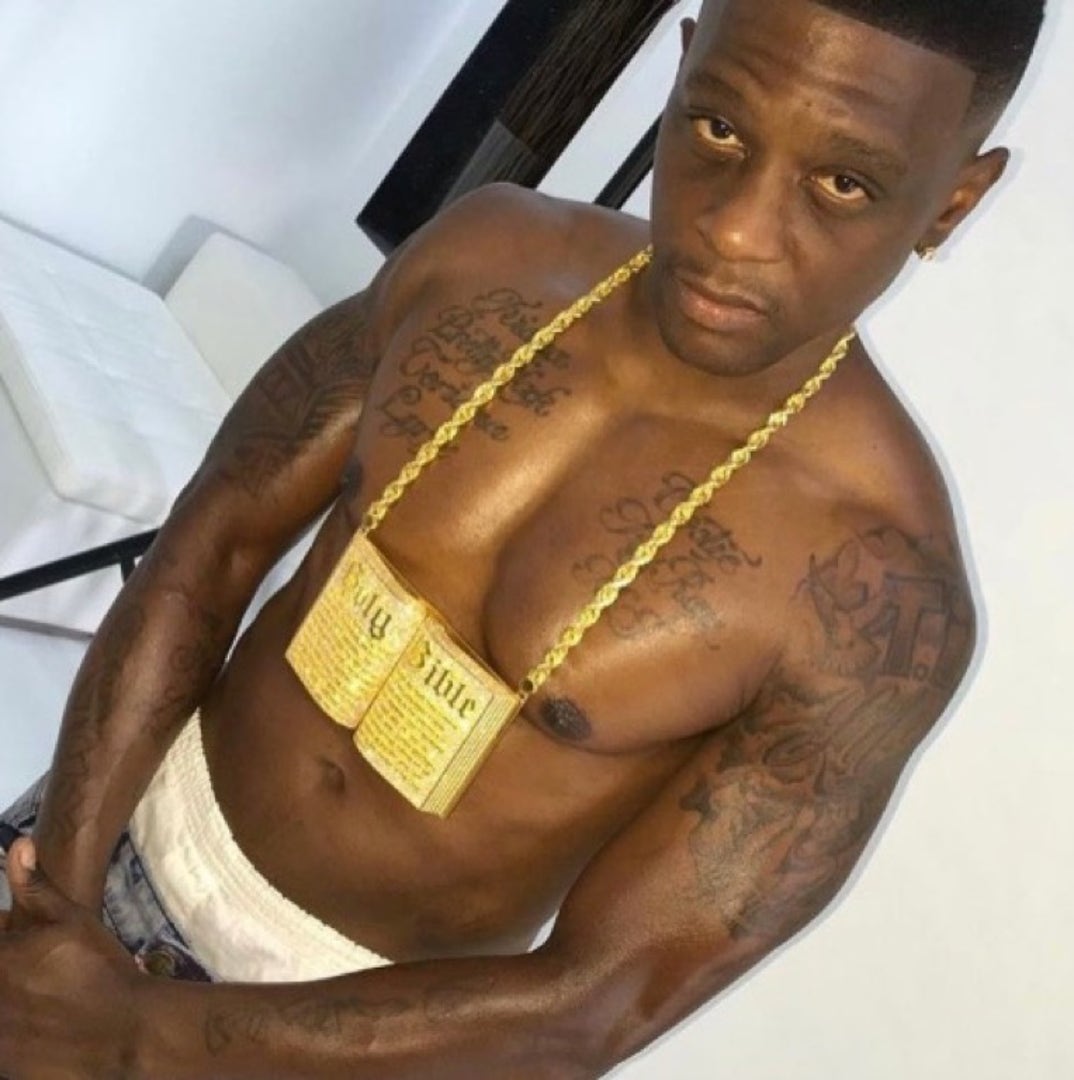
Several arm tattoos extend the family story. Accounts of Boosie’s ink mention his father’s name and birth date on a bicep, as well as tributes to friends who have died. The photos show script among darker work, with the names sharing the arm rather than sitting alone.
Over time, that mix can feel like a timeline: each name or date marks one relationship, and the nearby pieces show how the collection grew. The lines needn’t be mirror images on both arms. The uneven spacing can suit tattoos added at different points in life.
Dates narrow a tribute to a particular person and moment, but they need to stay legible. Too-small numerals can disappear into heavy shading. For a memorial tattoo, clear lettering matters as much as the feeling behind it.
Placement helps too. A bicep has a rounded surface for a name and date; a forearm gives a phrase more length. Hands and wrists are more exposed and usually suit shorter marks. Thinking about the space first can prevent the words from feeling squeezed in.
The Bossman lettering gives the torso a bold center
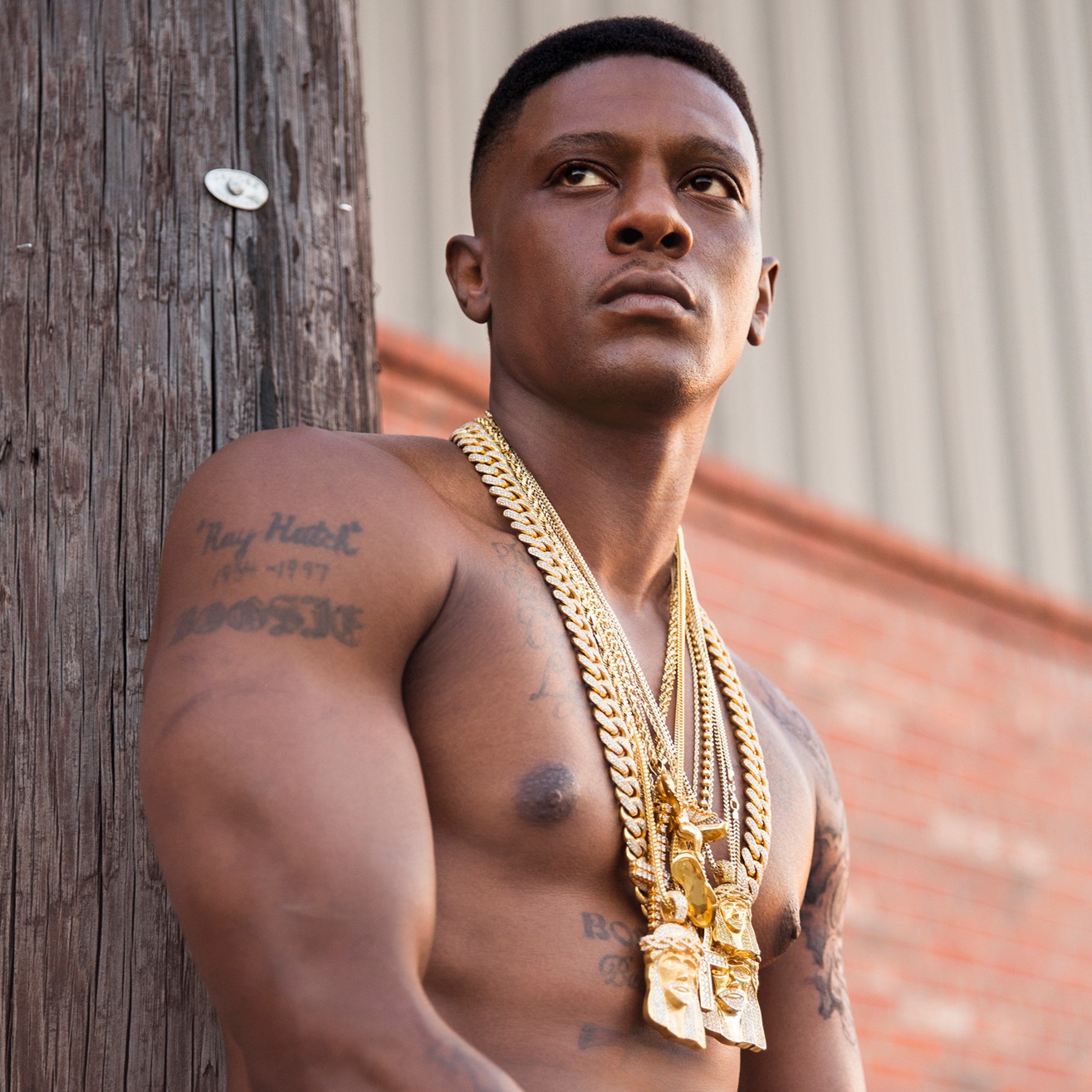
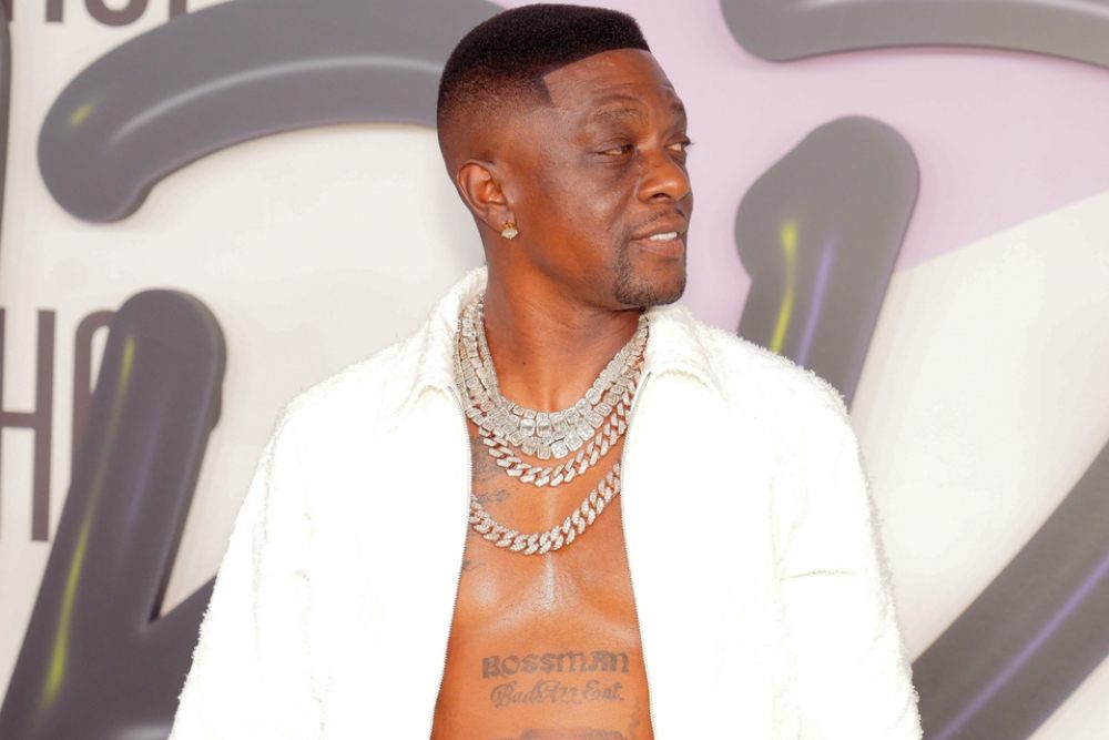
The bold “BOSSMAN BadAzz Ent.” lettering across Boosie’s lower chest gives the torso a different visual weight. It reads as both a nickname and part of his music identity. Its blocky letters sit beneath the flowing family script.
The two treatments work side by side because they don’t compete for the same job. The cursive carries names; the darker, heavier line announces the title. Different lettering styles can separate ideas on one area when their scale and spacing are planned together.
A stage name is a bigger commitment than a small symbol. Your work and public image can change, so it’s worth asking whether the word will still feel right years later. “Bossman” has been part of Boosie’s public identity for a long time, which gives the choice context beyond a passing design trend.
Before committing to a large nickname, try the stencil in a few positions: high on the chest, across the stomach or closer to the ribs. Look at it standing normally, not only while flexing. A broad phrase should feel balanced in an ordinary posture.
The sleeve work mixes scripts, symbols and heavy shading
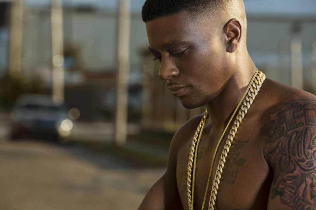
His sleeves combine script, shaded shapes and heavier blackwork. In photos where his arms and chest are uncovered, the darker patches sit among open areas of skin. The mix reads as layers of tattoos rather than one solid block.
Some pieces appear to have been added at different times. Repeated dark outlines and similar shading help them sit together even when the subjects differ. A sleeve can look coherent without every image following the same theme.
A full arm doesn’t have to be designed in one sitting. You can begin with a name, portrait or symbol, then decide what belongs around it. Keep the main designs clear before adding filler; small marks should help the larger images read.
For a similar mix, decide how much space lettering needs beside portraits or religious imagery. A page of names and one large picture don’t need the same background treatment. Boosie’s arm shows that the styles can share a space, but the transitions still need room.
Boosie’s first tattoo story explains why the collection feels so personal
Boosie has said his first tattoo came at 13 and was a tribute to his father, using his father’s name and birth date. That early choice gives a starting point for the rest of the collection: family keeps returning, even as the lettering and imagery change.
The chest names, arm tributes and Bossman tattoo look different, but all connect to people, memories or identity. That through line keeps the collection from feeling like ink added only to fill skin.
The size of a design can follow how much space it needs. A name may stretch across the chest; a memorial portrait might take a full section of the arm. A personal tattoo doesn’t have to be subtle. It does need enough room for the lines to stay clear.
If you’re choosing a tattoo for someone, start with what you want to remember, then think about the image and location. A name may work beside a date, while a portrait needs more room than a small stencil suggests. Boosie’s story is one example of a collection that looks bold but stays tied to real people.
Family and memory run through Boosie’s tattoos. Names across the chest and tributes on the arms sit beside the Bossman lettering, with dark shading giving the varied pieces a visual link.
You don’t have to copy the words or symbols. Choose something you actually want to keep with you, give it space, and let additions support it. A tattoo can be visually loud and still carry a personal meaning.
Boosie discusses the pain and personal meaning behind his tattoos in the video below.