Musicians

Tattoo guides for singers, rappers, DJs and musicians, with photographs, documented meanings and the stories behind their designs.

Marilyn Manson Tattoos: Dark Arm Ink, Symbols and Stage Photos

Marilyn Manson’s makeup, costumes and stage lights can dominate a photo. Look past them and there is a lot of permanent ink, especially on his arms. Color, heavy black outlines, skull-like images, lettering and smaller marks run from the upper arms toward the hands. Older shirtless performance photos also show tattoos across the chest and torso.

Photos can show where a symbol sits, but they do not automatically explain why Manson got it or who tattooed it. His public image uses theatrical symbols, and some designs look loaded with meaning. Unless an interview or reliable caption confirms a story, it is safer to describe what the image shows and leave the rest open.

This guide focuses on details visible in portraits and live photos. Some marks are clear; others are hard to identify through costume, shadows and movement. A plain description is more useful than giving an uncertain shape a made-up name.

The colorful arm tattoos carry the strongest visual identity
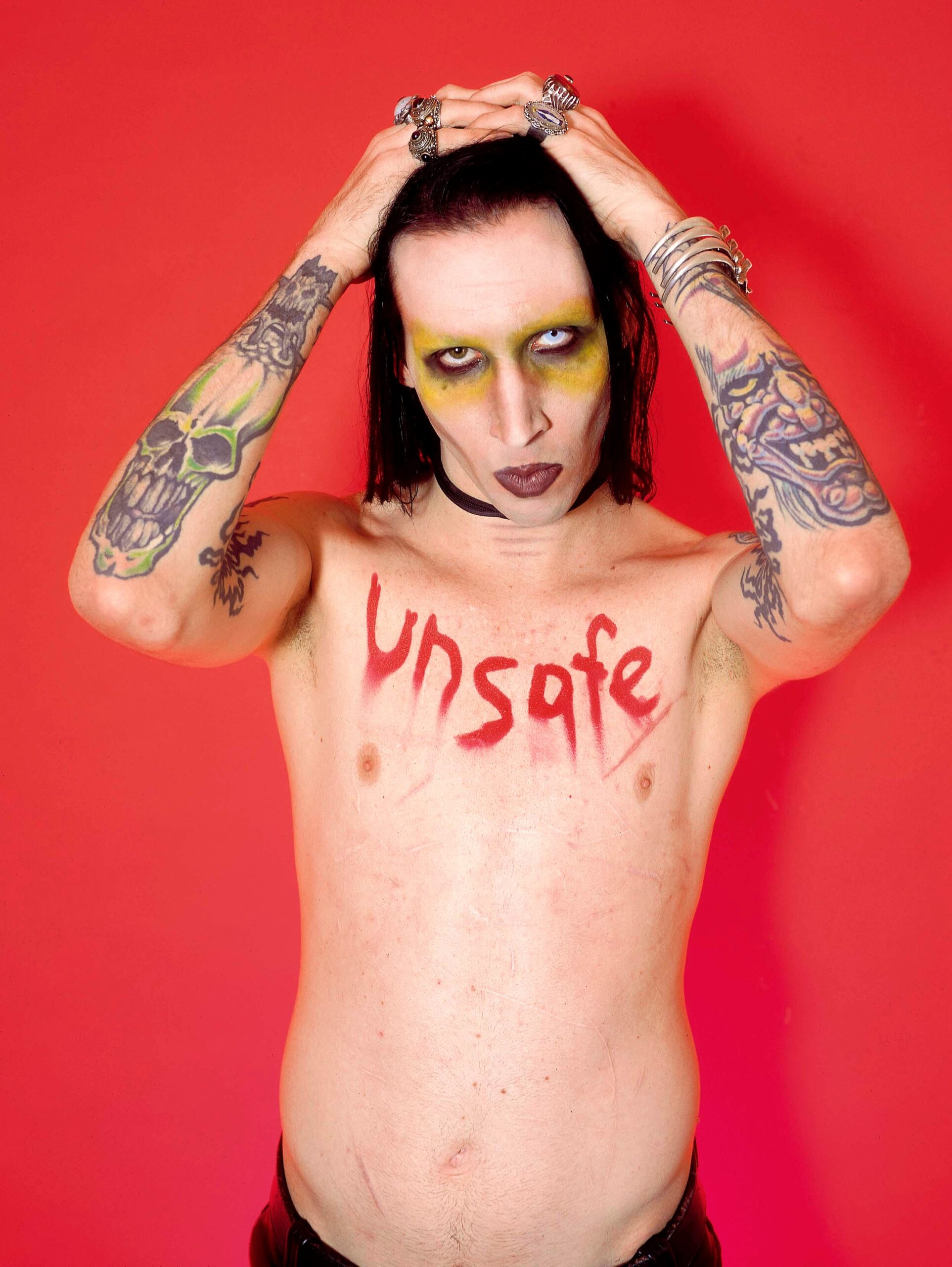
Marilyn Manson tattoos: high-resolution portrait showing the colorful arm tattoos, chest lettering and clear face detail

The arms are the clearest place to start. In this portrait, the ink stands out against the red background and pale makeup. Saturated color sits beside dark outlines and smaller marks. The pieces run from shoulder to forearm, but no single theme seems to explain all of them.

The tattoos are dense rather than delicate. Some parts disappear in shadow or beneath a costume, while the larger designs hold their shape as the arm bends. A turned torso also changes how broad the ink looks compared with a straight-on headshot.

It is tempting to give each shape a story, especially with Manson’s theatrical styling. Visually, the collection is built on contrast: bright patches next to black shading, with smaller marks in between. This close portrait shows more of the arm than a stage outfit often does.

The red demon and skull imagery make the arms feel like a gallery
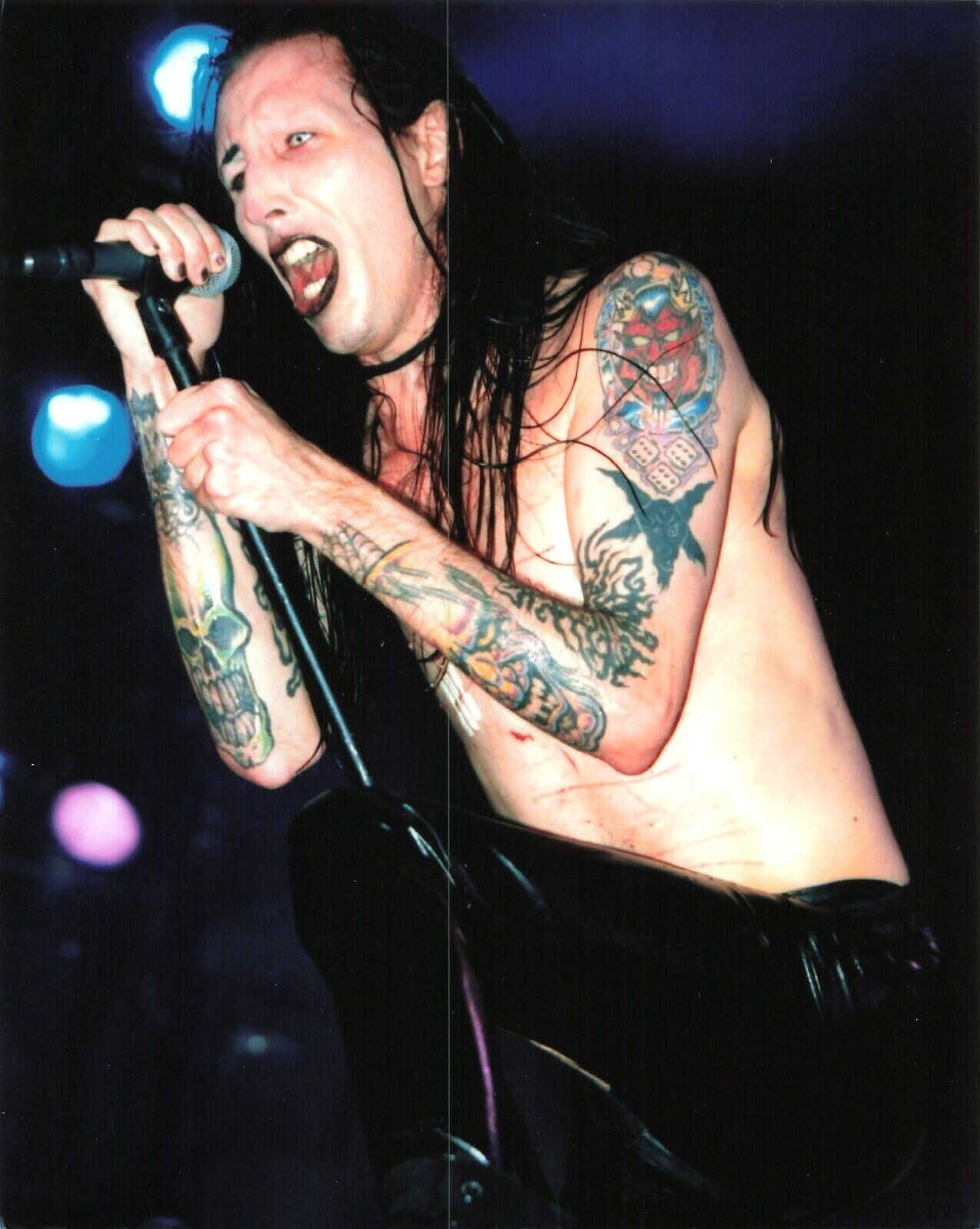
Marilyn Manson tattoos: large shirtless stage photograph where skull, dice and dark arm tattoos are visible together

A shirtless live photo shows more of the imagery than a tight portrait. Skull shapes, dice-like forms and dark creature designs appear on the upper arms, with other pieces around them. The red and black palette is clear, though the photo does not show every line sharply enough to name each tattoo.

The imagery sits comfortably beside Manson’s long-running interest in horror, religious theatre and outsider art. That does not confirm the meaning of each piece. A skull might be a personal reference or simply an image he liked. The photo confirms that skull imagery is there; the story behind it may not be public.

Larger pictures sit higher on the arms, with smaller marks below and areas of skin still visible between them. The gaps keep the coverage from becoming one flat block. When his arms hang down, shadows can merge the images; when he raises a microphone or reaches toward the crowd, the pieces separate more clearly.

If you are studying the layout, notice how the limited tones connect the designs while each keeps its own outline. The same approach could work with different imagery and still give an arm the feeling of being built in chapters.

Live photos show how Marilyn Manson’s tattoos move onstage
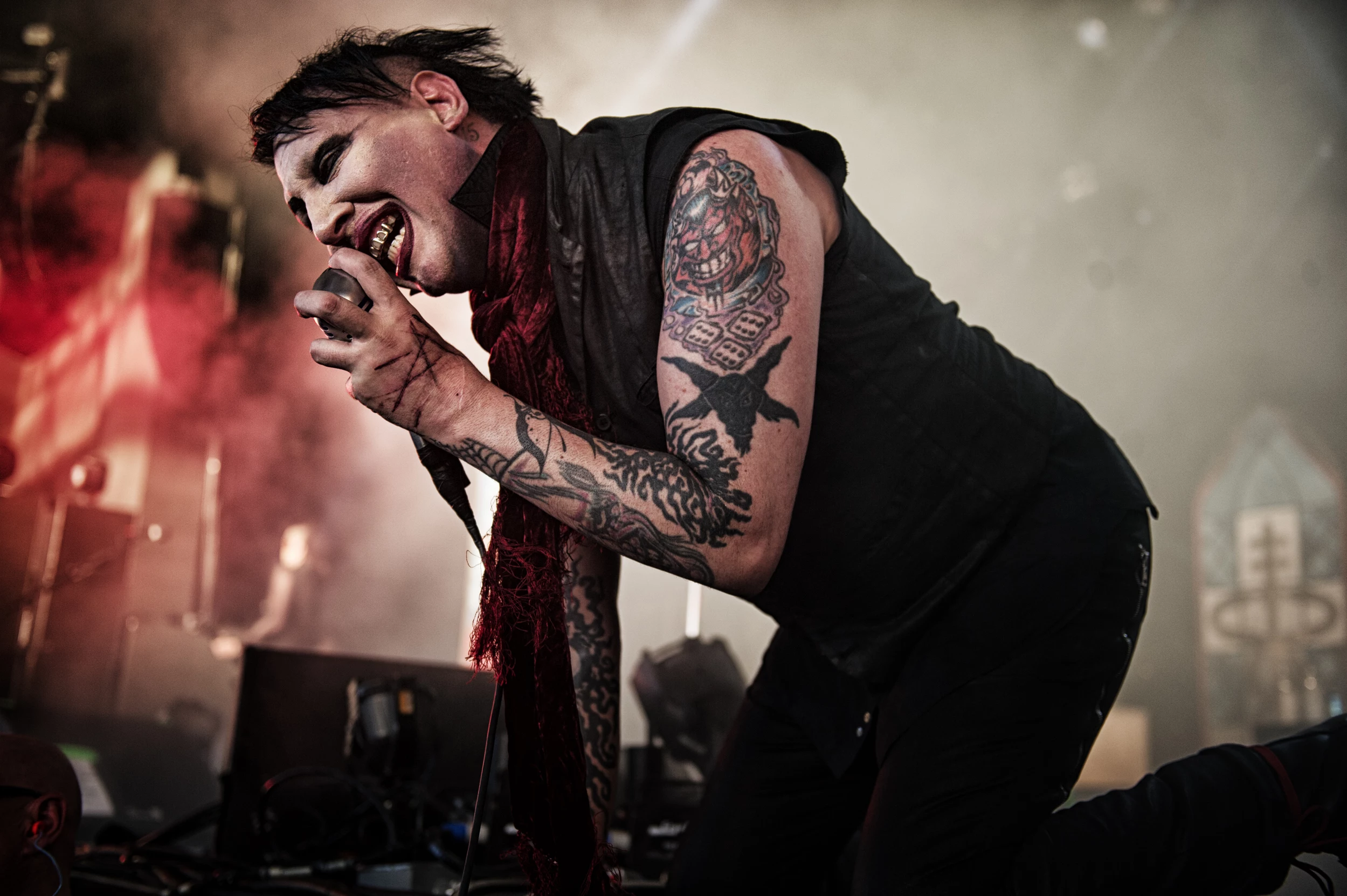
Marilyn Manson tattoos: wide live photograph with the tattooed forearms and upper-arm color visible beside the microphone

Stage photos are imperfect records, but they show how the tattoos look while Manson moves. In this image, the forearms catch the light before fading into red smoke. One hand covers part of an arm around the microphone; the other side has enough light for the dark outlines to stand apart.

At rest, an arm tattoo can look like a still illustration. Onstage, it bends and stretches with the elbow, breaking into fragments as he moves. Manson’s close-to-the-mic poses make the shifts more noticeable, with a raised shoulder and angled wrists. The ink becomes part of the shape of the performance.

A blurry screenshot can make ink, costume seams and makeup look alike. These higher-resolution photos give more detail, but they still do not show every design clearly. It is fair to say the image shows tattooed arms; it is not enough to identify every mark.

The same general areas of color and black work appear across different photographs, even as the styling changes. Makeup and costume can change from show to show; the arm tattoos stay visible in the frame.

Hand and wrist symbols bring the collection closer to the face
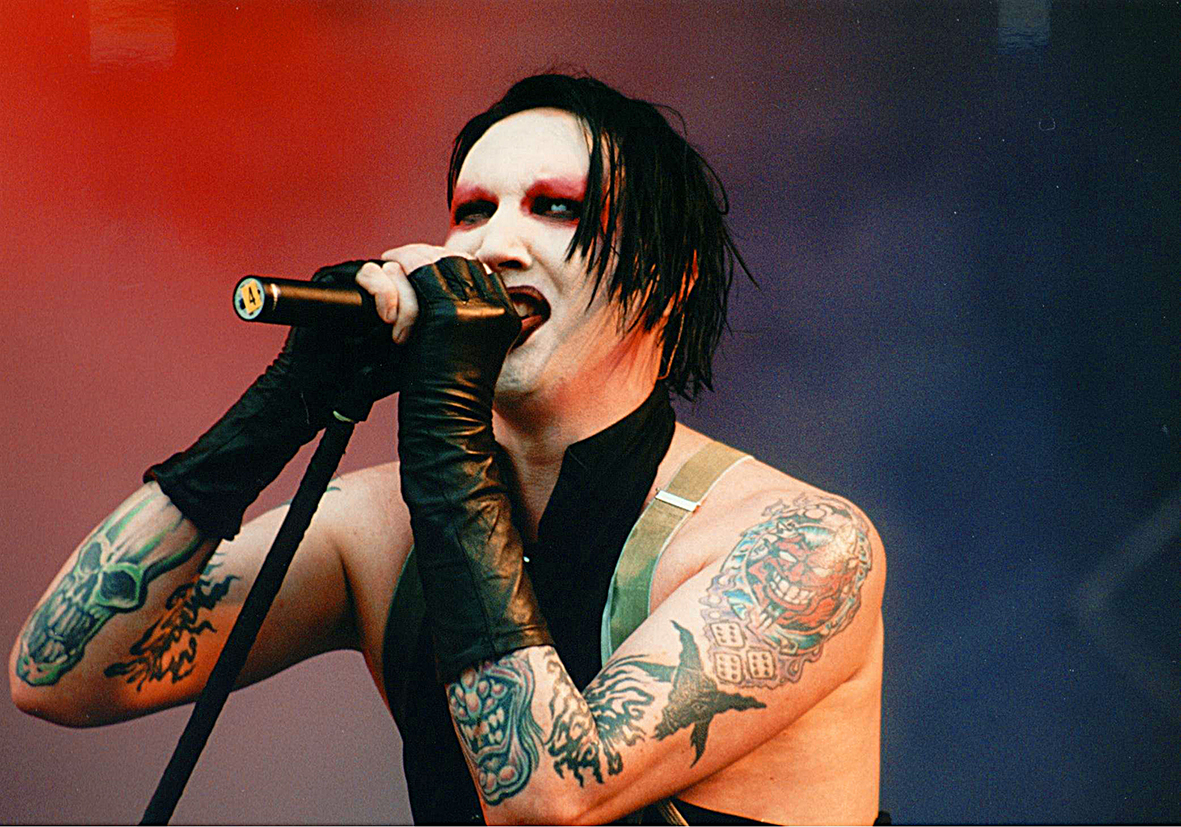
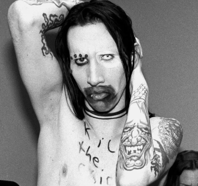
Marilyn Manson tattoos

The smaller marks on his hands and wrists show up when Manson grips a microphone, raises a hand or brings his fingers near his face. That makes them visible in ordinary photos as well as onstage. A chest design may disappear under a shirt; a wrist mark can remain in view.

In a close black-and-white portrait, the eye moves between the face, makeup, hand and symbols lower on the body. Heavy eyeliner, painted skin and hard studio shadows can blur the boundary between styling and ink. Even in a high-resolution image, not every mark has a confirmed name.

Hand and wrist placement is exposed and constantly moving. The skin bends, is washed and appears at odd angles in photographs. Manson’s small pieces work with that visibility rather than being hidden in a pose made only for a tattoo reveal.

If you are considering hand ink, focus on how a small design looks when the wrist bends and in everyday photos. The placement will be seen often, so a clear silhouette matters more than a dramatic setting.

The chest and back pieces stay harder to read
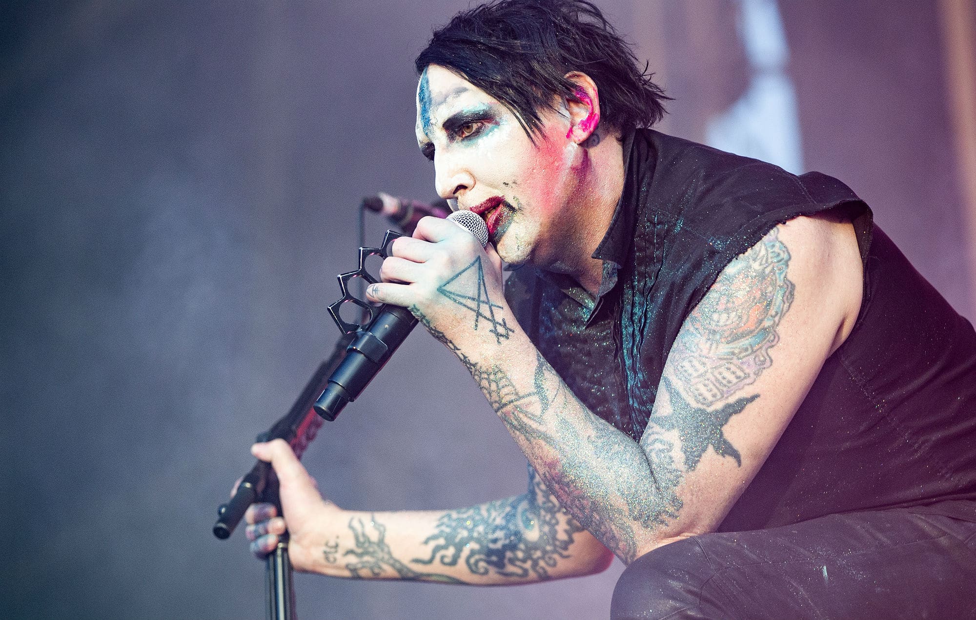
Marilyn Manson tattoos: high-resolution concert photograph showing both tattooed arms and the darker torso pieces

The torso is harder to document than the arms. Older shirtless concert photos show ink on the chest, shoulders and back, but the camera is often far away and the lighting theatrical. A tattoo can be visible without being readable. This live photo confirms body coverage, but not an exact name for every dark shape.

Posture changes the view too. When Manson leans forward, folds in the skin compress the design; when he turns, one shoulder can hide the other. Paint, sweat and colored light further soften the edges. The torso is best described broadly as dark ink, lettering and larger pieces that connect with the arms.

Large areas leave room to build scale, but a stage photo is not a technical reference sheet. Neutral light would show the final lines more clearly. The performance images are compelling for their atmosphere, but they cannot support every detail a viewer might want to identify.

The contrast between the arms and torso is partly about the available photos. Close portraits and repeated stage shots keep the arm designs familiar; the chest and back are usually distant, shadowed or caught in motion. That does not tell us which tattoos matter most to him.

Manson’s tattoos are easier to understand as visible choices than as a puzzle where every gap needs filling in. The arms provide the clearest evidence, the hand and wrist marks appear in everyday gestures, and the torso adds more ink even when the photos cannot resolve it.

The photographs confirm the tattoos; they do not explain every personal meaning. For more artist ink stories, browse the musician tattoo guides.
More musician tattoo guides

Davey Havok Tattoos: Blackout Sleeves, Chest Ink and Dark Design Ideas

Davey Havok’s tattoos have changed over time. Older photos show illustrative sleeves with dark characters and horror imagery; newer portraits show broad blackout sections, geometric bands and narrow gaps of open skin. His chest has an anatomical heart, and a large wing design covers his back.

The photos show the shift more clearly than generic AFI portraits, where his arms are often hidden. Compare how the older sleeve work and later blackout look across different angles. The amount of black, the open skin and the shapes that remain visible all change when he moves onstage.

The Davey Havok blackout look starts with strong shapes

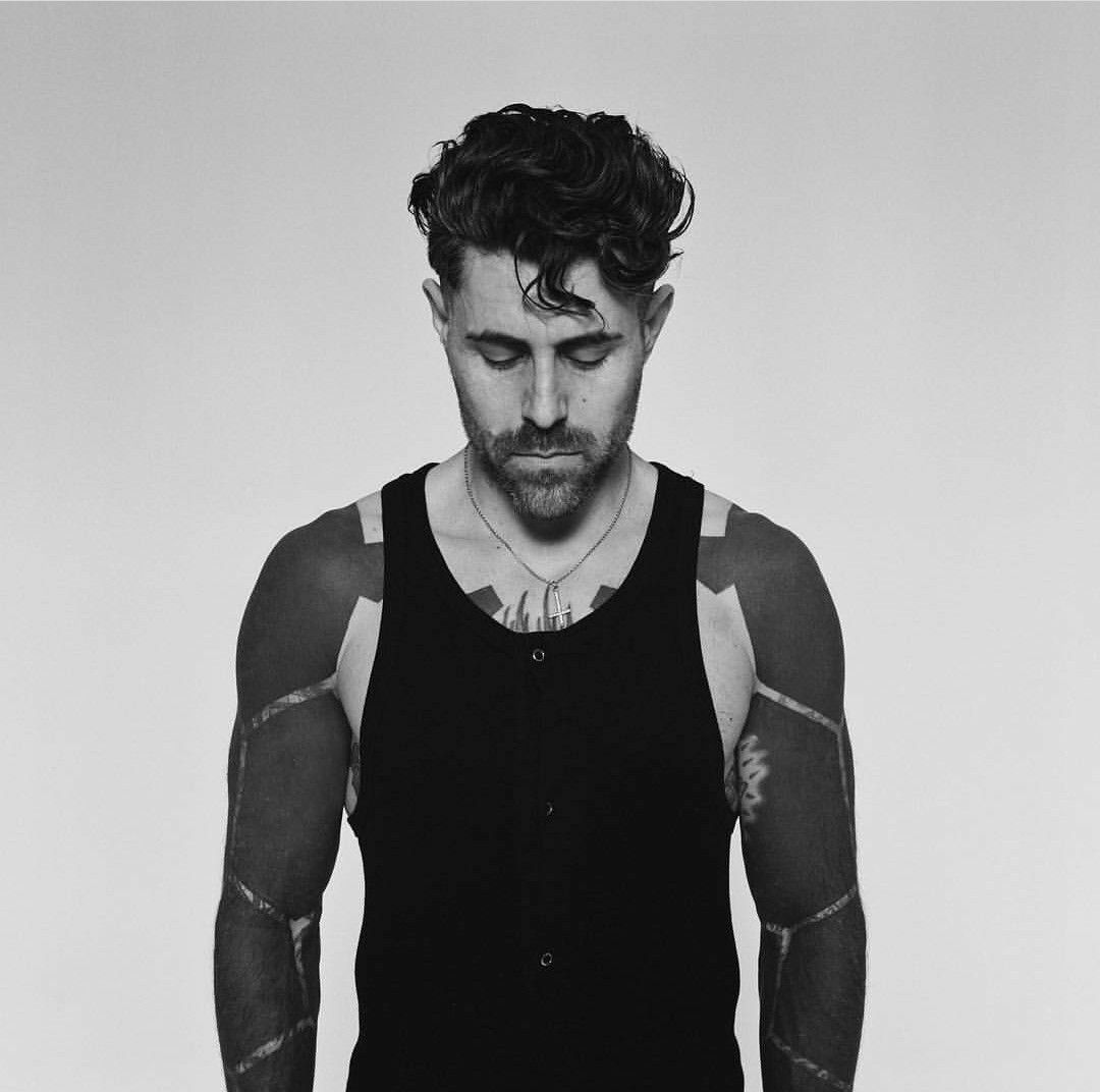
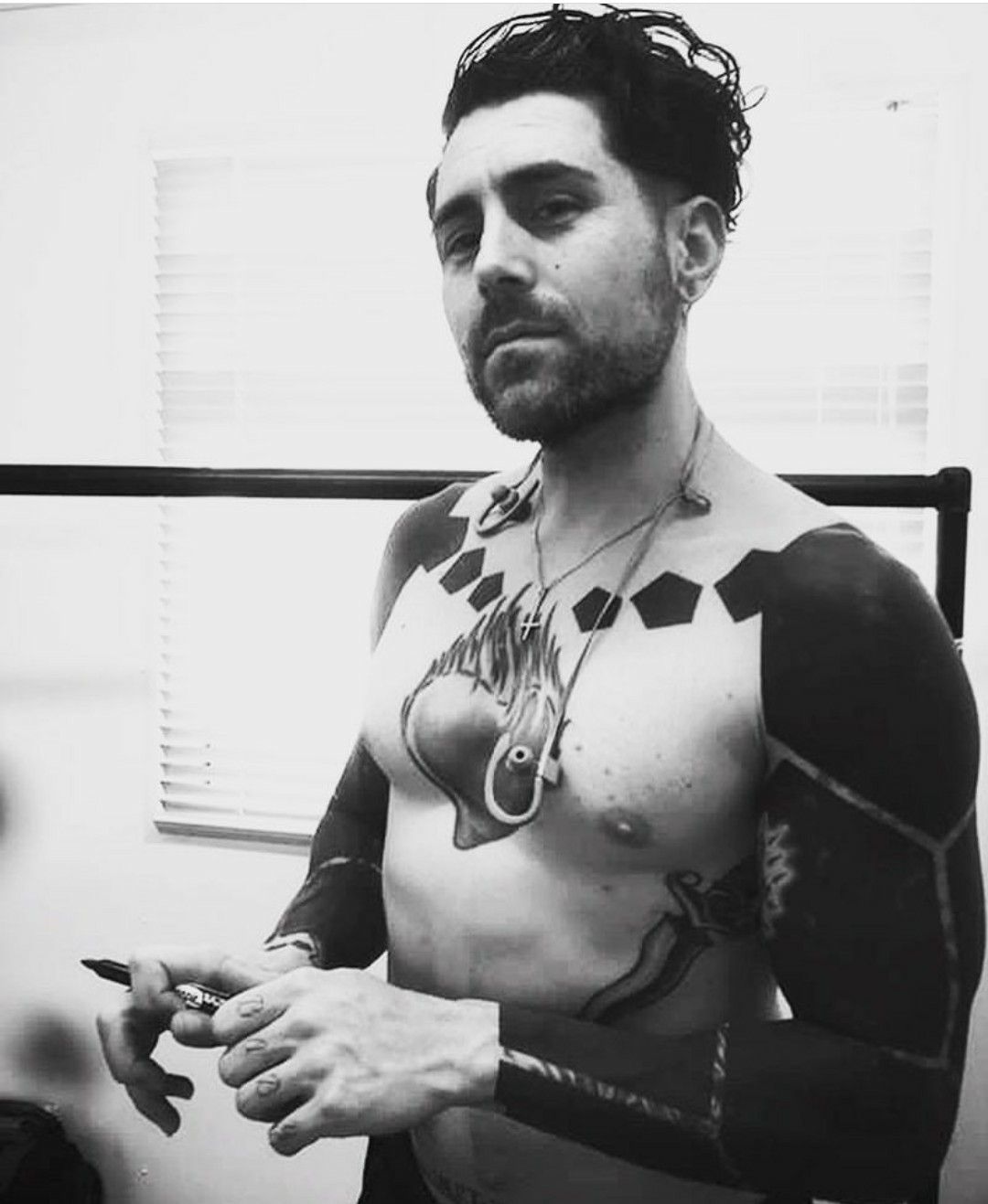
Davey Havok tattoos: shirtless black-and-white portrait showing the anatomical heart chest tattoo and bold dark arm coverage

The first photo puts the chest and arms in view. An anatomical heart gives the chest a clear center, while the dark coverage on both arms frames it. The two areas do different jobs, so the image does not collapse into one flat block of black.

Big shapes remain visible in a performance photo, even when the singer is moving or holding a microphone. Havok’s earlier sleeves used distinct subjects and plenty of texture; the overall outline stayed clear when smaller details were hard to make out.

The heart tattoo also shows why contrast matters. A detailed center needs some room, even when the surrounding arms are dense. Lighter lines and open skin let the eye settle on the chest before it moves to the sleeves.

If you are planning a large design, decide what the main subject is first. Then look at how the arm work can frame it. Useful reference photos show how the design is divided across the body, not only the individual images.

The sleeves use blackout ink and controlled negative space

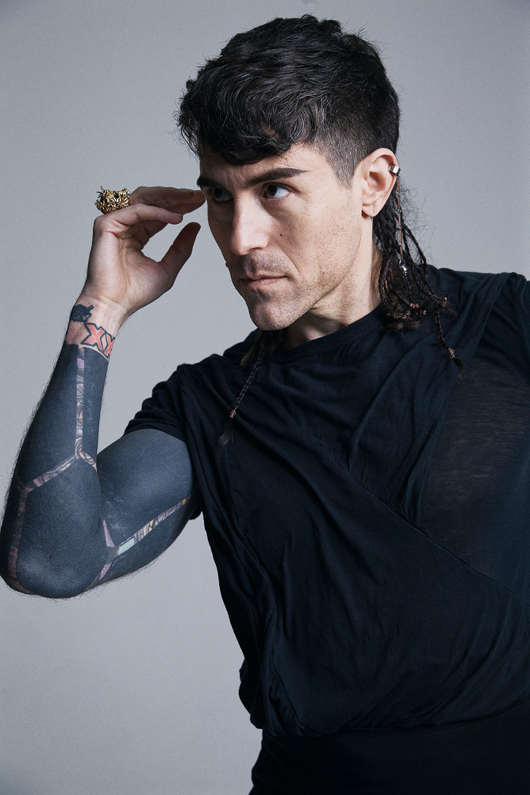
Davey Havok tattoos: studio portrait with both blacked-out arms visible and the shoulder-to-wrist coverage easy to study

This studio portrait makes the blackout sections easier to see. Large areas are filled with black, but narrow bands, cracks and open skin interrupt the dark surface. Those breaks make a pattern without taking away the heavy feel.

Blackout is a major commitment. It changes the whole surface of an arm. It can cover older tattoos, but the new design has to work on its own too. Havok’s sleeves show that blackout does not have to be featureless; lines of open skin can read like drawing against the dark fill.

The bands wrap around the arm, so their angle changes when it turns. A line that looks horizontal from the front may curve around the biceps. That is why a sleeve needs to be considered from several angles before it is tattooed.

If full blackout is too much, the same contrast can be used in a smaller area: a dark field behind a portrait, a black panel around a flower or a few geometric shapes. The black should have a clear purpose rather than fill space at random.

The blacked-out sleeves changed the mood of the collection

Davey Havok tattoos: modern face-visible portrait showing the current blackout sleeve texture and geometric arm bands

The newer portrait shows how blackout changed the feel of Havok’s collection. The older designs remain part of its history, while the solid black gives his arms a more graphic outline. From a distance the tattoos look simpler; close up, the bands and gaps add detail.

A cover-up does not have to hide every trace of what came before. Open lines can leave some of an older shape visible while giving the new surface a deliberate pattern. That may be useful if an old tattoo no longer works for you but you do not want to erase all of its outline.

Clothes and background also change how the sleeves read. A black top can blend with the ink; a pale background makes the arms stand out. It helps to compare references in both dark and light settings before deciding on a large black piece.

The shoulder contour matters as well. Solid black can make an arm look square if the design does not follow the shoulder. Havok’s bands and open cracks soften the edge and help the sleeve follow the body.

The live photographs show how the ink moves with the performance

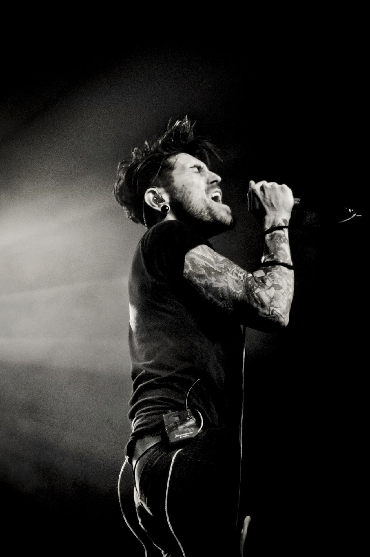
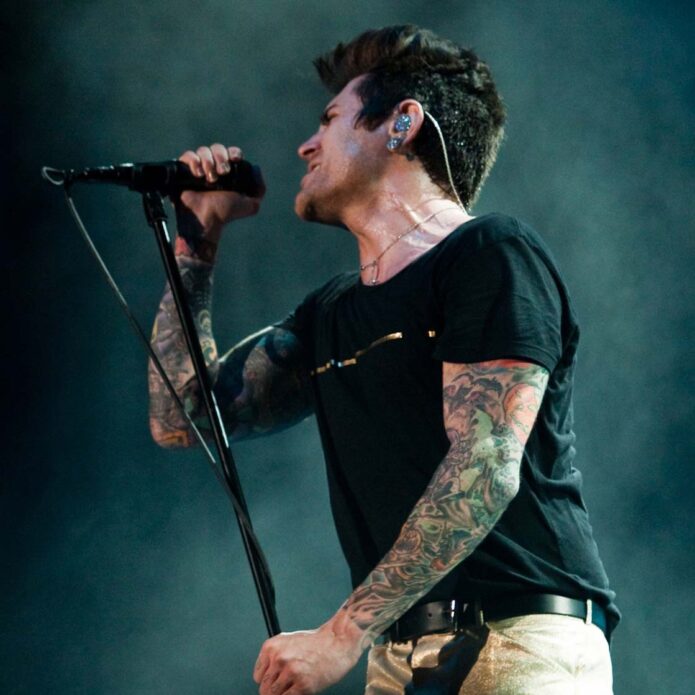
Davey Havok tattoos: high-resolution AFI performance image showing the arm tattoos while Davey sings on stage

Live photos show what studio portraits cannot: Havok singing, leaning and raising his arms while holding a microphone. The ink bends over the elbow, and the wrist comes in and out of view as his hands move.

That matters with any sleeve. Arms turn, bend and reach. A design that looks balanced with the palm down may feel crowded when the hand turns up. Check how the main lines sit around the elbow and wrist, especially if the design uses bands that need to stay even.

Stage light can wash out color or flatten dark work. Havok’s tattoos still read because the outlines and shifts in value are strong. A design that relies only on fine detail may be harder to see in a moving photo.

For a smaller tattoo, the same idea can be applied to one feature: a curved line around the forearm, a dark shape that follows the triceps or a symbol near the wrist. Placement can connect a design to the body without adding more images.

What Davey Havok tattoos can teach a design brief

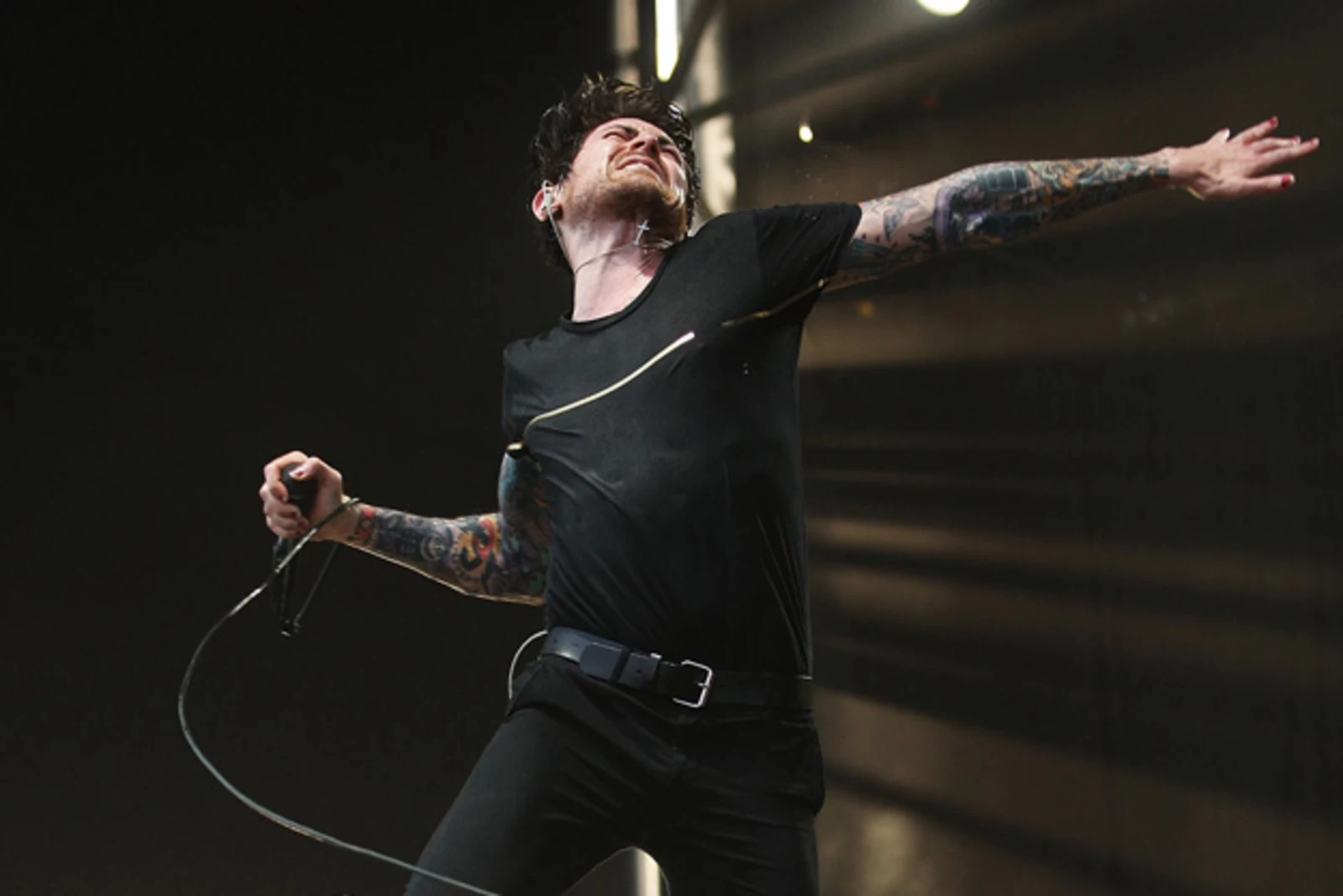
Davey Havok tattoos: large live performance photograph showing both tattooed arms and wrist details in motion

This performance photo shows how the main arm shapes hold up while Havok reaches, sings and turns away from the camera. Smaller details come and go, but the overall coverage remains clear. That is a useful test for a design brief: will the tattoo still read when the body is moving?

If you prefer the older sleeves, describe the subjects and mood rather than asking for an exact copy: horror imagery, an anatomical center, dark illustrative lines and a few lighter areas. For the blackout look, talk about solid fill, controlled open skin and how the outer edge should follow your shoulder and elbow.

Think about the overall effect. Colorful sleeves can feel busy or theatrical; blackout is more severe and graphic. Neither is automatically better. Decide whether you want the tattoo to be the first thing people see or a dark frame around another subject.

Cover-ups need an in-person plan. Very dark ink cannot be hidden by placing a thin line over it, and old colors affect what an artist can do. An experienced tattooer can assess the existing work and explain what is realistic.

For more musician references, compare the blackout approach here with the colorful sleeves in our Nikki Sixx tattoos guide and the heavier arm coverage in our M. Shadows tattoos guide. The useful part is how black, open skin, repeated shapes and movement can make a large collection feel connected.

After watching the AFI performance below, look at the photos from more than one angle. Choose the placement and contrast you want, then leave room for the artist to draw around your body. A good brief gives direction without asking the artist to copy someone else’s proportions.

One view can make a sleeve look solid; another may show open skin, bands or older imagery underneath. Bring several references, explain what you want to keep or change, and ask how the design may age as the black settles into the skin. Good planning leaves room for a better drawing.

Lilith Czar Tattoos: Script, Symbols and Arm Ink

Lilith Czar, who used the name Juliet Simms earlier in her career, has visible tattoos across her arms, wrists and hands. In portraits and stage photos, script, symbols and shaded designs sit beside one another. The collection looks like it grew over time, rather than being planned as one matching sleeve.

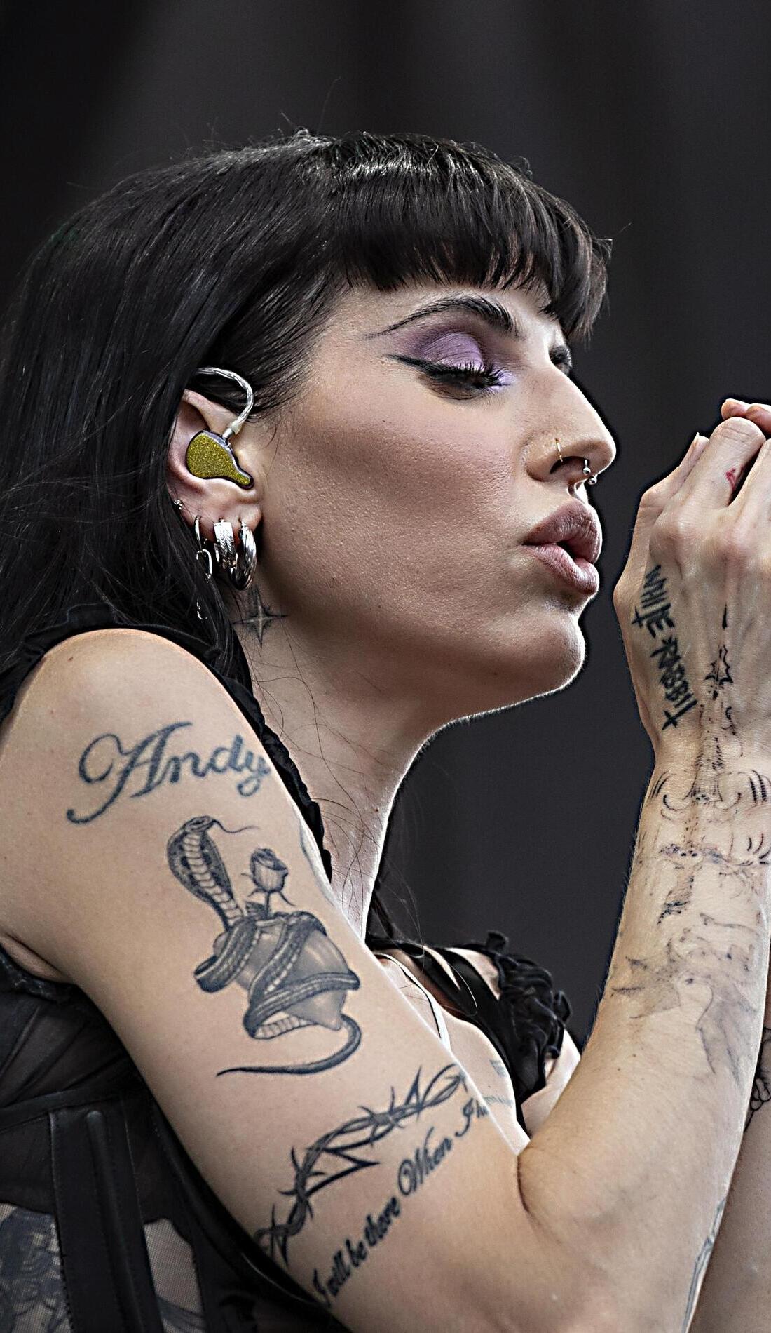
Older coverage under the Juliet Simms name records pieces such as the Andy lettering and a snake cover-up. Newer Lilith Czar portraits show that ink as part of her current image. Those sources help with the history, but a photo can only show the design and where it sits. When a meaning hasn’t been confirmed, it’s better to leave it open.

The five images below show her arms and hands in posed portraits and onstage. The lighting and poses make some marks easier to see than others.

The arm tattoos read as a collection of separate chapters

Lilith Czar tattoos: high-resolution portrait showing both tattooed arms, including script, shaded images and hand ink

The Pretty Cult portrait shows both arms at once. There is script, shaded artwork and small symbols, but the pieces don’t form one perfectly matched sleeve. The scale changes from upper arm to forearm and hand, and some details soften in the light.

Czar has talked about tattoos as part of her change from Juliet Simms into Lilith Czar. Inked Magazine also described the collection in that context. The photos support a connection between her body art and the new persona; they don’t show that every tattoo was planned around one theme or added at the same time.

Black lines sit beside areas of open skin, so the separate pieces remain visible instead of blending into a solid block. The lettering is easier to follow because there is space around it, even in a smaller image.

Hand and wrist tattoos keep the smallest marks in view

Lilith Czar tattoos: high-resolution color portrait with visible tattoos across the hands, wrists and forearms

Her hands appear beside her face, at her waist and across her arms, so the smaller tattoos often show up in close portraits. The Pretty Cult photo gives a clear look at lettering and fine marks from the fingers through the wrist and toward the forearm.

Jewelry and nail art can be hard to separate from tattoos in a posed image. Here the sharp focus helps, though the photo still can’t tell us why she chose a particular design. Sometimes the soundest description is just its placement: script on the hand, small marks near the fingers, or lines across the wrist.

Hand ink gets a lot of wear from washing, movement and friction. Czar’s visible pieces have enough contrast to show up when her fingers are spread or held against her face. Their placement gives the collection a rougher edge than a mark hidden under a sleeve.

The close photos also show why scale matters on the hand. A small design needs a clear outline, and its placement should still work when the fingers bend.

Stage photography shows how the ink moves with the performance

Lilith Czar tattoos: close stage portrait showing the Andy lettering, snake-like arm work and other visible ink while she performs

The SeatGeek stage portrait catches Czar mid-performance, with her arm angled toward the camera. The visible lettering, curved lines and darker shapes sit inside the gesture. As her elbow bends and her hand reaches into the light, the designs read differently than they do in a still portrait.

The word Andy is visible on the upper arm, alongside a snake-like design and other ink running toward the forearm. Older coverage under the Juliet Simms name records an Andy tattoo and a snake cover-up, along with pieces connected to her relationships and music. The stage photo shows where the ink is; that reporting supplies some of its history.

Live photos are harder to read. Colored lights can change how black ink looks, and a microphone, hair or moving hand may cover part of a design. This image is useful for seeing how the tattoos appear in performance, while the editorial portraits show finer details.

The larger outlines remain visible as Czar moves, which keeps the arm work prominent onstage.

The Inked portrait connects the tattoos to the Lilith Czar reinvention

Lilith Czar tattoos: high-resolution Inked portrait with both forearms, script and symbols visible against a red background

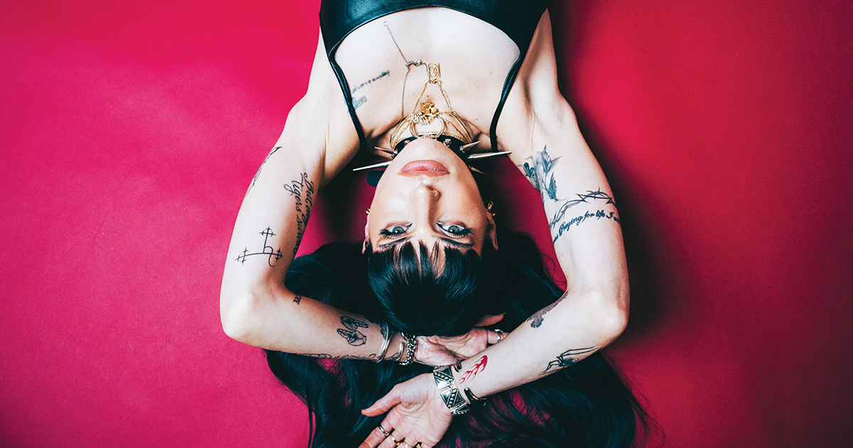
Inked Magazine’s portrait puts Czar upside down against a red background, with both forearms and parts of her upper arms in view. Script, symbols and smaller marks are clear against the skin.

The pose is dramatic, but it doesn’t obscure the tattoos. Her arms are close to the camera, and the contrast keeps the lines from turning into a blur. A creative portrait can still be useful reference when the focus is sharp.

Inked described tattoos as part of Czar’s change from Juliet Simms. That gives the collection a place in the story she has discussed publicly, but it doesn’t tell us the meaning of every mark or identify the artist behind each one.

The red background also separates the black and grey details. You can follow the pieces from wrist to elbow, while the limits remain clear: the image shows their appearance, not the private reason for each tattoo.

Finger and hand details add a darker close-up layer

Lilith Czar tattoos: high-resolution black-and-white portrait with the finger, hand and forearm tattoos visible around her face

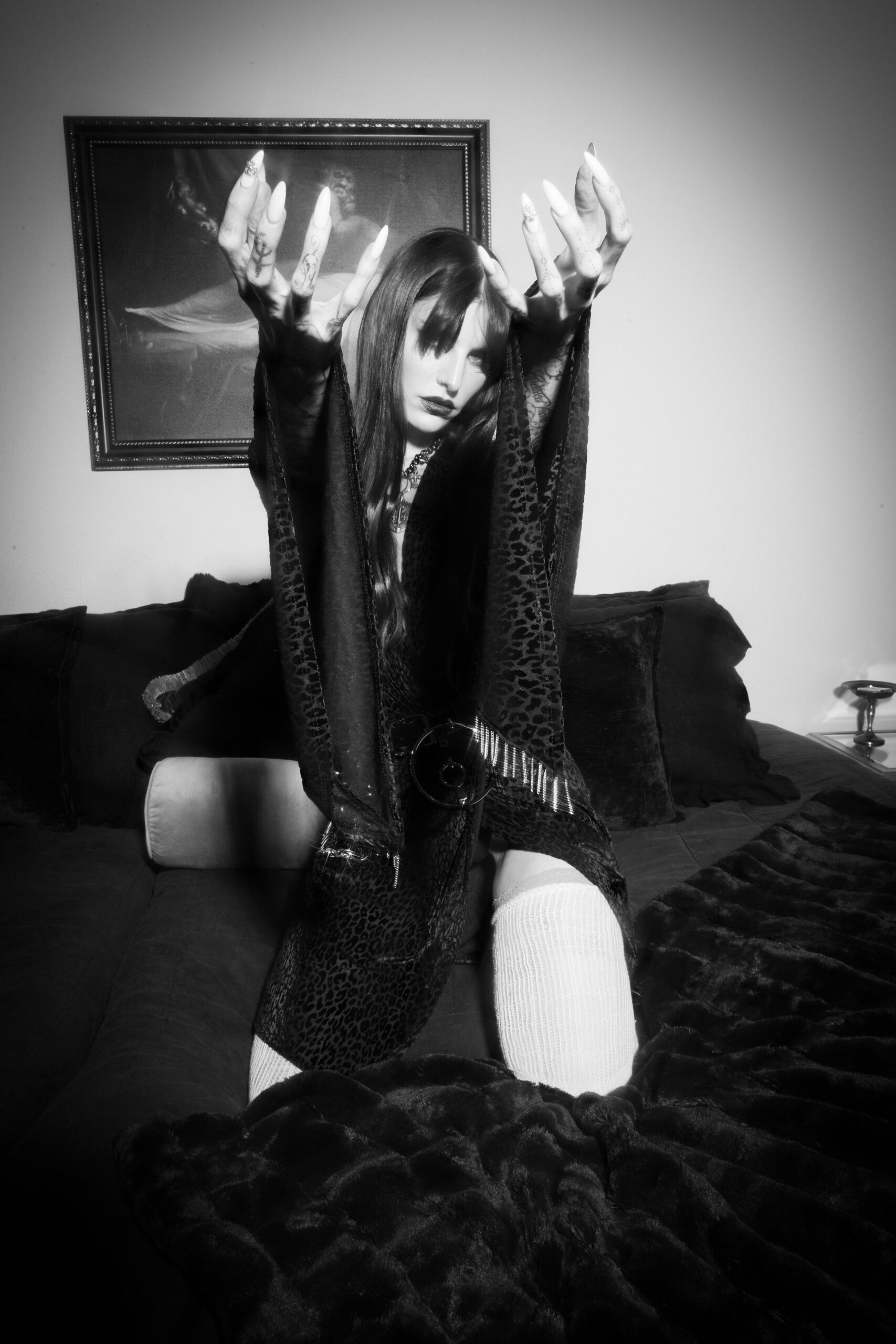
This black-and-white Pretty Cult portrait puts Czar’s hand close to the camera. The finger and hand marks are easier to see than in a full-body shot, and they can be compared with the color portrait above.

Without color, shape and contrast take the lead. The designs look more graphic against her skin and dark clothes. That doesn’t establish that every tattoo is black ink; it shows how much the line and silhouette matter in this photograph.

The marks remain in similar places across the different portraits, which makes them easier to distinguish from shadows or stage styling. The large arm pieces establish the overall look; the smaller finger marks break it up.

For comparison, see the site’s musician tattoo guides. Czar’s hand ink can be described from the photos, while any personal meaning should come from her interviews or an artist’s account.
The clearest details in this set are the arm script, hand marks and the way the tattoos show up onstage. Older Juliet Simms coverage names more pieces, but it doesn’t mean they were all added together or belong to a single new Lilith Czar design.

That earlier record includes a heart and dagger, a panther, a snake, an eagle, the words I carry the fire, a feather, a rose and other lettering. Those designs are part of the history Czar carried from the Juliet Simms years; the photos here don’t date them to one period.

Some pieces have been linked in coverage to music, family, friendship or relationships. Others are designs she worked out with an artist. Inked quoted her describing the tattoos as original and well thought out. That says something about her approach, but it doesn’t supply a public explanation for every symbol.

The photos do different jobs: the portraits show placement and smaller details; the stage shot shows the ink in motion. Together they give a fuller view than a single red-carpet image, without turning the gallery into a catalogue of guesses.

Czar’s body art is a collection that has changed with her. The arms give it its broad shape, the hand tattoos keep appearing in close poses, and the stage photo shows how the designs sit while she performs. Older Juliet Simms pieces add history to the current Lilith Czar look.

If you’re using the photos for ideas, notice how script sits beside shaded work and how hand marks continue toward the forearm. The useful reference is the placement and scale; copying a symbol won’t carry the story that made it hers.

More musician tattoo guides

2pac Tattoos: Thug Life, Cross and Heartless Ink

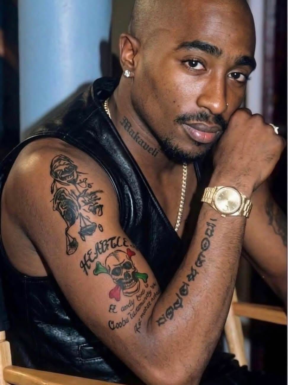
Tupac Shakur’s tattoos were part of his public image. The Thug Life lettering across his stomach, the cross on his back, Makaveli on his neck and the Heartless design on his arm are easy to pick out in photographs, though each has a different scale and feel.

The photos show where the tattoos sit and what they look like. Some meanings have been widely reported; others remain unconfirmed. I’ll stick to what the images and published accounts support instead of assigning a story to every mark.

The five article photos show different views: Tupac’s back, his face and arm, a close view of his chest and arms, a front portrait and a separate torso shot. The featured portrait is a separate image, so each photo has its own purpose.

Tupac’s back tattoo cross carries the heaviest visual weight

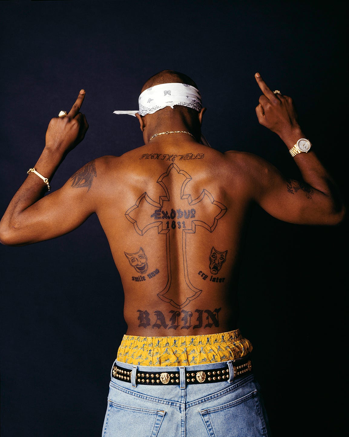
Tupac Shakur tattoos: high-resolution Chi Modu back portrait showing the large cross, Exodus lettering, theater masks and Ballin tattoo

The large cross on Tupac’s back fills most of the space between his shoulders and waist. Its outline leaves the inside relatively open, and the words Exodus 1831 run through the center. Around it, lettering and small drawings turn the cross into part of a larger design.

The Chi Modu photograph shows the full layout. Tupac stands with his back to the camera and his shoulders turned slightly toward it. “Fuck the World” stretches across his shoulders, “Ballin” sits near his waist, and theater masks flank the cross. The words “smile now and cry later” appear below the masks.

The arrangement reads from top to bottom: shoulder lettering, the long cross, the masks and lower lettering. The spine gives the composition a natural center, while the smaller details keep the sides from feeling empty.

A back piece this large needs room for its separate parts. Here, the cross, phrases and masks have space around them, so the design can be read as a whole. Anyone planning a large back tattoo can use the photograph to study how the elements follow the body before focusing on individual symbols.

Makaveli and Heartless tattoos make the neck and arm read together

Tupac Shakur tattoos: sharp face-visible photograph showing the Makaveli neck tattoo, Heartless skull and script on the arm

A face-and-arm photograph catches details that can disappear in a full-body shot. “Makaveli” runs along Tupac’s neck. On his upper arm, the Heartless skull sits among lettering, flowers and smaller marks. Together, the tattoos create a visible line from the jaw to the bicep.

The neck piece uses a narrow strip of skin. Its lettering follows the side of the neck instead of spreading across the whole area. The arm design has more going on: a skull and crossed bones, decorative shapes, color and script share the space.

The two placements have different textures. Makaveli is dark lettering against a slim area of skin; the arm has rounded shapes and more open space between its elements. That gives the arm ink a collected look instead of making it read as one solid band.

The photograph shows the names and shapes clearly, but it doesn’t explain every mark. There’s no need to guess at those stories to describe the design. The neck lettering is immediately visible, while the arm reveals more detail when you look closer.

The chest and arm tattoos show how many ideas share one canvas

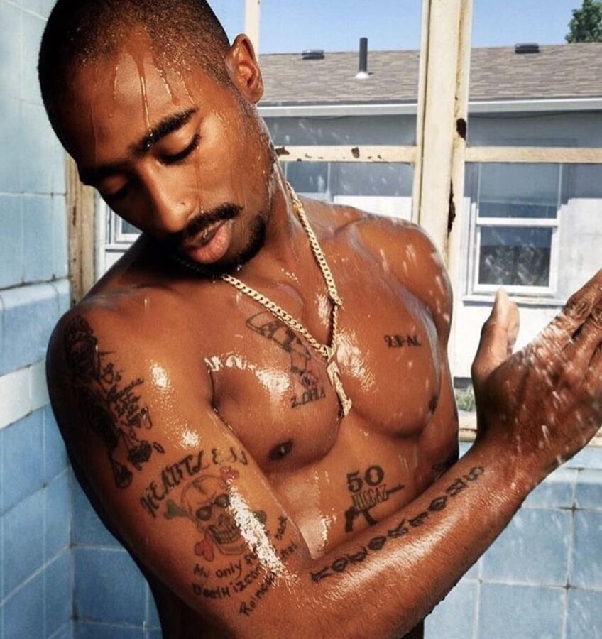
Tupac Shakur tattoos: clear shower portrait showing chest marks, the Nefertiti piece, the Heartless skull and arm lettering

This color photograph, taken in a shower setting, shows several tattoos across Tupac’s upper body. “2PAC” and a Nefertiti portrait sit on his chest beside smaller marks. His arm has the Heartless skull, script and other symbols. The close view makes the lines easier to see than they are in a distant performance photo.

The Nefertiti portrait gives the chest a focal image, while “2PAC” is a simpler piece of lettering on the opposite side. One side is built around a face; the other around a name. They share the same area without repeating the same treatment.

On the arm, the skull and flowers form a compact image, with script beneath them. The pieces don’t have to be read as a single sleeve. They look like separate choices added over time, each fitting beside the existing ink.

A collection can hold together without every tattoo sharing the same subject or line weight. In these photos, the common ground is placement and contrast, with enough open skin to keep the images distinct. Lettering, portraits and symbols sit side by side without being forced into one style.

The Thug Life tattoo turns the stomach into a statement piece

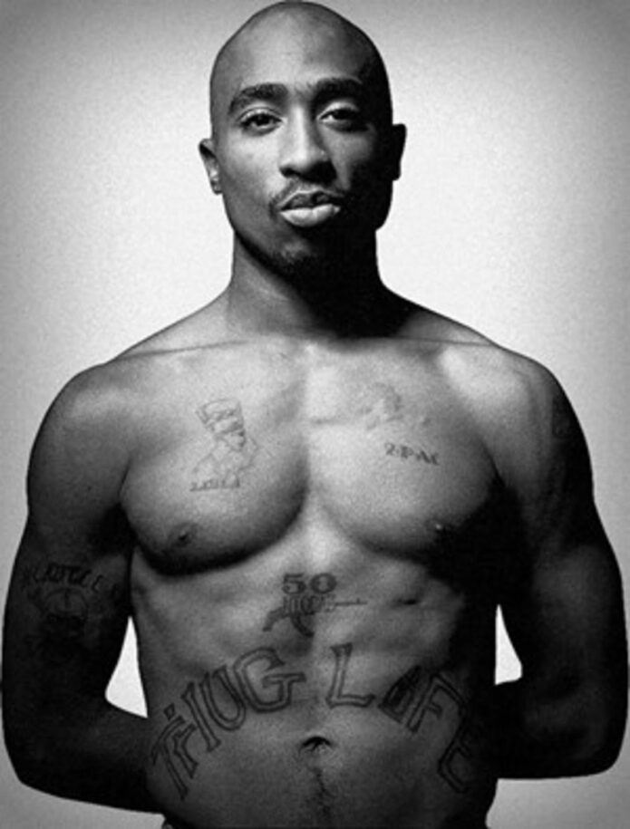
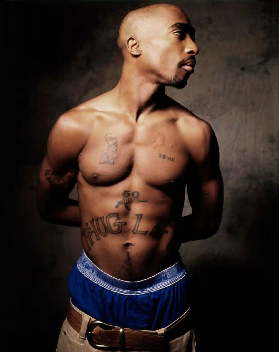
Tupac Shakur tattoos: large, clean front portrait showing the Thug Life stomach lettering, 50 Niggaz mark and chest tattoos

The large “Thug Life” lettering across Tupac’s stomach is the clearest statement in this front view. The outlined letters curve with his abdomen. Above them are the smaller “50 Niggaz” mark and the chest tattoos, so the lettering anchors the lower half of the composition.

The phrase was closely tied to Tupac’s music, public identity and writing about social conditions. It is often discussed as an acronym. In the photograph, its size and placement are clear even before considering those associations: it can be read from a distance and becomes part of his silhouette when he performs without a shirt.

The outline style leaves skin visible inside the letters instead of filling them in as a solid black block. The baseline curves across the abdomen, following the body rather than sitting like a straight banner. Both choices help the large design stay readable as the body moves.

The photograph is useful for studying the relationship between size, placement and legibility. A phrase across the stomach needs enough space to follow the body’s curve. Here, the broad lettering has room to do that.

The torso tattoo view connects 50 Niggaz to the larger Thug Life design

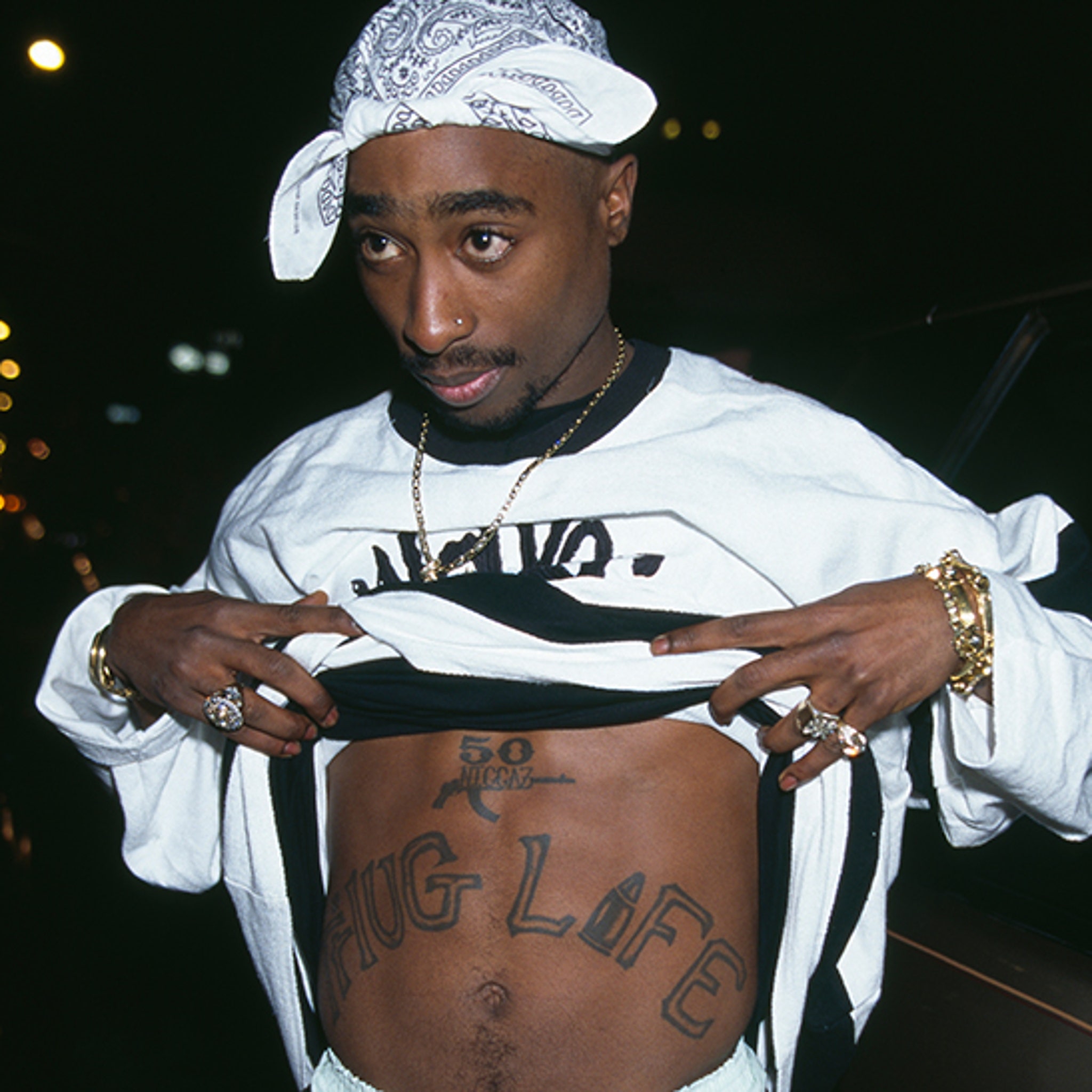
Tupac Shakur tattoos: high-resolution nighttime torso photograph showing the 50 Niggaz mark and the full Thug Life lettering

This nighttime torso photo gives another view of the front tattoos. Tupac lifts his shirt to show the “50 Niggaz” mark above the larger “Thug Life” lettering. The first sits higher and takes up less space; the second spreads across his stomach.

The shirt, chain and hands remain in frame, but the words are still easy to read. The image shows the tattoos in a casual pose rather than a clean studio view, with clothing partly covering the body.

“50 Niggaz” reads as a compact emblem with a small graphic element. “Thug Life” stretches across the abdomen and draws the eye from side to side. Their different scales let each mark occupy its own space.

Seen alongside the other photos, this frame helps explain why the collection is recognizable. Large placements make the words and symbols visible, while smaller pieces fill nearby areas. It’s a group of tattoos tied to identity, music and belief, rather than one matching sleeve.

The contrast between public statements and smaller details runs through the collection. “Thug Life” can be read from a distance. “Makaveli” sits close to the face, and the cross and theater masks form one scene across the back. The Nefertiti portrait and chest lettering add more detail to the front.

Photographs can confirm placement and visible lettering; they can’t settle every meaning. Published tattoo coverage discusses the main pieces in connection with Tupac’s music, beliefs and public life. Smaller marks are less certain, so they’re best described by what can actually be seen.

The back is the clearest example of a design built across a large area. The cross runs down the center, masks sit at its sides, and words above and below frame it. The shapes follow the body without needing perfect symmetry.

The front uses scale differently. “2PAC” is small on the chest, while the Nefertiti portrait carries more detail. The “50 Niggaz” mark sits above “Thug Life,” which spreads across the lower torso. Each piece has a separate area.

The arm photos show a collection that doesn’t rely on a matching sleeve. The Heartless skull, flowers and script each keep their own shape, and Makaveli remains separate on the neck. That leaves room for tattoos to accumulate over time.

Lettering appears on the neck, shoulders, back, arms, chest and stomach, but it changes to suit each spot. Smaller areas use compact words; the abdomen carries wide outlined letters. The photos make a practical point about text tattoos: scale the lettering to the body area.

A face portrait alone can’t show how the cross sits across the back or how “Thug Life” curves over the stomach. These five images give those placements room to be seen, and each adds a different view instead of repeating the same portrait.

If you’re looking at Tupac Shakur’s tattoos for ideas, study the placement before the symbols. Decide whether words need to be readable across a room or are meant for a closer look. Leave space around a large piece, and sketch the full flow of a back design before adding its smaller details.

For more musician ink with clear placement photos, see the site’s musician tattoo guides. Keep confirmed stories separate from guesses when you use any celebrity tattoo as a reference.
More musician tattoo guides

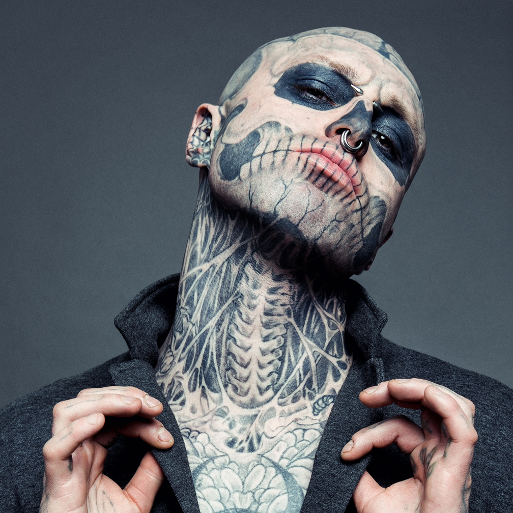
Rick Genest Tattoos: Zombie Boy’s Skull and Full-Body Ink

Rick Genest, known as Zombie Boy, covered most of his body in black-and-grey tattoos that follow the human skeleton from his scalp to his feet. A skull shapes his face; ribs and vertebrae run over his chest and back; insects fill some of the spaces between the larger forms.

Genest said his first tattoo was a skull and crossbones on his shoulder. In interviews, he also said Frank Lewis tattooed much of his head and torso during the main period of the project. The designs are easy to describe from photos, but those images don’t tell us the private meaning of every small mark.

The five body photos show different parts of the work: his face and neck, the scalp, chest, arms and hands, and the full back. The featured portrait is a separate face-visible image used for the post header.

The face and neck tattoos create Rick Genest’s living-skeleton illusion

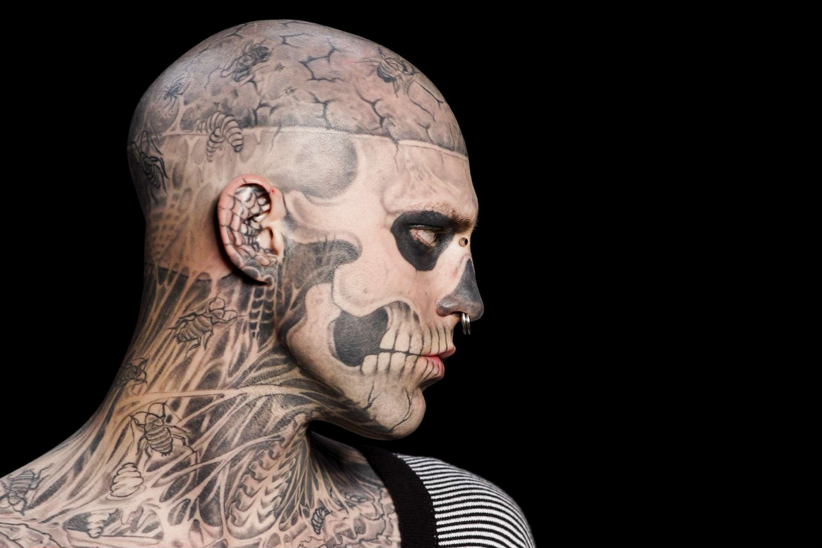
Rick Genest tattoos: clean high-resolution side profile showing the skull face, cracked scalp, insects and neck anatomy tattoos

Genest’s face is the first thing most people notice. The dark eye sockets, shaded nose, cheekbones and teeth are arranged to resemble a skull, with lines that follow the planes of his face instead of sitting on top like a mask.

The side view shows how the design continues toward his ear. Lettering and teeth run along the jaw, while ribs, tendons and shadow fill the neck. The skull remains the focal point; the neck gives it a path down into the rest of the body suit.

The eye sockets carry most of the effect. Their solid black shapes stay recognisable even from a distance. Thinner lines around them suggest cracks and bone edges, and small insects sit among the details. Open skin between the dark areas keeps the face from becoming a single block.

The tattoo also changes with his expression. When Genest smiled, looked serious or turned his head, the design moved with him. That’s part of what makes face placement demanding: lines need to work with the face’s existing features and movement.

The brain and insect tattoos turn the scalp into a second layer

Rick Genest tattoos: large studio close-up showing the brain, temple, ear, eye socket and jaw tattoo details from a different angle

Genest’s scalp carries a large brain design above a horizontal skull band. In a close photograph, the winding lines look like an anatomical drawing. Open areas between the folds keep the shape legible against the dark bands around it.

Small insects appear around the scalp and neck. Some look like flies or beetles; others blend into the bone work and are harder to identify. Their fine shapes add detail to the head and sit beside the broader skull forms.

The scalp brings different shapes together. The brain uses rounded lines and softer shading, the skull band runs horizontally, and the insects add small marks with wings and legs. They share a limited area without all using the same scale.

Genest said Frank Lewis tattooed much of his head and torso during the main period of the transformation. The many separate designs were made over time, but the repeated anatomy and black-and-grey palette connect them.

The chest tattoos extend the skeleton idea below the jaw

Rick Genest tattoos: sharp front portrait showing the jaw, neck, chest ribcage, insects and central body tattoo work

This front portrait traces the design from Genest’s jaw down to his torso. Teeth meet the neck, which gives way to ribs and tendons across the chest. The tattoos leave skin visible between the bones, so the chest doesn’t read as a solid black panel.

A central body design sits within the ribs, insects and darker areas. From a distance, the chest looks like one skeletal section. Closer up, the separate marks come into view. Lighting and camera distance can make the same area look quite different.

The chest links the upper and lower parts of the suit. Lines from the neck continue into the ribs, which widen across the torso before narrowing toward the stomach. The drawing changes scale as the body changes shape.

The tattoo’s consistent subject doesn’t depend on repeating one image everywhere. Anatomical lines carry the idea from face to chest, while insects and smaller symbols fill some gaps. The visible skin is part of the design too.

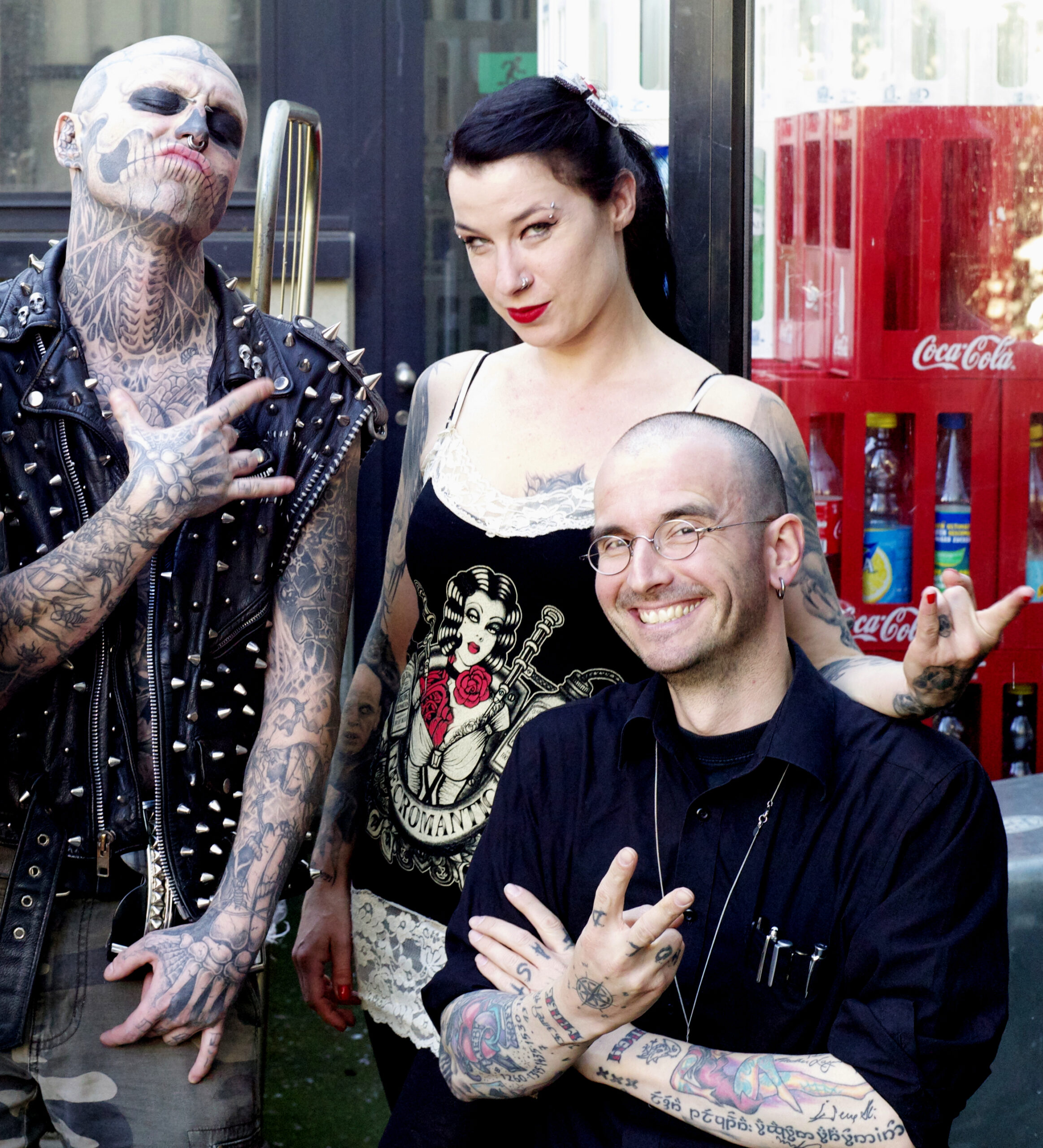
The arms and hands carry the smaller tattoos that make the suit feel lived in

Rick Genest tattoos: high-resolution documentary photograph showing the tattooed forearms, hands, fingers, neck and skull face in a public setting

This public photograph from Zurich shows Genest’s arms and hands outside a studio portrait. Bones, insects, lettering and smaller symbols cover the forearms. His fingers are tattooed as well, and the marks are easier to see when he reaches toward the camera.

The arms are darker and busier than the face. That contrast leaves the skull readable while giving the forearms room for clusters of smaller pieces. Differences in line weight also make the collection look like it developed over time.

The hand marks are difficult to pin down from one image. Finger tattoos are exposed, small and constantly moving with the hand. Some shapes aren’t clear enough to name, so it’s better to describe their placement and appearance than to assign them a private meaning.

The smaller pieces add detail before the eye returns to the larger skeletal design. An insect, a bone or a short line of lettering can stand out on its own, even though it belongs to the broader body suit.

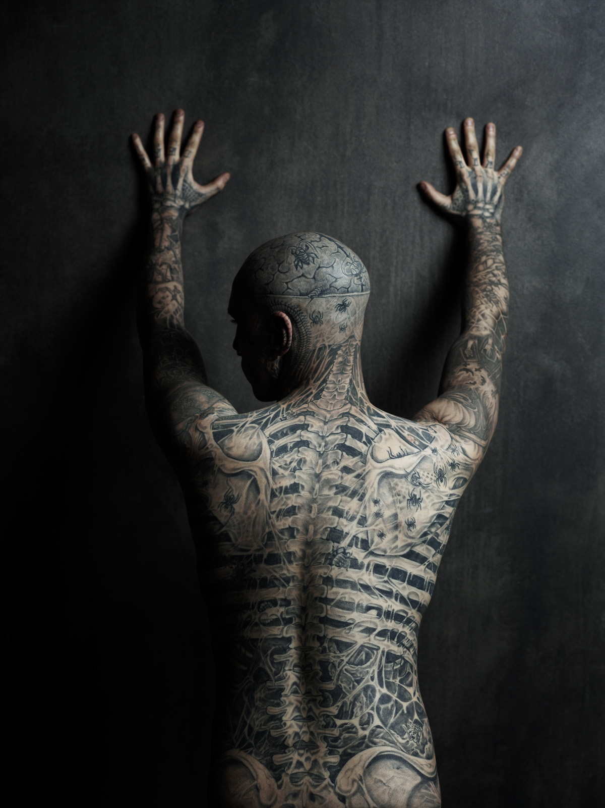
The back tattoo follows the spine like an anatomical map

Rick Genest tattoos: distinct high-resolution rear studio view showing the spine, ribs, pelvis, shoulders, arms and back insects

This rear studio photo gives the clearest single view of Genest’s back. He faces the wall with his hands raised, showing the skull at the back of his head, vertebrae down the neck and a long ribcage design. The spine anchors the composition, while the bones and insects around it keep the drawing from feeling like a straight diagram.

The shoulder blades form part of the upper skeleton. Ribs spread out from the spine and narrow again near the waist. The ink continues down the arms and into the hands, joining the back piece to the rest of the suit.

The design follows a body that bends and changes width. Genest’s spine gives the artist a centre line; the ribs and shoulders follow the body’s curves. The photo shows the overall arrangement even though he isn’t standing perfectly straight.

Photos from different years can vary as tattoos age and lighting changes the balance between skin and black shading. The same central idea remains visible here: bones, insects and skull imagery are arranged to suggest the body beneath the skin.

The collection uses one visual language across different areas. Skull shapes sit beside brain folds, ribs beside insects, and small marks fill gaps around the larger forms. The black-and-grey palette ties them together, while each area has its own scale and layout.

Zombie Boy became a public identity attached to Genest’s appearance, but the photographs also show a person making choices about his skin. His face drew attention first; the arms, chest and back show how much of the project extended beyond that first view.

Genest spoke about his first skull and crossbones tattoo and identified Frank Lewis as a major artist on the head and torso work. That doesn’t mean every small insect or bone fragment has a documented explanation. Where the reporting leaves a gap, the photos can still show the design without filling in a story.

News, tattoo and fashion coverage discuss the body suit from different angles. The images show the bones and insects; fashion photographs show how the work changed the way he was presented. The tattoos were often the focus of the camera because they covered so much of his body.

If you’re using Rick Genest’s tattoos for inspiration, study how one theme changes scale across a body. The face has a clear focal design, while smaller marks continue the idea onto the hands, neck, ribs and back.

Placement matters as much as the drawing. The eyes, nose and mouth guide the face design; the spine anchors the back; the ribs widen the chest. Those landmarks help the ink follow the person instead of sitting on a flat surface.

The photos work as a set because some are close enough to show the lines and others show where the designs sit. A headshot can’t explain how the work moves across the torso, so the chest, arm and back views fill in that picture.

For more musician and performance-world ink, see the site’s musician tattoo guides. Use photos for visible placement and rely on a clear interview or source before assigning a tattoo a meaning.
More musician tattoo guides

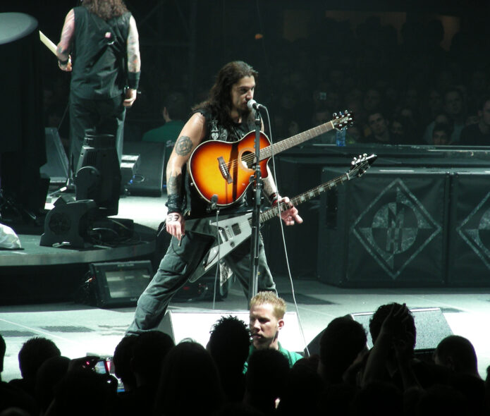
Robb Flynn Tattoos: Machine Head Arm Ink and Sleeve Details

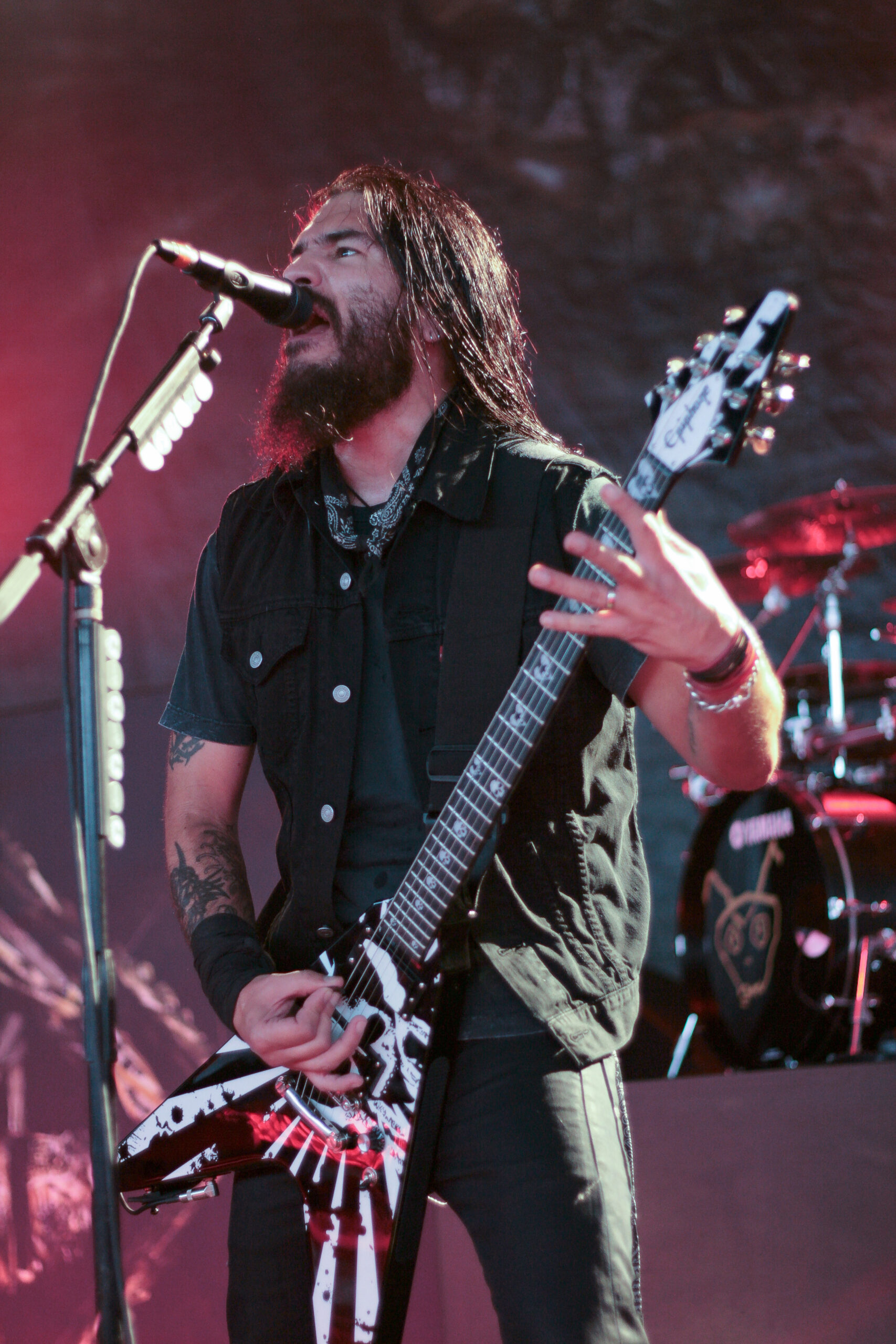
Robb Flynn’s tattoos cover both arms, with large pieces on the upper arms and denser work down the forearms. As Machine Head’s vocalist and guitarist, he’s usually photographed mid-performance: playing, leaning into a microphone or lifting his arms. Those pictures show how the ink sits when his arms are moving, which a posed portrait can’t quite capture.

Across the clearest shots, the tattoos mix black, grey and some colour. A large emblem-like panel stands out on an upper arm; tighter lines and shaded designs fill the forearms. Flynn hasn’t publicly explained the meaning of every piece, so this guide sticks to what the photos show: placement, colour, coverage and how the designs follow his arms.

The five body images below offer different views. The featured portrait is separate. Together, the photos show raised arms, close performance angles, upper-arm placement, forearm detail and an older stage shot.

Robb Flynn’s upper-arm tattoos are easiest to read in live photos

Robb Flynn tattoos: high-resolution live photograph showing the dense upper-arm and forearm tattoos as Flynn raises his guitar

The upper-arm pieces are easiest to see when Flynn raises his hands on stage. In this shot, dark shapes and lighter gaps run from the shoulders toward the elbows. It isn’t one solid blackout sleeve: separate designs sit at different densities, with patches of open skin between them.

A change in pose can make familiar ink look different. When Flynn flexes, the skin turns away from the camera; red stage lights can flatten grey shading and make outlines seem heavier. The broad layout stays consistent across the photos, though: both arms have substantial coverage, and the upper-arm pieces give the eye a place to start.

The placement is clear; the meaning isn’t always documented. The photos don’t explain every symbol. They do show separate upper-arm panels, darker sections on the forearms and artwork arranged around the elbows.

Robb Flynn’s forearms mix dense linework with larger colour blocks

Robb Flynn tattoos: high-resolution stage photograph showing the geometric forearm work, upper-arm colour and layered sleeve coverage

This performance photo brings the forearms into view. Lines and dark shapes cluster around the wrist and lower arm, while broader colour and black sections sit higher up. The designs are close together, but their different sizes keep them from reading as one blur.

Concert lighting can hide some of the colour. Red shows around the shoulder and upper arm, with black and grey filling the space nearby. Lower down, linework and shading become more prominent. Looking from shoulder to wrist makes the change in scale easier to see than treating the whole arm as one repeated pattern.

Density gives the sleeves much of their impact. The ink reads from across a stage, while lighter lines add edges in a closer shot. If you’re using the photos for sleeve ideas, notice how the larger filled areas sit beside detail that remains visible in motion and changing light.

The upper-arm panel gives Flynn’s tattoos a strong visual anchor

Robb Flynn tattoos: clear concert photograph showing the large upper-arm panel, lower-arm imagery and wrist area without a generic portrait crop

A side view isolates one of Flynn’s most recognisable areas. His upper arm has a large circular, emblem-like design, outlined in dark ink with lighter shapes inside. Below it is a separate group of imagery, giving the arm distinct upper, lower and wrist areas.

The panel remains visible when Flynn wears a vest or plays guitar. It sits on the exposed upper arm and reads as a large shape before the smaller details come into focus. That’s a practical spot for a musician who’s moving, holding an instrument and turning toward the crowd.

The tattoos share the frame with the performance. These aren’t catalogue poses: the guitar, microphone and changing lights are part of the photographs. Even so, the upper-arm design stays clear enough to compare across years.

The separate arm pieces stay readable when Flynn is playing guitar

Robb Flynn tattoos: high-resolution live photograph showing the separate upper-arm emblem and the dense lower-arm tattoo work

This live photo shows how the tattoos sit while Flynn plays. His wrists and forearms bend as he frets and picks, but the larger upper-arm design still faces the camera. Farther down, dark pieces and curved lines follow the arm toward the wrist. It gives a better sense of the wrap than a shot with the arm held flat.

The coverage isn’t perfectly even. Some areas have heavier fill; others leave skin between the designs. That spacing helps the pieces stay distinct when a bracelet, guitar strap or microphone enters the frame, and it gives the sleeves the look of work added over time.

More than one pose helps explain the layout. A straight-on portrait can show surface detail, while a playing shot reveals how the ink follows the arm and slips out of view when Flynn turns his elbow.

Older performance photos show the same arm layout in a different light

Robb Flynn tattoos: large vertical concert photograph showing the upper-arm emblem, forearm coverage and tattoo placement around the guitar strap

The vertical Blackening-era photo has dark, warm stage lighting, which changes how the tattoos read. The upper-arm emblem remains visible; the forearm looks like a dense mix of black, grey and soft-edged shading. Compared with daylight, the image is less crisp, but the overall layout is still easy to follow.

It also shows the ink alongside clothing and gear. The guitar strap crosses Flynn’s torso rather than his arm, leaving the main pieces visible. A bandana covers part of the wrist, so this photo can’t tell us exactly what the tattooing looks like across the whole hand or lower forearm.

Age and lighting matter when comparing photos. Ink can look softer, darker or more faded depending on the camera and conditions. The details that recur across several shots are the safest to describe: heavy arm coverage, a large upper-arm emblem, dense work lower down and colour in parts of the sleeves.

Across the photos, Flynn’s tattoos cover the arms without turning them into one flat block. The upper arms hold the largest shapes; smaller marks and darker shading fill the forearms. That contrast gives the eye somewhere to land, while a close shot can reveal lines that disappear in a wide concert frame.

The pose changes what you can see. When Flynn lifts an arm, the upper-arm panel faces the camera and the forearm lengthens. While he plays, the wrist bends and some of the lower-arm designs turn away. Each angle shows a different part of the same work.

Lighting shifts the details too. Bright, neutral light makes colour and lighter shading easier to pick out. Red or blue stage lights push the ink toward a darker silhouette. Comparing different kinds of photos helps avoid mistaking a lighting change for a new tattoo or a grey area for solid black.

Clothing and instruments also affect the view. Flynn’s vests leave his upper arms exposed; guitar straps cross his torso, and bracelets can cover the wrists. The larger designs remain visible because of where they’re placed, even while he’s performing.

There’s no need to guess at a backstory to describe the visible work. The upper-arm emblem, black and grey forearm pieces and flashes of colour already give the collection a distinct look. When a tattoo’s meaning hasn’t been made public, describing its design is more accurate than supplying a story.

For sleeve inspiration, the photos show how a larger upper-arm piece can sit beside tighter forearm work, with open skin separating denser sections. They also show how the layout changes when an arm bends. Anyone drawing on the same approach should work with an artist on scale and flow around the elbow and wrist.

Machine Head fans know Flynn through the band’s lyrics and album art, and he has talked about seeing listeners tattoo those words and images. That’s separate from the record of his own tattoos, but it helps explain why his arms draw attention in performance shots: the ink is visible alongside the music and artwork people associate with him.

The clearest picture comes from looking across several photographs. A raised-arm shot shows the coverage; a close performance angle reveals linework; an older image helps with comparisons over time. Each adds something without asking one frame to show everything.

For more real celebrity and musician tattoo guides, visit the site’s celebrity tattoo section. As with this guide, the useful details are the ones a photograph supports: show the tattooed person, keep the featured image separate and describe what can actually be seen.

More musician tattoo guides

Loredana Tattoos: Bold Lettering, Hand Ink and Arm Designs

Loredana’s tattoos combine bold lettering, dates, small hand symbols and larger designs on her arms. The Swiss-Albanian rapper often uses short words and phrases rather than filling an entire arm with one connected sleeve. Photos show ink across her chest, hands, neck and arms.

The six images below show different parts of the collection: a mirror view of the chest and arms, a close-up of the hand and forearm, a face shot, the lettering on her neck, a side view of the deer tattoo and a second portrait showing the neck and collarbone. The featured image is a separate portrait for the post header.

Some meanings have been reported by outlets that covered the tattoos; others can only be described by what the photographs show. I’ll keep those apart and leave guesses about private symbols out of it.

Loredana’s chest and arm lettering tattoos set the tone

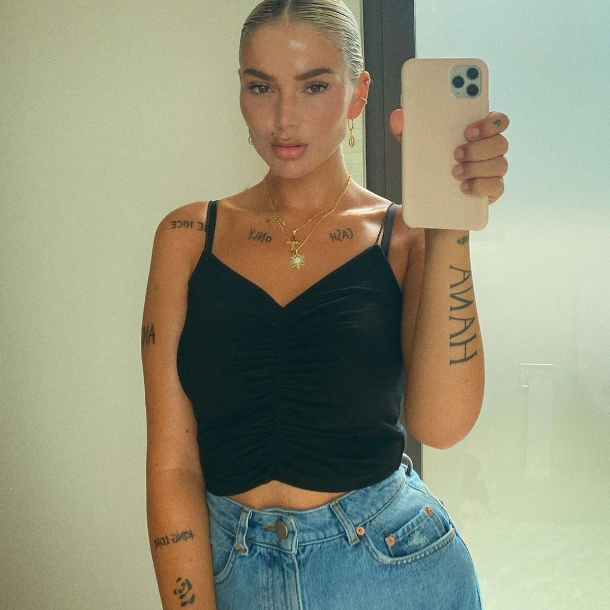
Loredana tattoos: clear mirror portrait showing CASH ONLY across the collarbone, HANA on the arm and large vertical lettering on the opposite arm

Words, dates and small symbols are a big part of Loredana’s collection. In this mirror photo, lettering crosses the collarbone and both arms, including CASH ONLY and HANA. The dark text stands out against her skin and gives the tattoos a graphic, easy-to-read look.

The words are placed in separate areas instead of running together as one large block. That leaves each phrase room to show clearly across the chest, while the longer lettering on the arm draws the eye down the limb.

There’s a consistent approach across the pieces. Loredana uses short phrases as visible marks, with larger designs appearing alongside them. The result feels personal while keeping the clear, fashion-forward look seen in her music photos.

The hand and finger tattoos keep the lettering compact

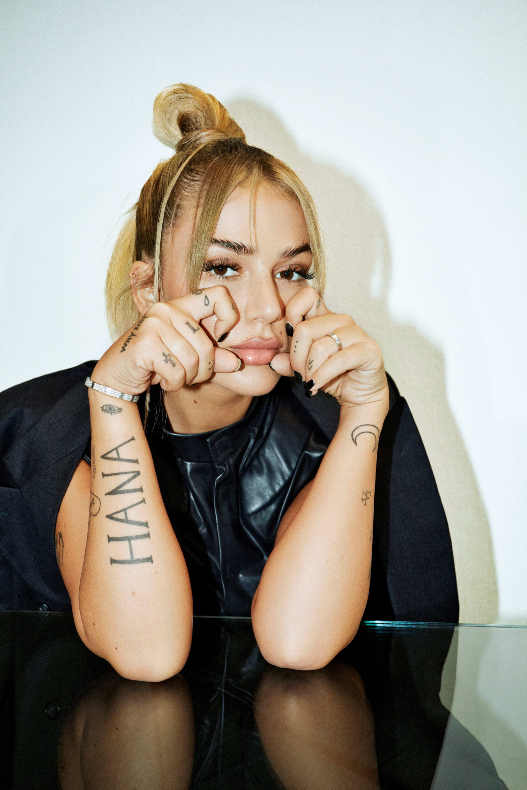
Loredana tattoos: high-resolution portrait showing the large HANA forearm lettering, finger symbols, wrist eye and crescent tattoos

The closer view brings out the hand tattoos. Large lettering crosses the back of the hand beside a year mark, while small symbols sit on the fingers, including a clover, a cross and other simple shapes.

Hands bend and turn throughout the day, so small tattoos need space to stay legible. Loredana’s marks sit across different planes; the words change direction as she turns her hand. A wide portrait would miss those fine details, which makes this close shot useful.

The hand puts the lettering in motion. Rings, phones and microphones naturally draw attention to it during everyday gestures and performance.

The teardrop finger tattoo changes the mood of the close portraits

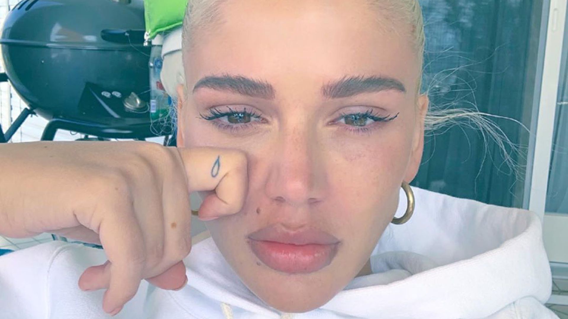
Loredana tattoos: high-resolution close portrait showing the teardrop finger tattoo beside Loredana's face

In this close selfie, one of Loredana’s smallest tattoos sits beside her face. A teardrop appears on the finger resting near her cheek; the pose hides part of the hand but leaves that mark visible.

The photograph has a different feel from the brighter mirror shots. The tattoo itself is tiny, yet its dark outline stands out against the softer portrait.

A small mark can change what you notice first. Finger tattoos show up in selfies, gestures and stage photos, so they become part of how a person moves through the frame.

The Selfmade Millions neck tattoo is a bold statement

Loredana tattoos: high-resolution two-panel photograph clearly showing the Selfmade Millions neck lettering and Loredana's face

The Selfmade Millions lettering crosses the back of Loredana’s neck just below the hairline. It’s easy to see when her hair is tied up or swept aside, so it appears in photos where a less exposed tattoo might stay hidden.

The source image includes a second panel with her face visible, but the lettering remains the focus. Dark letters stand out against her skin and hair, making the phrase readable.

Where a phrase sits changes how visible it is. A tattoo on the back or thigh can stay under clothing. Neck lettering is harder to cover and becomes part of the public image.

The deer and upper-arm tattoos bring in larger artwork

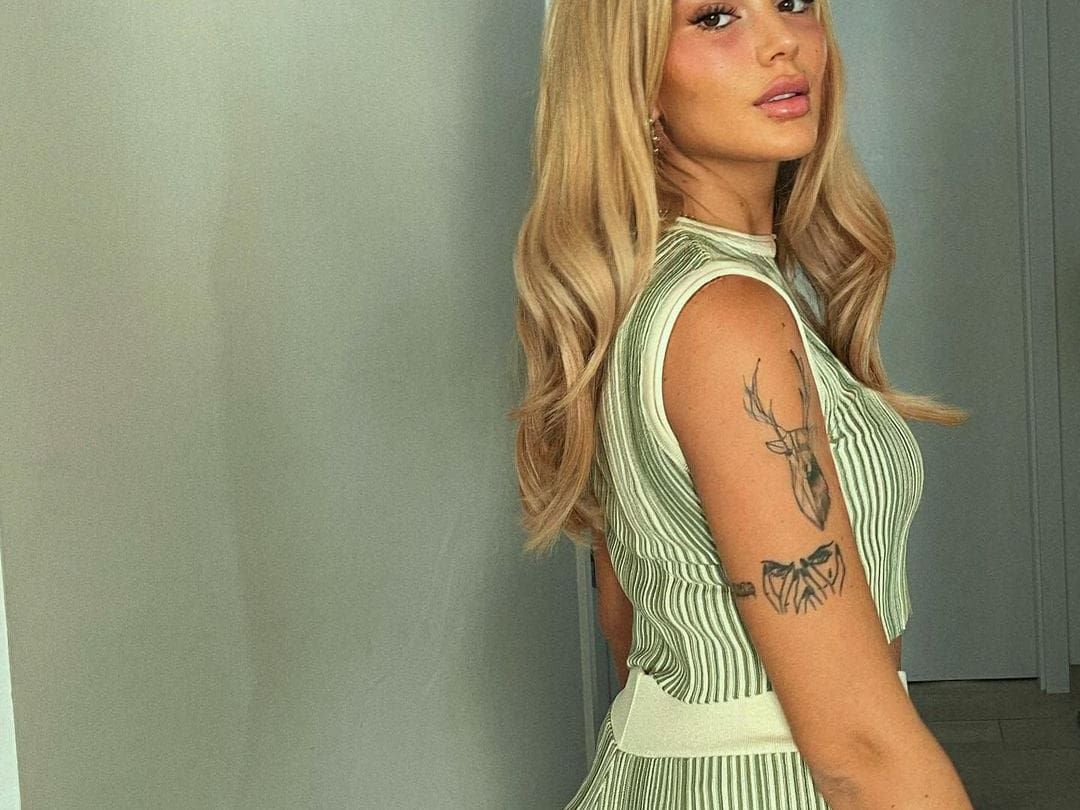
Loredana tattoos: sharp side portrait showing the deer head and layered black linework on the upper arm

The side portrait shows a different kind of tattoo: a deer head on the upper arm, with another dark, layered design beneath it. Both pieces take up more space than the small phrases on her fingers and wrist.

The deer gives the upper arm a clear focal point. Its antlers angle upward, while the lower design fills the space below and follows the curve of her arm.

That combination adds variety. Lettering sets a rhythm across the collection; the deer and linework bring shape, texture and movement.

The smaller neck and collarbone tattoos fill the gaps

Loredana tattoos: high-resolution portrait showing visible neck and collarbone lettering against a clean red outfit

This portrait shows a small cluster of tattoos near Loredana’s neck and collarbone. The marks sit close to the neckline, so different tops can reveal or cover them.

They fill the space between the face and the larger arm work. The arms hold the strongest shapes, while the smaller lettering adds detail without turning the upper body into one solid field of ink.

The clean portrait helps here: wide performance photos rarely show these marks clearly. This one leaves enough room to see them while keeping Loredana’s face and styling in view.

Across the collection, language is a recurring element. CASH ONLY, HANA, Selfmade Millions and the phrases on her legs are readable statements. They don’t need a large scene around them; simple lines and deliberate placement carry the words.

The hand tattoos bring that lettering into a smaller space. Larger words sit on the back of the hand, while smaller symbols fit across the fingers. Together, they add layers without filling the hand with a single dark patch.

Those small symbols leave room around the text. The teardrop on a finger, a crescent near the wrist and the other marks can be picked out in close shots without competing with the larger HANA lettering.

Selfmade Millions stands apart because it’s on the neck. It follows the line below the hair and becomes part of Loredana’s silhouette. That placement is visible in photos, on stage and with everyday clothes.

The deer and layered arm pieces keep the collection from being all lettering. The deer has a clear outline, and the darker image below it adds weight. Together, they give the upper arm a focal point that short phrases can’t provide.

Some of Loredana’s tattoos have reported connections to family and identity. HANA has been described as a dedication to her daughter, and tattoo outlets have covered dates on her hands and wrists. The photos show where those marks sit; any personal meaning should be attributed to its source.

For inspiration, look at the change in scale. A large arm piece can anchor a design, with smaller marks on the hand or wrist adding detail. Words can follow the collarbone, neck or leg, but the lettering needs to stay readable as the body moves.

Placement is part of the design. Collarbone lettering follows a shallow horizontal line. HANA runs along the forearm. A finger has very little room, so a simple symbol is easier to read as the skin flexes.

The photos also show why different views help. A mirror selfie reveals how the tattoos sit with clothes and jewellery. A close portrait catches the hand ink, and a side view shows the size of the deer and the artwork below it.

Together, the images show a range from tiny finger marks to broad arm lettering and an exposed neck phrase, balanced by names, dates and larger symbols. The collection is legible in close shots and still recognisable on stage.

The angle and light affect which details stand out. A mirror view shows the chest and arms; the hand portrait records small symbols; the neck-and-collarbone shot picks up the finer marks; the side portrait gives the larger upper-arm design its proper scale.

The result is a direct mix of statements, personal references and bold black shapes. Some pieces are small; others are hard to miss. Together they make Loredana’s tattoos easy to recognise without needing to guess at meanings that haven’t been confirmed.

For more real musician tattoo guides, visit the site’s musician tattoo section. Use clear images of the artist, keep the featured portrait separate and describe only what the photographs support.

More musician tattoo guides

Josh Dun Tattoos: Tree Sleeve, Symbols and Stage Ink

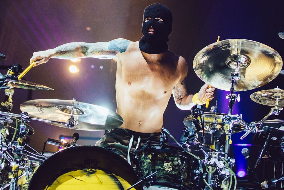
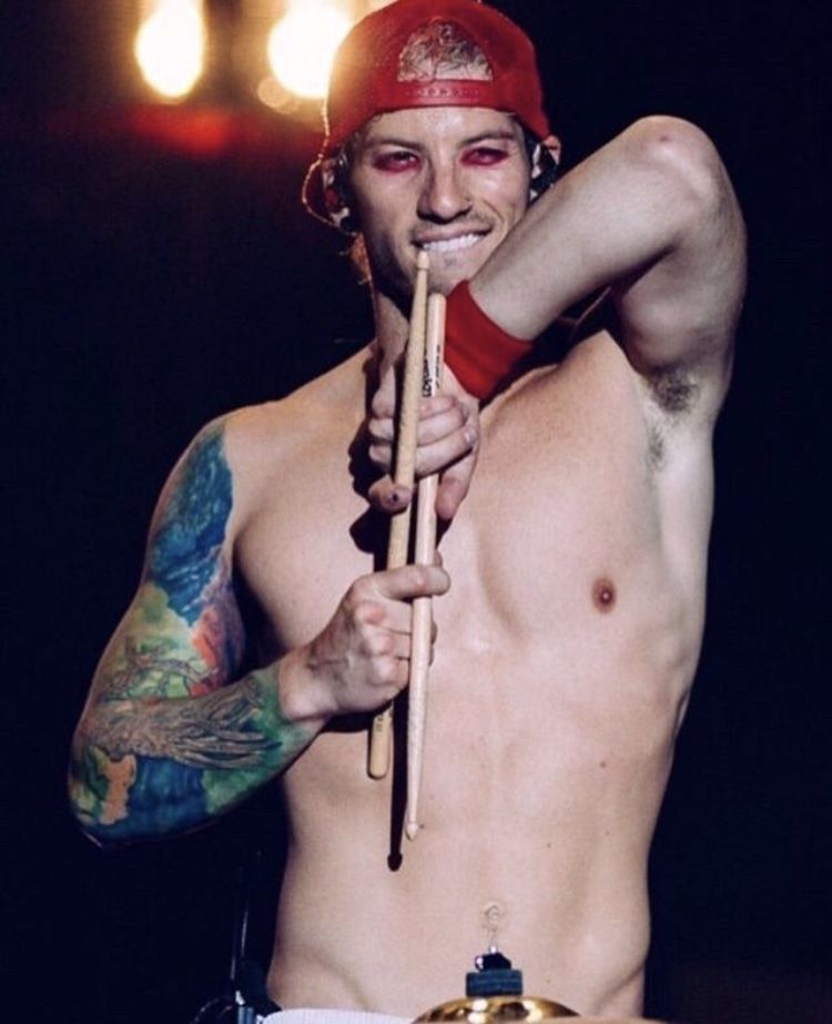
Josh Dun’s tattoos pair a bright tree-and-roots sleeve with smaller symbols, lettering and stage-era details. Photos from daylight, backstage and Twenty One Pilots shows catch different parts of the ink: some show the colour clearly; others show how it wraps around his arm as he plays.

Not every meaning has been made public. Dun has kept some details private, so I’ll stick to what’s visible and keep interpretation separate. The photos show placement, colour, scale and linework; they don’t tell us why he chose every mark. This guide to Josh Dun tattoos focuses on the designs and the ideas someone might use in their own work, without filling gaps with guesses.

The tree and roots sleeve is Josh Dun’s most recognisable tattoo

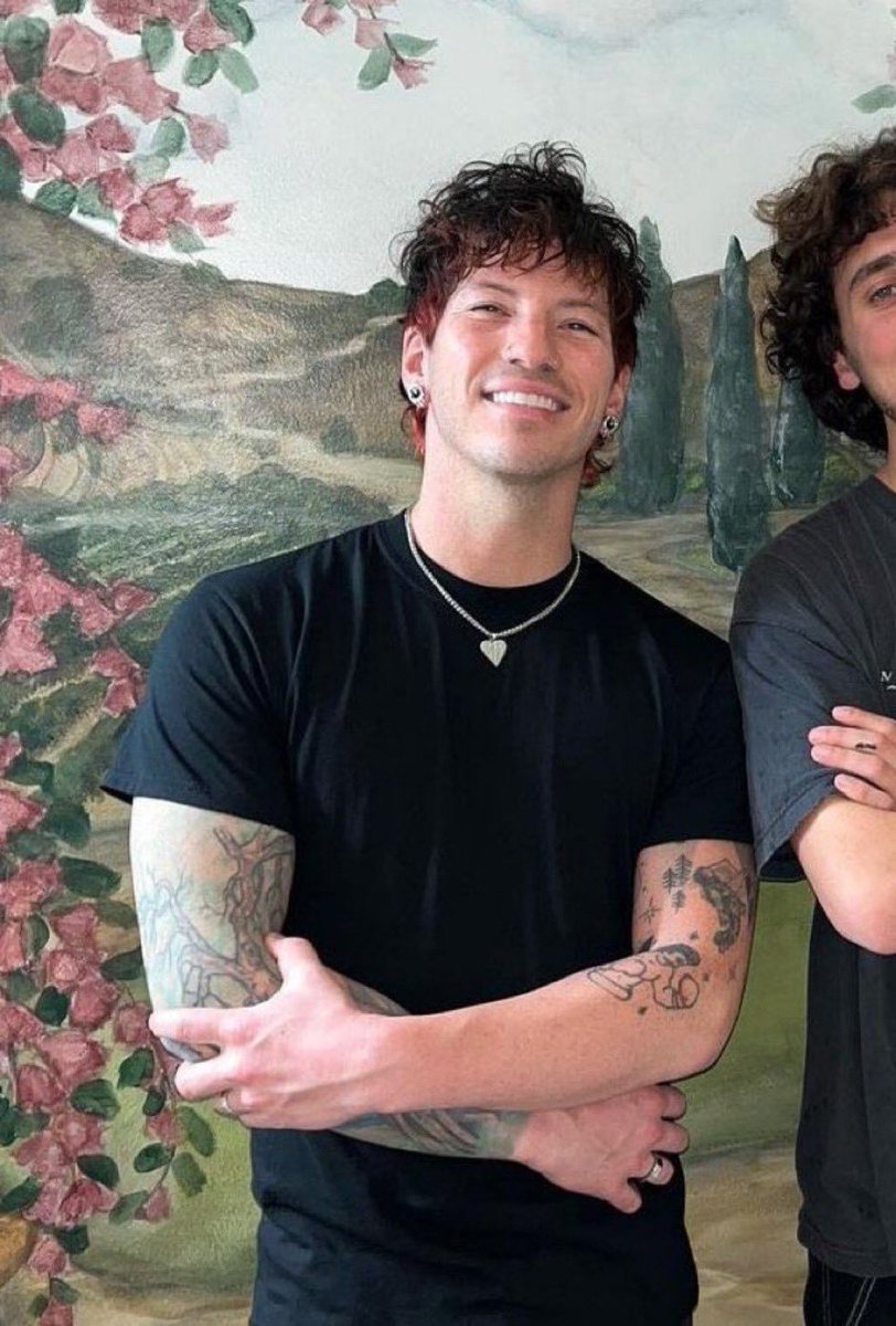
Josh Dun tattoos: portrait showing the tree and root work wrapping across the forearm

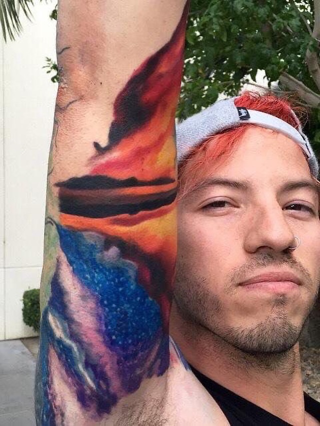
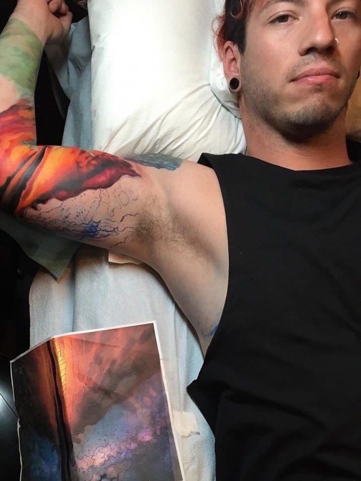
Dun’s colourful arm sleeve is the piece people tend to recognise first. It’s colourful and full of detail, and it shows clearly when he wears a sleeveless top. A tree, its roots and a bright circular burst near the shoulder form the main image. Colour runs from the upper arm toward the forearm, so the design reads as one composition rather than a stack of separate tattoos.

The design feels connected to his arm instead of like a piece of flash sitting on its own. Dun has said some of his tattoos are personal, but he hasn’t explained every detail in public. It makes sense to stay with what the pictures show: the trunk, branches and roots, without assigning a meaning to each leaf or line.

Roots spread across the lower arm rather than stopping in a straight band. From farther away, the sleeve has the look of a colourful landscape; up close, the dark outlines and smaller marks make it read more like an illustration built in layers.

Colour gathers around the shoulder and gives the eye a place to land. In the close portrait, Dun’s arm turns toward the camera, showing the change from the bright upper section to the tree and root detail below it.

For a nature sleeve, the useful part is its clear subject and scale. The tree carries the idea while movement and colour fill out the arm. A design built around a landscape or roots can feel personal without covering every inch in heavy black ink.

His tattoo sleeve changes character under concert lights

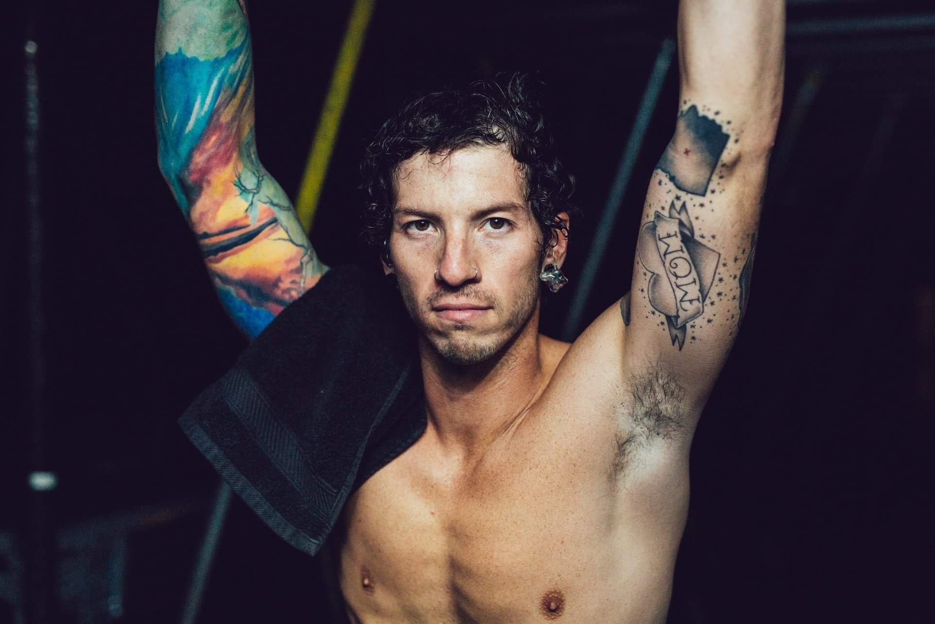
Josh Dun tattoos: high-resolution portrait with both arms raised and the colourful sleeve fully exposed

Concert lighting changes what a tattoo photo shows. In daylight, the sleeve’s colours separate and the branches are easier to pick out; under stage lights, it can look darker or flatter. The performance photo catches his arm as he reaches toward the drums.

Dun’s arms are constantly moving when he plays. The tree and bands of colour travel across the image as his sticks blur around them, making the tattoo part of the performance shot. It also means a photo may show only one part of the full design.

His clothes can cover parts of the ink: he’s played in sleeveless tops, shirts with wide armholes and costumes with sleeves. A photo may confirm a tattoo while hiding where it ends. It’s safer to describe what’s visible than to guess at a covered section.

Bright colour gives the sleeve a playful edge, while the dark outlines hold the shapes in place. Together, they lean toward a punk and alternative look without losing definition from a distance.

If you’re planning a tattoo, start with one image that reads quickly and build smaller texture around it. Dun’s tree is clear in both close-ups and concert photos; the lighting shifts, but its overall outline stays recognisable.

His other arm adds smaller symbols and lettering to the collection

Josh Dun tattoos: portrait showing both tattooed forearms and the separate pieces around the wrists

His other arm isn’t built around one colourful scene, so the smaller pieces stand out more. Photos show separate marks on the upper arm and forearm, including darker linework, lettering and compact symbols. Open skin between them keeps them from reading as one solid sleeve.

That difference gives the collection two distinct rhythms: the tree and roots on one arm, and smaller pieces you can take in one by one on the other. A wide shot can make the second arm look like a pattern; a close photo shows the spaces between the marks and their different levels of shading.

Lettering needs room to stay legible. Crowded words can blur as a tattoo ages. In the photos, the separate marks have space around them, and the skin between them helps each one read.

Some of the designs are graphic rather than realistic. Simple icons and dark outlines sit beside the larger work without competing for attention. A mixed collection doesn’t need one matching style; thoughtful placement gives the eye a path between pieces.

The exact meaning of each mark on this arm isn’t consistently documented. The photos still let us describe the placement and how the pieces fit together; they don’t need to serve as a biography.

His stage tattoos became part of the Twenty One Pilots look

Josh Dun tattoos: wide live shot showing the ink from shoulder to forearm during a masked performance

Dun’s tattoos are part of the visual impression of Twenty One Pilots on stage. The band’s shows have used colour, masks, uniforms and strong visual themes over the years. His ink is personal, but it also enters the picture when he performs in a sleeveless or shirtless outfit.

The masked performance shots make that contrast clear: even with his face covered, the colourful arm remains visible. It becomes one of the details fans recognise, alongside the drums, cap or sticks. If you want a tattoo to stand out across different outfits, placement is part of that decision.

Live photos also show why an arm design needs to work on a moving body. The elbow bends, the shoulder turns, and drum hardware can hide parts of it. A sketch can look clean on a flat page, but it’s the way the tree and roots follow Dun’s arm that keeps the main lines visible while he plays.

These images show colour, coverage and how the ink sits beside joints and muscles. They can’t confirm personal stories Dun hasn’t shared; the visible details are enough to discuss the design.

There’s also the band’s connection with tattoos. Dun and Tyler Joseph have used ink in their connection with Twenty One Pilots fans, including the well-known X symbol associated with the Clique. Dun’s wider collection goes beyond that one mark, but the shared reference helps explain why fans look closely at the tattoos.

What Josh Dun’s tattoo choices suggest for your own design

Josh Dun tattoos: stage image showing the contrasting colourful left arm and darker right-arm pieces

Dun’s tattoos show that one arm doesn’t have to follow a single style from shoulder to wrist. The coloured tree, darker graphic pieces and lettering sit together because each has its own space. Their moods differ, but they aren’t competing for the same patch of skin.

If you’re drawn to the nature sleeve, begin with a subject: a tree, roots, branches or a landscape. Choose whether it should face inward or outward, then plan for the arm’s bend. A design that follows the body’s shape tends to read more naturally than a rectangular image laid across it.

For smaller pieces, decide on spacing before settling every symbol. Gaps can keep tiny tattoos crisp; too many words, dates and icons in a narrow area can crowd them. Plan the arm as a whole, even if you add the pieces over time.

Colour needs the same thought. Dun’s sleeve holds its shape in busy stage photos because strong outlines break up the saturated areas. An artist can help decide where colour should lead and where open skin might keep the image from feeling muddy.

Don’t copy the artwork itself. Take the broader ideas—a nature subject, a sleeve built around movement, a few strong colours and space between smaller marks—and make them your own.

The collection has a clear focal point: the tree sleeve catches the eye first, while the smaller arm tattoos add detail. That balance can work in a personal design too, with one main piece carrying the theme and smaller references filling the surrounding space.

Reference photos should show the roots, smaller lettering and edge of the sleeve, not only confirm that he has tattoos. A close-up reveals the detail; a wider image shows how the pieces sit on the body. Each view answers a different question.

Look for images where the main arm design is unobstructed, with enough skin around it to judge scale. Clear photos also make it easier to distinguish a tattoo from shadow, jewelry or a stage mark. The line matters before its meaning: “Read the shape first, then chase the meaning.”

Browse the musician tattoo guides to see how other performers use colour, lettering and placement. The point is to notice what makes a design readable and discuss those choices with your own artist, not copy a celebrity’s tattoo.

The live performance embedded below shows how Dun’s arms turn and stretch while he plays, and how parts of a tattoo can disappear behind the drums. That movement is part of the design’s look, especially where it crosses a joint or follows a muscle.

Fan-made visual guide

This compilation compares photographs of Josh Dun’s tattoos. The meanings discussed in the commentary are fan interpretations.

More photographs of Josh Dun’s tattoos

Josh Dun raises his tattooed arm in a close selfie.
Josh Dun’s coloured sleeve during a live performance.
A separate selfie shows the coloured tree-and-roots sleeve.

Nelly Tattoos: Chest Rose, Stomach Lettering and Arm Ink

Nelly’s collection centres on a large chest emblem and lettering across the stomach, with darker arm patterns and smaller symbols around them. The pieces appear in different photos from his music career, and they don’t form one matching sleeve. Their scale and placement give the collection its shape.

Some designs are linked in coverage to his St. Lunatics identity and public music career. Other marks are easier to see than to explain. Photos show the ink, but not the private reason for every line. This guide stays with the visible work and uses Nelly tattoos with care.

The chest rose and stomach lettering carry the strongest old-school look

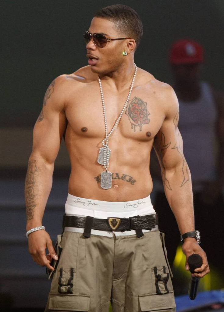
Nelly tattoos: shirtless performance image showing the chest rose, stomach lettering and arm work

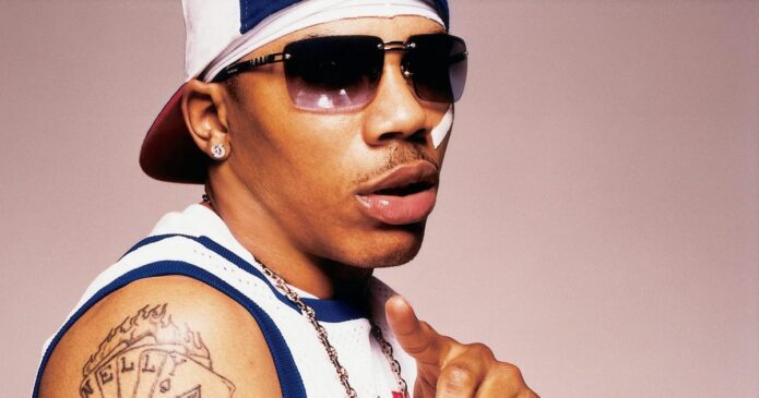
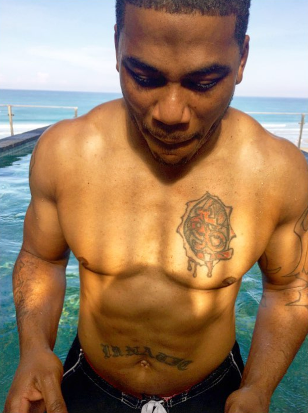
When Nelly appears shirtless, the chest and stomach pieces are hard to miss. A large rose-like emblem sits on his chest, with a dripping edge and a darker centre; lettering runs across the torso above the navel. Together they have the bold look seen in his early-2000s stage and editorial photos.

The chest piece has a clear outline, so it stays visible when the lighting changes. Its rough, dripping edge sets it apart from a fine-line rose. Open skin around it keeps the darker centre from blending into one solid patch.

The script below it is horizontal and easy to pick out in shirtless photos. Tattoo references link it to Nelly’s crew and music identity, though online captions don’t always render the word the same way. It’s safer to describe the lettering and mention the St. Lunatics connection where it’s documented.

The emblem and script do different jobs: one reads as an image higher on the chest; the other works like a banner across the stomach. Keeping those shapes distinct makes the torso feel organised, even with tattoos from different styles and periods.

If this part of Nelly’s collection appeals to you, notice the scale. One central image draws the eye; a short line below it adds context. That’s easier to read than several large designs competing across the torso.

The arms mix tribal lines, symbols and smaller pieces

Nelly tattoos: clear event photograph showing the dripping chest rose and script across the stomach

The arms have more variety than the chest. Photos show darker linework, tribal-style patterns and smaller symbols across the upper arms and forearms. Some shapes stand out in close portraits; at a distance they become part of a broader pattern.

That gives the arms a different rhythm from the torso. The rose is one focal image, while the arm designs repeat lines, leave open skin and keep separate symbols apart. The collection looks as though it grew over time, rather than beginning as one coordinated sleeve.

Clothes change what the photos reveal. A sleeveless jersey exposes the shoulder and upper arm; a white T-shirt hides most of the same ink. Look for a well-lit image with enough skin visible to see where a tattoo begins and ends.

Some galleries call the arm work tribal. The images support that broad description, but they can’t establish a personal meaning for every curve. A good guide stays with what the photo shows: line weight, placement, coverage and how the work follows the muscle.

For your own arm piece, leave space around smaller symbols. Those gaps help each one stay readable. A tattooist can connect them with light shading or background texture without turning the whole arm into a dark block.

The newer photos make the main chest emblem easier to read

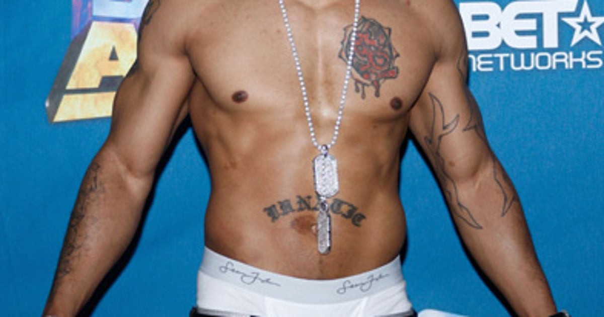
Nelly tattoos: event portrait showing both arms, the chest piece and the waistband lettering together

Later photos give a clearer look at Nelly’s chest emblem than some of the older stage shots. The poolside portrait has even light and no shirt or microphone hiding the torso. You can see the emblem, lower script and arm work together.

In natural light, the design looks softer than it does beneath red concert lights. The tattoo itself hasn’t changed; colour temperature, camera distance and skin highlights change how it appears. Daylight close-ups can show the ink more clearly than dramatic stage pictures.

The lower script makes another horizontal line under the chest piece. It balances the shape above it. If you’re planning chest lettering, watch how the text sits against the main design; the spacing and curve can make it support the image or crowd it.

From the front, the chest piece anchors the layout and the arms frame it. Together they read as one view of the body, rather than separate tattoos shown in unrelated snapshots. Placement does as much as the drawings here.

The best-supported meanings are the ones tied to Nelly’s public music identity. The larger designs sit alongside references to his name, crew and career. Smaller marks may have private stories he hasn’t explained, and the photos can’t fill that in.

His stage photographs show how the tattoos work as a full collection

Nelly tattoos: sunlit close portrait showing the chest emblem and lower stomach script without stage clothing

Nelly’s tattoos appeared in the same public image as bandanas, dog tags, jerseys and loose stage clothes. The ink isn’t a costume; those performances and videos simply made the arms and torso part of the look people saw.

Live photos show what still shots miss. An arm bends around a microphone, a shoulder turns to the crowd, or a chain covers part of the chest. A design that looks like one flat graphic in a portrait can break into sections as the body moves.

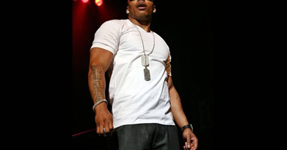
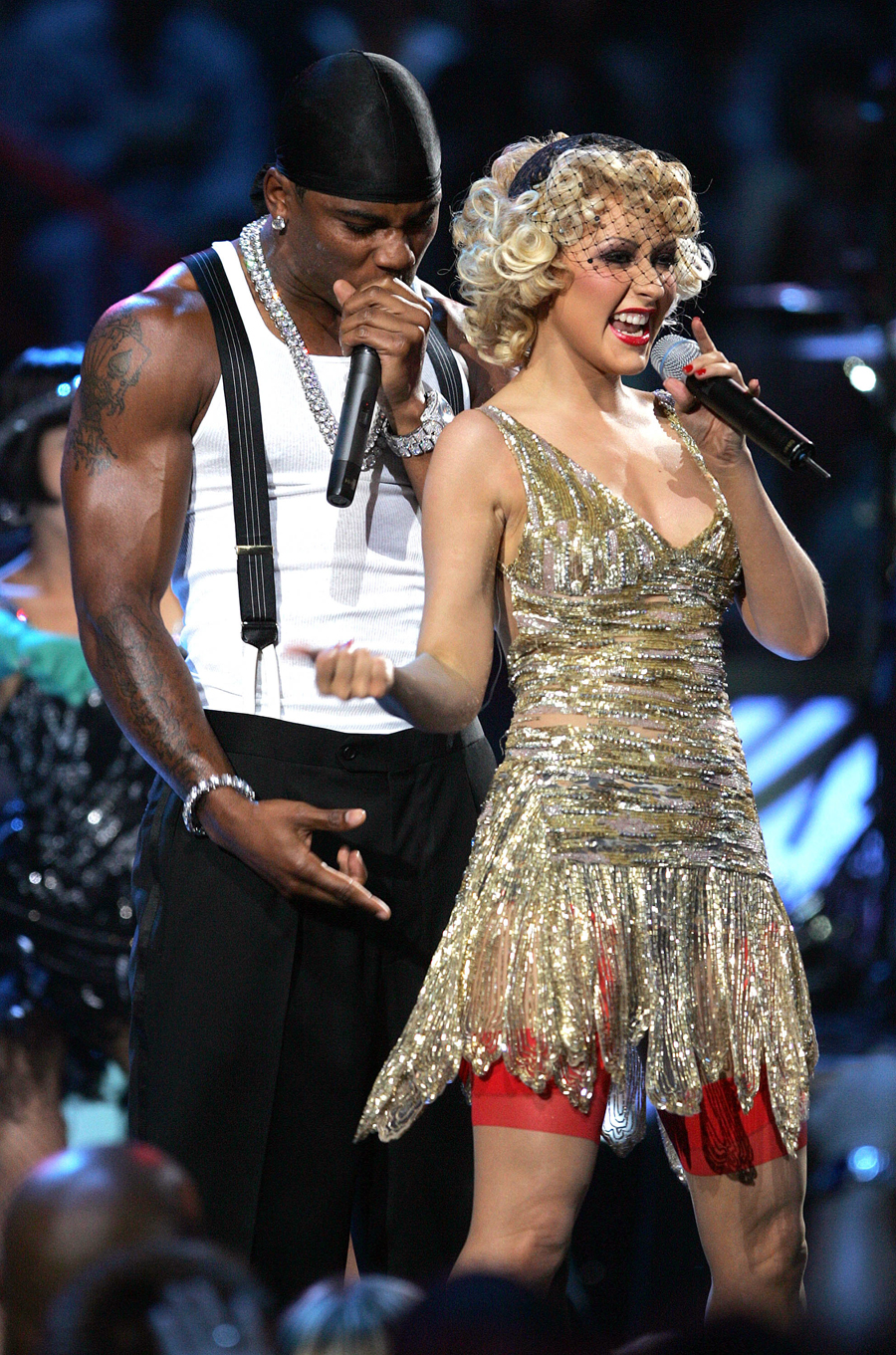
The duet photo shows the arm ink against a busy background of another performer, lights and a crowd. The darker lines still give his silhouette definition. If you want a design to read in everyday photos, strong shapes and placement matter.

A photo can prove a tattoo is there without showing every edge. Stage shots are useful, but the close-up and poolside images fill in more detail. Each view has a job; no single frame tells the whole story.

Bold central art and smaller supporting marks provide the main visual pattern. Nelly’s tattoos don’t all need to match; the chest emblem, script and arm work sit together through placement and shared references to his public identity.

What Nelly’s tattoo layout can teach you about custom ink

Nelly tattoos: live duet photograph showing the arm ink and how the tattoos read in motion

Nelly’s collection may appeal if you like ink that feels personal without looking too polished. The chest rose has a rough graphic edge, the stomach lettering is direct, and smaller arm patterns break up the larger pieces. It feels lived in rather than like a matched set of flash.

Choose the area you want to build around. For the chest, start with one image and plan the lettering below it. For the arm, decide whether you want a connected sleeve or separate pieces with open skin between them.

Lettering needs a little more thought. Words across the stomach or ribs move with the body, and the curve can change how they read. Pick a type style that stays clear at the size you can fit; a short phrase with room around it is easier to read than a long line squeezed into a small space.

Think about how much of the tattoo you want visible day to day. Nelly’s larger pieces disappear under a shirt and become the focus when he takes it off. That lets the wearer choose how much of the collection other people see.

Use the photos as references, not templates. Keep the ideas that suit you: a central emblem, honest lettering, a few symbols linked to your life and enough open skin for the layout to breathe. The finished piece should still tell your story.

The chest emblem gives the eye a place to land, while the arm work frames the body and stomach lettering adds another horizontal line. That layout can guide a design without requiring every tattoo to share the same style.

Useful reference photos show the tattoo, the skin around it and the angle of the body. A close image can clarify a line or symbol; a wider portrait shows how the pieces sit together. “Read the placement before you read the legend.”

Browse the musician tattoo guides to compare chest lettering, arm symbols and old-school colour across performers. Nelly’s collection shows how ink can feel bold and personal with a rough edge.

The performance embedded below shows the arm tattoos appearing and disappearing as he moves. Compare it with the still photos above: the ink sits on a moving body, not a flat screen.

More musician tattoo guides

Fabolous Tattoos: Portraits, Lettering, and His Full Arm Style

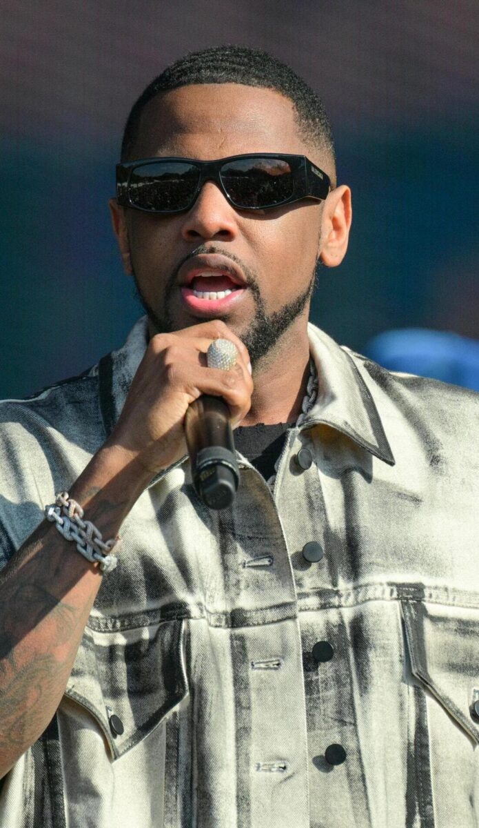
Fabolous’s style has always included more than clothes. Jewelry, jerseys and sunglasses are part of the look, and the tattoos add another layer: black-and-gray portraits, forearm lettering and dense arm work that appears in photos onstage and at events.

Most of the visible ink sits on his arms. Short sleeves and tank tops reveal the upper-arm portraits and forearm text; performance photos show how the designs shift as he moves. Separate pieces blend into a sleeve-like collection, even though they may have been added over time.

This guide follows the details shown in clear tattoo photos: the portraits, “HUSTLE + MUSCLE” lettering, black-and-gray shading and the way clothing frames the ink. The featured portrait is separate from the five inline images.

Fabolous portrait tattoos on his upper arms

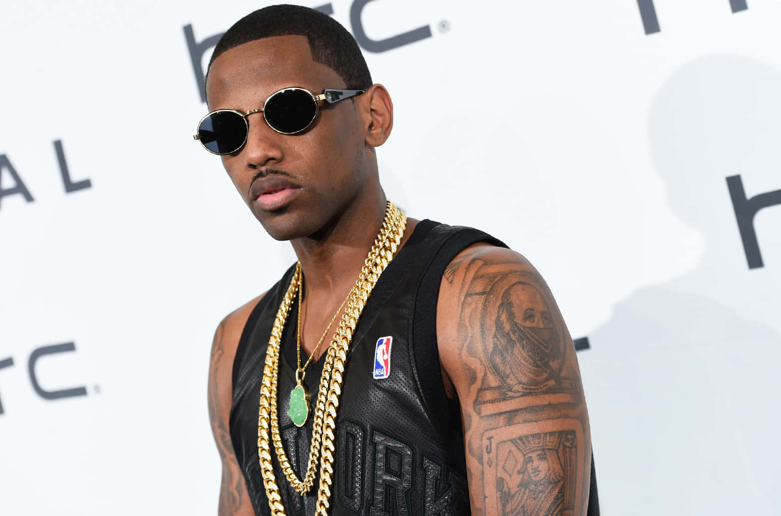
The portrait tattoos on Fabolous’s upper arms give the collection a clear focal point. In a black tank top, a face sits inside shaded work, with curls, outlines and darker background elements around it. The image keeps the arm from reading as a set of disconnected symbols.

Contrast helps the face remain recognisable. In these photos, darker shading frames the features without relying on colour; line weight and a firm outline keep the portrait visible against the rest of the arm.

A second event photo shows the same approach from another angle. A large face sits above a band of lettering and other imagery, creating a path down the arm. That layout can be useful when planning a sleeve instead of a single small piece.

The portrait stays readable because the surrounding detail leaves the face room. When every area has equal weight, a large tattoo can become hard to take in. Small gaps help the main features stand out in a wider photo.

Jewelry and clothes appear alongside the tattoos without covering them entirely. A chain may cross the shoulder and a jersey may hide the lower chest, while the arm remains the main view of the ink. The pieces sit within his everyday styling rather than in a separate display.

With a portrait, placement matters as much as likeness. The upper arm gives an artist space to work and lets the wearer choose when the design shows. Fabolous’s photos range from close event views to wider images with the outfit around the tattoo.

Fabolous tattoos: high-resolution portrait showing the tattooed forearm and black-and-gray shading

Fabolous’s “HUSTLE + MUSCLE” forearm tattoo

“HUSTLE + MUSCLE” is among the easiest phrases in Fabolous’s collection to pick out. The lettering runs along his forearm and matches the confident image he presents through music and performance. Its visible placement gives the short phrase weight.

The words can be read when his arm is relaxed, bent or held near a microphone. In stage photos, they appear as he reaches toward the crowd, so the tattoo becomes part of the movement.

The plus sign separates the two words but also links them. That small graphic choice gives the phrase the feel of a mark or logo, which suits an artist who pays attention to presentation.

“HUSTLE + MUSCLE” carries a full attitude in three words. It does not explain every part of Fabolous’s career, but it quickly signals work and confidence.

Forearm lettering needs room because the arm curves and moves. If the layout is too tight, the words can distort or become hard to read. Here, the phrase has space and the surrounding sleeve work does not swallow it.

If you’re considering text, choose a phrase you would actually use. A slogan picked only for its sound can feel generic; a short line with a personal rhythm is more likely to keep its meaning over time.

Fabolous tattoos: clear event portrait showing the large upper-arm portrait and surrounding ink

Fabolous’s black-and-gray sleeve style

Black and gray dominate the visible work on Fabolous’s arms. The shared palette gives portraits, lettering, patterns and smaller symbols a similar tone even though the subjects differ.

Lighter gray areas leave breaks between the darker shapes. Those shifts keep the sleeve from becoming one solid block and help the writing and portrait edges stay clear in event photos.

The palette also sits naturally with the dark shirts and jerseys, sunglasses and gold chains that appear in many photos. The tattoos become part of the overall look, with the jewelry adding shine and the ink giving it darker structure.

Shading is what links the different pieces into a sleeve. A portrait can sit near a phrase and a pattern can sit below it; the shared tonal range helps the arm read as one collection.

Clear shapes and contrast also help tattoos remain readable in varied light. Fabolous’s larger pieces can be seen in stage lighting and flash photos, as well as softer event pictures.

For a sleeve built over time, start with one main piece and add work that shares its shading or line style. Planning that visual link early makes separate tattoos easier to bring together later.

Fabolous tattoos: front-facing event image showing both arms and layered lettering

Fabolous tattoos with jerseys, jewelry, and stage clothes

Photos often show Fabolous’s tattoos alongside the clothes he wears. Basketball jerseys leave the shoulders open, tank tops frame the upper arms, and black T-shirts bring out the gray shading without making every image feel like a posed tattoo shot.

Gold chains and watches catch light, while the tattoos stay matte and dark. That contrast gives the photos depth: jewelry moves and shines, and the ink provides a steadier shape underneath.

One event photo shows both arms from shoulder to wrist, making it easier to compare the two sides. They are not mirror images; each has its own mix of faces, words and shading.
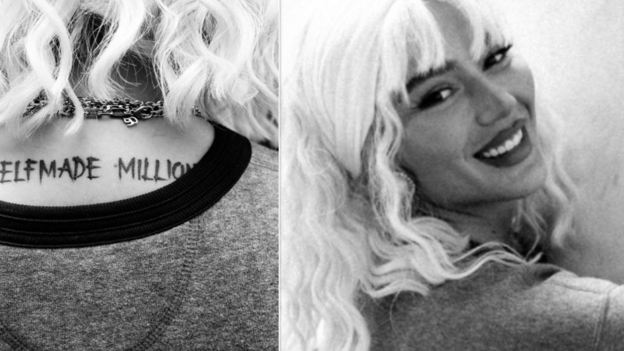
In a live performance photo, Fabolous holds a microphone with the forearm lettering and sleeve visible. The tattoo appears as part of the performance, rather than as a separate object being shown to the camera.

The clothes help show how the tattoos work in everyday settings. A design has to sit well on a moving body and under changing light, not only in a close-up. Fabolous’s photos offer views across several settings.
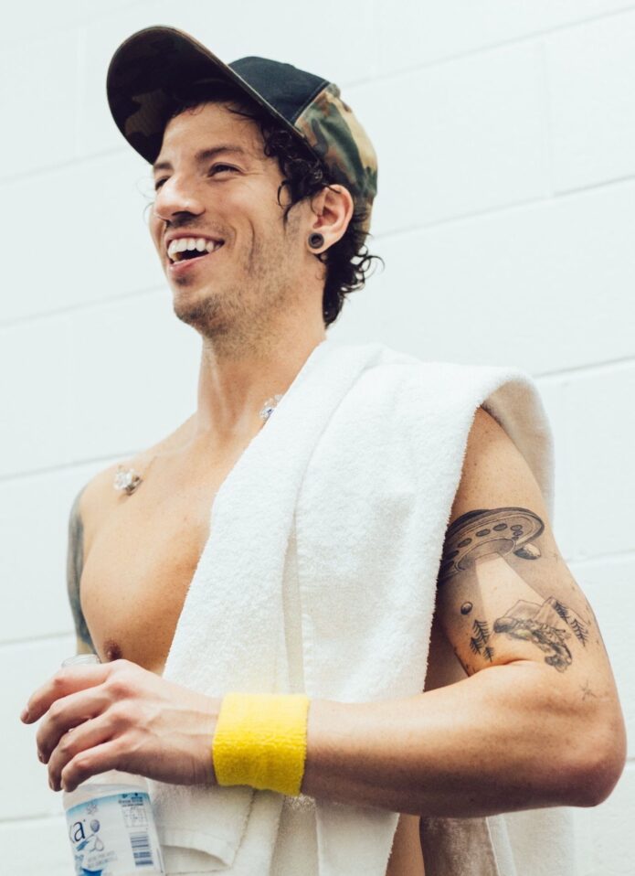
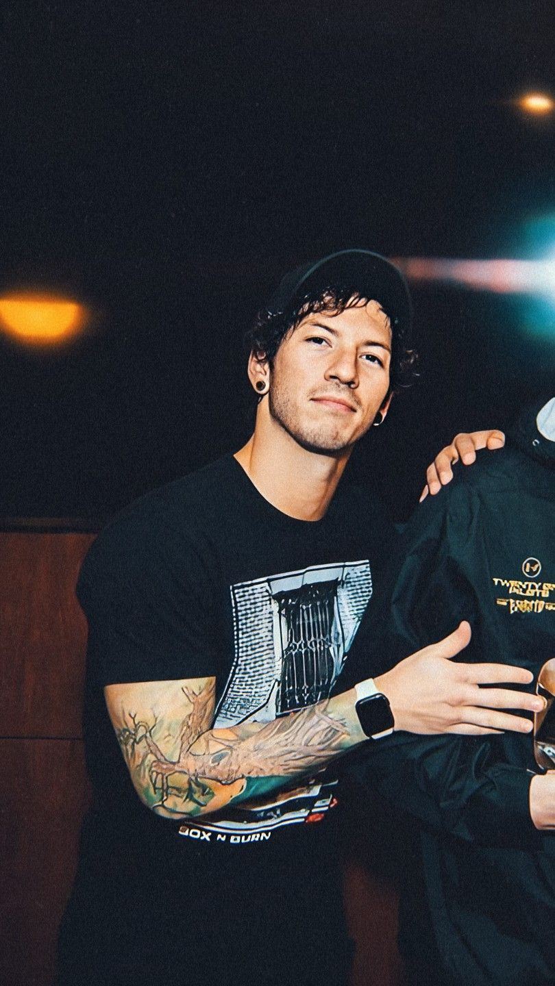
Clothing can also control how much of a sleeve shows. A tank top reveals the arm; a T-shirt or jacket can cover more when needed. That flexibility matters when a tattoo needs to fit different parts of daily life.

Fabolous tattoos: high-resolution portrait showing dense ink across both forearms

What Fabolous’s tattoo collection says about hip-hop style

Fabolous’s collection sits within a hip-hop tradition of using names, portraits, phrases and symbols as part of an artist’s public image. Here, the tattoos echo the confidence and strong visual choices that also appear in his clothes and music.

Arm placement keeps the ink visible across many parts of his career: portraits, events, videos and live shows reveal different sections of the same collection. Over time, the tattoos become part of the silhouette people recognise.

The designs do not follow one narrow trend. Some use portrait realism; others rely on bold lettering or shaded patterns. Their connection comes from how Fabolous wears them and from the shared confidence of the overall look.

Tattoos can work as part of a wider visual identity. That means thinking about placement, clothing and the story behind a design together, rather than copying a particular sleeve.

For more examples, browse our musician tattoo guides to see how artists use lettering, portraits and symbols. Keep the ideas that connect to your experience.

The portraits, lettering and sleeve shading stay visible in ordinary outfits as well as under stage lights. That makes Fabolous’s collection a useful reference for tattoos designed to be worn in both settings.

Fabolous tattoos: front-facing portrait with visible tattoos across both arms

His collection is a reminder that a tattoo can be both personal record and public style. The best pieces give the viewer something to see while still belonging to the person wearing them.

More musician tattoo guides