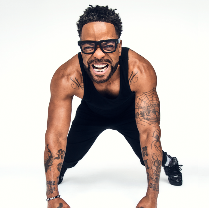
Method Man’s ink is easy to pick out in a photo. “MEN” and “MAN” run down his forearms, and a spiderweb gives his arm a shape you notice straight away. The tattoos cover his chest and shoulders too, but the skin between them keeps the larger areas from reading as one dark patch.
Method Man tattoos mix blunt lettering with finer lines and shaded sections. The pieces don’t all follow one theme or look like a single planned sleeve. They still hold together because the main shapes are clear and have space around them, whether he’s onstage, in a portrait or at the gym.
Method Man has been part of Wu-Tang Clan since its early years. His tattoos have a similar directness: the strongest designs are easy to see, without a lot of filler hiding them. Here are the placements and details that give the collection its character.
The MEN and MAN forearm tattoos are Method Man signatures
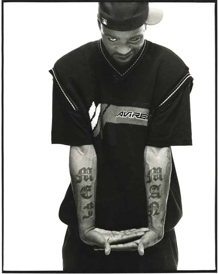
The best-known lettering sits on Method Man’s forearms: “MEN” on one and “MAN” on the other. The heavy gothic letters are short enough to read quickly, but they take up much of each forearm. When his arms hang by his sides, the words frame the hands and give the pair a strong outline.
The font adds as much character as the words. Thick strokes and pointed edges give the letters an old-school look; a plain block font would be easier to read, but less distinctive. Here the message comes through first, with the decorative details catching your eye after.
Putting a related word on each arm creates a natural pair. The tattoos don’t have to be mirror images: their shared scale, weight and position already connect them. With short lettering, the placement and font can carry as much weight as the words.
If you’re considering a name or a two-part phrase, test it at actual size before settling on a font. A design that looks sharp on a screen can lose its shape when it wraps around an arm. The tall letters need clear edges and enough space to stay readable as the forearm turns.
The spiderweb tattoo gives his arm work a sharp focal point
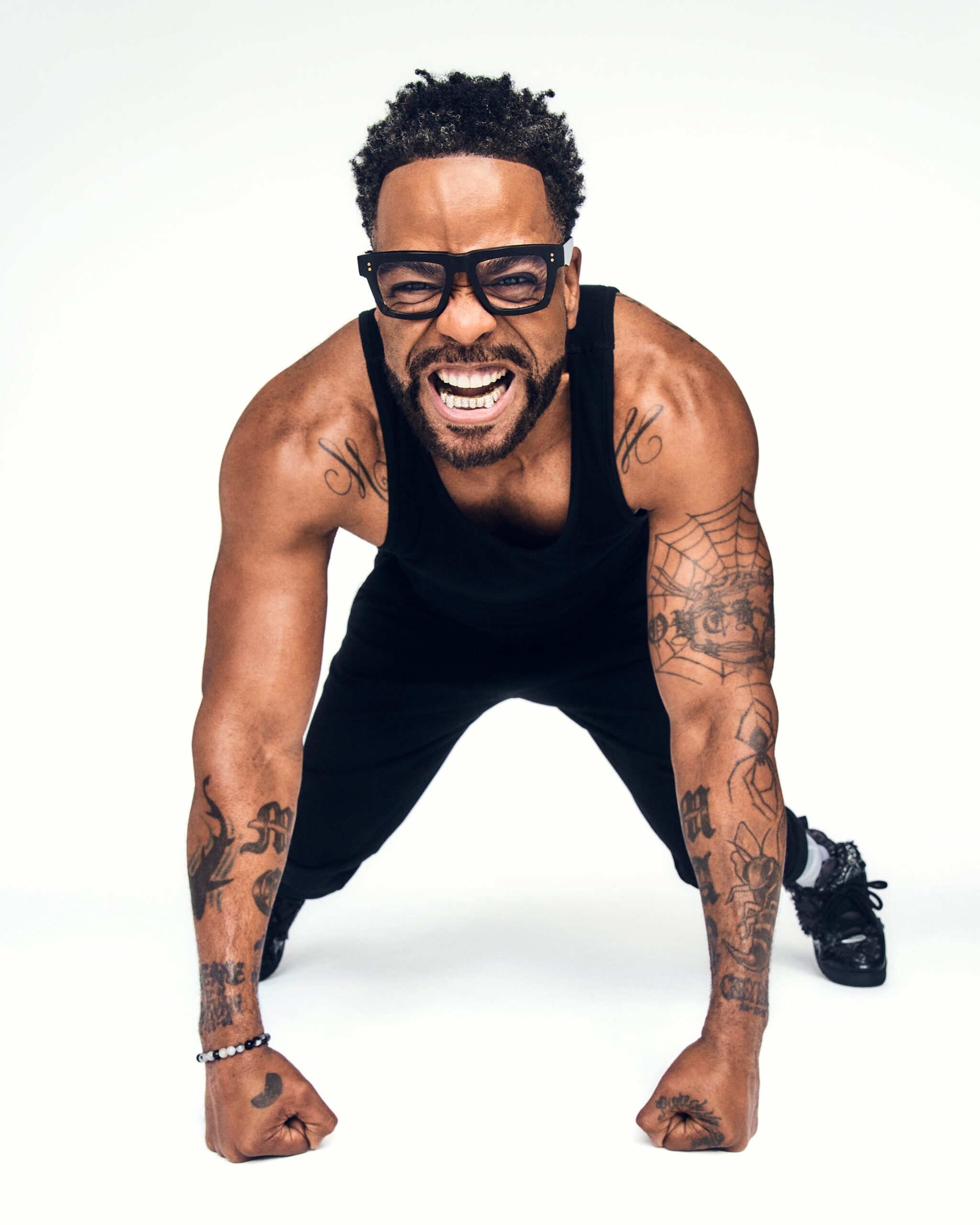
The spiderweb on Method Man’s upper arm changes the look. The forearm words are solid and angular; the web uses thin lines and open space. It gives the upper arm a clear focal point, and its curved spokes follow the round shape of the bicep.
A web can feel delicate or quite dark depending on how thick the lines are. In these photos, the pattern remains easy to see because it sits beside areas of skin that aren’t fully covered. That contrast keeps the fine lines from blending into the other ink.
The web’s round pattern also plays against the vertical lettering below it. Different shapes can lead the eye from one tattoo to another and make a collection feel connected. Here, the curve around the bicep and the long forearm words pull in different directions without competing.
If you like a web or another circular design, leave a little space around its edge. It can break up a run of straight lines, but a tight gap between lettering and a dark sleeve can swallow the pattern. Open skin may frame the design better than another small filler mark.
Gym photos show how the lettering sits with the larger arm work
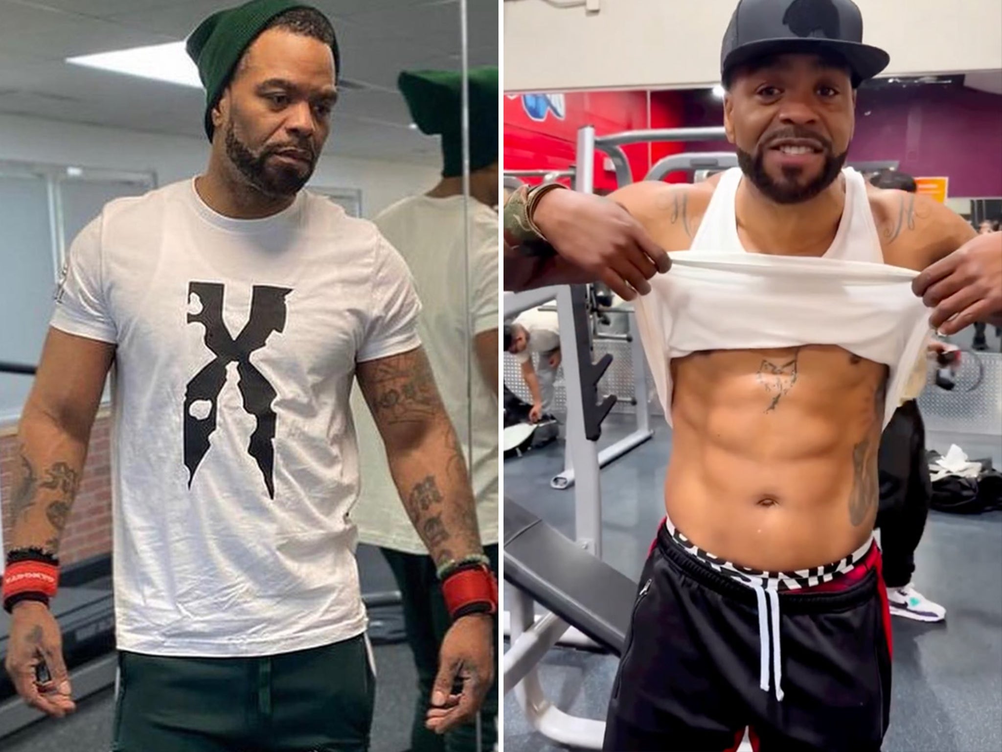
Gym photos show the tattoos in a less formal setting than a red-carpet portrait. With a tank top on, Method Man’s arms, shoulders and upper chest are visible together. You can see how the forearm lettering remains distinct while smaller marks and shading occupy the space around it.
The photos also show why placement has to account for movement. An arm narrows at rest and broadens when bent or flexed; the skin shifts as it turns. Tall lettering has a better chance of holding its shape through that movement, which helps explain why these words read clearly from different angles.
The collection isn’t one seamless illustration. Some areas are darker, others lighter, and patches of skin stay open. Open skin is part of the composition, not proof that a tattoo is unfinished. Leaving space can keep bold work cleaner than filling every gap.
If you’re building a sleeve, start with its main piece and live with it before deciding what goes around it. Look at photos with the arm relaxed as well as flexed, from the front, side and back. A gap that seems empty in a drawing may help the tattoo read once the arm moves.
Chest and shoulder ink connect the separate pieces
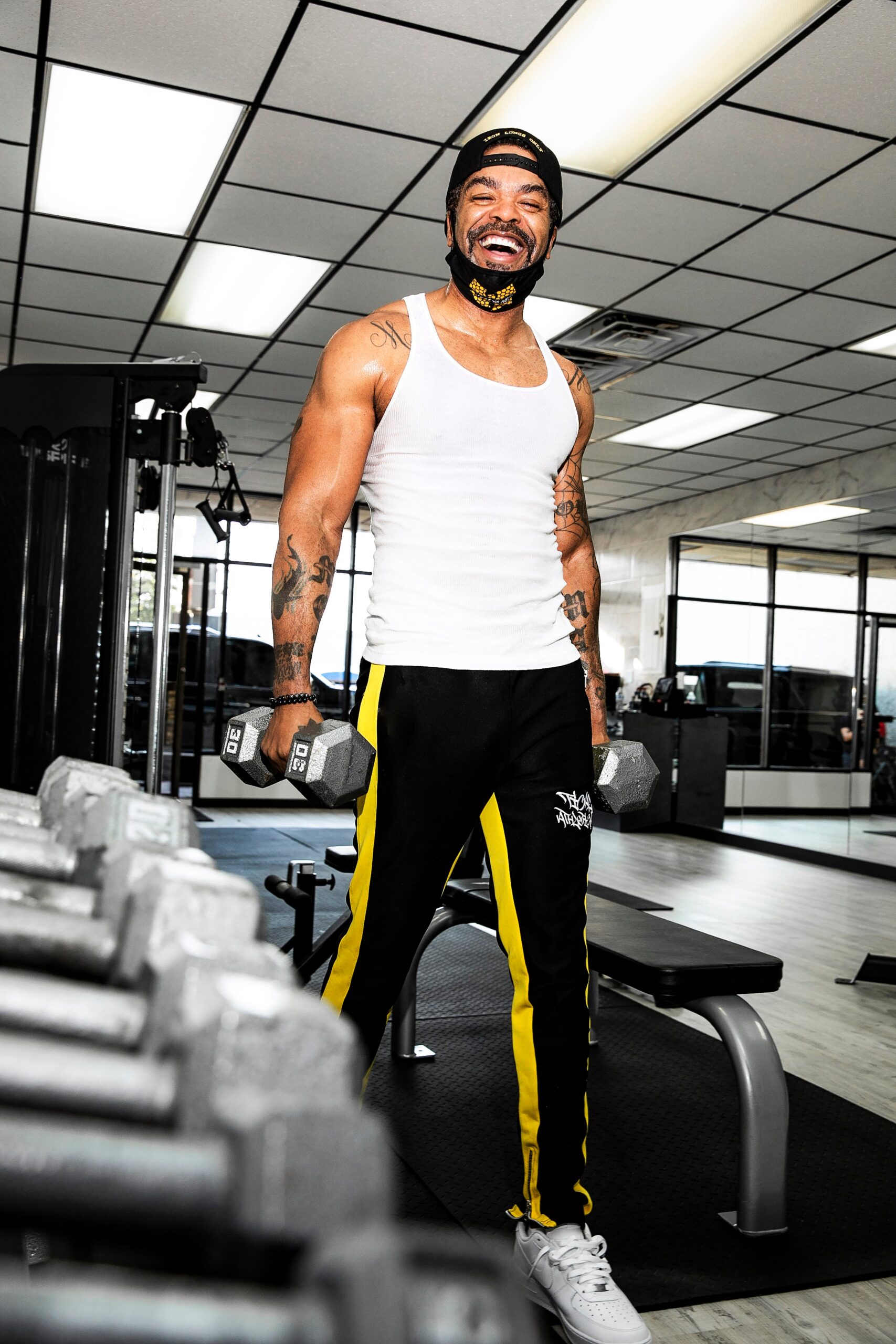
The chest and shoulder work gives Method Man’s upper body more visual weight. It sits away from the forearm lettering and uses a different scale, so the areas don’t compete. From a distance, the ink frames his chest and neck; closer up, separate lines, symbols and shading are easier to make out.
His arms carry the clearest words, while the chest and shoulders add texture and balance. When a sleeveless top leaves both areas exposed, the eye can travel from shoulder to forearm. That makes the separate tattoos feel related without forcing them into one continuous design.
Chest and shoulder placements need to work with several curves: the pectorals, collarbones and the joint that moves as the arm lifts. A design can shift as the wearer reaches or bends. Pieces with enough scale and room are easier to read across those changes.
Before joining work across the chest and shoulders, decide where you want the main focus. One central word or image can anchor the layout; separate pieces with open skin between them can work too. Either way, the first large tattoo will shape what fits around it, so account for how your usual shirts expose the area.
The tattoo collection feels bold because the main shapes stay readable
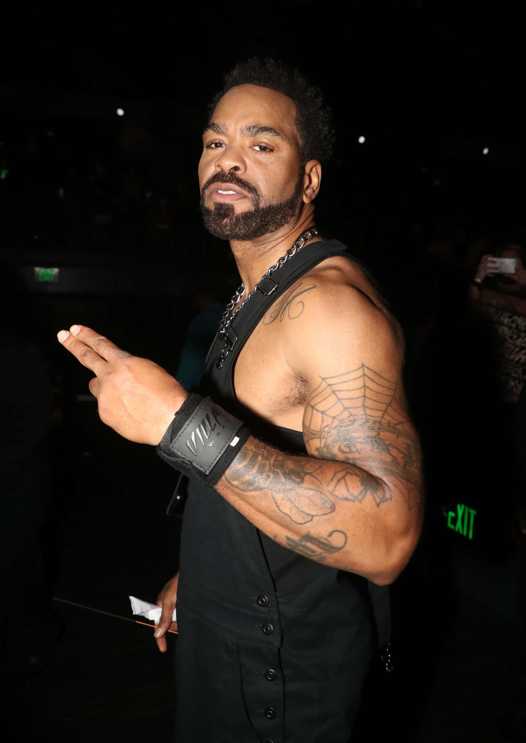
An event portrait shows another side of the collection. The lighting and clothes change, but the spiderweb still reads clearly and the other marks don’t collapse into a blur. The contrast lets the larger designs keep their shape in a different setting.
The MEN and MAN letters are strong landmarks, and the web has a pattern people recognise. The chest and shoulder pieces add detail around them without burying them. When every tattoo has the same dark weight, none stands out; a few clear shapes give the eye somewhere to land.
The collection varies its textures: the gothic type has hard edges, the web has fine lines and open gaps, and the torso shading adds depth. Different textures can keep a large collection varied without making every tattoo look unrelated.
If you want a collection to grow over time, decide what you want to repeat. It might be black-and-grey shading, heavier outlines, or a few recurring subjects. That gives each new piece room to be its own design while still fitting the rest. Method Man’s tattoos show how a strong visual identity can develop without making every tattoo identical.
Method Man’s tattoos are bold, but their main shapes remain easy to recognise. The “MEN” and “MAN” forearm words give the collection its signature; the spiderweb adds a finer graphic shape, while chest and shoulder ink fills out the upper body around them.
You don’t need to use the same words or symbols. Start with a piece you want to keep, give it room, and add nearby work only when it helps the main design. Clear lines and some open skin can make tattoos feel considered, even when they were added one at a time.
Here is Wu-Tang Clan’s original video for “Method Man”: