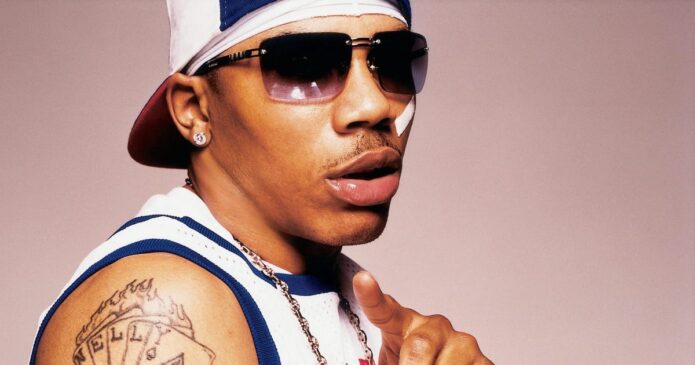
Nelly’s collection centres on a large chest emblem and lettering across the stomach, with darker arm patterns and smaller symbols around them. The pieces appear in different photos from his music career, and they don’t form one matching sleeve. Their scale and placement give the collection its shape.
Some designs are linked in coverage to his St. Lunatics identity and public music career. Other marks are easier to see than to explain. Photos show the ink, but not the private reason for every line. This guide stays with the visible work and uses Nelly tattoos with care.
The chest rose and stomach lettering carry the strongest old-school look
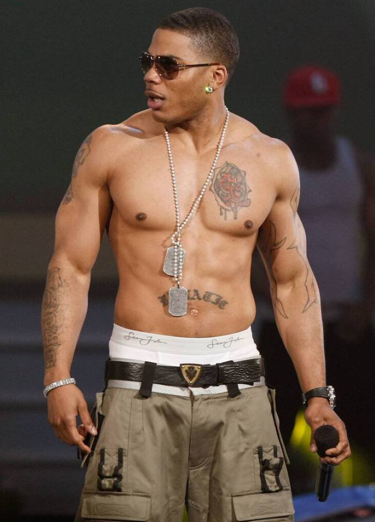
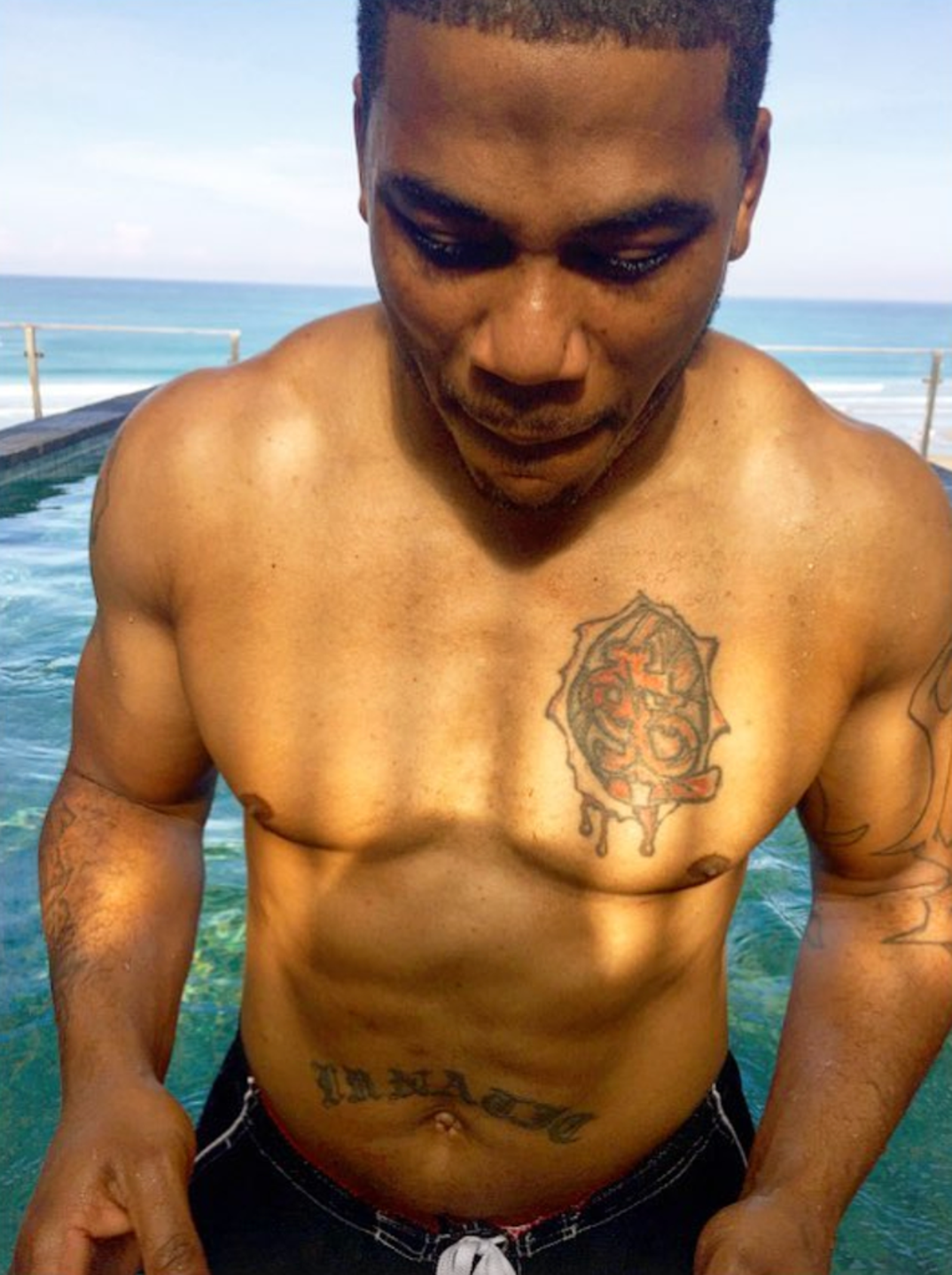
When Nelly appears shirtless, the chest and stomach pieces are hard to miss. A large rose-like emblem sits on his chest, with a dripping edge and a darker centre; lettering runs across the torso above the navel. Together they have the bold look seen in his early-2000s stage and editorial photos.
The chest piece has a clear outline, so it stays visible when the lighting changes. Its rough, dripping edge sets it apart from a fine-line rose. Open skin around it keeps the darker centre from blending into one solid patch.
The script below it is horizontal and easy to pick out in shirtless photos. Tattoo references link it to Nelly’s crew and music identity, though online captions don’t always render the word the same way. It’s safer to describe the lettering and mention the St. Lunatics connection where it’s documented.
The emblem and script do different jobs: one reads as an image higher on the chest; the other works like a banner across the stomach. Keeping those shapes distinct makes the torso feel organised, even with tattoos from different styles and periods.
If this part of Nelly’s collection appeals to you, notice the scale. One central image draws the eye; a short line below it adds context. That’s easier to read than several large designs competing across the torso.
The arms mix tribal lines, symbols and smaller pieces
The arms have more variety than the chest. Photos show darker linework, tribal-style patterns and smaller symbols across the upper arms and forearms. Some shapes stand out in close portraits; at a distance they become part of a broader pattern.
That gives the arms a different rhythm from the torso. The rose is one focal image, while the arm designs repeat lines, leave open skin and keep separate symbols apart. The collection looks as though it grew over time, rather than beginning as one coordinated sleeve.
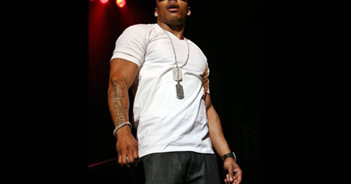
Clothes change what the photos reveal. A sleeveless jersey exposes the shoulder and upper arm; a white T-shirt hides most of the same ink. Look for a well-lit image with enough skin visible to see where a tattoo begins and ends.
Some galleries call the arm work tribal. The images support that broad description, but they can’t establish a personal meaning for every curve. A good guide stays with what the photo shows: line weight, placement, coverage and how the work follows the muscle.
For your own arm piece, leave space around smaller symbols. Those gaps help each one stay readable. A tattooist can connect them with light shading or background texture without turning the whole arm into a dark block.
The newer photos make the main chest emblem easier to read
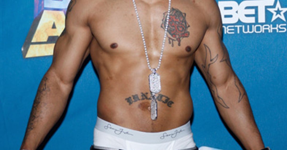
Later photos give a clearer look at Nelly’s chest emblem than some of the older stage shots. The poolside portrait has even light and no shirt or microphone hiding the torso. You can see the emblem, lower script and arm work together.
In natural light, the design looks softer than it does beneath red concert lights. The tattoo itself hasn’t changed; colour temperature, camera distance and skin highlights change how it appears. Daylight close-ups can show the ink more clearly than dramatic stage pictures.
The lower script makes another horizontal line under the chest piece. It balances the shape above it. If you’re planning chest lettering, watch how the text sits against the main design; the spacing and curve can make it support the image or crowd it.
From the front, the chest piece anchors the layout and the arms frame it. Together they read as one view of the body, rather than separate tattoos shown in unrelated snapshots. Placement does as much as the drawings here.
The best-supported meanings are the ones tied to Nelly’s public music identity. The larger designs sit alongside references to his name, crew and career. Smaller marks may have private stories he hasn’t explained, and the photos can’t fill that in.
His stage photographs show how the tattoos work as a full collection
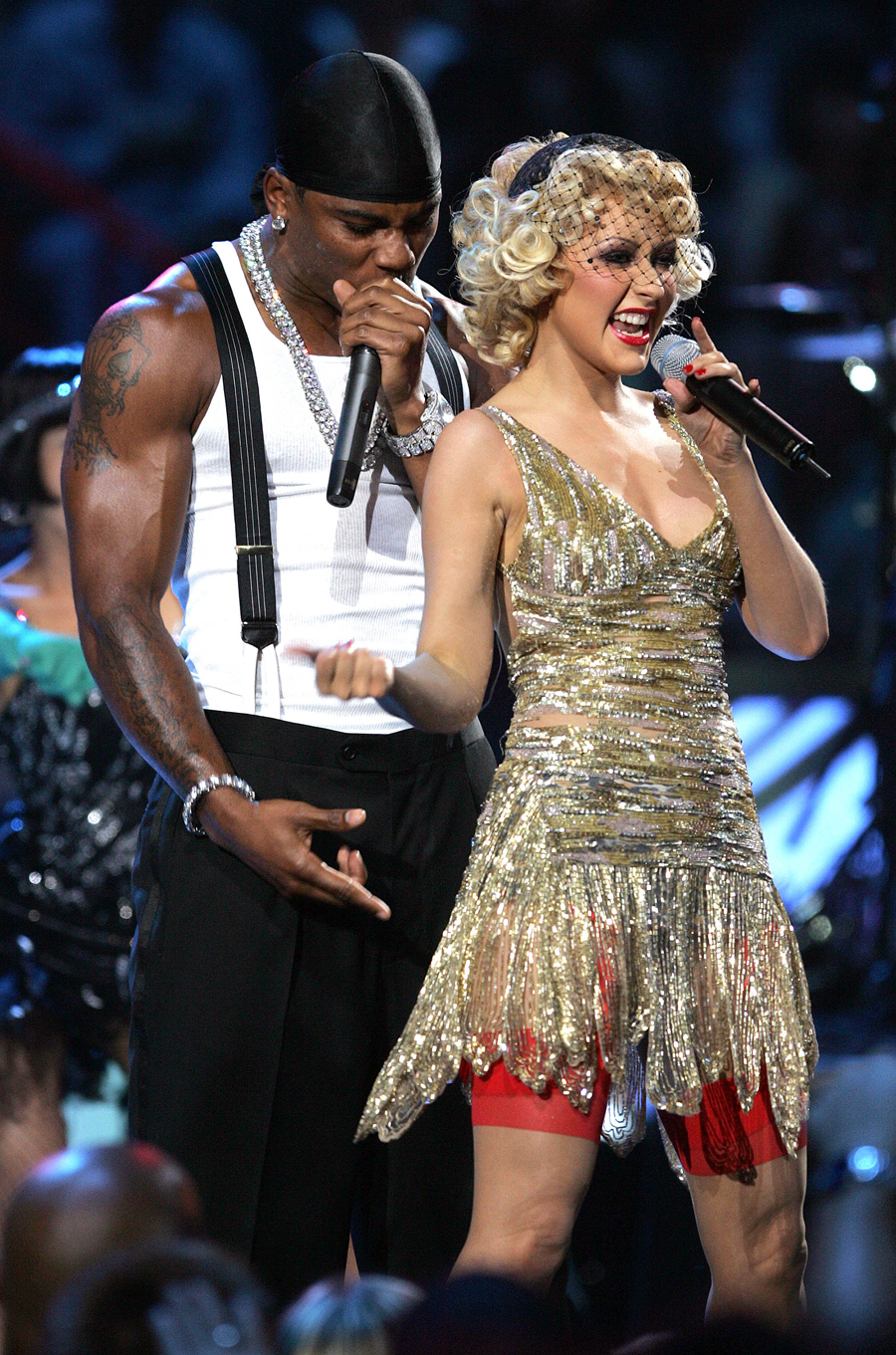
Nelly’s tattoos appeared in the same public image as bandanas, dog tags, jerseys and loose stage clothes. The ink isn’t a costume; those performances and videos simply made the arms and torso part of the look people saw.
Live photos show what still shots miss. An arm bends around a microphone, a shoulder turns to the crowd, or a chain covers part of the chest. A design that looks like one flat graphic in a portrait can break into sections as the body moves.
The duet photo shows the arm ink against a busy background of another performer, lights and a crowd. The darker lines still give his silhouette definition. If you want a design to read in everyday photos, strong shapes and placement matter.
A photo can prove a tattoo is there without showing every edge. Stage shots are useful, but the close-up and poolside images fill in more detail. Each view has a job; no single frame tells the whole story.
Bold central art and smaller supporting marks provide the main visual pattern. Nelly’s tattoos don’t all need to match; the chest emblem, script and arm work sit together through placement and shared references to his public identity.
What Nelly’s tattoo layout can teach you about custom ink
Nelly’s collection may appeal if you like ink that feels personal without looking too polished. The chest rose has a rough graphic edge, the stomach lettering is direct, and smaller arm patterns break up the larger pieces. It feels lived in rather than like a matched set of flash.
Choose the area you want to build around. For the chest, start with one image and plan the lettering below it. For the arm, decide whether you want a connected sleeve or separate pieces with open skin between them.
Lettering needs a little more thought. Words across the stomach or ribs move with the body, and the curve can change how they read. Pick a type style that stays clear at the size you can fit; a short phrase with room around it is easier to read than a long line squeezed into a small space.
Think about how much of the tattoo you want visible day to day. Nelly’s larger pieces disappear under a shirt and become the focus when he takes it off. That lets the wearer choose how much of the collection other people see.
Use the photos as references, not templates. Keep the ideas that suit you: a central emblem, honest lettering, a few symbols linked to your life and enough open skin for the layout to breathe. The finished piece should still tell your story.
The chest emblem gives the eye a place to land, while the arm work frames the body and stomach lettering adds another horizontal line. That layout can guide a design without requiring every tattoo to share the same style.
Useful reference photos show the tattoo, the skin around it and the angle of the body. A close image can clarify a line or symbol; a wider portrait shows how the pieces sit together. “Read the placement before you read the legend.”
Browse the musician tattoo guides to compare chest lettering, arm symbols and old-school colour across performers. Nelly’s collection shows how ink can feel bold and personal with a rough edge.
The performance embedded below shows the arm tattoos appearing and disappearing as he moves. Compare it with the still photos above: the ink sits on a moving body, not a flat screen.