Musicians

Tattoo guides for singers, rappers, DJs and musicians, with photographs, documented meanings and the stories behind their designs.

Dero Goi Tattoos: The Fractal Blackwork Project Behind His Ink

Dero Goi has described his tattoos as one integral piece, not a set of separate flash designs. That phrase is a useful guide to the blackwork across his arms, chest and back: photographs show different sections, but he has said they were meant to connect as one composition.

In an interview about the work, he traced it back to his first tattoo in 1991. He also named the artists who influenced its fractal and biomechanical direction, the Wolfsburg studio and artist who made it, and how his views on pain and changing taste shaped the project.

The interview doesn’t identify each small shape or give every one a separate meaning. Where Dero hasn’t named a symbol, this article leaves it as part of the larger design.

The first tattoo arrived in 1991
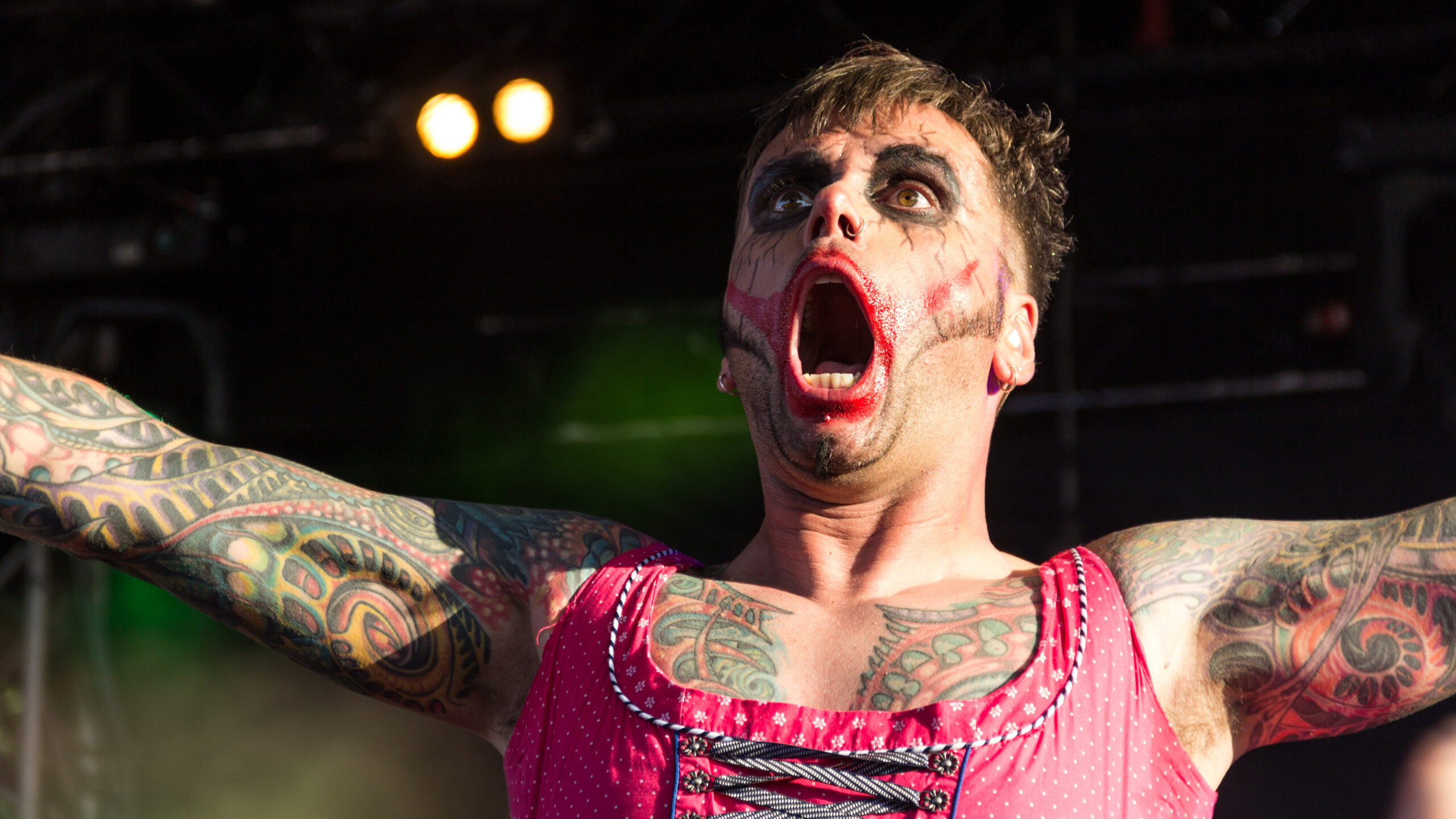
Dero Goi tattoos across both arms and chest during an Oomph! performance.
Dero Goi tattoos across both arms and chest during an Oomph! performance. Wikimedia Commons.

Dero says he got his first tattoo in 1991, after thinking it over for a while. He was drawn to black work then, and the first piece was entirely black. He later covered it when his taste changed.

The tattoos people see now didn’t all come from one sitting or one original plan. The early work was more exploratory; the larger project came later and was more deliberate. That first black tattoo is still part of the story, even though the newer design covers it.

It also belongs to an earlier point in Oomph!’s history, before the band’s later visual identity had fully taken shape. The expanded work came as Dero’s ideas about how the tattoos should fit together became clearer.

The collection is inspired by fractal and biomechanical tattooing
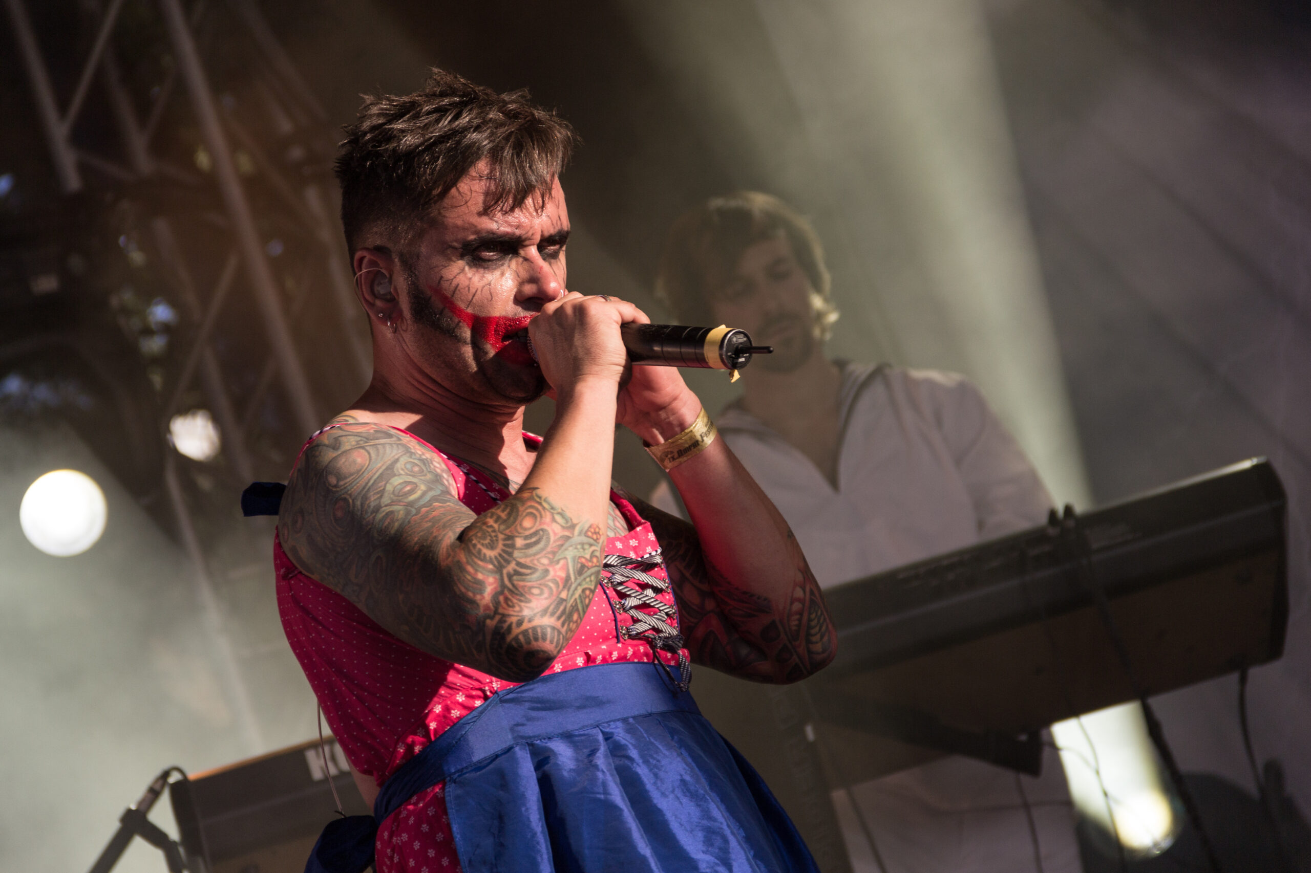
Dero Goi left arm tattoo detail in a high-resolution live photograph.
Dero Goi left arm tattoo detail in a high-resolution live photograph. Wikimedia Commons.

Dero has named Aaron Cain and Guy Aitchison as influences on the current direction. He points to fractal and biomechanical tattooing: patterns that branch or repeat, and layered textures that can follow the body’s lines. Those references help explain the connected look without turning every dark patch into a named object.

He wanted the design to feel original. Dero and the artist settled on the motif together, then developed it freehand and refined it with the needle. It wasn’t copied from a book. The interview doesn’t give each section a separate public meaning, so the clearest description is the overall style and how it moves across the body.

Olli at Culture Shocks made the project in Wolfsburg
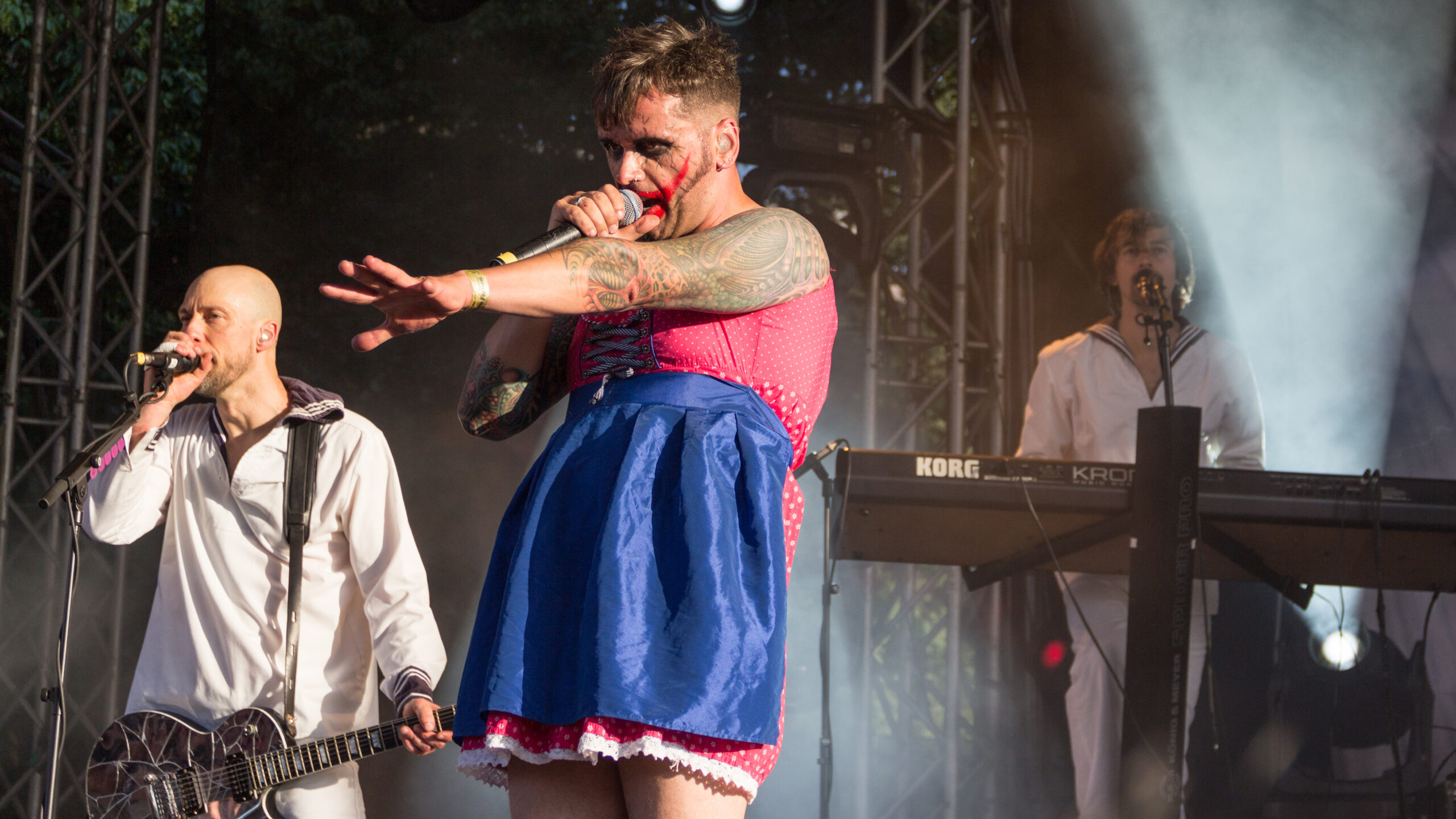
Dero Goi full arm tattoo project shown during a live performance.
Dero Goi full arm tattoo project shown during a live performance. Wikimedia Commons.

The work was done at Culture Shocks in Wolfsburg. Dero identifies Olli, the studio’s boss, as the artist. He said he looked through many artists’ portfolios, folders and shop displays before settling on the studio.

Dero and Olli chose the motif together. It was drawn freehand and then refined with the needle, rather than copied from a ready-made design. Having one main artist work across the arms, chest and back helped the composition keep a consistent direction as it grew.

His arms became the most visible part of the work
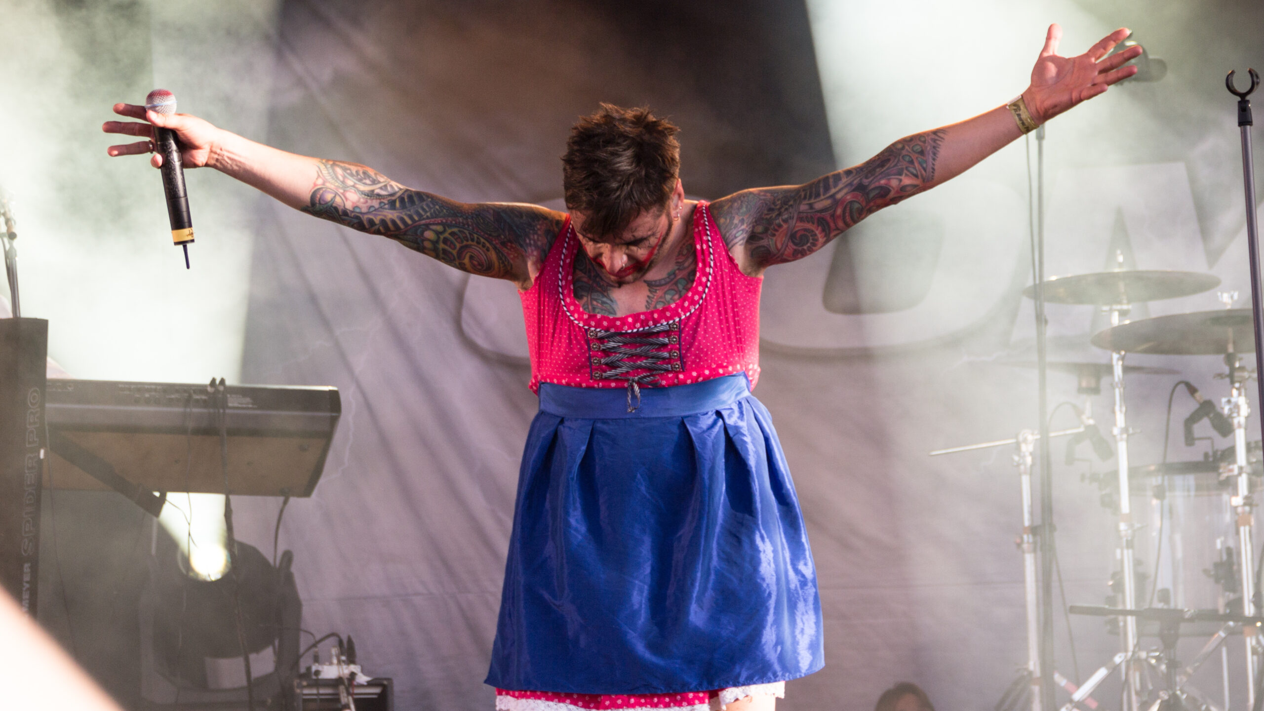
Dero Goi sleeve and chest tattoos, showing how the blackwork flows across his upper body.
Dero Goi sleeve and chest tattoos, showing how the blackwork flows across his upper body. Wikimedia Commons.

For years, Dero performed fully clothed, so most of his tattoos stayed out of view. That changed when he began wearing outfits that showed more skin. A vest at a Moscow performance made his arms visible, and photos from that period showed people the work wasn’t a new experiment.

He also points to the Supernova video, where part of the upper arm is already tattooed. The project spread from there over time. An older clip shows an earlier stage; later photographs show more of the work.

Dero describes the arms as part of the same piece, not as sleeves with separate themes. A close-up can show one section clearly, but it doesn’t tell the whole story of how the design connects across the body.

The chest and half-back carry the project beyond the sleeves
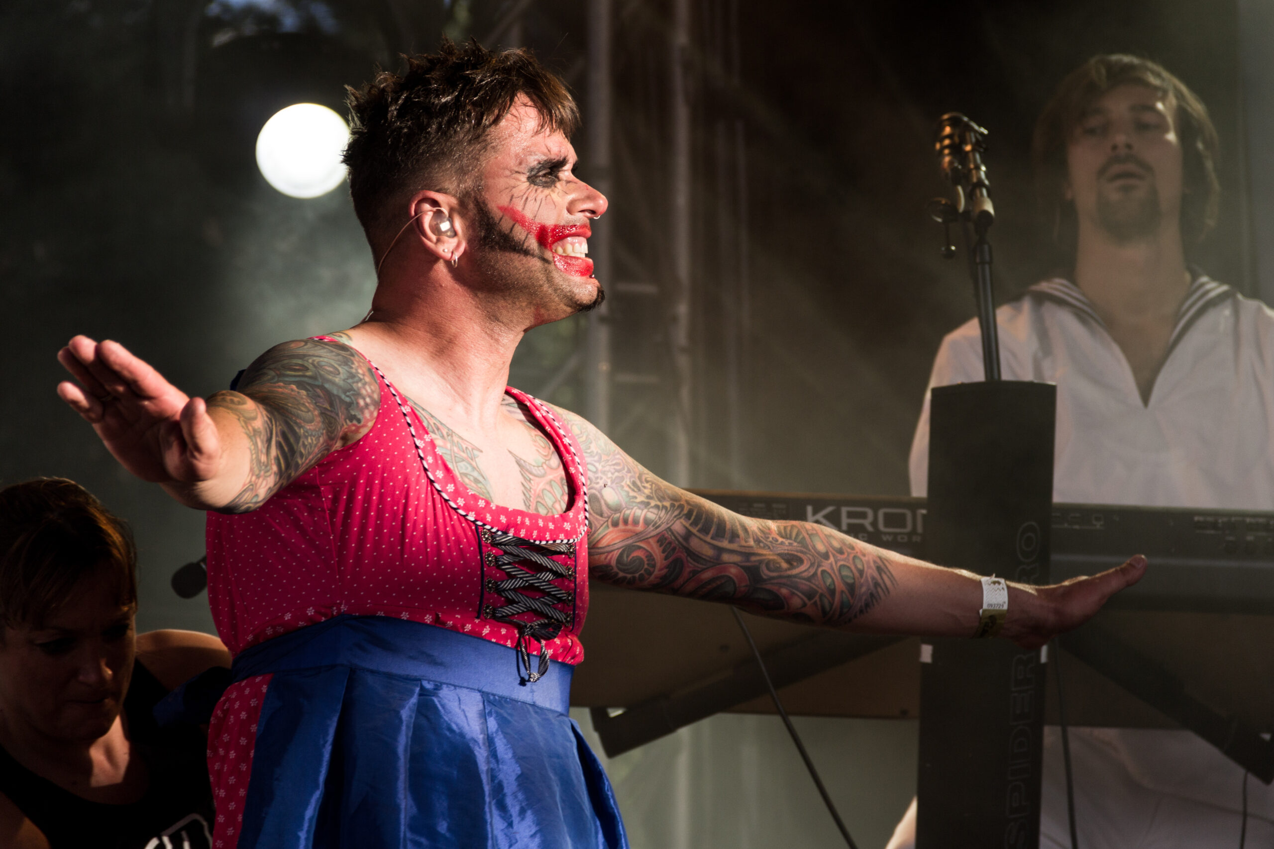
Close view of Dero Goi right arm tattoos and connected chest work.
Close view of Dero Goi right arm tattoos and connected chest work. Wikimedia Commons.

Dero says the work covers both arms, the chest and half of his back. The back carries it beyond a pair of sleeves and around the torso, into an area that isn’t usually visible from the stage.

At the time of the interview, a few small spaces were still to be filled, though the project was nearly complete. The chest photographs show broad areas of connected work rather than one emblem in the centre. Stage lighting and studio portraits bring out different details, and neither offers a full map of the tattoos.

Pain is part of what the tattoos mean to him

Dero says the chest and other sensitive areas hurt a lot. He doesn’t describe that pain as something separate from the finished tattoo; for him, it’s part of the experience and the physical commitment of changing his body.

He connects it with overcoming yourself and with pain traditions in different cultures and religions. His practical advice is that anyone who can’t accept the pain should think carefully before getting tattooed.

The project also took shape over many sessions. Each one added to the same composition, and the time between sessions let the work grow across his body in stages.

Changing taste led to a cover-up and a firm stopping point

Dero says his taste changed enough that he covered his first tattoo. If he wants to alter something again, he would rather rework or refresh existing ink than add a completely new design. He isn’t trying to keep adding separate motifs.

He also has limits on the imagery he’d choose. Tattoos that go against his political, moral or ethical principles aren’t for him. He accepts that other people make different choices, but those boundaries guide his own collection.

At the time of the interview, he was nearly finished and didn’t want to add something unrelated just to fill space. The project already had a direction, an artist and a point where he was ready to stop.

What the documented inventory can safely claim

The record supports a connected project across both arms, the chest and half the back. It began with a black tattoo in 1991, which Dero later covered. The current work was made by Olli at Culture Shocks in Wolfsburg, developed freehand and refined with the needle. Dero has linked its direction to fractal and biomechanical tattooing and named Aaron Cain and Guy Aitchison as influences.

Photographs show dense blackwork, layered textures and branching or repeated forms. The interview says the work grew beyond the upper arm and that a few small areas still needed filling at the time. It doesn’t provide a precise list of every shape, a separate meaning for each section or a complete timeline of every session.

Watch Dero talk about his tattoo project

This interview covers Dero’s influences, the Wolfsburg studio, the pain of the sessions and how the work spread across his body.
More musician tattoo guides

Lajon Witherspoon Tattoos: Family, Faith and a Full Arm Story

Lajon Witherspoon’s tattoos have been part of the Sevendust singer’s life for decades. He got a tribal band on his right arm at 17; later additions include family designs, religious imagery and a chest piece. A well-known cover-up replaced an older mermaid tattoo.

The collection has changed with him. Some tattoos mark where he started; others connect to his wife, children or faith. In an interview with Loudwire, he explained the religious cover-up. He also discussed his artists and family tattoos with Maytherockbewithyou. Those interviews help separate what he has said from what a concert photo can show.

The photos are useful for placement, but they do not identify every mark. A Rock Ink interview gives a closer look in his own voice.

His first tattoo was a tribal band on the right arm

Witherspoon has said his first tattoo was a tribal band around his right arm, done when he was 17. He remembered the point of making the choice: once it was inked, it was not coming out.

The band came before the family and religious designs that later became part of his collection. It is simple beside the larger pieces, but it set a starting point: every later tattoo would sit alongside that first mark.

Lajon Witherspoon tribal arm tattoo
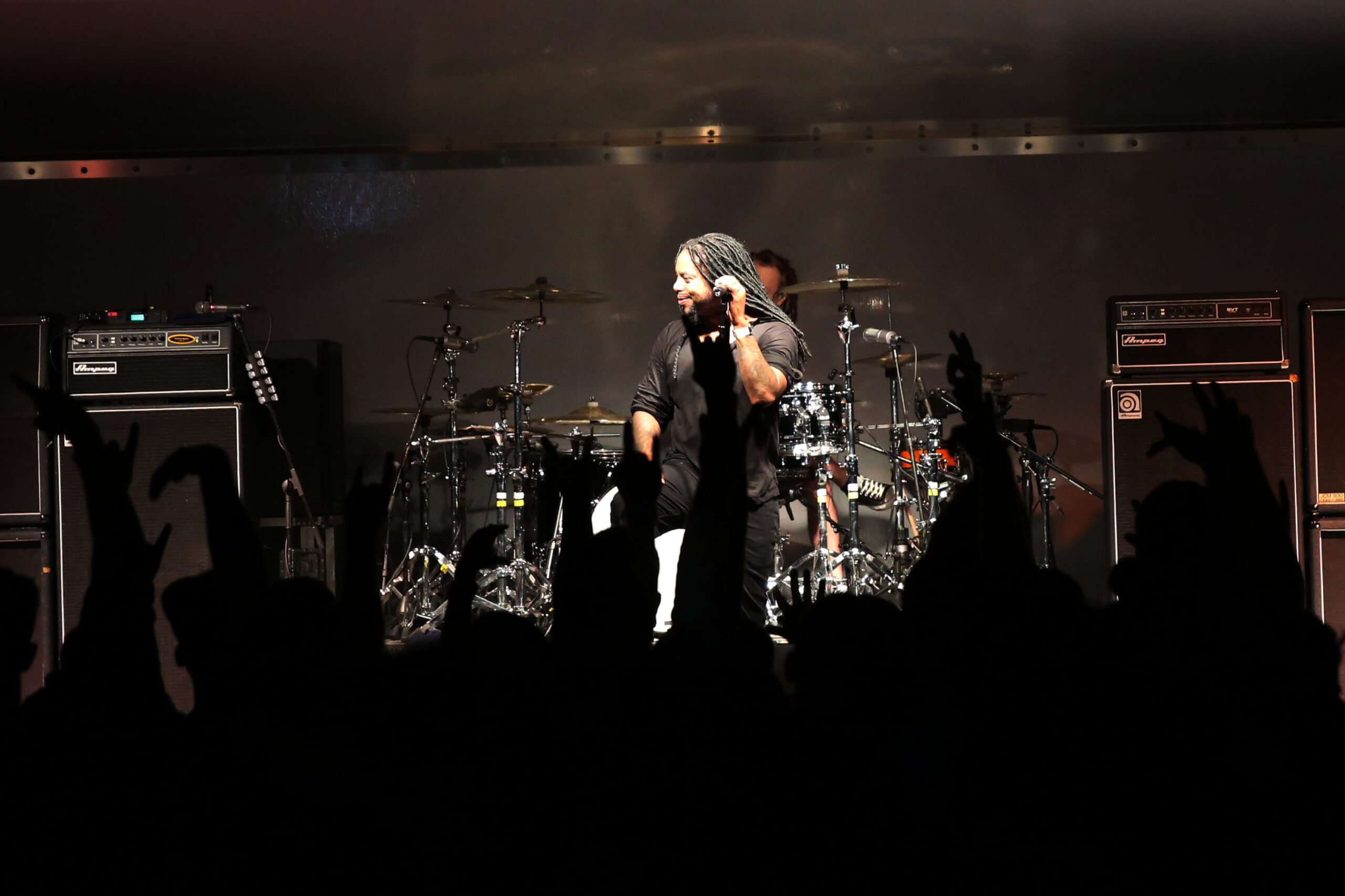
Witherspoon performs with the tattooed right arm visible. Photo: Wikimedia Commons.

A band wraps around the arm, so it remains part of the picture when he raises a microphone or reaches across the stage. It also shows up in older Sevendust photos even when a shirt or dark lighting hides the rest of his ink.

The arm work is easiest to see when he performs

Most public photos show Witherspoon singing rather than sitting still for a tattoo portrait. That makes live shots useful for scale, though the angle can change from one frame to the next.

Sharper stage photos show extensive work on both arms. They do not offer a reliable inventory of every symbol, especially where shadows cover the skin. They do make the overall coverage clear: the tattoos are a visible part of his stage presence.

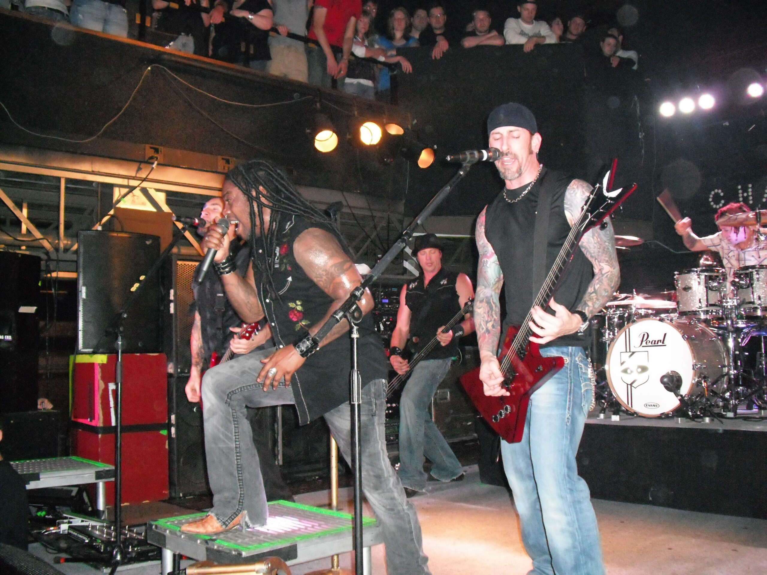
Lajon Witherspoon tattooed arms on stage
A wide stage photo shows the coverage across Witherspoon’s arms. Photo: Wikimedia Commons.

A face-focused publicity portrait may work as a featured photo, but it tells readers little about the tattoos. The useful images leave the arms, upper chest or shoulders visible long enough to show where the ink sits.

Clothing and light change what can be seen. A sleeveless top exposes more of the upper arm; a T-shirt can cover the chest. Daylight brings out linework, while a dark stage can make black ink blend into the background. Several views give a more honest account than one dramatic shot.

Family ink and the chest piece add a personal layer

In an interview with Maytherockbewithyou, Witherspoon said he had tattoos connected with his wife and children. He named Philip Lewis of New Zealand, Tony Levis in Miami, and Stu from Fort Wayne among the artists involved. Lewis worked on his chest piece; the newest tattoo at the time was for his wife and newborn child, placed on his arm.

Those comments add a timeline without asking a concert photo to supply names or dates. The family pieces connect the ink to people close to him rather than simply filling space.

Lajon Witherspoon Sevendust arm tattoos
His arm tattoos remain visible during a Sevendust performance. Photo: Wikimedia Commons.

A family tattoo can matter even when a crowd cannot see it clearly. The public photos confirm that Witherspoon has talked about family-related designs; they do not let us assign a specific name or date to a blurred section of skin.

The chest piece is harder to document because a shirt hides it in most performance photos. The visible arms and neck may tell only part of the story, while interviews provide details the camera cannot show.

Religious tattoos cover an older mermaid image

The best-documented cover-up is on Witherspoon’s left forearm. Loudwire reported that portraits of Jesus and Mother Mary now cover an older mermaid tattoo. Witherspoon described the earlier image directly.

He said his life had changed: he was older, married and raising children, and no longer wanted the mermaid on his arm. The religious portraits gave the area a new meaning.

Lajon Witherspoon chest and arm tattoos
A performance photo shows the scale of Witherspoon’s upper-body ink. Photo: Wikimedia Commons.

A cover-up changes what is visible, but it does not erase the older tattoo from someone’s history. In this case, the portraits mark a different point in Witherspoon’s life; the placement holds both chapters, even though only the newer design can be seen.

That context matters as much as the image itself. The forearm has religious art, but the story is also about why he chose to replace the mermaid. It is a change in priorities, not proof the earlier choice never happened.

Older photos show how the collection developed

Older Sevendust performances and appearances show the arm work at different angles. A close frame can make it look dense; a wider photo shows how the tattoos sit across his body.
Lajon Witherspoon arm tattoos during a Sevendust visit
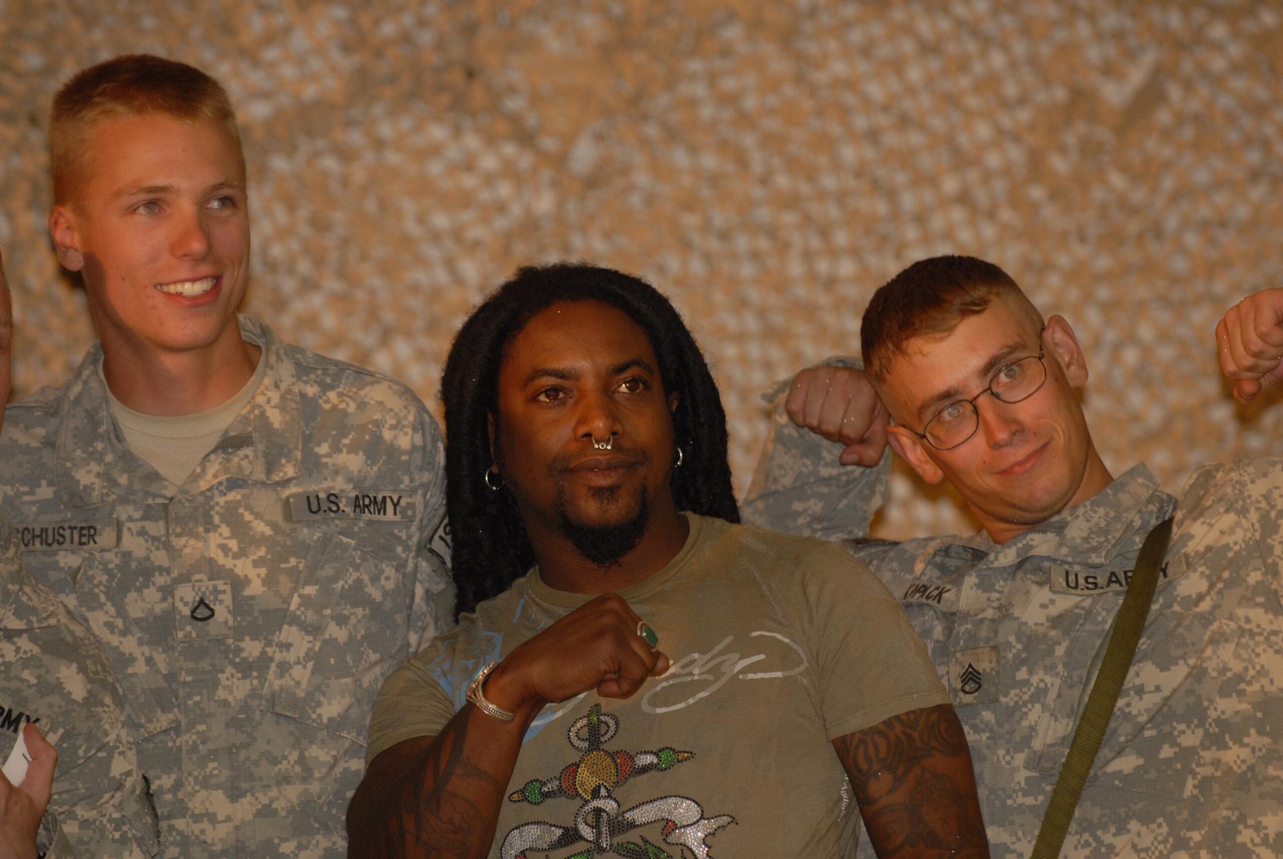
An older photo shows tattoo coverage on both arms. Photo: Wikimedia Commons.

Photos from a Sevendust visit to Afghanistan are useful for placement: the arms are uncovered, the light is more even than in a dark club, and the images show how much of the visible skin is tattooed. They still do not identify every design, but they are better references than a cropped thumbnail or a publicity portrait.

For tattoo inspiration, the useful parts are the scale, placement and personal history. The first tribal band sits beside later family designs; religious portraits cover an image he no longer wanted. A cover-up changes the look of an arm without removing the earlier chapter from his story.

What the public record confirms

The main details Witherspoon has discussed or that are visible in the photographs are:

  • His first tattoo was a tribal band around his right arm, received at 17.
  • He has discussed tattoos connected with his wife and children.
  • He has talked about a chest piece and named Philip Lewis, Tony Levis and Stu among the artists connected with his work.
  • Portraits of Jesus and Mother Mary cover an older mermaid tattoo on his left forearm.
  • His arm tattoos are extensive, but public photos do not provide a complete inventory of every design.

What remains uncertain matters too. A fan caption cannot identify a family member, and a dark stage photo cannot confirm a symbol that only looks familiar from a distance. The interviews establish the stories he has told; the photos show placement without filling in the gaps.

That approach lets readers see where the tattoos sit and which details Witherspoon has actually shared. For more documented ink from bands and artists, visit the musicians section.

Watch Lajon Witherspoon talk about his tattoos

The Rock Ink segment lets Witherspoon discuss the pieces himself and shows how the tattoos move with him. It is a useful companion to the interviews and photographs above.

Sources: Loudwire’s interview about the religious cover-up, Witherspoon’s artist and family tattoo comments, Tattoo the Earth interview, and Wikimedia Commons photographs.

More musician tattoo guides

Tommy Lee Tattoos: Sleeves, Chest Ink, Face Tattoos and More

Tommy Lee’s tattoos have grown over several decades: large pieces, family names, band references and newer face ink. Some belong to his Mötley Crüe years; others mark family, friends or different points in his life. Interviews help fill in the story because Lee has talked about specific designs rather than leaving every meaning to guesswork.

This guide focuses on details that are supported by interviews and clear photos: the large back piece, Loaded logo, his sons’ names, the star near his eye and more recent face tattoos. Some smaller marks are visible only in certain shots, so they are described cautiously.

The huge back piece that started the conversation

Tommy Lee full body tattoos
A full-body view shows how the arm, chest, stomach and hand tattoos work together.

Lee has described his large back tattoo as a major project by Leo Zulueta in the 1990s. It is usually hidden under clothes, so it can disappear from a stage photo and then fill the frame when he turns around in a shirtless portrait.

The piece matters for its scale and the period it represents. Lee was deep into the Mötley Crüe years, when large black-and-grey back tattoos were becoming part of rock’s visual language. It is more accurate to call it a full-back composition tied to his 1990s tattoo history than to reduce it to a single symbol.

Photos of the back are less common than arm and face shots. Lists sometimes describe it more precisely than the available images allow, but the broad facts are clear: it is substantial, associated with Zulueta and central to Lee’s own account of his tattoos.

Family names and the tattoos closest to his hands

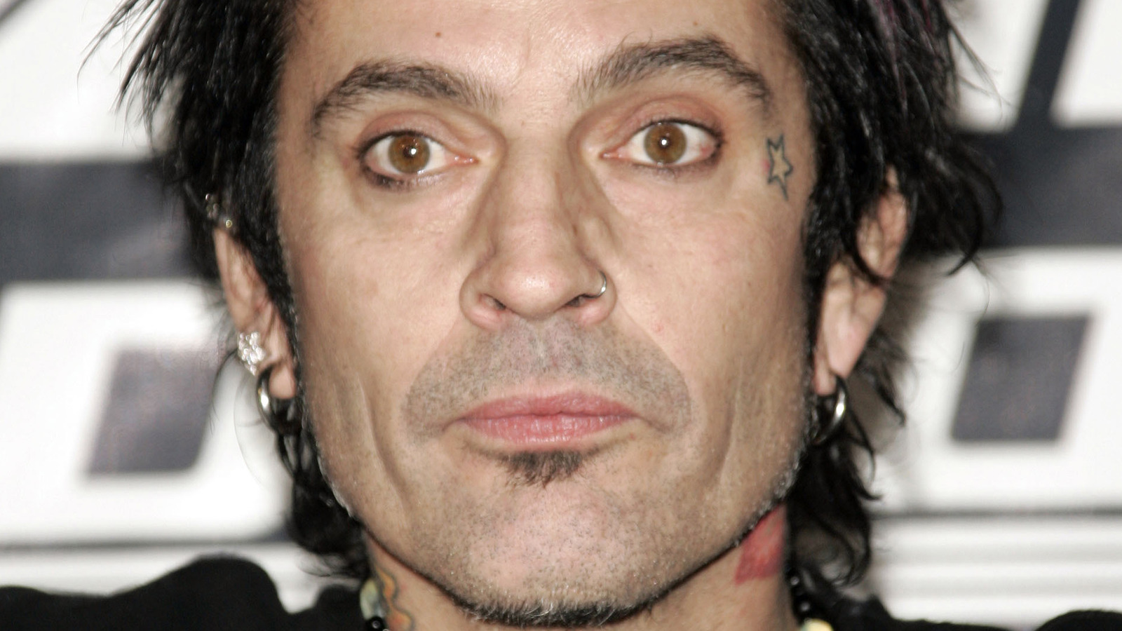
Tommy Lee face and hand tattoos
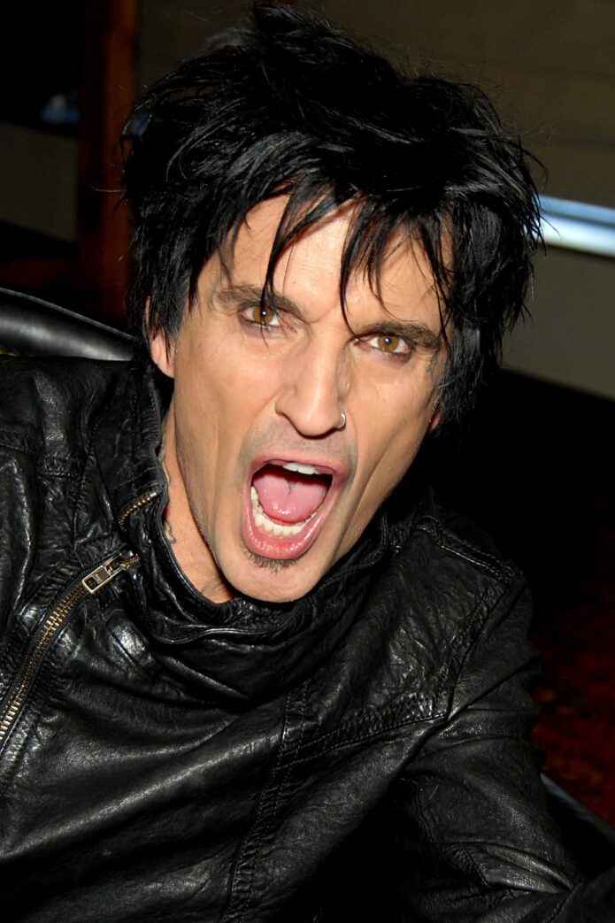
The face and hand tattoos are easy to spot in this close public portrait.

Lee has his sons’ names around his wrists. They are visible when he plays, but they also read as personal reminders rather than stage decoration.

Smaller marks on his hands and fingers come and go depending on the photo. A star is visible near his eye in some portraits, and other images show finger and knuckle tattoos. Since the count changes as he adds new work, a careful summary is wrist lettering for his sons, smaller hand designs and a star near the eye, rather than a list of shapes that cannot be clearly seen.

The scale changes from one part of the collection to another. The back piece required planning and long sessions; a finger tattoo could be a quick decision or a small joke. Both kinds of choices sit together without looking as if they came from the same appointment.

The Loaded logo and the band-related ink

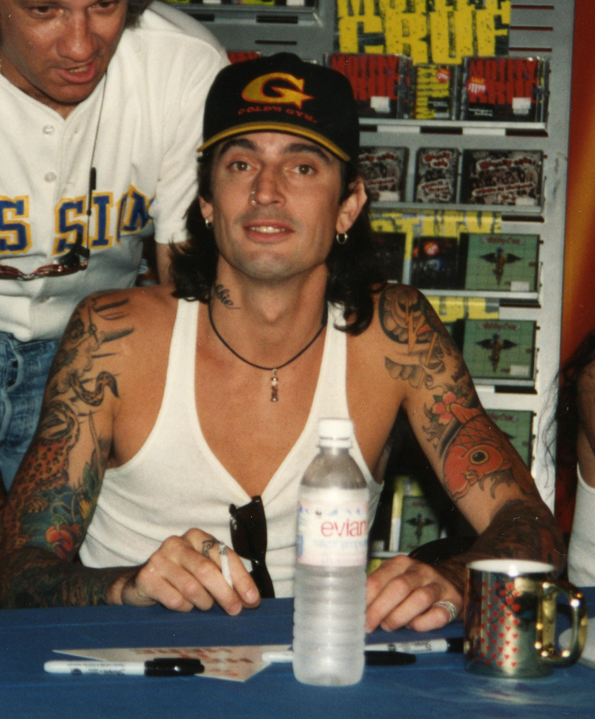
Tommy Lee full arm tattoos
His arm coverage mixes colour, black work, lettering and smaller symbols.

In a Las Vegas Weekly interview, Lee pointed out the Loaded logo on his forearm and said it had just been done. The design ties his ink to Loaded, his band outside Mötley Crüe, and marks a particular stretch of his career.

His arms show more than the logo. Photos capture sleeve-like coverage, color and smaller symbols running toward the wrists. The pieces are not perfectly uniform: a band mark can sit beside a portrait, a family name or an image chosen for its look.

That is why it is better not to label every tattoo as Mötley Crüe-related. Some designs clearly connect to bands, while others belong to different parts of Lee’s life. Music runs through the collection even where the image is not a literal logo.

Face tattoos, neck ink and the newest changes

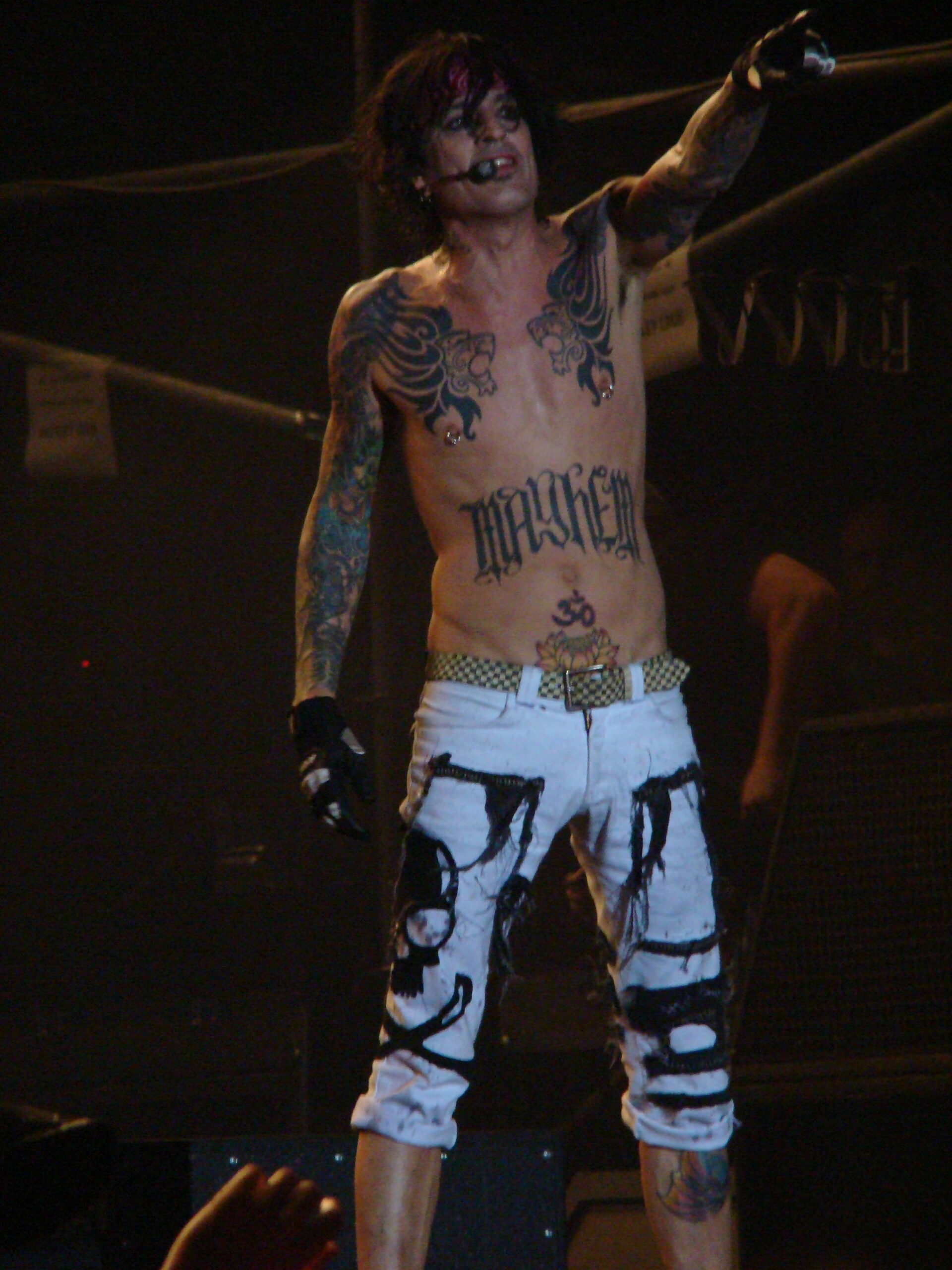
Tommy Lee stage chest tattoos
Stage lighting catches the large chest lettering and older arm work.

Newer face tattoos shift the focus of the collection. Older photos emphasize his arms, wrists and hidden back piece; recent close-ups bring the cheek and area near the eye forward. The face work is hard to treat as background detail because it is often the first thing people notice.

One clear image shows vertical black lettering along the side of his face, with more ink at the neck and near the ear. It is a sharper, more graphic look than the color seen in older sleeve photos. Dates matter here: putting a 1990s picture beside a recent close-up without context can make the collection look inconsistent when it has changed over time.

Lee has talked about tattoos in a relaxed, sometimes mischievous way. The face pieces do not need an invented mythology to be interesting. They mark a newer chapter, with bolder placement and less effort to keep every tattoo easy to hide.

The chest lions and the Mayhem lettering

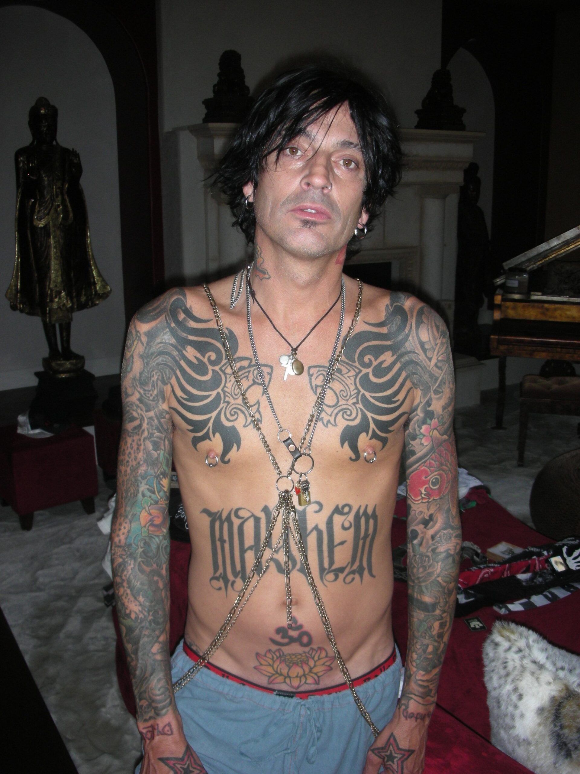
Tommy Lee chest and stomach tattoos
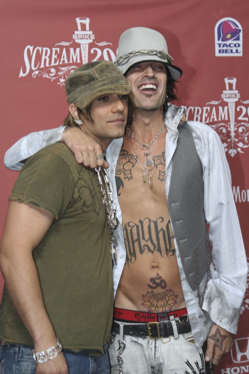
The chest and stomach view shows the paired lion designs, Mayhem lettering and lower-abdomen ink.

Large animal heads sit on either side of Lee’s chest, with heavy Mayhem lettering across the upper stomach. Lower down, a lotus and the number 30 add more focal points. The designs are visible in a full portrait, while a closer crop gives the linework and color more room.

The torso also shows how Lee’s tattoo eras differ. The chest has a strong tribal and traditional-rock feel; the newer face and neck marks are more direct black lettering. They do not look like one planned suit. They look like separate decisions added over time.

Close-up sleeve work shows the smaller designs

Tommy Lee shoulder tattoo close up
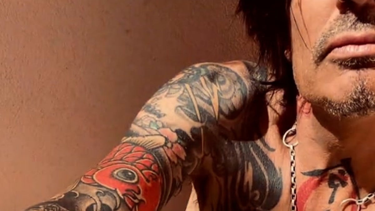
A shoulder close-up reveals the smaller images packed into the sleeve.

A wide photo can make a sleeve look like a single dark block. This close view separates the flowers, animals, outlines and shaded sections. Some designs overlap; others leave a little skin between them. Those gaps help the arm remain readable instead of turning into one flat patch.

The chest work in performance photos

Tommy Lee Mayhem chest tattoos
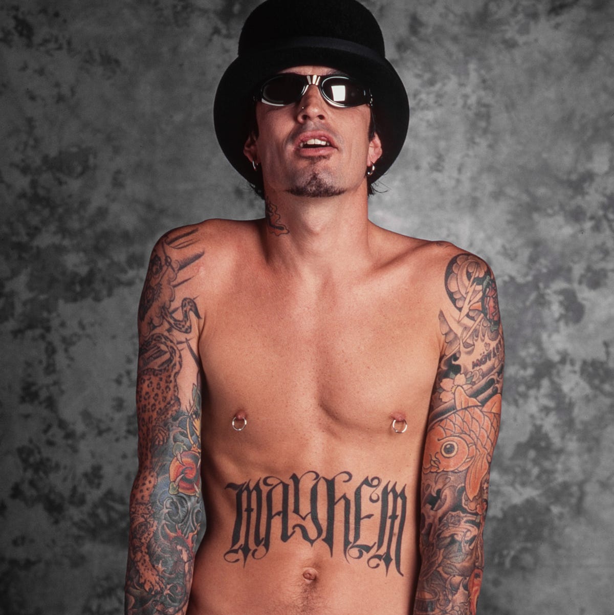
Another chest portrait makes the Mayhem lettering and mirrored chest work easy to compare.

Backstage and performance photos show Lee moving and playing, with the tattoos inside the rock image rather than posed apart from it. This is useful for the sleeves and chest lettering, which can look different under stage lights than in a neutral room.

What the photographs reveal about his overall style

A few patterns repeat across the photos. Lee favors designs that read from a distance: a large back piece, bold arm coverage, a logo or clear face lettering. He mixes black-and-grey work with brighter color, moves between sentimental and playful subjects, and does not make every area match.

The collection looks lived-in, not showroom-perfect. A wrist name can sit partly under a watch; stage light can change how a sleeve reads; face ink may look sharper in one year’s portrait than another’s. Those differences are part of the record and show how the tattoos were added and maintained.

It also takes several kinds of photos to document a drummer’s tattoos. His arms are always moving onstage, so a performance shot freezes only one angle. A studio portrait may show the hands but hide the torso; a red-carpet photo can show the face and neck while covering the back. No single picture tells the full story.

A careful inventory of Tommy Lee’s documented tattoos

Interviews and clear photos support this outline: a large back piece associated with Leo Zulueta; the Loaded logo on his forearm; his sons’ names around the wrists; a star near the eye; smaller hand and finger designs; extensive arm and sleeve work; neck tattoos; and newer face lettering. Other pieces may be there, but they need a sharper photo or a direct explanation before being given a precise name or meaning.

The stories behind those designs are enough. The back piece marks a major 1990s project; the Loaded logo connects his ink to a band outside Mötley Crüe; the wrist lettering keeps family close; and the newer face work shows that Lee continues to change the look of his tattoos. There is plenty of history here without guessing at the gaps.

The photos also suggest a timeline. Older shots focus on the arms and back; later close-ups draw attention to the cheek, eye and neck. Some years of the collection are easy to see, while others are known mainly from Lee’s comments.

That is why tattoo lists can disagree. A 2000s portrait will not show the later face work; a recent social photo may show a new symbol but hide the back piece. Lee’s collection is best read as something that has changed, with certain chapters visible and others filled in by his own words.

For tattoo fans, the placements create an interesting contrast: a large back piece gives him a private canvas; wrist names and face lettering keep details close at hand and in view; the star and logo add smaller points of focus. The choices sit together without cancelling one another out.

Sources and image notes

The tattoo details are checked against Tommy Lee’s short interview with Las Vegas Weekly, face-tattoo coverage from British GQ, and the inventory at Body Art Guru. The photos use separate attachments for full-body, arm, chest, shoulder, face and stage views. For more musician tattoo guides, see the musician tattoo archive.

Watch Tommy Lee talk tattoos

This tattoo-focused video gives Lee a chance to talk about the designs himself. It adds context to the photos and lets his own voice fill in what the pictures cannot.

https://www.youtube.com/watch?v=cZup6ng6AuU

More musician tattoo guides

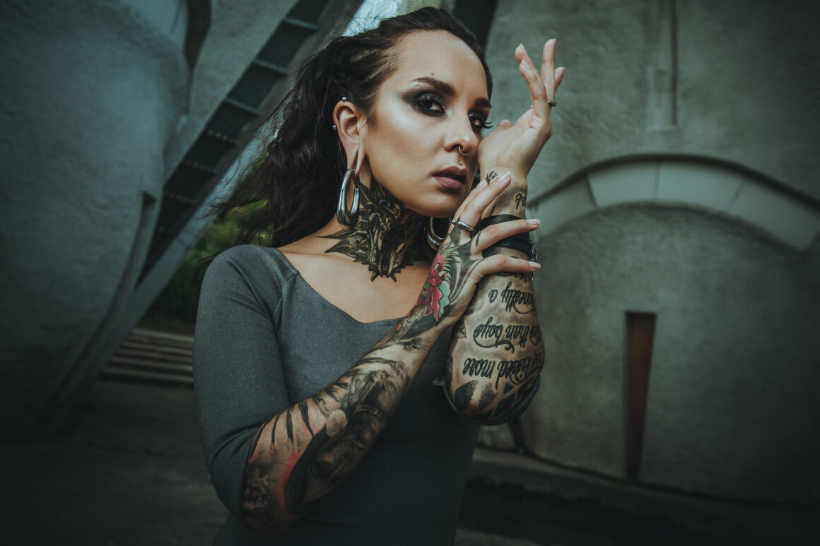
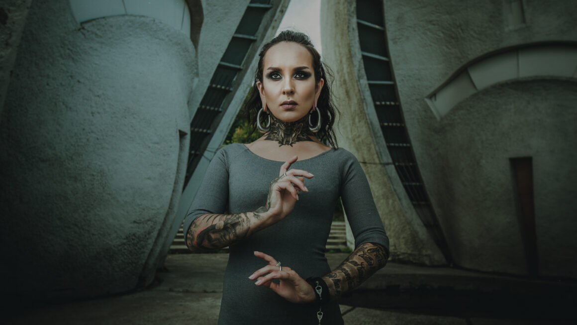
Tatiana Shmayluk Never Needed a Deep Meaning for Her Ink

Tatiana Shmayluk has not described her tattoos as a list of symbols with one explanation for each. In interviews, she has talked more plainly: she likes certain images, lives with the result and sometimes a design simply stays with her. That makes her collection interesting, though it also means a careful account should distinguish her comments from guesses based on stage photos.

Tattoo Life, Metal Hammer and Louder have all discussed parts of her ink. A dedicated Tattoo.com interview with Jinjer also includes a section on the band’s tattoos. Taken together, the interviews suggest a useful starting point: an image can matter to her without needing a grand public meaning.

Her look changes from one era to another, and stage lighting can alter how a tattoo appears. Black-and-white photos hide color; a magazine close-up may show one area and crop out another. The sections below stick to designs that she has discussed or that are clear in published photos.

The throat tattoo is the collection’s most recognisable landmark

Tatiana Shmayluk throat tattoo

Tatiana’s Quetzalcoatl, or feathered-serpent, throat tattoo is among the best-documented pieces. In a Tattoo Life interview, she identified the design and said an artist at Barma Tattoo Studio in Kyiv, Ukraine, did the work. That gives the tattoo a named motif, placement and studio context.

She has pushed back on the idea that every tattoo needs a special meaning. The serpent can be described without treating it as a secret code. Its placement is bold and easy to see in portraits and performance photos, especially when her hair is tied back or her neck is uncovered.

A design can matter to someone without a public explanation attached. The motif and placement are documented because Tatiana has discussed them; any more specific private meaning should be left to her.

Frida Kahlo and Amy Winehouse appear among her portrait-inspired ink

Tatiana Shmayluk tattoo profile

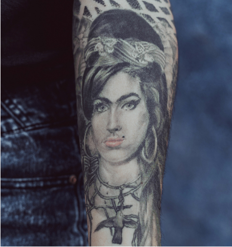
Tatiana has mentioned tattoos connected with Frida Kahlo and Amy Winehouse when talking about images that mean something to her. The interviews document those references, though every detail is not visible in every photograph.

Kahlo’s work fits the wider visual interests Tatiana has discussed: art, strong faces and images that do not feel polished for their own sake. Winehouse brings a different musical reference. Tatiana has not reduced either to a slogan, so it is better to call them portrait or tribute references than invent a precise backstory.

Her comments also leave room for a simpler reason: sometimes a design just feels right. That is less dramatic than a rehearsed origin story, but it says something about how the tattoos belong to her life as an artist without turning each one into public mythology.

Her early tattoos began with a friend at home

Tatiana Shmayluk early tattoo

In a Metal Hammer interview, Tatiana said her first tattoo was done when she was 17. A friend who had studied art with her was just beginning to tattoo and worked on her at his home, where he was tattooing some of his first customers. It was a very different start from booking a famous studio for a planned sleeve.

She has said she sometimes regrets much of her tattoo work because she is not fully satisfied with how it was executed. That is a comment about the result, not necessarily the decision to get tattooed. A design can matter while the linework or technique still disappoints her.

She has also linked her interest in tattoos to rock music and to temporary tattoos and painted hands she liked as a child. The story runs from play and drawing on skin to permanent images. It is a more grounded account than assuming each tattoo arrived with a single fixed meaning.

Some tattoos are self-made or deliberately imperfect

Tatiana Shmayluk self-made tattoo

In another interview, Tatiana pointed to small tattoos on her wrist and ankle and said she had done some herself. Those marks show a different side of the collection from the throat design and portrait references: experimenting with images and accepting a rougher result.

She spoke about the wrist and ankle pieces matter-of-factly. The placements are reported, but the available photos do not always make the individual designs clear enough to name them precisely.

Tatiana has also said prison-style imagery is not for her. That is a useful boundary: her collection is selective, not an attempt to adopt every traditional tattoo motif. Her comments about regret and imperfect execution make the same point from another angle. The tattoos record choices, not a flawless display.

What the stage photographs can and cannot prove

Tatiana Shmayluk tattoo detail

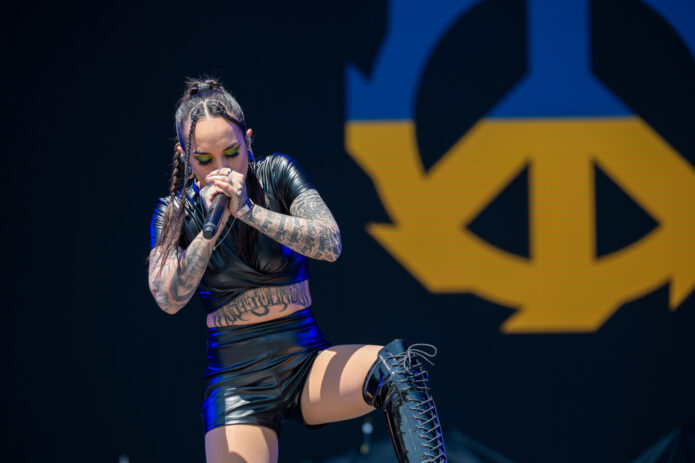
Jinjer’s performances produce plenty of images, but a concert photo is not automatically a good tattoo reference. Microphones, shadows, hair, gloves, mesh, color and movement can hide or distort linework. Interviews and close portraits are more helpful when trying to identify a design.

The documented outline includes the Quetzalcoatl throat tattoo, references to Frida Kahlo and Amy Winehouse, small wrist and ankle marks she has said she did herself, and her first tattoo at 17 by an artist friend. Other pieces appear in photos, but the sources do not consistently identify their designs. Tatiana has also said that she does not give every tattoo a special meaning.

The interviews do not support exact dates for every piece, a complete list of symbols or unverified claims about tattoo artists she has not named. Her own comments give the collection more detail, not less: she likes images, has experimented, remembers the people around her first tattoos and is candid when the execution did not meet her hopes.

Visibility is not the same as a full explanation. Tatiana’s interviews identify the designs she has chosen to discuss; photos show where they sit at particular moments. That is enough for a useful record without claiming that every part of her skin has been catalogued.

Her stage presence is vivid, but the story also rests on quieter details: a throat design she identified by name, portrait references she has discussed, small marks from early experiments and her admission that not every tattoo feels perfect. Those details let the collection change over time, as she adds work or explains another piece.

Watch the Jinjer tattoo interview

This dedicated Jinjer Tattoo.com interview includes a segment on the band’s tattoo collection and gives Tatiana’s style more context. It follows the written guide so the documented details are clear before the video.

Rich The Kid Tattoos: Chest Script, Arm Ink, and Jewelry-Heavy Style

Rich The Kid’s tattoos read differently depending on what the photo shows. A shirtless shot lays out the lettering across his chest and stomach; a close portrait picks out the marks on his hands and face; onstage, the arm work is what you notice while he holds a microphone. His rings, chains and clothes are part of the same frame, but the tattoos are easy to see beneath them.

The collection is built in layers rather than around one matching sleeve. Lettering sits beside shaded designs, and the amount of ink visible changes with his clothes and the angle of the photograph. The notes below stick to what can be seen: his chest, arms, hands, face and neck, plus the way jewelry and stage clothes frame those areas.

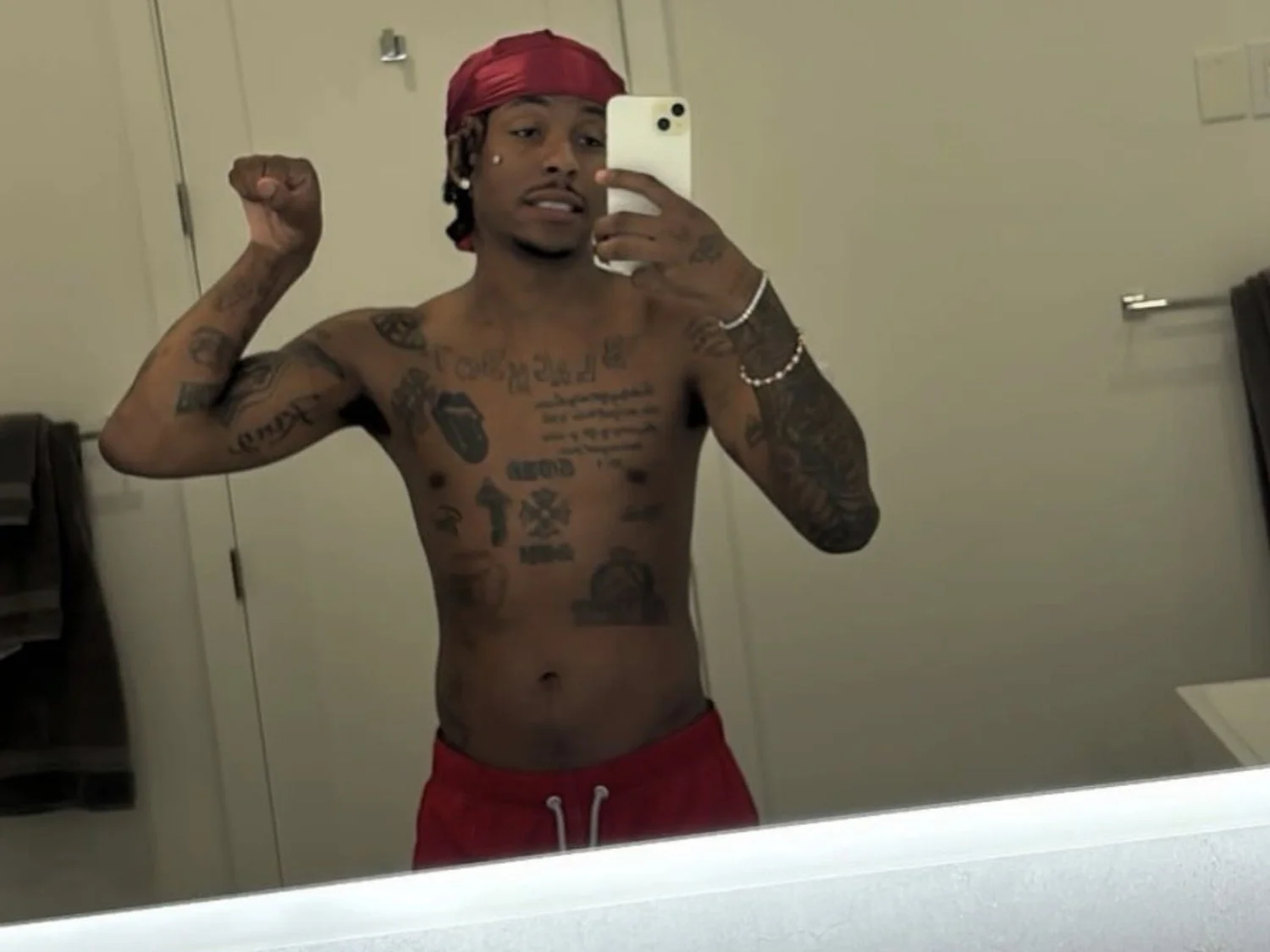
Rich The Kid’s chest lettering tattoos

Rich The Kid tattoos: shirtless chest lettering and stacked torso script

A shirtless mirror photo gives the clearest view of his chest. Large lettering runs across the upper part, with more lines of script and block text below. Smaller symbols and darker shapes fill the spaces around the words, so the front of the torso looks accumulated over time rather than designed as one single panel.

The layout starts with a broad line across the chest, then draws the eye down through the lower pieces. Even in less-than-perfect light, the large lettering is easy to pick out. The darker sections have breaks of bare skin between them, which keeps the different parts from merging into a solid block.

His chest lettering sets the tone for the rest of the collection. The words are the first thing you see, while the nearby symbols interrupt the lines and give the area a more layered feel. The result looks closer to a group of statements and images than one decorative logo.

Rich The Kid’s arm and shoulder ink

Rich The Kid tattoos: dense arm and shoulder ink in a studio portrait

His arms carry the most continuous coverage in the portraits. A dark studio photo shows shaded designs and lettering running from the wrists toward the shoulders. The tattoos sit close together, but changes in outline and texture make the different pieces visible.

In brighter light, the same work looks less dense. The outlines come through and the gaps in the ink are easier to see. That view helps show how smaller marks sit among the larger designs instead of disappearing into them.

The shoulder pieces can be partly covered by a short sleeve. In a sleeveless shirt or a shirtless photo, they appear to connect with the chest work. The arms give the front of his body a frame, with lettering and symbols continuing across the upper torso.

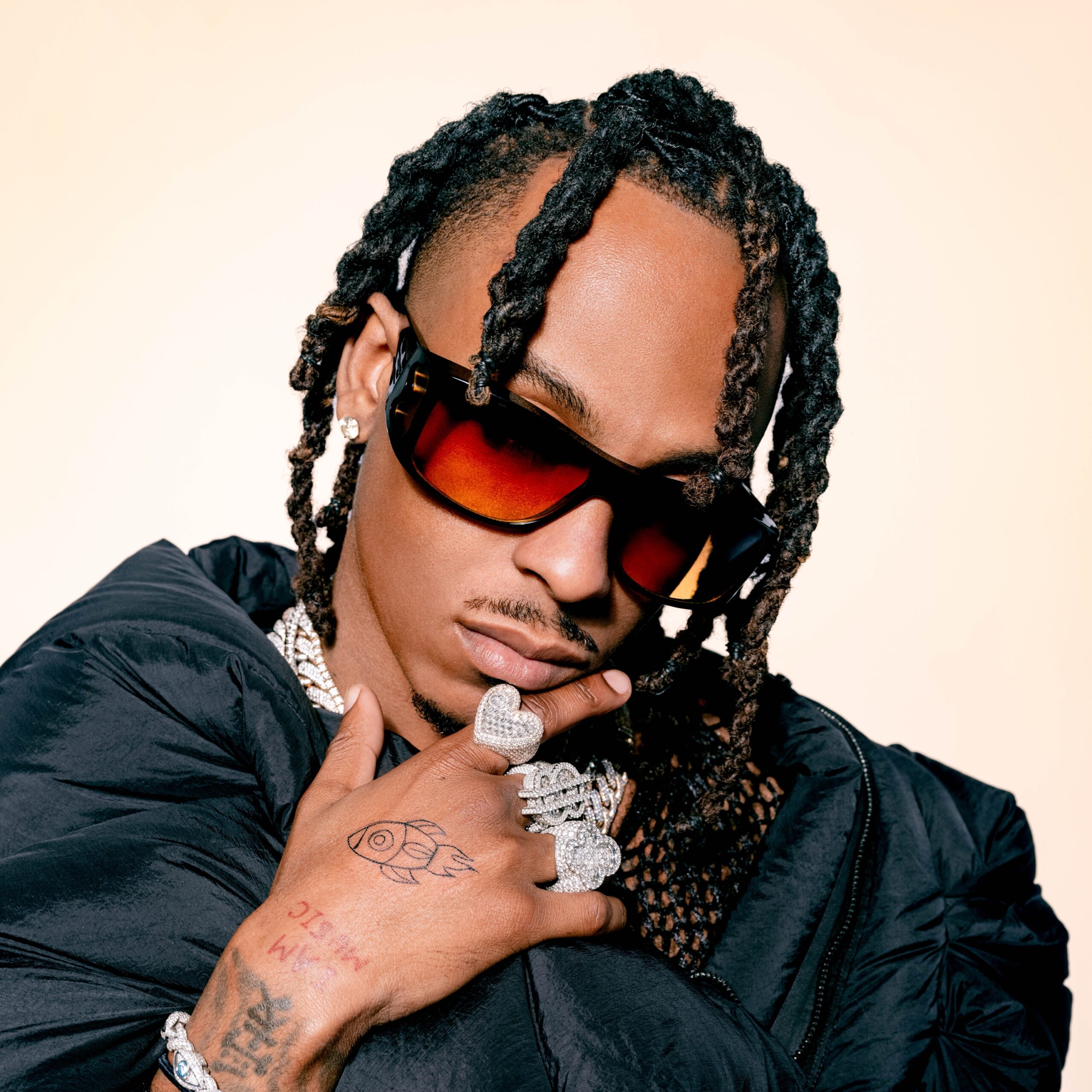
Rich The Kid’s hand and finger tattoos

Rich The Kid tattoos: hand tattoo and wrist details beside oversized rings

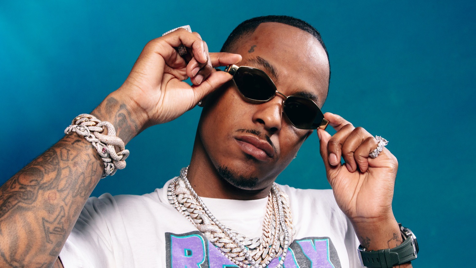
A close portrait shows a tattooed hand held near his face, with oversized rings around it. One design is visible on the hand, and there are smaller marks along the wrist and lower arm. Those details are easy to lose in a full-body image.

The hand ink stays visible even when his chest and upper arms are covered. In the photo, it sits alongside rings, a watch and bracelets; the jewelry draws attention to the same parts of the body as the tattoos.

Hand tattoos are hard to hide, and there is less room for a large design. Rich’s photos show a compact mark alongside the larger work farther up the arm. The rings add another layer, but the tattoo still reads as its own detail.

Rich The Kid’s face and neck tattoo details

Rich The Kid tattoos: small face detail and exposed arm tattoos onstage

A festival photo shows a small mark near his temple along with the tattoos on his arm. The face is well lit against the background, so the mark is noticeable without taking over the image.

His neck area can be more or less visible depending on the collar and chains. With a low neckline, the tattoos sit among the jewelry; with more of the neck covered, the small face mark and arm ink stand out instead.

A tattoo does not have to be large to catch the eye. Placement matters: a small mark near the eye, ear or collar can be noticed quickly because it sits in a part of the image people naturally look at.

Rich The Kid’s festival and stage tattoos

Rich The Kid tattoos: festival view of the visible forearm tattoo layout

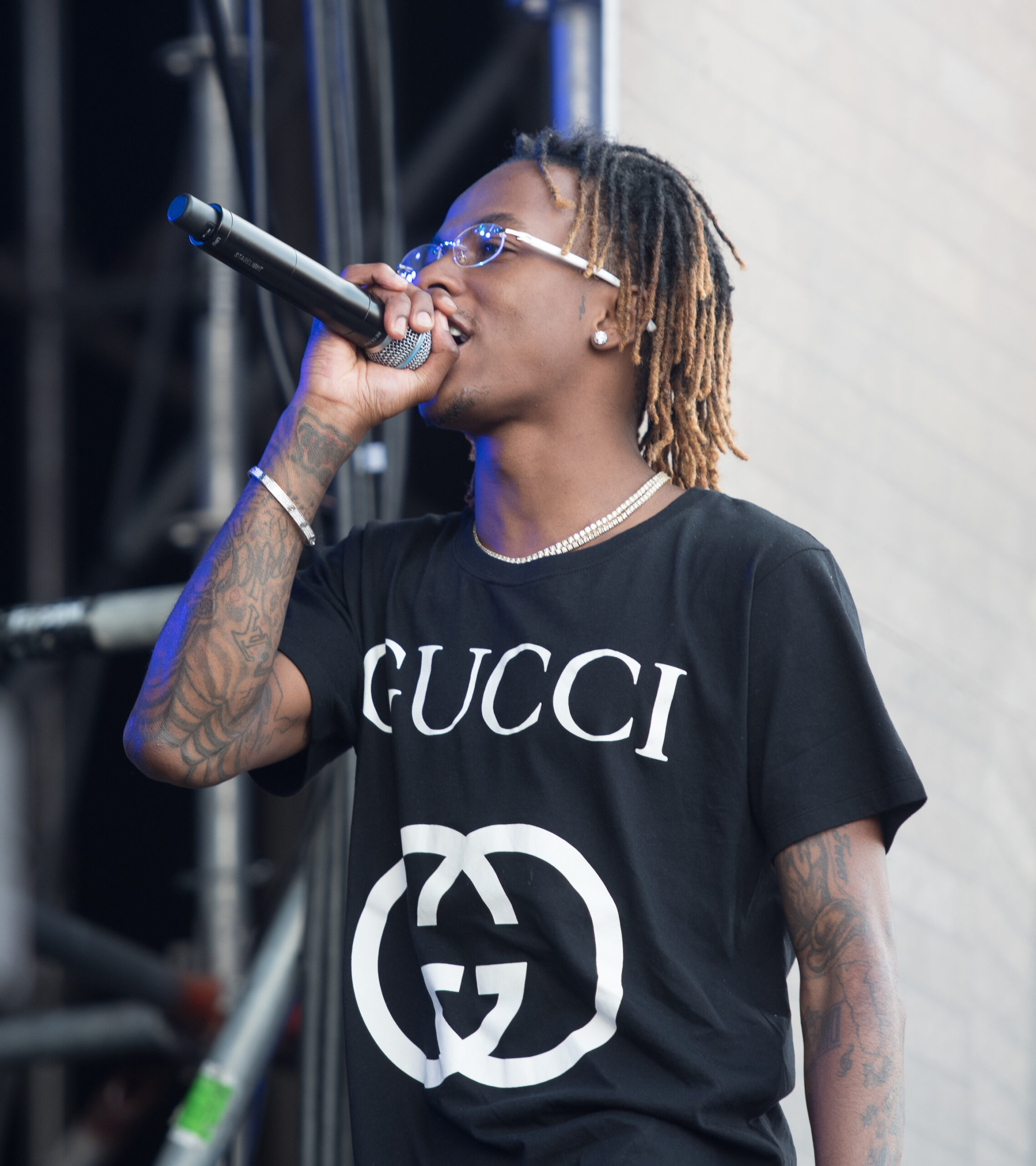
The Wikimedia Commons photos from Openair Frauenfeld show how the tattoos read from farther away. He is wearing a dark shirt, with his forearms exposed as he holds the microphone. The arm designs remain visible as he moves; glasses and jewelry repeat across the images.

A stage photo may not be sharp enough to identify each small symbol, but it does show the size and contrast of the larger shapes. The ink can still be made out under stage lights and motion, which is different from seeing it in a still portrait.

The clothes change what is visible. A black Gucci shirt covers the chest, leaving the forearms, jewelry and shirt graphic to carry the look. The outfit hides some tattoos without making the rest of the image feel incomplete.

Rich The Kid’s tattooed live-performance look

Rich The Kid tattoos: side-profile performance view of the arm tattoos

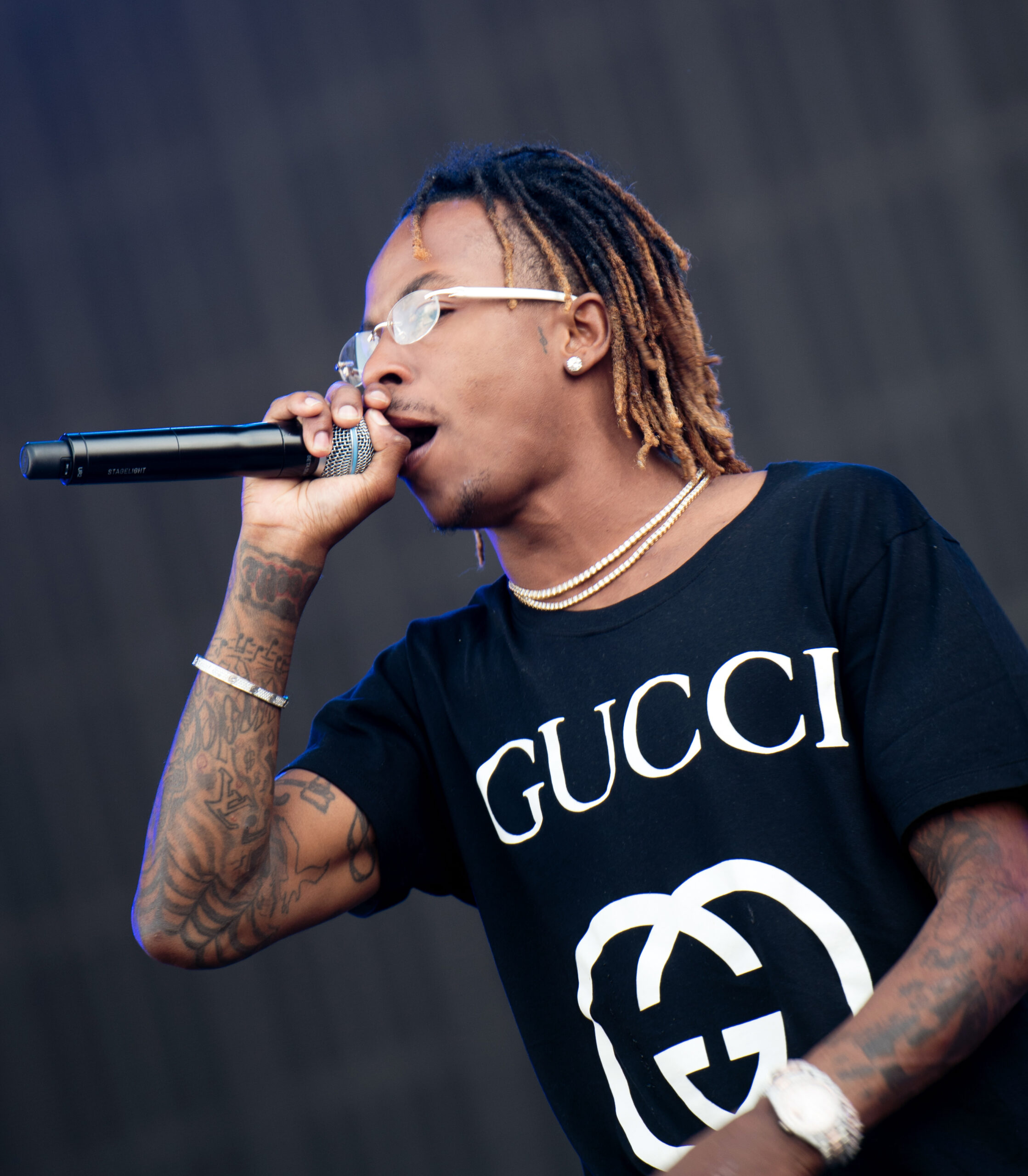
Another live photo shows his arm tattoos from the side as he holds a microphone. You can see his profile, the small facial detail, and the forearm coverage in one frame. That makes it easier to see how the pieces sit together than a set of tightly cropped close-ups would.

The photo is less posed than a fashion portrait. He is moving and holding the mic in a loose T-shirt, but the ink still gives the arm a clear outline. The tattoos remain part of the image even when the stage and the rest of the frame are busy.

Different photos answer different questions. A close portrait helps with the small marks; a shirtless photo shows the chest layout; and a performance image gives a sense of how the arm work reads from a distance. Taken together, they show more than any single crop.

How Rich The Kid’s jewelry frames the look

Chains, rings, watches, tinted glasses and bold clothes appear alongside Rich The Kid’s tattoos in many photos. The jewelry sits across the same areas as the ink: a ring draws the eye to his hand, a watch rests at the wrist, and a chain crosses the chest lettering.

Those details do not have to match exactly. They share the same space, and the contrast between bright metal and dark ink helps each stand out. A change in accessories can shift the feel of a portrait without changing the tattoos themselves.

If you are using the photos as a reference, start with the areas you want to connect. One larger piece can anchor the layout, with smaller marks on the arms or hands. Leave room between designs so they remain distinct, and consider how sleeves and jewelry will sit around them.

The style in one frame

Across these photos, the repeated details are the chest lettering, dense arm work and smaller marks near the face and hands. The overall look changes with the setting: a mirror photo gives the chest more space, studio light makes the arm outlines clearer, and stage lighting puts the tattoos in motion.

That variation is the useful part of the reference. The ink looks different in a selfie, a posed portrait and a performance shot, but it still shapes the outline of his arms and torso. Jewelry and clothes add their own details around it.

The official Rich The Kid video for “Motion” is below.

More musician tattoo guides

Soulja Boy Tattoos: Chest Lettering, Face Ink, and Arm Style

Soulja Boy’s tattoos sit alongside the chains, watches, bright caps and bold clothes that have long been part of his public look. The ink covers his chest, neck, face, arms and hands, from script and small symbols to larger black-and-gray pieces. It’s part of the image he built around his music, though the designs don’t follow one theme.

The collection has changed over time. Older portraits show more of his chest and arms; later close-ups make the face, neck and hands easier to see. Each photo catches a different part of the collection, not a complete inventory.

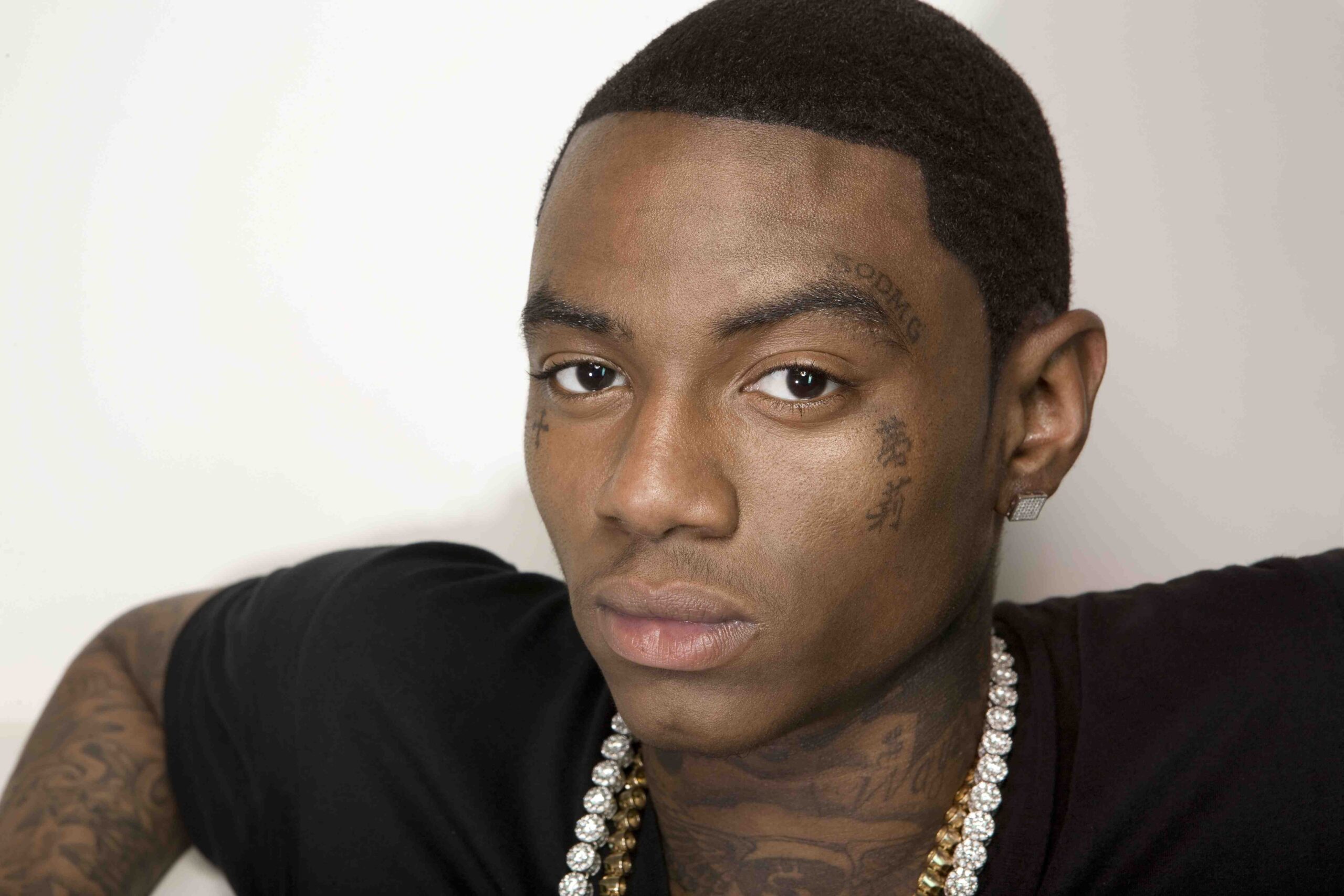
This guide focuses on tattoos visible in the photos: chest lettering, arm coverage, face and neck designs, and hand ink. It also looks at how jewelry and clothes sit around the tattoos. The featured portrait is separate from the five tattoo images in the article.

Soulja Boy chest tattoos and full torso coverage

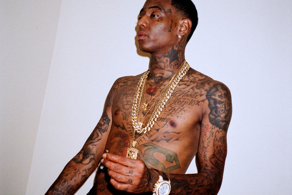
A shirtless Hypebeast portrait is a useful starting point. Lettering and symbols cross Soulja Boy’s chest, while his arms carry the same dense style. Some words are readable in an ordinary photo; the darker areas help separate one design from another.

Necklaces, watches and bracelets add shine, but they don’t hide the tattoos. The ink remains visible beside the accessories.

The chest includes words linked to ambition and self-belief, alongside decorative symbols and other personal references. Soulja Boy hasn’t explained every piece publicly, so the photos show more about appearance than meaning.

Scale matters in these torso photos. The large lettering takes up space, and the wide framing shows how the designs cover the chest.

Placement changes how a design reads. A tattoo near the collarbone stands apart from one lower on the ribs, while open skin can give a symbol more room. Soulja Boy’s photos show dense coverage and spaces between pieces.

His chest work is bold and often visible in an open shirt, tank top or shirtless photo. It becomes part of the outfit, especially in images from his earlier hip-hop years.

Soulja Boy tattoos: clear shirtless portrait showing chest lettering, arm coverage, and layered jewelry

Soulja Boy arm tattoos and layered sleeve work

A mirror selfie shows script and shaded pieces running from Soulja Boy’s shoulders through his biceps and forearms. It’s a relaxed view, away from a red-carpet pose.

The arm work mixes broad dark areas with smaller words and symbols in the spaces between them. The different sizes make the layering visible.

Curved lines follow the shoulder, while script runs along the chest and arms and smaller marks reach the hands and wrists. The tattoos may not form one planned sleeve, but their shared black-and-gray palette helps them read together.

A close portrait with his hand raised makes the wrist lettering easier to see. His neck and cheek tattoos remain in the background, giving another view of the same collection.

A phone in his hand or a bent elbow can bring a different section into view. These pictures show the ink in ordinary positions, not just posed for a close-up.

If you’re planning a sleeve, decide which piece matters most and leave room around it. Open skin can keep separate designs legible; filling every gap at once can make later additions harder to place.

Soulja Boy tattoos: high-resolution mirror photograph showing dense chest, arm, and hand ink

Soulja Boy face, neck, and hand tattoos

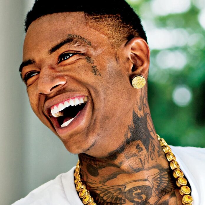
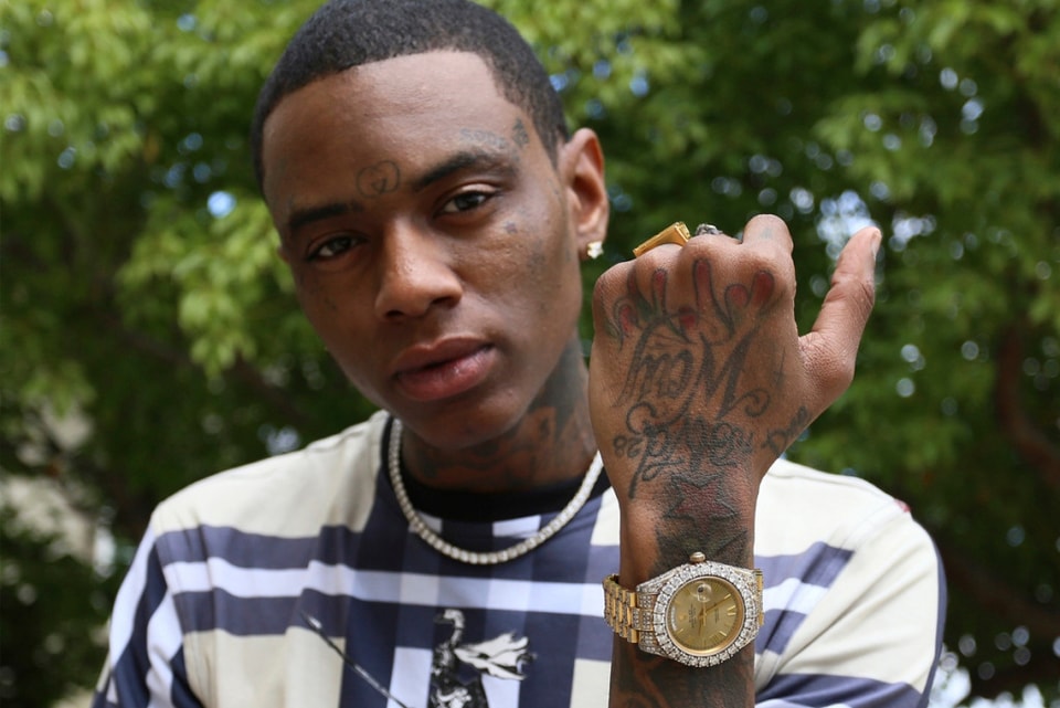
An outdoor close-up shows small marks near Soulja Boy’s eyebrow and cheek, a larger neck piece and ink continuing below the collar. The detail is clear enough to see the tattoos as part of his appearance.

Face tattoos change how a portrait reads because they sit near the eyes and mouth. In these photos, the ink is part of the same direct look as his clothes and jewelry.

When he raises a hand toward the camera, lettering and symbols across the knuckles and back of the hand become prominent. Rings and a watch add detail, but the ink remains easy to see.

Small marks stand out when they sit where people naturally look. Fingers, hands, the sides of the face and the neck show in ordinary gestures, without a dramatic pose.

These tattoos are hard to cover. A shirt can hide chest ink, but hands and face are visible in most settings. Soulja Boy’s photos make that visibility part of his public image.

Close-ups show tattoos from different years together. Some lines look crisp and dark; older shading appears softer. The photos capture the collection at different points in time.

A face tattoo can look striking in a celebrity photo, but it is a highly visible choice. The image below shows the hand, neck and cheek ink together in a portrait.

Soulja Boy tattoos: sharp outdoor portrait focused on hand lettering, wrist ink, and face tattoos

Soulja Boy lettering, symbols, and personal branding

Phrases about hustle, money, loyalty and ambition appear alongside symbols and larger illustrations. The lettering is direct, much like the slogans and stage name Soulja Boy uses in public.

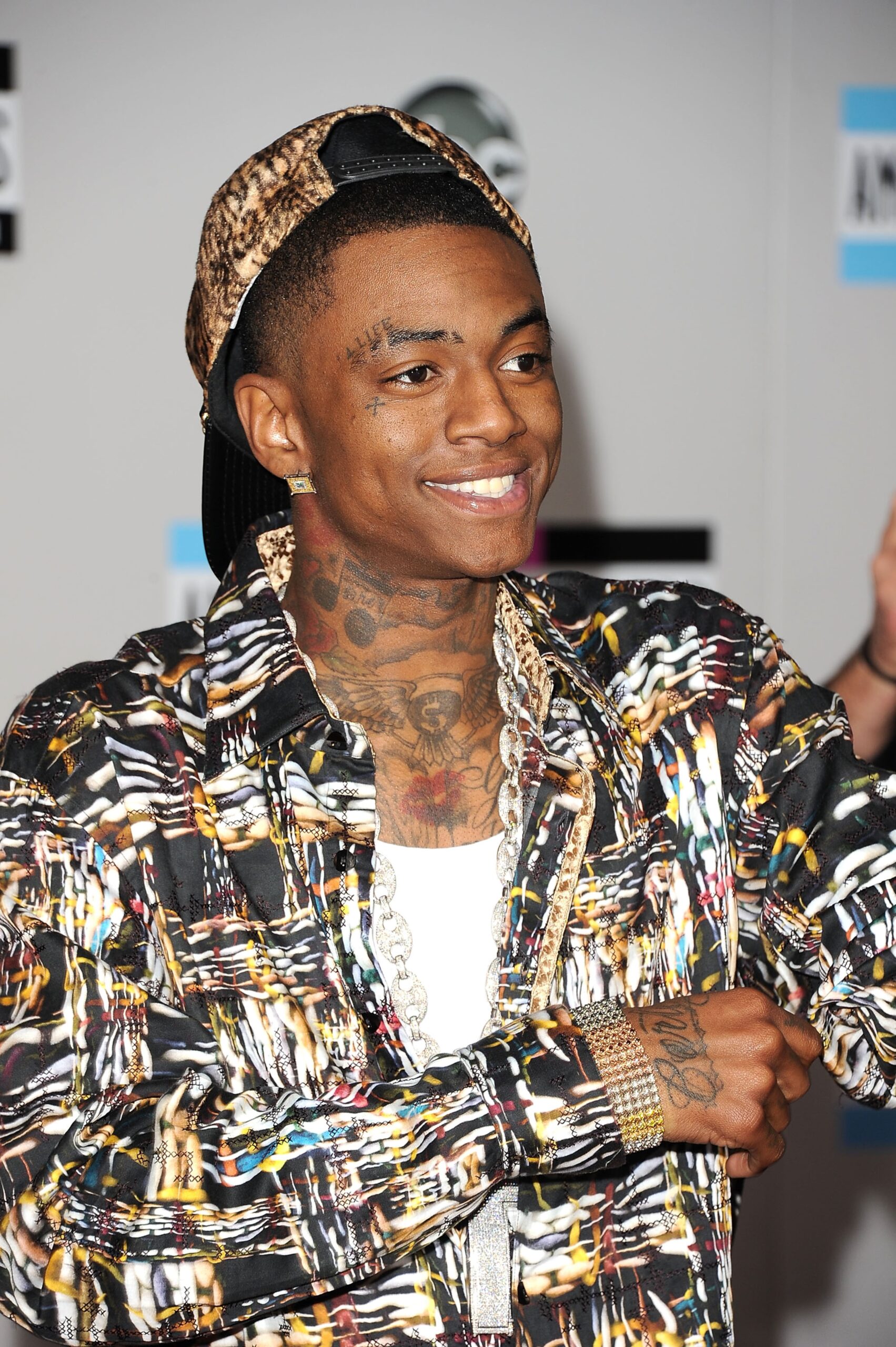
A red-carpet photo shows the tattoos beneath patterned clothing and jewelry. The shirt adds color and movement, while the neck, hand and lower-face ink remain visible.

An earlier photo shows his arm tattoos with a simpler outfit. With less pattern around them, the writing and symbols stand out. The surrounding clothes change how the same ink reads.

Lettering works best when the phrase still means something to the person wearing it years later. Soulja Boy’s visible phrases connect with his music and business identity, rather than appearing as unrelated decoration.

Symbols break up the lines of text. A cross, star, globe or cartoon-style image gives the eye a pause and adds variety to a tattooed torso.

Font choice affects what can be read in a photo. Heavy lettering shows from farther away, while thin script needs a closer look. On a wrist or hand, spacing also affects whether the words remain legible.

A private phrase and a public motto can suit different placements. Soulja Boy often chooses visible areas, so the lettering becomes part of how he presents himself.

Soulja Boy tattoos: high-resolution event portrait showing the neck piece, chest design, and hand ink

How Soulja Boy’s tattoos fit his hip-hop style

His tattoos appear with chains, watches, rings, caps and patterned shirts. In those photos, the ink gives the outfit a consistent base, even when the clothes change.

Photos from different years show different stages of Soulja Boy’s look. Earlier portraits emphasize chest and arm tattoos; later ones show more of the face, hands and neck. The collection grew over time but kept a recognizable style.

Not every tattoo has a confirmed meaning. Some may relate to music or family; others may simply be designs he liked. The photos show placement, size and how each piece sits beside the rest, but not always the reason behind it.

The tattoos across his face, neck, hands, chest and arms make his silhouette recognizable before the outfit comes into view. That visibility is part of the style and a lasting choice for anyone considering similar placement.

Soulja Boy’s collection has built up over time. A design with personal meaning can give a new piece a starting point, while leaving room for later work helps the tattoos sit together without crowding each other.

The ink is visible and layered, and it appears alongside the clothes and accessories he wears. That combination makes the collection part of his public presentation.

Soulja Boy tattoos: large face-visible portrait showing eyebrow, cheek, neck, and hand-adjacent ink

Tattoos don’t have to be quiet to feel personal. Soulja Boy’s photos show how the ink can sit with the clothes and accessories he chooses.

More musician tattoo guides

Gunna Tattoos: Chest Wings, Arm Ink, and His Black-and-White Style

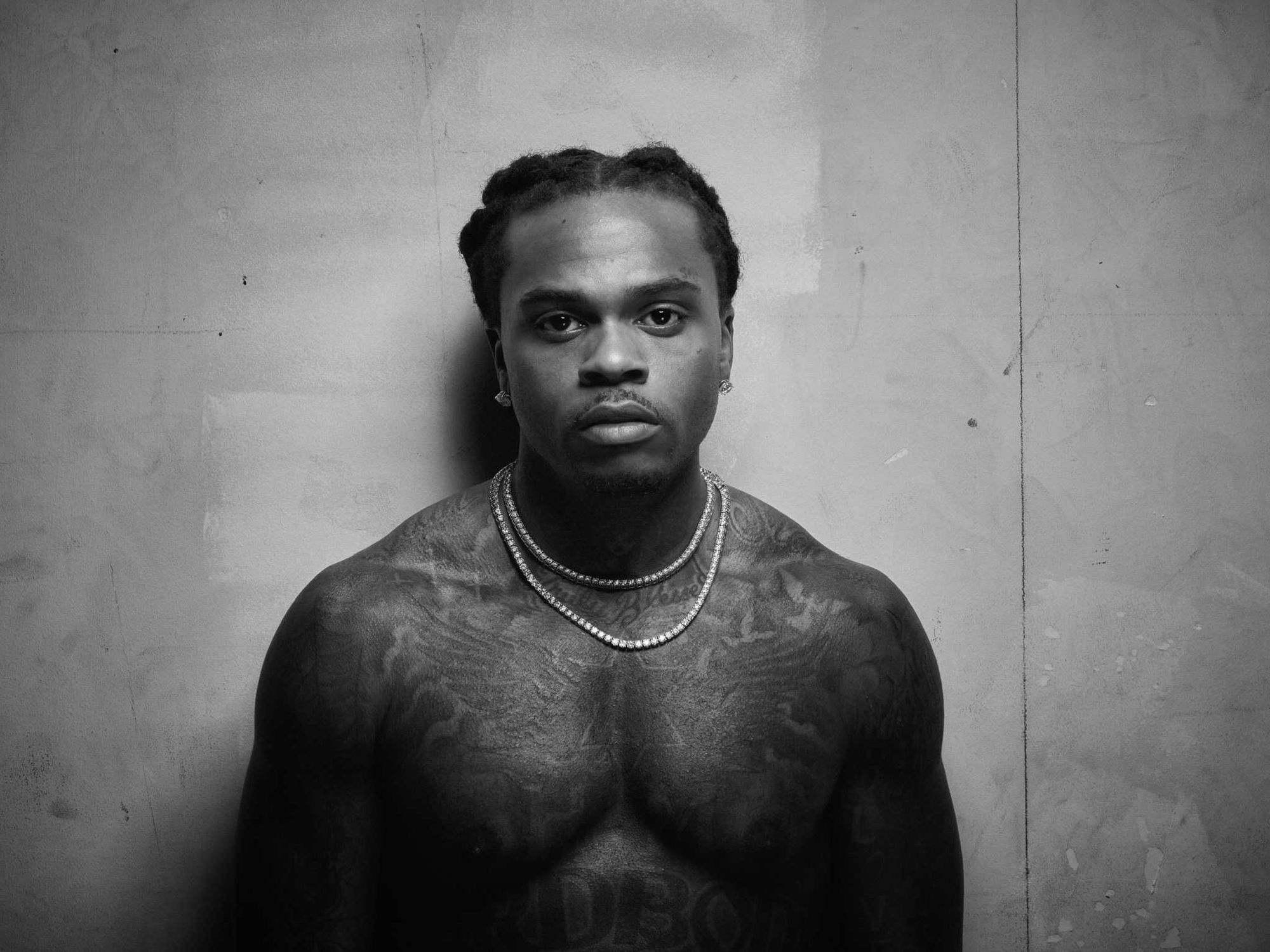
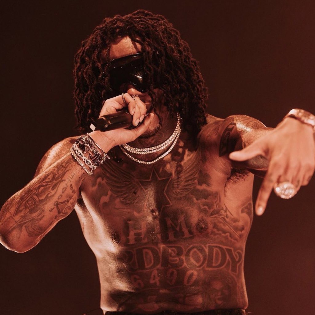
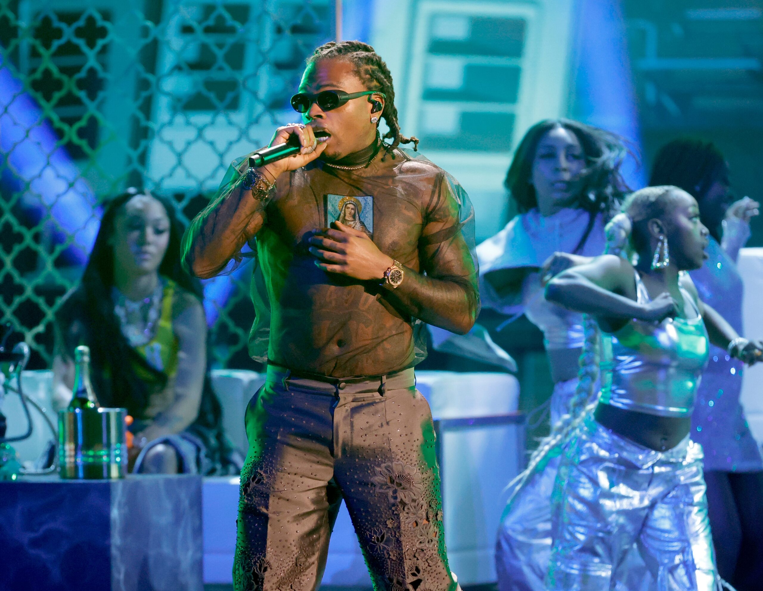
In a shirtless stage photo, Gunna’s chest tattoos are part of the outfit, alongside the chains, shades and clothes. The chest draws the eye first, the arms carry more ink, and smaller marks around the neck and hands show up in closer portraits. What you can see changes with the photo and what he is wearing.

The collection mixes lettering, shaded designs, religious imagery and small symbols. It does not read as one uniform style, and some pieces are only visible from the right angle. Stage shots show the ink in motion; relaxed portraits give a clearer look at the chest and arms.

Gunna’s winged chest tattoo

Gunna tattoos: winged chest and shoulder tattoo layout

The large chest design is the first thing that stands out in the clearest shirtless photos. A pair of dark wings spreads across his upper chest and shoulders. The shading gives the shapes weight from a distance, while sharper photos show the lines inside them. The wide placement makes the design move across the torso rather than sit as a small detail in the middle.

More lettering and imagery continue down his stomach. The pieces reach beyond one neat rectangle, so the front of his body looks different depending on the crop and light. In a cool-toned portrait the wings look crisp; under warmer concert lighting, the darker areas become more prominent.

The clothes change how much of the design is visible. A low tank top leaves the wings exposed, while a sheer shirt puts the tattoo work behind the fabric. The effect comes from the size and placement of the design as much as from its individual shapes.

Gunna’s layered arm and shoulder tattoos

Gunna tattoos: layered arm and shoulder tattoos in a tank-top portrait

His arms look different from the broad chest piece. In tank-top photos, lettering, shaded shapes and smaller marks are grouped across the shoulders, upper arms and biceps. Jewelry sits close to the ink, which is one reason the arms stand out in portraits.

The angle changes what you can make out. A straight-on photo shows the pattern across the shoulder; a performance shot catches the forearm as he raises a microphone or reaches toward the crowd. Moving hands and chains shift the composition, but the tattoo coverage remains visible.

His arm tattoos look built up in layers, with open spaces, darker groups and lettering sitting near other designs. They do not look like one perfectly matched sleeve. That unevenness gives the arms the feel of separate choices collected over time.

Gunna’s neck and hand tattoos

Gunna tattoos: neck, chest, and hand-adjacent tattoo details in a portrait

Close portraits bring the neck and throat tattoos into view. They can be easier to see when his head is turned or the chains sit low on his collar. Those marks fill the space between the larger chest work and his face.

The smaller designs on his hands and fingers are easy to miss in a wide stage photo. In fashion portraits, they sit next to rings, watches and bracelets. They do not need to be large to show up: hands are in motion when he talks, poses or performs.

The neck ink stays visible with many outfits. A jacket or sleeves can cover much of the chest and arms, while the neck and hands remain exposed. In that way, the tattoos can still read as part of the look even when most of the body work is hidden.

Gunna’s black-and-white tattoo portraits

Gunna tattoos: black-and-white stage view of chest and arm tattoos

Black-and-white performance photos make the contrast between ink and skin easier to see. Across the chest and arms, lettering, shaded shapes and religious imagery sit close together, but the differences in outline help separate them.

Hard stage lighting can flatten some details and bring out others. In these photos, the darker shading and outlines remain visible as he moves. The images show how the larger shapes read from the crowd, though they are not always sharp enough to identify every small design.

There is a relaxed quality to the way he wears the tattoos in these shots. He might be holding a mic, looking down or leaning into a pose, while the ink stays in view. The strongest references show both the tattoos and the setting around them, rather than cropping away the performance.

Gunna’s religious chest and torso imagery

Gunna tattoos: religious chest and torso imagery visible through a sheer stage top

Several performance photos show religious imagery across his torso. In one high-resolution concert image, a central figure is visible through a sheer top. Other photos show the same general area without fabric over it. The placement gives the image a strong center, with lettering and shading continuing toward the ribs and stomach.

The photos do not explain why he chose the designs, so their personal meaning is hard to state with confidence. What is visible is their central placement and how they sit among the lettering, symbols and portrait-like forms elsewhere on his body.
Sheer and sleeveless clothing changes the way the torso work reads. Through fabric, the outlines soften; under stage lights, the darkest areas come forward. In a shirtless photo, the same tattoos look more direct. The designs stay the same while the presentation shifts.

How Gunna’s clothes frame the collection

Gunna’s clothes move between clean tailoring, oversized streetwear, bright accessories and high-shine jewelry. The tattoos add another texture. A plain tank top leaves the chest and arms uncovered; a sheer shirt puts the ink behind fabric; a jacket can hide most of the body work and leave the neck and hands visible.

That makes the collection work with different outfits. It can appear under pearls and sunglasses, beside a watch, or take focus when he performs shirtless. A photo does not need to show every tattoo for the ink to shape the look; a partial view can be enough.

If you are gathering references for a similar layout, look at placement before copying a symbol. Notice how the chest spreads wide, how the arms frame it, and how smaller designs fill the neck and hands. Consider how a shirt, tank top or jacket would cover each part. The full silhouette matters as much as any one tattoo.

The overall look in one frame

The chest and torso carry the largest shapes; the arms add more layers; the neck and hands keep the ink visible when the rest is covered. Lettering, religious imagery and shaded forms give the collection a strong black-ink base, while clothes and lighting change how it comes across.

The different areas have different weights. Some pieces can be seen from a distance; others only show up in close portraits. That range lets the tattoos sit alongside his music and fashion without every image looking the same.

The official video for “WUNNA” gives another look at the styling, jewelry and performance setting around the tattoos.

More musician tattoo guides

Tom DeLonge Tattoos: Blink-182 Sleeve, Neck Ink and UFO-Inspired Designs

Tom DeLonge’s right-arm sleeve has been part of his public image since the Blink-182 years. It is dense with color, symbols and layers of line work, and the coverage has appeared through his time with Blink-182 and Angels & Airwaves. The design has changed over the years, so it is better understood as a long-running collection than a single piece added all at once.

Start with the whole arm, then look closer at individual sections. The sleeve mixes stars, heavy outlines, shaded panels and less familiar shapes. Some of it fits with DeLonge’s music and public interest in UFOs, but he has not published a full explanation of every design. The photographs let us describe what is visible; they do not settle every meaning.

The sleeve is the main event in Tom DeLonge’s tattoo story.

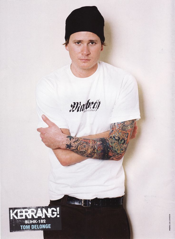
Tom DeLonge tattoos: wide interview portrait showing the layered sleeve across Tom DeLonge's forearm and upper arm

The first thing you notice is how much of the arm is covered. The sleeve runs from the upper arm toward the wrist, with pieces close enough together to read as one composition from across the room.

This Kerrang portrait catches the sleeve in a relaxed pose. His forearm rests across his body, showing how the ink wraps around the arm. The view changes when the arm is straight, bent or turned away from the light, so a single flat photo cannot show the full layout.

The artwork has a punk feel: heavy outlines, bright sections and shapes that do not all use the same style. It looks collected over time, with later work fitting around existing pieces. The sleeve is busy, but the darker borders and shifts in color help keep its sections distinct.

Color remains legible because the outlines separate one panel from another, while brighter areas draw the eye across the arm. If you like the look, the useful details to study are the spacing and contrast, not any one symbol in isolation.

The raised-arm shot shows how far the color runs

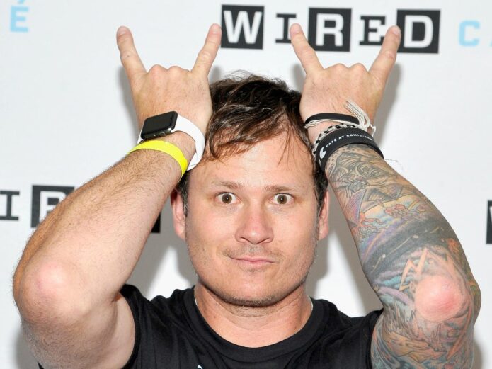
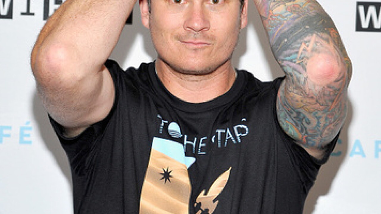
Tom DeLonge tattoos: close event photograph showing the raised arms, colored sleeve and wrist details clearly

With both arms raised, the right sleeve is hard to miss. The pose opens up the elbow and upper arm, and the colors stand out against his black shirt. Photos across different years and settings show the ink on his arm, rather than a single stylized image creating the impression of a tattoo.

The sleeve also holds together while he moves. DeLonge is making a rock-hand gesture, but the main shapes remain visible as the skin stretches. The photographs do not tell us whether every later addition was planned as part of one project; they do show how the existing design works across a bent arm.

The elbow is a difficult place to tattoo because it bends, creases and catches shadows. Here, the surrounding shapes keep the coverage looking connected from the shoulder down. A sleeve has to make sense in motion as well as in a posed photo.

Some of the stars and space-like shapes fit naturally beside DeLonge’s public interest in unusual aerospace stories and life beyond Earth. That is a visual connection, though; it is safer to describe the resemblance than assign a private meaning he has not confirmed.

The close portrait makes the sleeve’s mix of styles easier to read

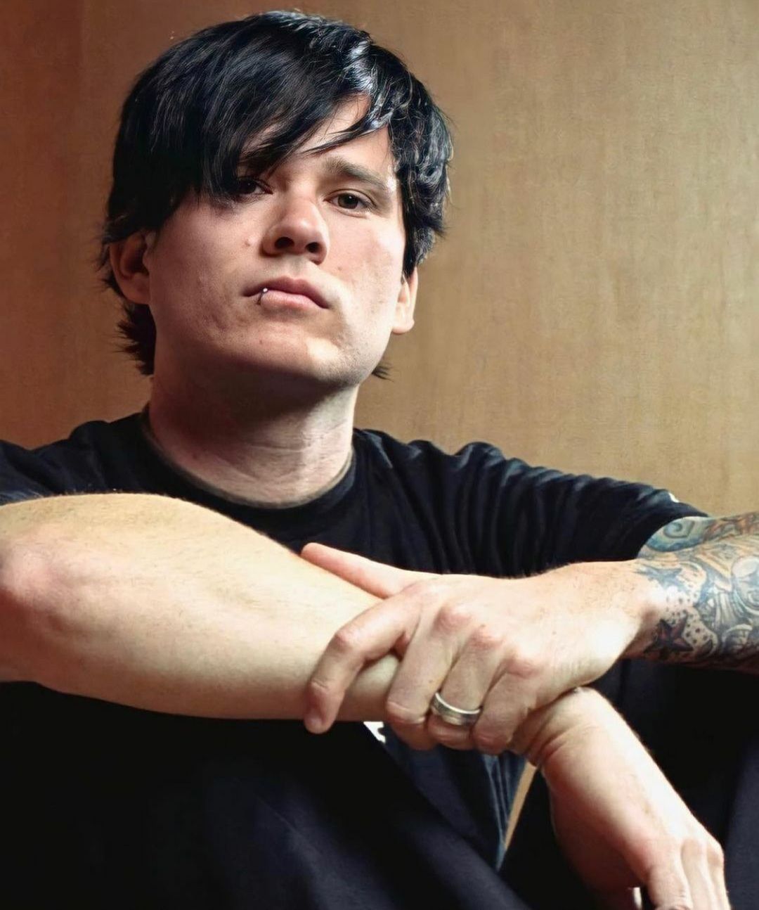
Tom DeLonge tattoos: tight portrait where the colorful forearm panels and black line work sit beside DeLonge's face

In a tight portrait, the forearm is close enough to show the sleeve’s different textures. It is not one flat block of color: black line work, illustrated sections and small gaps sit beside one another. From a distance they form one bold arm; up close, each area reads as a separate idea.

The sleeve does not look like a set of designs lifted from one flash sheet. Its mix of cartoon-like shapes, hard black marks and bright panels reflects a collection built over years. Those choices also sit comfortably with the punk and alternative scenes DeLonge came from.

It is easy to misread a small shape in a photograph. Lighting, resolution and the angle of the skin can make a mark look like a letter or logo. Describe what the photo shows before guessing what it means.

The close view also shows how the color has softened at the edges in places. Arm tattoos move constantly and get sun; older color can look less sharp than it did when fresh. That gives the sleeve some texture. For colorful work, contrast and how a design will age are part of the planning too.

The early Blink-182 photos show the sleeve’s punk color palette

Tom DeLonge tattoos: early Blink-182 promotional portrait showing the full right-arm sleeve, stars and saturated color blocks

An early promotional portrait shows DeLonge when the sleeve was already a prominent part of his look. He crosses his arms in front of a white shirt, which makes the colored right arm easy to see. The image shows how much of the sleeve’s character comes from its saturated color, not only from the dark outlines.

The beanie, shirt and bold shapes all fit the same punk-rock presentation. The tattoos feel like part of the image rather than an accessory added afterward, which helps explain why fans connect the arm with DeLonge’s early years in Blink-182.

A photo that looks like a complete sleeve does not prove every part was done in one sitting. A design can be built in stages, extended or reworked later. DeLonge’s arm has appeared across different bands and visual periods, so the photographs are a record of how the sleeve developed, not a precise appointment timeline.

The color palette creates a shared mood without making every element identical. Stars, lettering, mechanical shapes and abstract panels can sit together when the line weight and colors connect them. That leaves space for new work while keeping the older sections visible.

The casual street photo shows the sleeve away from the stage

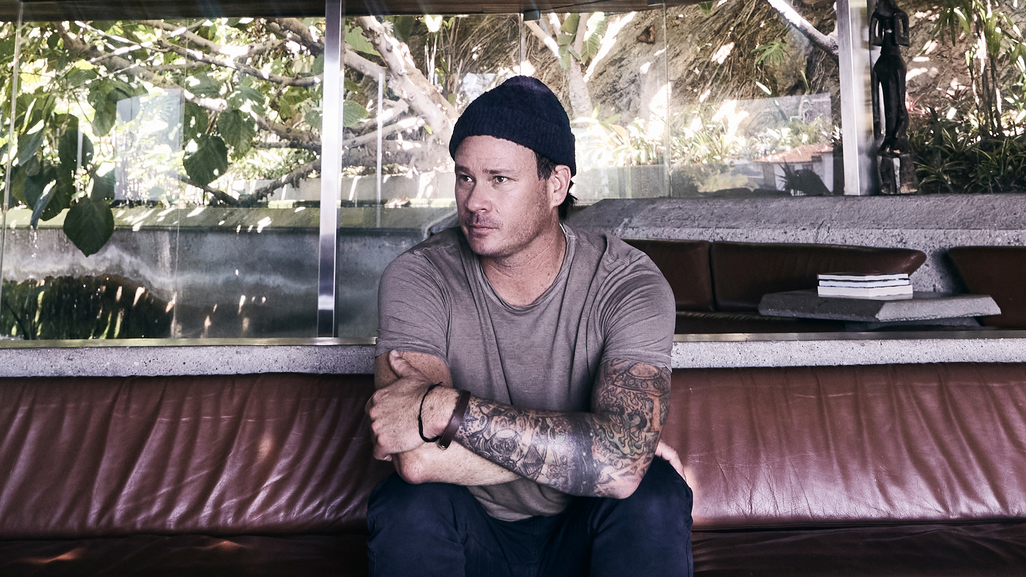
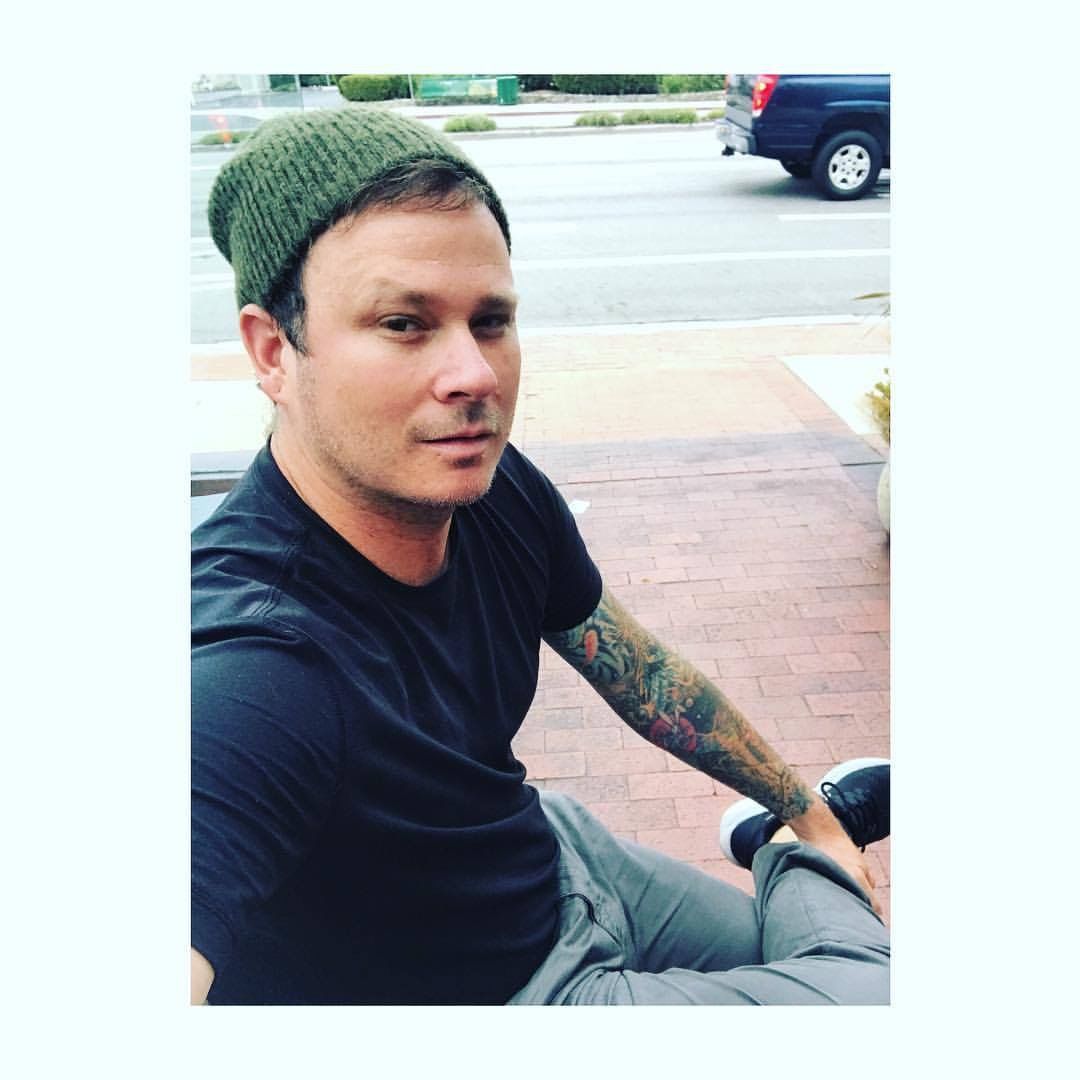
Tom DeLonge tattoos: casual outdoor portrait with the tattooed arm resting in the foreground, showing how the sleeve looks away from a stage

This outdoor portrait is more casual than the interview and promotional images. DeLonge sits in ordinary clothes with the tattooed arm in the foreground. There are no stage lights or dramatic backdrop, and the sleeve still reads clearly in everyday light.

The relaxed pose makes the arm feel like part of daily life rather than a stage prop. The colors are softer, and the shapes follow the way his forearm rests. That is a useful reminder when looking at placement: tattoos appear in ordinary settings too, not only when someone is posing for a camera.

His neck tattoos have also drawn attention because of the public connection to UFOs and unexplained stories. Reports about their meaning are partly speculative. DeLonge has not offered a complete official explanation for every mark, so it is better to leave those details open than invent a quote.

What the photos do show clearly is a recognizable, colorful right-arm sleeve. It is layered, appears in interviews, event photos and casual portraits, and is closely tied to the image he built with Blink-182 and Angels & Airwaves. That is enough to discuss the look without claiming to know the private meaning of every part.

The sleeve also works as a visual timeline. Early punk references, later space-like imagery and additions from a long career share the same arm. You can study how the work uses the elbow, how color divides the panels and how newer designs sit beside older ones.

Tom DeLonge’s tattoos are not a neat list of isolated symbols. The right arm is the main canvas, and the photographs show an evolving sleeve. The ink is real; the exact meaning of every design is not public. If you borrow from the look, take its structure and contrast and make the design your own.

For a quick video reference, watch this early Blink-182 tattoo interview:

https://www.youtube.com/watch?v=CEWkLt0GTKw

More musician tattoo guides

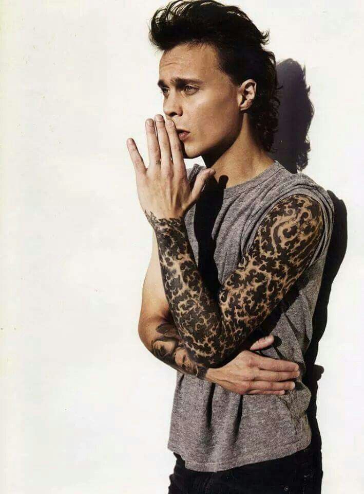
Ville Valo Tattoos: Heartagram, Sleeves and HIM Ink

Ville Valo’s tattoos share the dark, romantic feel people associate with HIM. His collection includes a dense ornamental sleeve, the Heartagram, portraits and smaller marks. The photographs show how the ink has developed from HIM’s years into his solo work as VV.

This account sticks to what is visible in photos and what Valo has discussed in interviews. Fans have attached plenty of stories to the designs, but a photograph and a confirmed explanation are different things. Some parts are documented; others remain personal.

The sleeve is the main visual anchor in Ville Valo’s tattoo story.

Ville Valo tattoos: performance portrait showing the full ornamental sleeve and upper arm tattoo texture

This sleeveless portrait shows the sleeve from upper arm toward the wrist. Black-and-grey ornament covers most of the arm, with repeated curves and open areas that keep the pattern from reading as one flat patch of ink.

Valo has described wanting one continuous idea around the arm and building trust with the person tattooing him. The sleeve’s patterns change, but the line work gives them a common feel. The shoulder uses heavier shapes; smaller repeated forms fill more of the lower arm.

That change in scale guides the eye along the arm, including when he bends it onstage. A sleeve can hold a lot of detail and still keep a clear outline if the darker sections are placed with care.

For anyone planning a sleeve, the useful starting point is the overall texture and how it travels around the arm. Valo’s does not rely on several unrelated images competing for attention. Open skin is part of the pattern too, leaving room for the smaller details to show when someone looks closely.

Lighting changes the effect. Warm stage light brings out softer grey areas and skin texture; a darker club photo makes the strongest black shapes stand out. More than one view gives a fairer sense of the sleeve than a single dramatic performance shot.

The Heartagram tattoos connect the band and the body art

Ville Valo tattoos: close performance photograph showing the Heartagram area and both tattooed forearms

The Heartagram is the design most closely associated with Valo. It combines a heart with an inverted pentagram, and he created it as a symbol for HIM. In this photo it sits near the chest, with the arm tattoos around it without obscuring the shape.

Valo has described the symbol as bringing love and death together. That tension fits HIM’s identity, and the simple outline works on skin, record sleeves, shirts and stage backdrops.

Placement changes its effect. A large chest version becomes part of the public image, especially in a performance photo or an open shirt. Smaller Heartagrams can feel more private, even though fans recognize the mark.

The design does not need much decoration to stay legible. That is one reason fans use it as a starting point for their own tattoos. Valo’s examples show it beside a dense sleeve, a portrait or open skin while remaining recognizable.

The connection to HIM is documented; the reason for every individual placement is not. The symbol’s history can be described without guessing at what Valo has kept to himself.

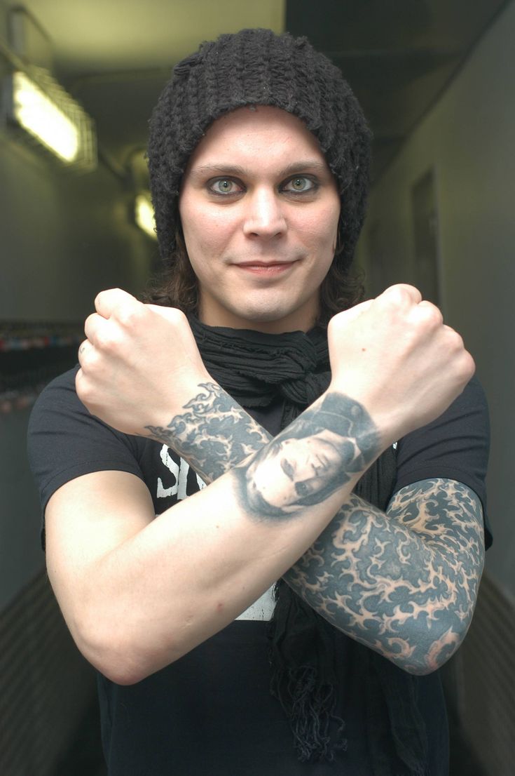
The two-arm photographs show the contrast in Ville Valo’s ink

Ville Valo tattoos: tight sleeve detail showing the dense repeating blackwork pattern on the arm

Photos that show both arms reveal a contrast: one is dominated by the ornamental sleeve, while the other has portraits and smaller symbols. The collection does not mirror itself on both sides, which gives each arm a different role.

Valo has discussed using different artists for particular designs, including portraits of writers and artists he admires. A portrait needs clear edges, so it reads best with some breathing room around it instead of being buried in the sleeve’s repeated pattern.

This close view also shows how the design wraps around the arm. A flat scan cannot capture the way a pattern changes when the wrist turns or the forearm moves.

Black and grey dominate, but the sleeve has plenty of contrast: solid black beside lighter skin, soft portrait shading beside firm outlines, and repeated ornament beside a single letter or heart. A limited palette can still feel varied when texture, line weight and spacing change.

Raised-arm photos help show the scale: where the sleeve begins at the shoulder, how far it reaches toward the wrist, and where other pieces stop. That tells more than simply calling him heavily tattooed.

The portraits and writer references give the collection its personal edge

Ville Valo tattoos: face-visible studio portrait exposing the sleeve and small opposite-arm tattoo details

This studio portrait puts the arm ahead of the stage setting. The sleeve’s texture is easier to see, along with smaller marks near the wrist. After years of being added to, the arm looks like a collection of choices rather than a costume.

Valo’s tattoo history includes portraits connected with writers and artists. An Inked interview identified Charles Bukowski, Charles Baudelaire and Finnish novelist Timo K. Mukka among the figures represented. Those references fit a songwriter whose public image has often brought together literature, melancholy and heavy music.

Faces also change the rhythm of a sleeve. Repeating ornament carries the eye along the arm; a portrait gives it a place to pause. Different subjects can sit together when the shading and line work connect them.

The smaller marks work like punctuation. A heart on the wrist, a letter on the chest and the Heartagram do not need to be large. They break up the broader patterns and give fans details to notice in photographs.

Some older magazine images include headlines, watermarks or page layouts. They can help with the history, but cleaner photographs make it easier to see the actual tattoos and where they sit.

The full-body portrait shows how the sleeve works with the torso

Ville Valo tattoos: wide portrait showing both forearms, a visible face and the sleeve silhouette together

This wider portrait is quieter than a stage image. Valo stands in a plain shirt, with his face and tattooed arm both visible. The dark clothing sets off the sleeve without turning the photo into a performance shot.

The wider view gives a sense of how the arm sits beside the chest and torso. Some pieces appear only when a shirt lifts or the neckline changes; others are easier to see onstage. The collection has different levels of visibility, depending on the clothes and pose.

The sleeve is dense, but the chest and opposite arm are not a solid wall of black. Those open areas let each part keep its own shape, keep the Heartagram visible and give the portraits room.

You do not need to copy the exact images to borrow from the approach. A consistent sleeve texture can sit beside a personal symbol and a portrait that matters to you. Valo’s tattoos connect to his music, his reading and the people he trusted to do the work.

In short, the collection centers on an ornamental sleeve, Heartagram designs, black-and-grey portraits and smaller marks on the chest, wrist and other visible areas. Photos establish the broad picture; interviews explain a few of the stories. The rest should stay uncertain unless Valo confirms it.

For more on the ideas behind the designs, watch Valo in PitCam TV’s Behind The Ink interview:

https://www.youtube.com/watch?v=q_xp8lnS8bo

More musician tattoo guides

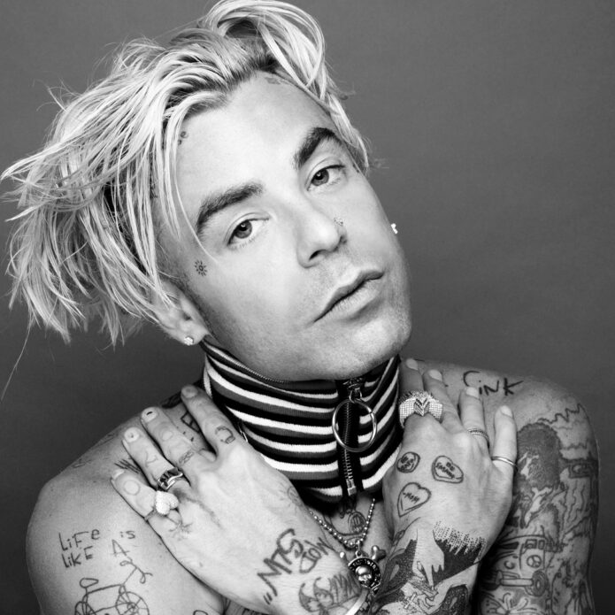
Mod Sun Tattoos: Mantras, Face Ink and a Whole Lot of Color

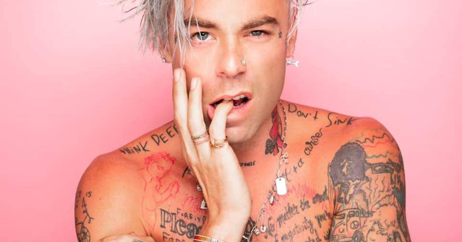
Mod Sun’s tattoos look like a notebook that kept getting new pages: shoulder mantras, small symbols, cartoon-like drawings, flowers and stars. “Think Deep” and “Don’t Sink” sit across his shoulders. A tiny sun and other small marks appear near his face, while the chest is crowded with lettering and color.

The mix fits the scrapbook feel of his music, clothes and videos. Some designs are easy to identify in photos; others have a meaning only if Mod Sun has explained it. This account sticks to that distinction and does not turn a visible shape into a story without a source.

The mantras across his shoulders are the clearest starting point

Mod Sun tattoos: Think Deep and Don't Sink lettering across the shoulders

The shoulder lettering is among the easiest parts to read. “Think Deep” runs across one side in loose handwriting, with “Don’t Sink” on the other. The phrases are short and spaced clearly enough to stand out in photos, even with other ink covering his torso.

The words read like reminders rather than a formal quote in a frame. Their rough edges keep them from looking typeset or polished for a campaign. They also fit the way Mod Sun has spoken about staying creative and avoiding the old rock-and-roll routine.

There is more lettering lower on the torso, but not all of it is clear in photos. Some lines are partial, while others blur into the color or movement. The shoulder pair is the surest visual anchor because the wording is readable across several images.

If you like the idea of a short phrase, the placement is worth noticing: the words follow the shoulders and have room around them. That keeps them easy to read without filling the whole chest. The casual handwriting is part of the look too.

His arms carry the messy, colorful mix that defines the collection

Mod Sun tattoos: layered linework and color tattoos on both arms

The arms have the densest mix: small line drawings, patches of color, words and symbols sit beside one another without forming a perfectly matched sleeve. In a close portrait, some marks are bold enough to read from a stage; others look more like little doodles.

The styles do not all match. A simple outline sits beside heavier shading, and bright color interrupts the black ink. Rather than smoothing over those differences, Mod Sun wears them together. The result feels closer to a visual diary than a coordinated set.

Small marks on his face and hands change where the eye goes. It might move from a phrase on the bicep to a finger symbol, then back to a larger illustration on the forearm. A full-body photo shows the scale, while a close view helps with line weight, color and overlap.

The clearest photos keep the ink in view. When a jacket or microphone blocks the arm, it is hard to see how the pieces differ. These images show that the tattoos are not all variations on the same pose or design.

The chest and neck work reads as a personal scrapbook

Mod Sun tattoos: full chest, neck and forearm tattoo layout in a shirtless portrait

The chest is full of phrases, flowers, small characters and darker illustrated sections. Some designs use bright color; others are drawn in thin black lines. Their overlap gives the torso movement instead of turning it into one flat panel.

Ink around the neck and collar stays visible when a shirt covers the chest. On Mod Sun, those marks connect the face with the larger body work. In a portrait, they often catch the eye before the smaller details lower down.

Body Art Guru lists motifs including a butterfly, star, horseshoe, dice and safety pin. Those labels are useful when a clear photograph supports them, but they do not explain what each design means to him. The visible shape can be identified; the personal reason may not be public.

“Scrapbook” is a better fit than trying to impose one grand theme. His career has moved through music, touring and filmmaking, and the tattoos set a short phrase beside a joke or a colorful image beside a serious reminder. That mix keeps the torso interesting.

Live photos show how the tattoos move with him onstage

Mod Sun tattoos: torso and arm tattoos visible during a Hellfest performance

A studio portrait shows the ink at rest; the Hellfest photo catches it while Mod Sun is performing. His arms lift and turn as he works the stage, so the tattoos bend with the body. It is not a posed catalogue photo, but it shows the ink as part of his performance presence.
Lighting changes what stands out. Daylight separates the colors; blue or purple stage light can flatten dark outlines and make a small phrase harder to see. One photo can show the design clearly, while another gives a better sense of how it sits when he moves.

Placement becomes easier to understand in motion. Shoulder work follows the arm as it rises; chest lettering shifts when he leans toward a microphone; a side tattoo may disappear when he turns. A tattoo is seen on a moving body, not a flat sheet of paper.

The live images keep the collection in context. Mod Sun is sweating, jumping and leaning toward the audience, not standing still for a tattoo catalogue. The ink remains visible without taking over the performance.

Smaller Mod Sun tattoos keep the collection from feeling staged

Mod Sun tattoos: script and illustrated tattoos across the torso during a live set

The small pieces are easy to overlook beside the shoulder phrases and larger chest images. But the marks on his hands, the short bits of lettering and the little shapes around his arms make the collection feel accumulated over time. They do not need a dramatic explanation to belong there.

In this performance photo, the torso carries the bigger statements while the hands and forearms show smaller details as he reaches forward. Your eye moves from a large chest design to a mark about the size of a coin.

The gaps, overlaps and changes in color keep the collection from looking too neat. It does not follow one strict flow from the first appointment onward. For someone building a personal collection, that can be a useful reference if the goal is to add pieces over time rather than commit to one theme at once.

It is better to borrow the approach than copy a phrase or symbol just because a musician wears it. Think about which reminders or images would still matter to you in a few years, then choose a design and placement that suit your own body.
Mod Sun’s collection stays specific: the shoulder mantras, the small sun near his face, the colorful chest and the smaller marks each add something different. Together they read like notes gathered across changing parts of his life.
Watch a related Mod Sun video below for more of the creative world around the tattoos.

More musician tattoo guides