Musicians

Tattoo guides for singers, rappers, DJs and musicians, with photographs, documented meanings and the stories behind their designs.

Caskey Tattoos: Face, Head, Neck, Chest and Arms

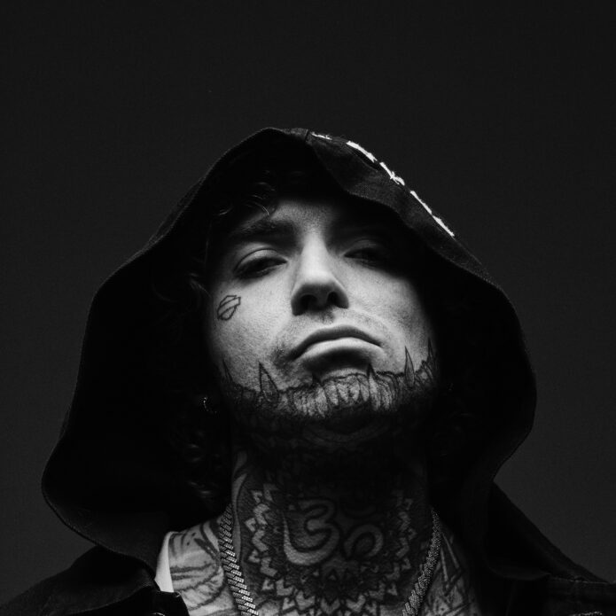
Caskey’s tattoos cover his head, face, neck, chest, arms, hands and back. The mix includes large portraits, religious imagery, lettering, skull-like shapes and smaller details that show up in close photos. The ink is dark and extensive, but it isn’t one unbroken block of black.

His brother Ryan K. Severe designed and tattooed much of the work. That includes the head piece drawn from the animal-jaw imagery in Apocalypto. Caskey has said he wants to keep building toward a full bodysuit, so the tattoos have grown over time instead of arriving as one matched set.

Black-and-grey shading, spiritual imagery and bold placement run through the collection. Caskey also uses areas many people leave alone, including his face, neck and hands. The chest carries the larger portraits; the face, neck and hands keep the details close to view.

Caskey’s chest and torso tattoos carry the biggest pieces
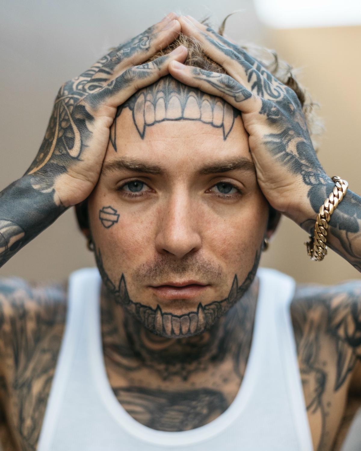
Caskey tattoos: high-resolution portrait showing the face, neck, chest, hands and arms covered in tattoos

The chest holds some of Caskey’s largest work. A Native American portrait sits across the upper torso, with tattoos filling the shoulders and continuing toward the stomach. In a shirtless photo, the open skin around the portrait helps it read clearly beside his heavily inked arms.

Lettering runs across the lower torso beneath the portrait. Its lines give the area a different texture from the shaded image above. That change in scale keeps the chest from becoming one flat field: the portrait, script and geometric borders each have room to show.

The portrait also follows the curve of the chest. It has to read when Caskey is standing, bending or turning, and it doesn’t look like a rectangle laid over the skin. The design spreads across the torso while leaving the arms space for their own pieces.

If you’re planning a large chest tattoo, choose the main image first and build around it. Smaller details can fill gaps later. Caskey’s torso shows how a portrait, lettering and patterned borders can sit together without all competing for the same attention.

His arm tattoos mix heavy shading with softer detail
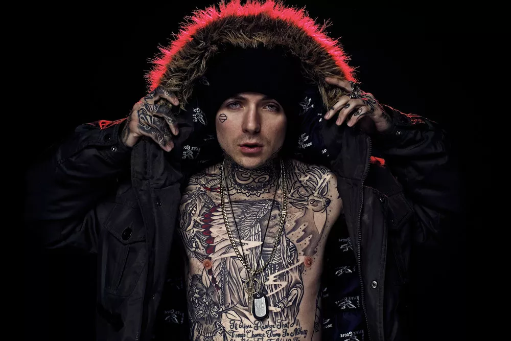
Caskey tattoos: high-resolution hooded portrait showing the tattooed chest, neck and arms

Caskey’s arms are densely tattooed, but the images still read as separate pieces. Larger shaded work covers the upper arms; patterns and smaller marks continue toward the wrists. The designs follow the muscles, so they change with the arm instead of reading like a flat sleeve.

The black-and-grey shading is easy to see on the forearms. Dark areas give the larger images weight, while lighter shading keeps fine lines visible. In performance photos, the stage light catches different parts of the ink as his arms move.

The shoulder tattoos meet the chest work, and the forearm pieces draw the eye toward the hands. Those connections make the separate tattoos feel considered without requiring every image to match. Scale, direction and open skin do much of that work.

Let the shape of your arm guide the strongest lines. A long image may sit well on the forearm, while a rounder design can fit the shoulder. Caskey’s tattoos show how much a piece changes when it wraps around a part of the body that is always moving.

The Caskey face tattoos make the whole collection recognizable
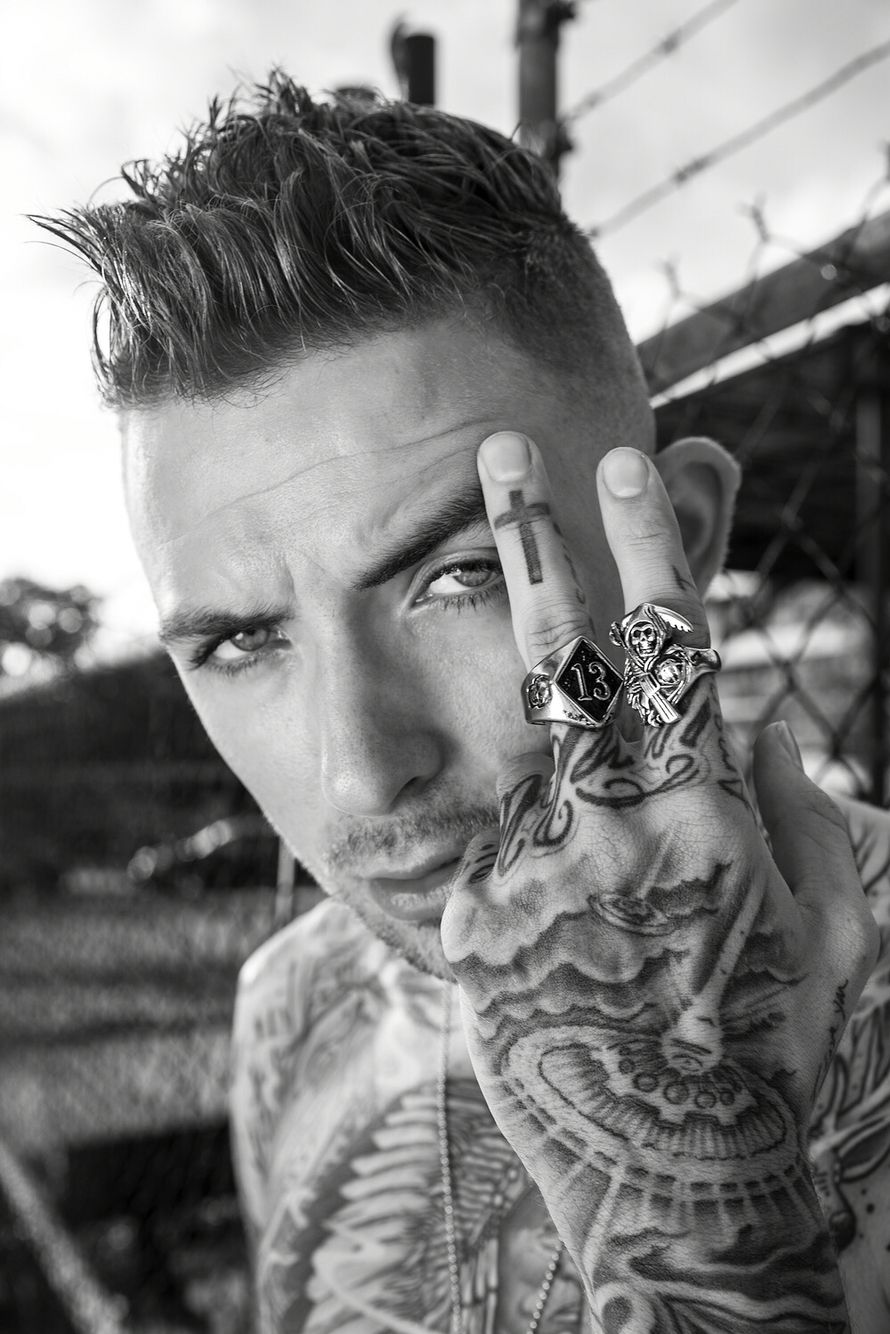
Caskey tattoos: high-resolution close portrait showing face, hand, chest and finger tattoos

The face tattoos are often the first part of Caskey’s look people notice. A jaw-like design crosses his forehead and cheeks, giving the face a skeletal outline. Smaller marks around the eyes and temples fill the spaces between the larger shapes, and the design looks different in profile.

Caskey has said the head piece was inspired by an animal jaw in Apocalypto. He and Ryan K. Severe worked on the idea over time, using shots of his head to plan how it would look from different angles. The finished lines wrap over the top and sides rather than reading as a front-facing image alone.

Face tattoos have to account for the curves of the forehead, temples and jaw, and they’re always visible. Caskey’s repeated teeth and firm outlines help the jaw shape remain clear when he turns his head.

For face tattoo ideas, look at how a design follows the skull as well as the symbols it uses. A drawing that works straight on may not hold up from the side. The whole shape should make sense as the wearer moves.

Neck and hand tattoos pull the details into close view
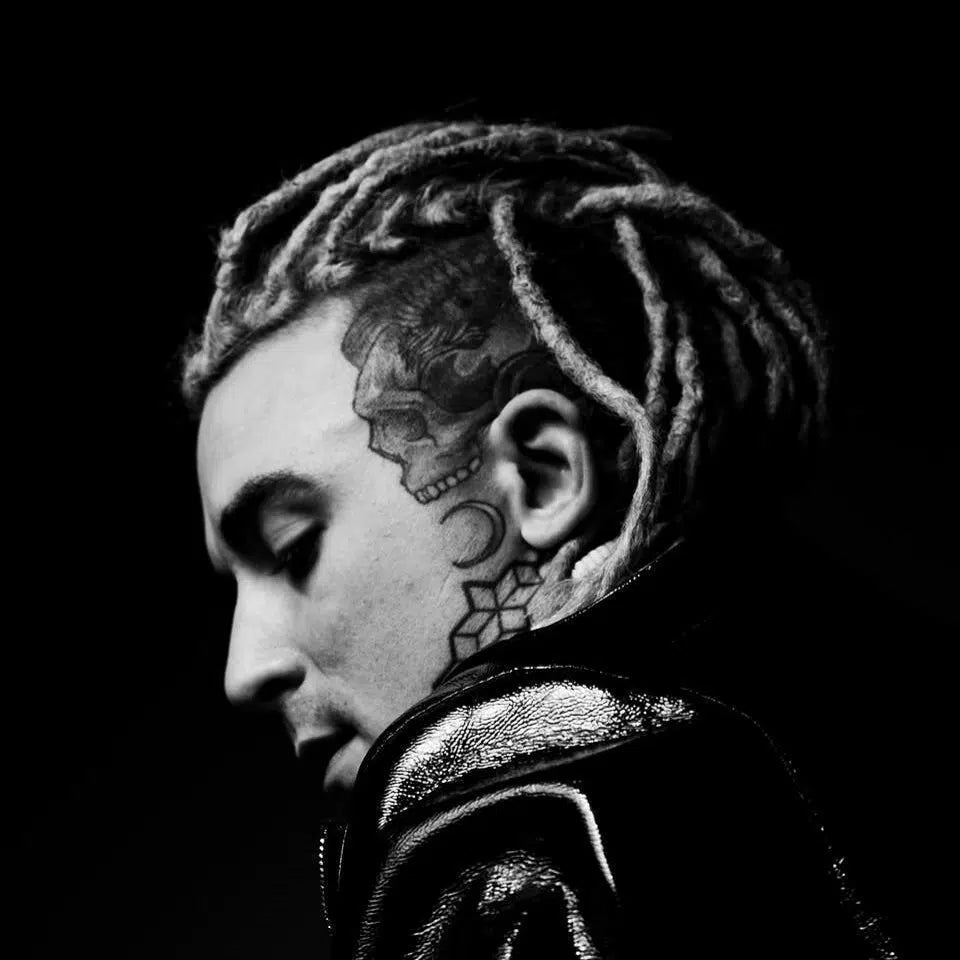
Caskey tattoos: high-resolution side profile showing the head, face and neck tattoo layout

A large symbol sits at the center of Caskey’s throat. Lines around it reach toward the jaw and down to the collar, making the neck a distinct piece in a close portrait and a link between the head and chest in wider shots.

Caskey has also placed meaningful lettering and spiritual imagery on his neck. The subjects vary, but the dark shading and strong outlines give the pieces a shared look.

Lettering across the hands, including “Be Humble,” is easy to see when Caskey holds a microphone or raises his fingers near his face. Hand tattoos take up less space than chest pieces, but the hands appear in so many photos and gestures that the ink is hard to miss.

Short lettering has more room to stay legible on the fingers, where joints bend and the skin gets regular wear. The words on Caskey’s hands are brief and direct, with little extra decoration around them.

Caskey’s tattoo style is built around contrast and placement
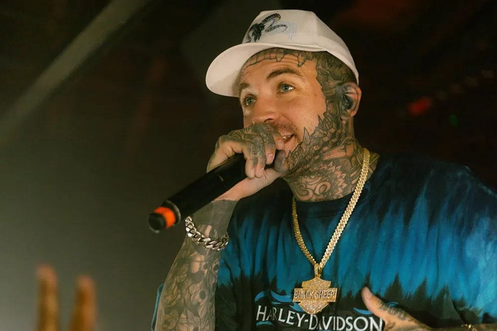
Caskey tattoos: high-resolution live performance photo showing face, neck, hands and arm tattoos

Contrast does much of the work in Caskey’s tattoo style. Black outlines, grey shading and patches of open skin keep the designs readable in close portraits and performance photos. The head and neck are the darkest focal points; the chest and arms carry the larger images, while smaller details draw attention back to his face and hands.

Spiritual imagery is another thread. Caskey has discussed religion-inspired tattoos, including a Lord Shiva piece on his back, alongside the Native American portrait on his chest. The subjects differ, and both designs take up substantial space.

Planning by body area helps explain how the pieces fit. A face tattoo changes how the neck is seen; a chest portrait shapes the space around the shoulders; and hand tattoos appear with every gesture. The images don’t need to match, but their placement affects one another.

You can take cues from the way Caskey’s tattoos are arranged without copying the artwork. Choose a main area, decide what should draw the eye first, then let smaller details support it. Leave open skin where a design needs room, and use symbols that mean something to you.

Caskey’s tattoos feel personal, but their placement also looks planned. The head and face catch the eye first; the chest and back hold the larger images; and the neck, arms and hands carry the work into everyday photos. The pieces are bold, yet the way they connect matters just as much.

If you’re using Caskey’s tattoos for reference, start with placement. Consider how a design looks when you turn your head, lift an arm or move your hands. What matters here is how the tattoos follow his body and keep their main shapes clear.

Here’s Caskey’s official “Tats On My Neck” video:
More musician tattoo guides

Pop Smoke Tattoos: Chest, Arms, Face and Neck Ink

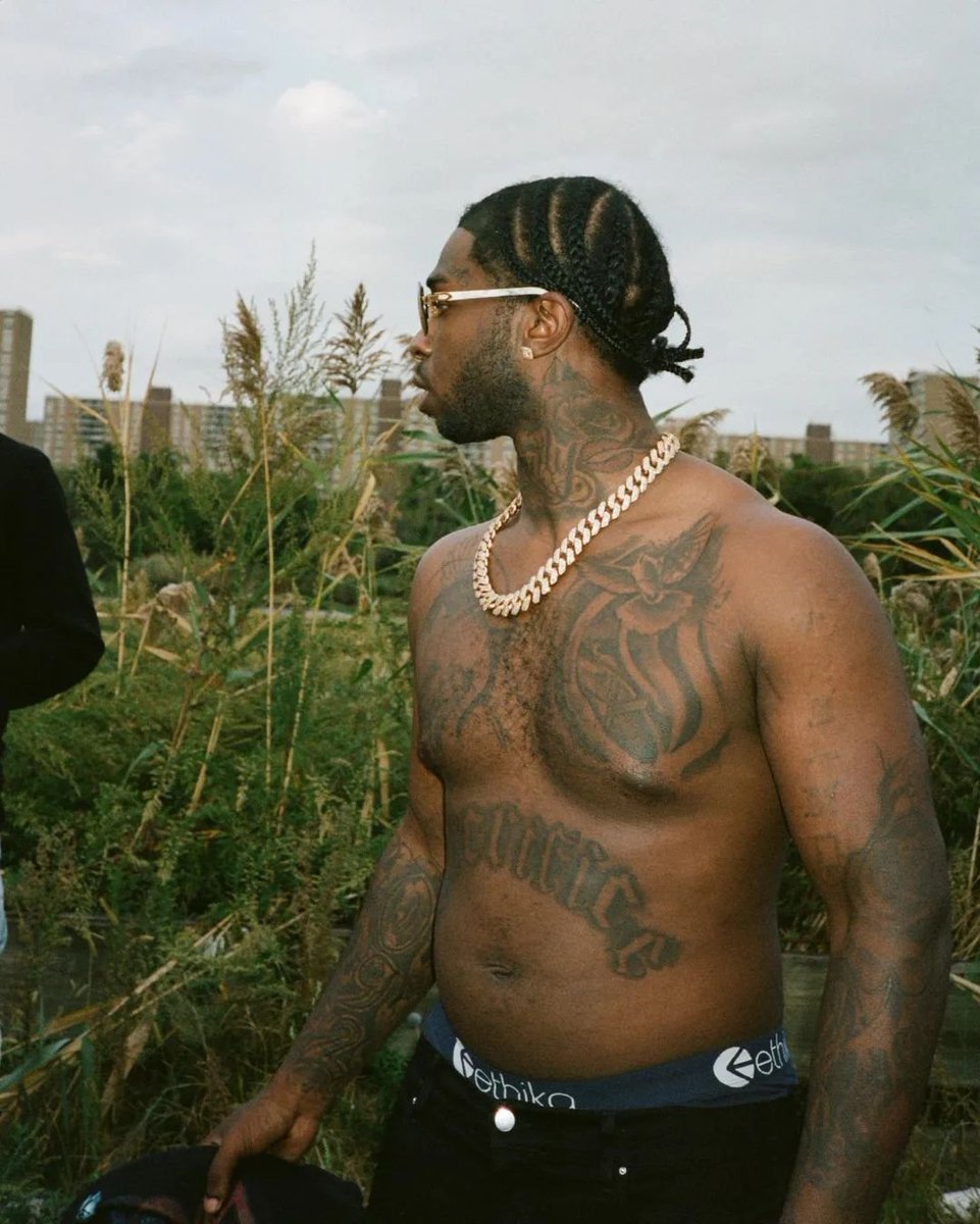
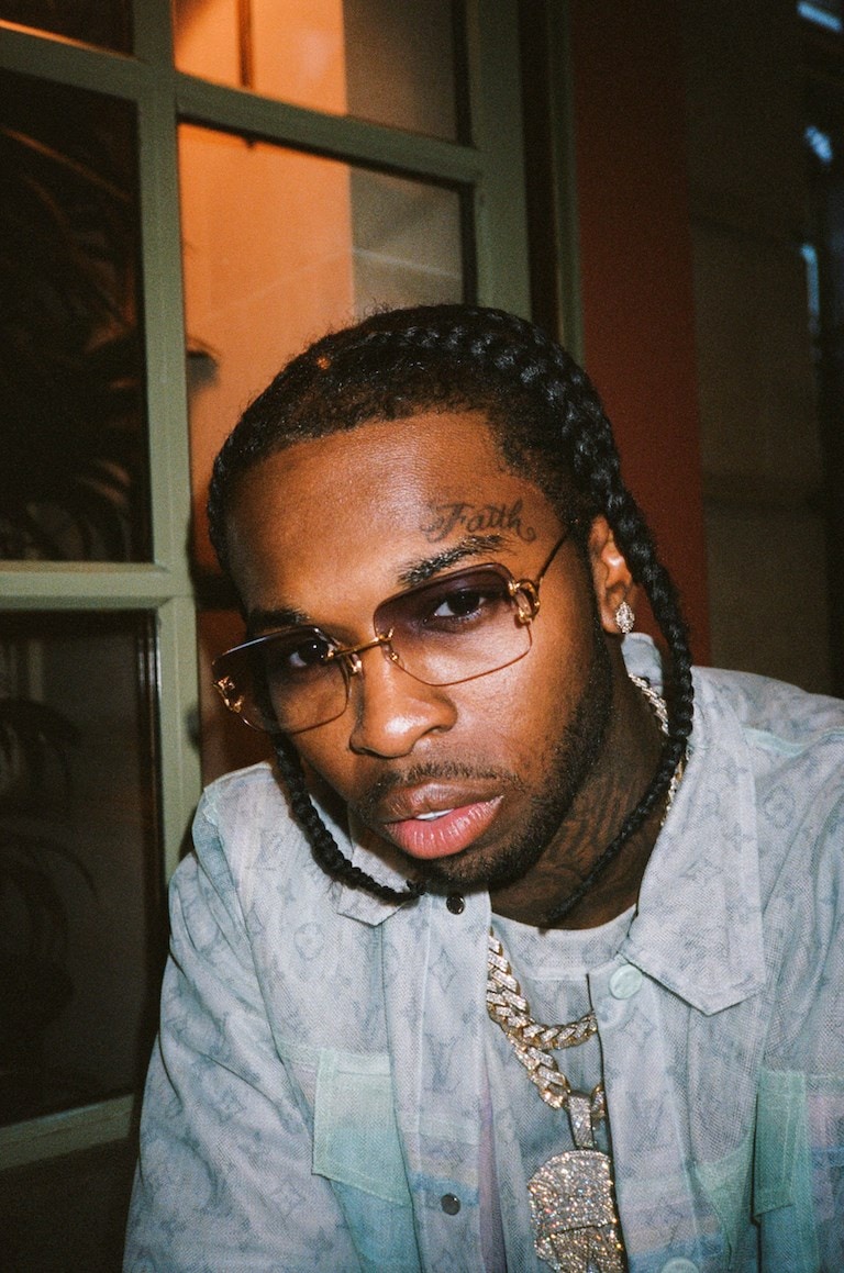
Pop Smoke’s tattoos ran across his chest, stomach, arms, hands, neck and face. Photos show large dark shapes, lettering and smaller symbols. The torso and arm pieces read from a distance; details such as the word “Faith” above his eyebrow show up in close portraits.

His tattoos became part of his public image, but no single photo shows the full collection. A shirtless portrait reveals the chest and stomach, while stage shots and close-ups show different parts of his arms, face and hands. Jewelry and clothing sometimes cover parts of the ink.

The photographs make placement easier to compare. Each angle shows something different, from the broad torso work to the smaller marks near his face.

Pop Smoke’s chest and torso tattoos carry the biggest shapes

Pop Smoke tattoos: local tattoo photograph

In shirtless portraits, the chest and stomach are the first areas you see. Dark tattoos spread across the chest and follow the pectoral muscles. Lettering sits lower on the stomach, giving the torso two distinct areas instead of one solid design.

The change in scale leaves some room between the heavier chest work and the lower lettering. That open skin helps the darker parts stay separate and makes it easier to follow the tattoos down the body.

Pop Smoke often wore a chain over the middle of his chest. The pendant covers some of the ink, while tattoos remain visible around it and across his shoulders.

If you’re planning a chest tattoo, start with the shape of the body before settling on the artwork. The chest curves, so a design that looks balanced on a screen may feel crowded once it is on the skin. Give the main image enough width, then use a smaller piece lower on the torso if it fits without competing with it.

His arm tattoos build the strongest lines

Pop Smoke tattoos: local tattoo photograph

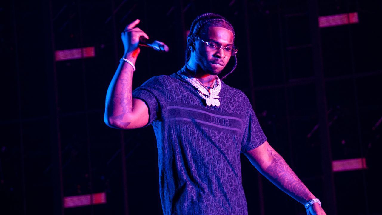
Pop Smoke’s arm tattoos are easy to see when he raises a hand or holds a microphone. The ink runs over the shoulders and upper arms, with dark areas and curved lines that wrap around the muscles. In the pool portrait, his raised arm exposes more of that shape.

The designs vary in size. Some read as broad shaded panels, while narrower marks follow the forearm. As the arm turns, different parts of the work come into view.

Dark ink stands out against the open skin in bright outdoor photos. Good placement can make a tattoo easier to read than extra detail. A simpler design that follows the arm may hold up better than a crowded one forced into the wrong direction.

The pool photo also shows his hand and wrist alongside the upper arm. The tattoos connect across those areas, so the eye can follow them from shoulder to hand. That flow can be useful when planning work over several sessions.

The Faith face tattoo became part of his signature look

Pop Smoke tattoos: local tattoo photograph

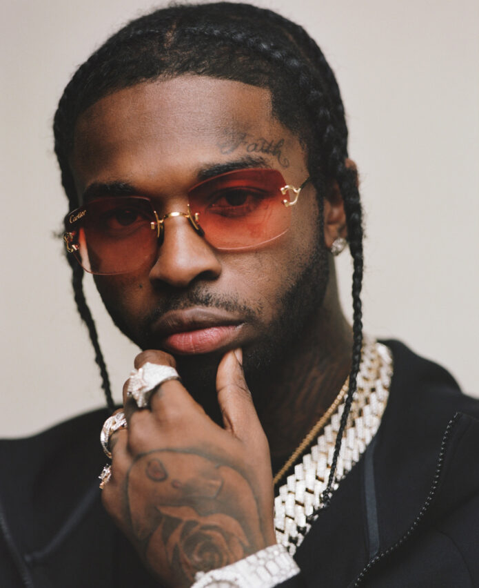
The word “Faith” above Pop Smoke’s eyebrow became one of his best-known tattoos. Dark script sits high on his forehead, close to the eye, and appears clearly in close portraits. It’s smaller than the chest and arm pieces, but the placement draws attention to it.

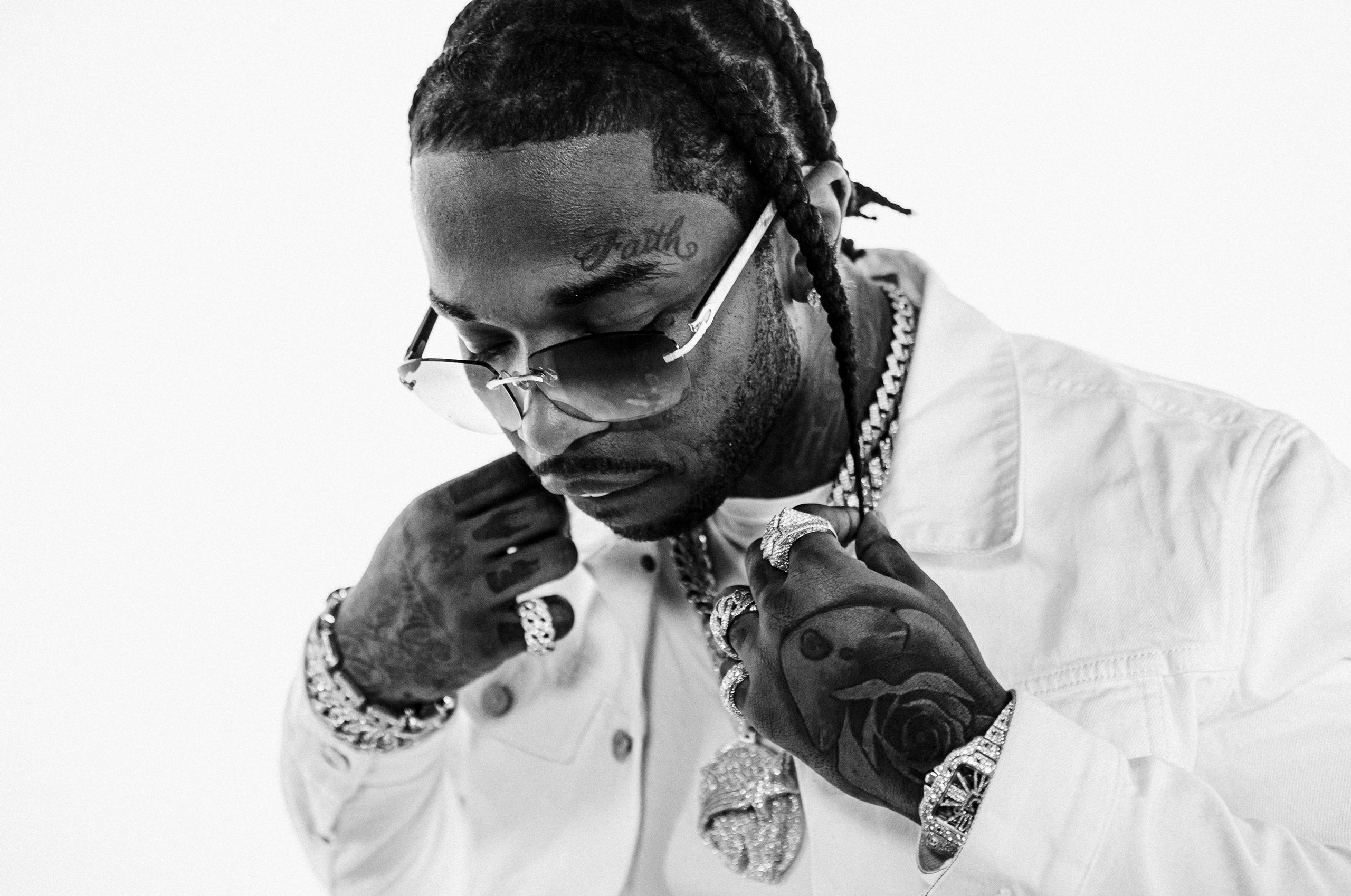
His braids, glasses and jewelry were already part of his look; the lettering added another fixed point. In black-and-white photos, “Faith” stands out against the skin and is often one of the first details you notice.

Face tattoos stay visible when a shirt or jacket covers other ink, and the design has to fit the lines of the forehead and eyebrow. Pop Smoke’s script follows that area. For face lettering, clean shapes and enough space matter more than fitting a long phrase into a small spot.

The word is not the largest tattoo in his collection, but it became a recognizable part of his look. Smaller marks on his face, neck and hands sit nearby; “Faith” is the clearest focal point among them.

Hand and neck tattoos bring the details closer

Pop Smoke tattoos: local tattoo photograph

Close portraits show Pop Smoke’s hand and neck tattoos more clearly than most stage shots. Lettering and darker symbols on his hands appear when he adjusts his glasses, touches a chain or brings his fingers near his face.

Hand tattoos are hard to keep out of view. Rings, watches and bracelets often framed his designs, while the black ink remained visible beside the jewelry.

The neck work fills the space under his jaw and around his collar, joining the face and chest tattoos in a close-up. From farther away it reads as a dark shape; sharper photos show the lines against his throat.

Leave breathing room around small tattoos near the face. Hair, jewelry and lettering can crowd the same area. Pop Smoke’s designs remain easier to pick out when there’s space between each part.

Pop Smoke’s tattoo style depends on contrast and placement

Pop Smoke tattoos: local tattoo photograph

Dark ink, lighter skin and bright jewelry create much of the contrast in Pop Smoke’s tattoo style. Even in photos with purple or blue stage lighting, the larger arm shapes remain visible.

The placement gives the collection a clear order: the “Faith” lettering draws the eye to his face, the chest and arms hold the larger designs, and the hands and neck add details that show up in close-ups.

Photos also show why tattoos need to account for movement. An arm changes shape when it lifts, a hand folds, and the chest stretches as the shoulders move. A design that follows those shifts can sit naturally on the body.

You can take cues from the balance in Pop Smoke’s tattoos without copying the symbols. Choose one area for a larger piece, then leave enough space for smaller work around it. The pieces don’t all need the same amount of black ink; placement and contrast help them fit together.

The chest and arms carry the larger shapes, while the face tattoo is an unmistakable focal point. The neck and hands come into view in close-ups. Their placement links the larger pieces without requiring a matching theme.

The different photos tell different parts of the story: a shirtless portrait shows the torso, a pool shot catches the arm and hand, and a concert image shows the tattoos in motion under colored lights. No single angle captures everything.

If you’re looking at Pop Smoke’s tattoos for ideas, start with the body part and how it moves. Give the main piece enough space, then use smaller tattoos to fill in around it. The designs can feel connected without all looking alike.

Here is Pop Smoke’s official “Dior” video:

More musician tattoo guides

King Von Tattoos: Chest, Arms, Neck and Hand Ink

King Von’s tattoos cover his chest, neck, shoulders, arms and hands. Photos show a mix of dark lettering and larger black-and-grey shapes. The chest and arms carry most of the ink, while smaller marks on the neck and hands come into view in close-ups.

His tattoos were often visible in photos of him in sleeveless shirts or without a shirt. Chains and streetwear sometimes covered part of the ink, so different shots reveal different sections. Looking at more than one angle gives a clearer view of where the pieces sit.

Side views show how the arm work wraps, while close portraits bring out the neck and hand tattoos.

King Von’s chest tattoos set the tone

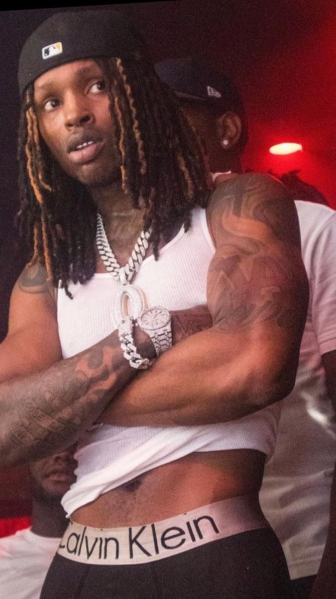
King Von tattoos: high-resolution shirtless portrait showing the chest, neck, shoulders and both tattooed arms

In shirtless portraits, the chest is one of the first areas you see. Dark tattoos spread across both sides of the upper torso, with curved shapes and lettering following the pectoral muscles. The necklace sits over the center; the chest ink remains visible around it.

The layout changes with his posture. With his shoulders relaxed, the pieces look broad across the torso. When his arms lift, the skin pulls toward the shoulders and the chest designs appear narrower. The photos show both positions.

The larger black-and-grey shapes stay readable from a distance. If you’re planning a chest tattoo, start with a clear main image and give it room. Adding many small symbols to the upper chest can make the design hard to read once the pieces sit together.

King Von’s arm tattoos carry the heaviest visual weight

King Von tattoos: high-resolution front portrait clearly showing the chest lettering, neck ink and shoulder tattoos

The arms hold some of the most visible tattoos in the collection. Larger black-and-grey shapes cover the shoulders and upper arms; lettering and smaller marks continue down the forearms. The shift in scale breaks up the surface.

A front-facing photo shows the designs from shoulder toward wrist. Another angle reveals how they wrap around the arm instead of sitting on one side. That wrap changes the way a sleeve looks as the arm turns. The outer arm and inner forearm can show different parts of the same piece.

Scale matters across the arm. A broad shoulder can carry a larger image, while the narrower forearm calls for shapes that stay clear on less space. The photos show Von’s tattoos at both sizes.

Open skin between the darker sections keeps the designs distinct. You don’t have to fill every inch for a tattooed arm to feel complete. Gaps can leave the arm’s shape visible and give each piece room.

King Von’s neck and hand tattoos make the close-ups feel personal

King Von tattoos: high-resolution angled portrait showing the wrapped arm work, chest tattoos and hand placement

Close portraits show the neck and hand tattoos more clearly than full-body photos. Dark ink climbs from the collar toward the jaw, and smaller designs sit across the fingers and backs of the hands.

The hand pieces are visible when Von grips a chain or brings his fingers near his face. They move with each gesture and are harder to cover than chest tattoos. That visibility is one reason to think carefully before getting a hand tattoo.

The neck fills the space between the face and chest. Jewelry and the collar line frame the area, where several details sit close together. Small lettering and symbols need clear spacing on the neck, where the skin bends and shifts.

The close-ups also show how the smaller tattoos relate to the larger chest and arm work. The collection isn’t only made up of broad designs; the hand and neck pieces bring more detail into the photos.

King Von’s tattoo style works because the pieces stay bold

King Von tattoos: high-resolution close portrait showing the neck, shoulders and both hands with tattoo details visible

Strong outlines, dark shading and lettering give Von’s tattoos a consistent look. The larger shapes remain visible beside chains, clothing and stage lights, while the smaller marks come through in closer photos.

Most of the work uses black and grey. Darker areas give the tattoos weight, and patches of lighter skin break up the chest and arms. That contrast helps each shape stand apart.

The designs don’t all need the same amount of shading. If every piece is equally dark, it can be harder to tell where one ends and another begins. Mixing larger shaded areas with smaller marks and open skin gives the eye places to pause.

Sleeveless shirts show more of the shoulders and arms; a tank top keeps the chest and neck in view. In photos, the clothes change which tattoos are visible.

Photos of King Von’s tattoos show how much the collection depends on placement

King Von tattoos: high-resolution stage portrait showing a separate angle of the arm, chest and shoulder tattoos

A front-facing photo shows the chest and shoulders but hides the outside of the arm and the back of the forearm. A side portrait shows more of the shoulder wrap and hand, while part of the chest falls into shadow.

The angle changes what you can make out. An arm can look like one dark sleeve from the front, then resolve into separate pieces from the side. The gaps and shifts in line weight are easier to see when the body turns.

The tattoos share a bold treatment, but they don’t follow one strict theme. Dark contrast and placement tie the pieces together. A personal tattoo style can come from the way you use space, even when the symbols differ.

If you like this approach, choose the body area you want people to notice first. Build the larger piece there, then use smaller tattoos to connect nearby areas. That gives later work a direction while leaving room for it to change.

The chest and arm tattoos read from farther away; the neck and hand designs show up best in a close portrait.

The photos also show how posture affects placement. The shoulder turns, the chest stretches, and the hand closes around a chain. Each change reveals a different part of the ink.

For King Von tattoo ideas, borrow the balance instead of copying the artwork. Choose a main area, keep the contrast clear and let smaller pieces support it. The tattoos can feel connected without repeating the same design.

Here is King Von’s official “Crazy Story” video:

More musician tattoo guides

SahBabii Tattoos: Chest, Face, Neck and Arm Ink

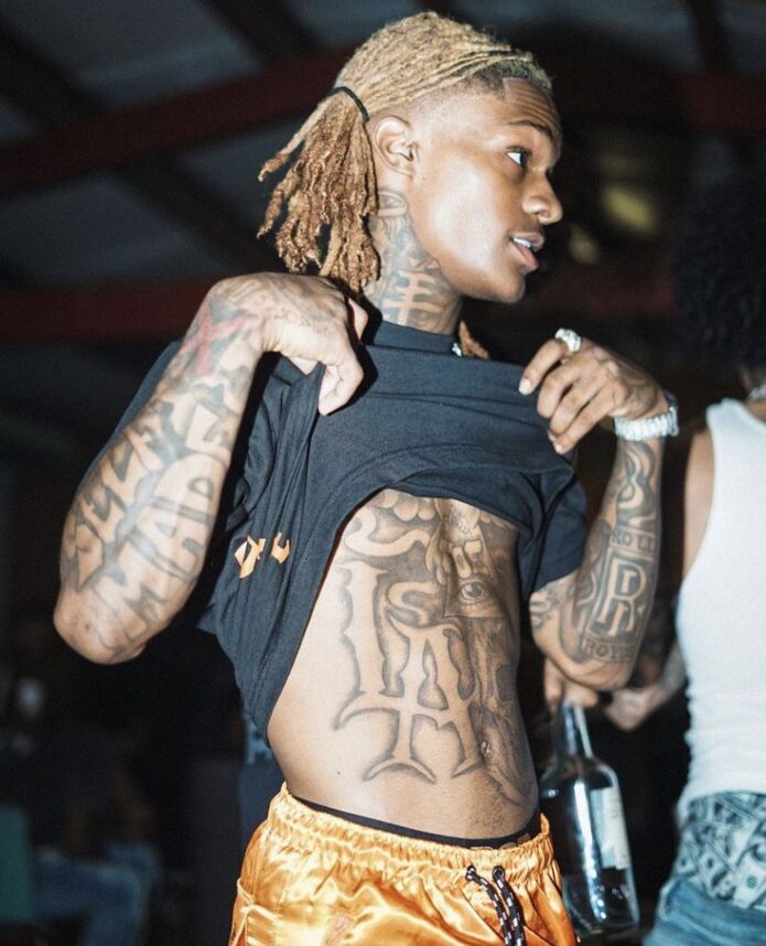
SahBabii’s tattoos are spread across his chest, neck, arms, stomach and face. They make up a loose collection of symbols, script and shaded designs rather than one planned sleeve. The larger pieces are easy to spot in a portrait; the smaller marks show up when the camera gets closer.

SahBabii has said his uncle, who worked in the family home, introduced him to tattooing and did most of his tattoos. His first was a Pisces design on his arm. That family connection helps explain why the collection feels personal without looking like one matching set.

Placement is the easiest way to take in SahBabii’s tattoos. The chest holds the broadest shapes, the neck and forehead have the symbols people tend to recognize, and the arms carry smaller pieces. The clearest photos show how those areas fit together.

SahBabii’s chest and shoulder tattoos create the main frame

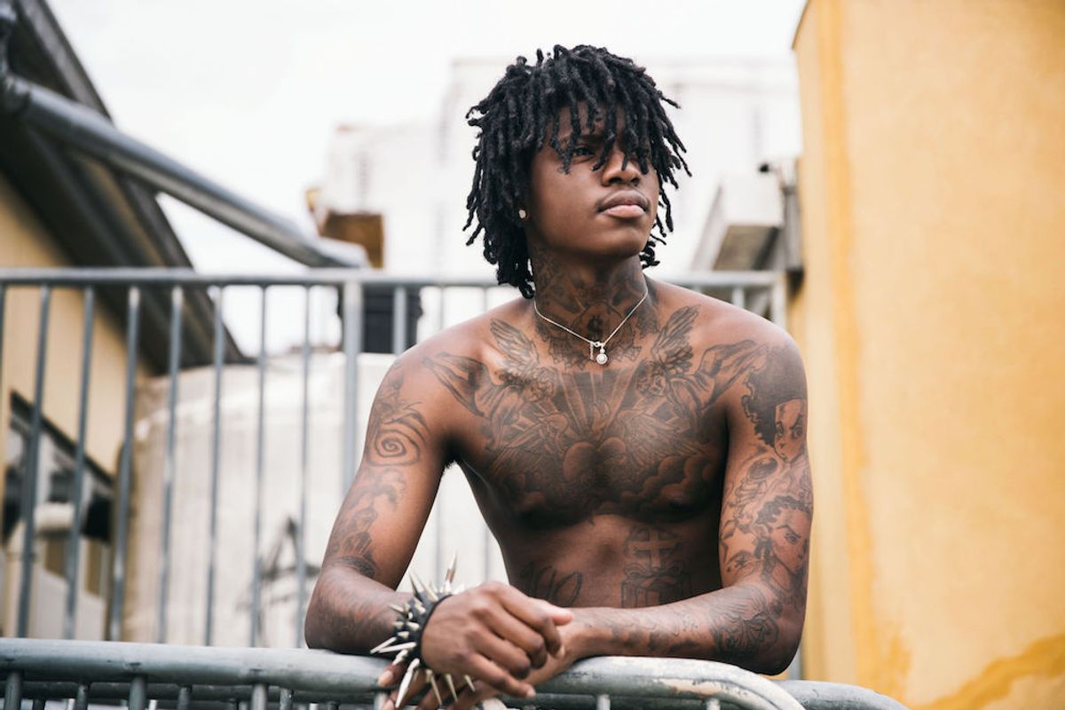
SahBabii tattoos: high-resolution shirtless balcony portrait showing the chest, shoulders, neck and arms

The chest has the biggest shapes in SahBabii’s collection. Dark shading runs across both sides of his upper body, follows the shoulders and reaches toward the center. In some light, the designs read like wings or mirrored panels. The darker edges give his torso a clear outline, while the skin between them keeps the whole area from turning into one solid block.

Around the collarbone, script and curved lines sit beside the heavier shapes. The center fades into lighter detail, so there’s more to see than the dark outline at first glance. The shading has depth because the pieces aren’t all filled to the same weight.

The ink carries onto the shoulders and upper arms, which makes the chest feel less boxed in. A design that ends at the pectoral can look separate from the rest of the body; these pieces extend outward and follow the width of his shoulders. A broad tattoo layout tends to sit more naturally when it follows the body’s shape.

Photos from different years can make the same tattoo look heavier or lighter. A stage picture may deepen the shading, while a closer portrait can show faded lines and the gaps between designs. Lighting, posture and camera distance all affect how old ink appears.

His neck and forehead tattoos carry the strongest symbols

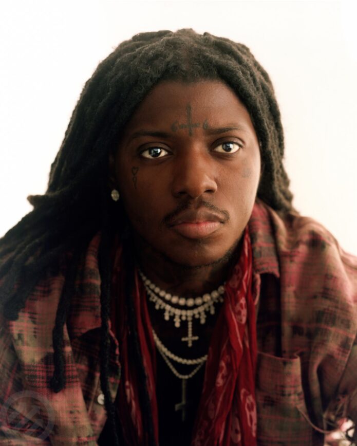
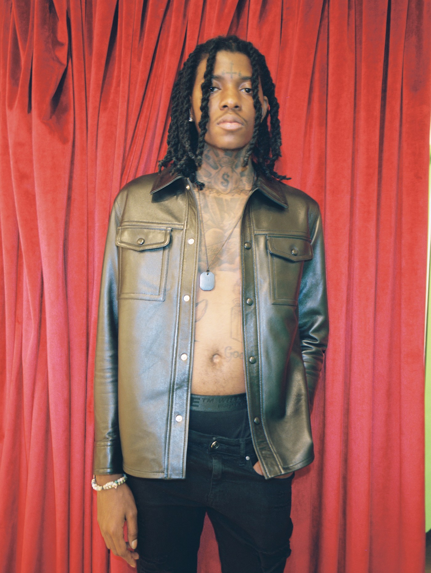
SahBabii tattoos: high-resolution red-curtain portrait showing the neck tattoo, forehead cross and open chest

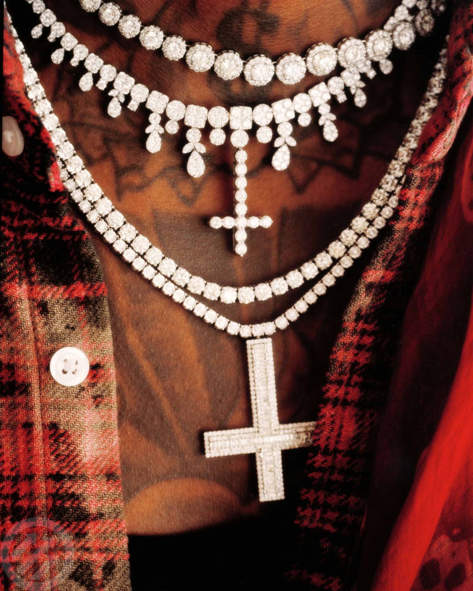
The tattoos under SahBabii’s jaw continue down toward his chest. From a distance they can look like a dark collar. In closer photos, you can pick out separate shapes and lettering. The placement keeps them visible in an open jacket or a low-cut shirt.

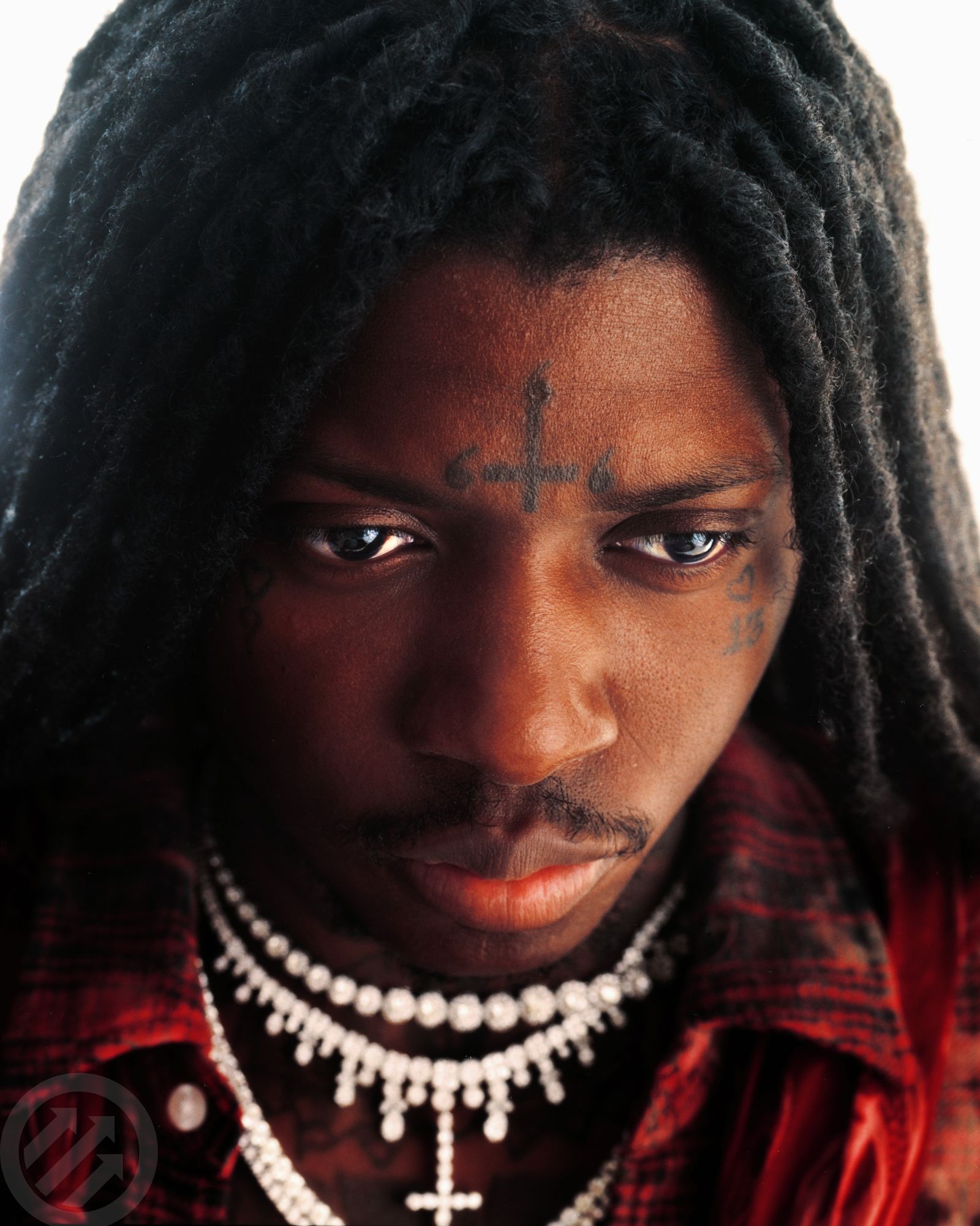
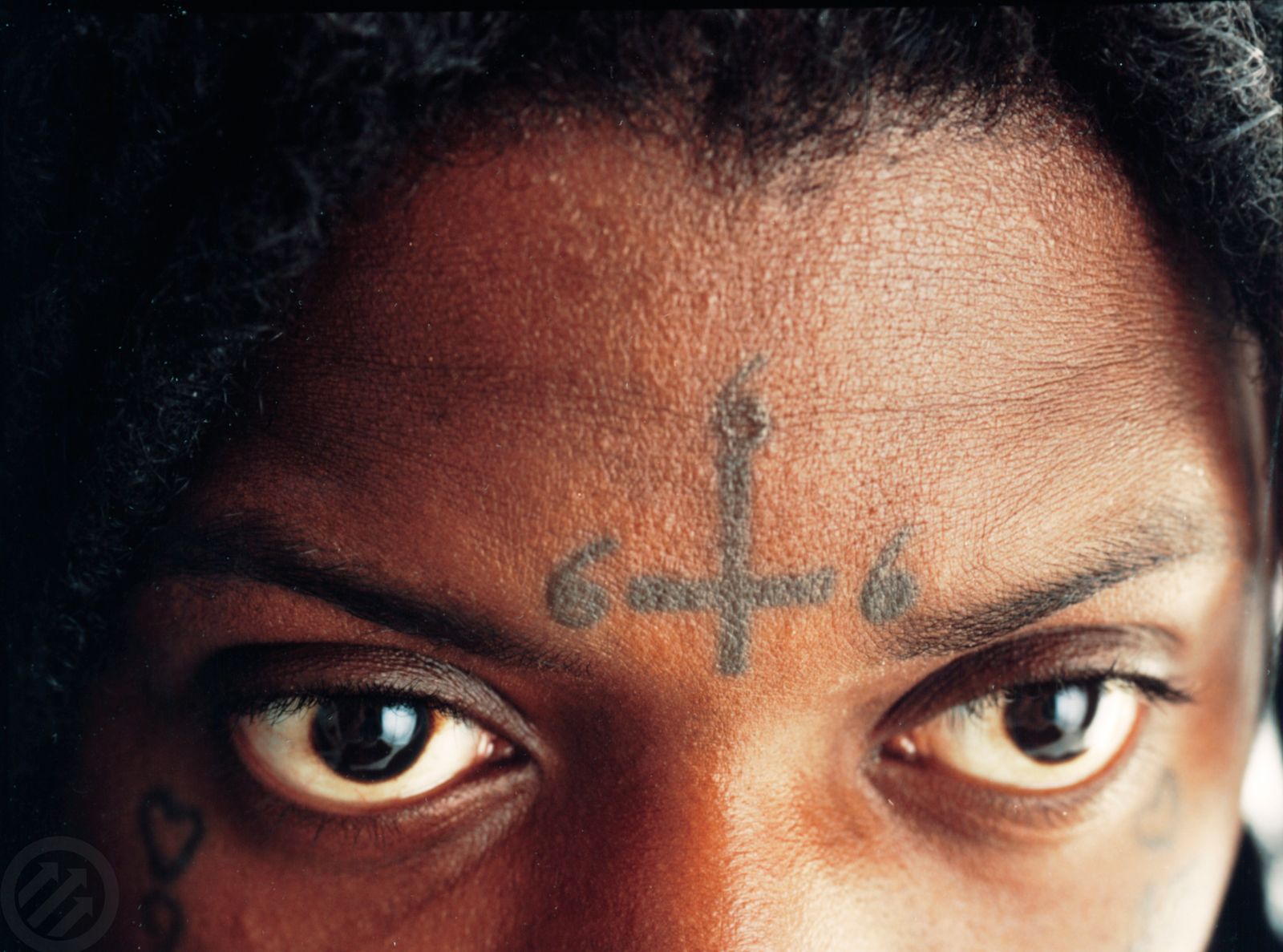
The upside-down cross on his forehead is the symbol most often linked to his public image. SahBabii has said he chose it to reject the way the traditional cross has been used against Black people. That explanation gives the design a specific meaning for him; it isn’t just there to shock.

Other photos show small marks near his eyes and cheeks, along with a number close to the cross. They’re compact, but they change the feel of his face. A small mark in the middle of the forehead can draw more attention than a much larger tattoo under a shirt.

The face pieces look arranged around a center point, while the neck is busier and less even. That difference keeps the tattoos from reading as a matching set. They look like separate choices that accumulated over time.

The arm tattoos bring in smaller personal details

SahBabii tattoos: high-resolution close-up showing the forehead cross and small cheek tattoos

SahBabii’s arms have smaller lettering and shaded symbols, along with the Pisces tattoo he has described as his first. In the clearest photos, the mix gives his forearms and biceps a more handwritten feel. The pieces fill some of the space around the chest work without needing to be large themselves.

There’s room in the arm tattoos for different styles. Some marks are dark and defined; others look lighter or more faded. They don’t all need to match for the collection to make sense.

The shape of a forearm changes as the wrist turns or the elbow bends. A design that looks narrow with the arm at rest may stretch into view during a performance or ordinary movement. Check a tattoo from the positions you use every day. A forearm piece should still read well when you’re holding a phone, a microphone or resting your hand on a table.

The smaller arm marks also leave the face and chest as the strongest focal points. The darkest concentration is higher on the body, while the arms fill in around it. When planning several tattoos, that difference in scale can help a mixed collection stay easy to read.

SahBabii’s face tattoos keep the look instantly recognizable

SahBabii tattoos: high-resolution close-up showing the upper chest tattoo details beneath his chains

The forehead cross is the most visible of SahBabii’s face tattoos. Smaller marks sit near his eyes and cheeks. His hair and expression can make the ink look softer in one portrait and more severe in another, but the tattoos don’t obscure his features.

The symbols bring the collection into the portrait itself. The cross sits in the middle of his forehead, with smaller marks off to either side. That gives the face a clear focal point while leaving skin around each design.

Line weight matters on a small tattoo. The cross has a dark outline, while the marks around it are finer. If you’re thinking about a face tattoo, consider how the design will read at its actual size. Detail that looks crisp on a screen can blur when it’s reduced to a few centimeters of skin.

SahBabii’s face pieces are bold, but they don’t depend on a lot of tiny detail. A simple symbol can stay clearer over time than a crowded miniature picture. A clean outline and enough room around the design can help it remain legible as the skin changes.

The full collection works because the ink stays loose and layered

SahBabii tattoos: high-resolution face-visible portrait showing the forehead, cheek and neck ink from a separate angle

Seen across the whole body, SahBabii’s tattoos look more like a collection built up over time than one fixed theme. The chest carries the broadest designs; the neck and forehead hold the most recognizable symbols; the arms add smaller pieces, and the stomach fills in below. Each area has its own role.

There’s a shared feel to the work even though the designs vary. Black and grey shading returns across the body, as do crosses, script and compact symbols. Some lines look sharper than others, which makes the tattoos feel worn in rather than freshly applied.

Building a collection one area at a time leaves room for later choices. A new piece can respond to what’s already there without forcing every open patch to be filled. Leave space for future work, and let some skin stay clear. The collection can grow at its own pace.

Not every tattoo needs a long explanation. SahBabii has given a specific reason for the forehead cross, and the Pisces design connects to his first experience with his uncle’s tattoo work. Other pieces may simply be designs he liked. A collection can include both personal stories and tattoos chosen for their look.

The chest and shoulders give SahBabii’s tattoos their broad shape. The face and neck bring the strongest symbols forward, while the arms add smaller details. Across the body, you can still see open areas, changes in line weight and ink that has aged at different rates.

If you’re using SahBabii’s tattoos for ideas, start with placement and the meaning you want a piece to carry. Think about how much skin you want to leave open and how the design will move as you work or perform. A tattoo doesn’t have to cover every inch to feel complete; it has to fit the person wearing it.

Here is SahBabii’s official “Pull Up Wit Ah Stick” video:
More musician tattoo guides

Ja Rule Tattoos: Pain Is Love Chest, Arms and Back Ink

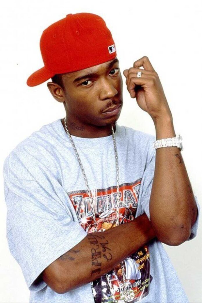
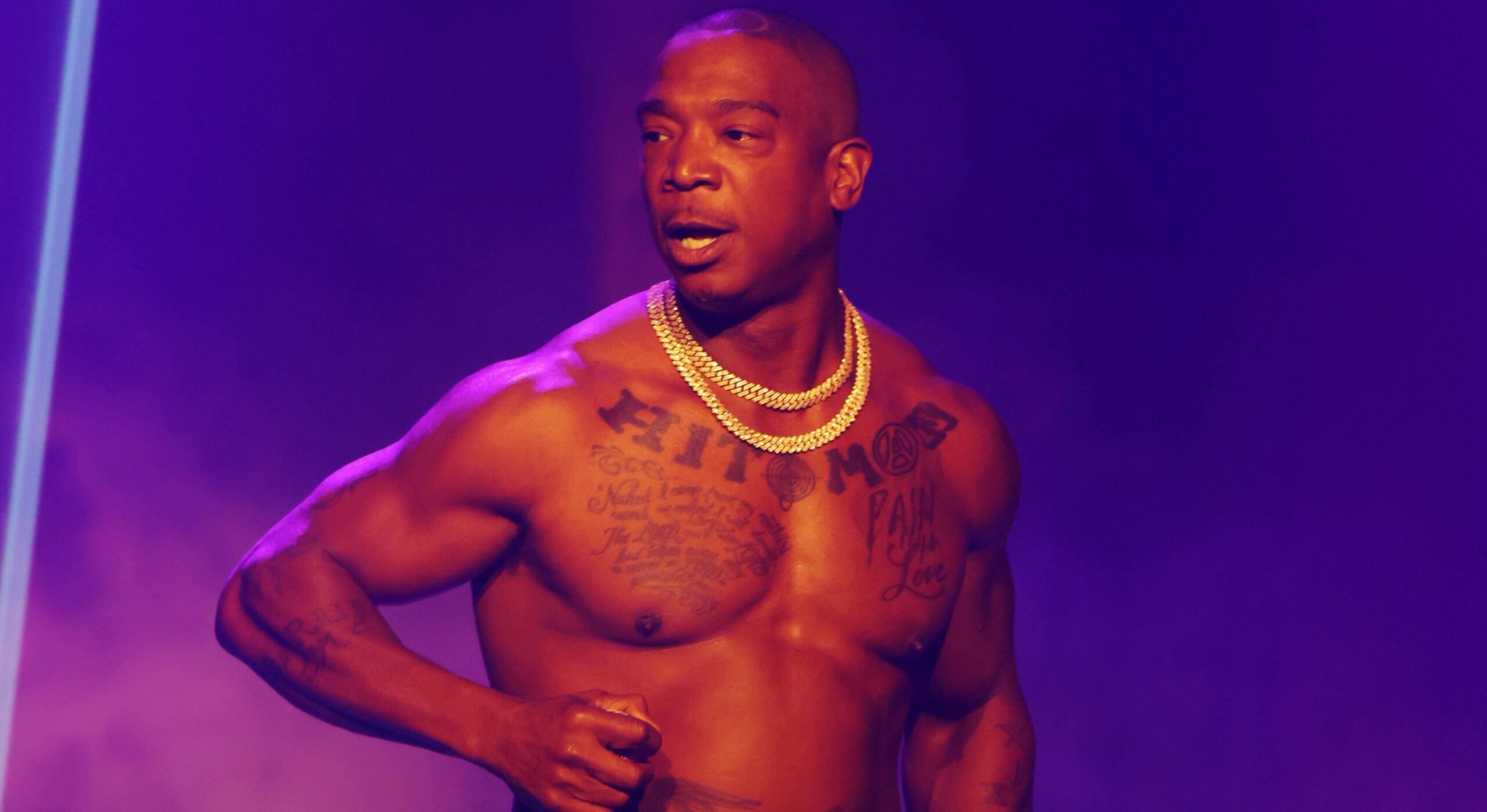
Ja Rule’s tattoos are part of the image many people remember from his early music videos, but the designs also carry personal stories. He has large lettering across his chest, Roman numerals and script on his arms, more writing on his stomach, and a winged back piece connected to his family. The styles vary, but the ink is easy to recognize in photos and performances.

Ja Rule tattoos make more sense as a collection than as a single chest quote. His designs move between block lettering, cursive, religious symbols and memorial imagery. Some are visible from across a room; others take a close photo to make out.

Ja Rule has said the words over his heart, “Pain Is Love,” describe the sacrifices people make for those they care about. He has also connected the back tattoo to his family. The arm lettering and Roman numerals add their own texture. Looking at the tattoos by placement makes those different parts easier to follow.

Ja Rule’s Pain Is Love chest tattoo sets the tone

Ja Rule tattoos: high-resolution shirtless stage portrait clearly showing the Pain Is Love chest lettering and both arms

The first tattoo many people notice is “Pain Is Love,” written across Ja Rule’s chest over his heart. The script is large, with enough room around the letters to stay legible in performance photos and colored stage lighting. It’s a simple phrase, but its placement makes it feel personal.

Ja Rule has described the words as a statement about sacrifice and the difficult things people accept for love. Set near the center of his body, the phrase reads more like something he carries than a slogan aimed at an audience. It appears in older photos, recent performances and shirtless portraits, so it has remained a familiar part of his look.

The lettering has a loose, handwritten quality. The capital letters sweep across the chest, and the smaller ones run together instead of sitting in a perfectly even font. That keeps the design from feeling generic. If you’re considering a text tattoo, think about whether the lettering should look polished or more like a personal note.

A chest quote has to work with your posture and breathing as well as the words themselves. Check the design with your shoulders relaxed and your arms raised. Skin moves over the pectoral muscles, and tight lettering can shift when your body does. Ja Rule’s phrase has room to stretch while staying centered.

Ja Rule’s arm tattoos are built from lettering and Roman numerals

Ja Rule tattoos: high-resolution live photograph showing the arm lettering, Roman numerals and lower torso ink

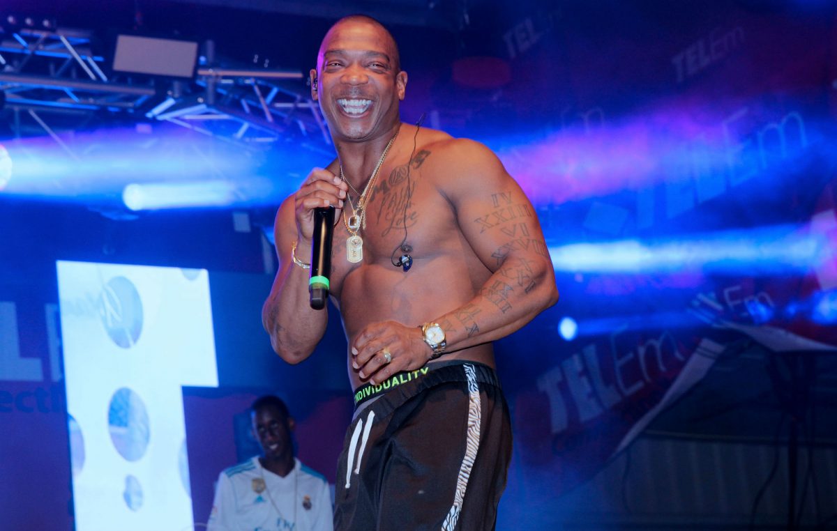
The smaller tattoos on Ja Rule’s arms add detail around the broad chest piece. Roman numerals run down one arm, with other script along the biceps and forearms. They don’t form one seamless sleeve. The changes in spacing and size make the collection look as if it grew over time.

The straight strokes of the numerals stand out beside the rounded chest lettering. They break up the cursive and follow the length of the arm. In performance photos they catch the light when he raises a microphone or gestures; in still portraits they give the arm a clear line.

Some open skin between designs helps each piece remain distinct. An arm doesn’t need ink in every gap to look complete. A few tattoos with room around them can be easier to read than designs packed tightly together.

The scale of the lettering changes with the placement, too. A phrase that fits across the chest may be cramped on a narrower forearm, where the skin bends more. Size lettering for the part of the body it will cover instead of repeating one scale everywhere. That helps keep the words legible in photos taken from farther away.

The lower chest and stomach tattoos add a second layer

Ja Rule tattoos: high-resolution performance photograph showing the chest, stomach lettering and arm tattoos from a different angle

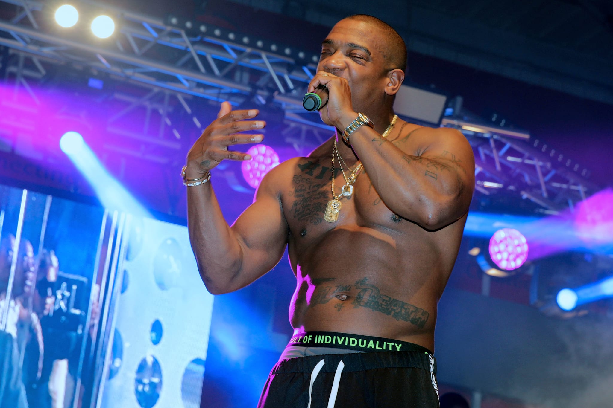
Below “Pain Is Love,” Ja Rule has more script and symbols across his lower torso. Chains, microphones and stage clothes often cover these pieces, but they’re visible in shirtless photos. They add another band of ink beneath the main chest lettering and connect the upper and lower torso.

The stomach designs sit closer together and follow the curve of his body. That gives them a different look from the broad, centered phrase above. The eye moves from the large words to the smaller marks, then back across the chest.

Lighting changes how the tattoos appear in photos. Stage lights can flatten lighter shading; an indoor close-up may show faded edges and overlapping lines. Older ink also changes with skin and exposure, so one kind of picture won’t show every detail.

If you want a layered torso design, decide which piece needs the most room first, then plan around it. One clear focal point can make several smaller tattoos easier to read together. Ja Rule’s chest phrase stays dominant while the lower work fills in around it.

Ja Rule’s back tattoo carries the most personal story

Ja Rule tattoos: high-resolution back portrait showing the angel wings, halo, name lettering and cross imagery

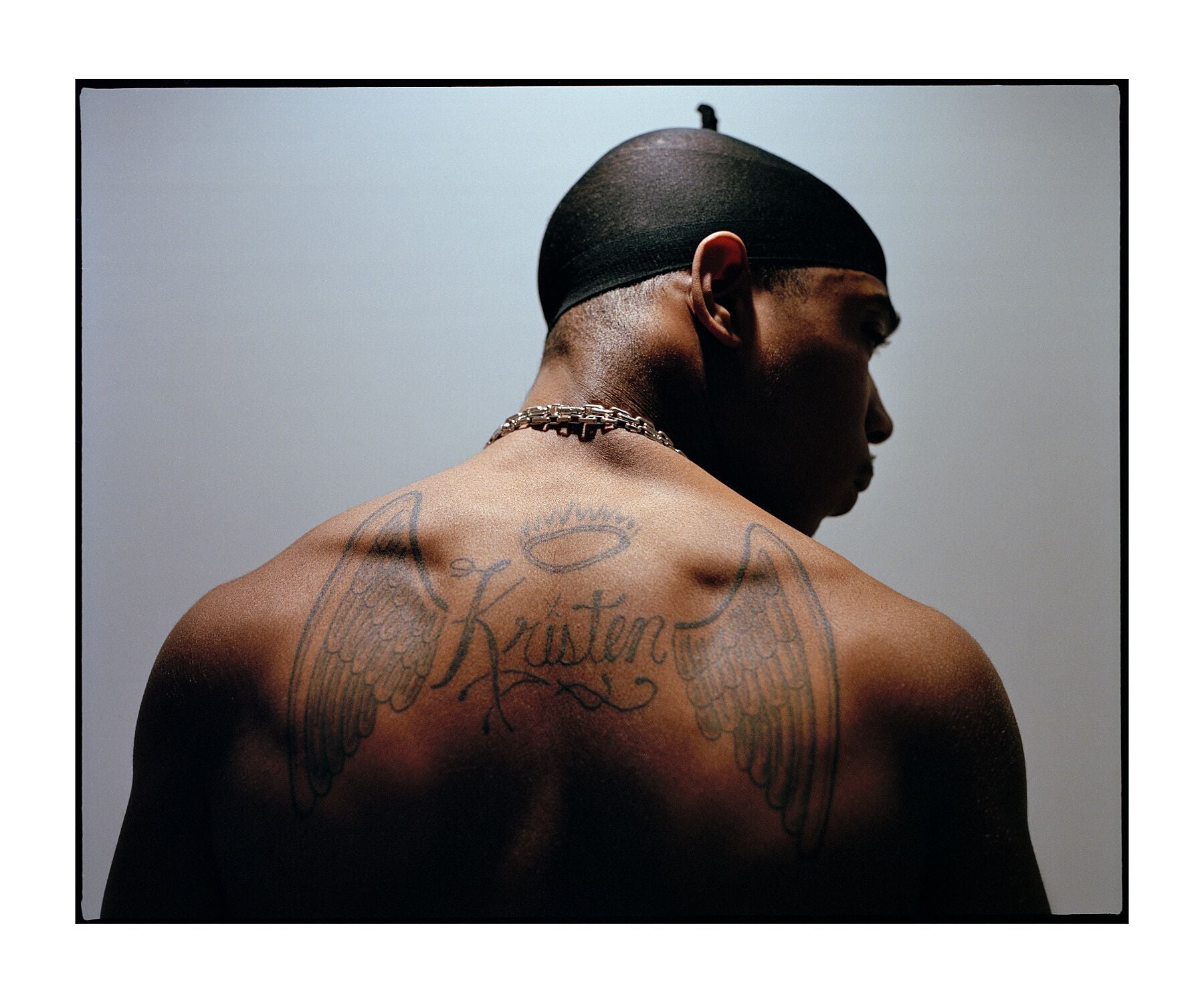
Ja Rule’s back piece is the clearest memorial tattoo in his collection. It has large angel wings, a halo and flaming cross imagery around the name Kristen. He has explained that Kristen was the name his mother gave to the baby sister he lost before birth. The design keeps that family story with him.

The wings spread across his shoulder blades, framing the halo and name near the center. The crosses draw the eye up and out. It’s a familiar memorial layout, but the size makes it a full back piece rather than a small name tucked under a shirt.

The back gives an artist room to work. There’s space for the wings to extend across the shoulders and for the lettering and religious images to remain separate. With less room, those parts could crowd one another.

A memorial tattoo carries a name or story that can matter for a long time, so the placement and balance deserve thought. Ja Rule’s piece has its own visual shape, but its meaning comes from the family history behind it. For a similar design, consider whether the name or the image should draw attention first.

His early-2000s tattoo photos show how the collection grew

Ja Rule tattoos: high-resolution early-2000s portrait showing the chest lettering and arm ink in a separate view

Photos from the early 2000s show the tattoos alongside the look Ja Rule wore at the time: a durag, an open shirt or no shirt, and a heavy chain. The chest lettering and arm pieces are easy to see in those images. Comparing them with later photos also shows how clothes, styling and camera angles change what stands out.

His face has relatively little ink compared with his chest and arms. That leaves the body tattoos prominent without making them the only part of a portrait the viewer sees.

The older images also show recurring choices across the collection. Lettering stays central, Roman numerals appear along the arms, and religious imagery shows up in the back piece and cross jewelry. The tattoos weren’t all made at once, but those details give them some visual continuity.

You can borrow that approach without copying a full design. Choose a few elements you actually like, such as script or religious symbols, and let them recur in different places. Repeating a lettering style or shape can tie separate tattoos together while leaving each one distinct.

Ja Rule’s collection has a public side and a family side. “Pain Is Love” is tied to the phrase many fans recognize and to his explanation of love and sacrifice. The Roman numerals and lower script fill out the arms and torso; the wings and name on his back carry a family memory.

The tattoos are large, but they aren’t just a series of unrelated pictures. The chest phrase is the main focal point, the arms add lettering and numerals, and the back piece has room for its story. Older photos show how visible placement and open skin work together.

If you’re using Ja Rule’s tattoos for inspiration, begin with your own phrase or image and plan for the space it needs. Give the lettering room to stay readable. A collection can take shape over several sessions, and each piece doesn’t need a separate story.

Here is Ja Rule’s official “Thug Lovin’” video:

More musician tattoo guides

Scarlxrd Tattoos: Eagle Chest, Wolf, Rose, Face and Hand Ink

Scarlxrd’s tattoos are tied to the way he performs. The British rapper’s look combines dark, heavy ink with stretched ears, dreadlocks and a lot of movement. A large bird spans his chest; wolves, roses, skulls and lettering fill his arms; face and neck tattoos bring the design right up to his expression.

Scarlxrd tattoos don’t follow one tidy sleeve or a single theme. The collection has built up in layers. Some pieces point to family, Wolverhampton, Myth City or his own name. Others are there because he liked the design. Seen one area at a time, the different choices still fit together.

Scarlxrd has said that not every tattoo needs a deep explanation. Some have a story; some just looked right to him. Here’s a closer look at the pieces that show up most clearly in photos, and at what makes the collection work for someone who likes bold blackwork or lettering.

The eagle chest tattoo anchors the whole look

Scarlxrd tattoos: high-resolution eagle chest tattoo

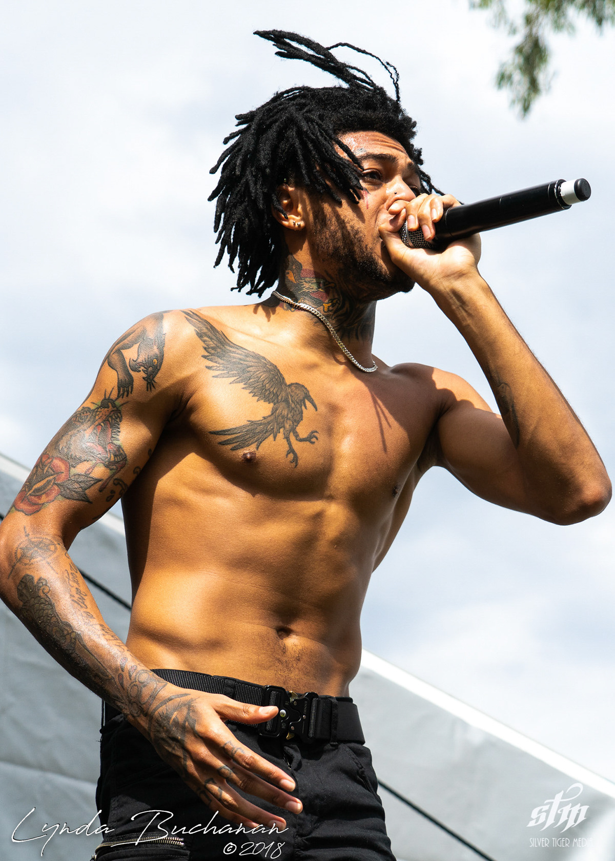
The large bird across Scarlxrd’s chest is usually the first tattoo you notice. Its wings reach toward his shoulders, giving the upper body one broad focal point. In performance photos, the bird reads as a single shape before the smaller details around it come into view.

The wings follow the line of his chest and angle up toward the shoulders. That gives the design a sense of movement even in a still photo. When he leans toward a microphone or raises his arms, the shape shifts with his body.

Scarlxrd has said he got the bird because he liked the design. That’s reason enough: a tattoo can work without a long story behind it. The strong outline and wide placement let the chest piece hold its space.

If you’re thinking about a winged chest tattoo, look at the stencil with your shoulders relaxed and again with your arms raised. The upper chest moves as you do, and a layout that feels balanced in one pose can look cramped in another. The wings here extend toward the shoulders instead of bunching in the center.

Scarlxrd arm tattoos mix wolves, roses and skulls

Scarlxrd tattoos: high-resolution side portrait showing the wolf, rose, chest bird and neck tattoos

Scarlxrd’s arms hold the most densely packed part of the collection. His right arm has a wolf and a red rose; the forearms add a dagger, compass, spider, skull and other designs. The pieces have different shapes and appear to have been added at different times. Dark outlines and shading help them sit together.

He calls the wolf Scrappy. Scarlxrd is from Wolverhampton, home of the Wolves football team, so the animal connects to his hometown as well as to the character. In the larger layout, the wolf seems to chase the bird across the chest and arm.

The rose below it brings a patch of color among the black and grey ink. Its softer shape offsets the wolf’s expression. A skull and rose on the forearm have a more traditional tattoo feel, but the darker shading keeps them in step with the rest of his work.

Scarlxrd has tied other arm tattoos to people and ideas in his life. The dagger is connected to his mother, the compass to direction, and the brass knuckles to his brother’s strength and support. Some pieces have a personal meaning, while others appeal for their design. That range gives the arm more character than a sheet of matching images would.

The neck and face ink make his stage identity obvious

Scarlxrd tattoos: high-resolution stage portrait showing the tattooed forearms, hand and neck work

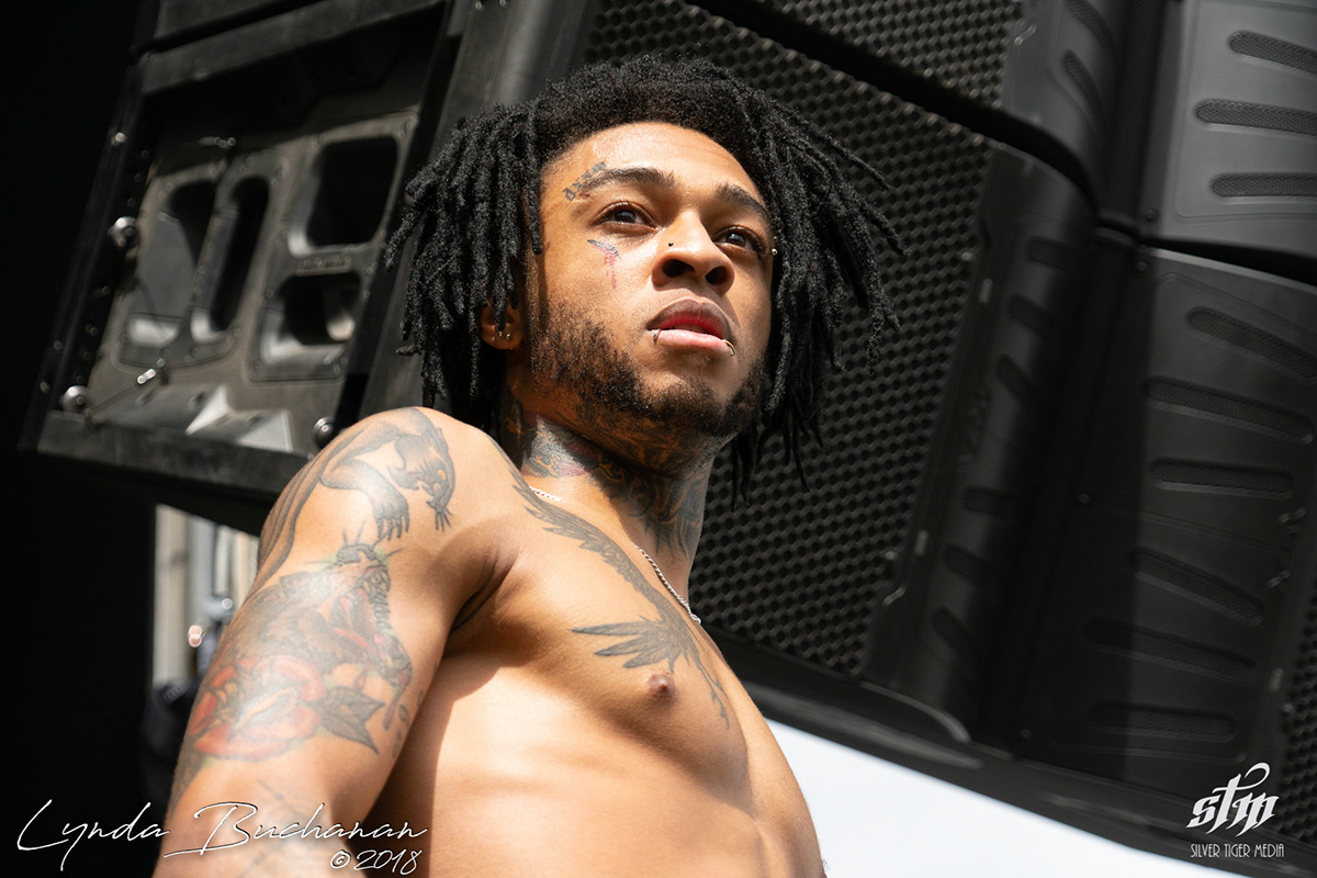
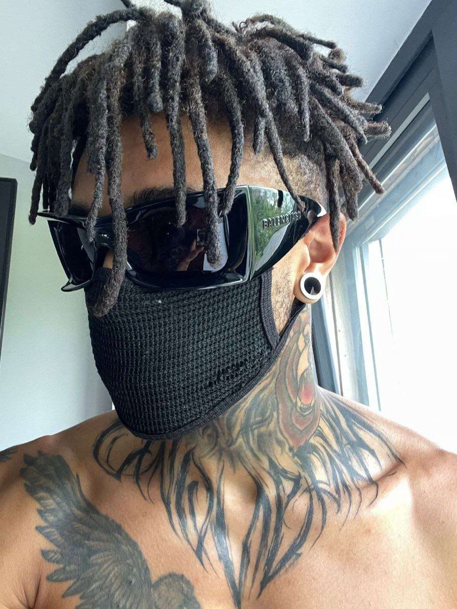
Scarlxrd’s neck has a bald eagle, a bear with an arrow and the words MADE IN HELL. Darker shapes run along the side of his neck and throat. They frame his head and stay visible in shirtless performance photos, even from farther back.

The small mark below his eye connects to his name. It looks like a scar with drops beneath it, turning “Scarlxrd” into a visible part of his face. Other small letters above his eyebrow add to the look without covering the whole area.

The ink changes how a smile, shout or sideways glance reads. In a performance, those lines move with his expressions and become part of the visual scene. The tattoos are hard to miss when he’s on stage.

Face and neck tattoos are difficult to hide, and they change how people see your face. If you want some of that framing with more room to change your look, a neck or upper chest design is another option. Scarlxrd’s photos show the difference between a small face mark and making your face a central part of the collection.

Scarlxrd stage photos show how the arm ink moves

Scarlxrd tattoos: high-resolution concert photograph showing tattooed chest, arms and neck under blue stage light

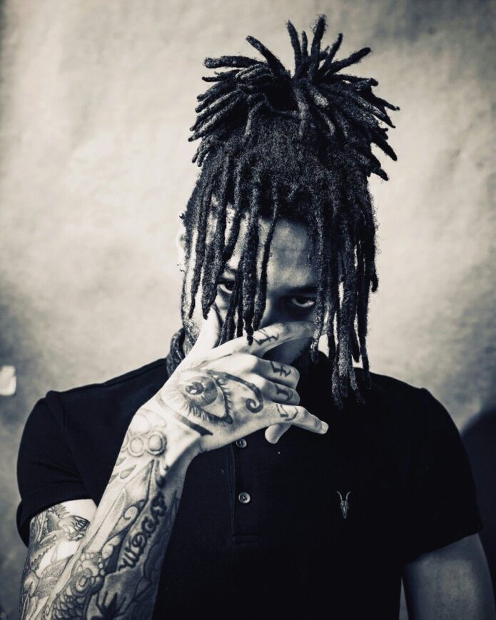
His hand tattoos are smaller than the chest and arm pieces, but they’re easy to spot when he performs. Letters across his fingers spell SCARLXRD when he brings his hands together. There’s a large eye on his right hand, another name tattooed on his left and more blackwork down toward the wrist.

Hand tattoos show whenever he grips a microphone, reaches toward the crowd or covers part of his face. The eye is visible in a posed portrait and flashes into view during movement.

The finger letters use both hands to form one name. On their own, they’re small pieces; together, they spell Scarlxrd. A split design like this needs short lettering, enough spacing and measurements taken with the hands in their natural position. Fingers bend and swell, so small lettering needs room to remain clear.

The hand ink also varies in scale. The eye is a bold image, the letters spell his name, and the other hand carries another name. They don’t need to match the size of the chest bird; they work in the places people look when someone is talking or performing.

Chest lettering and symbols keep the collection personal

Scarlxrd tattoos: high-resolution close portrait showing the eagle neck tattoo and layered chest ink

Words appear in several places across Scarlxrd’s body. The inside of his forearm carries “Too weird to live, too unique to die.” Other tattoos read W.D.G.A.F, Myth City and MADE IN HELL. The phrases sit on his arms, wrist and neck instead of being grouped into one panel.

The longer quote runs from near his wrist toward his elbow, following the length of his arm. W.D.G.A.F is more compact. Myth City refers to his earlier band, and the finger lettering brings his stage name into the design.

Different phrases can have different jobs. The meaning helps determine where each one goes, while the black linework connects them visually. Lettering needs to stay readable, but it can still feel personal to the person wearing it.

The subjects return to a few parts of Scarlxrd’s life: his identity, Wolverhampton, family, and the freedom to look different. The wolf points to his hometown; the dagger and brass knuckles are tied to his mother and brother; Myth City refers to his earlier music.

The chest bird gives the collection its broad shape. The wolf and rose continue the movement down the arms, while the face and neck pieces make Scarlxrd easy to recognize. Hand tattoos and lettering fill in the smaller details.

If you’re taking ideas from his tattoos, start with one design that matters to you or that you simply like. Leave room for the next piece. You don’t need to attach a story to every mark: some tattoos carry a meaning, and some are there because you like how they look.

Here is Scarlxrd’s official “Heart Attack” video:
More musician tattoo guides

B-Real Tattoos: Arm Sleeves, Placement and Style
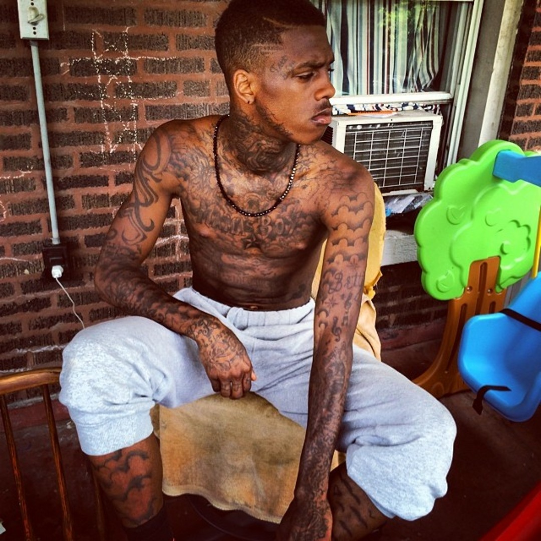
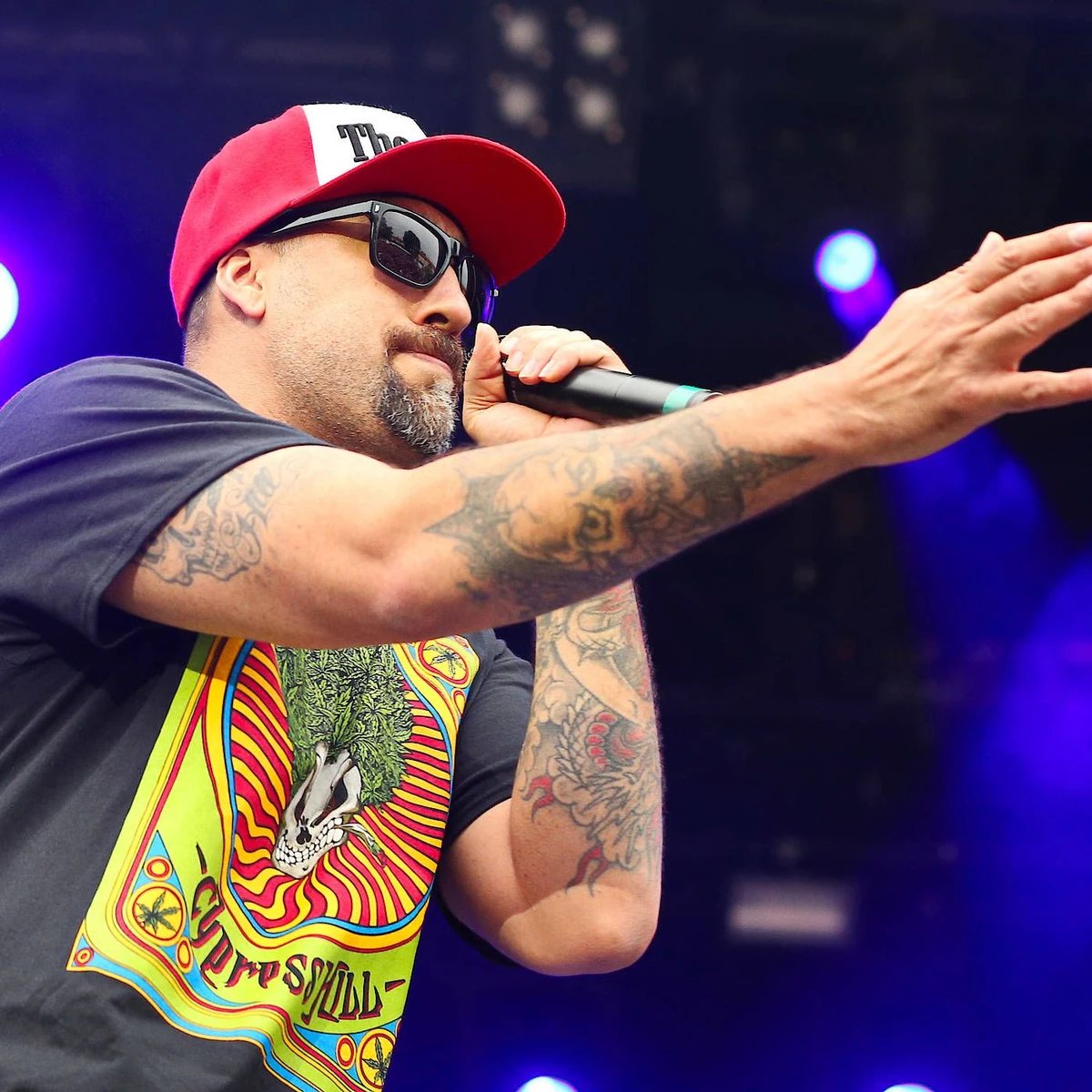
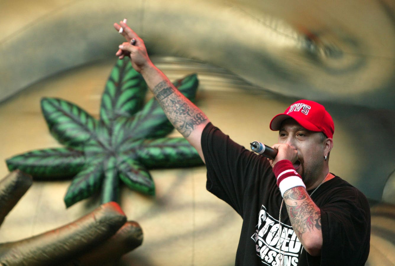
B-Real’s tattoos are easy to spot in performance photos. He often wears a cap, sunglasses and a T-shirt or vest, but the ink across his arms still stands out. Most of the visible work covers his forearms and upper arms, where shaded images, lettering and smaller details sit close together.

The tattoos fit the way he dresses and performs. They show when he’s holding a microphone or reaching toward the crowd, without needing a posed, shirtless photo. That makes his arm work useful to study if you’re thinking about how a tattoo will look while you move.

There isn’t a reliable public list explaining every design, so the photos are the best guide to placement and style. They show the larger shapes clearly, though they don’t confirm what every smaller mark means. Here’s what you can see in B-Real’s collection.

B-Real’s arm tattoos are the clearest part of his look

B-Real tattoos

Most of B-Real’s visible ink is on his arms. Close performance shots show black-and-grey work on both forearms, with heavy outlines, shaded figures and smaller marks between the larger images. The designs wrap around the arms, so they change as he reaches for the mic or gestures to the audience.

The upper-arm pieces connect with the elbow and shoulder instead of reading as separate flash designs. Darker areas help the main shapes stand out, while lighter grey keeps the sleeve from looking like one solid block.

That balance is useful to notice when planning a sleeve. A strong central image needs enough lighter shading and smaller transitions around it. B-Real’s arms are densely covered, but the darker pieces still draw the eye first.

If you want a tattoo that reads from across a room, start with a clear silhouette and strong contrast. Fine detail can add interest, but the main shape should still make sense from a distance. B-Real’s arm tattoos stay readable even in colored concert light.

The Cypress Hill tattoo style stays bold on stage

B-Real tattoos

In live photos, B-Real’s forearms stand out against his dark clothes, hands and microphone. Warm red stage light brings out some parts of the ink; in daylight, a black shirt makes the outlines look sharper. The lighting changes, but the overall look remains clear.

The tattoos use bold outlines, traditional-looking shapes, some saturated color and grey shading. That high-contrast treatment fits Cypress Hill’s established visual style and holds up as he moves around onstage.

Not every part of a sleeve needs to be large. Smaller designs can sit around a bigger image, and a little open skin helps the arm keep its shape. The main image gives the eye somewhere to land; the other pieces fill in around it.

Use lighting and movement as part of the design test. Turn your arm, raise it and bend the elbow to see how the focal point shifts. In B-Real’s performance photos, the main shapes are still visible when his arms are angled or partly hidden by a microphone.

His tattoo placement works with caps, shades and tees

B-Real tattoos

B-Real often wears caps and sunglasses, with short sleeves, vests or rolled-up layers that leave his forearms out. The ink sits lower than the accessories and has enough contrast to stand on its own.

His arms are in motion through much of a performance: he grips the mic, points, waves and reaches toward the crowd. That makes placement matter. A design on the part of the arm that faces the audience or camera will be seen more often than one under a sleeve.

For a forearm tattoo, consider how it looks from the front and from the wearer’s own point of view. Photos of B-Real show both the inner and outer parts of his arms, which helps explain how the designs connect around them.

Plan the tattoo around the clothes and gestures you actually use. If you usually wear short sleeves, a forearm piece will be visible most days. Think about how it looks when you bend your elbow or move your hands, especially if you play an instrument, train or perform.

B-Real’s ink reads best in close performance photos

B-Real tattoos

Close performance photos make the different shapes easier to see. A wide crowd shot shows that B-Real is tattooed; a closer view reveals curved lines around the forearms, darker patches near the elbows and lighter shading between them.

One photo may show one arm well and leave the other mostly hidden. A raised arm can reveal the outer forearm, while a side view may show the inner section near the elbow. Looking at several angles gives a better sense of how the pieces wrap around.

His caps, sunglasses and dark shirts also make a simple frame for the tattoos. The clothes don’t hide the placement, so the arms remain the focus in many performance shots.

When you collect reference photos, save different angles instead of five versions of the same pose. A front view may show the main image; a side view can show how the design wraps and how the shading sits around the arm.

What to take from B-Real tattoos without copying them

B-Real tattoos

The clearest lesson in B-Real’s collection is its visual consistency: broad arm coverage, strong outlines and enough contrast for the designs to show in ordinary photos. You can use that approach with different subjects and less ink.

Start with one area. A forearm sleeve might have one main image, a few smaller pieces and some open skin around them. If you extend it up the arm later, connect the new work through its scale, direction or shading instead of filling every gap.

The photos show the placement and overall style, but they don’t tell us the private story behind every tattoo. That’s fine. You can study the line work and how the pieces fit together without knowing what each mark means to B-Real.

Use B-Real’s collection as a lesson in visual weight, not a stencil. Find an artist whose work fits the style you want, bring references from different angles and decide which part of the design should catch the eye first. The result will be your own because it reflects your choices, not because it copies a rapper’s sleeve.

B-Real’s arm tattoos remain visible when he performs, and the darker designs hold their shape under different lighting. The smaller details come through in close photos. Together, they fit the way he dresses and moves onstage, a look he’s carried through years of music and touring.

If you’re using B-Real’s tattoos for ideas, pay attention to the contrast, the way the designs wrap around the arm and how they look from different angles. Those choices can help you plan a tattoo that works for your own life.

Here’s a B-Real interview from the Cypress Hill era:

More musician tattoo guides

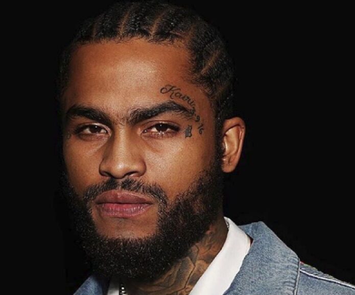
Famous Dex Tattoos: Face, Neck, Chest and Arms

Famous Dex’s tattoos change the look of a portrait. His ink covers his chest, neck, arms, hands and face, so even a simple photo shows several different designs. There are dark shaded pieces, lettering, smaller marks and the pink ribbons that stand out against the rest.

Photos from different angles show how the tattoos sit together. The chest pieces meet the arms, the sleeves wrap around his elbows, and the neck ink stays visible when he turns his head. The placement is a big part of the overall effect.

The face tattoos draw the eye first, while the chest and arms give the collection more scale. Smaller marks around his cheeks, forehead and hands fill in details that can disappear in a wider shot.

One picture can’t show the whole collection. A close portrait makes the face and neck easier to see; a shirtless photo shows how the chest and arms connect. Looking at both helps explain how the larger areas and smaller designs fit together.

Famous Dex’s chest tattoos carry the biggest visual weight

Famous Dex tattoos: high-resolution mirror portrait showing the tattooed chest, stomach and arms

The chest is the broadest area shown in many Famous Dex tattoo photos, and it gives the collection a center. Layered shapes and lettering cover the upper torso, with darker ink beside lighter areas. Seen from the front, the designs read together instead of disappearing around a joint.

The chest also leads into the arms. The larger pieces give the torso a focal point, while the arm tattoos continue toward the shoulders and elbows. In photos, the chest doesn’t feel separate from the neck and sleeves, even when a shirt or pose hides part of the transition.

Lighting changes how the ink appears. Some photos make it look nearly black; brighter light brings out warmer tones and smaller details. The chest remains the main focus because the largest shapes take up the most space.

If you’re planning chest tattoos, decide what should be noticed first before filling the whole area. One main image or lettering can guide the rest. Smaller pieces can follow the ribs, shoulders or upper stomach without competing for the same attention.

His arm tattoos create a dense sleeve effect

Famous Dex tattoos: high-resolution seated portrait showing chest, neck, face and both tattooed arms

Famous Dex’s arms make the collection look full, whether he’s in a jacket or a shirtless portrait. Ink covers much of the visible forearms and upper arms, following the shape of the muscles. In a seated photo, the work gives his arms a strong outline; in a shirtless one, it connects the shoulders to the hands.

The designs don’t follow one obvious theme. Different shapes sit close together, but the darker shading helps them read as part of the same sleeve. For someone who prefers several pieces over one large image, the spacing and overall weight are useful details to notice.

The view changes as the arm moves. A standing photo may show the outer forearm, while a turned wrist brings the inner arm into view. Dex’s photos show how much fuller the sleeve can look from one angle than another.

Ask your artist to show the design from the front, side and with your arm relaxed. That makes it easier to see where the sleeve may look crowded or leave an unexpected gap. A design should follow the shape of the arm, not sit on it like a flat poster.

The Famous Dex face tattoos change the whole portrait

Famous Dex tattoos: high-resolution close portrait showing the face and neck tattoo layout

The face tattoos are the part of Famous Dex’s collection most often recognized. In close portraits, you can see small hearts and lettering around the cheeks, marks near the eyes, and designs between his brows and hairline. The pink ribbons are easy to pick out beside the darker ink.

Face tattoos change how the rest of a portrait reads. Hair, glasses, jewelry and a hat all sit in the same frame. Dex’s multicolored hair adds another patch of color, while the tattoos keep the center of the image busy even when his clothes are simple.

In a wider photo, the face reads as one bold shape. A close crop separates the smaller designs. Both views are useful references: one shows the overall balance, the other shows how the tattoos are spaced.

Face tattoo inspiration is best used for spacing and scale rather than exact copying. Small designs need room to stay clear, especially around the eyes and cheeks. If you want visible ink without covering the whole face, choosing one area leaves the surrounding skin open.

Neck and hand tattoos keep the details moving

Famous Dex tattoos: high-resolution color portrait showing forehead, cheek and neck tattoos

The neck and hand tattoos show up in ordinary photos and gestures. Neck ink is visible above a collar and from the side. Marks on the hands and fingers appear when Dex holds jewelry, touches his hair or takes a mirror photo.

The neck also links the face and chest. In Dex’s portraits, the ink runs between those areas, so the face and torso read as part of a larger design.

Hands are a smaller canvas. The marks have to remain clear as the hand turns and moves. They don’t cover as much space as the chest tattoos, but a hand near the mouth or across the stomach can bring the ink into the center of a photo.

Think about your normal gestures before choosing hand or finger placement. If you work with your hands, play an instrument or use your phone often, the tattoo will be seen from many angles. Simpler designs tend to read more clearly in a small space.

How to borrow the Famous Dex tattoo structure

Famous Dex tattoos: high-resolution portrait showing chest, neck and hand tattoos from a different angle

One useful idea in Famous Dex’s collection is the way a central area connects to smaller pieces around it. The chest and face draw the most attention, while the arms, neck and hands carry the ink outward. You can use a similar layout without copying any of his designs.

Choose the main area first: chest, arm, back or face. Then decide which nearby area should connect to it without taking over. A chest piece could extend into the shoulders; a sleeve could leave open skin near the neck; a small hand tattoo could echo a line or shape from the arm.

Some open skin can help the larger pieces stand out. Dense tattoos work when they are planned, but filling every gap at random can make the main designs harder to see. Dex’s collection is packed, yet the different sizes give the face, chest and sleeves their own weight in a photo.

Use the structure of Famous Dex tattoos as a planning guide, not a stencil. Choose designs that mean something to you, think about how visible you want them to be and let one or two areas lead. That will make the result yours instead of a copy of a celebrity’s tattoos.

Famous Dex’s tattoos stand out across his face, chest, arms, neck and hands. The face work changes the first impression, the chest anchors the collection, and the other placements keep the ink visible in casual photos. The pieces work together because they cover different areas at different scales.

If you’re using Famous Dex tattoos for ideas, look at how the designs sit in both close and wider photos. Check the arms from several angles and decide where you want the eye to land first. Placement can do more for a design than adding another tattoo.

Here’s a Famous Dex interview:

More musician tattoo guides

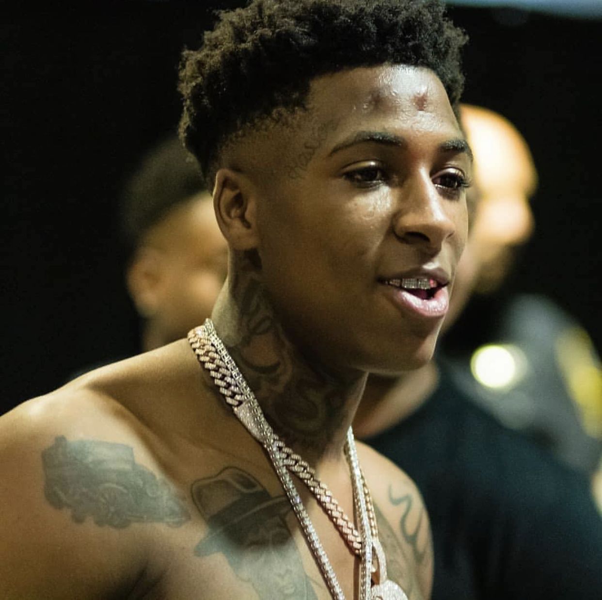
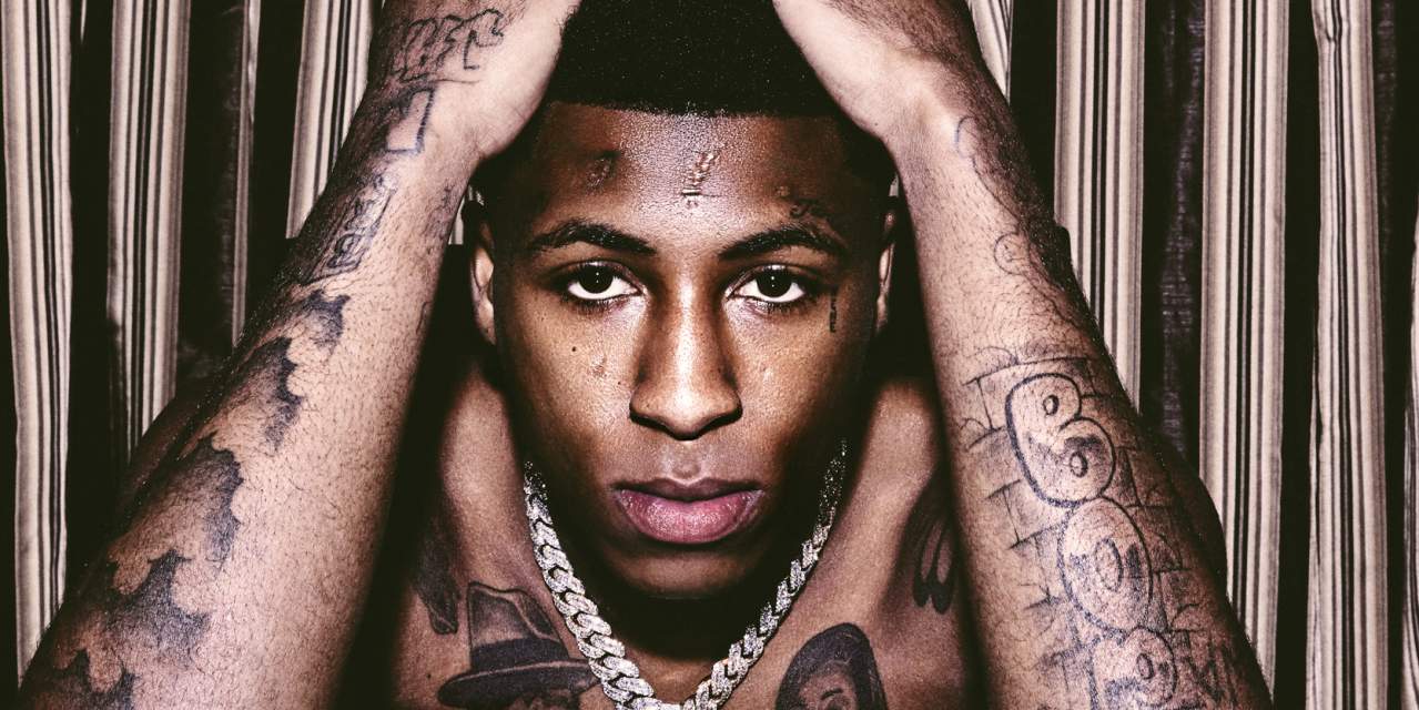
YoungBoy Never Broke Again Tattoos: Face, Chest and Arms

YoungBoy Never Broke Again’s tattoos are easy to recognize in photos. His ink covers his chest, shoulders, arms, neck and face, with portraits, lettering, symbols and larger shaded shapes. There’s a lot of it, but the bigger designs still give the eye somewhere to land.

The tattoos aren’t confined to one area. A front-facing photo shows the chest, while a close portrait or turned shoulder brings other pieces into view. His placement changes what you notice from one pose to the next.

The large NBA lettering across his lower chest and the portraits on his upper chest are visible from a distance. Smaller marks on his face, neck and forearms need a closer look. The contrast between those scales makes the collection read from far away and up close.

It helps to look at the tattoos by area: chest, arms, then neck and face. Some earlier photos show more open skin; later ones show ink across more of the visible areas. As the collection grew, individual portraits and lettering became part of a denser layout, with the eye moving from face to torso.

Chest tattoos give YoungBoy Never Broke Again a clear center

YoungBoy Never Broke Again tattoos: clear shirtless portrait showing chest portraits, NBA lettering, neck ink and both arms

The chest is the center of many YoungBoy photos. Bold lettering across the lower torso and portrait work over the pectorals are among the largest shapes. From the front, you can take in several pieces at once instead of losing them around a joint.

The chest portraits add fine detail beside the heavier lettering and outlines. The larger words or shapes catch the eye first; the faces are easier to study up close.

Spacing helps each part stay legible. The portraits have some open skin around them, while darker ink near the ribs and shoulders fills the edges. The coverage is dense, but the middle still has a clear focus.

If you are planning a chest piece, decide which element should lead before adding supporting work. A portrait, phrase or symbol can set the direction. Smaller images can follow the ribs and shoulders once you’ve chosen the main focus.

His arm tattoos keep the collection moving

YoungBoy Never Broke Again tattoos: high-resolution seated portrait showing chest, shoulder, neck and forearm tattoos

Lettering, symbols and shaded sections cover much of YoungBoy’s visible upper arms and forearms. In shirtless photos, these pieces connect back to the chest and carry the ink past the front of the torso.

The view changes when he bends an elbow or turns a wrist. A relaxed arm shows more of the outside; crossing the arms brings the inner forearm into view. Those angles matter when a sleeve is being planned.

The two arms don’t have to match exactly to feel connected. Different designs can work together when their line weight, shading and spacing feel related. YoungBoy’s photos show a varied mix across the arms.

Ask for front, side and relaxed-arm views before committing to a sleeve. A design that looks clear from one angle may be hidden from another. Checking how it sits while the arm moves helps with placement.

Face and neck tattoos make the portraits unmistakable

YoungBoy Never Broke Again tattoos: high-resolution outdoor portrait showing chest lettering, arm work and the Young NBA Boy pendant

The face and neck tattoos shape the first impression in YoungBoy’s portraits. Small marks around the eyes and cheeks, script near the hairline and darker neck work sit close together. Even when his chest is covered, these tattoos remain visible.

Face ink is viewed at close range. People see the overall pattern first, then the separate marks. With less room between designs, scale and spacing can make a big difference to how clearly each piece reads.

The neck connects the face to the torso. Its ink fills the area under the jaw and shows above a collar. In close photos, that creates a continuous frame from the head toward the chest.

Use face tattoo references to study placement and proportion, not to copy the exact marks. A small symbol near the eye draws attention quickly. If you want visible ink with more room to adjust later, the neck, behind the ear or upper arm are other options.

The torso shows how lettering and portraits sit together

YoungBoy Never Broke Again tattoos: high-resolution backstage portrait showing face, neck, chest and shoulder tattoos

A wider photo shows how the chest lettering, portraits and arms relate. The lettering gives the torso a strong horizontal line; the portraits add detail above and below it. His arms frame the body, carrying the darker ink toward the shoulders.

That layering can be useful when planning a tattoo. Simple lettering can sit beside a detailed portrait if each has enough space. It also helps to see a large design with the arms relaxed, lifted and crossed.

Ink below the chest changes the proportions of the front of the body. When designs run from the pectorals toward the stomach, the collection reads as one larger composition instead of a few separate pieces.

Take photos in the same poses you normally use before you choose a large front-facing layout. A design can look balanced when you stand still and feel crowded when you sit, bend or lift your arms. Check it in the positions you use every day.

How to use the YoungBoy tattoo layout for ideas

YoungBoy Never Broke Again tattoos: high-resolution portrait showing raised-arm tattoos, facial ink and chest lettering

YoungBoy’s tattoos have a clear order: the face and chest draw attention first, the neck connects them, and the arms extend the coverage outward. You can use that layout with different designs and still make the pieces feel connected.

Pick one area to lead. If you want a strong front-facing design, the chest can be the anchor. If you’d rather keep more of the ink covered, start with the upper arm or shoulder and let smaller pieces continue toward the forearm.

A mix of sizes helps, too. A large portrait or word can sit beside smaller symbols, but not every piece needs the same amount of shading or detail. Contrast gives the eye a way through the design and leaves room to add more later.

Think about how the design will look in motion, under clothes and in ordinary photos. YoungBoy’s tattoos cover areas that are often visible: the face, neck, arms and upper torso. Choose placement that suits your life, then make the artwork your own.

YoungBoy Never Broke Again’s collection spans his chest, arms, face and neck. The chest carries the largest shapes, the arms add coverage, and the face and neck make his portraits easy to recognize. The sections are bold, but they still have a clear visual order.

If you are using YoungBoy Never Broke Again tattoos for ideas, compare a wide torso photo with a close face portrait. Notice the main focal point, how the arms sit around it and where smaller details remain visible. That planning can give your own design a stronger starting point.

The main thing to consider is balance. Let the largest pieces lead, use smaller designs to guide the eye and connect the face, neck and torso through placement. That gives a collection space to grow while keeping new work in step with the body.

Here’s a video about YoungBoy’s tattoos:

More musician tattoo guides

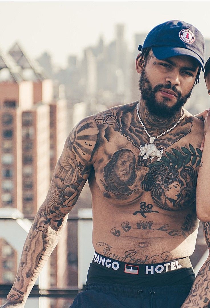
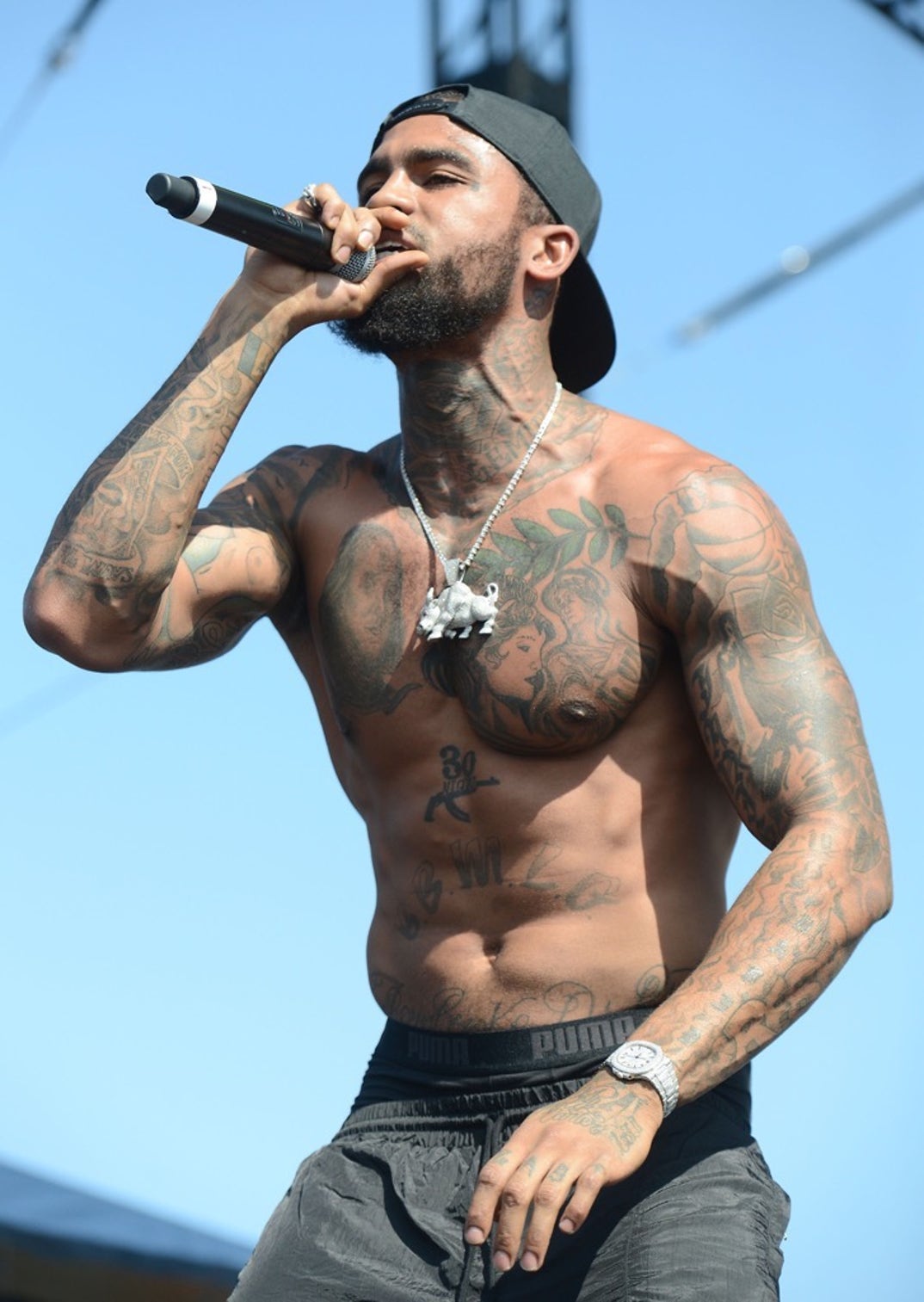
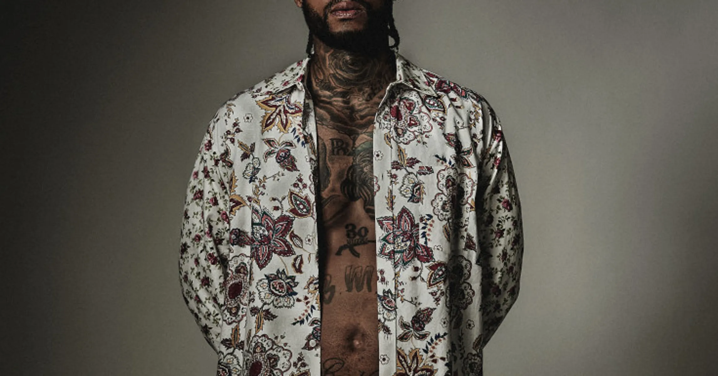
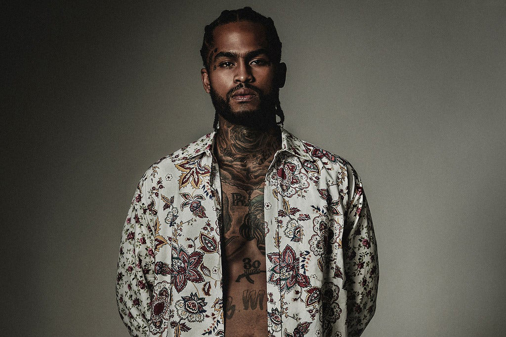
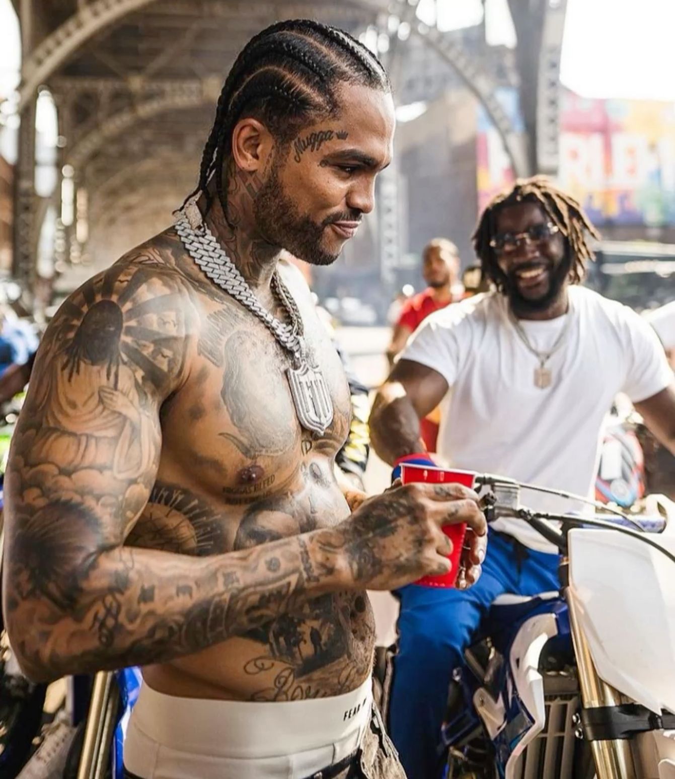
Dave East Tattoos: Chest, Arms, Neck and Face

Dave East’s tattoos look like a collection built piece by piece. The ink covers his chest, stomach, arms, neck and face, mixing portraits, lettering, flowers, symbols and dark shading. Different designs sit together across his body, following its shape.

Photos show the collection from different angles. A rooftop portrait catches the chest and sleeves in bright light; a stage shot brings the arms and forearms forward; a close crop shows smaller marks on his face. Each view reveals something the others miss.

The chest holds the largest portraits, the arms carry broad areas of darker ink and the neck leads toward the face. Smaller script fills gaps without taking attention from the main images.

Looking at the tattoos by placement makes the layout easier to follow. Start with the chest, then look at the sleeves and the work on his face and neck. The photos also show how the ink has filled in over time: earlier images leave more skin open, while later ones show more connected coverage.

Different settings help with different details. A shirtless rooftop photo shows the portraits and stomach lettering together. A performance photo shows the designs as he lifts his arms, while a close-up brings out finer lines. Taken together, they give a better sense of how the tattoos sit on his body.

Dave East’s chest tattoos do most of the storytelling

Dave East tattoos: high-resolution shirtless rooftop portrait showing chest portraits, stomach lettering and arm coverage

The chest is one of the first areas people notice. Several large portraits sit across the pectorals, with dark outlines and shading that keep the faces clear in wider photos. Their size gives the torso a center without letting smaller script take over.

The designs vary. A portrait sits near floral shapes, chain-like work or short lettering. That mix moves the eye between detailed faces, open skin and darker areas instead of reading as one solid patch.

Lower on the torso, smaller lettering, names, phrases and symbols follow the stomach and ribs. Those placements carry the design downward while leaving the larger portraits room to stand out.

If you want a chest layout with this kind of weight, choose the largest image first. Once the main portrait or symbol is placed, supporting pieces can follow the ribs and shoulders. Filling empty spots first can leave the central design squeezed for space.

His arm tattoos turn the sleeves into a continuous canvas

Dave East tattoos: high-resolution stage photograph showing the chest, shoulders, neck and forearm tattoos

Dave East’s upper arms and forearms carry portraits, lettering, linework and shaded pieces. In performance photos, the arm raised toward the microphone shows how the designs follow his muscles as they move.

The sleeves vary in density. Some areas are dark and packed; others leave more skin visible around individual designs. That change keeps one section from blending into the next.

A relaxed arm shows the outside of the sleeve. Bend the elbow or turn the wrist, and the inner forearm and lettering near the wrist come into view. A sleeve has to make sense from each of those angles, with the hand down, raised or crossed over the chest.

Ask your artist to map the arm while it is relaxed and while it is bent. That can help keep a portrait clear of a crease or script visible when the elbow moves. The designs need to work with the arm in motion.

Neck and face tattoos keep the portraits sharp

Dave East tattoos: high-resolution open-shirt portrait showing the chest, neck and stomach designs

The neck tattoos frame Dave East’s face and chest. Close portraits show ink under the jaw and along the sides of the neck, even with his shirt buttoned. That placement also keeps the tattoos visible in photos that don’t show his torso.

The face tattoos are smaller than the chest portraits, but they change the look of a portrait. Script near the temple and marks around the eye follow the natural lines of his face. They draw attention because there’s little open space around them.

The neck links the face and upper chest, so the tattoos don’t read as two separate panels. Curved lines and darker shading are easier to see when he turns his head; a side view can reveal details a straight-on photo misses.

Use face and neck references to study scale before you choose a visible placement. Small lettering needs space and careful linework. If facial ink feels like too much, the side of the neck, collarbone or upper shoulder gives you more room.

The smaller lettering adds a personal layer

Dave East tattoos: high-resolution studio portrait showing the chest and neck tattoos through an open shirt

Short words and script sit between the larger chest portraits and arm tattoos. They fill narrower areas around the stomach, ribs and lower forearms where a full image might feel too heavy.

From a distance, the lettering can blend into the darker sections. Up close, the words become easier to make out. That shift gives the collection more than one level of detail.

The amount of text matters less than where it sits. A short phrase can follow the collarbone or sit below a portrait. A name can stay clear if it has space away from heavier shading. Dave East’s photos show different sizes of work sharing the same area.

Keep small script simple and leave room for the letters to age. Tiny detail can blur when it is packed tightly. A little open skin helps the words stay readable, especially around the stomach, ribs and hands.

How to borrow the Dave East tattoo layout

Dave East tattoos: high-resolution outdoor portrait showing the torso, arms and hand tattoos from the side

The tattoos move from one area to the next: the chest is the anchor, the arms add width, and the neck draws the eye back toward the face. You can use that layout with other artwork and still create a connected look.

Start with the area that matters most to you. The chest gives room for a portrait or large symbol. A sleeve can grow over time. A neck or shoulder piece can frame a smaller collection without covering as much skin.

Then decide how the large and small designs will sit together. One or two portraits can carry the detail, with script and symbols in the narrower spaces. Some lighter areas make it easier to see the main work and leave room to add more later.

Plan the collection around your real movements, clothes and comfort level. Dave East’s tattoos show in photos because they cover visible areas, but every piece doesn’t need to be exposed. Choose the parts you want to lead and let the rest support them.

Dave East’s collection combines large portraits on the chest with dark sleeve work and smaller tattoos around the face and neck. The chest sets the scale; the arms carry the coverage; close photos reveal the lettering and finer marks.

If you’re using Dave East tattoos for ideas, look at how each placement connects instead of copying one design. Notice how portraits sit beside script, how the sleeves follow the arms and how the neck links the face to the chest. That can help you plan a collection with its own shape.

Together, the large images and smaller reminders give the collection room for different kinds of work.

Here’s a Dave East video filmed around new ink:

More musician tattoo guides