Musicians

Tattoo guides for singers, rappers, DJs and musicians, with photographs, documented meanings and the stories behind their designs.

Central Cee Tattoos: Chest, Dragon and Script Ink

Central Cee’s tattoos are hard to miss. The London rapper has built up a dense collection across his chest, neck, arms, stomach and hands, mixing bold lettering with dragons, script, symbols and smaller marks.

It doesn’t look like one carefully matched flash sheet. Some pieces read from across a crowd; others come into focus in close-up photos. The larger chest work gives his outline weight, while smaller writing and hand tattoos fill in the spaces around it.

He has talked about getting tattoos regularly, almost as if each one were another part of his wardrobe. In his XXL ABCs appearance, he explained the meaning behind details such as the words under his chin and the loyalty behind some of his lettering. The collection feels worn in, as though it has grown alongside his music rather than appearing all at once.

Older script sits beside newer symbols. The styles don’t line up perfectly, but that unevenness feels natural. Different parts reflect his taste, his influences or the point he was at in his career when he chose them.

Here’s a closer look at the main designs, what the photos show and how the large chest pieces and smaller script work together.

The Trapstar chest lettering gives his upper body its first focal point
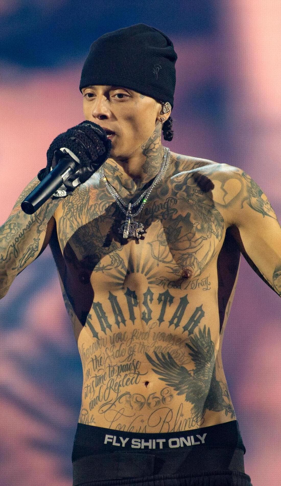
Central Cee tattoos: Trapstar chest lettering and full torso tattoos

Trapstar is one of the first tattoos people notice on Central Cee’s chest. The large, dark letters stretch across the centre of his torso, so they stay readable under stage lights and while he’s moving. Their width also gives his upper body a strong horizontal line.

There’s a lot more ink around the word: layered drawings, curved lines and shaded shapes make the chest look full. The lettering catches the eye first; the smaller details come into view after.

That’s a useful way to plan a large chest tattoo. A central word or symbol can hold the design together, while the surrounding lines and images follow the curve of the pectorals instead of looking like text on a flat panel.

Chest lettering needs enough room around each letter. Squeeze a phrase into too little space and the open parts can close up, making it hard to read. Central Cee keeps the main word bold and lets the designs around it add detail more quietly.

The dragon across his chest adds movement to the lettering
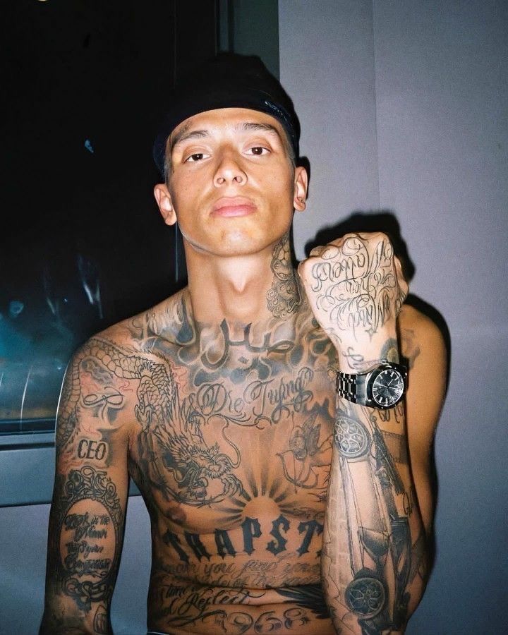
Central Cee tattoos: dragon and chest tattoo layout

The dragon is one of the clearest images in Central Cee’s upper-body collection. Its long body and curling lines cross the chest, while the head gives the design a livelier shape than the block lettering around it. That movement keeps the chest from becoming a wall of straight words.

It also brings a different texture. Script uses repeated strokes and smooth curves; a dragon relies on scales, claws, teeth and a strong outline. The contrast helps each part stand out, and gives the eye somewhere to move beyond the lettering.

In closer photos, the dragon sits among other black-and-grey pieces instead of floating by itself. A large image needs a little space to read. If every gap has the same weight of ink, the main subject can disappear. The different marks across Central Cee’s chest give the dragon room to hold its shape.

For a large animal tattoo, settle on a readable pose before adding the small details. A dragon can twist around the body or stretch across the ribs, but its outline should still make sense from a distance. Shading can add depth once that basic shape is clear.

The neck work makes his tattoo style visible from every angle
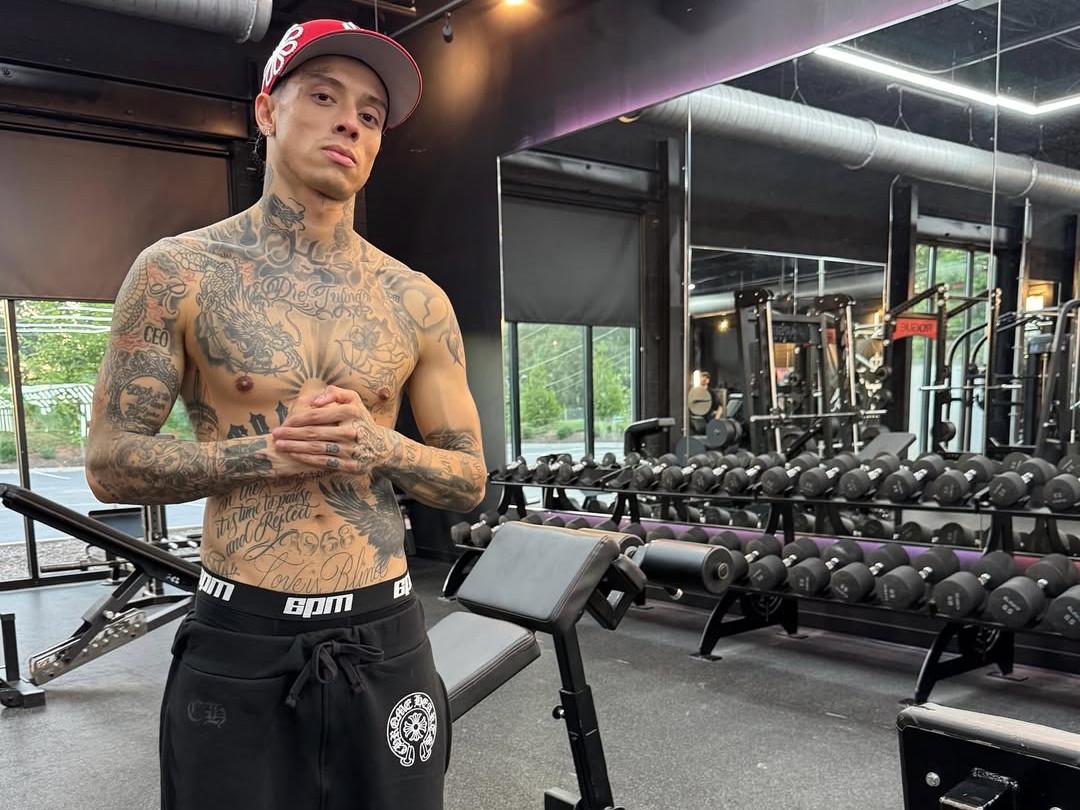
Central Cee tattoos: neck tattoo placement and upper body ink

Central Cee’s neck is covered with dark shapes, lettering and smaller lines. It’s nearly always visible in a vest or open shirt, so the ink there has become part of his public image in a way a tattoo on his back or thigh wouldn’t.

The designs follow the curve from his collar toward his jaw rather than sitting like one separate stamp. That gives the area a connected look. A side view also shows how the ink wraps around his neck instead of stopping at the front.

Neck tattoos take careful planning. The skin shifts when someone turns their head, and the design is seen from the front, side and three-quarter angles. A phrase that looks right on a straight stencil can feel cramped once it bends around the neck. Shading and open gaps help the work keep its shape.

A visible tattoo doesn’t need to be one huge image. Several smaller marks can have the same impact when their line weight works together. Consistent spacing makes a busy neck look intentional.

The script on his stomach gives the collection a more personal tone
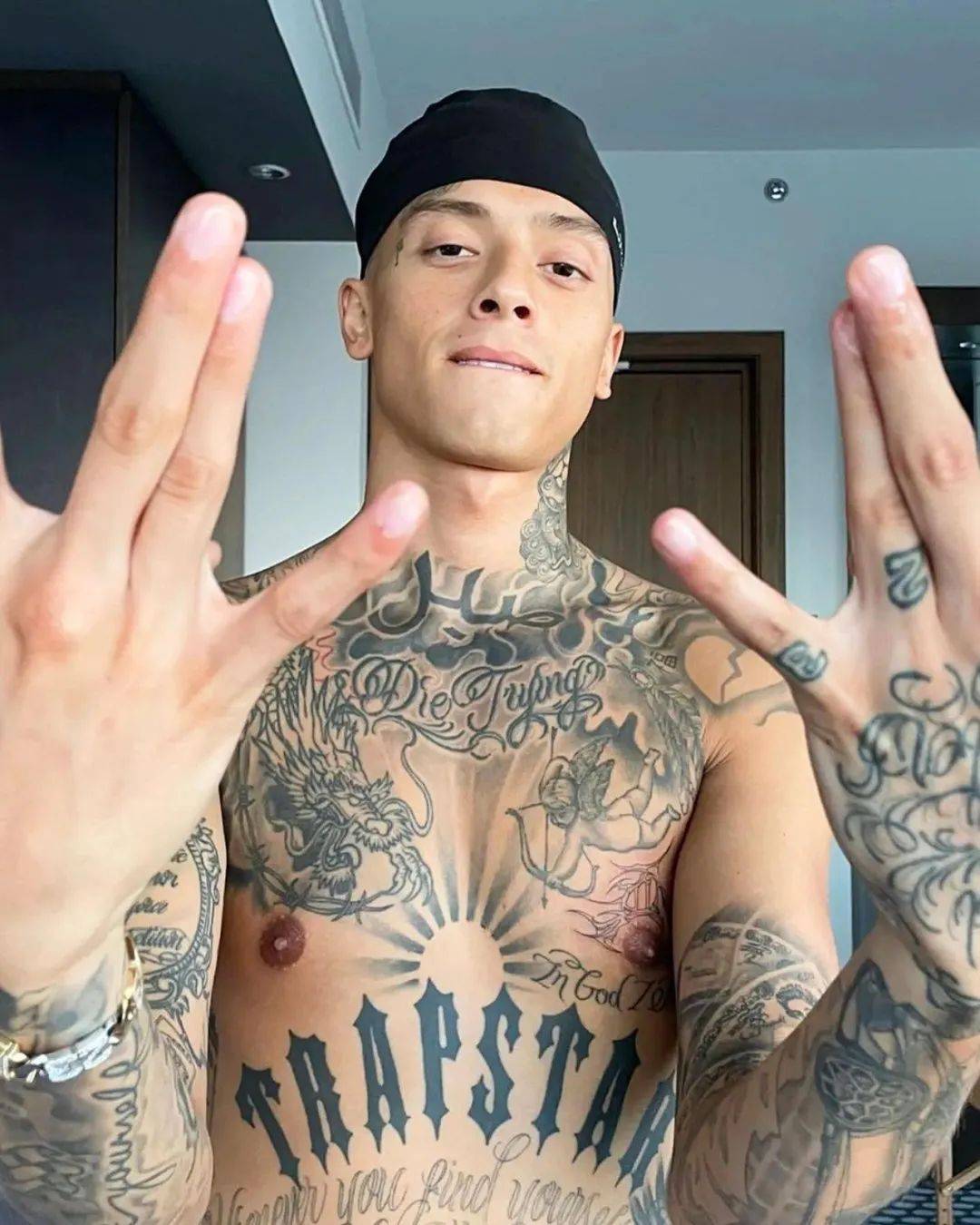
Central Cee tattoos: script and stomach tattoo details

Below the chest lettering, Central Cee has a broad stretch of script across his stomach. The words follow the torso and soften the heavier Trapstar letters above. From a distance, the writing reads as a dark band; up close, the loops and changes in scale are easier to see.

Script suits an area that moves constantly. The letters can follow the stomach’s curve, and their long strokes shift as the wearer bends or twists. Fine writing can blur over time, though, especially when the lines are crowded.

Central Cee’s script isn’t treated like a small secret. It takes up space and sits alongside the chest and arm work, while bringing a more reflective tone than the large word above it.

If you’re considering script, look at the phrase at the size you’d actually wear it. Check the spacing, line weight and how it follows the body. A meaningful sentence still needs a clean layout. The words matter, and so does how they’ll look after years of movement and sun.

His arm and hand tattoos fill the smaller gaps with detail
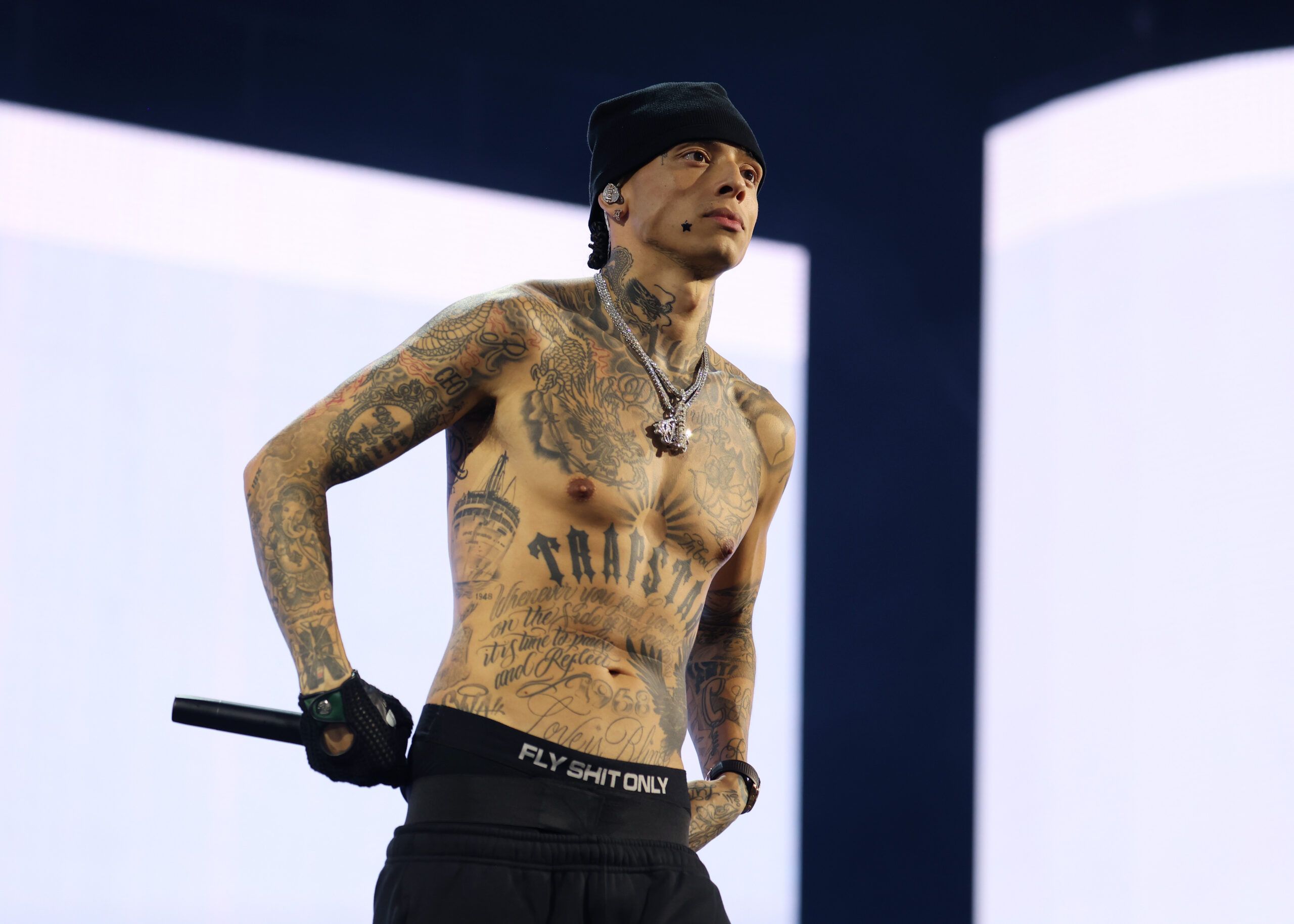
Central Cee tattoos: arm and hand tattoo details

The tattoos on Central Cee’s arms supply much of the collection’s smaller detail. Writing, symbols, shaded shapes and compact images run from the shoulders toward the wrists. They can look different from photo to photo as he moves onstage.

His hands carry the same mix in a tighter space. Short words and small marks sit across his fingers and the backs of his hands, where each line has to be placed carefully. They’re easy to spot in interviews because he gestures while he speaks, so the tattoos become part of that movement.

One well-known phrase beneath his chin reads “Death Before Dishonor.” In his XXL ABCs appearance, he said the saying appeals to him, while acknowledging that real life is more complicated than a slogan. That admission gives the words more context than treating them as a tough-looking design.

The smaller pieces also show why a little bare skin helps. Each finger tattoo, line of script or symbol needs space around it so its shape doesn’t disappear into the arm. A busy collection can still be easy to read.

Central Cee’s tattoos work on different scales. The chest gives a broad first impression, the neck makes the style clear in a close portrait, and the arms and hands reward a longer look. The dragon adds movement, the script brings a personal note and the small marks keep the collection open to change.

If you like his ink, you don’t need to copy the Trapstar lettering or choose the same dragon. Start with the part of your own story that deserves the most space, then let smaller designs support it. Several styles can sit together when placement, scale and line weight are planned as a whole. Good placement turns separate ideas into one readable collection.
More musician tattoo guides

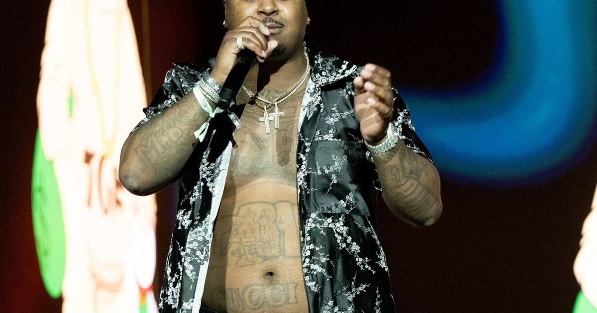
Drakeo the Ruler Tattoos: Chest, Arms and DRAKEO Ink

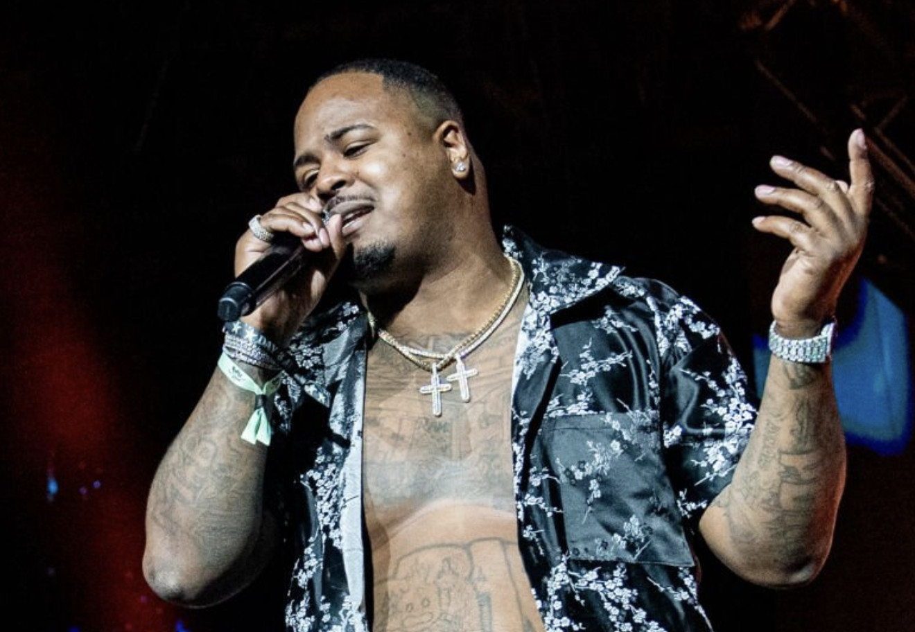
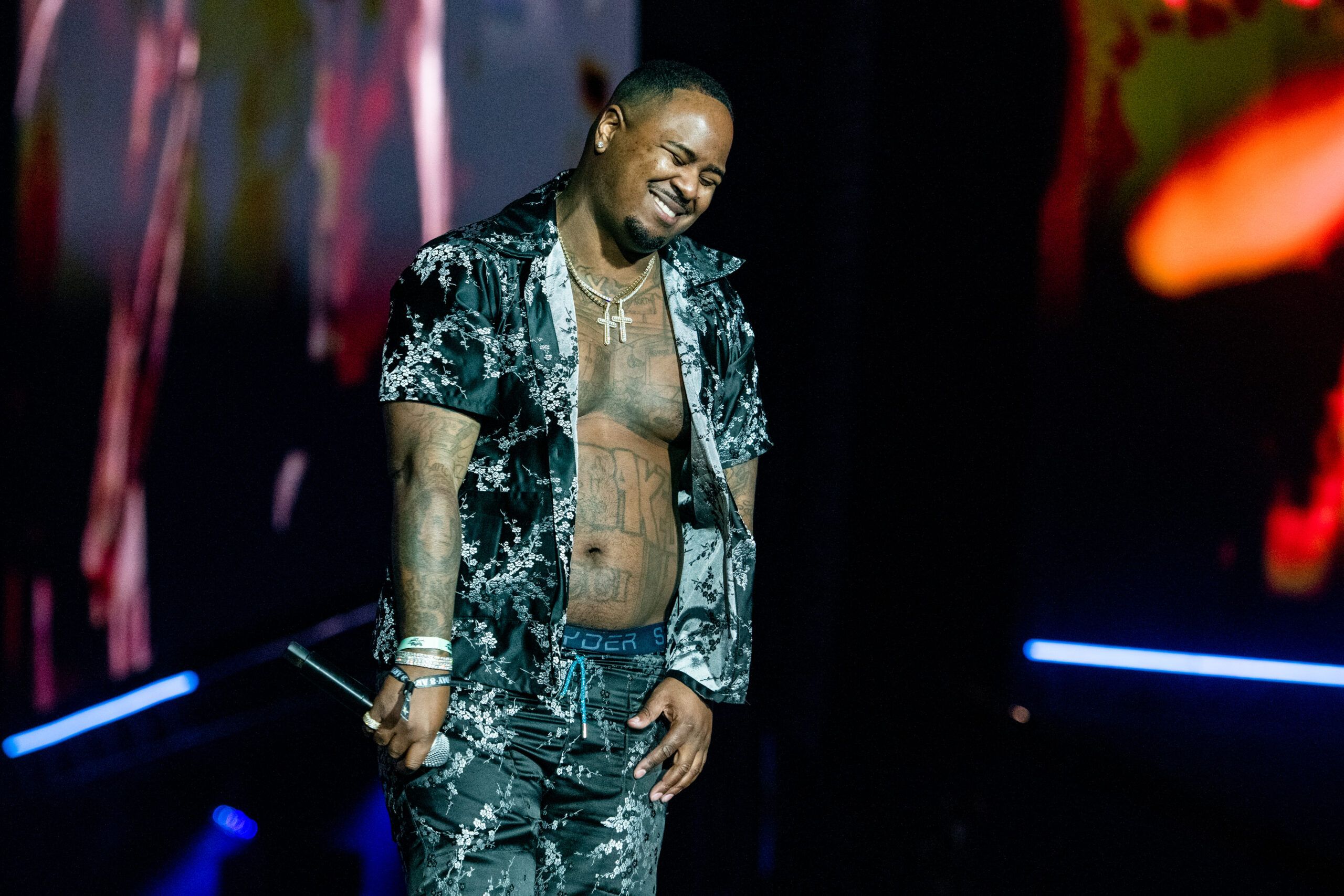
Drakeo the Ruler’s tattoos were hard to miss when he took his shirt off. They covered his chest, stomach, arms, wrists and head, mixing big lettering with money symbols, cartoon references, luxury cues and details that rewarded a closer look. The collection was dense, but recurring ideas gave it a thread: identity, ambition, business and the world he’d built for himself.

There wasn’t one polished theme tying everything together. The tattoos grew in layers: heavy work across the torso, smaller designs on the arms and a bold word beside a detailed portrait. From across a room, the ink gave him a strong outline. Up close, the lettering and symbols made the collection feel more personal.

Drakeo was known for a sharp West Coast sound and a delivery that stood apart. His tattoos shared some of that directness. They were easy to spot, and sometimes playful. Here’s a closer look at the designs and placements that gave them their character.

The DRAKEO stomach tattoo turns his name into the centrepiece

Drakeo the Ruler tattoos: chest, stomach and arm tattoo layout

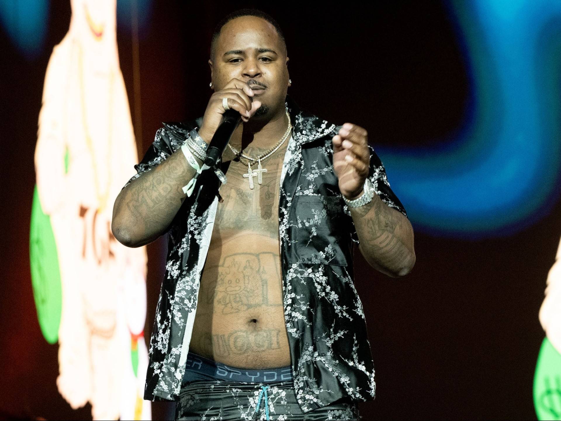
The large DRAKEO lettering across Drakeo’s upper stomach is the collection’s clearest anchor. It fills most of the space below his chest, so his name is the first thing you read. The word works almost like a logo, turning his stage name into body art rather than leaving it on a cover or a piece of clothing.

The scale is deliberate. Instead of keeping the name small, Drakeo gave it room to run across his torso. The broad letters follow the stomach’s natural width and stretch with him when he moved or performed.

The lettering also breaks up the torso. Finer lines and details sit higher on the chest, while the word below is heavier and easier to read. Your eye catches the name, then moves up into the more layered work around his ribs and chest.

A name tattoo needs to work with the body in motion. Drakeo’s design uses the whole area instead of only fitting a stencil. The open space around the lettering helps it stay clear.

His chest and neck tattoos build a dense black and grey frame

Drakeo the Ruler tattoos: chest, neck and arm tattoo frame

Above the stomach lettering, Drakeo had dense work across his chest and neck. Shaded shapes, script and symbols formed a broad band of ink. In performance photos, the chest framed his chains and open shirts; the neck pieces carried that dark look toward his face.

His chest wasn’t one empty panel filled with a single design. Separate pieces sit beside one another, some easy to identify and others adding texture. That mix matters as a collection grows. If every tattoo has the same outline and the same space around it, the body can start to look like a sheet of stickers. Drakeo’s chest reads more like a group that grew together.

The neck ink kept the style visible when the rest of his body was covered. It connected his face, chains and torso, so the tattoos were still part of a close portrait. The neck moves constantly and shows from several angles; strong shapes and dark shading help the work keep its presence.

Chest and neck tattoos can feel connected without using the same designs. Repeating a line weight, shading style or a few shapes can lead the eye from the collarbones toward the jaw.

The Baby Jack-Jack arm tattoo adds a playful change of mood

Drakeo the Ruler tattoos: torso lettering and forearm tattoos

One of the more surprising designs in Drakeo’s collection was Baby Jack-Jack from The Incredibles. The cartoon character on his arm brought a lighter, nostalgic note to the surrounding ink. Even a heavily tattooed person can make room for something funny without losing the edge of the rest of the collection.

The forearm gives a character tattoo enough length to read clearly. It can also show in a photo without a full shirtless shot, and it sits among other designs instead of on its own. That contrast helps it catch your eye.

A playful image keeps a collection from taking itself too seriously. Drakeo had money lettering and dark, hard-edged pieces, so the familiar cartoon brought a different rhythm. It still fit because it showed what he enjoyed, not only what looked intimidating.

If you’re planning a forearm collection, a small character can give the eye a break. Leave a little space around its face and outline so nearby tattoos don’t swallow it. Contrast can make a small tattoo memorable.

The Benjamin Franklin portrait and burning dollar work lean into money imagery

Drakeo the Ruler tattoos: arm and money-themed tattoo details

Money came up more than once in Drakeo’s tattoos. A Benjamin Franklin portrait sat on his arm, alongside dollar signs, burning money and the word MONEY elsewhere in the collection. The imagery matched the luxury-heavy clothes he often wore, and the way he spoke about independence, survival and making a name without waiting for permission.

The Franklin portrait gives that theme a face. A dollar sign is quick and graphic; a portrait adds expression, texture and a sense of history. Fire pushes the burning-dollar design in a more dramatic direction, giving it movement that a simple cash symbol doesn’t have.

The same subject can appear in several styles if each tattoo has a different role. One can be a portrait, another lettering and another a small symbol. The shared idea connects them while the changes keep the collection from feeling repetitive.

Scale matters too. A portrait needs room for its eyes, shadows and edges to stay distinct; a dollar sign can be much smaller. Let the detailed design use the broadest space, then fit simpler marks into the smaller gaps.

PUMA, GUCCI and the watch tattoo turn branding into body art

Drakeo the Ruler tattoos: branding lettering and smaller arm tattoos

Brand names appeared on Drakeo’s arms, wrist and lower abdomen. PUMA and GUCCI were among the clearest words, and a watch tattoo added another luxury detail. Together, they linked the ink to clothing, jewellery and status. These were visible choices, not hidden symbols.

Lettering needs to fit the part of the body it sits on. A wide word can stretch across an arm or stomach, while the wrist needs a tighter layout. The letters have to stay readable without crowding the hand or bending awkwardly around the joint. Drakeo’s small branding pieces show how a short word can still carry visual weight.

The watch changes the shape of the design. Its round face, hands and sense of time bring something different to the luxury theme. It also gives the surrounding lettering a shape to sit beside, so a busy arm feels planned rather than simply filled.

Brand tattoos are personal choices, not just logos. They can mark a connection to a style, a period in someone’s life or the work it took to reach a certain point. The meaning may shift later, but the image still records who chose it and when.

His head, wrist and arm tattoos finish the collection with smaller details

Drakeo the Ruler tattoos: head, wrist and arm tattoo details

Drakeo’s tattoos reached beyond his torso. The head and side-of-neck pieces made his look easy to recognize, while smaller designs on his wrists and arms showed when he gestured or held a microphone. A Laughing Buddha on his wrist added a symbol associated with luck, happiness and abundance alongside the names and money imagery.

The head tattoos changed the balance of his face. Even a small mark in such a visible spot can lead the eye in a portrait. It takes commitment to choose that placement, and it helps explain why his style felt complete in a close crop.

His arms connected the rest of the collection. Forearms carried words, portraits and symbols between the darker chest work and his hands. The tattoos moved with him onstage: a wrist piece appeared when he raised the microphone, and a forearm word showed when he pointed toward the crowd. The ink became part of his gestures.

The collection’s strength is in its range. Drakeo mixed stage-name lettering with character art, portraits, symbols and luxury references instead of repeating one design everywhere. Some pieces read across a room; others reward a closer look.

That combination is why Drakeo the Ruler’s tattoos still feel distinctive. They reflected his name, his style and the world he built around his music, with room for humour and change. If you like the look, begin with an idea that matters to you, give it enough space and let the smaller pieces support it. A strong collection can be loud, personal and varied. Placement keeps a crowded set readable.

More musician tattoo guides

Boosie BadAzz Tattoos: Family Names, Script and Meaning

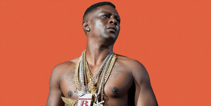
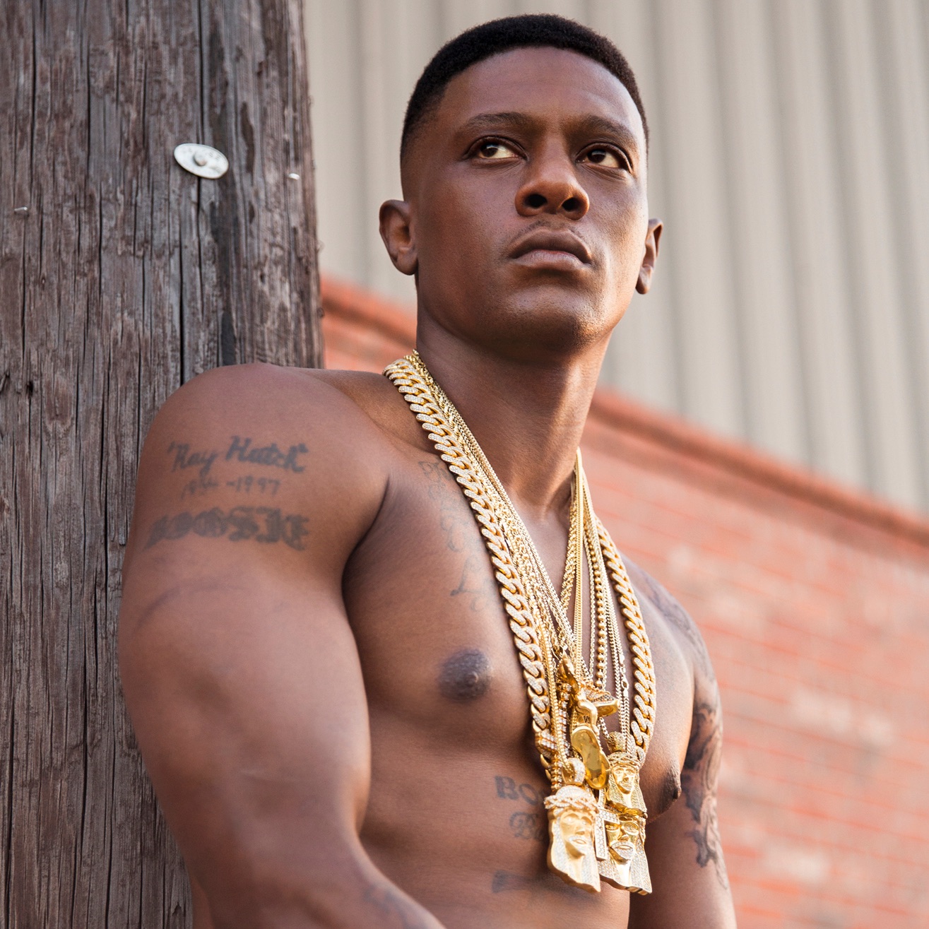
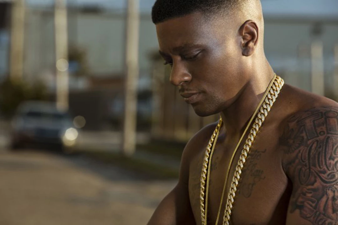
Boosie’s tattoos make the most sense when you look at the people they name. His chest is covered in script, and his arms carry portraits and more lettering. Most of the visible work is black and grey, but it doesn’t feel like a wall of unrelated designs. Names, dates and tributes keep bringing it back to family and memory.

In photos, Boosie BadAzz tattoos can look like one dense collection. Up close, the pieces are more individual: a child’s name, his father’s birth date, a friend remembered in ink. The script and shading vary, but each tattoo has room to read as its own choice.

Boosie has said he got tattoos for pain rather than decoration. Whatever the reason behind each piece, the placement keeps the ink in view: across the chest and shoulders, down both arms. Here are the designs and details that give the collection its shape.

Family names make Boosie BadAzz’s chest tattoos personal

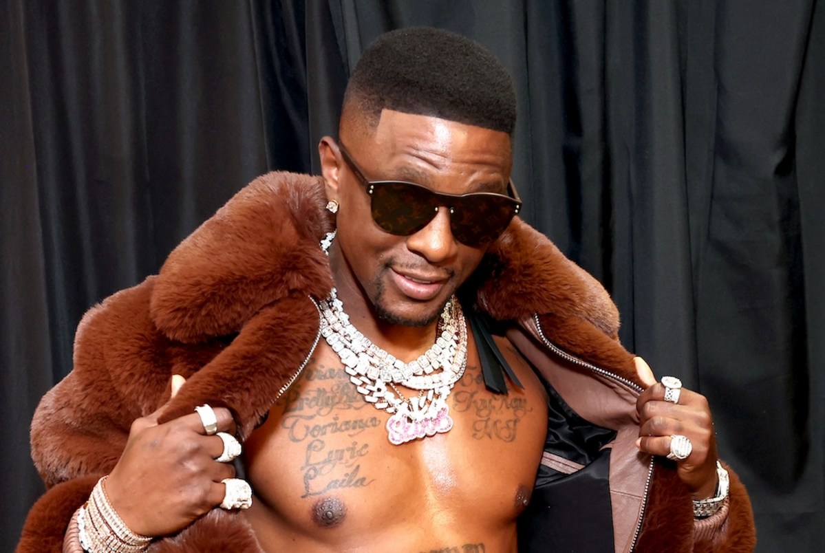
Boosie BadAzz tattoos: shirtless fur-coat portrait showing the large family-name tattoos across his chest

The names “Torrence,” “Lyric” and other family references run across his upper chest in broad cursive. They take up space instead of being packed into one line, which keeps the letters readable even with chains and pendants over them.

The chest changes shape as a person moves, so long script has to follow that curve. Boosie’s lettering spreads across the pectorals rather than sitting like a straight label. From the front, the words read as one wide piece.

The family names are the main subject, so the design can stay simple. The placement does some of the work: the words sit where they’re visible when he wears an open shirt, while still disappearing under clothing.

Planning a similar tattoo? Decide which names matter most before adding dates or decoration. Leave some breathing room around the letters; you can always connect the pieces later. It is harder to bring clarity back after small filler has taken over the open skin.

His arm tattoos carry names, dates and memories

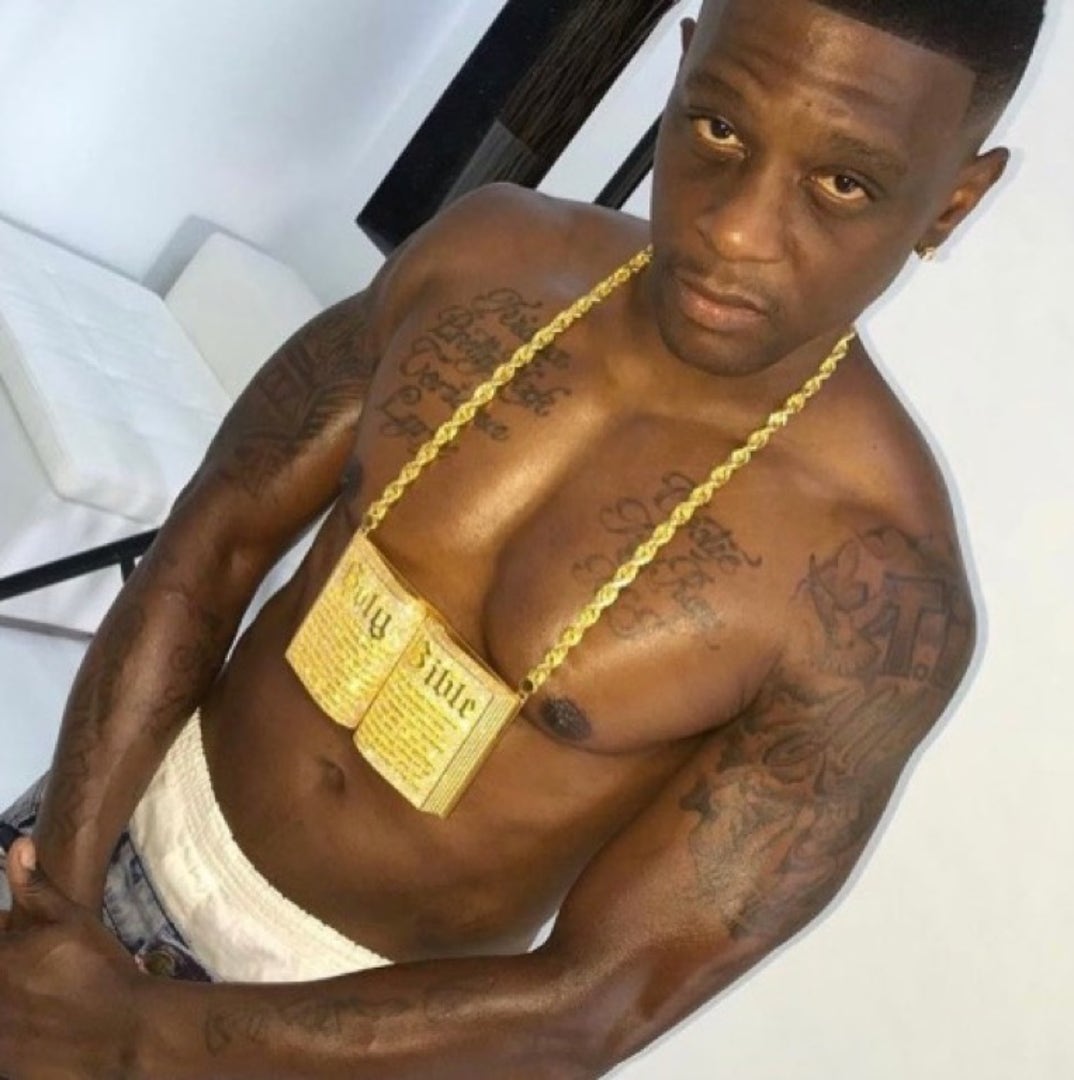
Boosie BadAzz tattoos: shirtless jewelry portrait showing dense chest and arm tattoo coverage

Several arm tattoos extend the family story. Accounts of Boosie’s ink mention his father’s name and birth date on a bicep, as well as tributes to friends who have died. The photos show script among darker work, with the names sharing the arm rather than sitting alone.

Over time, that mix can feel like a timeline: each name or date marks one relationship, and the nearby pieces show how the collection grew. The lines needn’t be mirror images on both arms. The uneven spacing can suit tattoos added at different points in life.

Dates narrow a tribute to a particular person and moment, but they need to stay legible. Too-small numerals can disappear into heavy shading. For a memorial tattoo, clear lettering matters as much as the feeling behind it.

Placement helps too. A bicep has a rounded surface for a name and date; a forearm gives a phrase more length. Hands and wrists are more exposed and usually suit shorter marks. Thinking about the space first can prevent the words from feeling squeezed in.

The Bossman lettering gives the torso a bold center

Boosie BadAzz tattoos: portrait showing the Torrence Hatch name and date tattoo on the upper arm

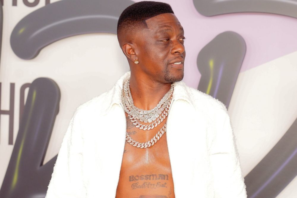
The bold “BOSSMAN BadAzz Ent.” lettering across Boosie’s lower chest gives the torso a different visual weight. It reads as both a nickname and part of his music identity. Its blocky letters sit beneath the flowing family script.

The two treatments work side by side because they don’t compete for the same job. The cursive carries names; the darker, heavier line announces the title. Different lettering styles can separate ideas on one area when their scale and spacing are planned together.

A stage name is a bigger commitment than a small symbol. Your work and public image can change, so it’s worth asking whether the word will still feel right years later. “Bossman” has been part of Boosie’s public identity for a long time, which gives the choice context beyond a passing design trend.

Before committing to a large nickname, try the stencil in a few positions: high on the chest, across the stomach or closer to the ribs. Look at it standing normally, not only while flexing. A broad phrase should feel balanced in an ordinary posture.

The sleeve work mixes scripts, symbols and heavy shading

Boosie BadAzz tattoos: side portrait showing the detailed upper-arm sleeve and chest script

His sleeves combine script, shaded shapes and heavier blackwork. In photos where his arms and chest are uncovered, the darker patches sit among open areas of skin. The mix reads as layers of tattoos rather than one solid block.

Some pieces appear to have been added at different times. Repeated dark outlines and similar shading help them sit together even when the subjects differ. A sleeve can look coherent without every image following the same theme.

A full arm doesn’t have to be designed in one sitting. You can begin with a name, portrait or symbol, then decide what belongs around it. Keep the main designs clear before adding filler; small marks should help the larger images read.

For a similar mix, decide how much space lettering needs beside portraits or religious imagery. A page of names and one large picture don’t need the same background treatment. Boosie’s arm shows that the styles can share a space, but the transitions still need room.

Boosie’s first tattoo story explains why the collection feels so personal

Boosie BadAzz tattoos: event portrait showing the Bossman BadAzz Ent. chest lettering

Boosie has said his first tattoo came at 13 and was a tribute to his father, using his father’s name and birth date. That early choice gives a starting point for the rest of the collection: family keeps returning, even as the lettering and imagery change.

The chest names, arm tributes and Bossman tattoo look different, but all connect to people, memories or identity. That through line keeps the collection from feeling like ink added only to fill skin.

The size of a design can follow how much space it needs. A name may stretch across the chest; a memorial portrait might take a full section of the arm. A personal tattoo doesn’t have to be subtle. It does need enough room for the lines to stay clear.

If you’re choosing a tattoo for someone, start with what you want to remember, then think about the image and location. A name may work beside a date, while a portrait needs more room than a small stencil suggests. Boosie’s story is one example of a collection that looks bold but stays tied to real people.

Family and memory run through Boosie’s tattoos. Names across the chest and tributes on the arms sit beside the Bossman lettering, with dark shading giving the varied pieces a visual link.

You don’t have to copy the words or symbols. Choose something you actually want to keep with you, give it space, and let additions support it. A tattoo can be visually loud and still carry a personal meaning.

Boosie discusses the pain and personal meaning behind his tattoos in the video below.

More musician tattoo guides

Method Man Tattoos: MEN, MAN, Spiderwebs and Arm Ink

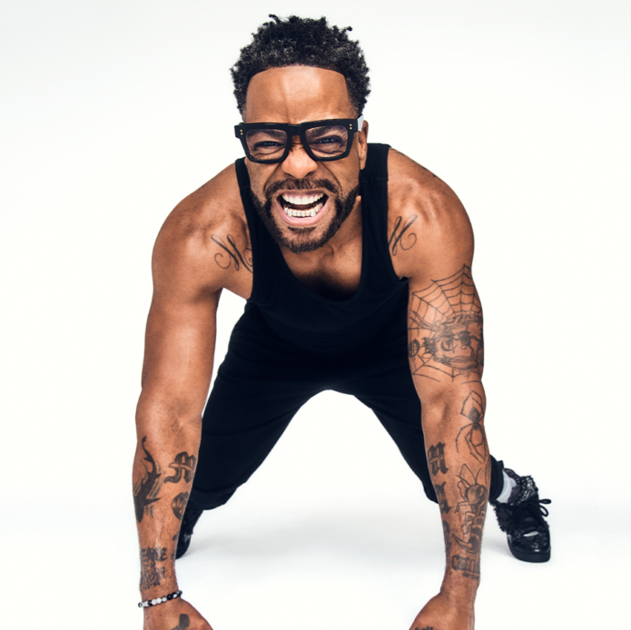
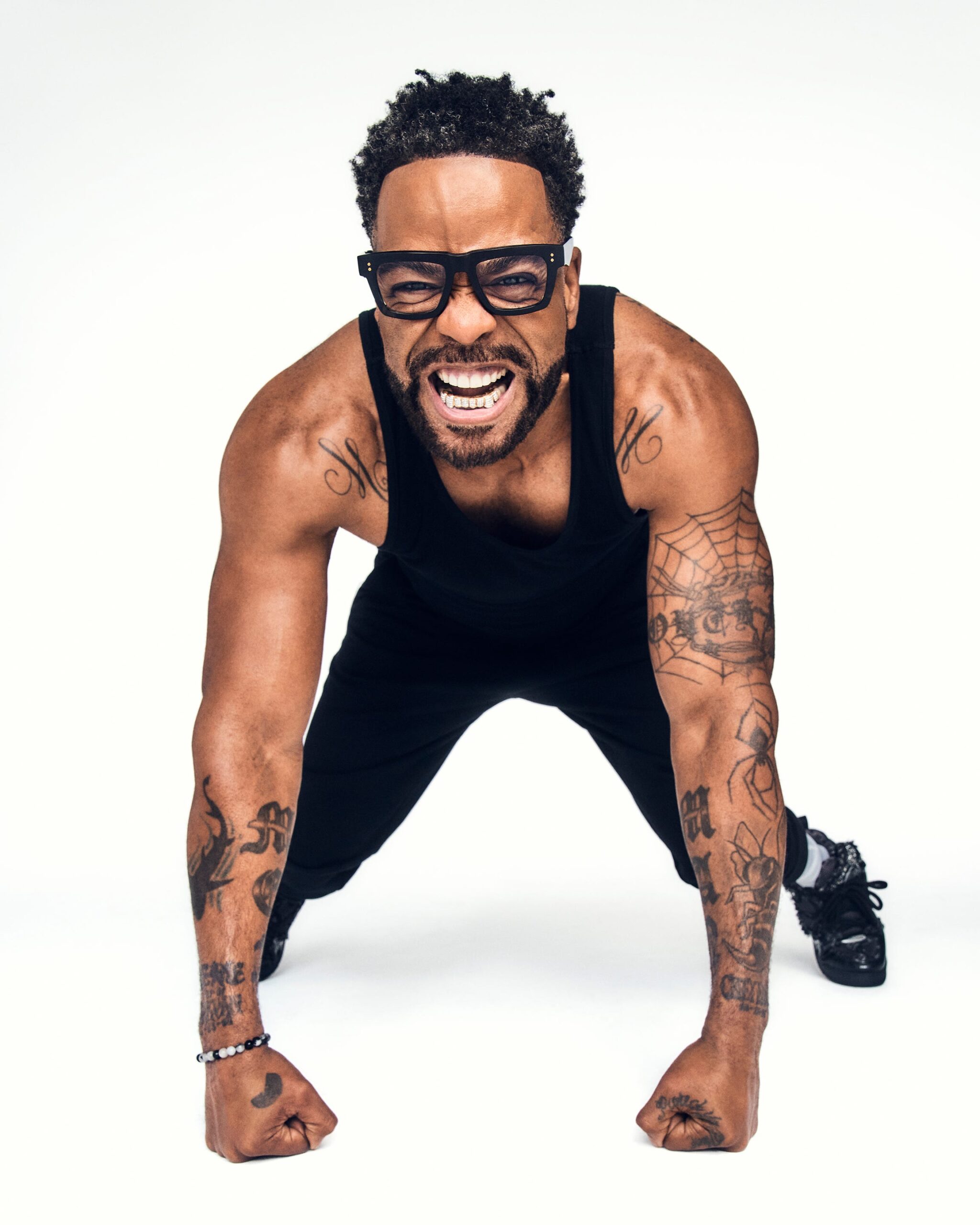
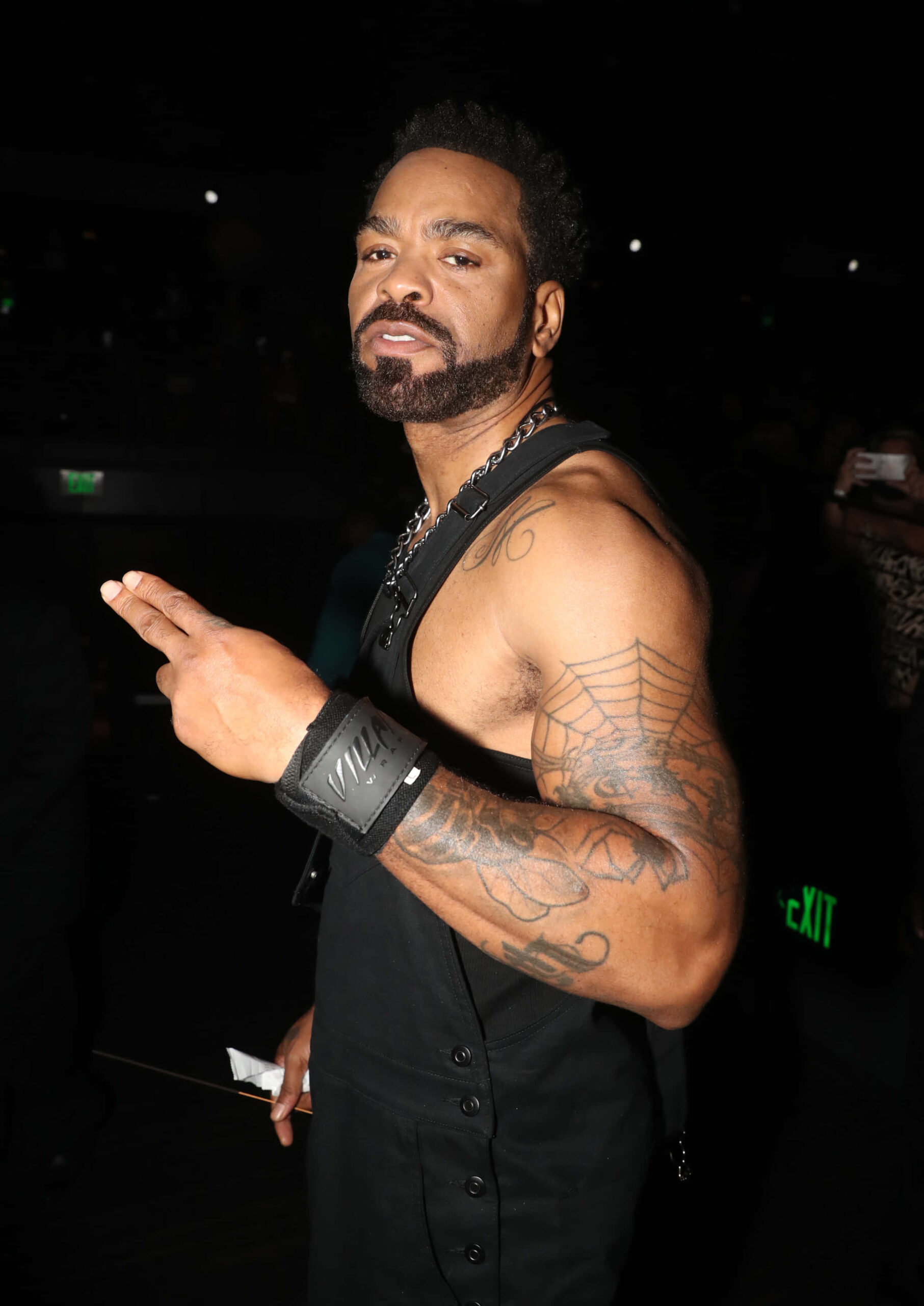
Method Man’s ink is easy to pick out in a photo. “MEN” and “MAN” run down his forearms, and a spiderweb gives his arm a shape you notice straight away. The tattoos cover his chest and shoulders too, but the skin between them keeps the larger areas from reading as one dark patch.

Method Man tattoos mix blunt lettering with finer lines and shaded sections. The pieces don’t all follow one theme or look like a single planned sleeve. They still hold together because the main shapes are clear and have space around them, whether he’s onstage, in a portrait or at the gym.

Method Man has been part of Wu-Tang Clan since its early years. His tattoos have a similar directness: the strongest designs are easy to see, without a lot of filler hiding them. Here are the placements and details that give the collection its character.

The MEN and MAN forearm tattoos are Method Man signatures

Method Man tattoos: high-resolution portrait with tattooed arms, bold lettering and the spiderweb tattoo visible

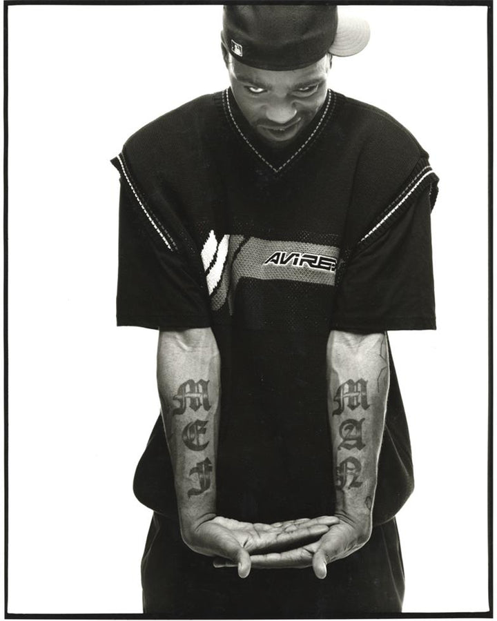
The best-known lettering sits on Method Man’s forearms: “MEN” on one and “MAN” on the other. The heavy gothic letters are short enough to read quickly, but they take up much of each forearm. When his arms hang by his sides, the words frame the hands and give the pair a strong outline.

The font adds as much character as the words. Thick strokes and pointed edges give the letters an old-school look; a plain block font would be easier to read, but less distinctive. Here the message comes through first, with the decorative details catching your eye after.

Putting a related word on each arm creates a natural pair. The tattoos don’t have to be mirror images: their shared scale, weight and position already connect them. With short lettering, the placement and font can carry as much weight as the words.

If you’re considering a name or a two-part phrase, test it at actual size before settling on a font. A design that looks sharp on a screen can lose its shape when it wraps around an arm. The tall letters need clear edges and enough space to stay readable as the forearm turns.

The spiderweb tattoo gives his arm work a sharp focal point

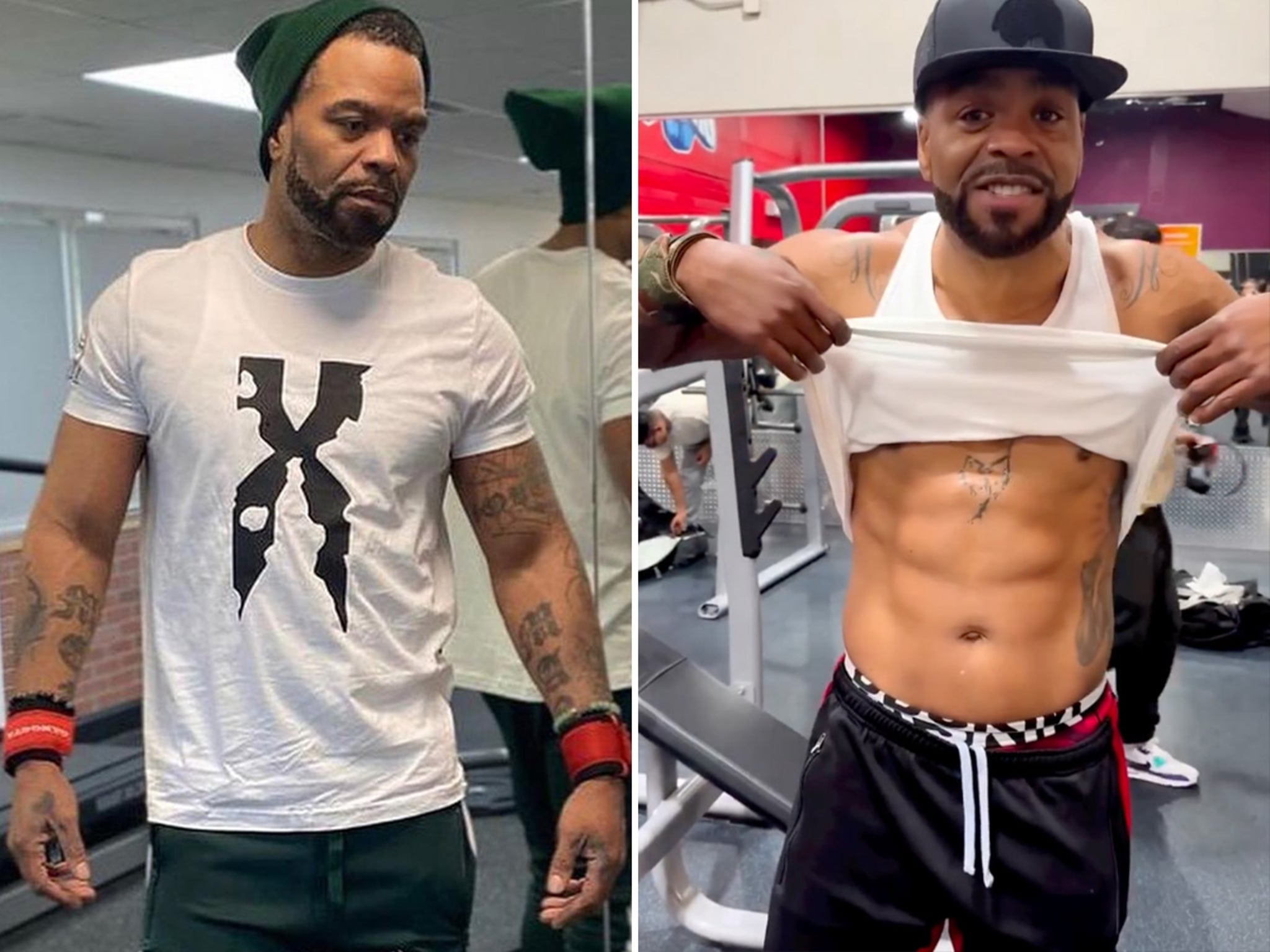
Method Man tattoos: gym photo showing tattooed arms, chest and upper-body coverage

The spiderweb on Method Man’s upper arm changes the look. The forearm words are solid and angular; the web uses thin lines and open space. It gives the upper arm a clear focal point, and its curved spokes follow the round shape of the bicep.

A web can feel delicate or quite dark depending on how thick the lines are. In these photos, the pattern remains easy to see because it sits beside areas of skin that aren’t fully covered. That contrast keeps the fine lines from blending into the other ink.

The web’s round pattern also plays against the vertical lettering below it. Different shapes can lead the eye from one tattoo to another and make a collection feel connected. Here, the curve around the bicep and the long forearm words pull in different directions without competing.

If you like a web or another circular design, leave a little space around its edge. It can break up a run of straight lines, but a tight gap between lettering and a dark sleeve can swallow the pattern. Open skin may frame the design better than another small filler mark.

Gym photos show how the lettering sits with the larger arm work

Method Man tattoos: archival portrait clearly showing the MEN and MAN forearm lettering

Gym photos show the tattoos in a less formal setting than a red-carpet portrait. With a tank top on, Method Man’s arms, shoulders and upper chest are visible together. You can see how the forearm lettering remains distinct while smaller marks and shading occupy the space around it.

The photos also show why placement has to account for movement. An arm narrows at rest and broadens when bent or flexed; the skin shifts as it turns. Tall lettering has a better chance of holding its shape through that movement, which helps explain why these words read clearly from different angles.

The collection isn’t one seamless illustration. Some areas are darker, others lighter, and patches of skin stay open. Open skin is part of the composition, not proof that a tattoo is unfinished. Leaving space can keep bold work cleaner than filling every gap.

If you’re building a sleeve, start with its main piece and live with it before deciding what goes around it. Look at photos with the arm relaxed as well as flexed, from the front, side and back. A gap that seems empty in a drawing may help the tattoo read once the arm moves.

Chest and shoulder ink connect the separate pieces

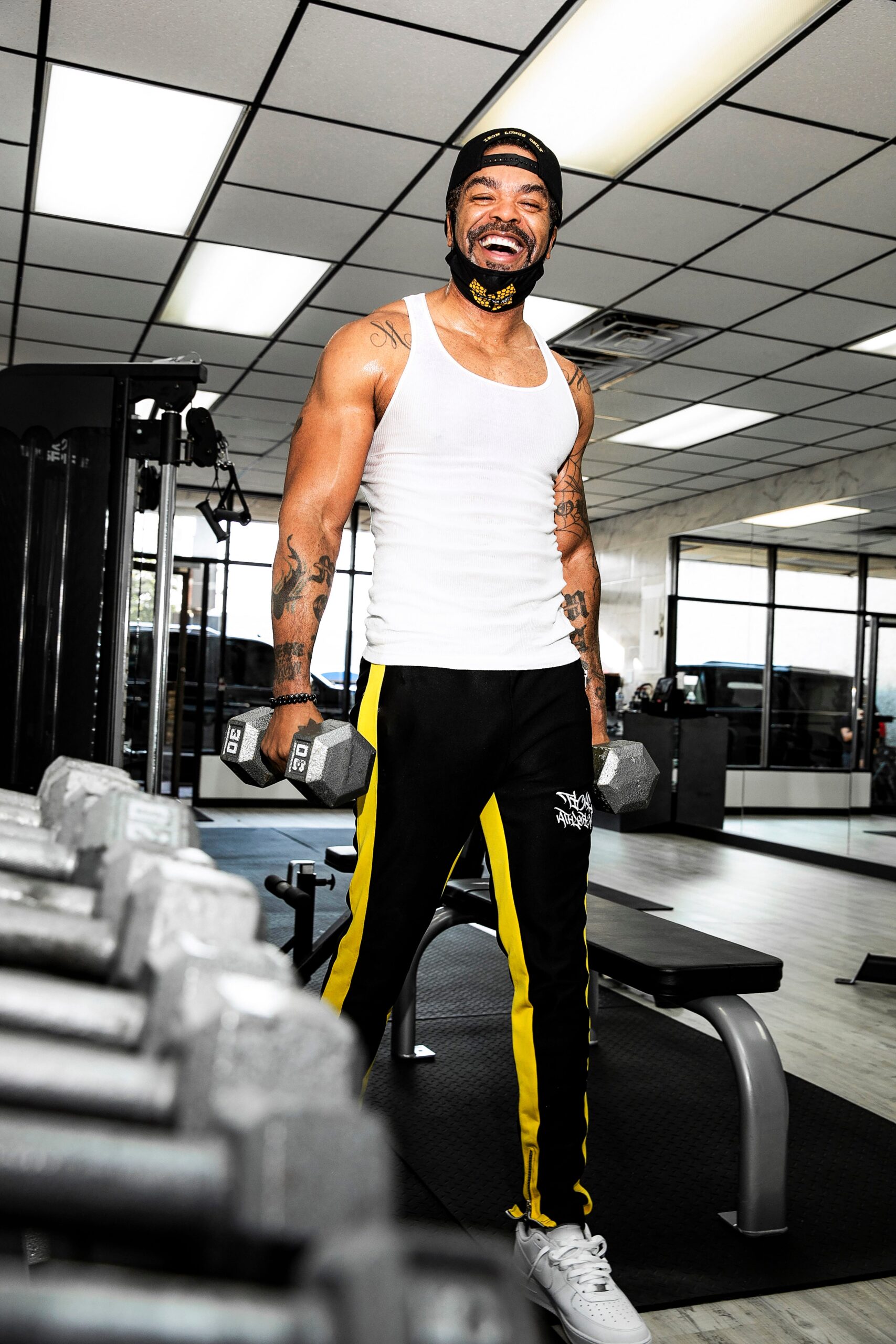
Method Man tattoos: large fitness portrait showing the chest, shoulders and arm tattoos in motion

The chest and shoulder work gives Method Man’s upper body more visual weight. It sits away from the forearm lettering and uses a different scale, so the areas don’t compete. From a distance, the ink frames his chest and neck; closer up, separate lines, symbols and shading are easier to make out.

His arms carry the clearest words, while the chest and shoulders add texture and balance. When a sleeveless top leaves both areas exposed, the eye can travel from shoulder to forearm. That makes the separate tattoos feel related without forcing them into one continuous design.

Chest and shoulder placements need to work with several curves: the pectorals, collarbones and the joint that moves as the arm lifts. A design can shift as the wearer reaches or bends. Pieces with enough scale and room are easier to read across those changes.

Before joining work across the chest and shoulders, decide where you want the main focus. One central word or image can anchor the layout; separate pieces with open skin between them can work too. Either way, the first large tattoo will shape what fits around it, so account for how your usual shirts expose the area.

The tattoo collection feels bold because the main shapes stay readable

Method Man tattoos: high-resolution event portrait with the spiderweb and additional arm ink visible

An event portrait shows another side of the collection. The lighting and clothes change, but the spiderweb still reads clearly and the other marks don’t collapse into a blur. The contrast lets the larger designs keep their shape in a different setting.

The MEN and MAN letters are strong landmarks, and the web has a pattern people recognise. The chest and shoulder pieces add detail around them without burying them. When every tattoo has the same dark weight, none stands out; a few clear shapes give the eye somewhere to land.

The collection varies its textures: the gothic type has hard edges, the web has fine lines and open gaps, and the torso shading adds depth. Different textures can keep a large collection varied without making every tattoo look unrelated.

If you want a collection to grow over time, decide what you want to repeat. It might be black-and-grey shading, heavier outlines, or a few recurring subjects. That gives each new piece room to be its own design while still fitting the rest. Method Man’s tattoos show how a strong visual identity can develop without making every tattoo identical.

Method Man’s tattoos are bold, but their main shapes remain easy to recognise. The “MEN” and “MAN” forearm words give the collection its signature; the spiderweb adds a finer graphic shape, while chest and shoulder ink fills out the upper body around them.

You don’t need to use the same words or symbols. Start with a piece you want to keep, give it room, and add nearby work only when it helps the main design. Clear lines and some open skin can make tattoos feel considered, even when they were added one at a time.

Here is Wu-Tang Clan’s original video for “Method Man”:

More musician tattoo guides

Tech N9ne Tattoos: WORLDLY, ANGEL, LIBERATE ME and SACRIFICE

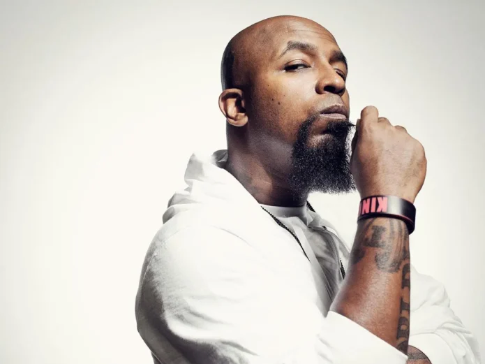
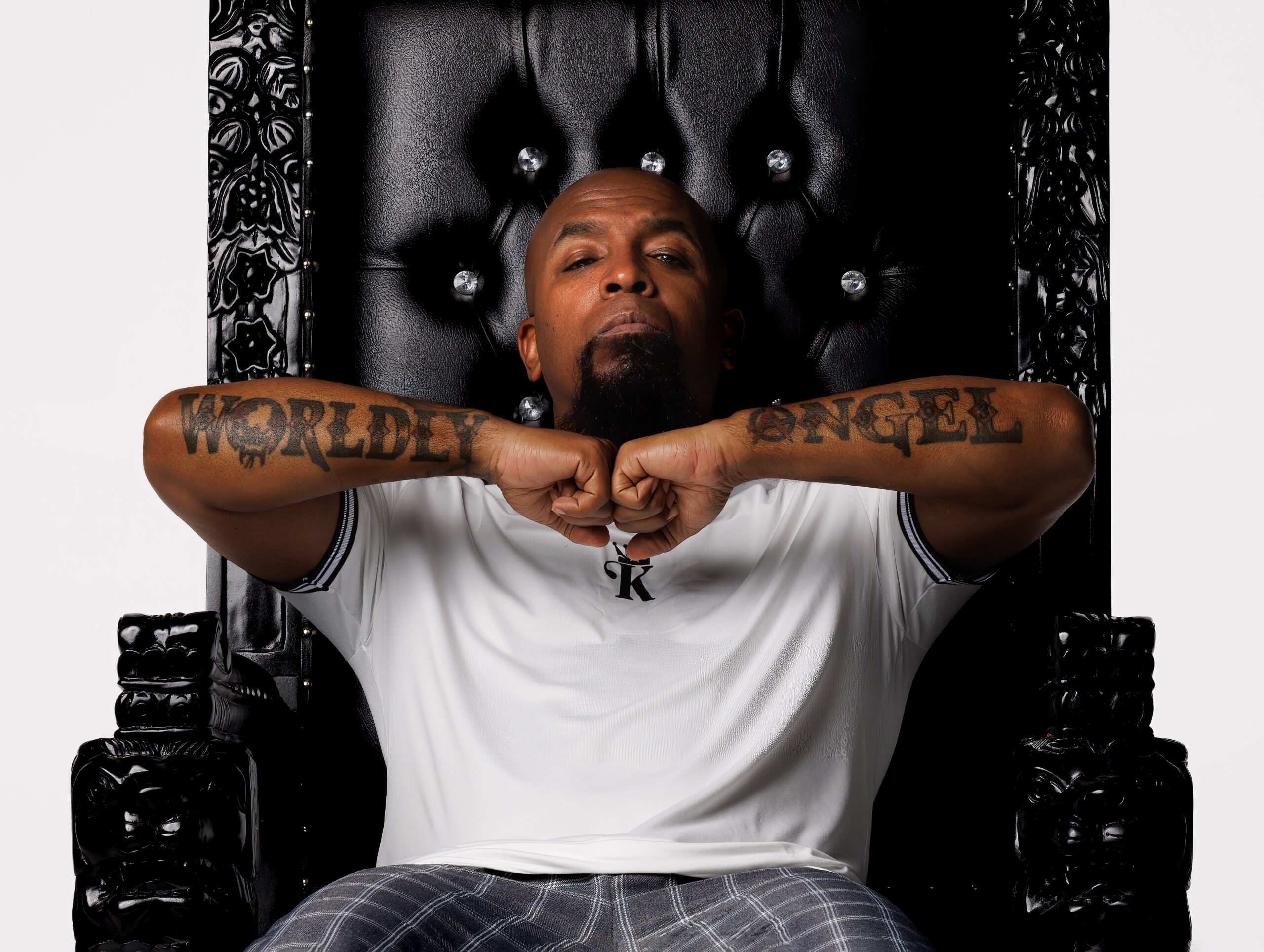
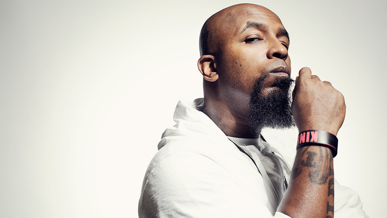
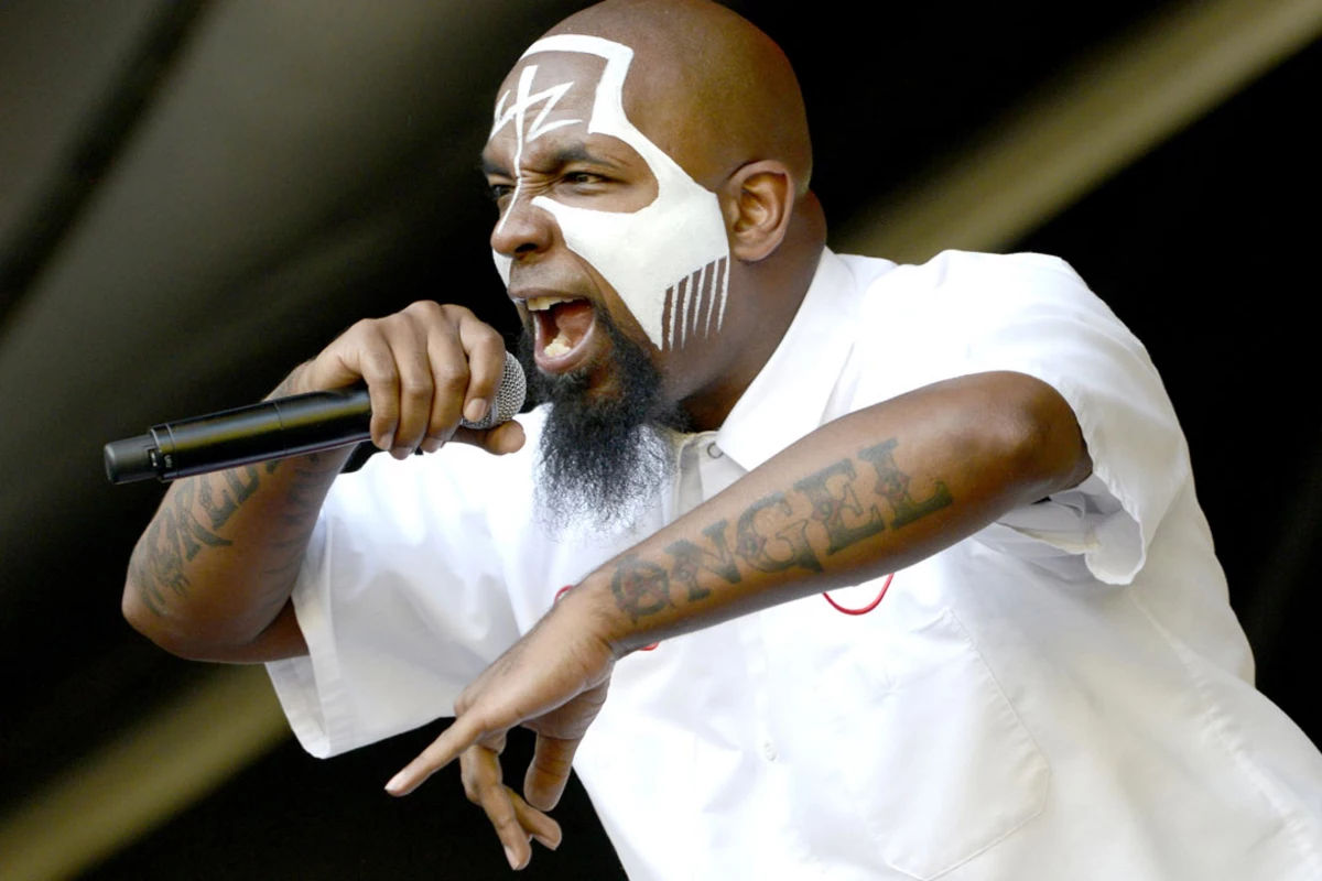
Tech N9ne’s tattoos are made to be seen. WORLDLY and ANGEL run across his forearms, LIBERATE ME is split between his arms, and SACRIFICE stretches across his chest. Even when face paint and concert lights compete for attention, the lettering gives his look a clear centre.

Tech N9ne tattoos pair large words with religious imagery and dark outlines. The designs refer to ideas and experiences he’s spoken about, and they suit a performer whose arms are always moving. Onstage, the ink shifts with his gestures instead of sitting still like decoration.

Tech has discussed the meaning behind several pieces, including the forearm words, angel wings and a date tied to a serious van accident. Here’s a closer look at the designs that define his collection and what their placements can teach anyone considering bold lettering.

WORLDLY and ANGEL make the forearms impossible to miss

Tech N9ne tattoos: high-resolution portrait clearly showing the WORLDLY and ANGEL forearm lettering

Photos of Tech N9ne’s forearms show WORLDLY on one side and ANGEL on the other. The words run along the arms and stay readable when he lifts his elbows or crosses his wrists. Together they set up a contrast: one points to everyday life, the other to something spiritual.

The lettering is heavy and a little rough around the edges, rather than thin or ornate. Thick outlines keep each character distinct, while the worn finish fits his stage image. It also suits a part of the body that bends and turns often; the strong strokes help the words hold their shape.

Putting related words on opposite arms lets each tattoo stand alone and still form a pair. A two-part design can give each arm its own role without making the tattoos mirror images. Shared size and placement are enough to connect them.

If you’re planning a phrase across both arms, test the lettering on each side before you settle on its direction. Word length, font shape and forearm rotation all affect the balance. Keep some room near the elbow crease; the letters shouldn’t merge into a dark band when your arm bends.

LIBERATE ME turns the arms into a personal statement

Tech N9ne tattoos: portrait showing the LIBERATE ME lettering and additional forearm ink

The LIBERATE ME lettering divides a short phrase between Tech’s arms. He has described it as a message connected to a difficult period in his life. “Liberate” sits on the underside of one forearm and “Me” on the other, turning the two arms into parts of the same sentence.

A few clear words can carry a lot when they’re tied to an actual experience. The phrase doesn’t need a field of symbols around it to make the point. Good lettering lets people read the words before they need to ask what they mean.

The split also changes with his pose. Standing still, someone may see one half at a time; a performance gesture can bring both words into view. That gives the tattoo a natural link to movement, since his arms are part of how he works a microphone and addresses a crowd.

If you’re splitting a phrase, decide whether you want it read in one glance or revealed as you move. A long sentence can feel awkward when divided too far apart, but two short words may sit comfortably across the arms, hands or collarbones. Try the stencil in the pose you’ll actually use, then check it from the side.

The SACRIFICE chest tattoo carries the biggest words

Tech N9ne tattoos: performance image showing both tattooed forearms beside the SACRIFICE chest area

SACRIFICE gives the chest a different scale from the forearm words. The letters spread across a wider surface and stay visible when his arms are down, making the word a centrepiece for the upper body.

Chest lettering has to follow the pectorals and sternum and still work as the shoulders move. A line that looks even while standing may stretch when the body turns. The size and contrast of Tech’s piece help the word remain legible from a distance.

Tech has connected sacrifice with family and the work behind his career. The design relies on the word itself rather than a busy field of symbols. When the message is the focus, a simple chest layout can make it land more clearly.

If you’re thinking about a large chest word, settle the position before the font. A line too high may sit under a shirt; one too low can fold awkwardly when you bend. Ask to see the stencil while standing naturally. The lettering should follow the body instead of looking pasted on.

The arm lettering stays readable even under stage paint

Tech N9ne tattoos: stage portrait showing the bold arm lettering under face paint and concert lighting

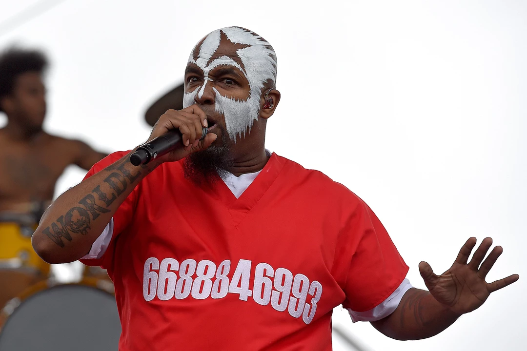
Stage photos show that the tattoos remain visible when the rest of Tech’s look is loud. In one image, white face paint and a red jersey draw the eye to his head and torso, yet the dark forearm words still show against the clothing and lights.

Contrast helps a tattoo hold its shape next to clothes, jewellery and movement. Tech’s forearm letters are large, with thick strokes, so they don’t disappear when the whole frame is busy. Their design suits a performer who rarely stands still onstage.

The face paint is temporary, while the ink underneath stays the same from show to show. Changing makeup can shift the mood; clear tattoo shapes give the look a steady base.

If you want a tattoo to read well in photos or under stage lights, check it in more than one setting. Try daylight and low light, and look at it beside the clothes or accessories you usually wear. Tech’s high-contrast lettering stays visible even when colour and movement fill the frame.

Tech N9ne arm ink mixes faith, memory and movement

Tech N9ne tattoos: large concert portrait showing the raised tattooed forearm and face-visible performance look

In another performance portrait, Tech N9ne raises one tattooed forearm. The pose is casual, but the ink still looks deliberate. His collection brings together religious references, personal memories and language tied to his career without forcing every piece into one style.

The larger words are the first things you notice. Smaller marks and shaded details sit around them, rather than asking for the same attention. That order helps a heavily tattooed arm read as a collection instead of a blur.

Tech has also used ink to mark 3-23-05, a date connected to the van crash he survived. The inscription is small beside the angel-wing imagery, but it carries a specific memory without needing a large portrait or an elaborate frame.

Faith, memory and performance recur in the collection. Tech has spoken about those ideas, and the placements keep them visible while he works onstage. The strongest tattoos let the design and the body’s movement support each other.

If you’re drawing on that approach, begin with words you expect to stand by for years. Pick a spot where the lettering can move naturally, then leave room for any surrounding designs. It’s easier to add symbols later than to make a crowded area feel calm. Keep the main words clear and build around them only when there’s a reason.

Tech N9ne’s tattoos are bold and tied to parts of his life. WORLDLY and ANGEL give the forearms their signature contrast; LIBERATE ME turns both arms into one message, while SACRIFICE anchors the chest. The angel imagery and date add quieter details without crowding the larger words.

You don’t need to borrow his exact phrases. Choose words that matter to you, place them where they move well with your body, and give the lettering room to stay clear. A tattoo can make a strong impression without becoming hard to read.

Here is Tech N9ne’s official “RDV” video from Strange Music:

More musician tattoo guides

Nipsey Hussle Tattoos: Face, Neck, Chest and TMC Ink

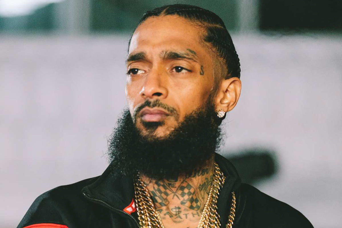
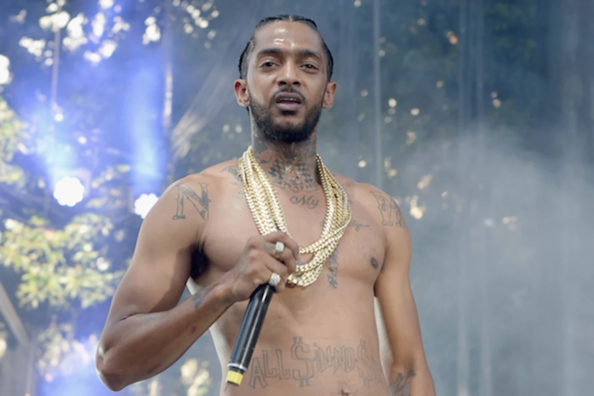
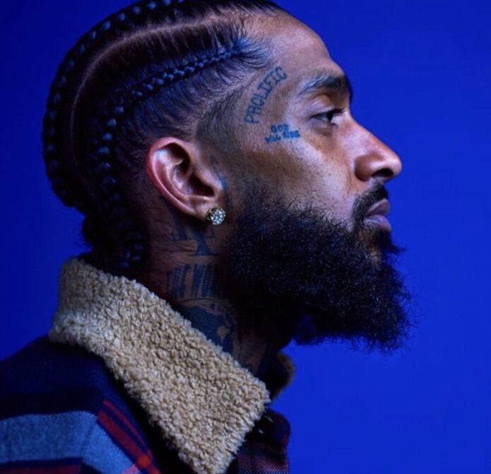
Nipsey Hussle’s tattoos cover his face, neck, chest, stomach and arms. In some photos you can pick out the lettering; in others, the darker shapes and patches of open skin show how the pieces sit together when he moves or wears an open jacket. The ink reads as a collection built across his body, not a few isolated marks.

Nipsey Hussle tattoos combine black-and-grey shading, visible lettering and a streetwear edge. There isn’t one matching sleeve or single subject tying everything together. Instead, words, symbols and larger shaded areas grew around one another. Placement is a big part of the effect: each new piece has to work beside what is already there.

Nipsey spoke about the ideas behind several of his tattoos, including the face lettering, checkerboard-style neck work and designs connected to his name and business. You don’t need to copy those symbols to learn from the layout. Start with a few ideas that matter to you, then give the design room to grow.

Nipsey Hussle’s face tattoos make the message immediate

Nipsey Hussle tattoos: face tattoo placement and lettering

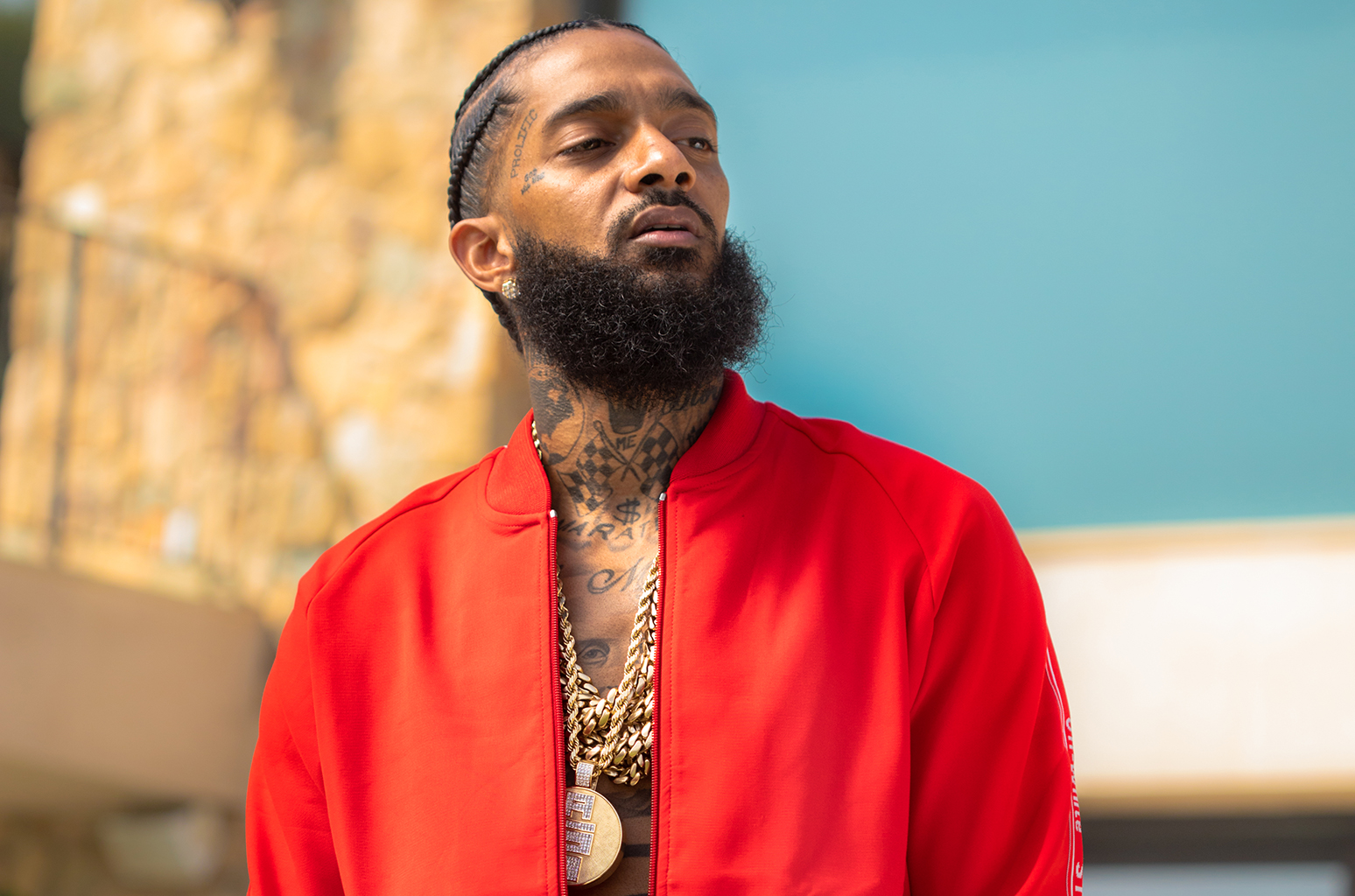
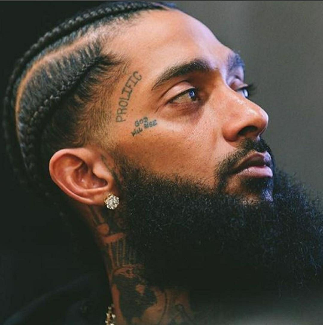
The face tattoos are the first marks most people notice. Vertical PROLIFIC lettering follows the side of Nipsey’s temple, while smaller writing sits beneath his eye. The long word draws a line down the forehead; the compact mark adds detail without covering the whole face.

The two sizes keep the area from feeling crowded. One tattoo gives the eye a direction, and the other stays close to the natural lines of his face. Visible placement makes even a short word hard to miss when it’s set in the right spot.

Face tattoos need careful thought because there is no easy way to cover a line that doesn’t work. If you like the look, settle on the reason first, then choose the words and position. Nipsey’s photos show how leaving space between separate marks can help each remain clear.

The neck tattoos connect the face to the chest

Nipsey Hussle tattoos: checkerboard neck and upper chest connection

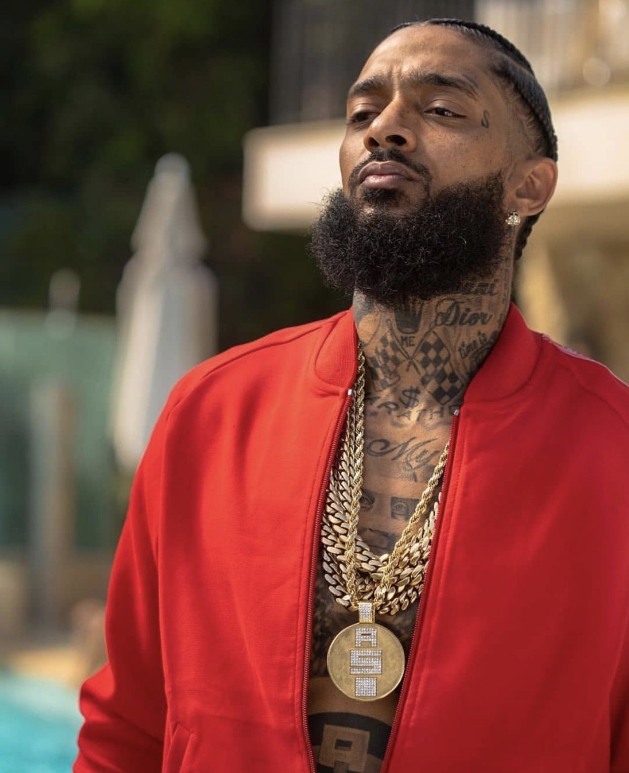
Nipsey’s neck tattoos link the face to the chest. Lettering, dark checkerboard shapes and curved lines move up from the upper chest toward the jaw. From the side, they form a dark panel; from the front, the words and symbols reveal themselves in layers.

The neck turns constantly and offers little flat space. Nipsey’s work follows its curve instead of forcing every line into a straight strip. Heavier sections sit beside lighter lettering, giving the words contrast without turning the whole area into a solid block.

If you’re considering neck ink, look at the design from the front, side and three-quarter angle. Check it with your head tilted as well as facing forward. The tattoo should follow the shape of the neck, not only look balanced in a straight-on photo.

His chest and stomach tattoos carry the biggest ideas

Nipsey Hussle tattoos: chest and stomach tattoo scale

The chest and stomach carry the largest pieces. In shirtless photos, ink spreads across the pectorals and down the centre of the torso, mixing large lettering with heavier dark shapes. The big marks read from a distance, while finer details become clearer up close.

The chest gives those words and symbols enough width to breathe. Lettering lower on the stomach draws the eye down and links the upper chest to the rest of the body. The change in direction keeps the torso from reading as one flat band of ink.

When planning a chest piece, decide where its centre should sit. A design can balance across both sides without matching exactly, and leaving a few small areas of skin open can keep the body visible beneath the work. In Nipsey’s photos, larger marks set the pace; smaller script and shading fill in around them.

Stomach skin moves as you bend, sit and turn, and it changes over time. Narrow lettering needs enough width to remain readable. If you want a phrase, ask the artist to check the stencil against the curve of your body before the appointment. It should still read in a natural posture.

Shoulder and arm tattoos keep the collection moving

Nipsey Hussle tattoos: torso tattoos as seen through clothing

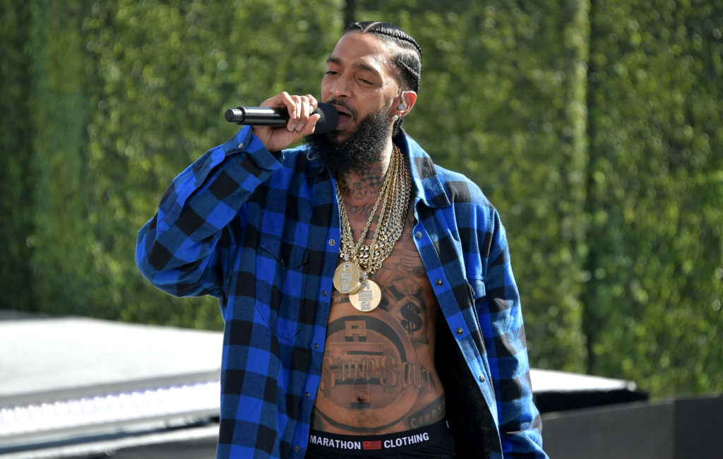
The shoulder and arm tattoos widen the outline of Nipsey’s torso. The ink carries beyond the chest, onto the shoulders and down the arms. In a vest or open shirt, those pieces soften the edge between the central chest work and the less-covered skin around it.

Performance photos show the tattoos while Nipsey is moving, rather than in a still studio pose. As his plaid shirt opens and shifts, different parts of the chest, stomach and upper arms come into view. The changing view is a reminder to consider how tattoos sit with the clothes you wear.

Decide what role you want a shoulder tattoo to play: a cap over the joint, a bridge between two areas, or the start of a sleeve. Each calls for a different layout. Thinking about the next section before filling the current one can prevent awkward gaps later.

The TMC and Marathon tattoos give the body a centre

Nipsey Hussle tattoos: TMC and Marathon tattoo references

The TMC and Marathon references tie Nipsey’s tattoos to the community and business he built around himself. They sit among the chest and neck work as reminders of place and belonging, rather than reading as decoration added at random.

The useful idea is how those words and symbols give a collection a centre. Several tattoos can relate to one story without using identical lettering or subjects. A word, an emblem and a larger image can sit together if they share a similar weight, mood or direction.

If you already have several ideas, choose the piece that explains the others. Then decide whether supporting tattoos can echo one of its shapes or styles. Nipsey’s neck and torso show how repeating visual cues can make different designs feel deliberate without turning them into a matching set.

Some ideas can stay private. A meaningful tattoo doesn’t have to be placed on the face or neck to count. The chest, ribs or upper arm can keep a design close and let you cover it when you choose. How visible the tattoo is doesn’t measure how much it means.

How Nipsey’s tattoo placement changes with clothing

Nipsey Hussle tattoos: tattoo placement with an open jacket

Clothing changes which parts of Nipsey’s collection you see. A shirtless photo shows the chest and stomach together; an open red jacket draws attention to the face, neck and upper chest. In performance shots, his shirt frames parts of his torso while the arms show more as he moves.

That range makes the ink feel lived in. The lettering still reads when a shirt covers part of it, and the larger shapes stay recognisable when the body turns. If you’re planning visible tattoos, think about the clothes you actually wear and where the ink will show around a collar or sleeve.

The collection is bold without filling every patch of skin. The face is an immediate focal point, the neck carries the line down, and the chest and stomach hold the largest pieces. Smaller marks on the arms support that path instead of competing with it.

To build a similar flow, start with one placement that matters to you and leave room for later choices. Use shading for weight, script for direction and open skin where the design needs a pause. The aim is a personal map, not a costume.

Nipsey Hussle’s tattoos carry a strong sense of identity and follow the shape of his body. The face marks make a direct first impression, the neck work links them to the torso, and the chest, stomach and arms give the collection room to develop. The result feels connected without making every piece the same.

Nipsey Hussle discusses his work, ideas and creative life in the video below.

More musician tattoo guides

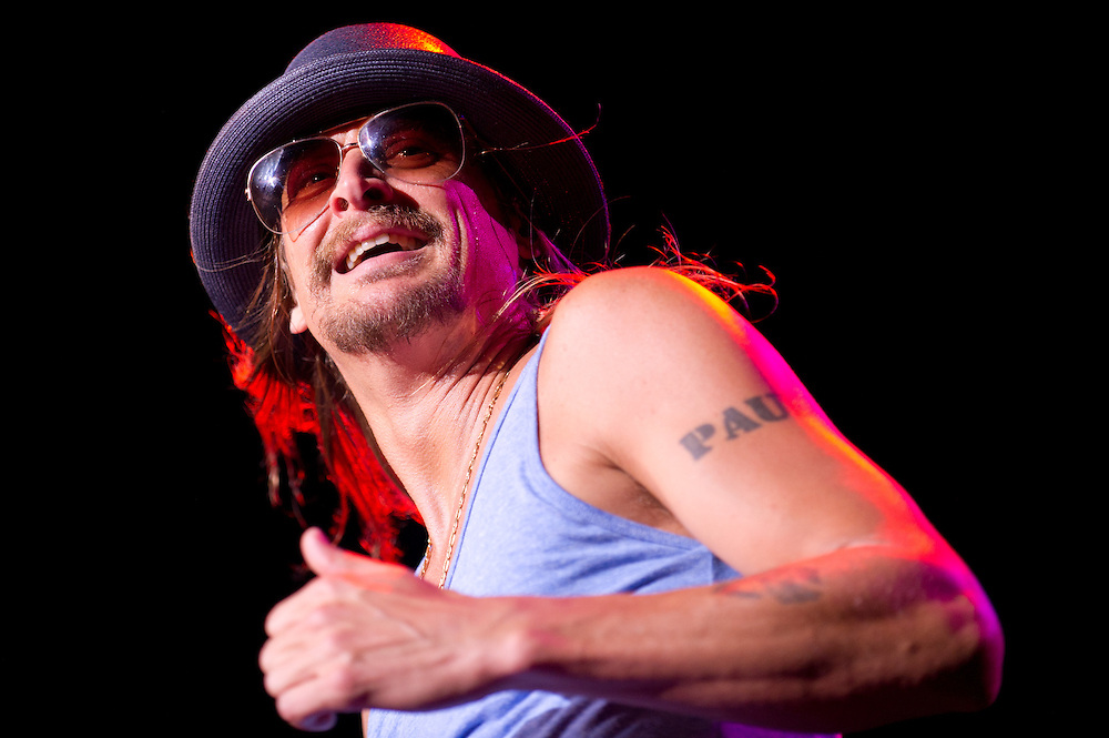
Kid Rock Tattoos: PAUL Lettering, Forearms and Rock Ink

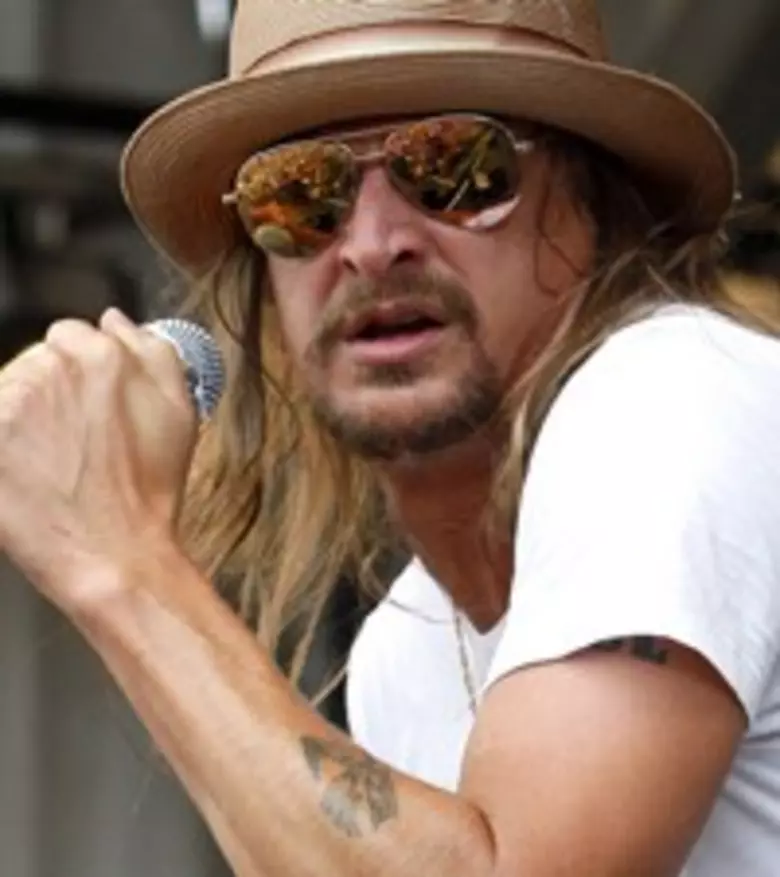
Kid Rock’s tattoos suit the rough edge of his music. The most familiar piece sits high on his arm, while photos also show ink over both forearms and across his upper back. Bold lettering, classic rock imagery and larger dark shapes keep the collection readable under stage lights.

Kid Rock tattoos are a useful reference if you like old-school placements with a biker or outlaw feel. His ink isn’t a matching sleeve. Some pieces show from across a room; others appear only when he is shirtless or leaning into a microphone. Together they look worn in, rather than arranged for a single photo.

The useful lesson is to plan for the body and the way you live. A strong word on the upper arm can lead the eye, while denser forearm work adds detail. Kid Rock’s photos also show how the same ink can change in daylight, coloured concert light or under a shirt.

Kid Rock’s upper-arm lettering is the clearest starting point

Kid Rock tattoos: upper-arm lettering

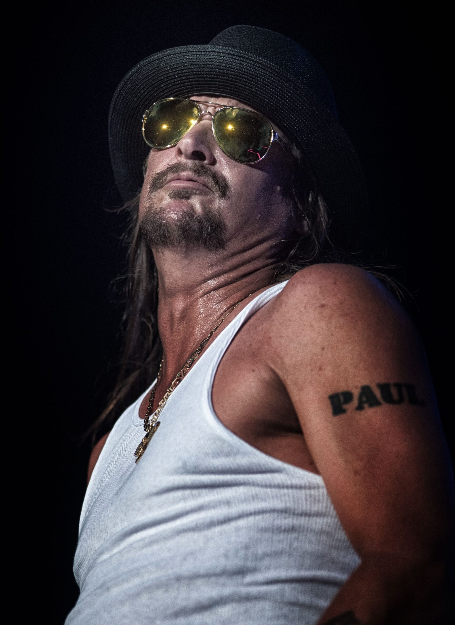
The word PAUL on Kid Rock’s upper arm is one of the easiest tattoos to recognise. Its dark block letters have enough space between them to stay readable as the arm turns. The design is plain, but its shape holds up in a quick performance shot and from farther away.

The placement helps. The word sits on the outer upper arm, framed by the shoulder above and bicep below. A tank top leaves it visible, while a short sleeve can cover it. That lets a prominent tattoo show when he wants it to.

If you’re choosing a name or phrase, settle on the words before choosing a font. Test the stencil around the arm, not just on a flat screen. When the message matters, clear lettering can do more than decoration.

His shirtless stage photos show his tattoo scale

Kid Rock tattoos: shirtless stage tattoo coverage

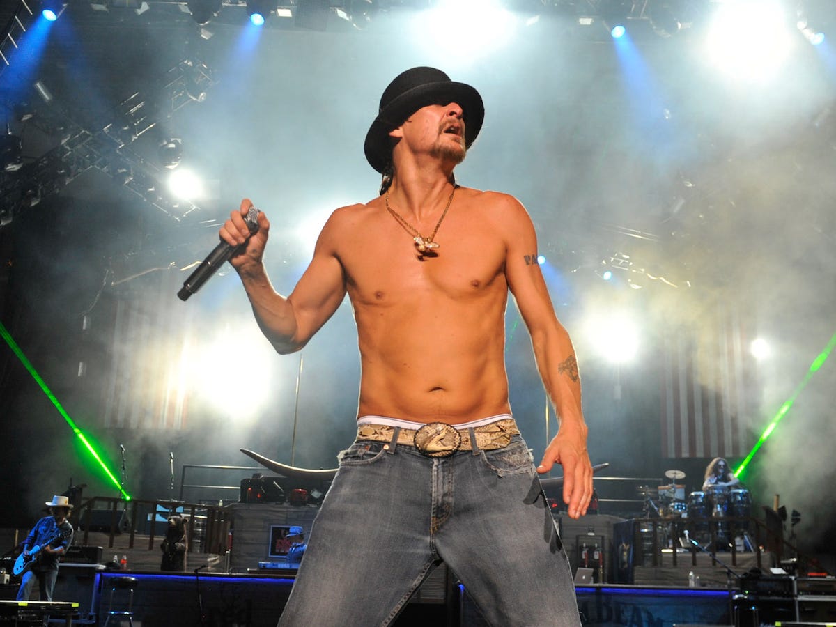
When Kid Rock performs shirtless, the upper-arm word appears alongside smaller tattoos on both forearms. The pieces vary in size and colour, but dark outlines and familiar rock imagery give the eye a steady path. The larger lettering catches you first; the forearms reward a closer look.

Stage photos show the ink in motion. Bright lights can flatten details, while smoke and shadow make them look heavier. The main shapes remain visible, and the smaller pieces become texture without vanishing completely.

Plan for ordinary settings as well as a perfect studio photo. Think about how the tattoo looks with your usual clothes, indoors and from the side. A small forearm piece can be enough if it sits where the arm naturally turns toward people; a full sleeve isn’t required for a collection to feel intentional.

The spacing is part of the effect. The PAUL lettering has room around it, and the forearm designs don’t crowd the centre of the chest. A little open skin keeps each major piece distinct. If you’re adding several tattoos, leave space around the largest ones so their outlines remain clear.

The PAUL tattoo follows the shape of the upper arm

Kid Rock tattoos: upper-arm placement

A side-stage photo shows how the PAUL lettering follows the upper arm. It sits on the rounded section rather than too close to the shoulder joint. The thick characters hold their shape, with open skin around the word keeping the area from feeling cramped.

That breathing room can matter as the ink ages. Closely packed outlines may merge, while a simple design with a clear edge can keep reading when the arm bends or turns away. Here, the word has its own space.

Bring photos of your arm in different positions when planning a similar placement. A word that looks centred at rest may shift when you lift your arm. The artist can adjust its baseline to follow the muscle without making the lettering look crooked.

Different angles reveal the same tattoo in new ways

Kid Rock tattoos: tattoo visibility from a second angle

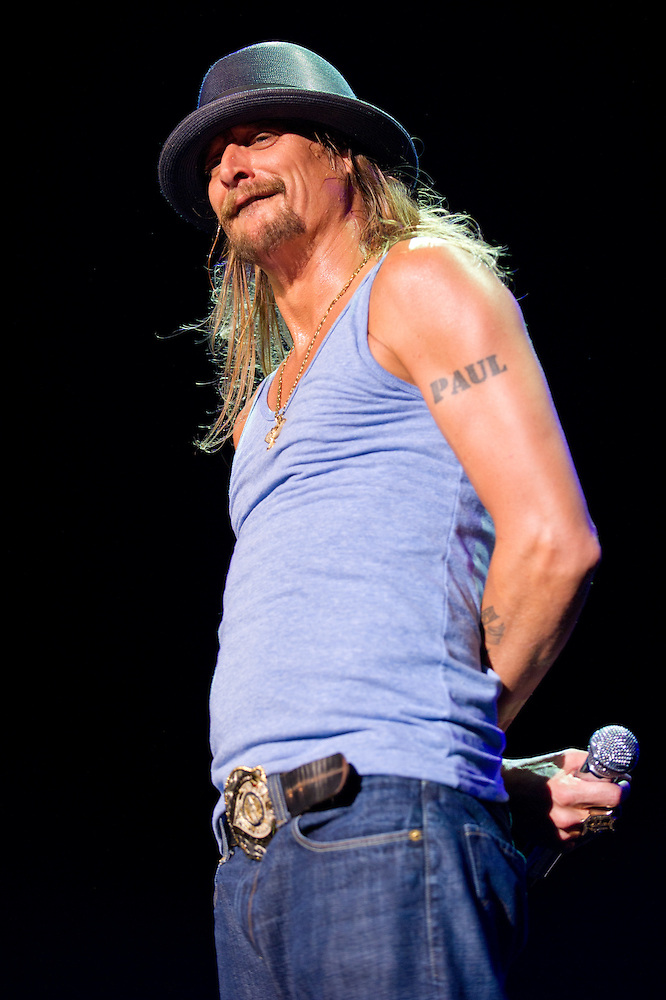
The same upper-arm tattoo looks different when the lights and camera angle change. Red and blue stage light soften the black letters at the edges, and the bent elbow brings the forearm into view. It is a good reason to judge placement while the body is moving, not only in a mirror.

The smaller forearm ink adds another layer when the arm is raised, but it doesn’t compete with PAUL. That hierarchy helps the collection feel calm: one tattoo leads, another supports, and the rest can stay quieter.

If you already have a large word or symbol, resist filling every gap straight away. Later you may find a small flash piece, a little colour or a fine-line mark that works as a bridge. Good spacing leaves future tattoos room to breathe.

His forearm tattoos carry more detail than the big lettering

Kid Rock tattoos: forearm tattoo detail

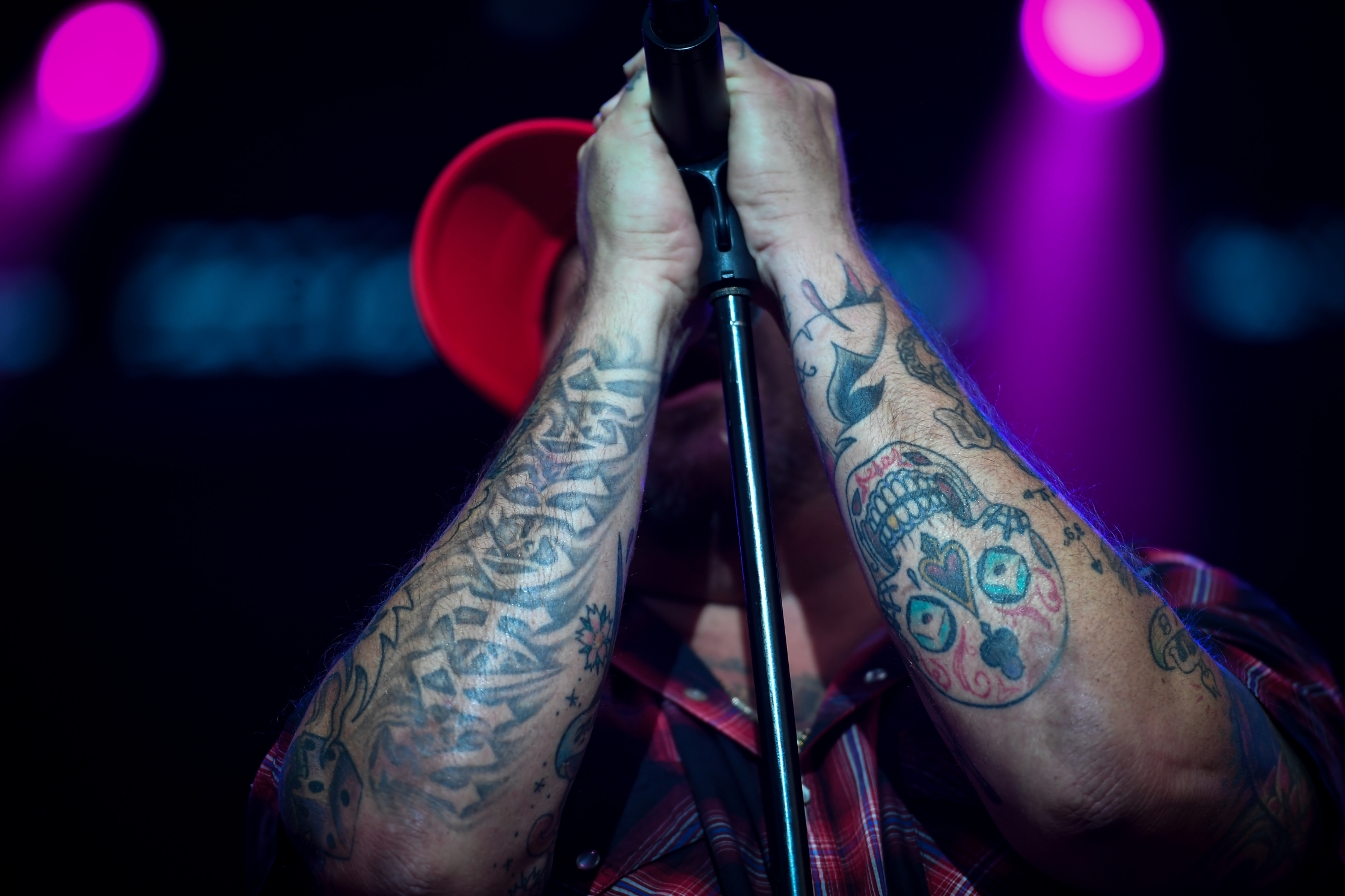
A close view of Kid Rock’s forearms shows the collection at its busiest: shaded faces, stars, symbols and touches of colour sit among larger shapes. From a distance it reads as a dark sleeve; up close, the separate edges and details become easier to see.

A forearm has limited room, so each new tattoo has to work beside the pieces already there. Contrast helps: solid black next to open skin, colour beside grey shading, and small marks beside a larger focal shape. Those changes stop the arm from becoming one flat patch.

Before booking several sessions, sketch the whole arm. Mark what should stay open, choose the piece that needs to show from the outside, and check how the work will meet near the wrist and elbow. A full collection can still read clearly when you choose the main shapes first.

How to build a Kid Rock-inspired tattoo collection

Kid Rock tattoos: tattoo placement with clothing

A closer performance portrait shows how Kid Rock’s arm ink appears with most of his body covered. The tattoos come into view as he holds a microphone or moves his arm; they don’t depend on a shirtless photo to make an impression.

If you wear shirts or jackets most of the time, choose a spot that suits that routine. An upper arm is easy to cover, a forearm is more direct, and a shoulder can become the start of a larger piece. You can borrow the attitude without copying the words or symbols.

A few repeated choices can tie different tattoos together. You might use thick black outlines, traditional shading, a limited palette or lettering with personal weight. The pieces don’t need to match; they just need enough shared structure to feel like your collection.

There is no need to plan the whole arm in one go. Start with the placement you care about most, let it settle, then decide what belongs beside it. A slower approach lets you see how the lines, colour and spacing work on your skin before you add more.

Kid Rock’s tattoos are clear and visible, with enough roughness to suit his style. The upper-arm lettering gives the collection a focal point, the forearms add detail, and the photos show how the ink shifts with movement and light. A good place to start is a location that fits your life and leaves each design room to read.

Kid Rock talks about his music, life and career in the interview below.

More musician tattoo guides

Meek Mill Tattoos: Chest Symbols, Sleeves and Meaning

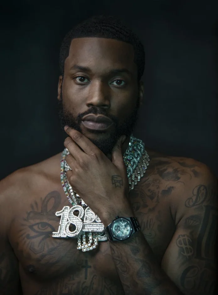
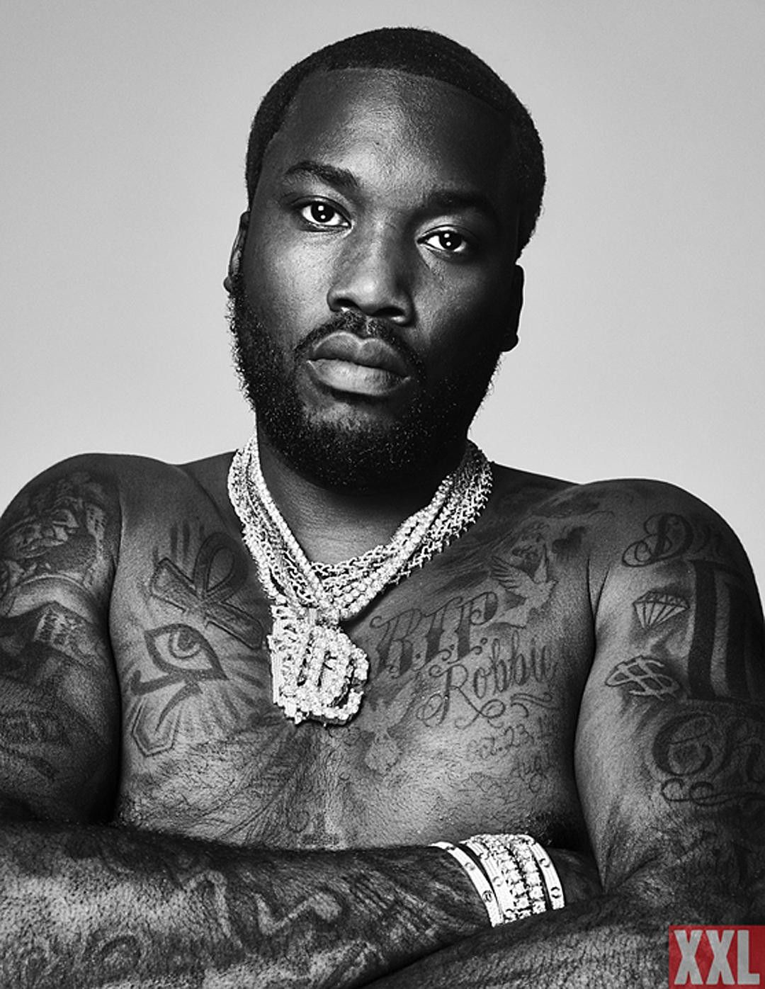
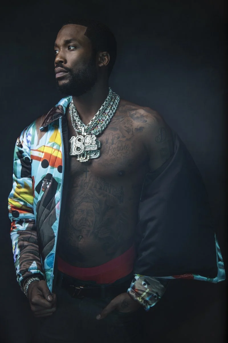
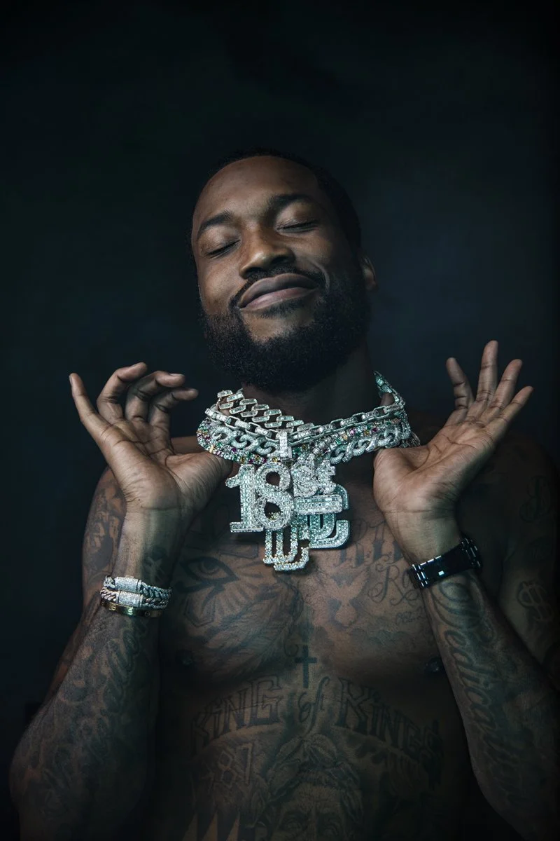
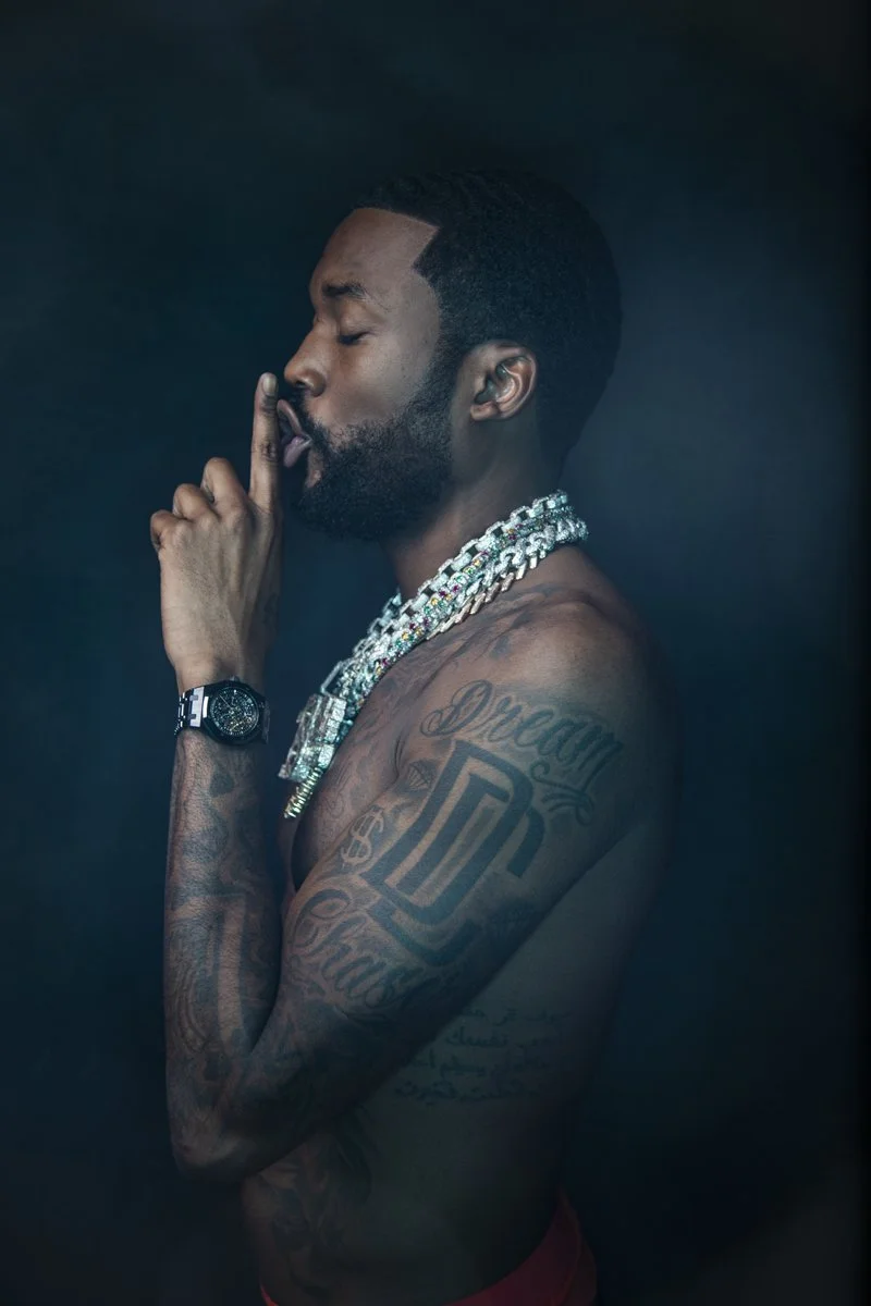
Meek Mill’s tattoos cover his chest and arms, with smaller marks on his hands and forearms. Religious symbols sit beside memorial lettering, money signs, and music references. The collection has grown piece by piece.

The larger chest tattoos anchor Meek Mill’s collection; his arms carry more of the detail. A crown on his hand and words on his forearms add smaller accents. You can study the full layout or one placement at a time.

The photos show the tattoos from different angles. Lighting can soften a chest design, and an arm sleeve can look like one dark patch until he turns. Here are the most visible pieces.

The eye of Horus and ankh anchor Meek Mill’s chest tattoos

Meek Mill tattoos: shirtless chest view showing the Eye of Horus, ankh and upper-arm tattoos

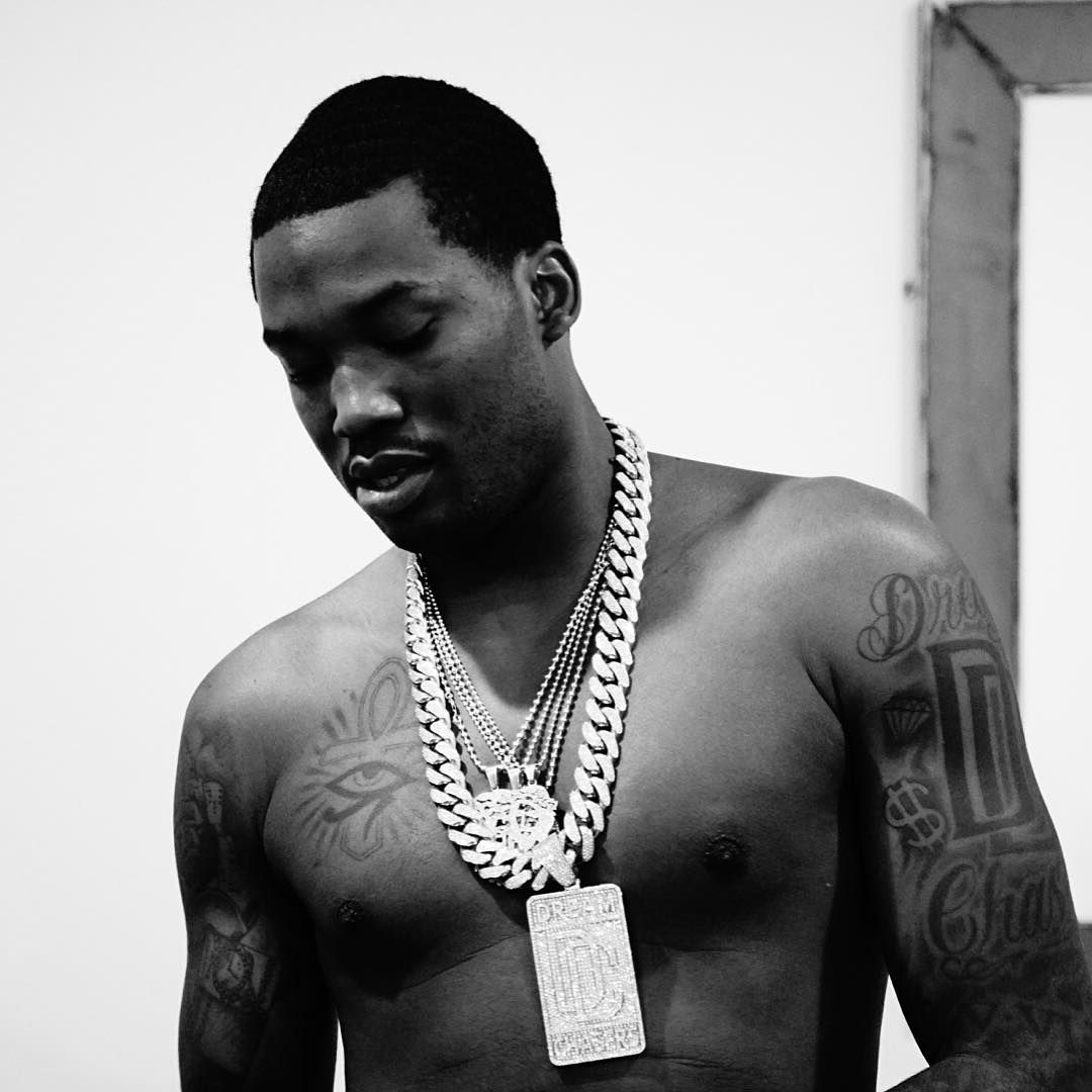
The Eye of Horus and ankh are two of the first designs visible on Meek’s chest. Both sit on the right side. The eye is more compact; the ankh adds a longer vertical shape.

The ankh is commonly associated with life, and the Eye of Horus with protection, health, and sight. Those familiar readings sit beside other religious and personal designs in Meek’s collection. The symbols are large enough to show when his shirt is open.

The symbols have solid shapes; the lettering around them uses thinner lines. That contrast helps a large chest piece stay readable. Using the same heavy outline everywhere could make the designs run together.

If you’re planning a similar chest tattoo, settle on the main symbol first and leave space around it. Lighter shading or short lettering can connect it to the shoulders without filling the whole chest.

The Rip Robbie tribute gives his chest ink a personal center

Meek Mill tattoos: shirtless portrait showing the memorial chest lettering and both tattooed arms

On the left side of Meek’s chest, “RIP Robbie” appears with white doves and a date. The lettering is direct; the birds soften the memorial design.

The name sits near the heart, with the date and birds around it. The layout leaves the words room while completing the tribute.

A chest tattoo can be shown or covered, and the area allows for larger lettering. Open letters are easier to read over time than a name, date, and decoration crowded into a small space.

For a memorial, decide whether the name or image should stand out first. A date or birds can sit nearby without crowding the lettering.

Motivation and dedication run through the arm sleeve tattoos

Meek Mill tattoos: Haute Living portrait showing the arm sleeve, chest lettering and shoulder work

The words “Motivation” and “Dedication” are among the clearest forearm tattoos. They sit as a pair and follow the length of the arms.

The sleeves also include symbols, lettering, and shading. A music note sits near the wrist; other designs reach toward the elbow and shoulder. Similar line weight and dark shading tie the separate pieces together.

For a sleeve, start with one design that matters and add around it over time. Leaving space between early pieces gives you more options later for symbols, leaves, or shading.

Most of the sleeve uses dark outlines and grey shading. That shared finish connects different designs. If you want a similar look, settle on a shading style before choosing every symbol.

The crown, dollar sign and music symbols fill in the smaller pieces

Meek Mill tattoos: front portrait showing the forearms, wrist area and layered chest symbols

Smaller designs include a crown on Meek’s right hand, dollar signs on his hands or forearms, music notes, a camera, and a road sign. They show more clearly when he turns or raises his hands.

The crown has a clear outline and reads quickly. That simplicity suits the hand, where the skin moves and small details can soften faster than on the chest or upper arm.

Money signs and music notes connect to Meek’s work; the road sign and arrow add a more graphic shape. Small tattoos are easier to place when each has a purpose, such as adding a reference or filling a gap.

Before adding small pieces, consider the line weight and space around your existing tattoos. A fine-line mark can disappear beside heavy blackwork, while a large word can crowd a narrow gap.

King of Kings lettering ties the lower chest into the full collection

Meek Mill tattoos: side portrait showing the lower chest lettering and outer-arm tattoos

Large lettering including “KING OF KINGS” runs across Meek’s lower chest, below the symbols. The broad, dark words are easy to read in shirtless photos and give the upper-body work a lower edge.

The words spread across the chest rather than sitting in a narrow line. Spacing keeps them readable when the body moves, and balances the symbols above.

For a long phrase, check the lettering at its actual size and look at it while standing, sitting, and moving. The body can change how a line of text reads, especially when it wraps across the chest.

The chest combines religious symbols, a memorial, ambition, and music references. The shared black-and-grey style helps the different messages sit together.

Meek’s chest carries the largest symbols and lettering; his arms have more detail, and his hands add smaller marks. The “RIP Robbie” tattoo is a direct tribute to a real relationship.

You don’t need to copy the whole collection. Start with one design, give it room, and add pieces that support it. A sleeve can grow over time; there’s no need to fill every gap at once.
Meek Mill’s “1942 Flows” video shows the tattoos as part of his on-camera style:

More musician tattoo guides

Polo G Tattoos: Face Ink, Neck Work and Arm Tattoos

Polo G’s tattoos grew from a few early pieces into a mix of face ink, neck lettering, and arm work. Small marks near the eyes and forehead sit beside larger shaded designs.

Some pieces make a direct statement, like the script above his eyebrow; others are harder to read from a distance. Face tattoos stand out in close-ups, while short sleeves and performance photos reveal more of the arm work.

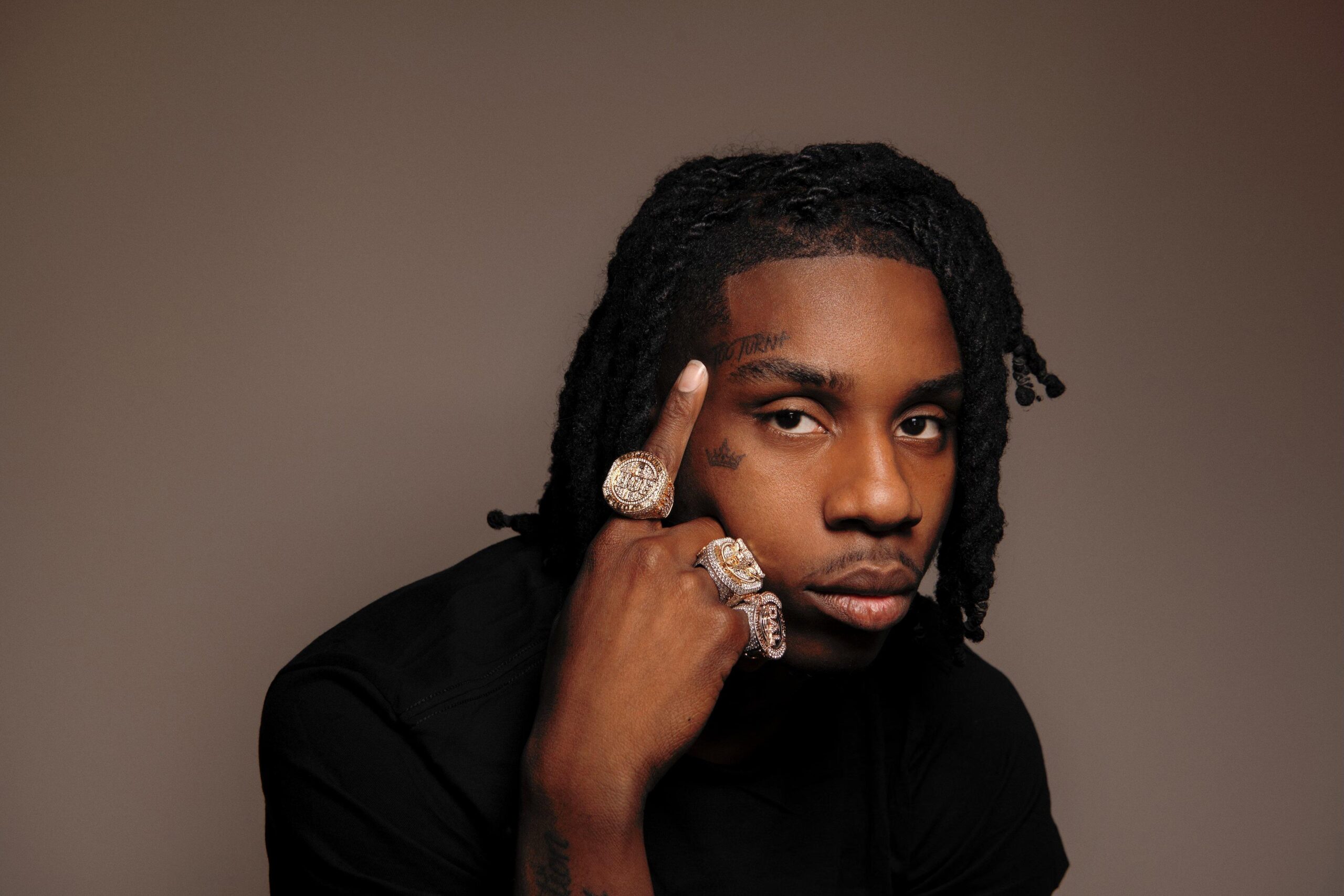
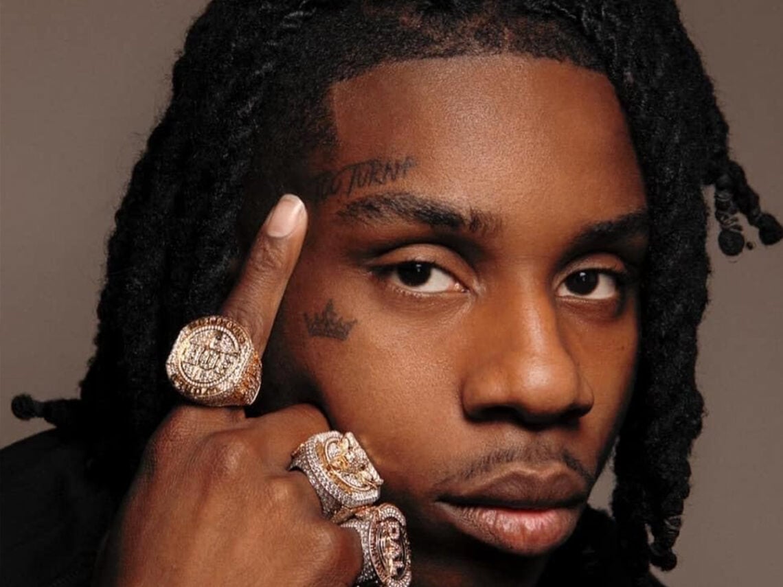
The most visible pieces include the TOO TURNT forehead tattoo, cheek crown, neck work, BLACK = INTIMIDATION FACTOR arm lettering, and larger sleeve designs.

The TOO TURNT forehead tattoo and cheek crown set the tone

Polo G showing his TOO TURNT forehead tattoo and cheek crown

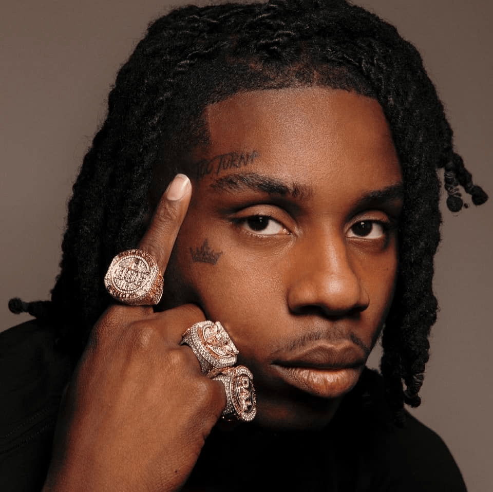
The script above Polo G’s eyebrow reads TOO TURNT; a small crown sits beneath his cheek. Both designs are compact, but easy to notice in portraits.

The forehead lettering is handwritten rather than set in block type. It sits beside the cheek crown, a simple outline. One is text, the other a symbol.

Face tattoos need careful sizing, especially near the eyes. Polo’s designs leave room for his expressions. Small marks can stand out without covering the whole area.

The forehead lettering and cheek crown read as separate tattoos, not one large face panel. If you like the placement, start with one small symbol or short word and leave room to decide later.

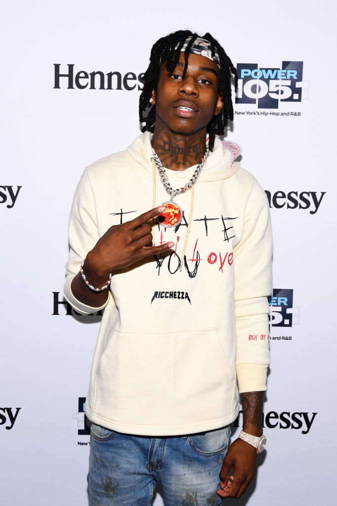
His neck tattoos give the portrait a strong centre line

Polo G showing his neck and shoulder tattoos in a close portrait

Close portraits with an open collar show the dark lettering across Polo G’s neck and other shapes toward the sides. The tattoos remain visible even when clothing covers most of his body.

The neck lettering adds ink below the smaller face pieces, carrying the design from the eyebrow and cheek down toward the shoulders.

Polo hasn’t publicly explained every neck mark. Photos show wide, dark lettering and a cross-like shape at the center, with shading around it.

Neck tattoos need to be planned with the face and shoulders. A design should still fit when the head turns.

The BLACK = INTIMIDATION FACTOR tattoo brings lettering down his arm

Polo G showing the tattooed arms connected to his statement ink

The black-and-red lettering on Polo’s right arm reads BLACK = INTIMIDATION FACTOR. He has said it was his first tattoo and linked it to the way Black people can be judged or feared before being known.

The arm gives the long phrase room. Its vertical layout and red-and-black contrast make it stand apart from the darker shading around it.

Long text needs clear lettering, space between lines, and a placement that won’t fold the words together. Polo’s design uses the length of the arm to keep the phrase readable.

Give a long phrase enough room to stay readable. The arm, ribs, or thigh can fit more text than a small wrist area.

His arm tattoos mix shaded work with smaller symbols

Polo G showing his face and shaded arm tattoos

Photos show shaded designs on both arms, from the upper arms to the wrists, with smaller marks between the heavier pieces. From a distance, they can look like one sleeve; closer views show separate designs.

Short sleeves reveal more of the upper arms; raised hands show the wrist and hand pieces. The tattoos follow the arm as it moves.

Open skin around the designs separates the darker areas and keeps the arms from reading as one solid block.

If you’re planning several arm tattoos, choose a main piece and place others around it over time. Spacing can make tattoos added years apart feel intentional.

The Juice WRLD tribute tattoo adds a personal layer

Polo G showing the large tattoo he got as a Juice WRLD tribute

Polo G has a large tribute tattoo connected to Juice WRLD, his friend and fellow Chicago rapper. Photos show it among the other designs in his collection.

A tribute can use a name, date, portrait, symbol, or private reference. Polo’s design is one part of a larger collection, not the only one that matters.

Photos show where a tribute sits and what it depicts, but not always why it was chosen. You can draw on the idea of a memorial without copying someone else’s design.

The face lettering, arm statement, neck work, and Juice WRLD tribute each serve a different purpose. Together, they make the collection specific to Polo G.

The face tattoos stand out in close-ups; the neck and arm pieces remain visible from farther away. Use the placement as inspiration, not a design to copy. Start with one area and leave room to add more later.

Key Glock Tattoos: Neck, Arms, Hands and Meanings

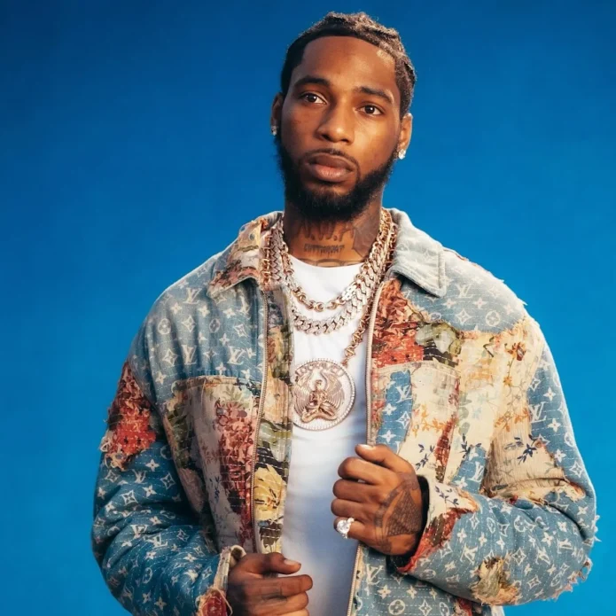
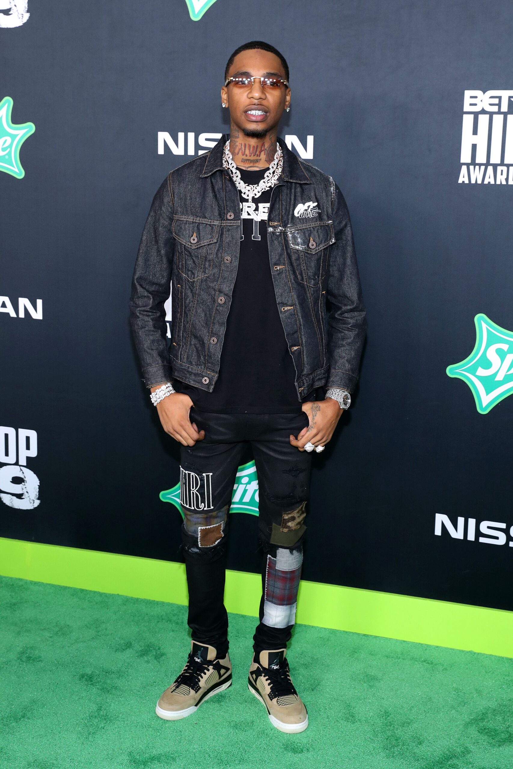
Key Glock’s neck lettering is the most visible part of his tattoo collection. Arm and hand designs add more detail, often shown beside chains and carefully styled clothes in portraits.

Key Glock’s tattoos vary in size and placement. The neck lettering is easy to see; the arm pieces are darker, and smaller hand marks show when he gestures or holds something.

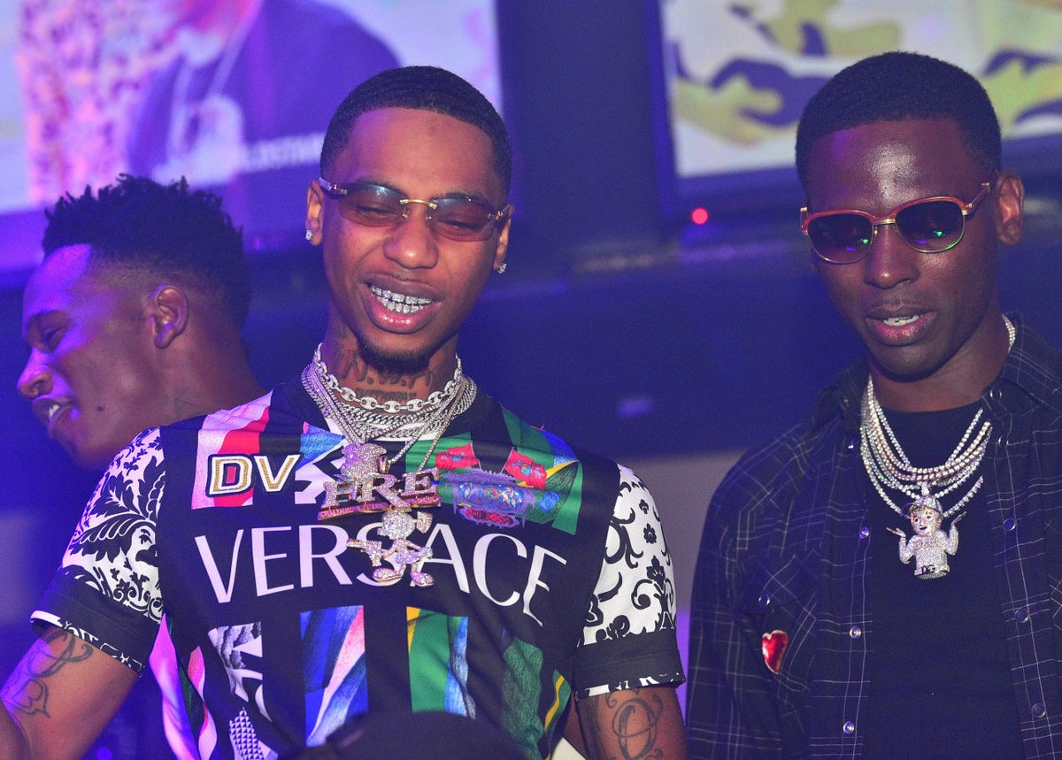
The tattoos appear in studio portraits, fashion shoots, and casual photos. Clothes, chains, and lighting change; the neck and arm placements remain visible.

The photos below show the tattoos from several angles: front portraits reveal the neck lettering, profiles show the jaw and arm, and wider images place the hand ink beside his styling.

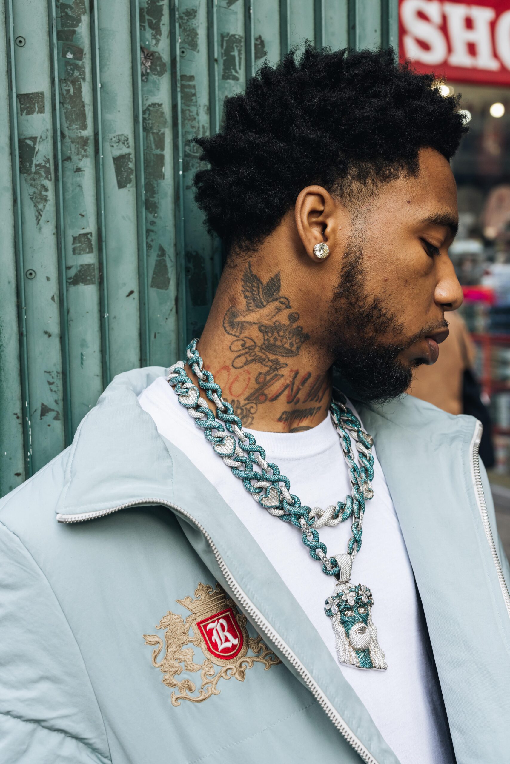
The neck tattoos give Key Glock’s portraits a strong outline

Key Glock tattoos: side neck lettering and shaded ink close-up

Lettering runs across the front of Key Glock’s neck, close to the jaw. It forms a dark line beneath his beard in front-facing photos and connects the head and shoulders in profile.

Photos show the neck tattoo as he looks straight ahead and turns his head. The skin shifts with each pose, changing how the lettering appears.

The lettering is large enough to remain visible beneath facial hair and chains. Bold lines outline it, while open space keeps the design from becoming a solid patch.

Use the jaw and collar as placement guides. Check whether you want the design to read straight on or from the side before choosing its size and lettering.

Check the stencil with your usual clothes. A high collar may hide part of the design; an open shirt may reveal all of it.

Small hand and wrist tattoos add movement

Key Glock tattoos: neck lettering and hand ink in a full-body portrait

Small tattoos on the hands and wrists show when Key Glock gestures, touches his face, or adjusts a chain. The placement makes them visible in ordinary poses.

Hand tattoos shift as the fingers spread or curl. Photos of a hand in use reveal more than a flat-palm shot.

The hand designs don’t need to repeat the neck lettering. They can differ in style and still sit comfortably beside the arm tattoos.

Test a hand design in the gesture you make most. If it only looks balanced with the hand flat, the artist may need to rotate it.

Hands are washed, rubbed, and exposed to sunlight, so fine details may soften. An artist can help choose a line weight and level of detail that suit the placement.

Key Glock tattoos lean into polished contrast

Key Glock tattoos: neck lettering and arm ink in a club portrait

Photos from the Glockaveli era pair dark tattoos with bright chains, clean styling, and controlled lighting. The simple backgrounds make the ink easier to see.

The tattoos aren’t delicate; the darker marks stand out against white clothes, polished jewelry, or a simple jacket.

Clothing and jewelry change how a tattoo reads. The same design can look different with workwear, gym clothes, or a suit.

Give the main tattoo room to stand out. A simple outfit can help a dense design show clearly; clothing or nearby pieces can add context to a smaller one.

Many photos use gold, black, white, and muted tones around the tattoos. Black-and-gray ink can stand out without bright color when the placement and lighting are considered.

Memphis identity tattoos show up in the details

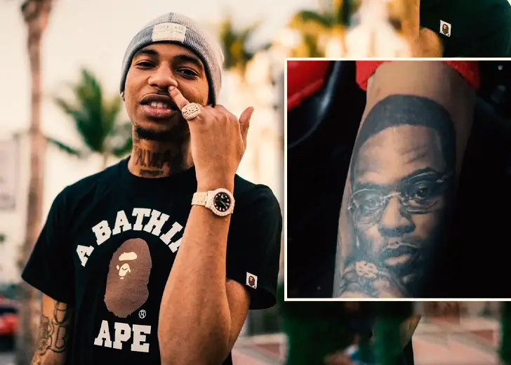
Key Glock tattoos: Young Dolph portrait tattoo on his forearm

The collection doesn’t center on one Memphis logo. The neck and arm work appear alongside jewelry and clothes that place the photos in his rap career.

A local reference can be a number, neighborhood, crew symbol, family initial, or image connected to home. The choice should mean something to the wearer.

A profile shows how the neck tattoo sits below the ear and follows the curve of the head. It also makes the lettering easier to distinguish from shading.

Choose the personal reference before the font or style. Then work with the artist to find a placement that fits the idea and how visible you want it to be.

You can take inspiration from a local identity without using someone else’s exact wording. Choose a symbol or phrase connected to your own life.

How to plan a Key Glock inspired tattoo layout

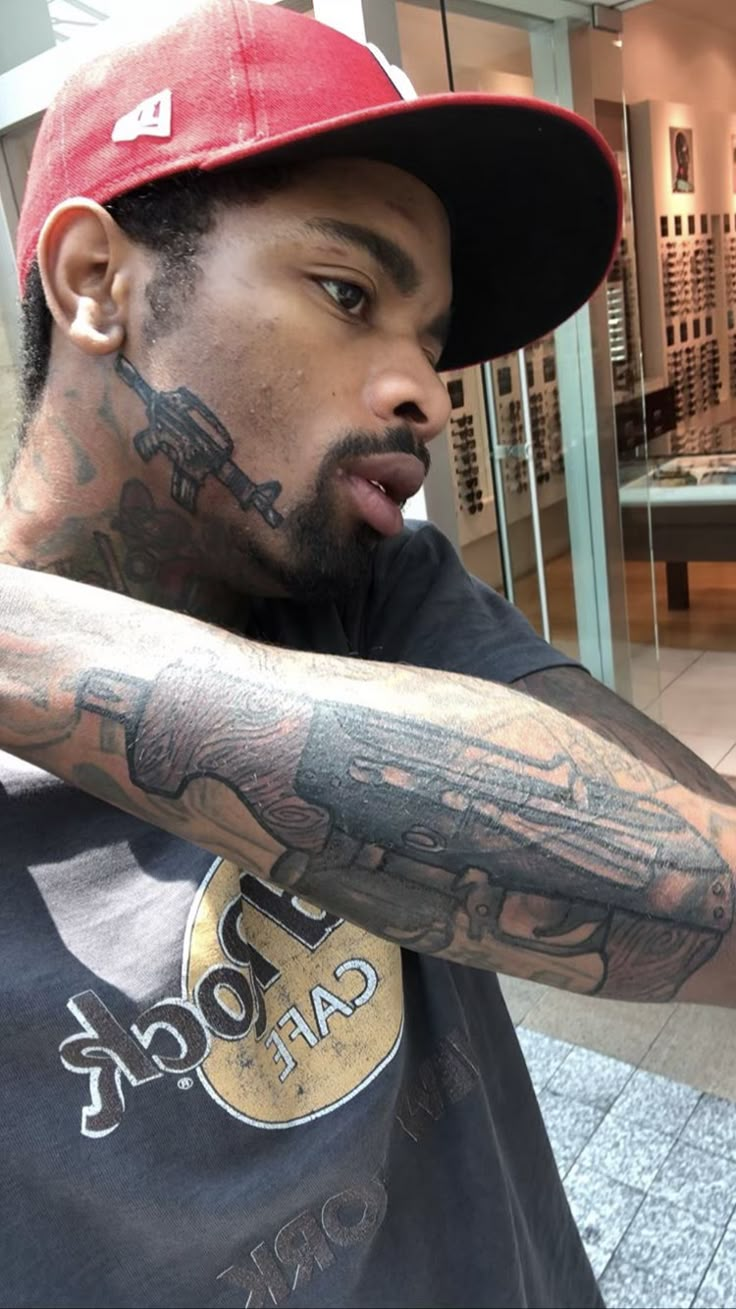
Key Glock tattoos: rifle design on the neck and dense forearm ink

For a similar layout, decide first which area matters and how visible you want the tattoo. Neck and hand pieces are hard to hide; arms are easier to cover, while chest designs are usually more private.

You don’t need the same amount of ink. One large tattoo can anchor smaller marks around it; a neck symbol can link the face and shoulder without filling all the skin.

Check a design close up and from farther away. Try different clothes and arm positions to see how it reads beyond the tattoo chair.

Leave open skin around the piece you want people to notice first. Space gives that design a frame and leaves room for future work.

Choose an artist experienced with the placement. Bring references, explain what you like, and ask them to adapt the design to your body.

The neck lettering shapes Key Glock’s profile, hand and wrist pieces add detail, and darker arm tattoos fill out the collection. His clothes and jewelry frame the ink in photos.
For inspiration, study the layout of Key Glock’s tattoos, then choose a placement and symbol that fit your own story.

The video below shows Key Glock performing and talking about his work:

Key Glock tattoos: front neck lettering beneath the beard

More musician tattoo guides