codex

Kendrick Lamar Tattoos: The Cover-Up, TDE Mark and Earlier Forearm Ink

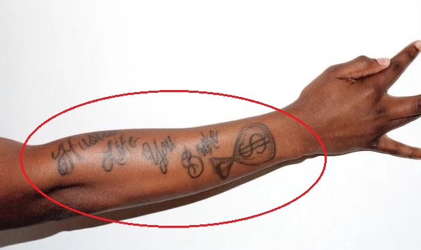
Timeline note: the widely photographed Hustle Like You Broke words were an earlier tattoo on Kendrick’s right forearm. Later photos show a dark abstract cover-up in that spot. The newer images below are included to avoid presenting the old lettering as his current design.

Kendrick Lamar does not have the kind of instantly readable body art that turns every photograph into a tattoo inventory. Much of his ink appears only in glimpses: a stage sleeve pushed back, a forearm exposed in an interview or an older photo before clothing covers it again. That makes accuracy more useful than padding the list with guesses. The strongest account comes from Kendrick, especially his explanation of the large forearm message. An early photo labelled as the TDE tattoo offers another reference. Other marks can be seen, but without support they should remain visual details rather than invented names or meanings.

This guide separates what Kendrick has explained from what photographs show and keeps dates in view. An image from 2012 does not prove every later photo shows the same arrangement, and a blurred stage shot cannot identify a tiny symbol. The result is a more dependable map centred on the pieces that can be linked to a source.

Hustle Like You Broke was an earlier forearm tattoo
Kendrick Lamar tattoos

The clearest tattoo in Kendrick Lamar’s public record was the large script along his right forearm: Hustle Like You Broke $. The phrase is not a fan’s reading of a photo. Kendrick identified it during a 2018 Vanity Fair conversation, after pulling up his sleeve to show the interviewer. He also explained its origin: Top Dawg, head of Top Dawg Entertainment and a central figure in his career, told him to keep working as if he had not escaped the need to hustle.

That context gives the lettering a practical meaning. Kendrick described it as a reminder not to get comfortable, not as a secret lyric or a tough-sounding decoration. The dollar sign gives the phrase the look of a compact slogan, but his explanation is about discipline rather than a promise of wealth. The point is to keep working. That is why the tattoo fits so closely with the way he talks about his work, where long hours and revision matter alongside public success.

The placement supports the message. The forearm shows when Kendrick performs, gestures or rolls up a sleeve, so the words do not require a shirtless photo to be seen. They run along the arm rather than sitting as one small word near the wrist. In available images, the script shares space with darker ink and smaller marks below it. Photos establish scale and location, but do not name every surrounding shape.

There is a difference between reading the tattoo and explaining all of it. The large letters make out the main phrase. Smaller symbols near the wrist are less certain and may disappear with changes in light, angle or arm position. The reliable description names the confirmed script and stays cautious about the rest. The message is documented; a complete list of nearby marks is not.

The phrase also reflects Kendrick’s relationship with Top Dawg Entertainment without turning the tattoo into a company logo. Top Dawg’s advice is part of the story, but carrying the words on his skin makes the reminder personal. It records a working outlook from before his biggest awards and after them. That is more grounded than calling it a generic ambition symbol. The source gives the speaker, wording and reason without requiring another layer of interpretation.

Later photos make the forearm look different depending on sleeves, framing and lighting. Black ink can merge in a low-resolution stage image, and a cuff or watch may cover part of the phrase. Readers comparing photos should look for the long line along the right forearm instead of expecting the same pose each time. Its direction and scale are more reliable clues than the shade of the surrounding skin or the amount of other ink in view.

This is the tattoo that most clearly connects Kendrick’s visible ink to his public work ethic. He has often talked about writing, studying and discarding work that does not meet his standards. The forearm message gives that attitude a physical place, near the hand that writes and gestures. Its documented explanation is enough; there is no need to attach a private biography to every word.

The TDE tattoo is a separate mark of Kendrick’s label world
Kendrick Lamar tattoos

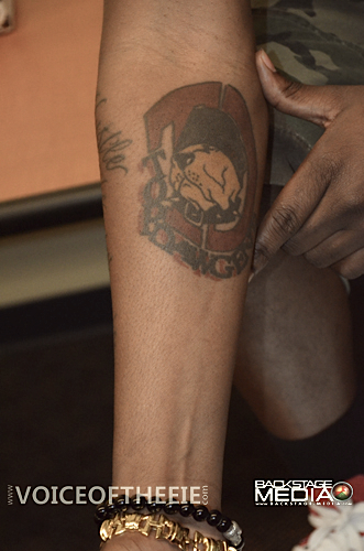
An older photo from a 2012 Kendrick Lamar event is labelled Kendrick TDE Tattoo. It shows a compact, dark design on his upper arm, with nearby skin and ink visible around it. TDE stands for Top Dawg Entertainment, the label and creative home that helped shape Kendrick’s rise alongside artists such as Jay Rock and Schoolboy Q. The caption and his career history make the connection clear, though the photo does not provide a first-person account of when he chose the mark or what it means to him privately.

That distinction matters because small emblems are easy to overread. The original caption supports identifying it as the TDE tattoo. It does not prove the design represents every label member, a particular album or a specific turning point unless Kendrick or the artist has said so. The careful description is that the mark shows his connection to the company and its people during the early part of his career.

The photo is useful because it shows how Kendrick’s tattoo record changes over time. The early TDE mark is compact and sits like a badge on the upper arm; the later forearm message is much larger and uses a full line of script. They do not form one planned sleeve. They show a collection built in stages, with some pieces tied to work and relationships and others recorded by the camera without a public explanation.

Location helps keep the two tattoos distinct. The TDE mark is higher on the arm; the Vanity Fair interview drew attention to the long phrase on the right forearm. A crowded photo can make the upper arm and forearm seem like one dark area, especially in short sleeves. Comparing the placements prevents separate designs from being mistaken for one.

TDE also reflects the fact that Kendrick’s public identity was built with other people. The label was not simply a logo attached after success; it supported early releases, tours and collaborations. Even without a detailed quote about this tattoo, its position makes sense as a visible sign of belonging. That interpretation recognises the relationship without claiming the photo reveals a private story.

Early images show other small marks around his arm, including dark lines and shapes that can look different at different angles. Some catalogues and fan pages give them names, but primary and editorial sources do not consistently confirm those details. A blurry shape is not automatically a symbol, and a visible symbol is not automatically a message. The photo names the TDE tattoo; the uncertain marks around it are best left as surrounding ink.

The word documented is useful here. Kendrick has more visible ink than the two main designs discussed, but not every mark has a reliable published label. That does not make the rest imaginary; it means each one needs a different level of confidence. A photo can prove ink is present without proving a design name, date or meaning. The TDE image is a concrete reference while leaving that limit clear.

What the photographs can and cannot identify

Kendrick’s tattoo history shows why an article should not turn every dark patch in a photo into a named design. The forearm lettering has a confirmed phrase and explanation. The TDE mark has a useful photo and clear label. Smaller marks are visible, but do not have enough consistent reporting for a confident inventory. Keeping those categories apart helps readers compare the placements and recognise tattoos in later photos.

The number of images should follow the evidence rather than a fixed quota. One close photo can show the forearm message better than several distant stage shots; another can establish the upper-arm TDE mark. A generic portrait would not add tattoo evidence. The featured photo is separate from the tattoo figures: it identifies Kendrick, while the body images show the ink.

His visible tattoos connect to work, loyalty and self-discipline, but the sources do not support turning them into a neat symbolic system. The right forearm has a phrase he explained; TDE points to the label family that helped build his career. The other marks remain a changing set of details that need sharper photos or direct comments before they can be named. That gives readers a useful guide without making the ink say more than Kendrick has said.

The abstract cover-up is the current visual landmark on the right forearm
Kendrick Lamar tattoos

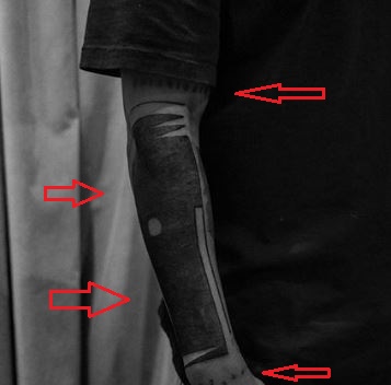
Later photos show a broad abstract black design across Kendrick’s right forearm. It is denser than the older lettering and changes the balance of the arm. Instead of a readable sentence, the newer work uses dark bands, shaded areas and lighter gaps that follow the bend from elbow to wrist. It can look like a solid sleeve in a recent photo, though a close view separates its sections.

Tattoo coverage describes the abstract work as a cover-up of the earlier phrase and money design. Kendrick has not publicly explained every curve in the newer tattoo, so the description should stay visual. Photos establish where it sits, how much space it covers and how the surface changed; they do not show that each dark shape represents an album, lyric or private event.

The change helps date photographs. If the forearm shows large script, the photo belongs to the earlier stage of Kendrick’s tattoo history. If it shows the dark abstract field, it is from the later stage. Clothing and light can blur the distinction, especially when the elbow is bent or a sleeve hides the top edge.

A cover-up remains part of the history after the older design is no longer visible. The first tattoo explains why Kendrick’s arm looked different in earlier interviews and performances; the newer work shows what viewers see now. Showing both as current would be wrong, but dropping the old design would lose the clearest personal meaning attached to that arm.

The bands and small marks need closer photographs than a stage shot
Kendrick Lamar tattoos

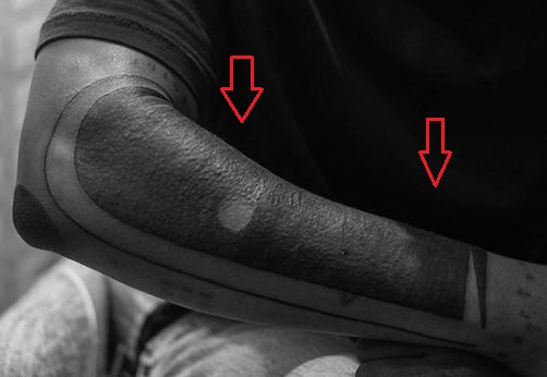
Close-ups of the newer work show smaller details around the dark central area: narrow bands, lettering-like marks near the edges and shapes near the wrist. The ink is visible, but independent sources do not name every element with confidence. It is safer to describe them as surrounding marks than to turn them into a list of invented symbols.

Image quality changes what a viewer can make out. A distant performance photo compresses the dark work into one patch; a close image separates the arm into planes and shows where one band ends. The forearm curves, too, so an inside mark may disappear when Kendrick turns his arm outward.

The most accurate wording stays close to the image: a dark abstract cover-up on the right forearm, with bands and smaller marks around it. The details have no confirmed meaning. That is more useful than assigning symbolism to every blurred line, especially when the tattoo itself has changed over time.
More musician tattoo guides

Rhea Ripley’s Tattoos Trace Her Rise From Evolution to WWE Stardom

Rhea Ripley’s tattoos are part of her wrestling identity, but they are more than stage decoration. Her collection includes a date tied to her career, horror references, mythic female figures, a scorpion, hand designs and large pieces on her legs. WWE’s tattoo photos and the WWE Tattooed video offer strong evidence because Ripley discusses her journey as the camera shows the work. Other reports add dates and newer tattoos, but the official material is the best foundation.

Her collection has grown alongside her public career. Early pieces connect with milestones and influences; later work covers more of her arms, thigh, torso and chest. That growth is why a quick list often misses details: an entrance photo may show one side, while an official gallery reveals the hand, leg and torso separately. This guide groups the designs around the images available.

The arm collection mixes daggers symbols and heavy black work

Rhea Ripley tattoos: Rhea Ripley dagger and arm tattoo collection

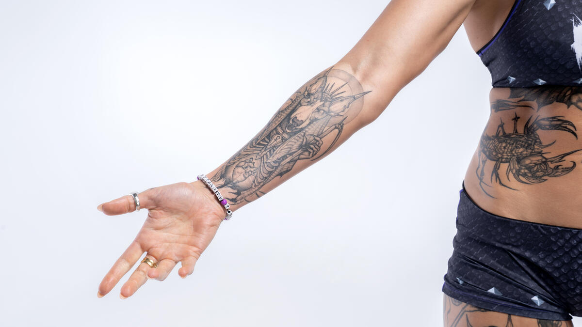
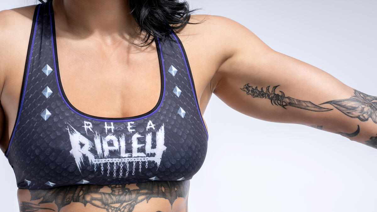
Ripley’s arms hold some of the most immediately recognisable parts of her collection. WWE photos show a stylised dagger on the forearm, surrounded by darker linework and smaller symbols. The designs do not all have a confirmed story, but their strong visual weight connects them. Black ink, sharp edges and compact shapes suit her forceful ring presentation without making the tattoos mere costume.

The dagger is a design that can be described without guessing at its meaning. Its outline is clear, its position is visible and its contrast holds up in a sports photo. A viewer may associate it with danger or strength, but that is not automatically Ripley’s personal reason. The blade and its placement on the forearm are already useful details.

Other marks make the arm feel as if it was built over time. Some sit close together, while open skin gives others room to stand apart. That spacing keeps the collection from reading as one solid black block. Close photos also show how jewellery, wrist movement and ring gear can change the tattoo’s appearance during a match.

Ripley’s arms are often the first part of her tattoo map viewers notice because wrestling gear leaves them exposed. That visibility can make it seem as if the arms are the whole collection, though the official gallery shows much more. The forearm work is important, but only one part of a record that also runs down the legs and across her torso.

The arm tattoos share a mood with Ripley’s horror-influenced pieces. Sharp lines and dark shading can make a symbol look ominous even when no source explains it. That is why visual description is more useful than saying every tattoo represents rebellion. The photos show the ink; Ripley’s interviews describe her broader interest in tattoos.

The scorpion is one of Ripley’s clearest standalone designs

Rhea Ripley tattoos: Rhea Ripley scorpion side tattoo

The scorpion on Ripley’s side is one of the easiest designs to isolate in official photos. Its segmented body, legs and pincers create a strong outline along the curve of her torso. Unlike a small mark among the arm work, it reads as a complete image and stays recognisable even at a glance.

A scorpion invites associations with danger, defence and survival, but those should not be presented as Ripley’s own explanation without a source. Visually, it fits the collection’s dark, precise and slightly threatening mood. The side placement changes how it appears: a front-facing ring photo may hide it, while a profile or dedicated tattoo image shows the whole design.

Tattoo placement also matters in a wrestling context. Ripley moves constantly, and the torso stretches as she poses or performs. The scorpion can look compressed in one photo and longer in another. A good guide compares angles instead of treating every difference as a new or altered tattoo.

Her body art is often discussed alongside her ring persona because both carry a dark, confrontational mood. That connection makes sense, but the person and performance should remain distinct. The scorpion is permanent ink, not only part of an entrance look; it can be seen in ordinary portraits and studio photos when the character presentation is toned down.

The hand and thigh work carries the collection into mythic imagery

Rhea Ripley tattoos: Rhea Ripley hand tattoo and three-faced woman thigh design

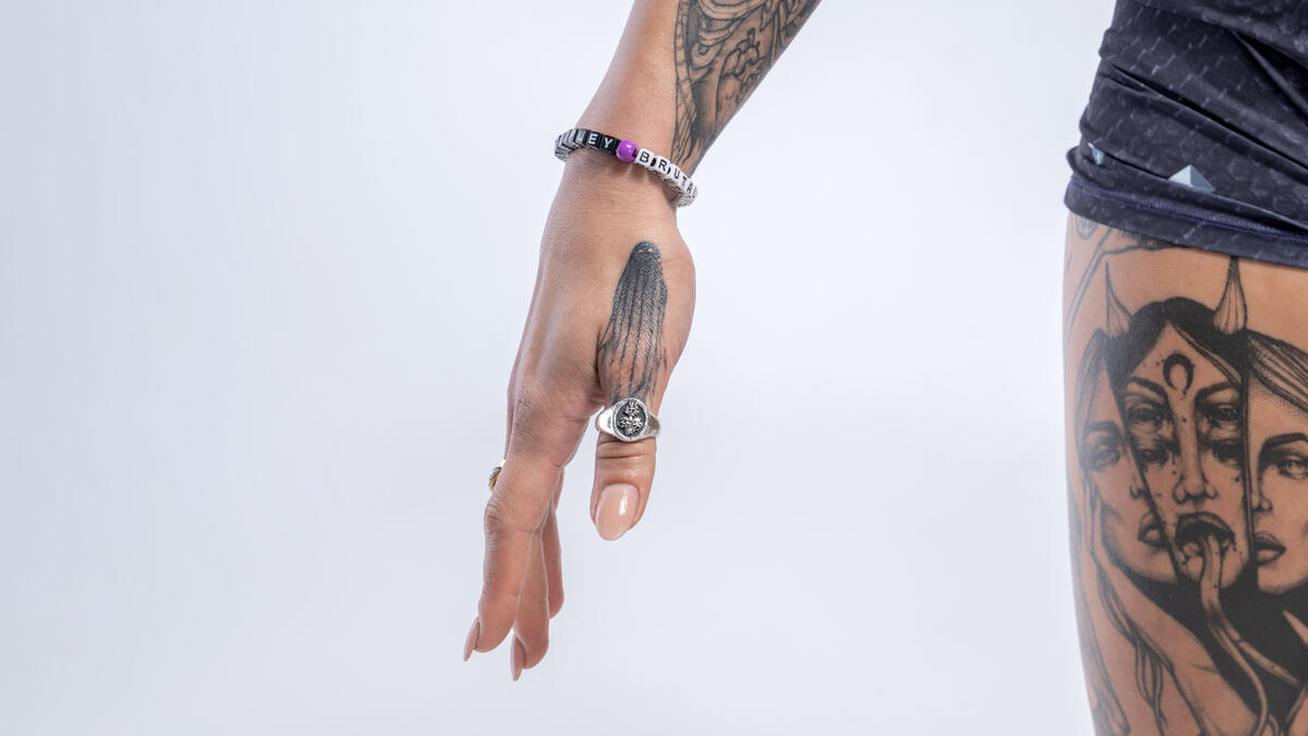
A WWE photo shows both the hand and thigh work. A linear tattoo sits on the back of Ripley’s hand near rings and bracelets, while the upper thigh carries a three-faced woman with flowing hair and a crescent moon. These designs broaden the collection beyond the dagger and scorpion. The hand and thigh deserve separate coverage rather than one general line about full-body ink.

The three-faced woman is a striking figure. Repeated faces, flowing hair and a crescent give it a mythic, night-time feel. The photo establishes the design and placement, but not whether it is a named goddess, a portrait or an original tattoo. Calling it a three-faced woman with a crescent is safer than choosing a name the source does not provide.

Hand tattoos have a different practical history: they are constantly exposed and show up in gestures, photos and stage images. Ripley’s hand design is smaller than the thigh piece but often more visible in everyday shots. Rings and bracelets can hide part of it, making a close official photo better evidence than a distant entrance image.

The thigh work is harder to see in regular WWE coverage because shorts and ring gear control what enters the frame. When a photo does show it, the larger scale is clear. A design spanning the upper leg cannot be understood from a cropped portrait from the waist up, which is why several images are useful for this guide.

Medusa and horror references give the tattoos their darker mood

Rhea Ripley tattoos: Rhea Ripley Medusa-inspired sleeve tattoo

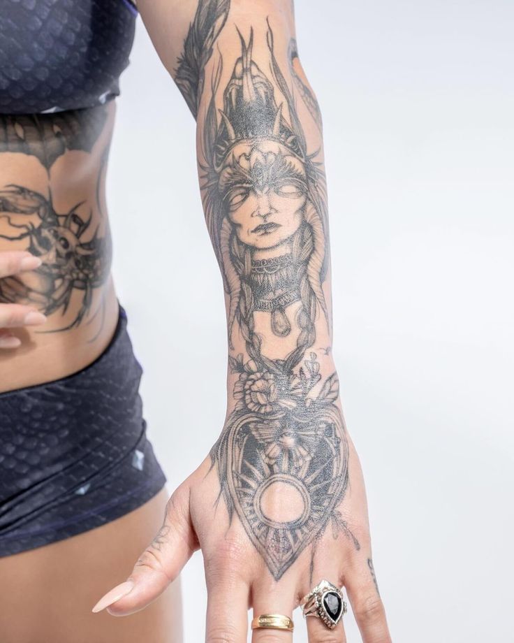
Medusa is one of the most recognisable ideas connected with Ripley’s tattoo collection. A close photo shows a female face framed by braided or snake-like hair, ornamental detail and floral elements continuing toward the hand. Fine lines, dot shading and surrounding shapes make it more than a simple emblem: the portrait is built into a larger sleeve.

The Medusa reference fits the horror vocabulary seen elsewhere in Ripley’s tattoos. WWE’s Halloween coverage has highlighted her Freddy Krueger glove and other spooky Superstar designs, while the wider collection includes grim and monstrous imagery. That supports horror as an important influence, but it does not make every dark tattoo a direct film reference. Each piece should remain distinct.

The sleeve is arranged around the body. The face draws the eye, while the hair and decorative marks fill the space around it. A sun-like detail near the hand shifts the design’s direction and connects it to the wrist instead of letting it stop abruptly at the forearm. Those details disappear when the collection is described only as “a sleeve.”

Ripley has said she loved tattoos from a young age, and both of her parents also have ink. That family background provides context, but it does not explain every later design. The tattoos can be personal, aesthetic and horror-influenced at the same time. The useful distinction is between the documented influence and meanings that remain private.

The date on her wrist is the clearest career milestone. Reports identify Roman numerals for 10.28, connecting the date to her 2012 Riot City Wrestling tryout and the 2018 WWE Evolution event. The small combination of numbers and letters turns career history into a tattoo, and the reported events give the date a specific context rather than a guess at symbolism.

That date shows why the collection is more than a mood board. Some designs keep milestones, others reflect horror interests, and some build a body map that suits Ripley’s taste. Newer work has appeared, including a large chest addition and a reported Italian phrase, so any guide needs a date rather than a final count. Photos show what is visible now; interviews and wrestling coverage explain the moments with the strongest evidence.

Rhea Ripley’s tattoos read as a growing archive of wrestling milestones, dark imagery and personal style. Her arms carry daggers and symbols, the scorpion stands on its own, and the hand and thigh pieces add mythic figures. Medusa and horror influences give the collection a recognisable mood, while 10.28 ties it to her career. That is a clearer guide than a generic list, with private meanings left private when Ripley has not shared them.

More athlete tattoo guides

Bad Bunny’s Tattoos Connect Puerto Rico, Music and Private Memories

Bad Bunny’s tattoos circle themes that appear in his music: Puerto Rico, memory, romance, playfulness and the space between public confidence and private feeling. He has not stuck to one style. The collection moves from small album references to large chest pieces, from an outline of Puerto Rico to a playful forearm group with a vase and cartoon flowers. Reporting identifies many designs and connects some to his records, but not every tattoo has a first-person explanation.

That distinction matters because the tattoos often appear in dramatic photos. A campaign image can make a small tattoo seem like the centre of the body, while a casual thigh photo may reveal ink hidden under stage clothes. A useful guide pairs close images with reliable reporting and separates what a source identifies from what a viewer might imagine.

The chest tattoos mix numbers animals and personal symbols

Bad Bunny tattoos: Bad Bunny chest tattoos including horse and number 10

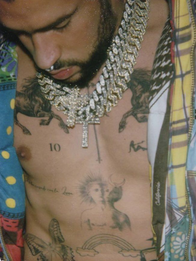
Bad Bunny’s chest is one of the most recognisable parts of his tattoo map. Published photos show the number 10, animal images, a small reclining figure and a face combining the sun and moon. Campaign photos also reveal a horse and the number 1994, which points directly to his birth year. These are separate symbols arranged so different poses bring different parts into view, not one continuous illustration.

The horse shows why photos and dates matter. Calvin Klein campaign coverage makes it easy to see, and the year is a concrete detail that can be named without inventing a story. The image shows the horse and the number, but does not tell us if the horse means freedom, speed, a childhood memory or something else. Staying with what is visible makes the description more dependable.

The number 10 has drawn attention because it is so plain. Numbers can mark birthdays, sports, milestones or private codes, and Bad Bunny has not given a public meaning for every numeral on his body. The photo does establish placement and scale: 10 sits among more illustrative designs, creating a contrast between clean type and softer shapes.

The sun-and-moon face adds another visual contrast. It gives the chest a symbolic centre without making the entire collection a spiritual statement. It is fair to call it a dual-face sun and moon tattoo, since that is what the image shows, but a detailed cosmology would need an explanation from Bad Bunny. In a collection built around music, personal style and shifting public images, there is no need to fill the gaps with symbolism.

The chest also makes use of open skin. The tattoos are spaced apart rather than packed into one solid piece, which keeps each mark legible. It feels more like a patchwork of memories than a traditional chest plate. Different photos reveal different sections, so the body map is best read across several images.

The thigh tattoos hold the Puerto Rico outline heart and Saturn

Bad Bunny tattoos: Bad Bunny thigh tattoos including Puerto Rico outline and Saturn

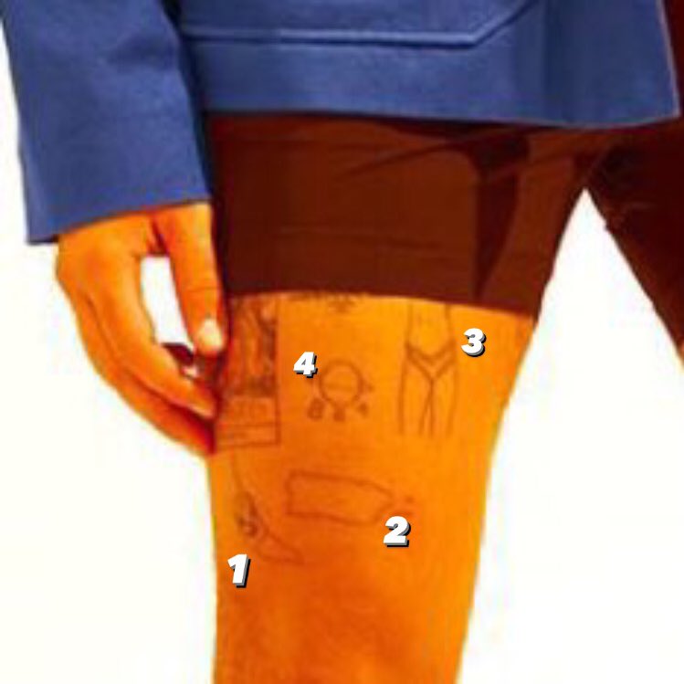
The thigh tattoos bring together some of the clearest links between Bad Bunny’s music and identity. El País describes a sad heart associated with Un Verano Sin Ti, an outline of Puerto Rico and a Pokémon Go logo. The designs sit where regular clothing can hide them, making them feel less like stage branding and more like pieces he chooses when to show.

The outline of Puerto Rico is especially direct. It marks a place rather than a vague tropical idea and puts home at the centre of the collection. Bad Bunny’s music often returns to the island, its language and its social life, so the tattoo fits his public identity without needing a private explanation. The shape is clear; interviews and reporting support the larger connection.

The sad heart carries a different feeling. It is linked with an album image and reads more emotionally than geographically, but it should not be treated as a permanent diary entry about one relationship. Album art can carry several meanings, and its personal context may change. For the tattoo record, the reliable details are the Un Verano Sin Ti connection and its placement on the thigh.

Another thigh photo shows a fine-line Saturn beside three letter Bs. The small planet is distinctive, and its position next to the letters gives the group an unusual balance. A close crop matters: a wide campaign photo might show that the thigh is tattooed, but the Saturn and letters need a tighter view before they can be named with confidence.

The thigh is not one era or one visual style. Puerto Rico is stark and geographic, the heart is graphic, the Pokémon reference points to gaming, and Saturn uses a delicate line. Together they form a personal archive. The designs sit beside one another without turning into a single logo, reflecting changes in Bad Bunny’s music and public life.

The forearm moves between realistic ink and cartoon flowers

Bad Bunny tattoos: Bad Bunny vase and cartoon flower forearm tattoos

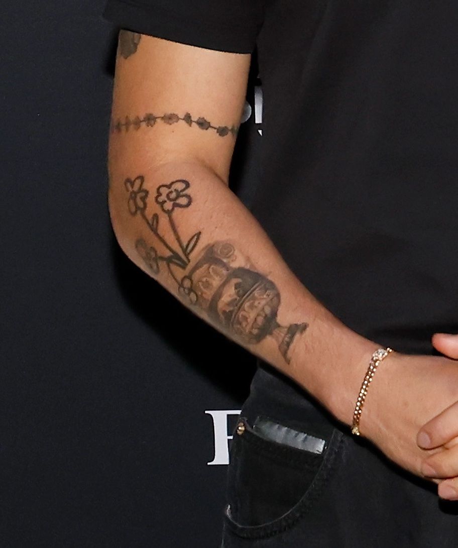
An Allure photo shows a different part of the collection: a realistic vase near the wrist with cartoon-like flowers running up the forearm. The pairing lets contrasting styles share one arm. The vase feels more traditionally illustrative; the flowers are lighter and more playful. Neither design needs to be forced into the same meaning.

The arm also shows why a generic tattoo list falls short. Saying “flowers” does not explain how they sit beside the vase, how much open skin surrounds them or how their scale changes from wrist upward. The photo establishes that visual relationship; the text can describe it without pretending the flowers are just decoration.

Cartoon tattoos are sometimes dismissed as jokes, especially when the wearer has a serious public image. Bad Bunny’s collection resists that split. Playful flowers and a politically meaningful Puerto Rico outline can sit together without cancelling each other out. Humour, taste or memory may be involved, but the sources do not confirm one fixed explanation. The clear point is that the flowers give the forearm a different mood from the darker sword and angel imagery.

The vase is another anchor in the forearm group. Its recognisable shape shows how a realistic object can sit among looser designs. Photos capture the outline and placement well enough to describe it with confidence. Tattoo coverage is more useful when it names the actual object instead of calling every black-and-grey mark a sleeve.

The wrist and forearm tattoos can appear when Bad Bunny lifts a microphone or a sleeve shifts, then disappear again. A thigh tattoo usually needs a more deliberate reveal. That is why campaign, concert and social photos show different parts of the collection. No single image is a complete catalogue.

The sword and angel designs add a more traditional tattoo vocabulary

Bad Bunny tattoos: Bad Bunny sword and angel arm tattoos

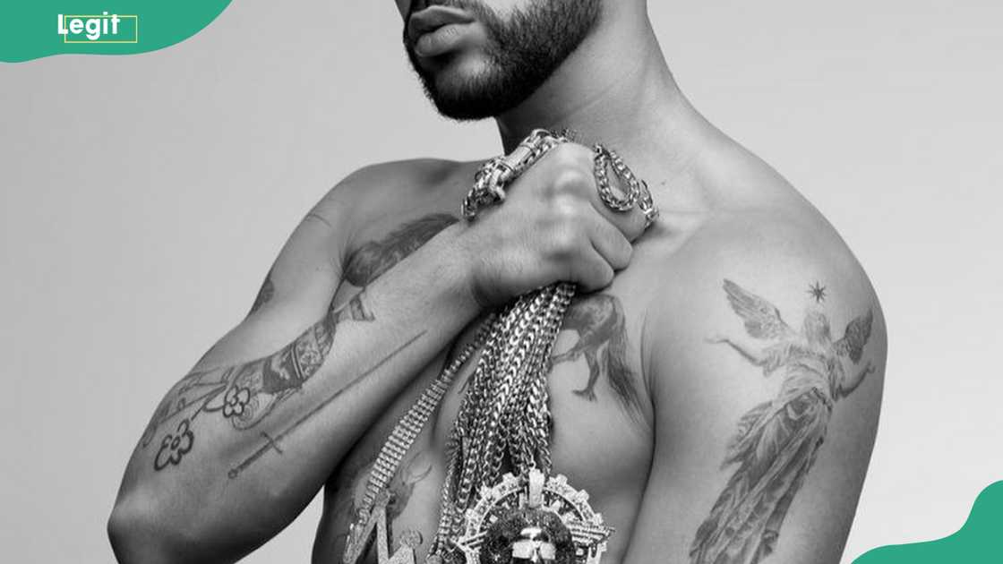
Other coverage identifies a sword on one arm and an angel with a star on the other. These familiar subjects still deserve a clear description. The sword makes a strong vertical line in the photo; the angel and star form a more figurative group, with the star above the figure as a small focal point.

Legit.ng offers symbolic readings such as bravery, resilience and protection. Those are useful as reported interpretations, but should not be presented as a full explanation Bad Bunny gave for every detail. A sword could be a traditional emblem, a story reference or simply a design he liked. The photo confirms the tattoo; the article can attribute the broader reading to its source.

The sword also balances the more playful forearm work. Beside the vase and cartoon flowers, it makes the collection feel deliberately mixed. Bad Bunny does not seem to be building one traditional sleeve around a single theme. He brings together music, geography, gaming, romance and familiar tattoo motifs.

The YHLQMDLG bunny logo belongs in the music-linked designs. The album title became a recognisable visual identity, and tattoo catalogues show a small bunny-head design paired with the letters. It is important to distinguish fan art from Bad Bunny’s own tattoos when images circulate online. His tattoo can be discussed as an album reference, while a tattoo idea page may only show designs made by fans. That keeps borrowed images from being labelled as celebrity photos.

Bad Bunny’s tattoo record is broad without needing one invented story. The chest holds numbers, a horse and animal imagery; the thighs carry Puerto Rico, the sad heart, Pokémon and Saturn; and the arms move between a vase, flowers, sword and angel. Music-linked logos connect the designs to his catalogue. Some meanings are reported, especially those tied to albums and Puerto Rico; others stay personal.

The tattoos make most sense as overlapping parts of Bad Bunny’s identity: Puerto Rican, musician, gamer, performer and a person with private memories he does not have to caption. Photos show placement and style; reliable reporting supplies context where it exists. Anything beyond that should be clearly labelled as interpretation rather than fact.

More musician tattoo guides

J Balvin tattoos: tigers, “Mi Gente,” family and a covered first piece

J Balvin’s collection is extensive, but his own explanations make it easier to distinguish tattoos with a clear story from designs he simply liked. In GQ’s Tattoo Tour, he talks about his first tattoo at 12, the cover-up, the large arm collage, and his choices of tigers, words, music references and family portraits. He also says tattoos are another way to express yourself, alongside fashion and music.

That does not make every tattoo a secret message. Balvin is open about choosing some designs because they look good. A useful inventory stays literal: name the image, note its location when he gives it, and keep his explanation close to it.

His first tribal tattoo was covered by a woman, dollar, cards and microphone collage

J Balvin showing the large arm tattoo collage from his GQ Tattoo Tour

Balvin says his first tattoo came when he was 12. He asked his mother for permission, expecting her to realise he was joking. When she agreed, he followed through and got a tribal design. He later covered it, so it belongs in the history of his collection rather than as a design that remains plainly visible today.

The first large replacement was a dense arm composition made up of a woman, a dollar sign, poker cards and a microphone. Balvin jokes that people with one tattoo can seem heavily tattooed to him, before remembering that his own arms and body are covered too. The collage does not need one theme; its interest is in how the images sit together and in its place as one of the earliest major pieces.

The woman and microphone connect naturally with Balvin’s creative life, but he does not say every element was designed as a formal career emblem. The dollar sign and cards are visible details, not a reason to invent a story about money or gambling. Staying close to what he actually names makes the large tattoo more interesting, not less.

Tigers, the Mickey skull and Nirvana mark the bolder visual side

J Balvin showing the tiger, Mickey skull and Nirvana tattoo area

Balvin says tigers are his favourite animals and that he has several across his body. His interest grew after a trip to Thailand, where watching tigers left him fascinated by their power, intelligence and beauty. His explanation is direct: the repeated animal comes from admiration, not a generic claim that tigers always mean strength.

He also shows the inside of Mickey Mouse’s head as a skull. The design turns a familiar cartoon into something darker, creating a playful but unsettling contrast found elsewhere in the collection. Balvin presents it as a creative choice rather than attaching a private confession to it.

A Nirvana tattoo is one of the designs he says hurt badly. His reason is straightforward: he loves the band. The reference is a documented music tattoo, while the pain is about its placement and the thin skin in that area. Those two details should not be confused.

“Vida,” “real,” “lealtad” and “Mi Gente” turn words into anchors

J Balvin showing his hand lettering tattoos including loyalty

Balvin points out several text tattoos: “vida”, meaning life; “real”; and “lealtad,” meaning loyalty. He says his closest friends share the loyalty design, giving the word a specific social context. It is more than a translation included for search terms; it is a matching tattoo connected to the people nearest to him.

“Mi Gente” is another notable entry. Balvin says he got the tattoo roughly 12 years before the song became a major hit. He describes its later success as a strange, happy coincidence, as though the phrase was already waiting for the song. The tattoo came first, so it should not be treated as merchandise or a promotional tie-in.

The lettering also shows why the collection cannot be mapped by body area alone. Words can work as personal reminders, shared designs or unexpected echoes of later work. The writing is visible, but the meaning depends on the date and the account attached to each tattoo.

Women’s profiles, the Virgin Mary and Carolina keep family close

J Balvin showing family and woman portrait tattoos

Balvin says he likes the look of women’s faces and has several female figures across his body. One profile came from an image he found through Google because he liked the face. He does not identify her as a partner or say the portrait represents a particular person, so it should stay a design choice rather than be given a fictional identity.

He also points out more women’s eyes, a Virgin Mary and another female figure. These belong in the visual inventory, but the GQ conversation does not give a separate explanation for every portrait. The accurate approach is to describe what appears and leave the personal context open where it has not been confirmed.

One portrait is more specific because Balvin names the subject: his sister, Carolina. He jokes that she is not especially expressive but thinks she loves the tattoo. Her portrait gives a clear family detail to a group that could otherwise be described too broadly as women’s faces.

The ribs hurt, while family and “familia” widen the collection

J Balvin showing the Familia rib tattoo

Balvin calls the ribs the most painful place he has been tattooed. The skin is thin, he says, and he cried during the process. That comment is about the location and sensation, not a hidden meaning in the design. It helps explain why an image may show the tattoo clearly even though the session was difficult.

He also uses “familia” broadly. For Balvin, family includes not only relatives but fans, friends and people who support him. The word therefore carries a wider social meaning in his account and should not automatically be reduced to one household member.

Balvin’s summary gives a useful frame for the collection: he sees tattoos as part of personality and believes people should choose them because they want them, not because someone else says they are cool. His first tribal mark, the large arm collage, tigers, Mickey skull, Nirvana, Spanish words, “Mi Gente,” portraits and family pieces each reflect a different side of that idea.

There is no need to find one master meaning for J Balvin’s tattoos. Some celebrate animals or music, others mark loyalty and family, and some are simply images he liked. Together, they read as a timeline of taste, relationships and creative instincts, built around the designs he has actually named.

More musician tattoo guides

Harris Dickinson’s Tattoos Turn Film History Into Body Art

Harris Dickinson’s tattoos sit close to his interests as an actor and filmmaker. Reports connect some designs to films and directors that have shaped him, while other marks are visible without a public explanation. At Cannes, he mentioned a small tattoo linked to Donnie Darko, a larger Kes reference on his arm, and more ink on his legs that he could not bring to mind at the time.

That comment is a reminder that no public list is likely to be complete. Dickinson has enough tattoos for individual details to disappear inside a broader collection that separate photographs show different parts of the collection. His arms, chest, neck and torso rarely appear together in one frame. A useful guide can name the tattoos identified by reliable sources and leave the rest open.

The studio photograph shows the scale of Dickinson’s tattoo work

Harris Dickinson tattoos: Harris Dickinson tattoo session with chest and shoulder designs

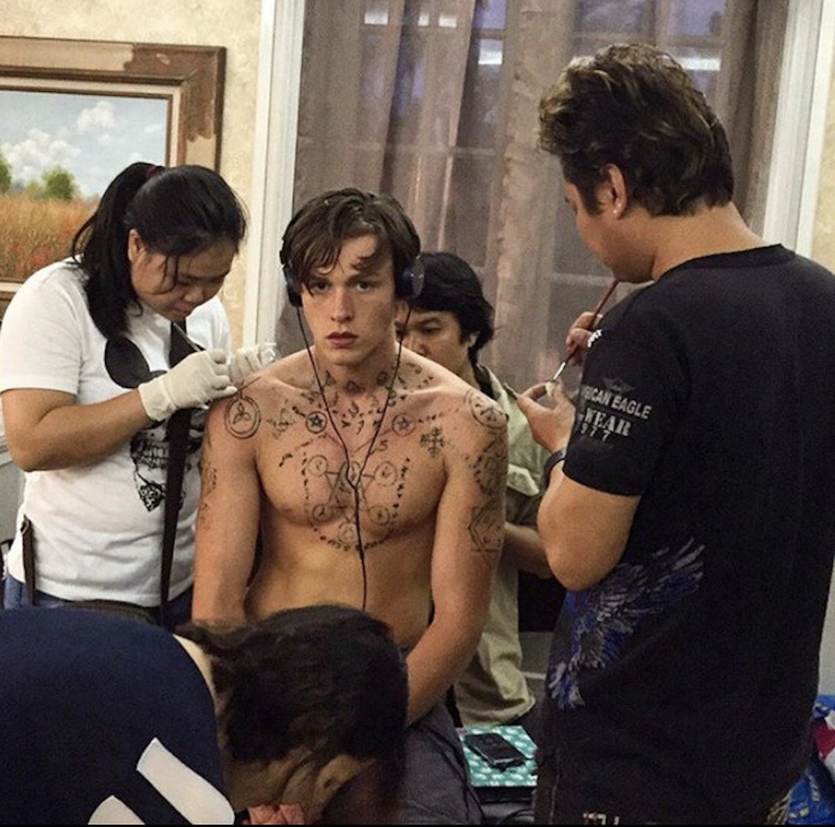
The tattoo-session photograph gives the clearest sense of how much work Dickinson has had done. He is shirtless in a studio as artists work across his chest and shoulders. The image shows geometric patterns, darker patches and smaller symbolic marks, as well as the process of building the designs. It helps establish both their placement and their scale.

A session photo can be hard to read in detail. Fresh ink may be covered with ointment, still partly outlined or blocked by an artist’s hands. A design that looks whole in a later portrait may appear in fragments during the appointment. The photograph shows that Dickinson’s tattoos cover a substantial area, but it cannot explain every shape.

The work has a loose visual rhythm. Some pieces are compact and dark, while others use finer lines and geometric forms, with open skin between them. That spacing makes the collection feel like it grew over time rather than being planned as one continuous design. It also fits with the way Dickinson has described separate tattoos tied to films and influences.

It is important to distinguish real tattoos from the temporary ink. Dickinson has played characters with extensive body art, and promotional pictures do not always make clear what is temporary. The session image shows him outside a role, giving a useful point of reference for the personal tattoos that now span several parts of his body.

The small arm and neck marks are easiest to misread

Harris Dickinson tattoos: Harris Dickinson forearm lettering and small neck symbols

Close-up portraits show small tattoos on Dickinson’s forearm and neck. One line of lettering has been read as I want to; nearby linework and small symbols are harder to identify from the available images. The visible words can be noted, but a partial phrase should not be extended into a quote without stronger evidence.

The marks on his neck are easy to misread. Hair, skin folds, collars and shadows can interrupt a symbol, making one design look like several or the other way around. It is safer to describe what can actually be seen and leave the personal meaning unstated unless Dickinson has explained it.

The forearm tattoos sit near the reported Kes reference, but that does not make every neighbouring mark part of the same design. A tattoo inventory should avoid transferring the meaning of one confirmed piece onto the tattoos around it. The arm may hold film references, private symbols and designs chosen for their shape at the same time.

These smaller tattoos belong in the picture too. They show how a collection appears in everyday life, beyond the dramatic studio shot. A mark on the forearm or neck can become part of someone’s familiar gestures and appearance, the details readers notice in interviews, portraits and red-carpet photographs.

Size alone does not tell us how important a tattoo is to its wearer. A few words may have a private association, just as a large geometric piece may simply appeal visually. Without a first-person explanation, the clearest account is still a visual one: small lettering, linework and symbols on Dickinson’s arm and neck, with their personal stories left private.

My Brother’s Keeper is the clearest chest lettering reference

Harris Dickinson tattoos: Harris Dickinson My Brother's Keeper chest tattoo

The chest photograph makes the phrase My Brother’s Keeper easy to read and shows where it sits. It is one of the clearest tattoos in the available photographs. The words sound protective, but the image does not tell us which brother, friend or personal experience inspired them. The wording can stand on its own without adding a backstory.

This lettering has a different feel from the film references. Kes points to a director and a movie, while My Brother’s Keeper reads like a message about a relationship. The sources here do not identify the person or event behind it. That mix of movie references and personal-sounding words gives Dickinson’s collection its range.

The setting of the photograph helps, too. Dickinson is shirtless outdoors, so the lettering is not hidden by a costume or shown mid-session. The phrase runs across his chest, and the image gives a better sense of its size than a tightly cropped portrait. It clearly shows the words and their placement.

The image supports those details without telling us when the tattoo was done or what prompted it. Ink and skin can look different across photos, but there is no need to guess at a date or explanation. The readable phrase and its position already make this a striking piece of lettering.

Film-reference tattoos such as Kes and Donnie Darko explain the collection’s theme

Harris Dickinson tattoos: Harris Dickinson film-inspired tattoo context

The best documented stories in Dickinson’s collection are the film references. The Associated Press reported a small tattoo tied to Donnie Darko and a larger tattoo on his arm connected with Ken Loach’s Kes. Dickinson has spoken warmly about Loach, and Spanish coverage also points to the Kes reference when he lifts his sleeve. These connections come from reporting, not guesses based on his filmography.

The Kes tattoo links Dickinson’s ink to both a movie and its director. Loach’s work has influenced Dickinson’s interest in socially grounded stories, an influence that carries into his own move behind the camera. The tattoo refers to the specific 1969 film while also marking a wider artistic connection.

The smaller Donnie Darko tattoo is less visible in published photos, but it belongs in the record because Dickinson identified it himself. A reference does not need to take up much space to matter. It also points to a film he values as a viewer and artist, rather than one associated with a role he played.

Dazed describes another distinctive design: an AK-47-wielding cherub in a balaclava. That specific description makes the tattoo recognizable; calling it simply an angel would lose the details that set it apart. It is a good example of why written reporting can clarify what a photograph alone might leave uncertain.

There may be more tattoos on Dickinson’s legs and elsewhere. He said he was sure there were additional leg pieces, so the available coverage should be treated as a record of what has been identified, not a final count. More interviews or clearer photographs may add to it over time. For now, the sources support the film references, chest lettering, cherub and visible arm work described here.

The clearest summary may be this: tattoos form a portrait of an actor who carries his influences with him. Kes connects him to Loach, and Donnie Darko records another film he admires. The lettering and cherub make the collection feel more personal and unexpected than a list of career references. Photographs show placement, while interviews give the strongest available account of meaning.

Dickinson’s tattoos are best read as an evolving collection: some honour films, some use words, and others remain visible without a public explanation. There is already more to the story than a quick list can capture, while some details remain unknown. One clear phrase, a named film or an unusual figure is more useful than a confident interpretation of a blurry image.

More actor tattoo guides

GloRilla tattoos: the red gorilla, family names and hard-earned cover-ups

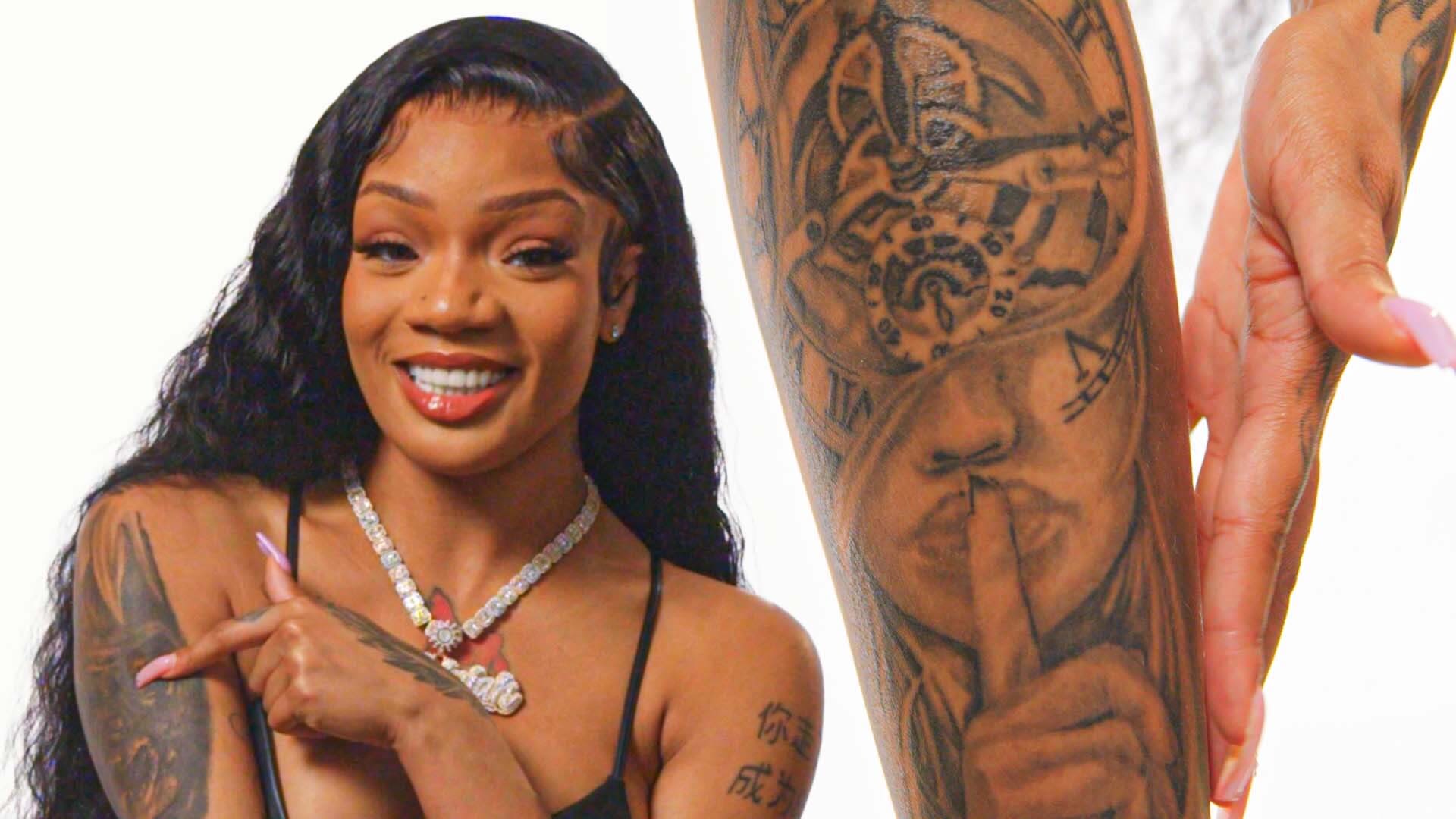
In GQ’s Tattoo Tour, GloRilla talks through tattoos from high school, pieces she chose during difficult periods, and lettering tied to family, faith, friends and important dates. She is frank about cover-ups and mistakes, too, including designs she would like to change.

That candour makes her collection easier to document. The red gorilla is the most recognisable piece, but it covers an earlier “Big Glo” tattoo, and the designs around it each have their own story. The details here follow GloRilla’s explanations and leave visible facts separate from outside guesses.

The red gorilla covers GloRilla’s badly placed “Big Glo” tattoo

GloRilla showing the red gorilla cover-up tattoo on her chest

GloRilla says she got her first tattoo in 12th grade. She paid about $20 after asking on Facebook if anyone knew a tattoo artist. The design read “Big Glo” with a crown, but the letters were spaced badly: the L and O sat far from the rest, so the name looked more like “Big 6.” She still calls the tattoo ugly and says she chose to cover it.

That cover-up is the large red gorilla face across her chest. GloRilla says it took around five or six hours, and the earlier lettering can still show faintly if you look closely. The gorilla was a deliberate replacement for a lettering job she disliked, not a symbol invented by someone trying to decode her stage name.

She chose red because red is her favourite colour. GloRilla says plenty of women might pick a heart for that spot, but she wanted a gorilla. People criticise the design, yet she calls it one of her favourites and says she has no plans to cover it. Her own explanation carries more weight than guesses that it must stand for aggression, Memphis or fame.

The hand, leg and snake tattoos record pain and impulse

GloRilla showing her hand and chest tattoos during the GQ Tattoo Tour

GloRilla says a hand tattoo is among her most painful pieces. She was at the tattoo artist’s apartment after her career had taken off, smoking and drinking while wearing a waist trainer. Near the end of the session she felt woozy, got up to use the bathroom, took two steps and passed out. When she came to, only half the tattoo was done. It remains memorable as a rough session, not just another small design.

The large leg piece shows someone saying “Shh” beside a clock. GloRilla says it took about eight hours, maybe longer, and was the biggest tattoo she had at the time. Numbing cream helped, but the placement near the bone still hurt. She says she could barely walk and spent about a week in a wheelchair afterward.

She feels differently about the snake tattoo. GloRilla says she got it while angry and going through a hard time, when tattoos had become a kind of therapy. She calls the snake ugly, says there was no clear reason for choosing it, and has talked about covering it with something she likes more. In her account, it was an impulsive choice rather than a symbol planned for the long term.

Her comments are also a reminder that photographs capture a moment, not a permanent opinion. A tattoo can still be there after its owner falls out of love with it. And saying she hopes to cover a design does not mean the cover-up has already happened.

Leo, Saint, Olivia and Glo Gang fill the smaller lettering map

GloRilla showing her hand and leg tattoos

Several small tattoos point to GloRilla’s astrology, faith, family and music circle. She identifies the Leo sign on a finger and the word “saint”, joking that she is not actually a saint while still liking the label. Both are easy to record because she names them herself; there is no need to invent a deeper explanation.

Her mother’s name, Olivia, is another confirmed tattoo. GloRilla also points to “Glo Gang,” connecting it to her own name and saying she is a big Chief Keef fan. She let her friend Teez practise the tattooing, describing that choice as a way to support a friend learning the craft. The piece carries both the lettering and the story of who put it there.

There is also a small “faith” tattoo. GloRilla says she got it in the trenches of Memphis, describing the apartment where it was done in blunt terms, and mentions wanting a butterfly on her thigh. The butterfly is a separate design; the two details came up in the same conversation about early tattoos and local experiences.

She and her best friend Gloss have matching tattoos on their thighs. The line reads “Told you I’ll be here forever.” GloRilla says it comes from Rihanna‘s “Love on the Brain,” with each friend carrying part of the phrase. That makes it a shared friendship tattoo, rather than a general inspirational quote.

Family names, Chinese lettering and dates add the personal detail

GloRilla showing family, faith and date tattoos across her arms

GloRilla’s family tattoos include her father’s name, Edwin, and the word “woods.” She says her father had seven children at the time, and later eight, with her as number five. The names and wording connect the ink to how she sees her place in the family.

Another design uses Chinese characters to express the idea that she would become a star. GloRilla says a friend who died in 2020 used to praise her music and tell her she would be a superstar, back when she still had what she calls her “baby voice.” She got the phrase to hold onto that encouragement and hopes her friend can see how things turned out. Its meaning comes from her account, not from guessing at the characters.

She also points out “hallelujah” in Arabic, her birth year 1999, the date 7/28/1999 and an AK-47. She says the gun and date tattoos are red because she likes that colour. These small details fill in more of the story than a single chest photograph can show.

One tattoo for a cousin reads “A cousin is a sister destiny forgot to give you.” GloRilla says she no longer speaks to that cousin and wants the design covered. That change is part of this tattoo’s history, but it should not be taken as a statement about all of her family relationships.

GloRilla’s collection holds choices she still loves, choices she regrets and designs connected to people she wants to remember. The red gorilla replaced a badly spaced high-school tattoo; the hand and leg pieces bring back painful sessions; the snake reflects an angry period; and the names, dates, faith words, friendship quote and Chinese lettering keep specific people and milestones close. The collection makes the most sense when those differences stay visible.

More musician tattoo guides

Milly Alcock’s 20 Tattoos and the Personal Map Behind Them

In a 2026 interview around Supergirl, Milly Alcock said she has 20 tattoos and talked about why she keeps getting more, even though acting can require her body to change for a role. That number is a useful snapshot, not a complete public inventory. Some designs are clear in photographs; others show up only briefly or from a distance.

Her explanation says more than a simple list can. Alcock described her body as part of her work, but also as her own once the costume, makeup and character are gone. Tattoos make her skin feel personal and help ground her while travelling and living away from Australia. That gives the collection a shared idea without assigning a hidden story to every flower, key or abstract mark.

The arm tattoos are a visible collage rather than one single style

Milly Alcock tattoos: Milly Alcock arm tattoos including flowers and keys

Recent photographs show a group of tattoos across Alcock’s arms: flowers, key-like shapes and small abstract designs beside one another. They do not make a traditional sleeve built around a single central image. The arms read more like a personal collage built up in stages. Some marks are delicate and fine, while others have heavier lines or more unusual shapes.

The flowers are easy to recognise, but Alcock’s broader comments about ownership, identity and feeling grounded should not be mistaken for an explanation of each one. She has not publicly assigned a detailed meaning to every flower. What the photographs establish is that floral designs sit among smaller motifs and give the arm collection a varied look.

The keys deserve the same restraint. They are distinct enough to note, but the image cannot tell us what a key means to its wearer. It could be a personal reference, a design she liked, or part of a story she has not shared. The photograph confirms the motif; it does not tell us what it unlocks.

The interest is also in how the different pieces sit together. A flower, a small key and a darker shape change the visual rhythm without turning the arm into one fixed theme. The collection has room to grow, unlike a tattoo map built around just around famous matching designs. Spacing and contrast are part of what makes the collage feel personal.

Her arms also appear often because they are easy to show in sleeveless portraits. Film and television work can mean covering tattoos for a role, and a red-carpet photo may show only the outline of a design. A closer frame can reveal whether a mark is a flower, a key or an abstract line. Those pictures answer different questions, and a useful guide should treat them accordingly.

The small forearm pieces show why close photographs matter

Milly Alcock tattoos: Milly Alcock floral oval forearm tattoo and small knot tattoo

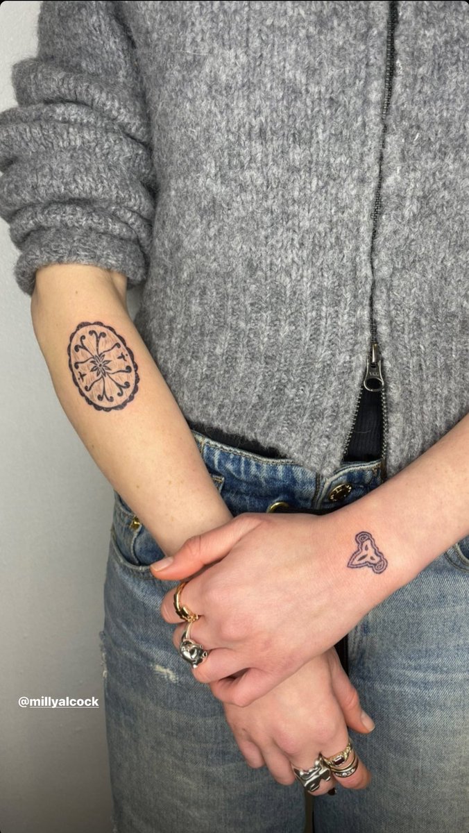
A close photograph shows a small oval floral tattoo on one forearm and a compact knot-like design on the other. Rings, sleeves and changing poses can hide both in a general photo gallery. Up close, the tattoos show how much of Alcock’s collection is made up of small marks rather than large portraits. Their shapes are visible, but their private meanings are not documented.

The oval flower has a contained shape, almost like a little emblem. Its place in an inventory is clear from its design and location, not from a meaning supplied by an anonymous caption. The knot is more sensitive to angle: simple lines can look different when the wrist turns or a bracelet crosses the frame. It is better to name what the image supports and stop there.

These forearm pieces make the collection feel like a record of changing taste. Fine lines keep some designs light, while darker shapes give them weight. The overall effect is less like a finished mural and more like a notebook with new marks added over time. That sits naturally with Alcock’s description of herself as a collage of where she comes from and who she is while living in different places.

It is easy to ask about the meaning of every small tattoo, especially when Alcock says she has twenty. Her own comments point to a broader answer: the collection helps her feel like herself outside the roles she plays. A flower can matter to her without a public explanation, just as a key can be memorable without offering readers a puzzle to solve. The lack of a quote is a boundary, not an empty space to fill.

Close photos also help distinguish today’s tattoos from older pictures. Ink may be covered, extended or shown in different light. A low-resolution shot might make a symbol look solid black, while a clearer one shows open lines inside it. The close-up is the right evidence for small forearm marks; a distant premiere photo cannot support a longer catalogue.

The small upper-back mark is visible but its meaning remains unconfirmed

Milly Alcock tattoos: Milly Alcock upper-back E tattoo

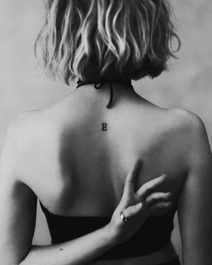
One published photo shows a small E mark on the upper back. It sits where an open-backed outfit can reveal it, but the sources used here do not include a reliable explanation from Alcock. It belongs in the visual record because it is clear enough to see, not because we can safely turn the letter into a person’s name or a relationship.

An upper-back tattoo appears differently in public than an arm design. Everyday clothes can hide it for months, then a fashion shoot or candid photo makes it visible. The date and source matter: the picture tells us the E was visible at that time, but not when Alcock got it or whether it has changed since.

The small letter also adds a quiet contrast. Alcock’s arm tattoos form a busy collage, while the mark on her back is spare and easy to miss. Her collection ranges from tiny lettering to denser groups of designs, and their different placements shape how people see them. It cannot be reduced to one style.

There is no solid basis for identifying what the E stands for. It might refer to a person, a place, a phrase or simply a letter she liked. Without a source, all of those are guesses. The useful description is the visible mark, its upper-back placement and the photograph that records it.

Why Alcock says the tattoos keep her grounded

Milly Alcock tattoos: Milly Alcock forearm tattoos in a high-resolution portrait

Alcock’s clearest explanation is about the collection as a whole. She said acting can make her body serve a character, a production and other people’s ideas; tattoos remind her that her skin still belongs to her. That is why the count of twenty should not become a hunt for dramatic symbolism in every design. The point she describes is personal control: the ink stays when the costume comes off.

She also tied the tattoos to movement and identity. Living in another country and travelling for work can leave someone feeling pulled between places. Alcock described herself as a collage of where she is from and who she is at the centre of that movement. Flowers, keys, abstract shapes and a small back letter can all fit that idea without sharing one subject.

That is the most grounded way to read her collection. Some designs are visible but unexplained; others appear in recent photos without a published quote. Alcock has joked that tattoos are addictive and that she wants another, so twenty is a snapshot of a collection that may keep growing, not a final count.

Milly Alcock’s tattoos are best documented in layers. Arm photographs show flowers, keys and other small motifs; a close forearm image makes the oval flower and knot easier to see; and an upper-back photo records the E without guessing at its owner or meaning. Her own comments explain why the collection matters. The result is specific, while leaving her private stories private.

More actor tattoo guides

Jacquees’s tattoos, from Fear God to the family pieces

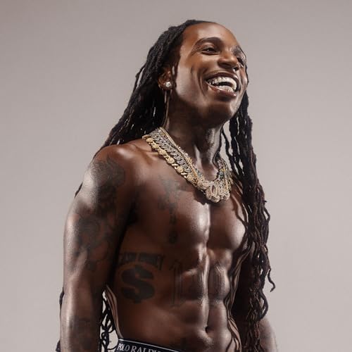
Jacquees does not describe his tattoos as one perfectly planned sleeve. In GQ’s Tattoo Tour, he moves from ink he chose as a teenager to family names, symbols and small jokes that came later. Together, they mark different ages, loyalties and turning points.

Some designs are clear in photographs, while others make most sense through Jacquees’s own account. The guide keeps those kinds of evidence apart so a visible symbol does not get a made-up meaning just because it looks dramatic.

Fear God was the hand tattoo he got at 15

Jacquees showing his Fear God hand tattoo during a tattoo tour

The hand lettering is the most recognisable tattoo in Jacquees’s public record. He says he got “Fear God” at about 15, after being influenced by Lil Wayne’s visible tattoos. The words sit across his hand where they can be read from a distance, but they are one part of a much larger collection.

Jacquees’s explanation is direct. He does not present the phrase as a code or a complicated private philosophy; it is a visible statement he chose young and kept. That timing puts it before the later family portraits, body symbols and career references. It is also one of the tattoos that shows how quickly he moved from experimenting with ink to making it part of his look.

The first neck tattoo was Que with notes and stars

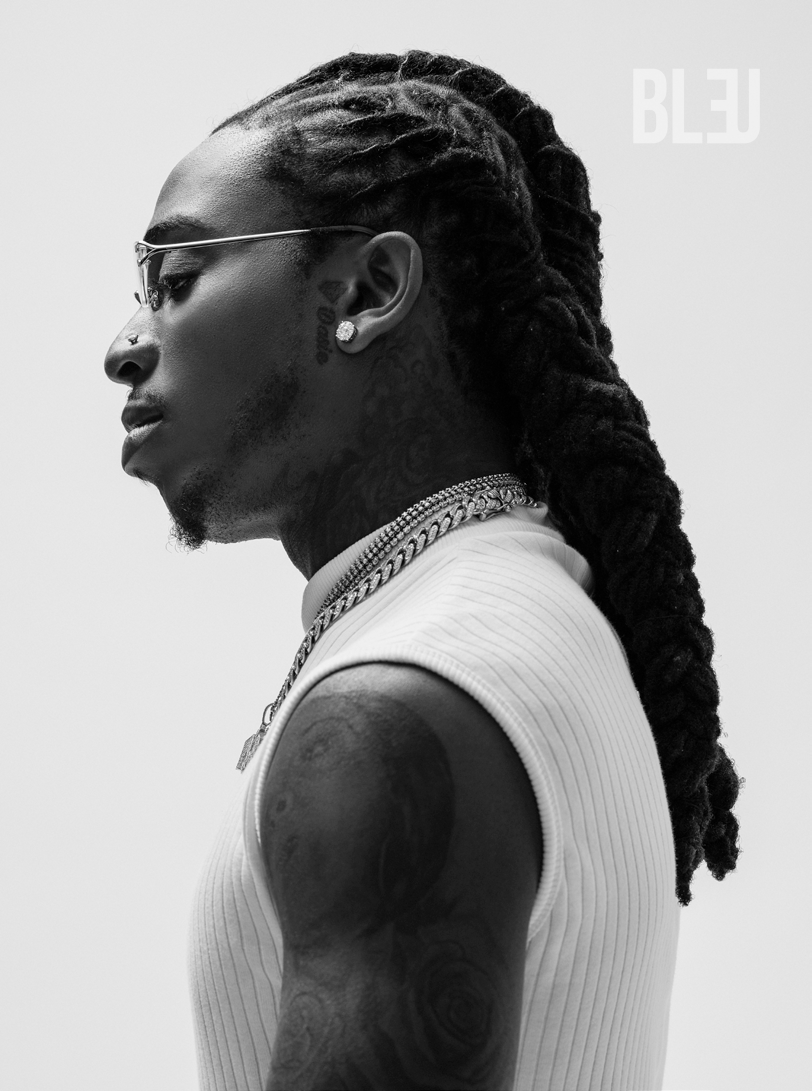
Jacquees showing neck and arm tattoos in a side-profile portrait

Jacquees says he got his first neck tattoo at 13 because he did not want to be the only kid at school without one. The original design was his nickname, “Que,” with music notes and stars around it. It connected his name with music, though the tattoo was later covered.

The cover-up belongs in the story, not just in a footnote. A tattoo chosen at 13 can feel like a permanent decision, but changing it later shows how his taste and public image developed. The neck is hard to hide, so putting his nickname there made an early experiment unusually visible. Photos show the location and later layers; Jacquees’s account explains why he got it.

Confidence, Jesus, the rose and doves built the neck sequence

Jacquees with visible neck, hand and arm tattoos

At 17, Jacquees added “Confidence is a stain they can’t wipe off” to his neck. He says the line stayed with him, and its length gives the area a different look from the compact nickname it replaced. The quote is worth keeping intact because it explains the tattoo; it explains the tattoo more clearly than a general claim about confidence would.

The neck later became home to several different ideas. Jacquees names a Jesus tattoo, a rose, the original Atlanta Braves sign, a heart at the back of his neck and doves associated with peace and love. They do not need to fit a single invented theme: the religious image, sports reference, flower and birds can simply sit alongside one another.

The way the neck looks changes across photographs. Hair, camera angle and lighting can hide part of a design or make lettering look heavier. The images establish placement and scale; Jacquees’s interview is what confirms which tattoos he identifies.

FYB, roses, the spaceship and the three wise monkeys fill out the arms

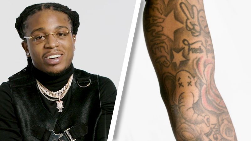
Jacquees showing multiple arm tattoos including lettering and traditional designs

The arms carry more of the collection’s group identity. Jacquees says FYB, short for Fresh Young Boyz, appears more than once, including near his elbow. He also points to three roses on the East side, a spaceship that fits the phrase “I’m outta here,” and the see-no-evil, hear-no-evil and speak-no-evil monkeys.

Those designs do not all carry the same kind of meaning. FYB connects to the people around him, and the roses have a location reference. The spaceship turns a playful phrase into an image. Jacquees says he got the three monkeys around 18, but there is no need to assign a separate private confession to each one.

He also talks about the idea that no one sin is greater than another. That wording belongs with the design he describes; it does not mean every nearby religious or darker image represents the same idea. Keeping the statement tied to its source makes the tattoo record clearer.

Family names, portraits and the symbols on his face

Jacquees with visible family-name and facial tattoos

The family tattoos are among the most personal pieces. Jacquees names his grandmother Daisy, his mother Rosy, his sisters and his nephew Little Ray. He also mentions a cartoon version of himself on the back of his arm, a guardian angel and two angels with wings. Together they make the collection feel like a way of keeping people close, not simply a catalogue of fashionable designs.

When asked which tattoos matter most, Jacquees returns to the ones for his grandmother and mother, as well as FYB, long life and family names. That does not mean the mean the other tattoos are unimportant; it tells us which ones he chose to name as favourites. An inventory can identify a portrait or lettering, but the preference comes from his own answer.

Smaller details on his face and ears belong in the record too. Jacquees mentions a star on his ear from ninth grade, a diamond, a cheek tattoo linked to strength and courage, and other small marks. Small facial tattoos can be hard to read in a soft photograph, so it is safest to stick with designs he names instead of guessing at every line near his eye or cheek.

The collection also reaches his legs and torso. Jacquees identifies a king symbol on his leg, which he got at 18, along with CM for Cash Money and Rodriguez, his first name. He describes a triquetra as representing three things that cannot be untied, a design shared with his sisters.
Those pieces add another layer: the king is a statement about self-image, the Cash Money initials connect to his music world, and Rodriguez is direct family identity. The triquetra is the clearest example of a tattoo with a specific reported meaning: he says it stands for the bond between his siblings.

Jacquees says he wants room to grow and does not want to cover his body in ink. That helps explain why the collection can hold many separate designs without turning into one solid field of tattoos. The open skin is part of the look, leaving space for each piece to remain readable and for a future memory to be added.

What the tattoo tour confirms

The tattoo tour follows several stages of Jacquees’s life: a nickname at 13, a hand phrase at 15, a confidence quote at 17, then family names, music references and symbols added as his career developed. The strongest descriptions pair a close photograph with the explanation he gives himself.

His collection is best read as a changing record. Some tattoos remain clearly visible, some have been covered, and some meanings belong to the people who were there when the ink was chosen. That balance keeps the guide specific without filling in stories the photographs and interview do not tell.

Jelly Roll’s tattoos, from Music Man to Mama V

Jelly Roll’s tattoos make the most sense when the face, neck, hands and arms are considered as different parts of a long record. His collection is large, but there is no official count that turns it into a neat catalogue. Some designs are named during his GQ tattoo tour, others can be seen in close portraits, and later coverage sometimes describes pieces without enough detail to confirm every feature.
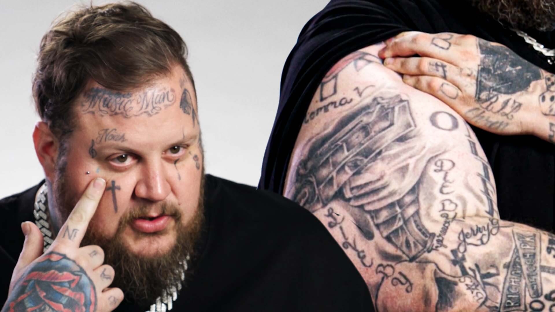
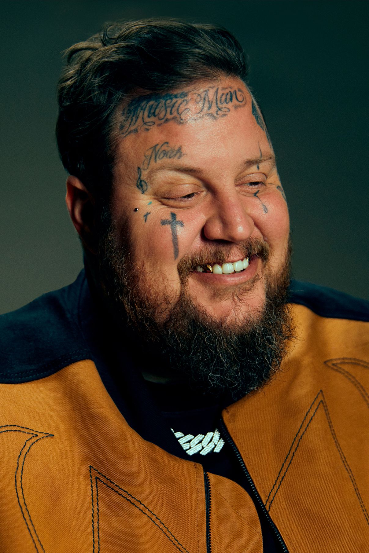
The GQ conversation is his strongest guide because Jelly Roll points to the tattoos: he names designs, explains several personal connections and admits when a tattoo was excessive or poorly planned. Those comments belong beside the designs they describe. When a photograph shows placement but not meaning, the account should stay with what is actually visible.

His tattoo tour shows how concentrated the collection is

Jelly Roll showing the tattoos across his face, hands and upper arm during a tattoo tour

Many of Jelly Roll’s most recognisable tattoos sit high on his body. His forehead, cheeks, neck and hands are visible when he performs, while the larger arm pieces show whenever he wears short sleeves. The close photos reveal many separate designs rather than one continuous tattoo, even though the group shapes how people read his appearance.

The photos also differ in clarity. Some lettering can be read immediately; other marks have softened with age or sit beside newer ink. Stage lights can make black tattoos look heavier than they do in a neutral portrait. A careful inventory records the design, its location and where the identification comes from before assigning meaning.

That care matters because Jelly Roll is open about his past. The fact that a tattoo can be connected to his family or recovery does not mean every nearby symbol has the same explanation. The tattoos are personal, but what can be confirmed publicly still has limits.

Music Man, the cheek cross and the smaller face symbols

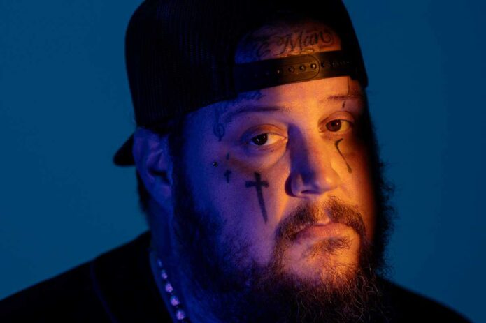
Close portrait showing Jelly Roll’s forehead lettering, cheek cross and smaller face tattoos

The most noticeable facial lettering is “Music Man” across Jelly Roll’s forehead. It is written in a large, old-style script above the smaller marks around his eyes and cheeks. The words describe his profession plainly, but their placement makes them one of the first things a viewer sees. They are not hidden in a sleeve or visible only in a private photo.

Below the forehead lettering, portraits show a large cross on the cheek, smaller marks near the eyes, a teardrop and compact symbols around his hairline. In the tattoo-tour conversation, Jelly Roll connects the larger cross with a turning point in his life. That comment speaks to the cross’s importance to him; it does not automatically explain every mark nearby.

The face also carries lettering associated with his mother and other small symbols that come into focus when he is photographed straight on. Some edges have softened, so a blurry shape should not be turned into a confidently named object. The portrait is good evidence of placement and general form; his words are the stronger source for meaning.

The Nashville skyline covers an earlier neck mistake

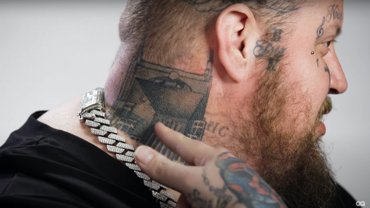
Side profile showing Jelly Roll’s Nashville skyline neck tattoo and nearby face ink

At the back of Jelly Roll’s neck is a dark Nashville skyline, shaped to sit beneath his hairline. It fits his connection to the city, but the story behind the cover-up is even more revealing.

Before the skyline, he had the phrase “Surviving the Sruggle.” The spelling was wrong because the second T in “struggle” was missing. Jelly Roll discusses that mistake as part of the tattoo’s history, so it should not be listed as a second design that remains visible. It is what the skyline replaced.

The side photo makes the change easier to see. The skyline follows the area where the old lettering sat and forms a deliberate horizontal shape on the neck. His face and hand tattoos make it look like one part of a larger group, but the city outline has its own placement and correction story.

Mama V’s cross is an early memorial tattoo

Jelly Roll’s shoulder cross and Mama V memorial lettering

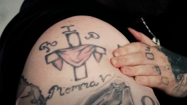
Jelly Roll identifies the cross on his upper arm as a memorial to Veda Newcomb, known around his neighbourhood as Mama V. He says he was 14 when she died and that the tattoo became his first arm piece. In the photograph, the shoulder cross and surrounding lettering give the tribute a clear visual anchor rather than leaving it as a vague reference to faith.

The memorial predates much of his highly visible face work. It comes from an earlier period of his life and honours someone important in his neighbourhood. The cross is a familiar shape, but the name and age give this tattoo a specific story.

In photographs, the shoulder piece sits among newer arm tattoos, so its edges can blend into the larger collection. It is still useful to describe it on its own. The memorial explains why he chose this design; other tattoos on the arm do not automatically share that meaning.

The smoking baby is the tattoo he calls excessive

Close-up of Jelly Roll’s smoking baby tattoo on his arm

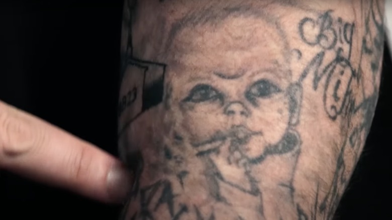
One of the collection’s stranger designs is a baby smoking a blunt on Jelly Roll’s arm. In the tattoo tour, he calls it excessive and treats it as an idea that went too far. That reaction tells us more than an invented symbolic reading would: the tattoo is real, he knows how extreme it looks, and he is not presenting it as a solemn emblem.

A close photo shows the baby’s face, the smoke and enough of the linework to distinguish it from the surrounding arm tattoos. Some reports have suggested it was covered, but the public record does not confirm a finished cover-up. It is accurate to say that he regrets or questions the design, not that it has definitely disappeared.

Tattoos can change in stages. A cover-up may be planned, partially done or shown only in later images. Without a clear before-and-after record, his comment and the photograph are the available evidence.

The quokka tattoo is another design he names. Jelly Roll says he got it with a group in Florida and connects the animal with keeping cheerful when life is difficult. The interview does not make its exact placement clear enough to assign it to his arm based on a distant image, so the location should remain unspecified.

Other arm photos show lettering, numbers, religious designs and family references. It is better to read them one by one than call the whole area an anonymous sleeve. A visible name or word can be recorded, but an unconfirmed story should not be attached just because the tattoo sits near Mama V’s cross or the smoking baby.

The GQ tour also documents The Jesus-on-the-cross tattoo on his back. Jelly Roll calls it a rough pick-and-poke piece and jokes that his wife first thought the face looked like Elvis. The public material used here does not offer a sharp, reliably matched photo of the back design, so the description stays cautious. A generic religious tattoo image would mislead readers about the actual piece.

What the close photographs can and cannot prove

The strongest parts of Jelly Roll’s tattoo record are the ones supported by a clear photo, a specific design and a comment from him. That combination helps describe the forehead “Music Man”, cheek cross, Nashville skyline cover-up, Mama V memorial and smoking baby. It also gives the quokka a reported meaning while leaving its placement open.

The smaller marks around his eyes, fingers and hands need more care. They are real visible tattoos, but a soft concert image is not enough to identify every symbol or claim a private reason for it. The article gets more useful when confirmed details can stand without filler.

Read this way, Jelly Roll’s tattoos form a record of family, place, mistakes, faith and humour. The designs are not all polished or solemn: some honour people, some correct earlier choices, and some are tattoos he now looks back on with regret. That mix is what makes the tattoo tour more revealing than a generic list.

More musician tattoo guides

Pete Davidson’s tattoos tell a story of impulse, comedy and removal

Pete Davidson’s tattoos were never a neat, coordinated collection. They mixed jokes, pop culture, lettering and relationship references, with some pieces added quickly enough that the circumstances became part of their story. For years, photos showed a dense patchwork across his chest, arms, hands and neck. More recently, laser removal has changed the picture, so dates matter as much as design names.

Davidson has explained some choices himself. On Fresh Air, he told the story of getting a Game of Thrones tattoo while watching the show. Later interviews and reports covered why he began removing much of the ink. A careful inventory keeps his own explanations separate from what a photograph only seems to show.

The shark became the most recognisable piece on his chest

The shark works both as an image and as a cover-up. Its open mouth and heavy outline take over the chest and change how the older ink underneath appears. In photos, the red mouth draws the eye first, while the black-and-grey work around it makes the whole area feel crowded. The shark is a headline image, even though it is only one piece in a much larger collection.

Its position tells readers something practical about Davidson’s tattoo history. A large chest design can cover an earlier phrase without removing that decision from the record. The shark is what is visible now; the old tattoo helps explain why the area looks so dense. Those facts should not be blurred into a claim that both designs carried the same meaning.

Pete Davidson tattoos: shark chest tattoo

A large shark is one of the clearest anchors in photos from Davidson’s tattooed years. It spans the chest and appears beside smaller illustrations, words and symbols. Reports have also connected it to a cover-up, which gives the design a history beyond that of a random animal in the middle of a crowded torso.

The shark’s blunt outline suits Davidson’s earlier approach to tattoos. Its mouth gives it energy, and its size keeps it visible even in a wide shot. That matters because smaller marks can disappear when a photograph is cropped for a news story or television appearance.

Still, the shark should not stand in for all of Davidson’s ink. It is one design among many, and the surrounding tattoos arrived at different times. They do not automatically share its story. A useful guide can give the shark its own space, then move on to the lettering and pop-culture pieces.

SHAOLIN and GOON show how much lettering filled the map

SHAOLIN sits lower on Davidson’s torso, while the shorter GOON lettering is higher on his chest. SHAOLIN runs across a wider area; GOON reads more like a compact label. From straight on, the words can look like one band of text, but they are separate tattoos in different positions. Naming both makes the tattoo inventory more useful than calling the area general chest lettering.

Numbers, script and small drawings nearby add texture, but do not all have a documented explanation. Some have been linked to family, friends or entertainment, yet a soft photo cannot settle every attribution. The grounded description is the visible wording and placement, with Davidson’s own comments supplying context when available.

Pete Davidson tattoos: SHAOLIN and GOON lettering

Photos of his torso show the bold words SHAOLIN and GOON. The lettering is not just filler around the shark; it is part of a visual mix that places plain words beside cartoons, skulls and small personal symbols.

Lettering can be identified without a specialist interpretation. A guide can name each word, describe where it sits and show the photograph without claiming that every phrase is a lifelong motto. Some designs began as jokes or impulses; others were later covered or removed.

That changing record matters when comparing old and new photos. A 2020 image may show a word clearly, while a later appearance shows fading, cover-up work or bare skin. Both tell us what the collection looked like at different times. A dated photo is not a current inventory.

Pop-culture tattoos came from the way Davidson watched and joked

Davidson’s pop-culture tattoos are easiest to describe when their subject is clear. A character, film reference or comedy image can be named without turning it into a grand statement about his personality. Often, the joke is the point. That tone sits beside larger memorial and relationship designs.

The photos show these designs competing for space. A cartoon or emblem may sit beside lettering, a skull or a line drawing, making the torso look more like a sketchbook than one coordinated sleeve. The useful detail is the individual motif, where it appears on the body and whether it can be seen in the photograph being used.

Pete Davidson tattoos: Game of Thrones tattoo

On Fresh Air, Davidson said he got a Game of Thrones tattoo while watching the series. His story makes it sound like a decision made in the moment, rather than the result of a formal design process. It belongs with the pop-culture side of his tattoo history, which also included film and television references.

That anecdote does not tell us which other tattoos were done during a particular episode or night. It supports one specific story. The rest need to come from clear photos or reporting that names the design. With a collection this large, it is easy to attach an unverified origin to a mark.

The variety is part of the look. A TV reference can sit beside a skull, a word or a rough cartoon without matching one style. The body reads like an archive of things Davidson found funny, memorable or worth carrying for a while.

Relationship tribute tattoos changed as the relationships changed

Relationship tattoos need their own section because several widely reported pieces were later covered, altered or removed. A matching design can be placed in a particular relationship period without suggesting it remains unchanged today. That distinction preserves the timeline and explains why older photographs show more lettering than later ones.

The later changes are part of the visual record. Cover-ups can make old designs harder to identify, while fading and laser work may leave partial outlines that look like new ink. When a photo is unclear, the article can name a reported tribute and describe what is currently visible instead of guessing at what lies beneath it.

Pete Davidson tattoos: relationship tribute tattoos

Reports about Davidson’s relationships have also documented tattoos and marks connected with partners. Some appeared as initials, phrases or designs tied to a shared joke. Coverage of his relationship with Kim Kardashian discussed Jasmine, the phrase My girl is a lawyer and a branding mark described differently from an ordinary tattoo.

That distinction matters. A branded mark is not the same as a tattoo, even if it appears on skin. And a tattoo made during a relationship does not prove its wearer meant to make a permanent promise. Davidson’s later removal process shows how the emotional context of an image can change.

It is best to name a design only when a source does and avoid treating the relationship as the tattoo’s entire meaning. A photograph can show placement and wording; an interview can add context. Neither turns a public romance into a private psychological diagnosis.

Removal is now part of the tattoo story

Removal changes how a photograph should be read without making the image useless. A chest photo from the heavily tattooed period documents designs that may no longer look the same, while a later one records the effort to clear space. Davidson has described the pain, cost and length of the laser process, so the timeline belongs beside the tattoo inventory instead of a separate celebrity-news aside.

For anyone comparing pictures, lighting and distance matter. Faded black ink may disappear in one frame and show up in another, while a cover-up can look like a solid shape from across a room. A careful guide ties the shark, lettering, pop-culture marks and relationship designs to dated images, and labels what comes from reporting rather than a clear photograph.

Pete Davidson tattoos: tattooed torso and removal-era detail

Davidson began removing many tattoos in 2020. Later reports described the process as lengthy, expensive and physically unpleasant. El País reported his explanation that the ink had become a reminder of an earlier part of his life. Other coverage described the number of sessions involved and how some designs would take longer to fade than others.

That means a current guide cannot simply reuse a famous old tattoo list. The shark may be clear in one appearance while lettering has faded in another. Hands, neck and arms may show the process differently from the torso. Readers need to know whether an image comes from the dense-ink period or documents removal.

Davidson’s tattoo history is a record of choices, jokes, attachments and revisions, not a fixed catalogue. The most useful details are the designs that can be named, the stories he has told and the changes visible across dated photos. Anything else should remain uncertain rather than be presented as fact.

More actor tattoo guides