Public Figures

Tattoo guides for models, presenters, creators and other public figures, with photographs and the stories behind their designs.

Jack Osbourne Keeps His Dad Close in Ink

Jack Osbourne’s tattoos reward a closer look. Some are huge and colourful; others are small, funny and full of family history. The matching tattoos getting the most attention are the smiley faces on his knees, shared with his dad, Ozzy Osbourne.

That’s only one part of the collection. Jack also has a samurai-and-sea-serpent back piece, a prowling tiger on his forearm, a mermaid sleeve tied to his daughter Pearl, a chest cross, matching name tattoos with Kelly and traditional Japanese work shared with Ozzy. A newer Black Sabbath tattoo connects to Ozzy’s final performance.

There isn’t a definitive public catalogue of every line of ink, but the clearest pieces point to family, music, travel and a sense of humour. Here’s what has been documented.

Matching smiley faces sit on both knees
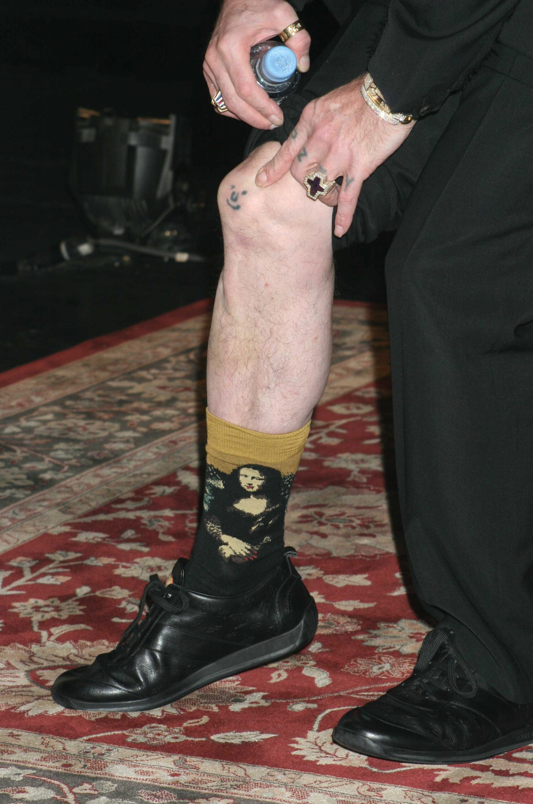
Jack Osbourne matching smiley knee tattoos

The first tattoos many people notice are the matching smiley faces on Jack’s knees. They’re simple round faces with eyes, noses and wide grins. The design itself is part of the joke, but it has a more tender connection too: Ozzy had similar tattoos on his knees, making Jack’s a small, permanent link between father and son.

Jack talked about the tattoos on I’m A Celebrity. He said he had the same knee ink as his dad and mentioned that the show’s director had them too. That makes the design feel less like random old-school body art and more like an in-joke that grew into a family marker.

Ozzy’s knee tattoos became famous after he joked that the faces helped with loneliness: he could look down and pretend they were alive and talking to him. Jack’s version carries the same silly, affectionate feeling. It can make someone laugh before they hear the story, then feel more meaningful once they do.

The placement helps. Knees are bony, awkward and visible when someone sits or pulls up their trousers. Jack put the family joke somewhere people can see it, which suits the Osbourne sense of humour.

The jungle photos show the knee tattoos in the larger collection
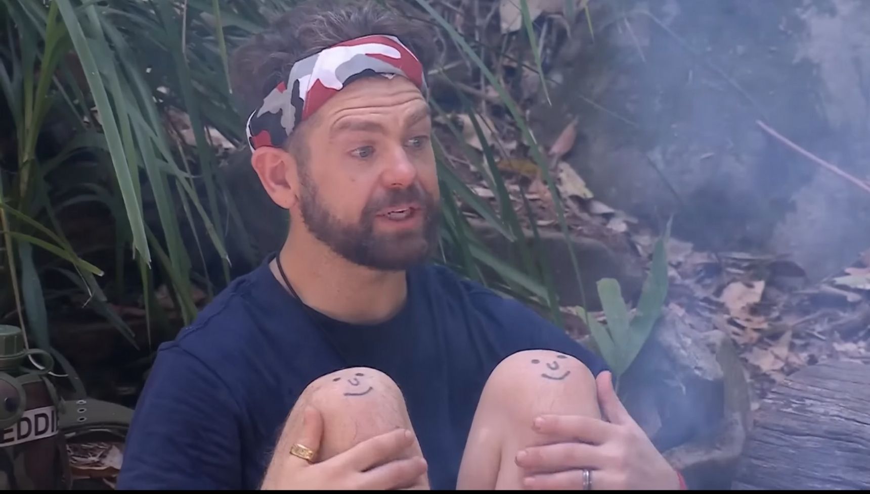
Jack Osbourne smiley knee tattoos in the jungle

A second set of jungle photos gives a better sense of how the knee designs fit into the rest of Jack’s ink. The two faces are easy to spot with his knees pulled up, while the heavily tattooed arms enter the frame too. The simple smileys sit beside darker, more detailed pieces.

That contrast is part of the collection’s character. The knee tattoos are cartoonish; the arm and back work leans toward traditional animals, movement and dense shading. Jack hasn’t tried to make everything match. Each design seems to keep its own personality.

It also helps explain why the knees have become a talking point. You see two small faces, then learn they mirror Ozzy’s. The story does the work.

A prowling tiger covers part of Jack’s forearm
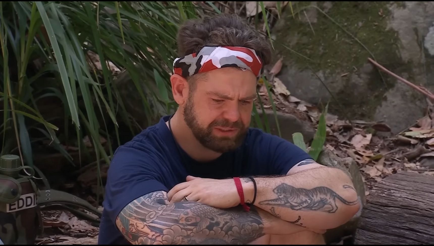
Jack Osbourne prowling tiger forearm tattoo

One of the clearest designs on Jack’s arm is a prowling tiger on his left forearm. It’s more aggressive and detailed than the smiley faces, with the animal’s movement following the shape of his arm.

Jack hasn’t publicly given a firm explanation for the tiger. It might suggest strength, independence or protection, or it may simply be an image he likes. The design is well documented, but its personal meaning hasn’t been clearly explained by him.

The tiger shows how varied the collection is. The faces are deliberately funny, the back piece is theatrical and sprawling, and the forearm tiger is direct. It looks like a piece chosen for the image itself, without needing a speech or family story around it.

His back piece brings together a samurai, a sea serpent, and mermaids
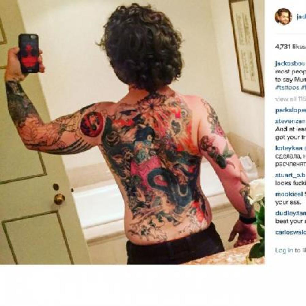
Jack Osbourne samurai and sea serpent back tattoo

Jack’s largest documented tattoo is a full back piece showing a samurai fighting a sea serpent. The scene is colourful and busy, with mermaids and floral details around it. It transforms the whole back instead of acting as a small accent.

Jack revealed the piece after working on it over a long period. Reports said his mother, Sharon Osbourne, wasn’t thrilled when she realised how extensive it had become. It’s easy to understand that reaction when a design has grown across someone’s entire back, but it also shows Jack’s willingness to commit to an idea.

The imagery has a classic adventure feel. The samurai facing a sea creature gives the tattoo a story, while the mermaids and flowers soften the edges and fill out the scene. It isn’t minimalist or meant to disappear under a shirt; the scale is the point.

A mermaid sleeve honors his daughter Pearl
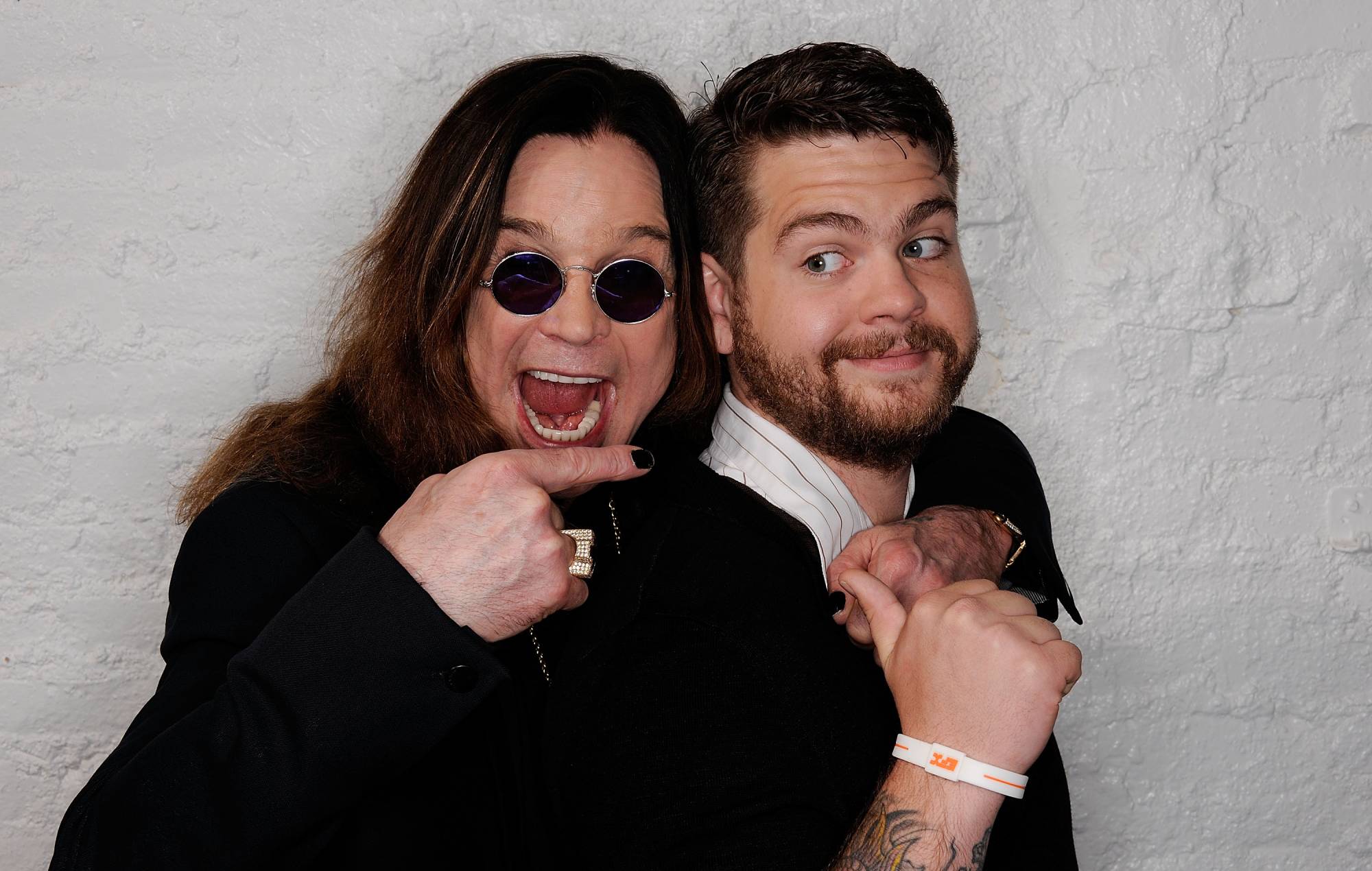
Jack Osbourne tattooed forearm in a family photo

Another important piece is the mermaid tattoo with the name Pearl, part of a sleeve on Jack’s arm. Pearl is his eldest daughter, making this one of the clearest examples of his tattoos as family history rather than decoration.

The sleeve is reported to include fish and a Chinese dragon alongside the mermaid. Together, they create an underwater or fantasy scene instead of leaving the name on its own. Pearl gives the design its personal anchor; the surrounding imagery turns it into something larger.

Photos don’t always show the sleeve clearly, so it’s better to stick to the parts that are documented than pretend we can map every inch from one image. The mermaid and Pearl connection are well established. The fish and dragon have also been reported, though the exact layout is harder to confirm from event photos.

Jack and his sister Kelly Osbourne have matching tattoos of each other’s names. The lettering and placement aren’t always clear in public photos, but reports of the matching idea are consistent. It fits the family theme running through his collection, alongside the pieces connected to Ozzy, Pearl and the Osbourne siblings.

There’s something very Osbourne about pairing a sentimental idea with a design that can look a little rough around the edges. These aren’t delicate promises hidden away; they sit with animals, fantasy scenes and music references in a heavily tattooed look.

Jack has also been reported to have a cross on his chest. It’s more straightforward than the full back piece, but adds another layer. Ozzy was famously associated with a cross necklace, so there’s an obvious family echo, even though Jack hasn’t given a long public explanation of the tattoo.

The chest is a very different canvas from his knees or forearm. The cross sits close to the body and is usually covered by clothing, making it feel more private than the grin on his knees or the samurai scene across his back.

Japan added a traditional Tebori chapter to the family story.

On Ozzy & Jack’s World Detour, Jack and Ozzy travelled to Japan and got matching tattoos. The show followed Jack as he received a traditional Tebori tattoo from Horiyoshi III in Yokohama. Tebori is done by hand with a rod holding a group of needles, rather than an electric machine.

The technique gives the tattoo a connection to a specific craft tradition. It also makes the piece feel different from the colourful back scene, tiger and cartoon smileys. The story is in the image and in the fact that Jack and Ozzy chose to go through the same old-school process together.

The exact design of Jack’s Tebori tattoo isn’t always visible in available photos, so some restraint is useful here. We can describe the trip to Japan, the matching choice and the technique. A precise symbol or placement needs a clear photo or direct explanation.

In July 2025, Jack also got a Black Sabbath tattoo backstage at Ozzy’s final-ever show. The timing gives it an obvious emotional weight: it was made during a performance that mattered enormously to the Osbourne family and to the band’s history.

Reports confirm that the tattoo happened, but don’t provide a reliable close-up of the finished design. The safest description is a Black Sabbath tribute, without guessing at its exact lettering, size or placement. The story is strong as it is: Jack marked the night, the band and his dad with permanent ink.

Jack Osbourne’s tattoos feel collected rather than carefully matched.

The collection isn’t one tidy visual project. The smiley faces are playful; the tiger is intense; the samurai scene is huge and theatrical. The Pearl mermaid brings fatherhood into the sleeve, the sibling names make the family connection literal, and the Tebori piece records a trip and a shared experience with Ozzy.

There are still gaps in the public record. Some pieces only show in passing; others have been described without a clear close-up. A complete inventory would need Jack himself, a full tattoo tour or a long run of high-resolution photos. Until then, the sensible approach is to stick with identifiable designs and mark anything uncertain as such.

That doesn’t make the collection less interesting. Jack has built a body of work that holds jokes, family memories, music history, travel and personal milestones in the same place. It’s messy in the best way, and it feels lived in.

His tattoos aren’t trying to tell one perfectly edited story. They’re snapshots from different parts of his life: some loud, some private, some deliberately funny. That’s why the little smiley faces matter. They look simple, but point back to Ozzy, family and humour that can survive even hard times.

Watch Jack talk about the tattoos.

For more context, watch this video about Jack Osbourne’s tattoo story and family connection.
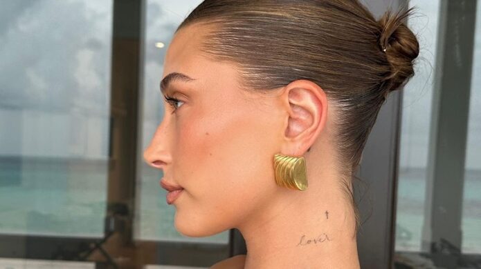
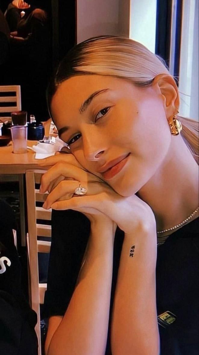
Hailey Bieber’s tiny tattoos keep family dates close to the skin

Hailey Bieber’s tattoos are tiny and easy to overlook until you pay attention to the details. The model and Rhode founder has more than twenty small designs across her wrists, hands, forearms, neck, and collarbone. Rather than one large sleeve or a dramatic central image, her collection feels like a set of personal notes: family dates, friendship, faith, heritage, and little designs that fit moments in her life.

That’s what makes her ink interesting. Fine-line pieces can disappear under a bracelet or sleeve, then show up in a close-up photo. Hailey and some of her tattoo artists have explained a few meanings; others are guesses repeated by fan guides. A useful overview keeps those two things separate while showing how many designs connect to people she cares about.

The Roman numerals mark her parents’ wedding date

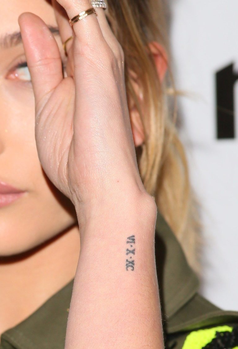
Hailey Bieber Roman numeral wrist tattoo
One of Hailey’s best-documented tattoos is the date VI·X·XC in Roman numerals on her wrist. It marks June 10, 1990, the wedding day of her parents, Stephen and Kennya Baldwin. The design captures her style: small and delicate, with a personal meaning that doesn’t need to be written out in large letters.

The piece is associated with tattoo artist JonBoy, whose work often uses fine lines and compact placement. The wrist keeps the date close at hand, while still making it more private than a large family portrait. Her parents’ anniversary is one of the clearest confirmed meanings in Hailey’s collection. It’s a good example of her tattoos serving as reminders rather than statements.
A ribbon joined the collection as a tiny new addition

Hailey Bieber ribbon tattoo
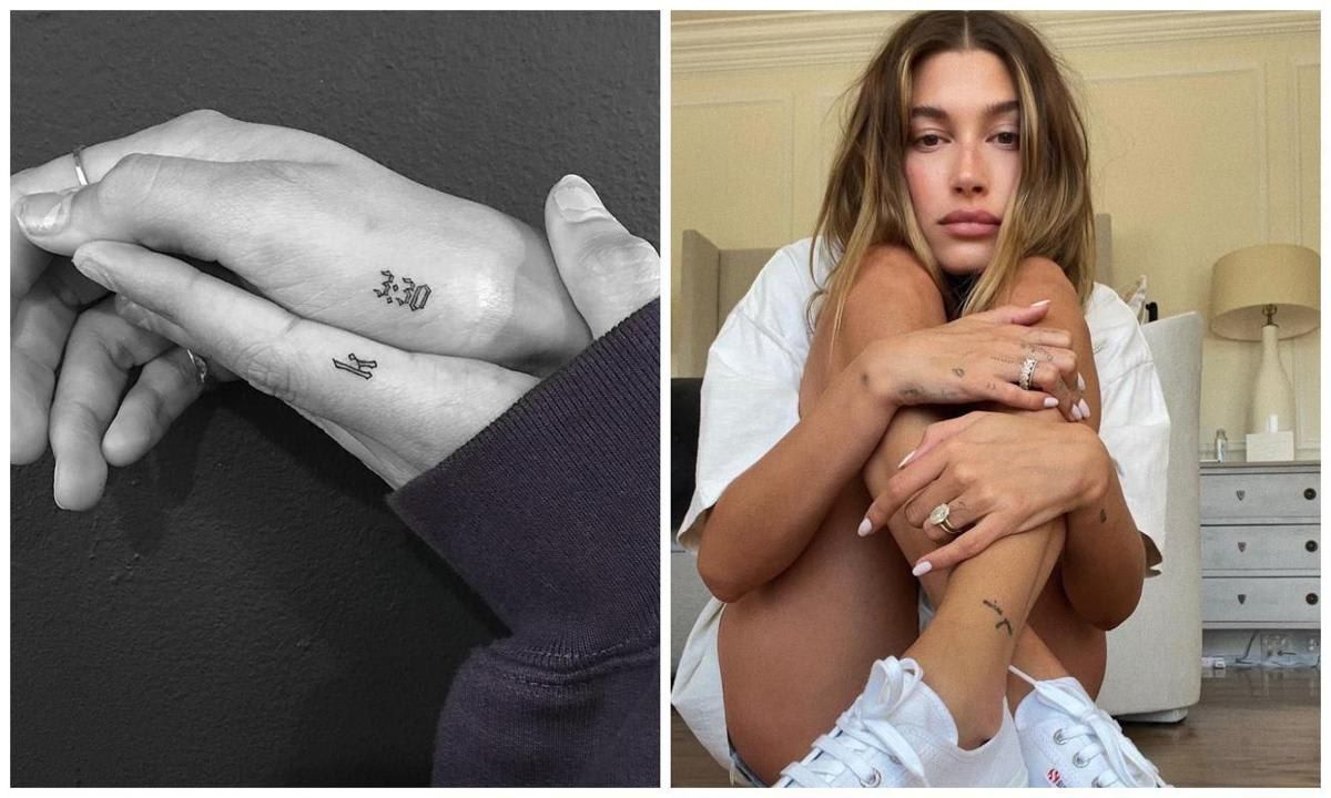
In late 2023, Hailey showed a small black ribbon tattoo and called it a “tiny baby tat.” Its simple design fits with the rest of her fine-line pieces without competing with them. That’s part of the appeal of micro tattoos: each one can be added like another note in a small journal.

The coverage confirms that Hailey called the ribbon a new addition, but it doesn’t give a definite meaning for it. A ribbon might suggest remembrance or celebration, or it may simply have appealed to her as a shape. Without an explanation from Hailey, it’s best to describe what’s visible instead of guessing at the reason. Not every tiny tattoo needs a public backstory.

Her forearm holds celestial and directional details

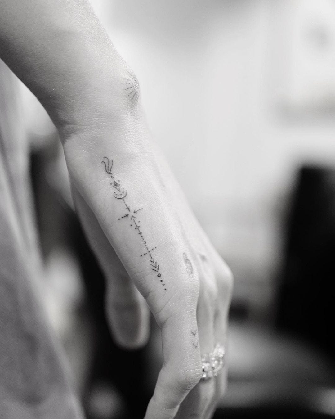
Hailey Bieber forearm tattoo symbols
Hailey’s forearm and hand include a few small celestial and directional designs. One documented piece pairs a crescent moon and a star with an arrow, all joined by a dotted line. The symbols have plenty of space around them, so they can be read on their own or as a group.

That light arrangement is typical of her collection: a few small marks instead of one solid block. The moon and star are visible, but their personal meaning hasn’t been clearly confirmed. Fans may connect them with astrology, guidance, or a timeline, but those are interpretations. The most reliable description is a celestial design above the wrist on her forearm.

Her heritage appears in small lettering

Hailey Bieber heritage tattoo
Small words and place names also help Hailey keep family history close. Tattoo guides identify “Minas Gerais” as a reference to her Brazilian heritage through her mother’s side of the family. It’s a short phrase, but it points to a place and the family roots she carries with her.

The small scale matches her other tattoos. Rather than choosing a large flag or emblem, she uses a phrase that can sit quietly on her skin. That makes her collection look different from celebrity tattoos built around chest pieces and sleeves. Heritage is there as a detail, not a billboard.

Friendship tattoos add a shared language

Hailey Bieber friendship tattoo collection
Some of Hailey’s tattoos are shared with friends. Guides have discussed “Gente,” a word she shares with her friend Mari Fonseca. Like the date for her parents’ anniversary, it turns a relationship into a small mark she can carry with her. The point seems to be keeping the connection close, not explaining it to everyone else.

Matching tattoos can raise questions about when they were done, who made them, and whether both people still have the same design. The documented link between Hailey and Mari is enough to describe the tattoo without adding details that haven’t been shared. It also fits the wider pattern of using small words and symbols to remember people.

Faith and short words sit near the neck

Several guides point to faith-related words and symbols in Hailey’s collection, including “PRAY” and “lover” beneath a cross on her neck. These are easier to read than the moon or Roman numerals, but their exact meaning still depends on what Hailey has chosen to explain. A word can matter to someone without having one fixed public interpretation.

A small neck tattoo feels different from a piece on an ankle or rib. It’s more visible when her hair is tied back, but a collar can cover it. The modest scale keeps that visibility understated. Her ink is personal language in a very small typeface.

The collection includes a peach and other playful symbols

Hailey is also known for a small peach emoji tattoo on her forearm, along with stars, hearts, and other tiny designs seen in tattoo roundups. The playful pieces keep the collection from feeling too serious. Family dates and heritage can sit beside a simple icon without having to follow one grand theme.

That variety is part of the appeal. Celebrity tattoos don’t all have to connect to a single idea, and Hailey’s feel more like a series of moments. One can honour her parents, another can mark a friendship, and another might simply make her smile. The collection feels considered without needing an explanation for every piece.

Artists JonBoy and Dr. Woo shaped the fine-line look

Hailey’s fine-line tattoos are often associated with JonBoy and Dr. Woo, both known for delicate, precise work. Their association helps explain some of the visual consistency across designs that don’t share a single subject. Thin lines, open spacing, and clean symbols let new pieces sit alongside older ones without making the collection feel heavy.

That doesn’t mean one artist did every tattoo. Tattoo guides and press photos don’t provide a full record of each appointment. The careful description is that JonBoy and Dr. Woo are associated with notable pieces, not that they made every mark. It’s fair to credit their work while leaving the gaps in the record clear.

Her ink is built around memory more than shock

Hailey’s tattoos aren’t designed to overwhelm. They reward a closer look. The clearest meanings involve her parents, heritage, friends, and faith. The ribbon fits in because it adds another small detail without changing the overall feel.

That works with her public style. The tattoos can show up in beauty photos, streetwear looks, and close-up product campaigns without taking over the image. They invite questions, while leaving some answers for the people closest to her. Their small scale lets Hailey choose when to share the story.

What remains unconfirmed

Public guides list more than twenty tattoos, but there isn’t one authoritative source confirming every design, placement, artist, and date. Some pieces are clear in photographs; others come from fan guides that repeat information without pointing to an original interview. Meanings for the moon, star, ribbon, and several other symbols remain uncertain unless Hailey or the artist has explained them.

A grounded inventory can include her parents’ wedding date in Roman numerals, the ribbon, the celestial forearm design, Minas Gerais, the Gente friendship tattoo, faith-related words, and the peach and small-symbol pieces. That gives readers a useful picture without pretending to be a complete record. The missing details are part of the privacy Hailey’s tattoo style seems to protect.

Hailey Bieber’s tattoos keep the important things close

Hailey Bieber’s ink is easy to miss because the designs are deliberately delicate. Look closer and they form a record of family dates, Brazilian heritage, friendship, faith, and small personal choices. The tattoos don’t need to be loud to mean something. They’re reminders she can see herself, which a camera may catch when it gets close enough.

That’s the thread tying them together: not one grand story, but many small reasons. Her parents’ anniversary sits alongside a new ribbon. A word for a friend appears near a religious symbol. A peach or star adds a playful note to more serious pieces. Hailey’s tattoos feel less like a brand and more like bookmarks in a private life.

Watch a guide to Hailey Bieber’s tattoo meanings

More celebrity tattoo guides

A Family Tree, a Lennon Tribute and Ant McPartlin’s Other Tattoos

Ant McPartlin’s tattoos can be hard to spot when he’s wearing a suit, so they tend to make headlines when he rolls up his sleeves. There’s a family tree, a John Lennon tribute, a rose and arrow, dog designs, recovery-related ink, and a chest tattoo for his wife, Anne-Marie.

The collection has grown through some major changes in his life. Ant has spoken about recovery, marriage, and family, and those subjects appear in the tattoos. He also has a sense of humour about them. Not every mark comes with a big speech or a confirmed explanation. That blend of certainty and mystery makes the collection feel lived-in.

The family tree is the centre of the collection

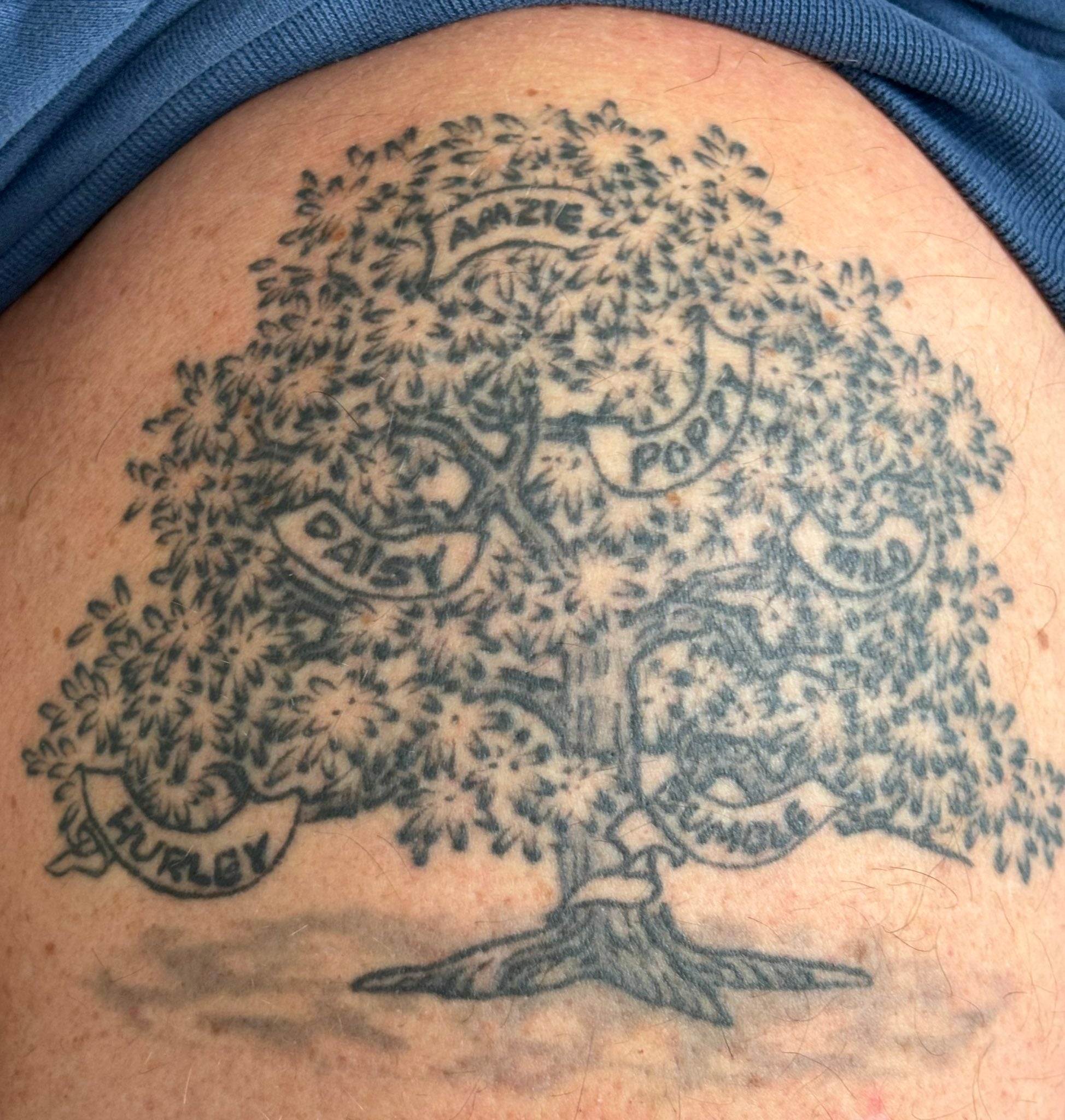
Ant McPartlin family tree shoulder tattoo with names
The largest and most personal design is the family tree tattoo on Ant’s shoulder. Its branches hold the names of the people and animals closest to him. Public photos show names linked to his wife Anne-Marie, her daughters Daisy and Poppy, their son Wilder, and the family dogs Milo, Bumble, and Hurley.

There was a brief online fuss when fans thought Hurley’s name had been left off. Hurley is the Labrador Ant shares with his former wife Lisa Armstrong. Ant clarified that the name was there, but a newborn covered it in the original photo. His reply was simple: Hurley was on the tree too.

That small correction says a lot about the tattoo. It isn’t a generic tree picked from a tattoo design book; its branches carry the names of the people and dogs in his family. The shoulder piece works like a private family chart that happens to appear in public photos.

Wilder’s arrival also helps explain why the tattoo drew attention. The design was shown around the time Ant and Anne-Marie welcomed their son, tying the newest name to a major family moment. The tree has a timeline as well as a meaning.

His John Lennon tattoo turns a song into a tribute

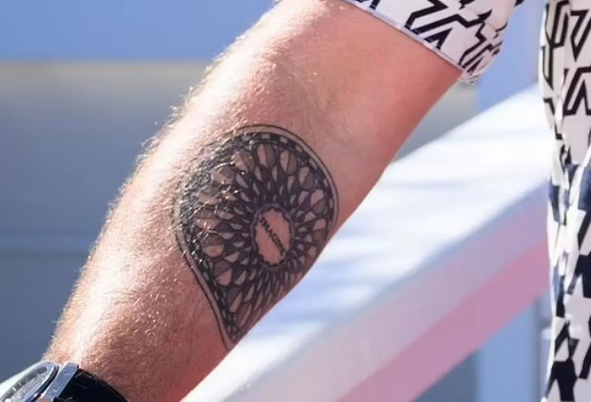
Ant McPartlin John Lennon Imagine tattoo on his forearm
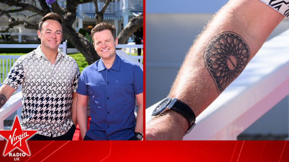
On his right forearm, Ant has a large circular tattoo based on the Imagine mosaic at Strawberry Fields in Central Park. “Imagine” sits at the centre, surrounded by a black-and-white pattern echoing the memorial’s tiles. The circle gives the reference a shape of its own instead of looking like a photograph copied onto skin.

The tattoo was revealed before an I’m a Celebrity series and quickly became one of the easiest pieces to identify. It also fits Ant’s long-standing interest in music. Rather than a generic guitar or lyric, he chose a particular place, image, and word with history behind them.

From a distance, the design can look like a mandala or wheel. Up close, the centre clarifies the reference. The word “Imagine” is what identifies it, while the surrounding pattern gives the forearm a dark, graphic look.

There are two ways to read it. The straightforward one is a John Lennon tribute. It can also suggest hope, especially alongside Ant’s family and recovery tattoos. Its meaning is personal, while the reference is deliberately public.

Anne-Marie appears close to his heart

Ant McPartlin forearm tattoo visible at a public event
Ant has several tattoos linked to his wife. The clearest is “Amzie” across his chest above his heart. Amzie is Anne-Marie’s nickname, and the placement makes the connection plain. It’s a small, direct tribute rather than a symbol that needs decoding.

He also has a simple letter A inside a heart on his chest, added in 2021. One design uses a nickname and the other an initial, but both point to the same person. Neither tries to hide who inspired it.

Reports from the same period also show a sun with black wings on his stomach. Ant hasn’t offered the same detailed explanation for every part of it, so it’s best to leave that uncertain instead of turning a guess into a fact.

Anne-Marie’s presence isn’t limited to one tattoo. Her nickname appears in the family tree, the chest piece, and the heart initial. The repeated reference feels like an ongoing thread, not a one-off gesture.

The rose and arrow carry different kinds of meaning

Ant McPartlin rose and arrow tattoos on his forearm
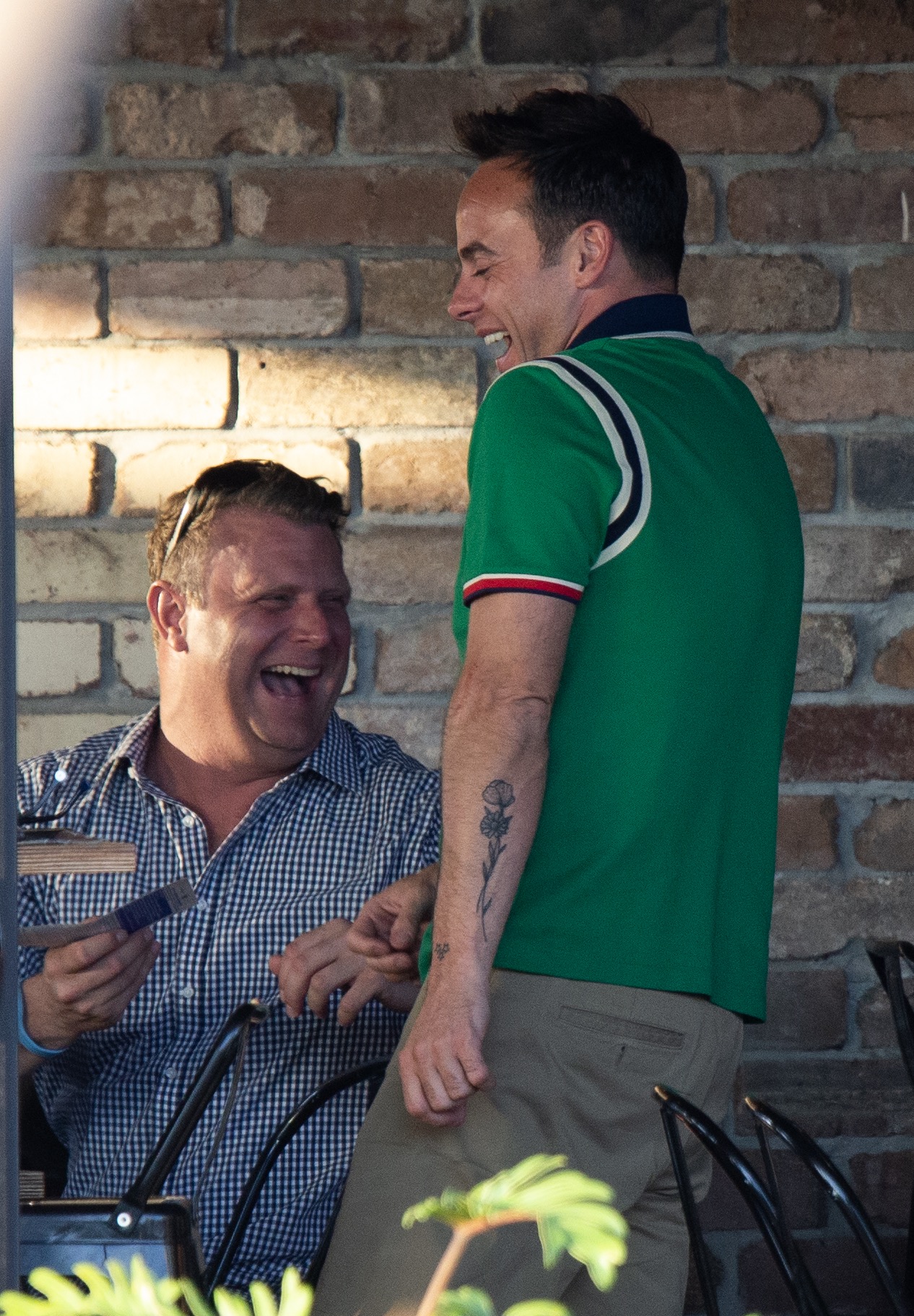
Ant’s arms include a rose tattoo and an arrow tattoo, one on each forearm. The pair balances visually even though the designs are separate. Roses are often associated with love, while Ant has described the arrow as personal and positive.

That’s as far as the confirmed explanation goes. People often assign arrows a universal meaning—direction, momentum, or getting through a difficult stretch—but Ant hasn’t settled on one specific interpretation publicly. The safest description is the one he has given: it means something positive to him.

The rose has a softer look than the Lennon mosaic. Its long stem runs vertically, while the arrow points across the skin and gives the arm a sharper line. Together, they keep the collection from becoming one solid block of dark shapes.

These designs are simple, but they’re part of Ant’s everyday image. His arms show on television, in holiday photos, and whenever he presents in short sleeves. Simple symbols become part of his familiar on-screen look.

His dog tattoos are a proper family tribute

Ant McPartlin forearm tattoo detail and visible arm ink
Ant’s love of dogs shows up beyond the family tree. He has a design of three cartoon dogs on his forearm, representing Milo, Bumble, and Hurley. These aren’t anonymous pet portraits; the dogs are treated as part of the family.

The design helps explain why Hurley’s apparent absence caused a reaction. Fans who knew the story were looking for his name, and Ant wanted them to know Hurley hadn’t been forgotten. The full family-tree photo settled it by showing the name where it had been covered.
There’s more warmth here than the phrase “pet tattoo” suggests. The dogs appear in the same family picture as the children and Anne-Marie. They’re alongside the people, not treated as a separate novelty.

It’s a very Ant detail: sentimental, a little chaotic, and impossible to explain without mentioning the dogs. The pieces make more sense together than in a quick list.

The harder years left a few quiet reminders

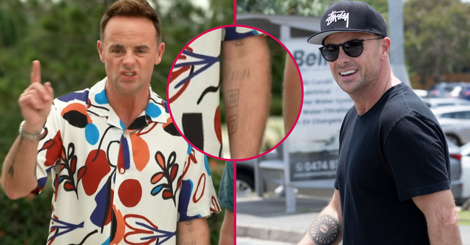
Some of Ant’s tattoos are linked to his recovery from alcohol and drug addiction. A small design near his wrist is often identified as the Alcoholics Anonymous symbol, although reports note that Ant hasn’t personally confirmed every detail of that interpretation. Small stars and other marks appear around his arms, along with the letters “S&H”, which coverage has connected to his sobriety story.
A little caution matters here. The recovery context is well documented, but Ant hasn’t captioned every shape himself. Some meanings come from people interpreting photos, and those should stay labelled as interpretations.

The placement makes sense, though. Wrist tattoos are hard to ignore and easy to see during everyday routines, so they can work as personal reminders. The family pieces look outward to the people Ant loves; the recovery-related marks may serve as quieter notes to himself.

Some pieces stay in the background

Alongside the main designs, Ant has smaller tattoos and lettering that don’t always come with an explanation. Some show only when his sleeves are pushed up; others are easy to miss in TV footage. They may matter, but a careful inventory still separates clear details from guesses.
His collection includes small stars, stacked lettering, geometric marks, and a circular wrist symbol linked to recovery. Public coverage describes the rose, arrow, family tree, dog tattoos, and Lennon tribute most clearly. Other marks add texture without a confirmed story attached to them.

That incomplete record is one reason celebrity tattoo lists can be tricky. A photo may show a shape, but only the wearer can explain why it’s there. Not every line needs a made-up meaning. Sometimes Ant simply hasn’t said.

The collection keeps its own balance

Taken together, the tattoos are less about one style than about the people and ideas Ant carries with him. The family tree and dog designs keep home life visible. Anne-Marie’s nickname and the heart initial mark his marriage. The Lennon piece connects him to music, while the rose and arrow add simpler designs with personal weight.

Recovery is another thread, expressed through small marks rather than one large statement. That seems fitting for someone who has spoken about difficult years and moving forward. These tattoos can be reminders, tributes, and parts of his visual identity at once.

There’s no need to pretend the collection was planned as one grand sleeve. The tattoos arrived at different times, for different reasons, and with different amounts of explanation. That’s what makes the collection feel human: a family tree, a Lennon tribute, his wife’s nickname, beloved dogs, and a few symbols whose full stories remain his own.
Watch the tattoo story on video

More celebrity tattoo guides

Ireland Baldwin’s New Ghostface Tattoo Changed the Whole Story

Ireland Baldwin’s tattoo collection has gone through a lot of changes, but the biggest one came when she covered an older David Bowie tribute with a large Ghostface sleeve. The new work runs from her shoulder toward her elbow and gives the collection a darker focal point.

That change also says something about how she feels about old ink. Ireland has at least 24 tattoos, spread across her arms, legs, ribs and other spots. Some are playful, some carry personal meaning, and some were designs she liked at the time. The new piece stands out because it makes a strong visual statement and replaces a tattoo she no longer wanted on her body.

It can be hard to read the full collection from a single red-carpet photo. A black dress can cover most of it; a sleeveless look reveals a jumble of colour, lettering and linework. The collection is still changing, and that is part of what makes it interesting. Ireland has never treated her tattoos as one perfectly planned sleeve. They look more like a record of different eras.

The Ghostface sleeve now dominates Ireland Baldwin’s collection

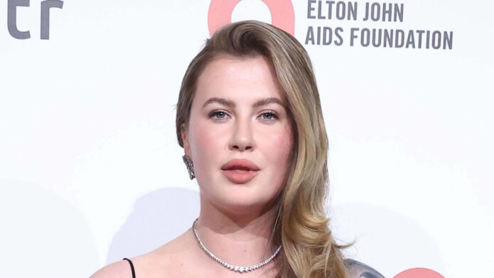
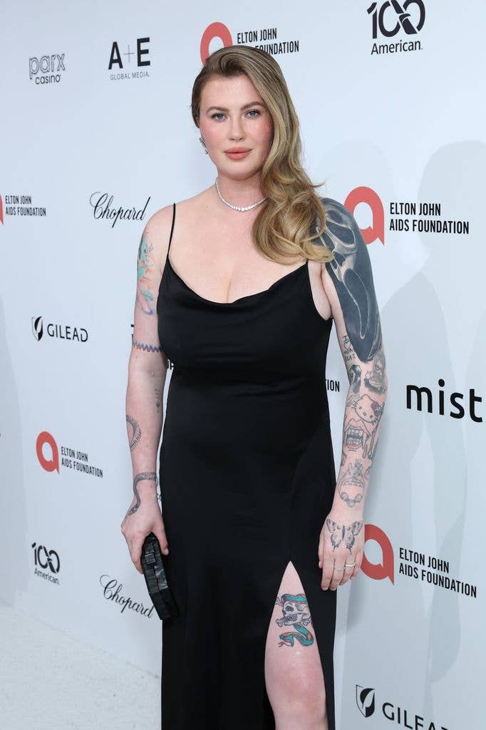
Ireland Baldwin colorful arm tattoos and Ghostface sleeve at red carpet

Ireland showed off the new Ghostface tattoo after getting into the Halloween spirit. It depicts the masked villain from Scream and covers a large part of her upper arm. This is not a tiny reference hidden under a sleeve: the portrait is big enough to stand out in photos, and the surrounding ink makes it feel like a half-sleeve rather than a single flash design.

The tattoo also shows a hand holding a knife, pushing it firmly into horror territory. That detail gives the image a sense of movement. Ghostface is recognisable on its own, but the knife makes the whole composition feel more like a scene.

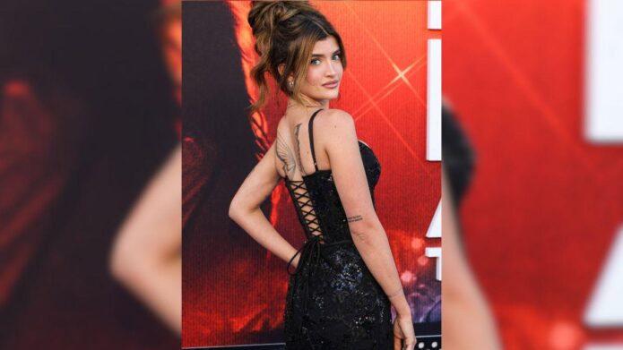
At the 2026 Elton John AIDS Foundation viewing party, Ireland’s black dress left her shoulders and arms on display. The photos offered a rare clear look at how much space the new tattoo takes up. Her right shoulder has a large, dark abstract section, while older, more colourful designs cover parts of the forearm. The Ghostface piece sits among that existing work rather than replacing the whole map.

She covered an older David Bowie tattoo

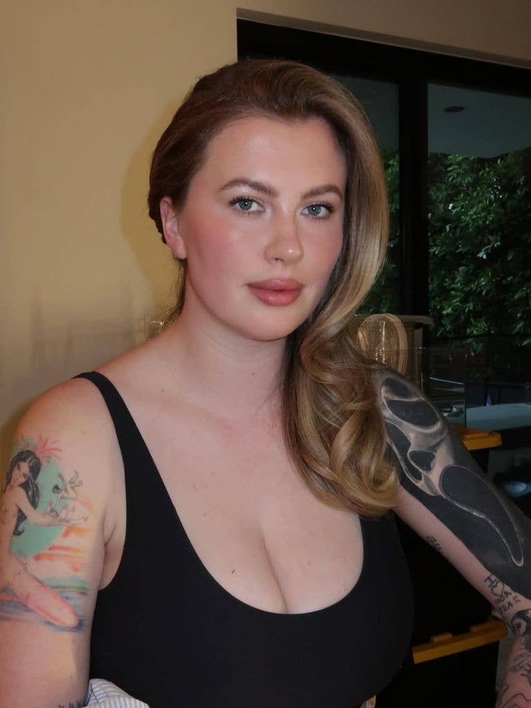
Ireland Baldwin earlier colorful arm tattoos and sleeve designs

The Ghostface design covers an older David Bowie tattoo. Ireland said she planned to get Bowie tattooed somewhere else because she no longer wanted the original piece on her body. She was blunt about why: she said the person who gave her that tattoo was a terrible person, and keeping that particular design no longer felt right.

Covering a portrait takes some thought. The new tattoo usually needs enough size, dark shading or careful detail to hide the old lines. That helps explain why the Ghostface sleeve has such a strong presence. It adds a new image and closes the chapter on an older one at the same time.

There is a difference between replacing a tattoo because it feels dated and covering one because the memory behind it has changed. Ireland’s explanation puts this in the second category. The cover-up is more than a style change. It lets her take back a piece of her body she no longer wanted to carry.

The older arm photos help show why the before-and-after matters. Before the cover-up, the sleeve already held a mix of distinct designs: a colourful figure, cartoon-style work, lettering and small black line tattoos. Those pieces remain part of the wider collection, even though the Bowie portrait is now gone.

The older arm pieces are colourful, funny and deliberately mixed

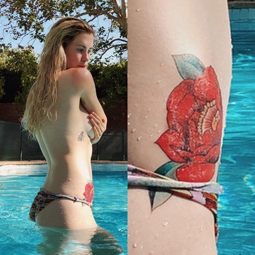
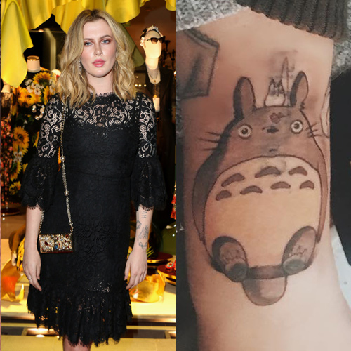
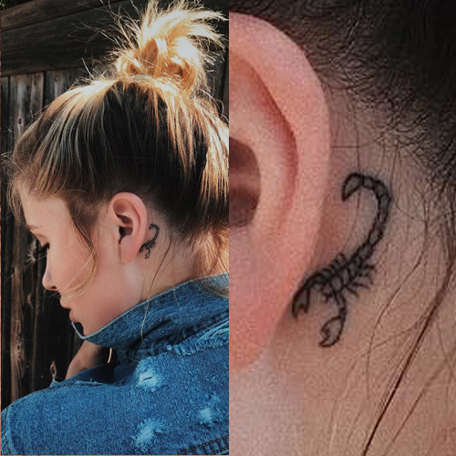
Ireland’s earlier tattoos do not stick to one style. Bright illustrative pieces sit alongside black lettering and more traditional-looking designs. The mix includes a rose on her hip, a lotus flower on her arm, a scorpion behind her ear and the Japanese character for Totoro on her forearm. The placements are scattered, which makes the collection feel personal instead of planned for one photoshoot.

That variety is part of the charm. Many celebrity collections become easy to recognise because they share an artist, colour palette or fine-line look. Ireland’s ink is less uniform. The rose does not need to match Totoro, and the scorpion does not have to echo the lettering on her ribs. Each piece seems to come from a different choice.

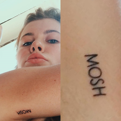
Her arms also show writing along her ribcage and forearm, along with small drawings that are easier to catch in close-up photos than on a red carpet. The lettering gives the collection a more personal feel, while the larger illustrations keep it from becoming a wall of text.

The collection also shows how colour affects the way tattoos read over time. Bright designs grab your attention, while black-and-grey linework can fade into the background until the light hits it. An event photo can help show placement, but it may not be clear enough to identify every individual tattoo.

Her tattoos have always been tied to changing phases

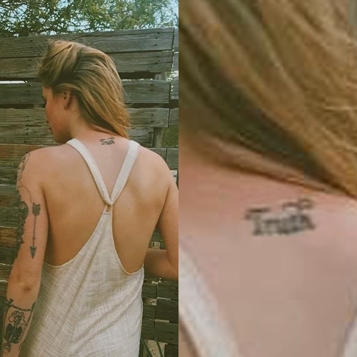
Ireland Baldwin Truth neck tattoo

Ireland has talked publicly about body image, confidence and the strain of being photographed. That context matters when looking at her tattoos. They sit alongside parts of her body she has discussed learning to accept, including stretch marks, curves and eczema.

She has not said that every tattoo is perfect. If anything, her comments suggest the opposite: some pieces reflect an image she wanted at the time, some grew out of a friendship or interest, and others simply looked good in the moment. The collection keeps those changes visible instead of hiding them.

That is why covering the Bowie tattoo feels like a turning point. Ireland did not pretend it had never been there. She explained why she wanted it replaced, then chose something much larger and more theatrical. The sleeve makes the point that a tattoo can change when the story attached to it no longer feels right.

There is a practical side to the decision as well. Cover-ups can limit future options. With a dark portrait and knife scene on her arm, any later work will need to fit around the new design. The Ghostface piece has become the main feature of that arm, whether or not Ireland set out to make it an anchor.
What Ireland Baldwin’s ink looks like now

Ireland’s tattoos now feel like a collection still in progress. The Ghostface half-sleeve is the newest focal point, surrounded by older colourful designs, small symbols and personal lettering. The rose, lotus, scorpion and Totoro are visible in some photos, while other pieces appear or disappear depending on her clothes and the camera angle.

That makes the collection more interesting than a perfectly matched sleeve. It shows how tattoos picked for different reasons can still add up to a recognisable look. Ireland’s arms have a scrapbook feel: bright images, dark patches, small text and references to people or ideas that mattered at different points.

Nothing about the collection feels fixed. The Bowie cover-up shows that even a tattoo with a strong personal or artistic connection can be changed. Ghostface now takes centre stage, but the older tattoos are still part of the story. They show where the collection began and make the new sleeve feel even bolder by comparison.

If you are looking to Ireland’s tattoos for ideas, the useful lesson is not to copy the Ghostface portrait. Think about how a new design will sit beside the ink you already have. A cover-up can solve one problem while creating a new focal point. Different styles can share an arm when their placement works. And a tattoo can mean a lot for years before you decide it is time to move on.

Ireland’s collection is a reminder that tattoo stories do not stop when the needle does. The next chapter might be a cover-up, moving an old idea somewhere else or deciding that the mix of pieces still feels like yours.

Ireland’s tattoo history also shows why photos matter. A list can name a rose, lotus or character tattoo, but pictures show how the designs sit together. The new sleeve does not erase all the earlier work; it shifts the balance between the colourful pieces and the heavier horror image. That contrast is what makes the design interesting. The collection has grown through edits, additions and personal choices, not one session with a fixed blueprint. Her tattoos keep changing as her life does.

Ireland Baldwin red rose hip tattoo

Ireland Baldwin Totoro forearm tattoo

Ireland Baldwin scorpion behind ear tattoo

Ireland Baldwin Mosh armpit tattoo

Watch Ireland Baldwin discuss her scary new tattoo

There is no full tattoo tour from Ireland to include, but this verified report covers the new Ghostface piece and the reaction it received.

More actor tattoo guides

Sami Sheen Wants a Fresh Start With Her Tattoos

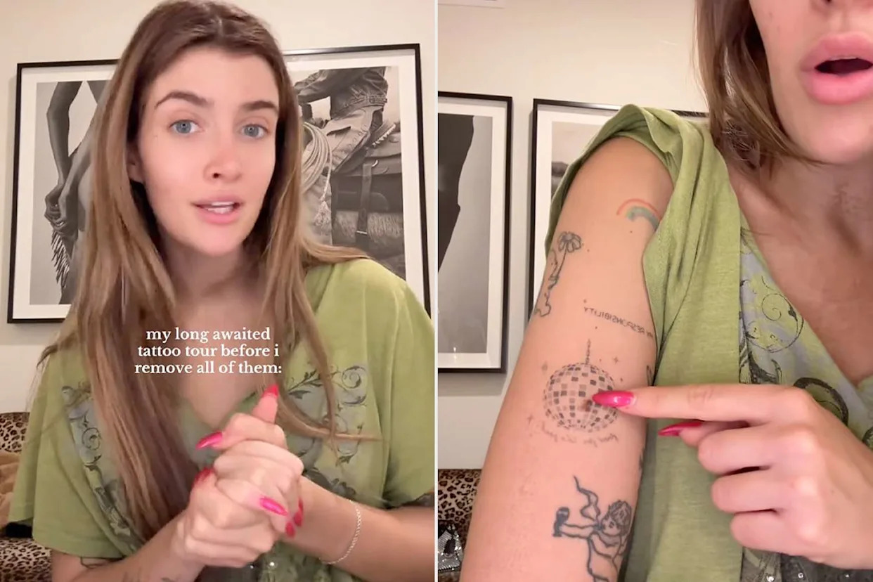
Sami Sheen is being unusually candid about a tattoo collection she no longer feels comfortable with. She has around 18 pieces, most added between ages 16 and 18, and says she wants nearly all of them removed. Her tattoo tour was not a polished showcase of perfect work. It was a walk through decisions made young: some done by a cousin learning to tattoo, some copied from Pinterest, and others that simply seemed like a good idea at the time.

That makes the collection more interesting than a standard celebrity ink list. Sami talks openly about thick lines, awkward placements, pieces she still likes and tattoos she would rather cover. She has estimated the removal process could take about two years. The story holds regret, humour and a very understandable wish to feel comfortable in her own skin again. She isn’t pretending every tattoo has a perfect story. That is the point: the collection shows what can happen when someone starts getting ink before settling into a style.

The first tattoos came when Sami was sixteen

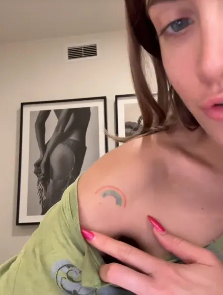
Sami Sheen rainbow and butterfly tattoos

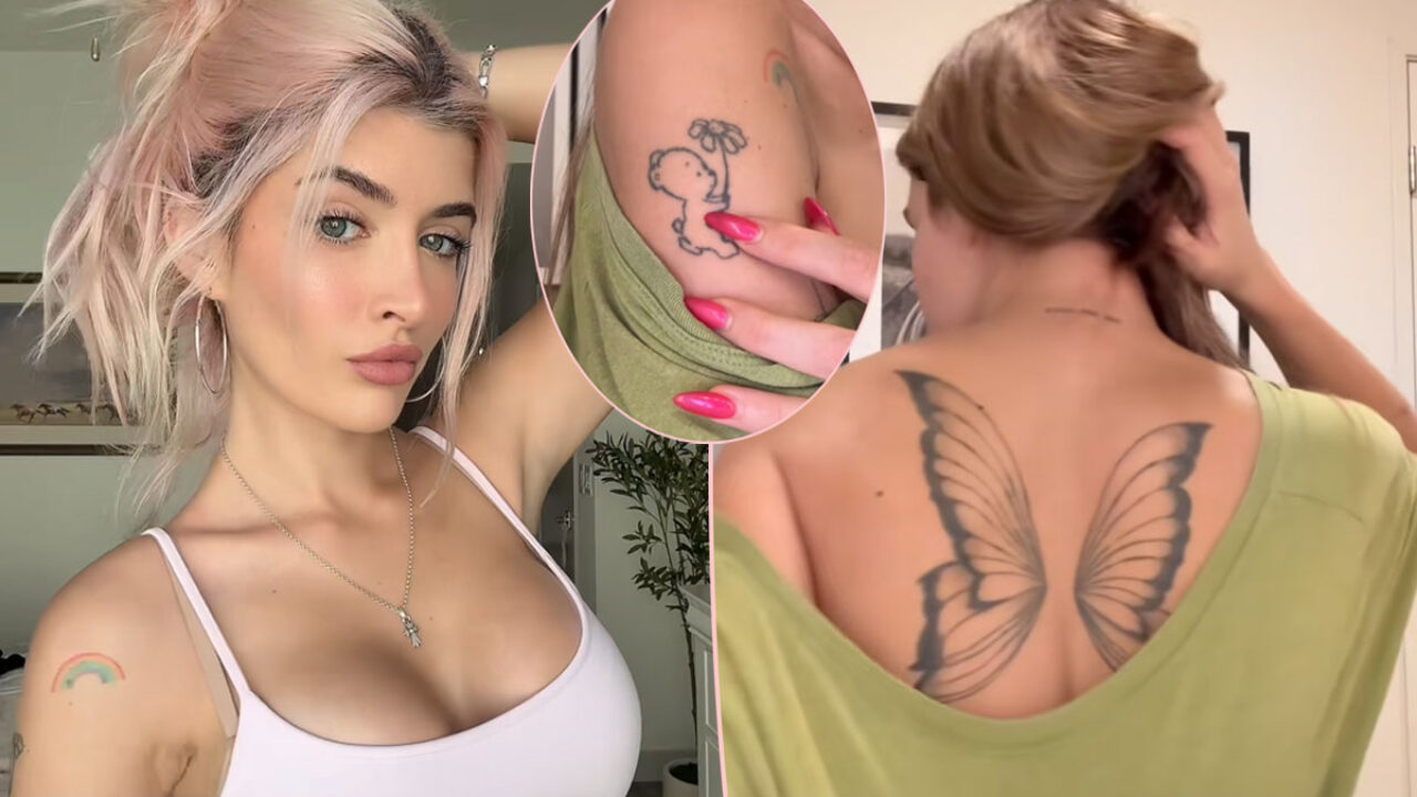
Sami has said she got her first tattoos at 16. One early design combined a butterfly and dominoes to represent the butterfly effect. Another was a teddy bear holding a flower. Looking back, she has joked about the thick lines and how some pieces sit on her arm.

That is a familiar way to begin. Many people choose a first tattoo because they like an image, without thinking much about how it will age. Sami’s early choices were simply documented and later shown to a huge audience. The internet saw the designs, her second thoughts and her decision to move on.

Some of the first pieces came from her cousin, who was practising tattooing. That helps explain the rougher look Sami talks about now, and her mixed feelings about the results. The tattoos were part of being young and experimenting, but they were not all done by artists with the same level of experience.

Her back wings are the tattoo she may keep

Sami Sheen butterfly wings back tattoo

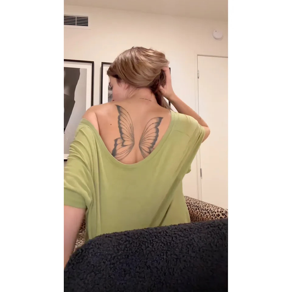
The largest design in Sami’s collection is a butterfly wing tattoo across her upper back. It spreads from her spine toward both shoulder blades and stands out from the smaller pieces on her arms. She has described it as extremely painful, one reason she is not rushing to remove it.

Sami has said she wants every tattoo gone, but the wings are the one design she seems less sure about. Removing a large, dark back piece would take time, money and many uncomfortable sessions. There is also a difference between disliking a small, crooked design and changing a major piece that affects her whole silhouette.

The wings change the way the collection reads. Without them, it would look mostly like scattered small tattoos; with them, there is a clear centrepiece. The design shows up in red-carpet photos and when she wears an open-back outfit.

The disco ball covered a mole and carried a phrase

Sami Sheen disco ball arm tattoo

One of Sami’s more unusual pieces is a disco ball on her arm. She has explained that it was originally meant to cover a mole and was connected to the phrase “Food for the soul.” It is a good example of a tattoo that began for a practical reason and picked up another meaning along the way.

The disco ball feels lighter and more playful than the wings, with a slightly kitschy edge. That contrast runs through Sami’s collection: sentimental pieces sit next to funny or impulsive ones, and some only make sense once you know the backstory.

Sami has been honest that some tattoos looked better in her memory than they do on her arm. That does not make a design worthless; it means it belongs to a particular part of her life, and she now sees it differently.

Her arm has cherubs, a cow, a boot and a rainbow

Sami Sheen cherub cow boot and rainbow tattoos

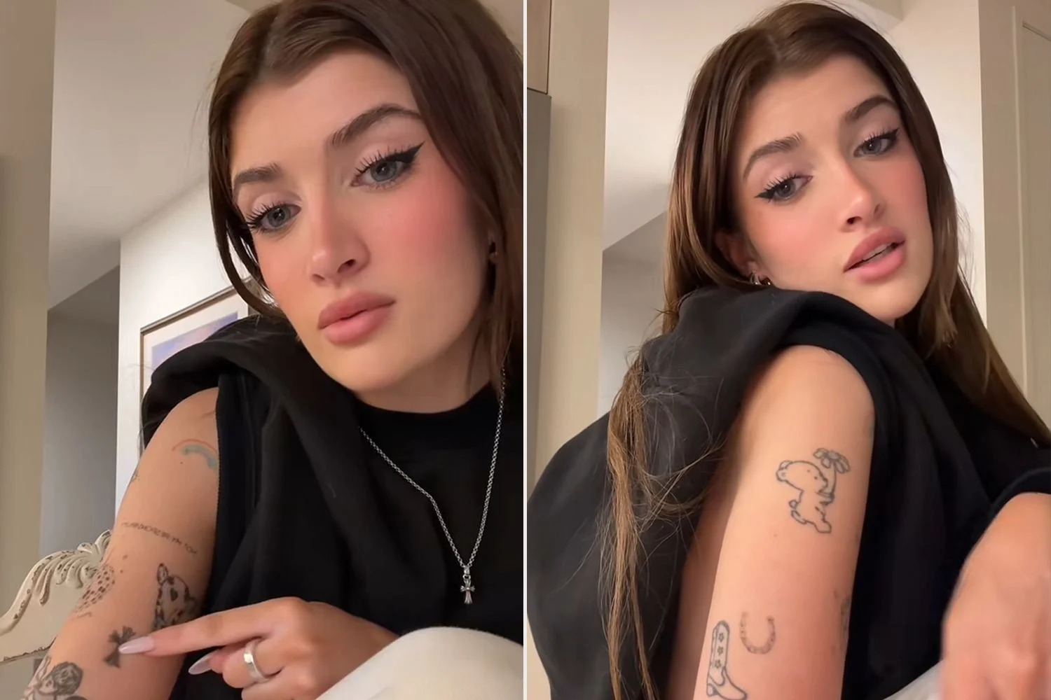
Sami’s tattoo tour also covered a run of smaller arm designs. One shows a cherub smoking a joint and holding a crooked wine glass; she has called it one of her worst tattoos. There is also an outline of a cow with a heart on its forehead, a cowboy boot, fairy imagery and other small drawings chosen at different times.

A rainbow tattoo marks her first Pride parade. She got it after turning 18, during a more deliberate period of tattooing. It sits beside older work she now sees as amateurish, so the arm becomes a timeline: one section records a quick teenage choice, another a more considered memory.

She has also shown text reading “We accept the love we think we deserve,” a quote from The Perks of Being a Wallflower. Small numbers and symbols sit among the larger pieces. It is not a perfectly planned sleeve, but that messy quality is part of what she has chosen to show.

Some tattoos are tied to people and old memories

Sami Sheen tattoos and back wings at red carpet

Not all of Sami’s tattoos began with a random image search. She has a photorealistic portrait of her late dog, which gives the collection a more emotional centre. She has also mentioned a matching horseshoe connected to a former friend. That tattoo feels awkward to her now, but it still records a relationship and a moment that have since changed.

The contrast is telling. An imperfect tattoo can still matter because of who or what it represents. A well-placed design can become something you no longer want. Sami’s removal plan is less about rating every piece good or bad than deciding which memories she wants to keep visible.

Her dog’s portrait seems to fall on the meaningful side; the matching horseshoe belongs to a phase she would rather leave behind. That split is familiar to anyone who got tattoos before realising how quickly life can change.

Why Sami wants most of the ink removed

Sami has talked about feeling deeply insecure about her tattoos. She has mentioned the thick lines, designs she no longer connects with and the way some pieces make her want to cover her arms. That is more than simple boredom. She has said the tattoos affect how comfortable she feels in photos and at events.

Laser removal is not a quick reset. Sami has estimated it could take around two years, and she knows it may hurt. The butterfly wings in particular would be a major project. She is excited to see the unwanted ink fade, but has also said she dreads the process.

It helps to separate tattoo regret from shame. People can dislike old work without disliking who they were when they got it. Sami’s first tattoos came from a young person trying things out. Removing them does not erase that version of her; it gives her more say over what she wants people to see now.

Sami Sheen’s tattoo collection is a work in progress

Sami’s tattoos tell a story of growing up faster than her ink could keep up. The butterfly, teddy bear, cherub, disco ball, rainbow, quote, dog portrait, matching horseshoe and back wings all belong to different chapters. Some are funny, some sentimental and some, by her own account, a little embarrassing.

The collection is not a tidy set of matching designs. Sami has already decided she wants a fresh start. Whether she removes every piece or keeps the wings, that process will become another chapter in the story.

If you are looking at her tattoos for ideas, the useful lesson is not to copy one design. It is to think about timing, the artist’s experience and whether a tattoo will still feel like you after the excitement wears off. Sami has learned that the hard way and has been unusually open about showing what it looks like.

The best part of her story is that she leaves room for mixed feelings. She can dislike thick lines and still remember why a tattoo felt exciting at 16. She can want a cleaner arm and still feel attached to the dog portrait or rainbow. That is not inconsistency; it is what happens when a person changes while the ink stays put.

Watch a related Sami Sheen profile

There does not seem to be a dedicated YouTube upload of Sami’s full tattoo tour, so this related profile clip is included instead.

More actor tattoo guides

Ava Phillippe Is Rethinking Her Tattoo Collection

Ava Phillippe does not treat tattoos like a permanent personality test. Her collection is small, easy to miss in some photos, and full of little designs that make more sense once she explains them. In 2025, she gave a casual tattoo tour and said she was already rethinking a few pieces.

She has eight tattoos in total: a feather, angel numbers, the word “true,” three birds representing her and her brothers, and an orchid with a little face that she calls her favourite. Three older designs—a ticket stub, a crying eye and a candle with a match—are being removed. This is not just a list of small tattoos; it is a snapshot of someone letting her style change as she gets older.

Ava’s small collection started with personal details

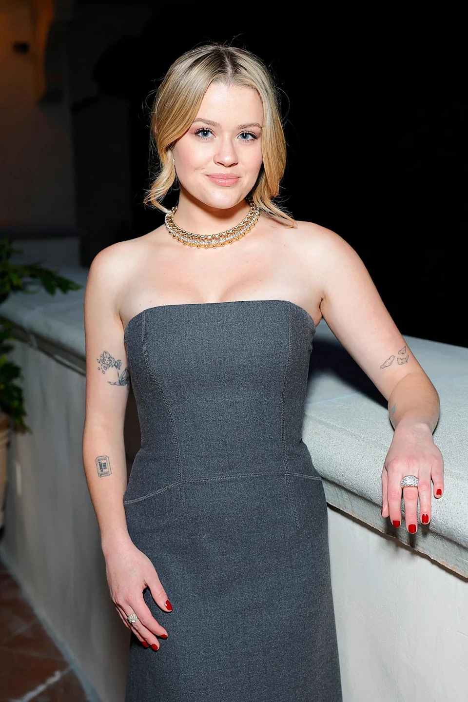
Most of Ava’s tattoos are on her arms, where they can be seen without being the first thing people notice. They are fine-line designs and small bits of lettering rather than large blocks of colour. A red-carpet photo might show one on her upper arm and another near her wrist; a close-up brings more of the collection into view.

That placement fits the way she talks about the tattoos. Ava has not presented herself as someone with a carefully planned sleeve or one big tattoo concept. The designs came at different times, and each holds its own memory. Some are sentimental, some playful, and a few have stopped feeling like her.

The collection feels young in a good way. There is no pressure for every mark to match. The tattoos look like choices that mattered at the time, not pieces designed to fit one fashionable style.

The feather is one of her easiest tattoos to spot

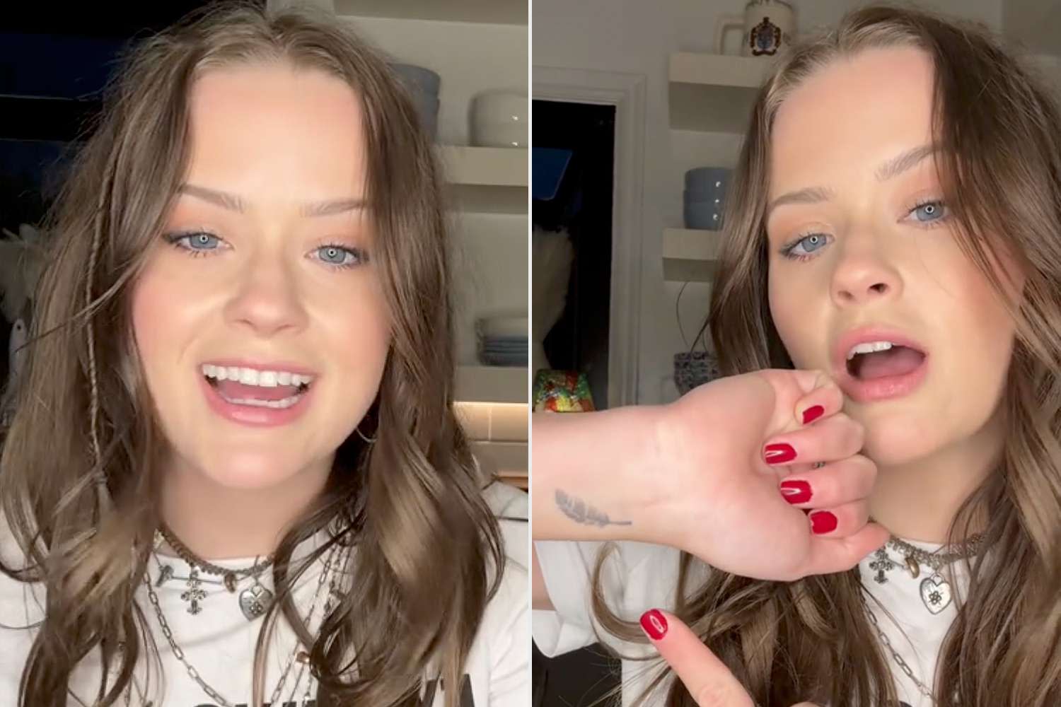
Ava Phillippe feather wrist tattoo

A small feather near Ava’s wrist is one of the clearest designs in her tattoo tour. It is light and simple, the kind of piece that can disappear beneath a bracelet or sleeve. When she lifts her hand in close-up footage, though, it is easy to see.

She has not shared a dramatic public explanation for every line of the feather, and it does not need one. Not every tattoo needs a long backstory to matter. It has a soft, slightly old-fashioned look, while other pieces on her arm carry more direct reminders of family and identity.

Small tattoos can be hard to photograph. A design that is clear on skin may turn into a grey smudge in a distant event photo. Ava’s close-ups are more useful because they show the scale and placement without asking people to guess.

Four nines and true keep the message simple

Ava Phillippe arm tattoos and true lettering

One of Ava’s tattoos uses four nines to represent her birthday. It is a small way to keep a personal detail close without writing out the full date.

She also has the word “true” on her arm. It could be a reminder to be honest, a nod to being herself in public or simply a word she liked enough to keep. Ava has not turned it into a grand slogan, and the low-key placement helps it stay personal.

Together, the numbers and lettering show two sides of the collection: one points to a fact about her life; the other is open to interpretation. They are both small, but neither feels random.

Three birds represent Ava and her brothers

Ava Phillippe three birds arm tattoo

Ava has three birds representing herself and her two brothers. It is a warm idea, turning a family connection into a simple visual. The design does not need names or dates underneath; the number of birds carries the message.

Family tattoos can become very formal, especially when they use full names or portraits. Ava went the other way. The birds are small, light and spaced like personal notes on her arm. They feel more like a shared symbol than a public announcement.

The tattoo also gives the rest of the collection a little context. Ava grew up around a famous family, but the birds point to the people she grew up with, not to celebrity.

Her orchid baby is the favourite

Ava Phillippe orchid baby tattoo

Ava has said her favourite tattoo is an orchid with a little face. She describes it as representing her sensitive younger self, which gives the design more personality than an ordinary flower. The face turns it into a character, almost like a younger version of Ava she has chosen to carry with her.

The idea fits with how she talks about growing up and finding her own direction. She has spoken about resisting the assumption that she would automatically become an actor because both of her parents are actors. The orchid baby keeps a softer, more emotional part of her in view without making her stay stuck in that chapter.

From across a room, the tattoo could pass for a flower. Up close, the face changes the whole mood: a little strange, a little sweet and unmistakably her.

Three older tattoos are being removed

Ava Phillippe tattoos she is removing

Ava’s tattoo tour was notably open about removal. She said she was rethinking her collection and planned to laser off three designs: an “admit one” ticket, a crying eye and a candle with a match. She has not called them terrible; they simply no longer feel like choices she wants to keep.

That may be the most relatable part of her collection. People often talk about tattoos as if every decision has to matter forever. In reality, tastes change. A design can fit one chapter perfectly and still feel out of place a few years later. Letting it go does not erase who she was when she got it.

The ticket stub feels playful and impulsive, while the eye and candle seem more symbolic. Together, they show how different her earlier choices were from the quieter family and identity pieces she talks about now.

What Ava Phillippe’s tattoos say about her style

Ava’s tattoos are not loud, but they are not generic either. The best-known pieces connect to family, memory or the way she sees herself. The orchid baby is personal, the three birds are about her brothers, and the nines point to her birthday. Even the tattoos she is removing tell us that her taste has shifted.

There is no need for the collection to form one seamless design. It looks like real tattoos gathered over time: a few still feel right, while others are being let go.

If you are looking for ideas, the useful lesson is not to copy Ava’s feather or birds. Think about size and placement. A small tattoo can still carry a real memory, and a simple design leaves room for life to change around it.

What makes the collection feel human is the mix of certainty and second thoughts. Ava can talk warmly about the orchid baby and the birds, then calmly say that other tattoos are on their way out. Both feelings can be true. A tattoo may have been a good idea for a while and still become something you do not want to carry forward.

Small tattoos often come from quick moments: a friendship, a phase, a trip or a version of yourself you were still trying to understand. When the moment passes, the ink stays. Laser removal gives Ava a way to edit the collection without pretending those earlier choices never happened.

Her remaining pieces have a softer rhythm: a delicate feather, personal nines, connected birds and an orchid with a little odd charm. None needs to shout. The arm close-ups reveal more than a generic red-carpet photo because they show the details clearly.

There is no reason to assume these will be Ava’s last tattoos. She is still young, still choosing what kind of creative life she wants, and comfortable changing her mind. Any new piece will make more sense as part of that process than as a sudden reinvention.

Watch Ava’s related interview

There does not seem to be a dedicated YouTube tattoo tour from Ava, so this related profile video about her public life and family background is included instead.

More actor tattoo guides

Amber Rose’s tattoos move from roses to Philadelphia numbers

Amber Rose’s tattoos range from large, colourful pieces to small marks you might miss unless you know where to look. Her collection includes portraits, lettering, a rose sleeve, tiny lip art and Philadelphia’s 215 area code. Some designs have changed or been covered, so an older photograph may show a version that looks different from what is visible today.

A careful look at the collection starts with three things: what the photo actually shows, where the tattoo sits and what Amber or a reliable source has said about it. That matters because a guess about a celebrity tattoo can spread much further than the original evidence. This guide stays close to the images and keeps reported stories separate from fan theories.

The right-arm rose remains Amber’s main colour piece

Amber Rose tattoos: rose tattoo

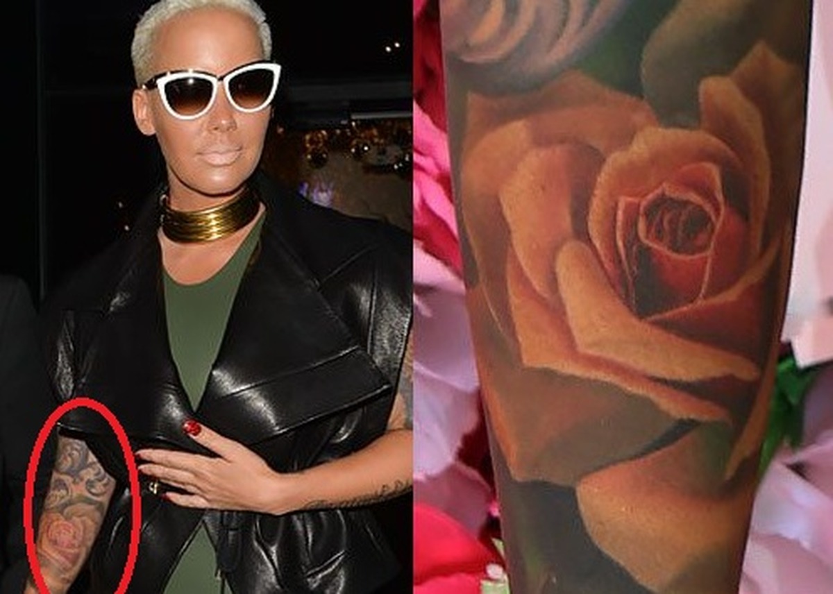
Amber’s right-arm rose tattoo is one of the most recognisable pieces in her collection. A large rose sits beside a pendant-style heart and key, with leaves and fine details spreading across the arm. It takes up real space, working more like a section of a sleeve than a small flower tucked into a gap.

The rose has the familiar shape of a traditional tattoo, while the pendant gives the design a more personal look. A heart and key can invite plenty of symbolic readings, but available descriptions do not confirm one private meaning for each detail. What can be stated plainly is the rose, pendant shape, colour and right-arm placement.

Colour changes as tattoos age, and photos can exaggerate the difference. Red ink may soften, skin tone affects contrast, and stage lights can flatten the image. An older picture does not automatically show a separate tattoo; it may show the same arm before the colour settled or before another detail was added.

The man with a guitar is a detailed portrait tattoo

Amber Rose tattoos: guitar tattoo

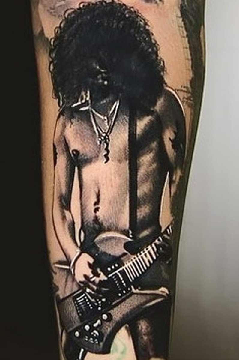
Another reported design is a man-with-a-guitar tattoo. It is more illustrative than the rose, showing a figure and instrument in a compact, portrait-like composition. A close photograph is useful here because the guitar, face and surrounding lines fade into the arm when seen from farther away.

The image tells us more about the tattoo itself than the available descriptions tell us about its meaning. It may be tempting to identify the portrait as a particular musician, but the sources do not make that clear. The careful description is simply a man with a guitar, with the placement noted and the identity left open unless Amber has named it.

That restraint does not make the piece less compelling. Portrait tattoos rely on fine details in a face, hair and instrument, and they age differently from bold lettering. Facial lines may soften while a heavier guitar outline remains, another reason to use dated photos instead of suggesting every detail has stayed unchanged.

The vampire design brings a darker note to the collection

Amber Rose tattoos: vampire tattoo

Amber also has a vampire tattoo, which brings a darker note to the brighter rose work. The figure has the theatrical features associated with a vampire and a moodier palette. It reads as a character illustration rather than a simple emblem.

There is no solid basis for turning the image into a biography. A vampire could reflect horror, a taste for dramatic art, or simply a design Amber liked. Without a source giving her explanation, the reliable description stops with the subject and placement. Tattoo writing loses accuracy when it fills that gap with certainty.

The difference from the rose is part of the collection’s appeal. Bright flowers and a darker character can sit on the same arm without needing to follow one strict style. Many people add tattoos over time, so a collection can reflect different artists, moods and periods instead of a single plan.

Hollywood lettering keeps one side of the story simple

Amber Rose tattoos: hollywood tattoo

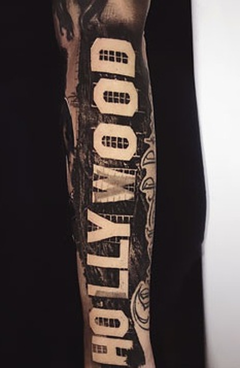
The Hollywood tattoo is a lettering design that connects Amber’s ink to the film and entertainment world around her. Text is usually easier to identify than to interpret: the photograph can confirm the word, while the reason she chose it may remain personal.

Lettering is especially dependent on the photo. A bent shoulder or arm can warp the letters, and lighting can make black ink appear grey. When the word is visible, it should be transcribed carefully rather than turned into a more dramatic phrase.

This piece also asks something different of a photograph than the larger designs. The rose and vampire need an image that shows their shapes; Hollywood needs a clear close-up so the actual word can be read. Both belong in the guide, but the pictures do different jobs.

The smoking lips tattoo is small but easy to recognise

Amber Rose tattoos: lips tattoo

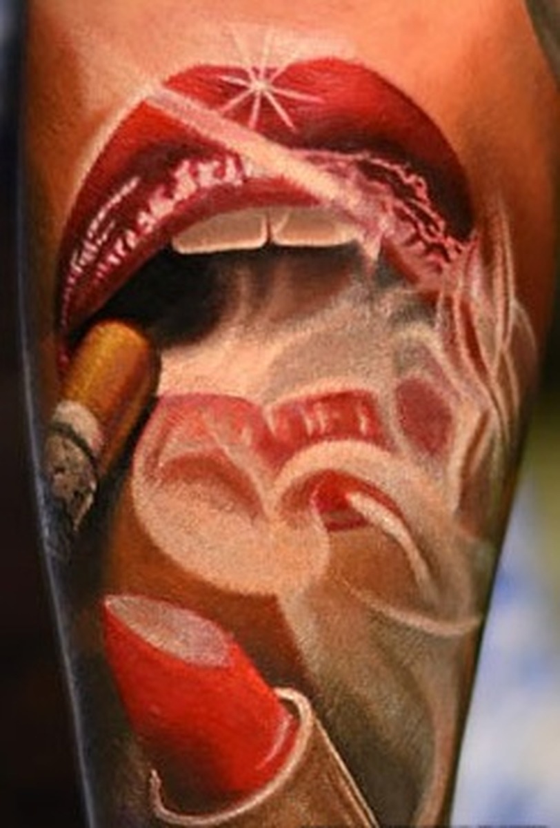
Amber’s smoking lips tattoo is built around a simple graphic: lips with smoke rising above them. It is small, but the outline is clear enough to recognise quickly. Small tattoos can stand out in public photos because their silhouette reads even when the finer lines do not.

The tattoo should not automatically be read as a statement about smoking. The image shows lips and smoke; it does not establish a lifestyle, personal history or hidden message. A design can be visually clear while its meaning remains unknown.

Small graphic tattoos can fade unevenly, changing how their parts look together. Smoke lines may grow lighter before the lips do, so one photo can make the same tattoo seem like a different version. A close, well-lit image gives readers a better sense of what is on the skin.

Amber’s paw prints are linked with her dogs

Amber Rose tattoos: paw tattoo

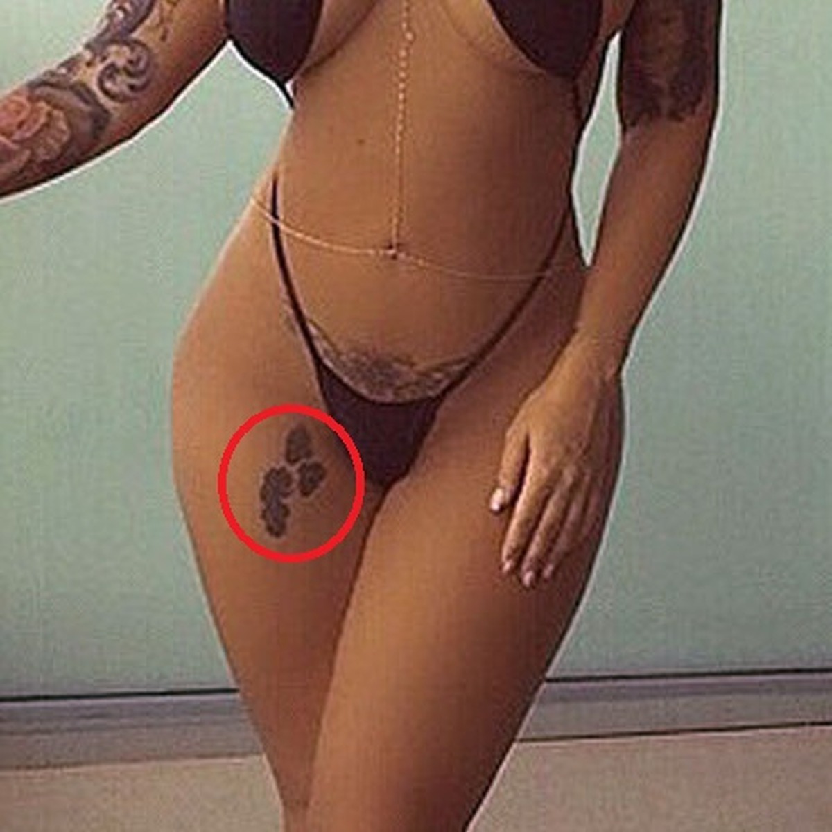
Tattoo lists connect the paw-print tattoos with Amber’s dogs. The simple shapes are easy to distinguish from the portraits and lettering, and the subject gives them a clear place in the family side of her tattoo history.

A pet tattoo does not need a complicated backstory. The useful details are the animal connection, the paw design and its location. If a source names a particular dog, that name should stay tied to that source instead of being expanded into a story about every pet Amber has owned.

The paw prints also show that a meaningful tattoo does not have to be large. A small mark can hold a more specific personal reference than an expansive decorative piece. Here, the paws sit among more dramatic artwork while quietly marking the dogs that mattered to her.

215 replaced older wrist lettering

Amber Rose tattoos: wrist tattoo

The 215 wrist tattoo refers to Philadelphia’s area code. Amber has spoken about the city as home, making the numbers a compact hometown marker. A wrist tattoo is easy to show, though a watch or bracelet can cover it.

The number also reflects a change in her tattoo history. Reports say it covered older “Pa’Trice” lettering linked to a past relationship. That makes the wrist a clear example of a cover-up: the earlier design remains part of the story, while 215 is what is visible now.

A cover-up should not be described as though both designs remain untouched on the skin. The newer tattoo changes what can be seen. Dated photos let readers follow that change without treating an old relationship tattoo as Amber’s current lettering.

Amber’s collection moves across several visual styles. The rose work is colourful and broad; the man with a guitar and the vampire are portrait-like illustrations. Hollywood and 215 use readable text, while the smoking lips and paw prints rely on simple outlines. The pieces do not need a single origin or meaning to sit together.

Close images make a real difference. A red-carpet photo may show that Amber has tattoos, but it may not reveal the lettering, the paw shapes or the details of a portrait. Each section needs a picture that supports the specific design being discussed, especially when it is small or has changed through a cover-up.

Some meanings are supported by reporting, such as the Philadelphia connection and the dog references. Other designs are best described visually. That is fine: a tattoo does not need an official explanation to be worth documenting. It needs an accurate description, a clear location and enough evidence to show what is there.

That mix is what makes the collection interesting. The larger pieces catch the eye, while smaller marks carry personal details. Taken together, they offer a fuller picture than a quick celebrity tattoo list.

More celebrity tattoo guides

The tiny tattoos Kylie Jenner keeps rewriting

Kylie Jenner’s tattoos can be easy to overlook: most are small, and she has never built a full sleeve or covered herself in heavy blackwork. Her collection is made up of fine red lettering, tiny dark symbols, dates, matching designs and a few pieces she has changed as her life shifted. A wrist or ankle tattoo can disappear beneath jewellery, a dress strap or a phone held at the wrong angle, so an older photograph may show something a newer one hides.

The timeline is more revealing than a simple count. Kylie’s first tattoos came when she was young, then later designs marked friendships, relationships, family and the birth of her daughter. Some were changed rather than removed; others began as matching tattoos and took on a different context as relationships changed. This guide follows those stages and sticks to confirmed placement and wording instead of guessing at every small mark.

The red heart on Kylie’s arm started the collection

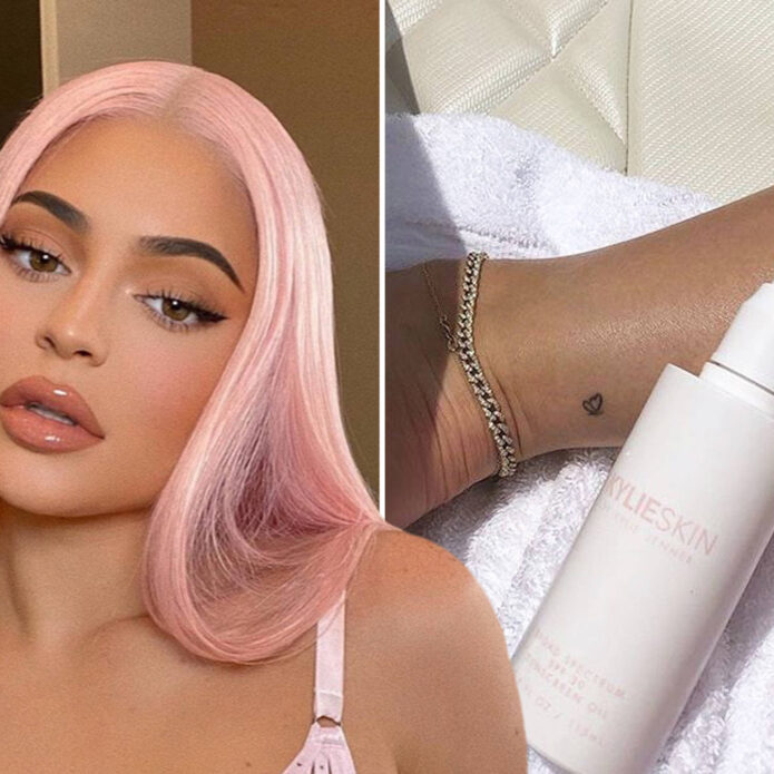
Kylie Jenner tattoos: clear image of Kylie’s red-ink heart tattoo on the back of her upper arm

Kylie’s small red heart is one of the earliest pieces in her tattoo timeline. It sits on the back of her left arm, just above the elbow, in the fine red ink that became a recurring feature of her collection. The outline is simple, with two curves meeting at a point and no heavy shading or frame.

The heart appeared around Kylie’s 18th birthday and is often identified as her first tattoo. That puts it before the later lettering, relationship references and family tributes. It is not a large statement piece; it feels more like a private mark that happens to show when she wears sleeveless clothes.

There is no confirmed explanation for why Kylie chose a heart. It is easy to read it as a romantic message, but the photo establishes only the design and its placement. It may have been a birthday choice, a family reference, a favourite shape or something she has never discussed publicly. The careful description is the most accurate one.

The red ink also gives the heart a softer look than black tattoos. In older photographs it appears bright, while later images may show it less clearly because red pigment can fade into the skin under flat lighting. That alone does not mean the tattoo was removed; age, camera settings and distance can all affect how it looks.

Mary Jo is Kylie’s family tattoo in her grandfather’s handwriting

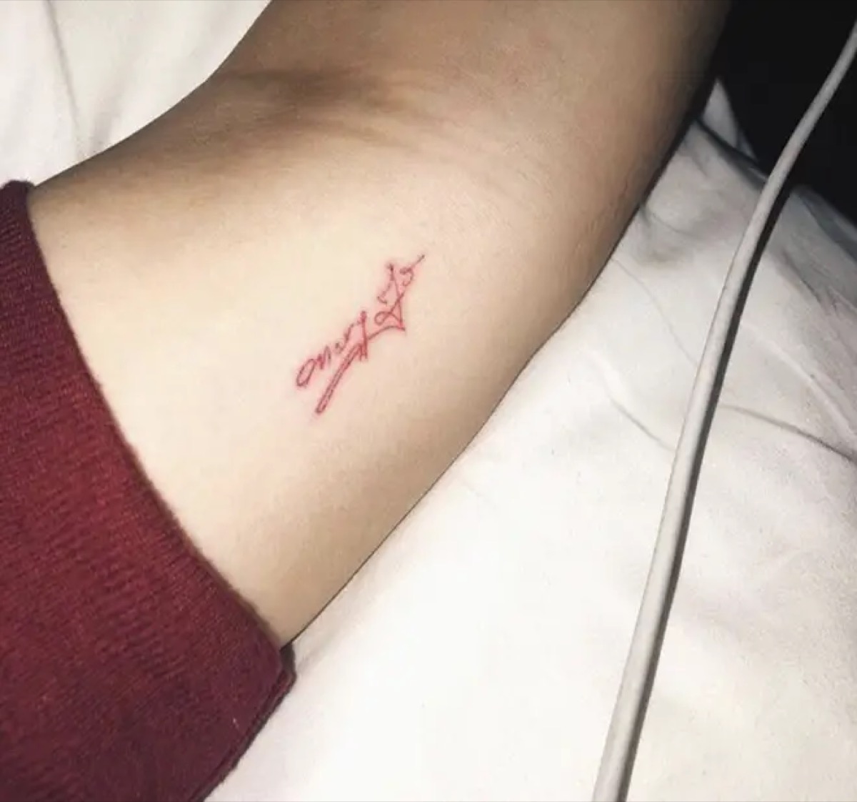
Kylie Jenner tattoos: clear image of Kylie’s Mary Jo inner-arm lettering

The words “Mary Jo” sit on Kylie’s inner arm in red ink. Mary Jo is her grandmother, and Kylie said the lettering was copied from her grandfather’s handwriting. That makes the tattoo specific: it is a family connection written in the hand of another family member, not simply a name chosen for the skin.

The letters are fine and compact, matching the style Kylie favoured at the time. The name takes up only a small part of her forearm, and the red lines sit quietly beside her other tattoos. A close-up is needed to make out the handwriting; in a wide portrait it can look like a tiny red dash.

This is one of the clearest meanings in Kylie’s tattoo history. Sources have identified both the handwriting and the family relationship, so there is no need to add symbolism that was never reported. The detail that matters is her choice to use her grandfather’s writing instead of a standard tattoo font.

Some later photos make the lettering look lighter than it did when it was new. Red ink can lose contrast with time, especially on an arm that is often exposed. That is part of the tattoo’s timeline: the design remains, even if it no longer looks exactly like the fresh reveal.

The matching M tattoo belonged to Kylie and Jordyn Woods

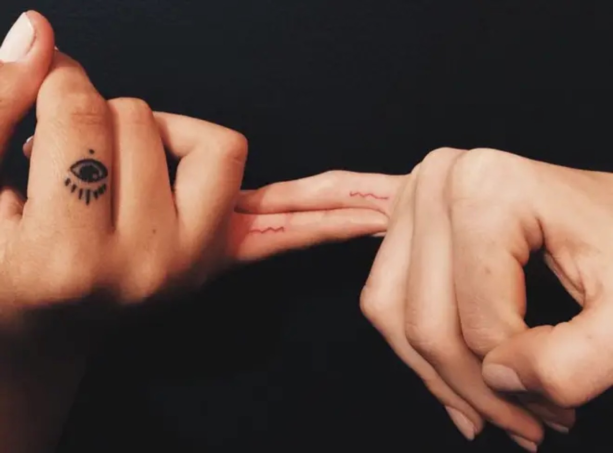
Kylie Jenner tattoos: clear image of Kylie and Jordyn Woods matching M finger tattoos

Kylie and Jordyn Woods got matching red “M” tattoos on their fingers in 2016. The letter sits on the inside of the finger and is small enough to notice mainly when a hand turns toward the camera. In a group photo it can look like a smudge, then stand out in a close-up.

At the time, the tattoo marked a close friendship. The shared initial did not need a large image or a complicated emblem; the matching letter carried the idea. Its small size let both friends wear it without making the design the focus of their public image.

Their later falling-out changed the context, but it did not erase the original moment. A tattoo can belong to a real period of closeness even when the relationship later changes. Dating the design is more accurate than presenting it as a current friendship symbol.

Finger tattoos bring practical challenges: the skin bends, the lettering is tiny and frequent handwashing can fade fine lines. Kylie’s red “M” looks clearer in some photos than in others. That variation does not necessarily mean the letter changed; it may simply reflect how the hand was photographed.

The ankle tattoos changed from T to LA

Kylie Jenner tattoos: clear image of Kylie’s redesigned LA tattoo

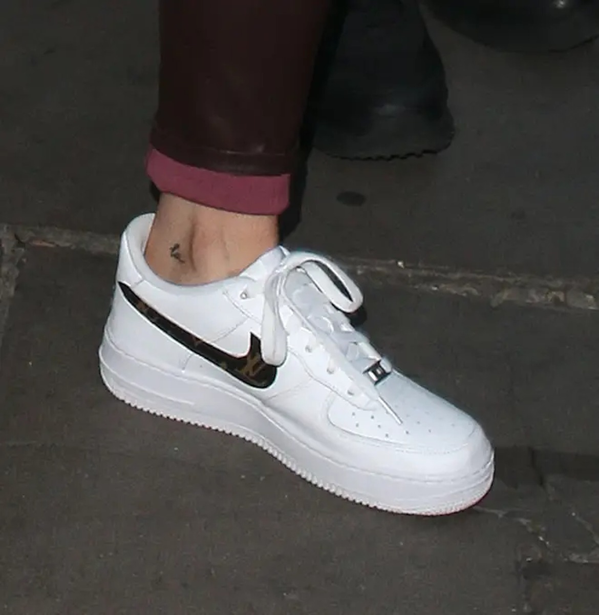
Kylie first had a tiny lowercase “t” on the inside of her ankle, associated with her relationship with Tyga. After they split, she changed it to “LA”, referring to Los Angeles. It is one of the clearest edits in her collection: the later design visibly reworks the earlier letter.

The original was a small black letter in a simple handwritten style. The updated version uses the same general area but points toward home. The first tattoo still belongs in the history; the alteration shows how someone can take a design from an earlier chapter and give it a different meaning.

The updated lettering also fits Kylie’s preference for compact designs. It can sit beneath clothing, appear in a holiday photo or show up in a quick close-up of her ankle. Boots or heels can hide it, so dated before-and-after images tell the story better than one isolated shot.

There is a practical lesson in this change for anyone considering a relationship tattoo. Kylie’s ankle design could be adapted, though cover-ups are not always simple. Here, the change is well documented and shows how the tattoo became part of a different story.

Kylie and Travis Scott matched butterfly tattoos

Kylie Jenner tattoos: clear image of Kylie’s matching butterfly ankle tattoo

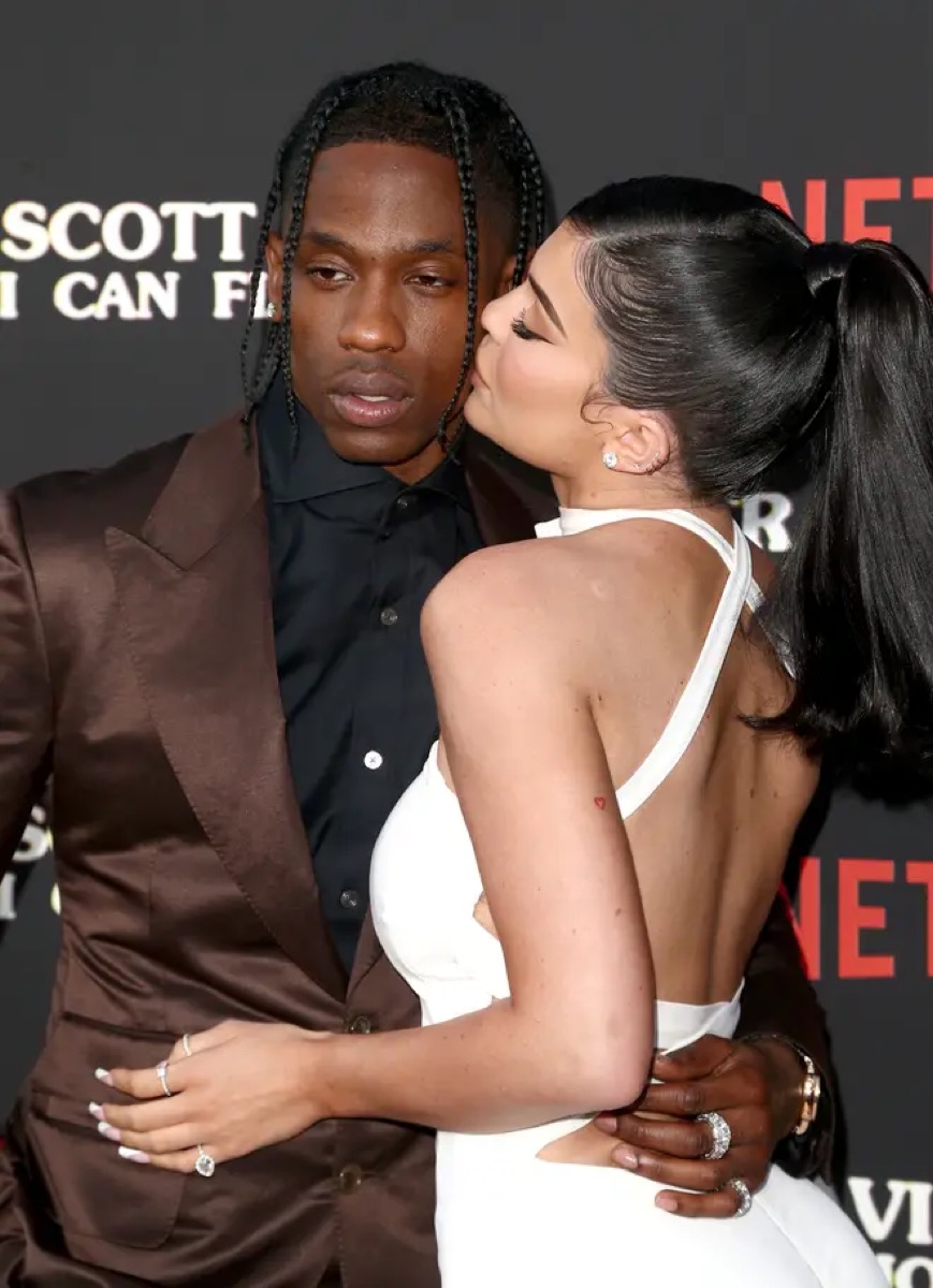
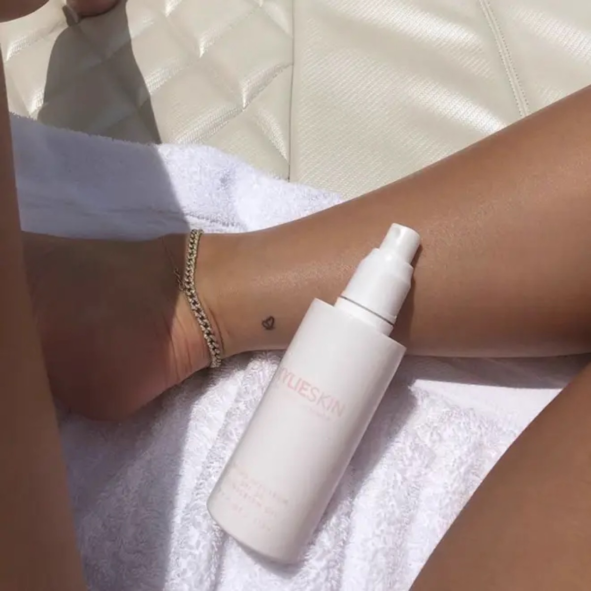
In 2017, Kylie and Travis Scott revealed matching butterfly tattoos above their ankles. Kylie’s is on the back of her right leg, with a corresponding design on Travis’s opposite side. The tattoos are small, black and easy to cover, in keeping with her fine-line collection.

The butterfly was linked to Travis’s song “Butterfly Effect”, giving the shared tattoo a direct connection to his music. The original coverage focused on the song and the period when the matching designs appeared, rather than presenting the butterfly as a generic symbol of transformation.

Matching tattoos can take on a different context when a relationship changes, but the ink still records what happened at the time. This is best described as a dated shared design, not a statement about Kylie’s current relationship status. A photograph alone cannot tell us how she feels about it years later.

The ankle placement also affects how the butterfly looks. Pointing her foot or standing on her toes stretches the skin, and a flat image can make the wings seem uneven. A relaxed ankle gives a better sense of the proportions, so a clear close-up is more useful than a distant event photo.

Stormi’s name and the 4:43 birth-time tattoo

Kylie Jenner tattoos: clear image of Kylie’s Stormi birth-time tattoo, reading 4:43 on her forearm

Kylie has two tattoos connected to her daughter Stormi. One is the name “Stormi”, on the back of her arm and created as a matching tattoo with Travis Scott and her friend Anastasia Karanikolaou. The other is the small black “4:43” on the inside of Kylie’s forearm, marking Stormi’s birth time.

The name tattoo was made during Travis’s birthday celebrations in 2019. The shared design connects all three people to Stormi, while the small lettering keeps the tribute understated. It is not a portrait or a decorative announcement; the name carries the point.

The time tattoo is even more compact. Its clean little numbers sit where a sleeve or bracelet can cover them. Unlike a date, “4:43” records a precise moment, making the design personal without needing a long explanation.

These pieces show Kylie’s collection moving from relationship references toward motherhood and family. The earlier “M”, “t” and butterfly were tied to friends or partners; the later lettering and numbers focus on her daughter. The subjects changed while the tattoo style stays small and restrained.

Before sanity is Kylie’s most unusual wording

Kylie Jenner tattoos: clear image of Kylie’s before tattoo added to the red-ink sanity design

Kylie’s hip tattoo began with the phonetic spelling of “sanity”. She later added the word “before”, making the phrase read “before sanity.” The red lettering sits on her hip, less visible than the arm tattoos but part of her earlier tattoo timeline.

Kylie later said the original word reminded her to keep her sanity. Adding “before” changed the line and gave the design a new edge. It is a good example of her tattoos developing after they first appear: the wording was edited, and that edit became part of the story.

The hip placement makes this tattoo hard to spot in everyday photos. It appears more often in holiday or swimwear pictures and selected close-ups than on a red carpet. That limited visibility may explain why some lists treat the phrase as a single design while others describe the original word and later addition separately.

Kylie’s tattoos are small, but the details are specific. The red heart marks an early starting point; “Mary Jo” carries her grandfather’s handwriting; the matching “M” and butterfly record friendships and relationships; “LA” shows a redesign; and “Stormi” and “4:43” mark motherhood. “Before sanity” captures a phrase that changed along with her.

The collection makes more sense as a timeline than as a simple inventory. The delicate designs connect to a grandmother, a daughter, a city, a friendship, a past relationship and a personal reminder. Some meanings are confirmed; others are visible in the image alone. Keeping those apart gives Kylie’s tattoos a clearer story without turning tiny marks into generic decoration.

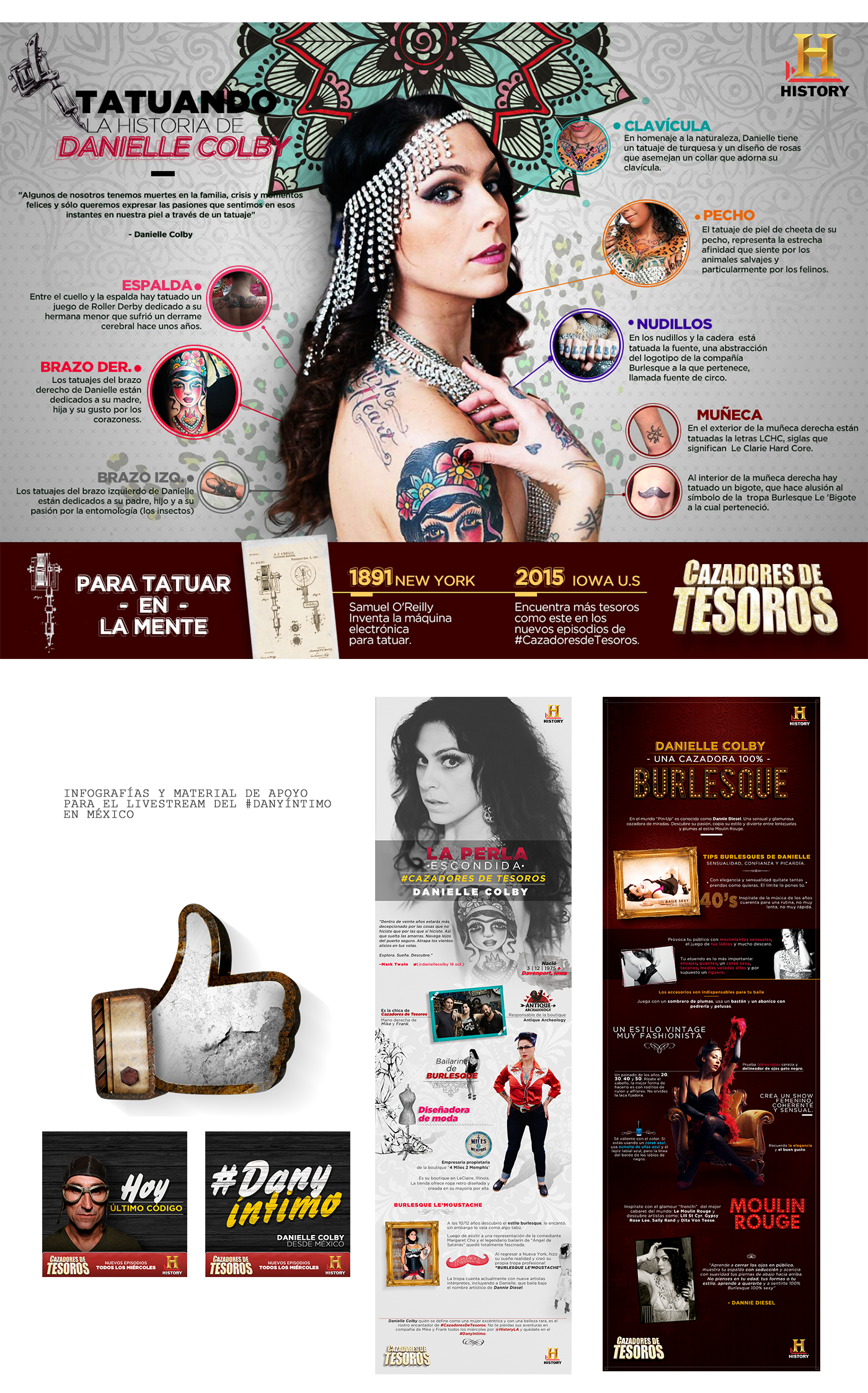
Danielle Colby’s American Pickers Tattoos

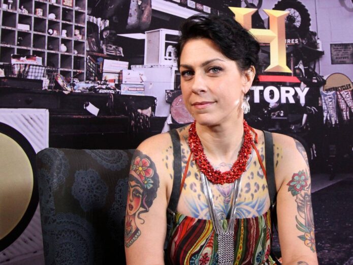
Colby’s tattoos have grown over many years around artists, family, bugs, music, heritage and burlesque. Interviews put the collection at more than thirty designs, though the exact count matters less than how they fit together: a torso she calls pagan suit of armor, a violin-shaped back, insects on the left arm and a Frida portrait on the right. Words appear too, including Irish Blood, English Heart and Hold Fast.

Colby has described herself as collecting tattoos. She gives artists a theme and trusts them to develop it. Some designs have a clear story; others are known mostly through photos.

The pagan suit of armor covers Colby’s chest and stomach

Danielle Colby tattoo map showing chest, arm, back and hand designs

Patrick Cornalo of Speakeasy Custom Tattoo developed the pagan suit of armor across Colby’s chest and stomach. She says she brings him a theme and trusts his vision to build around it. The phrase describes a connected project, not a single emblem.

A chest tattoo can be read on its own; the armor is meant to work as overlapping shapes, panels and symbols. Photographs often show only part of the torso at a time.

Colby’s interest in vintage performance history adds context. She collects burlesque costumes and documents the women who wore them. No source says the armor copies a historical garment, but the broader project fits her interest in themed visual worlds and the artists who create them.

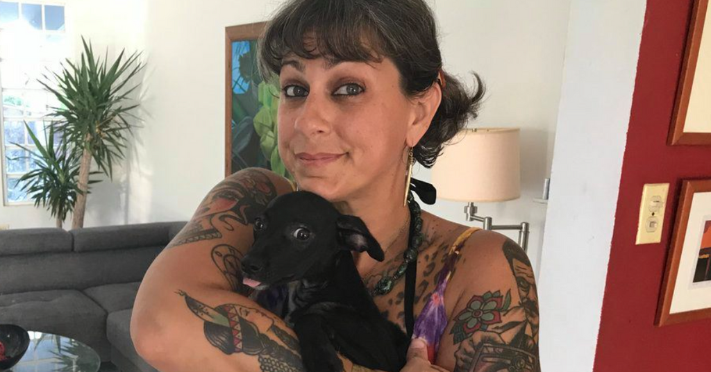
Danielle Colby seated with her chest, arm and thigh tattoos visible

The violin-shaped back is the collection’s most unusual piece of body mapping.

Several tattoo profiles describe Colby’s back as a violin, with oversized F-holes on either side. The body supplies the instrument’s outline: it is not a small violin picture, but a composition built across her back.

A front-facing television shot cannot show the whole design. A portrait from behind reveals the F-holes and the way the piece follows the shoulder blades, though clothing or pose may hide the lower section.

The F-holes are large enough to read across the back, shaping the space around them instead of serving as random filler. The design changes how the surrounding tattoos are seen.

Entomology gives Colby’s left arm its subject

Danielle Colby showing colorful arm and shoulder tattoos

Colby told YuppiePunk that Chewie was finishing her left arm as an entomology project. She loves bugs; that is the theme.

A beetle, moth or other insect gives the arm different shapes and textures to work with. Fine wing lines can sit beside darker shading, and new pieces can be added without repeating the same composition.

Stage lights can flatten fine legs and wings, while a turned forearm hides the edge of a design. Colby’s interview explains the entomology theme; the photographs show how much of the arm is covered.

Frida brings a portrait to the right arm

Danielle Colby showing her right-arm tattoo work

Colby has identified a Frida portrait on her right arm as work by Alex Strangler. Knowing the subject and artist gives this entry a firmer basis than guessing from a photograph.

A face gives the arm a focal point, while the insects rely on many smaller shapes. That contrast lets Frida sit beside the entomology work without making the arm look uniform.

Colby names her collaborators and talks about trusting their vision. The tattoo’s identity includes both the subject on the skin and the artist’s approach to rendering it.

Irish Blood, English Heart crosses Colby’s shoulders

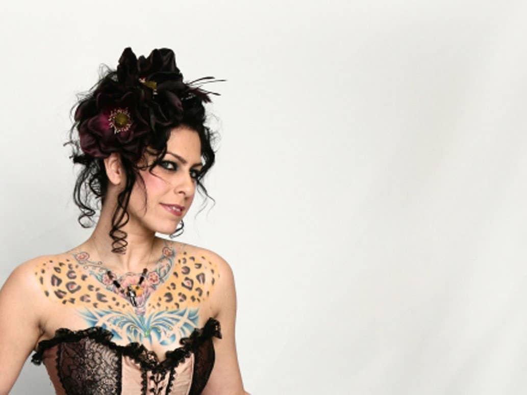
Danielle Colby showing leopard and butterfly chest tattoos

The words Irish Blood, English Heart run across Colby’s shoulders. Lettering reads in a glance, while the armor, violin and insects invite a closer look.

The phrase connects with the Irish heritage Colby has discussed. Its wording and placement are clear without adding a wider story about her family.

Posture changes how the line reads. A raised arm can stretch the shoulders; a relaxed pose makes the words easier to follow. Some television photos show only part of the phrase.

Hold Fast brings the knuckles into view

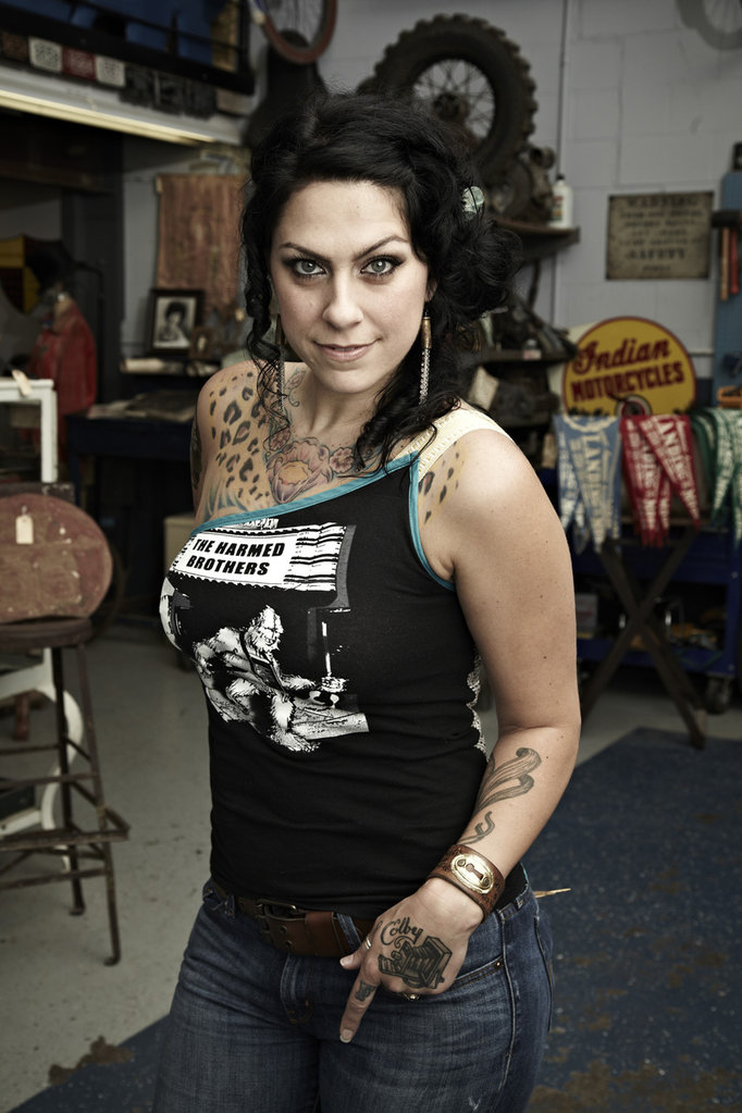
Danielle Colby showing hand and arm tattoos

Colby told YuppiePunk that Chewie tattooed Hold Fast across her knuckles. The short phrase is easy to notice whenever she reaches for something or gestures on camera.

The wording draws on sailor and working-class tattoo traditions, but the interview does not give a personal explanation for Colby’s choice. Readers can take the phrase as written; no story behind it has been reported.

Why Colby’s collection works as a map

Read by location, the designs have their own threads: armor across the torso, a violin on the back, insects on the left arm, Frida on the right, Irish Blood across the shoulders and Hold Fast on the knuckles.

Colby has talked about artists continuing the work and about trusting them with a theme. New photographs may reveal additions or details older coverage missed; no single article gives a final count.

The appeal is how distinct ideas share the same body. Armor, a violin, insects, a portrait and short phrases each keep their own look, while the artists help them belong together.

More actor tattoo guides

Steve-O’s Tattoos Are Built Around One Unmissable Backpiece

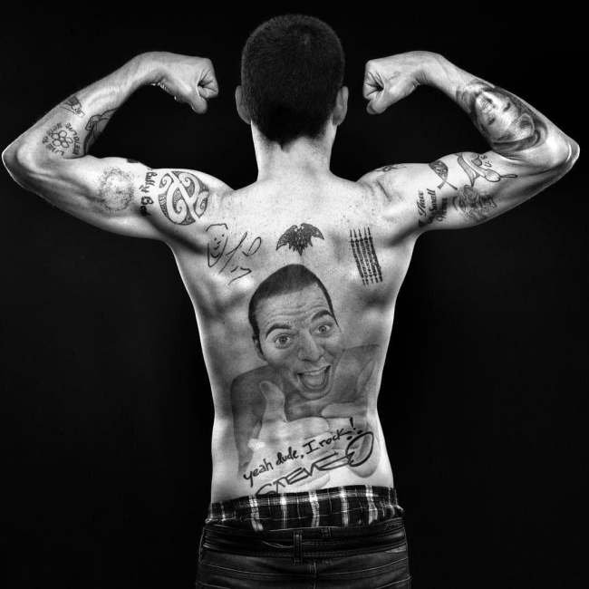
Steve-O has never been one for subtle tattoos. The largest is a huge portrait of himself across his back, smiling and giving a thumbs-up. Lettering, smaller symbols and the phrase yeah dude, I rock! fill the space around it. It looks like a joke made for an audience, which fits a performer who has often used body modification to get a reaction. In interviews, he has talked about making his body part of his comic persona.

There is plenty of ink beyond that portrait, across Steve-O’s hands, face, chest and shoulders. Photos make the scale easy to see, while interviews fill in some of the words and choices. The smaller marks are harder to read, so their meaning is best left open.

The full-back self-portrait is Steve-O’s defining tattoo

Steve-O showing his full-back self-portrait tattoo

His back tattoo is a photorealistic portrait of Steve-O giving a thumbs-up. It covers most of his back, putting the performer’s own face at the center. The expression is broad, the gesture is easy to read and the surrounding lettering frames the image. The Daily Beast called it a magnificent tattoo of himself, while an earlier BME interview discusses the piece as part of his wider interest in body modification.

At first glance it could look like vanity, but the exaggeration is what makes it funny. Steve-O has always taken things to extremes; putting his own face across his back turns that impulse into the joke. The image needs no decoding: it is simply Steve-O, smiling back at the viewer.

The size changes how the tattoo reads. This is not a small portrait tucked below one shoulder blade; it is a full backpiece with room for shading, expression and handwritten details. The face catches the eye first, while the lettering makes the design feel more like a personal poster than a conventional portrait.

“Yeah dude, I rock!” finishes the backpiece with a punchline

Steve-O back tattoo with yeah dude I rock lettering

The phrase yeah dude, I rock! sits below the self-portrait beside Steve-O’s signature. It is part of the same composition, not a separate tattoo that happens to be nearby. The thumbs-up is boastful, but the exaggerated wording makes the boast a joke.

That line is the punchline, and its casual wording and punctuation are part of the voice. A tattoo guide should keep it as written; polishing the wording would flatten the joke. The script and signature tie the words to Steve-O’s persona and the portrait.

The lettering does a different job from the portrait: the face supplies the expression, and the words supply the voice. Even without knowing the rest of Steve-O’s body-art history, the tattoo is easy to read. Its subject and tone are clear, which helps explain why profiles keep coming back to it.

Face and knuckle tattoos carry the smaller jokes closer to the camera

Steve-O showing face and hand tattoos

Steve-O’s face and hand tattoos are hard to pin down in photos; small lettering blurs and can be misread. In BME interview material, he talks about choosing words for the reaction they’d get. Later coverage also describes added face ink as part of his public look. A single blurred photo can’t tell the full story.

His hands are on show whenever he gestures, and a face tattoo appears in interview close-ups. It suits a performer who often makes his body part of the bit. Still, visibility does not mean every mark comes with a story.

Photos also vary with the years and the lighting. A microphone can hide part of his hand, stage makeup can obscure face ink, and tattoos can be changed or covered. When a word is too blurred to read, it is better to describe where the tattoo is than to guess what it says.

Smaller chest and shoulder ink fills out the larger body-art map

Steve-O chest and shoulder tattoos

The other tattoos put the back portrait in context. Photos show more symbols and smaller pieces across Steve-O’s shoulders, chest and arms. Some are hard to identify and have no clear published story. Together, though, they make the point: the famous portrait sits among a lot of other work.

This is not one coordinated sleeve. The tattoos vary in size and mood; some are jokes, while others seem more personal. They look like a mix of decisions made for different reasons.

How to read Steve-O’s tattoos without losing the joke

The back portrait draws the eye, and the lettering gives it a voice. Smaller work on Steve-O’s face and hands brings the humor right up close, while the other marks fill out the collection. The sources explain some of his choices, but not every symbol needs decoding to see the through-line: he uses tattoos as part of the performance.

A huge portrait has room for expression, and the lettering is large enough to read. A small face tattoo comes with different limits. Steve-O embraces the contrast and uses it as part of the act. The result is funny, excessive and unmistakably his.

More actor tattoo guides