Public Figures

Tattoo guides for presenters, creators, tattoo artists, designers and other public figures, with photographs and the stories behind their designs.

Nikki Simpson Tattoos: Colourful Sleeves, Neck Ink and Hand Details

Nikki Simpson’s tattoos are hard to miss. Her arms are covered in bright colour and bold outlines, with illustrated scenes that reveal more detail up close. The ink runs from her fingers and hands through both sleeves, then reaches her neck and chest. Nikki Simpson tattoos make a useful reference if you like colour and want a collection with a clear point of view.

The designs include flowers, faces, ornamental lines, dark framing, and smaller details within the sleeves. Simpson often wears clothes that show much of the work, and she is a tattoo artist herself. The photographs give a sense of how the pieces fit together across her body.

This guide focuses on what can be seen in the photos: colour, placement, line weight, and how the tattoos flow. Their personal meanings aren’t always clear from an image, so there’s no need to guess. You can build a bold collection without making every tattoo look identical. A shared palette and thoughtful placement can connect different subjects.

Nikki Simpson’s colourful sleeves work as full-body compositions
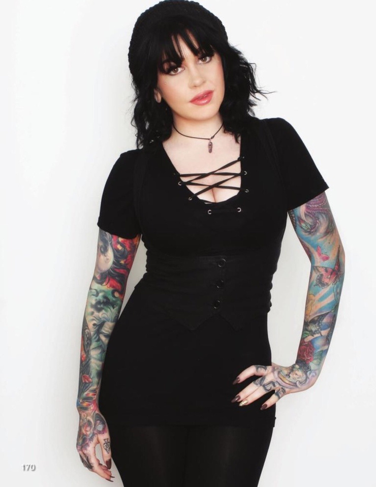
Nikki Simpson tattoos: full-resolution face-visible portrait showing both colourful sleeves from shoulders through the hands

Simpson’s sleeves cover a lot of skin, but they’re not solid blocks of colour. Lighter patches, black outlines, softer washes, and small accents break up the designs. That gives the eye places to rest and keeps individual shapes visible.

The two arms have different colour palettes. One leans on deep reds and greens with darker framing; the other uses cooler blues and brighter highlights. The contrast lets each sleeve have its own feel instead of making them mirror images.

The designs follow the shape of her muscles. A face turns around the biceps, a flower opens across the forearm, and leaves and shading carry the eye toward the wrist. The ink moves with her arms in both portraits and everyday photos.

If you want a full sleeve, choose an anchor design first: perhaps a portrait, flower, animal, or ornamental shape. Let later pieces work around it. A sleeve looks calmer when the empty skin and the dark areas are planned together, instead of filling every gap just because it’s there.

Her forearm work mixes portrait details with strong colour
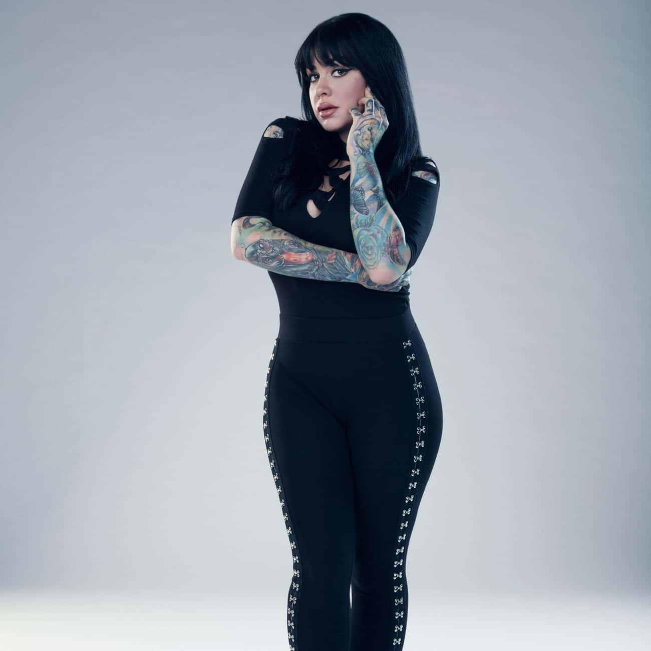
Nikki Simpson tattoos: face-visible portrait showing Nikki's forearm colour, sleeve flow, and hand coverage clearly

The forearm photos make Simpson’s illustrative style easy to see. Faces, flowers, and layered shapes sit close together, but their outlines keep them distinct. From a little farther away, the contrast holds; up close, there are details in the eyes, petals, and decorative edges.

A portrait needs enough space for its features to read. Simpson’s forearm designs use the length of the arm, rather than squeezing a face into a small patch. That gives the colours room and keeps the features clear.

Some of the ink continues over the wrist onto the back of the hand, so the sleeve doesn’t stop at a hard line. That transition takes planning: the artist has to consider how the design looks with the palm open, the wrist bent, and the fingers moving.

For a forearm portrait, decide which expression or feature should lead. Let the surrounding shapes add texture. Readable contrast will usually do more for a tattoo than extra tiny texture. Colour can make the image feel full without trying to reproduce every detail of a photograph.

The hand and finger tattoos make the sleeves feel personal
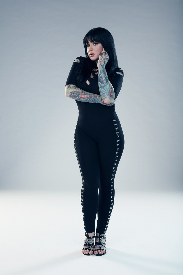
Nikki Simpson tattoos: face-visible portrait with both hands and colourful sleeve details visible against a clean background

The hands change the feel of the collection. The sleeves are the larger statements, but hand tattoos show up in everyday gestures: when Simpson holds a tattoo machine, rests a hand on her hip, or touches her hair. They move with her instead of appearing only in a posed photo.

Hands are hard on tattoos. Washing, friction, sunlight, and bending can soften fine lines. Simpson’s visible handwork uses graphic shapes that suit the smaller area; the fingers add accents without trying to hold an entire scene.

The details also link the colourful forearm to the hand. A repeated colour or curved line can carry through without making the designs identical. Sometimes one small echo is enough.

If you’re considering hand ink, check the placement with your hand relaxed, not only held flat. Leave space between the marks and choose an artist who understands how the skin moves. Small tattoos need room just as much as big ones do, especially beside an existing sleeve.

Her neck and chest tattoos soften the heavy arm coverage
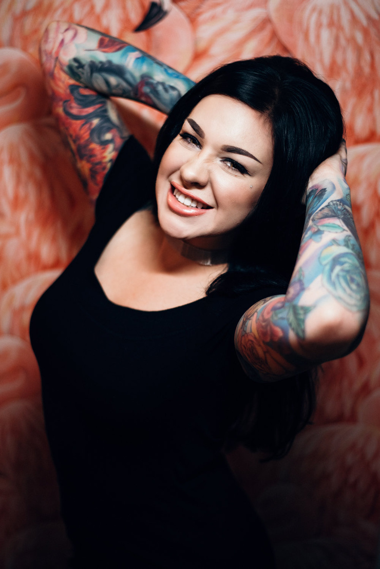
Nikki Simpson tattoos: face-visible close portrait where Nikki's neck tattoos, chest area, and upper-arm ink are easy to inspect

The neck and chest give the eye a break from the colourful sleeves. The ink near Simpson’s face looks lighter and more open in the photos. That change keeps the upper body from turning into one dense field of colour and leaves room for her face to stand out.

Neck placement has to work around the jaw, collarbones, and hair. A design that looks balanced in a straight-on portrait can shift when the head turns. Simpson’s visible neck work follows the lines of the area and sits naturally beside her other ink.

The chest gives an artist more room, but spacing still matters. Fine lines can sit against open skin; darker areas can echo the sleeves’ black outlines. The pieces don’t need to match exactly to feel related.

A collection can include full sleeves and still leave some areas quieter. Sometimes the smartest way to make colour pop is to give it a calmer neighbour.

The black linework designs give everything structure
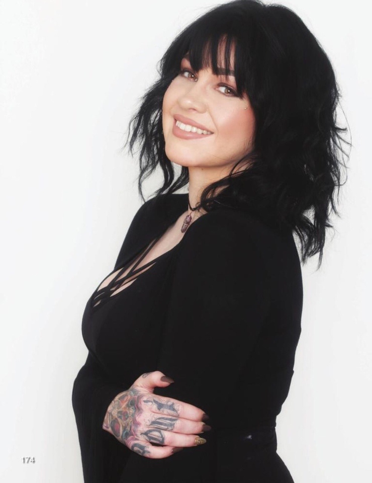
Nikki Simpson tattoos: face-visible portrait showing the contrast between Nikki's black outlines, colour fields, and sleeve details

In wider portraits, the black linework does more than outline the colour. It separates flowers, faces, and other shapes so the sleeves don’t blur into one wash. The colour catches your eye first; the darker lines keep the designs organised.

Repeated line weight and similar shading can also connect different subjects. A flower, a portrait, and an ornamental design may not seem related on their own, but they can sit together when they share those visual choices. Simpson’s sleeves show that kind of connection.

The chest and shoulders use the same idea. Darker marks carry the eye from the upper arm toward the collarbone, while open skin keeps lighter details visible. The design moves with the body instead of following a strict geometric grid.

Before starting a colourful collection, ask your artist how the lines may age, how much open skin to leave, and where a new piece would sit beside older work. A strong outline is not just decoration. It is the framework that lets the colour stay readable.

Why Nikki Simpson’s collection feels so connected

Simpson’s tattoos share a style more than a single subject. They’re colourful, illustrative, and comfortable taking up space. The faces, flowers, symbols, and textures vary, but the overall collection still feels connected.

If you’re adding tattoos over time, you don’t have to repeat the same subject. Think about the feeling you want the collection to have: bright and playful, dark and ornamental, or realistic faces with bold colour around them. A shared mood can bring different designs together.

Placement helps too. Simpson’s arms carry most of the visual weight; the hands, neck, and chest add smaller details. That gives the collection a clear rhythm. If every area had the same amount of detail, it would be harder to know where to look.

Ask your artist to adapt the drawing to your body. A sleeve has to work around the elbow, wrist, shoulder, and hand, not just look good on a flat page. Those joints and curves can help the design feel natural.

Nikki Simpson’s tattoos look personal without being precious about matching every piece. They’re bright and built to move with her. If you like that approach, choose an image you care about, give it room, and let the rest of the collection grow around it.

Nikki Simpson and the Angels

Her Ink Master Angels interviews offer a look at Simpson as an artist and at the illustrative style seen in her tattoos.
More celebrity tattoo guides

Peaches Geldof Tattoos: Daisy Chain, Lyric Back Piece and Script

Peaches Geldof’s tattoos were part of her everyday style. The bluebirds, script, hearts, and long daisy chain showed up in photos alongside her clothes and movement. Her collection looked gathered over time, with different designs sharing the same body rather than following one plan.

That is what makes Peaches Geldof tattoos worth a closer look: they combine fine colour, flowing script, small symbols, and larger pieces that move across the body. Some photos isolate one tattoo; others show how several sit together. There isn’t a single theme tying every piece to the next.

This guide sticks to visible details and documented designs. A tattoo’s meaning belongs to the person wearing it, so the focus here is on placement, linework, and how different ideas share the skin. If you like a collection that grows over time, Geldof’s offers a few useful ideas.

Peaches Geldof’s daisy chain turns one tattoo into a moving line

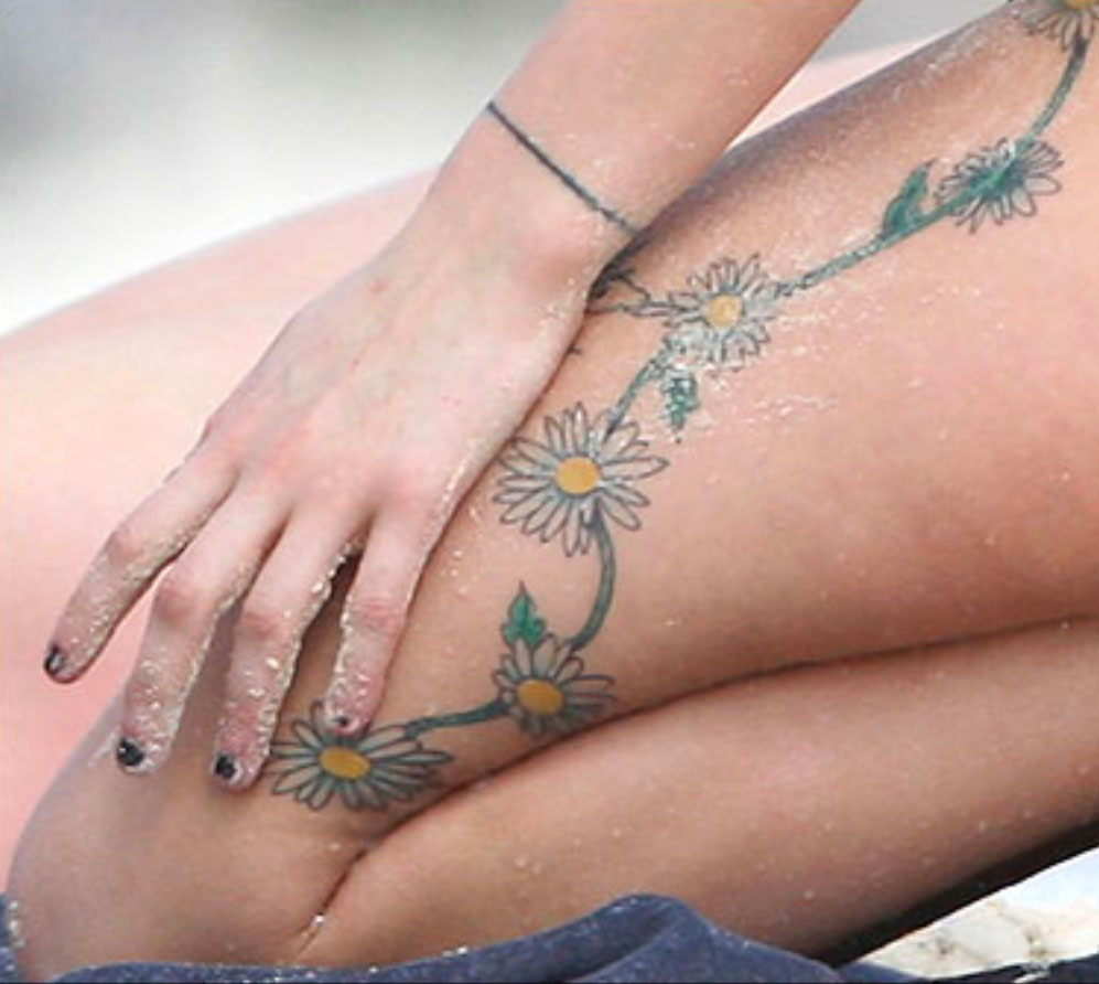
Peaches Geldof tattoos: high-resolution close view of the daisy chain flowers, vine, and hand placement across the leg

The daisy chain gives this part of the collection its shape. In close photos, the flowers curve along Geldof’s thigh and continue up the side of her body. The vine links them, and the yellow centres and pale petals stand out against the skin.

A chain like this can follow the body’s curves. The thigh, hip, and ribs don’t form a flat surface; the vine bends as the body moves. The open skin around it is part of the design too.

The flowers change in size. Some are clear at a glance, while the fine stem and small leaves show up when you look closer. A repeating motif does not need to be perfectly identical to feel connected. Slight differences give a hand-drawn piece a looser feel.

For a floral chain, decide where you want the eye to land. A larger bloom can anchor the thigh or hip, with smaller flowers tapering toward the knee or ribs. Leave room for the skin to move; packing the whole area can make the line harder to follow.

Her red-carpet portraits show arm ink in context

Peaches Geldof tattoos: high-resolution face-visible portrait showing multiple arm tattoos and small symbols in context

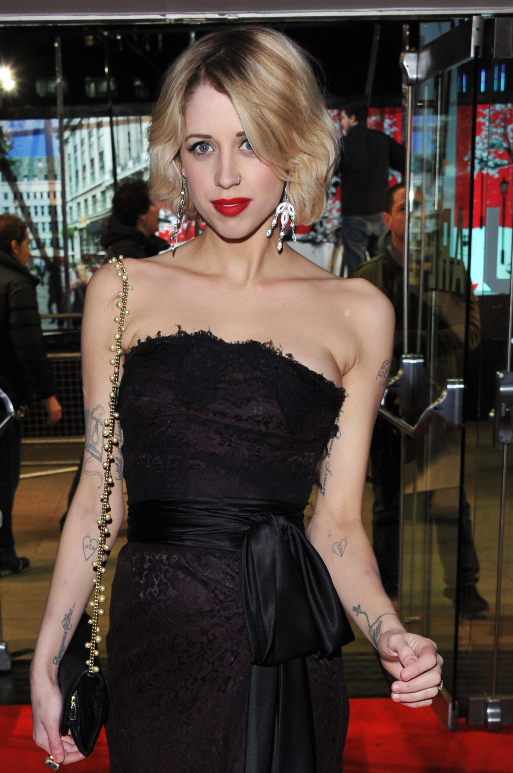
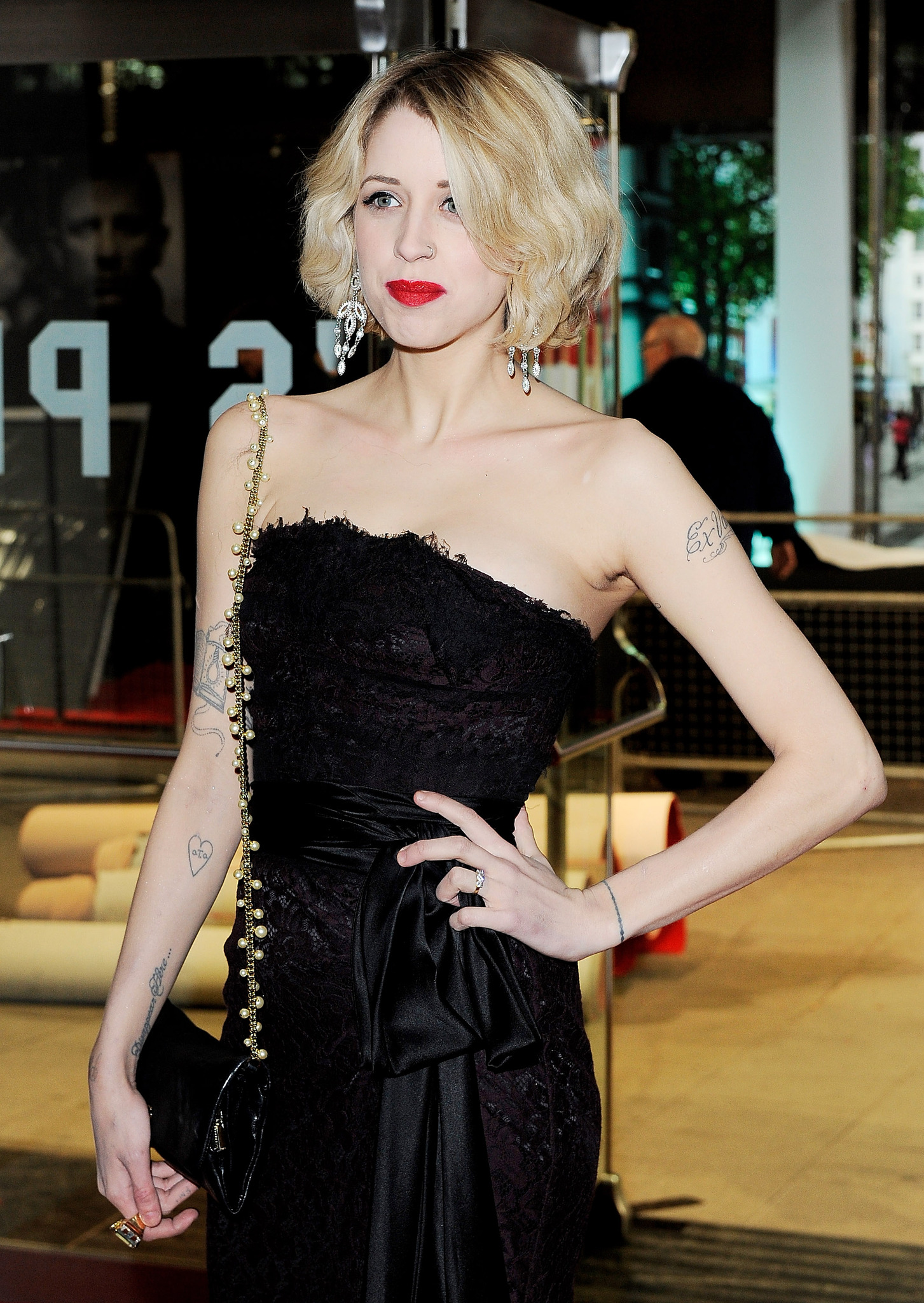
Event portraits show how Geldof’s arm tattoos sat with her clothes and posture. Script appears against bare skin, with smaller marks lower down near the wrist. In photos where she’s standing, turning, or holding a bag, the ink looks like part of her everyday style rather than a display arranged for the camera.

The arm combines clean lettering with lighter decorative lines. That leaves space around the words. A short phrase can hold attention while a heart or bird nearby adds another detail without filling the whole arm.

Placement changes what a tattoo feels like. Clothing can cover an upper-arm piece, while wrist and forearm ink shows during ordinary gestures. Geldof’s photos include both: some designs are immediately visible, others take a closer look.

If you’re planning script on your arm, check how it looks from different angles and with your arm hanging naturally. Think about how sleeves, straps, and movement will frame it. Good placement lets a small tattoo feel intentional without asking it to fill the whole limb.

The arm script makes personal names part of the everyday look

Peaches Geldof tattoos: high-resolution close portrait showing the upper-arm script tattoo and additional visible ink

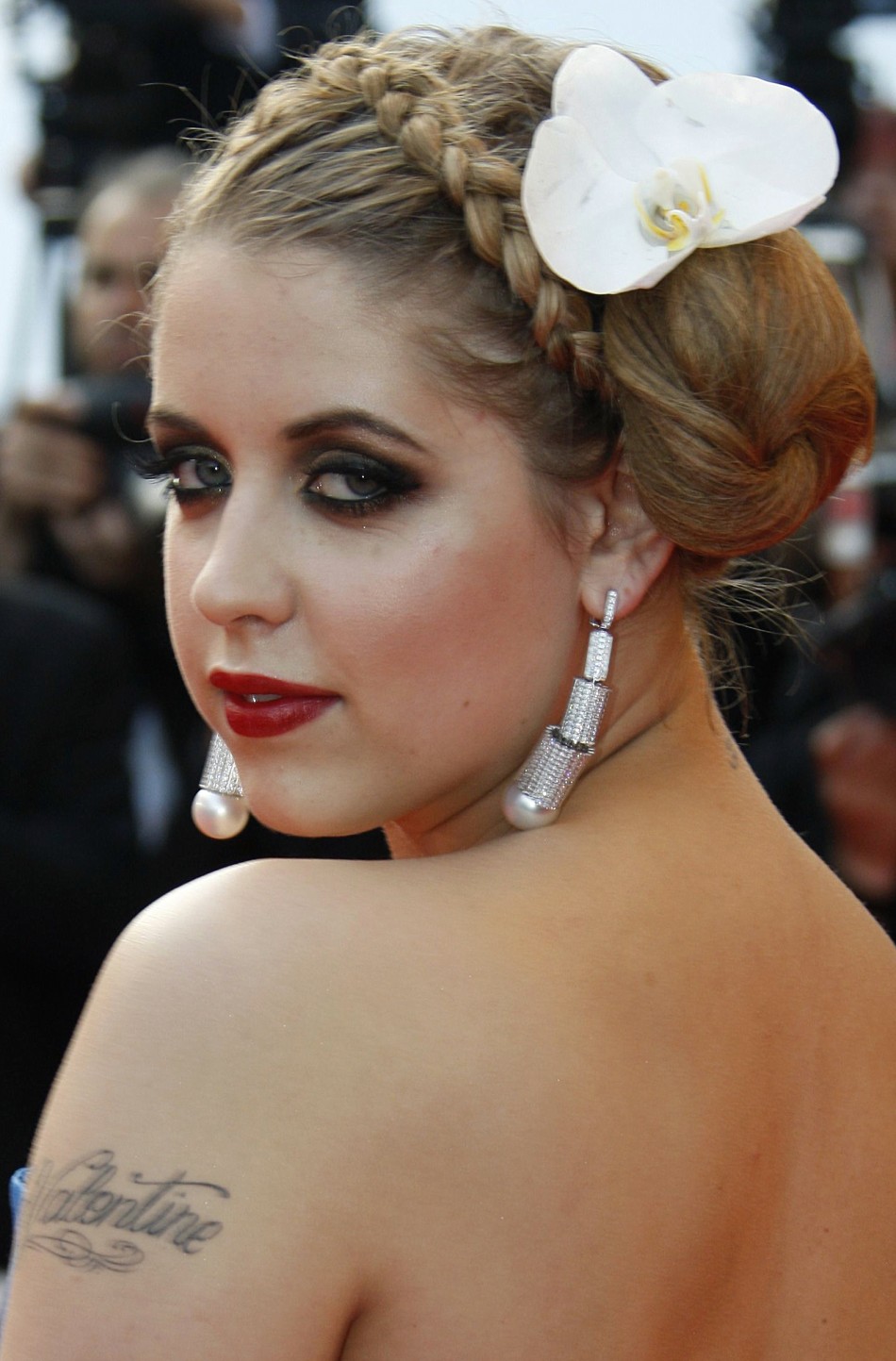
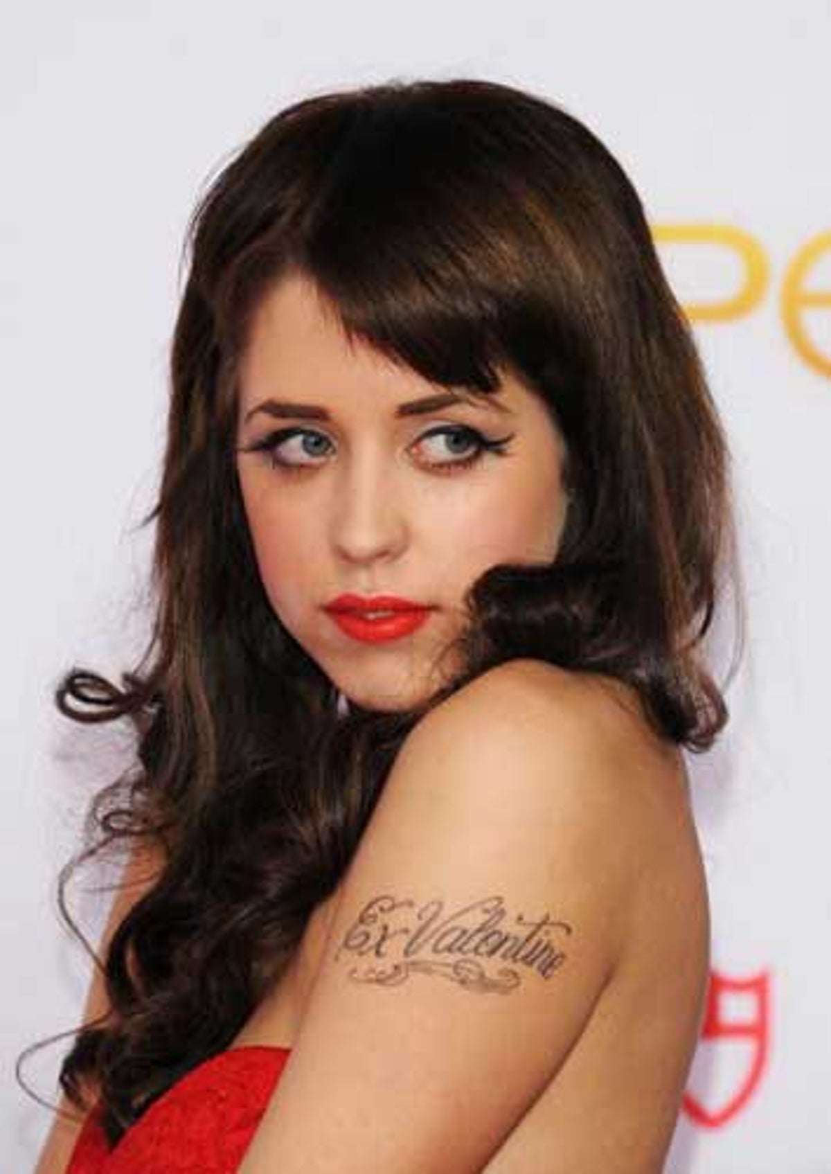
Geldof had several script tattoos on her arms, visible in event photographs. They show up when she raises a hand, reaches for a bag, or turns toward a camera. Arm lettering is hard to keep private; it becomes part of the way a person presents themselves.

The letters are modest in scale, with flourishes that extend beyond the words. Those curves add movement, but the lettering still needs to be easy to read. Near a shoulder, elbow, or wrist, a few details can finish the design; too many can crowd it.

The script sits between the mood of the floral chain and the larger back piece: direct enough to read, with a decorative style that fits beside symbols and flowers.

If you’re considering a name tattoo, check it when your arm is relaxed, bent, and turned away. Placement can make a simple word feel private or prominent. Placement can make a simple word feel either intimate or loud.

Small hearts and symbols give the collection its lighter notes

Peaches Geldof tattoos: high-resolution event portrait showing the heart, arm script, and placement around the shoulders

The small hearts and symbols are easy to miss in a full portrait, but they give the collection a lighter touch. A heart on the arm, a bird near the script, or a mark at the wrist works like a small pause between the larger designs.

Small tattoos depend on clean lines and placement more than a large silhouette. Geldof’s visible marks are simple enough to read quickly: a heart looks like a heart, a bird like a bird. They don’t need close-up detail to make sense.

They also break up the longer designs. The lyric piece across her back asks for a longer look, and the daisy chain draws the eye along her body. A small symbol gives the eye somewhere else to land.

A small tattoo can mark a moment without becoming a major project. Keep the design clear, give it enough room, and choose a spot that won’t be constantly rubbed. Little tattoos can carry a lot of personality when they are allowed to stay little.

Peaches’ floral and script tattoos work because the contrast is honest

Peaches Geldof tattoos: high-resolution face-visible portrait showing the delicate shoulder script and surrounding styling

In full-body photos, the pieces differ in style: the daisy chain is light and colourful, the script is dark and flowing, and the smaller symbols read quickly. They don’t have to look alike. Their differences make the collection feel like it grew with her interests.

Placement gives each piece its own space. Flowers follow the thigh; words sit across the back; arm tattoos show up with movement; a small heart can be more private. The design choices create a sense of order without needing one master plan.

If you’re building a collection over time, you can repeat a style without repeating a subject. Maybe the connection is fine linework, soft colour, or hand-drawn lettering. The tattoos can still mark different parts of your life. A personal collection does not need a logo. It needs a point of view.

Clothing changes how tattoos read. A design under a strap may look delicate, then feel bolder against bare skin. The same piece can be private in one outfit and more visible in another. That’s part of how tattoos become part of someone’s everyday style.

Why Peaches Geldof’s collection still feels personal

Geldof’s tattoos don’t look like a matching set. They include names, lyrics, flowers, birds, hearts, and smaller marks that suggest different chapters. The mix is what gives the collection its character.

The point isn’t to copy a daisy or a line of script. Choose designs that matter to you, think about how their placement will work together, and don’t rule out a small piece because it won’t dominate a photograph. A quieter detail may be the one you notice most.

Not every tattoo needs a grand explanation. It can be meaningful, decorative, impulsive, or some mix of the three. Geldof’s collection shows how one body can hold different stories at once.

Peaches Geldof in conversation

This interview offers a glimpse of Geldof’s voice and public style during her lifetime.

More celebrity tattoo guides

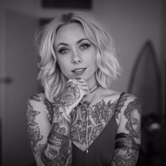
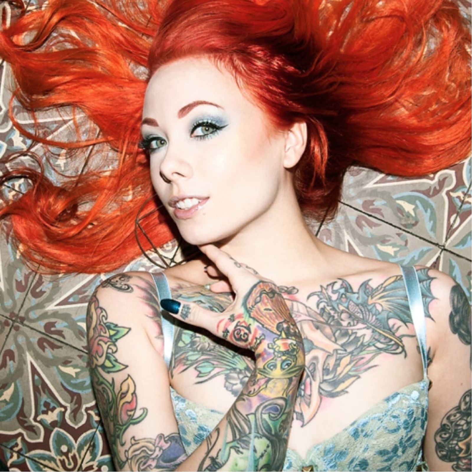
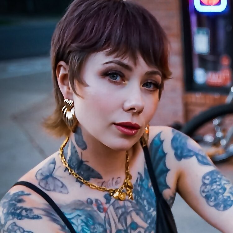
Megan Massacre Tattoos: Colorful Sleeves, Chest Ink and Creepy-Cute Details

Megan Massacre’s tattoos have always felt like part of the outfit, but they’re much more than decoration. The artist, model and TV personality wears a dense mix of color, black linework, portraits, animals and little symbols that all seem to come from the same slightly spooky, slightly playful world. Her ink is bold without looking stiff, and it has plenty of personality even when the details are small.

That’s what makes Megan Massacre tattoos so useful for inspiration. The collection isn’t built around one trend or one neat sleeve template. It looks like it grew over time, with different artists and ideas joining the party as her style changed. The common thread is attitude: bright color, strong outlines and images that feel a little weird in the best possible way.

Some designs are easy to identify from photographs, while the story behind individual pieces isn’t always public. So this guide sticks to the ink that can actually be seen and focuses on the practical design lessons: how to build a colorful sleeve, mix cute and creepy imagery, handle hand tattoos and keep a busy collection from turning into visual noise.

Her chest tattoos set the colorful, neo-traditional mood

Megan Massacre tattoos: high-resolution chest and arm view showing colorful illustrative tattoos

The chest is the first place to study if you like Megan’s style. Her upper-body work uses large, readable shapes rather than hiding every inch under tiny detail. Flowers, faces, leaves, dark outlines and bright fills sit beside each other, creating the feeling of a full illustration even when the designs were added at different times.

A chest piece like this needs a clear anchor. Megan’s work often has a strong central image or a dark line that gives the eye somewhere to land. Around it, smaller designs can move toward the shoulders and collarbones without making the whole area look like a sticker sheet. That’s a smart approach for anyone planning a first large tattoo because it leaves room for future additions.

The color choices matter just as much as the subject matter. Warm reds, greens, yellows and muted blues give the collection a vintage flash feel, while heavy black outlines stop the palette from becoming too soft. “Creepy but cute” is a useful shorthand for the balance, but the real trick is contrast. A sweet flower looks more interesting beside a skull, bat or strange little character than it does surrounded by more flowers.

If you’re planning chest work, start with the shape of your body instead of picking five unrelated flash drawings. Ask your artist where the sternum, collarbone and pectoral curve will pull the lines. Megan’s chest ink shows how separate motifs can still read as one composition when the scale and spacing are planned before the appointment.

The sleeves mix portraits, animals and bright illustrative linework

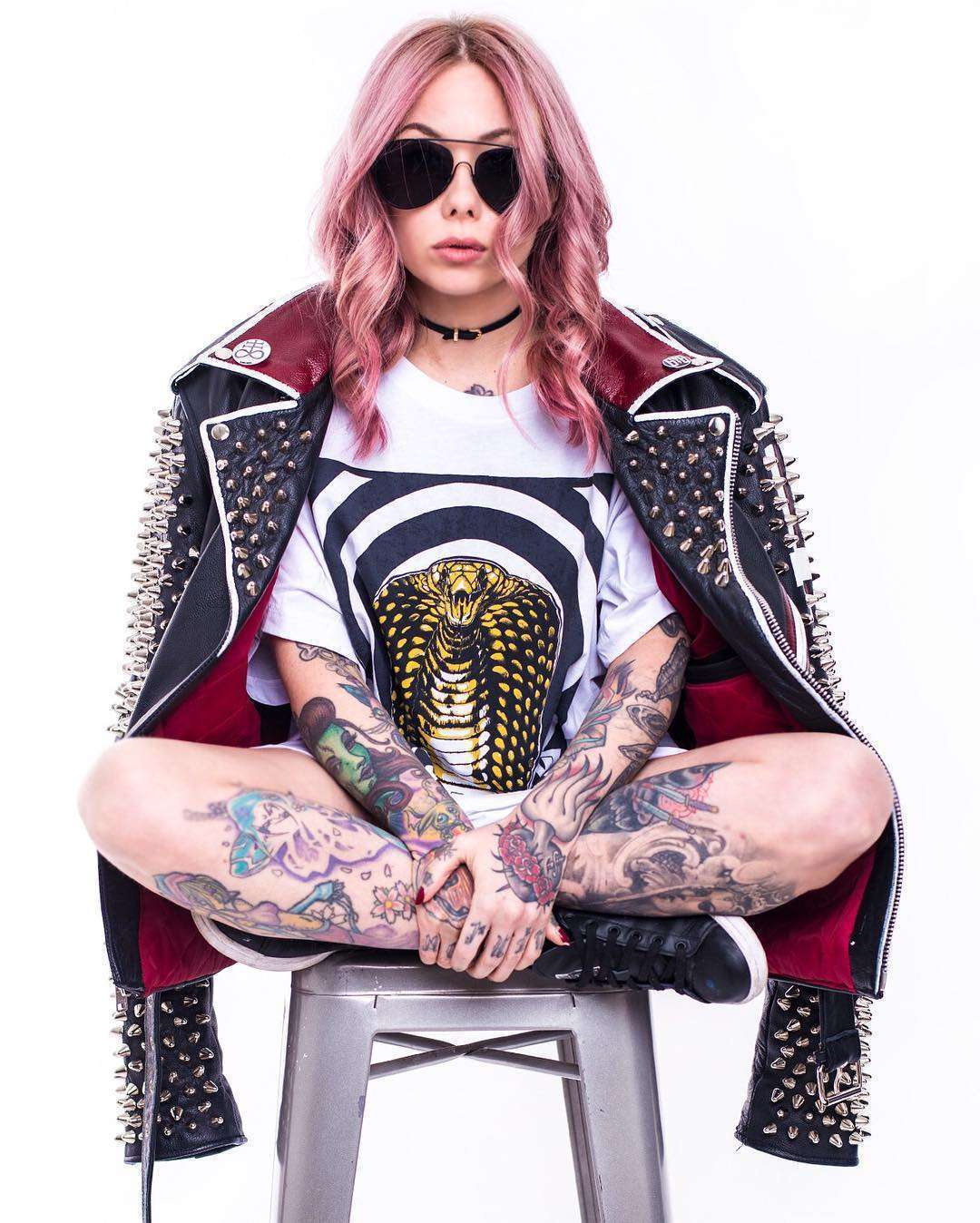
Megan Massacre tattoos: full-body view showing the colorful sleeves, legs and placement choices

Megan’s arms are where the collection gets busiest. The sleeves combine portrait-style faces, animals, florals and graphic shapes with enough open skin to keep the designs readable. From a distance, the arms look like a strong block of color. Up close, there are lots of small decisions in the line weight, background texture and way each figure turns around the arm.

Portraits are especially useful in a sleeve because they create a visual pause. A face has a natural focal point, so it can hold one section of the arm while smaller images fill the space above and below. The same idea works with a favorite animal, a doll or a character if realistic portrait work isn’t your thing.

One reason this style ages well is that the main silhouettes are clear. Even when color softens, you can still tell where the face, wing, flower or creature begins. Good sleeve planning is less about squeezing in more art and more about giving every major image a readable outline. The gaps are doing useful work too. They stop all the dark marks from merging into one muddy band.

For a Megan-inspired sleeve, pick one mood before you pick the exact images. Do you want old-school candy colors, darker horror references or a blend of both? Once that choice is made, your artist can repeat the same line weight and background treatment across pieces that are different in subject. That’s how a mixed sleeve starts to feel intentional.

Hand and finger tattoos bring the details right into the frame

Megan Massacre tattoos: close portrait showing hand, finger, neck and chest tattoos

Hand tattoos show up constantly in Megan’s photos because they’re impossible to hide when she’s working, posing or holding a tattoo machine. The fingers carry tiny lettering and symbols, while the backs of the hands connect into the heavier work on the wrists and forearms. It’s a high-visibility area, but the designs still feel playful rather than overly serious.

Small finger tattoos need a different kind of planning from a chest piece. There isn’t much room for detail, and the skin gets washed, bent and exposed every day. Megan’s hand work leans into simple shapes and compact marks that can still read when the fingers are moving. That’s a better reference than copying a delicate image that only looks good in a tightly cropped studio photo.

The hand designs also help the sleeves feel finished. When a tattoo stops suddenly at the wrist, it can look like an unfinished border. Small marks on the fingers and hand create a softer transition into the arm. That little bit of visual echo is enough to make a scattered collection feel connected.

There’s no need to rush into hand ink just because it looks cool on an artist whose career is built around tattoos. Think about work, sun exposure and how much you care about perfect lines. Finger tattoos often fade or need touching up. If you like the idea but want less commitment, try the same symbol on the wrist or the side of the forearm first.
Animal tattoos and darker motifs keep the collection from feeling too sweet

Megan Massacre tattoos: bright portrait showing the colorful chest and illustrative arm work

The darker side of Megan’s tattoos keeps the colorful pieces from becoming overly polished. Bats, skulls, spider imagery, snakes and other gothic shapes appear alongside flowers and cartoon-like details. The result is lively instead of gloomy because the color palette keeps the horror references from taking over.

Animal tattoos are a good way to build that kind of contrast. A raven, cat, bat or snake can act as a strong black shape, then smaller flowers or decorative marks can soften the edges. Megan’s collection shows that a dark image doesn’t need to be rendered in solid black to feel bold. Sometimes the attitude comes from the eyes, the pose or the way the shape cuts across the body.

The same idea works for a cover-up. A busy, illustrative subject gives an artist more options than a tiny fine-line flower. When an old tattoo needs to disappear, look for a design with movement, strong shadow and enough color to carry the new shape. Don’t force a cover-up to be smaller than the tattoo underneath it. The better design usually wins by being larger and more confident.

If you like the creepy-cute mix, make a short list of subjects you’d still enjoy after the novelty wears off. A smiling skull, a pretty moth or a cartoon animal can hold both moods at once. Keep the main silhouette simple, then let the color and small details do the personality work.

Full-body tattoos and placement make the collection feel like a living sketchbook

Megan Massacre tattoos: face-visible portrait showing hand tattoos and the dense sleeve texture

Megan’s tattoos don’t stop at the chest and arms. Photos show ink moving down the legs and across smaller areas of the body, which gives the collection a less formal, more sketchbook-like feel. A full-body set doesn’t need every section to match. It just needs repeated choices in color, outline and attitude.

This is where her collection offers a useful lesson for people who don’t want a traditional full suit. You can build a body map slowly. Start with the areas you most want to see every day, then use smaller pieces to connect the visual language later. A leg can carry a larger standalone image while the ankle or knee gets something compact and graphic.

Busy collections also benefit from a few quiet areas. Leaving skin open around a large tattoo makes the piece feel bigger and gives the eye a break. If every inch is filled at once, even beautiful work can lose its impact. Space isn’t empty when it helps the next tattoo stand out.

The best takeaway from Megan Massacre’s tattoos is that consistency doesn’t mean repetition. Her pieces can be cute, macabre, realistic, decorative or a little silly, yet they still belong together because the linework stays confident and the colors feel chosen. Build around your own strange mix instead of chasing someone else’s exact sleeve. Pick images that make you smile, give the important pieces enough room and let the collection grow at a pace you can actually live with.

Before you book a large project, bring your artist a few references and explain what you want the finished set to feel like. Talk about color, contrast, healing and how much empty skin you want to keep. Megan’s tattoos look spontaneous, but the strongest parts still have enough structure to age well. A little planning gives the weird ideas room to stay weird without losing their shape.

More celebrity tattoo guides

Katie Price Tattoos: Her Back Wings, Floral Ink and Leg Designs

Katie Price’s tattoos cover her back, arms, stomach, thighs and wrists. The collection includes wide feathered wings, floral work, script, bracelets and designs tied to people and moments in her life. Some pieces cover a large area; others are small details. The overall look is bold, busy, and very personal.

Price often chooses designs that read from a distance, then adds smaller details around them. The angel wings across her back change its whole shape, while a horse, flowers and feathered forms make a separate composition over her stomach and thighs.

Her tattoos have changed over time, too. The phrase “tattoo transformation” suits a collection where names and relationship tattoos have been covered, altered or built over. The ink reflects more than one moment in her life. Here are the pieces that stand out in the clearest photos.

Katie Price’s giant angel-wing back tattoo is the main statement

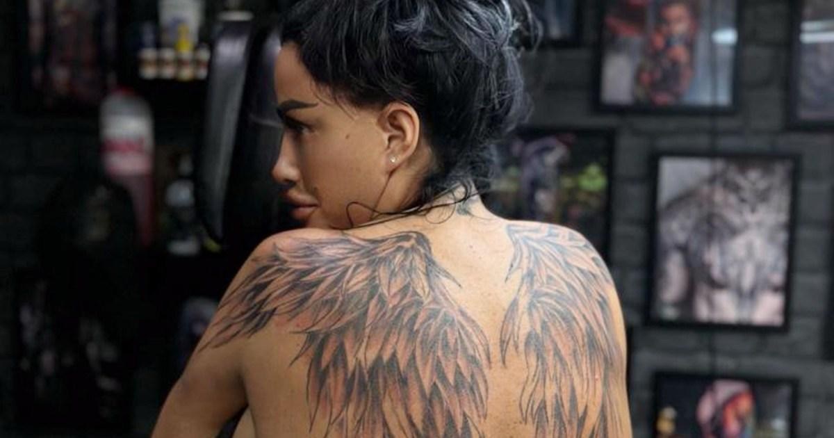
Katie Price tattoos: large angel-wing back tattoo across the shoulder blades

The newest and most dramatic part of Katie Price’s tattoos is the large pair of angel wings across her back. The feathers start high on the shoulders, spread across the shoulder blades and narrow as they reach toward the waist. In photos, the outer edges look soft, while darker shading through the middle gives the wings depth.

At this size, the tattoo sets the shape of the back. It widens across the shoulders and draws the eye toward the spine. Under an open-backed dress or crop top, it becomes the main detail rather than a small mark among others.

Price has shown the work while it was still fresh, when the ink appeared darker and the skin was settling. Those photos make the feather structure easy to see. Each feather points in its own direction, but the overlapping sections hold the two wings together. The design gets its scale from many smaller strokes rather than a thick outline.

Angel wings are a familiar subject; the full-back placement is what makes this version striking. A design that spans the shoulders, spine and lower back needs an artist to keep both sides balanced. At this scale, even a small difference between the wings will show.

Her older back and shoulder ink shows a layered layout

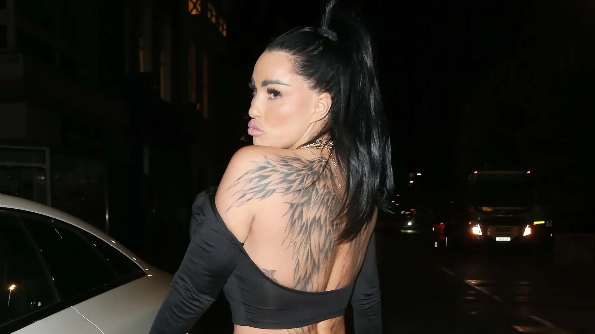
Katie Price tattoos: second angle showing layered feather and shoulder placement

A second photo shows the wings from another angle. The feathers curve around the shoulders rather than forming a strict mirror image, and some skin remains open through the center. That keeps the back from looking like one solid panel.

The view also makes the older tattoos around her shoulders easier to pick out. They have their own line weights and shapes, and the newer wings sit around them instead of replacing every detail. The result has more than one layer.

Price’s back is an example of how a tattoo collection can grow gradually. A larger piece can give earlier designs a frame, as long as there is room for each to remain visible. The lines and shading don’t all have to match.

Clothing changes how much of the back work people see. A low neckline can reveal the upper feathers; a shirt can cover the whole design. The placement can make a large tattoo feel private one day and central to an outfit the next.

Floral and horse tattoos bring movement to her stomach and thighs

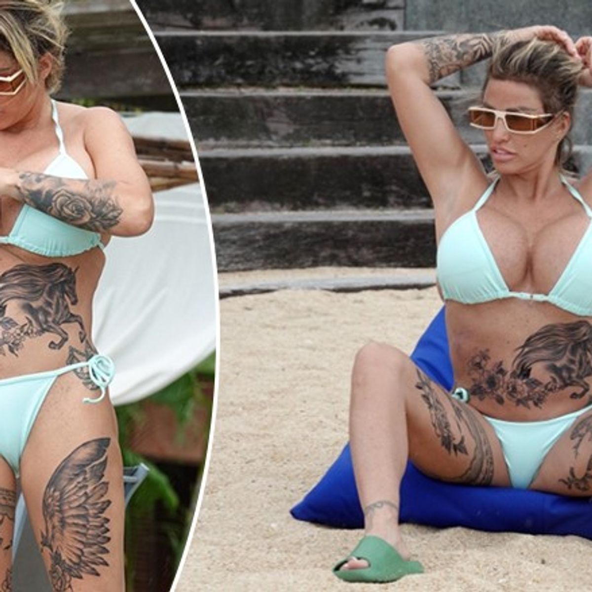
Katie Price tattoos: horse, flowers, and feathered thigh tattoo composition

The stomach and thigh work looks different from the wings on Price’s back. In beach photos, a detailed horse stretches across her stomach, surrounded by flowers and leaves. Related feather shapes continue down her thighs and follow the line of her legs.

The horse gives the composition a clear focal point. Its head and mane are easy to recognise, while the flowers soften the edges. The feathered forms on the thighs point downward, carrying the eye toward the legs rather than stopping at the hips.

These designs sit on parts of the body that bend and move. The stomach changes shape when someone sits or stretches, and the thighs shift as the legs turn. The open space between the horse, flowers and feathers helps keep the details distinct in different poses.

Flowers also appear elsewhere in Price’s collection, though they don’t all use the same design. Some are lighter; others sit inside darker shading. Repeating a subject without repeating the exact image can help a large collection feel connected.

The garter tattoo on her thigh is a very different kind of design

Katie Price tattoos: black and pink garter-style thigh tattoo

One of Price’s older thigh tattoos is a black-and-pink garter. It sits high on her leg. In photos with a short dress and tall boots, the band almost reads as part of the outfit. Its shape wraps around the thigh, with a decorative, lingerie-inspired look.

This piece is smaller and more graphic than the feathered back work. The garter shape is clear without taking up a large area. It can stay under everyday clothes, then show with a skirt, shorts or swimwear.

A garter design has to follow the leg without appearing to slide up or down. The band needs a clean line, and its details need enough room to stay distinct as the thigh changes shape. The simple outline here does the work without crowding the narrow space.

Not every tattoo in a collection has to share the mood of its largest pieces. A bold back tattoo can sit alongside something playful, bright or fashion-inspired on the leg. That contrast gives the collection more range.

Katie Price’s arm sleeve mixes flowers with darker shading

Katie Price tattoos: full floral arm sleeve with dark shading

The floral work on Price’s arm is easy to spot in close portraits. The sleeve runs from her wrist toward her upper arm, layering flowers and leaves with darker shaded sections. The full floral arm sleeve has enough contrast to show clearly even in a night-time photo.

Unlike the repeated feather shapes on her back, the sleeve combines several textures. Some petals are outlined and left open; other areas use heavier black or gray shading. The difference gives the flowers room to stand out.

Price has described floral work connected to her mum. Flowers can carry that personal meaning without a line of script or a portrait, and the design can be extended later with more leaves, stems or shading.

An arm sleeve is visible in everyday gestures. A hand near the face, a folded arm or a short-sleeved top can bring a different part of the design into view.

What ties the whole look together

Price’s tattoos share a confidence about scale. The wings take over much of her back, and other designs cover large sections of her legs and arms. Smaller script, bands and wrist details break up the larger pieces, giving the collection different weights.

Several designs use familiar symbols with personal associations. Wings can suggest protection or change; flowers have a family connection; and the horse reflects Price’s long-running interest in horses. The garter brings a fashion reference into the mix. The exact meaning of every piece isn’t clear from the photos, but the subjects recur across the collection.

If you’re using Katie Price’s tattoos for ideas, think about placement before settling on a subject. Wings need enough room to spread across the back; a flower sleeve has to wrap around the arm; and a band must follow the thigh. The same design can look quite different in another spot.

Her tattoos have also changed over the years. Names and relationship designs can be covered or reworked as a person’s life changes. The different stages remain visible in the collection, giving it a history rather than a single finished look.

Price wears much of her ink where clothes can reveal or cover it. A backless dress shows the wings; sleeves hide them. That combination of large placement, personal motifs and changing work gives the collection its distinctive look.

More celebrity tattoo guides

Mia Khalifa Tattoos: Her Arabic Script, Cross and Hand Ink

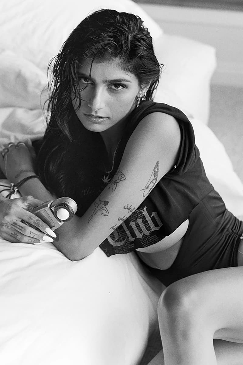
Mia Khalifa’s tattoos range across her arms, wrists, hands and the side of her body. Her collection runs across both arms, from Arabic lettering and small symbols to simple line drawings and darker pieces. Some are easy to cover with a sleeve; others show when she raises a hand or turns toward a camera.

The designs don’t follow one style. Arabic script sits near a bold red cross, tiny finger marks beside larger arm drawings. The variety makes the collection feel assembled over time rather than designed as a matching set.

Some of Khalifa’s tattoos have changed. The red cross on her wrist became part of a public conversation about Lebanon, and she later spoke about replacing it with another design. It’s helpful to view the photos as snapshots from different points in her life, not as one final version of the collection.

Mia Khalifa’s Arabic forearm script is one of her clearest tattoos

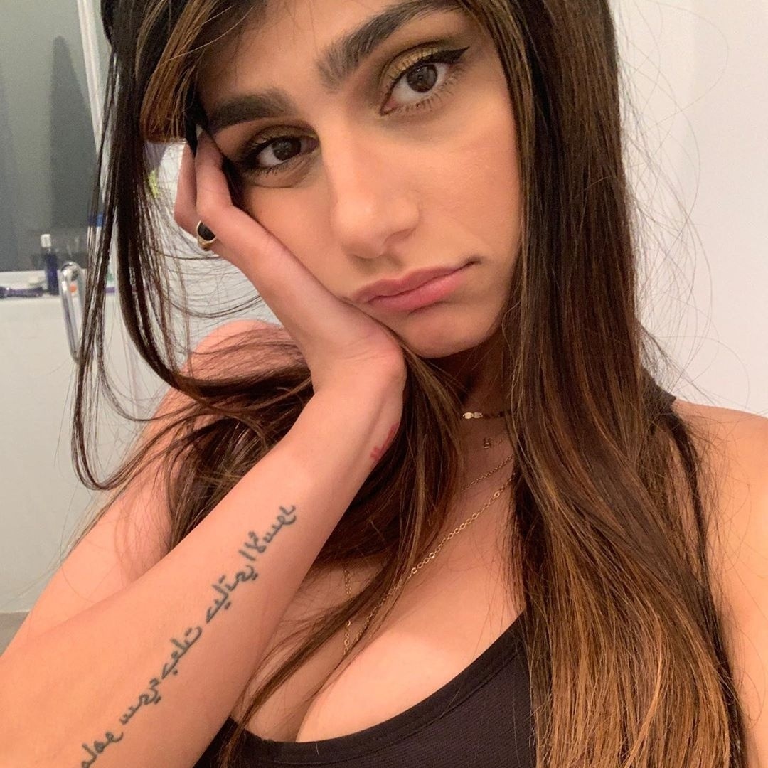
Mia Khalifa tattoos: Arabic forearm script in a clear close portrait

The long Arabic script on Khalifa’s forearm is one of her most recognisable tattoos. It runs in several lines along the arm, giving it a strong vertical shape. The lettering is dark and open enough to read clearly in close photos.
Spacing matters with script. When the lines sit too close together, they can blur into a dark block as the tattoo heals. Here, there is room between them, and the rounded Arabic forms give the lettering its own rhythm.

The forearm suits the design’s length. A bent arm brings the writing toward the camera; when relaxed, it follows the line of the limb. Longer phrases need more room than they might seem to on a screen.

If you’re considering Arabic script, have the text checked by a fluent reader before it is tattooed. A simple design still depends on the wording and lettering being right.

The red cross on her wrist carries a complicated chapter

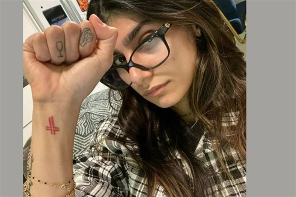
Mia Khalifa tattoos: red wrist cross and tiny hand symbols

The red cross on Khalifa’s wrist stands out in close-up portraits. Its colour separates it from the black lettering nearby, and its small size keeps it from taking over the arm. When she raises her fist, it is often the first tattoo people notice.

Khalifa has linked the design to her Lebanese background and her father’s political views. After the Beirut explosion, she said she wanted to replace it with a map of Lebanon and use the change to support relief work. The tattoo is part of a larger personal and public story, not just a red symbol.

The wrist moves constantly and rubs against clothing, so it can be a demanding place for fine detail. A compact mark works there because its shape can stay clear without much shading. The red ink also gives this small design weight.

Her discussion of changing the tattoo is a reminder that the meaning of a design can shift over time. A cover-up or replacement becomes part of the story of the collection, too.

Her hand tattoos include tiny symbols and a wine glass

Mia Khalifa tattoos: multiple arm and hand tattoos in a clear raised-arm photograph

Khalifa’s hand tattoos are small but easy to spot in a selfie. A tiny wine-glass outline sits on one finger, and another finger has a rounded symbol. Compared with the larger arm pieces, these marks are light and sit alongside her jewellery and manicure.

Finger tattoos move with the hand. They can disappear when a fist closes or look wider from a different angle. A fine outline may spread as the finger bends, which is one reason simple shapes tend to work well there.

The designs also bring a lighter note to the collection. The Arabic lettering carries a message; the wine glass feels more casual. Both can sit together without making the whole hand look formal.

Hands get frequent washing, sun and friction, and fine lines may need touch-ups sooner than ink on the upper arm. Small symbols like these work best when their outlines are clean and uncomplicated.

The arm collection mixes line drawings with bolder black ink

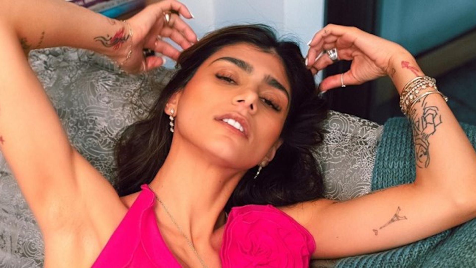
Mia Khalifa tattoos: line drawings and bolder black ink across the arms

A black-and-white portrait shows how the arm collection has grown. Line drawings sit along the upper arm and forearm, alongside Arabic script, small figures and darker outlines. The designs don’t form one solid sleeve; open skin separates them and lets each piece hold its own shape.

Those gaps guide the eye from one design to the next. Darker sections act as anchors, while the open areas keep details from competing. The arm holds a lot of ink without feeling packed from end to end.

The line drawings vary in weight and angle. Some are delicate, others more solid. They don’t look like parts of one polished illustration, and that variation gives the collection a more personal feel. A new tattoo can join without having to match a finished sleeve.

If you’re planning several pieces, leave some space around the ones you already have. Blank skin doesn’t need to be filled just because it’s there. The clear gaps on Khalifa’s arms help the separate designs remain legible.

A close look at the map and star-style designs

Mia Khalifa tattoos: map, stars, and small graphic marks on the arm

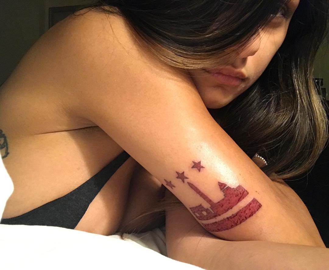
Other photos show small graphic marks on Khalifa’s arms and the side of her body. A map-style outline, stars and short symbols sit near the larger lettering. They are simple shapes, but they add another texture to the collection.

A small symbol can be personal without becoming the focus of an entire look. A map may point to a place or family connection; stars might mark a memory or be a shape the wearer likes. The photos don’t tell us what every design means, and there’s no need to guess.

The smaller pieces sit apart from the script, so the two don’t compete. One may be visible in a close portrait, while another appears when she changes clothes or raises an arm. They work as separate details rather than one large composition.

The designs share clear outlines that read well in ordinary photos. A map, star or short line of script doesn’t need to be large or heavily shaded to have a place in the collection.

Why this mix works

Khalifa’s tattoos move between different scales and moods. The Arabic forearm script is deliberate; the red wrist cross is bright and easy to spot; the finger symbols are tiny; and the arm drawings add texture. The map and stars keep the overall look from feeling too heavy.

Placement helps organize the mix. The forearms carry the longest writing and larger drawings. The wrists and fingers hold smaller marks, while the upper arms and side of the body give the broader designs more room. The styles don’t have to match exactly.

If you’re using Khalifa’s tattoos for ideas, decide which design needs the most space. A sentence needs a different plan from a small symbol. Hand ink needs more upkeep than an upper-arm tattoo, and a bright colour like red will draw the eye sooner than a soft black outline.

The collection also shows how tattoos can record change. Some pieces have family or national meaning; others are small marks chosen for their shape. A design may be covered or reworked later. That doesn’t erase the earlier chapter; it adds to the history visible in the photos.

Mia Khalifa’s tattoos feel personal because the designs aren’t over-organised. Lettering, a cross, hand symbols, maps, stars and line drawings sit together with room around them. The result is easy to recognise, with details that emerge in different photos.

More celebrity tattoo guides

Anthony Loffredo Tattoos: Black Alien Face and Full-Body Ink

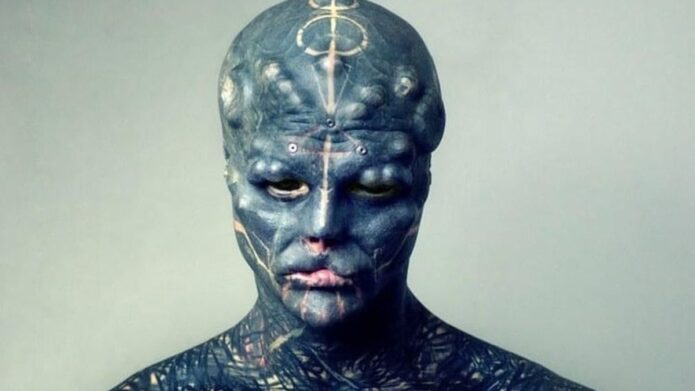
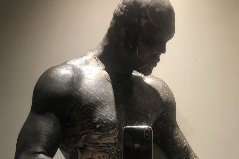
Anthony Loffredo’s Black Alien Project covers his face, scalp, neck, torso, arms and legs in dark tattoo work. Pale lines and geometric marks break up the black fill. In photos, the face draws the eye first, then the ink continues from the neck across the rest of his body.

Loffredo is also known for body modifications, including changes to his nose, ears, lips, tongue and fingers. Those procedures are part of the public project, but they are separate from the tattoos. This guide focuses on the ink that can be identified in the photographs.
The five body images show a close face view, the torso and arms, a side profile, details around the forehead and neck, and a wider view of the full-body coverage. The featured portrait is separate and appears in the post header.

Black Alien’s face tattoos use blackout ink and pale linework

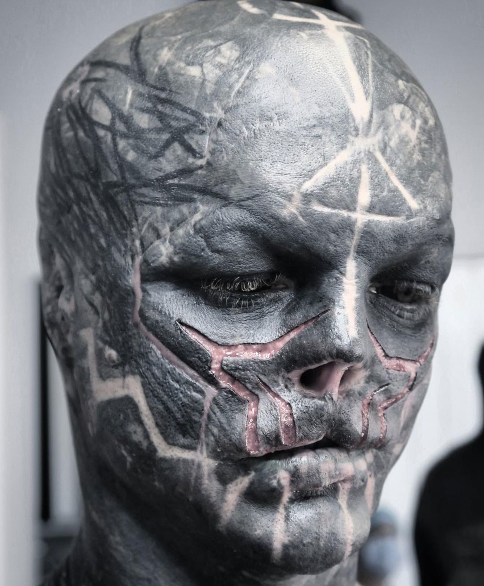
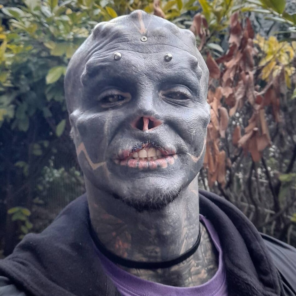
Anthony Loffredo tattoos: sharp close-up showing the black face tattoos, pale geometric lines, scar-like texture and head implants

Loffredo, known online as Black Alien, has almost completely covered his face in dark ink. Pale lines cross the cheeks, temples and brow. In a close photo, those marks give the blackout a shape instead of letting it read as one flat field.

The forehead, eyelids, nose area and jaw have different textures. Some sections are smooth and dark; others show fine geometric lines or raised, scar-like detail. The contrast gives the face structure even where the ink is dense.

The face relies on contrast. Broad black areas define its outline, while lighter marks direct the eye across the brow and cheeks. The smaller lines become clearer when you look closely.

Tattoos and body modifications appear together in these portraits, but they are different parts of the project. The face includes pale ink lines as well as changes to the nose, ears, lips and tongue. The photographs show where those details sit; they don’t make them the same procedure.

The torso and arm tattoos make the blackout work feel continuous

Anthony Loffredo tattoos: mirror photograph showing the blackout torso, patterned chest, tattooed arms and hand details

The mirror photo shows the design beyond Loffredo’s face. Dark ink covers the chest, stomach and shoulders, with lighter patterns breaking through the field. His arms use the same visual language, so the torso and head don’t look like separate pieces.

More pattern is visible on the chest than on the forehead. Marks continue down the arms toward the wrists and hands. The phone blocks part of the mirror image, but the surrounding ink still shows how the work is placed.

The edges matter in a blackout project. The shoulder, armpit, wrist and neck all bend and move. The dark fill crosses those areas, while lighter lines help keep the different sections legible.

The fingers and backs of the hands carry the pattern farther down the arms. In this photo, glare and the mirror angle make some of those details hard to see, but the hands clearly extend the design beyond the forearms.

The side profile shows how the ink follows the skull, neck and shoulder

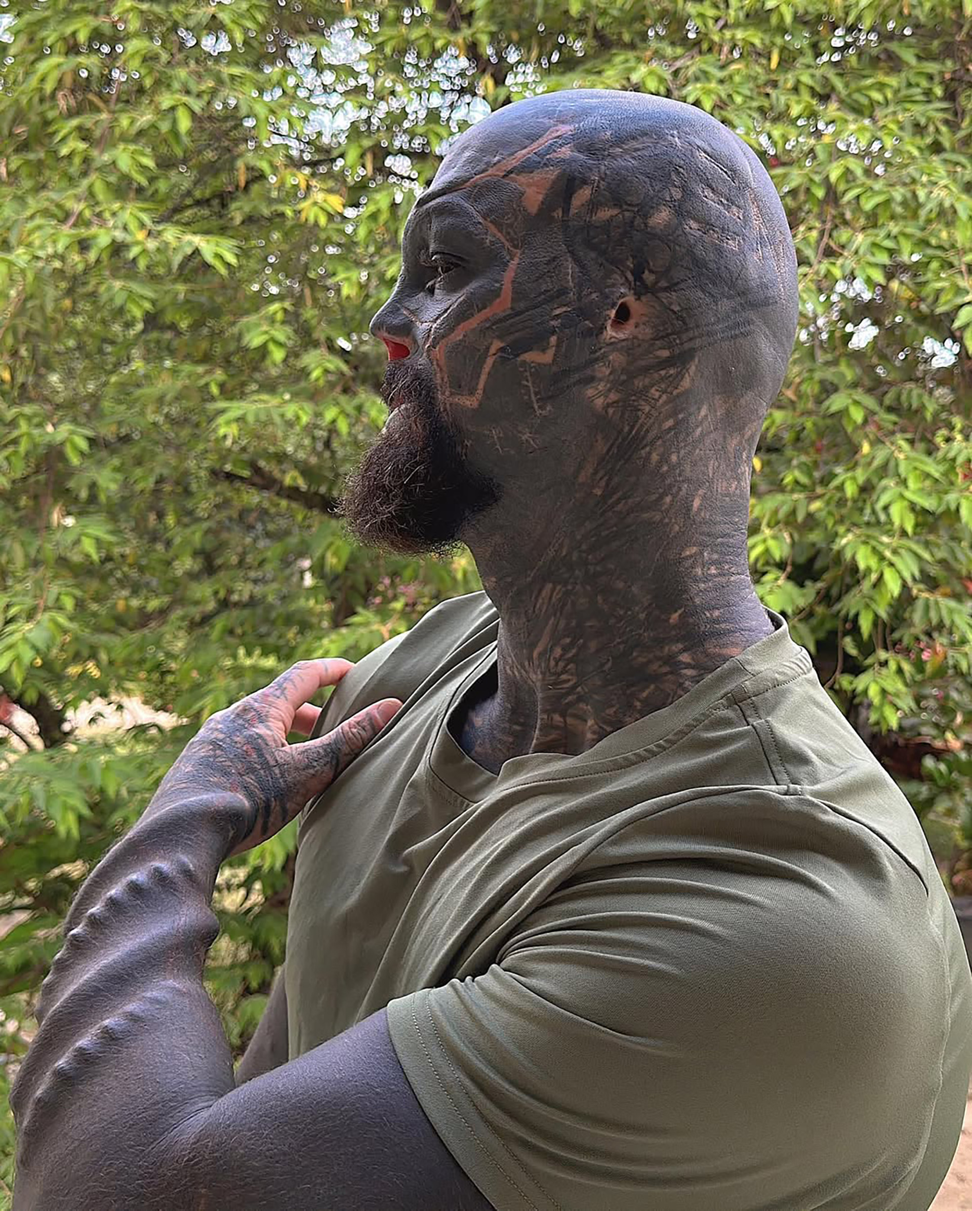
Anthony Loffredo tattoos: large side profile showing the head, neck and upper-arm tattoos with geometric pale lines across the dark fill

The side profile shows the depth of the coverage. Ink reaches across the forehead, crown and back of the head, then continues down the neck to the shoulder and upper arm. Pale lines curve around the head and help set the direction of the design.

The photograph also separates the scalp from the neck. The head has broad dark coverage; the narrower neck introduces denser marks and different angles before it opens into the shoulder.

The look is dramatic, but the placement follows the body’s shape. The skull is rounded, the neck is narrow and mobile, and the shoulder widens into the arm. Each area needs a different layout even when the palette stays mostly black.

Photos from different dates show the project at different stages. Some areas appear darker or more finished, and lighting changes how much of the pattern comes through. It’s safer to describe what each image shows than to call the design complete.

The forehead and neck details keep the dark tattoo style readable

Anthony Loffredo tattoos: clean square portrait showing the forehead studs, facial blackout, white geometric cheek lines and neck tattoos

This square portrait brings the smaller face details into view. Raised metal studs sit across the forehead, while pale angular lines mark the cheeks and jaw over dark ink. Clothing and the camera angle partly cover the neck pattern.

The lines around the cheeks add another texture beside the forehead hardware. The studs are body modifications, not tattoos, so the portrait shows several kinds of detail together: dark fill, fine lines and physical changes.

The finer marks give the blackout definition. Lines around the brow, cheekbones, mouth and jaw follow features that already shape the face. Even a small mark can change how the larger dark area reads.

The image doesn’t explain why Loffredo chose each stripe or shape. It does show their placement and contrast, which is enough to describe how they work with the rest of the face.

The full-body tattoo views show the scale of the Black Alien project

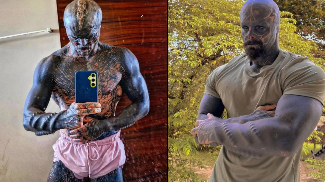
Anthony Loffredo tattoos: clean two-view source image showing the tattooed torso, arms, legs and outdoor full-body silhouette

This two-view image shows the coverage from head to legs. The upper body is dark from the head through the chest and arms, and the outdoor view shows the ink continuing down the legs. It’s a full-body project rather than a set of isolated tattoos.
The outdoor frame makes the proportions easier to read. The face is still the first focal point, but the shoulders, torso and limbs carry the same dark weight. The small lines become clearer when the camera moves closer.

The full-body design repeats a few choices across different areas. The blackout palette and geometric marks connect the sections; the body’s curves, poses and changing light keep them from looking identical.

Loffredo has described the work publicly as an ongoing transformation. These photos record particular stages. Later images may show new coverage or modifications, while older ones still show what was there at the time.

The same dark palette appears across very different parts of the body. The face uses blackout fill and pale geometry, the torso has a wider field of ink, and the limbs carry the design as they move. The details change with the placement.

That’s why it helps to look at the photos together. A face close-up shows how dense the head work is, but it can’t show where the shoulder or leg coverage begins. A full-body view gives the scale and loses the small cheek and eye-area marks.

Black Alien is a public name associated with Loffredo and the body-modification project. The tattoos are part of that image, but a photo doesn’t establish a personal meaning for every line. The visible blackout, geometry and placement are clear enough to describe on their own.

Lighting changes how the blackout looks. In sunlight, pale lines and scar-like details can stand out; indoor photos may make the same area appear almost solid. Comparing clear photos helps show which details belong to the pattern.

If you’re using Black Alien tattoos for ideas, pay attention to how the design crosses the head, neck, shoulder and arm. Those areas curve and move, so the line direction and amount of fill change with each surface.

Black is the dominant colour in the visible tattoo work. Pale skin and lighter marks provide contrast. With this much dark coverage, an even fill and legible linework matter as the tattoos age.

The close and wide photographs answer different questions. A face shot shows fine detail; a torso or leg view shows scale and how the ink sits on the body. Together, they give a clearer picture than one dramatic crop.

For more celebrity and public-figure ink, see the site’s celebrity tattoo guides. Use clear tattoo photos and reliable interviews to separate visible details from claims about meaning.

More celebrity tattoo guides

Romeo Beckham Tattoos

Romeo Beckham has collected a surprising amount of tattoo work while still looking young and fashion focused in public. His ink ranges from small hand details to a large chest scene, with neck designs, lettering and family references in between. There is no official catalogue that explains every piece, so this guide focuses on designs that show up clearly in public photos.

The styles vary. Some pieces are clean blackwork, others borrow from traditional flash, and a few seem tied to family, relationships or a particular moment. Romeo has let different styles sit beside one another, so the collection looks built over time instead of planned as one matching sleeve.

Romeo Beckham tattoo style at a glance

Most of Romeo’s tattoos are black and grey, with a few old-school symbols mixed in. The designs include faces, wings, script, religious imagery, animals and small marks on his hands. Placement matters too: the neck and hands keep smaller tattoos visible, while the chest and forearm give larger pieces room for detail.

Family comes up often. Romeo has been photographed with tattoos linked to his brothers and parents, and more recent lettering has made that theme even clearer. The Beckham family has a long history of meaningful tattoos, so tributes sit naturally beside pieces that may be there mainly for their look.

Neck and ear tattoos

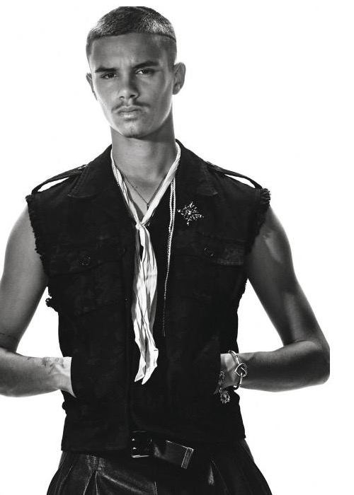
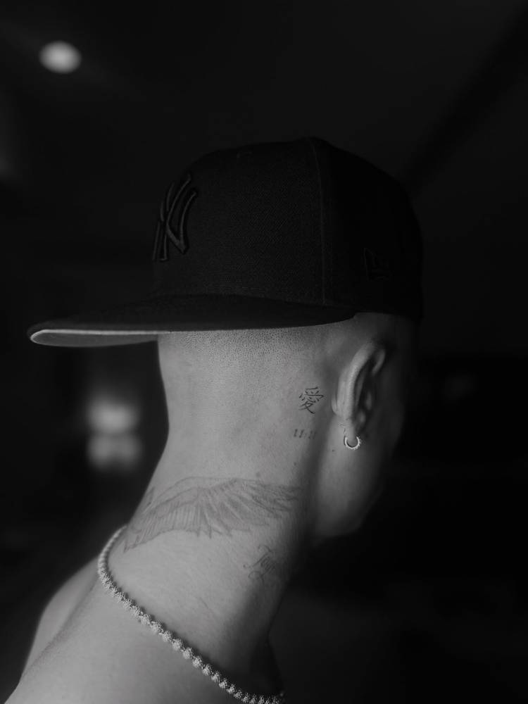
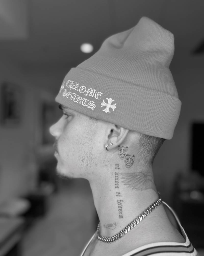
Romeo has several tattoos around his neck and ear. One close-up shows small lettering or symbols near the ear; farther down the side of his neck are masks, vertical script and wing-like blackwork. These are easy to see in portraits, runway photos and football shots, so they play a big part in his look.

Romeo Beckham neck and ear tattoos

The marks around the ear and nape make good use of a small area. They follow the shape of his head and neck instead of trying to form one large picture. With short hair or a close crop, the ink becomes part of the outline of his face.

Romeo Beckham neck masks and script tattoos

The masks and script make the neck look darker from a distance. Close up, the separate faces, fine lines and lettering are easier to see. That heavier area contrasts with the simpler hand pieces and the more open chest work.

Romeo Beckham hand and finger tattoos

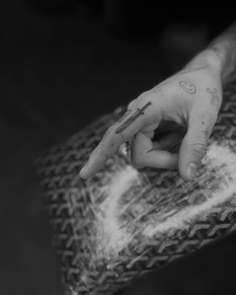
Romeo’s hands have smaller tattoos that can disappear in a regular portrait. Close-up photos show marks on his fingers and the back of his hand, including small symbols and a narrow sword-like design. It looks like a group of pieces added over time, rather than one planned hand tattoo.

Romeo Beckham finger and hand tattoos

Finger ink gets a lot of wear, and fine lines can soften over time. Romeo’s designs are simple enough to stay readable. Their small scale also suits his fashion work: they show without taking over every outfit.

If you’re looking for subtle celebrity tattoo ideas, the hand details are worth a closer look. A small finger symbol can still have plenty of attitude when the placement is neat and the lines have room.

Praying hands and forearm ink

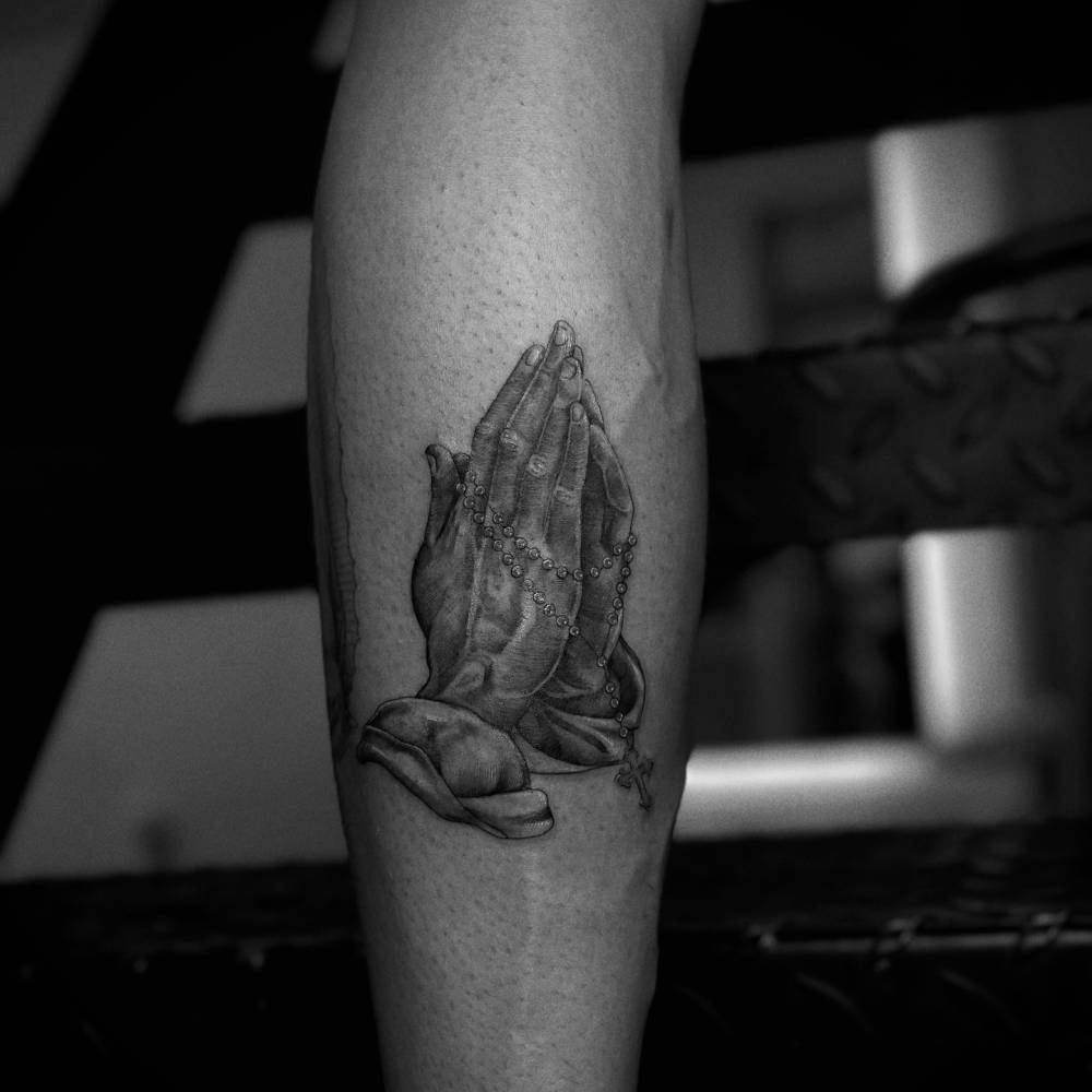
One of the clearest pieces in public coverage is a praying hands tattoo with a rosary running down Romeo’s forearm. The religious imagery is familiar, but the narrow layout follows the arm. The hands are the focus, and the beads lead the eye toward the wrist.

Romeo Beckham praying hands forearm tattoo

There is no need to attach one exact private story to the design. Praying hands can suggest faith, protection, gratitude or someone important. The piece fits alongside the family themes elsewhere in Romeo’s collection, but he hasn’t publicly explained its precise meaning.

The lion forearm tattoo

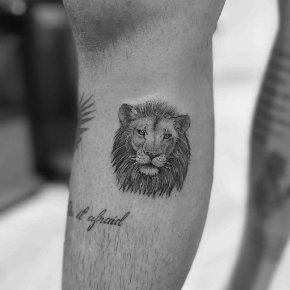
Romeo also has a detailed lion on his forearm. Black and grey shading gives the eyes, mane and nose a clear shape, even in a wider photo. Lion tattoos often stand for courage, loyalty, confidence or leadership, without needing a long quote to spell that out.

Romeo Beckham lion forearm tattoo

The lion and nearby lettering balance each other: the words make the area feel more personal, while the animal keeps it bold. Romeo mixes portrait-like realism with short text here instead of filling every bit of skin.

Dove, wing and lead with love details

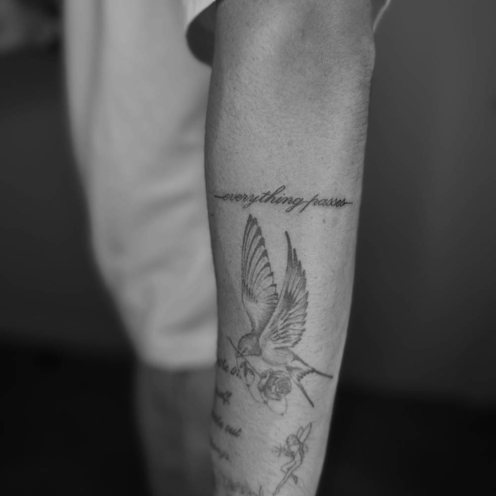
Another forearm and hand view shows a dove or winged design with script that reads like a reminder to stay positive. Coverage of Romeo’s tattoos has quoted the phrase “everything passes”, which suits the quieter side of his collection. This design feels less forceful than the lion or neck masks, though it still uses plenty of dark lines.

Romeo Beckham dove and wing tattoos

A short phrase is easy to remember, and the dove and wing shapes give the tattoo some movement. Together, the elements read more like a small story than a random set of marks.

Romeo has also been linked in public photos with the words “lead with love” around his hand. It fits the family-minded side of his tattoos, though the precise meaning is still an interpretation unless he explains it himself.

Romeo Beckham’s chest tattoo

The chest is where the collection gets much larger. A classical scene stretches across the upper chest, with figures, shadows and decorative details arranged almost like a painting. The faces and background lines need the wider area; squeezed into a narrow space, they would lose much of their detail.

Romeo Beckham chest classical scene tattoo

The wider view makes the scale easier to see. The scene spans the chest, and its dark areas hold their shape under an open shirt. It also sits comfortably beside the religious and classical hints in the praying hands and wing designs.

Romeo Beckham chest tattoo wide view

A chest scene has to move with the body and read both up close and from a few steps away. Romeo’s design leaves open skin around the main forms, which helps the details stay distinct instead of blurring together.

Family and matching tattoo ideas

Family is one of the clearest themes to connect to Romeo’s tattoos because it has been discussed publicly. He has shared tattoo moments with members of the Beckham family, and several have used the same tattoo artist. More recently, Romeo showed lettering built around the word “Family.”

That doesn’t mean each Beckham tattoo has the same meaning or that matching pieces are exact copies. Family tattoos might share a symbol, phrase or date, or simply come from the same appointment. Romeo’s ink often sits within a wider family story as well as his interest in fashion.

For other celebrity tattoo stories, Corey Taylor’s tattoos show a heavier collection built around personal symbols, while Danny Trejo’s tattoos show how family and identity can shape a style over many years.

What do Romeo Beckham’s tattoos mean?

Some of the words and images offer a fairly direct reading. Family lettering points to his relatives; “everything passes” sounds like a reminder that hard moments change. A lion can suggest strength, and praying hands can point to faith or protection. The masks, wings, chest scene and smaller symbols leave more room for interpretation.

It helps to leave some uncertainty in place. Photos show what a tattoo looks like, but not always why Romeo chose it. He has added pieces at different times; some may mark a relationship, belief, creative idea or private memory he hasn’t discussed.

Frequently asked questions

How many tattoos does Romeo Beckham have?

Public galleries document a range of his designs. Some list around six major visible pieces, while other roundups count many more small details. The number can change as he adds tattoos, and there is no complete official inventory.

Does Romeo Beckham have neck tattoos?

Yes. Public photos show tattoos around his neck and ear, including lettering, mask-like faces and wing or blackwork details.

Does Romeo Beckham have family tattoos?

Yes. Family is a repeated theme in coverage of his tattoos, and he has shown lettering connected with family. Several Beckham family members also have meaningful tattoos and have used the same studio.

What style are Romeo Beckham’s tattoos?

His collection mixes black and grey realism, fine lettering, religious imagery, small hand tattoos and larger classical scenes. It moves between styles rather than sticking to one.

Final take on Romeo Beckham’s ink

Romeo’s tattoos look personal without feeling overly planned. Small marks on his hands and near his ear sit beside a large chest scene, a lion, praying hands, wings, script and family lettering. The variety is what gives the collection its character.

A tattoo collection doesn’t need one strict theme. Romeo’s moves between family, faith, fashion and short reminders. The placements are useful to study too: small neck tattoos can frame the face, forearm lettering can sit beside an image, and a chest scene needs space to breathe.

Watch Romeo Beckham talk tattoos with David Beckham

In this clip, Romeo and David Beckham talk about tattoos and whether they have any they regret:

Jay Alvarrez Tattoos: Quotes, Skull and Travel-Inspired Ink

Jay Alvarrez’s tattoos are easy to spot. They’re a mix of black lettering, symbols and larger images, with plenty of short reminders about how he wants to live. Some are spare, others have more detail, and the travel theme fits the public image he has built around beaches, boards and airports.

This guide focuses on Jay Alvarrez tattoos that show clearly in photos: the phrases associated with him, the skull on his thigh, and travel-minded designs on his arms and legs. The focus is on the tattoos themselves, not pictures where a sleeve hides them.

The overall style of Jay Alvarrez tattoos

Jay’s collection relies on blackwork and lettering. Many of the words sit on his forearms, wrists, ankles and lower legs, like notes he has left for himself. Palm trees, bands, eyes, figures and larger images fill out the collection, with some pieces borrowing from traditional flash. The mix feels loose, rather than planned to look like one polished set.

Much of the work people recognize is associated with Konstantin Nossachev, who also goes by Noskos. The lines are often crisp, with open skin around each design. That helps when the tattoos are photographed outdoors, in motion or from a distance; they still have a clear shape without a studio close-up.

“Let’s Live” on the lower lip

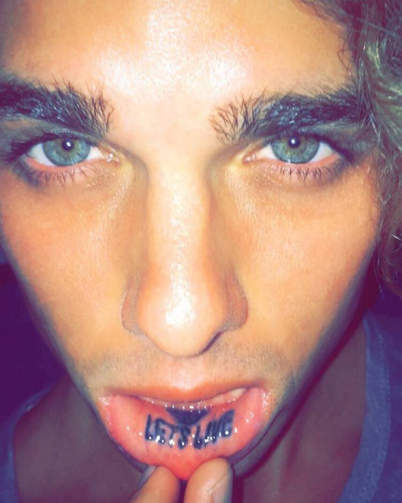
One of Jay’s earliest and best-known tattoos is “Let’s Live” on the inside of his lower lip. The placement is tiny, but the phrase has attitude. It isn’t visible in every photo, though it stands out when he pulls his lip down.

Jay Alvarrez lower lip Let's Live tattoo

The words fit the image Jay has built around travel, surfing, skydiving and chasing experiences. That makes it feel more like a personal motto than a stray inspirational quote. Lip tattoos can fade or soften faster than tattoos on an arm, so a clear close-up is useful here.

“Fantasy > Reality” on the forearm

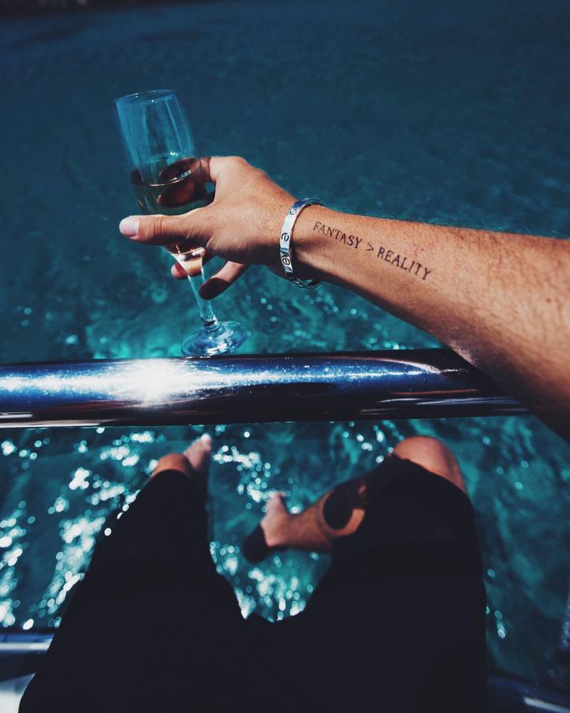
“Fantasy > Reality” is one of Jay’s clearest examples of text used as a personal rule. The phrase sits on his inner forearm in a simple serif font. There is no heavy shading or ornament around it; the words carry the design.

Jay Alvarrez Fantasy greater than Reality forearm tattoo

The inner forearm gives the lettering room to breathe, and the phrase stays readable with his arm relaxed or extended. It also has a little tension to it. Jay’s photos move between polished fantasy and everyday travel, so the tattoo can read as a comment on the image he has built.

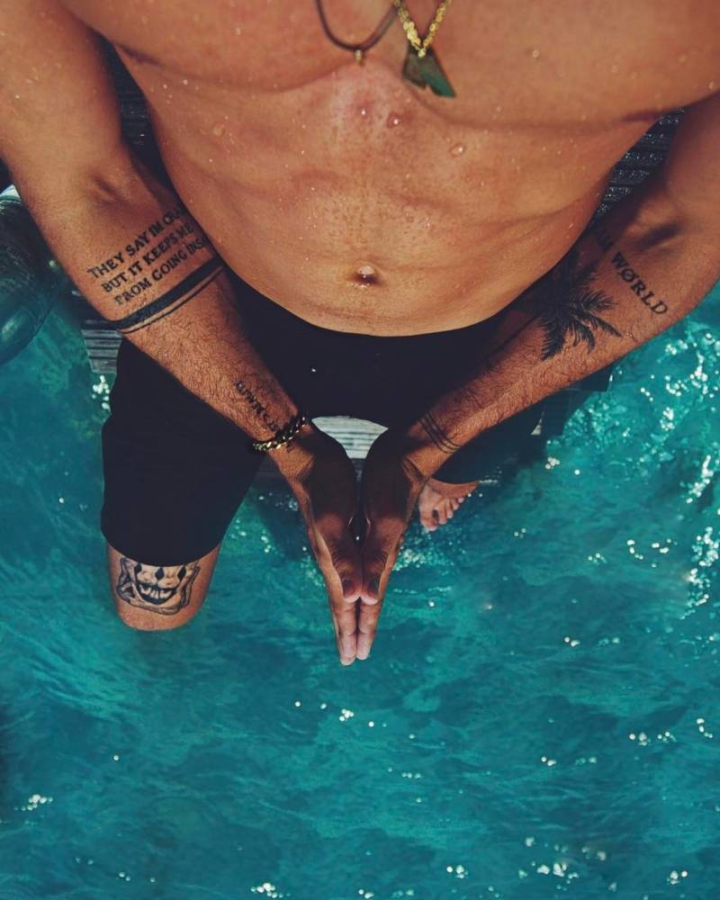
The Dream World, palm tree, and Isle group

On the other forearm, Jay has a few related details: “Dream World,” a palm tree, a fine line and “Isle” near the wrist. Together they read as a small composition, not four separate ideas. The palm tree connects with his Hawaiian background and beach imagery; the words make the arm feel like a map to an imagined place.

This is one of the quieter parts of the collection. The lettering is relaxed, and the palm tree has none of the heavy look of traditional flash. The narrow shapes follow the forearm. Fine lines like these also need careful healing and, at times, touch-ups.

The In Voluptas Mors inspired skull on his thigh

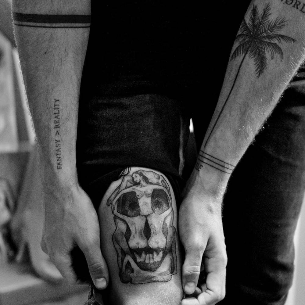
Jay’s thigh skull is a big change from the small text tattoos. It takes its cue from the famous “In Voluptas Mors” image associated with Salvador Dalí and photographer Philippe Halsman, in which bodies form a skull. Jay keeps that basic idea but gives it darker, more illustrative shading than his cleaner quote tattoos.
Jay Alvarrez In Voluptas Mors inspired skull thigh tattoo

The larger area gives the shadows and facial details room, so the image doesn’t collapse into a dark patch. This piece also shows the range of Jay’s ink: alongside the short phrases and travel symbols, he has tattoos built around a much larger image.

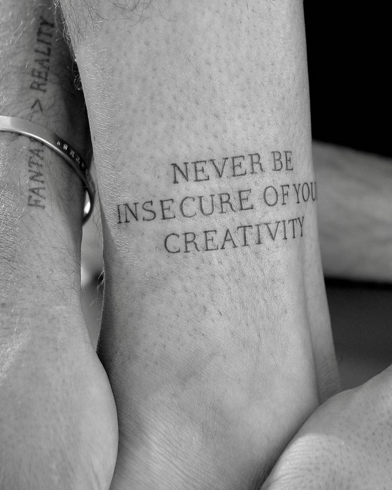
“Never Be Insecure of Your Creativity”

Jay has the words “Never Be Insecure of Your Creativity” on his lower leg near the ankle. It sounds like advice from a friend, but the placement makes it feel personal rather than like a slogan for other people. He can see it himself without putting it across his chest.

Jay Alvarrez Never Be Insecure of Your Creativity ankle tattoo

The lettering is compact but readable. Long phrases can get cramped on curved, moving skin like the ankle; this one keeps a steady line and some space between the words. If you like motivational lettering but want it to stay private, the placement is one to consider.

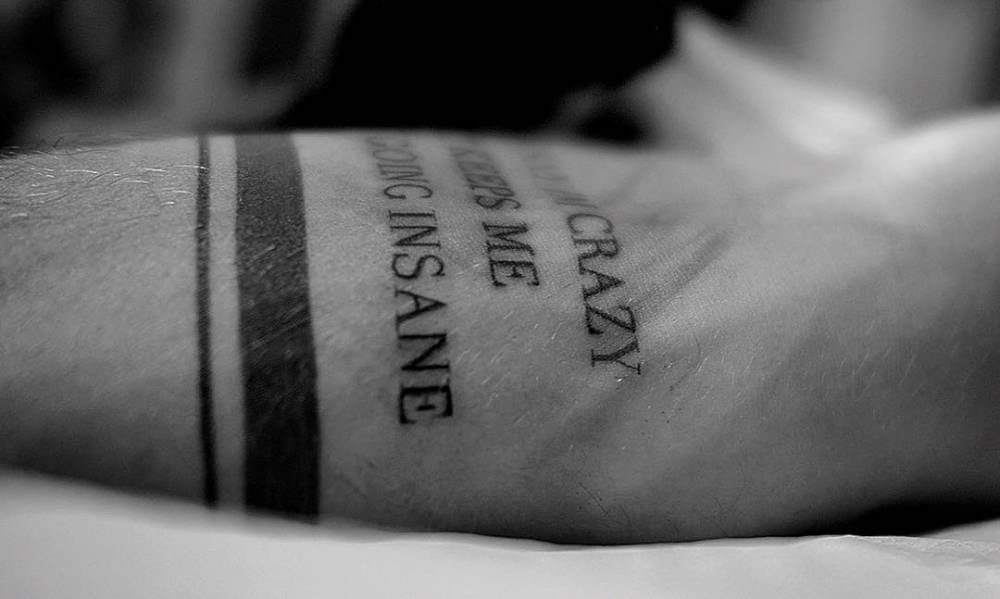
“They Say I’m Crazy…” on the other forearm

Another forearm quote reads, “They Say I’m Crazy But It Keeps Me From Going Insane.” It runs along the inner arm, with bands around it. The line has a joke in it, but it also speaks to a mind that doesn’t always follow the usual route.

Jay Alvarrez They Say I'm Crazy forearm tattoo

Long text takes planning. The letters need to stay clear without turning the forearm into a solid block. Jay’s version stays narrow, and the bands break up the phrase with a simple graphic detail.

Travel, circles, and the rest of the arm work

Jay also has simple bands and lines around his wrists and forearms. One armband has been described as representing the circle of life. These quieter details link the larger tattoos: a band can frame an area, while a fine line can lead from a quote toward a palm tree or another symbol.

Jay Alvarrez multiple arm tattoos and forearm lettering

Wider photos show more phrases, another palm tree, bands and designs running down his legs. Some are easier to identify than others. It’s better to leave an unclear mark unnamed than to assign it a story; a visible shape doesn’t confirm its meaning.

What makes his collection work

Jay’s tattoos move between clean lettering and larger images. The skull adds shade and texture, while the palm tree and island references carry the travel theme. Even the more abstract marks fit the same interest in movement and independence.

Placement does a lot of work here. A long quote needs enough length; a detailed image needs enough skin for its lines; small tattoos work best when they stay simple. Jay’s clearer designs respect those limits, so they remain readable in close-ups and regular travel photos. For another musician whose tattoos mix portraits, symbols and family pieces, see our Corey Taylor tattoos guide. Our Danny Trejo tattoos article shows a very different style built around bold blackwork.
Could Jay Alvarrez tattoos work as inspiration?

Yes, but it’s better to borrow the idea behind a design than the exact words. A small island, coordinates, wave or palm tree can give a tattoo a travel feel without turning your body into someone else’s scrapbook. If you like Jay’s lettering, choose a phrase that matters to you and leave it enough room to age well.
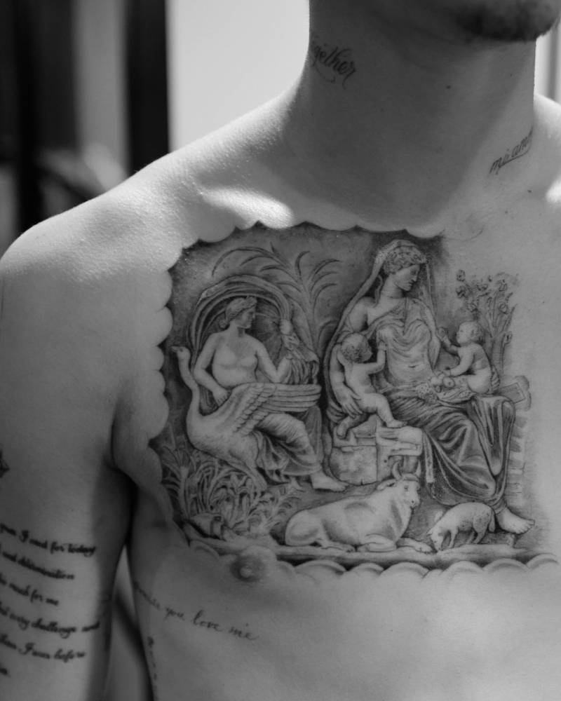
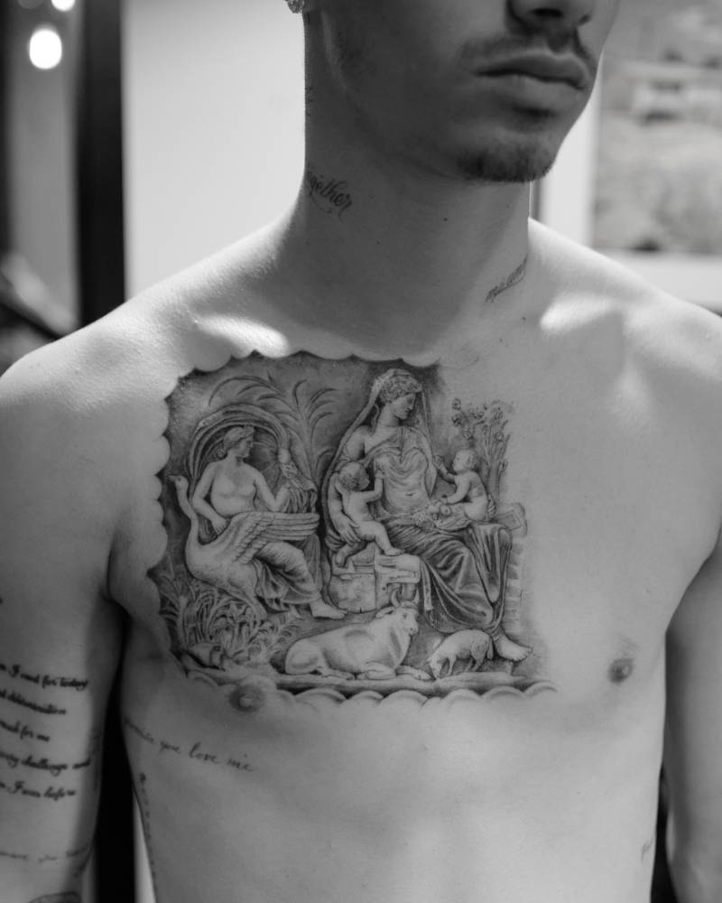
Think about sun exposure too. Jay spends a lot of time outdoors, and sunlight can soften fine lines faster. An artist can talk through line weight, placement and aftercare before you decide. The point is to choose a tattoo that still feels like yours after the holiday photos are gone, not to copy one of his forearms.

Quick questions about Jay Alvarrez’s ink

Who tattoos Jay Alvarrez?

Much of his collection is associated with Konstantin Nossachev, also known as Noskos. Jay has spoken about their close friendship and the trust between them.

What does “Fantasy > Reality” mean?

The phrase reads like a reminder to value imagination over a fixed idea of ordinary life. Jay hasn’t formally explained every tattoo, so the words themselves are the safest guide.

What is the biggest Jay Alvarrez tattoo?

The skull-inspired thigh piece is one of the most noticeable designs because it uses a large area and detailed shading. He also has larger compositions on his legs and arms.

Does Jay Alvarrez have mostly small tattoos?

No. He has small lettering and linework as well as a large skull, leg designs, illustrative figures and longer phrases. The collection varies in scale.

Watch Jay Alvarrez talk through his tattoo story

Here is a related video from Jay’s own channel, alongside the tattoo photos and the wider visual style he shares:

Carson Daly Tattoos: The Stories Behind His Meaningful Ink

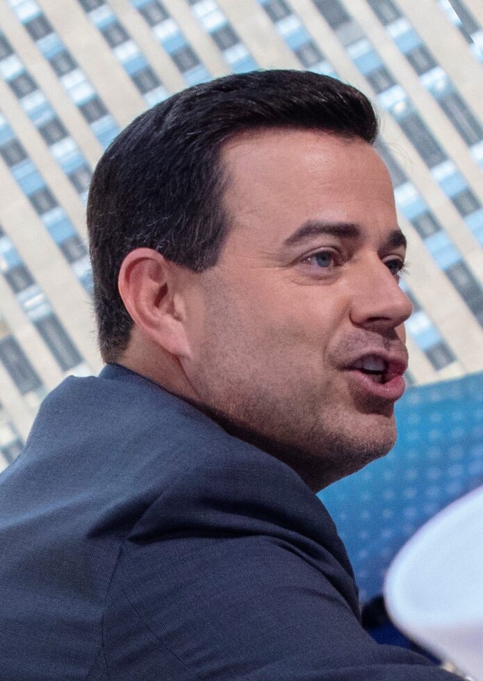
Carson Daly’s tattoos usually mark a person, a place or a moment from his life. Some designs are flashy, but the reason behind them tends to be personal.

The stories behind Carson’s tattoos run through family, his New York years and music. On TODAY in 2014, he explained eight designs, including tributes to his son Jack, father, grandfather and stepdad, family names, and a cover-up.

Why Carson’s tattoos are mostly family stories: He has said sentimental value matters most. He wanted tattoos he’d still care about years later, not designs he might tire of after one season.

Dates, initials, names and family objects can look unrelated without the backstory. Together, they read like a scrapbook spread across his arms and legs.

The tattoos weren’t planned as one sleeve. They were added over time, and their styles vary: some are detailed, others are small marks whose stories mainly belong to Carson and his family.

The one-eyed Jack tattoo for his son

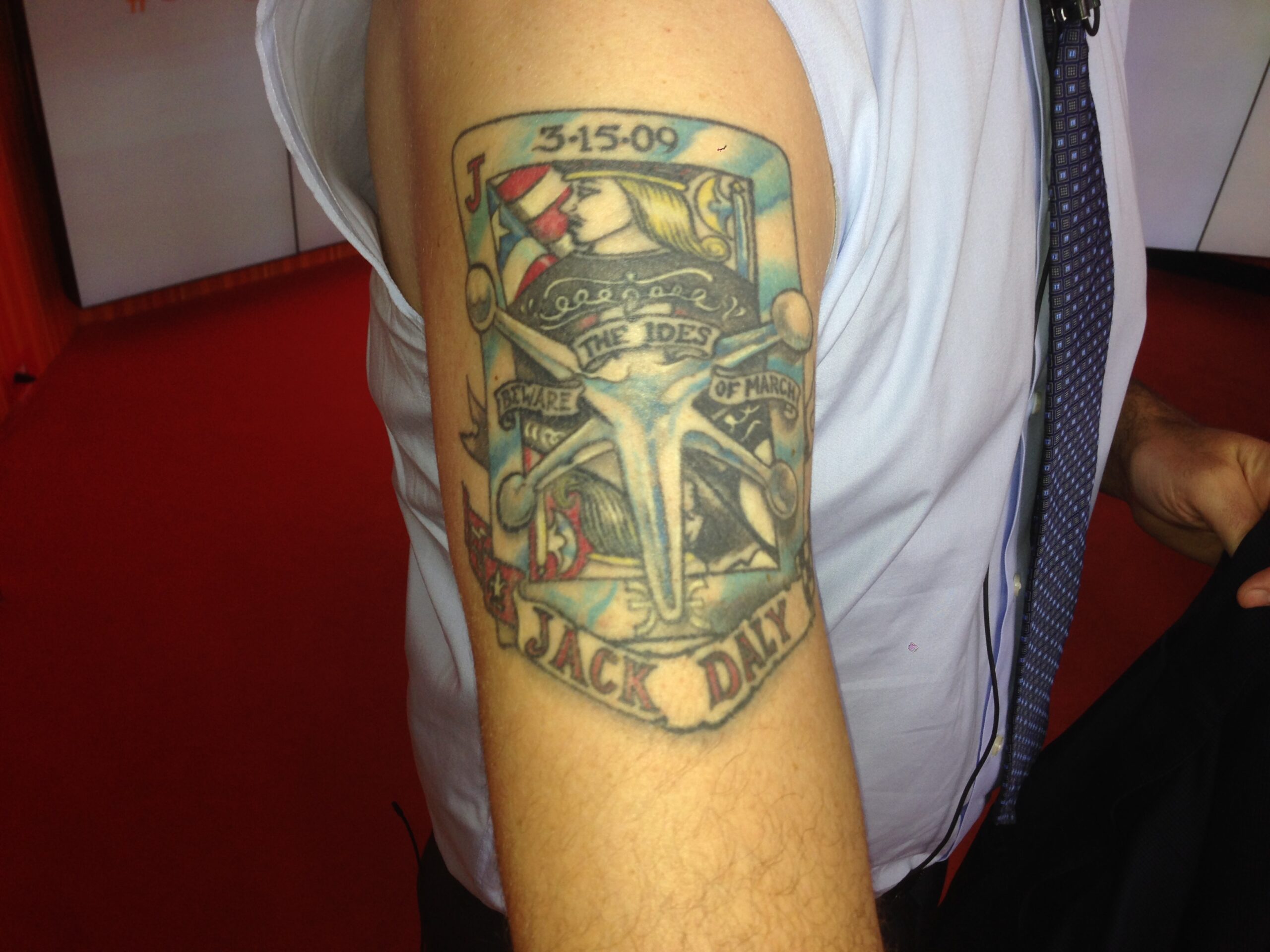
One of Carson’s best-known tattoos is a one-eyed Jack playing card he designed for his son, Jack. It carries several references instead of being just a card.

A jack from the game Jacks pierces the card, playing on his son’s name. Jack was born on March 15, so the tattoo also nods to the Ides of March. A Pisces symbol marks his star sign, and the American flag is a detail Carson wanted.

At a glance, the tattoo reads as a playing card with a few bold shapes. The date, Pisces symbol and flag each point back to Jack, turning the design into a small family timeline.

Carson has often described himself as family-first, and this card is a clear example. It celebrates Jack without a portrait or a plain name. The playing-card design leaves room for humor and small details.

Carson Daly one-eyed Jack tattoo

The NYC tattoo he got after 9/11

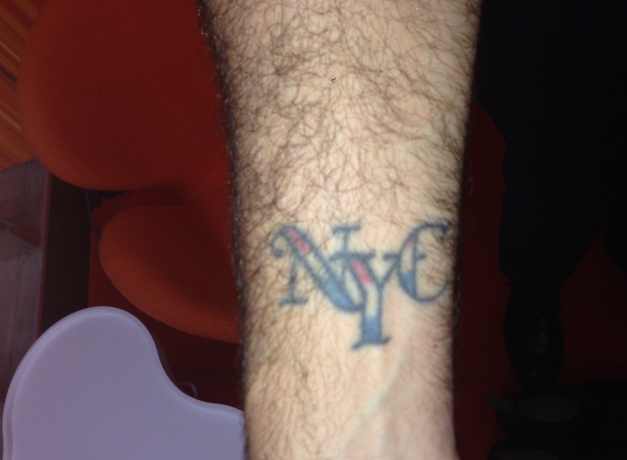
Carson said he got the NYC tattoo the day after September 11, after going to work at MTV in Times Square. The building was evacuated because of a bomb threat, and he walked around New York unsure what would happen next.

He ended up in a tattoo shop, listening to music, and chose a New York design out of pride for the city. It wasn’t planned; the day pushed him there, and the tattoo marked what the city meant to him during a frightening time.

The NYC design is more direct than the one-eyed Jack: its story comes from when Carson got it and his connection to the city. He said it marked New York while he was trying to process what had happened.

It marks both his connection to New York and an unsettling moment he lived through. In that sense, it works as a personal timestamp.

Carson Daly NYC tattoo

The Corvette hood ornament for his father

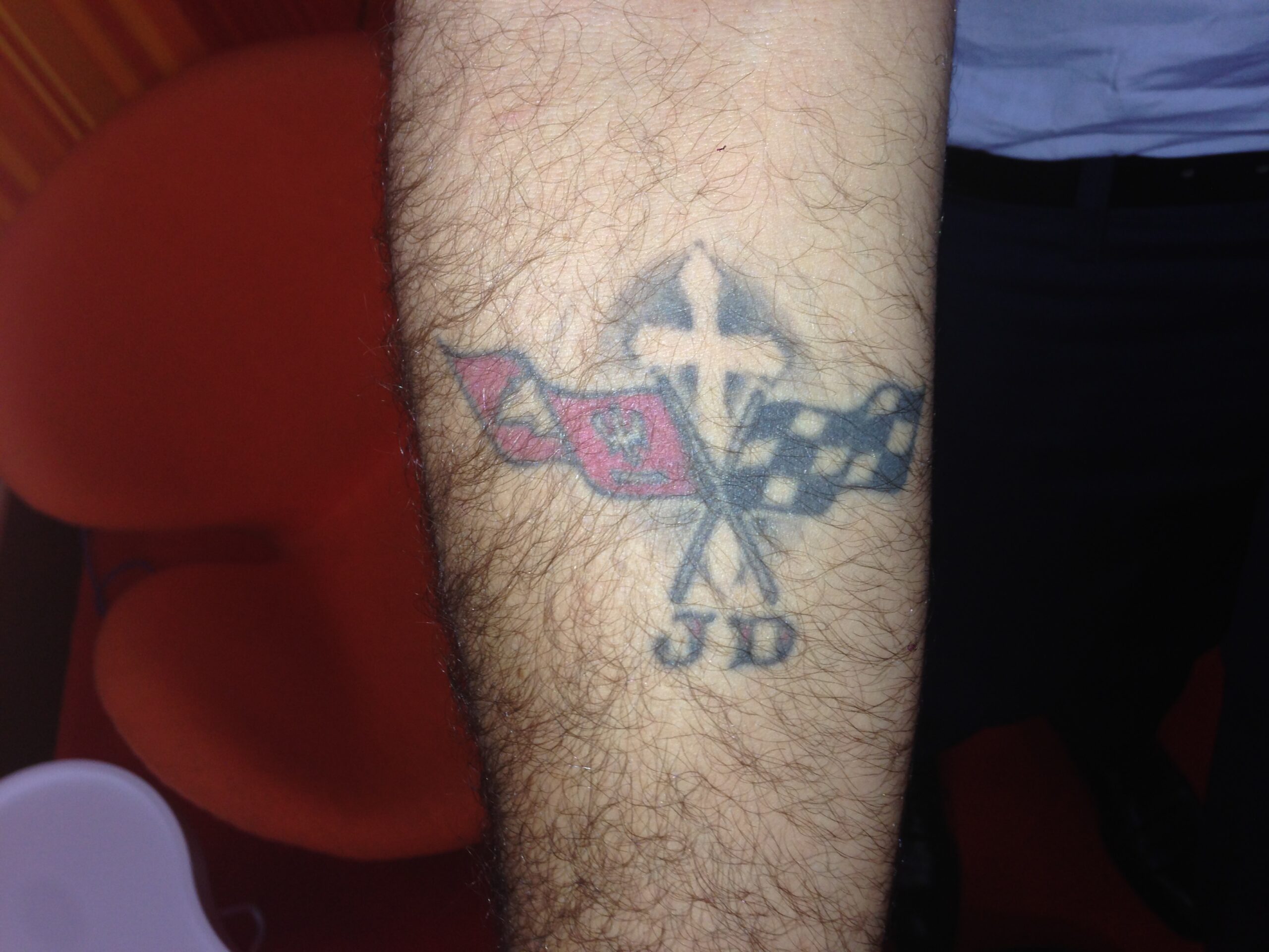
The initials J.D. connect several generations in Carson’s family. They stand for his father, James Daly, who died when Carson was five; his son Jack Daly; and Jones Daly, Carson’s middle name.

The lettering sits within the hood ornament of a 1977 Corvette. Carson’s father was a Corvette dealer, and Carson still owns that car. The ornament gives the tattoo a physical link to his dad, beyond the initials.

Carson said he wanted a memento that wasn’t too sad or heavy. The Corvette brings in something his father loved and makes the tribute feel more personal than initials alone.

At first glance, the Corvette shape may stand out before the initials. Carson’s explanation makes the family connection clear, while the design still reads as a car ornament on its own.

That’s how Carson often works: an object stands in for a person. The Corvette points to his father, just as the playing card points to his son.

Carson Daly Corvette tattoo

The Green Beret tribute to his grandfather

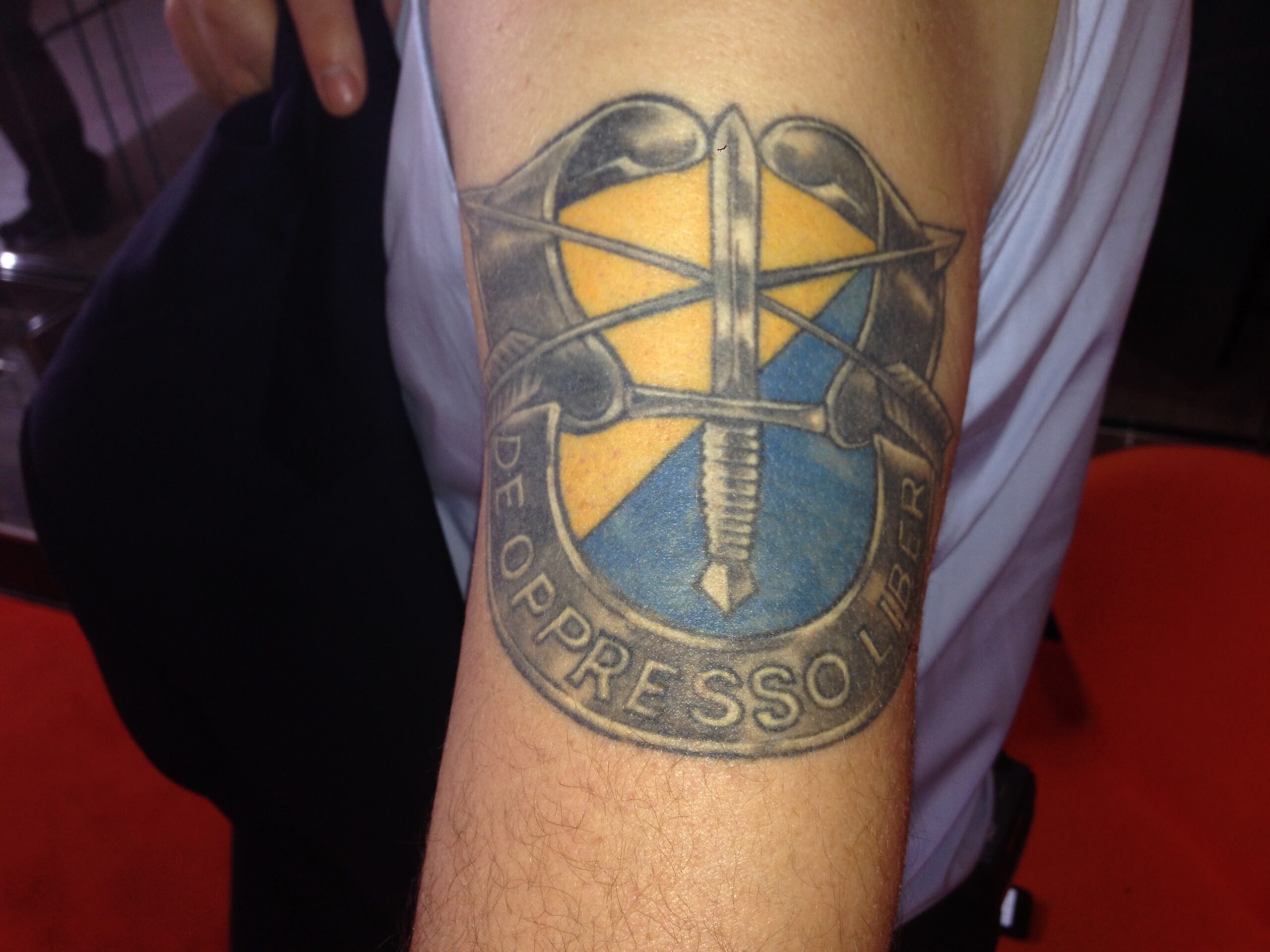
Carson’s grandfather on his mother’s side served in Army Special Forces as a Green Beret. Carson kept his grandfather’s beret and later used it as the basis for a tattoo.

The tattoo includes “to free the oppressed,” which Carson said is the Latin phrase associated with the Green Berets. The inscription sits beside a beret that belonged to his grandfather.

The Green Beret tattoo follows the same pattern as the Corvette: both start with an object tied to a family member.

The beret and inscription fit into a compact tattoo. You don’t need a large portrait to see what it honors.

Carson said the Green Beret was one of his favorites. It links his grandfather’s service to their family history.

Carson Daly Green Beret tattoo

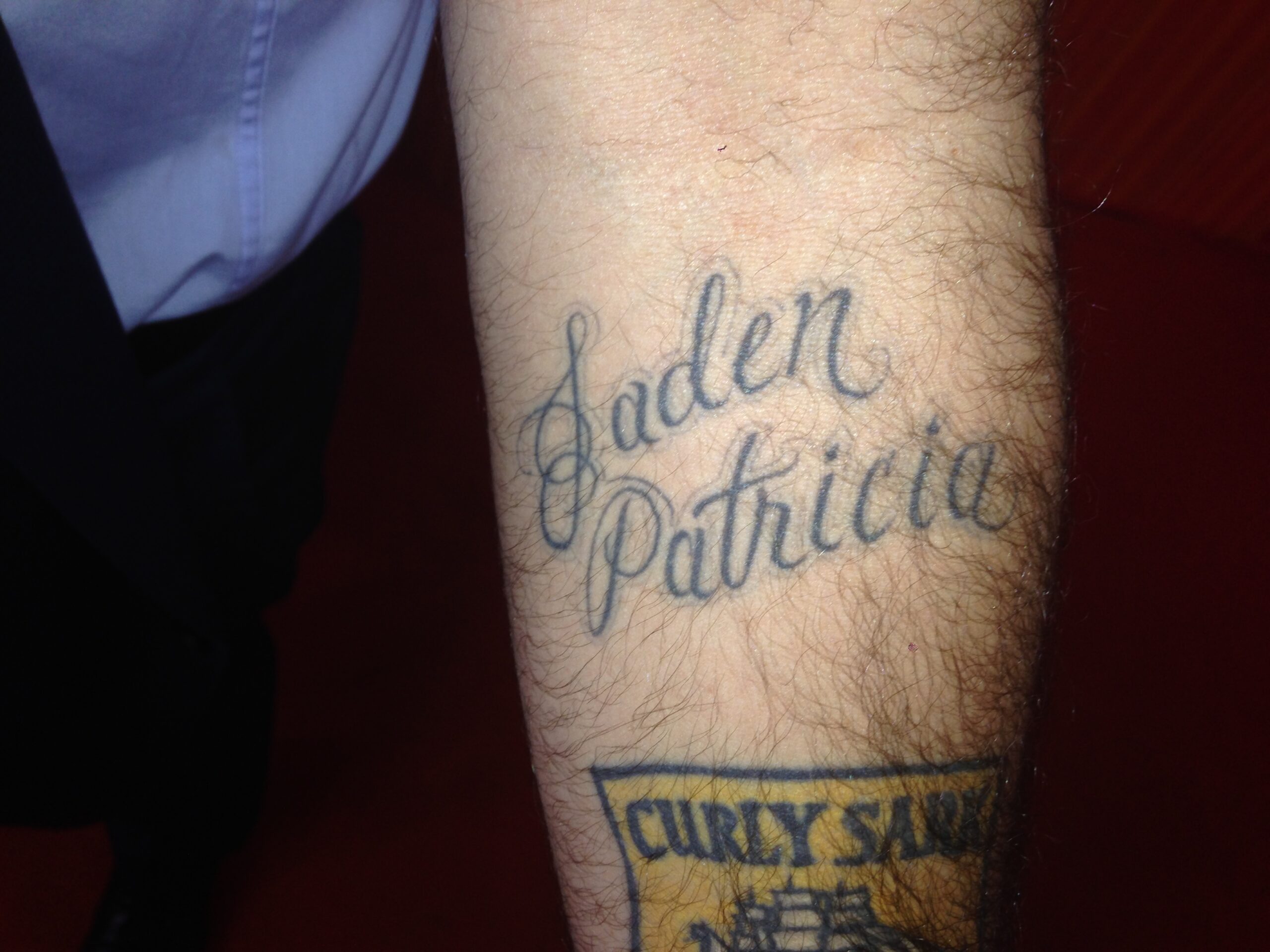
Jaden Patricia and the names that tie the family together

Carson’s tattoo honors his niece, Jaden Patricia, his sister’s first child.

Patricia is also Carson’s mother’s name, so the full lettering links Jaden with her grandmother.

That kind of link runs through Carson’s family tattoos: one name can bring another relative into the story.

The design stays simple. The names are enough; his more elaborate tattoos put their references into images instead.

In the TODAY interview, Carson also said he wanted tattoos for his daughter Etta and other family members. He joked that the children were arriving faster than he could get the tattoos done, so the collection was still growing then.

Carson Daly family tattoo

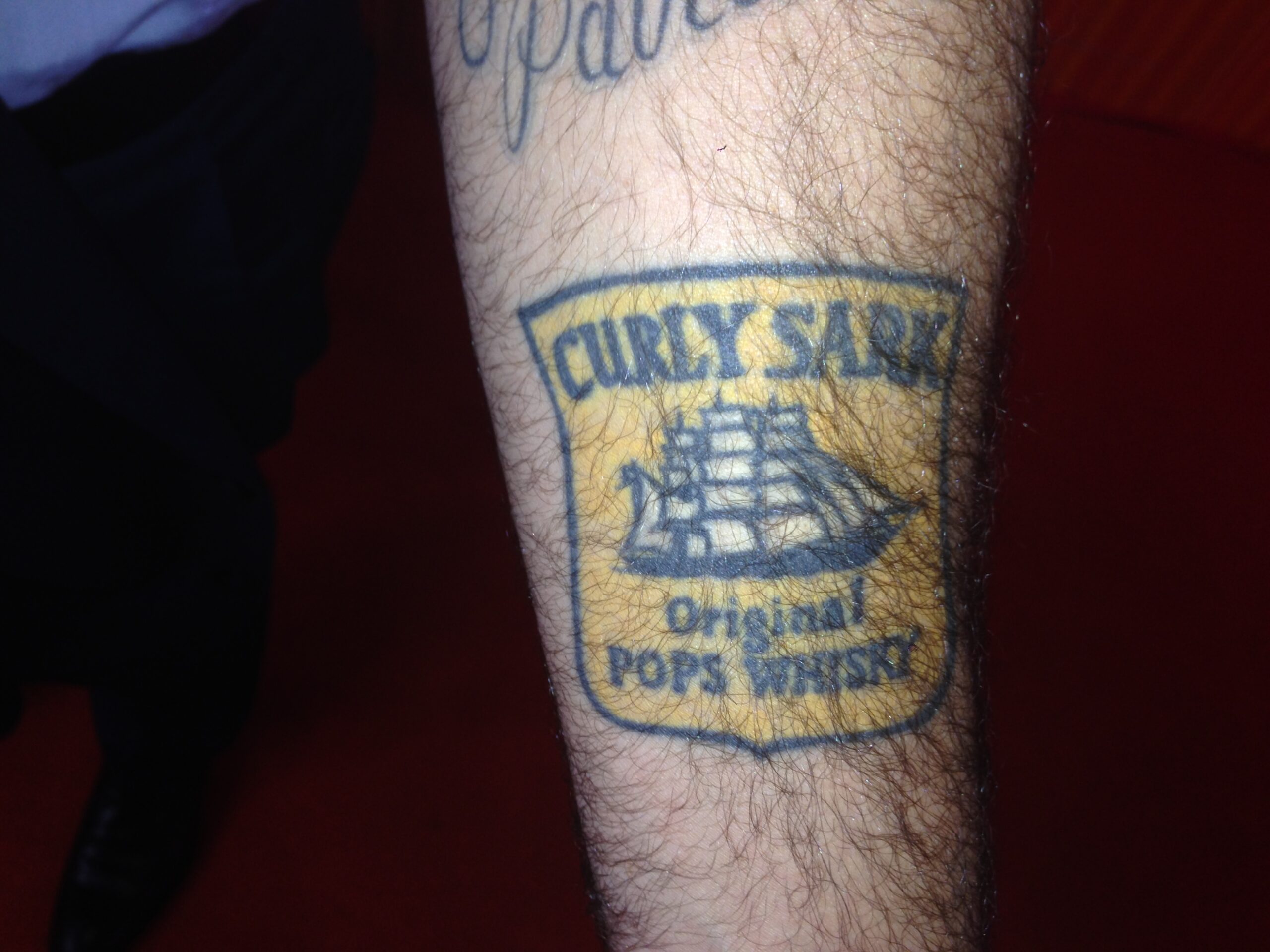
Curly Sark, his stepdad, and the drink behind it

One of the more playful tattoos is for Carson’s stepdad, whose favorite drink was Cutty Sark whiskey. Carson changed the name to “Curly Sark” after his stepdad’s nickname.

He also changed “Original Scots Whisky” to “Original Pops Whisky.” It looks like an old bottle label, but the wording makes it a family tribute. Carson said his stepdad was like a father to him; he felt he had two fathers.

The changed label turns a drink his stepdad liked into an inside joke Carson could carry with him, instead of a portrait or formal dedication.

“Curly Sark” is affectionate and a little silly without losing its meaning. Carson cares about the people behind these tattoos, but not every family piece has to be solemn.

The Corvette remembers his father, the beret his grandfather, and the whiskey label his stepdad.

Carson Daly Curly Sark tattoo

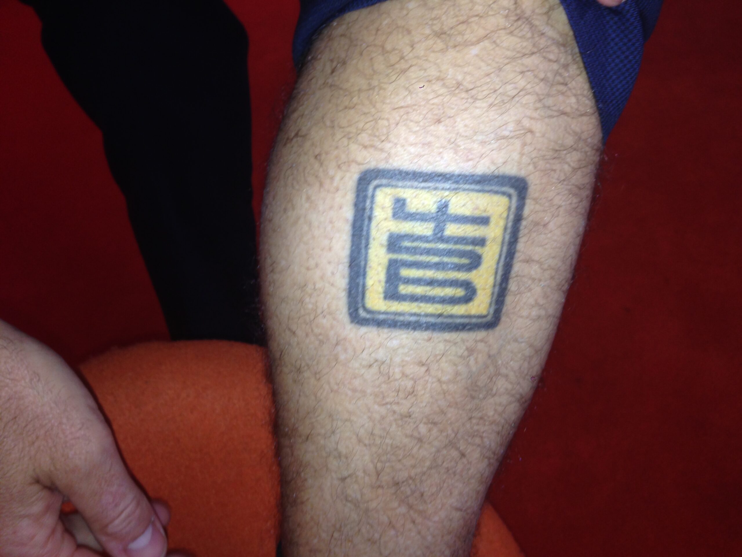
The 456 logo and Carson’s music years

Carson also has the 456 logo from a New York City record label he had during his music years.

Carson said 456 refers to both a street dice game and the hip-hop label. He no longer has the label, but the tattoo recalls that period and the part New York played in his life.

Like the NYC tattoo, the 456 logo points back to New York, but to a different part of Carson’s life. One remembers September 2001; the other his work in music.

The label stands out because it marks something Carson built, not a relative. It still mattered to him after the label itself was gone.

The subjects change, but each piece points to a particular time or relationship in Carson’s life.

Carson Daly 456 tattoo

The crab cover-up: Carson also told the story of a crab tattoo on his leg. It covers an ex-girlfriend’s name, so the design began as a cover-up rather than something he had planned.

Carson was getting another tattoo and asked the artist to black out the old name. The artist suggested a crab claw coming out of a pocket knife, and Carson let him work while his leg was raised so he couldn’t see. When he finally looked and asked what it was, he heard the answer and said, “Perfect.”

Unlike the family tattoos, the crab didn’t begin with a planned symbol. The artist’s suggestion turned a cover-up into a story Carson could tell.

Carson didn’t see what the artist was doing until he looked down at the finished tattoo. His surprise is part of the story.

The common thread is the memory behind each design: a playing card for Jack, a Corvette ornament for his father, his grandfather’s beret, a whiskey label for his stepdad, and the 456 logo from his music years.

Carson’s rule was simple: choose something you won’t be embarrassed to see years later.

The tattoos weren’t planned as one sleeve; they grew over time. Together, they hold family stories, New York memories, music and a few jokes.

Our Steve Aoki tattoo guide covers a very different collection, but the stories behind the designs matter there too.

Watch Carson explain the tattoo honoring his mom

Carson’s collection kept growing after the original TODAY feature. In a later clip, he showed a tattoo based on his late mother’s handwriting. It’s another tattoo rooted in a family memory.

Brooklyn Beckham Tattoos: Nicola Peltz Ink and Family Tributes

Brooklyn Beckham’s tattoos are mostly notes to people close to him: love letters, family names and short reminders. He has a lot of ink, but many designs are tied to someone or a moment in his life.

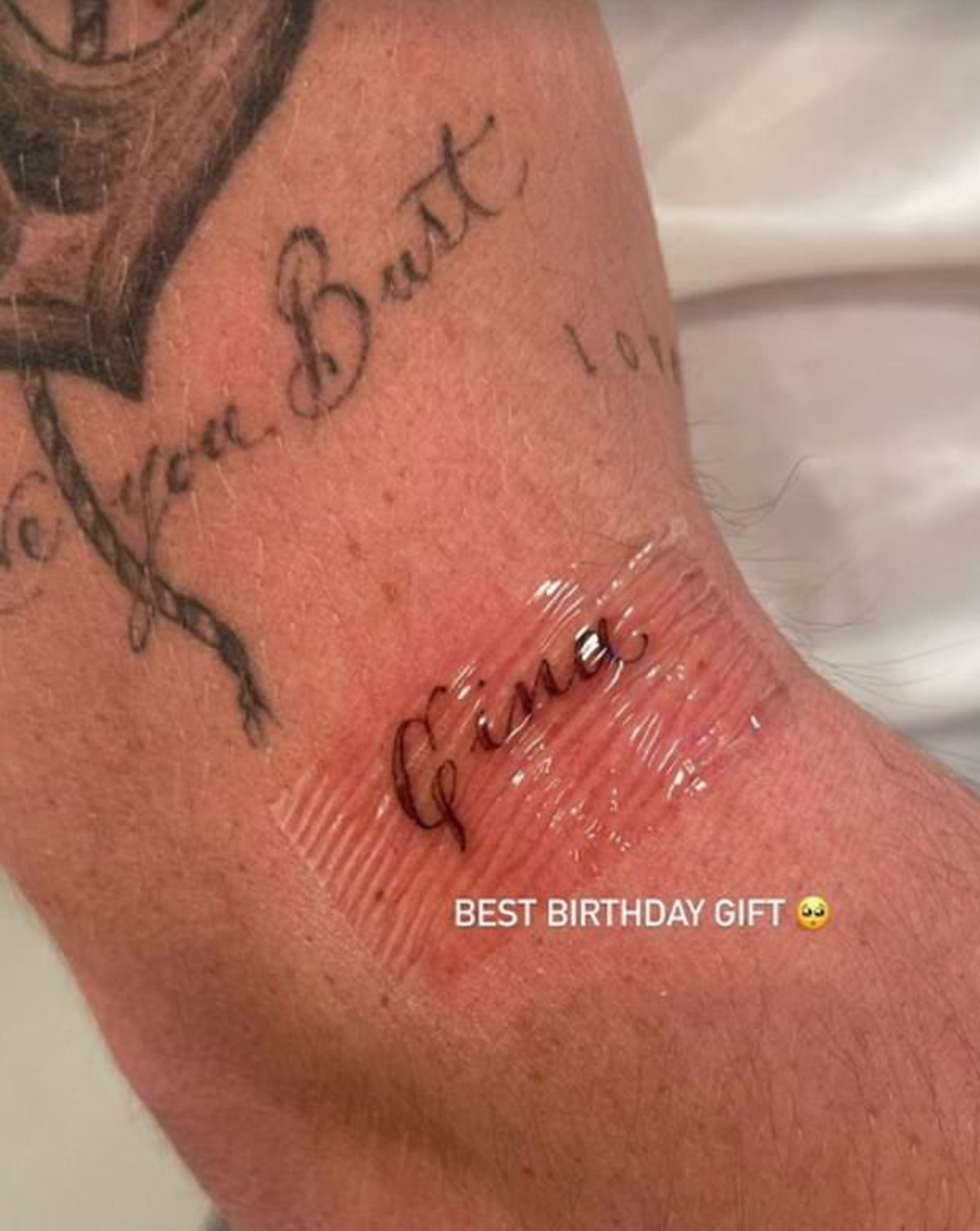
He began with tattoos for his parents and siblings, then added many for his wife, Nicola Peltz Beckham. Page Six’s January 2026 guide said he had dozens and dozens of pieces and reported that he once said 70 of his 100 tattoos were dedicated to Nicola. The number changes, but the theme is clear.

Some tattoos are short words, like “Married” or Nicola’s name. Others are longer notes, wedding vows, family initials, portraits and handwriting. This guide covers pieces he has shown publicly and the explanations he has given for them.

Brooklyn’s hand tattoos: Nicola, “our little bubble,” and “lover”

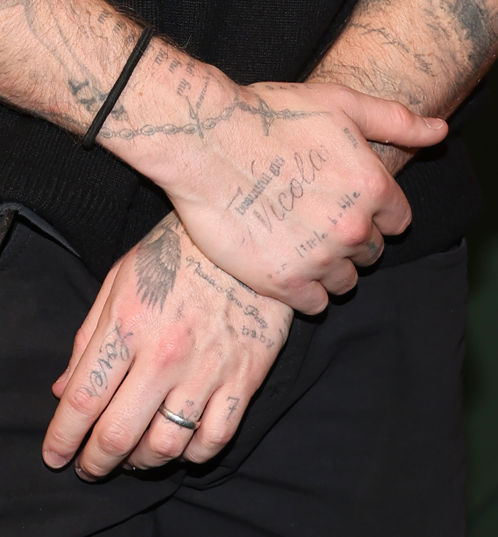
Brooklyn has several small tattoos on his hands for Nicola. “Nicola” crosses the back of one hand, with “beautiful girl” above it. An “N” and a heart on his ring finger echo the place of a wedding band.

Another hand tattoo reads “our little bubble.” Brooklyn and Nicola have used the phrase for the small world they share, away from the noise around them.

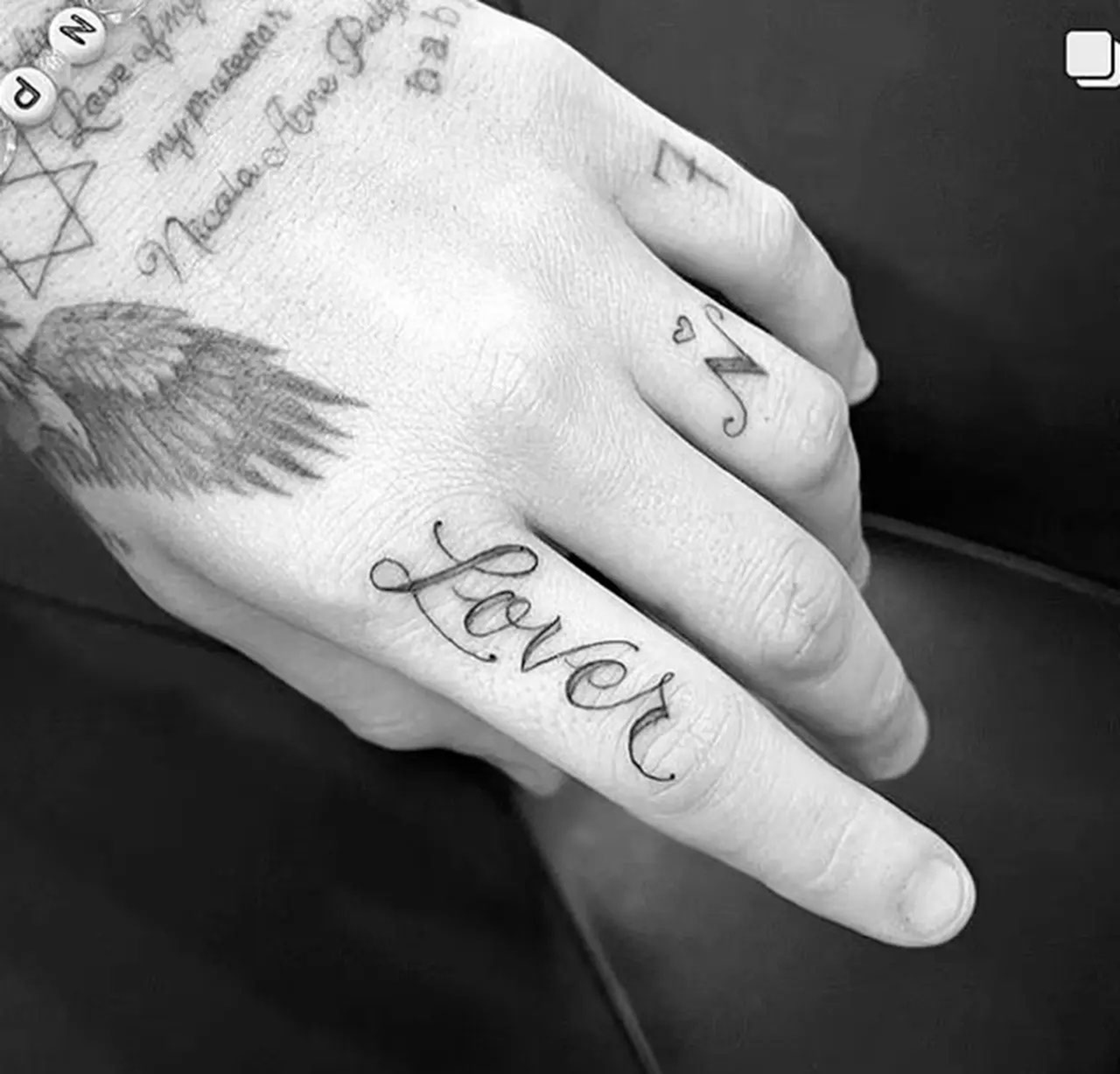
He has “lover” on his index finger. It’s a single word he can see throughout the day, without a longer message attached.

These hand tattoos show his preference for script and short phrases, some written like notes or cards. They make sense on their own, without needing a long explanation.

Brooklyn Beckham hand tattoos

The long “my life” letter across his arm

Nicola showed one of Brooklyn’s larger text tattoos in an Instagram Story. It runs up his right arm. Her caption read “Forever my person,” while the tattoo says, “My life, my love, my truth, my breath, my reason, my beauty, my precious.” Her birthday, January 9, is written below.

It’s a long message, and Brooklyn hasn’t tried to shorten his romantic tattoos to a word or two. This one spells out the phrases he chose for Nicola.

The lettering looks handwritten, like much of his collection. It reads more like a message than a logo or slogan, giving the tattoo a private-letter feel.

There’s a bit of contrast in tattooing a full love letter: most people might send a text or card, while Brooklyn put the message on his arm. The wording is about Nicola, not a generic quote.

Brooklyn Beckham arm tattoo

Nicola’s portrait and the wedding-song lyrics

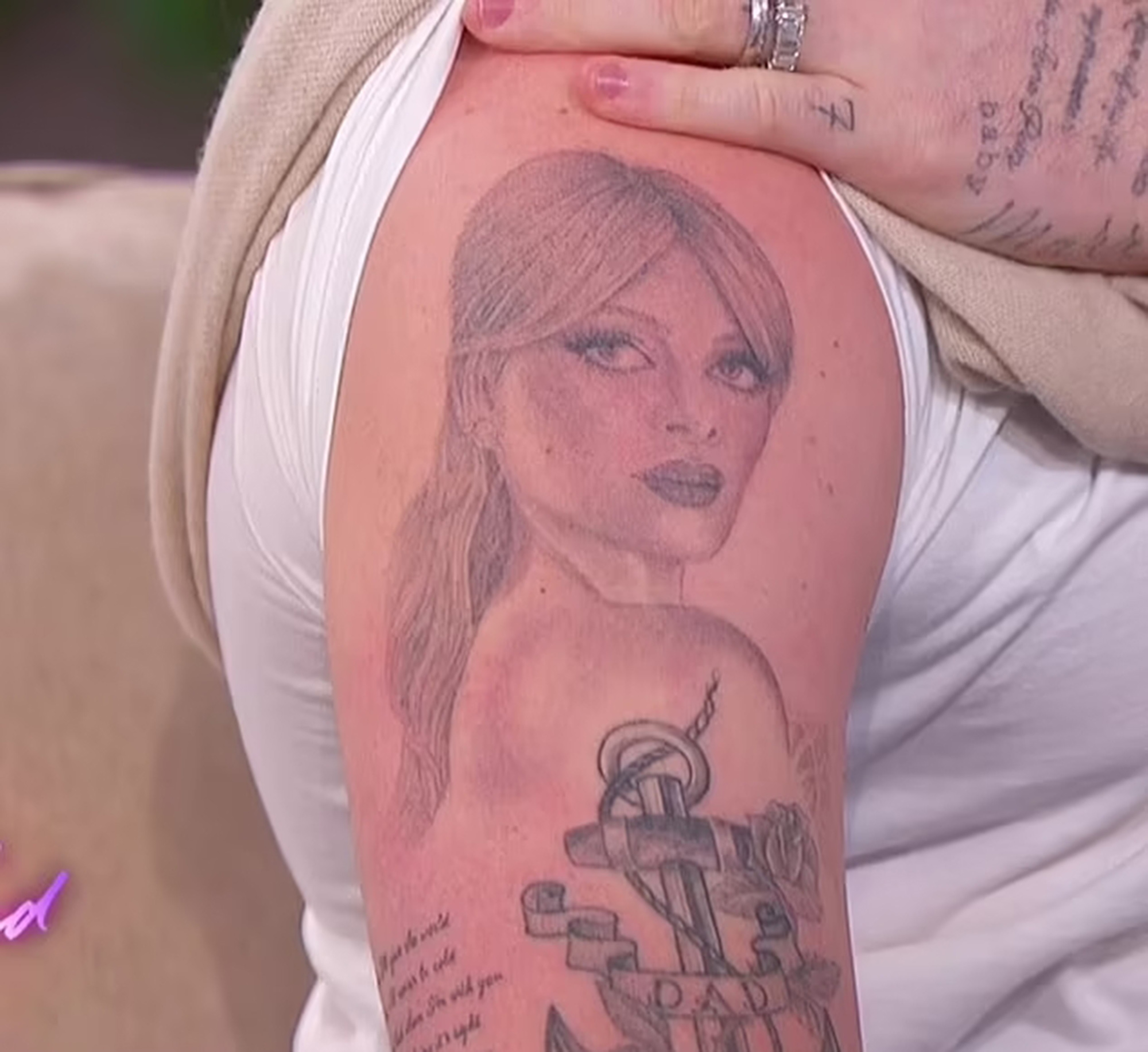
Brooklyn’s most noticeable tattoo is a large portrait of Nicola on his upper arm. He showed it on The Jennifer Hudson Show in March 2023. It covers a large section of his arm.

He said he added lyrics from the song Nicola walked down the aisle to that same day. The portrait is tied to their wedding as well as to Nicola herself.

The portrait is a record of a particular moment, as well as an image of his wife.

The portrait is larger and easier to spot than the small words on his fingers, but it follows the same pattern: it points to Nicola.

Brooklyn Beckham Nicola Peltz portrait tattoo

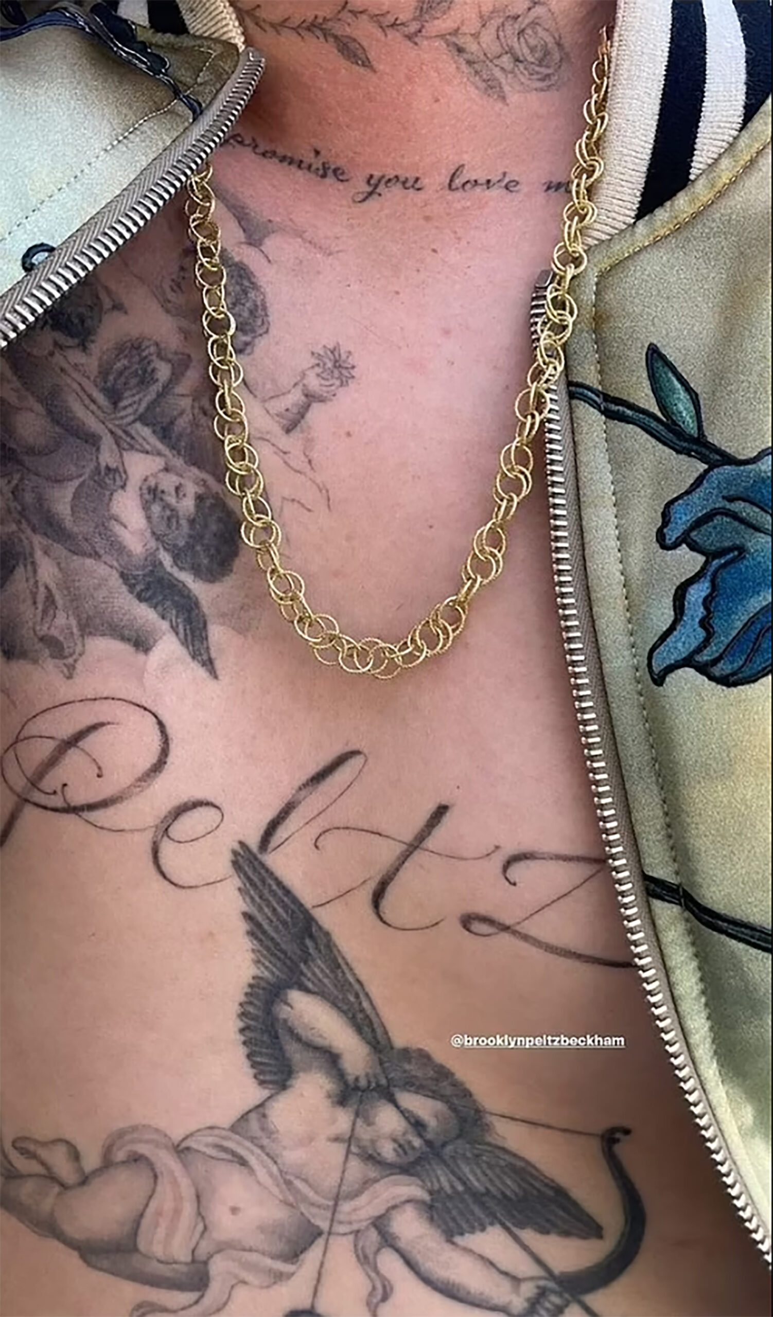
“Peltz” across his chest and the Cupid connection

Brooklyn has “Peltz” in large letters across his chest. He got it in July 2022, after marrying into the Peltz family. The word sits between Cupid tattoos he already had; those were his nod to his father David Beckham’s similar angel designs.

The Peltz tattoo brings Nicola’s family into a design that already nods to his own father. It connects the new surname to older family references.

It’s hard to miss: unlike a small wrist tattoo, the chest lettering is a public statement. Brooklyn hasn’t shied away from large, visible tattoos about his relationship.

His tattoos range from tiny finger lettering to large chest words and portraits. The styles vary, but many return to Nicola and his family.

Brooklyn Beckham chest tattoos

Gina, the prayer, and the family initials

Nicola’s grandmother Gina appears in more than one tattoo. After Gina died in 2020, Brooklyn tattooed her name as a birthday gift for Nicola. Nicola posted a photo of the fresh tattoo and called it the best birthday gift.

Two years later, he added a prayer Gina had held dear. It reads, “Focused in the present, sincere towards others and trusting in our self, know that you cannot fail.” The longer text sits on the left side of his torso.

Above the prayer are the initials “dvbrch”: David, Victoria, Brooklyn, Romeo, Cruz and Harper. The prayer honors Nicola’s grandmother; the initials name the Beckham family.

These tattoos include people from Nicola’s family as well as his own. They extend his focus beyond his wife to people who matter to her.

The handwritten style fits the material. The prayer looks like a message, not a standard typeface chosen from a tattoo menu.

Brooklyn Beckham hand lettering tattoo

The wedding vows that run down his arm: Brooklyn also tattooed part of his wedding vows down his arm. They begin with a line about how words cannot describe his love, followed by promises about Nicola being his world and his falling more in love with her each day.

He chose a longer passage from the ceremony rather than a short phrase. The vows become a love letter he wears on his arm.

The text adds to the crowded look of his arms, where a portrait, song lyrics, family messages and older tattoos sit close together. Some sections have little blank space.

Brooklyn keeps adding tattoos rather than planning one finished sleeve. The images and text build up over time, giving the arm the feel of a diary.

He has said he is addicted to tattooing. The vows, long letter and Nicola portrait show how often he returns to that subject.

The eyes, “Married,” and the other personal details: During their engagement, Brooklyn had Nicola’s eyes tattooed on the back of his neck. Beneath them is a note she wrote him, signed “your future wifey.” The tattoo also includes the coordinates of Portland Hospital in London, where he was born.

Later, he added “Married” to his hand and showed it to Nicola as a surprise. The word says exactly what he wanted it to say.

Brooklyn’s wrist also has a version of the rosary beads that belong to Nicola’s mother, Claudia. It can be easy to miss among the other tattoos, but it adds her mother to a collection that already includes Nicola, her grandmother, and Brooklyn’s parents and siblings.

Many of his tattoos haven’t been shown clearly. Page Six noted that most were not revealed publicly, so no list can cover the full collection. Counts also vary by date: older articles have reported 20, 50, 70 or 100 tattoos.

The public examples show a lot of ink, with an always personal mix of family, marriage and memories he wants to keep close.

Carson Daly’s collection offers another example of tattoos tied to parents, children and grandparents, as well as New York memories. Our Carson Daly tattoo guide covers those stories.

Watch Brooklyn show off his Nicola tattoo

Brooklyn has talked about his growing collection in interviews. This clip shows the large portrait of Nicola that became one of his best-known tattoos.