Public Figures

Tattoo guides for presenters, creators, tattoo artists, designers and other public figures, with photographs and the stories behind their designs.

The tiny tattoos Kylie Jenner keeps rewriting

Kylie Jenner’s tattoos can be easy to overlook: most are small, and she has never built a full sleeve or covered herself in heavy blackwork. Her collection is made up of fine red lettering, tiny dark symbols, dates, matching designs and a few pieces she has changed as her life shifted. A wrist or ankle tattoo can disappear beneath jewellery, a dress strap or a phone held at the wrong angle, so an older photograph may show something a newer one hides.

The timeline is more revealing than a simple count. Kylie’s first tattoos came when she was young, then later designs marked friendships, relationships, family and the birth of her daughter. Some were changed rather than removed; others began as matching tattoos and took on a different context as relationships changed. This guide follows those stages and sticks to confirmed placement and wording instead of guessing at every small mark.

The red heart on Kylie’s arm started the collection
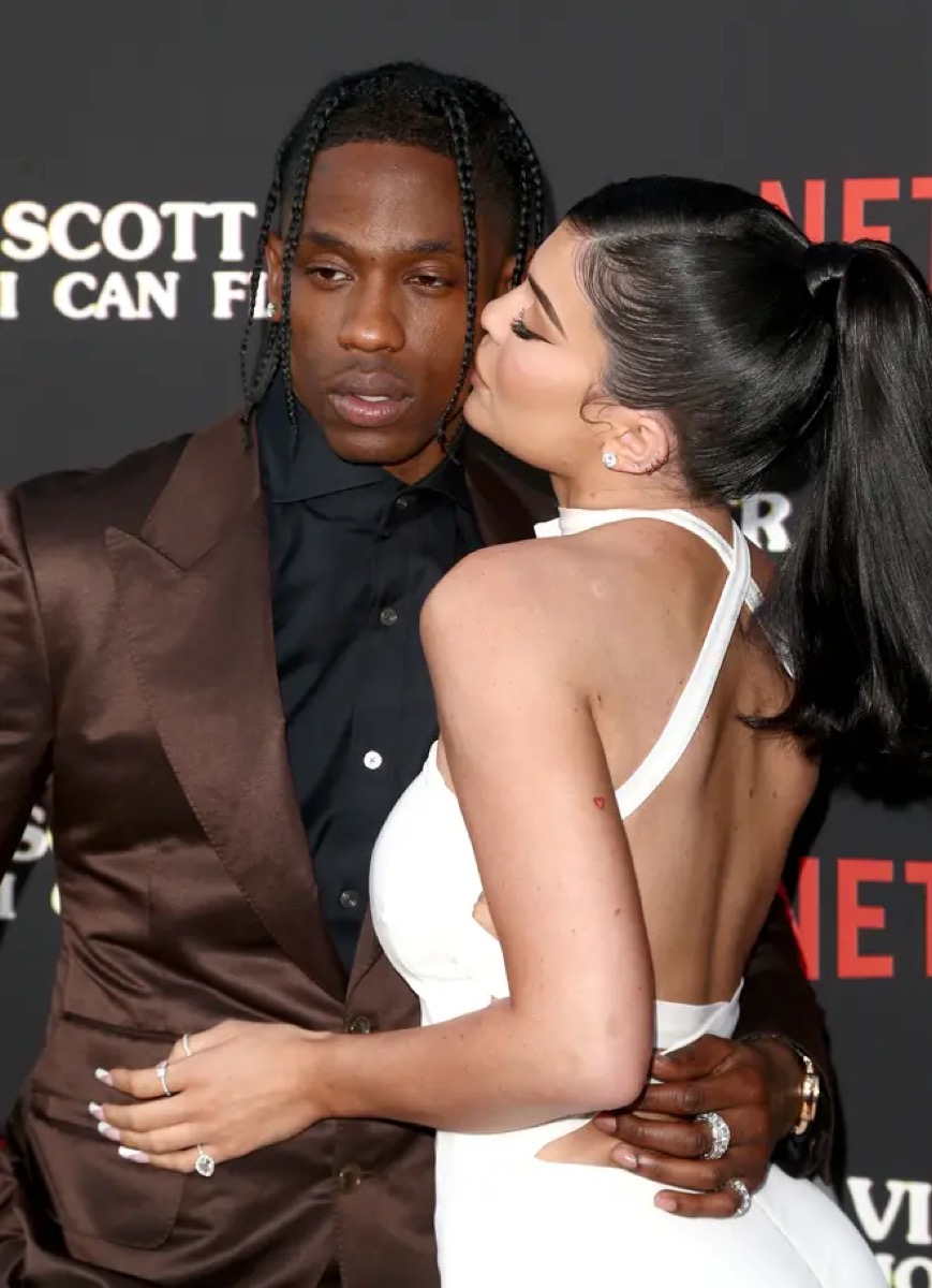
Kylie Jenner tattoos: clear image of Kylie’s red-ink heart tattoo on the back of her upper arm

Kylie’s small red heart is one of the earliest pieces in her tattoo timeline. It sits on the back of her left arm, just above the elbow, in the fine red ink that became a recurring feature of her collection. The outline is simple, with two curves meeting at a point and no heavy shading or frame.

The heart appeared around Kylie’s 18th birthday and is often identified as her first tattoo. That puts it before the later lettering, relationship references and family tributes. It is not a large statement piece; it feels more like a private mark that happens to show when she wears sleeveless clothes.

There is no confirmed explanation for why Kylie chose a heart. It is easy to read it as a romantic message, but the photo establishes only the design and its placement. It may have been a birthday choice, a family reference, a favourite shape or something she has never discussed publicly. The careful description is the most accurate one.

The red ink also gives the heart a softer look than black tattoos. In older photographs it appears bright, while later images may show it less clearly because red pigment can fade into the skin under flat lighting. That alone does not mean the tattoo was removed; age, camera settings and distance can all affect how it looks.

Mary Jo is Kylie’s family tattoo in her grandfather’s handwriting
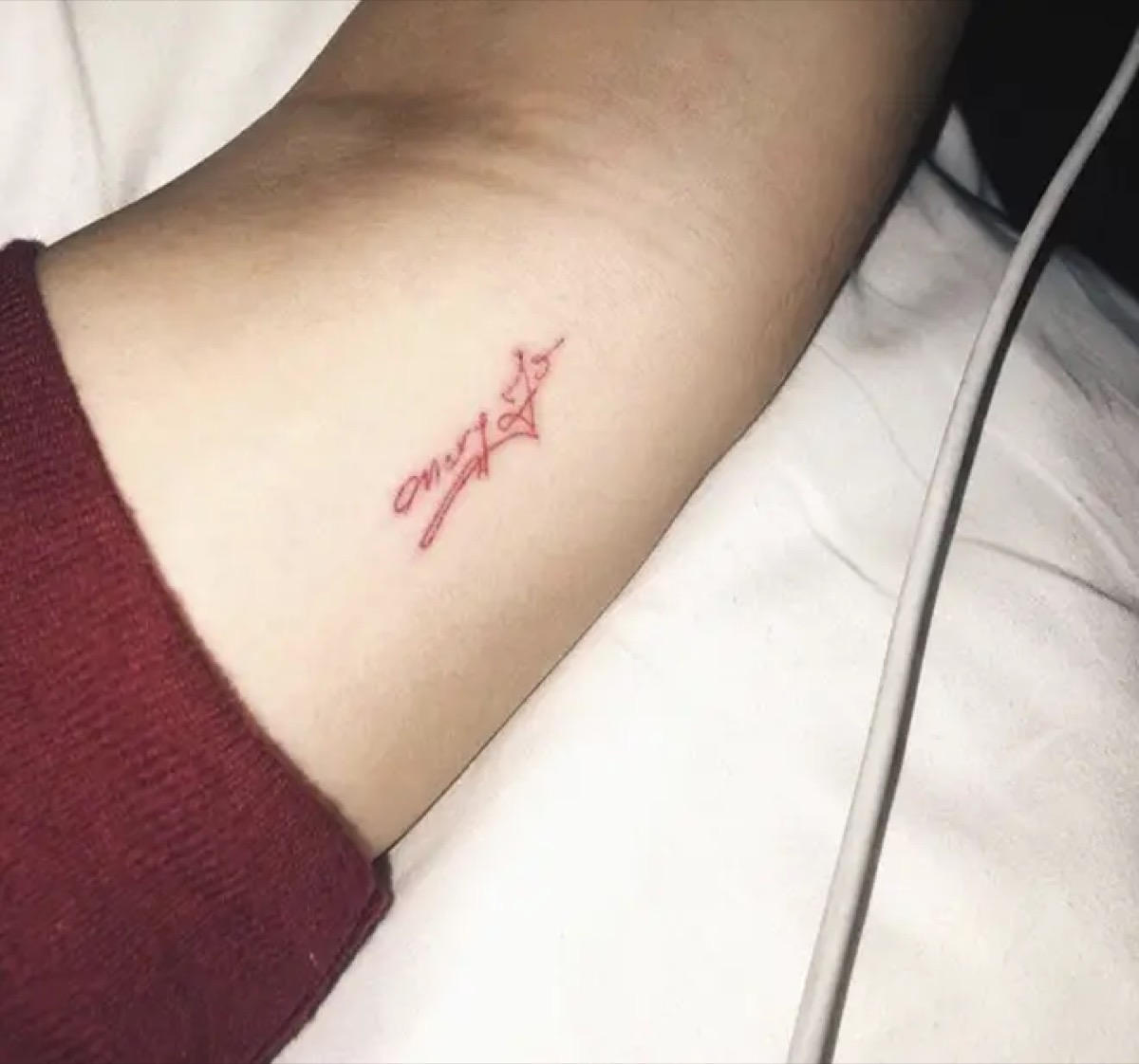
Kylie Jenner tattoos: clear image of Kylie’s Mary Jo inner-arm lettering

The words “Mary Jo” sit on Kylie’s inner arm in red ink. Mary Jo is her grandmother, and Kylie said the lettering was copied from her grandfather’s handwriting. That makes the tattoo specific: it is a family connection written in the hand of another family member, not simply a name chosen for the skin.

The letters are fine and compact, matching the style Kylie favoured at the time. The name takes up only a small part of her forearm, and the red lines sit quietly beside her other tattoos. A close-up is needed to make out the handwriting; in a wide portrait it can look like a tiny red dash.

This is one of the clearest meanings in Kylie’s tattoo history. Sources have identified both the handwriting and the family relationship, so there is no need to add symbolism that was never reported. The detail that matters is her choice to use her grandfather’s writing instead of a standard tattoo font.

Some later photos make the lettering look lighter than it did when it was new. Red ink can lose contrast with time, especially on an arm that is often exposed. That is part of the tattoo’s timeline: the design remains, even if it no longer looks exactly like the fresh reveal.

The matching M tattoo belonged to Kylie and Jordyn Woods
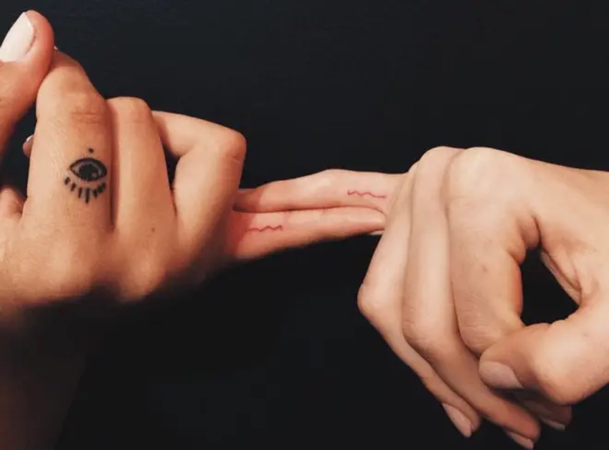
Kylie Jenner tattoos: clear image of Kylie and Jordyn Woods matching M finger tattoos

Kylie and Jordyn Woods got matching red “M” tattoos on their fingers in 2016. The letter sits on the inside of the finger and is small enough to notice mainly when a hand turns toward the camera. In a group photo it can look like a smudge, then stand out in a close-up.

At the time, the tattoo marked a close friendship. The shared initial did not need a large image or a complicated emblem; the matching letter carried the idea. Its small size let both friends wear it without making the design the focus of their public image.

Their later falling-out changed the context, but it did not erase the original moment. A tattoo can belong to a real period of closeness even when the relationship later changes. Dating the design is more accurate than presenting it as a current friendship symbol.

Finger tattoos bring practical challenges: the skin bends, the lettering is tiny and frequent handwashing can fade fine lines. Kylie’s red “M” looks clearer in some photos than in others. That variation does not necessarily mean the letter changed; it may simply reflect how the hand was photographed.

The ankle tattoos changed from T to LA
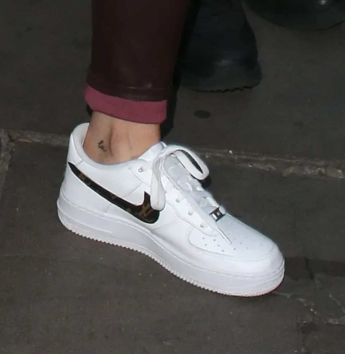
Kylie Jenner tattoos: clear image of Kylie’s redesigned LA tattoo

Kylie first had a tiny lowercase “t” on the inside of her ankle, associated with her relationship with Tyga. After they split, she changed it to “LA”, referring to Los Angeles. It is one of the clearest edits in her collection: the later design visibly reworks the earlier letter.

The original was a small black letter in a simple handwritten style. The updated version uses the same general area but points toward home. The first tattoo still belongs in the history; the alteration shows how someone can take a design from an earlier chapter and give it a different meaning.

The updated lettering also fits Kylie’s preference for compact designs. It can sit beneath clothing, appear in a holiday photo or show up in a quick close-up of her ankle. Boots or heels can hide it, so dated before-and-after images tell the story better than one isolated shot.

There is a practical lesson in this change for anyone considering a relationship tattoo. Kylie’s ankle design could be adapted, though cover-ups are not always simple. Here, the change is well documented and shows how the tattoo became part of a different story.

Kylie and Travis Scott matched butterfly tattoos

Kylie Jenner tattoos: clear image of Kylie’s matching butterfly ankle tattoo

In 2017, Kylie and Travis Scott revealed matching butterfly tattoos above their ankles. Kylie’s is on the back of her right leg, with a corresponding design on Travis’s opposite side. The tattoos are small, black and easy to cover, in keeping with her fine-line collection.

The butterfly was linked to Travis’s song “Butterfly Effect”, giving the shared tattoo a direct connection to his music. The original coverage focused on the song and the period when the matching designs appeared, rather than presenting the butterfly as a generic symbol of transformation.

Matching tattoos can take on a different context when a relationship changes, but the ink still records what happened at the time. This is best described as a dated shared design, not a statement about Kylie’s current relationship status. A photograph alone cannot tell us how she feels about it years later.

The ankle placement also affects how the butterfly looks. Pointing her foot or standing on her toes stretches the skin, and a flat image can make the wings seem uneven. A relaxed ankle gives a better sense of the proportions, so a clear close-up is more useful than a distant event photo.

Stormi’s name and the 4:43 birth-time tattoo
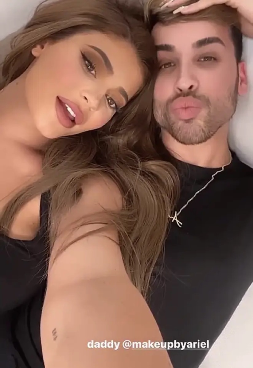
Kylie Jenner tattoos: clear image of Kylie’s Stormi birth-time tattoo, reading 4:43 on her forearm

Kylie has two tattoos connected to her daughter Stormi. One is the name “Stormi”, on the back of her arm and created as a matching tattoo with Travis Scott and her friend Anastasia Karanikolaou. The other is the small black “4:43” on the inside of Kylie’s forearm, marking Stormi’s birth time.

The name tattoo was made during Travis’s birthday celebrations in 2019. The shared design connects all three people to Stormi, while the small lettering keeps the tribute understated. It is not a portrait or a decorative announcement; the name carries the point.

The time tattoo is even more compact. Its clean little numbers sit where a sleeve or bracelet can cover them. Unlike a date, “4:43” records a precise moment, making the design personal without needing a long explanation.

These pieces show Kylie’s collection moving from relationship references toward motherhood and family. The earlier “M”, “t” and butterfly were tied to friends or partners; the later lettering and numbers focus on her daughter. The subjects changed while the tattoo style stays small and restrained.

Before sanity is Kylie’s most unusual wording

Kylie Jenner tattoos: clear image of Kylie’s before tattoo added to the red-ink sanity design

Kylie’s hip tattoo began with the phonetic spelling of “sanity”. She later added the word “before”, making the phrase read “before sanity.” The red lettering sits on her hip, less visible than the arm tattoos but part of her earlier tattoo timeline.

Kylie later said the original word reminded her to keep her sanity. Adding “before” changed the line and gave the design a new edge. It is a good example of her tattoos developing after they first appear: the wording was edited, and that edit became part of the story.

The hip placement makes this tattoo hard to spot in everyday photos. It appears more often in holiday or swimwear pictures and selected close-ups than on a red carpet. That limited visibility may explain why some lists treat the phrase as a single design while others describe the original word and later addition separately.

Kylie’s tattoos are small, but the details are specific. The red heart marks an early starting point; “Mary Jo” carries her grandfather’s handwriting; the matching “M” and butterfly record friendships and relationships; “LA” shows a redesign; and “Stormi” and “4:43” mark motherhood. “Before sanity” captures a phrase that changed along with her.

The collection makes more sense as a timeline than as a simple inventory. The delicate designs connect to a grandmother, a daughter, a city, a friendship, a past relationship and a personal reminder. Some meanings are confirmed; others are visible in the image alone. Keeping those apart gives Kylie’s tattoos a clearer story without turning tiny marks into generic decoration.
Danielle Colby’s American Pickers Tattoos

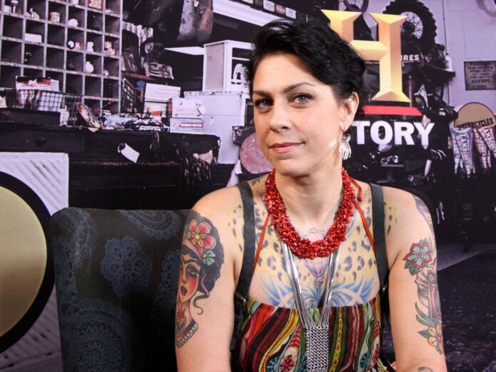
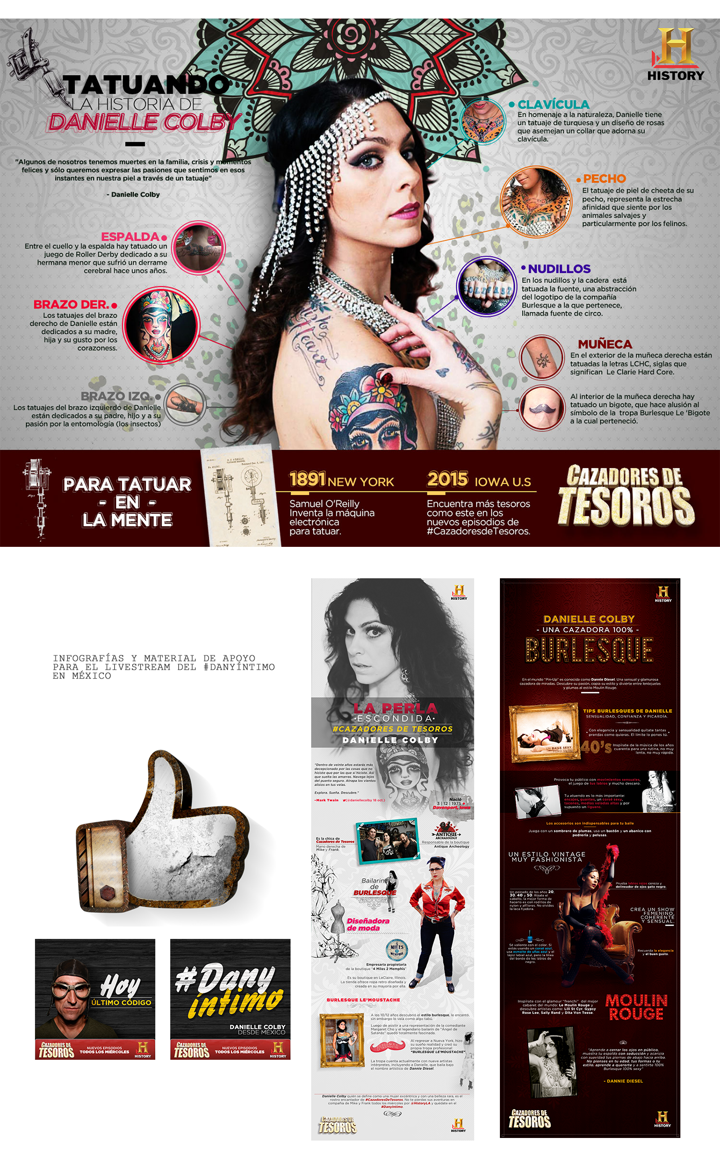
Colby’s tattoos have grown over many years around artists, family, bugs, music, heritage and burlesque. Interviews put the collection at more than thirty designs, though the exact count matters less than how they fit together: a torso she calls pagan suit of armor, a violin-shaped back, insects on the left arm and a Frida portrait on the right. Words appear too, including Irish Blood, English Heart and Hold Fast.

Colby has described herself as collecting tattoos. She gives artists a theme and trusts them to develop it. Some designs have a clear story; others are known mostly through photos.

The pagan suit of armor covers Colby’s chest and stomach

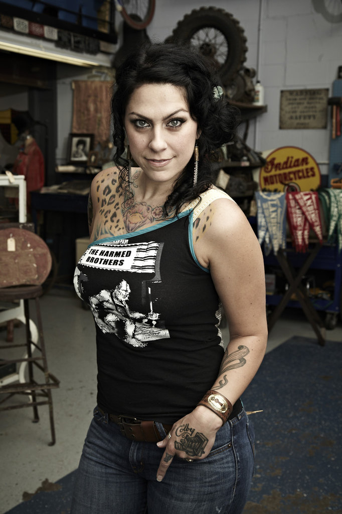
Danielle Colby tattoo map showing chest, arm, back and hand designs

Patrick Cornalo of Speakeasy Custom Tattoo developed the pagan suit of armor across Colby’s chest and stomach. She says she brings him a theme and trusts his vision to build around it. The phrase describes a connected project, not a single emblem.

A chest tattoo can be read on its own; the armor is meant to work as overlapping shapes, panels and symbols. Photographs often show only part of the torso at a time.

Colby’s interest in vintage performance history adds context. She collects burlesque costumes and documents the women who wore them. No source says the armor copies a historical garment, but the broader project fits her interest in themed visual worlds and the artists who create them.

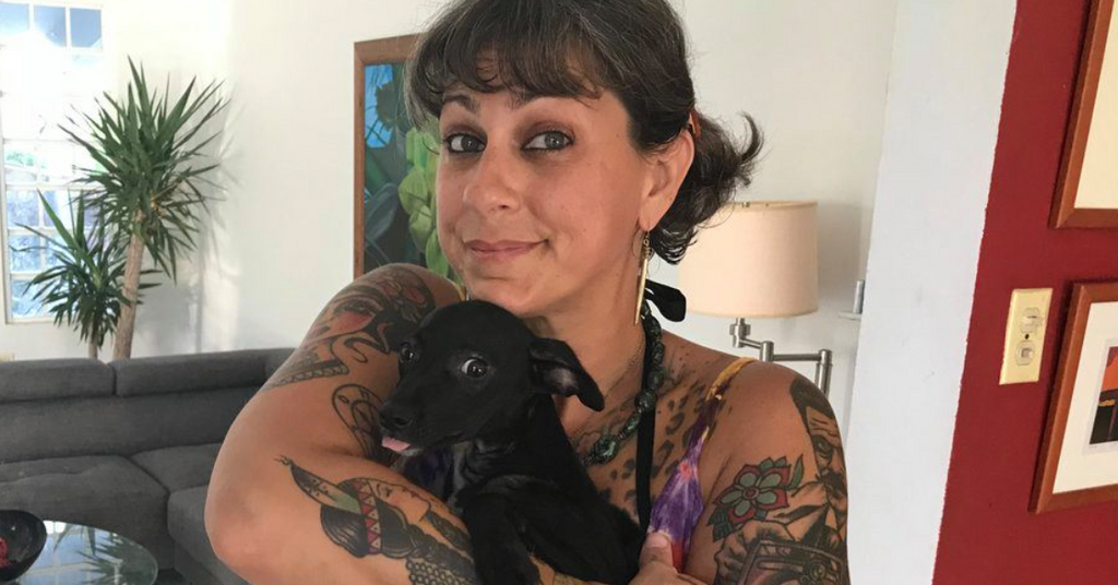
Danielle Colby seated with her chest, arm and thigh tattoos visible

The violin-shaped back is the collection’s most unusual piece of body mapping.

Several tattoo profiles describe Colby’s back as a violin, with oversized F-holes on either side. The body supplies the instrument’s outline: it is not a small violin picture, but a composition built across her back.

A front-facing television shot cannot show the whole design. A portrait from behind reveals the F-holes and the way the piece follows the shoulder blades, though clothing or pose may hide the lower section.

The F-holes are large enough to read across the back, shaping the space around them instead of serving as random filler. The design changes how the surrounding tattoos are seen.

Entomology gives Colby’s left arm its subject

Danielle Colby showing colorful arm and shoulder tattoos

Colby told YuppiePunk that Chewie was finishing her left arm as an entomology project. She loves bugs; that is the theme.

A beetle, moth or other insect gives the arm different shapes and textures to work with. Fine wing lines can sit beside darker shading, and new pieces can be added without repeating the same composition.

Stage lights can flatten fine legs and wings, while a turned forearm hides the edge of a design. Colby’s interview explains the entomology theme; the photographs show how much of the arm is covered.

Frida brings a portrait to the right arm

Danielle Colby showing her right-arm tattoo work

Colby has identified a Frida portrait on her right arm as work by Alex Strangler. Knowing the subject and artist gives this entry a firmer basis than guessing from a photograph.

A face gives the arm a focal point, while the insects rely on many smaller shapes. That contrast lets Frida sit beside the entomology work without making the arm look uniform.

Colby names her collaborators and talks about trusting their vision. The tattoo’s identity includes both the subject on the skin and the artist’s approach to rendering it.

Irish Blood, English Heart crosses Colby’s shoulders

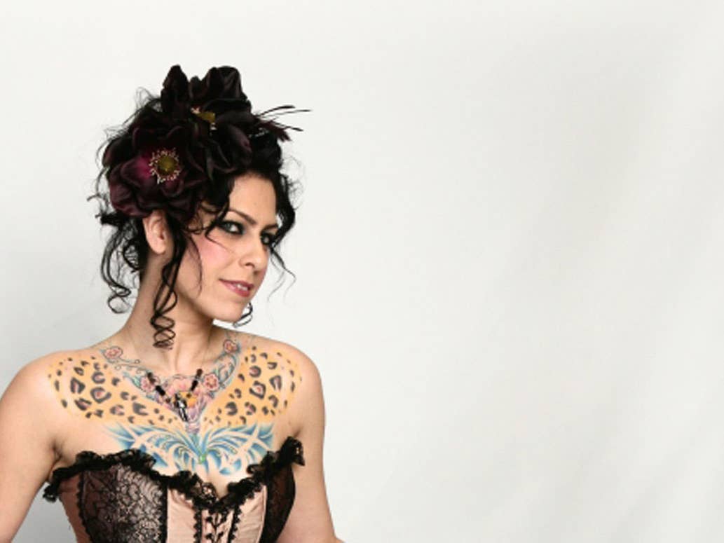
Danielle Colby showing leopard and butterfly chest tattoos

The words Irish Blood, English Heart run across Colby’s shoulders. Lettering reads in a glance, while the armor, violin and insects invite a closer look.

The phrase connects with the Irish heritage Colby has discussed. Its wording and placement are clear without adding a wider story about her family.

Posture changes how the line reads. A raised arm can stretch the shoulders; a relaxed pose makes the words easier to follow. Some television photos show only part of the phrase.

Hold Fast brings the knuckles into view

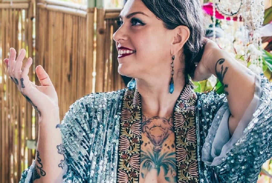
Danielle Colby showing hand and arm tattoos

Colby told YuppiePunk that Chewie tattooed Hold Fast across her knuckles. The short phrase is easy to notice whenever she reaches for something or gestures on camera.

The wording draws on sailor and working-class tattoo traditions, but the interview does not give a personal explanation for Colby’s choice. Readers can take the phrase as written; no story behind it has been reported.

Why Colby’s collection works as a map

Read by location, the designs have their own threads: armor across the torso, a violin on the back, insects on the left arm, Frida on the right, Irish Blood across the shoulders and Hold Fast on the knuckles.

Colby has talked about artists continuing the work and about trusting them with a theme. New photographs may reveal additions or details older coverage missed; no single article gives a final count.

The appeal is how distinct ideas share the same body. Armor, a violin, insects, a portrait and short phrases each keep their own look, while the artists help them belong together.

More actor tattoo guides

Steve-O’s Tattoos Are Built Around One Unmissable Backpiece

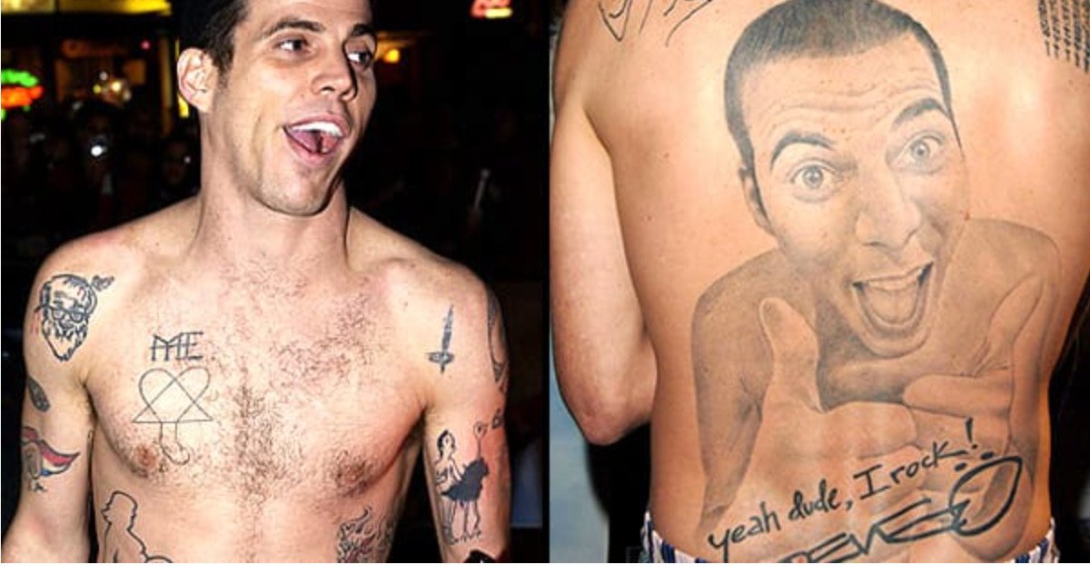
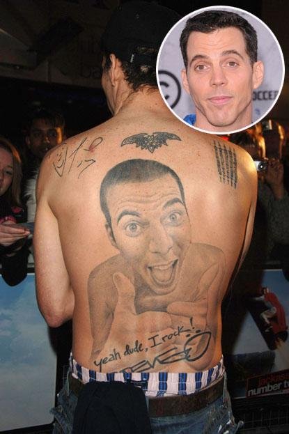
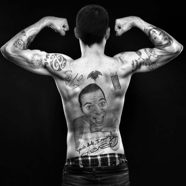
Steve-O has never been one for subtle tattoos. The largest is a huge portrait of himself across his back, smiling and giving a thumbs-up. Lettering, smaller symbols and the phrase yeah dude, I rock! fill the space around it. It looks like a joke made for an audience, which fits a performer who has often used body modification to get a reaction. In interviews, he has talked about making his body part of his comic persona.

There is plenty of ink beyond that portrait, across Steve-O’s hands, face, chest and shoulders. Photos make the scale easy to see, while interviews fill in some of the words and choices. The smaller marks are harder to read, so their meaning is best left open.

The full-back self-portrait is Steve-O’s defining tattoo

Steve-O showing his full-back self-portrait tattoo

His back tattoo is a photorealistic portrait of Steve-O giving a thumbs-up. It covers most of his back, putting the performer’s own face at the center. The expression is broad, the gesture is easy to read and the surrounding lettering frames the image. The Daily Beast called it a magnificent tattoo of himself, while an earlier BME interview discusses the piece as part of his wider interest in body modification.

At first glance it could look like vanity, but the exaggeration is what makes it funny. Steve-O has always taken things to extremes; putting his own face across his back turns that impulse into the joke. The image needs no decoding: it is simply Steve-O, smiling back at the viewer.

The size changes how the tattoo reads. This is not a small portrait tucked below one shoulder blade; it is a full backpiece with room for shading, expression and handwritten details. The face catches the eye first, while the lettering makes the design feel more like a personal poster than a conventional portrait.

“Yeah dude, I rock!” finishes the backpiece with a punchline

Steve-O back tattoo with yeah dude I rock lettering

The phrase yeah dude, I rock! sits below the self-portrait beside Steve-O’s signature. It is part of the same composition, not a separate tattoo that happens to be nearby. The thumbs-up is boastful, but the exaggerated wording makes the boast a joke.

That line is the punchline, and its casual wording and punctuation are part of the voice. A tattoo guide should keep it as written; polishing the wording would flatten the joke. The script and signature tie the words to Steve-O’s persona and the portrait.

The lettering does a different job from the portrait: the face supplies the expression, and the words supply the voice. Even without knowing the rest of Steve-O’s body-art history, the tattoo is easy to read. Its subject and tone are clear, which helps explain why profiles keep coming back to it.

Face and knuckle tattoos carry the smaller jokes closer to the camera

Steve-O showing face and hand tattoos

Steve-O’s face and hand tattoos are hard to pin down in photos; small lettering blurs and can be misread. In BME interview material, he talks about choosing words for the reaction they’d get. Later coverage also describes added face ink as part of his public look. A single blurred photo can’t tell the full story.

His hands are on show whenever he gestures, and a face tattoo appears in interview close-ups. It suits a performer who often makes his body part of the bit. Still, visibility does not mean every mark comes with a story.

Photos also vary with the years and the lighting. A microphone can hide part of his hand, stage makeup can obscure face ink, and tattoos can be changed or covered. When a word is too blurred to read, it is better to describe where the tattoo is than to guess what it says.

Smaller chest and shoulder ink fills out the larger body-art map

Steve-O chest and shoulder tattoos

The other tattoos put the back portrait in context. Photos show more symbols and smaller pieces across Steve-O’s shoulders, chest and arms. Some are hard to identify and have no clear published story. Together, though, they make the point: the famous portrait sits among a lot of other work.

This is not one coordinated sleeve. The tattoos vary in size and mood; some are jokes, while others seem more personal. They look like a mix of decisions made for different reasons.

How to read Steve-O’s tattoos without losing the joke

The back portrait draws the eye, and the lettering gives it a voice. Smaller work on Steve-O’s face and hands brings the humor right up close, while the other marks fill out the collection. The sources explain some of his choices, but not every symbol needs decoding to see the through-line: he uses tattoos as part of the performance.

A huge portrait has room for expression, and the lettering is large enough to read. A small face tattoo comes with different limits. Steve-O embraces the contrast and uses it as part of the act. The result is funny, excessive and unmistakably his.

More actor tattoo guides