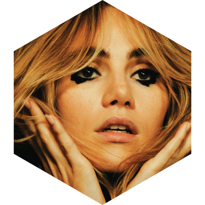
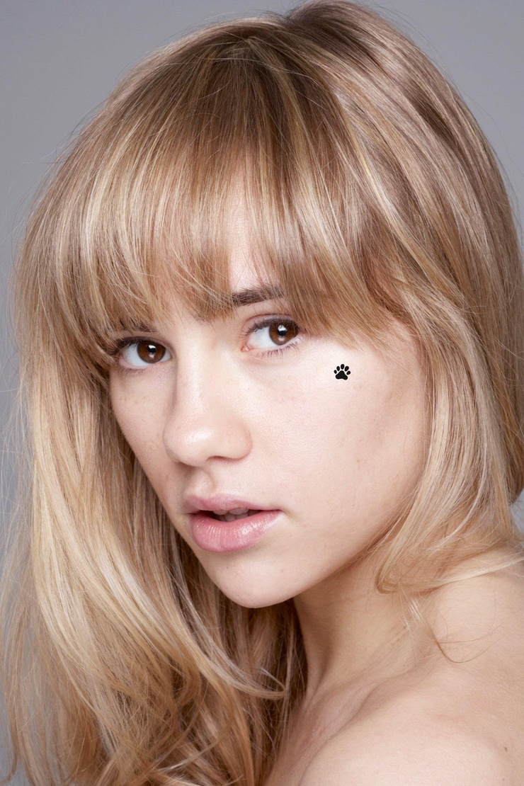
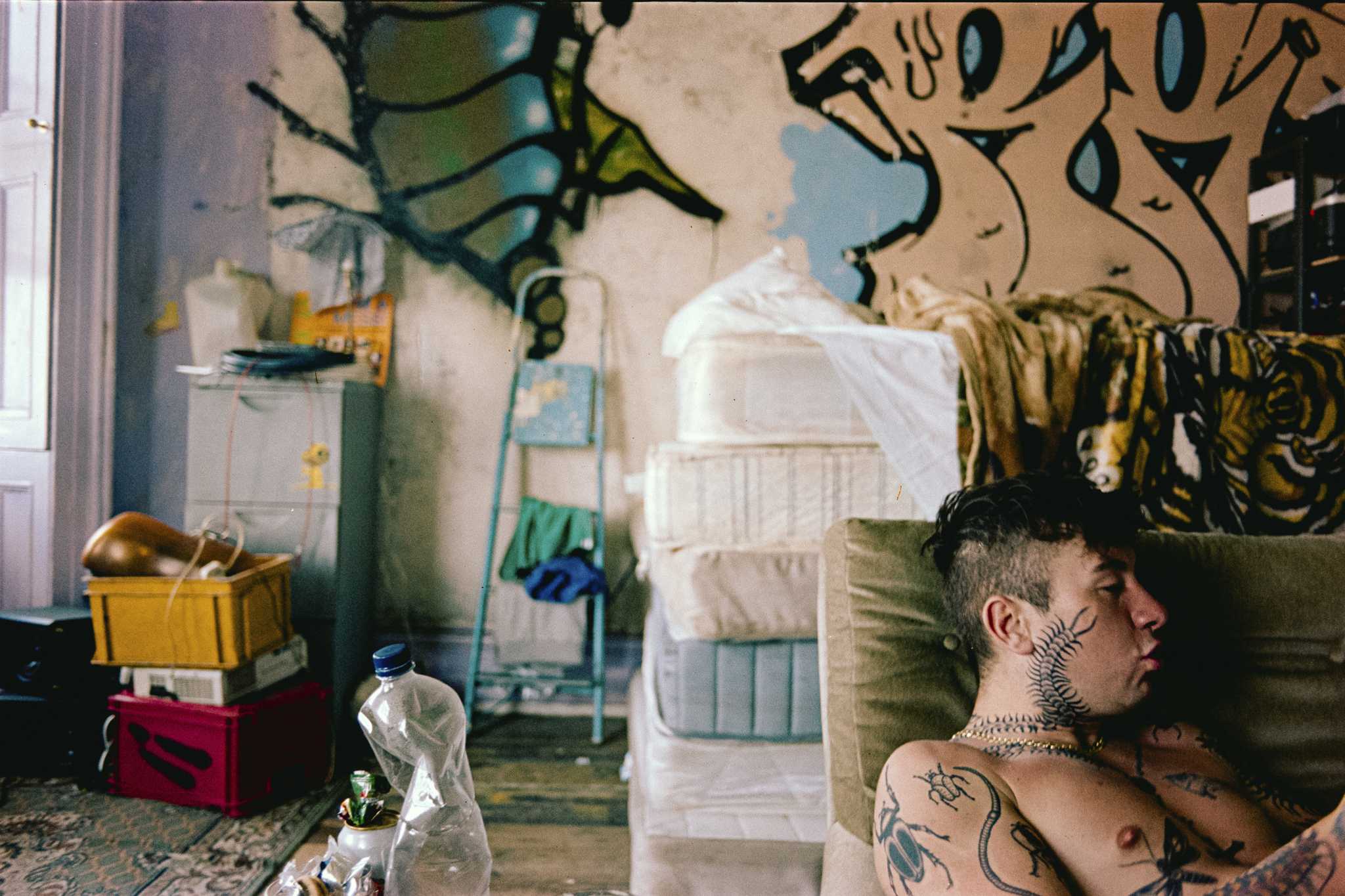
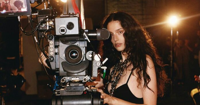
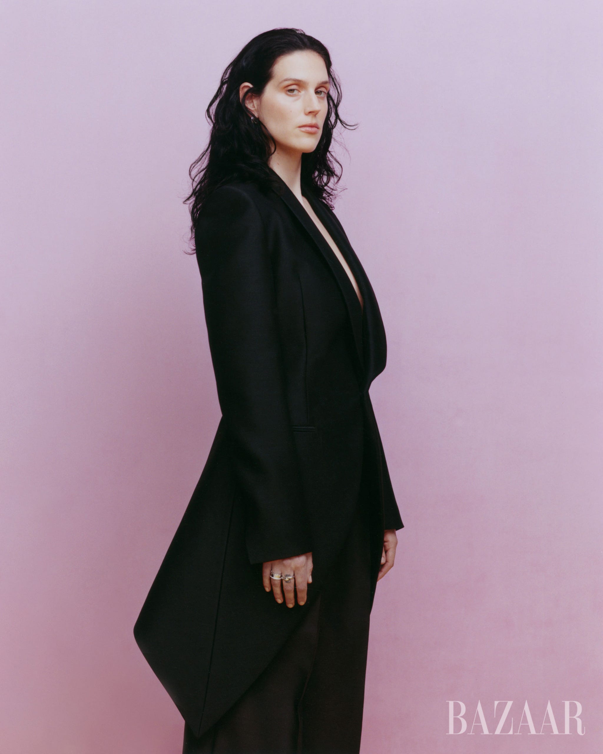
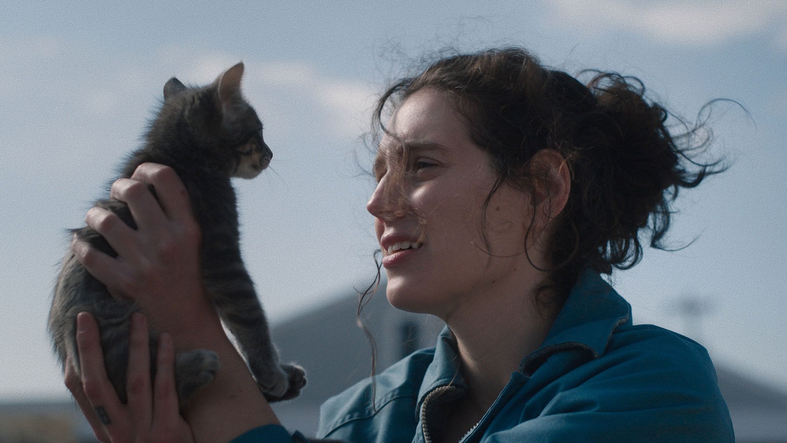
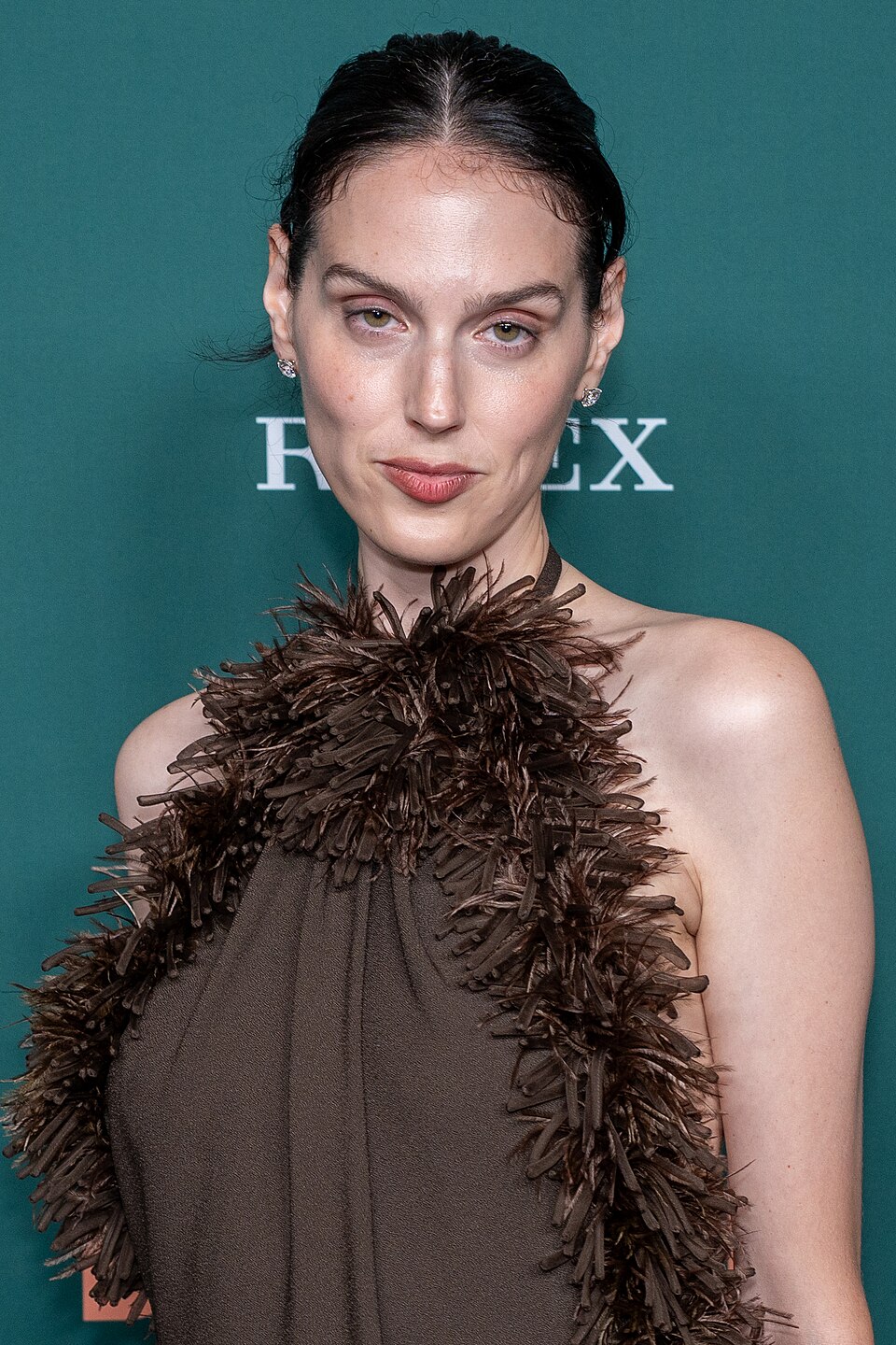
A close portrait shows a small paw-print shape beneath Suki Waterhouse’s right eye. The photograph makes the placement clear; its backstory is less certain.
Suki Waterhouse face tattoo: the paw-print mark
In the portrait, the black shape looks like a paw print: one central pad and several rounded toes. It sits just below her right eye. The photo shows the design and placement, but it doesn’t tell us when the mark appeared, whether it’s permanent, or what it means to Waterhouse.
Paw prints can be chosen for an animal, a memory or simply the shape. None of those explanations has been confirmed for this mark.
What the reporting actually confirms
ELLE UK’s 2023 “Ask Me Anything” video covers Waterhouse getting a tattoo at Sienna Miller’s house. Its published description doesn’t name the design, so it doesn’t establish that the tattoo is the paw print shown here.
The Sienna Miller house story
A tattoo at a friend’s house doesn’t tell us who did it or whether the setup was professional. If you get tattooed outside a studio, ask about the artist’s experience, sterile equipment, clean setup and aftercare.
Why temporary body art muddies the picture
Some fashion images show floral and geometric marks across Waterhouse’s legs, but they don’t establish those designs as permanent tattoos. Editorial shoots can use makeup or transfers; without confirmation, describe what appears in the photo as body art for that shoot.
Suki’s fashion and music worlds
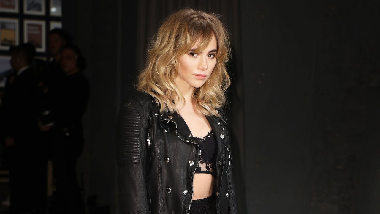
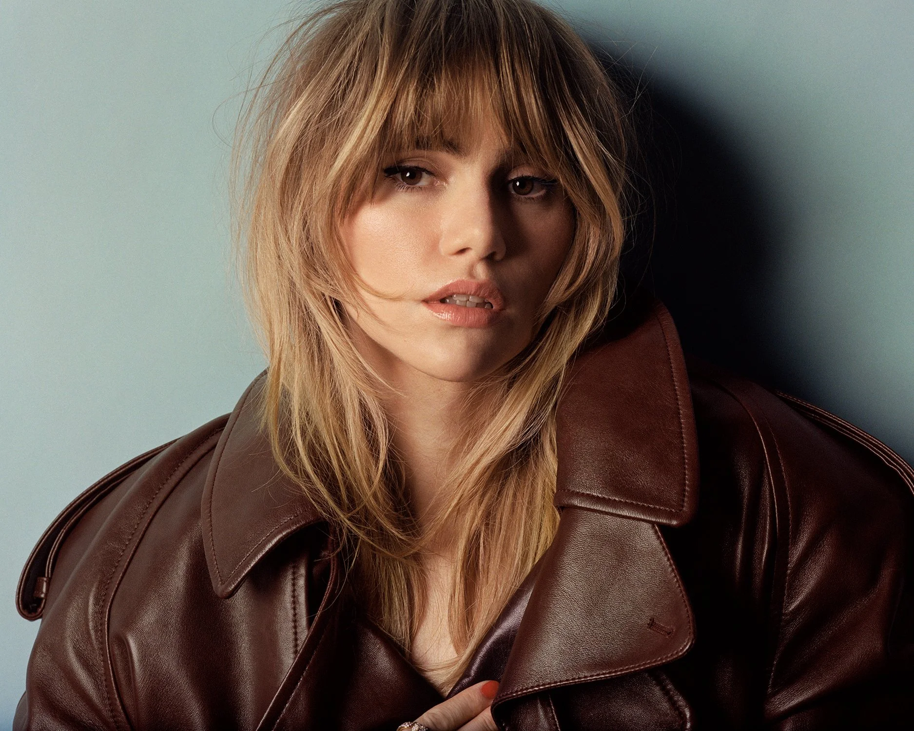
Her fashion shoots and music performances use different makeup, lighting and styling. A small black mark may stand out in one image and get lost in another; that describes the photo, not the tattoo’s meaning.
A tiny mark in a much bigger career
Waterhouse’s career spans modeling, acting and music; the paw print is a small detail in that public image. If you want to use it as inspiration, keep the simple outline and choose a meaning from your own life.
If you’re considering a mark near your own eye, take time with the decision. Face tattoos are hard to cover and removal can be difficult. Talk with an experienced tattooer about scale, healing and the risks of working so close to the eye; look at healed work before you choose.
Bryan Cranston’s Breaking Bad tattoo is a small Br/Ba logo. Its story starts on the series’ last day of filming.
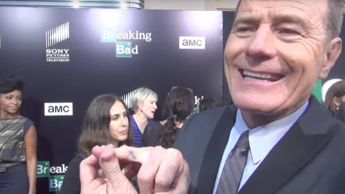
The Br/Ba mark on Bryan Cranston’s right ring finger
The logo uses two periodic-table squares: Br for bromine and Ba for barium. Together, they spell Breaking Bad. Cranston has it on the inside of his right ring finger, where it is easy to miss unless he turns or flexes his hand.
In a close view, the colored boxes are clear. In a wider event photo, the mark is tiny. Fan-made Walter White tattoos and makeup worn for a role are separate from this one piece of Cranston’s personal ink.
Why he chose such a hidden spot
Cranston has explained the placement himself. When asked why he wanted a tattoo most people wouldn’t see, he said he wanted to see it. He also chose a spot that wouldn’t need constant covering.
The last day of Breaking Bad production
Cranston and Paul finished five seasons of Breaking Bad in 2013. On the last day of filming, some cast and crew went to a bar and talked about getting tattoos to remember the series. One member of the art department was also a tattoo artist. Cranston chose the Br/Ba logo; Aaron Paul got “No Half Measures” on the inside of his bicep.
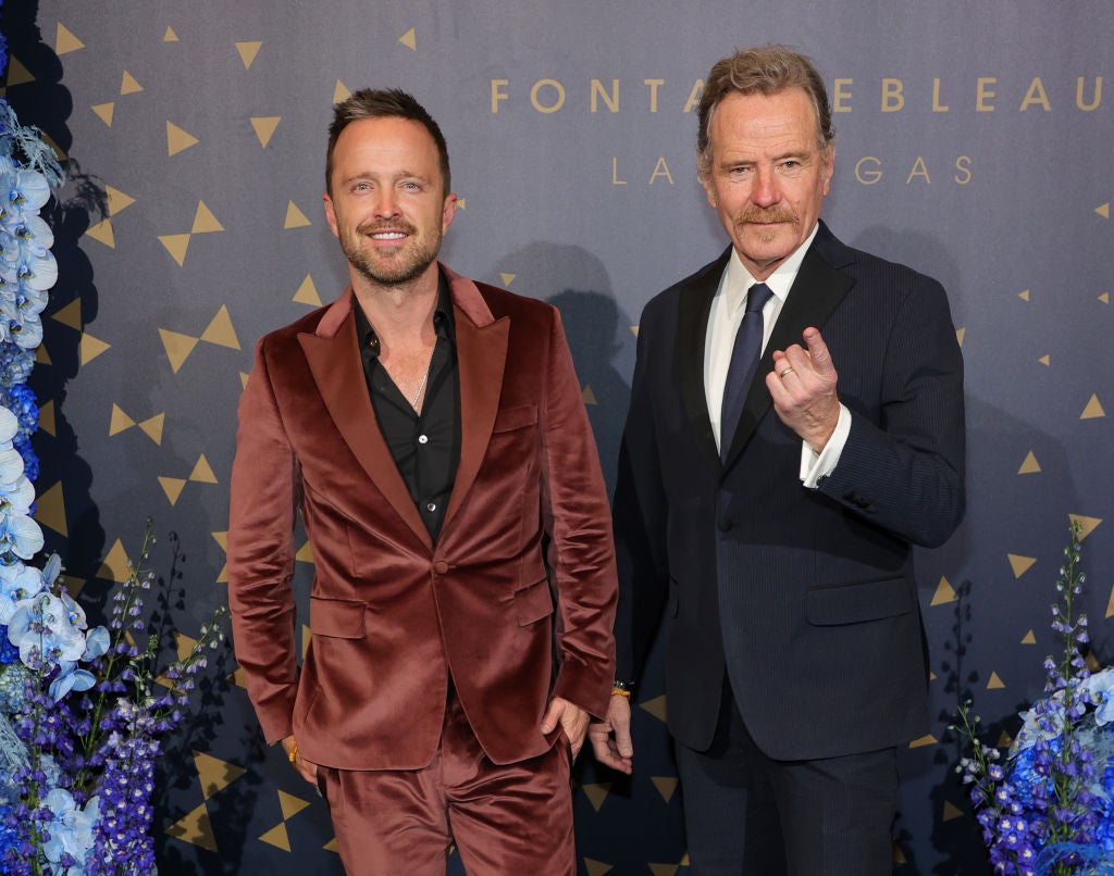
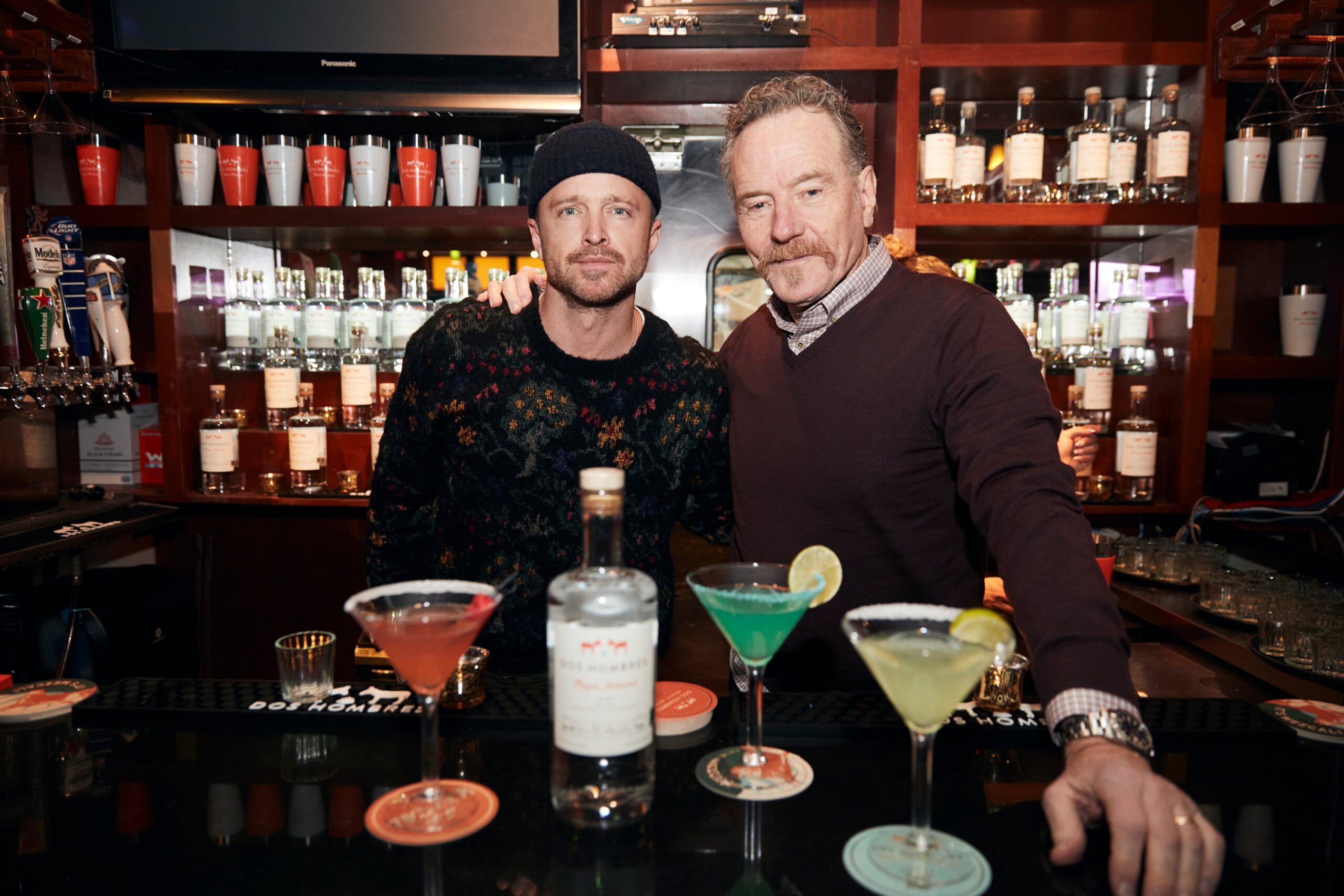
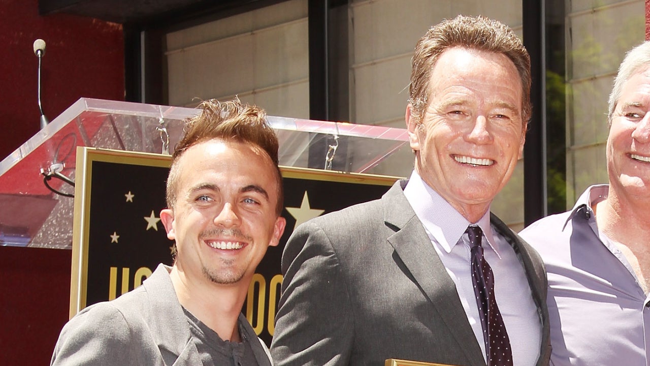
The tattoos mark the same production in different ways: one is the show’s chemistry logo, the other a line from it. Cranston and Paul later reunited for interviews, commercials and their Dos Hombres mezcal business. A photo from a Las Vegas opening shows them after the series; it isn’t where the tattoos came from.
What the photo evidence can and cannot prove
Cranston has described the Br/Ba tattoo and its placement in interviews; close photos show what it looks like. The other images here show him at events or in roles, not additional tattoos. Costume makeup isn’t permanent ink, and photos that don’t show his skin can’t establish a larger collection.
From Hal to Walter White
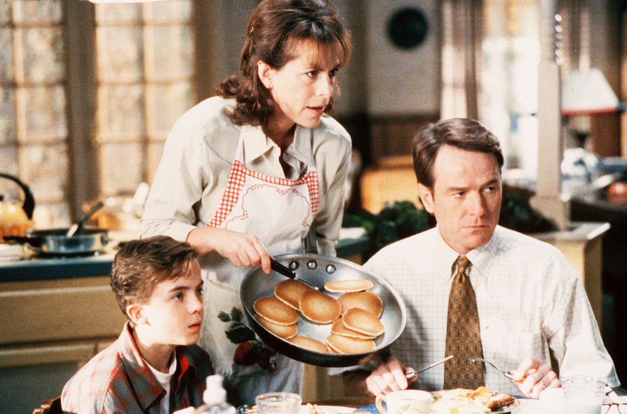
Before Breaking Bad, many viewers knew Cranston as Hal, the comic father in Malcolm in the Middle. Walter White was a sharp turn from that role. Cranston has said the opportunities he had afterward came because of Breaking Bad, and that is what the logo recalls for him.
Why a private mark fits Cranston
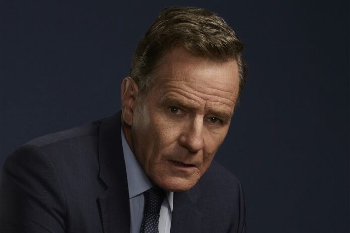
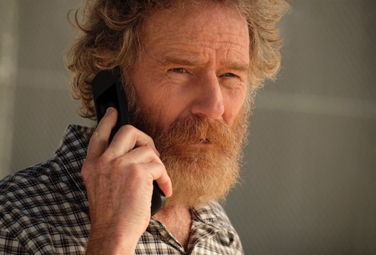
The accompanying image shows Cranston as Michael Desiato, the judge he played in Your Honor. In a 2023 interview with The Independent, he said he doesn’t want to live in the characters he plays. Br/Ba marks the making of Breaking Bad, not Walter White’s fictional life.
What the small logo gets right
If you want a tattoo in this spirit, start with a symbol tied to a real memory, then make sure it still reads at its final size. The Br/Ba mark has simple shapes and clear letters. Finger tattoos move and wear differently from tattoos on the arm, so ask your tattooer to set the scale and spacing with that in mind.
What is actually confirmed?
Cranston has publicly described one personal tattoo: the Br/Ba Breaking Bad logo on his right ring finger. Photos and reporting discussed here don’t confirm any others.
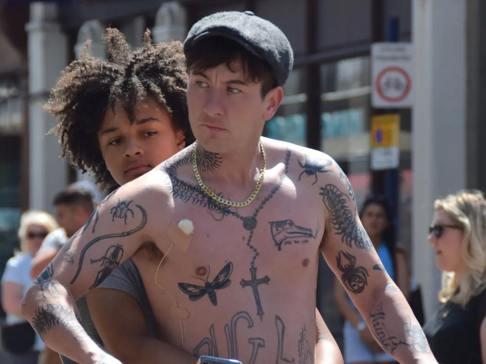
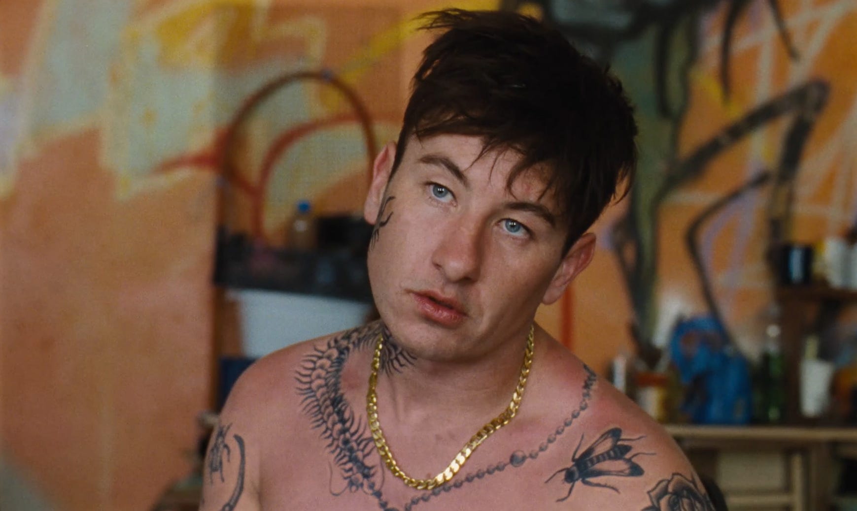
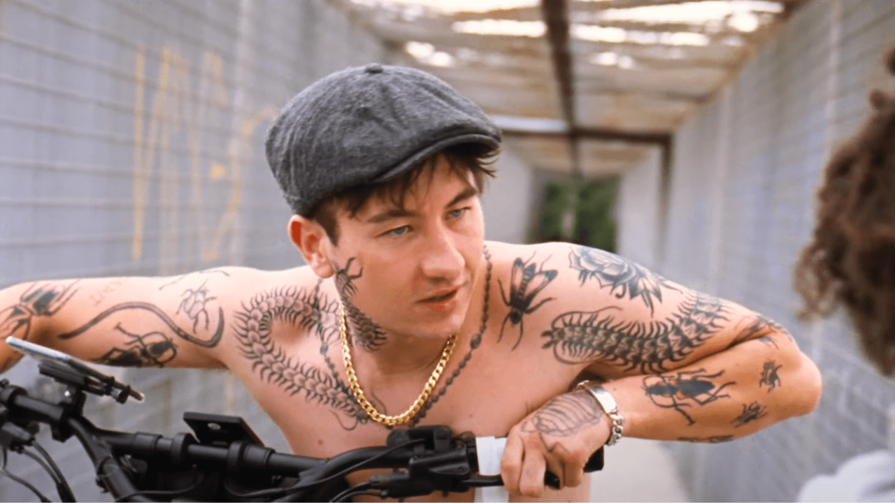
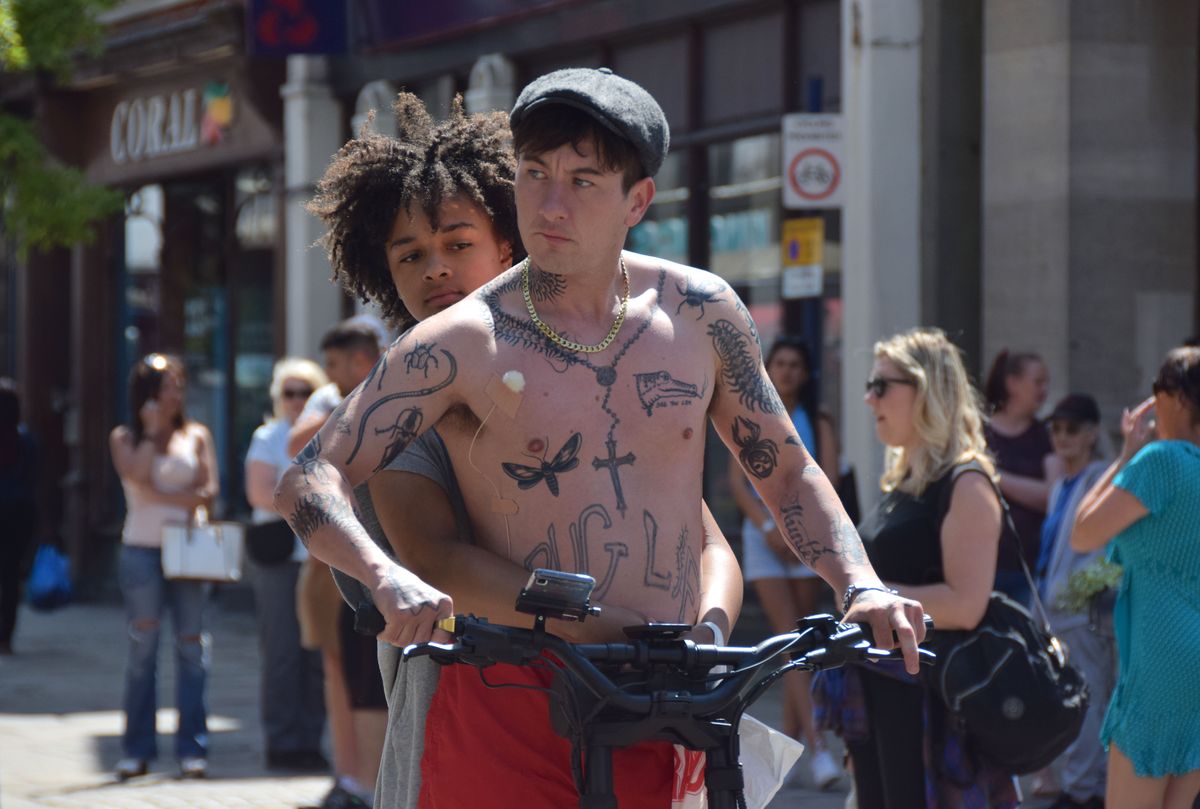
Barry Keoghan’s inked-up look in Bird belongs to Bug, the character he plays. Keoghan wore fake tattoos across his body for the film and said summer sun could leave pale marks after they were removed, including the shape of a scorpion or cross. That isn’t the same as a record of his own tattoos.
Duke Shelby has a separate set of designs in Peaky Blinders: The Immortal Man. Duke Shelby has a separate set of tattoos in Peaky Blinders: The Immortal Man. Here, I stick to what appears on screen instead of guessing what each symbol means.
Bird’s insect-heavy chest
The Bird still shows insect-like marks across Bug’s chest and neck. A large, dragonfly-shaped design sits low on the chest, with a cross down the centre and smaller marks around the collarbone. The pieces vary in size and angle, which gives the makeup a scattered look instead of a planned, matching set.
If you want to borrow that feel, try one detailed insect beside a darker, simpler symbol. Leave some skin between them so each shape can be read. The reference is useful for its loose spacing; the subject can come from your own life.
Composition matters more than copying the images. A few pieces with room around them can feel just as informal, whether you choose insects, flowers, tools or something else.
Loose arm tattoos and uneven linework
The arm and shoulder shots mix insect shapes, curved marks, small symbols and bits of lettering. Some are clear; others read as texture. That loose arrangement is part of the character design.
For a patchwork sleeve, choose one or two things that tie the pieces together, such as black ink and a similar line weight. Have the tattooer plan the gaps before adding more. Tiny legs, antennae and distressed lettering may need more space than they seem to in a screenshot if you want them to stay legible as they age.
The face and neck details
A dark, plant-like or insect-like mark runs from Bug’s cheek toward his temple in several frames, and the neck has denser lines. The exact shape is hard to make out, but the placement gives the character a strong outline on screen.
Face and neck tattoos stay visible in most settings. If you like the shape but aren’t sure about that level of visibility, try a temporary version first or move it to an upper arm or rib. For a permanent neck piece, take the stencil seriously and check how it sits beside any chest or shoulder work.
You can keep the reference without taking on the same placement. A small mark behind the ear or under the jaw gives you room to test the idea before choosing a more visible spot.
Lettering, crosses and the rough religious symbols
The chest cross is easy to pick out in the Bird stills. The lettering nearby is blunt and uneven, rather than set in a polished typeface. Together, they give the makeup a direct, hand-drawn look.
Lettering often needs to be larger on skin than it looks on a screen. Bring references for the style, then ask the artist to draw the words at their final size. If you want a symbol with personal meaning, choose one that connects to your own beliefs or experience; the film’s cross is a visual detail, not a reason to copy it.
Black outlines and a little texture can keep the design rough without filling every small gap with detail. Ask the artist which parts will still read clearly once the tattoo has healed.
What the Duke Shelby tattoos add
Duke’s tattoos are separate from Bug’s insect-heavy makeup. In the available shots, you can make out a small figure with its legs spread and the words “self-made” on his right bicep, dice on the right shoulder, a tiger on the chest, a wagon wheel on the left hand, intersecting lines on an arm, and praying hands beside crosses. A film breakdown counts seven designs, though some are only briefly visible.
The words are the easiest detail to adapt: use a phrase that still feels like yours after you’ve lived with it for a while. The dice and tiger also work as images on their own, without borrowing a meaning from the character. The film breakdown connects the wagon wheel with Romani identity, so don’t treat it as a generic decorative motif. The same care applies to religious imagery such as praying hands and crosses.
How to turn the look into your own
Gather a few references from both roles, then decide what you actually like: the insect shapes, loose spacing, rough lettering or a single bold symbol. You don’t need to copy a full screen look. Leave out anything that only appeals because Keoghan wore it.
Pick one element to start with and show the tattooer where you might place it. They can adjust its scale and spacing for your body, keeping the rough reference while making the lines clear enough to last.
Eva Victor’s best-known tattoo is a small four-pane window on their middle finger. It’s a little rough, and Victor has called it “janky.” They’re also fond of it. The story behind it is just as specific: a more detailed sketch, an Italian tattoo artist in France, and a design conversation that didn’t quite work.
Victor has also talked about a half-note rest on their foot and a blackberry they designed on an iPad during a difficult period. Each piece comes with its own story; there’s no need to make them fit one theme.
The window tattoo is the piece everyone asks about
The window sits on Victor’s middle finger: a rectangle divided into four panes. In a Harper’s Bazaar interview, they said they had first drawn a more intricate version, complete with an awning, curtains and other details. They took that sketch to an Italian tattoo artist in France.
The artist spoke neither French nor English. Instead of the original design, she showed Victor a simple box crossed by lines. Victor agreed to it. They later described the finished tattoo as “janky,” but said they were obsessed with it.
The finished piece is much simpler than the first sketch. It’s also the version Victor chose to keep. The drawing, the conversation and the quick decision are all part of the story now.
Why the story matters more than the size
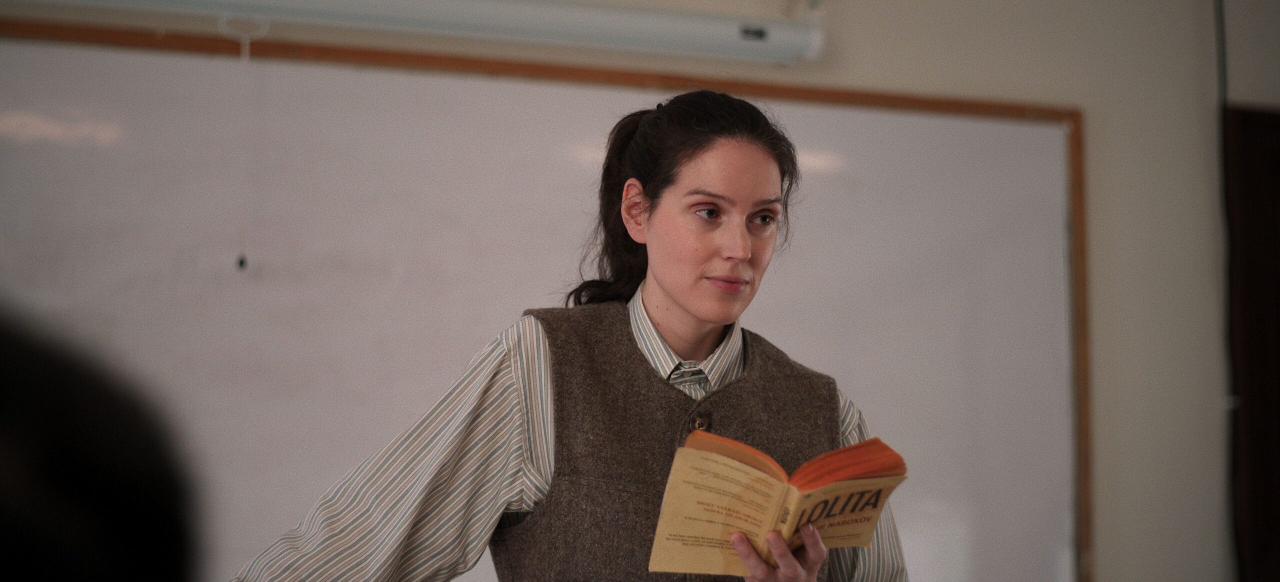
This is a contextual photograph from Victor’s Sorry, Baby coverage, not tattoo evidence. The window tattoo has since invited comparisons with the film, but Victor’s account of getting it came first: it began as an idea for a window on a trip to France, not as a symbol designed around the movie.
That order is worth keeping straight. A tattoo can take on another meaning later, but it doesn’t mean that meaning was part of the plan from the start. Here, the personal story and the public reading can sit alongside each other without one replacing the other.
A mark that came from miscommunication
This outdoor film still is contextual only; it doesn’t show another tattoo. Victor’s window story also offers a practical reminder: before an artist starts, make sure you both understand the drawing and where it will sit. That matters even more when you and the artist don’t share a language.
Take time with the stencil. Point to the details you want changed, ask the artist to show the design on your body, and don’t feel rushed into agreeing. Victor was happy with the simpler version, but the important part of their story is that the choice was theirs.
What the sources confirm
This New York Film Festival portrait is contextual only, not tattoo evidence. In a W Magazine interview, Victor said they got a half-note rest tattoo on their foot at 18 as a form of rebellion. They described its idea as a reminder to rest once in a while, take a beat and think. They also said they rarely see it.
Victor designed the blackberry tattoo on an iPad during what they called a “complete mental breakdown.” They told W Magazine they were in hospital because their stomach had “exploded,” but kept the appointment. They wanted the tattoo to remind them how bad they felt at the time.
Those are the meanings Victor has shared. The photographs here don’t establish any additional tattoo details, and there’s no need to guess at symbols they haven’t explained.
Ideas to borrow without copying
This reading scene is contextual only, not tattoo evidence. Victor’s examples suggest one simple starting point for your own design: choose a detail tied to a particular memory, whether it’s a place, an object or a moment you want to remember.
You don’t have to explain the tattoo to everyone who sees it. Its meaning can stay personal, and it can change as your own associations with it change.
What to borrow from Eva Victor’s approach
Start with the memory you want to keep, then work with an artist to find a shape that suits it. You don’t have to copy Victor’s window; the detail that makes a tattoo yours is the story you attach to it.
For a small design, ask the artist which lines will still read clearly as the tattoo ages. Finger and foot tattoos also get more friction and movement than many other placements, so talk through what that means for the design and any future touch-ups.
And leave room for the meaning to shift. Victor’s window began with a trip and a miscommunication; later, people connected it to their film. The tattoo can hold both associations without having been planned around either one.
Victor’s tattoo stories are memorable because they’re tied to real moments, including an idea that changed along the way. That’s more useful to take from them than copying the exact designs.
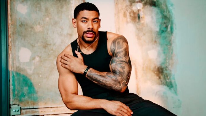
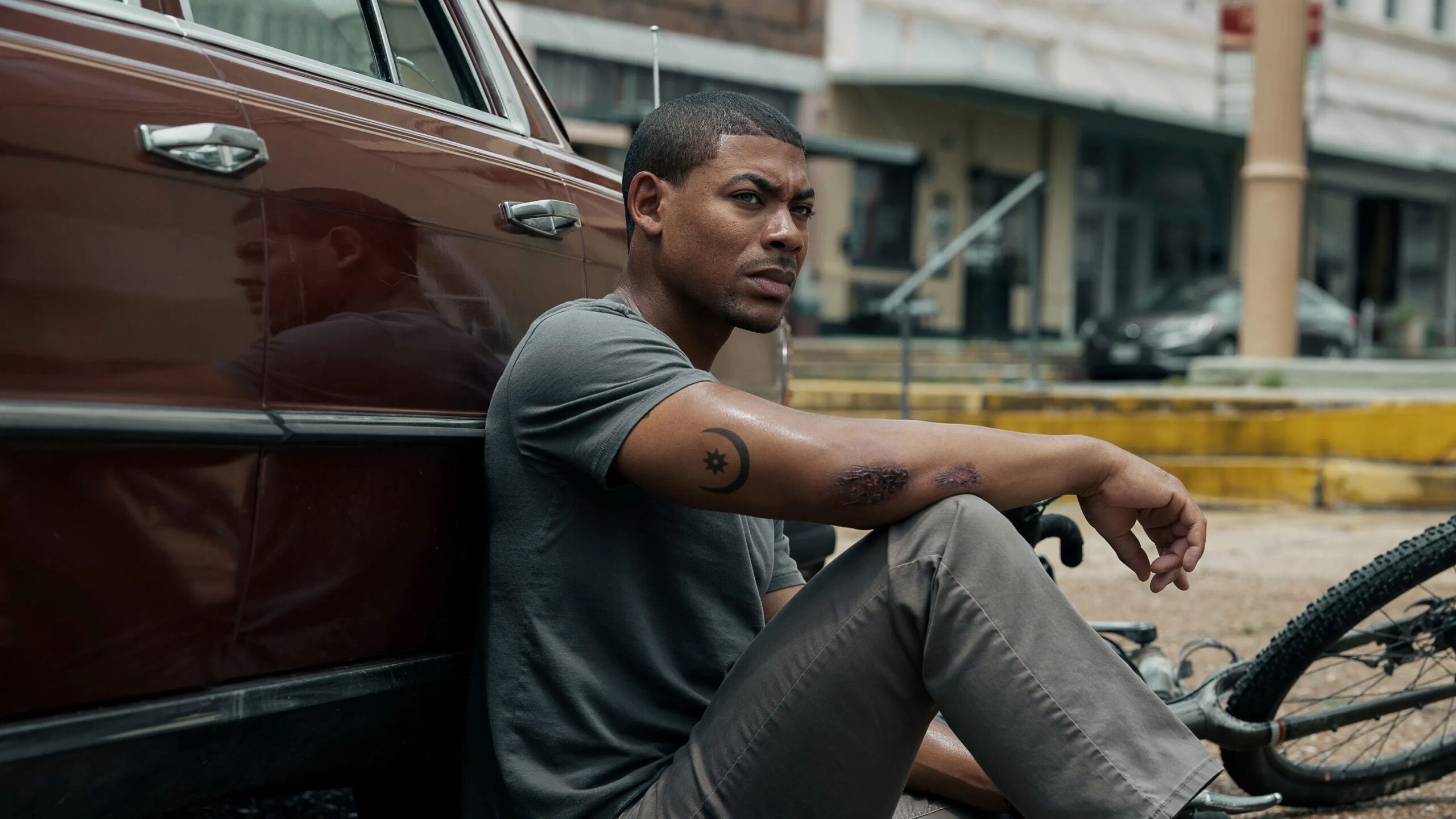
Aaron Pierre’s tattoos are easiest to see in the portraits from his Men’s Health cover interview, relaxed sofa photos and the Rebel Ridge press run. Most of the visible ink is on his right arm: black-and-grey work from shoulder toward wrist, with a smaller crescent-and-star design on the forearm in some images.
The photos show placement, shading and how the pieces connect. They don’t identify every shape or explain what it means, so this article sticks to what can be seen.
Aaron Pierre’s main arm sleeve
The largest piece covers Pierre’s right arm from the shoulder down across the upper arm and forearm. The photos show heavy black shading, grey wash and lighter gaps between the darker areas. The shapes follow the arm instead of sitting as a single rectangular panel.
In the Men’s Health cover photo, the forearm is close to the camera, which makes the contrast easier to see. Other portraits show how the design wraps around the arm. The exact forms aren’t clear enough in every photo to identify, but the sleeve reads as one connected black-and-grey composition.
The shoulder and upper-arm detail
The closer portrait gives a better look at the shoulder. Broad shaded shapes cover the rounded shoulder cap, with darker lines and smaller forms toward the centre. It’s still an editorial photograph, not a close-up of healed work, so some details remain indistinct.
Lighting changes how the grey tones read. In brighter photos, lighter wash is visible between the black areas; in darker portraits, the whole section can look almost solid. Both show different parts of the same tattoo.
The forearm section and flowing linework
Curved lines cross the forearm and link it visually to the upper sleeve. From a distance they can read as abstract shading; the available photos don’t show enough to name a particular image. Pale breaks in the skin interrupt the darker sections and keep the outline visible.
The forearm is also the most exposed part of the sleeve in short sleeves. It can be covered for a role or formal event, but it’s likely to show in everyday photos. That may matter if you’re planning a large piece in a similar spot.
A relaxed look at the sleeve
In the sofa photo, Pierre’s arm is bent, so the image shows how the ink crosses the elbow when he sits. Some darker shapes meet around the joint and shift with the angle. The sleeve doesn’t look the same in this pose as it does in a straight-on portrait.
The photo is useful for seeing the overall shape, though it isn’t clear enough to identify every small detail. The main impression is still the dense, shaded work that continues down the arm.
The smaller forearm tattoo
Some photos show a separate crescent-and-star shape on Pierre’s forearm. It sits apart from the larger shaded areas and has a simpler outline, making it easier to distinguish from the rest of the sleeve.
Pierre hasn’t publicly explained its meaning in the sources available here. A crescent and star can have different associations, so there’s no reason to assign one without his account. Visually, the smaller mark leaves a break between the larger sections of ink.
What Aaron Pierre’s tattoos say about his style
Across these images, the clearest pattern is black-and-grey shading and work that follows the shape of the arm. The photos don’t establish when each part was done or whether the sleeve was planned all at once. The available detail supports a description of its style and placement, not a timeline.
Could Aaron’s tattoos affect his acting work?
A large arm tattoo can be covered with makeup or clothing for a role. That takes time and continuity checks, particularly if a scene shows the same area from several angles. Whether to cover it depends on the character and production.
Good ideas to borrow from Aaron’s ink
If you’re planning a large piece, choose an artist whose black-and-grey work has the look you want, then talk through how separate areas will join. Leave some open skin so the design stays readable, and check how it sits with your arm both straight and bent.
Don’t copy a symbol because you think you know what it meant to someone else. Pierre’s crescent-and-star has no confirmed public explanation; your own design can start with a detail that matters to you.
Aaron Pierre discusses his work in this video interview.
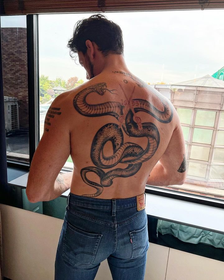
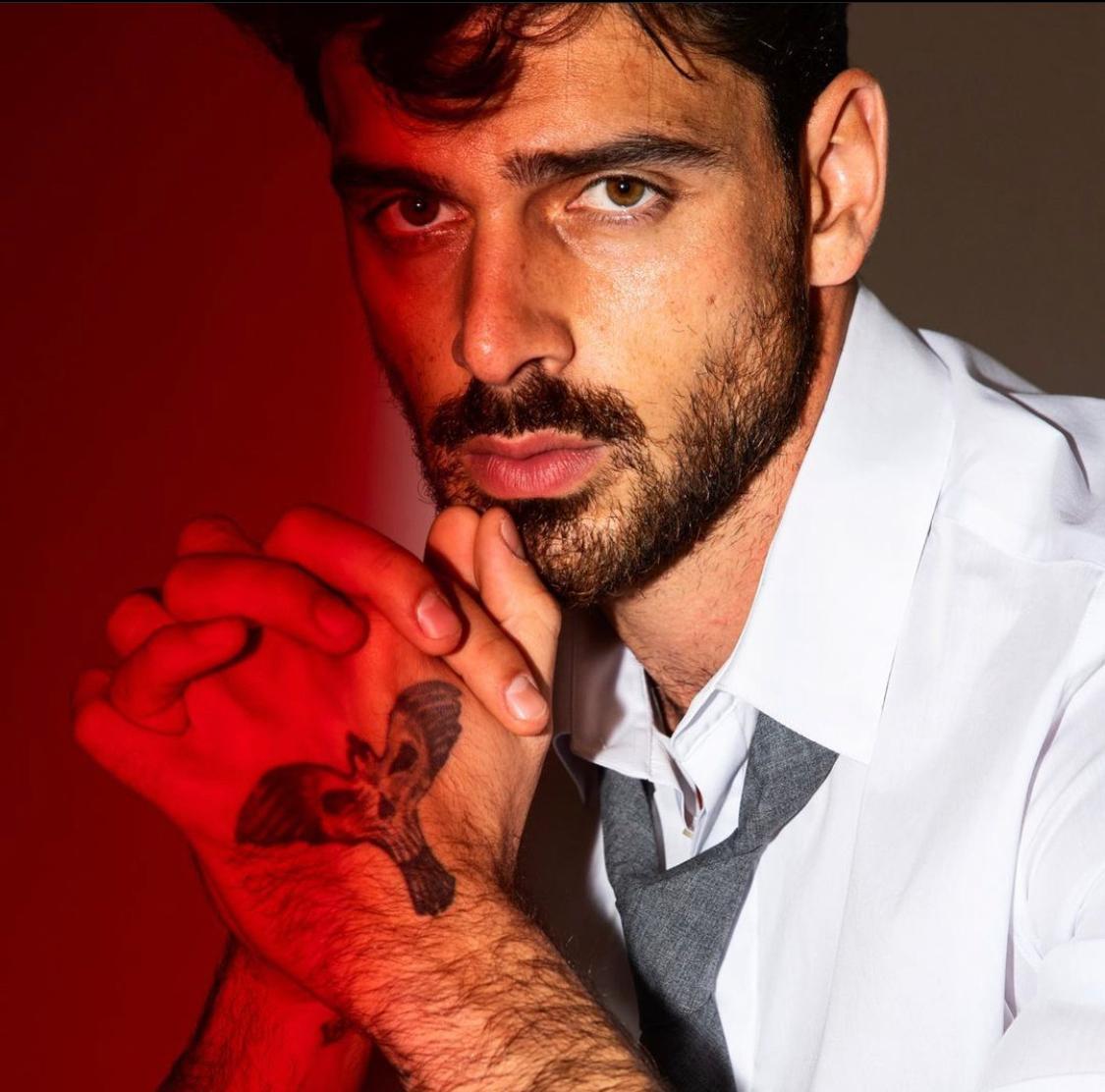
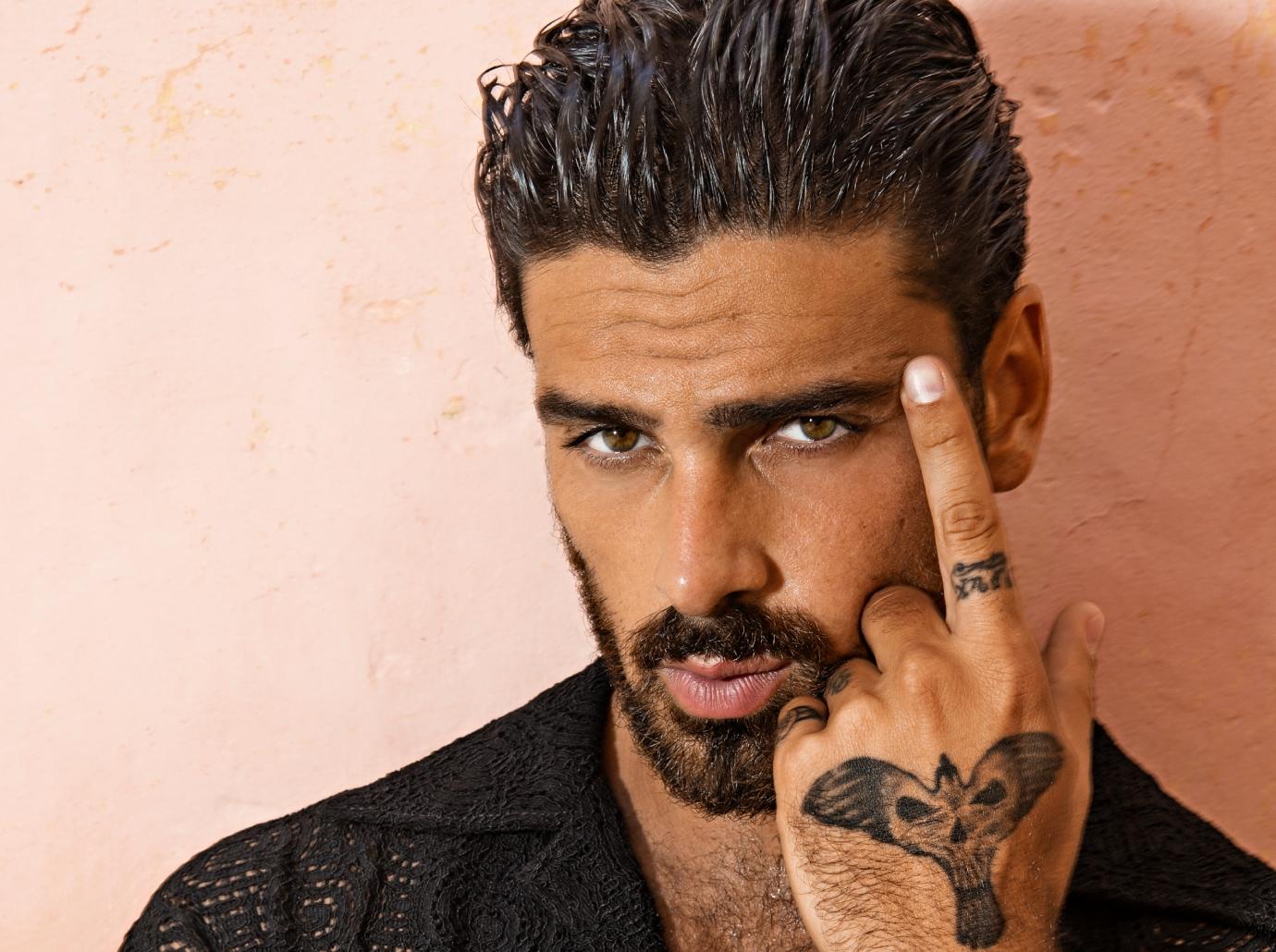
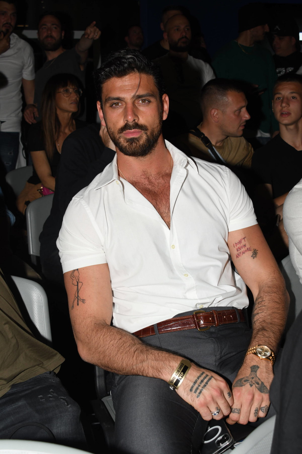
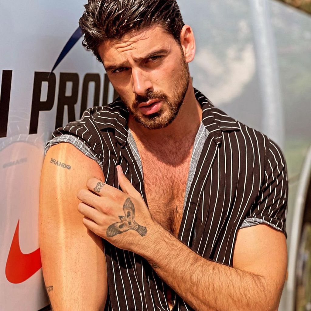
Michele Morrone’s tattoos cover his hands, arms and back, with family names, dates, script, religious imagery and larger animal designs. There isn’t a fixed public count: one Italian roundup in 2022 counted about 20, another report listed at least 19 before the back snake, and Morrone later said he had more than 30. The numbers come from different dates and ways of counting small marks. Morrone has described his body as a book, though many of the designs have no public explanation.
The two-headed snake across his back
Reported in 2022, the large two-headed snake spans Morrone’s upper back and follows the line of his shoulders. Its dark, symmetrical shape takes up far more space than a small name or date.
Morrone hasn’t publicly given the snake a meaning. The photos establish its shape, not a personal story behind it. It is a broad, graphic design that made his back a more visible part of the collection.
The phoenix and bird designs on his hands
Descriptions of Morrone’s hand ink vary. Some reports call the left-hand design a phoenix with a skull detail; others use “bird” or “winged” as a broader label. The accounts may describe the same central image from different angles, so they shouldn’t be counted as separate tattoos without clearer evidence. The photographs show a dark piece with feather-like forms and a skull-like element.
Morrone has said people recognize him by the tattoos on his hands, even when he wears a mask. Other inventories list a cross, script and a short number near the hands, though cropped photos don’t always make their exact placement clear.
Family names, dates and script on his arms
Several of Morrone’s tattoos refer to family. Brando on his upper arm is his son’s name; reports also connect Marcus to his other son and Cloud to the family dog. The date 18.04.2003 has been linked in coverage to his late father, though the public account doesn’t explain more.
One Italian sentence on his body has been translated as “Everyone will come to my funeral to make sure I’m dead.” Translations can differ, so that wording is best treated as the reported version. Another set of initials, AMS, was linked by fans to his 365 Days co-star Anna-Maria Sieklucka. Morrone later said the letters refer to his sisters; reports identify them as Angelica, Margherita and Stefania.
Published inventories also mention a cross, religious lettering, Our Lady of Aparecida, and crossed swords with the year 1955. The designs are visible or documented, but Morrone hasn’t publicly explained all their meanings. The same applies to several smaller lines of script.
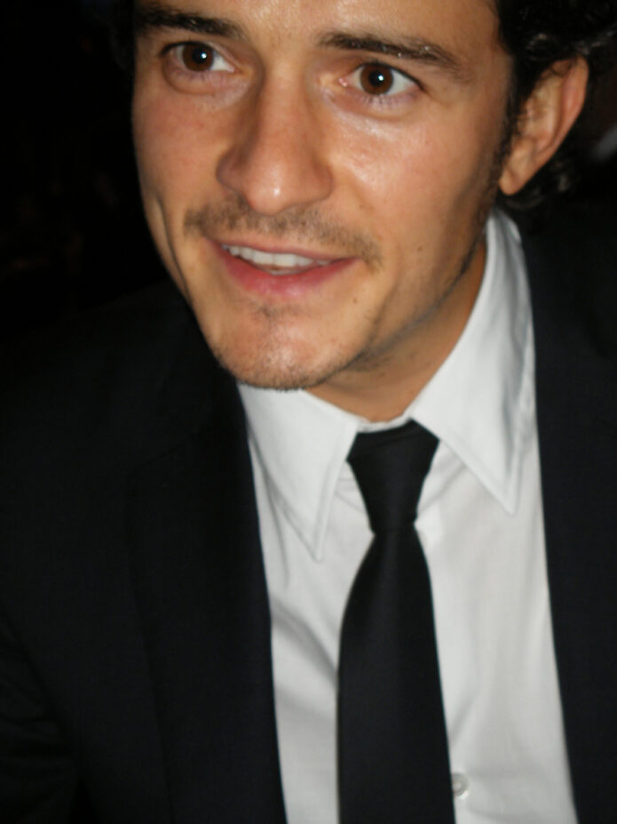
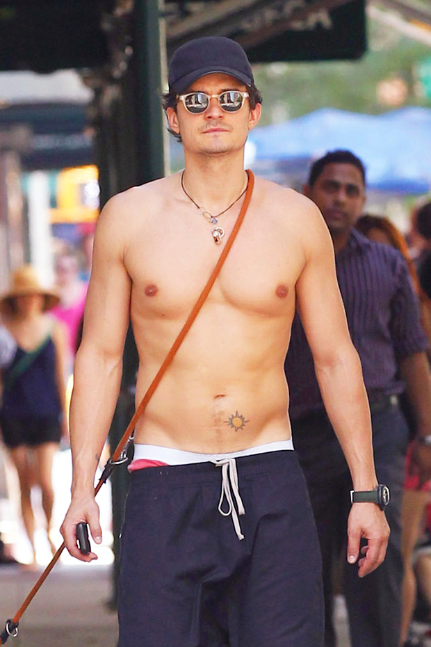
Orlando Bloom’s tattoos are a good reminder that a small collection can still have plenty of personality. He has a permanent sun on his lower abdomen, the Elvish word for “nine” on his wrist, and a newer tribute tattoo for his dog Mighty. He also has a Morse code forearm tattoo tied to his son Flynn. That mix makes his ink fun to look at because every piece has a different job.
Some designs are tied to a role. Some are about people he loves. Others are simply old marks that have stayed with him for years. If you’re looking for ideas, Bloom’s collection is useful because it covers a few different directions: fine lettering, a small symbol, large blackwork and a realistic chest layout. Here’s what each tattoo is doing and why the overall set still feels relaxed rather than overworked.
Orlando Bloom’s chest bird tattoos make a bold first impression
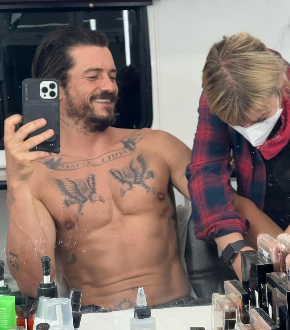
The chest photo shows Bloom with two dark birds spread across his pectorals, with a banner running above them. The placement is wide and symmetrical, so it reads clearly even from a distance. It has the visual weight people usually want from a chest piece, but the birds keep the design from feeling like a solid block of ink. Their wings create movement across the chest while the banner gives the eye a horizontal line to follow.
For tattoo inspiration, the useful part is the layout. The two birds sit far enough apart to leave breathing room in the center, and the banner ties the sides together without filling every inch. That can be a better starting point than copying the exact artwork. A pair of birds, swallows or ravens can be arranged in the same way, then drawn in a style that fits your own taste.
The linework in the image looks softer than a fresh tattoo photo because the ink has lived on the skin for a while. That doesn’t hurt the idea. In fact, it shows how a black and grey chest tattoo can settle into a more worn-in look and still hold its shape. If you’re planning a similar piece, ask your artist how much open skin should stay around the birds. The negative space matters just as much as the wings.
The banner also shows why chest lettering needs a good curve. Straight text can look stiff when it crosses a rounded body area. A gentle bend follows the chest and keeps the words readable when the body moves. Bloom’s piece is a nice example of using the anatomy instead of fighting it. The result feels personal, bold and a little old-school without being too busy.
The Mighty chest tattoo keeps the tribute small and personal
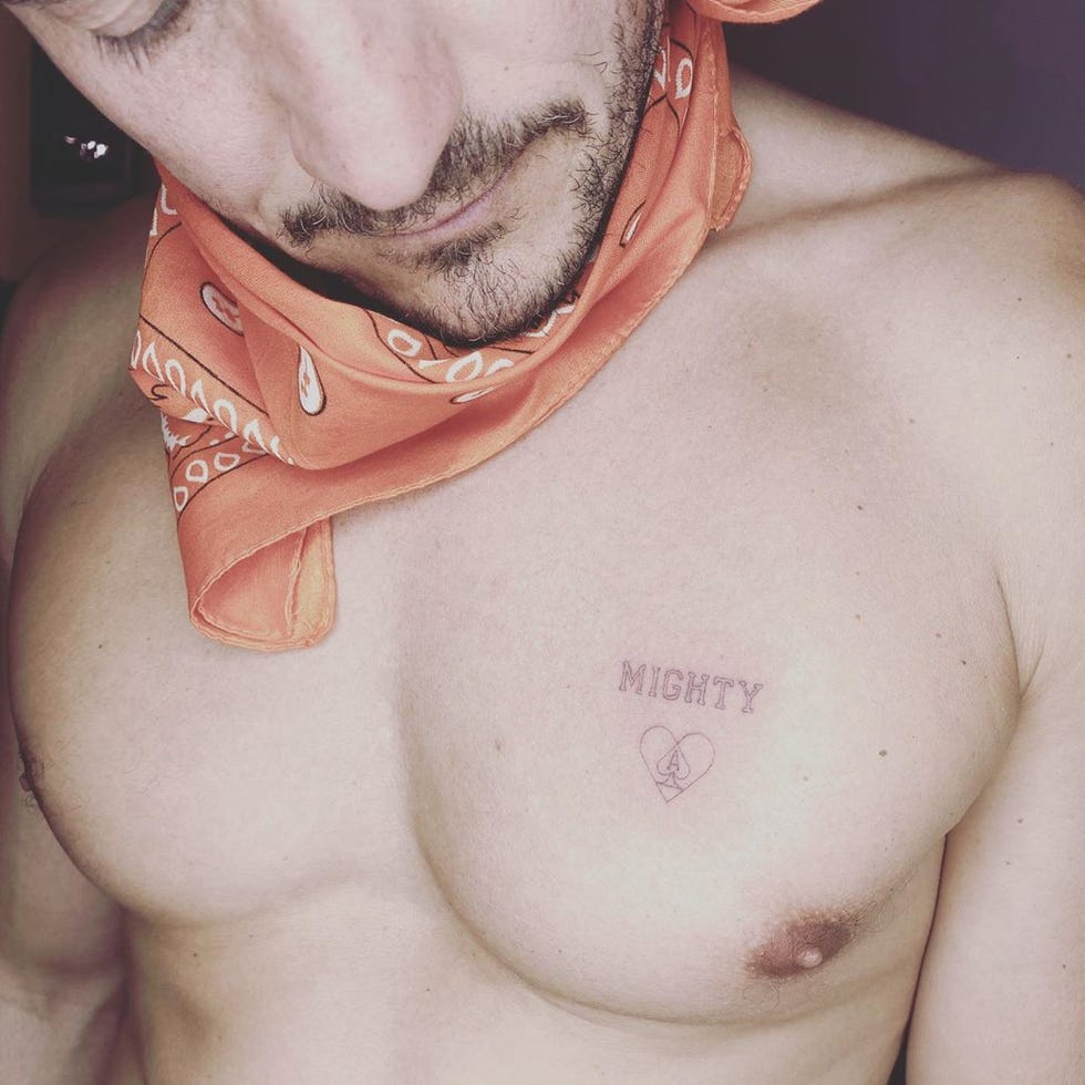
Bloom showed the tattoo for his late dog Mighty in a close-up photo. It reads “MIGHTY” above a small heart outline, with a tiny mark inside the heart. The design sits high on the chest and stays deliberately simple. There isn’t a big portrait or a wall of text. The name does the talking, and the heart gives it a soft visual finish.
This is the kind of memorial tattoo that works because it doesn’t try to explain every detail of the relationship. A pet’s name, a date, a small outline or one shared symbol can be enough. The strongest memorial pieces often leave room for the memory to stay personal. Bloom’s tattoo has that feeling. You can understand what it means without needing a long caption.
The lettering is also worth studying. The word is large enough to read but thin enough to sit comfortably above the heart. That balance keeps the tattoo from looking like a logo. If you’re considering a name tattoo, bring your artist a few examples of letter styles, then let them adjust the spacing for your skin and the size you want. Small changes in width can make a big difference once the ink settles.
Placement changes the mood too. On the chest, the tattoo is close to the heart without landing in the center of it. That makes the tribute feel private, even though the image was shared publicly. You could get a similar idea over the ribs, near the collarbone or on the upper arm. The design doesn’t need to match Bloom’s placement to keep the same quiet tone.
One small detail makes this piece feel more complete: the heart isn’t treated like a heavy, filled-in icon. It stays light and open. That choice helps the word remain the focus and gives the tattoo an easy, everyday look. It’s a good example of how a simple memorial tattoo can be emotional without becoming visually loud.
The Elvish “nine” wrist tattoo is the signature piece
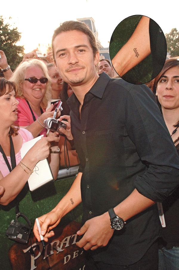
Bloom’s most famous tattoo is the Elvish word for “nine” on his right wrist. He got it with other members of The Lord of the Rings cast as a reminder of the nine members of the Fellowship. The placement is small, easy to cover and easy to show when he turns his hand. It also connects the tattoo to one of the roles people know him for, which gives the design a story before you even see the lettering.
What makes this piece work is its restraint. The script is compact, but it isn’t hidden in a crowded sleeve. The wrist gives it a natural frame, and the vertical shape follows the length of the arm. If you like the idea of a meaningful word in another writing system, take the translation seriously before booking the appointment. Use a trusted source, confirm the characters with someone who can read them and remember that a small mistake will stay small forever.
Matching tattoos don’t have to look identical on every person. The Fellowship tattoos share the same idea, but the final result depends on wrist size, skin tone, angle and how the artist places the lines. That’s useful if you’re planning a group tattoo. Agree on the core design, then allow each person a little room to make it fit their body. The shared meaning matters more than perfect tracing.
A wrist tattoo also gets plenty of wear. Sleeves rub against it, hands see sunlight and the skin bends all day. Fine lettering can soften over time, especially when it’s small. That doesn’t mean you need to make the design huge. It does mean the artist should leave enough space between the characters for the lines to age without merging together.
Bloom’s piece stays memorable because the story and placement do the heavy lifting. It isn’t trying to be a full wrist wrap. It is one compact word linked to a specific chapter of his life. That is a strong formula for anyone who wants a fandom tattoo that feels personal instead of looking like random franchise branding.
The Morse code forearm tattoo turns family details into ink
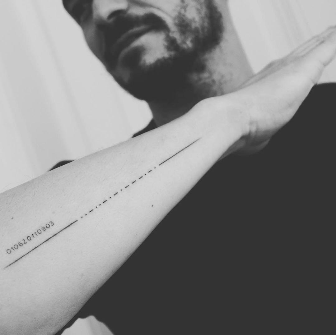
Bloom’s Morse code tattoo runs along his forearm as a quiet tribute to his son Flynn. From a distance, it looks like a neat line of numbers and marks. Up close, the dots, dashes and spacing turn it into a private message. That is part of the appeal. The tattoo can carry a full name or date without announcing the meaning to everyone in the room.
The design is a good example of how coded lettering can make a personal tattoo feel less obvious. You still get the rhythm and texture of a text tattoo, but the finished piece reads more like linework than a sentence. If you like the idea, start with the exact word or date you want to encode, then have the translation checked before the stencil is made.
Bloom’s tattoo also shows why a second check matters with any Morse design. Reports around the first version said a dot was missing and the mark was later corrected. That is an easy mistake to make when a small symbol carries the whole message. Ask for the code to be reviewed by more than one reference and compare the final stencil with the version you approved.
A long, narrow forearm placement gives the sequence room to breathe. The line follows the arm instead of being squeezed into a tiny block, and the open skin around it keeps the marks readable. Sunlight, sleeves and daily movement will still soften fine work over time, so spacing matters as much as the ink itself. Clean gaps help a coded tattoo stay clear as it settles.
If you want a Morse code tattoo, choose a name, date or short phrase that will still matter years from now. Keep the design honest and let the pattern do the visual work. Bloom’s piece is a relaxed idea for anyone who wants a family tattoo that feels meaningful up close without looking like a standard name band.
The sun tattoo is simple, old and easy to miss
Bloom’s sun tattoo sits low on the left side of his abdomen. In a shirtless street photo it looks small and uncomplicated, with a dark outline and short rays around the center. He has had it since he was young, which gives it a different role from the newer Mighty tribute and the movie makeup designs. It is the sort of tattoo that can disappear under clothes for most of the day, then show up when he is at the beach or between takes.
Small sun tattoos are popular for a reason. The shape is easy to understand, and the design can be adjusted in hundreds of ways. You can use thin rays, thick rays, a face, a geometric center or a simple black disc. The placement also gives you options. A sun can sit on the ribs, shoulder, wrist, ankle or lower stomach without needing a large surrounding scene.
Bloom’s version has an older, straightforward feel. It isn’t trying to be photorealistic or packed with tiny shading. That simplicity helps it age. Small symbols tend to hold up better when the artist avoids details that are too fine for the final size. If you’re getting a small sun, ask to see the stencil from a normal distance, not only close to the skin. You want the shape to read in one glance.
The lower abdomen can be a sensitive placement, and the area changes with movement and weight. Talk through the exact position before the stencil goes on. A design that looks centered while standing can shift visually when you sit or bend. That sounds obvious, but it is one of those small choices that separates a tattoo you love from one you keep adjusting in the mirror.
Bloom’s collection lands in a nice middle ground. The big chest imagery gives it presence, while the sun, wrist script and memorial lettering keep it tied to small personal marks. There is no need for every tattoo to follow one style. The trick is to give each piece a clear reason for being there and enough room to breathe around it.
Why Orlando Bloom’s collection still feels relaxed
The easiest way to read Bloom’s tattoos is as a mix of chapters. The Elvish wrist script points back to a shared film experience. The sun is an old personal symbol. The Mighty tattoo is a direct tribute. The Morse code forearm piece shows how a private message can become clean, readable body art, while the bird chest piece brings a larger, more classic tattoo layout into the picture.
That variety is useful if you’re building your own collection. You don’t have to force every design into one visual theme. You can keep one tattoo tiny and private, make another one a bold chest feature and use lettering when the words matter. Just pay attention to scale, spacing and how each placement moves. Those practical choices will make a mixed collection feel intentional.
The best takeaway from Orlando Bloom tattoos isn’t one exact symbol. It’s the idea that a tattoo can be meaningful without being loud, and bold without covering every inch of skin. Start with the story you want to keep, choose a placement that suits it and let the design stay as simple as it needs to be.
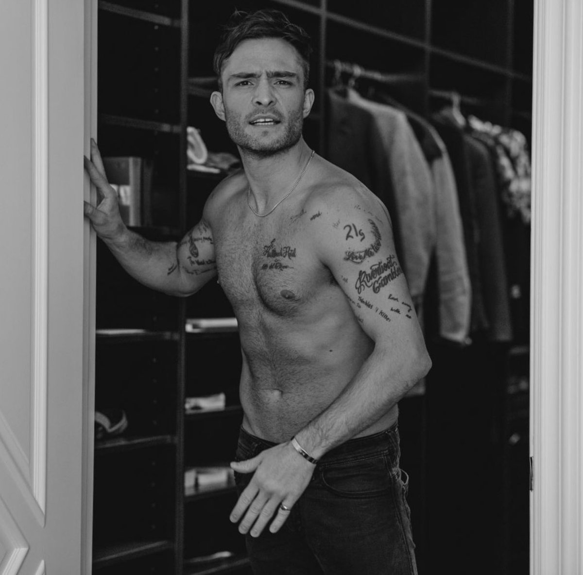
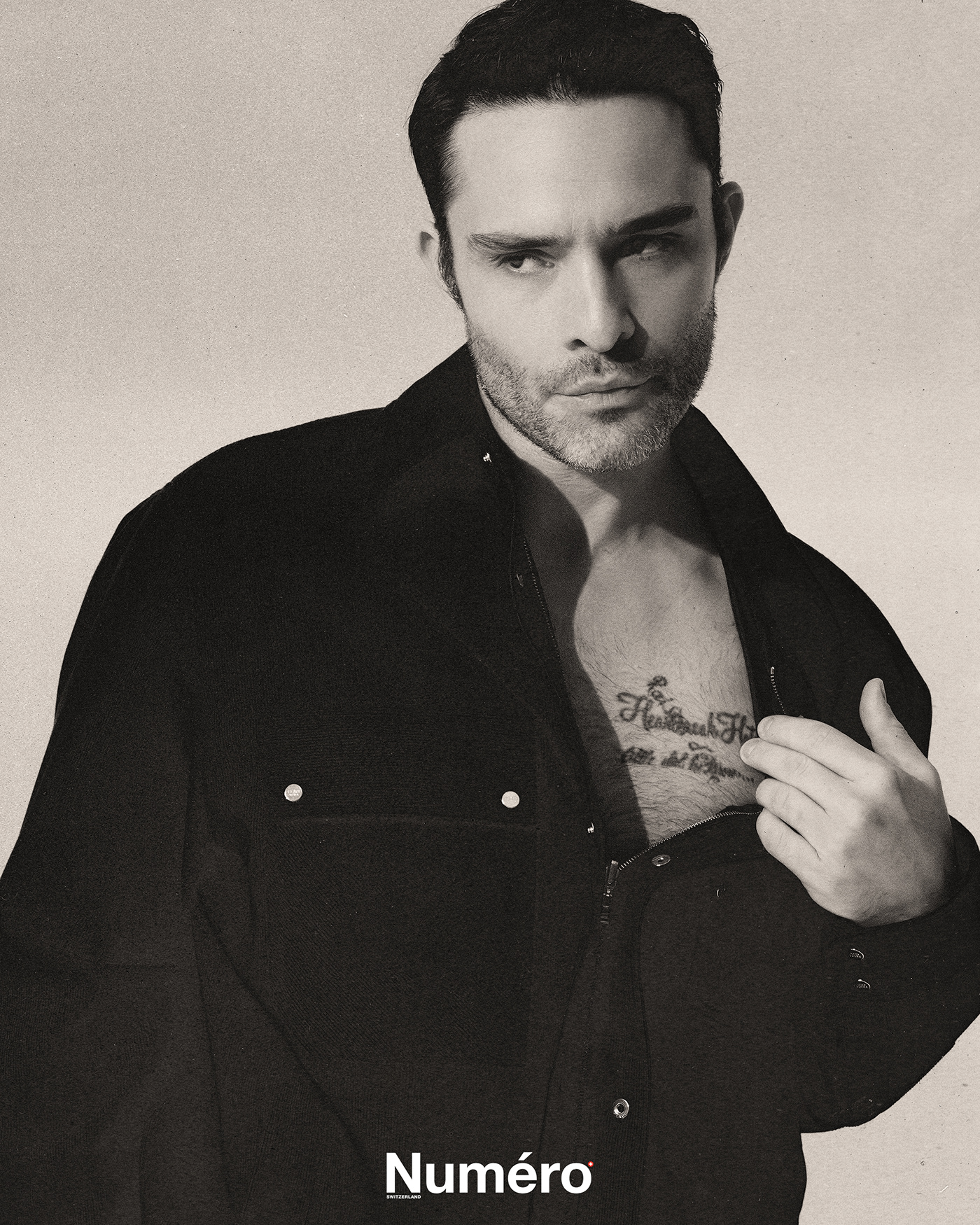
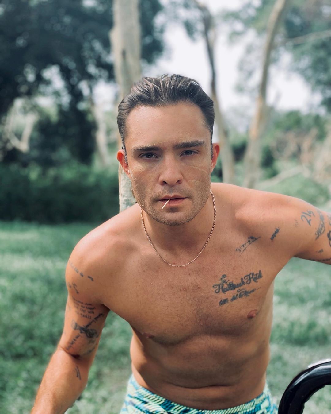
Ed Westwick’s tattoos read like snapshots from different parts of his life. The actor, known for playing Chuck Bass, has song titles, short phrases, a feather, a pin-up, and smaller lettering across his chest, shoulders, and arms. His collection feels like a stack of memories rather than one planned costume.
The tattoos don’t all match, and Westwick hasn’t tried to make them look like one sleeve. A lyric, a symbol, or a phrase that makes him laugh can sit beside the next idea as the collection grows.
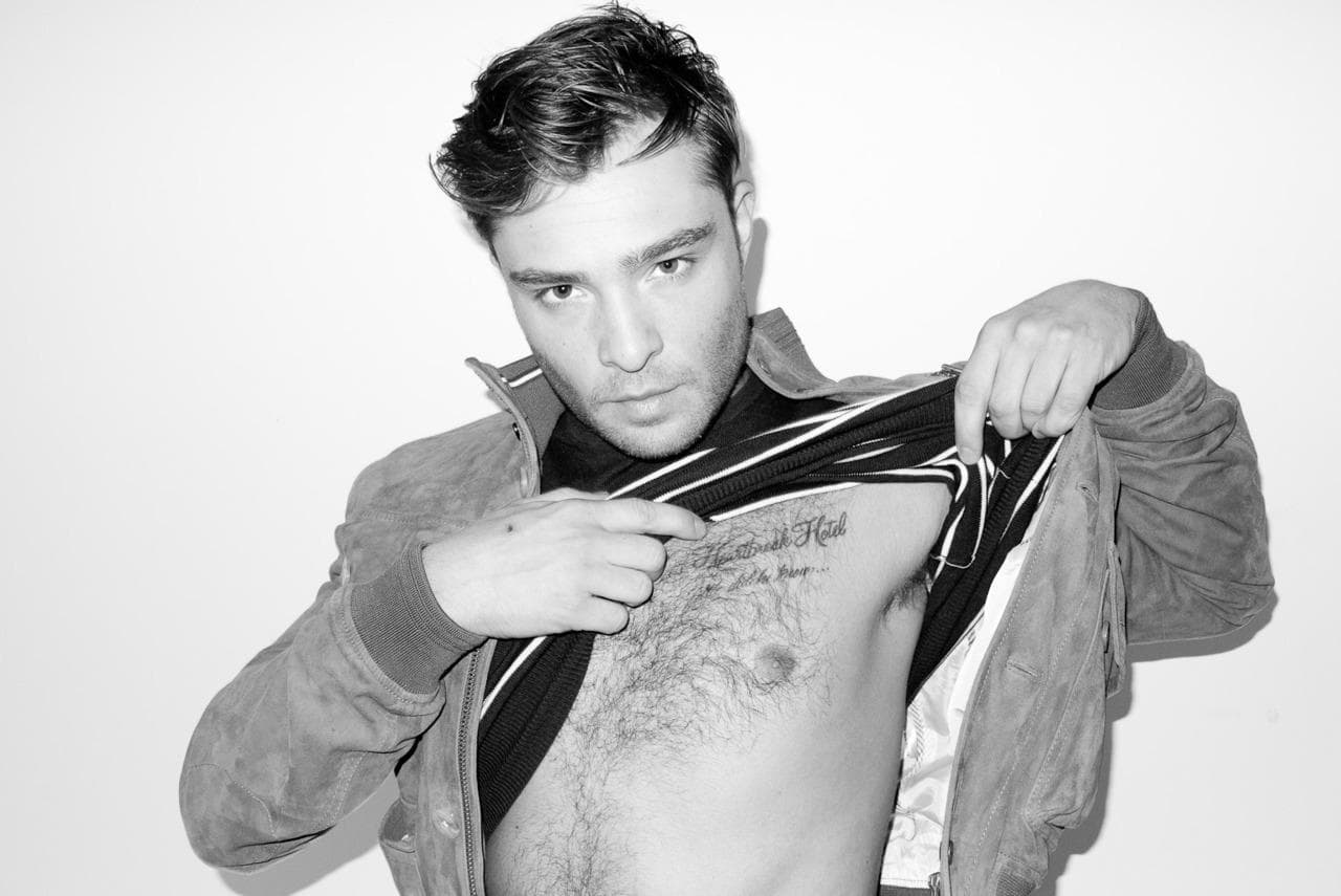
Westwick has talked in interviews about the Elvis reference on his chest and the Doors lyric on his shoulder. Close-up photos show the lettering; wider shirtless views show how the pieces sit together. Here’s a look at the main tattoos and the details behind them.
Heartbreak Hotel gives the chest a clear musical anchor
Westwick’s scripted “Heartbreak Hotel” sits across his chest. He has said it’s a nod to Elvis Presley. The words sit high enough to show when his shirt is open, making the tattoo part of his everyday look.
The script is loose and slightly rough, but easy to read. Chest skin curves and hair can soften the edges, so fine or tightly packed letters might disappear in a photo. Westwick’s lettering leaves room around each word.
A song title can give a chest tattoo its own mood without explaining a whole story. “Heartbreak Hotel” sounds dramatic, but it doesn’t spell out one specific breakup. If you want a lyric or title, choose a phrase that keeps a feeling, period, or artist close to you.
Chest lettering can be covered by a regular shirt and shown when the collar is open. That mix of visibility and control is one reason chest lettering stays popular. It can be part of your style without being visible in every setting.
The chest phrase gives Westwick’s collection a centre. From there, the smaller arm pieces draw the eye outward. The later tattoos don’t need to follow the same subject or line weight for the collection to feel personal.
21 Grams turns a small shoulder phrase into a talking point
“21 Grams” sits below one of Westwick’s shoulders. The phrase refers to the old idea that the human soul weighs twenty-one grams. Whether you take it literally or like its mystery, the words are short and easy to recognise.
A shoulder gives a brief phrase enough room to sit by itself. Westwick’s placement separates it from the chest lettering, so the two pieces don’t blur together in a shirtless photo.
The tattoo doesn’t need an illustration around it. The spare lettering leaves the meaning open, and the shoulder keeps it away from the busier upper-arm work. Sometimes a small tattoo feels stronger because it refuses to over-explain itself.
Letter size matters. Tiny lettering can look sharp on the day it’s done and become harder to read as it ages. Ask your artist what size will hold up on your skin, then check the stencil with your arm hanging naturally. It may sit differently when you relax than when you pull your shoulder back.
The phrase adds a reflective note beside Westwick’s music references. Not every tattoo in a collection has to point to the same theme.
Love Me Two Times brings a Doors reference onto the shoulder
“Love Me Two Times” is a reference to a song by The Doors. The phrase sits across Westwick’s shoulder, working as music memorabilia and as a playful line of text. It’s longer than “21 Grams,” but the shoulder gives it room to follow the body.
A music tattoo could use an album image, band symbol, handwritten lyric, or a title that fans recognise. Westwick chose the words themselves. The design stays simple, but it gives people who know the song something to ask about.
The shoulder offers a natural path from the upper arm toward the back. Script placed across the muscle can look uneven from the side, so the stencil should be checked with the arm down and raised.
There’s restraint in keeping the title on its own. When the words are already doing the emotional work, a clean placement can be enough. That also leaves open skin for other tattoos later.
The Elvis and Doors references make Westwick’s collection feel like a record shelf: different artists and songs represented in different places. Choose references you expect to care about beyond the current trend.
I Heart Romance shows the value of a slightly odd idea
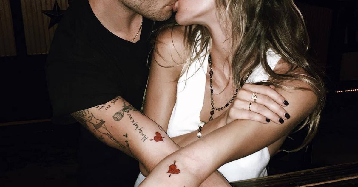
“I Heart Romance” is on Westwick’s forearm. He has said he saw the words written in a Brooklyn bathroom stall and thought they were cool, so he got them tattooed. It’s a more casual story than the Elvis tribute, which is part of why the tattoo sticks in people’s minds.
Some tattoos come from a phrase that makes you laugh or catches you at the right moment. Westwick put this one on his forearm, where other people can see it. It feels more like a conversation starter than a private message.
The inner forearm is a popular place for lettering because it’s relatively flat and the wearer can read it easily. It’s also visible in short sleeves and gets sun, so aftercare and sunscreen matter if you want the contrast to last.
If you find a phrase in an unexpected place, write it down and live with it for a while. Ask yourself whether you like the words themselves or only the story of where you saw them. A tattoo can start as a joke and still deserve a little planning before it becomes permanent.
“I Heart Romance” adds some humour beside the more deliberate music references. One tattoo can be researched; another can come from an impulse that stayed with you.
The feather and arm pieces make the collection feel lived in
Westwick’s arm tattoos include a large feather on the back of his left arm and a pin-up on his upper right arm. Wider photos also show smaller lettering, much of it hidden when he wears a jacket. These pieces make the collection look like something built over years rather than a short list of famous tattoos.
The feather has a clear outline from a distance, while its barbs give the artist detail to work with up close. With different outlines and shading, feather tattoos can look delicate or bold. Westwick’s has enough weight to sit beside the larger upper-arm piece.
The pin-up has a more traditional, mischievous feel. Westwick has spoken about the tattoo and about his mother disliking it. You don’t need the same image to take the idea: a tattoo can record a family joke, a rebellious phase, or a sense of humour.
Smaller phrases sit around the arm work like notes from different years. If you’re adding a tattoo, consider the gaps as well as the image itself. You don’t have to fill a sleeve in one appointment; open skin can keep each piece readable and leave room for another idea.
Take a step back before choosing the next spot. Look at your arm with the elbow bent, straight, and resting at your side. The best next piece is the one that improves the whole arm, not just the empty patch you noticed first. Westwick’s collection gives the eye several different shapes and sizes to move between.
His tattoos don’t have one mood: Elvis, The Doors, a thought about the soul, a phrase from a bathroom wall, a feather, and a pin-up. Some were carefully chosen; others feel like snapshots of a particular age. If you like that approach, start with one idea you’ll still enjoy explaining years from now, give it room, and let the rest of the collection grow at its own pace.
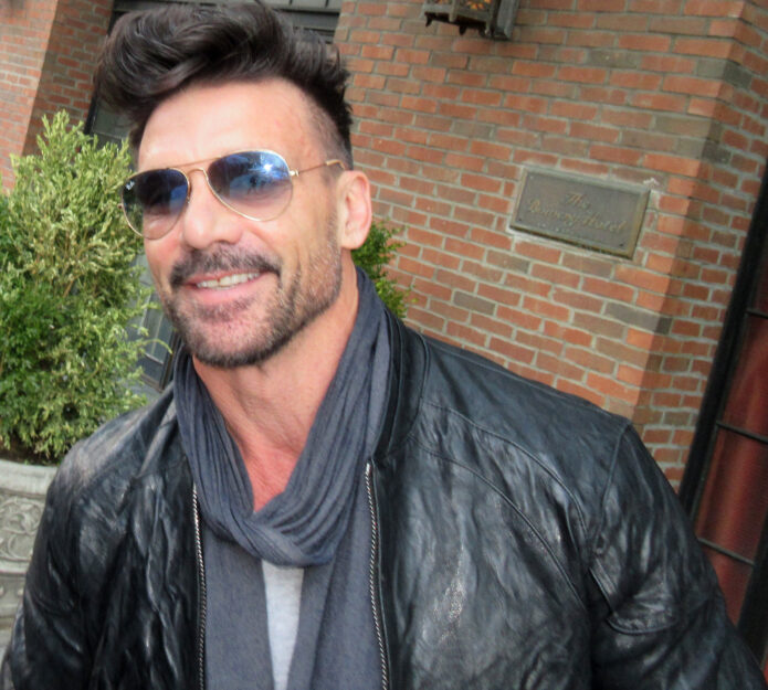
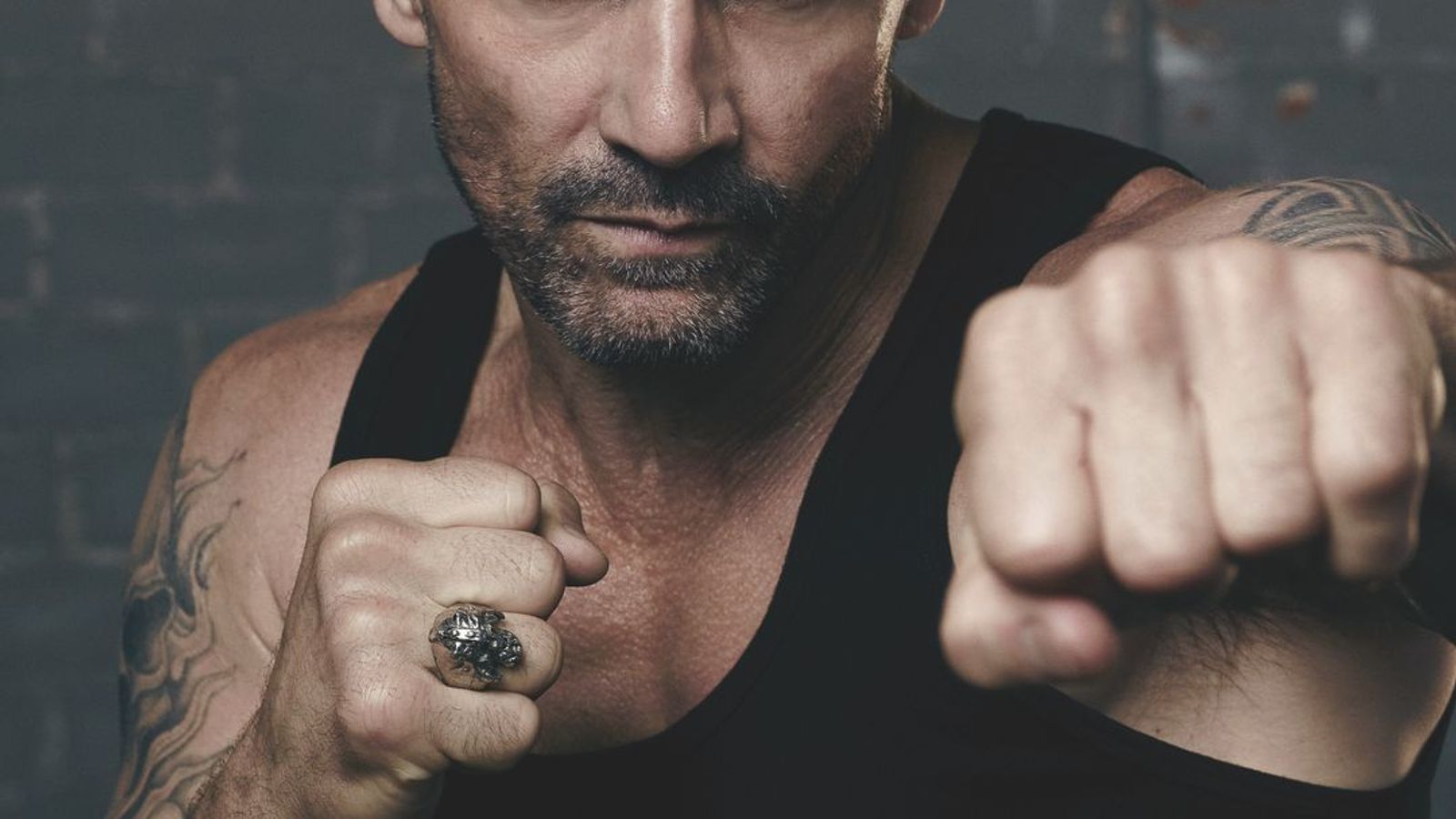
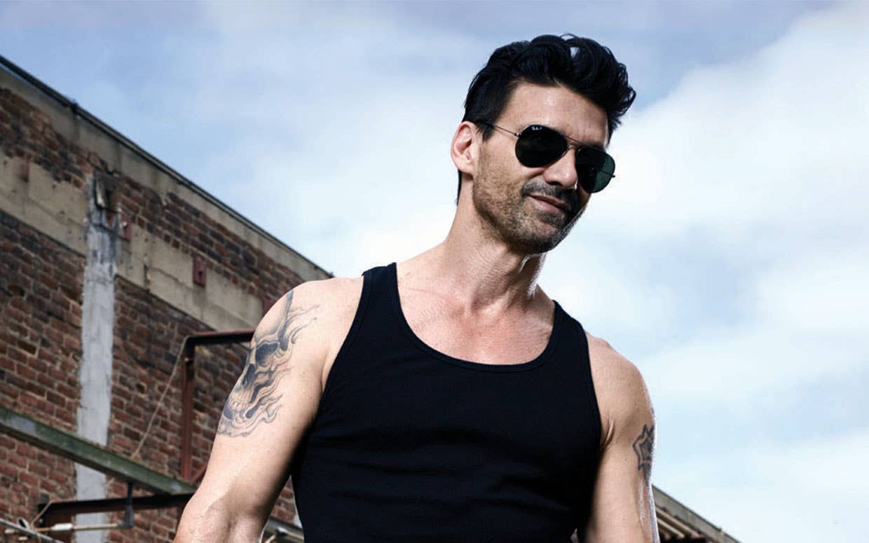
Frank Grillo’s tattoos make sense the second you see him in a tank top. The actor and lifelong combat-sports obsessive wears his ink in the same easy, unfussy way he carries himself on screen. There are bold upper-arm pieces, compact symbols, Thai-inspired work and lettering that gets noticed because it sits on a body built for movement.
That is the fun of Frank Grillo tattoos. The collection isn’t one giant matching sleeve, and it doesn’t need to be. Some pieces are dark and graphic, some are fine and personal, and the mix feels like a record of different chapters. Grillo has spoken about getting traditional tattoos in Thailand after training there, including the ritual and the atmosphere around the appointment. The pictures also show a man who likes ink with presence, whether it is a large cross on the shoulder or a small symbol tucked into the arm.
Here’s a laid-back tour of the designs that stand out most. If you’re collecting ideas for your own arm, the useful lessons are less about copying Grillo’s exact images and more about choosing a strong shape, giving the placement room and letting personal meaning show up without turning every tattoo into a caption.
Frank Grillo’s cross tattoo gives the upper arm a bold anchor
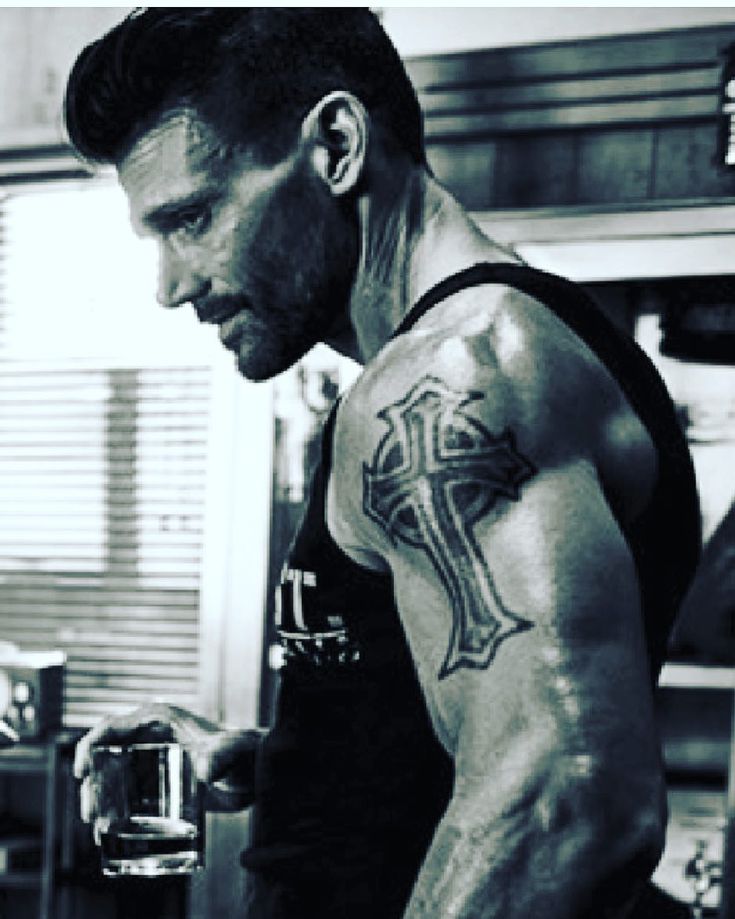
The cross on Grillo’s upper arm is the kind of tattoo that reads clearly before you get close. It has a strong outline, a dark centre and enough scale to hold its own against the shoulder and bicep. The shape is familiar, but the thick treatment keeps it from looking like a tiny flash design lost in the middle of the arm.
Large religious symbols often work best when the placement does some of the design work. The shoulder is rounded, the bicep changes shape when the arm bends and the upper arm is visible from the front and side. A cross placed there can feel like part of the body instead of a sticker pressed onto it. Grillo’s piece uses that advantage. The arm gives the image a natural frame.
There is also a nice bit of restraint in the composition. The design doesn’t seem to depend on lots of extra rays, banners or tiny lettering. The main silhouette does the talking. When a tattoo has one clear shape, it often ages more confidently than a design that tries to explain everything at once.
If you like this direction, decide first whether the cross should feel sharp and architectural, weathered and traditional or soft and realistic. Show your artist the mood rather than bringing a picture to copy line for line. They can adjust the width, the negative space and the way the arms of the cross follow your muscle. A few millimetres can make a big difference on a curved upper arm.
His shoulder and bicep ink uses heavy contrast instead of a packed sleeve
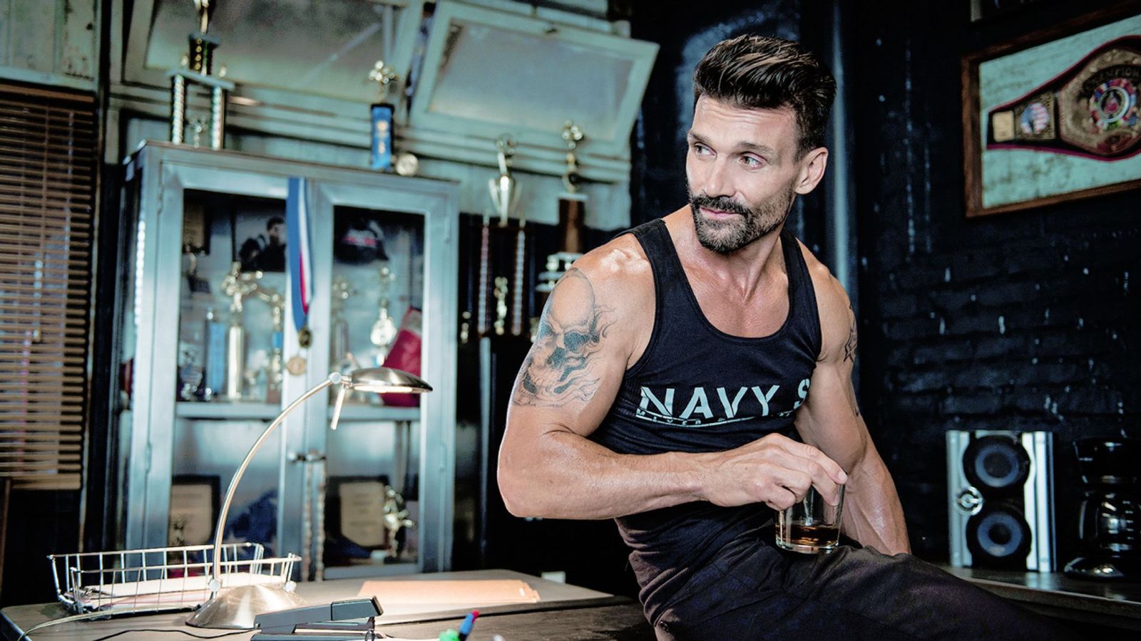
Grillo’s arm tattoos don’t all blend into one solid sleeve. In several portraits, you can see individual pieces sitting beside open skin. That spacing gives the collection a tougher, more casual feel. The work looks lived in, not overly planned, which suits somebody whose style is more gym, boxing ring and black T-shirt than polished red carpet.
The tattoo visible on the shoulder has a broad, dark presence. Around it, smaller marks and lettering create a change of pace. This is a useful approach for anyone who wants multiple tattoos but isn’t ready to commit to a full sleeve. You can start with one strong upper-arm piece, leave a little air around it and add the next design only when it earns its place.
Contrast matters here. A big black-and-gray piece can carry the visual weight, while smaller linework keeps the arm from becoming one flat block. Open skin is part of the composition, not an unfinished mistake. It lets the eye move and makes each tattoo easier to recognise from a distance.
Before filling gaps, live with the first design for a while. Wear a vest, train, sit at a desk and look at the arm in normal light. You’ll learn which angles you actually like and whether the next piece should match the first or push in a different direction. Grillo’s arm work is a good reminder that a collection can look complete without every inch being covered.
Frank Grillo’s Thai tattoos bring travel, ritual and balance into the collection
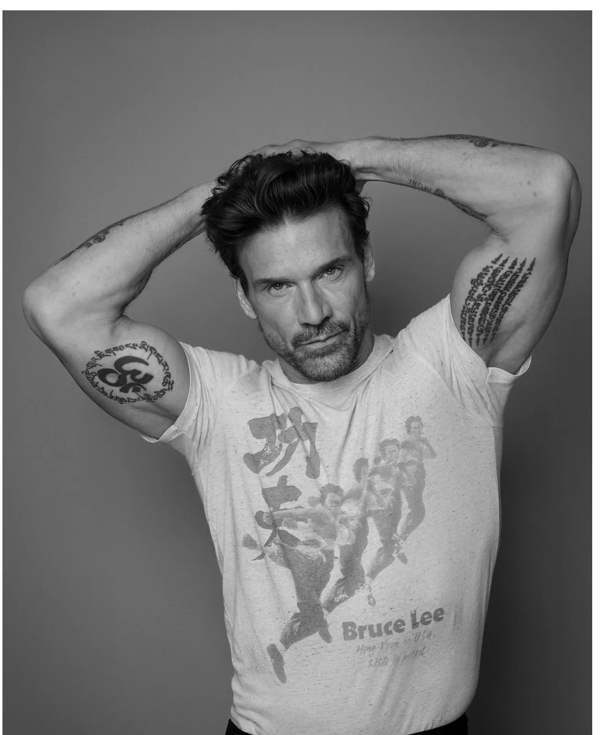
The most personal part of Grillo’s tattoo story is tied to Thailand. He has described training there, watching fighters with traditional body art and deciding he wanted to experience the process himself. He has also talked about the ceremony around the tattoo, including chanting, gold leaf and the unusual moment when the finished work was revealed.
He went back for another piece because he likes balance. That detail says a lot about how people build a collection. Sometimes a new tattoo isn’t only about the picture. It changes how the body feels visually. One arm may look heavier, one shoulder may feel empty or two designs may need a partner before the whole arrangement feels right.
The Thai-style work visible in Grillo’s photos uses compact symbols, script-like marks and a vertical layout that follows the arm. It doesn’t have the wide, poster-like shape of his cross. Instead, the tattoo feels closer to the skin and more connected to the path of the limb. Different designs can live together when they share a sense of direction, even if their linework is not identical.
If you’re inspired by Sak Yant tattoos, slow down and learn what the symbols mean before booking. These traditions carry cultural and spiritual weight, and the right approach is respect rather than grabbing a design because it looks cool in a photo. You can take inspiration from the balance, placement and rhythm while working with an artist who can create a piece that is personal to you.
The small bicep symbol proves that Grillo tattoos don’t all need to be huge
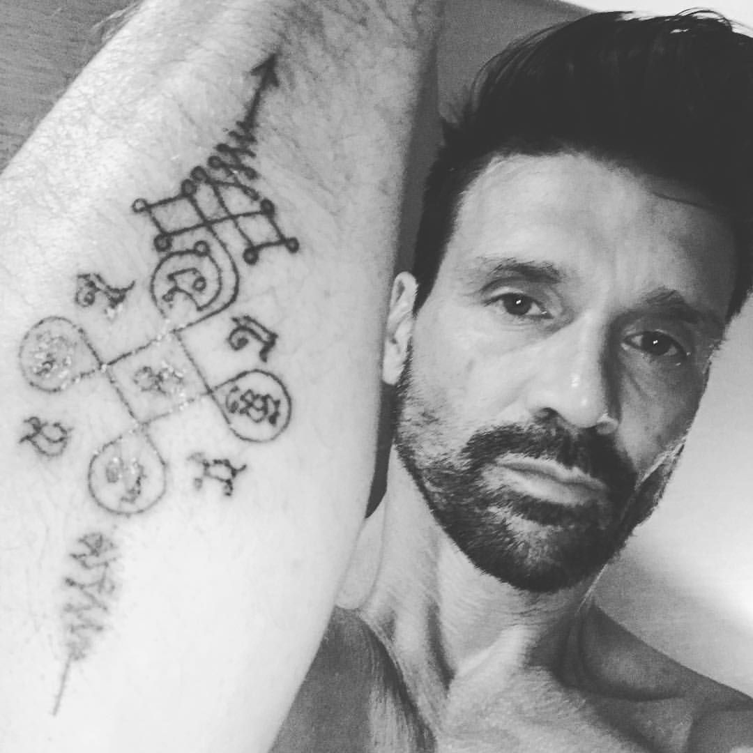
One of the best details in Grillo’s tattoo photos is the smaller symbol on the inside of the bicep. It sits close to the muscle, has a compact shape and becomes visible when he points toward it. That kind of tattoo can feel more private than a design placed on the outer arm, even when it is technically easy to show.
Small tattoos are often treated as the simple option, but they need just as much planning. Fine lines can soften, tiny gaps can close and a design that looks crisp on a screen may need to be simplified before it goes on skin. The shape on Grillo’s arm works because it has a clear centre and doesn’t try to carry too much detail.
The inner bicep is also a practical place for a personal mark. It can be covered by a shirt, then revealed when you move. That makes it a good spot for a date, a symbol connected to family or a reminder that doesn’t need to be announced all day. A private tattoo can still have a strong visual identity.
When you’re choosing a small design, ask your artist for the smallest size they would honestly recommend after healing. Don’t force a detailed picture into a space that can’t support it. A clean, slightly larger symbol usually looks better for longer than a miniature version packed with fragile lines.
His forearm and lettering tattoos add texture around the bigger pieces
Grillo’s forearms show why a tattoo collection benefits from different scales. Beside the larger shoulder work are smaller marks and lines that break up the arm without competing with the main image. The result has texture. You notice something new when the arm turns, but the overall shape still feels relaxed.
Lettering brings its own set of choices. The font can be clean, rough, narrow, wide, formal or almost handwritten. The placement changes the mood too. A line running along the forearm feels more public than words tucked inside the arm. A short phrase can look strong when the spacing is generous, while a long quote may need more room than you expect.
In Grillo’s photographs, some of the arm writing is difficult to read because of distance, lighting and the natural movement of the skin. That’s a useful lesson in itself. Readable lettering starts with a realistic size, strong spacing and a design that still works when the arm is not held perfectly still.
Bring your artist the words exactly as you want them, then let them show you several layouts. Check the stencil from the side and in a mirror. Look at it with your hand relaxed, not only with the forearm flexed for a photo. If the phrase has emotional weight, give it enough room to breathe. You don’t want the letters fighting for space with a larger tattoo you may add later.
What Frank Grillo’s tattoos can teach you about building an arm collection
The big takeaway from Grillo’s tattoos is that personality matters more than a strict theme. His ink connects to faith, training, travel and the physical identity he has built over decades. It doesn’t look like every design came from the same appointment, and that is part of the appeal.
Start with the tattoo that has the clearest reason behind it. That might be a cross, a family symbol, a place that changed you or a design linked to a sport you have stuck with. Once you know the emotional centre, decide whether the next piece should echo the shape, balance the weight or provide a completely different texture.
Placement is where the collection starts to feel intentional. Large pieces need a broad enough surface. Smaller symbols can sit in the gaps or turn toward the inside of the arm. Lettering needs a size that will remain readable. A good artist will think about all of that before the needle starts, and they’ll also help you avoid a future layout problem.
Keep the images personal, even when you like the look of celebrity tattoos. Grillo’s cross, Thai-inspired work and compact symbols feel convincing because they belong to his story. Your version should belong to yours. That is what turns a set of tattoos into a collection instead of a mood board on skin.
For a closer look at the way Grillo’s ink appears in motion, the short video below is a useful extra view. Photos show the designs, but movement shows how the pieces sit when the arm bends, reaches and relaxes.
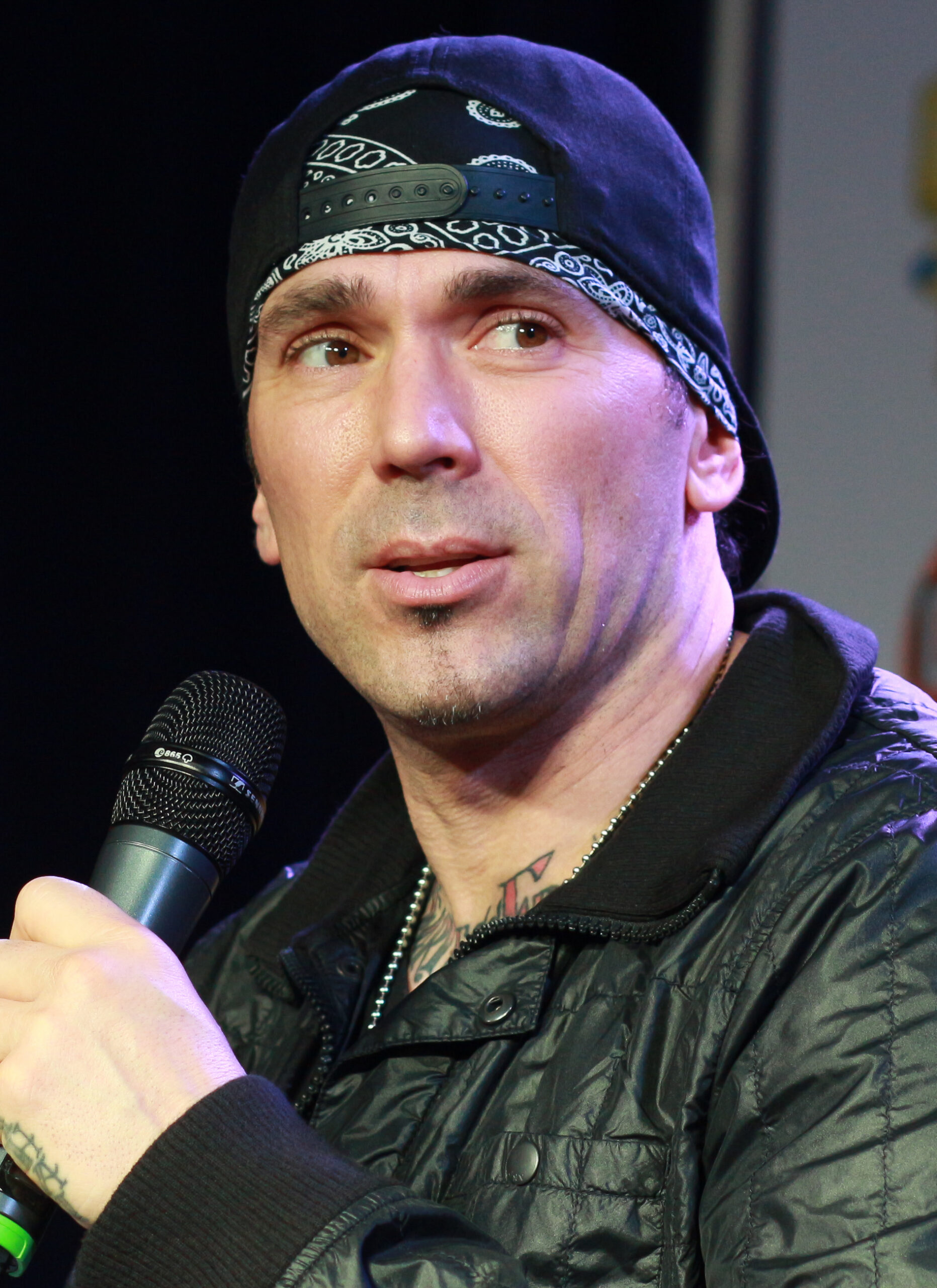
Jason David Frank spent much of his career in motion. As Tommy Oliver, he moved from the Green Ranger to the White, Red and Black Rangers, then brought that martial arts energy to real fight work and appearances around the world. His tattoos share that direct, high-impact feel: large, colorful designs that remain visible when he moves or poses.
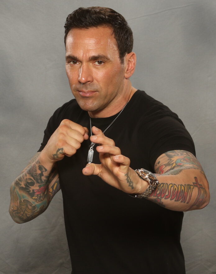
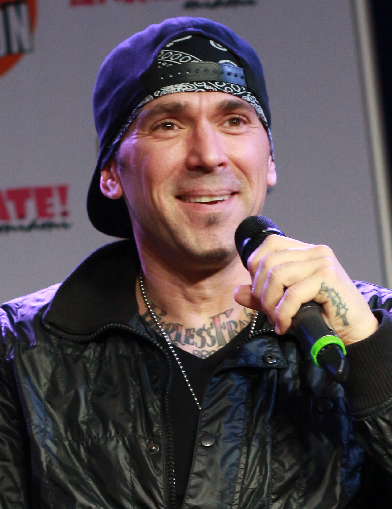
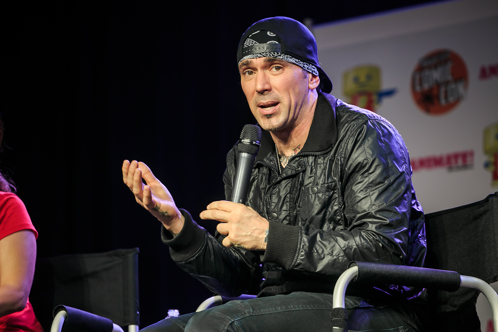
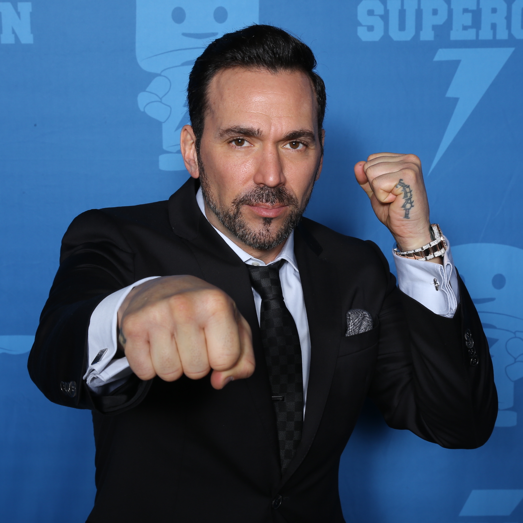
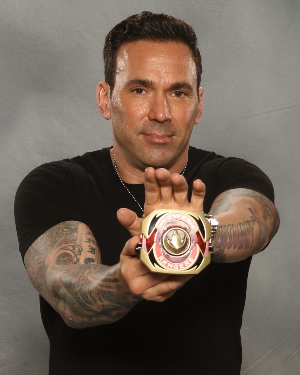
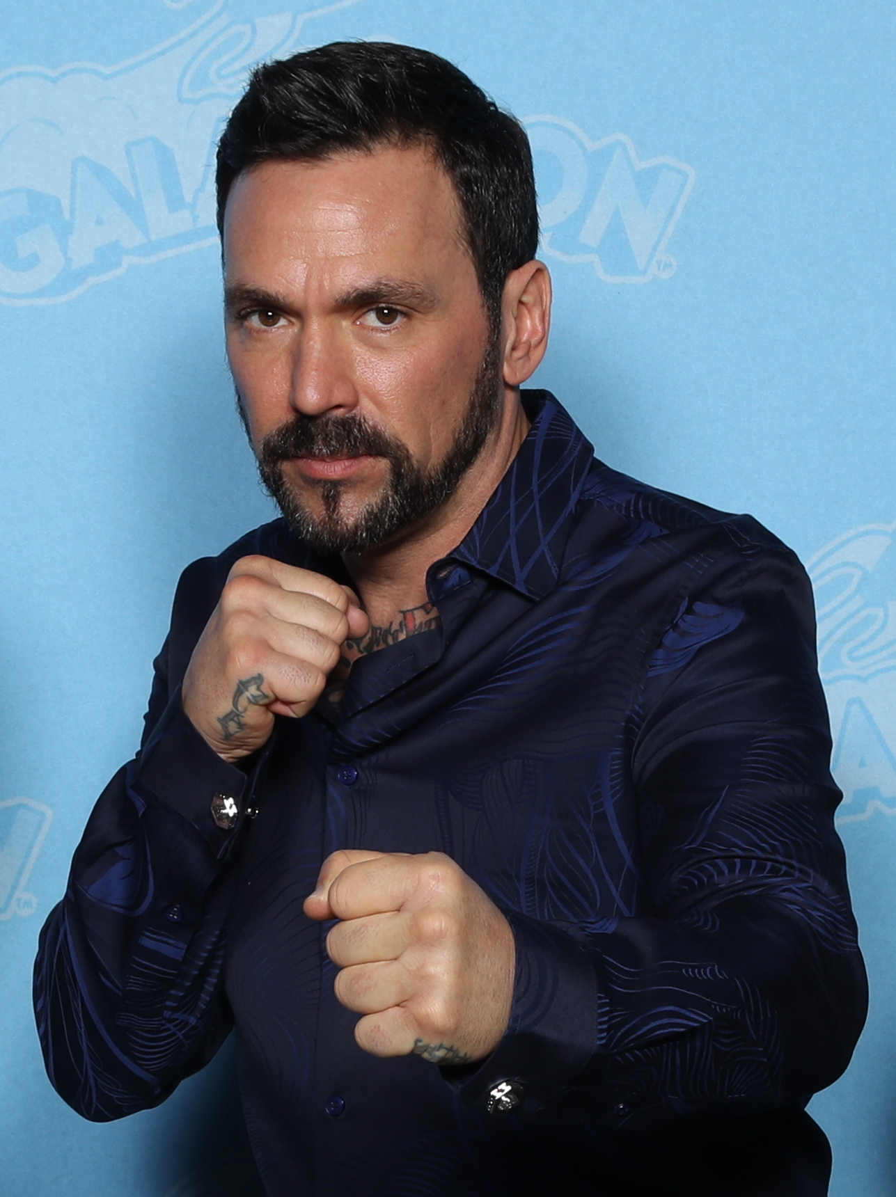
The amount of coverage stands out first. Jason David Frank’s tattoos run across both arms, forearms, hands and neck. It isn’t one matching sleeve; the collection looks more like several chapters, with color, black shading, lettering and smaller symbols sharing the same space.
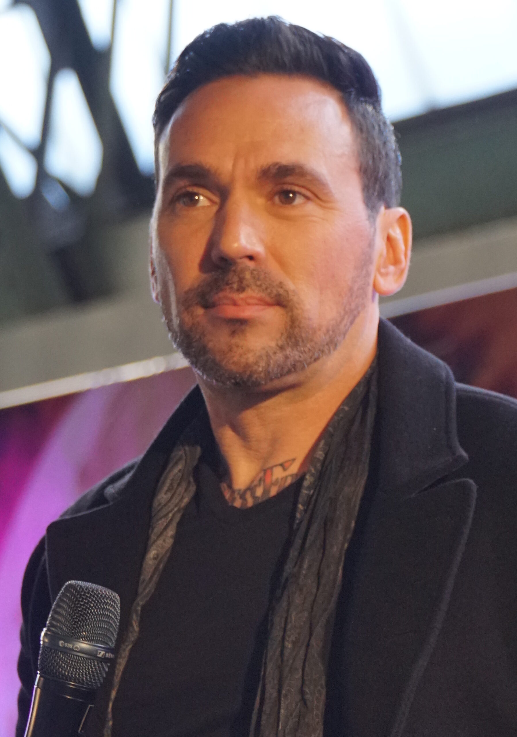
Photos clearly show the large color work on his arms, the neck lettering, the Jesus Didn’t Tap design on his forearm, and smaller pieces on his hands and wrists. Some tattoo stories have been discussed publicly, but not every meaning is confirmed. The safest read is the visible one: scale, style and placement. His ink is striking because of where and how it sits, not because we need to supply a private backstory.
The lettering on Jason David Frank’s neck gives the collection a sharp centre
The neck lettering is easiest to make out in a close portrait. It crosses the front of his neck, with heavier tattoos framing it on either side. That placement gives his face a stronger outline and keeps the ink visible even when his clothes cover the rest.
Neck lettering has a different presence from a sleeve. It can’t disappear under a watch or a relaxed pose; it sits in the center of the portrait. Jason’s design uses dark, compact lettering that stays clear under bright event lights.
The tattoos around it help the lettering feel connected to the rest of the collection. Darker designs rise from the shoulders and upper chest, giving the neck piece a base. If you’re planning neck ink after work on your chest or arms, it helps to think about how the pieces will read together.
A turn of the head changes what you can see. One side of the tattoo slips out of view while the other comes forward. The placement gives a still design a sense of movement.
His forearm ink mixes bold lettering with character and shading
Some of Jason’s clearest individual designs sit on his forearms. The Jesus Didn’t Tap lettering spans enough of the arm to read at a glance, while the surrounding color work gives it the weight of a larger patch. In photos with his hands raised, the words become part of the pose.
The martial arts influence comes through in the look of the lettering. It has the direct feel of a phrase on training gear, while the illustrations around it make the arm less like a simple text band. From a distance the message is clear; closer up, the colors and other shapes add detail.
Forearm lettering is easy for the wearer to see and can still be covered with a long sleeve. Jason spent years in costumes designed to conceal his tattoos, so the difference between his covered and uncovered looks is part of how the collection has been seen over time.
If you want a similar phrase, leave enough room for it to stay readable when your wrist bends. Good lettering depends on a clear shape, not on fitting in more words. Jason’s larger design shows why a forearm can suit bold type better than tiny, crowded text.
Jason David Frank’s hand tattoos make the larger designs feel more personal
The hand tattoos are smaller than the sleeves, but they change the overall look. Close-ups show ink on the back of his hand and around the fingers, with the forearm designs continuing down toward the wrist. They show up in ordinary gestures, not only in posed tattoo shots.
Hand ink is hard to miss. It appears whenever someone reaches, grips or holds something, which makes it feel more immediate than a tattoo under clothing. The skin also moves often and wears quickly, so the design needs to account for that.
Jason’s hand pieces don’t compete with the sleeve. Darker, simpler shapes bridge the forearm and fingers, standing apart from the brighter color work higher up. That contrast helps the small designs stay legible where several placements meet.
If you’re considering hand tattoos, keep the main shape clear and expect that touch-ups may be needed. A design doesn’t have to be delicate to feel personal. Simple hand ink has a presence because it stays in view through so much of the day.
The wrist details show how Jason’s tattoos work in motion
At the wrist, the larger forearm designs narrow into smaller marks. Photos of Jason holding a belt or raising his hands show the ink wrapping around the joint and continuing toward the back of the hand. The shapes shift as his wrist turns.
That movement suits the action in many of his public photos. Rather than seeing the tattoos in a still pose, you often see them while he gestures or moves. The wrist pieces become part of the frame, whether his hand is raised or in motion.
The wrist can also give a sleeve a natural stopping point. Smaller marks and open skin around the joint break up dense coverage, before the hand tattoos continue the line. That pause keeps every part of the arm from feeling equally busy.
When choosing a wrist placement, look at how it sits with your hand relaxed as well as in a reference pose. A photo of you moving can show details a mirror misses.
Why Jason David Frank’s tattoo style still feels recognizable
The tattoos vary, but they share a clear visual attitude: bright color, dark outlines, readable lettering and placements that stay visible. The pieces don’t have to match when they share that sense of scale and confidence.
The collection also fits the way Jason presented himself in public. Martial arts, Power Rangers and his other work all involved movement, costumes and larger-than-life characters. His tattoos look at home in that setting: easy to spot at a distance, with more to see up close.
A tattoo collection can build over time. You might start with a word and add a larger image later, using different styles as long as each has room. A shared attitude and scale can tie designs together without making them identical.
His tattoos look suited to a body in motion: arms that bend, hands that work and a neck that turns. Photos where he’s gesturing show the ink as part of him, rather than a flat catalogue of designs.
The neck tattoo changes shape as Jason turns his head
In another close portrait, much of the neck lettering disappears as Jason turns from the camera. The visible edge still links his jaw, collar and upper chest, while darker shapes at the base of the neck anchor the design.
A neck tattoo can read differently from different angles. From the front, lettering takes focus; from the side, the surrounding shapes stand out. As the body reveals more of the design, the whole piece can feel larger.
Watch Jason David Frank get his hand tattoos
The video shows the hand-tattoo process and how the new ink fits beside Jason’s existing arm work. The portrait above also makes the connection clear: hand tattoos are easier to plan when the wrist and forearm are part of the same layout.