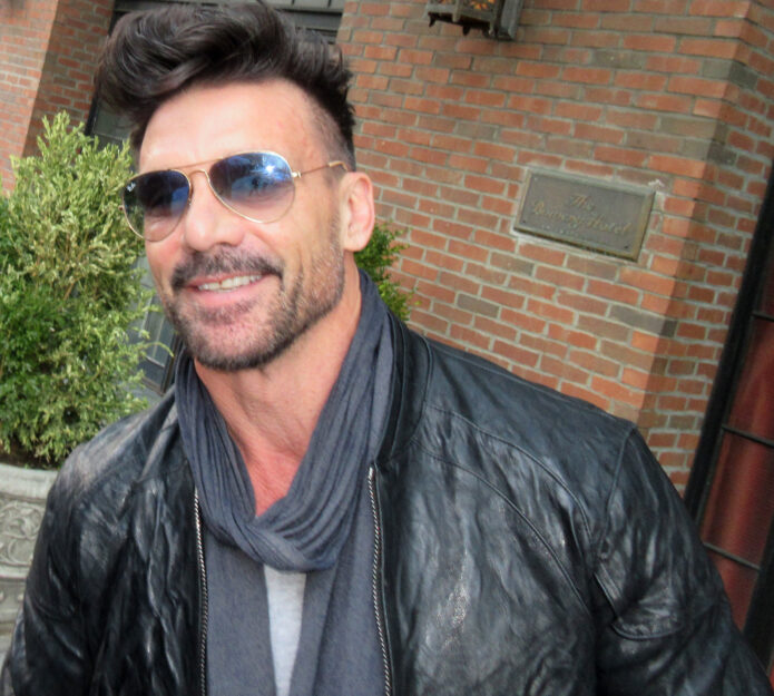
Frank Grillo’s tattoos make sense the second you see him in a tank top. The actor and lifelong combat-sports obsessive wears his ink in the same easy, unfussy way he carries himself on screen. There are bold upper-arm pieces, compact symbols, Thai-inspired work and lettering that gets noticed because it sits on a body built for movement.
That is the fun of Frank Grillo tattoos. The collection isn’t one giant matching sleeve, and it doesn’t need to be. Some pieces are dark and graphic, some are fine and personal, and the mix feels like a record of different chapters. Grillo has spoken about getting traditional tattoos in Thailand after training there, including the ritual and the atmosphere around the appointment. The pictures also show a man who likes ink with presence, whether it is a large cross on the shoulder or a small symbol tucked into the arm.
Here’s a laid-back tour of the designs that stand out most. If you’re collecting ideas for your own arm, the useful lessons are less about copying Grillo’s exact images and more about choosing a strong shape, giving the placement room and letting personal meaning show up without turning every tattoo into a caption.
Frank Grillo’s cross tattoo gives the upper arm a bold anchor
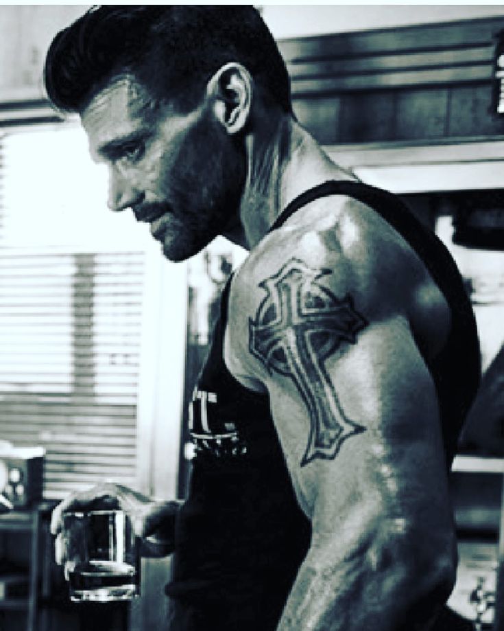
The cross on Grillo’s upper arm is the kind of tattoo that reads clearly before you get close. It has a strong outline, a dark centre and enough scale to hold its own against the shoulder and bicep. The shape is familiar, but the thick treatment keeps it from looking like a tiny flash design lost in the middle of the arm.
Large religious symbols often work best when the placement does some of the design work. The shoulder is rounded, the bicep changes shape when the arm bends and the upper arm is visible from the front and side. A cross placed there can feel like part of the body instead of a sticker pressed onto it. Grillo’s piece uses that advantage. The arm gives the image a natural frame.
There is also a nice bit of restraint in the composition. The design doesn’t seem to depend on lots of extra rays, banners or tiny lettering. The main silhouette does the talking. When a tattoo has one clear shape, it often ages more confidently than a design that tries to explain everything at once.
If you like this direction, decide first whether the cross should feel sharp and architectural, weathered and traditional or soft and realistic. Show your artist the mood rather than bringing a picture to copy line for line. They can adjust the width, the negative space and the way the arms of the cross follow your muscle. A few millimetres can make a big difference on a curved upper arm.
His shoulder and bicep ink uses heavy contrast instead of a packed sleeve
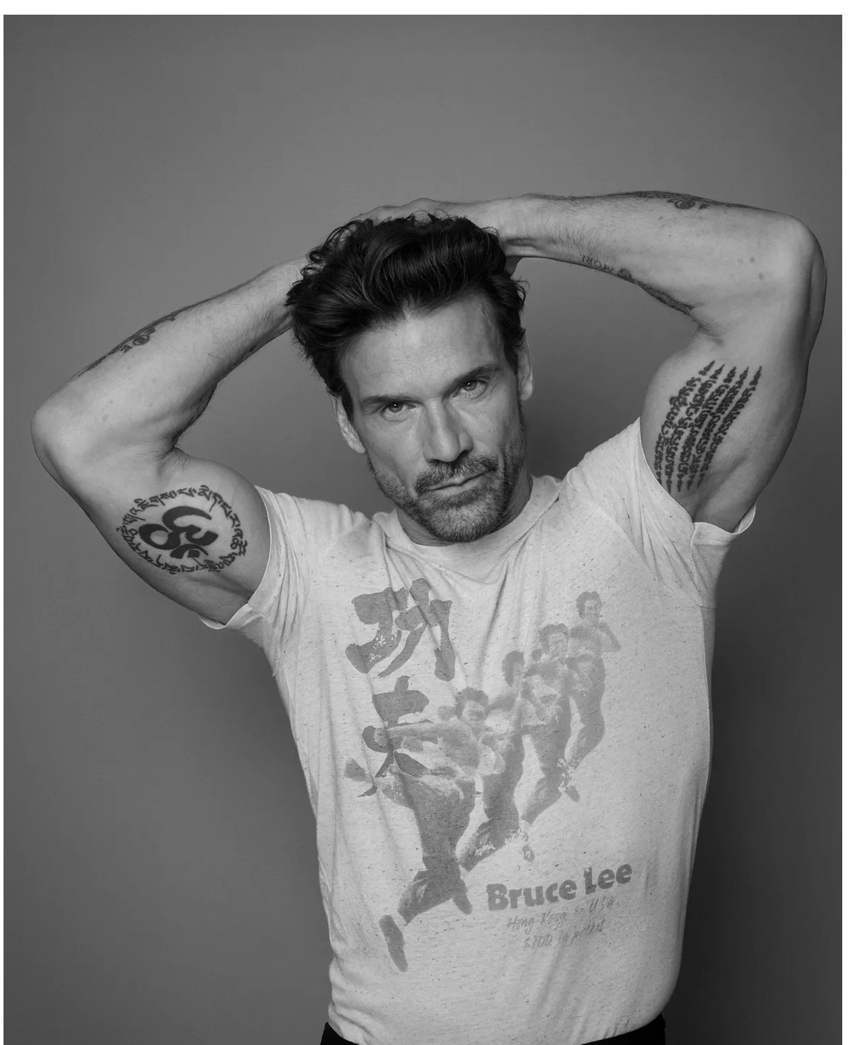
Grillo’s arm tattoos don’t all blend into one solid sleeve. In several portraits, you can see individual pieces sitting beside open skin. That spacing gives the collection a tougher, more casual feel. The work looks lived in, not overly planned, which suits somebody whose style is more gym, boxing ring and black T-shirt than polished red carpet.
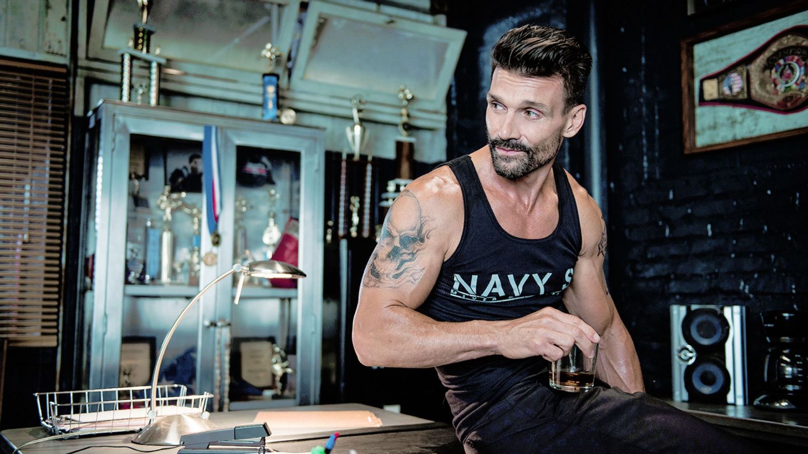
The tattoo visible on the shoulder has a broad, dark presence. Around it, smaller marks and lettering create a change of pace. This is a useful approach for anyone who wants multiple tattoos but isn’t ready to commit to a full sleeve. You can start with one strong upper-arm piece, leave a little air around it and add the next design only when it earns its place.
Contrast matters here. A big black-and-gray piece can carry the visual weight, while smaller linework keeps the arm from becoming one flat block. Open skin is part of the composition, not an unfinished mistake. It lets the eye move and makes each tattoo easier to recognise from a distance.
Before filling gaps, live with the first design for a while. Wear a vest, train, sit at a desk and look at the arm in normal light. You’ll learn which angles you actually like and whether the next piece should match the first or push in a different direction. Grillo’s arm work is a good reminder that a collection can look complete without every inch being covered.
Frank Grillo’s Thai tattoos bring travel, ritual and balance into the collection
The most personal part of Grillo’s tattoo story is tied to Thailand. He has described training there, watching fighters with traditional body art and deciding he wanted to experience the process himself. He has also talked about the ceremony around the tattoo, including chanting, gold leaf and the unusual moment when the finished work was revealed.
He went back for another piece because he likes balance. That detail says a lot about how people build a collection. Sometimes a new tattoo isn’t only about the picture. It changes how the body feels visually. One arm may look heavier, one shoulder may feel empty or two designs may need a partner before the whole arrangement feels right.
The Thai-style work visible in Grillo’s photos uses compact symbols, script-like marks and a vertical layout that follows the arm. It doesn’t have the wide, poster-like shape of his cross. Instead, the tattoo feels closer to the skin and more connected to the path of the limb. Different designs can live together when they share a sense of direction, even if their linework is not identical.
If you’re inspired by Sak Yant tattoos, slow down and learn what the symbols mean before booking. These traditions carry cultural and spiritual weight, and the right approach is respect rather than grabbing a design because it looks cool in a photo. You can take inspiration from the balance, placement and rhythm while working with an artist who can create a piece that is personal to you.
The small bicep symbol proves that Grillo tattoos don’t all need to be huge
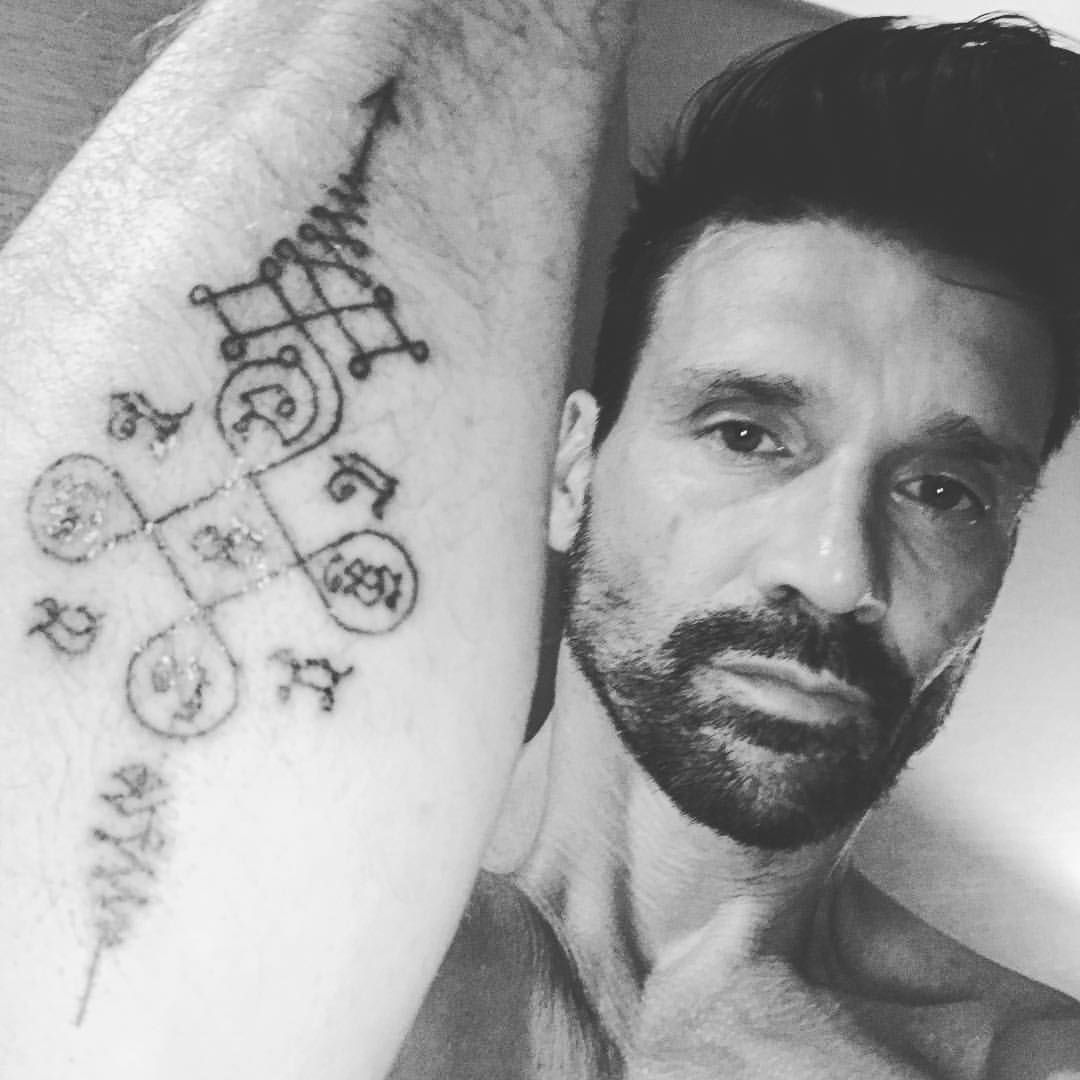
One of the best details in Grillo’s tattoo photos is the smaller symbol on the inside of the bicep. It sits close to the muscle, has a compact shape and becomes visible when he points toward it. That kind of tattoo can feel more private than a design placed on the outer arm, even when it is technically easy to show.
Small tattoos are often treated as the simple option, but they need just as much planning. Fine lines can soften, tiny gaps can close and a design that looks crisp on a screen may need to be simplified before it goes on skin. The shape on Grillo’s arm works because it has a clear centre and doesn’t try to carry too much detail.
The inner bicep is also a practical place for a personal mark. It can be covered by a shirt, then revealed when you move. That makes it a good spot for a date, a symbol connected to family or a reminder that doesn’t need to be announced all day. A private tattoo can still have a strong visual identity.
When you’re choosing a small design, ask your artist for the smallest size they would honestly recommend after healing. Don’t force a detailed picture into a space that can’t support it. A clean, slightly larger symbol usually looks better for longer than a miniature version packed with fragile lines.
His forearm and lettering tattoos add texture around the bigger pieces
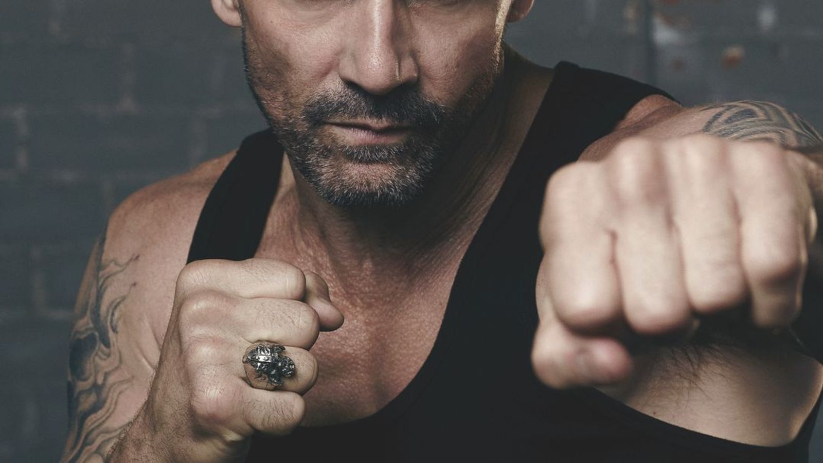
Grillo’s forearms show why a tattoo collection benefits from different scales. Beside the larger shoulder work are smaller marks and lines that break up the arm without competing with the main image. The result has texture. You notice something new when the arm turns, but the overall shape still feels relaxed.
Lettering brings its own set of choices. The font can be clean, rough, narrow, wide, formal or almost handwritten. The placement changes the mood too. A line running along the forearm feels more public than words tucked inside the arm. A short phrase can look strong when the spacing is generous, while a long quote may need more room than you expect.
In Grillo’s photographs, some of the arm writing is difficult to read because of distance, lighting and the natural movement of the skin. That’s a useful lesson in itself. Readable lettering starts with a realistic size, strong spacing and a design that still works when the arm is not held perfectly still.
Bring your artist the words exactly as you want them, then let them show you several layouts. Check the stencil from the side and in a mirror. Look at it with your hand relaxed, not only with the forearm flexed for a photo. If the phrase has emotional weight, give it enough room to breathe. You don’t want the letters fighting for space with a larger tattoo you may add later.
What Frank Grillo’s tattoos can teach you about building an arm collection
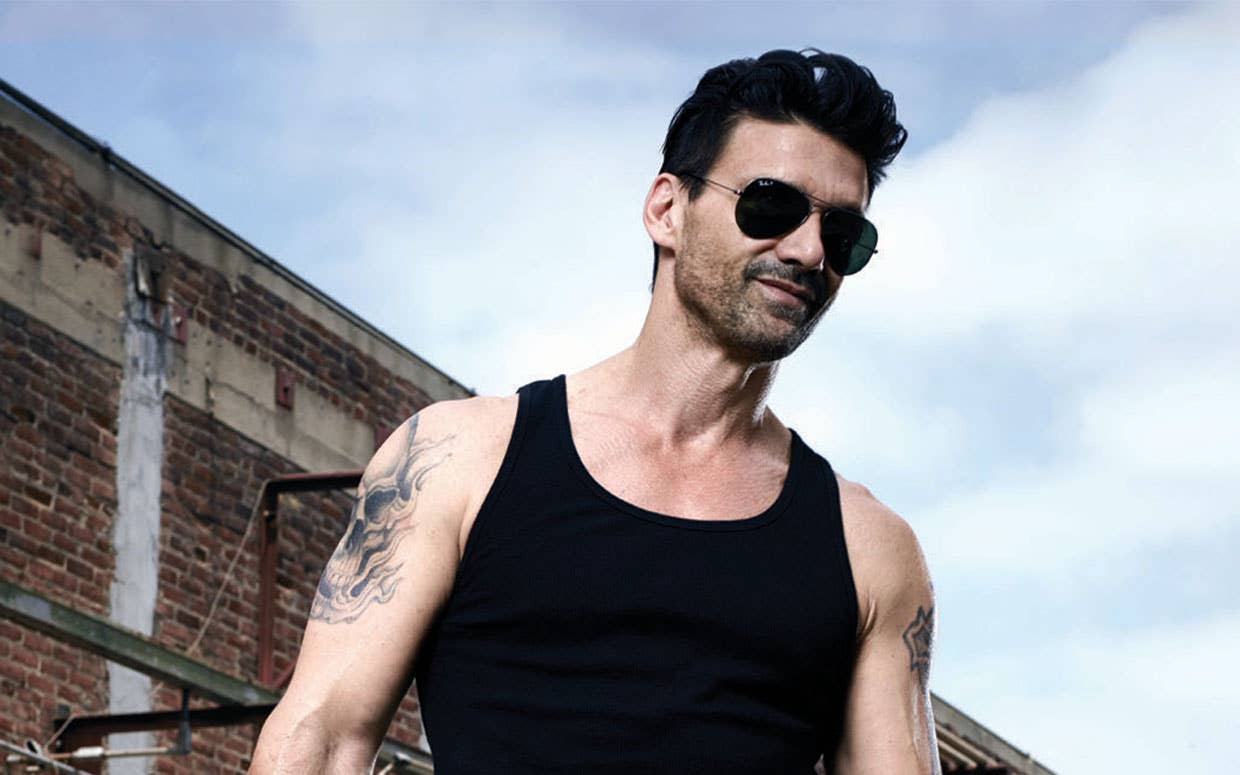
The big takeaway from Grillo’s tattoos is that personality matters more than a strict theme. His ink connects to faith, training, travel and the physical identity he has built over decades. It doesn’t look like every design came from the same appointment, and that is part of the appeal.
Start with the tattoo that has the clearest reason behind it. That might be a cross, a family symbol, a place that changed you or a design linked to a sport you have stuck with. Once you know the emotional centre, decide whether the next piece should echo the shape, balance the weight or provide a completely different texture.
Placement is where the collection starts to feel intentional. Large pieces need a broad enough surface. Smaller symbols can sit in the gaps or turn toward the inside of the arm. Lettering needs a size that will remain readable. A good artist will think about all of that before the needle starts, and they’ll also help you avoid a future layout problem.
Keep the images personal, even when you like the look of celebrity tattoos. Grillo’s cross, Thai-inspired work and compact symbols feel convincing because they belong to his story. Your version should belong to yours. That is what turns a set of tattoos into a collection instead of a mood board on skin.
For a closer look at the way Grillo’s ink appears in motion, the short video below is a useful extra view. Photos show the designs, but movement shows how the pieces sit when the arm bends, reaches and relaxes.
3 thoughts on “Frank Grillo Tattoos: Thai Ink, Crosses and Tough-Guy Arm Work”