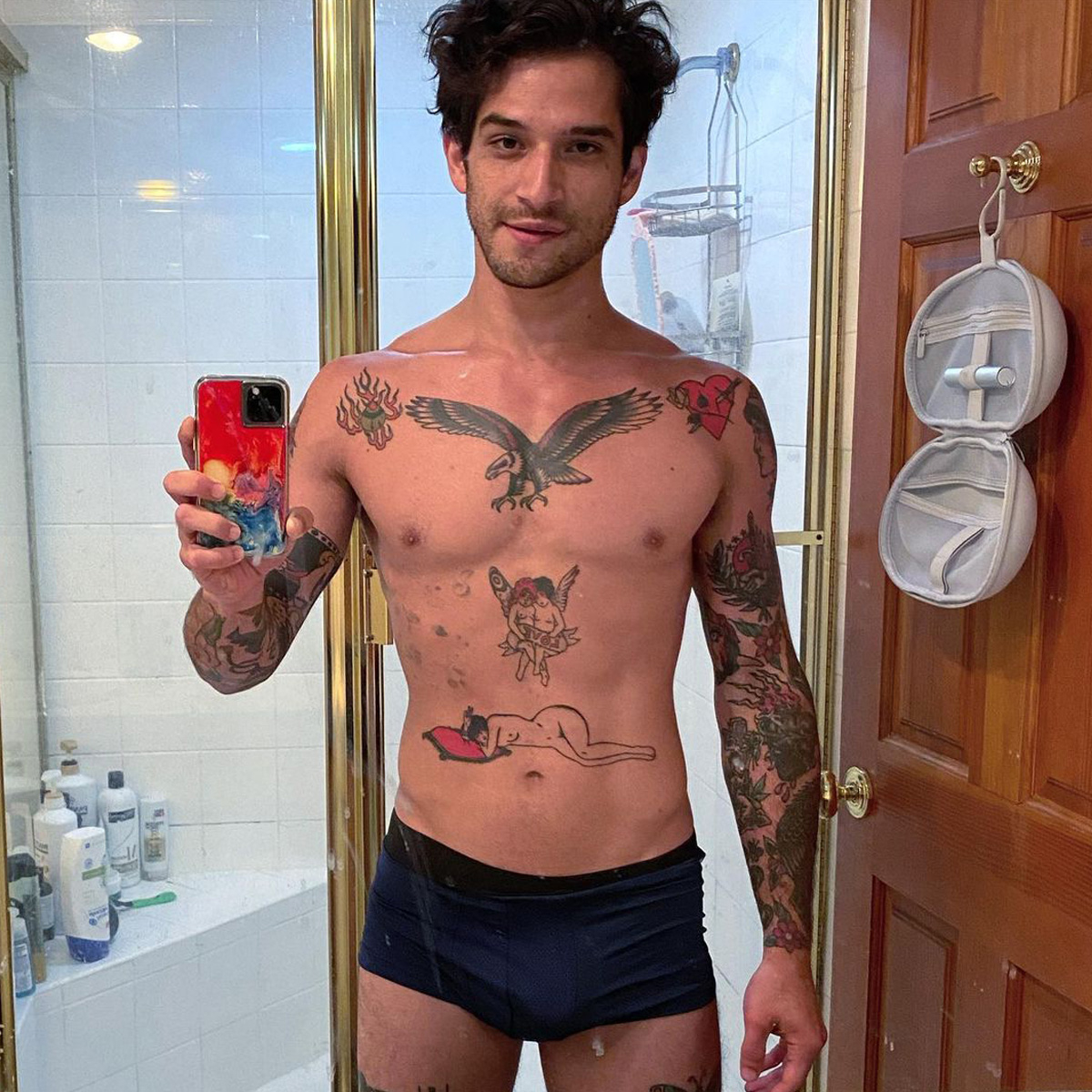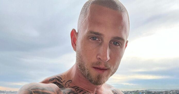
Actors

Millie Bobby Brown Tattoos: 011, Ruth, Roses and More

Millie Bobby Brown’s tattoos are small and easy to miss until a close-up or a red-carpet look brings them into view. There is the 011 number from Stranger Things, a tribute to her grandmother Ruth, a tiny heart, a rose and other delicate pieces on her back and ribs.

The collection is not a full sleeve, but each design has its own place. Some connect to family, others to the character who made Brown famous, and a few are simply little drawings she likes. Here is what the clearest photos and interviews show about the tattoos fans tend to notice first.

Brown’s tattoos also show how a public image can change. When she first appeared on Stranger Things, viewers knew her through Eleven’s shaved head, hospital gown and temporary makeup. Brown’s real tattoos belong to her, not the character. As her own style has grown, the ink offers another small distinction, even when one design points straight back to the role.

The rose tattoo is one of Millie’s prettiest pieces

One of Brown’s most visible designs is a small rose tattoo toward the back of her body. It is drawn with light lines rather than heavy traditional shading, almost like a little sketch. The simple style fits the rest of her collection and is easy to cover when a role calls for it.

The rose tends to show up in open-back or low-back dresses. Under a T-shirt it can disappear, then become the detail people remember when an outfit reveals it. That hide-and-show quality runs through Brown’s tattoos: they are modest in size, but close-up photos reward a second look.

Tattoo guides also mention other small floral designs, including a branch and a tiny rose. It is better to treat them as separate pieces than to assume every flower in a photo is part of one design. The collection has grown over several years, and pictures catch different tattoos from different angles.
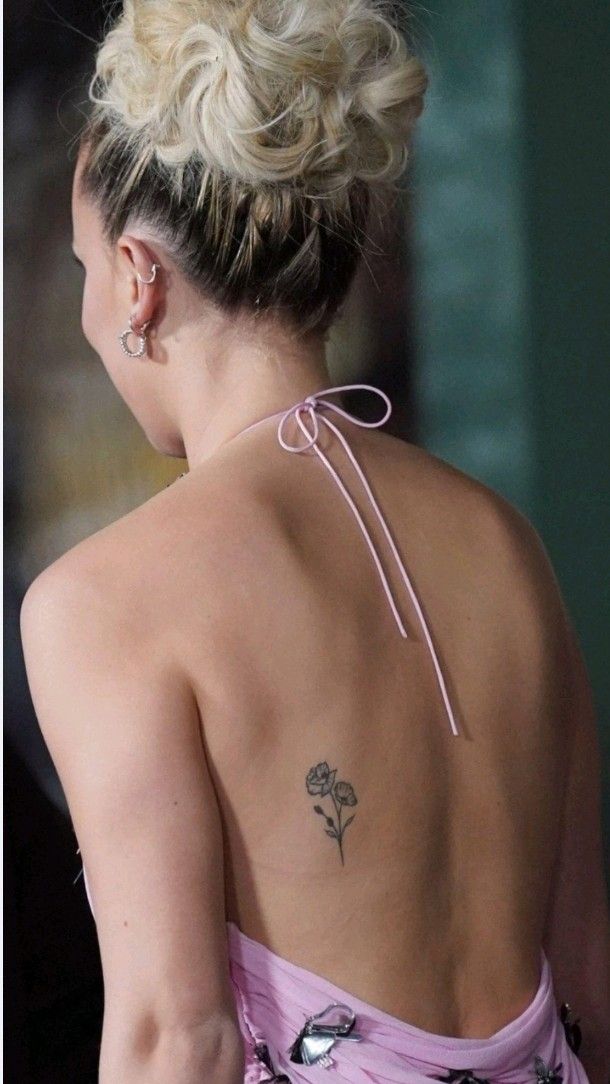
Millie Bobby Brown rose tattoo on her back

Ruth is a tribute to her grandmother

Brown has the name Ruth tattooed near her ribs in memory of her grandmother. Ruth died in 2020 after living with Alzheimer’s, and the name gives Brown a small, lasting way to keep her close. It is a simple tribute rather than a large portrait or an elaborate memorial.

Photographers first caught the lettering when Brown wore a pale pink Louis Vuitton gown to the Enola Holmes 2 premiere. The dress exposed part of her side, and the same look also revealed her 011 tattoo and a small heart near her collarbone.

A rib tattoo stays hidden most of the time, but remains close to the body. Brown has spoken about the importance of family, so the placement feels fitting even without a longer explanation.
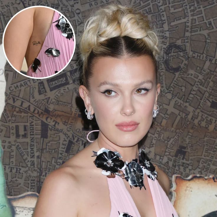
Millie Bobby Brown Ruth tribute tattoo near her ribs

011 is her personal link to Eleven

The number 011 is the tattoo most closely tied to Brown’s career. It refers to Eleven, the character she played in Stranger Things. On her wrist, the small number can look like a code until fans recognise the reference.

It is a neat way to remember the role without spelling out “Eleven” or adding a portrait. Brown spent years filming, promoting the series and meeting fans as the character. The number keeps that chapter personal while still giving viewers a clue.

Photos from the tattoo session show Brown smiling as the artist works on her wrist. The black ink is simple and small: visible to her every day, but not large enough to take over her hand or arm.
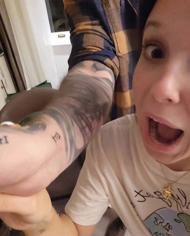
Millie Bobby Brown getting her 011 wrist tattoo

She and her sister Esme have matching 011 tattoos

There is a family story in Brown’s 011 tattoo too. She and her sister Esme got matching versions of the number on their wrists, turning a reference to the show into a sibling tattoo.

The matching designs are tiny and uncomplicated. A quick turn of the wrist is enough to show them, and they do not need extra decoration. The connection matters to the sisters; everyone else can simply see a neat little number.

The same three digits hold two meanings at once: a reminder of Eleven and a memory shared with Esme. That is part of why the tattoo has stayed meaningful beyond the show’s run.
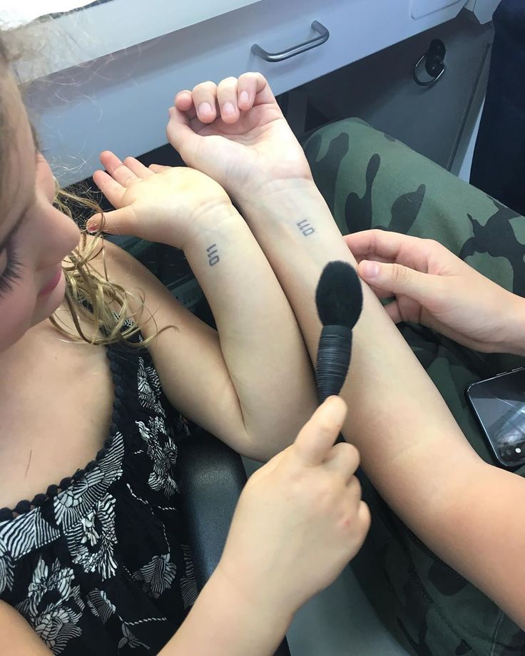
Millie Bobby Brown and Esme matching 011 wrist tattoos

The tiny heart keeps her collection playful

Brown has a small heart tattoo near her collarbone. It can disappear among jewellery or a detailed neckline, but close-up red-carpet photos catch it as a small accent beside the rest of her outfit.

The heart has not been presented as a major tribute, and it does not need to be. Brown’s collection has room for designs that are simply sweet. The heart gives the more serious Ruth and 011 tattoos a lighter neighbour, while matching the fine-line feel of her other ink.

Its placement works with different looks. A high neckline can hide it; a strapless dress can bring it out. Brown can change how visible the heart is without changing the tattoo itself.

That flexibility is useful for an actor. A tattoo can be covered for a period role, shown at a personal appearance or left visible because an outfit allows it. None of Brown’s designs dominate her look, so the focus stays on her rather than the ink.
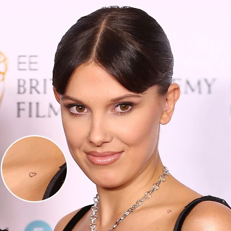
Millie Bobby Brown small heart tattoo near her collarbone

Brown’s smaller tattoos make the full collection feel personal

Fans have spotted other small tattoos over the years, including a cowboy hat on Brown’s arm. It is more playful than the family tributes and shows that she does not need every design to follow one perfect theme.

The cowboy hat may be a joke, a private reference or simply an idea she liked at the time. Small novelty designs can sit comfortably beside the rose and heart; they do not need to carry a solemn meaning to matter.

Older photos also show floral details and shapes that are hard to identify. The safest guide is to stick with designs that appear clearly and consistently. Celebrity tattoo lists sometimes repeat a guess as fact when a blurry image makes a tiny mark look like something else.

What comes through is Brown’s preference for small tattoos with clean lines. They can be covered for a role, revealed on a red carpet or joined by another small piece without changing her whole look. The collection feels less like a branding exercise and more like a scrapbook, built one choice at a time.
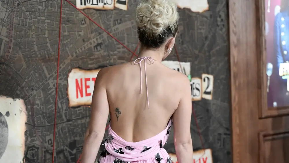
Millie Bobby Brown revealing tattoos at the Enola Holmes 2 premiere

Watch Millie talk about people getting her tattoos

Brown has joked about fans getting tattoos connected to her and her work. The clip below is a fun look at how closely some of her body art is tied to the Stranger Things years, especially the 011 design fans recognise right away.

Brown’s tattoos are small, but each one points somewhere different. The rose and heart keep things light, Ruth honours family, and 011 links her everyday life to the character that changed her career. Add the matching wrist tattoo with Esme and the little cowboy hat, and the collection starts to feel like a timeline. It is personal without being over-explained, which may be why fans keep spotting new details in clear photos.
Charlie Sheen’s tattoos were always meant to be a little ridiculous

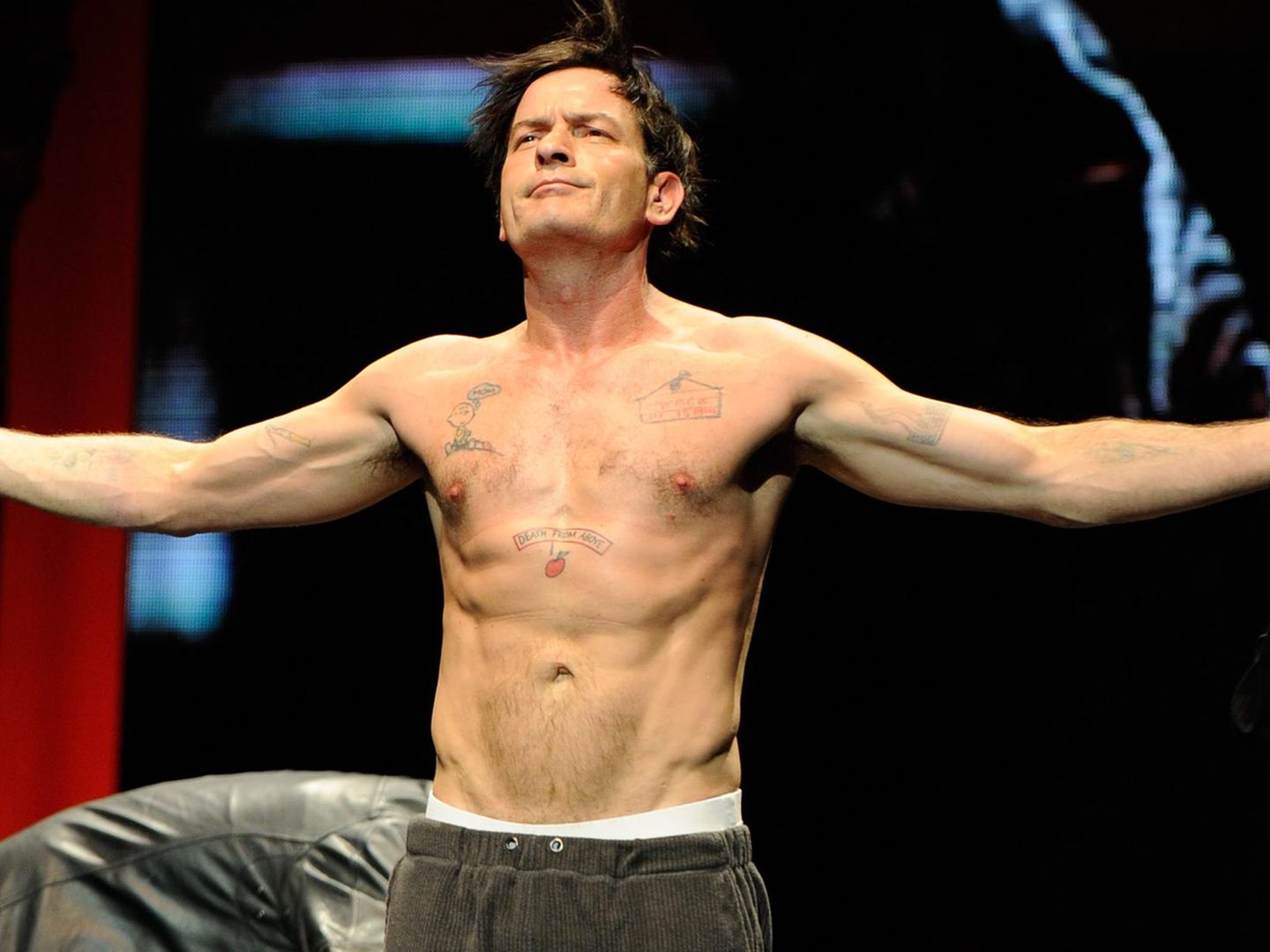
Charlie Sheen’s tattoos have often played out as a side story to his public life. They appear in old red-carpet photos, onstage during the Violent Torpedo of Truth tour and in close-ups where a word on his wrist takes over the frame. The designs are loud, personal and sometimes hard to treat seriously. That was likely part of their appeal when he got them.

Sheen talks about the ink differently now. In a recent interview, he called getting tattoos a terrible, stupid decision and said he has not added any in more than a decade. He has also said some tattoos covered scars from drug use. That changes how the collection reads, though it does not erase what the designs said about the period in which he chose them.

Online lists do not agree on every detail. The pieces seen most often are the Death From Above chest banner, Winning on his wrist, the Cincinnati Reds cover-up, the Charlie Brown design, the cigarette and ashtray, the zipper and eyeball, and a number of smaller jokes and symbols. Here is the clearest account of those tattoos.

Death From Above and the apple drop set the tone

Charlie Sheen Death From Above chest tattoo

One of Sheen’s most recognisable pieces is the Death From Above banner across his upper chest. The words sit beside an image described as an apple and a falling drop, blending a threat with cartoon logic. It is not minimalist or neatly polished. The design brings together a phrase, a strange image and a little swagger.

Sheen knows how a short phrase can become part of a public character. “Winning” became his catchphrase, while Death From Above feels more like a private slogan that made its way into view. It has the same oversized energy as his stage persona, fixed across his chest.

The placement is hard to miss in shirtless photos. During the 2011 tour, the banner appeared alongside several other tattoos, part of a busy collage rather than a single emblem. It captures the way the collection works: a bold line, an odd image and a punchline that mattered more than visual harmony.

Winning replaced Denise on the wrist

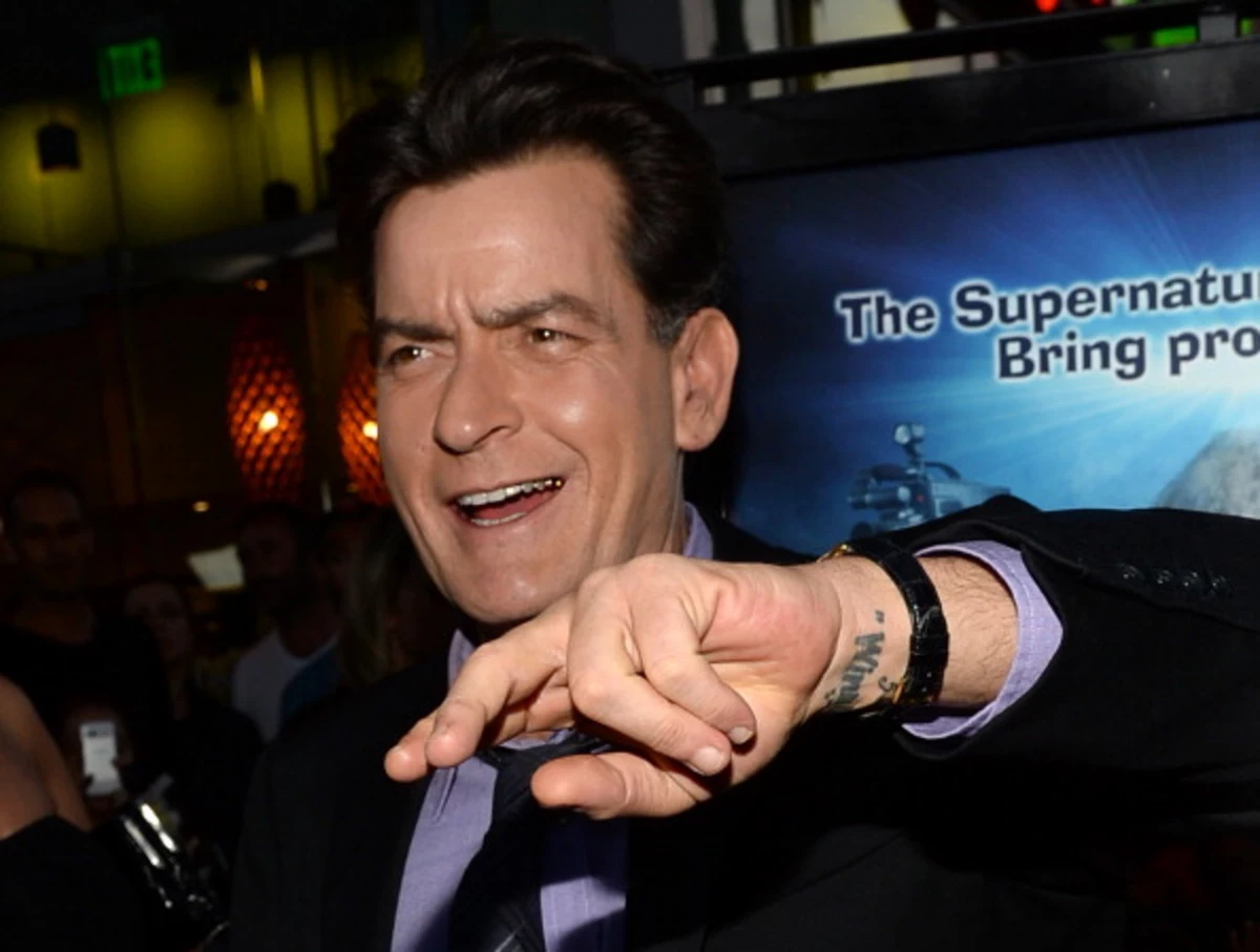
Charlie Sheen Winning wrist tattoo

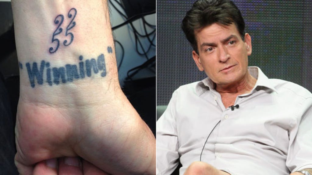
The wrist tattoo most associated with Sheen’s public image is Winning. It used to say “Denise,” referring to Denise Richards; older coverage shows that name was covered or replaced after their relationship ended. The change is a small piece of tattoo history, but it tracks a much bigger public shift.

By 2011, “winning” was everywhere. Sheen said it in interviews, put it on merchandise and built a stage show around the attitude. The word on his wrist made it feel less like a campaign slogan and more like something he could see whenever he looked down.

The lettering is simple, which is why it reads so clearly in photos. The more complicated story is underneath: a relationship reference became a marker of a very public new chapter. Sheen turned a personal change into part of his mythology.

The cigarette and ashtray joke sits on his forearm

Charlie Sheen cigarette forearm tattoo

The cigarette and ashtray tattoo is tied to Sheen’s hard-living image. Instead of hiding the habit, the design turns it into a visual joke on his arm, something that could only belong to a particular period of his life.

In photos of Sheen smoking, the real cigarette in his hand and the tattoo sit in the same frame. There is a deliberate absurdity to making a habit permanent, as if the image asks whether the joke will still seem funny years later.

His later comments about sobriety and regret give the piece a different weight. What once read as a punchline is now connected to a chapter he was trying to leave behind. That does not make it meaningless; it makes it a clear record of a mood that did not last forever.

The Cincinnati Reds logo covers an older tattoo

Charlie Sheen left wrist cover-up tattoo

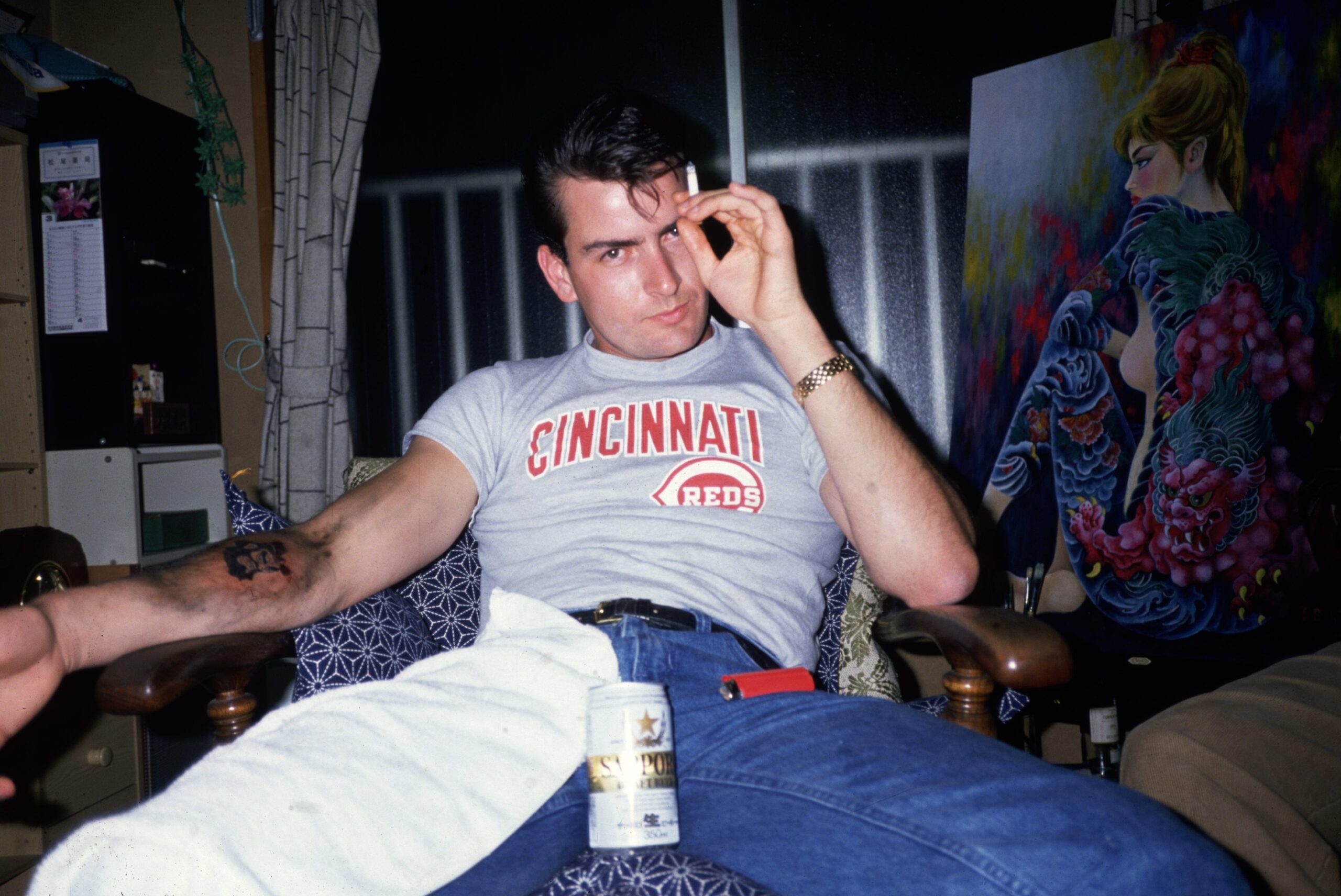
The Cincinnati Reds tattoo has one of the stranger histories in Sheen’s collection. Coverage describes it as a cover-up of an earlier design connected to a Japanese god. The baseball logo is more than a team mark; it also shows that he chose to cover something he no longer wanted.

Cover-ups make the past visible in a different way. People change their minds, a relationship ends, or a symbol stops feeling right. In Sheen’s case, a baseball logo replaced the earlier image, making the change feel both personal and deliberately plain.

The Reds design carries the collection’s mix of sincerity and comedy. A sports logo is straightforward; putting it over a Japanese-inspired design is not an expected choice. It feels like Sheen replacing an image that no longer fit with something familiar to him.

The small C on his wrist is easy to miss

Charlie Sheen C wrist tattoo

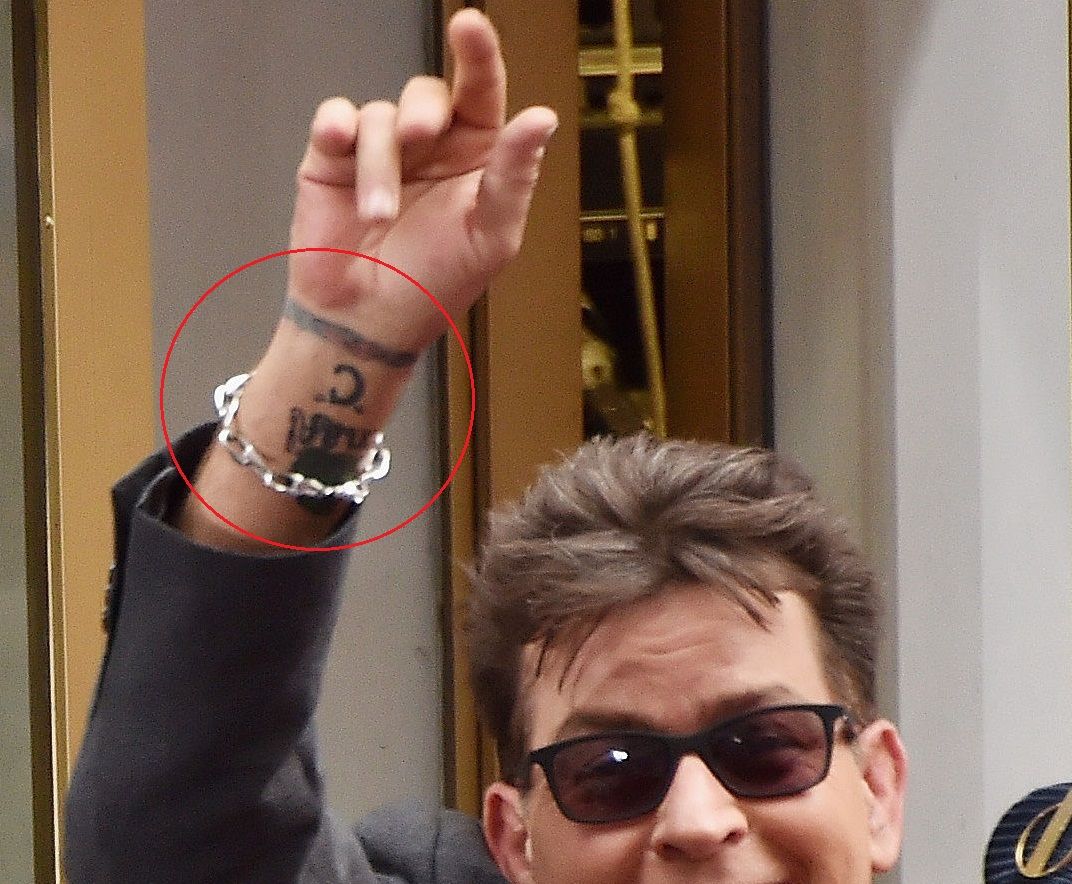
Tattoo galleries often show a bold C followed by a colourful ring on Sheen’s wrist. It does not have the instant recognition of “Winning,” but it gives a glimpse of how varied the collection is. Some designs are not headlines; they sit beside a watch or bracelet and wait for a clear photograph.

The letter has been linked to Charlie, though reports are less consistent about its story than they are for “Winning” or the Reds cover-up. It is safest to describe what is visible without assigning it a grand meaning.

That pattern runs through the collection. Some tattoos come with an obvious story; others only became notable after the person wearing them became famous. The wrist C is recognisable, but still a little mysterious.

Other wrist ink adds to the running joke

Charlie Sheen public wrist tattoo

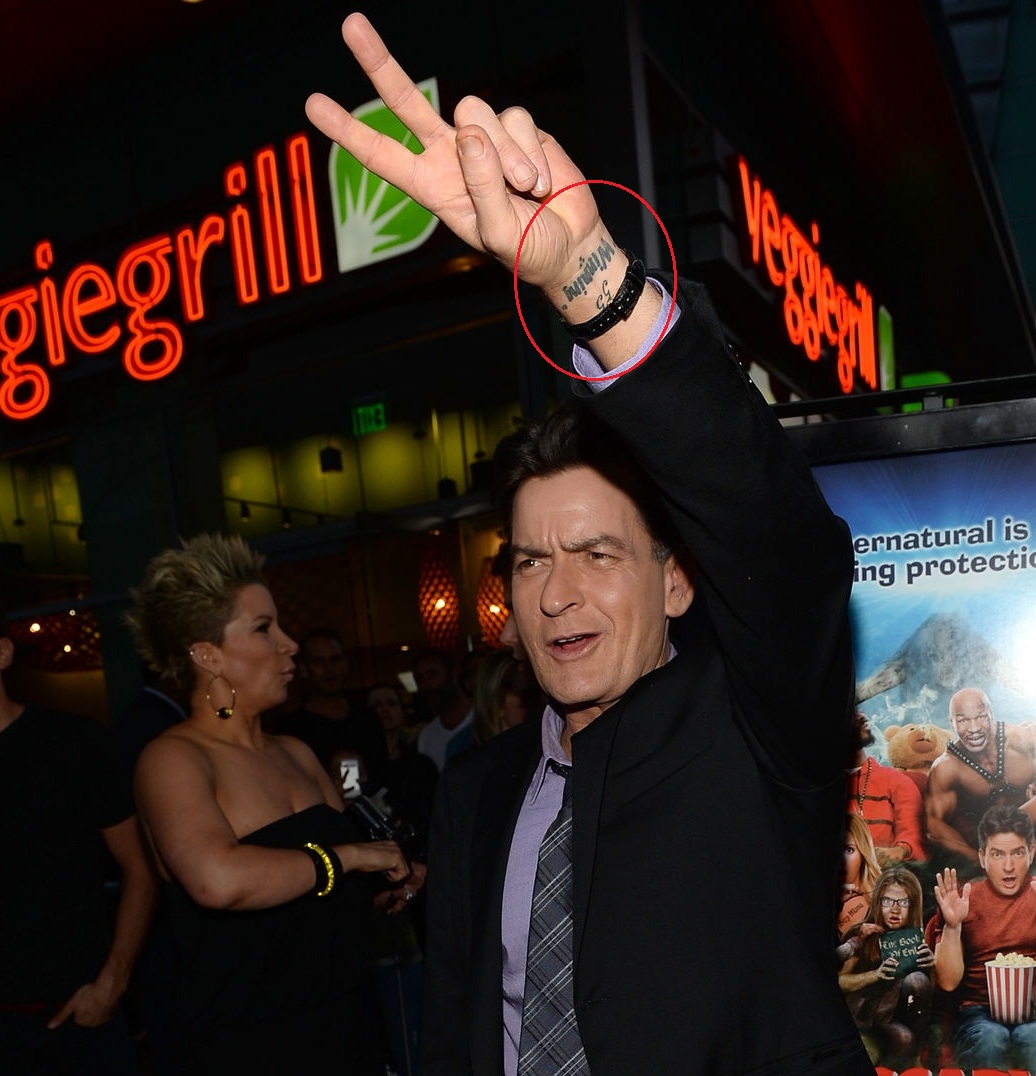
Photos show several more designs around Sheen’s wrists, including words and small symbols beside the larger tattoos. Reported pieces include a 22/55 marking, a shield-like design with the letters “MLBCES,” and other lettering that can be hard to read in every image. Some lists also mention a diaper pin with an S and a small stingray.

Those details are best kept separate from the tattoos that can be identified clearly. A blurry picture can make a shape look like something else, especially when Sheen’s wrist is turned away from the camera. The stronger approach is to name the confirmed words and visible symbols, then mark other details as reported.

What is clear is that Sheen liked tattoos that started a conversation. Wrist designs show when he reaches for a drink, gestures in an interview or waves to a crowd. His ink did not grow into one polished sleeve; it accumulated in separate choices, each adding to the running joke.

The chest and torso hold some of the more surreal pieces. Coverage describes a Charlie Brown figure with a speech bubble saying “MOM,” a zipper opening around an eyeball and a sign that reads Back in 15 minutes. Other descriptions mention a dragon head, a stingray, a burning cigarette and a Snoopy or Peanuts-related image.

The cartoon references keep the collection from looking like a standard tough-guy set of skulls, flames and military symbols. Even when the subject is dark, Sheen often undercuts it with something silly. A cartoon or visual gag lets a tattoo carry meaning without becoming a solemn monument.

Some of these designs are hard to inspect individually because the clearest photos show several tattoos at once. A broad torso shot helps show where the pieces sit, but it cannot confirm every small detail. The overall collection is documented; the exact wording or placement of every minor tattoo is not always clear.

There is a more serious story underneath the jokes. Sheen now describes the tattoos as a permanent record of a time when he was dealing with pain, projecting confidence and trying to control the public story. That can make the collection seem funny and sad at once. The designs belonged to a version of him who has since changed.

His tattoos are not a neat success story, and they were never meant to be. They make a messy timeline of relationships, catchphrases, sports, cigarettes, cartoons and choices that once felt right. “Winning” may be the most famous word, but his regret is now part of the story too. Permanent ink can outlast the version of yourself that chose it.

Watch Charlie Sheen talk about regretting his tattoos

Sheen has spoken directly about his tattoos and why he would not make the same choices today. The video below focuses on the ink and the regret he has attached to it.

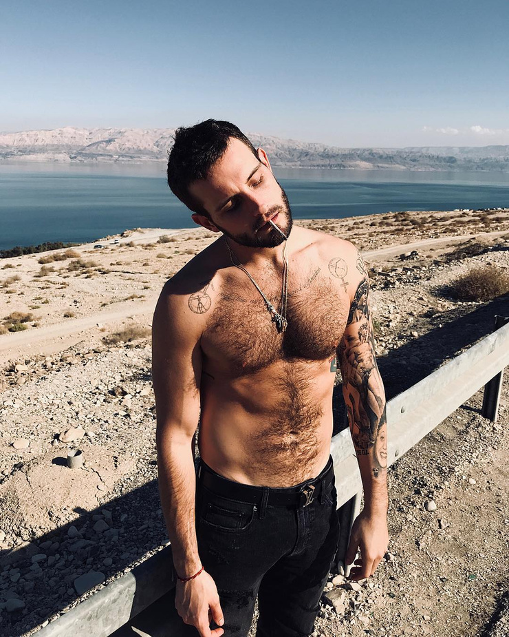
Nico Tortorella’s ink keeps the old stories and the strange ones

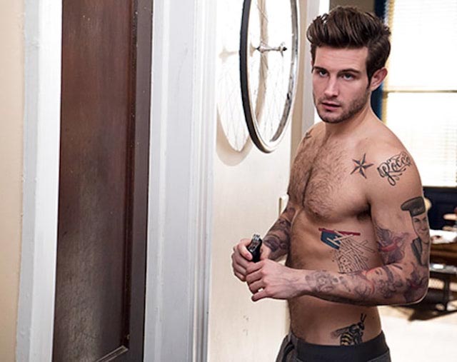
Nico Tortorella’s tattoos have never been a matching set. Their collection mixes old-school symbols, family jokes, big ideas and pieces chosen because the moment felt right. Some are easy to spot in a shirtless photo; others sit partly hidden by clothes, hair or the busy overlap of designs.

They’ve talked about getting their first tattoo with their mother at 15, and about how a tattoo’s meaning can shift over time. A piece might begin as a family tradition, turn into an awkward story and then stay because that story became the point. Not every tattoo needs a grand explanation. Sometimes the funny one is the honest one.

Here’s a look at the best-documented parts of Nico’s collection, from the Chinese lettering that didn’t mean quite what they thought it did to the sailor portrait, shoulder stars, chest symbols and large geometric work that makes the whole thing feel like a sketchbook in progress.

The first tattoo started with Chinese lettering

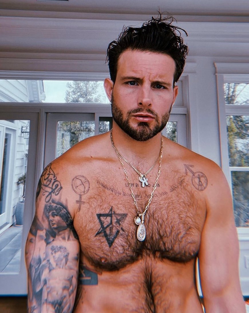
Nico Tortorella chest geometric tattoos

Nico got their first tattoo at 15: Chinese lettering meant to say “health, wealth and happiness.” The story took a turn when a relative explained that the character they understood as “wealth” had a sexual meaning they hadn’t expected. In Nico’s retelling, the phrase went from a teenage blessing to an unexpectedly direct comment about their sex life.

The tattoo stayed. Nico is open about how it began with incomplete information, but that’s not necessarily a reason to remove it. The misunderstanding is now part of its story, along with a family tradition of getting tattoos and motorcycles at certain ages. The lettering matters to them as a memory before it does as decoration.

The Vitruvian Man sits at the centre of the chest

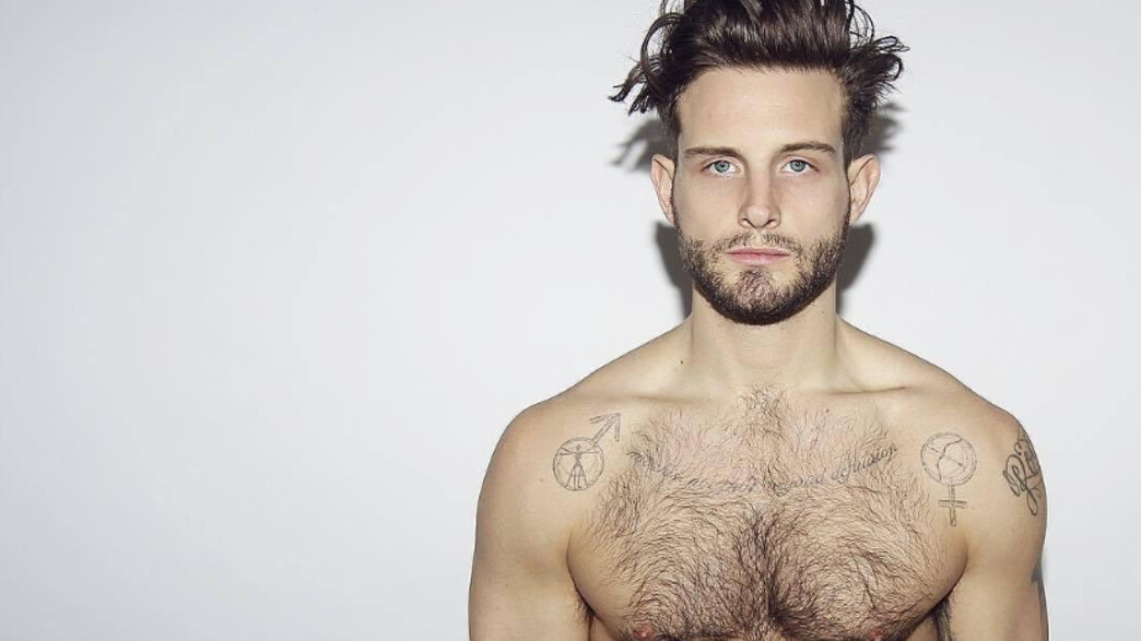
Nico Tortorella Vitruvian Man chest tattoo

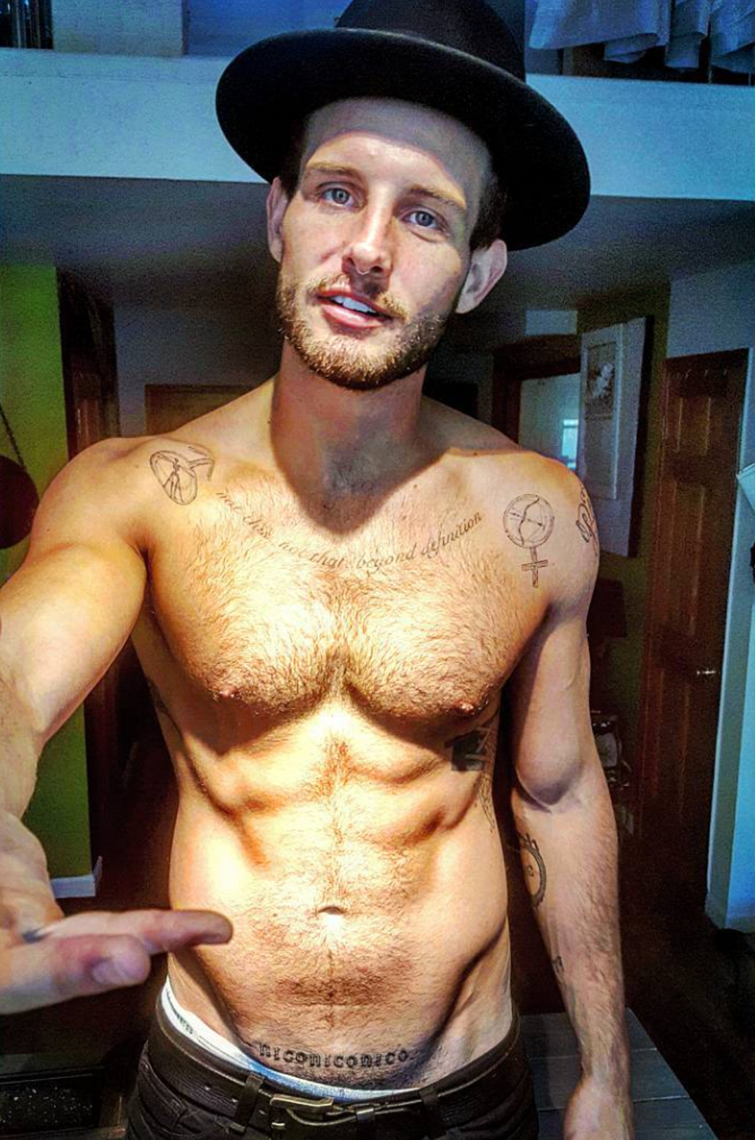
One of the clearest chest pieces is the Vitruvian Man. The familiar figure gives the tattoo a visual centre, but Nico’s version isn’t simply a copy of a museum drawing. It opens up a broader conversation about bodies, identity and the limits of trying to draw neat lines around something more fluid.

That idea connects with Nico’s public conversations about gender fluidity. A chest tattoo is hard to miss, so this one reads as a confident statement even as other pieces bring a more playful tone. The classical outline sits among symbols that make it feel personal rather than like a direct reproduction. The old image is doing new work on Nico’s body.

Lighting and posture can change how the design looks in a photo. A straight-on portrait shows the central figure most clearly; an angled view shows how it sits among the other marks across Nico’s chest and shoulders. No single image captures all of it.

Gender symbols turn the chest into a conversation

Nico Tortorella shoulder star tattoos

Gender symbols beside the Vitruvian figure give the chest an open-ended feel. Nico has described their tattoos as part of a wider exploration of gender, rather than a way of settling on one simple label. The symbols are recognisable, but they don’t claim to be a final answer. They can sit beside each other and let the body hold several ideas at once.

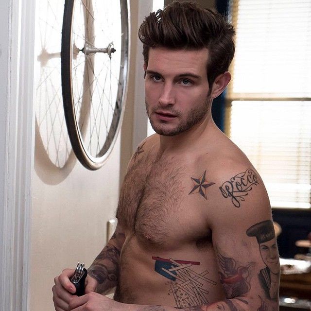
The five-pointed stars across Nico’s shoulders add another layer. They also cover older tattoos, making the current design one chapter in a longer timeline. A cover-up doesn’t always erase what came before; the newer stars are visible, but they sit on skin that has already been tattooed.

These pieces shape the upper body rather than hiding in small spots. They show when Nico wears an open shirt or goes shirtless, forming a loose frame around the chest.

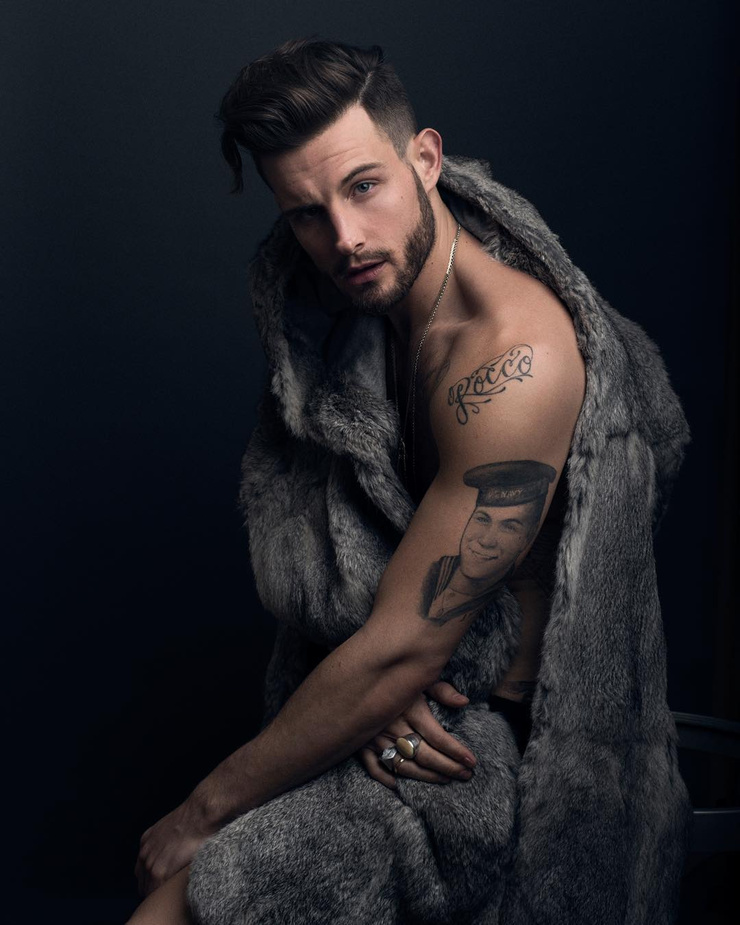
The sailor portrait became one of the signature arm pieces

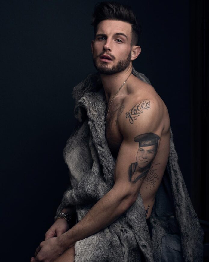
Nico Tortorella sailor portrait arm tattoo

The sailor portrait on Nico’s upper arm is one of the designs people notice first. It has the feel of an old flash image, with a sailor’s face and cap in a classic, slightly rough-edged style. Even when other parts of the arm are covered, the portrait remains easy to pick out.

A face gives the arm a natural anchor. Smaller symbols can blend into a sleeve, but the sailor draws the eye and gives the other pieces somewhere to gather. The image also echoes traditional tattoo themes of travel, luck, work and memory.

Nico has said tattoos should mean something, though they’ve also joked about pieces chosen on impulse. The sailor sits somewhere between those ideas. It’s bold, but the interviews don’t give a neat explanation for every detail. The visible design is clear; the rest can belong to Nico.

Script and small symbols fill the spaces around the big work

Nico Tortorella script and symbol tattoos

Nico’s arms and torso include the smaller work that makes a collection feel lived in. There’s script across the chest and shoulder area, along with symbols tucked near the larger portraits and geometric shapes. Some lettering connects to Nico’s writing and poetry; other marks are easier to see than to identify from a single photograph.

With a collection this busy, a tattoo can stand out in one shoot and disappear in the next because of a jacket, a different angle or a new stage of the work. Photos from different years show the collection changing: old designs are covered, new ones appear, and the gaps between them get smaller.

The smaller pieces are also where Nico’s humour comes through. They don’t all look like parts of one grand plan; they feel more like souvenirs from different versions of the same person. The body becomes the notebook, and the margins keep getting filled.

Geometric work gives the collection a darker edge

Nico Tortorella geometric and sailor tattoo work

The geometric pieces bring a sharper, darker edge to the older sailor and script tattoos. Strong shapes and dense black areas can read like abstract pattern from a distance; closer up, the individual lines come into view. That contrast keeps the collection from feeling entirely traditional.

The tattoos are hard to catalogue from a single photo. One image might show the chest symbols, another the shoulder cover-up, and a third the side or lower torso. Calling every visible patch a separate tattoo would be guesswork. It’s more accurate to describe connected designs added and revised over time.

Nico’s work as an actor may make that shifting visual language feel familiar. They’re comfortable changing their appearance for a role, a shoot or a new phase of life. The tattoos remain, but how they’re shown keeps changing.

A full-body piece pushed the collection into a new phase

Nico Tortorella seaside chest tattoos

Nico has shared photos of a much larger piece running down their body. It’s hard to understand from a cropped arm portrait; a wider view is needed, and even then other designs break up the lines. The scale turns the collection from a handful of separate marks into something closer to a full-body composition.

This large tattoo also helps explain why Nico’s collection keeps attracting attention: the designs move across the body instead of sitting as isolated symbols. There’s a loose sense of movement from the chest toward the stomach, with smaller pieces at the edges. The unfinished feeling is part of the style.

Because intimate photos can be intrusive, it’s better to stick to what Nico has shared publicly and avoid guessing at details that aren’t clear. There’s enough information about the major themes without turning every private area into a puzzle.

The meaning keeps changing as the tattoos stay put

Nico Tortorella’s tattoos don’t carry one fixed message. The first lettering holds a family story; the chest symbols explore gender; the sailor portrait brings in old-school character; and humour and impulse have their place too. The collection can be thoughtful without taking itself too seriously.

That’s part of why the cover-ups matter. A star placed over an older tattoo isn’t only a new image; it shows that Nico changed their mind, their body or simply what they wanted to see there. The collection reads like a timeline, but not a perfectly organised one: new marks sit over old ones, with plenty of edits along the way.

The clearest way to read the tattoos is to focus on the pieces and stories Nico has actually shared: the sailor, Vitruvian Man, Chinese lettering, stars, gender symbols and geometric work. The rest can stay a little mysterious. That feels more honest than forcing every mark into a tidy meaning.

The interview clip

Nico has talked about tattoos in interviews about Younger, gender, sobriety and their work on How Far Is Tattoo Far?. The clip below adds their own voice to the conversation about tattoo meanings and the way a design can become part of someone’s story.

Brad Pitt keeps a whole life in the margins of his tattoos

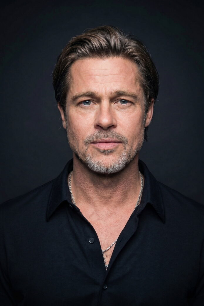
Brad Pitt’s tattoos feel less like a matching set than a notebook he has kept over the years. They mix family history, lines from writers he admires, private jokes and designs that only come into focus in the right photo. Some have been discussed in interviews or repeatedly identified by tattoo coverage; others are visible without a confirmed story behind them.

That mix makes the collection interesting. Pitt can appear in a suit with almost no ink on show, then turn up shirtless in a beach photo or film teaser with designs across his arms, ribs, back and stomach. It makes sense to take the tattoos one at a time and keep documented details separate from guesses based on distant pictures.

The torso and Khmer script keep the family-era ink visible

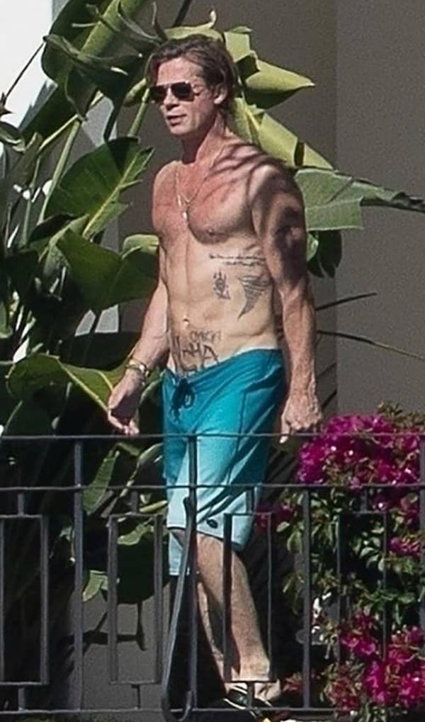
Brad Pitt Khmer script and torso tattoos

One of the clearest parts of Pitt’s collection is the Khmer script low on his torso. It has often been reported as Angelina Jolie’s birth date, written in the Cambodian script associated with the country where she was born. The placement keeps it mostly out of sight unless Pitt is shirtless or wearing low-rise clothing.

That location matters. It is not a design meant to be read from the red carpet; it sits near the centre of his body and belongs to a particular family chapter. Pitt and Jolie were known for sharing tattoos and choosing designs connected to their children, so older photos often show several pieces together.

Nearby marks have also been described as family symbols, including a cross-like arrangement connected with the couple’s children. Public photos do not always show the lettering or layout clearly enough to identify every detail. The careful takeaway is that this torso work belongs to Pitt’s family-era ink, even if online roundups sometimes claim more precise translations than the pictures support.

The tribal forearm design is easy to spot in candid photos

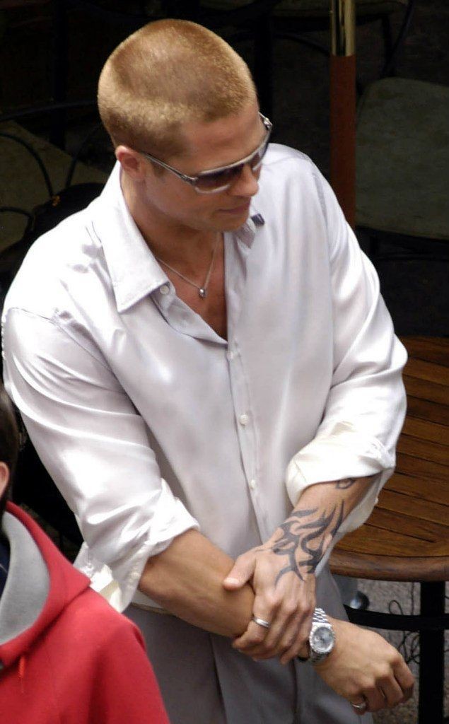
Brad Pitt tribal forearm tattoo

Pitt has a dark, graphic design on his forearm, often described as tribal or geometric. Its heavy black shapes make it easier to recognise than the smaller writing elsewhere. In a quick photograph it can look like part of a sleeve, but closer shots show it as a bold design on its own.

Pitt has not offered a reliable public explanation of its symbolism. Tattoo roundups sometimes assign a sweeping meaning to abstract blackwork, but there is no need to invent one here. Whatever its personal significance, visually the darker shapes balance the more literary pieces on his arms.

The forearm placement also brings it into view in everyday photos, from rolled-up cuffs to film publicity. It is a good example of how the collection reads as a group: the smaller writing can disappear, while this design remains easy to see.

Invictus turns a poem into a forearm statement

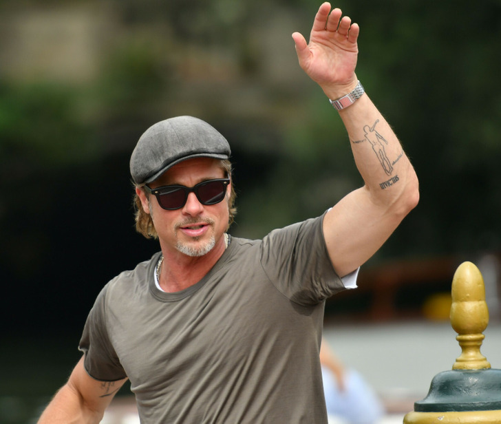
Brad Pitt Invictus forearm tattoo

One of Pitt’s best-known tattoos is Invictus, written on his forearm. The word points to William Ernest Henley’s poem of the same name, which is often read as a statement about resilience and keeping control of one’s inner life in hard circumstances.

The design is spare: a single word, without a banner or a larger scene around it. It works like a reminder that is usually personal but can be glimpsed when his sleeve shifts. Among the more mysterious designs, this is one of the references that is easiest to trace.

It is sometimes reduced to a message about toughness, but the poem is more nuanced than that. “Invictus” is not simply about being invulnerable; it is about holding on to your sense of direction when life is difficult. That gives the tattoo the feel of a literary marker, not just a slogan.

Ötzi the Iceman is one of the clearest documented pieces

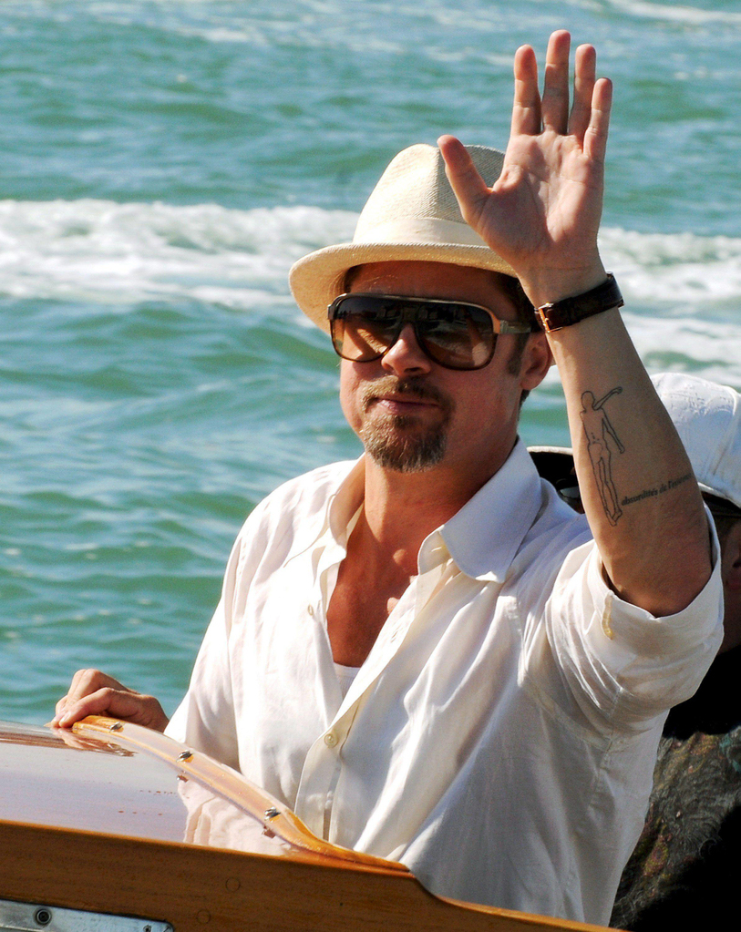
Brad Pitt Otzi the Iceman forearm tattoo

Another distinctive design in Pitt’s collection is the small figure commonly identified as Ötzi the Iceman. Ötzi is the Copper Age mummy found in the Alps; the tattoo appears as a fine, standing figure on Pitt’s arm. Once you recognise it, the unusual image is surprisingly easy to pick out.

Tattoo coverage has connected it to Pitt’s interest in history and the idea of someone preserved across thousands of years. That reading is plausible, but Pitt has not given a detailed public account of his personal reason for choosing it. The figure is widely identified as Ötzi; what it means to him remains less clear.

Its delicate, almost sketch-like lines offer a pause beside the heavier blackwork. It is also an unexpected historical reference, far from the more familiar symbols often seen in celebrity tattoo galleries.

The Rumi tattoo is about a meeting place beyond arguments

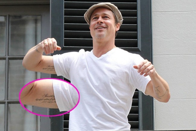
Brad Pitt Rumi quote tattoo on inner arm

On the inside of Pitt’s arm is a line attributed to the Persian poet Rumi: “There exists a field, beyond all notions of right and wrong. I will meet you there.” It is a longer, more reflective choice than a typical one-word tattoo, imagining a place beyond the urge to win an argument.

The quote has often been discussed as part of Pitt and Jolie’s shared tattoo history. Still, Rumi’s words do not belong only to that relationship. The idea of meeting beyond conflict can also speak to family, friendship or personal change.

The inner-arm placement gives the line a quieter feel than lettering across the chest. Pitt can see it easily, while others may only catch it when he turns his arm. It seems like a phrase carried for himself, even though photos brought it into public view.

The older shirtless photos show how much the collection has changed

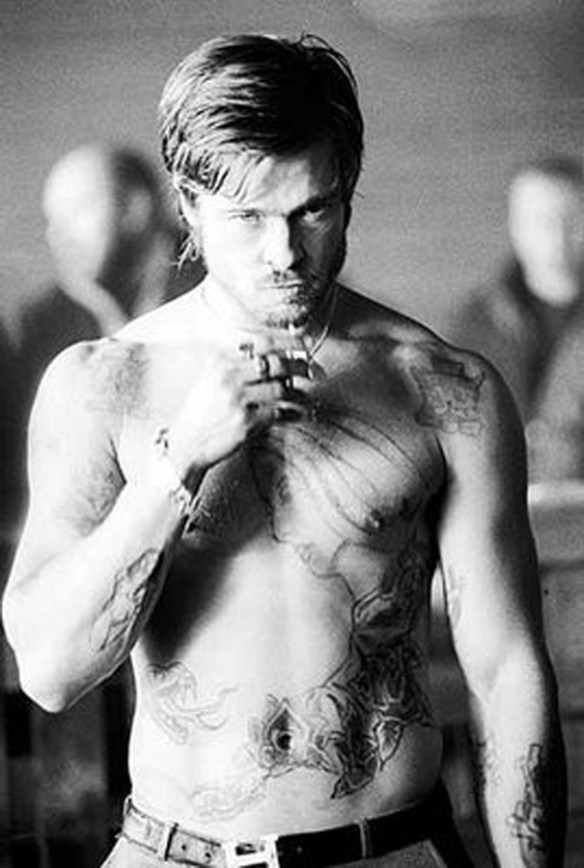
Brad Pitt shirtless chest and arm tattoos

Older shirtless photos help show how Pitt’s tattoos built up over time rather than arriving as one planned sleeve. They reveal the Khmer script, lines on his back, family-related marks and larger designs that usually sit under clothing. More recent film and beach images offer glimpses of additions and of how he presents the ink now.

Tattoo coverage has also described a submarine on his left arm, a tornado on his side, a horse-like image on his back, and smaller geometric marks across his torso. Some reports mention a rhino outline on one leg and a skull outline on the other. These designs have been photographed, but their meanings are less firmly established than the Rumi quote or Invictus.

A little caution helps with older photos. Film roles can involve temporary tattoos or makeup, and shadows in a distant paparazzi shot can resemble ink. It is safer to focus on designs that recur across appearances and label one-off details as reported rather than confirmed. Pitt’s collection is large enough without counting every uncertain mark.
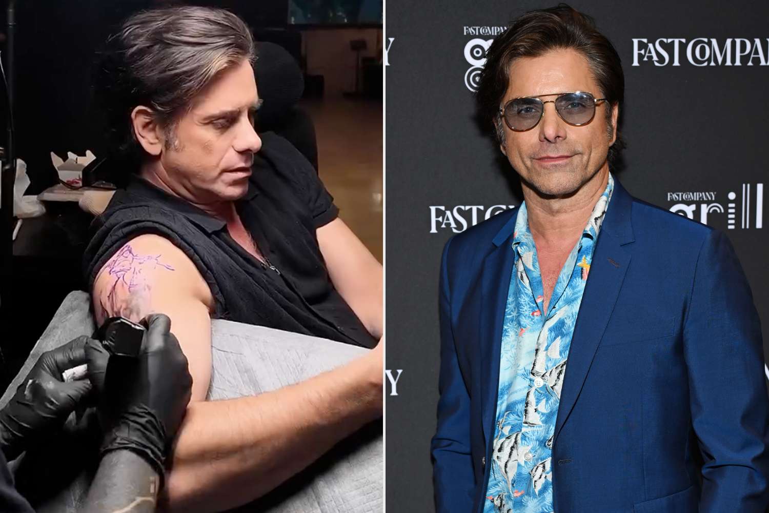
The rib lines and smaller marks are harder to pin down

Brad Pitt minimalist rib line tattoo

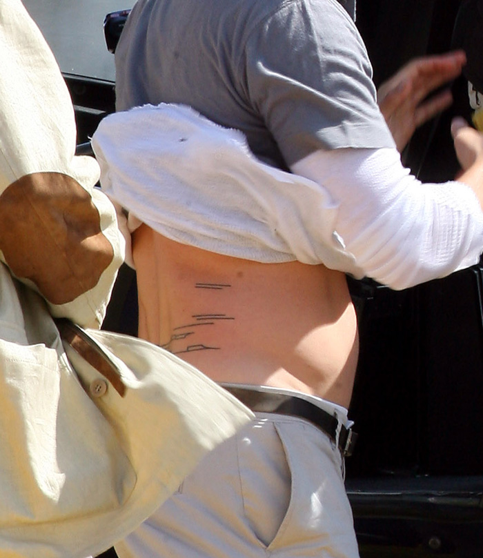
Thin lines and small marks around Pitt’s ribs and back are among the hardest parts of his collection to catalogue. They show up in older photos and have been described as minimalist symbols or lines drawn by someone close to him. The shapes look deliberate, but the images do not always make each one easy to identify.

That uncertainty is part of the story. Pitt has never treated his skin like an official catalogue, and the rib placement keeps these tattoos mostly private. They come into view as glimpses, rather than declarations.

Taken together, the collection has a loose rhythm: literary references, family memories, history, dark graphic work and a few designs that may simply have appealed to him. It does not follow one clean aesthetic, which helps it feel lived in.

Pitt’s tattoos make more sense as a work in progress than as one finished sleeve. The well-documented pieces already tell a story, and the less certain ones leave room for privacy. Invictus, Ötzi, the Rumi line, Khmer script and the bold forearm design each occupy a different part of it; none needs a louder explanation than the ink itself.

Watch Brad Pitt talk about his work

For a glimpse of Pitt away from tattoo photos, this interview looks at his acting career and recent work.

Dheeraj Dhoopar’s three tattoos each carry a different kind of love

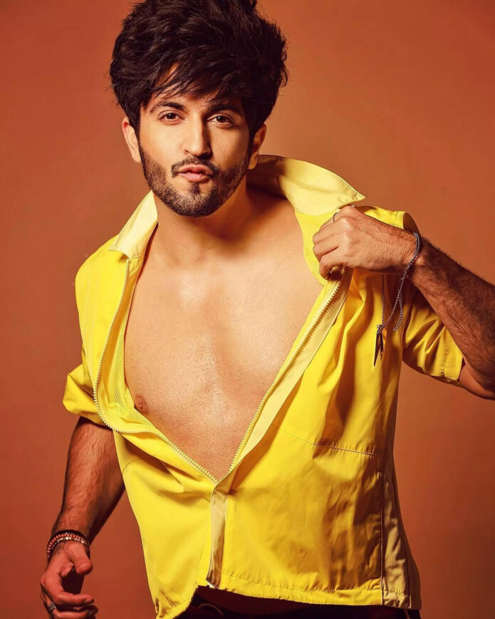
Dheeraj Dhoopar has only a few tattoos, but each one carries its own meaning. The Indian television actor has spoken about three tattoos: a “Starboy” design below his ear, two arrows pointing in opposite directions, and a Christian cross. They can be easy to miss in photos, which is one reason a television appearance in 2026 brought them back into the conversation.

Viewers of Lock Upp: Sach Ya Sazaa noticed the Starboy tattoo and asked about it. Dhoopar said it represents the love and support he has received from fans, family, and those close to him. That explanation gives the collection a clear starting point. Together, the three designs speak to direction, belief, and the people who have supported him.

The Starboy tattoo beneath Dheeraj Dhoopar’s ear

Dheeraj Dhoopar Starboy tattoo under the ear

The best-known piece is the “Starboy” tattoo beneath Dhoopar’s ear. It’s visible from the right angle but small enough to disappear when he turns his head or his hair falls over it. The name might sound flashy, but the meaning he has given it is more personal than a nickname.

Dhoopar has said the tattoo stands for the love and support he has received from fans, family, and loved ones. So the star isn’t just about celebrity. It’s a thank-you. The word reflects the life he has built in public, while its place near his face keeps the sentiment close.

There’s a quiet contrast in the design. A star can suggest ambition, performance, or attention, but Dhoopar’s explanation turns the focus toward other people. It feels less like a victory lap than a reminder of who helped him along the way.

The two arrows and the idea of movement

Dheeraj Dhoopar opposite arrows tattoo on the hand

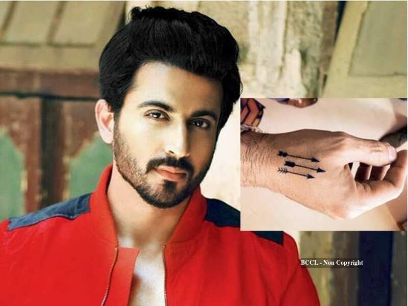
The second documented design is a pair of arrows pointing in opposite directions. The image is clearly described, but there isn’t a detailed public quote from Dhoopar explaining exactly what the arrows mean. Arrows can suggest many things: moving forward, choosing a path, remembering where you started, or accepting that life doesn’t move in a straight line.

The grounded description is simple: there are two arrows, and they point away from each other. More specific explanations should be treated as interpretation, not confirmed fact. The design might resonate with a career that has included long-running television roles, reality shows, and new challenges, but that story shouldn’t be attached to the tattoo without Dhoopar’s own explanation.

Visually, the pair creates a sense of balance. One arrow can feel like a direction to follow; two facing away from each other suggest a choice between paths. The design adds another layer to a small collection that already includes a tribute to the people around him.

The Christian cross

The third documented design is a Christian cross. Alongside the playful “Starboy” tattoo and the directional arrows, it brings a familiar spiritual symbol into the collection. A cross can represent faith, family influence, protection, or a personal reminder of values, without needing a long explanation.

There’s no reason to invent a dramatic backstory. The cross is recognisable, and available reporting identifies it as one of Dhoopar’s three tattoos. Unless he shares more, it shouldn’t be tied to a specific event or person. The tattoo is documented; its most personal meaning is his to explain.

Together with the other designs, the cross helps make the collection feel personal rather than trend-driven. One tattoo is tied to gratitude, another is a simple directional image, and the third is a widely understood religious symbol. The pieces are different, but each can serve as a compact reminder without taking up much space.

What the three tattoos say together

A small collection can still reveal a pattern. Dhoopar’s three tattoos touch on three kinds of connection: “Starboy” reflects the people who support him; the arrows suggest motion or choice, though their exact meaning is unconfirmed; and the cross brings faith or spirituality into the picture. It’s a short list, but it gives the collection an emotional shape.

The clearest explanation belongs to “Starboy,” which Dhoopar has connected to the love he receives from fans, family, and loved ones. It might be tempting to assign equally precise stories to the arrows and cross, but only one tattoo has a clear public explanation. The other two are documented designs whose private meanings remain open.

Keeping that distinction makes the story more accurate. Celebrity tattoo coverage can sound overly certain, especially when a design is small or only appears briefly in a video. The facts are enough: Dhoopar has three tattoos; the Starboy design sits below his ear; the arrows point in opposite directions; and a cross completes the group. Not every meaningful tattoo needs a public explanation attached to it.

How the tattoos fit Dhoopar’s public image

Dhoopar is known for a polished screen presence, and the tattoos add a quieter personal touch. They don’t create a full rebellious makeover. They’re compact and can be covered for a role or formal event, while the Starboy mark below his ear sometimes shows in photographs and adds a flash of personality.

His explanation about fans and family fits the way television careers work. Viewers may spend months or years watching an actor play the same character, which can make the relationship between actor and audience feel familiar. A tattoo acknowledging that support makes sense in that context without turning his body into an advertisement.

The collection’s timeline is less clear. Public reporting doesn’t establish when each tattoo was done, so there’s no basis for saying the arrows came first or that the cross marked a particular career milestone. The designs can be discussed together without inventing a chronology.

An earlier report also photographed a Loved tattoo

Dheeraj Dhoopar Loved tattoo shown in an earlier report

A 2017 Times of India report photographed an earlier version of Dhoopar’s tattoos and described a “Loved” tattoo alongside three arrows. A newer 2026 report lists Starboy, the arrows, and a Christian cross as his three tattoos, so the older image is included as a record of an earlier look rather than counted as a fourth current tattoo.

What is not confirmed

The best-supported count is three. Current reporting doesn’t confirm a fourth tattoo, a large hidden back piece, or a newer design beyond Starboy, the arrows, and the cross. It also doesn’t name a tattoo artist.

The arrows’ exact meaning is unknown, and Dhoopar hasn’t given a detailed public explanation of what the cross means to him. That’s a useful limit to keep in mind: the designs can be named and described where the reporting supports it, but the gaps shouldn’t be filled with invented personal history.

Photos also deserve care. A close-up or shirtless image may show skin clearly, but it doesn’t prove that every dark mark is permanent ink. Lighting, jewelry, body hair, and image quality can all cause confusion. The count here follows the published description of Dhoopar’s collection rather than guesses about marks in photos.
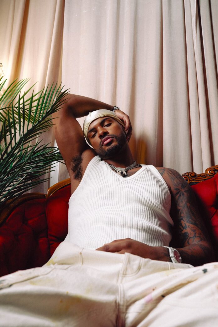
Dheeraj Dhoopar tattoo checklist

  • Under the ear: “Starboy,” a tribute to the love and support Dhoopar says he receives from fans, family, and loved ones.
  • Arrows: two arrows pointing in opposite directions; their exact personal meaning hasn’t been made public.
  • Cross: a Christian cross in the three-tattoo collection; the personal story behind it hasn’t been fully shared.
  • Total documented tattoos: three.
  • Publicly named tattoo artist: none confirmed in the available reporting.

That’s the clearest documented inventory. Dhoopar’s tattoos aren’t about collecting every popular design; they keep a few ideas close: gratitude, direction, and faith. The pieces are small and personal, but clear enough to suggest a story. The Starboy design may be the headline tattoo, but all three work best as a group.

There’s a practical lesson here, too. A tattoo guide is more useful when it separates what someone has shared from what viewers might assume. Dhoopar’s three tattoos are enough to tell a coherent story, and leaving uncertain details open respects the line between public style and private life.

Watch the tattoo discussion

This Hindi entertainment clip focuses on Dhoopar’s new “Starboy” tattoo and the attention it drew from viewers.

John Stamos Finally Got Ink at 62

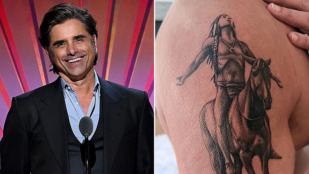
John Stamos waited until he was 62 to get his first tattoo, and the choice turned out to be more than a typical celebrity-ink reveal. It is a Native American rider on horseback, looking up, covering a large area of his upper right arm. The timing is part of the story. After decades on television, onstage and on tour buses, Stamos had never made a tattoo part of his public image. When he finally chose one, he did not go for a tiny symbol near his wrist. He picked a large image tied to music, freedom and the direction he wants his life to take.

This is currently the only publicly documented tattoo in his collection. That makes it easier to separate what is known from rumours. There is no long list to fill out and no reason to suggest the piece belongs to a secret sleeve. Stamos got one major tattoo, explained the choice and shared the process as it happened.

John Stamos’s first tattoo is a Native American on horseback

John Stamos Appeal to the Great Spirit tattoo and portrait

The design shows a Native American rider on horseback, looking toward the sky. It is a large, detailed image rather than a simple outline. In photos from the appointment, it covers a broad stretch of his upper arm, which surprised people expecting a smaller first tattoo.

The composition feels traditional and almost monumental. The rider and horse appear in profile, the figure’s arms raised as the horse moves forward. That gives the tattoo a sense of motion without adding text or extra symbols.

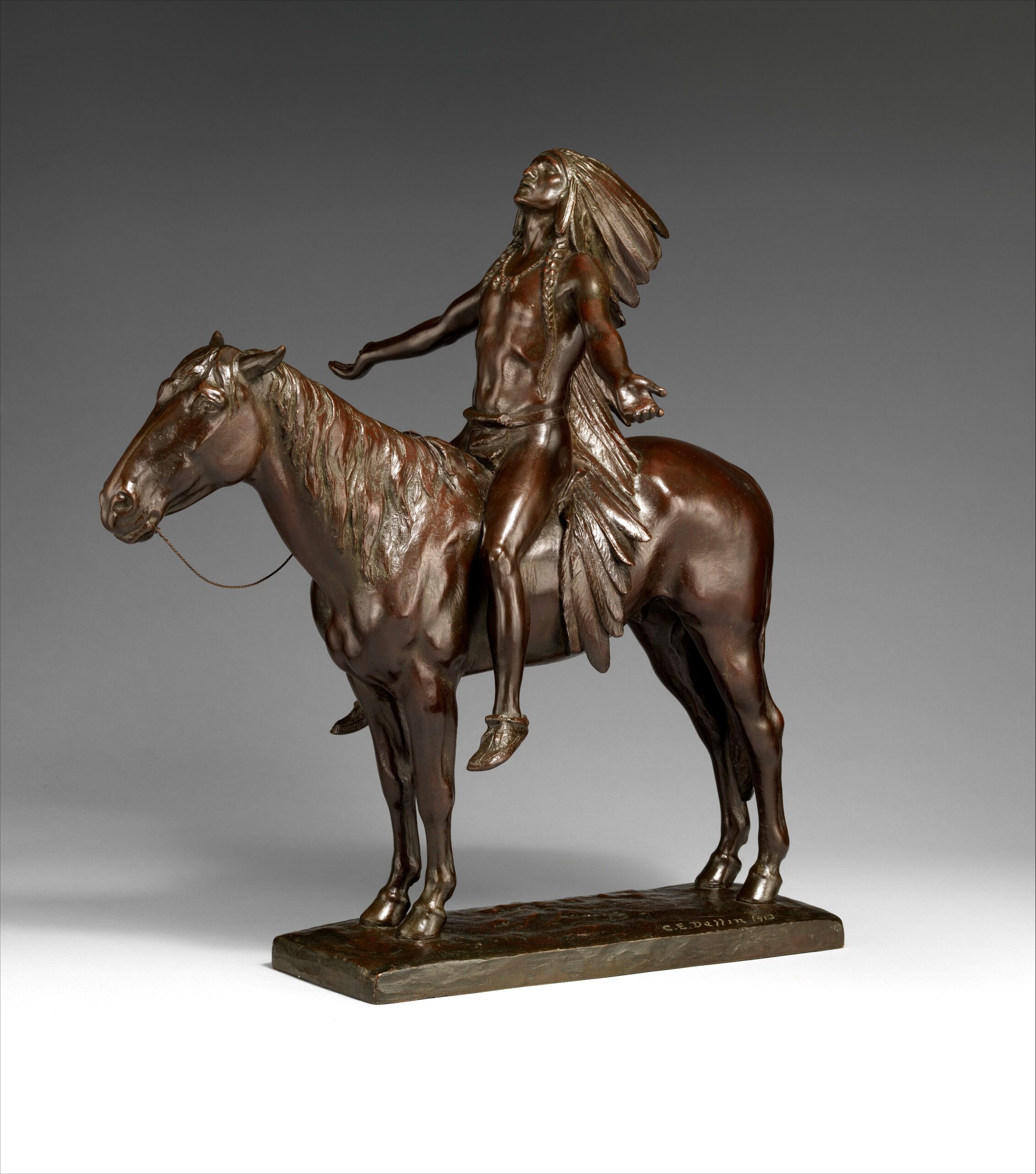
Stamos did not describe it as a random picture picked from a flash book. He connected it to “Appeal to the Great Spirit,” the well-known image the Beach Boys used above the Brother Records logo. That gives the tattoo two layers: a historical-looking figure and a personal nod to a band that has been part of his life for decades.

The design works as a first tattoo because it can carry meaning without a caption. Even in an early process photo, the silhouette is easy to read: the rider looks upward, the horse creates a strong horizontal line, and the placement gives the image room to breathe.
Why Stamos chose to get ink at 62

Stamos described the timing as a decision that finally felt right. He had recently turned 62 and was talking about a new chapter in his career and personal life. Rather than treating the number as a reason to slow down, he framed it as a moment to take bigger chances.

That makes his first-tattoo story different from one driven by youthful rebellion or a desire to shock people. Stamos chose the image after decades of knowing what his public image looked like. The tattoo does not suggest he suddenly became someone else; it makes a change he already felt more visible.

Waiting this long gave the choice a settled confidence. He had years to watch trends come and go and decide whether he wanted a tattoo of his own. By the time he sat in the chair, the decision was about more than novelty.

There is something funny about the scale of the reveal. A first tattoo at 62 could have been a tiny star or a discreet date. Instead, Stamos chose an image that covers much of his upper arm. He was not looking to ease into the idea halfway.

The Beach Boys connection gives the image its meaning

Appeal to the Great Spirit reference for John Stamos tattoo design

Stamos has a long public connection with the Beach Boys. He has performed with the band and often talked about how important music has been in his life. He tied the tattoo to “Appeal to the Great Spirit,” the image the group used for Brother Records as a sign of artistic freedom and trust in a creative path.

That is more specific than saying the tattoo simply stands for strength. The figure is not just there because it looks dramatic. Stamos uses it as a reminder to stay open, keep moving and trust where the work takes him.

He has said he felt the same pull in his own life and wanted the tattoo to remind him to “stay brave, stay open, and trust the direction the art is taking me.” That makes the image feel like a personal note large enough for other people to see.

The piece also brings his acting and music careers together. Many people know Stamos from television, especially Full House, but his relationship with the Beach Boys has kept music close to his public story. The tattoo connects those parts of his life instead of choosing just one.

The process matters as much as the finished design

John Stamos getting his first Native American horseback tattoo on his upper arm

Stamos shared a montage of the tattoo being done, giving the first piece more context than a single reveal photo. The video shows the early outline, the artist working across his upper arm and the image gradually taking shape. That is useful with a large tattoo, which can look abstract before the shading is finished.

The first lines do not immediately read as a complete rider and horse. As the shading comes in, the figure becomes easier to recognise. Seeing that change makes the final image feel built over time rather than instantly produced.

The footage also makes the appointment feel less like a publicity stunt. Stamos showed the awkward middle stage, when the design was still underway and the artist was working over his skin. A polished red-carpet photo would hide that part; the montage leaves it in.

For someone getting a first tattoo later in life, that openness matters. A large piece takes time as well as commitment. It asks for planning, patience and a willingness to live with the image while it is still unfinished.
One big tattoo gives him a clear visual starting point

Because Stamos has only one documented tattoo, it immediately becomes the centre of his ink story. No older designs compete with it, and there is no need to explain how it fits into a sleeve. The upper-arm placement can leave room for future work, but the first choice already stands on its own.

That does not mean he is planning a full collection. Stamos has not announced another tattoo, and one design is not evidence that a sleeve is coming. The useful point is that he chose a placement that works by itself.

The tattoo feels complete without closing off the possibility of more. It has a clear subject, enough space and a meaning that does not depend on matching pieces. If Stamos never gets another tattoo, this one still reads as a finished statement. If he adds more later, the upper arm gives him options without dictating a direction.

That balance can be hard to find. A first tattoo can feel too small or leave no room to grow. Stamos landed between the two: one substantial image without committing to a full sleeve.
What John Stamos’s first tattoo says about this chapter

Stamos framed the tattoo around bravery, openness and following the work. Those ideas fit with how he has talked about his life in recent years, including family, sobriety and staying on a healthier path. The design is not a direct memorial to one person, but it connects to choosing a direction and committing to it.

The rider looking upward gives the image a hopeful feel. It is not a skull, a warning or a joke. It is a figure in motion, tied to music history and the idea of taking the next step even when the whole route is not mapped out.

There is no need to make the tattoo more mysterious than Stamos already has. He has explained the reference. The appeal is in the straightforward meaning: a new piece for a new phase, connected to art that has mattered to him and placed where he can see it.

That makes it a fitting first tattoo. It is personal without being too private, dramatic without feeling random, and large without covering his whole body. At 62, Stamos did not need ink to prove he was tough. He used it to mark a decision about where he wants his life to go.

For now, the collection is one design, but it is a substantial one. The rider, horse and upward gaze point back to the Beach Boys reference and the idea of creative freedom. The tattoo is hard to miss, and its story keeps it from feeling like a late-life novelty.

If this remains Stamos’s only tattoo, it still tells a complete story. He waited until the choice felt right, picked an image tied to his musical life and treated the appointment as a reminder to keep moving forward. That is a lot for one tattoo to carry, but it has the scale and backstory for it.

Watch John Stamos get his first tattoo

This verified video report covers Stamos’s first tattoo and the Beach Boys meaning behind the design.

Mortal Kombat, Family and the Ink Trevor Jackson Chose

Trevor Jackson’s tattoos look chosen for a reason. Many connect to a person, belief, film, game, or memory he wants to keep close, so the collection feels more like a scrapbook than a random sleeve.

He has explained much of the ink himself. His first tattoo used a Bible verse in his mother’s handwriting; others refer to family, music, martial arts, and characters that shaped him. There’s even a large back piece tied to a frightening period in his life. Here’s a look at the tattoos Jackson has discussed, without trying to guess at marks hidden under his shirt.

Trevor Jackson’s first tattoo is a Bible verse from his mother

Trevor Jackson arm and shoulder tattoos

Jackson got his first tattoo at 18. It’s 2 Timothy 1:7, a Bible verse his grandmother taught him, written in his mother’s handwriting. That made it easier for his mother to accept: the words weren’t random text picked from a book, but a family memory in familiar handwriting.

The verse says God gave people power, love, and a sound mind instead of fear. Jackson has called it the first Bible verse he learned, making it both a faith tattoo and a piece of home. It sits on his left side, in the area that later grew into tattoos across his left arm and back.

It also gives a sense of how he approaches ink. Jackson has said his tattoos carry “extreme meaning,” usually tied to a situation, value, or belief. Even when the subject is a game or comic-book character, there’s generally a personal reason behind it.

The Jesus and Peter back tattoo came from a rough period

Trevor Jackson back Jesus and Peter tattoo

The clearest view of Jackson’s back shows Jesus pulling Peter out of the water, with a boat included in the scene. He said the design came from a difficult period when he felt he had been saved from something that could have gone badly.

It’s one of his larger, more detailed tattoos. Jackson said it took three sessions, which tracks with the shading and the way the figures fill his back. Water, movement, and a religious story all come together in one scene.

The message is direct but personal: being pulled out of trouble. Jackson has also said he’s proud of times when he felt lost, sad, or unsure, because those experiences helped shape him. The back piece fits that idea especially well.

Jackson explained the feeling behind the design without presenting it as a full account of his life. It’s a religious reference tied to survival and relief, not evidence that every tattoo he has carries a hidden religious message.

His left arm mixes Mortal Kombat with Toy Story

Trevor Jackson sleeve tattoos

Jackson’s left arm has some of the collection’s more playful references: designs from Mortal Kombat and the aliens from Toy Story, pointing toward the famous claw. The mix may sound unusual, but both come from things he genuinely enjoys.

The Mortal Kombat design is a tribute to his favourite game. Jackson jokes that he’s very good at it and that the tattoo warns people not to challenge him. It’s a fun detail, but it still follows his broader rule: a tattoo has to mean something before it earns a place on his skin.

The Toy Story aliens carry a more reflective idea. They’re stuck in a glass case, waiting for the claw to lift them somewhere else. Jackson related that image to the feeling that people are here to do something bigger, even if they don’t yet know what it is. Their wish to ascend became a reminder not to stay stuck or settle for a stationary life.

These aren’t just childhood references. Jackson uses familiar characters to express ideas about ambition, freedom, and growing into something bigger. The cartoon images feel approachable, while the stories behind them add another layer.

Prince, Bruce Lee and Capoeira fill out the arm story

Trevor Jackson arm tattoos portrait

Jackson has several more references on his arm. A Prince tattoo connects to the point when he started feeling more confident making music and playing guitar. Prince showed him he could do things differently, write for himself, and take charge of his own direction.

A tattoo tied to Bruce Lee recalls the martial-arts movies Jackson’s dad showed him as a child. Lee became a major influence, and the design represents making your own path instead of letting other people decide who you should be. Jackson has compared that kind of self-belief to figures such as Muhammad Ali, who carried himself as great before everyone else agreed.

Another piece represents Capoeira, the Afro-Brazilian martial art that enslaved people in Brazil disguised as dance when they were barred from training openly. Jackson has talked about its mix of discipline, acrobatics, music, and movement. The tattoo brings cultural history and physical practice into the collection.

Together, the designs explain a lot about the arm. Prince represents creative freedom, Bruce Lee self-belief, and Capoeira discipline and history. They look different, but the ideas fit beside one another.

Jackson’s approach has something in common with how Titus Welliver’s tattoos are discussed: what matters isn’t only how much skin is covered, but why certain memories stayed important enough to become permanent.

The Jackson ambigram and Silver Surfer tattoo are all about identity

Trevor Jackson forearm tattoos

One of Jackson’s cleverest pieces is an ambigram that reads “Jackson” from either direction. Turn it around and his name still works. It’s a smart bit of lettering, and it suits someone who thinks about identity and how he wants to move through the world.

Above it is a Silver Surfer tattoo. Jackson calls the Silver Surfer his favourite superhero. He likes that the character gave up his own life to save his world and carries the power of the cosmos. The tattoo is about more than a comic-book costume; it points to sacrifice, scale, and a bigger purpose.

The two images occupy the same area but carry different ideas. The ambigram is personal and name-based; the Silver Surfer looks toward a much larger fictional universe. One says who Jackson is, while the other points to the kind of heroic story he finds inspiring.

Jackson’s advice on timing is practical: get a tattoo when you actually feel ready, not because you think there’s a perfect age or schedule. His collection reflects that. He isn’t forcing every piece into one strict style; he’s recording what mattered at different points in his life.

Family ink, One Love and the woman on his arm

Trevor Jackson family and arm tattoos

Family is another strong thread in Jackson’s tattoos. He and his father have matching lion designs: his father has the large lion, with Jackson represented by a cub inside it. The pairing makes the animal imagery about their relationship rather than a generic lion tattoo.

He also has “One Love” inked on his body. The phrase comes from his family, especially his uncle Squeak, a large man Jackson describes as one of the gentlest people he knows. His uncle would say the words back whenever he saw the tattoo. The phrase caught on in the family, making the lettering a kind of private greeting that became permanent.

On the back of his arm, Jackson chose a portrait of a woman he first noticed in a tattoo shop. He didn’t know who she was; he simply liked the image and asked the artist to use it. The portrait includes a yin-yang symbol, the number 8 in the earring, and 777 in the hat.

Jackson connects those details to balance and numbers he likes. The yin-yang represents balance; eight is his favourite number, and sevens have appeared often in his life. It’s an example of how he can start with an image that catches his eye and then build personal meaning into the small details.

He has talked about filling out the other side of his body, including tattoos on his left leg and right side. Those were future plans, not completed work. The same goes for Flash, Ninja Turtles, and Rough Drafts designs he has considered; they shouldn’t be listed as tattoos he already has.

That mix of finished pieces and future ideas keeps the collection in motion. It’s best read as a timeline of people, stories, and interests rather than a fixed catalogue.

Watch Trevor Jackson talk through the stories behind his tattoos in the GQ Tattoo Tour:

Titus Welliver’s Tattoos Tell the Story of His Life

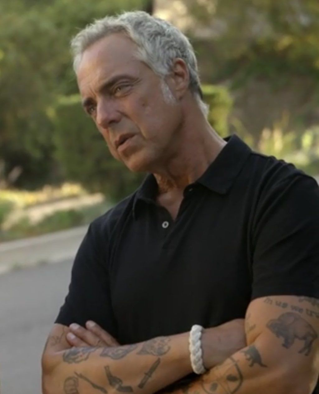
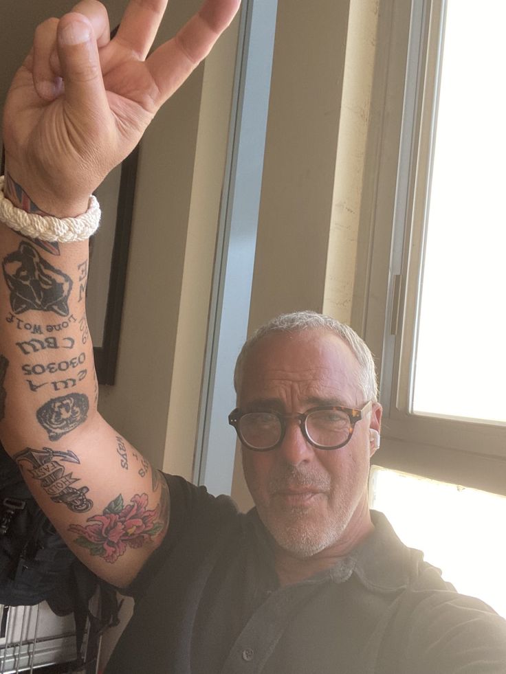
Titus Welliver has nearly thirty tattoos, and they aren’t just there to make him look tougher on screen. He’s been collecting them since he was young, and many connect to family, his background, martial arts, and long-standing interests.

That’s one reason the tattoos work so naturally on Bosch: they look lived-in because they are. When Welliver was cast as Harry Bosch, production could have covered the ink with makeup. He explained that the tattoos were real, and the show chose to leave them visible. The detective’s sleeves feel like part of his history rather than a costume detail.

Welliver has explained some designs clearly; others take a closer look at photographs to identify. This guide sticks to what he has said and what’s visible without inventing a story for every small mark.

The dojo koi were his first tattoo

Titus Welliver dojo koi and arm tattoos

Welliver told Inked that his first tattoo represents his martial arts dojo: two koi circling a rock. He says the fish stand for strength and fluidity, so the piece means more to him than simply liking Japanese-style tattoos.

The koi sit high near his shoulders and can be covered by a T-shirt. When his arms are bare, they help explain how the sleeves grew. The traditional image gives the collection a solid starting point, alongside later lettering and pop-culture references.

It’s a fitting first tattoo. Koi are often associated with movement, persistence, and pushing against resistance. That fits Welliver’s explanation, but it’s best to stay with what he has said rather than pile on extra symbolism.

Martial arts are also part of the way he carries himself. The koi aren’t a random image hidden under a sleeve; they connect to an important part of his life that began before his best-known television role.

The Silver Surfer brings comic-book colour to the sleeve

Titus Welliver Silver Surfer arm tattoo

Below the koi, Welliver has a Silver Surfer tattoo, one of the collection’s most visible pop-culture references. It sits among flowers, lettering, and other arm designs rather than looking like a sticker on its own.

The Silver Surfer makes a playful contrast with the tougher animals and weapon images elsewhere on his arms. The character’s distinctive shape stands out even when the sleeve is busy. It’s a reminder that Welliver’s tattoos aren’t all family names or solemn personal symbols.

That variety keeps the sleeves interesting. A martial arts design, a comic character, and traditional imagery can all sit together without looking completely out of place. The collection is personal, but it leaves space for things he simply enjoys.

Unlike actors who keep their fandom hidden, Welliver lets these references show. They help the sleeves look like a real person’s arms rather than one matching design made for a photo shoot.

The White Pony tattoo and the words So It Goes

Titus Welliver White Pony So It Goes tattoo

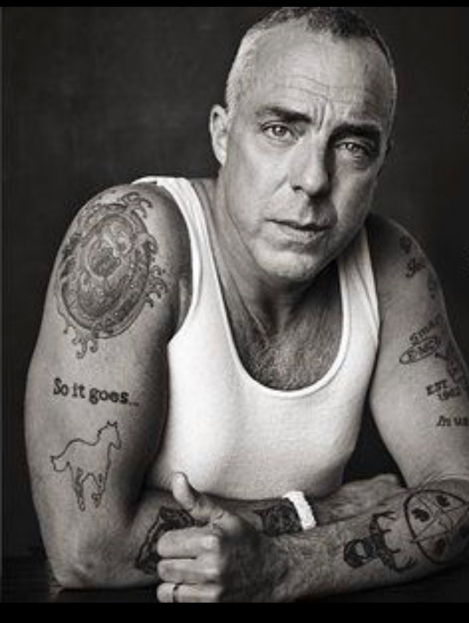
A clear music reference in Welliver’s collection is a white pony on his arm with “So it goes…” above it. He has said the tattoo was inspired by the cover of Deftones’ album White Pony, one of his favourite bands.

The horse is drawn as a simple outline, with the phrase lending it a reflective feel. It’s smaller than a full realistic portrait, and the words give the image a personal connection.

“My first tattoo is the symbol of my martial arts dojo. The two koi circling a rock represents strength and fluidity.” The quote captures how Welliver talks about his ink: he connects the designs to parts of his life instead of describing them as something that merely looks cool.

The White Pony piece also shows why one television still can be misleading. A sleeve may be covered by clothing, flipped by the camera, or partly hidden by a costume. In a clear portrait, the horse and words are much easier to distinguish from the surrounding tattoos.

Roses, wildcats and the bold right forearm work

Titus Welliver rose tiger and bobcat forearm tattoos

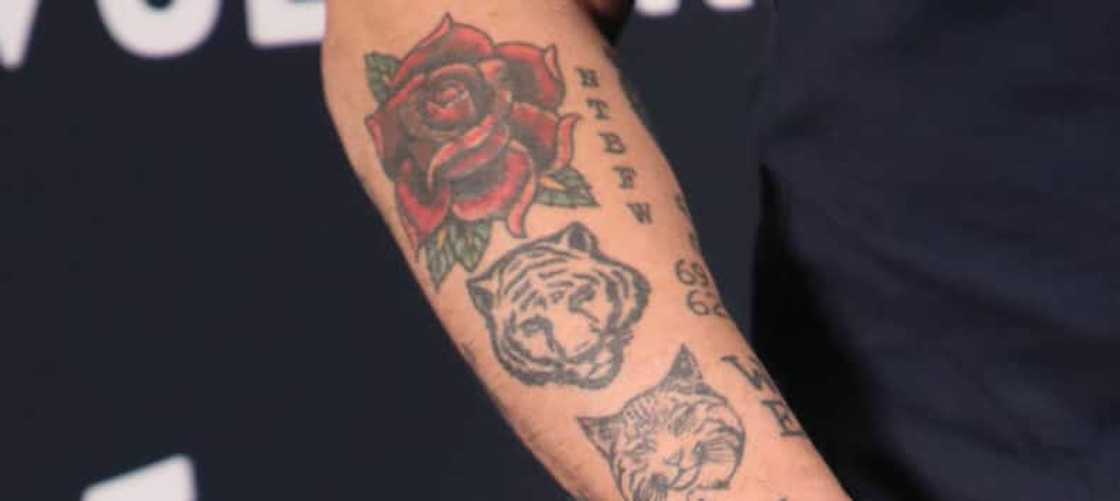
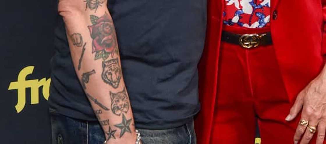
Welliver’s right forearm is packed with recognizable designs: a red rose above three wildcat heads, a lion, tiger, and bobcat. The lion was later covered by the rose, giving this part of the sleeve its own history.

Welliver hasn’t confirmed a personal meaning for each animal, so it’s safest to describe them as wildcat portraits. People may associate lions or tigers with strength, but that doesn’t tell us why he chose them. The rose is easy to see; the more intriguing detail is the story behind the lion cover-up.

The arm also has “NTBFW” and the number 69. The initials are often read as “Not To Be F***ed With,” though Welliver hasn’t given a detailed explanation of the phrase’s personal meaning. The lettering adds an edge beside the softer flower and animal faces.

This is the part of his ink that most resembles a traditional biker-style sleeve. Roses, animals, block letters, and dark outlines bring that old-school toughness, while the rest of the collection keeps it from becoming one-note. His arms feel like a timeline rather than a matching set.

Guns, knives, stars, bears and the Lone Wolf

Titus Welliver weapons star and forearm tattoos

Another part of the sleeve features a closed fist, a stick, a revolver, and a knife, with stars and smaller marks filling the gaps. These tattoos are noticeable in Bosch, when the camera catches Welliver’s forearm as he holds a file, leans on a car, or rolls up his sleeves.

Welliver hasn’t assigned a public meaning to every weapon, so they’re best described as visible objects. Tattoo guides sometimes turn a gun or knife into a statement about violence, even when the wearer hasn’t said that.

On the inside of his arm is a bear with the letters NTBFW, and on his wrist a wolf with “Lone Wolf” above it. Welliver has connected the wolf to loyalty and love for his pack. The bear and lettering sit nearby, making the area a grouping of animal and text designs.

A blue-and-black star appears near the wrist, along with another star inside a circle with footprints. There’s also a logo-style “All Ways” and “Always” design. These smaller pieces break up the large portraits and images.

Family, Irish roots and why Bosch kept the real ink

Titus Welliver buffalo EST 1962 arm tattoo

Not every tattoo on Welliver’s arms is an animal, weapon, or comic reference. He has said some are his children’s names and birth dates. Other designs connect to his Irish and Native American background. The variety reflects how the collection grew at different times and for different reasons.

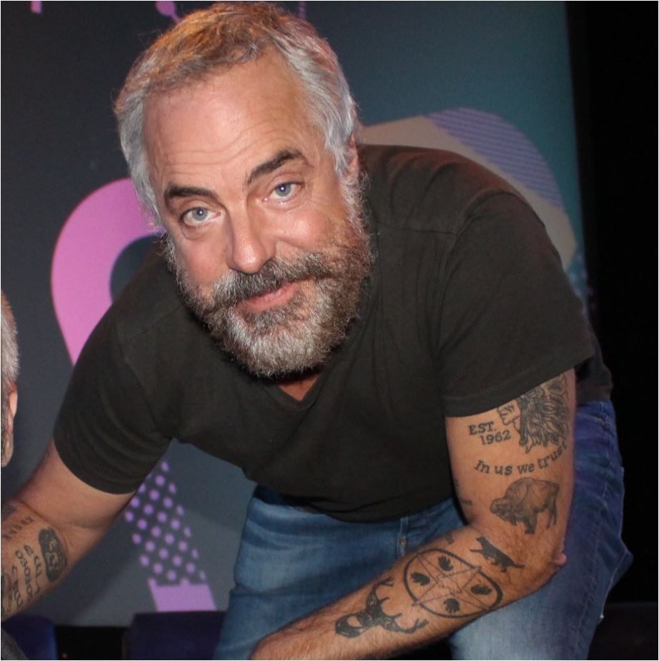
One arm photo shows a buffalo beside “EST. 1962” and the phrase “In us we trust.” Other small designs around his forearm are difficult to make out from a distance. A close-up reveals more than a red-carpet shot.

The tattoos became part of Harry Bosch almost by accident. Welliver told Inked that covering them every day would take extra time, so he spoke with Michael Connelly and production decided to leave them visible. The show incorporated Bosch’s fictional “Hold Fast” knuckle tattoos into that choice, without pausing to explain every mark.

That choice adds texture to the character. The arms don’t look like temporary props, and the tattoos don’t disappear when a scene turns serious. They’re simply part of Welliver’s life and, as a result, part of Bosch’s look.

His collection has something in common with Rag’n’Bone Man’s crowded arm work: both have a rough, collected feel, with different ideas added over time instead of one perfectly planned sleeve.

In the end, Welliver’s tattoos are compelling because they’re real, personal, and a little messy. Koi, the Silver Surfer, the White Pony horse, wildcats, roses, weapons, stars, family details, and lettering sit together without needing one grand explanation. They tell their stories in pieces, which is why another design catches the eye whenever he rolls up his sleeves.

Tyler Posey’s Ink Has Always Been a Work in Progress

Tyler Posey’s tattoos have never seemed like a finished project. They began with a small Blink-182 reference and grew into colourful traditional pieces, black armbands, chest and leg work, and odd little drawings that feel more like a sketchbook than one planned sleeve.

The designs don’t all match, and Posey hasn’t tried to make them look as if they came from one big plan. In his Teen Vogue tattoo video, he talked through the first piece, the painful leg work, his arm designs, and why acting often means covering the ink with makeup.

He has also said in recent interviews that some older tattoos don’t mean as much to him now. That doesn’t make them pointless; it shows how the collection has changed with him, and how a tattoo’s story can shift over time.

The first tattoo came from Blink-182

Tyler Posey shoulder and forearm tattoos

Posey has said his first tattoo was the opening note from a Blink-182 song. It’s a small design, but it says a lot about the rest of his collection. He was a huge fan of the band and had been thinking about tattoos since he was around ten or twelve, well before he could get them.

He has described drawing little outlines of himself on paper and filling them with tattoo ideas. That’s close to how his actual collection developed: serious pieces beside jokes, traditional flash, and small designs that looked good at the time.

The Blink-182 note came before the bigger commitments. As an actor, Posey had to think about placement. His arms and hands needed to stay manageable because the makeup team on Teen Wolf had to cover the tattoos for Scott McCall scenes.

His colourful arm tattoos mix traditional designs with black bands

Tyler Posey gypsy shoulder tattoo

Most people notice Posey’s arm work first. One shoulder has a colourful gypsy woman; the forearm carries a dagger, streetlight, skull, umbrella, and other traditional-style designs. They’re bold enough to read from a distance, but they don’t form one solid blackout sleeve.

Posey has said he chose different artists because he liked seeing how each handled a similar broad style. The outlines, colour, and shading vary, so the sleeve feels like it grew over time instead of being ordered from a catalogue.

Two solid black armbands are another recognizable part of his look. They sit high on the arm and create a strong contrast with the colourful work. In photos, the black bands can make the red, green, and yellow designs look even brighter.

There’s also a practical story behind the arm tattoos. Posey has explained that moving onto his forearm made the ink much harder to hide. For television, the makeup department had to shave and carefully cover his arms and body. He loves the tattoos, but acting made each new one more complicated.

The leg work includes a painful full-colour piece

Tyler Posey colorful arm tattoos outdoors

Posey’s leg tattoos are less visible in everyday photos, but he has described them as some of his most painful work. In the Teen Vogue tour, he showed a colourful piece on the back of his calf and said it hurt because there’s little padding in that area.

He didn’t frame the pain as a badge of honour. It was more of a warning. The calf design is packed with colour, with very little skin showing through, and was a different experience from a small line or quick arm symbol.

Other leg tattoos include an American traditional tiki from a trip to Hawaii, a small sign, and a hot-air balloon. They give the lower part of the collection a travel-and-memory feel. They aren’t all deep tributes, but they mark places and moments that stayed with him.

Photos of the leg work can be tricky to read because shorts, socks, or the camera angle hide parts of it. A seated portrait might show the dagger and lower-leg designs but not the upper thigh. One picture rarely tells the full story.

The eagle and chest tattoos changed the whole look

Tyler Posey eagle chest tattoo

The large eagle across Posey’s chest is one of the easiest tattoos to spot in shirtless photos. Its wings stretch across his upper chest, giving the collection a centre that the smaller early pieces didn’t have.
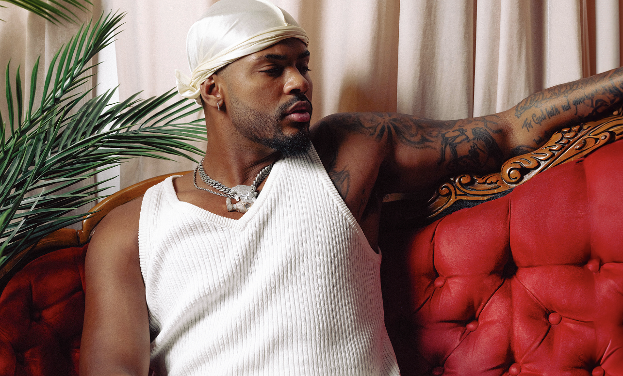
Nearby are a red heart pierced by a dagger and other small designs around his stomach and ribs. The chest work starts to feel connected, though each tattoo still keeps its own shape and colour.

A cherub-like figure sits lower on his torso, with smaller marks that show up differently depending on the light. Some older photos make the chest look more open; later mirror shots reveal more work around the eagle and down his sides.

The chest ink shows how much Posey’s look changed from the actor-friendly image at the start of Teen Wolf. An eagle isn’t easy to hide with a little concealer. Shirtless, it becomes part of the first impression.

That doesn’t mean the eagle has one confirmed meaning that explains the whole collection. It works visually as a bold traditional bird, and Posey seems comfortable getting tattoos because he likes the image as well as any story behind it.

Comedy masks, skulls and umbrellas keep the collection playful

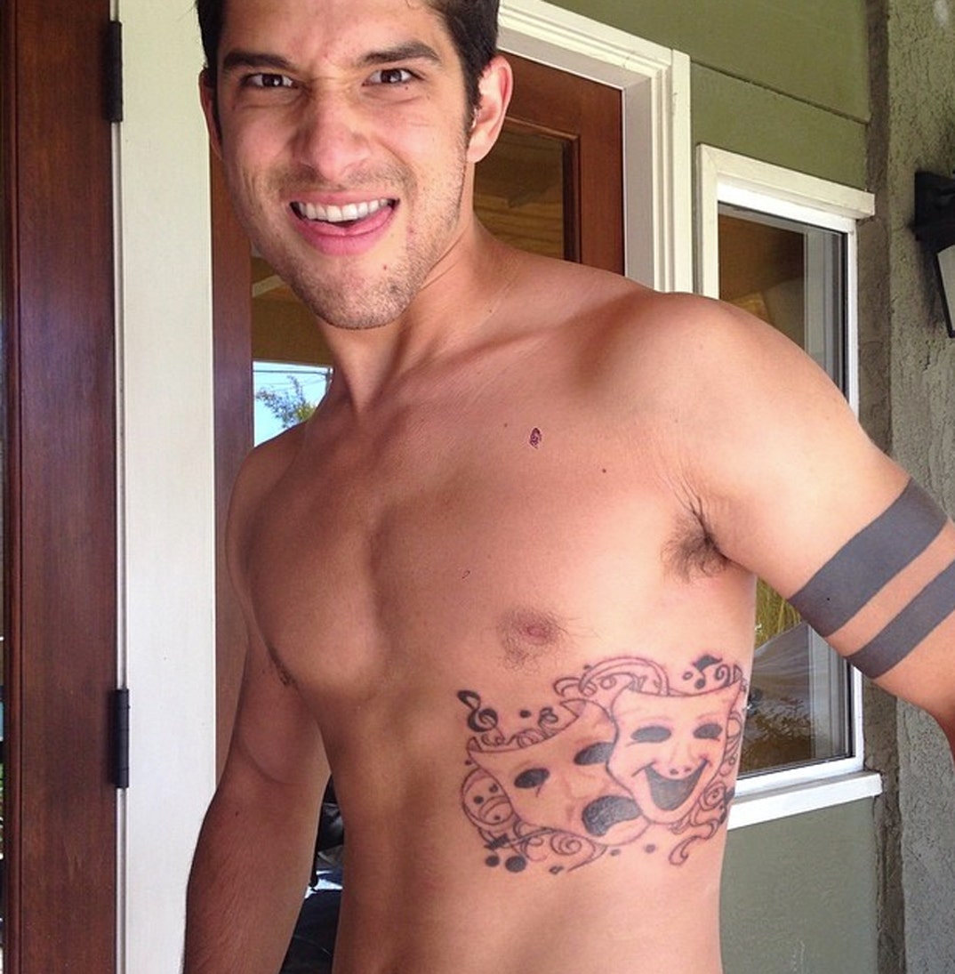
Tyler Posey comedy and tragedy masks tattoo

One of Posey’s more unusual designs is a comedy-and-tragedy mask on his side. The faces bring theatre imagery into a collection that already jumps between music, travel, traditional flash, and personal jokes.

His smaller skull and umbrella tattoos add to the mix. Posey has said he got those two in one session, then added the dagger and streetlight soon after. They may sound simple when listed one by one, but together they add energy to the arm.

He also has a clown, a hot-air balloon, and other small drawings around his body. None of these needs to be forced into one theory. Sometimes he liked the look, remembered a place, or wanted a design that suited the mood.

That relaxed approach is probably why the collection feels less polished than a carefully planned full suit. Blank spaces, different line weights, and tattoos facing different directions make it look lived-in rather than digitally arranged.

Posey’s tattoos had to work around his acting career

Tyler Posey eagle chest and sleeve tattoos

For years, Posey’s main limit on new tattoos was work. He wanted to keep adding ink, but filming meant the makeup department had to hide his arms, chest, and legs. That took shaving, layers of makeup, and careful checks under bright set lights.

It’s easy to forget how much effort that takes when an actor appears bare-skinned on television. Posey’s tattoos are a major part of his look off set, but the show could make them almost disappear. That contrast is why old photos and interviews help when tracing the collection’s timeline.

He has also admitted that some designs no longer carry the meaning they once did. That’s normal with a large collection. A tattoo can begin as a favourite-band reference or a travel memory, then become part of an earlier version of you while the image remains.

The result feels honest because the tattoos aren’t being presented as one perfectly planned story. There’s a Blink-182 note, a painful calf piece, an eagle, a gypsy woman, black armbands, comedy masks, a heart and dagger, a tiki, and plenty of smaller marks. Some have clear explanations; others are simply part of the visual mix.

Tyler Posey’s tattoos work best as a growing scrapbook. His arms carry the bold traditional colour, the eagle anchors the chest, and the legs hold some of the most painful work. The collection keeps changing, but the approach stays much the same: choose tattoos he likes and let them build on each other.

Chet Hanks’ Eye, Cross and Micaiah Tattoos Tell a Bigger Story

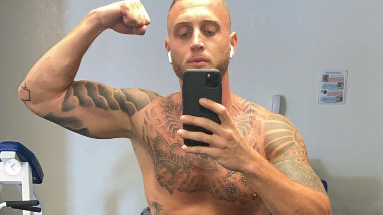
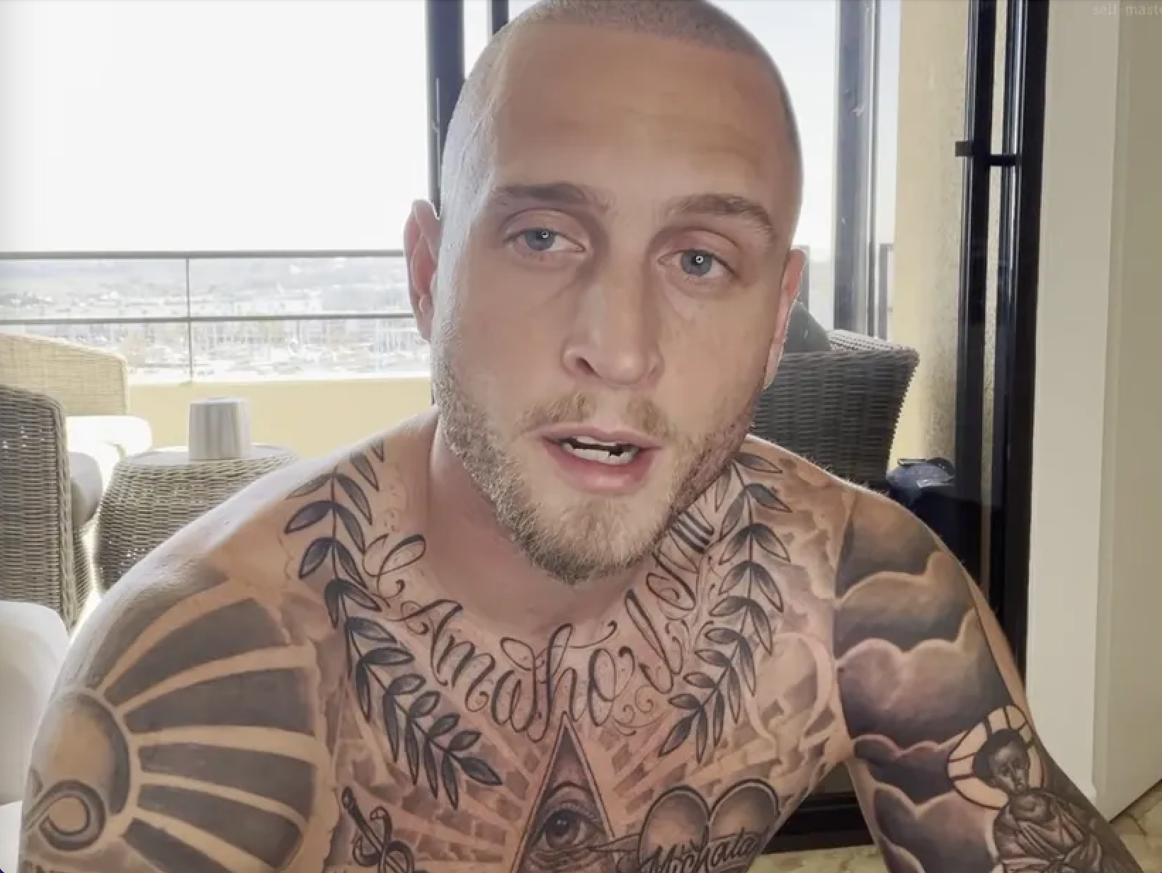
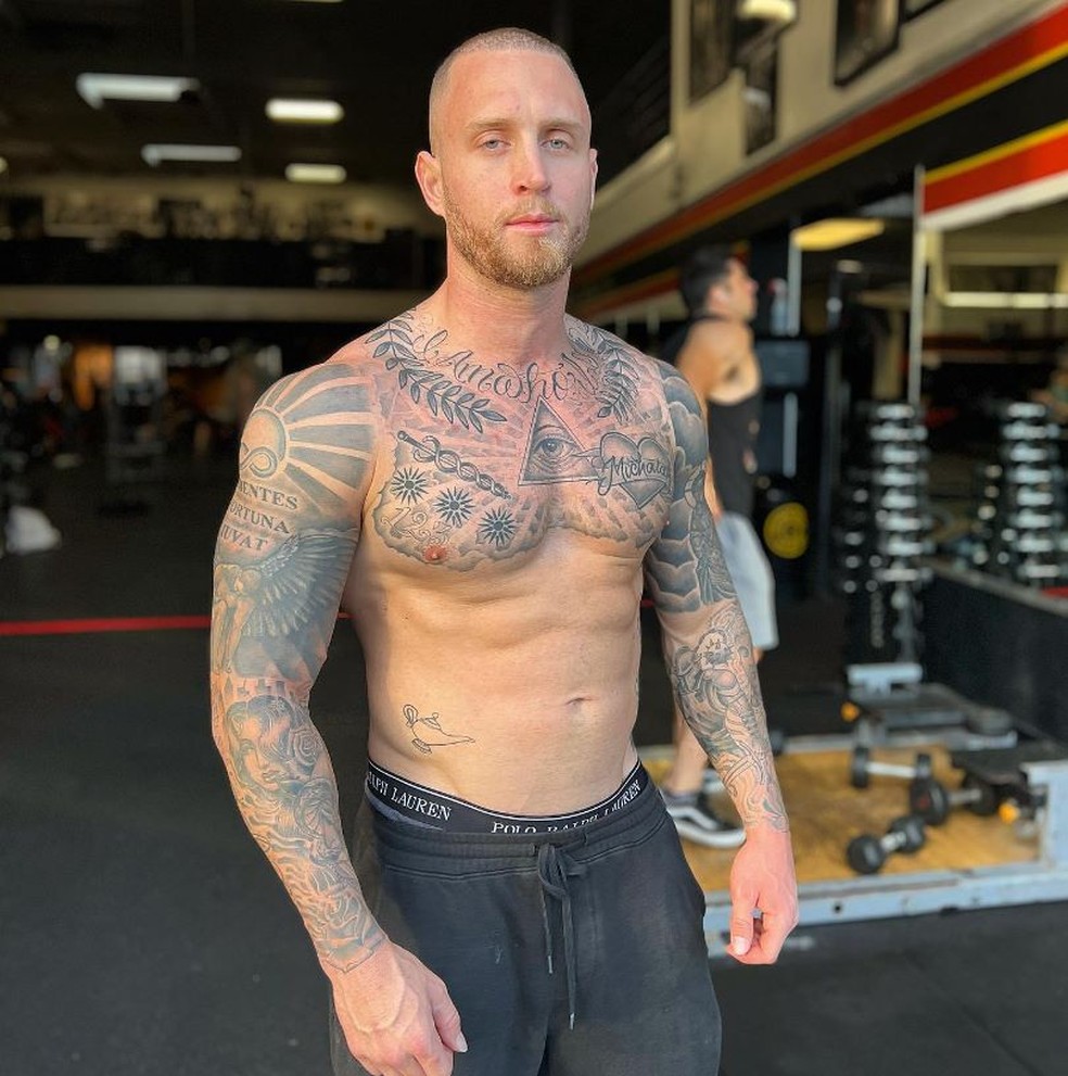
Chet Hanks’ tattoos have never been especially discreet. The first thing that stands out in a shirtless photo is usually the dark work across his chest and shoulders, with more ink running over his back and arms. There is no single style tying it all together: religious imagery sits beside family tributes, lettering and older pieces that look like they were added at different times.

Some tattoos come with a clear story; others are harder to place. The eye inside a triangle drew conspiracy theories, while Hanks said he was “extremely spiritual”. Later, a large cross took over the middle of his chest, during a period when he spoke about faith and trying to live more honestly. The older designs are still there around it, including the eye, his daughter’s heart and the work on his back.

That mix is part of what makes his collection interesting. A striking symbol can invite a lot of guesses, but Hanks has pushed back when people have read more into a design than he intended. Looking at what he has actually said, alongside what is visible in photos, gives a clearer picture than treating every tattoo as a hidden message.

The eye inside the triangle is about faith, not a secret society

Chet Hanks eye of providence chest tattoo

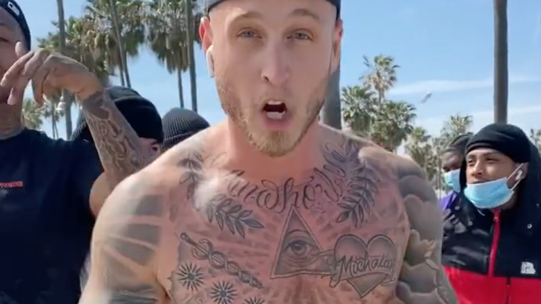
The most familiar design on Hanks’ chest is the eye inside a triangle. It sits within a larger piece, framed by laurel leaves and decorative shading. The eye is often called the all-seeing eye, so it did not take long for online theories about the Illuminati to attach themselves to it. Hanks has said that is not what it means.

He has described the tattoo as spiritual, connected to his belief that God watches over people and has a plan for their lives. The finer details around the eye do not each have a confirmed explanation, so there is little reason to assign them one. His own account is straightforward: it reflects his faith, not membership in a secret group.

The design also works as the centre of his upper chest. The triangle gives the eye a crisp outline, while the leaves and shading spread the piece toward his shoulders. In a shirtless photo, it reads almost like an emblem, which helps explain why it draws attention before the smaller lettering nearby.

It is a bold tattoo, but the reason Hanks has given for it is personal rather than mysterious. He wanted a reminder of his beliefs and chose a symbol with a long history in religious art. That is enough to understand the piece without adding a theory to it.

The heart over his chest is for his daughter, Micaiah

Chet Hanks Micaiah heart chest tattoo

Just below the central chest design is a heart with “MICAIAH” inside, a tribute to Hanks’ daughter. The placement over his heart makes the family meaning plain, and the name gives the design a personal focus rather than leaving it open to interpretation.

Hanks has connected fatherhood with getting sober and changing direction. He has talked about learning that a baby was on the way and finding a reason to close one chapter of his life. The tattoo cannot tell that whole story on its own, but it sits alongside it as a permanent reminder of his daughter.

The lettering is easy to make out in close-up photos, with the heart giving it a clear frame. There is no need to guess at the meaning: it is his daughter’s name, placed where it will always be visible to him.

That makes it a different kind of piece from the eye nearby. One speaks to his beliefs; the other is a direct tribute to family and a turning point in his life. They share the same stretch of skin, but each carries its own story.

The Byzantine cross became a huge chest statement

Chet Hanks Byzantine cross chest tattoo

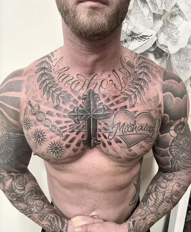
In 2023, Hanks showed a large cross across his chest. It is heavier and more elaborate than the smaller marks nearby, with thick black lines, rays and ornament spreading over his upper torso. Once it appeared, it became the main feature of his chest and shifted the balance of the tattoos around it.

He described the new work as part of a change in direction and connected it with serving God. Hanks said he wanted to move away from a public persona that had started to feel like a character and live in a way that felt more honest to him. The tattoo was presented as part of that shift, not just a new look.

The cross is big enough to stand out from a distance, but it is made up of more than the central symbol. There is lettering above it, a heart shape off to one side and ornamental work that meets the existing tattoos. Those details help it feel built into the collection instead of like one design placed on bare skin.

It also changed how the older chest tattoos read. Photos from before the cross show the eye, family name and other chest pieces more clearly; newer images put the cross in the foreground. The earlier work is still there, but it no longer gets the first look.

His arms and shoulders are packed with religious and symbolic work

Chet Hanks Audentes Fortuna Juvat chest tattoos

Away from his chest, Hanks has large sleeves and shoulder pieces with saints, clouds, floral details, symbols and dense black shading. A phrase reported on his right side reads “Audentes Fortuna Juvat,” commonly translated as “fortune favours the bold.” It suits the confident image he often projects, though the translation is clearer than any claim about why he chose that particular wording.

It can be hard to map the tattoos from photographs alone. Sleeves overlap, clothes hide parts of his arms, and lighting can make the same shading look different from one image to another. A gym mirror photo might show his bicep and chest but miss the forearm; a beach shot may reveal his side while leaving the shoulder in shadow.

Some of the religious imagery is easier to identify. A Virgin Mary with baby Jesus has been described on his left shoulder, and other photos show saintly figures against cloud-like backgrounds. The dark outlines and packed detail make these pieces feel related to the eye and cross on his chest.

Still, it would be a stretch to give every tattoo one overarching spiritual meaning. Hanks has smaller and older pieces too, and some may simply have appealed to him at the time. The collection has built up over the years, with new designs joining older ones as different images or ideas catch his attention.

The back piece adds another layer to the collection

Chet Hanks new cross chest tattoo

Hanks has also shown a large cross and religious back tattoo, which is easy to miss in photos taken from the front. Recent coverage of his family has also pointed to a matching cross connection with Rita Wilson. The back piece deserves a look in its own right, rather than serving only as a footnote to the chest tattoo.

A back piece changes how you read a tattoo collection. Front-facing photos can make the chest and sleeves seem like the whole story, but the back adds another broad area of ink and gives Hanks a strong silhouette from behind.

The family connection brings a more personal note to a set of tattoos that can look intense at first glance. Related or matching designs can be a way of keeping family close, even when the tattoos themselves are large and dramatic.

There is only so much to confirm from public photos. Smaller marks along his sides and ribs show up in some shots and disappear in others. The eye, Micaiah heart, cross, shoulder imagery and lettering are easier to identify, so it makes sense to focus on those instead of treating every patch of shadow as another tattoo.
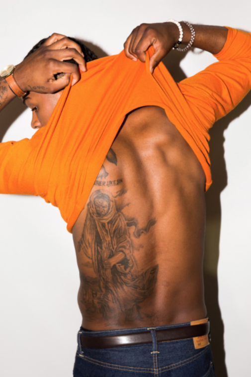
What Chet Hanks’ tattoos say as a group

Taken together, the collection circles around faith, family, recovery and reinvention. The eye and cross are the clearest expressions of faith; the heart with Micaiah’s name is a direct family tribute. The lettering and sleeves add the more public, attention-grabbing side of Hanks’ style.

There is a timeline in the ink, too. Older photos show a mix of chest symbols and arm work, while the later cross became a much larger focal point. As new tattoos are added, the older ones can change in feel without disappearing. They sit beside the newer work and become part of a different overall picture.

Not every piece is meant to be decoded. Hanks has explained some of his tattoos, while others are visible without a reliable account of why he chose them. Keeping those two things separate matters, especially when a symbol attracts online theories. The collection is more interesting when confirmed details are left apart from speculation.

The contrast between the dramatic look and the personal reasons is part of the story. The eye reflects his faith, the heart carries his daughter’s name, and the cross marked a change he wanted to make. The designs are striking, but the explanations he has given often come back to family, belief and moving forward.

Hanks’ tattoos cover a lot of skin and bring together religious scenes, family lettering, older work and newer additions. There is no single style to sum them up, and some parts remain hard to see clearly in public photos. The clearest way to read the collection is piece by piece, sticking to what Hanks has said and leaving the uncertain parts open.