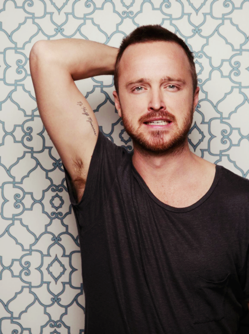
Actors

Aaron Paul Tattoos: Designs, Meanings and What Is Confirmed

Aaron Paul’s personal tattoo collection is small, but the stories behind the two best-documented designs are unusually clear. One is script connected to Breaking Bad; the other is a fine heartbeat line shared with Lauren Paul. Neither is a large sleeve or chest piece. What matters is the people and moments attached to them.

Paul’s tattoos are a good reminder to start with what the person has actually said. Photos can show where a mark sits and how it looks; Paul’s own explanations tell us why these two designs are there. There is enough evidence to describe them without turning every faint mark in an old picture into a new tattoo.

Aaron Paul’s confirmed tattoos are small, personal and easy to identify
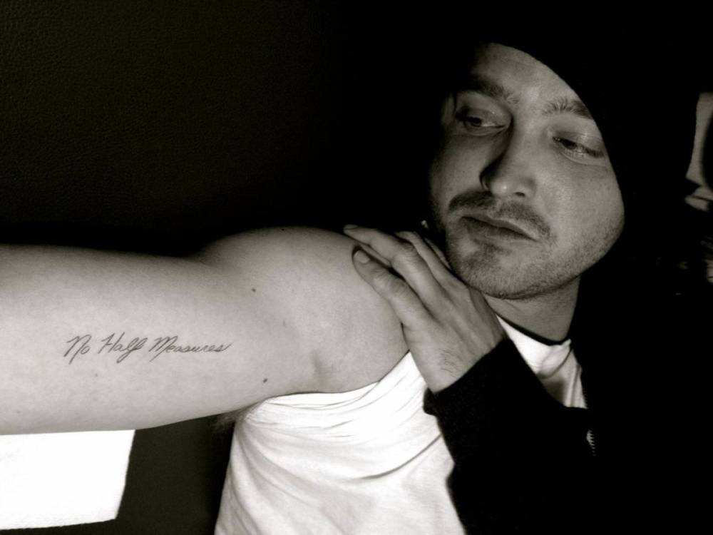
Aaron Paul’s “No Half Measures” tattoo

The best-known piece is the script “No Half Measures” on Paul’s upper arm. The phrase comes from Mike Ehrmantraut’s warning in the Breaking Bad episode “Half Measures.” Paul chose it with about twenty people connected to the show on the final day of filming. Bryan Cranston went with an abbreviated version of the show’s logo; Paul kept the line that had become part of the production’s shared language.

The words carry two stories. In the show, Mike’s warning is about making a real decision instead of settling for a compromise that fixes nothing. For Paul, the tattoo also marks the end of a long collaboration and the relationships built during years of work. It is not just fan merchandise; it is a souvenir of the people who made the series with him.

The design is intentionally simple. The narrow script reads as a sentence rather than a logo, and its compact placement avoids the look of a character portrait or costume piece. That restraint fits Paul’s account of it. Fans may recognise the line, but its deeper meaning comes from the final-day ritual and the group choosing to carry a piece of the production forward.

The upper-arm placement also means the tattoo appears only in some photographs. A sleeveless shirt, bent arm or close press image may reveal the writing; an ordinary red-carpet pose can hide it. A tattoo can be well documented without showing up in every picture, especially when it sits beneath a sleeve.

Paul has also described a much smaller tattoo on his ring finger: a tracing of Lauren’s heartbeat. They had their electrocardiograms printed and each kept part of the other person’s line. That is a specific origin story, not an interpretation borrowed from general tattoo symbolism. It records a shared physical trace, and the placement keeps it intimate rather than showy.

The heartbeat line can be hard to spot because a finger is always turning. A hand angled toward the camera may show a ring, knuckle or shadow while the fine line along the side stays hidden. That helps explain why photos document it less consistently than the arm script. A missing close-up is not proof that the tattoo was never there.

Together, the designs cover different parts of Paul’s life. “No Half Measures” connects him to the people behind his best-known role; the heartbeat is a private link he carried beyond the set. Both tattoos are modest in size, but neither is an afterthought.

Jesse Pinkman’s tattoos should not be counted as Aaron Paul’s:

Paul’s own descriptions support the arm lettering, its connection to the final day of Breaking Bad production, and the heartbeat tattoo on his ring finger. Details such as the exact artist, appointment dates and the heartbeat line’s current condition are less consistently documented. Those gaps do not erase the two confirmed stories; they simply mark where the public record stops.

There is no need to inflate a small collection to make it interesting. The script has a specific line, show and group ritual behind it. The heartbeat has a specific method and relationship behind it. That is more useful than adding character makeup or uncertain image captions to the count.

Read this way, Paul’s tattoos record two kinds of attachment: loyalty to the people who made a defining show and a private line shared with his partner. The designs are easy to miss, but the explanations are unusually direct.

Paul’s confirmed tattoos are smaller and more personal than the ink worn by his Breaking Bad character. That distinction matters. Jesse Pinkman’s tattoos belong to the role; Aaron Paul’s own pieces belong to his life away from the show. The photos help separate the two and keep a prop from becoming part of the actor’s biography.

The confirmed designs use simple symbols and compact lettering. That makes them easy to miss in a red-carpet photo, especially if a sleeve or jacket covers the arm. A close-up can establish the placement, but meaning belongs only where Paul has explained it.

A focused list is more useful than a longer one built from rumour, old character stills or marks that could be shadows. The guide can stay interesting without pretending the evidence is more complete than it is.

The smaller marks can also be confused with wardrobe details or production styling. A set photo may show temporary ink, drawn-on markings or a character tattoo; a personal portrait shows Paul’s own work. Checking the source matters before a design is added to his inventory.

His tattoos do not need exaggerated mythology. The contrast between Paul’s understated personal pieces and the more heavily tattooed character many viewers associate with him is interesting on its own. The confirmed designs deserve clear placement notes and useful close images, while uncertain marks can stay outside the main list.

A timeline helps explain why the count can seem to change. Sleeves hide tattoos, older photos soften fine lines, and some designs only appear in a particular interview. The guide should show those limits and give each confirmed mark enough room to be recognised.

That balance gives readers a better picture of Paul’s actual collection. There is enough documented work to talk about design and placement, but not every blurry mark deserves a confident name. Show the confirmed tattoo, explain the supported background and leave the rest open.

Keeping character ink out of the personal inventory:

Aaron Paul’s own tattoos should stay separate from Jesse Pinkman’s prop tattoos. That distinction keeps the guide accurate and gives the confirmed personal pieces room. It also prevents images from the show from being mistaken for photos of Paul’s own skin.

Why the confirmed list stays deliberately focused:

Paul’s tattoos are worth discussing in detail even though the confirmed list is shorter. Their design, placement and connection to his life matter more than padding the inventory with marks that could belong to a character, a temporary drawing or a shadow. That is why the images sit beside the passages they support.

A casual portrait may show the heartbeat line or script, but a production still may show something else entirely. Readers should not have to guess which ink is personal. Keeping Aaron Paul and Jesse Pinkman separate protects both the tattoo guide and the show’s visual history.

As the collection changes, the same tattoos may look different under varied lighting or when clothing covers part of the arm. A dated close-up remains the best evidence for a small design. The writing can stay relaxed while being clear about what is known.

The personal pieces also have a timeline. The script connected to Breaking Bad is Paul’s own tattoo, but it should not be confused with temporary designs used for Jesse Pinkman. The distinction is simple once the photos are sorted; it is often lost when tattoo lists reuse show images without checking where they came from.

A focused guide works because the confirmed tattoos have clear connections. The heartbeat points to his family life; the script carries another story. The scale is modest, but the placements and explanations give readers enough to understand why both pieces belong in his inventory.

There is no reason to turn an incomplete photo into another tattoo. A careful article can explain the confirmed work in detail and say when a mark is too soft to identify. If Paul later shows another design clearly, the list can grow then.
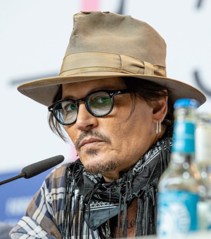
Johnny Depp tattoos: Wino Forever, family ink and hand designs

Johnny Depp’s tattoos feel more like a running journal than a planned sleeve. The collection began in his teens and grew to include family, films, relationships, music, friendships and symbols that caught his interest. Close photos make some designs easy to identify; interviews help explain others.

This guide keeps those kinds of evidence separate. A photo can show where a tattoo sits and what it looks like, while Depp’s own account is stronger evidence for what it means. That matters because several designs have been changed, covered or photographed years apart.

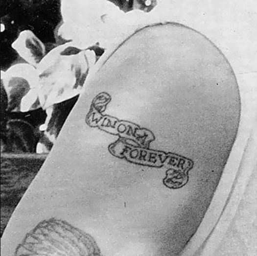
Wino Forever is the tattoo that changed with Depp’s life

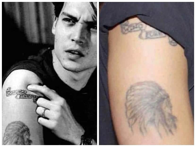
Johnny Depp Wino Forever tattoo on his upper arm

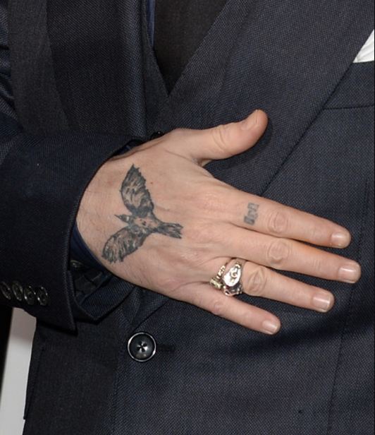
The crow on the back of Depp’s hand is one of his clearest animal designs. It is shown in flight, with darkly shaded wings and body. A close-up makes it easy to recognise, though the bird can look smaller or partly hidden when his hand is turned in an event photo.

Accounts connect the crow with Depp’s friendship with River Phoenix and with The Crow, the film associated with Brandon Lee’s death during production. That supports reading it as an artistic and friendship reference, but not assigning a private meaning to every feather or line.

The hand placement gives the bird a different presence from Depp’s arm lettering. It appears when he holds a microphone, adjusts his glasses or rests his hand on a jacket. That visibility helped make it one of the tattoos fans spot first, even though it is not his largest design.

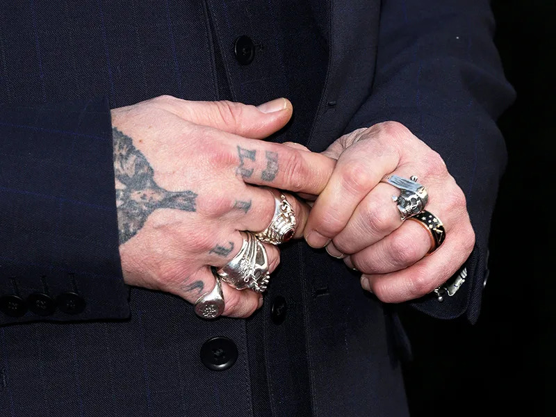
Other small marks appear around Depp’s fingers and knuckles, including symbols and a small design above a finger. Rings often cover them, so photos need to be read carefully. The crow is clear; every shape beside it is not.

The hand lettering moved from Slim to Scum and later appeared as Scam

Johnny Depp hand lettering and finger tattoos

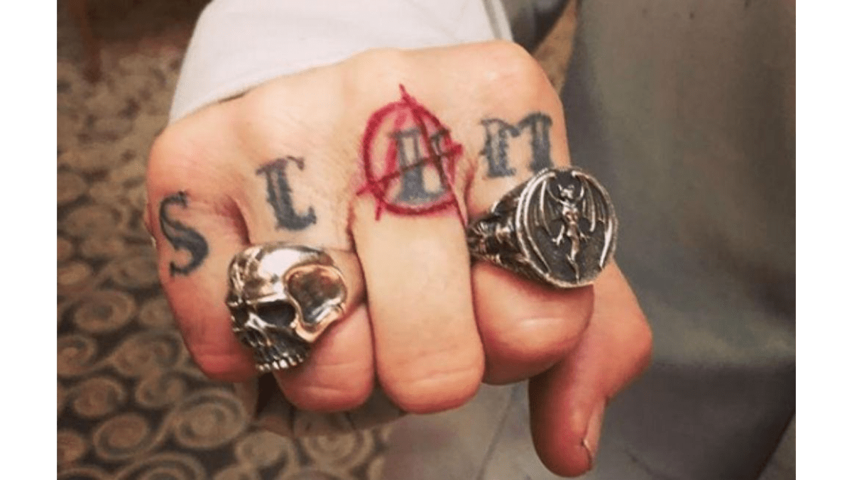
Depp’s knuckle lettering has changed in stages. It was widely reported as “Slim,”, a nickname linked to Amber Heard. After their breakup, the letters were altered to “Scum.” Later photos and coverage showed another version, “Scam,”, with an anarchy-style mark worked into the lettering.

The later knuckle lettering is clearest in a close-up

Johnny Depp Scam knuckle tattoo

The close-up makes the later Scam knuckle lettering easier to distinguish from Depp’s rings and nearby ink. The red anarchy-style mark is part of the visible change, while traces of the earlier letters help show how the design evolved. A distant red-carpet photo is less useful because jewellery can hide the fingers.

It is better to keep the versions distinct than describe them as one permanent design. Each belongs to a different point in time, and the exact look depends on when the photo was taken. The clearest story is the sequence of changes, not a claim that every later image shows its final state.
The hand also carries a bird, small symbols and dark marks partly covered by rings. Jewellery can hide the skin; harsh stage lights can make faded ink look darker. Close photos are useful for placement, but cannot identify every small detail with confidence.

The “Slim” change is best understood as a reworking rather than a clean removal. It follows a pattern seen in “Winona Forever” and “Wino Forever”: Depp kept the basic shape of a tattoo while changing the word that gave it meaning. The body becomes a timeline, with old lettering under a later decision.
Other documented pieces include a sparrow connected with Jack Sparrow, a skull-and-crossbones motif, geometric marks and later chest additions. Their visibility varies, and not all have a confirmed explanation. The Jack Sparrow bird is often discussed beside the character’s name because the references overlap in Depp’s tattoo history, but they are not the same tattoo.
Depp has also been linked with tattoo artist Mark Mahoney, whose work is part of the actor’s long-running circle of artists and friends. That connection offers context for the old-school lettering and portrait influences, but a specific design should only be attributed to an artist when a source makes that link.

There is no dependable official count. Depp offered a rough number in an older interview, but new tattoos, alterations and small symbols can shift the total. A better guide names identifiable groups: heritage, family names, changed relationship lettering, the crow, hand designs and film-related imagery.

Depp’s collection is most compelling as a sequence of choices. The Cherokee chief reflects heritage; Betty Sue, Lily-Rose and Jack reflect family; the crow holds an artistic connection. “Wino Forever” and the altered knuckle words show how relationship tattoos were changed rather than simply erased. Photos provide the visual record, and Depp’s interviews explain the pieces he has discussed.

Depp’s tattoos make the most sense when the changes are left visible. “Wino Forever” is more than a well-known phrase: it records an alteration after a relationship ended. The family names carry a different meaning, and Lily-Rose, Jack and Betty Sue should not be grouped with the relationship lettering as one story.

The crow also shows how art and friendship can meet in one tattoo. Its placement makes it easy to notice, while new ink around it may change how it looks in later photos. The Slim, Scum and Scam sequence is another reminder that a tattoo can have several versions, and an older image may show a design that has since been altered.

Dates help keep the guide accurate. Depp’s hands and arms have been photographed for decades, and the collection has not stood still. Images capture his skin at particular times; descriptions should not imply that every mark looks exactly the same today.

The hand tattoos show those stages especially well. A close image may reveal the crow or lettering, while a later photo shows the same area with extra ink nearby. Keeping the different moments in view is more useful than flattening them into one unchanging list.

Depp’s family tattoo sits beside the changing hand work

Johnny Depp Lily-Rose chest tattoo

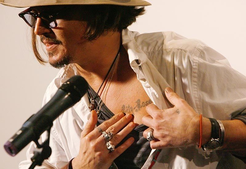
The family designs carry a different tone from Wino Forever. Lily-Rose, Jack and Betty Sue belong to Depp’s family tattoo history, and this image shows how the lettering and heart shapes sit on his body. They should stay distinct from the relationship tattoo because they come from another part of his life.

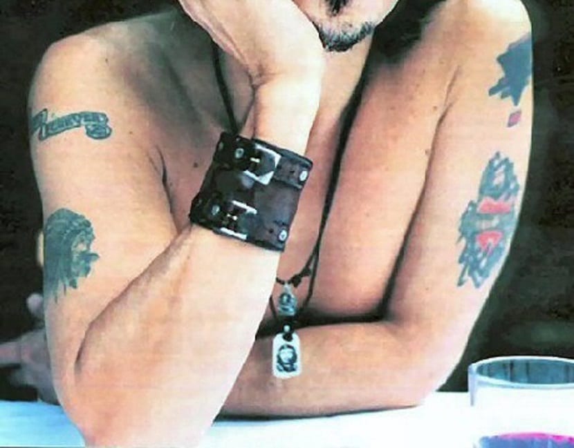
Betty Sue and the Cherokee portrait sit higher on the arm

Johnny Depp Betty Sue and Cherokee arm tattoos

The upper-arm photo gives the heritage and family tattoos a sense of scale. The Betty Sue lettering sits beside a portrait commonly identified as a Cherokee chief. The image supports the placement and pairing; Depp’s family history helps explain Betty Sue as a tribute, while the portrait should not be given a more specific story than the sources support.

Older photographs matter here. An arm or hand may turn away from the camera, and newer work can appear around an older name. A careful description notes the date and visible wording instead of suggesting that the collection has stayed the same.

The crow links Depp’s hand to his artistic friendships

Johnny Depp crow tattoo on the back of his hand

The crow is one of Depp’s most recognisable hand pieces. Its outline and placement make it easier to follow than smaller marks near his fingers. The photo establishes the bird, its position and the surrounding ink; any meaning belongs with the source that explains it.

Older photographs show how the lettering changed

Johnny Depp tattoos visible across his upper body and arm

The Slim, Scum and Scam sequence is a tattoo timeline rather than one fixed design. Each version belongs to its own moment. Readers can compare the changes without being told that an older version is still visible today.
Why the famous changes should stay in the article:

Wino Forever is useful because it shows that a tattoo can have a visible history. The original wording, later alteration and photos preserving both versions are all part of the record. A current image should not erase the old letters, and an older photo should not be described as Depp’s present-day skin.

The family tattoos offer another kind of evidence. Close-ups show names and heart imagery, but dates still matter because new ink has appeared around older pieces. Lily-Rose, Jack and Betty Sue belong apart from the relationship lettering. That keeps the family material personal without turning it into the same story as an altered phrase.

The crow is a clear example of why placement matters. It sits on the hand and appears often in photos, but its visibility still depends on angle, jewellery and nearby ink. A picture can establish the bird and where it is. Its artistic connection should come from a source rather than the shape alone.

The hand lettering changed over time, from Slim to Scum and then Scam. Those versions belong to different moments and should remain visible in the account. Comparing photos is more informative than flattening everything into one entry that claims the word was always the same.

Depp’s broader collection also includes symbols, portraits and lettering that cannot all be identified with equal confidence. A blurry line near a finger should not become a named tattoo simply because another list repeats the claim. The strongest inventory prioritises clear photos and details Depp or reliable coverage supports.

His tattoo history is not a clean catalogue with one explanation for every design. It brings together family, friendship, relationships, humour, artistic references and changes made over time. Some pieces are famous because their stories are public; others are interesting because a photo shows how they sit beside older work.

The safest reading is therefore chronological and visual. Name the piece, show the body area, explain documented context and leave the rest open. That gives readers details to look at without pretending a photograph reveals every private choice.

Wider images add a different kind of context. They show how named tattoos sit among rings, sleeves, chest designs and older linework. A small hand tattoo may seem much darker in one image than another because clothes and jewellery hide the edges in a stage photo, while a close-up isolates a single bird or word.

Depp’s collection moves between public symbols and private names. A family heart is not doing the same job as a crow, and neither should be folded into relationship lettering just because they appear in one frame. Looking at the designs separately makes the timeline easier to follow and avoids treating every mark as one large sleeve.

Chris Hemsworth’s Tattoos Remember Family, Friendship and a Favorite Story

Chris Hemsworth’s tattoos are easiest to read one at a time, using the story he has actually shared about each design. Some mark his family, one connects him with the original Avengers cast, and two grew out of time with his daughter India. Photos catch the collection at different points, so an older, darker image does not prove that a tattoo still looks the same today.

There is no complete public inventory of every mark on his body. What is available is a set of identifiable designs with reported locations and personal context. The sections below stick to what can be described with confidence and leave open the parts the sources do not settle.

The five family initials on his right forearm

Chris Hemsworth’s C E I T S family-initial tattoo on his forearm

The vertical initials C, E, I, T and S stand for Chris, his wife Elsa Pataky and their children India, Tristan and Sasha. Hemsworth has described them as a family design. Pataky has the same letters on her left arm, making them a shared mark. Reports place his version on the outside of his right forearm.

It is a simple design: five letters stacked one above another. The meaning comes from the people they represent, not from a complicated image or hidden code. A sharp forearm photo helps because a distant red-carpet image may show the ink without making the letters or their order clear.

Calling it a family tattoo is well supported because Hemsworth has explained the initials. Giving the typography a separate symbolic meaning would go beyond what he has said. His direct account is enough: the letters keep Pataky and their three children close in a design both parents wear.

The Avengers tattoo links him to the original cast

The original Avengers cast with a close view of the matching tattoo design

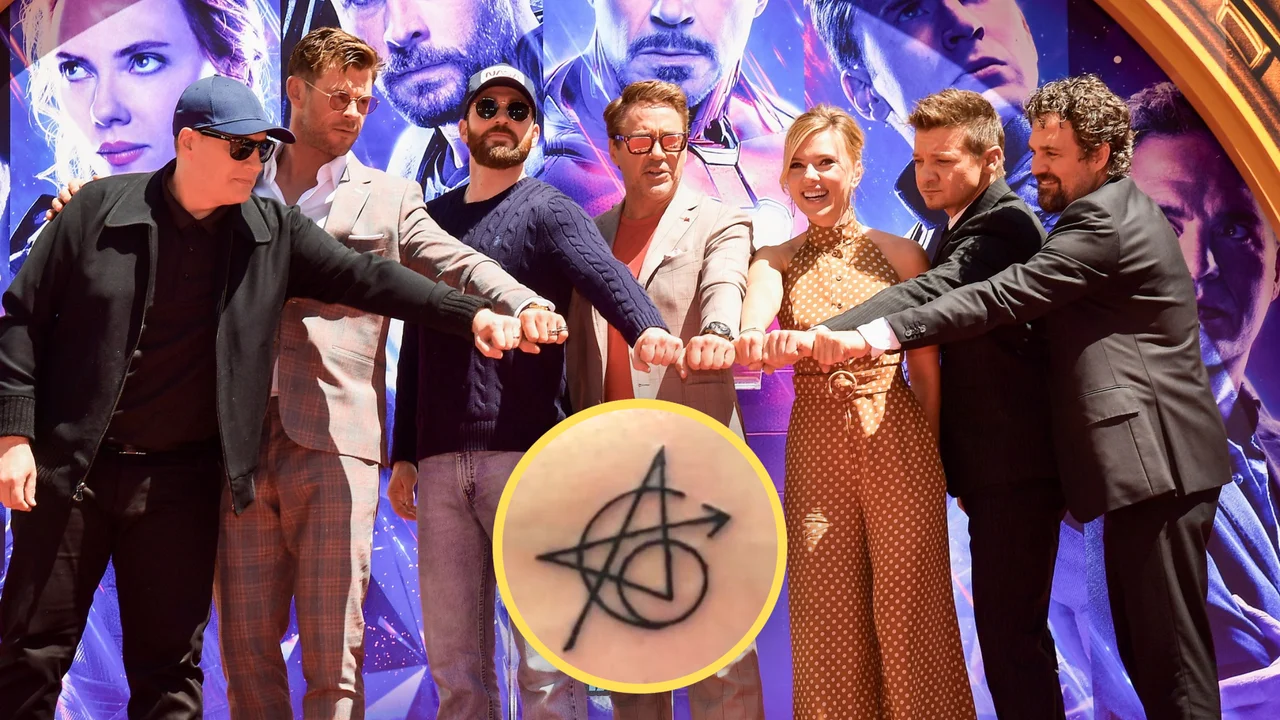
In 2018, Hemsworth joined Robert Downey Jr., Chris Evans, Scarlett Johansson and Jeremy Renner in getting a matching tattoo tied to their work as the original Avengers. Mark Ruffalo chose not to take part. The design is reported on Hemsworth’s right torso, where an ordinary portrait is less likely to show it than a forearm tattoo.

Tattoo artist Josh Lord worked with the actors on a design that combines an A, references to the six original heroes and individual marks associated with their characters. Accounts describe Iron Man’s reactor, Captain America’s star, Thor’s weapon, Hulk’s gamma symbol, Black Widow’s hourglass and Hawkeye’s arrow. The actors share the idea, but their placement and body shape mean the finished tattoos are not exact copies.

This is a keepsake from the original cast, not a general superhero emblem. It recalls the films and the close group the performers formed during that run. Its story is about that collaboration, not every later Marvel project or every character Hemsworth has played.

The Dr. Seuss character began with a book he read to India

Chris Hemsworth showing the Dr. Seuss character tattoo on his upper arm

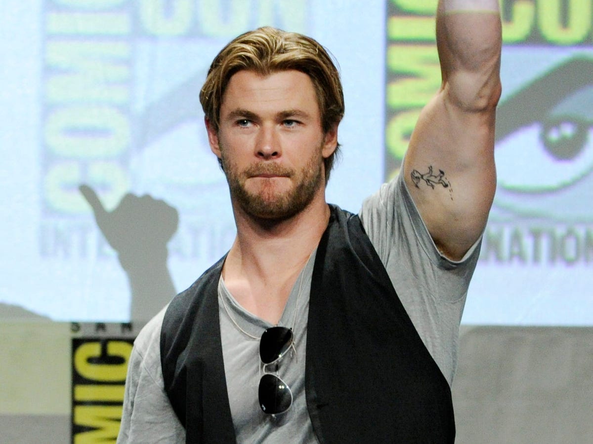
On his left bicep, Hemsworth has a small tattoo inspired by Oh, the Places You’ll Go! He has said it was one of India’s favourite books and that he used to read it to her. The design shows a character from the story, giving it a personal connection rather than making it simply a Dr. Seuss fan tattoo.

Hemsworth grew tired of the tattoo and tried laser removal, but stopped after one session. India noticed that it was fading and told him she loved it, so he decided to leave it. He has described the design as partly faded. That explains why older pictures may show darker ink than newer ones; it does not necessarily mean the tattoo was replaced.

The story is tender because India’s reaction changed what he planned to do. The account supports a clear point: the book was part of their time together, and her affection for the tattoo persuaded him to stop removing it. There is no need to add a broader meaning to the character.

India’s own drawings became small tattoos

Chris Hemsworth’s inner-arm tattoos based on drawings by his daughter India

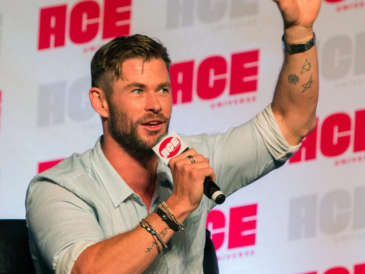
Hemsworth has also said that several small tattoos came from drawings India made when she was young. During a late-night session, the artist was preparing other ideas when India came in and drew a few pictures. The artist preferred her sketches, and Hemsworth had those drawings tattooed instead.

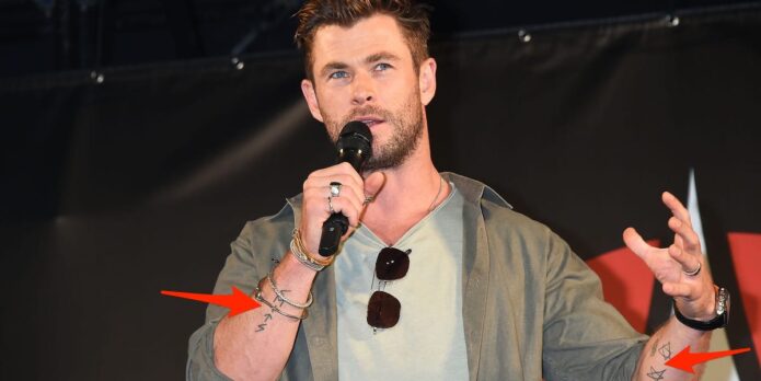
One identifiable design is a wheel of Dharma, described in the conversation as having eight parts associated with the eight steps to enlightenment. The small group also includes a five-pointed star and other childlike marks. They appear as fine lines on his forearm, though low-resolution images can make their exact shapes and placement difficult to judge.

These sketches are different from the larger sacred-geometry piece discussed next. Hemsworth directly tied the small designs to India; that does not make every geometric shape on his arm one of her drawings. The appeal is the simple handoff from a child’s sketch to permanent ink, kept as drawn instead of polished into a conventional design.

Dillon Forte’s sacred geometry is a separate forearm piece

Close view of Chris Hemsworth’s completed sacred geometry forearm tattoo

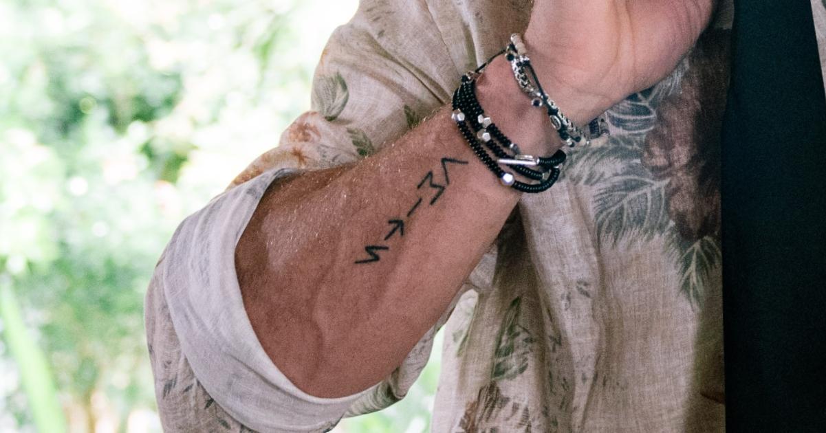
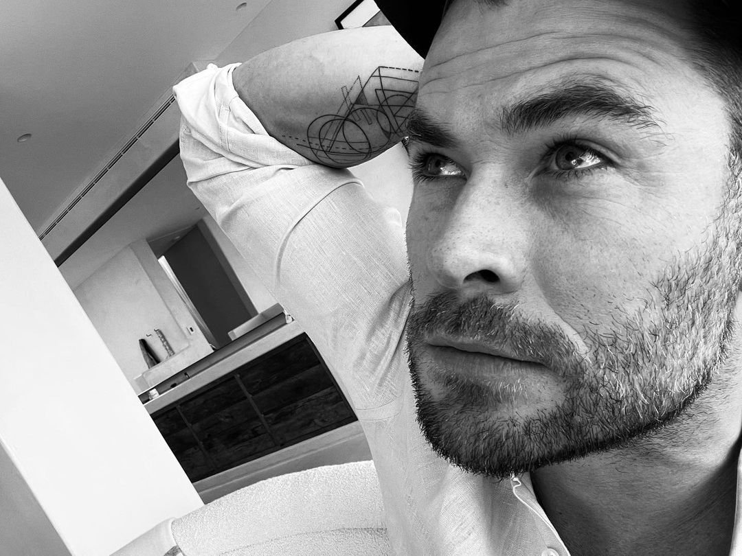
Hemsworth showed a separate forearm tattoo in 2022, made by Austin-based artist Dillon Forte. It is a compact black composition built from interlocking forms and repeated lines. Forte often works with sacred geometry, but the design can be described visually without assigning it a spiritual message Hemsworth has not claimed.

Hemsworth called the image “trippy sacred geometry” and said people might see different meanings in it, while he simply thought it looked cool. That puts a clear limit on interpretation. He identified the visual style but did not say the tattoo represents a particular belief, formula or life event.

This piece is also separate from India’s small drawings. It is easy to blur them when several forearm tattoos close together in the same photo. One group is a set of sketches tied to his daughter; the other is a finished geometric design credited to Forte. Keeping them apart preserves both the artist’s role and Hemsworth’s account.

Family is a strong thread, but not a meaning for every design

Family is a clear thread through some of Hemsworth’s tattoos: the initials name Pataky and the children, the Dr. Seuss character recalls a book he read with India, and her own pictures became ink. The Avengers design belongs to a different circle, the actors who played the original team. Forte’s geometry has a separate and simpler explanation: Hemsworth liked how it looked.

That variety is more interesting than forcing everything into one theme. The tattoos point to different relationships and moments, and their stories are not all equally detailed. A careful guide can describe each design, its reported location and what Hemsworth has said without inventing a hidden meaning for every line.

Which artists are identified with Hemsworth’s tattoos?

Josh Lord is identified with the Avengers cast tattoo, and Dillon Forte with the 2022 sacred-geometry forearm piece. The available accounts do not consistently name the artists behind the family initials, Dr. Seuss character or India’s drawings. Those credits are best left open rather than assigned to one studio.

The artists matter because these are different kinds of work: a group tattoo made with fellow actors, a child’s drawing, and Forte’s precise geometric design. Hemsworth’s ink has accumulated over the years with different collaborators and different reasons behind each piece.

Taken together, the initials, book character, children’s drawings and Avengers design give a grounded picture of Hemsworth’s collection. Some tattoos have a clear story; others are best recognised by their appearance. They make the most sense when each piece is considered on its own.

Rob McElhenney’s tattoos are more interesting than Mac’s joke suggests

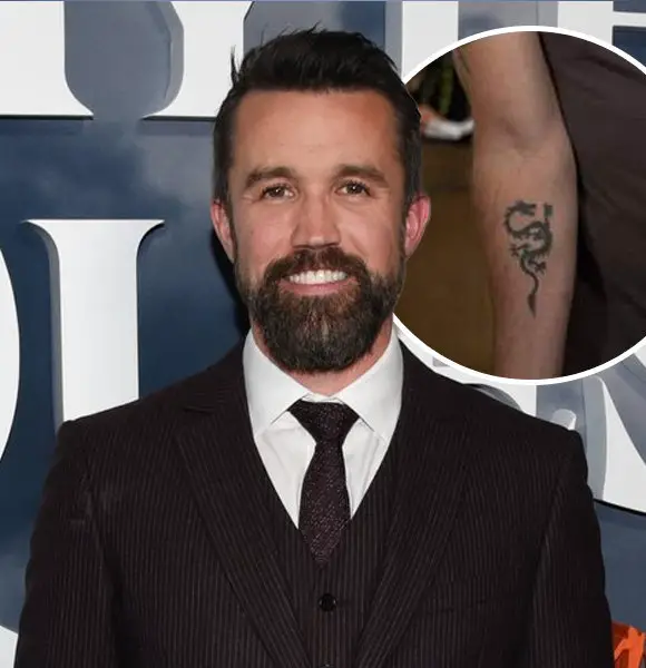
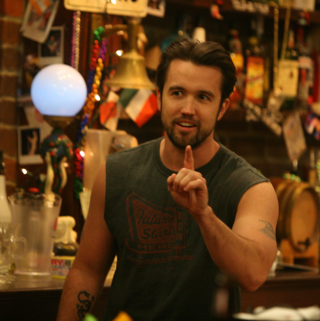
On It’s Always Sunny in Philadelphia, Rob McElhenney’s real tattoos helped sell Mac’s swagger. Older photos show a dragon on the right forearm, a feather on the right bicep and an eagle on the left bicep. The ink later faded as he went through laser removal. He has given no public explanation for a private meaning behind the designs.
The sitcom also played with fake ink, which makes the Conan clip easy to confuse with McElhenney’s real pieces. The three arm tattoos came first; his later comments confirm he had them removed. Keeping the joke separate keeps the famous Conan gag out of the permanent tattoo count.

The dragon on Rob McElhenney’s right forearm

Rob McElhenney's dragon tattoo on his right forearm

In older photos, the dragon on the right forearm is the easiest design to see. It is a small black dragon running down his forearm. That fit Mac’s act: he carried himself as if every physical detail were proof of his greatness, even if the design itself was unassuming.
The dragon sat on the forearm, where a tattoo is visible when the wearer rolls up a sleeve or wears a short-sleeved shirt. It shows in early Sunny photos. The feather and eagle were higher up, so sleeves often covered them. From a distance, the dragon can look like a dark smudge; closer shots bring out its outline.
Searches for dragon tattoos often return the same symbolic list: strength, danger, independence, transformation. McElhenney has not said those ideas inspired his design. In older photos, the dragon is clear on his right forearm; later it fades. Anything beyond that is speculation.
McElhenney joked that the tattoo was fading by “laser beams.” It was a quick line, but it confirms he had the design removed. He never gave a clear public reason. Regret, embarrassment or a change in identity would be guesses.

The feather on the right bicep and eagle on the left

Rob McElhenney's older feather and eagle tattoos on his upper arms

Higher on the arms were two more designs: a feather on the right bicep and an eagle on the left bicep. Together, they balanced across the upper arms. The feather has a lighter, narrower outline; the eagle is broader. McElhenney has not given a reliable first-person explanation for either, so claims about freedom or patriotism are speculation.
Sleeveless shirts let the tattoos show beside Mac’s oversized muscles, making them part of his attempt to look intimidating. A regular T-shirt covered them. The wardrobe let Mac flash the designs while flexing; his exaggerated confidence supplied the joke.
Online accounts disagree about which tattoo lingered longest: some mention the eagle, others the dragon. Lighting, camera angle and the stage of laser removal all change what shows in a photo, so a recent image cannot recreate the earlier look. Older shots place an eagle on his left upper arm and a feather on his right. They do not establish when either piece was done, or say anything about the tattoo or a private meaning beyond its appearance.
Laser removal can take time, so old outlines may linger from one photo to the next. The change was noticeable because the tattoos were so closely tied to Mac’s look. It prompted questions about whether the marks were makeup, props or real tattoos. They were real; later photos show them fading after treatment.
What the Conan “tattoo” was really showing
At a 2015 Conan appearance with the Sunny cast, McElhenney showed a deliberately terrible temporary tattoo of Bill Cosby. He added a moustache and changed a letter to pass it off as David Crosby. It was a quick gag, and reports at the time described it as temporary. The image sometimes circulates alongside his real tattoos, but it was never a fourth piece of permanent ink.
The list is short: a dragon, a feather and an eagle. All three were real tattoos, and McElhenney later had them lightened with laser treatment. The bad image from Conan was a temporary joke. Mac made the original designs memorable by showing them off with absurd confidence.

David Harbour’s Red Guardian Tattoos, Design by Design

David Harbour’s most detailed tattoo story belongs to Alexei Shostakov, the Red Guardian he plays in Black Widow. The designs were created for the character, and Harbour has discussed several in interviews. They are screen tattoos, not evidence that he wears the same ink in his everyday life.
Alexei’s ink tells you who he is before he opens his mouth: a Soviet super-soldier who spent years in prison and still claims Natasha and Yelena as his daughters, though the family began as a cover. The artists put that history on his skin through names, portraits, political figures and prison-style decoration.

Natasha and Yelena are named beside Melina’s portrait

Red Guardian Natasha and Yelena tattoo with Melina portrait
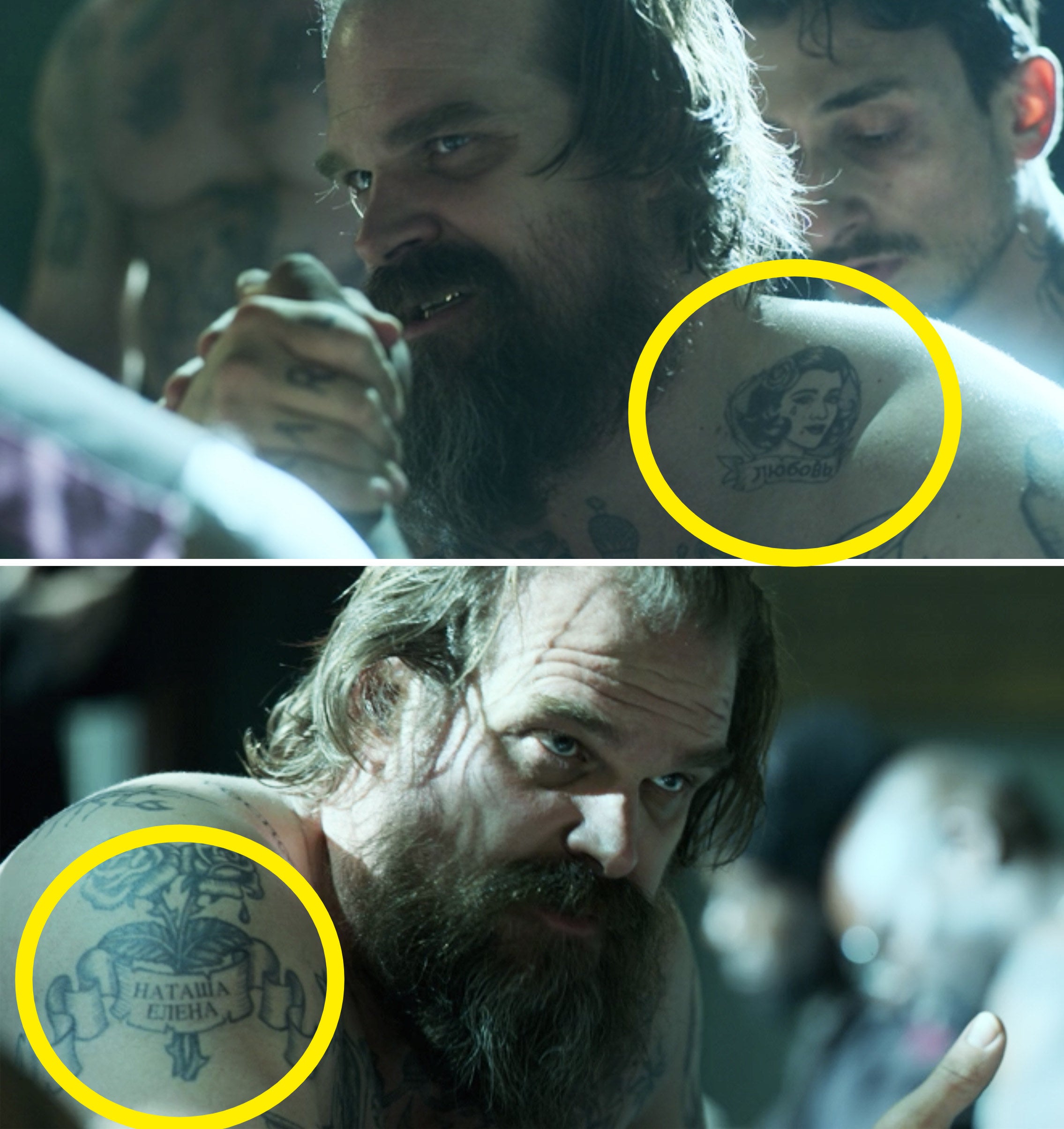
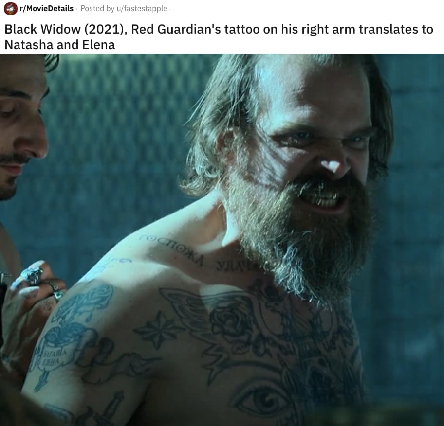
On Alexei’s upper arm and shoulder, the family tribute pairs a portrait of Melina (played by Rachel Weisz) with Natasha and Yelena’s names in Cyrillic nearby. The image and lettering say what a line of dialogue might not: Alexei still considers the people he treated as family part of his life.
Harbour said the portrait uses a younger image of Weisz and named it his favourite tattoo. The reference is specific to Alexei’s story: Melina was his wife in the undercover cover story and part of the family the four agents built together.
The names are more than decoration around a rose. They identify Natasha and Yelena, making Alexei’s attachment to them explicit. In a wide shot the Cyrillic can blend into a dark band; a close-up separates the words from the portrait.

KARL MARX and the knuckle lettering make the politics impossible to miss

Red Guardian Karl Marx knuckle tattoo
The words KARL and MARX run across Alexei’s knuckles. Harbour called them one of his favourite details: blunt, funny and impossible to hide when Alexei raises his hands. Instead of the familiar “love” and “hate” prison lettering, he wears the name of the communist philosopher.
The English lettering is deliberate: Alexei is Soviet, but the audience can read KARL MARX at a glance. The words are also visible in close-up. Whenever he gestures, his politics arrive before his speech about Captain America or the Soviet glory days.
Harbour has discussed the knuckles in interviews, so both the placement and the joke are clear. The other marks on Alexei’s body are different: buildings, symbols and ornament rather than readable words.

Lenin’s portrait turns the abdomen into a Soviet political panel

David Harbour Red Guardian chest and arm tattoos
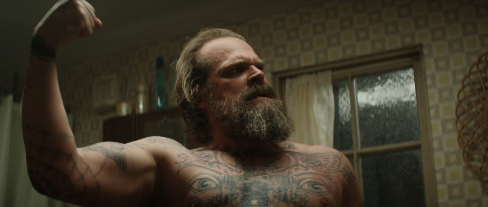
Lenin’s portrait takes up space on Alexei’s abdomen. Harbour identified him in interviews, and the scale gives the Soviet leader more weight than a small political emblem. It sits among chest decoration and dense prison-style marks, adding to the character’s Soviet identity.
The Red Guardian suit hides the portrait; prison scenes and shirtless shots reveal it. Against the surrounding ink, Lenin stands out as a deliberate image, matching Alexei’s old-fashioned politics and theatrical belief that he should be remembered as a national hero.
Harbour has discussed the design, but it belongs to Alexei on screen. That interview does not turn the fictional Lenin tattoo into part of Harbour’s permanent collection.

The Melina neck portrait is a separate tattoo from the family names

David Harbour Red Guardian prison tattoos and Melina neck portrait
On Alexei’s neck, another portrait shows Melina’s face with Melina written below. Harbour said it was based on a younger photo of Rachel Weisz. Set beside his face, it is easy to catch in profile and feels more intimate than the Soviet imagery across his chest.
The neck portrait and the shoulder tribute are two different designs. One names Melina; the other pairs her face with Natasha and Yelena’s names. Together they show the family Alexei loved and the daughters he kept claiming.
The close production shot catches details a headshot cannot: the tattoo is small, and beard shadow and lighting can hide its edge. The angle helps separate Melina’s face and name from the prison-style markings around it.
Prison and Russian gang symbols fill the spaces between the named tattoos
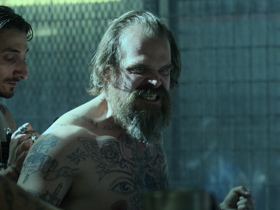
The portraits sit among layers of Russian prison-style artwork: buildings, lettering, crests, birds and decorative shapes. Harbour said the design team researched Russian gang tattoos, then adjusted some imagery so it would not read as a Nazi eagle. Small fortress-like details gave Alexei’s ink its own visual language.
The surrounding markings do not share a single meaning. Some suggest status, ideology or confinement; others make Alexei’s skin look lived-in. Production notes explain the research behind the designs, but not what every individual symbol is meant to signify.
In some frames, a falcon-like tattoo and a large double-headed eagle or crest appear across the arms and chest. These are details of Alexei’s character, not signs of Harbour’s own politics or prison history. Beside the named tattoos, they make his body look like a record of Soviet power and years behind bars.
Alexei boasts about the Soviet Union as if it might restore his old status. The family tattoos show what matters after that status fades: Natasha, Yelena and Melina. The knuckle lettering is loud and ideological; the names and faces are quieter and more personal. That contrast gives the makeup its weight.
The placement lets the film reveal each detail in motion. Karl Marx appears when Alexei gestures; the abdomen shows when the prison scenes remove his suit; Melina appears in profile; and the shoulder tribute comes into view when he wrestles or lifts an arm. The tattoos tell parts of his story without stopping the film to explain them.
On screen, the references are clear: Karl Marx, Lenin, Melina, Natasha and Yelena are all identified through Harbour’s comments or production accounts. The prison-style marks draw on research, but their individual symbols do not all have a confirmed translation. Together, the pieces make Alexei’s body part of the story, not just a collection of fake tattoos.

The story behind Ben Affleck’s enormous phoenix tattoo

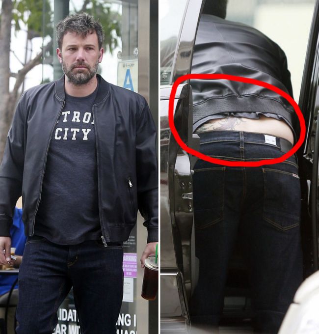
Affleck’s huge phoenix tattoo came into public view gradually. Early photos raised questions; set images made it harder to dismiss as temporary, and he eventually discussed it openly on television. That long reveal became part of the tattoo’s public story.
Affleck has said the tattoo is personal and that he likes it, but he has not explained every feather and colour. The design and its existence are easy to establish; the private symbolism is less clear.

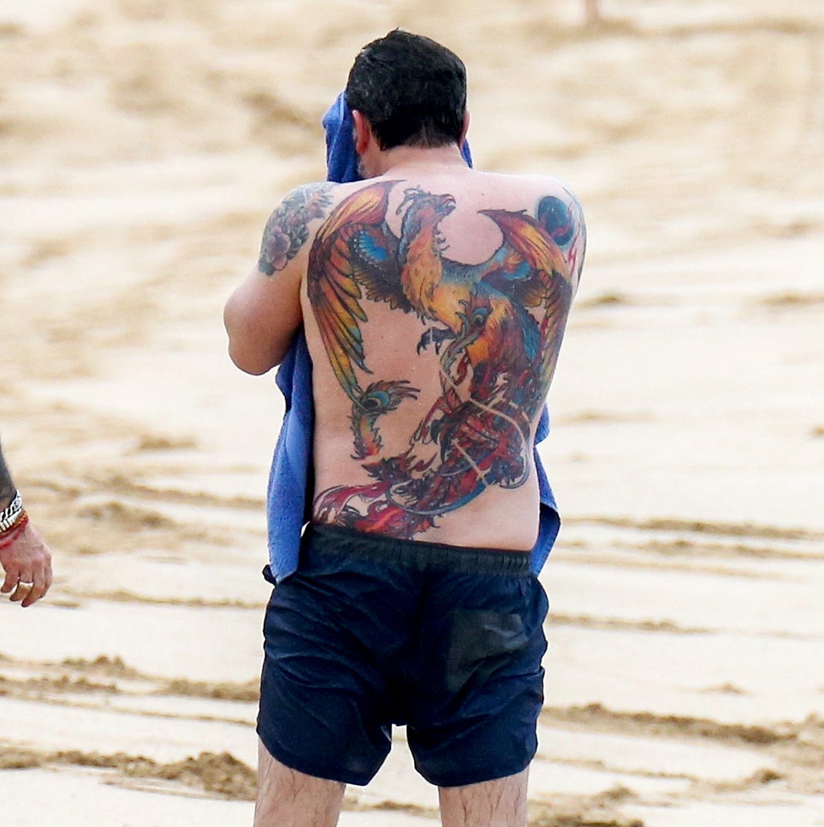
The phoenix fills Ben Affleck’s back

Ben Affleck’s full-back phoenix tattoo

Photos show a multicolour phoenix with wings spanning the shoulders and a long tail running toward the lower back. Orange, red, blue and yellow give it a louder presence than the black-line tattoos usually discussed in celebrity tattoo guides. Its scale is the first thing you notice: this is a full-back composition, not a small emblem.
Cropped photos make it easy to lose part of the design. One may show the head and wings but miss the tail; another catches the lower feathers while a towel or shoulder hides the top. Those differences come from angle, distance and clothing—not proof that the tattoo changed.
A full-back photo shows the phoenix in one piece, from the spread of its wings to the falling tail. Whenever Affleck’s back is uncovered, the tattoo fills most of the frame.

The outstretched wings give the tattoo its width

The phoenix’s wings fan out from the shoulders in layers of feathers. They make the bird look as though it is moving rather than sitting like a crest. Close photos show dark outlines, warm highlights and repeated feather edges beneath the colour.
The wing tattoo is not separate from the phoenix; the layered feathers make up its upper half. They set the composition’s width and make it look different in a mirror, a beach photo or a straight-on shot.
That scale helps explain the mixed reaction: the tattoo is theatrical by design, bright and large enough to register at a glance. Affleck later defended it as a finished work of art, not a tiny mark.

The lower tail feathers complete the phoenix shape

The lower tail of Ben Affleck’s phoenix tattoo

The tail runs down the lower half of Affleck’s back, extending the design below the shoulders. Some photos show the feathers sweeping toward his left side. Their exact edge is hard to judge in every frame, but the tail clearly carries the phoenix down the length of his back.
In a cropped photo, the tail can disappear and make the tattoo seem to stop at the shoulders. A wider view shows how it balances the head and wings, turning the phoenix into a vertical back piece rather than a logo between the shoulder blades.
Published coverage does not identify each colour or feather as a separate symbol. The lower section is part of the same phoenix, carrying the design from mid-back toward the lower back.

Why the tattoo was first treated as a mystery

When the phoenix first appeared in photos, Affleck had called it temporary makeup connected with a film. That explanation shaped early stories and became a running joke. Later images and his own comments made clear the ink was permanent. Time and Esquire covered the shift.
The comments belonged to different moments: at first he called the image temporary; years later he discussed it as a permanent tattoo. A movie shoot can involve temporary body art, while another photo may show lasting ink. The dates explain why early coverage and later accounts sound different.
By 2019, on The Ellen DeGeneres Show, Affleck was defending the tattoo rather than calling it temporary. He said he loves it and described it as meaningful, while keeping the personal details to himself.

What Ben Affleck has actually confirmed

Affleck has said the tattoo is real and spoken positively about it. Photos show the phoenix, its approximate placement and its bright colours. They do not give an exact appointment date or explain what every feather means to him.
A phoenix is commonly used as an image of renewal, but that association does not tell us why Affleck chose it. A design can suggest something visually and still carry a private meaning its owner never shares.
The image is straightforward even if the personal story is not: a bright, detailed phoenix across Affleck’s back. He once called it temporary and later said he was happy with it. Anything beyond that is his to keep private.

Shia LaBeouf’s tattoos mix private marks with a film-era chest piece

Shia LaBeouf’s tattoos range from small personal marks to the huge chest piece he got for The Tax Collector. Photos also catch script inside one arm, Bakersfield across a finger and smaller designs near his wrist and hand. The film tattoo gets the headlines, but there is more to his collection than that.

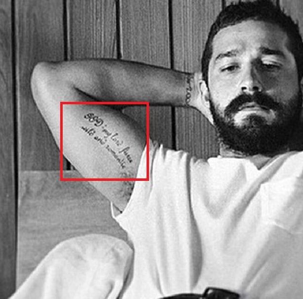
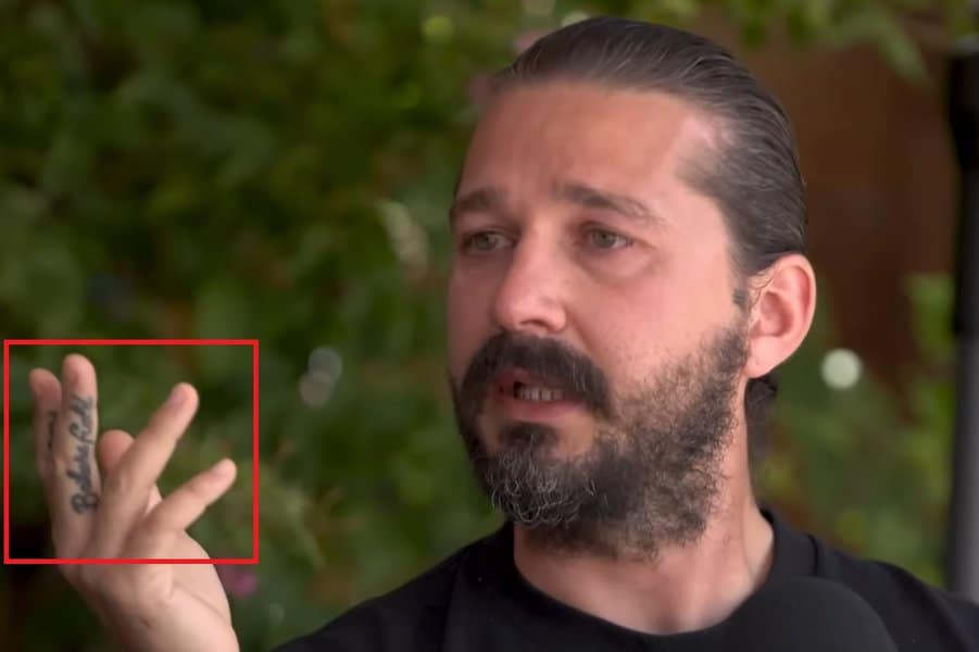
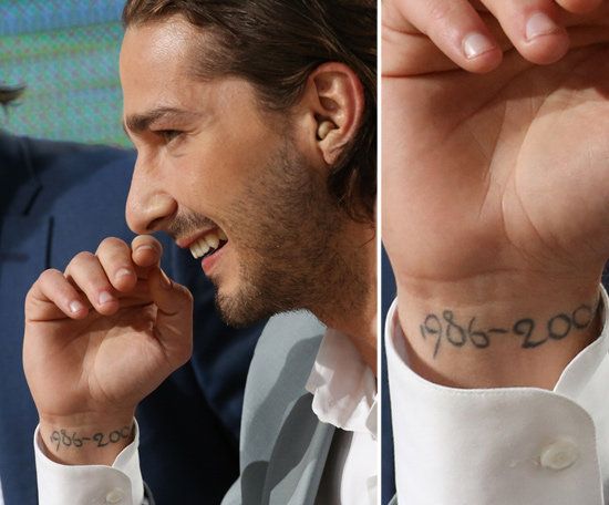
Some of the smaller pieces are harder to date or make out in photos. The inner-bicep script spells out GOD, and the finger reads Bakersfield. Older profiles mention a date on his wrist as well, though it is not as clear in every picture.

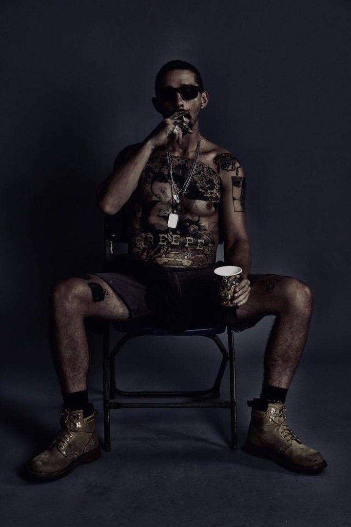
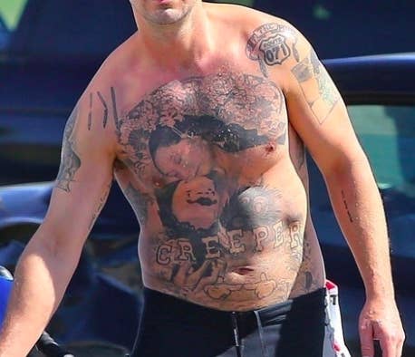
The Creeper tattoo covers the chest and abdomen

Shia LaBeouf showing the Creeper chest tattoo

The largest piece stretches across LaBeouf’s chest and abdomen. It was tattooed for The Tax Collector, rather than painted on as temporary makeup, and the word Creeper stands out near the bottom. In photos, it takes over his torso.

The film tells us when the tattoo was made, but not what every figure means to LaBeouf. Reports described it as a real tattoo, a permanent change to his body rather than makeup for the role.

From a distance, the portrait-like shapes blur into the dark field around them. Up close, the lettering and figures are easier to pick out. There is no missing the scale of the piece.

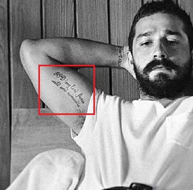
GOD is a long script tattoo on the inner bicep

Shia LaBeouf showing the GOD script bicep tattoo

Another photo shows a long line of script along LaBeouf’s inner bicep. The words are usually given as GOD: My Lord, Fierce, Wild, and Romantic. The phrase is distinctive, but the image alone cannot tell us when he got it or how he interprets each word.

The narrow lettering looks more like a short passage than a bold emblem. Its inner-arm placement makes it easy to miss unless his sleeve is rolled up. Ruby Rose has a similar tattoo that can be hidden by a short sleeve.

The words may invite guesses about LaBeouf’s faith or personal beliefs, but the tattoo itself does not answer those questions. The photograph makes the wording and placement clear; anything beyond that would be a guess.

Bakersfield is written across a finger

Shia LaBeouf’s Bakersfield finger tattoo

When the photo is close enough, Bakersfield is easy to read across one finger. In a wider shot, the lettering can disappear against his hand.

The Bakersfield lettering is a place name, so it is natural to wonder why he chose it. Available coverage does not give a confirmed story behind the word; the compass and other little marks nearby are separate designs.

The contrast with Creeper is striking: one fills the torso, while this one is only a few fine letters across a finger. It takes a much closer look to catch it.

The wrist date belongs to an earlier layer of the collection

Shia LaBeouf 1986 to 2004 wrist date tattoo

Older biographies have described 1986-2004 on LaBeouf’s inner wrist, tied to an earlier period of his life. Unlike the newer images of his chest tattoo, photos of the date are harder to read and less consistent.

A wrist turns away from the camera easily, and a watch, bracelet or sleeve can cover the area. That makes this mark harder to spot in photos than the bold chest piece.

Beside Creeper, the date is understated: a few numbers on the wrist, linked in older coverage to an earlier part of his life. The two tattoos differ in size and in how clearly they have been photographed.

Why the film tattoo should not erase the smaller designs

Shia LaBeouf’s tattooed torso and Creeper chest piece

The chest tattoo drew attention because it was impossible to miss and tied to a film role. The quieter pieces are easy to overlook beside it: the GOD script, Bakersfield on a finger and the wrist date, each taking up only a small patch of skin.

LaBeouf’s tattoos do not seem to follow one obvious theme. The chest piece is dramatic, the bicep carries a full phrase, the finger has a place name and the wrist shows a date. Each has its own look and scale.

They are easy to miss when looking only at wide shots. The chest comes into view first, while the inner-arm script, finger lettering and wrist numbers need closer photographs. Together, those images fill out the picture.

What the sources can and cannot establish

Photos show the Creeper chest tattoo, inner-bicep script and Bakersfield lettering, and older biographies mention the wrist date. They do not give a complete tattoo count or verified meanings for every mark. Some small tattoos can be hard to keep track of when designs are covered, changed or added later.

Even tattoo records can be incomplete over the years. Skin changes, roles come and go, and tattoos can be covered or reworked; one photo from a film set is only a snapshot.

LaBeouf’s collection mixes career-related tattoos with smaller, more personal marks. The chest piece explains why his ink drew headlines, while the script, finger lettering and wrist date give the collection more texture.

Alan Ritchson’s Matching Tattoo, Rib Number and Forearm Work

In GQ’s tattoo tour, Alan Ritchson said he had 23 tattoos and talked through several of them. The first was a matching piece with his wife Catherine; later additions include “81” on his ribs and a large forearm project. He has also explained tattoos for his children, though not every mark has a public story.

What the GQ tattoo tour documents about Alan Ritchson’s tattoos

GQ places the first tattoo in Ritchson’s tattoo history, early in his relationship with Catherine; they got matching designs together. It was a shared decision, not a tattoo for a film role. His later work grew larger, but the matching piece still marks the start of the collection.

Reports confirm the matching origin, but do not describe every line or give a private meaning. A symbolic reading beyond what Ritchson has said would be guesswork. Photos show the size and placement; the GQ account explains why it was his first tattoo.

The matching piece began the collection. Ritchson later added larger designs, turning a shared tattoo into the first point in a much broader story.

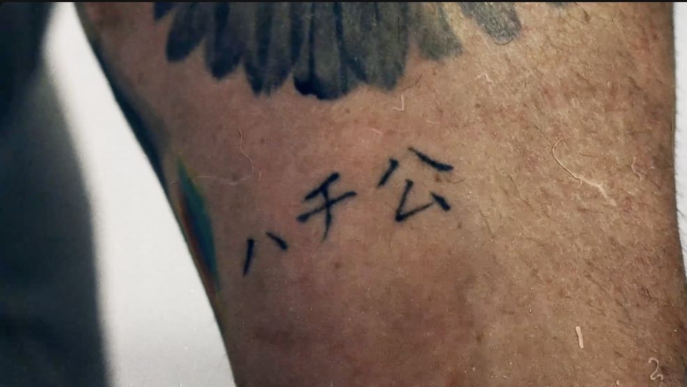
Forearm lettering and the matching Hachiko tattoo

Alan Ritchson’s forearm lettering and cross tattoos shown during GQ Tattoo Tour.

GQ identifies tiny Japanese characters as Ritchson’s first tattoo, a matching Hachiko design he shares with Catherine. He connects Hachiko with loyalty and lasting love. The tour also shows a cross and nearby handwriting, which he reads as “boundaries, devotion and winter storms.” The photo gives a close view of the lettering, though not every mark is legible.

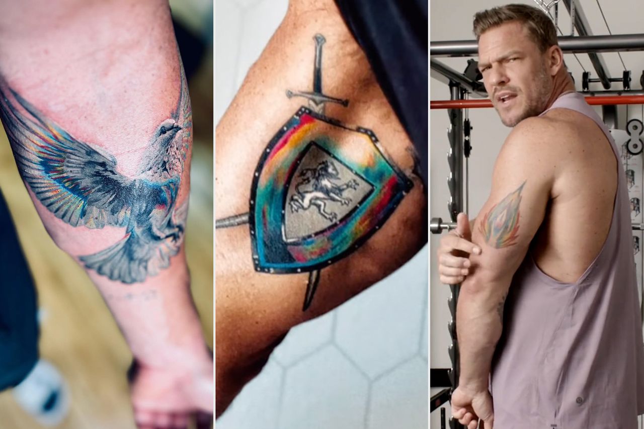
Dove, flame and shield designs honour his sons

Close views of Alan Ritchson’s dove and sword-and-shield family tattoos, alongside a photo of the actor showing his arm.

The family tattoos include a dove for his eldest son, Calem; an abstract flame for Edan; and a sword-and-shield crest for Amory. Ritchson explains the dove and flame in GQ, while People identifies the crest as a tribute to Amory. Each design has a specific connection to one of his sons.

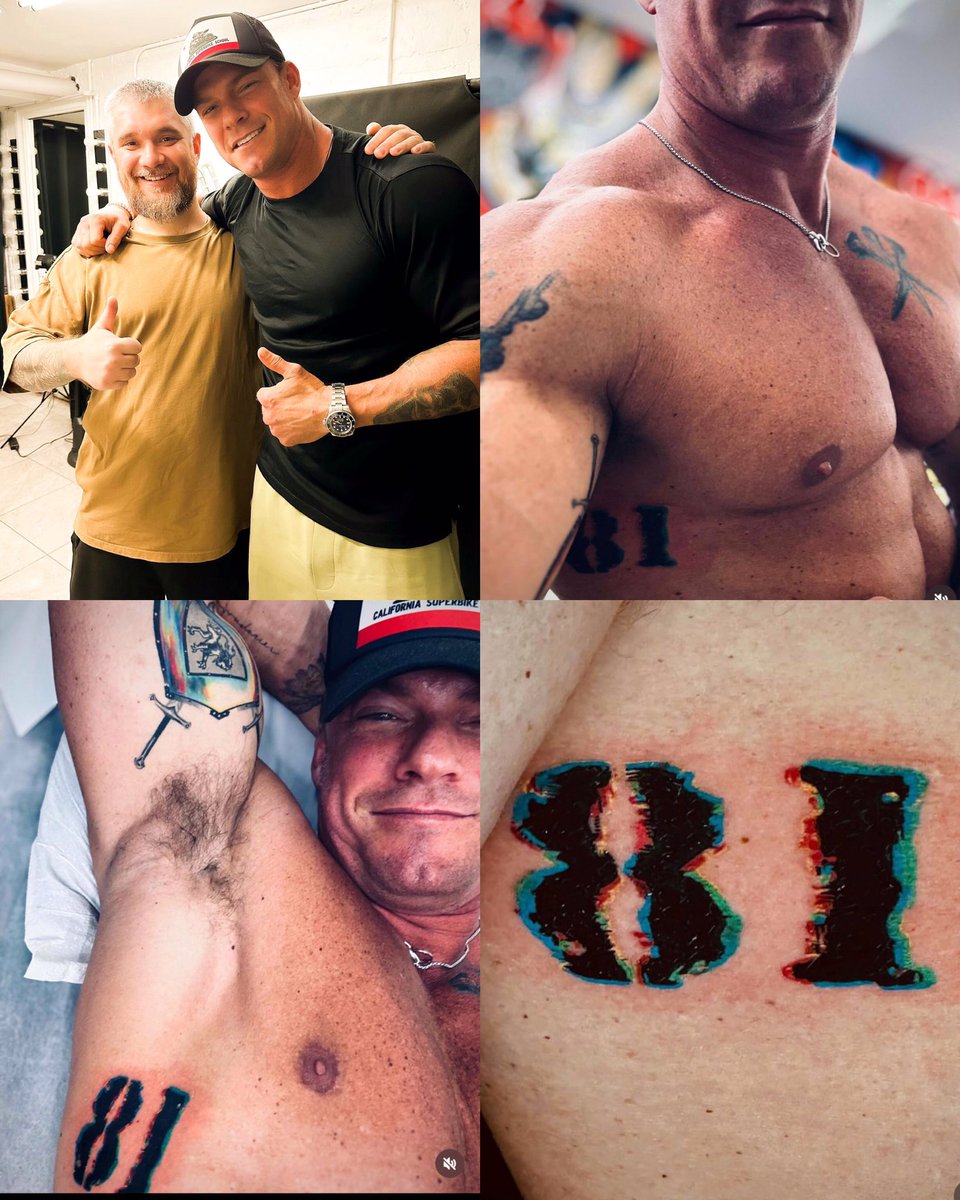
The “81” on Ritchson’s ribs

A multi-panel view of Alan Ritchson’s tattoo work, including the 81 numerals and arm designs.

Coverage also documents a separate tattoo: “81” on Ritchson’s ribs, a piece he added after the matching design. The number appears in later discussions of his collection, though older photos often hide the ribs under clothing.

Earlier coverage identified the number and its placement without a clear explanation. Ritchson later discussed the tattoo tour and tied “81” to a film project. A close-up shows the marking, but the GQ interview supplies the context.

On its own, “81” could be a date or a private reference. Ritchson’s explanation connects it to the film War Machine and the character he played, rather than to an address or a birthday.
GQ connects the number to the making of War Machine: Ritchson says the story moved him enough to mark 81 on his ribs, and he wanted to embody the character.

The large forearm project and the tattoo-tour era

Alan Ritchson showing tattoos across both arms during GQ Tattoo Tour.

Ritchson’s forearm became the largest visible expansion of his collection. British GQ and other coverage say the artist spent about 16 hours on the work. He also had to let it heal before filming a demanding water sequence for Reacher, tying the tattoo to a particular production period.

The 16 hours describe the size and process, not a single named design. Photos show black-and-grey work and lettering across the forearm, but they do not identify who created every part or what each mark means.

Photos can show different stages of the forearm work. While it healed, wardrobe or bandages may have hidden it; later images reveal more of the finished piece. GQ gives Ritchson’s account, while production coverage explains why the timing mattered on set.
GQ points out a lighthouse on the arm and describes the unfinished forearm as Zeus throwing a lightning bolt. A mountain and horses were still to be added. The feature says Pasha Ink did most of Ritchson’s tattoos.

How the documented tattoos fit together

Alan Ritchson with tattoos visible on both forearms, showing the collection discussed across the article.

The timeline starts with the matching Hachiko tattoo, then moves to “81” and the forearm work around the Reacher filming period. That sequence helps make sense of photographs taken at different stages.

Ritchson’s total of 23 comes from his own tattoo-tour conversation. The feature does not identify every one with the same precision: some are small or private, and others disappear in event photos. The number is his estimate, not a complete visual inventory.

The dates help separate the designs. The matching tattoo belongs to the early part of his relationship with Catherine; the rib number and large forearm project came later. A recent close-up should not be mistaken for proof that every part was present in earlier photos.

A count and a design-by-design list are different things. Ritchson gave a total, but only some tattoos have a clear name, location and explanation. The documented pieces make a useful record without filling in what the interviews leave out.

What remains unconfirmed

The reports do not identify every meaning, artist or location in Ritchson’s collection. A dark shape in a distant photograph is not automatically a named tattoo. The clearest entries are the matching Hachiko, the “81” rib tattoo and the forearm project; a future interview or sharper image may add more.

Inside Zac Efron’s Tattoo Collection

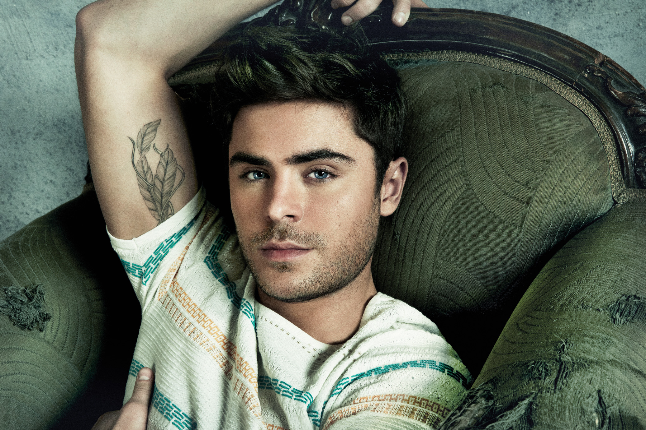
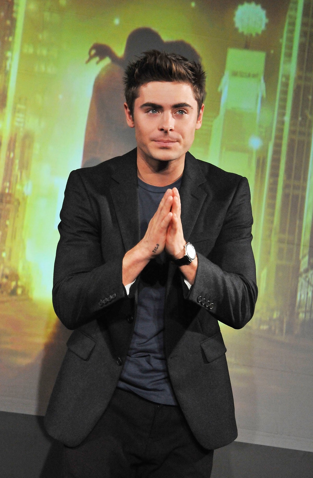
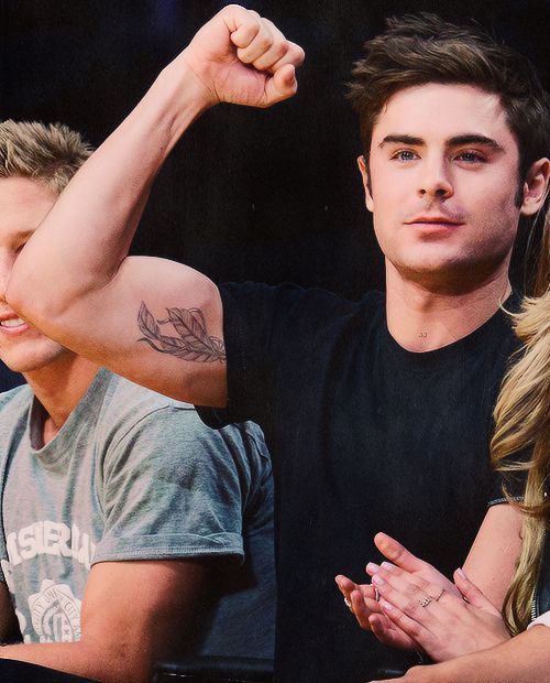
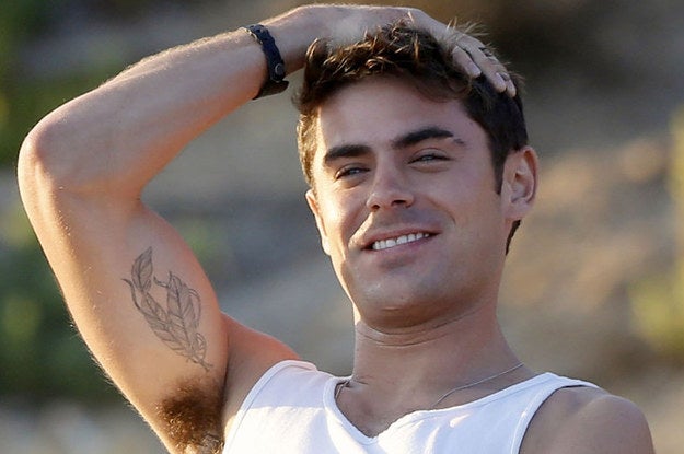
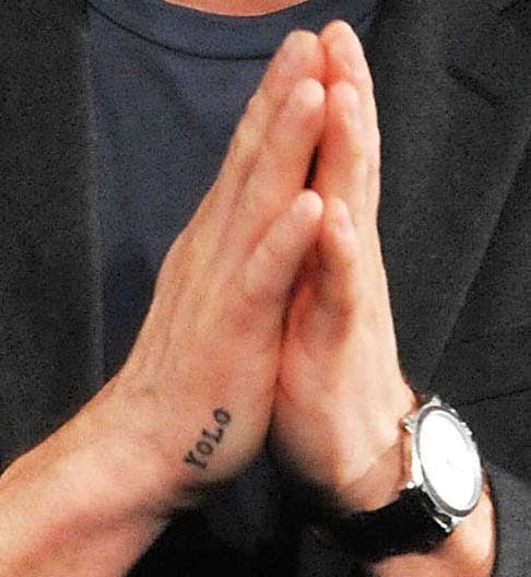
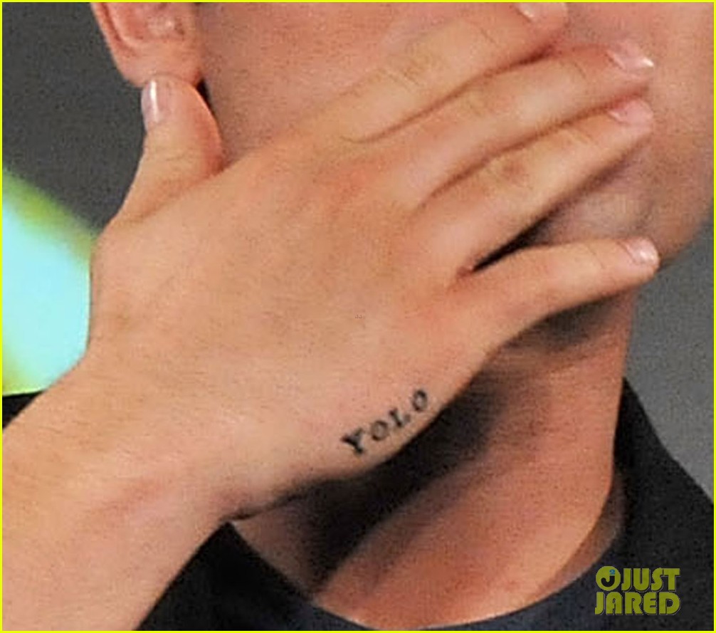
Zac Efron’s tattoo collection is small: the word YOLO on his right hand and a pair of feathers on his inner right bicep are the two designs most consistently documented. Both have appeared in public photos, though the explanations behind them are limited. Efron has reportedly said he wanted the YOLO lettering, while the feather tattoo’s meaning has not been confirmed.

How many tattoos does Zac Efron have?

Zac Efron’s YOLO tattoo on his right hand

Efron has not published an official count of his tattoos. Body Art Guru lists two permanent designs and separates them from temporary ink he has worn for appearances or film roles. That distinction matters: makeup and promotional styling can make a temporary mark look permanent in a photo.

Those two designs have the clearest record. Some online lists add marks on his neck, wrist or arm, but without a dated photo or a direct source it is hard to tell what they show. A picture can confirm that a mark was visible on one day; it cannot tell us when it was done, whether it later changed or what Efron intended it to mean.

The YOLO hand tattoo

Close view of Zac Efron’s YOLO tattoo on his right hand

Efron’s best-known tattoo is “YOLO”—short for “you only live once”—on his right hand. Body Art Guru says he revealed the tattoo while promoting New Year’s Eve in 2011 and wanted the words without giving them a deeper meaning. The phrase invites big interpretations, but his reported explanation was straightforward: he liked the lettering.

The hand placement makes even a small tattoo easy to spot in interviews, photographs and red-carpet appearances. Its plain lettering also makes it easy to recognize in pictures from around 2011. There is no clear close-up that establishes a particular font, so “simple lettering” is the safest description.

Later entertainment stories have raised questions about whether the hand tattoo was covered, changed or recreated temporarily. They do not provide a full account of any treatment. In public photos, its appearance has varied; without a direct explanation from Efron or a tattoo professional, the reason is unclear.

The double-feather bicep tattoo

Zac Efron’s double-feather tattoo on the inside of his right bicep

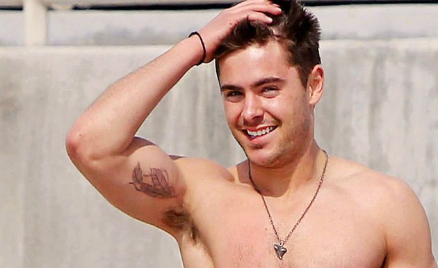
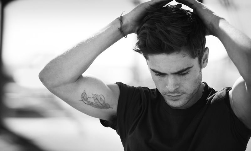
The other consistently documented design is a pair of feathers on the inside of Efron’s right bicep. Body Art Guru says it was first seen on the cover of Men’s Health in 2012. The placement helps explain why it appears in some photos and not others: a short sleeve can cover it, while a raised arm reveals it.

Feathers are often associated with freedom or travel, but Efron has not confirmed either as the tattoo’s meaning. The reference says he has not publicly discussed the tattoo’s meaning, so its subject and placement are known while his reason for choosing it remains private.

Some photos show only part of the feather design. An arm turned away from the camera, a tight crop or poor lighting can hide the rest. A clear view of the inner right bicep is more useful than a distant red-carpet shot where the tattoo is only suggested by a dark mark.

What the 2012 photographs show

Zac Efron raising his arm with the feather tattoo visible

Some of the clearest public views of the bicep tattoo date from 2012. Licensed event photos from that period show its placement and approximate size, but they cannot tell us who did the work or how it was planned. They document what was visible at the event.

The date matters. A photo labeled 2012 shows how the tattoo looked then, not necessarily how it looks now. Ink can soften over time, and a single image may not show a later change or cover-up.

Are there other Zac Efron tattoos?

Online searches turn up other supposed tattoos, but some marks may be temporary, part of a film’s makeup or too blurry to identify. Efron has appeared in productions that use body makeup and character styling, so an on-screen mark is not automatically a personal tattoo.

In some photos, necklaces, shadows, clothing seams or body hair can look like small symbols. Without a reliable source, they should not be counted as confirmed tattoos. The hand lettering is linked to his 2011 New Year’s Eve promotion, and the feathers were photographed around his 2012 Men’s Health cover.

Who tattooed Zac Efron?

The sources used here do not name the tattoo artist behind either design. Artist credits appear often in celebrity coverage, but there is no reason to guess when no source connects a particular artist to Efron’s tattoos.

The visible styles are simple lettering on the hand and a feather design on the inner arm. Photos support those descriptions, but they do not show whether the two tattoos were planned together or tied to a particular tattoo tradition.

What do Zac Efron’s tattoos mean?

Zac Efron showing his feather tattoo

Body Art Guru reports that Efron wanted the YOLO phrase and did not attach special importance to it. The feathers have no confirmed public explanation. Freedom, movement and resilience are common readings of feather imagery, but they are interpretations rather than statements from Efron.

The two tattoos can be described clearly even where their personal significance is unknown. Keeping the visible details separate from guesses gives readers a more reliable picture of the designs and their placement.

Frequently asked questions

Does Zac Efron have a YOLO tattoo?

Zac Efron’s right-hand YOLO lettering in a promotional photograph

Yes. The widely documented design is YOLO on his right hand. It came to public attention around 2011, during promotion for New Year’s Eve.

Where is Zac Efron’s feather tattoo?

Zac Efron displaying the feather tattoo on his inner right bicep

The double-feather tattoo is on the inside of his right bicep. It was widely seen around his 2012 Men’s Health cover appearance.

What does the feather tattoo mean?

Close photograph of Zac Efron’s feather tattoo

Efron has not publicly explained the feather tattoo in the sources reviewed. Freedom is a common interpretation, but it has not been confirmed by him.

Does Zac Efron have temporary tattoos?

Zac Efron’s hand tattoo in close view

He has appeared with temporary or role-related body designs. Without separate evidence, those marks should not be counted as permanent personal tattoos.

Efron’s documented collection centers on two designs: YOLO on his right hand and a pair of feathers on his inner right bicep. Dated photos and repeated descriptions support both. Other marks are harder to verify, so the public record remains a short one.

The Personal Stories Behind Shemar Moore’s Tattoos

Shemar Moore’s tattoos mark different parts of his life rather than one planned sleeve. He has linked a lion to a childhood trip with his mother, an eagle to his career and the lettering across his back to people he admired. In 2025, he added two half sleeves that include tributes to his daughter Frankie and his late mother. The newer work extends the collection; it does not replace those earlier pieces.

The tattoos can be hard to make out in photos. One shoulder portrait shows the lion from a distance; a CBS still crops close on the forearm eagle; and a People photograph gives a rare front-and-back view of the back piece. Each image shows a different tattoo, and the details below follow Moore’s comments or what the photo makes visible.

The lion on his shoulder began with a childhood safari

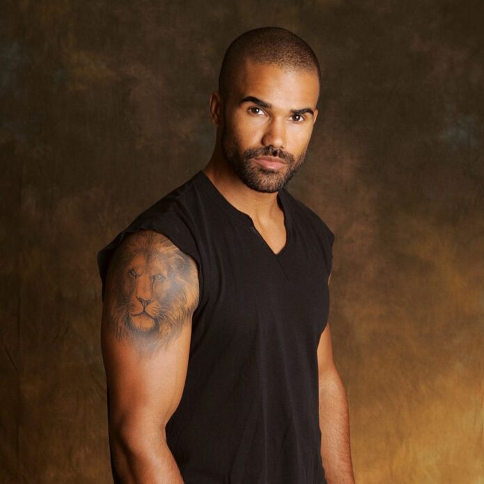
Shemar Moore’s lion tattoo clearly visible on his shoulder in a sleeveless portrait

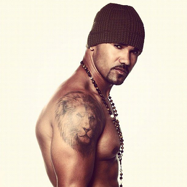
Moore has described the lion on his shoulder as a memory from a trip to Ghana with his mother. He told People he was four when they went on safari and became captivated by the animal. He later connected the lion with strength and with how he wants to show up for the people he loves. That explanation comes from Moore himself, not a stock meaning assigned to a lion tattoo.

In the portrait, the tattoo sits high on Moore’s shoulder and upper arm, where the rounded shape of the body gives the lion’s face a broad area of skin. The studio-style photo confirms the subject and placement, but it is not a close-up. Lighting and distance soften the fine lines; Moore’s interview supplies the personal context.

The story is unusually specific. Moore did not just say he likes lions or that the design stands for courage. He tied it to a childhood encounter with his mother and said the fascination stayed with him as he grew older. The tattoo carries a family memory as well as a personal emblem, rooted in one trip rather than a general idea of strength.

Moore’s interview records what he said the lion meant to him then; it does not make the tattoo a permanent summary of his personality. The photo shows where it sits, and his words explain why it mattered. Nothing in the account defines what the design means to him today.

The S.W.A.T. eagle marks a career turning point

Close view of Shemar Moore’s S.W.A.T. eagle tattoo on his left forearm

The eagle on Moore’s left forearm is tied to S.W.A.T. In a 2018 CBS interview, he said the role inspired the tattoo, though the bird meant more to him than television branding. He associated it with rising, reaching and continuing to work toward a goal. The CBS still gives a close look at the forearm, where the eagle’s spread wings fill most of the frame.

The eagle marked a specific career moment: becoming the lead of a major show after decades in the business. Moore described the opportunity as an achievement and said he was grateful for it. In his account, the tattoo also stands for persistence and possibility beyond S.W.A.T.

Moore has said the eagle was not just for his S.W.A.T. character; it also reflected his outlook beyond the show. That distinction is easy to miss when the role dominates the story. Because CBS recorded his comments at the time, there is more to the design’s meaning than later guesses in tattoo lists.

The CBS still shows the eagle’s placement and dark outline, but crops off its lower edge. It documents the tattoo during the S.W.A.T. period, before Moore revealed much fuller sleeves years later; it cannot map every design now covering his forearms.

Carpe Diem spans the upper back with portraits in the lettering

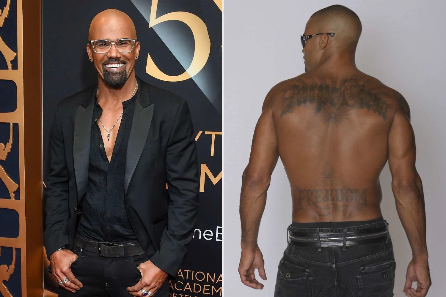
Moore’s largest older piece is the “Carpe Diem” lettering across his upper back. On X, he explained that the phrase means “seize the day,” and said portraits of Barack Obama, Martin Luther King Jr. and Malcolm X appear within the letters. People reported his view that the choice was not simply political. A paired photo shows the design across his shoulders, though the dark exposure makes the small portraits harder to distinguish.

Moore has called the three men among his heroes. Their portraits sit inside the letters, so the back reads first as a broad phrase and then as a collection of figures. The available photograph is soft and low in contrast; Moore’s description, rather than the image alone, identifies the portraits.

People also reported a second word, Freedom, across Moore’s lower back in its 2024 account. The available photo does not show it clearly, so the reported location is all that can be confirmed visually.

There is a clear difference between the phrase’s literal translation and its personal context: “Seize the day” is straightforward Latin, and Moore has named the men as heroes. The sources do not establish one political or biographical message for every part of the design. His interview explains his respect for them; photos show the scale and placement.

Later sleeves add family tributes without changing the older stories. Moore kept adding tattoos after those three. In 2025, he showed two nearly finished half sleeves made over four sessions with tattoo artists Saul Lira and Orks. Parade reported that one arm honored Frankie and his late mother Marilyn; the other represented his career and persistence. The descriptions included Frankie’s name and portrait, a butterfly, a flower, and the phrases Self Made and Live Laugh Love. These pieces extend the collection without changing the stories behind the lion, eagle or back lettering.

Moore said the two sleeves contained almost twenty pieces after four sessions. That is a count for the 2025 project, not an official total for every tattoo he has had. A single sleeve photo can show several designs, while a news story may count each one separately. Older interviews mentioned six tattoos at an earlier point; both counts describe different moments.

The lion is tied to a childhood trip with his mother, the eagle to work and ambition, and the back piece to a motto and historical figures he admired. The newer sleeves add family and career imagery in greater detail. Taken together, the tattoos read like chapters added over time, not one fixed visual theme.

The older pieces are easy to place: the lion sits on Moore’s shoulder, the eagle runs along his left forearm, and “Carpe Diem” crosses his upper back. His interviews supply the stories behind each one, while the 2025 sleeves add a separate layer of family and career imagery.