Actors

Tattoo guides for actors, with photographs of their real tattoos and clear distinctions between personal ink and designs created for screen roles.

Kendall Jenner Tattoos: Tiny Hearts, White Ink, Meow and a Cowboy Boot

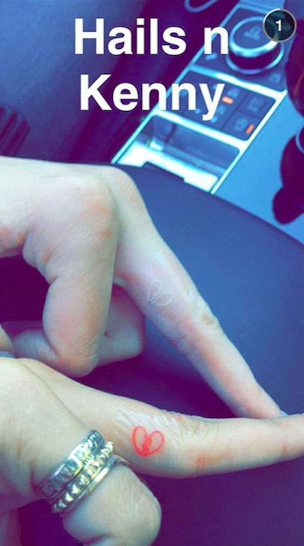
Kendall Jenner’s tattoos stay small: a white dot, matching finger hearts with Hailey Bieber, “meow” inside her lower lip, and a fine-line cowboy boot at her ankle.

Kendall Jenner’s low-key visual style

Her collection isn’t a sleeve or a coordinated set. Tattoo artist JonBoy said Jenner wanted her first tattoo to be subtle and cared about “the little things.” He also said the white ink kept the dot from distracting from her modeling work. Small designs and discreet placements leave the tattoos easy to cover between different looks.

Kendall Jenner’s tiny heart tattoos
Kendall Jenner tattoos: inline

Jenner and Hailey Bieber got matching heart tattoos on their fingers. Bieber’s is red; Jenner’s is white. Jenner has said the full heart represents her angel side and the broken heart on her other hand her devil side. The color ties the pair together, while the split design gives hers a different meaning.

The white dot: the smallest piece in the collection

The white dot on Jenner’s finger came before the hearts and the lip tattoo. It is easy to miss, in keeping with what JonBoy said she wanted. White ink can fade, blur or settle differently depending on the skin and placement. With a micro tattoo, even a small change in the line is noticeable, so ask an experienced artist how the pigment may age before choosing a spot.

Why subtle choices work with fashion
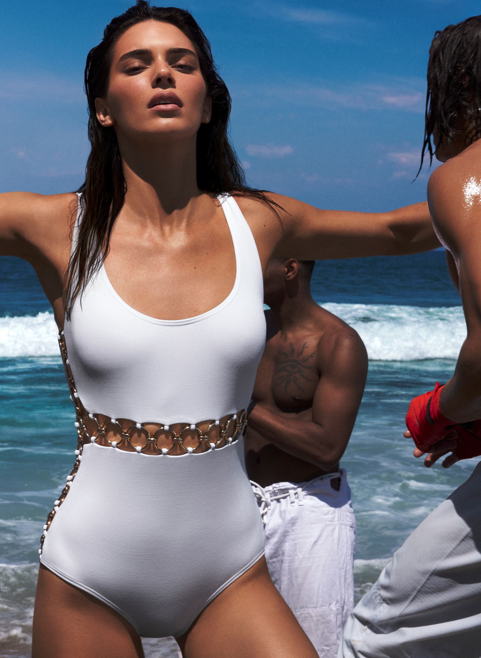
Kendall Jenner in a contextual photograph: inline; not tattoo evidence

The different placements give Jenner some choice about when the ink shows. Her finger hearts appear as her hands move; the lower-lip tattoo stays hidden unless she points it out; the ankle boot can show with sandals and disappear under boots. That flexibility suits a job where her look changes from shoot to shoot.

The playful side of a private joke

Jenner said “meow” was the first word that came to mind when she decided to get a tattoo inside her lower lip. She later said it was the only one she regretted. Hidden there, it reads like a private joke; the placement decides who sees it and when.

A little Western energy

Kendall Jenner in a contextual photograph: inline; not tattoo evidence

Tattoo artist Kate McDuffie, known as The Ghost Kat, shared the small cowboy boot on Jenner’s inner ankle. Jenner posted it with the caption “when at the rodeo.” The design appeared while she was spending time in Wyoming and leaning into a ranch-inspired look; it works as a small snapshot of that moment.

The boot has a clear outline that suits its size, and the ankle gives its shape room to follow the curve of the leg. For a tattoo of your own, keep the main silhouette readable instead of crowding it with details that may blur together.

A strong point of view in a small detail
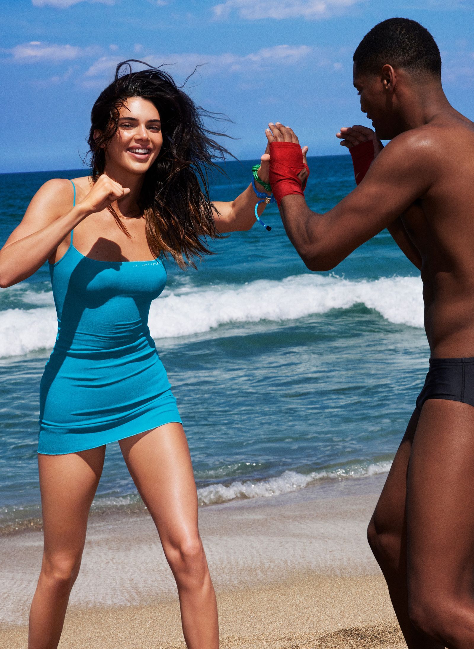
Kendall Jenner in a contextual photograph: inline; not tattoo evidence

The tattoos don’t share one subject: the dot is quiet, the hearts connect Jenner to a friend, “meow” is a joke, and the boot recalls a Western look. Their small scale is enough to make the separate pieces feel like part of one collection; they don’t need to match.

Make the idea your own
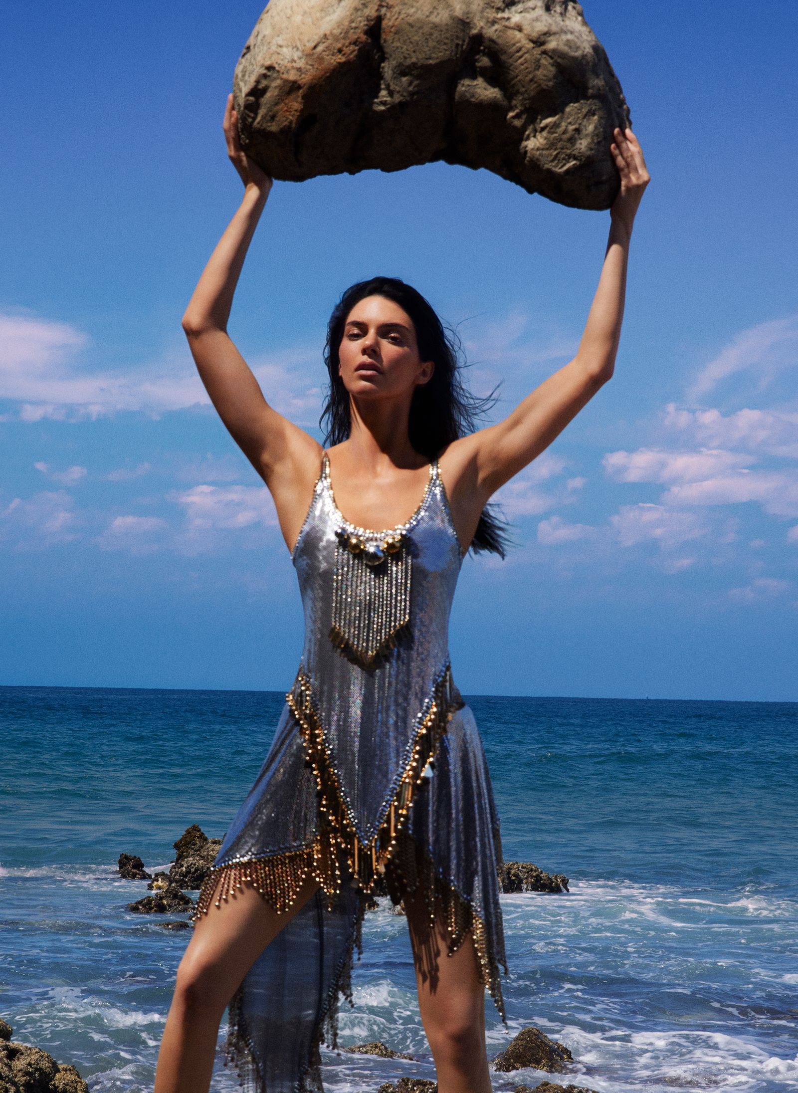
Kendall Jenner in a contextual photograph: inline; not tattoo evidence

Start with the part of Jenner’s style you actually like: small scale, fine lines, white ink or a hidden placement. A friendship tattoo can use related symbols without making them identical. A private joke works best if the word still amuses you years later. White ink needs its own planning, so ask the artist about healing, fading and touch-ups. You can explore more celebrity ink in our tattoo photo archive.

Follow the artist’s aftercare advice and wait for the tattoo to heal before judging the final look.
More model tattoo guides

Franklin Jonas Tattoos: His Matching Ponyo and Sosuke Design

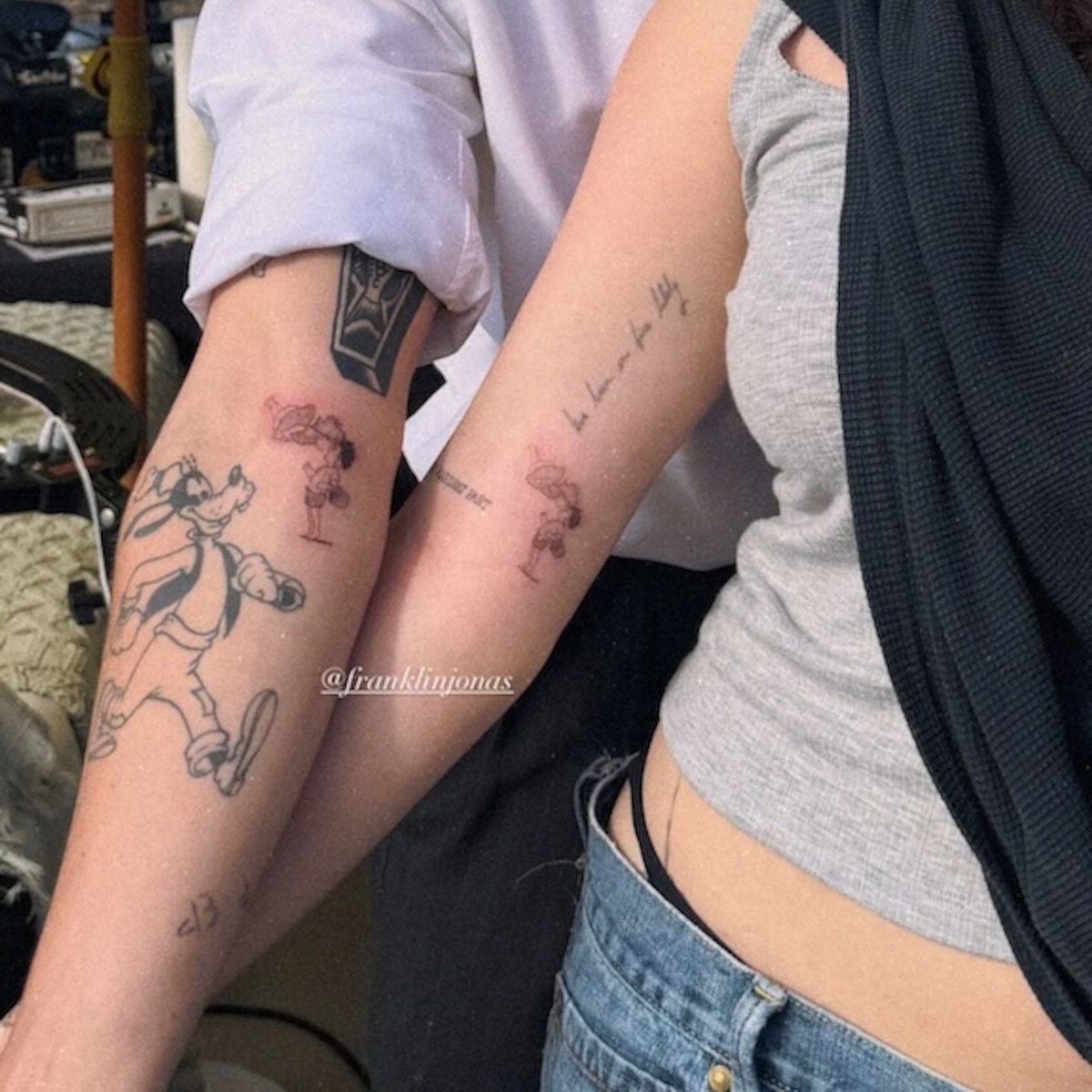
Franklin Jonas and Noah Cyrus got a small matching tattoo of Ponyo and Sosuke on their inner forearms. It’s a movie reference with a direct link to Jonas’s own work.

The matching Ponyo and Sosuke tattoo

Franklin Jonas tattoos: The matching Ponyo and Sosuke tattoo

Each inner forearm has the same small black-outline scene: Ponyo and Sosuke leaning toward each other. The caption accompanying the reveal translates as “Ponyo loves Sosuke.” There is open skin around the figures, so the faces and simple lines have room to read without a lot of shading.

Why the reference matters to them

Each forearm carries the complete scene, so neither tattoo needs the other to make sense. The shared image connects them without adding initials or a date.

The Ponyo connection

Jonas voiced Sosuke in the English-language version of Ponyo. In the film, Ponyo is a magical fish who wants to become human; she and Sosuke look after each other as the story unfolds. The tattoo chooses one small moment between them instead of trying to summarize the whole film.

A clear gesture or expression often carries more than a crowded scene. An artist can simplify the background or small details so the characters stay recognizable at tattoo size.

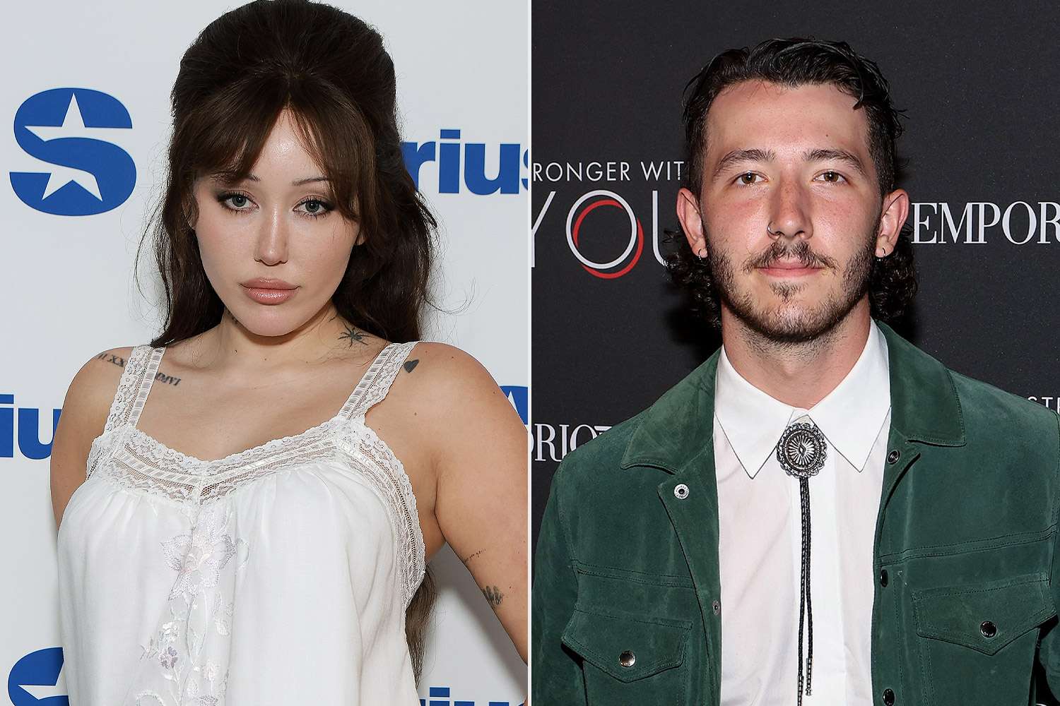
Franklin Jonas in a contextual photograph: Current Franklin Jonas and Noah Cyrus contextual portrait; not tattoo evidence

This portrait of Jonas and Cyrus provides context; it isn’t evidence of the tattoo. The close-up above shows the ink itself.

Franklin and Noah before the new drawing

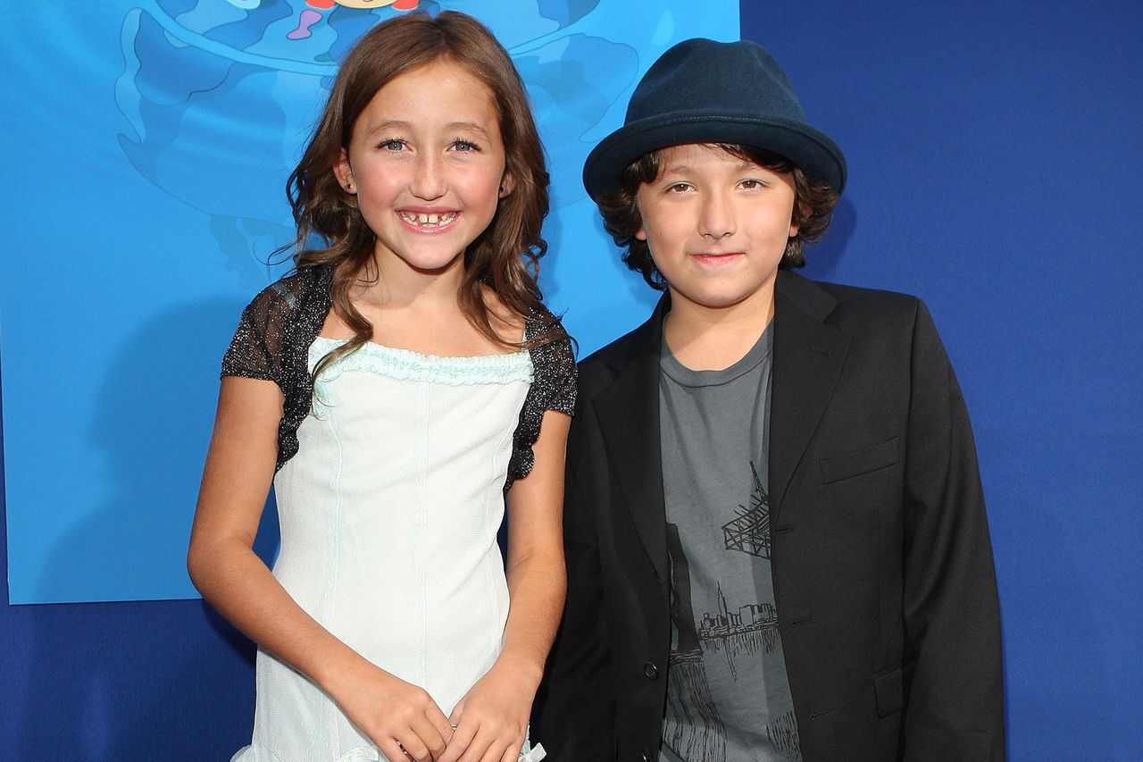
Jonas and Cyrus have known each other since they were young. The movie reference sits within that longer history without spelling it out on their skin.

Franklin Jonas in a contextual photograph: Childhood contextual portrait; not tattoo evidence

A matching tattoo can mark a shared history without needing to explain every part of it.

Franklin’s style outside the reveal

Franklin Jonas in a contextual photograph: Franklin Jonas contextual graduation portrait; not tattoo evidence

This graduation portrait is also contextual, not proof of another tattoo. The Ponyo design’s inner-forearm placement gives it room while letting Jonas cover it with a sleeve or show it by turning his arm. Since the forearm rotates, an artist should check how the image looks from different angles.

Keep the line work simple and give two faces enough space to stay clear. Ask to see the design at its actual tattoo size; a frame that looks detailed on a screen may need to be simplified for skin. Follow the artist’s aftercare advice and protect the tattoo from unnecessary sun while it heals.

Jeremy Allen White Tattoos: The Real Ink Behind Carmy’s Look

Jeremy Allen White’s real tattoos are smaller and quieter than the heavy ink worn by Carmy Berzatto on The Bear. White worked with tattoo artist Benny Shields to create Carmy’s designs, but his own chest triangle was also worked into an earlier role on Shameless.

Jeremy Allen White’s real triangle tattoo

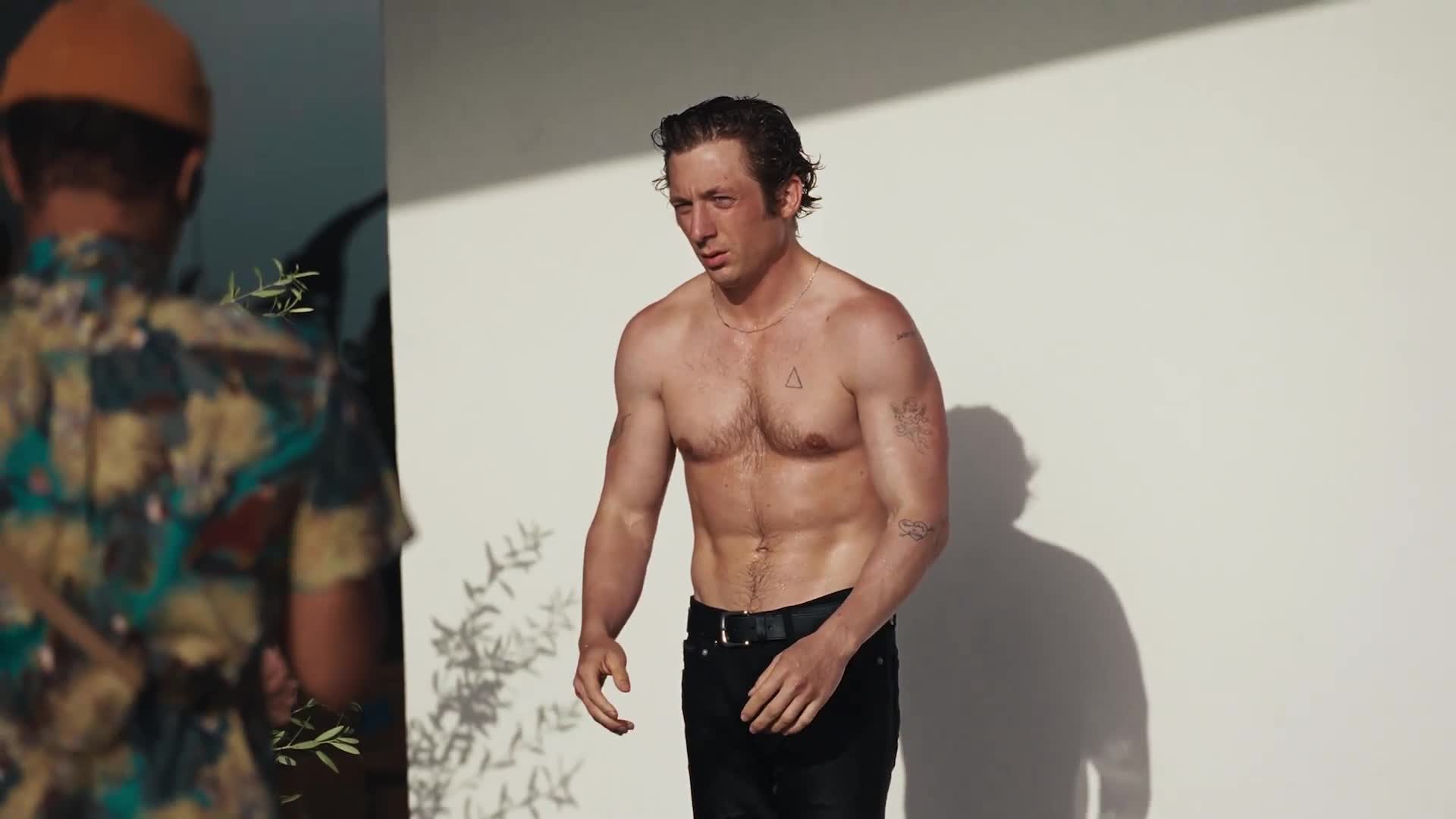
Jeremy Allen White tattoos: Jeremy Allen White’s real triangle tattoo

The triangle sits high on the left side of White’s chest. The GQ España campaign image shows its open outline and the raised texture around it. White has said he got the tattoo at 17 and that it was done badly enough to leave the skin raised. He has connected it to a friendship and his younger years, but hasn’t assigned it a more specific symbolic meaning.

Makeup artists tried to cover the triangle when White played Lip Gallagher on Shameless. Its texture made that difficult, so the show worked the real tattoo into Lip’s look. The old mark became part of a character, even though it belonged to White first.
What White’s personal collection looks like

White has at least six known tattoos, though the number can vary with what a photo shows. They include a heart pierced by an arrow with “Buddy & Billie” on his upper forearm; a hummingbird with a banner reading “Ezer”; “R.W.” on a shoulder; “EZ” on an inner bicep; and a two-word phrase beginning with “sweet” on the opposite shoulder.

The hummingbird and Ezer banner are commonly linked to his daughter. The heart-and-arrow has been reported as a tribute to Addison Timlin, while White hasn’t explained every initial or phrase. Those connections should stay qualified.

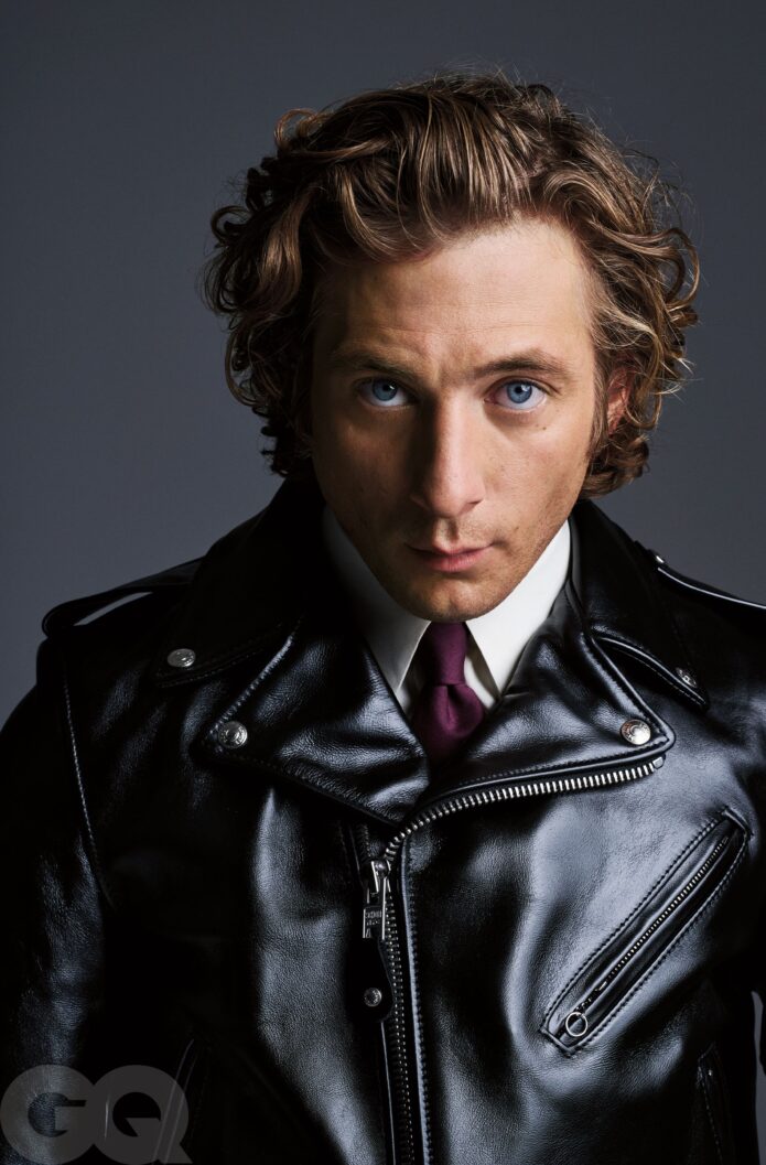
Jeremy Allen White in a contextual photograph: What White’s personal collection looks like; not tattoo evidence

This portrait gives context; it isn’t evidence of another tattoo. White’s visible pieces vary in size and style, from script and initials to a small illustration.

The actor beyond the role

Carmy’s tattoos are a separate design from White’s own collection. White worked with tattoo artist Benny Shields on the character’s heavy, scattered ink. In an interview with TheWrap, White said Shields could look at a stranger’s tattoo and make an educated guess about when and where it was done. That knowledge helped them make Carmy’s pieces feel chosen over time rather than added at random.

White’s favorite Carmy tattoo was a knife going through a hand. He described it as a reminder of how close the character is to damaging what he’s trying to build. That reading belongs to Carmy’s story, not White’s personal tattoos.

Jeremy Allen White in a contextual photograph: The actor beyond the role; not tattoo evidence

How the production built the look

White’s raised triangle also affected how makeup handled the role. For The Bear, NewBeauty’s behind-the-scenes account says the crew covered White’s existing tattoos before applying Carmy’s temporary designs. The production had to keep the character’s ink consistent through long kitchen scenes, movement and close-up shots.

Carmy’s tattoos vary in age and finish, which makes them look like marks gathered over time. The real triangle shows why texture matters too: the skin itself can make a flat-looking reference harder to reproduce.

Jeremy Allen White in a contextual photograph: How the production built the look; not tattoo evidence

A style that leaves room to breathe

White’s own tattoos mix a small outline, lettering and a few illustrations. They don’t follow one strict visual rule, and each piece has its own history. If you’re planning a collection, choose the reason first, then match the size and detail to the place on your body. A small triangle can stay simple; a bird needs enough room for its shape; script needs space between letters.

The personal tattoos aren’t a blueprint for Carmy’s heavier designs. Borrow the line work or scattered placement if you like it, but keep the character’s fictional story separate from White’s.

Jeremy Allen White in a contextual photograph: A style that leaves room to breathe; not tattoo evidence

The clean version of the story

The triangle is the one clear overlap: White got it for himself as a teenager, and it later became part of Lip’s look. Carmy’s heavier ink belongs to a different story.
More actor tattoo guides

Elliot Page Tattoos: The Personal Meaning Behind His Ink

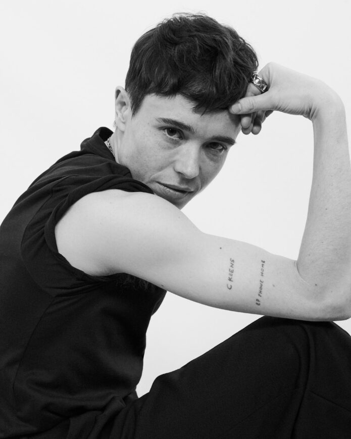
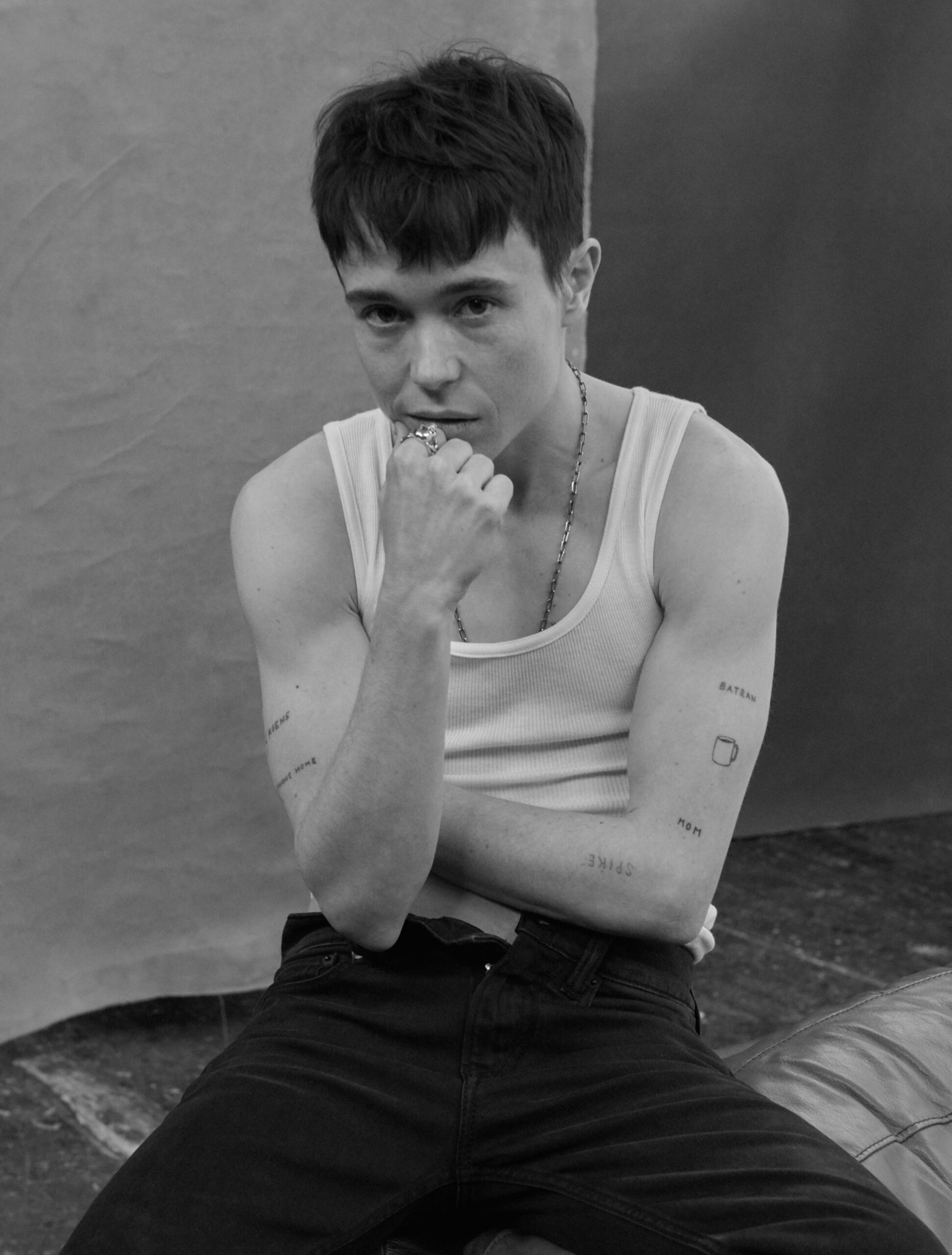
Elliot Page’s tattoos are mostly small pieces of lettering and symbols tied to people, films and specific memories. Some only show in the right photograph, so the collection can be easy to miss. Page has described having nine tattoos, most connected to people in their life; earlier coverage counted eight.

EP PHONE HOME: Elliot Page’s E.T. tattoo

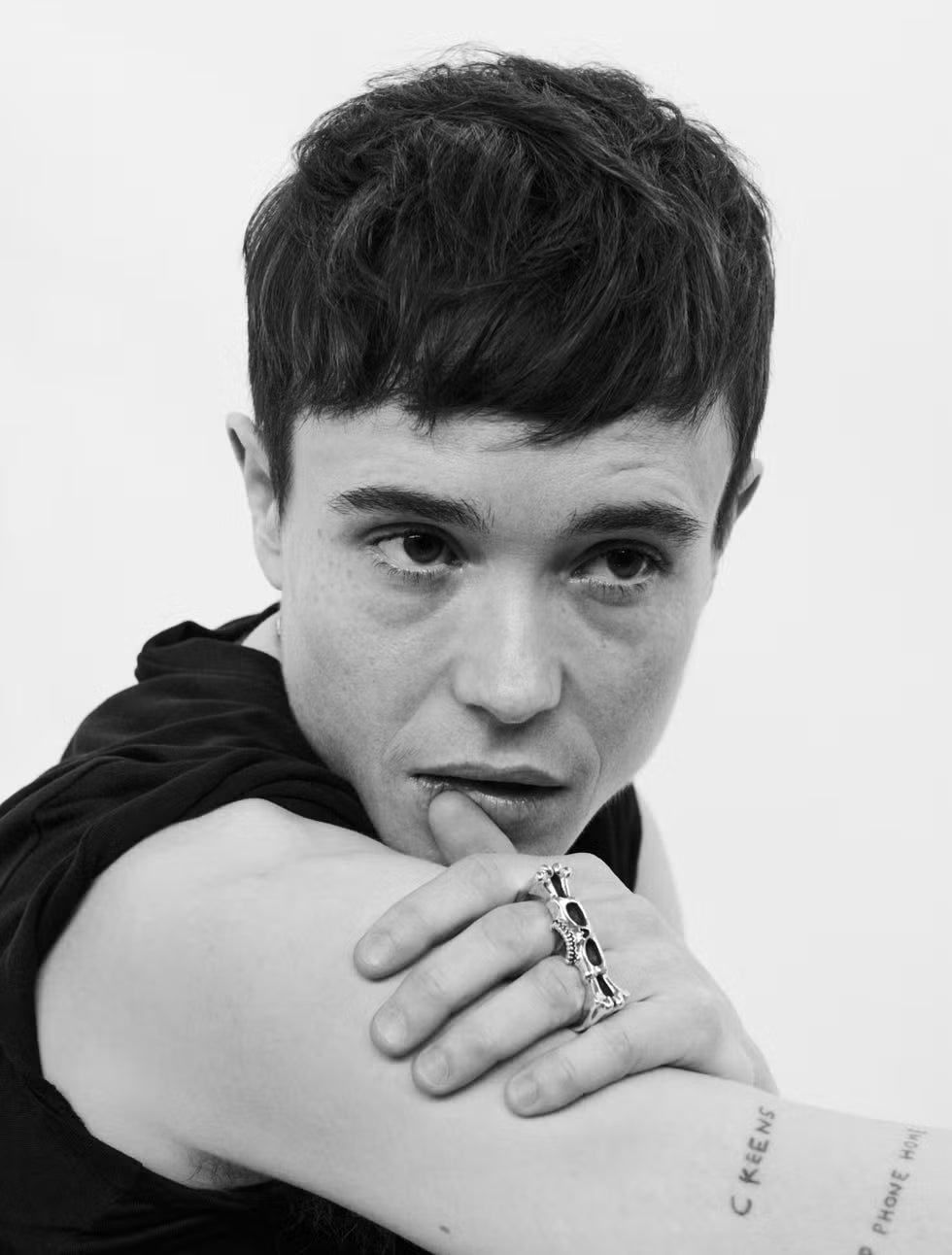
Elliot Page tattoos: Black-and-white portrait with EP PHONE HOME and C KEENS visible on the arm

The best-known design is EP PHONE HOME, Page’s twist on the line from E.T. the Extra-Terrestrial. Page has said they loved the film as a child and wanted to look like the boys in the movies. The character Elliott also helped inspire their name, so the phrase connects the film to something more personal.

Page wrote about the tattoo in Pageboy. They recalled staying in a motel after filming Whip It and finding E.T. on television. The plain lettering leaves the reference to do the work; there’s no extra image or frame around it.

C KEENS: a tattoo for Catherine Keener

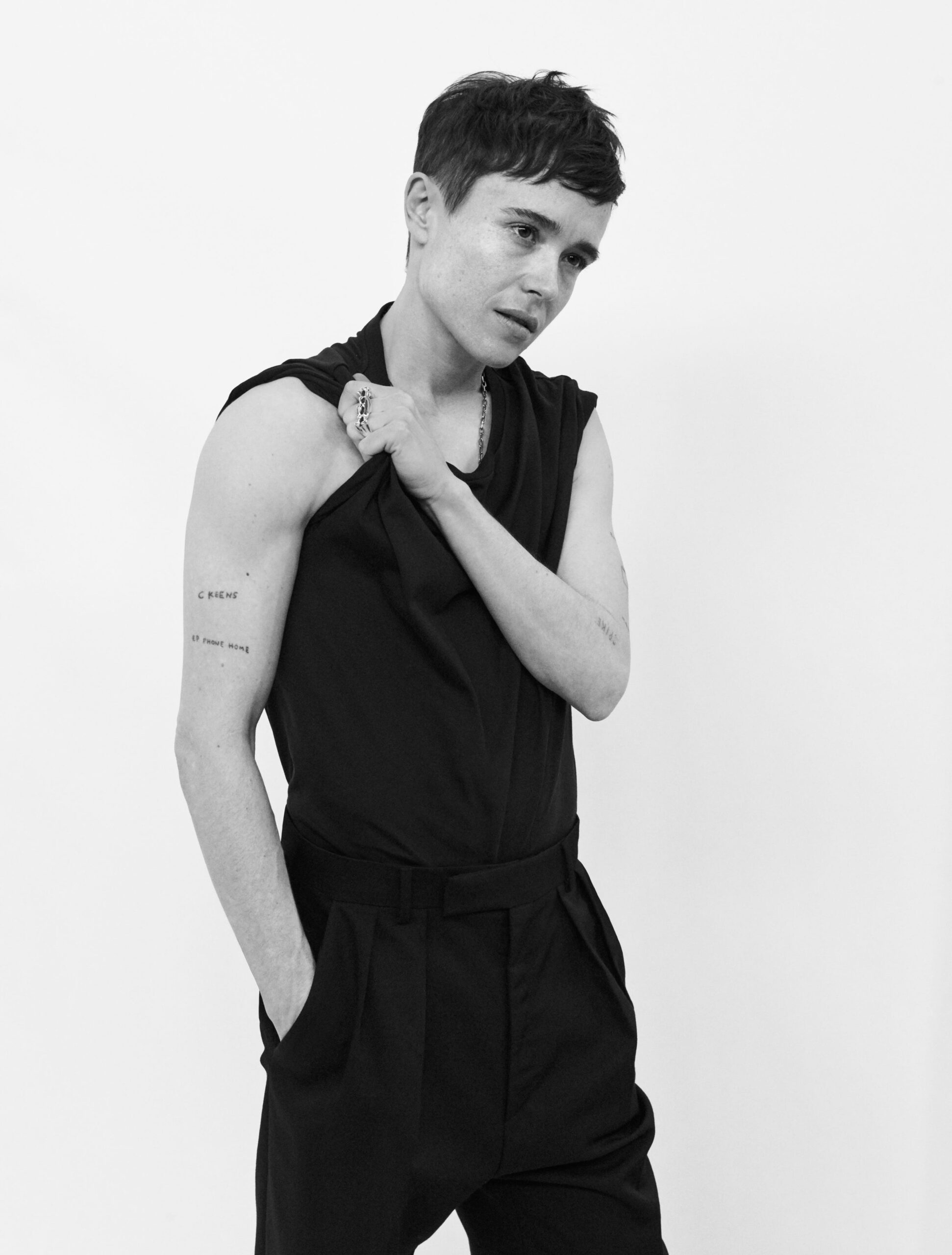
Elliot Page tattoos: Full studio portrait with C KEENS and EP PHONE HOME visible on the right arm

The small C KEENS lettering beneath Page’s right shoulder is a nickname for actor Catherine Keener. Page has called it their first tattoo and said they met Keener at nineteen. They’ve described her as a close, grounding friend.

During the years when Juno brought intense attention, Page faced pressure around clothes, public appearances and other expectations. They’ve credited Keener with helping them stay grounded, live honestly and take care of themself. The short nickname keeps that friendship close without spelling out the whole story.

WIIG: the Kristen Wiig friendship tattoo

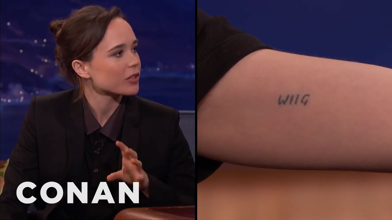
Elliot Page tattoos: Video still showing the WIIG tattoo in close-up

WIIG is Page’s nod to Kristen Wiig. Page showed it during an appearance on Conan, while talking about their friendship and the strange permanence of putting someone else’s name on an arm.

It’s a blunt little word, which suits the affectionate, in-joke quality Page has described. Alongside the other names and initials, it points to people who mattered at a particular time without trying to turn each relationship into a grand symbol.

The coffee cup tattoo shared with Mae Martin

Elliot Page tattoos: Seated studio portrait with the small coffee cup visible on the arm

Page and Mae Martin have matching coffee cup tattoos. Andrew White tattooed them at Midway Tattoo and Piercing in Toronto; Page’s cup is on the right arm. The small design is quieter than the block lettering elsewhere in the collection, but it still marks a shared reference between friends.

Friends’ initials, nicknames, and the word “turtles”

Page has said that other pieces use friends’ initials, nicknames or middle names. They’ve described these tattoos as reminders of people who helped them through periods when getting by felt uncertain. One of the more casual choices is the word turtles: Page has said they love turtles and called the tattoo random.

There are also references connected to Spike Jonze and small marks that are hard to read in available photographs. Rather than guessing at blurred lettering, it’s safer to stick to designs Page has discussed and details that are clear in the images.

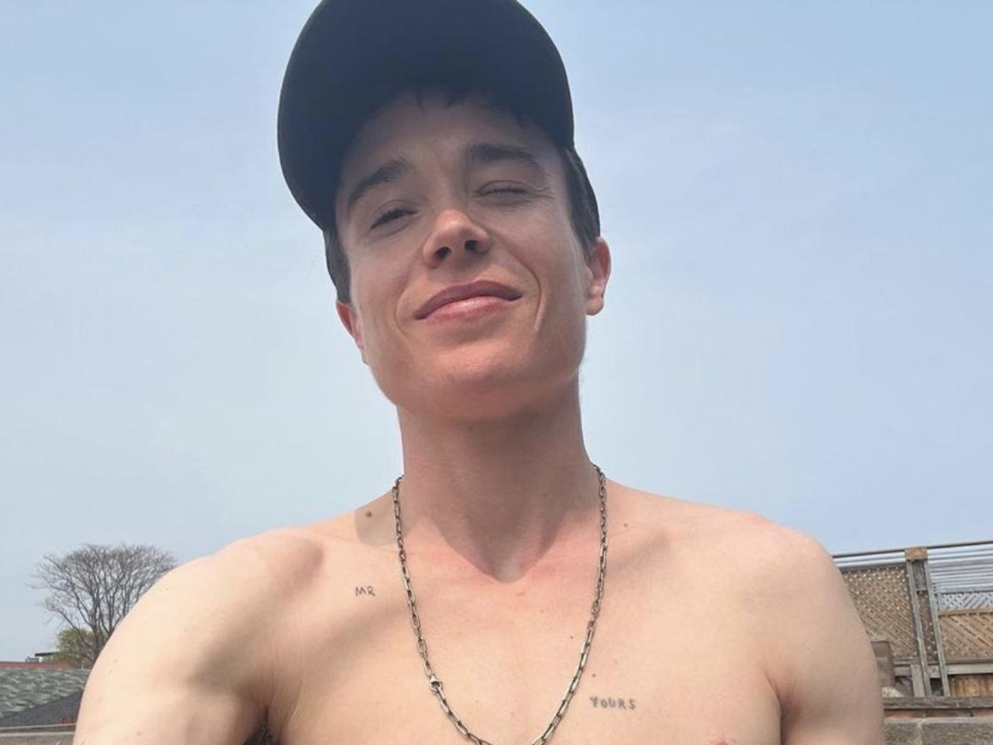
MR and YOURS: newer pieces with a softer feel

Elliot Page tattoos: Casual portrait with MR and YOURS chest tattoos clearly visible

Later photos show chest lettering that reads MR and YOURS. Page hasn’t publicly explained every small tattoo, so the words should be described without assigning them a specific story. They could have a private meaning, but the article doesn’t establish one.

The chest pieces also appear in different settings from the arm tattoos: they tend to be visible in more relaxed portraits, while the arm lettering often turns up in interviews and public photos.

Why Elliot Page’s tattoos stand out

The collection brings together film references, friends’ names, a shared coffee cup and a turtle tattoo Page chose simply because they like turtles. The designs are small and often plain, but the stories behind several of them are specific: E.T., Catherine Keener, Kristen Wiig and Mae Martin each have a clear place in the account.

For tattoo ideas, Page’s collection is a reminder to start with the connection behind a design, not just its font or placement. You can find more examples in the Celebrity Tattoo Design archive, but the meanings of Page’s smaller pieces aren’t all public, and it’s best to leave those details open.

More actor tattoo guides

Karan Kundrra Tattoos: The Tejasswi Prakash Portrait Explained

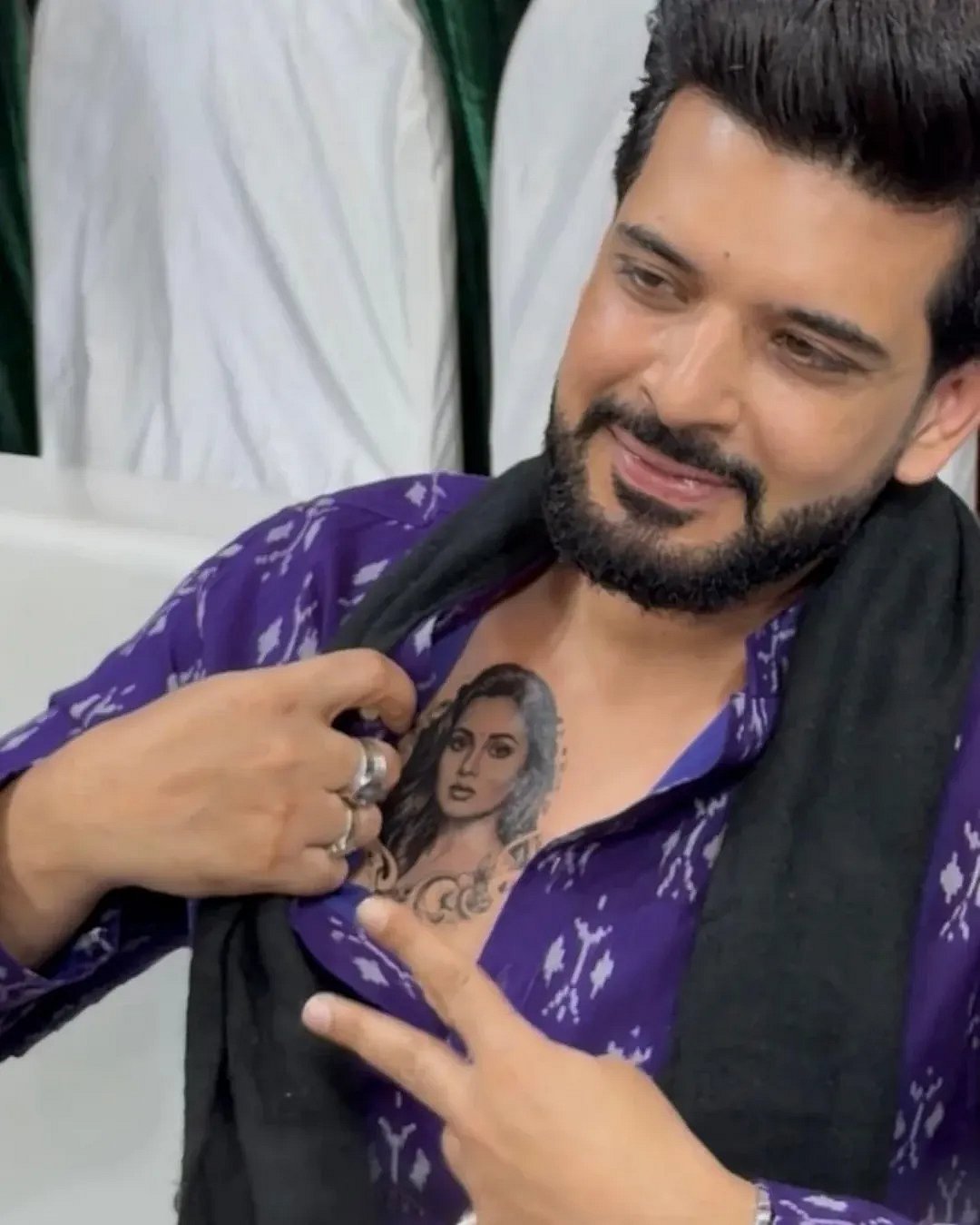
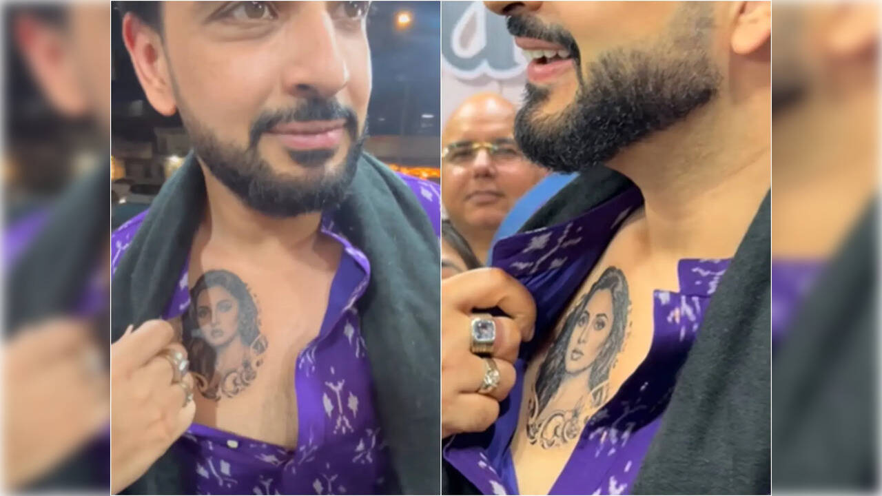
At a Ramzan event in Mumbai in February 2026, Karan Kundrra revealed a portrait of Tejasswi Prakash across his chest.

Karan Kundrra’s Tejasswi Prakash portrait tattoo

Karan Kundrra tattoos: Genuine tattoo photograph showing Karan opening his shirt and pointing to the chest portrait.

The portrait sits high on Karan’s chest, close to the heart. Tejasswi’s dark hair and defined eyes carry most of the contrast. Soft shading and the ornamental curls below her face spread the design across the chest. It is large enough for the features to read from a distance.

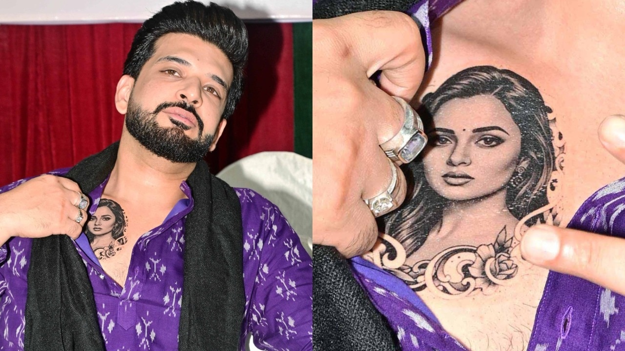
What the chest portrait actually looks like

Karan Kundrra tattoos: Genuine tattoo photograph showing both the wider placement and a closer crop of the portrait.

India Today’s event photos pair a waist-up view with a closer crop. The wider shot shows the portrait’s scale and placement; the close view catches the linework and shading. Event lighting, posture and fabric affect what the camera catches. These photos record the reveal, not a clean studio reference.

Why the tattoo caused so much debate

Karan Kundrra tattoos: Genuine tattoo photograph with two closer event views of the portrait.

Early coverage called it a tattoo but did not say whether it was permanent or connected to a promotion. The photos showed the portrait, but not why he was wearing it.

Karan later said it was temporary promotional ink for Tejasswi’s OTT series Psycho Saiyaan, whose character has a tattoo. It was made to promote the show, so the photos should not be read as evidence of a permanent piece.

Who is Karan Kundrra?

Karan Kundrra in a contextual photograph: Contextual portrait for the biography section; explicitly not tattoo evidence.; not tattoo evidence

Karan Kundrra is an Indian television actor and host. His credits include Kitani Mohabbat Hai, reality and dating shows, and work across MTV and Hindi television.

Karan and Tejasswi’s public love story

Karan Kundrra in a contextual photograph: Contextual red-carpet portrait for relationship and public-image context; explicitly not tattoo evidence.; not tattoo evidence

Fans have followed Karan and Tejasswi’s relationship since the two met on Bigg Boss 15, so the portrait could read as a public romantic gesture.

If you’re choosing a partner tattoo, decide whether you want a public declaration or something only the two of you know. A small, private symbol can carry as much meaning as a portrait.

Can you borrow the look?

If you like the layout, borrow its main choices: chest-high placement, strong black-and-grey contrast and ornamental framing. Bring clear reference photos to an experienced portrait artist, and choose a size that leaves room for the features.

Ask how the image may heal and age, and how chest movement could affect it. Temporary ink can help test the scale, but it won’t show exactly how a permanent piece will look on your skin.

The bottom line

Karan’s portrait was temporary promotional ink, but the event photos remain a reference for chest placement and framing.

More actor tattoo guides

Eugenio Franceschini Tattoos: The Shakespeare Quote Explained

Eugenio Franceschini got his Shakespeare tattoo at 17, after a night at Budapest’s Sziget Festival that ended with rain, flooding and a disrupted Metallica set. The lettering isn’t perfect. He has said so himself, and he still likes it because it takes him back to that morning.

Across his left trapezius, it reads a line from The Tempest: “We are such stuff as dreams are made on.” Italian reports give the wording as “Siamo fatti della stessa sostanza dei sogni.”

The story is about a decision made in the moment, and why he has kept the result as it was.

Eugenio Franceschini’s Shakespeare Tattoo

Eugenio Franceschini tattoos: Genuine tattoo photograph showing Eugenio’s upper-back tattoo; not a contextual fallback.
The photograph shows a small black line design on Franceschini’s upper back; reporting identifies it as the quote he has described in interviews. It sits on the left trapezius, where the shoulder slopes into the back.
He has said the words come from Prospero’s speech in The Tempest, his favourite Shakespeare play. The line is often translated as “We are such stuff as dreams are made on,” though versions vary. Franceschini’s own tattoo uses Italian lettering.

There’s no frame or extra imagery around the words. The design stays simple and lets the quote carry the meaning.

A Strange Morning in Budapest

Eugenio Franceschini in a contextual photograph: Contextual editorial portrait for the tattoo backstory; explicitly not tattoo evidence.; not tattoo evidence

Franceschini told Rolling Stone Italia he went to Sziget to see Metallica. Heavy rain and flooding on Óbuda Island disrupted the festival. When the generators stopped, people began making music and dancing in the rain.

The next morning, on his way back to his tent, he got the tattoo. There was no long search for a font or careful design plan. Franceschini has said the lettering wasn’t executed particularly well, and that the uneven result is part of what makes it his.

The story can inspire a spontaneous idea without requiring a rushed appointment. Take time to check the words, artist and placement before making the memory permanent.

A Closer Look

Eugenio Franceschini in a contextual photograph: Contextual press portrait for placement discussion; explicitly not tattoo evidence.; not tattoo evidence

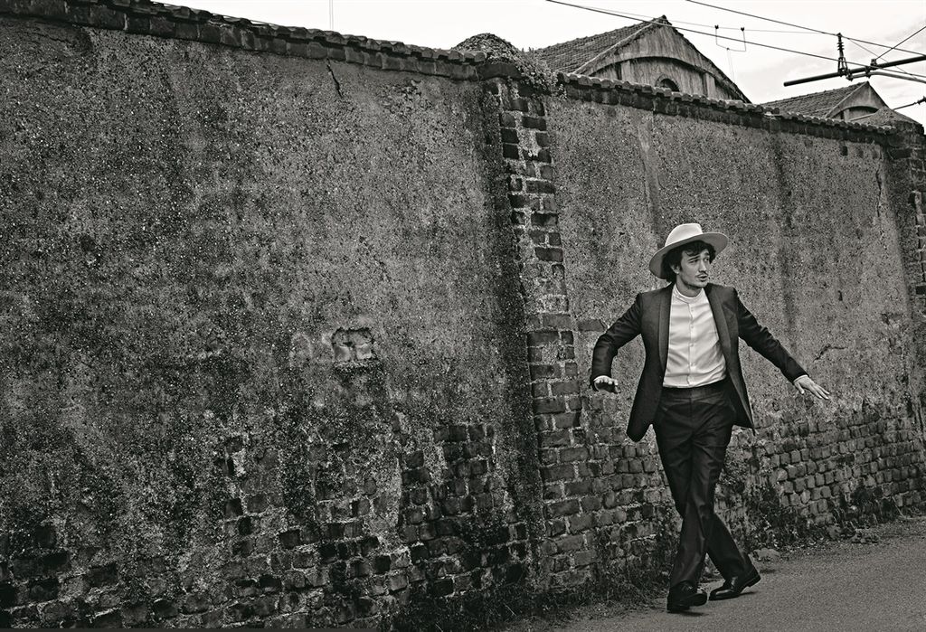
The black-and-white Vogue Italia portraits are editorial images, not close-up evidence of the tattoo. They show Franceschini in tailored clothing and help place the mark near the shoulder line, though the lettering itself isn’t clear.

The trapezius slopes between the neck, shoulder and back, so text there needs to follow the body rather than sit as a straight line. Franceschini’s left-side placement also keeps the quote away from the centre of his back.

The spot is easy to cover under a shirt. If you want lettering that appears in some photos but stays hidden day to day, ask the artist to test it at its actual size and on a body-shaped stencil.

When the Finish Isn’t Perfect

Eugenio Franceschini in a contextual photograph: Contextual editorial portrait for design and career context; explicitly not tattoo evidence.; not tattoo evidence

Franceschini’s account isn’t an argument for careless work. He likes the tattoo despite its uneven execution because it is tied to a night he remembers. A tattooer can still make lettering readable and help it age well.

Small text needs enough space and careful placement. If you’re choosing a line in another language, ask a fluent speaker to check it; Shakespeare translations and editions can differ.

Meaning and craft can both matter. You can keep the personal story while giving the artist time to make the design clear.

Who Is Eugenio Franceschini?

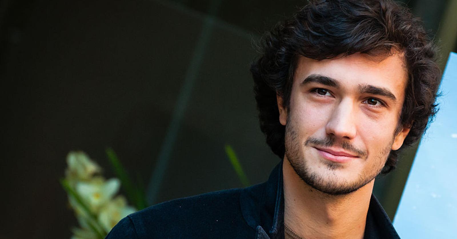
Eugenio Franceschini in a contextual photograph: Contextual face-visible portrait for biography context; explicitly not tattoo evidence.; not tattoo evidence

Eugenio Franceschini is an actor from Verona. His parents worked as performers and puppeteers, and he spent much of his childhood travelling with their company. He later moved to Rome to study at the Centro Sperimentale di Cinematografia.

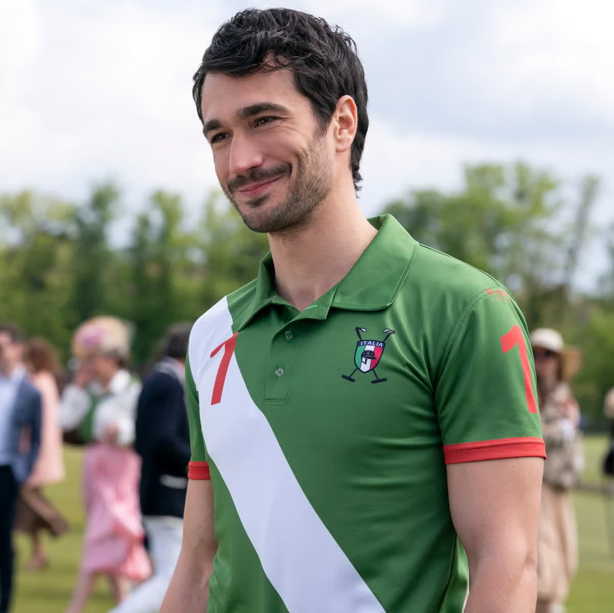
His work includes Italian film, television and theatre, including I Medici, Sconnessi and Io che amo solo te. He became better known internationally as Marcello in Emily in Paris. The tattoo dates to his teens, years before the role.

Finding Your Own Reference

If you’re considering a quote tattoo, start with a line that means something to you, not one you chose only because a celebrity has it. Read it at the size you have in mind and decide where the line breaks should go.

Ask the artist to fit the lettering to the part of the body. The trapezius slopes, ribs move with each breath and forearms turn; a layout that looks balanced on a screen may shift on skin.

Franceschini’s story began at a concert, but your reason doesn’t need to be dramatic. Choose a moment or idea you’ll still want to carry years from now.

The Bottom Line

Franceschini’s Shakespeare quote sits on his left trapezius. He got it at 17 after the rain-soaked Sziget night, and he has said the imperfect lettering is part of its story. The lasting point is the personal connection; the words and design still deserve careful checking.

If you want to see Franceschini discuss his work and background, the interview below adds context:

More actor tattoo guides

Jonathan Majors Tattoos: The Meaning Behind His Rebirth Neck Ink

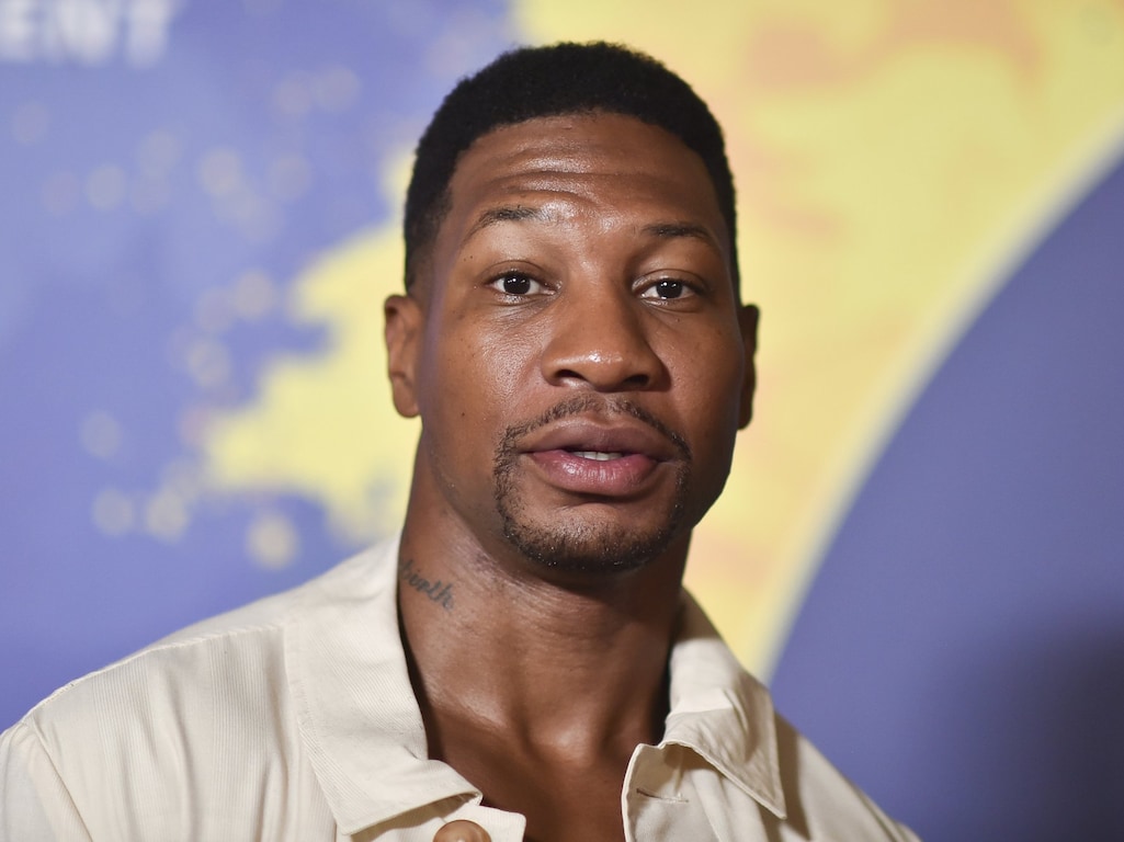
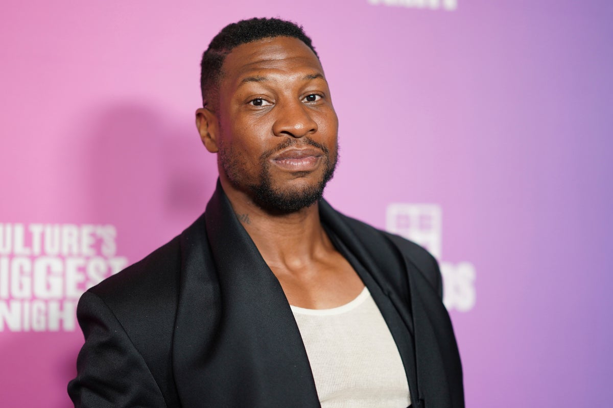
Jonathan Majors’ documented personal tattoo is a cursive word on the left side of his neck: Rebirth. He told Variety and Complex that he walked into a tattoo shop and asked for that word while talking about where he wanted his life to go.

It’s a small design with an exposed placement, and the word is open to interpretation. Majors hasn’t described it as a complicated code, so there’s no need to add extra symbolism to it.

Photos from film roles and editorial shoots can show other tattoos, but they aren’t proof of Majors’ own ink. The clearest starting point is the neck piece he has discussed himself.

Jonathan Majors’ Rebirth Tattoo

Jonathan Majors tattoos: Genuine tattoo photograph showing the documented Rebirth neck tattoo; not a contextual fallback.

The tattoo sits on the left side of Majors’ neck, just below the jaw. In the clearest photographs, the dark cursive letters are loose rather than perfectly uniform.

Majors discussed the word around the release of Magazine Dreams. Variety described it as cursive lettering on his neck, while Complex connected it to the changes he was talking about at the time. That gives the tattoo a clear context without guessing at a more specific meaning.

“Rebirth” can mean different things to different people. For Majors, it’s the word he chose; its placement makes it visible, but the design stays simple.

The Context Around It

Jonathan Majors in a contextual photograph: Contextual formal portrait for biography and career background; explicitly not tattoo evidence.; not tattoo evidence

The tattoo became public during interviews around Magazine Dreams, when Majors was discussing accountability, personal change and continuing his work. That timing is part of the story, though a tattoo alone can’t prove that someone has changed. It can mark a point in time or a decision the wearer wants to remember.

The design doesn’t spell out what “Rebirth” means to him. That leaves room for a personal interpretation without turning the word into a claim about his life beyond what he has said.

A Clean Visual Choice

Jonathan Majors in a contextual photograph: Contextual fashion portrait for visual style discussion; explicitly not tattoo evidence.; not tattoo evidence

The script gives the word a handwritten look, without a frame or added symbols. Lettering still needs careful spacing and enough room to stay readable as skin changes over time.

The neck moves when a person speaks or turns, so an artist should check the stencil from more than one angle. A script that looks straight facing forward can shift when the head moves. The tattoo’s size keeps it within the curve of the neck while leaving the word visible in close photographs.

Character Styling vs. Personal History

Jonathan Majors in a contextual photograph: Contextual film still used to explain the difference between character styling and documented personal ink; explicitly not tattoo evidence.; not tattoo evidence

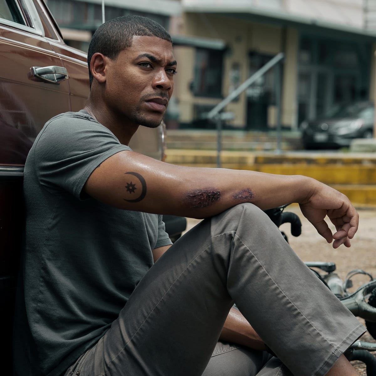
In Gully, Majors’ character wears a crescent-and-star tattoo on his forearm. It’s part of the role, not evidence of a personal tattoo.

Film, music video and editorial tattoos often get mistaken for an actor’s own designs. Unless there’s a direct statement or clear personal photo, they should be described as character or shoot styling. The Gully design can still inspire someone who likes celestial imagery; it just shouldn’t be attributed to Majors himself.

Here, the distinction is straightforward: he has discussed the Rebirth lettering, while the crescent and star belong to a character.

Choosing a Visible Spot

The side of the neck is exposed whenever a collar opens or the wearer turns, even when the tattoo is small. That visibility can be part of the appeal, but it also brings practical questions about work, family reactions and future plans.

The sides of the neck can be painful, and healing takes care around collars, sweat and constant movement. A reputable artist should explain the placement and aftercare before starting. Check the spelling and the stencil at the final size before the session; with a short cursive word, every letter matters.

An Idea With Room to Change

“Rebirth” can fit many different experiences, but that doesn’t make it a universal slogan. If you’re considering a word tattoo, choose language connected to your own life rather than copying a celebrity’s choice.

Write the word in a few styles and let an artist adapt it to your handwriting and the shape of the area. You can keep the simple, one-word approach while choosing a different word, font or placement.

Who Is Jonathan Majors?

Jonathan Majors in a contextual photograph: Contextual industry portrait for career and timing context; explicitly not tattoo evidence.; not tattoo evidence

Jonathan Majors is an American actor whose work includes The Last Black Man in San Francisco, Da 5 Bloods, Lovecraft Country, Creed III and Marvel’s Ant-Man and the Wasp: Quantumania. He also stars in Magazine Dreams, a drama about an isolated bodybuilder seeking recognition.

The Rebirth tattoo drew attention in interviews around the film. Majors has discussed the word, but its full personal meaning remains his to define.

A Visible Personal Choice

You can borrow the idea of a single word without taking Majors’ exact design. If a visible neck tattoo feels like too much, the upper arm, ribs, shoulder or chest can hold lettering with more room to keep it private.

Before committing, verify the spelling, ask how the design will age, and choose an artist with lettering experience. The goal is a word that stays legible and still feels like yours.

The Bottom Line

Majors has discussed one documented personal tattoo: the cursive word Rebirth on the left side of his neck. Other ink shown in films belongs to the characters unless he confirms otherwise. The short word and visible placement make a clear reference; its meaning is personal to him.

The interview below offers more context on the period when Majors spoke about rebuilding and starting over:

More actor tattoo guides

Nick Blood Tattoos: Red Alchemical Symbol and Still Ill Script

Nick Blood has two tattoos described in a Gentleman’s Journal interview: a red alchemical symbol for blood, shared with his siblings, and “Still Ill” on the inside of his arm, a reference to The Smiths. The interview and photographs give a clear account of both without suggesting a larger collection.

The British actor’s screen credits include Slow Horses, Agents of S.H.I.E.L.D., Euphoria, Andor and the thriller Hit Point.

The red alchemical symbol on his upper arm

Nick Blood tattoos: Inline tattoo evidence

The red mark is a compact alchemical symbol for blood, rather than a literal drawing. Blood says his brothers and sisters have the same tattoo. The design carries the family connection on its own; it doesn’t need a name or date beside it.

Its upper-arm placement gives the symbol room and lets him cover it with a sleeve. It can show when he wears a vest or raises his arm, without dictating what he wears. Red also reads differently under warm light, daylight and editorial lighting, so photographs can vary in how strong the color looks.

A second view of the same symbol

Nick Blood tattoos: Inline tattoo evidence

The second photograph shows the same mark from another angle. It is easier to spot with Blood’s arms raised; the wider view also shows where it sits on his arm. A close crop can show the symbol, while a portrait gives a better sense of placement.

That distinction matters with matching family tattoos. The shared mark can stay recognizable while an artist adjusts its size or line weight for each person. The family members don’t have to force the design onto identical proportions.

Where the music fits

Nick Blood in a contextual photograph: Inline contextual photo; not tattoo evidence; not tattoo evidence

The other tattoo is “Still Ill,” written on the inside of Blood’s arm. He identifies it as a reference to The Smiths. In the same interview, he also mentions The Stone Roses, The Cure, Nirvana, the Beastie Boys, Nina Simone and Ezra Collective; those names add context to his musical interests, but the confirmed tattoo reference is The Smiths.

The short phrase keeps the lettering simple, and the inner-arm placement makes it less immediately visible. The interview gives the connection without adding a story about why he chose it. For a music tattoo, a title can be easier to keep readable than a long lyric; the right lettering depends on whether you want it to look like a note, a label or handwriting.

A life split between stage and screen

Nick Blood in a contextual photograph: Inline contextual photo; not tattoo evidence; not tattoo evidence

Blood has played police officers, criminals and soldiers on screen, and appeared onstage in Much Ado About Nothing and Backbeat, where he played Stuart Sutcliffe. His roles change from one production to another; the interview describes the tattoos as personal choices tied to family and music.

What the photographs add

Nick Blood in a contextual photograph: Inline contextual photo; not tattoo evidence; not tattoo evidence

The first two images show the red symbol; the portraits that follow give context for Blood’s clothes, posture and the feature’s visual style. They aren’t evidence of other tattoos. The interview names two: the shared alchemical mark and “Still Ill.”

More actor tattoo guides

LaKeith Stanfield Tattoos: Face Ink, Arm Pieces, and a Lived-In Style

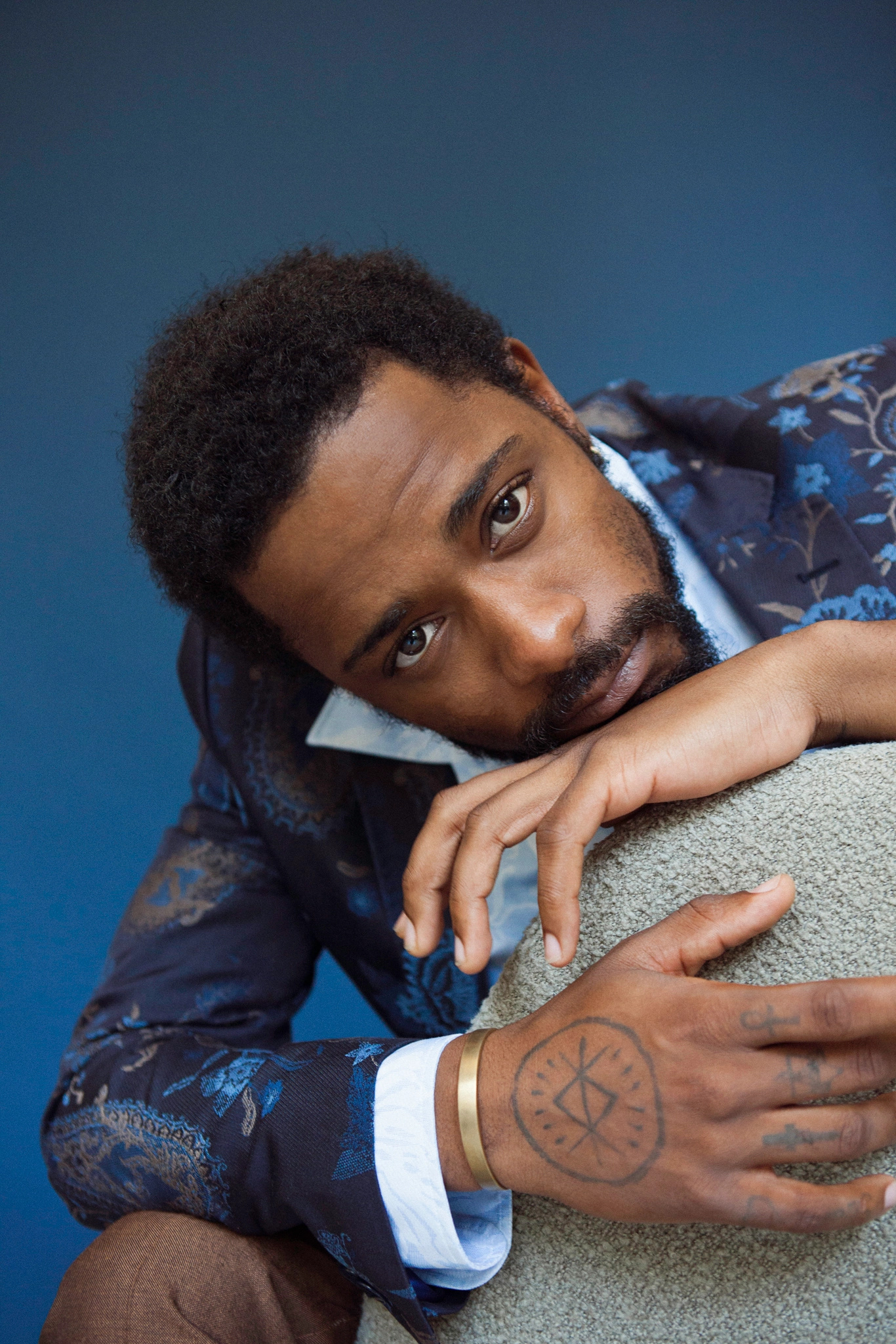
LaKeith Stanfield’s tattoos include an anchor and a magnolia on his face, a circular hand design, and graphic lettering and symbols on his arms. In a WIRED interview, he said he got his first tattoo at 17 and described ink on his arms, knuckles, chest and leg.

He has explained some of the designs himself. The anchor represents staying grounded; the magnolia connects to Magnolia Avenue in Victorville, California, and to his daughter’s name, according to Vanity Fair.

The face tattoos: anchor and Magnolia

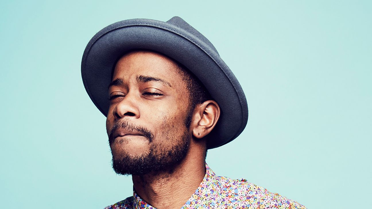
LaKeith Stanfield tattoos: LaKeith Stanfield face and hand tattoo reference

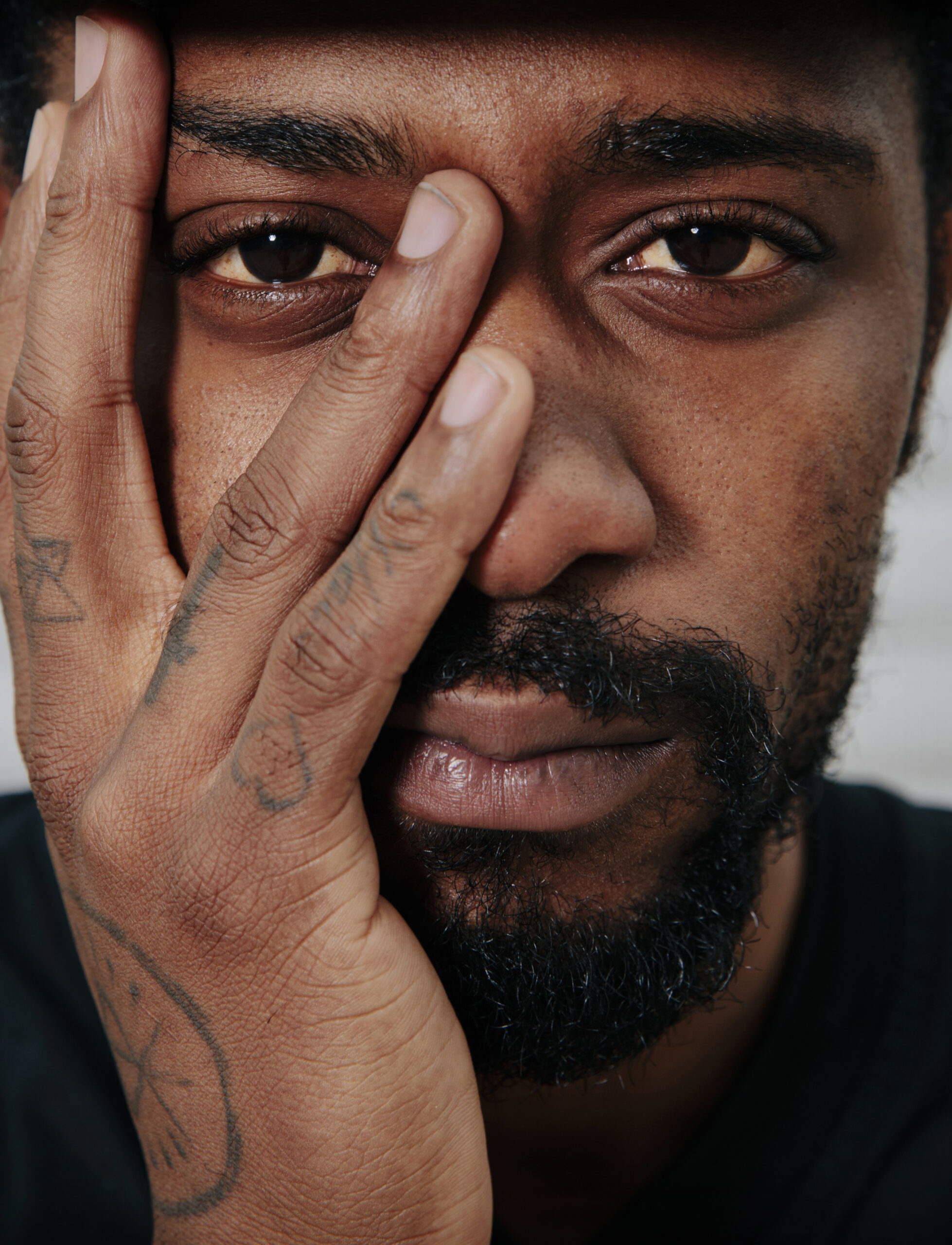
Stanfield has described an anchor near his face as a reminder to stay grounded. The word Magnolia sits above his right eyebrow. Vanity Fair connects it to both the street where he grew up and his daughter.

The two pieces have different references: one is a familiar symbol, the other a place and family name. The sources give those explanations, so there’s no need to add another meaning.

The circular hand tattoo

LaKeith Stanfield tattoos: LaKeith Stanfield circular hand/wrist tattoo reference

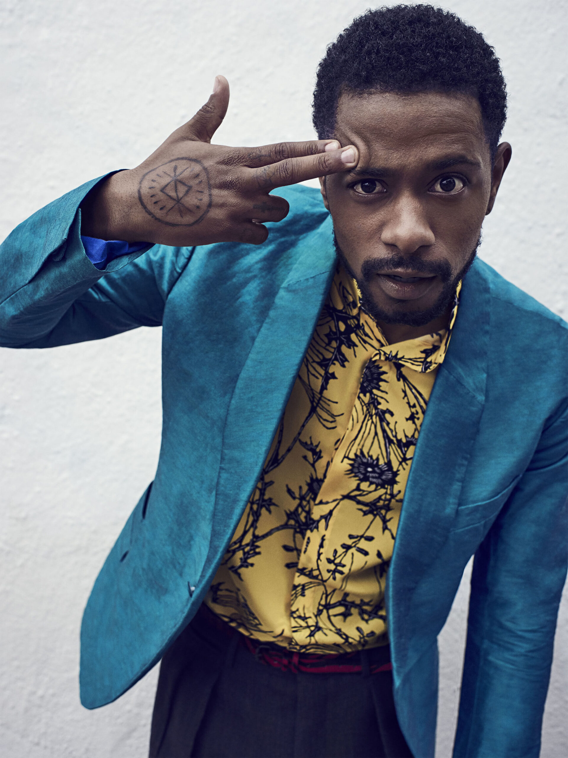
A circular design on the back of Stanfield’s hand frames an angular shape with short marks around it. It can resemble a compass or emblem, but no confirmed backstory appears in the sources reviewed here.

The circle gives the design a clear boundary, while the lines inside provide the detail. It reads as a graphic symbol without needing a specific interpretation.

33322 and the graphic arm tattoos

LaKeith Stanfield tattoos: LaKeith Stanfield forearm numbers and graphic tattoo collection

The number “33322” appears on Stanfield’s forearm. Nearby designs include the block lettering “HIGH TIMES,” a broad geometric band, and a crescent with a star lower on the arm.

The pieces keep their own shapes rather than blending into one realistic sleeve. The words, band and smaller symbol are distinct; the open skin around them helps each remain visible.

The arm collection is meant to feel lived in

LaKeith Stanfield tattoos: LaKeith Stanfield circular hand tattoo and forearm collection reference

In wider portraits, the tattoos run from Stanfield’s shoulders down toward his wrists. Some are clear in close views; others read as part of the wider texture of his arms.

Vanity Fair reported that his first tattoo was his mother Karen’s name with “True Love of My Life.” He said he paid five dollars and hoped the tribute would keep her from being too upset. After that first one, he said, he developed “tat fever.”

That account helps explain why the collection doesn’t follow one plan. The first piece was a family tribute; later designs range from numbers and lettering to symbols. The tattoos mark different choices over time.

How the whole look comes together

In a GQ interview, Stanfield showed a block-letter tattoo reading “TRU RELIGION.” He called it his self-created religion and spelled the phrase in his own deliberately unusual way.

The piece is blunt and playful. It doesn’t need a solemn explanation to work as lettering; its short words and heavy type make the design easy to read.

A relaxed style reference

LaKeith Stanfield in a contextual photograph: Contextual portrait only; not tattoo evidence; not tattoo evidence

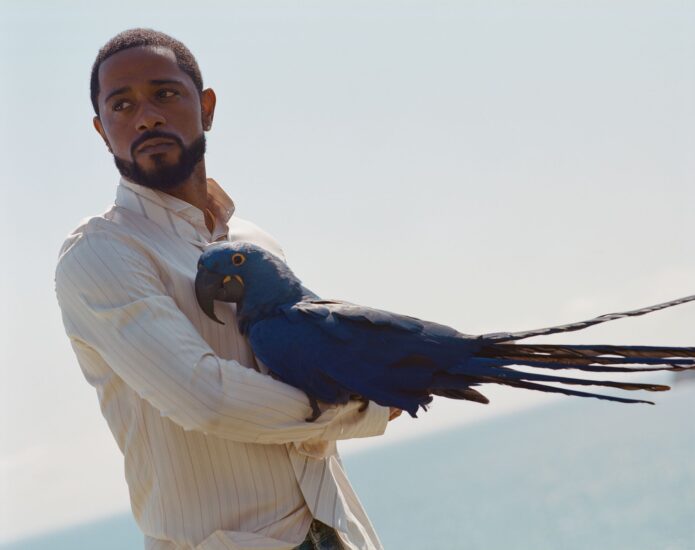
This portrait gives context for Stanfield’s clothing and posture; it isn’t evidence of another tattoo. His ink is part of his everyday look, appearing in close-ups, under sleeves or when he moves his hands.

The face designs, graphic arm pieces and circular hand mark don’t have to match. The confirmed stories are specific where Stanfield has explained them, while the hand symbol can remain an image without a public meaning.

More actor tattoo guides

Suki Waterhouse Tattoos: The Paw Print Under Her Eye

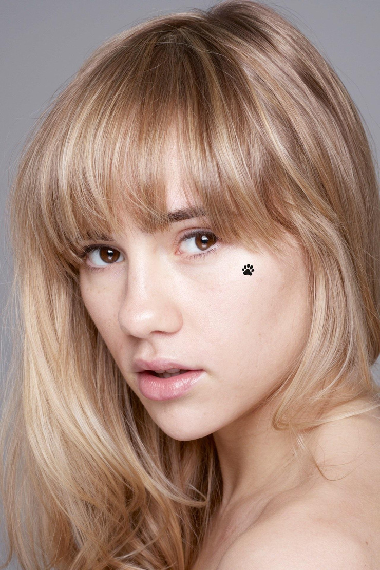
A close portrait shows a small paw-print shape beneath Suki Waterhouse’s right eye. The photograph makes the placement clear; its backstory is less certain.

Suki Waterhouse face tattoo: the paw-print mark

Suki Waterhouse tattoos: inline tattoo reference

In the portrait, the black shape looks like a paw print: one central pad and several rounded toes. It sits just below her right eye. The photo shows the design and placement, but it doesn’t tell us when the mark appeared, whether it’s permanent, or what it means to Waterhouse.

Paw prints can be chosen for an animal, a memory or simply the shape. None of those explanations has been confirmed for this mark.

What the reporting actually confirms

Suki Waterhouse in a contextual photograph: inline contextual photo; not tattoo evidence

ELLE UK’s 2023 “Ask Me Anything” video covers Waterhouse getting a tattoo at Sienna Miller’s house. Its published description doesn’t name the design, so it doesn’t establish that the tattoo is the paw print shown here.

The Sienna Miller house story

Suki Waterhouse in a contextual photograph: inline contextual photo; not tattoo evidence

A tattoo at a friend’s house doesn’t tell us who did it or whether the setup was professional. If you get tattooed outside a studio, ask about the artist’s experience, sterile equipment, clean setup and aftercare.

Why temporary body art muddies the picture

Suki Waterhouse in a contextual photograph: inline contextual photo; not tattoo evidence

Some fashion images show floral and geometric marks across Waterhouse’s legs, but they don’t establish those designs as permanent tattoos. Editorial shoots can use makeup or transfers; without confirmation, describe what appears in the photo as body art for that shoot.

Suki’s fashion and music worlds

Suki Waterhouse in a contextual photograph: inline contextual photo; not tattoo evidence

Her fashion shoots and music performances use different makeup, lighting and styling. A small black mark may stand out in one image and get lost in another; that describes the photo, not the tattoo’s meaning.

A tiny mark in a much bigger career

Suki Waterhouse in a contextual photograph: inline contextual photo; not tattoo evidence

Waterhouse’s career spans modeling, acting and music; the paw print is a small detail in that public image. If you want to use it as inspiration, keep the simple outline and choose a meaning from your own life.

If you’re considering a mark near your own eye, take time with the decision. Face tattoos are hard to cover and removal can be difficult. Talk with an experienced tattooer about scale, healing and the risks of working so close to the eye; look at healed work before you choose.

More actor tattoo guides