codex

Janel Parrish Tattoos: Moon, Deer, Finger Letters and More

Janel Parrish’s tattoos read like small pieces of her life gathered over time. There are fine-line symbols, short bits of script, letters linked to her family and castmates, and images tied to memories. Some sit on her fingers or feet; others show at the nape of her neck or along an arm. The collection is personal, but it doesn’t look like every piece had to match the others.

Parrish has said that many of the tattoos have a specific meaning. They point to Hawaii, family, music, her Pretty Little Liars character, and people she has lost. That mix gives the work a lived-in feel. Her collection is a reminder that a small tattoo can hold a story without needing to explain it to everyone.

The close-ups below make it easier to see the tattoos themselves and how they’re placed. A crescent with flowers needs different spacing from a word on the bicep, and a deer at the nape has to fit the curve of the neck. If you like delicate tattoos with a personal connection, Parrish’s pieces offer ideas you can adapt to your own life.

Janel Parrish’s moon tattoo turns a family memory into a fine-line piece
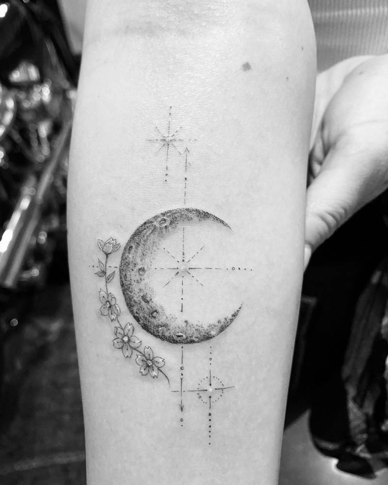
Janel Parrish tattoos: crescent moon with flowers and fine geometric marks on the forearm

The crescent on Parrish’s forearm is one of the most detailed pieces in her collection. Flowers and fine geometric marks gather around its textured edge, giving the small design more to look at than a bare outline. It stays light, though: the details don’t crowd the moon or turn it into a solid patch of ink.

Parrish has explained that the moon refers to her grandmother’s middle name and nickname. The personal connection gives it the feel of a memorial, while the flowers keep the image gentle. There’s also enough open skin around the crescent to let each part read clearly. It’s a quiet way to remember someone without spelling out the whole story in the design.

If you have a memory you’d like to carry, begin with the object or shape that connects you to it. That might be a moon, a plant, a star, or something less obvious. Add detail only where it helps the image feel like yours. Here, the flowers frame the crescent instead of fighting for attention. The forearm leaves room for crisp lines, though the idea could be simplified for a wrist or moved to the upper arm.

The deer tattoo at her nape is small but impossible to miss
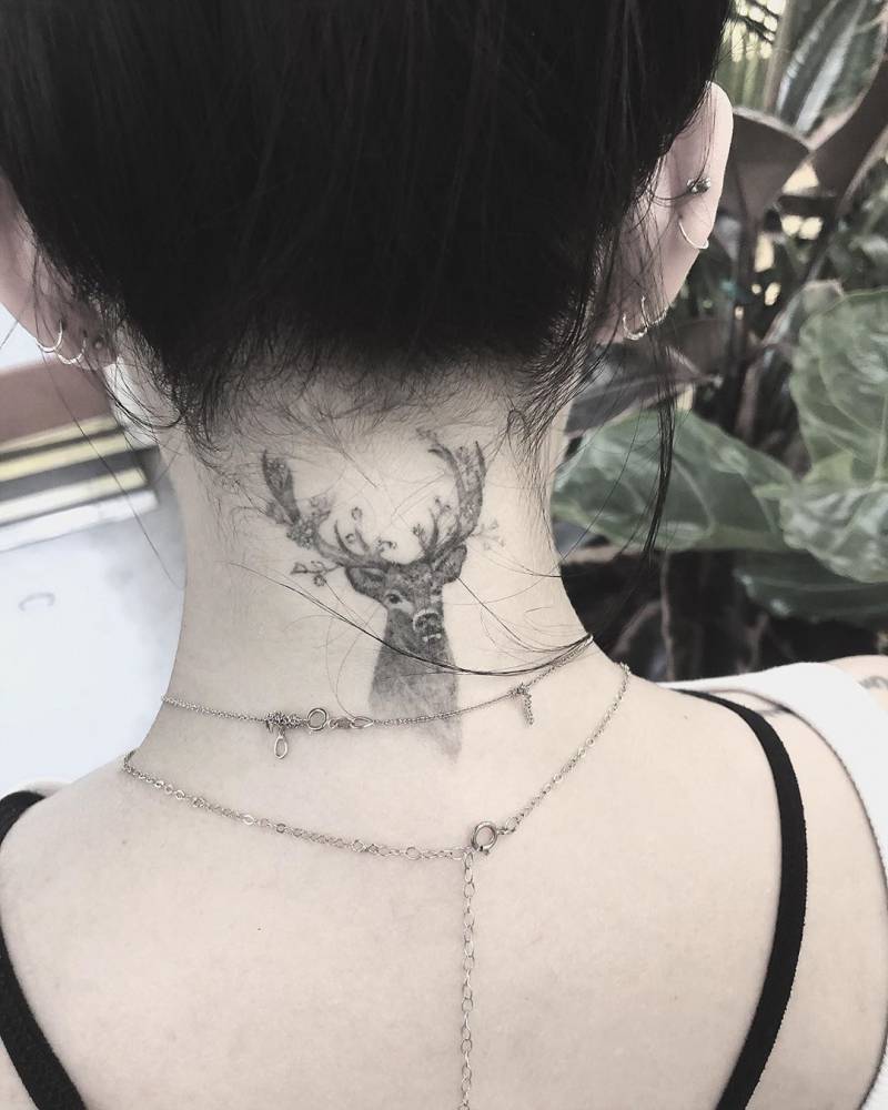
Janel Parrish tattoos: small black-and-grey deer head with antlers at the nape

The deer at the back of Parrish’s neck has a more striking look than the moon. It’s a compact black-and-grey head with antlers, sitting just below the hairline. Hair can cover it, but when she wears her hair up, the tattoo becomes the first thing you notice. The narrow space at the nape suits a design with a clear, compact outline.

The deer looks alert without feeling harsh. Shading gives the face depth, while the antlers keep its shape recognizable. At the nape, the overall silhouette has to work before the small details do. You should be able to make out the animal from a few steps away; closer up, the fine shading can bring it to life.

For an animal tattoo in this spot, show your artist references for both the shape and the level of detail you want. Check how the stencil follows the neck when you turn your head. Leaving some space around the antlers can help keep the design from feeling crowded as it settles. If you want more room for detail, the upper back is another option.

Her Pretty Little Liars finger tattoos keep the meaning close at hand
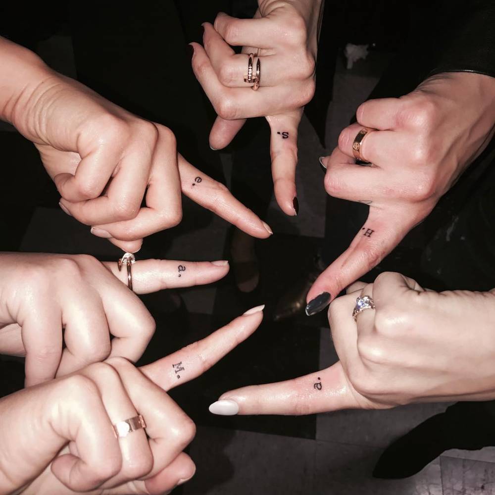
Janel Parrish tattoos: Pretty Little Liars character initials and tiny finger lettering

Parrish’s finger tattoo comes from a shared moment on Pretty Little Liars. The cast had their characters’ initials placed on the inside of the index finger, a nod to the shushing gesture in the show’s opening. Parrish got an M for Mona. The letters are tiny, but the group connection gives them a meaning beyond the characters themselves.

Finger tattoos are easy to see and hard to keep pristine. Hands move, rub against things, and get washed often, so simple lettering is usually a better fit than a detailed image. In the close-up, the letters stay compact and legible. There isn’t much reason to decorate them further; the story is already there.

If you’re thinking about an initial on your finger, decide which way you want it to face before the stencil is applied. It can face you or other people, or sit at an angle that follows your hand. Ink on fingers can soften or fade sooner than ink on the forearm, so choose a size that has some breathing room and be prepared for a touch-up later.

The butterfly tattoo shows how tiny symbols stay light
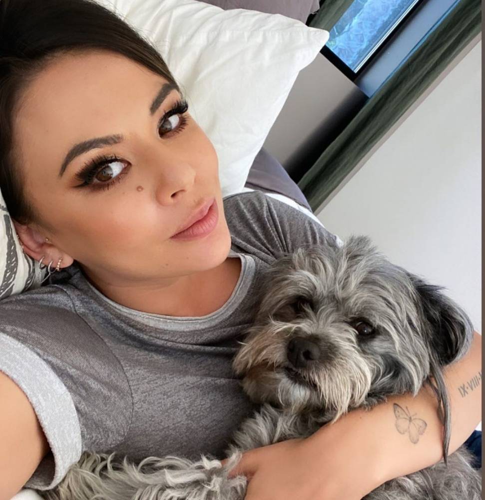
Janel Parrish tattoos: small butterfly tattoo visible on the forearm in a face-visible portrait

The butterfly on Parrish’s forearm is quieter than the deer at her nape. In the portrait, it looks like a fine outline with just enough detail to define the wings. It sits low on the arm, where a sleeve can cover it and a turn of the wrist can bring it into view.

Butterflies are a familiar choice, but an open shape and considered placement can make one feel individual. Parrish’s design leaves plenty of skin visible inside the wings. That space keeps the small outline from closing up into a dark blur. A butterfly can stand for change, freedom, or a memory, depending on what it means to the person wearing it.

When choosing a small butterfly, look closely at the wing shape before settling on a size. Fine details need enough room to stay distinct, especially in an area that sees sun. A wrist, forearm, shoulder, or ankle could all work; ask your artist what level of detail will remain clear at the size you have in mind.

A wider look at the deer tattoo shows why placement matters
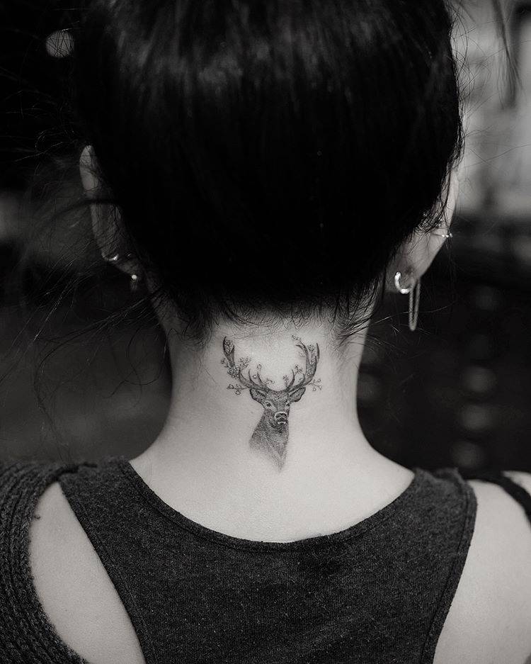
Janel Parrish tattoos: wider placement view of the deer tattoo below the hairline

This wider view shows the deer sitting just below Parrish’s hairline. Its antlers follow the curve of her neck, and the head is centred above her shoulders. The close-up shows the linework; this angle makes it easier to see how the placement works when the tattoo is part of the whole silhouette.

The design doesn’t need a background to stand out. The deer already has a distinct outline, and her dark hair gives it contrast. Sometimes the placement gives an image all the framing it needs. Extra leaves, stars, or shading could make this small piece feel crowded.

If you’re planning a tattoo in the same area, look at the stencil from more than one angle. Turn your head and relax your shoulders to see how it shifts with your posture. Consider how it will look when your hair is up, when you’re moving, and with the clothes you usually wear.

How the collection hangs together

Parrish’s tattoos cover different subjects, yet they don’t feel like a random assortment. Their connection is personal: the moon recalls family, the deer marks a chapter in her life, and the finger initial ties back to her castmates. A phrase can serve as a reminder, while the balloon and its later cover-up show that a tattoo’s story can change.

Fine lines and selective darker shading give the collection a loose visual connection. The designs don’t have to match exactly. The lettering stays lettering; the moon and deer have enough shape to read as images. That shared light touch lets the tattoos feel collected over time rather than planned as a matching set.

To build a collection of your own, think first about what you’d actually like to remember. Some ideas may work better as words, others as symbols or larger images. There’s no need to decide on every piece at once. Adding tattoos gradually gives each one room to mean something on its own.

Simple ideas you can borrow from her style

Parrish’s choices offer a few useful ideas. Let a meaningful symbol stand on its own. Give lettering enough space to stay readable. The nape offers the option of covering an image with your hair or showing it when you want to. Keep finger designs simple, since that skin takes a lot of wear. None of these choices needs to be showy to work well.

The same design can feel different depending on where it sits. A moon on the wrist is easy to see; on the ribs, it’s more private. A deer at the nape draws attention, while a small animal on the ankle may stay mostly for you. Think about when you want to see the tattoo yourself, as well as when other people might notice it.

It’s also worth taking time with the practical decisions. Double-check any spelling, ask how the lines may age, and look at healed work from the artist. Make sure the image has enough room and that you’ll be comfortable with its placement day to day. Those choices help keep a meaningful tattoo clear over time.

Why her choices feel personal

Parrish’s tattoos feel connected to the life around them, not to a single trend or visual theme. They touch on family, friendship, Hawaii, music, work, memory, and reminders to herself. Even a tiny initial has a reason behind it.

That gives the collection a warm, approachable quality. You might like the moon without copying its flowers, or use an initial that belongs to someone in your own life. A deer, a phrase, or a small balloon can be a starting point if it means something to you. The useful part isn’t copying Parrish’s tattoos; it’s seeing how a personal detail can become a clear design.

The close-up photos help because they show the tattoos as they are: small, distinct, and placed with care. They also show that a collection can change. An old design might be softened, covered, or joined by something new. The story doesn’t have to stop when the tattoo is finished.

Final thoughts

Janel Parrish’s tattoos share a thoughtful feel, but each one has its own story. The moon and flowers refer to family, the deer gives the nape a strong focal point, and the Pretty Little Liars initial keeps a cast connection close. The French phrase serves as a reminder, while the balloon shows how a tattoo can take on a new form over time.

If you’re collecting references, notice what makes each piece readable: a clear shape, open space, lettering that isn’t squeezed in, and a placement that suits the design. A tattoo doesn’t need to be large or elaborate to matter. A letter, a crescent, or a few well-chosen words can be enough.
More actor tattoo guides

Ricochet Tattoos: Full Sleeve, Chest Script and Wrestling Ink

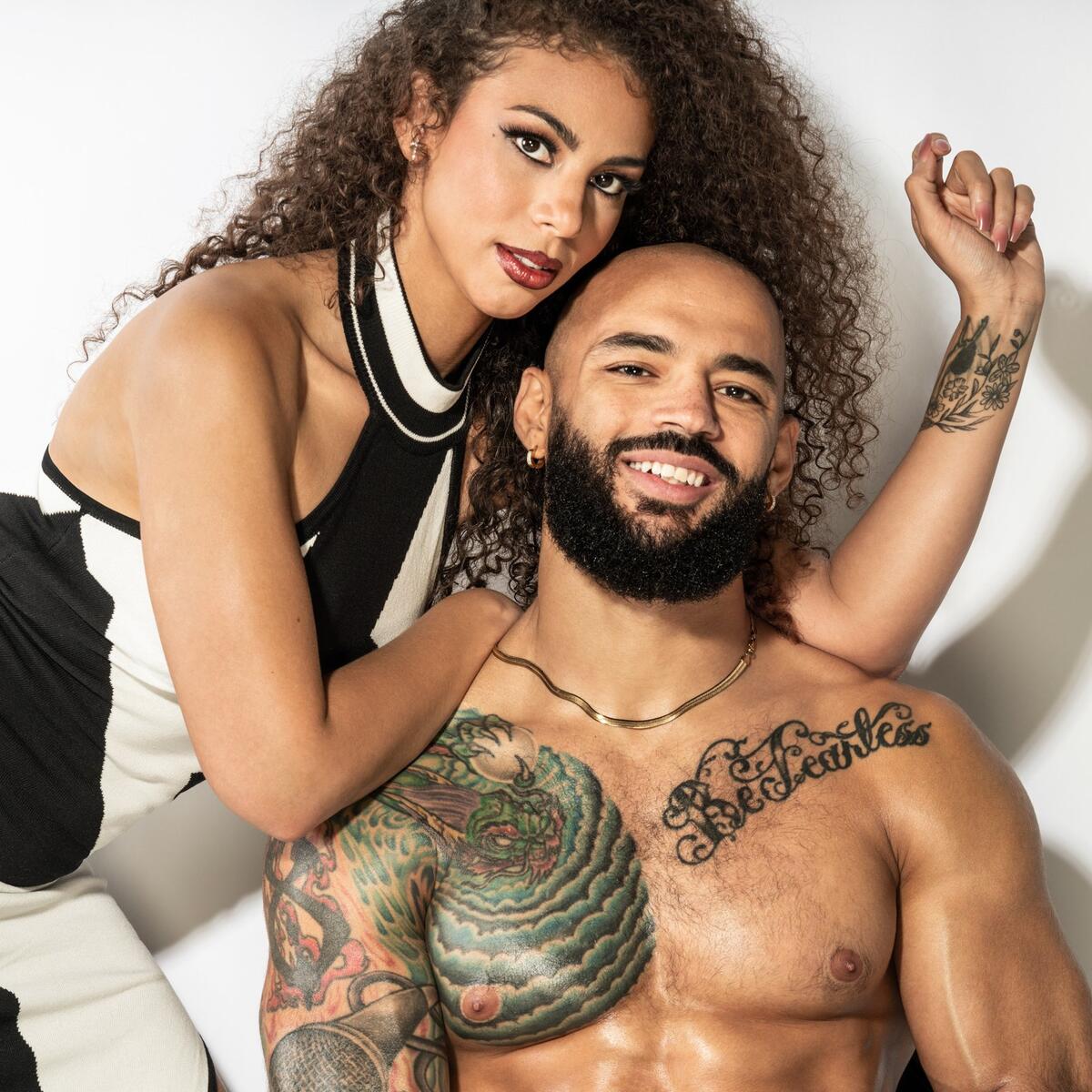
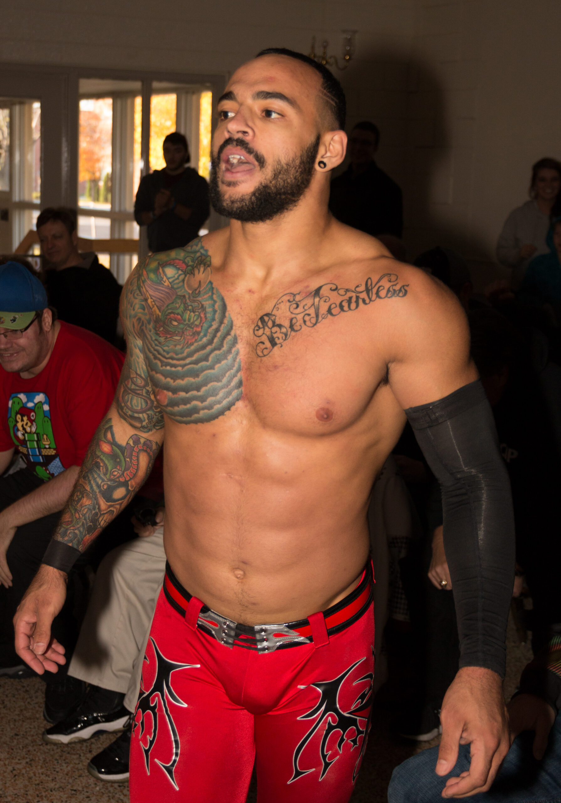
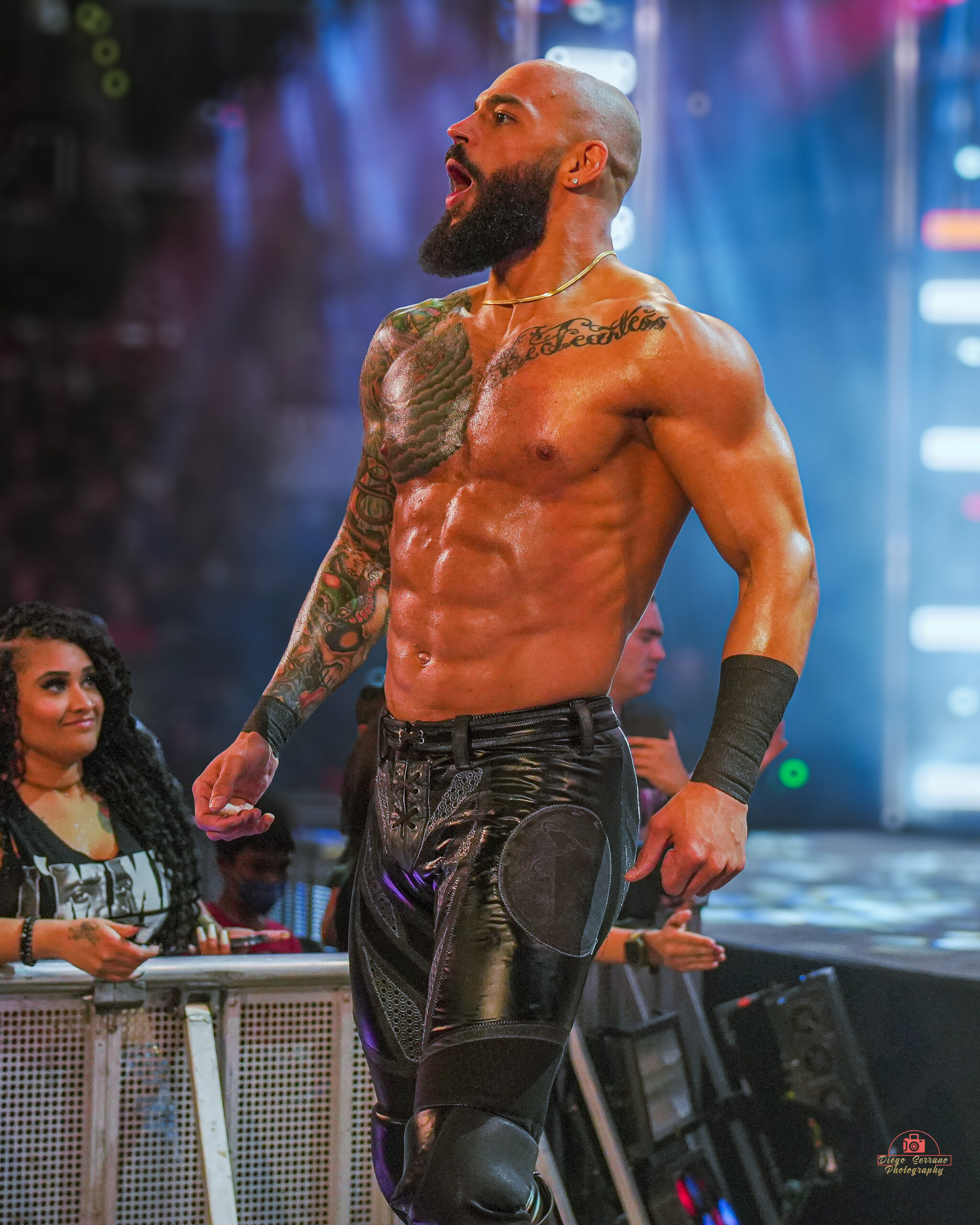
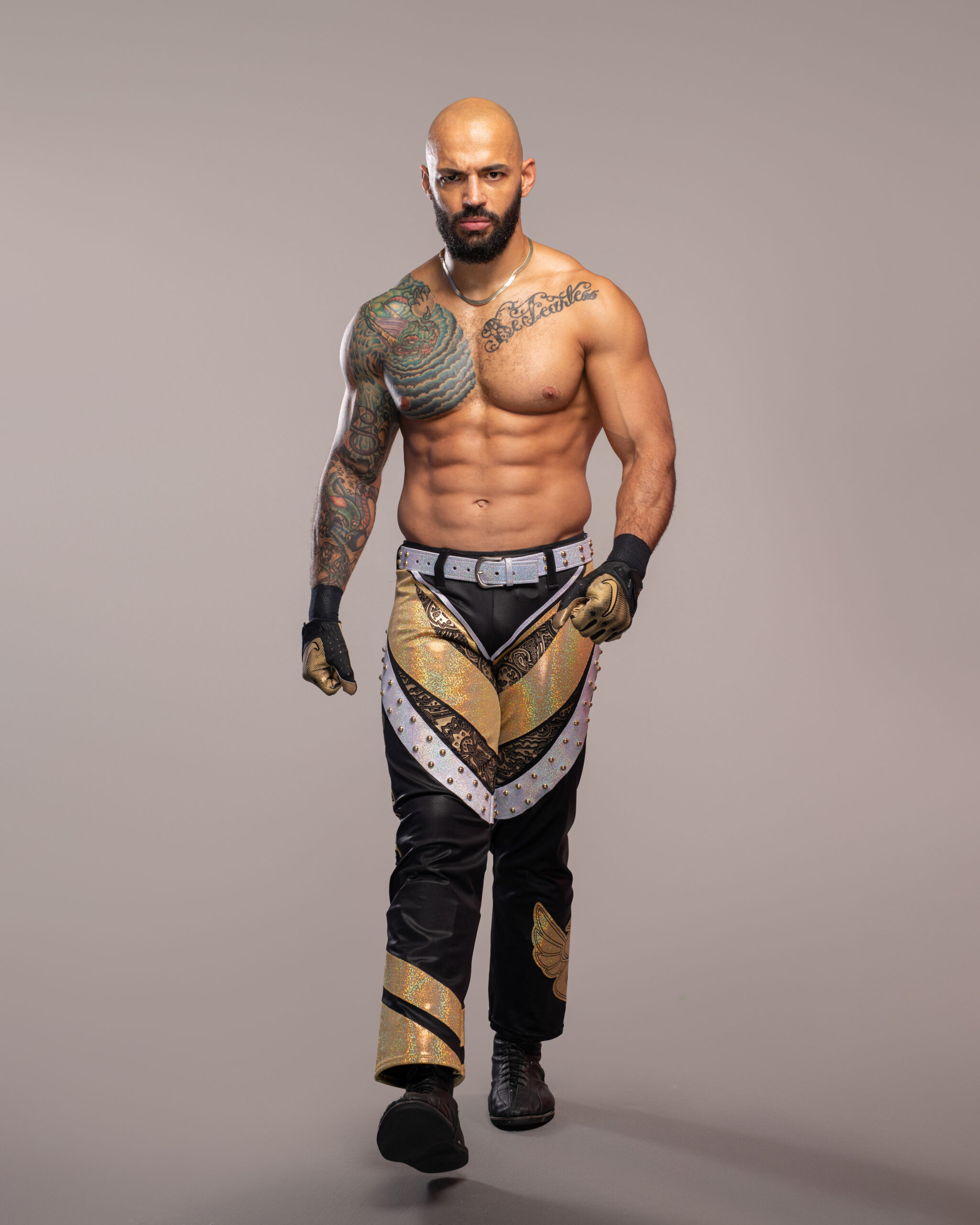
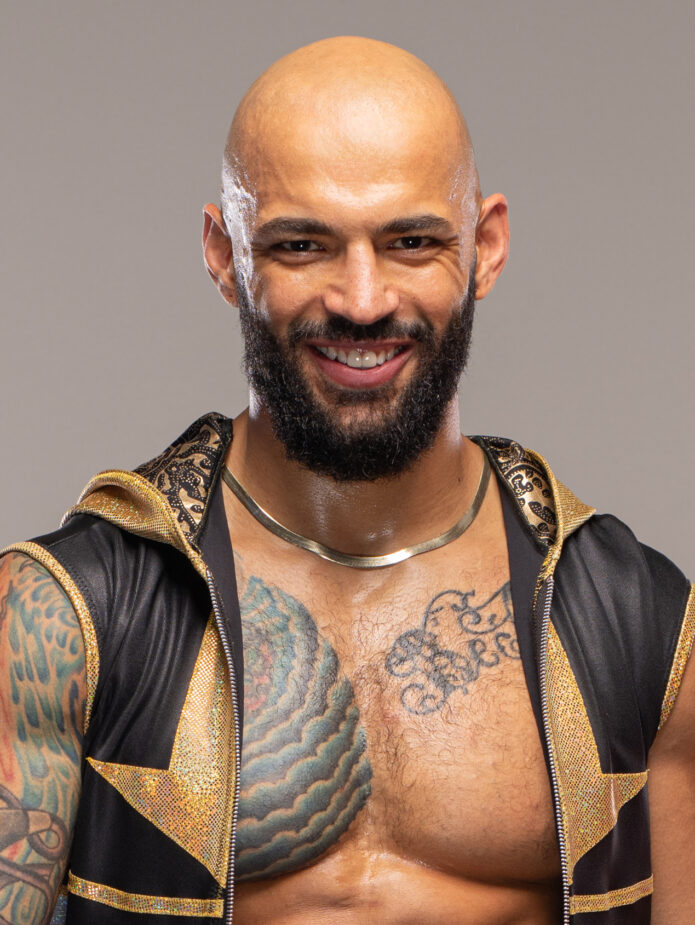
Ricochet’s tattoos are hard to miss, especially the color on his left arm and the large pieces across his chest. The designs have bold outlines and plenty of detail. They suit a wrestler who’s usually seen under bright lights and in motion, where a tattoo needs to read quickly.

His ink mixes traditional color, black outlines, script, and smaller images that sit close together. It looks assembled over time rather than planned as one seamless sleeve. A dragon-like chest design, swirling shapes, lettering, and smaller marks all have their own place, yet the arm still reads as a whole when he’s moving through the ring.

Different photos show different things. A posed portrait brings out the color and linework; a ringside shot shows the sleeve shifting with his shoulder; a close-up makes the chest script easier to see. Taken together, those views give a better sense of the tattoos than one standard portrait would.

The sections below look at the main parts of Ricochet’s style and what you can take from them if you like colorful sleeves, visible lettering, and tattoos that connect without looking overly coordinated.

The full left-arm tattoo sleeve does the heavy lifting

Ricochet tattoos: Full left-arm sleeve and shoulder color reference

The left arm is the first thing many people notice. Ricochet’s sleeve isn’t a solid sheet of blackwork; it has distinct sections, with color and shading linking the larger outlines. Warm reds and oranges sit alongside greens and blues, while darker areas keep the colors from fading into the skin under arena lights.

The palette has a traditional feel, but the coverage follows the whole arm. The shoulder, upper arm, elbow, and forearm each contribute to the design. From across the ring, the sleeve reads as one strong shape; up close, you can pick out separate images and textures.

Flow is the part to pay attention to. If you’re planning a sleeve with similar energy, think about how each tattoo leads into the next. Neighbouring pieces don’t need the same subject. Repeated line weight, a related palette, or similar background shading can bring them together.

Even a heavily tattooed arm needs some open skin. Those gaps give the larger shapes room and keep the whole sleeve from closing into a dark blur. When planning a colourful design, leave space where it helps the main images stay clear rather than filling every patch of skin.

The chest tattoo gives Ricochet’s look a clear focal point

Ricochet tattoos: Chest tattoo focal point and shoulder placement

The chest gives the layout an anchor. A large coloured piece sits high on the left side and reaches toward the shoulder, somewhere between a shoulder panel and a chest tattoo. It’s visible when Ricochet wrestles shirtless and can peek out from open ring gear, making it part of his familiar look.

The design follows the chest and upper arm instead of sitting like a rectangle on top of them. Its curves move with the body, and the shading adds depth without a hard border. That’s a useful reminder for any large tattoo: plan the image around the body, not only around how it looks on paper.

The saturated colour also stands out against the skin around it. The piece doesn’t need a full background to hold attention; its outline and shifting tones do that work. For a large chest tattoo, it can help to choose one main image, give it a clear edge, and let the surrounding skin frame it.

Placement changes the feel of the design too. The same image on a forearm might feel contained. Across the chest and shoulder, it takes up more space and feels tied to performance.

The script across his chest adds a softer layer

Ricochet tattoos: Chest script lettering and nearby forearm ink

A sweeping script piece sits beside the larger chest design. Its flowing letters soften the heavier lines and dense colour on his arm. The script follows the curve of his chest, giving the eye somewhere to pause among the larger shapes.

Lettering needs room to stay legible as it follows the body’s contours. Here, the phrase is large enough to read and isn’t squeezed into a narrow spot or lost in the sleeve. The open area of the chest gives each letter space, and the curved line feels at home there.

Good lettering needs breathing room. If a phrase matters to you, don’t make it so small that the words become hard to read just to fit a preferred location. A comfortable size gives the lines more room and makes the text easier to see in photos over time. It also lets the words feel like a deliberate part of the tattoo collection.

The script adds a personal, text-based note to a look mostly made up of large images. That contrast is useful if you like bold tattoos but want one quieter element among them.

A full-body angle shows how the arm sleeve travels

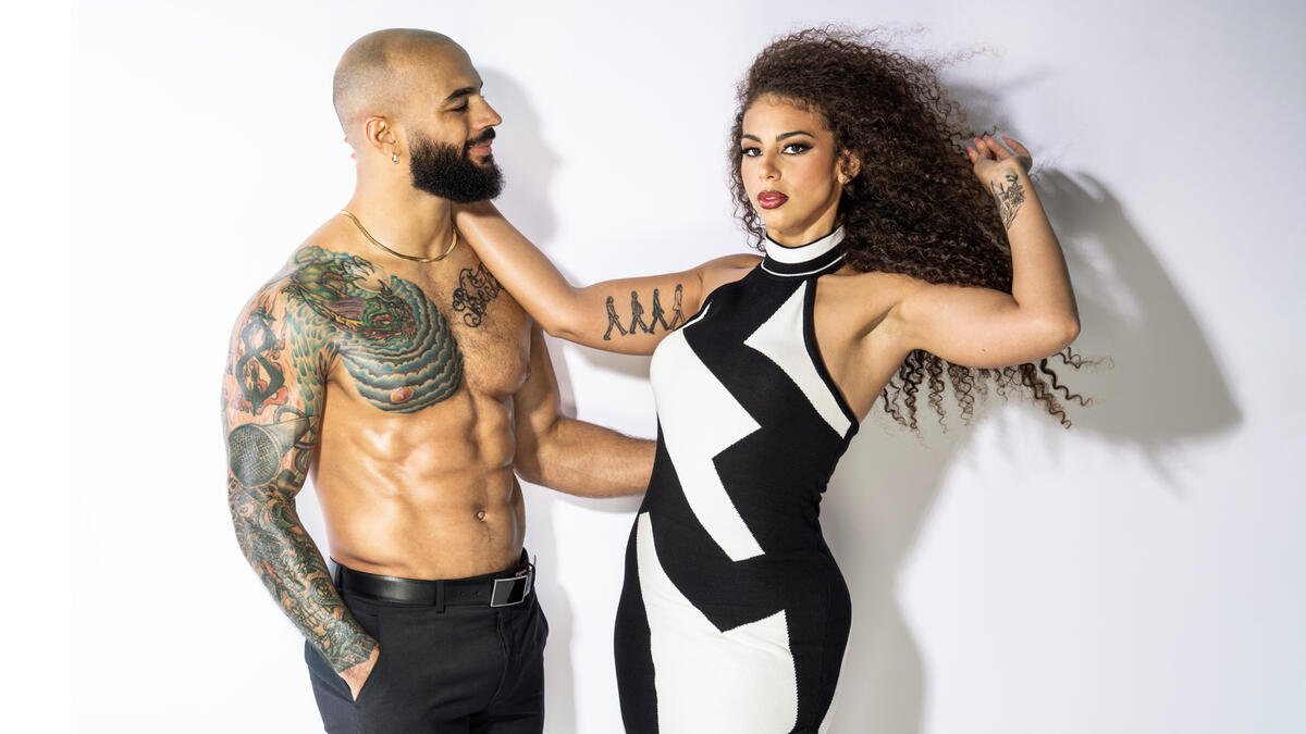
Ricochet tattoos: Wide tattoo layout showing the relationship between chest and arm

The wider view makes the placement easier to follow. In ring gear, you can see the ink run from the shoulder toward the elbow and forearm, wrapping around the arm instead of sitting on one flat, front-facing side. The designs come into view as Ricochet turns or reaches.

That wrap changes what the audience sees as he moves. A tattoo placed only on the front can disappear when an arm turns; a design that continues around it offers different details at different angles. The sleeve feels active because it moves with his stance rather than sitting like a sticker on the skin.

You can try the same check before settling on a design. Look at the stencil with your arm relaxed, raised, bent, and turned sideways. Notice where the main image sits in each position. If it works from only one angle, you may want to adjust the focal point or let the design wrap farther around.

The wider photo also shows the sleeve alongside different looks. It works with colourful ring gear, dark clothes, and simple shirtless portraits. The outlines and overall shape give it structure even as the styling changes.

The older arm tattoos still read clearly in the ring

Ricochet tattoos: Older arm tattoo visibility and ring readability

Ricochet’s arm tattoos have been visible in motion for years, not just in close-up studio portraits. They have to hold together as he runs, climbs, flips, and lands. The larger shapes are distinct enough to register even when the camera is farther away.

Harsh light can make older tattoos look softer, but the main outlines are still easy to follow in these images. Patches of colour also separate the designs from each other. That makes contrast worth considering if you want a tattoo people can recognize from a distance.

A detailed tattoo can still be easy to read. The key is how the darkest lines, brightest areas, and overall shape are arranged. Ricochet’s arm has several elements, but they don’t all compete for attention at once.

If you’re adding to a sleeve over time, start with the piece that matters most to you and leave room for the next one. Thinking about scale and direction early can help later additions sit naturally beside it.

The color work keeps the sleeve from feeling flat

Ricochet tattoos: Color work, contrast and tattoo texture

Colour helps separate the shapes in Ricochet’s tattoos. Greens, reds, and blue-grey shadows give the sleeve depth, and the black outlines hold the edges in place. That contrast matters in a full-colour piece, since skin tone, lighting, and camera exposure can all affect how it looks.

The chest piece shifts in mood with the photo. Under darker arena lighting, it looks gritty; in a clean portrait, it feels more illustrative. The palette gives it range without needing a filter or heavy editing.

If you like this kind of work, ask your artist how the colours will sit together once the tattoo has healed. Fresh ink may look brighter than settled colour. A considered palette can use a few anchor shades, some open skin, and enough dark contrast to keep the design legible. A sleeve doesn’t need every colour available to feel rich.

Bright areas draw the eye, while darker shading can support the shape around them. That difference in emphasis helps a busy sleeve feel considered.

What Ricochet’s tattoo layout can teach about placement

Ricochet tattoos: Overall tattoo placement and body flow reference

Ricochet’s tattoos show how different scales can share space. The arm sleeve is the largest group, the chest pieces give the upper body another focal point, and the script adds a different rhythm. They work together without forcing every design into one theme.

It helps to choose a starting point. If the upper-arm piece matters most, let it guide the direction of later tattoos. If you care most about the lettering, leave enough open space around it. For an old-school sleeve, decide which outlines and colours you want to repeat before adding smaller filler designs.

Think about how visible you want the tattoos to be, too. Ricochet’s ink is on show during a match, which fits his work and public image. You can use similar design ideas on a shoulder, thigh, back, or ribs if you’d rather choose when people see them.

The strongest tattoo collections feel lived in. They carry a person’s taste and history, and they can change over time. Ricochet’s tattoos are colourful and confident; the body connects them, but they don’t look as if they came from one matching catalogue page.

His ink is a useful reference without being a template to copy: a bold main image, a sense of movement, text with enough space around it, and colours that hold up in different light. Start with an idea that matters to you and let the rest take shape around it.

More athlete tattoo guides

Jake Paul Tattoos: Tiger, Angel Sleeve, Torso Ink and More

Jake Paul’s tattoos have expanded from a few small personal marks into a mix of blackwork, realism, and larger designs with their own stories. The ink covers his arms, chest, ribs, legs, and feet, so the collection doesn’t fit neatly into one style. Some pieces are graphic and simple; others use dense shading and details that reward a closer look.

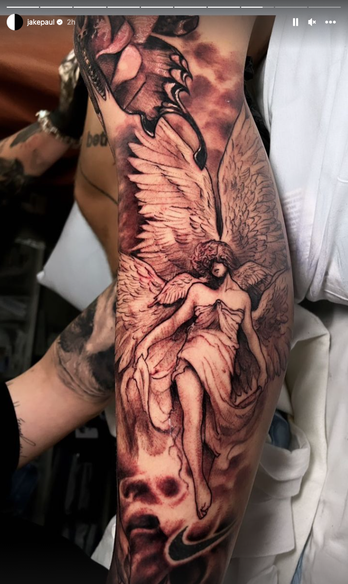
There is a tiger on his foot, an angel along his leg, skull and skeleton imagery, chest lettering, a Polynesian-inspired design, and smaller marks among the larger pieces. It feels more like a collection built in stages than one sleeve planned all at once.

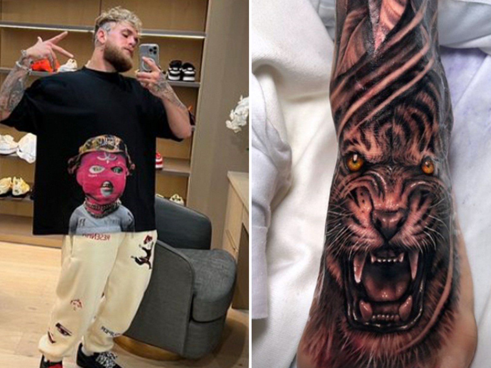
A mirror selfie, a fight photo, and a studio close-up can each make a tattoo look different. The angle, movement, and light all affect what you notice. This guide looks at the visible pieces and how their design choices might inform your own tattoo plans.

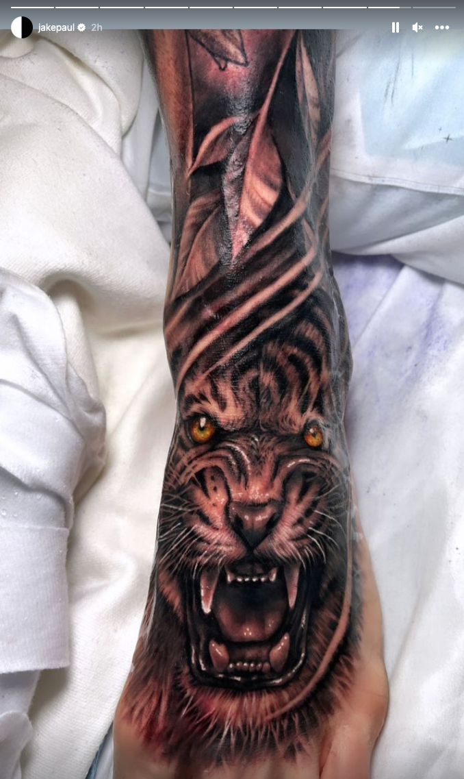
The tiger foot tattoo is the sharpest focal piece

Jake Paul tattoos: Tiger foot tattoo, controlled colour and long placement flow

The tiger on Paul’s foot is one of his most recognizable tattoos. Its face sits low on the foot, with the eyes, nose, and open mouth carrying the expression. Warm tones in the eyes and fur make it feel vivid, while the darker stripes give the image weight. The face is easy to spot when he wears shorts or low shoes.

Feet are a demanding place for detailed ink: the skin moves, rubs against socks, and gets daily wear. The tiger’s face has enough room for its main features to remain clear. At a smaller size, the eyes and mouth could be hard to make out, so anyone drawn to the idea should consider how much space the detail needs.

The long shape also suits the foot. Rather than placing a round tiger head in the center, the tattoo extends along the line of the leg. The stripes pull the eye upward, and the darker area links the face to the other body art. For an animal tattoo in a tricky spot, start with the shape of the body part and choose an image that can follow it.

Color sets this piece apart from the mostly black-and-gray work around it. The amber eyes add a focused contrast rather than bringing in a whole bright palette. One carefully placed color accent can give a mostly dark design more life without changing its overall feel.

The angel sleeve turns the leg into a full scene

Jake Paul tattoos: Angel sleeve scene and long composition

The angel and leg work bring a different mood to the collection. This isn’t one small symbol on its own: wings, a figure, and smoky shading form a tall composition that follows the leg. It has the feel of an illustration, with details for the eye to follow from the upper section down toward the calf.

A long leg design needs a clear visual path. The figure and wings create one, while the shadows help connect separate areas. If every section has equal weight, the whole tattoo can feel crowded. Changes between light and dark give the eye room to move and keep the central figure easy to see.

The figure also softens a collection that includes tigers, skulls, and heavy tribal shapes. That contrast keeps the overall look from becoming one-note. You can use the same balance with different subjects: pair a sharp-edged animal with a softer botanical detail, or place fine linework and open skin near a dark mechanical design.

A large leg tattoo takes careful planning. Check the reference from the front, side, and back; the leg shifts as you walk. The artist may adjust the wings or angle of the figure so the face remains clear. The design should follow the body rather than look pasted onto a flat template.

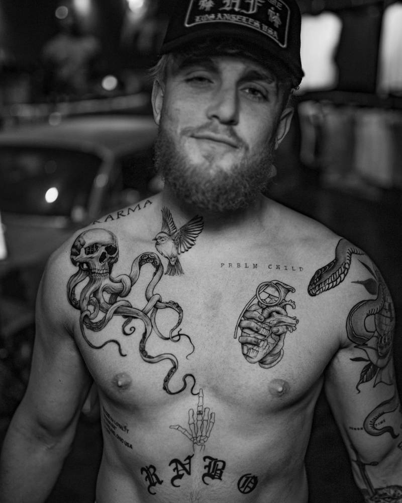
The torso tattoos mix lettering, skulls and movement

Jake Paul tattoos: Torso tattoos, lettering, skull and tentacle movement

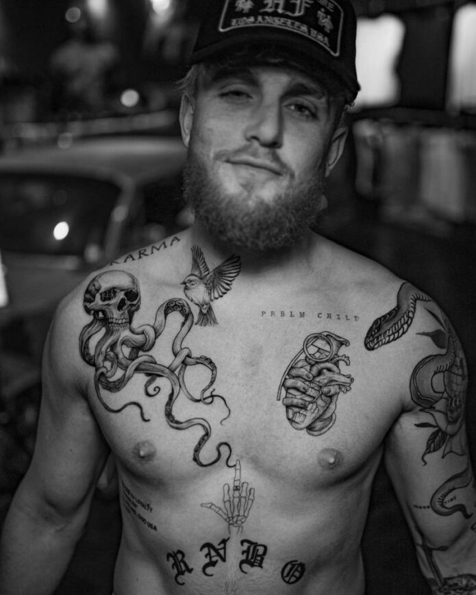
Paul’s torso is the most layered part of the collection. Lettering sits near the collarbone, alongside an octopus or tentacle shape, a bird, a heart, and other pieces. They come close together without closing into one solid block. There’s a lot to look at, but the gaps between designs keep them distinct.

The skull and tentacle work has movement because the shapes travel across the chest rather than sitting like stickers. Curves guide the eye, and the tentacles help connect the upper and lower parts of the composition. If you’re planning several chest tattoos, the images don’t need to match as long as their lines and placement work together.

The lettering is more restrained. Short words near the collarbone are easy to see without competing with the larger designs. That’s worth considering on the chest, where too much text can crowd the space. A brief phrase is often easier to place well than a long sentence, particularly as the body moves.

The torso combines organic and symbolic imagery. The octopus and bird bring a sense of motion; the heart and words are more direct. It has the feel of a personal scrapbook rather than a set from one catalog, while the black lines and gray shading give the pieces some visual connection.

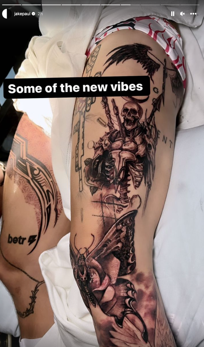
The newer eleven-piece tattoo session added speed and variety

Jake Paul tattoos: Eleven-piece session, skeleton detail and layered leg work

A major update to Paul’s collection came during an eight-hour session that added eleven pieces. The work covered his shoulder, thigh, foot, and much of his left leg, with several artists contributing. The images include a Polynesian-inspired design, a tiger, a skeleton, an angel, and a butterfly.

Most people add tattoos gradually, so getting several in one session is unusual. The change can be dramatic, but healing that many fresh pieces at once takes effort. The tattoos all need time to settle, and sleep, training, and getting dressed can be uncomfortable for a while.

The design lesson is how different subjects can share a mood. The images vary, but dark outlines and dramatic shading give them a related feel. That’s one way to plan a collection without making every tattoo match: settle on a common approach to contrast or line weight, then choose subjects that mean different things to you.

Scale matters here as well. A butterfly can sit beside a large skeleton and still hold its own when the size and contrast are considered. The smaller image offers a pause among heavier pieces. When planning a sleeve, leave enough room so the larger designs don’t merge into a wall of black.

The arm and rib work show his preference for personal symbols

Jake Paul tattoos: Newer collection, animal imagery and contrast between large and small pieces

Some of Paul’s smaller tattoos carry stories that aren’t obvious in a full-body photo. He has described a time-based tattoo connected to his late bodyguard Shadow, and a Gotcha Hat piece linked to the incident around his brother Logan’s fight with Floyd Mayweather. He has also worn branding-related tattoos after making bets connected to business and boxing.

These examples show why a celebrity’s tattoo collection isn’t only about how the designs look. A number or a few words can matter more to the wearer than a large portrait. The reference might seem plain to someone else, but knowing the story changes how it feels to the person who chose it. Keep that in mind before picking a name, date, or private reference.

The ribs show the time and commitment a tattoo can take. Paul has said one rib piece took around twenty-two hours. The area gives an artist room to work, but skin there moves with each breath, and sitting through a long session can be difficult.

If you want a meaningful symbol without a large tattoo, keep the central mark legible and the surrounding detail simple. A number can use clear lettering; a phrase can follow the ribs or collarbone; a small object can have just enough shading to feel complete.

How the full collection hangs together

At first, Paul’s tattoos can look like a jumble of ideas. Look again and some choices repeat: strong contrast, bold outlines, dramatic figures, animals, and placements that show during training or public appearances. Even the smaller pieces tend to have a direct message or story behind them.

Several of the best-known designs work with the shape of the body. The tiger runs along the foot, the angel follows the leg, and the torso pieces spread across the chest instead of staying in a small square. That makes them feel more natural because the artist has shaped the image around the person wearing it.

You can take that approach without borrowing any particular image. Choose the placement first and think about how it will move with your body. Then find a subject that fits: a snake can wrap around a limb, wings can spread across a shoulder, or lettering can follow the collarbone. Thoughtful placement usually matters more than following a trend.

What to take from Jake Paul’s style

One idea is to let a collection build in stages. You don’t have to decide how your whole body will look before choosing the first tattoo. Leave room for future work, let each piece heal, and see how a later design might connect with it.

It also helps to distinguish between what a portrait needs and what a symbol needs. Realistic animals and figures need enough space, good reference images, and an artist who knows how to shade them. A number or short phrase calls for care with type and spacing. The right technique for the idea is what keeps it readable.

Contrast deserves thought, too. Black and gray can have plenty of variety through changes in line weight, texture, and open skin. A small hit of color, like the tiger’s eyes, can stand out precisely because most of the palette is darker.

And choose a story you’ll still want to carry. Paul’s tattoos include jokes, business bets, memories, symbols, and dramatic images. That mix belongs to him, which is what makes it more interesting than a perfectly coordinated set of unrelated designs. The point of taking inspiration isn’t to copy an image; it’s to find the part of an idea that fits your own life.

Paul’s tattoos show that a collection can be bold without being uniform. Think about placement, give detailed images enough space, keep some skin open, and let the pieces that matter guide the rest. Whether you like a tiger, a full leg scene, or one small mark with a private meaning, the planning is what makes the design work.

More athlete tattoo guides

Chrisean Rock Tattoos: Face Portrait, Neck Ink and Hand Details

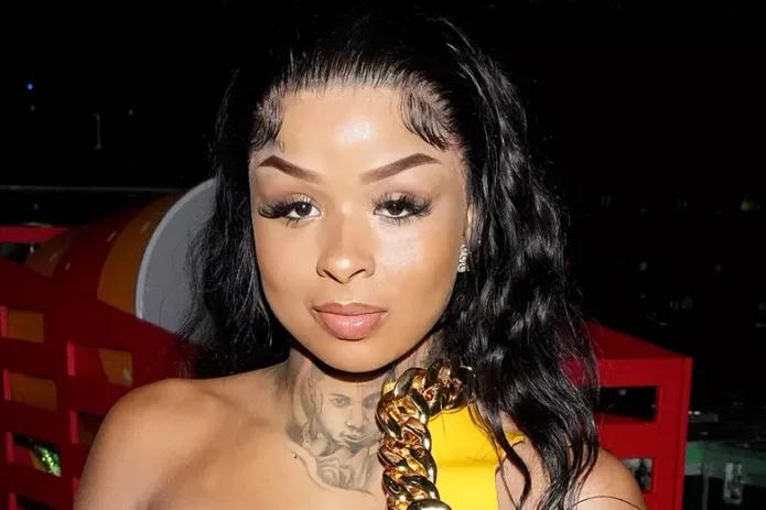
Chrisean Rock tattoos are a visible part of her style. Face and neck pieces, hand lettering, and large portraits share a rough black-and-gray look. These aren’t small designs hidden under clothes; they change the feel of an outfit and draw attention to her face.

Her collection pairs fine lettering with dense portrait shading. One mark can look handwritten and delicate, while the next uses deep shadows that almost resemble a photograph. Placement is part of the effect: tattoos around the face and neck frame her features, and the hand and body pieces carry that look below the neckline.

A single celebrity portrait rarely shows how all the tattoos fit together. Rock’s designs are easier to understand in separate close-ups of the neck, cheekbone, portrait, and side profile. Here’s a look at those placements and the choices you could discuss with a tattoo artist.

The neck tattoo creates a dark frame under the jaw

Chrisean Rock tattoos: Layered neck tattoo and the way dark shading frames the jaw

The neck is one of the defining parts of Rock’s tattoo style. Dark, layered shading reaches from the upper chest toward the jaw and side of the neck. The placement fills the space between her clothes and face, so the ink remains a strong part of her look even with a simple outfit.

The shading makes a bold impression: in some places its edge is soft, while other areas are dark and dense. If you like the idea of a neck tattoo, that approach may feel more substantial than a thin outline that gets lost among the body’s natural shadows. The design has to follow the curve of the neck, especially where it turns toward the collarbone.

The scale is part of what makes it work. The design takes up enough space to feel deliberate, while the edges still leave some skin open. For a smaller version, choose one clear focal shape and let the shading taper outward instead of trying to reproduce every dark area.

The cheekbone ink makes the face portrait feel built in

Chrisean Rock tattoos: Cheekbone ink and placement near the hairline

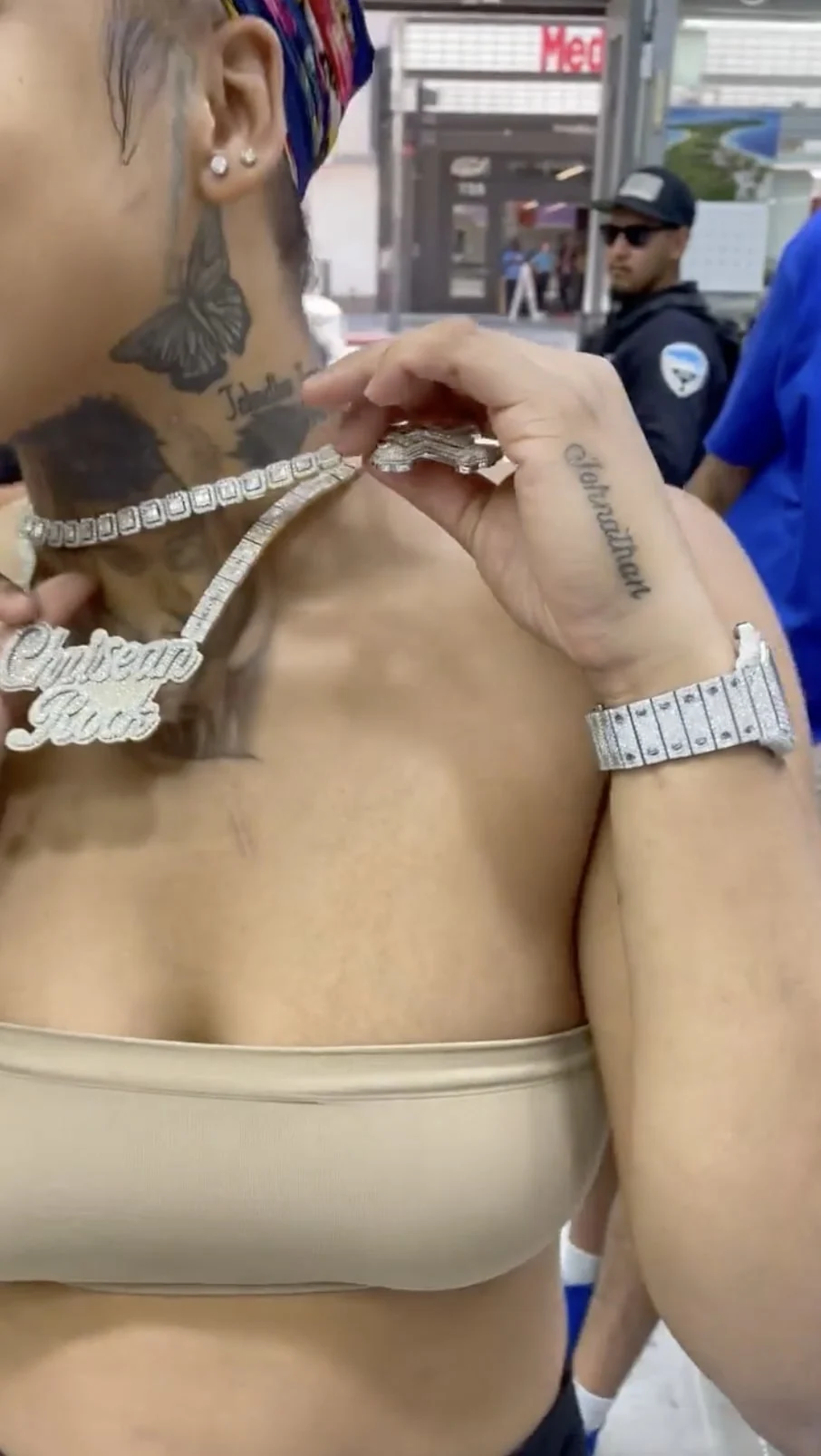
Rock has also shown ink along her cheekbone and beside her ear. It’s subtler than the large face portrait, but it still changes how the features read. The lines sit close to the hairline and jaw, so the hairstyle, makeup, and camera angle can all affect how they look.

A tattoo on the side of the face leaves little room for error; even a small shift in the design can change the expression. The cheek moves when you smile or talk, so an artist needs to consider how the lines sit both at rest and in motion. Fine lettering can work there, but it needs enough space to remain clear as it heals.

If you like the placement but want something less dramatic, a small botanical sprig, a few stars, or one word could follow the cheekbone without filling the whole side of the face. The direction matters: lines that trace the cheek toward the ear tend to sit more naturally than a design placed in the middle of the skin.

The Blueface portrait is the collection’s biggest statement

Chrisean Rock tattoos: Large face portrait, heavy shading and surrounding lettering

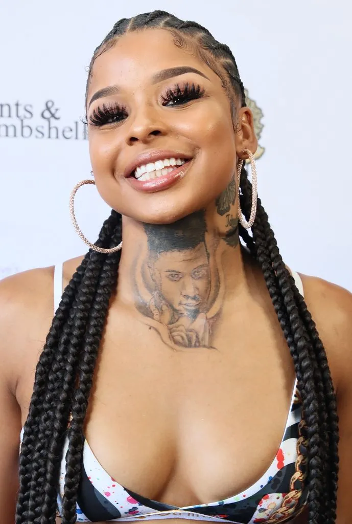
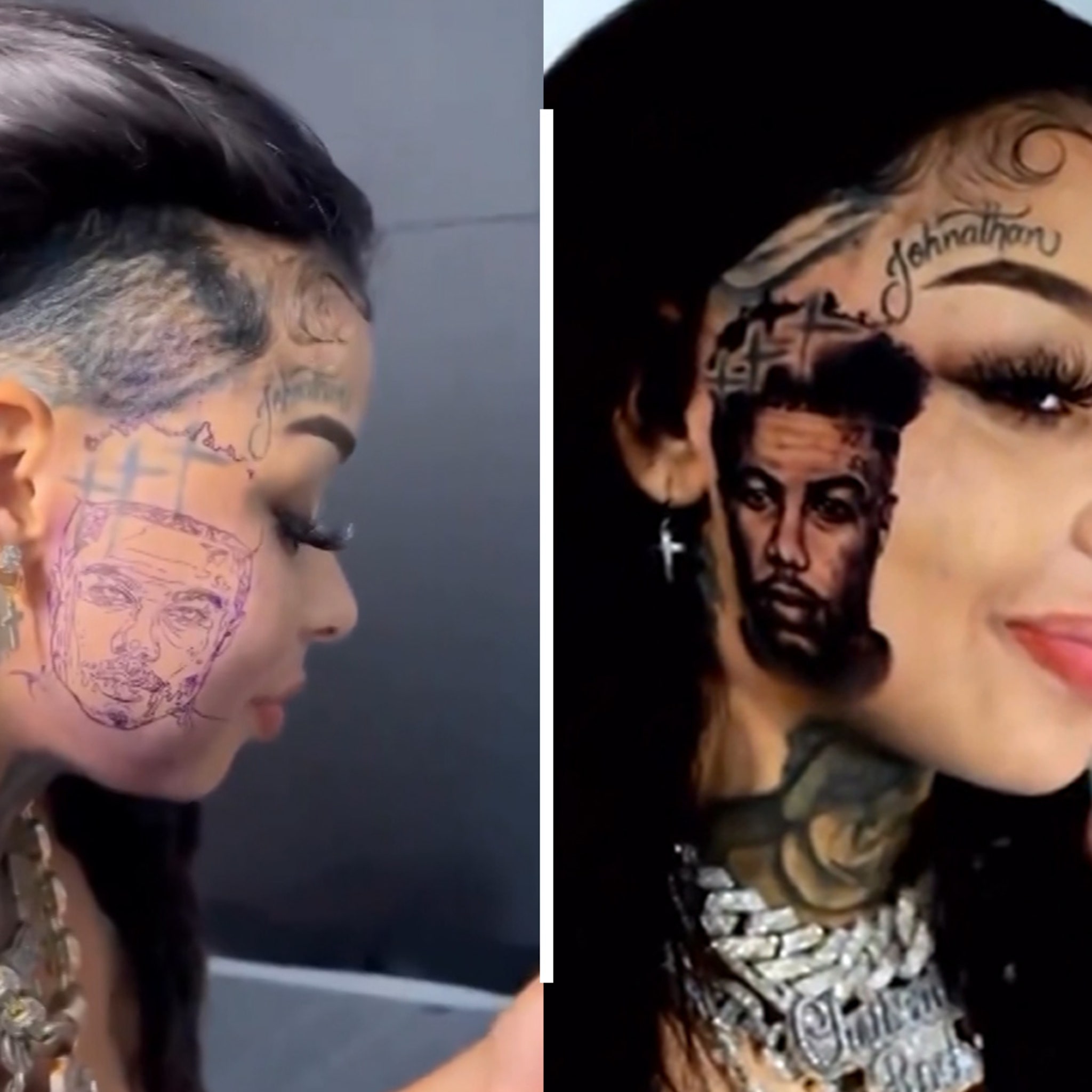
The large Blueface portrait is the tattoo most people notice first. It covers a broad part of the side of her face, with heavy shadows, a defined outline, and realistic features. It’s a major commitment in both size and visibility: the image becomes part of how people see her face.

Portrait tattoos depend on the eyes, nose, and mouth. If those features are slightly off, the whole image can feel wrong. The contrast in Rock’s portrait keeps it legible from a distance, and the darker areas help its shape hold up in photos. Lettering near the hairline and smaller marks add texture without overtaking the face at the center.

Anyone considering a portrait should start with a clear reference photo. An artist can’t make a blurry or poorly lit image more useful after the fact. Choose a photo where the facial structure is easy to see, decide how much shading you want, and consider the design in profile. A half-face portrait may sit more naturally than a full rectangle across the cheek.

The face tattoo looks different in a close crop

Chrisean Rock tattoos: Close crop of portrait shading and the face structure

The close-up makes the portrait’s impact easier to understand. It shows dotwork, soft gradients, and small lines that are hard to see in a full-body photo. The top of the portrait sits near the hairline, while its darker lower edge follows the cheek and jaw. That helps the image feel shaped around her features rather than placed on top of them.

Contrast needs careful handling in this kind of work. Too much solid black can flatten a portrait as it heals; too little can make it disappear when the light changes. Leaving small areas of skin between the deepest shadows and middle grays can keep the face readable without relying on one perfect camera angle.

The surrounding lettering adds another layer. Rock’s face tattoos combine portrait work and script, making the design feel more personal and varied. If you like that rhythm but don’t want a full portrait, a short name or phrase near the temple could create a similar effect with a smaller commitment.

The side profile shows how the face and neck ink connect

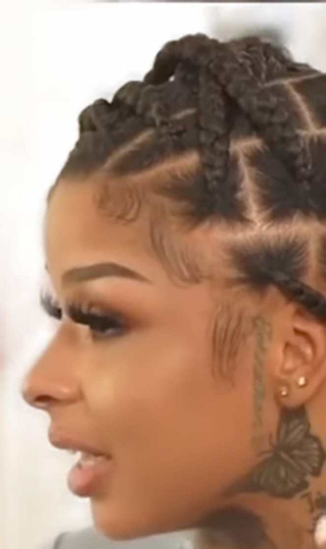
Chrisean Rock tattoos: Side-profile view of the face portrait and connected cheek and neck ink

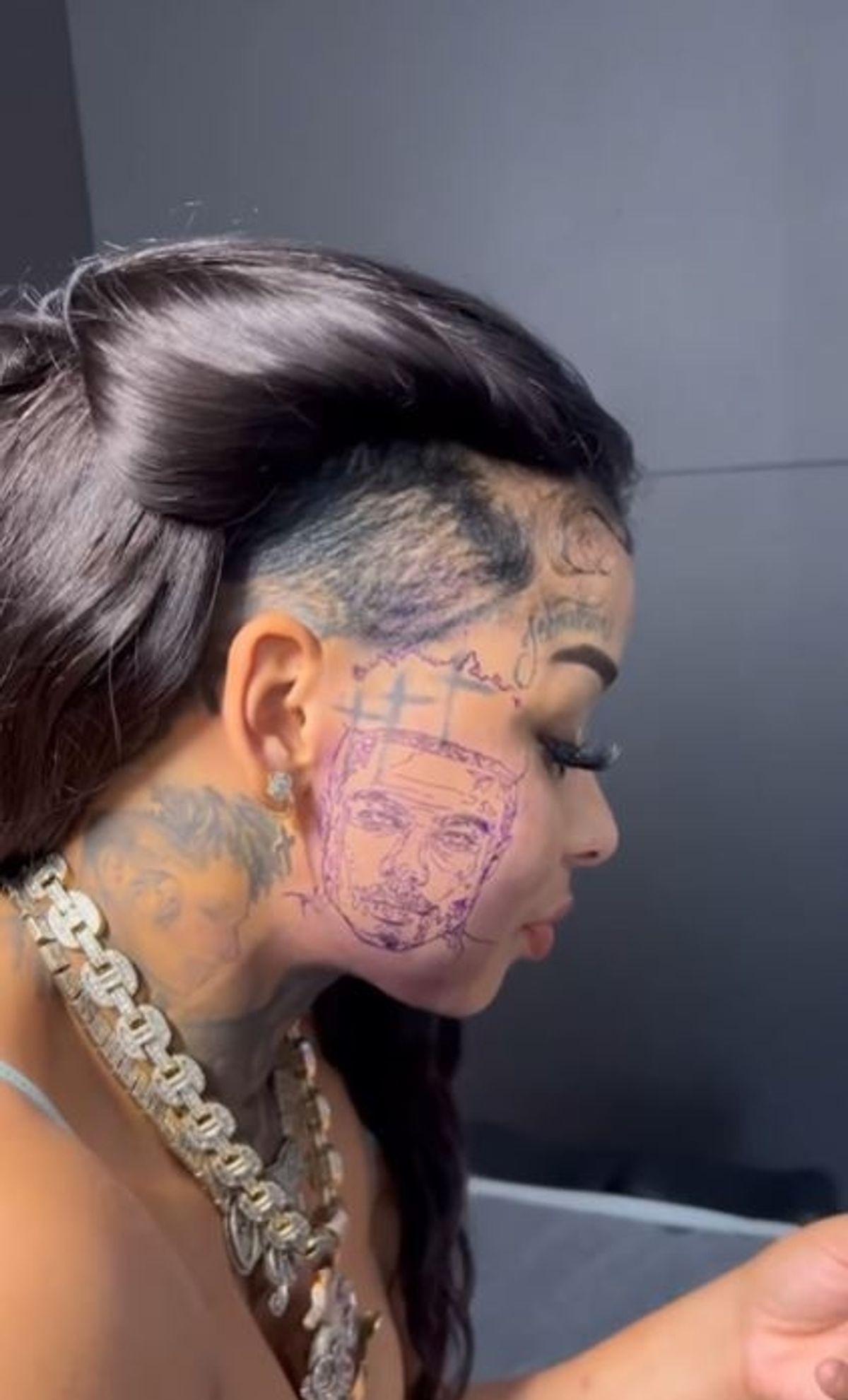
From the side, the portrait, cheek lettering, and neck tattoo line up in one view. The ink moves from the temple toward the jaw and down the neck, so several separate ideas read as a connected panel. That angle is useful when you’re planning a tattoo across a curved area.

The view also changes what stands out. From the front, the portrait dominates; from the side, the neck shading and letters near the hairline become just as noticeable. If you’re planning a large design, look at reference photos from different angles before deciding. Something that looks spacious straight on may feel cramped as the skin turns.

Hand lettering is another part of Rock’s broader style, even though it isn’t visible in this side view. Small words on the hand carry the same personal feel in a less prominent area. Keep the lettering simple, leave room for the lines, and check the design with your hand relaxed as well as stretched flat.

How the collection works together

Black-and-gray shading, strong outlines, personal names and portraits, and visible placements give Rock’s tattoos a consistent look. The face and neck pieces are hard to miss; hand lettering offers a smaller detail people notice up close.

The collection also balances focal pieces with supporting marks. The portrait carries the most visual weight, the neck and cheekbone tattoos lead the eye around it, and script adds movement and personality. One or two large designs can set the direction, with smaller tattoos filling the surrounding space without competing.

You can get a related effect without choosing the same placements. A portrait on the upper arm, a phrase near the collarbone, and a small wrist symbol could share a style. Repeating one or two choices, such as dark shading, script, or a limited palette, can make separate tattoos feel connected.

What to borrow from Chrisean Rock’s style

One thing to notice is how directly the placement shapes the design. Face and neck tattoos aren’t background details; they work best when there’s a clear reason for putting them there. Contrast matters too. Strong differences between dark and light help a tattoo read in indoor light, phone photos, and video.

It’s also useful to separate a personal reference from a design chosen because it’s popular. A portrait, name, or phrase carries its own meaning. Before getting anything permanent, ask yourself whether it will matter to you after the trend has passed. That question deserves extra thought for a hand, neck, or face tattoo, since those placements are part of your everyday appearance.

Take your time planning the collection. Begin with the piece that matters most, leave room for later work, and see how each new tattoo fits after the others have healed. Rock’s tattoos are bold partly because they’re visible, and the strongest pieces also have a story behind them.

The video below gives more context on the face portrait and the conversation about removal. For the design itself, each placement is easiest to understand on its own.

Lena Dunham Tattoos: Bull, Floral Arm, Houses and LOVE ME Ink

Lena Dunham’s tattoos don’t look like one matching sleeve planned in a single sitting. There’s a storybook bull, a row of houses, a detailed floral piece, direct lettering and smaller marks on her chest and hand. Each has its own mood; the way they sit on her body gives the collection some order.

It helps to follow the placements rather than count the tattoos. Illustration runs along the arm, the flowers spread across the upper arm, the houses sit on her back and the lettering stays easy to spot. The designs feel personal because each one has a different job.

The Ferdinand bull tattoo brings a storybook drawing onto the upper arm

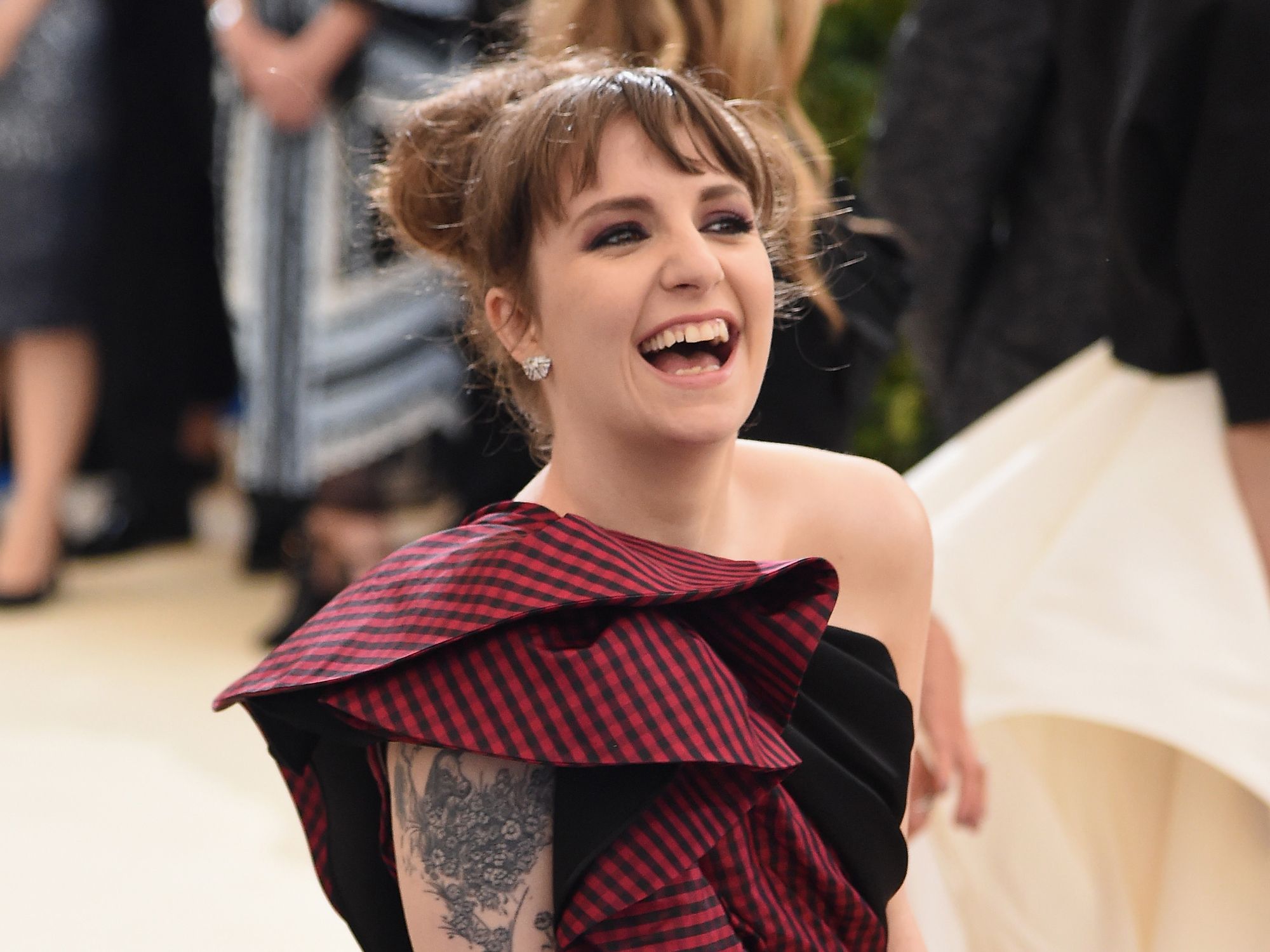
Lena Dunham tattoos: close-up of the fine-line Ferdinand bull surrounded by flowers on the upper arm

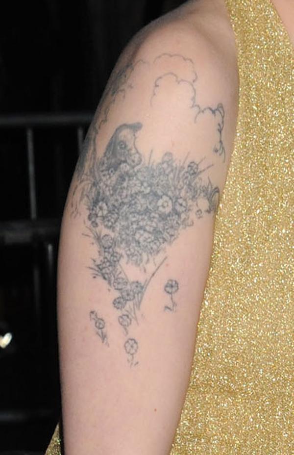
The Ferdinand bull is one of the clearest personal references in Lena Dunham’s collection. A fine-line drawing sits on her upper arm, with flowers and soft shading around it. It comes from The Story of Ferdinand, the book about a bull who would rather smell flowers than fight.

The close-up shows why the light linework holds together. The bull’s profile is easy to recognize, the flowers frame it and open skin keeps the picture from turning into a gray patch. It looks more like an illustration placed on the body than a design picked from a flash sheet.

The upper arm gives the drawing a gentle curve without making it wrap too far. Flowers fill the space around the bull and stretch the design beyond a small emblem. The nearby marks on her hand and wrist still have room to read on their own.

A personal reference works best when its main shape stays clear. The book connection makes the bull meaningful without needing a caption in ink. Leave some open skin around the figure, then use smaller details to frame it.

A floral upper-arm tattoo packs detail into one clear shape

Lena Dunham tattoos: high-resolution red-carpet photo showing the floral upper-arm tattoo clearly

One of Lena’s floral tattoos shows how a dense design can still have a clear outline. The black-and-gray work fills the space below her shoulder, with petals, leaves and smaller marks packed into one piece.

It has more visual weight than the Ferdinand bull, but it follows the shape of her arm instead of sitting there like a sticker. The shoulder lets the upper edge spread out, then the design narrows as it runs down the arm.

The red-carpet photo shows the tattoo in an ordinary pose. You can see how it sits beside her clothes, how the darker areas read from farther away and how the lighter details come through when you look closer.

Detailed flowers still need a strong outer shape. Texture can fill the petals and leaves, but the tattoo should read as one idea before anyone studies the fine marks. That keeps an arm piece from becoming a blur.

The chest tattoo stays small while the surrounding placement does the talking

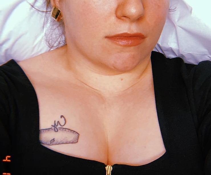
Lena Dunham tattoos: clear close-up of the small chest design peeking above the neckline, with the placement easy to identify

The small chest tattoo is easy to overlook, so the close-up helps. It sits near Lena’s neckline and just above the black fabric. The mark is compact, but its position makes it feel chosen rather than hidden. You notice it after the larger arm and back designs.

The chest moves with the collarbone, clothing and folds of the skin. A small tattoo works there when its edges stay clear; it doesn’t need to cover the whole area to belong.

That scale adds variety to Dunham’s tattoos. The bull is an illustrated arm piece, the floral work is denser, and the chest mark gives the eye a short pause. A collection feels more individual when each tattoo isn’t trying to be the main event.

Small doesn’t mean unimportant. A compact chest tattoo can be a pause between larger designs. Place it where clothing and nearby ink won’t swallow its outline.

The house tattoos turn Lena Dunham’s back into a small piece of architecture

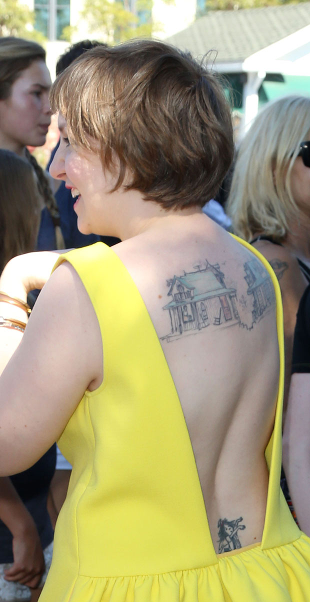
Lena Dunham tattoos: red-carpet back view showing the two architectural house tattoos across the upper back and the lower-back figure

The two houses across Lena’s upper back are among her most recognizable tattoos. Their windows, roofs and uneven lines give them the feel of small architectural drawings. A separate figure sits lower on her back, with open space between the designs.

The red-carpet photo shows how the houses sit on her back. Her dress exposes the shoulder blades without turning the tattoos into one large panel. They feel like private illustrations that appear when an outfit happens to reveal them.

The houses suggest home without spelling out a long explanation. Their hand-drawn lines keep them from feeling like a logo. The small windows reward a closer look, while the larger outlines remain clear from a few steps away.

The back gives architectural drawings room to breathe. Squeeze the houses between the shoulder blades and the small details would lose their charm. Here, the roofs, windows and open gaps stay distinct.

The LOVE ME heart and arm script make the collection feel direct

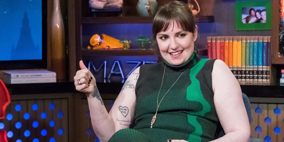
Lena Dunham tattoos: clean talk-show portrait where the heart-shaped LOVE ME arm tattoo and nearby script are plainly visible

The LOVE ME heart on Lena’s arm has a different feel from the bull and the houses. It’s blunt, small and easy to read. Nearby script follows the arm in a looser line, so the two marks sit together without becoming one dark block.

The talk-show portrait catches the tattoos in a normal seated pose. The heart is on her arm, the script runs below it and the older upper-arm piece is still visible higher up. Nothing depends on a dramatic photo angle.

That mix of lettering and illustration sums up the collection. Some tattoos use a clear phrase; others rely on a character, a house or flowers. The variety keeps the designs from falling into one predictable style.

Simple words work best when they have room to speak for themselves. The heart doesn’t need a long explanation. Its size, placement and outline make the point, while the script nearby feels more handwritten.

The collection has a rhythm, even as the styles change. Larger illustrations invite a closer look, small words read quickly and open skin keeps the designs apart. That balance matters more than making every tattoo use the same line weight.

A drawing can carry a private reference and still be easy to recognize. The Ferdinand bull connects to the book, but the picture makes sense on its own. The houses suggest home while keeping their own simple visual language.

The floral work takes another route. Flowers are a familiar subject, but the shoulder placement and shifts in line weight give this piece its own character. A common design can feel specific when its size and position suit the person wearing it.

Back tattoos need their own kind of planning. The houses need a broad enough area for their small details, and the lower figure benefits from the space below them. Packed into one rectangle, the drawings would lose their sketchbook feel.

The arm’s curve adds movement to its tattoos. The bull and the LOVE ME heart change a little when Lena bends her elbow or turns her wrist. That’s fine; a well-placed design moves with the body rather than pretending skin is paper.

Lettering deserves a close check before it’s inked. Read the words from a normal distance, see how they sit when the arm hangs naturally and leave space around them. Clean letters stay easier to read than a crowded line of tiny details.

If you like Lena Dunham’s tattoos, take note of how each idea has its own place. Use a broader area for an illustration, keep a short phrase clear of busy edges and let the open skin around a house or flower become part of the design.

You don’t have to copy the bull, heart or houses to get a similar feel. The better inspiration is the mix of direct and unusual choices. A collection can hold a book reference, a plain phrase and a familiar flower without losing its point of view.

For more actor ink ideas, browse the site’s actor tattoo guides and compare how performers use the back, arm and chest. Dunham’s collection shows that a group of tattoos doesn’t need one perfect theme to feel complete.

More actor tattoo guides

Bill Kaulitz Tattoos: Heart, Mermaid, Snake and Cross Ink

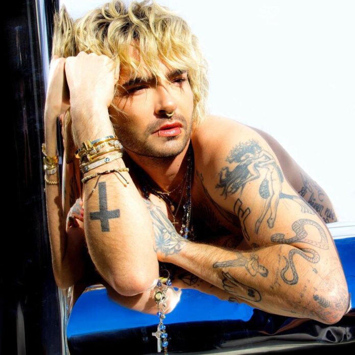
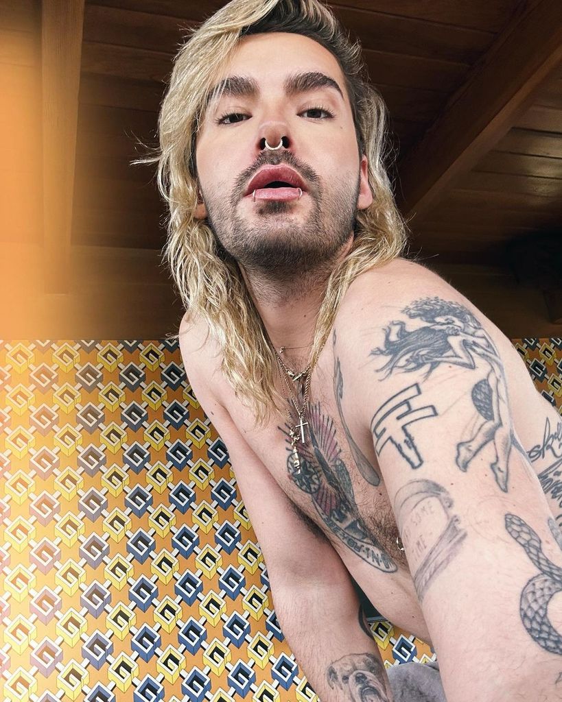
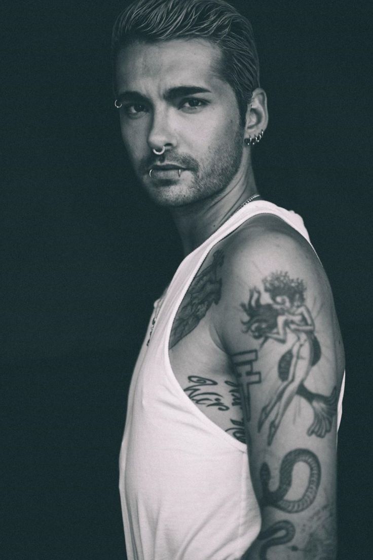
Bill Kaulitz’s tattoos bring together bold symbols, fine lettering, anatomical drawings and a few playful images. Most of the attention falls on his chest and arms, while a small star and palm tree add quieter details below.

Placement is what makes the collection easy to read. The chest has a clear center, the arms hold the busier illustrations, and the palm tree sits on its own lower down. The designs don’t have to match for the overall look to feel considered.

That mix suits Bill’s changing style. His tattoos appear alongside jewelry, piercings and different looks, so some feel dramatic and others almost understated, depending on the photograph.

Bill Kaulitz’s chest tattoos mix a heart with a radiant central emblem

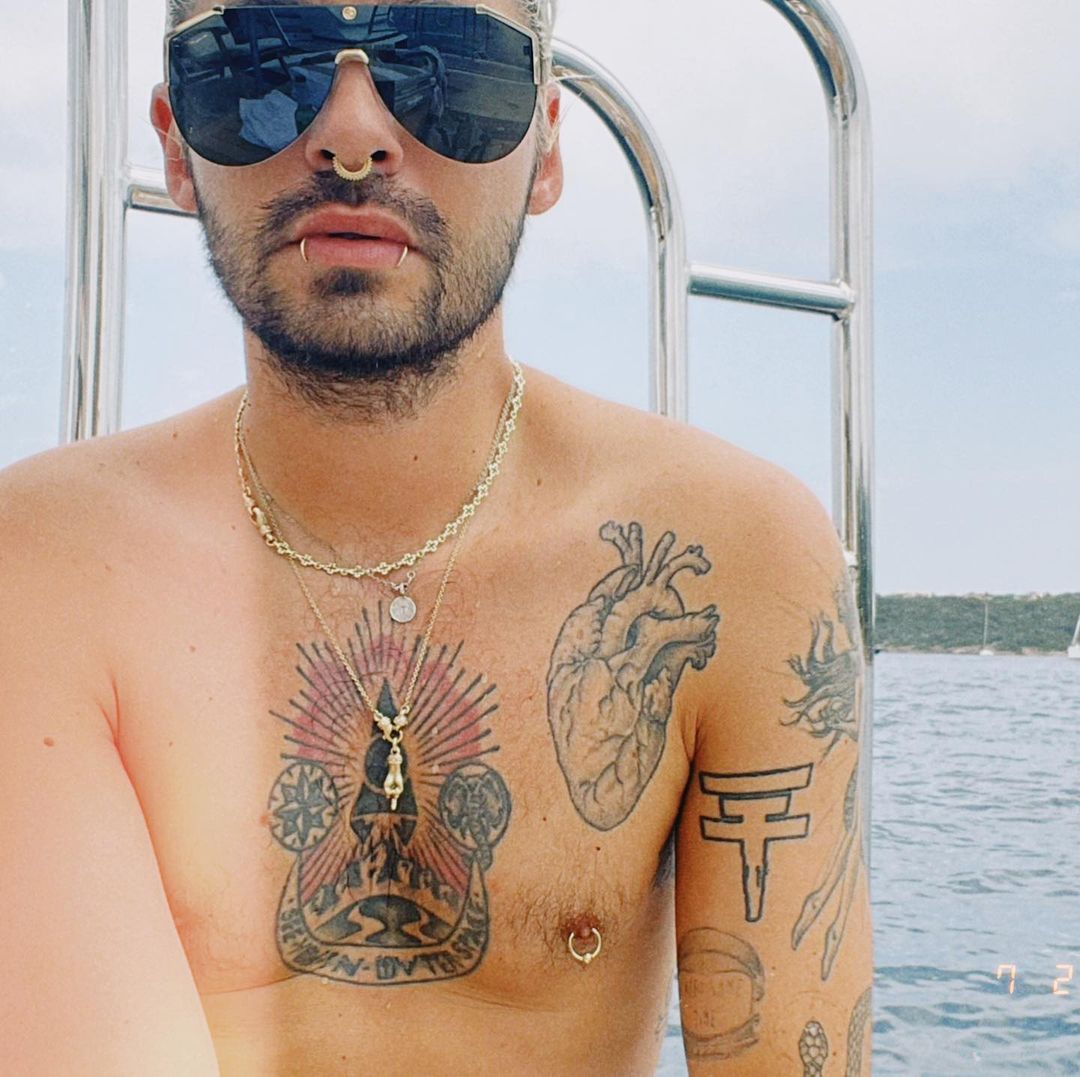
Bill Kaulitz tattoos: sharp shirtless selfie showing the central chest emblem, anatomical heart edge, bold upper-arm figures and lower arm ink

The chest isn’t one single design. An anatomical heart sits high on one side, beside a larger circular emblem filled with rays, symbols and lettering. They use different styles, which keeps the front from looking too uniform.

In a clear shirtless portrait, the heart catches the eye first. Its fine lines and familiar shape feel softer beside the heavier, more graphic emblem. The small gap between them helps each piece stay distinct.

The emblem’s rays spread out from a dark center, giving the design a strong vertical shape. A necklace crosses it in some photographs, but the main image remains easy to follow. That’s useful to keep in mind when a chest tattoo will sit near jewelry or clothing.

The contrast is what makes the pairing work. A realistic heart can sit beside a bold symbol when both have room. One brings an organic shape; the other gives the chest a strong center. They don’t need the same line weight to belong together.

The cross, palm tree and star give the front view a simple visual rhythm

Bill Kaulitz tattoos: high-resolution mirror selfie where the tattooed hand, solid forearm cross and central chest emblem are plainly visible

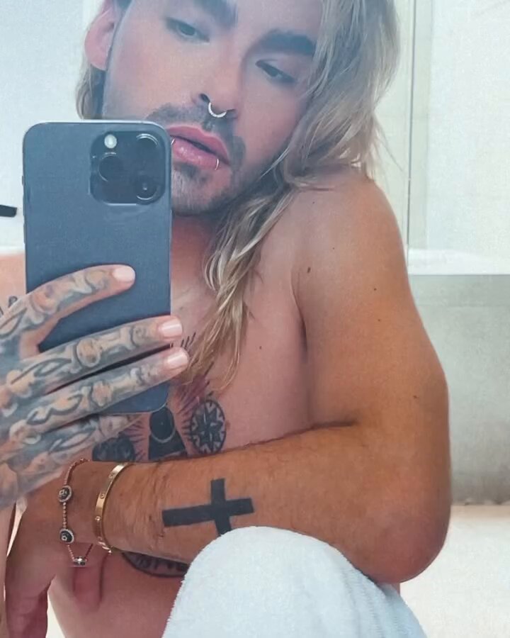
A second front portrait shows the smaller tattoos more clearly: a solid cross on the forearm, a palm tree low on the stomach and a small star near the hip. There’s open skin between them, so the front doesn’t read as one crowded panel.

The cross is the most direct of the three. Its heavy outline stays clear when the arm bends. The palm tree is more like a tiny scene, with a narrow trunk, a small crown and a line for the island; it rewards a closer look.

Near the waistband, the star acts as a small anchor without competing with the chest emblem or arm work. A compact design can fill a spot on its own terms, without needing to become part of a sleeve or larger panel.

The different sizes keep the front relaxed. The cross is bold, the palm tree is more detailed and the star is small. A little space between them lets each idea read clearly.

The mermaid and side script make Bill Kaulitz’s arm collection feel personal

Bill Kaulitz tattoos: side portrait showing the large mermaid on the upper arm, long script along the ribs and smaller lower-arm designs

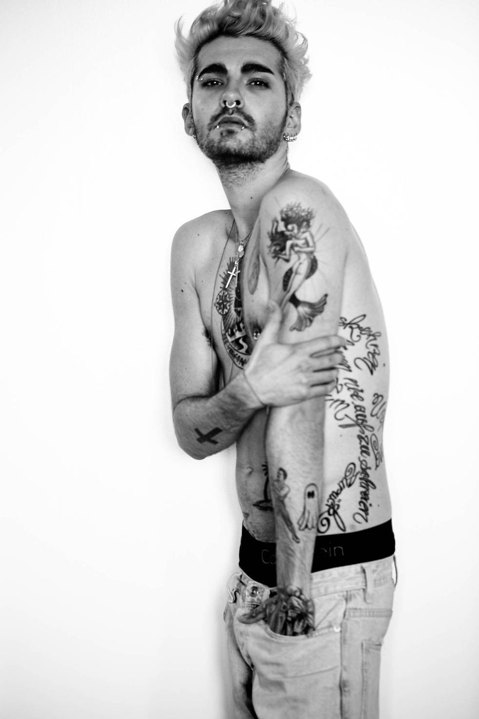
From the side, more of the arm work comes into view. A mermaid covers the upper arm, long script follows the outer side, and smaller figures continue toward the forearm. It looks like a collection built over time, rather than one matching sleeve.

The mermaid gives the upper arm a focal point. Its outline and flowing tail follow the curve of the muscle, so the figure changes as the arm turns instead of sitting flat in one view.

The script brings a different shape to the area: a narrow, dark line beside the larger figure. It feels more private than the chest emblem, even when both show in the same photograph. The mix of images and words is a distinctive part of his tattoos.

Each piece keeps a shape of its own. The mermaid flows around the arm, the script runs in a narrow line, and smaller drawings occupy the gaps. When planning a sleeve, the spaces between designs matter as much as the ink.

The anatomical heart tattoo becomes the focal point in the color portrait

Bill Kaulitz tattoos: sharp color boat portrait with the anatomical heart, large chest emblem, shoulder work and upper-arm ink

In the color boat portrait, the anatomical heart stands out against bare skin in the daylight. Its fine internal lines give it a sketch-like quality beside the darker, graphic emblem. The two pieces make a clear composition across the chest.

The heart has more than an outline: valves, vessels and folds give it texture. The open skin around it keeps those details visible. A design this intricate needs room; squeezed between other tattoos, it would be harder to read.

The warm light also changes how the black-and-gray tattoos look. The chest emblem stays high contrast, while the heart sits against the warmth of the skin. They aren’t a perfectly matched palette, but their separate placements help them work together.

Room is doing much of the work here. The heart has space to stand on its own, with the shoulder tattoos farther out. When one detailed image is meant to lead, give it room and let nearby pieces stay quieter.

The arm tattoos show how Bill Kaulitz layers different shapes in one area

Bill Kaulitz tattoos: high-resolution tank-top portrait showing the snake, figure, script and layered arm tattoos without generic filler imagery

The tank-top portrait shows how the arm tattoos sit together. A large figure is on the upper arm, script runs down the side, and a snake curves through the lower section. The subjects vary, but their placement gives the arm a clear flow.

The snake follows the arm’s curve and links the larger illustrations. Its movement softens the transition between them; a straight block of text would give the area a more rigid feel. From the side, the snake also gives the eye a path through the sleeve.

The upper-arm figure carries the most detail, while the script uses a narrower strip beside it. That lets the larger shape register first, with the smaller marks appearing on a closer look. A sleeve can have several focal points without making every tattoo compete at once.

Plan for the way an arm bends and turns. A curved subject can follow the arm, while vertical lettering can use its flatter side. Consider how the design looks with the elbow bent or the hand turned, not only in a straight pose.

The larger tattoos set the visual order. The heart and chest emblem read from farther away; the mermaid, snake and script add detail up close. The cross, star and palm tree are smaller accents around them.

That difference in scale keeps a heavily tattooed look legible. Open skin gives larger designs room to hold their shape; it doesn’t have to mean the collection is unfinished. In Bill’s photographs, the gaps help separate one symbol from the next.

Lettering runs through the arm and side pieces, but it changes direction and style. Some follows the body vertically, some sits near the ribs, and some appears beside larger drawings. That variation keeps the words from reading like one repeated pattern.

For a chest layout of your own, decide which tattoo should draw the eye first. The heart works as a focal point because its outline is clear and it has open space around it. Secondary designs can sit lower or to the side.

An arm needs a different kind of planning. A figure can use the round upper arm, script can follow a flatter area, and a snake or another curved subject can connect the two while staying recognizable.

The palm tree shows how a small tattoo can change the mood of a larger collection. Its island scene takes up little space but gives the front view a lighter note. A smaller design can keep a group of serious images from feeling too heavy.

The cross takes the opposite approach. Its thick, simple shape is easy to spot even when part of the arm is covered. A minimal design can stand out as much as a detailed one when it has a clear outline and enough contrast.

The pieces don’t need to match. The anatomical heart, central emblem, mermaid and snake come from different visual styles, but their placement gives them order and keeps them from competing for the same space.

There is a playful side to the collection too. The palm tree and smaller figures sit alongside the serious symbols and realistic heart, giving the overall look a less formal feel. That range can shift with what he wears.

If Bill Kaulitz’s tattoos are an inspiration, take ideas from the layout rather than copying the designs. Give the main image a clear place, use curved areas for shapes that need movement, and keep lettering away from crowded edges. Leave room around each piece so the collection can grow.

For more musician tattoo ideas, browse the site’s musician tattoo guides to see how other designs use the chest, arms and smaller placements. Bill’s collection shows how varied tattoos can still feel personal when their placement gives them room.

More musician tattoo guides

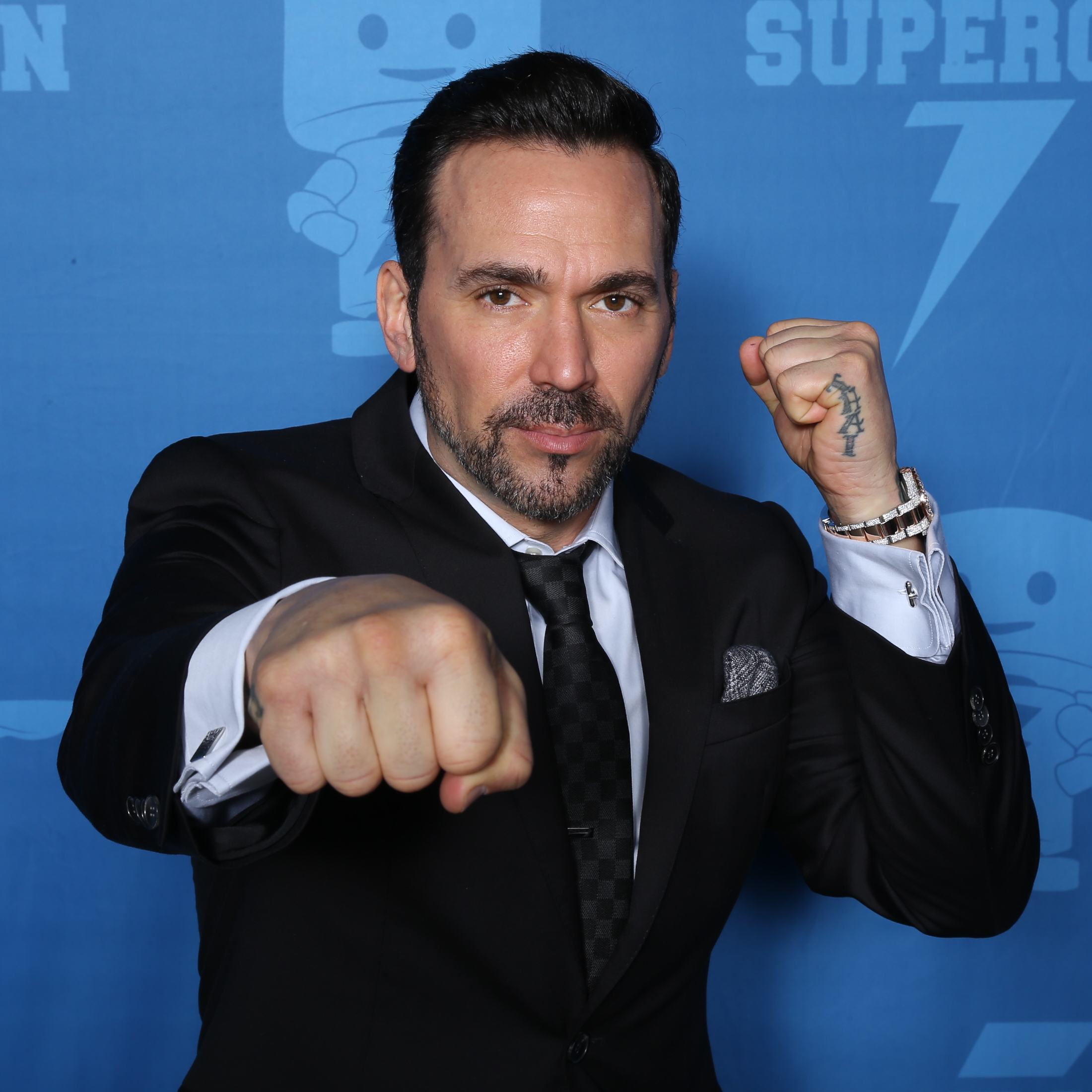
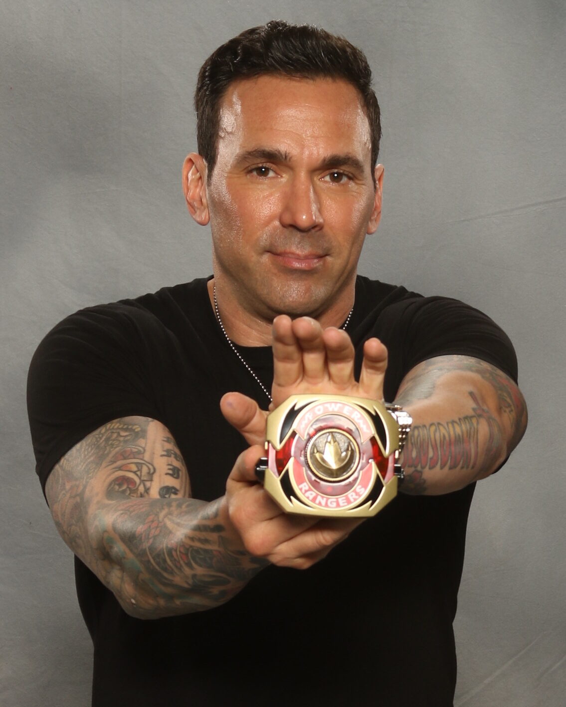
Jason David Frank Tattoos: His Sleeves, Neck Ink and Hand Designs

Jason David Frank spent much of his career in motion. As Tommy Oliver, he moved from the Green Ranger to the White, Red and Black Rangers, then brought that martial arts energy to real fight work and appearances around the world. His tattoos share that direct, high-impact feel: large, colorful designs that remain visible when he moves or poses.

The amount of coverage stands out first. Jason David Frank’s tattoos run across both arms, forearms, hands and neck. It isn’t one matching sleeve; the collection looks more like several chapters, with color, black shading, lettering and smaller symbols sharing the same space.

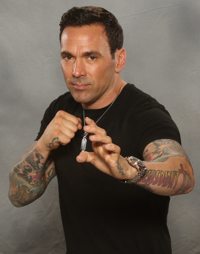
Photos clearly show the large color work on his arms, the neck lettering, the Jesus Didn’t Tap design on his forearm, and smaller pieces on his hands and wrists. Some tattoo stories have been discussed publicly, but not every meaning is confirmed. The safest read is the visible one: scale, style and placement. His ink is striking because of where and how it sits, not because we need to supply a private backstory.

The lettering on Jason David Frank’s neck gives the collection a sharp centre

Jason David Frank tattoos

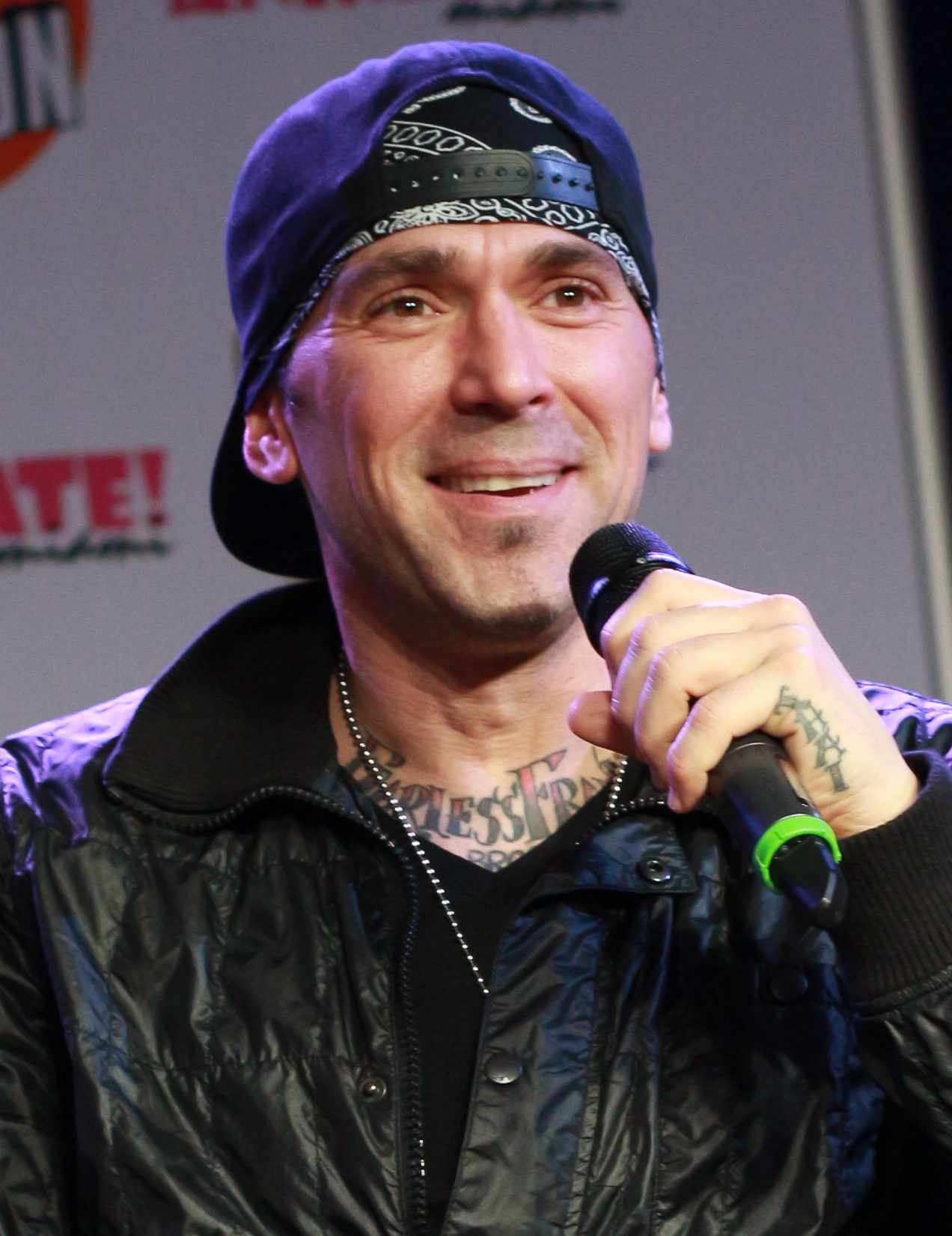
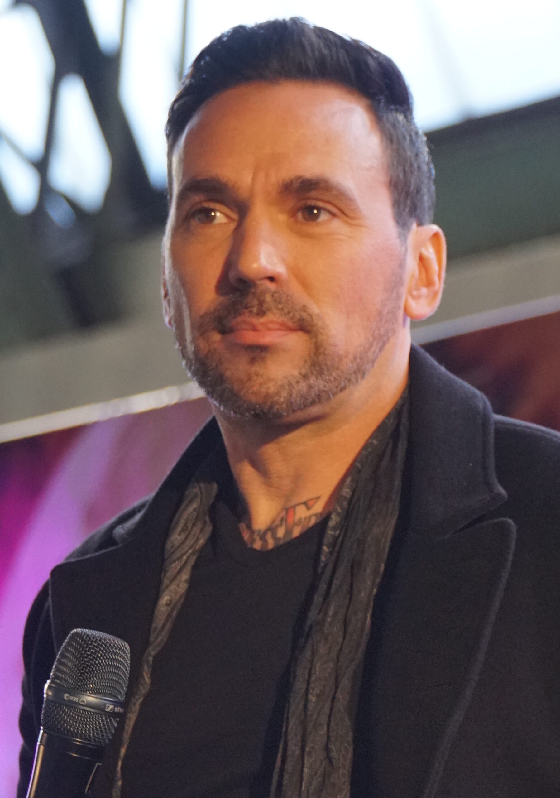
The neck lettering is easiest to make out in a close portrait. It crosses the front of his neck, with heavier tattoos framing it on either side. That placement gives his face a stronger outline and keeps the ink visible even when his clothes cover the rest.

Neck lettering has a different presence from a sleeve. It can’t disappear under a watch or a relaxed pose; it sits in the center of the portrait. Jason’s design uses dark, compact lettering that stays clear under bright event lights.

The tattoos around it help the lettering feel connected to the rest of the collection. Darker designs rise from the shoulders and upper chest, giving the neck piece a base. If you’re planning neck ink after work on your chest or arms, it helps to think about how the pieces will read together.

A turn of the head changes what you can see. One side of the tattoo slips out of view while the other comes forward. The placement gives a still design a sense of movement.

His forearm ink mixes bold lettering with character and shading

Jason David Frank tattoos

Some of Jason’s clearest individual designs sit on his forearms. The Jesus Didn’t Tap lettering spans enough of the arm to read at a glance, while the surrounding color work gives it the weight of a larger patch. In photos with his hands raised, the words become part of the pose.

The martial arts influence comes through in the look of the lettering. It has the direct feel of a phrase on training gear, while the illustrations around it make the arm less like a simple text band. From a distance the message is clear; closer up, the colors and other shapes add detail.

Forearm lettering is easy for the wearer to see and can still be covered with a long sleeve. Jason spent years in costumes designed to conceal his tattoos, so the difference between his covered and uncovered looks is part of how the collection has been seen over time.

If you want a similar phrase, leave enough room for it to stay readable when your wrist bends. Good lettering depends on a clear shape, not on fitting in more words. Jason’s larger design shows why a forearm can suit bold type better than tiny, crowded text.

Jason David Frank’s hand tattoos make the larger designs feel more personal

Jason David Frank tattoos

The hand tattoos are smaller than the sleeves, but they change the overall look. Close-ups show ink on the back of his hand and around the fingers, with the forearm designs continuing down toward the wrist. They show up in ordinary gestures, not only in posed tattoo shots.

Hand ink is hard to miss. It appears whenever someone reaches, grips or holds something, which makes it feel more immediate than a tattoo under clothing. The skin also moves often and wears quickly, so the design needs to account for that.

Jason’s hand pieces don’t compete with the sleeve. Darker, simpler shapes bridge the forearm and fingers, standing apart from the brighter color work higher up. That contrast helps the small designs stay legible where several placements meet.

If you’re considering hand tattoos, keep the main shape clear and expect that touch-ups may be needed. A design doesn’t have to be delicate to feel personal. Simple hand ink has a presence because it stays in view through so much of the day.

The wrist details show how Jason’s tattoos work in motion

Jason David Frank tattoos

At the wrist, the larger forearm designs narrow into smaller marks. Photos of Jason holding a belt or raising his hands show the ink wrapping around the joint and continuing toward the back of the hand. The shapes shift as his wrist turns.

That movement suits the action in many of his public photos. Rather than seeing the tattoos in a still pose, you often see them while he gestures or moves. The wrist pieces become part of the frame, whether his hand is raised or in motion.

The wrist can also give a sleeve a natural stopping point. Smaller marks and open skin around the joint break up dense coverage, before the hand tattoos continue the line. That pause keeps every part of the arm from feeling equally busy.

When choosing a wrist placement, look at how it sits with your hand relaxed as well as in a reference pose. A photo of you moving can show details a mirror misses.

Why Jason David Frank’s tattoo style still feels recognizable

Jason David Frank tattoos

The tattoos vary, but they share a clear visual attitude: bright color, dark outlines, readable lettering and placements that stay visible. The pieces don’t have to match when they share that sense of scale and confidence.

The collection also fits the way Jason presented himself in public. Martial arts, Power Rangers and his other work all involved movement, costumes and larger-than-life characters. His tattoos look at home in that setting: easy to spot at a distance, with more to see up close.

A tattoo collection can build over time. You might start with a word and add a larger image later, using different styles as long as each has room. A shared attitude and scale can tie designs together without making them identical.

His tattoos look suited to a body in motion: arms that bend, hands that work and a neck that turns. Photos where he’s gesturing show the ink as part of him, rather than a flat catalogue of designs.

The neck tattoo changes shape as Jason turns his head

Jason David Frank tattoos

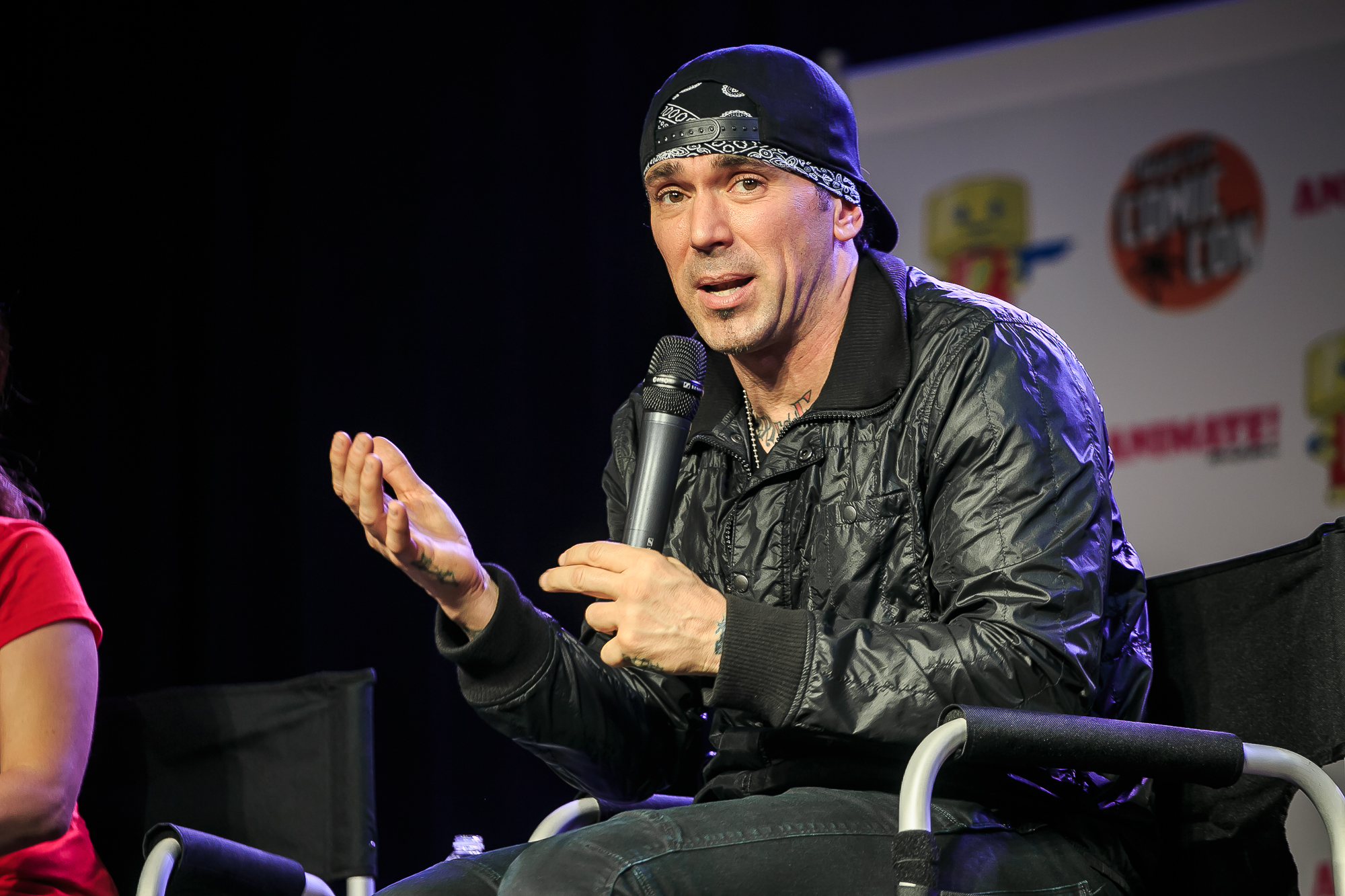
In another close portrait, much of the neck lettering disappears as Jason turns from the camera. The visible edge still links his jaw, collar and upper chest, while darker shapes at the base of the neck anchor the design.

A neck tattoo can read differently from different angles. From the front, lettering takes focus; from the side, the surrounding shapes stand out. As the body reveals more of the design, the whole piece can feel larger.

Watch Jason David Frank get his hand tattoos

Jason David Frank tattoos

The video shows the hand-tattoo process and how the new ink fits beside Jason’s existing arm work. The portrait above also makes the connection clear: hand tattoos are easier to plan when the wrist and forearm are part of the same layout.

More actor tattoo guides

Darren Till Tattoos: Gorilla Cover-Up, Arm Portrait and More

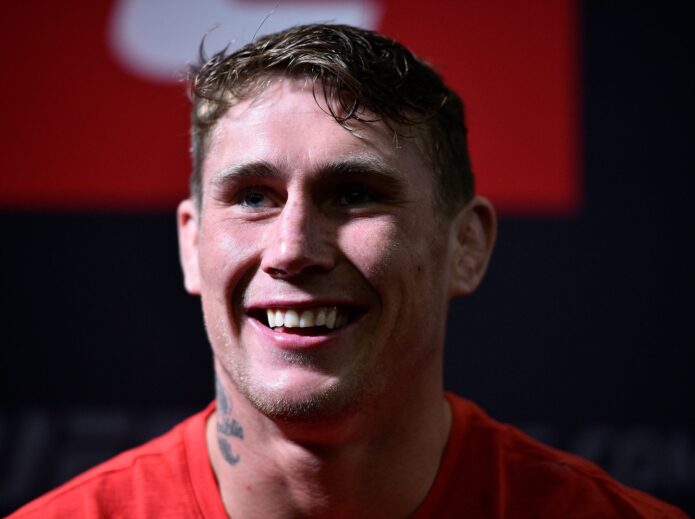
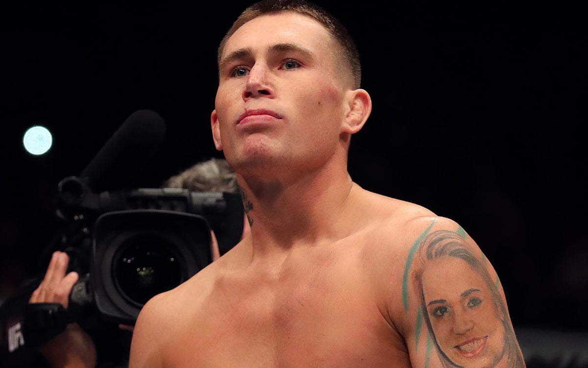
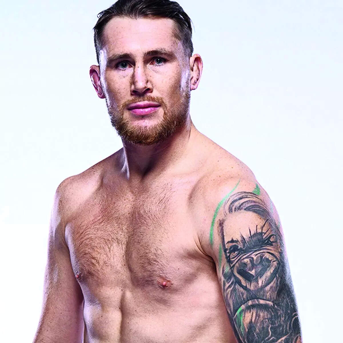
Darren Till’s tattoos have shifted along with his career. The Liverpool fighter first drew attention for a large portrait on his upper arm, visible neck ink and a dark piece across his upper back. Later, the portrait became part of a gorilla cover-up, tying the arm to his nickname and giving it a heavier look.

The change is what makes the collection more than a list of designs. The same arm appears in photos before and after the cover-up: first with a portrait that prompted questions, then with a darker piece built around The Gorilla. Placement shapes the view too. A close crop can make one image look small; turn the arm and the work reads more like a sleeve.

Most of the ink is black and gray, with lighter skin breaks that help the larger shapes stay legible. The finish has a rough edge that suits an active fighter. Across different photos, the main themes remain visible: family, identity, toughness and a willingness to wear his choices openly.

The original arm portrait is the tattoo everyone noticed

Darren Till showing his original girlfriend portrait arm tattoo

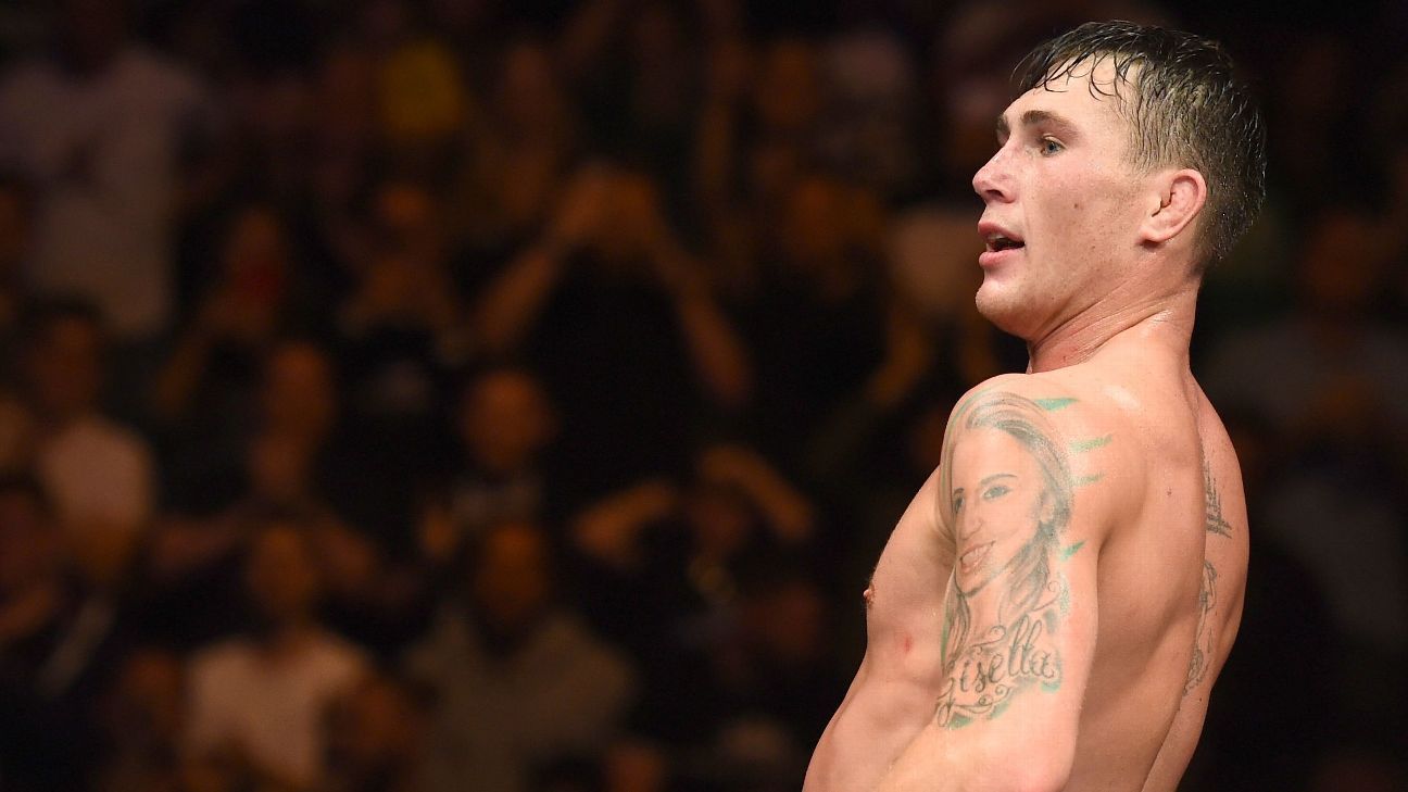
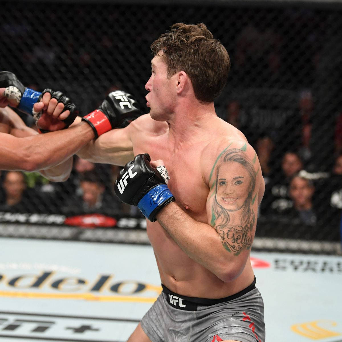
The portrait on Till’s upper arm was the tattoo people kept asking about. In close photos, a woman’s face fills the shoulder area, with loose lines and a name beneath it. Fans often guessed it was Paige VanZant, but Till said the portrait was of his girlfriend, Gisella. It was personal before it became famous.

The high placement made it easy to spot in a fight kit or sleeveless training top. The shoulder gives the face a natural frame, and the image shifts as Till lifts or turns his arm. From the side, other marks start to connect it to a larger composition.

Portraits leave little room for error: a small change to the eyes or mouth can alter the expression. Till’s image was not a polished studio reproduction. It was a personal gesture, and its rough finish became part of why people remembered it.

The portrait takes up the shoulder and gives the upper arm a clear focal point. The name and loose lines carry the design toward the biceps, making it feel like a memory on the skin rather than a piece of decorative flash.

If you’re planning a portrait tattoo, find the artist before deciding on the size. A face needs a clear reference, room for shading and a placement that works from more than one angle. Take photos with the arm relaxed and raised before settling on the final position.

A different angle shows how the ink wraps around the body

Darren Till showing his arm, back and neck tattoos

A side or back view changes what stands out. The portrait is the focus from the front; from behind, it sits beside a larger upper-back piece, with the neck tattoo linking the head, shoulder and torso. Those connections keep the designs from looking like separate stickers.

The upper-back tattoo is harder to make out in a fast fight photo, but its broad shape gives the back a dark center. It spreads across the shoulder blades, while the arm work carries the eye around the side of the body.

Movement changes how a back tattoo reads. The design looks different when Till stands square, twists for a face-off or leans over after a round. Photos from those angles make the lines seem to shift with him.

Placement can make a small collection feel larger. Rather than filling every inch, let one piece lead into the next. The neck detail meets the shoulder, the shoulder turns into the portrait, and the portrait frames the upper-back work from the side.

For a back or shoulder piece, take photos while moving instead of relying on a mirror alone. Check how the design looks with your arm relaxed, raised and turned. A tattoo that works in one pose may lose its shape when you move through the day.

Fight photos make the old portrait look like a full sleeve

Darren Till showing his arm portrait tattoo during a fight

In a still portrait, you can study the face and lettering. A fight photo adds another view: the arm bends, the skin stretches, and more of the surrounding ink appears. The portrait starts to read as the front of a larger design rather than a single picture.

That is useful when planning a sleeve. The main image needs space, but the surrounding shapes help the whole arm feel finished. Till’s arm has darker edges, lighter gaps and smaller marks around the portrait. They support the face without replacing it.

The neck tattoo also links the head and torso. It is small, but it shows in many shirtless photos. A short line of text or a simple symbol can do similar work in a sleeve, connecting two larger areas without competing with them.

An arm tattoo has to work when the elbow bends, not only when the arm is straight. Till’s fight photos are a reminder to check the shape around the joint, especially when a portrait sits near the shoulder and upper biceps.

Contrast matters as well. Black-and-gray portrait work needs open skin or lighter shading around it to remain clear. Pack every gap with dark ink and the face can disappear from a distance. The lighter areas around Till’s older tattoo help it read.

The gorilla cover-up changed the whole arm story

Darren Till showing his gorilla arm and neck tattoos

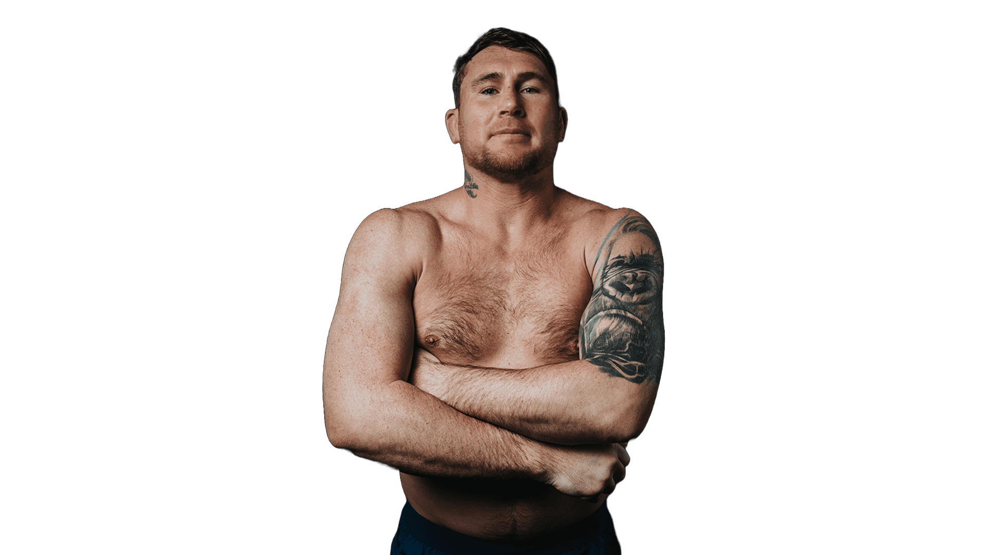
Later photos show the biggest change: Till covered the old portrait with a gorilla. The new subject connects to his nickname and shifts the arm’s tone. What began as a personal portrait becomes a fighter’s symbol, closer to the public identity he built as The Gorilla.

A cover-up has to work with the lines and shading already on the skin. Fur, shadow and a strong face give a gorilla enough texture to take in much of that older work. The final piece is denser and darker because the new image has to cover what was there.

The DAZN portrait shows the newer design from the front. The arm reads as a dark sleeve with an animal face at its center, while the neck lettering still links it to older photos. The later close-up makes the scale of the change clear: this is a new direction for the whole arm.

A cover-up should solve the old problem while acknowledging the tattoo underneath. That takes planning. The artist needs to see the existing work, decide what can be softened and choose a new subject that can carry the amount of ink required.

If you’re considering a cover-up, bring a few possible subjects and stay open to a larger design. Darker work can look strong, but it needs enough space and contrast for the main face or figure to remain clear.

The cover-up is a snapshot of how tattoos change over time

Darren Till showing the detail of his gorilla cover-up tattoo

The close-up shows how much the gorilla changed the arm’s identity. It is larger, darker and closely tied to Till’s fighting persona. The old portrait is no longer the first thing you see, but it explains why the new work has such visual weight—and why fans remember the earlier version.

Tattoos can change with the person wearing them. People add new work, cover old pieces, move on from relationships or build a different public image. Till’s before-and-after photos make that process easy to see because the original portrait appeared so often.

The gorilla also has a clear silhouette. Even in uneven light, its brow, nose and mouth give the arm an immediate shape. That’s useful in a large cover-up: the main image should read before the viewer gets close enough to inspect the shading.

A large tattoo needs one strong idea more than a pile of small details. The gorilla has a recognizable face and a reason to use deep shading. The extra lines support that subject instead of competing with it.

The rest of Till’s collection follows a similar balance. The neck piece is compact; the upper-back work gives the torso a center; and the arm moves from portrait to gorilla. Each looks different when he is still, turning for a camera or fighting under arena lights.

The tattoos don’t form a perfectly matched set, and they don’t need to. They mark different chapters, from family and relationships to the tougher identity of The Gorilla. The changes are part of the story the collection tells.

For a similar look, start with the story you want your tattoos to carry, then choose placements that can grow. Leave room around large pieces, consider how movement changes the view, and find an artist with experience in the style and any cover-up work you need.

Darren Till’s tattoos are memorable because they connect his public image with personal history. The arm portrait drew questions, the neck and back work filled out the composition, and the gorilla cover-up gave the sleeve a new direction. Each photo catches a different moment in that evolution.

More athlete tattoo guides

BamBam Tattoos: GOT7 7 Ink, Fine Line Faces and More

BamBam’s tattoos reflect his time with GOT7, his solo work and the playful way he presents himself. There’s bold lettering on his ribs, fine-line work on his arm, small marks by his ear and script that only shows when he shifts a collar. Together, they feel like a collection built over time, not one matching set.

Some tattoos point straight to GOT7. The number 7 on his upper back is shared with the group’s name and its seven members. Other pieces invite a closer look: the three faces on his arm, for instance, and chest ink caught briefly in stage photos. The 7 is easy to place; the faces and glimpses of chest ink leave more questions.

The sections below look at those designs in place and separate what BamBam has explained from what fans have inferred. They also offer a few practical details for anyone drawn to fine-line tattoos, script, small symbols or a collection that can grow gradually.

The matching 7 tattoo turns friendship into a simple back piece

BamBam tattoos: matching GOT7 7 back tattoo

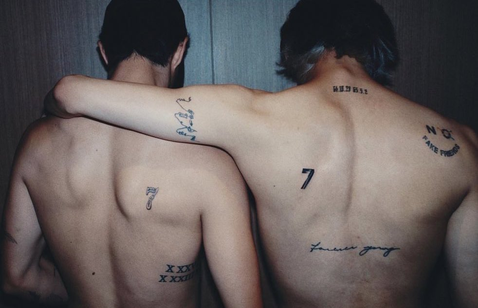
The clearest GOT7 reference is the matching 7 that BamBam and Mark Tuan showed on their upper backs. It sits between the shoulder blades, easy to see when they turn away from the camera. The shape is simple, but it has room there to stand on its own. It isn’t tucked on a wrist or partly hidden by a sleeve.

For BamBam, the number connects both to GOT7 and to the friendship among the members, which continued after the group left its original label. It makes the point without a long quote or a detailed image; fans who know the group will recognise it.

The photo shows how much a clean shape can do. The black 7 is easy to pick out, while the smaller lettering and date details add a personal touch. BamBam’s surrounding marks don’t copy Mark’s exactly. They share the central idea, and that’s enough.
A friendship tattoo is easier to recognise when its main symbol reads from a distance. If you’re considering one, start with a number, sign or small shape that’s part of your relationship. Then settle on a placement that feels right for you instead of tracing someone else’s tattoo.

The GODBLESS cross sits in a small but visible spot

BamBam tattoos: GODBLESS cross behind the ear

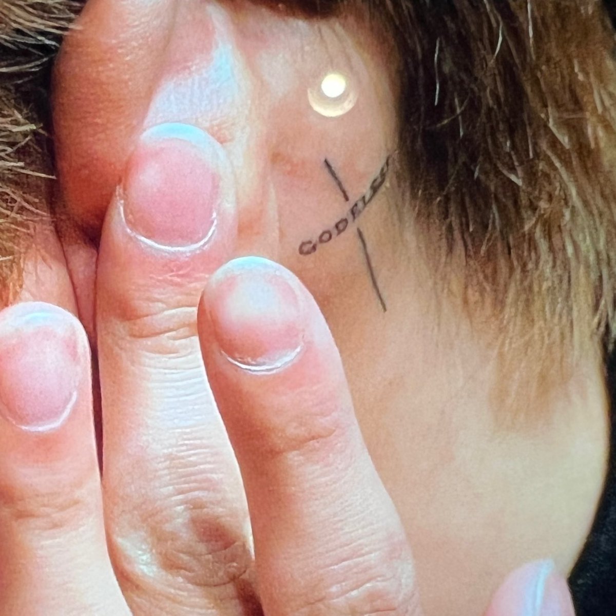
The cross behind BamBam’s ear shows how a small tattoo can still catch the eye. It pairs a simple cross with GODBLESS running through it. Just above the jaw, it appears when his hair shifts or he turns his head. It’s visible without taking over his face.

The close-up makes the lines easier to see: the cross stays compact, and the lettering follows its shape instead of spreading into a block. In such a small space, leaving some air between the lines helps keep the design legible.

Hair changes how much of it shows. A short cut leaves it in view; longer hair can cover it. That gives the wearer some choice about when the tattoo is on display.

A small tattoo still has to read when you move and when the light changes. Ask the artist to show the stencil from the front, side and three-quarter angle. Those are all ways people will see it, not only straight on in a mirror.

The three faces are one of BamBam’s most recognisable arm tattoos

BamBam tattoos: upper arm linework and faces tattoo

The fine-line piece on BamBam’s upper arm, often read as three faces drawn with a few flowing strokes, is one of his most recognisable tattoos. Its light, overlapping lines make a different impression from the solid 7 on his back. It comes into focus when you look closely.

Some fans read the faces as different sides of BamBam: the person away from the stage, the performer and the private self between them. He hasn’t given a fixed explanation, so that remains a fan interpretation rather than a confirmed meaning.

The spare lines leave room for a personal reading without spelling out the whole story. The upper arm also suits the shape: it curves with the muscle and can be seen from the front or side.

For a faces tattoo, the reference needs to be clear even if the final drawing is loose. The artist still has to decide how the eyes, jaw and profile will read. Minimal work still takes care. With fewer lines, each one carries more of the image.

His lettering tattoos keep the collection personal and a little playful

BamBam tattoos: Kissin On My Tattoos collarbone script

The script by BamBam’s collarbone reads “Kissin’ On My Tattoos,” a phrase that fits his humour and stage style. It sits close to the chest and comes into view when he opens a shirt or shifts the neckline. The placement lets the words show as part of the outfit without making them a large chest panel.

With script, the feel comes from the spacing and the way the letters flow. BamBam’s tattoo uses loose handwriting rather than a rigid block font, so the phrase moves along the collarbone.

He also has “forever young” written across his back. The two pieces show how lettering can change the mood: one is cheeky and close to the skin, the other more like a private reminder.

Before settling on a quote, try it in a few styles and read it from across the room. Words that look clear on a phone can be harder to follow when curved over a shoulder or rib. Leave enough space for each word to breathe. That’s especially helpful where the tattoo moves with the chest or back.

The ROCKSTAR, 97 and small number tattoos show different eras

BamBam tattoos: ROCKSTAR, 97 and small arm tattoos

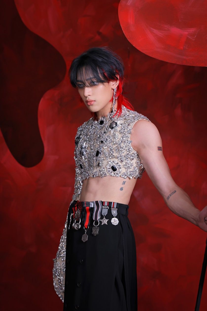
BamBam has added smaller designs around the larger pieces. He showed ROCKSTAR as a new black tattoo on his arm and said he likes the idea of becoming a rockstar or living like one. It’s a direct word, almost a label he chose for himself.

His birth year appears in more than one style. The number 97 points to 1997, while Roman numerals give the same date a more decorative look. A personal number can stay plain, or take the form of Roman lettering or a symbol whose meaning is mostly for the wearer.

The stage photo shows how the smaller tattoos sit together: a number on the arm, a word near the forearm and lettering along the side. They add detail without filling every open patch of skin; there’s still space between them.

If you’re building a group of tattoos, there’s no need to plan the whole set at once. Pieces can mark separate moments as they happen. Leave some room for a later idea. The newer tattoos sit alongside older ones, rather than forcing them into a single style.

Why BamBam’s tattoos feel connected without matching perfectly

BamBam tattoos: small hand flower tattoo and collection overview

Across the collection, you see lettering, small black symbols, fine-line faces and a few bolder shapes. The subjects and sizes vary, but the open spacing and the way the designs follow the body’s lines give them some common ground.

The back 7 is the boldest piece. The three faces and collarbone script draw you closer; the cross by the ear and the smaller numbers reward a close-up. You notice the 7 from across the room, while smaller details become clear in a close-up.

You don’t need one theme or a full sleeve planned from the start. Choose a first design that matters to you, leave breathing room around it and let later tattoos respond to the space. Scale, spacing and tone can tie the collection together.

A partly hidden tattoo can stay with you as much as a large back piece. Not every photo needs to show everything at once. A phrase under a collar or a small cross behind the ear can feel like part of everyday life rather than a display.

BamBam’s collection brings together GOT7, solo work, playful lettering and fine-line images whose meaning is left open. The matching 7 gives it the clearest group connection; the cross, faces, script and ROCKSTAR word add other details. If this style appeals to you, choose symbols that matter, give lettering room and check how a design sits when you move.

More musician tattoo guides

Bella Poarch Tattoos: Winged Ship, Feather Work and Meanings

Bella Poarch’s tattoos draw on her music and fashion style, as well as her time in the U.S. Navy. Soft black-and-gray feathers sit alongside script, small symbols and pieces she has linked to personal memories.

The largest is a winged ship across her back. Poarch has said the wings refer to her work as an airman, while the ship recalls her Navy deployment. Other pieces include a long chest quote, shaded arm work, a small heart and key, and a cover-up that became part of a wider discussion about cultural harm.

This guide looks at the main tattoos, where they sit and what Poarch has said about them. It also considers some practical choices behind feather sleeves, back pieces, script and designs drawn from personal experience.

The winged ship back tattoo is Bella Poarch’s signature piece

Bella Poarch tattoos: winged ship back tattoo

The winged ship across Poarch’s back is the tattoo most closely associated with her. It stretches from the shoulder blade toward the upper arm, with layers of feathers around a sailing ship. The vertical shape follows the back and shoulder, so it reads as one piece rather than a small image set apart from the body.

Poarch has said the wings refer to her work in aviation. She served as an airman and worked around helicopters on an aircraft carrier; the wings give that part of her life a visual form. The ship brings in her time deployed with the Navy and being at sea. She has also described the night sky and open ocean as part of the memory behind the design.

Together, the ship and feathers carry those Navy memories without a portrait, date or long quote. The ship is easy to recognise, while the feathers add movement and keep the back piece from feeling too heavy. The shading reads from a distance; finer lines show up when you look closer.

A back tattoo like this needs a clear centre and room around it. If extra details crowd the main image, the wings can lose their shape. An artist can map the design to the shoulder blades first, then work out how far the outer feathers should extend.

Her chest quote brings a softer script style into the collection

Bella Poarch tattoos: upper chest script tattoo

Poarch also has a large script tattoo across her upper chest. It curves beneath the collarbones and ends in a small heart-like point at the centre. The lettering is dark and decorative, but open skin around it keeps the design from reading as one solid block.

Chest script changes with posture, clothing and camera angle. From the front, the words form a line across the body; from the side, they follow the collarbone and chest. That’s why lettering that looks right on a flat reference can need adjustment before it is placed on skin.

Poarch’s tattoo shows how a longer phrase can stay readable when the letters have a clear rhythm. There is space between the words, and the flourishes support the line instead of covering it. The script is decorative, but the message remains easy to follow.

If you’re planning chest lettering, print the phrase at the size you want and wear it for a day. You’ll see whether the line feels too wide, sits too high or comes too close to the throat before booking the appointment.

The feather work on her arms gives the back piece a wider frame

Bella Poarch tattoos: arm feathers and chest lettering

The feathers continue from Poarch’s shoulder blades down her upper arm, giving the back tattoo the look of a sleeve that carries on around the body. The outer arm appears densely shaded in photos; breaks of bare skin on the inside keep the pattern from closing up.

Linking several areas takes more planning than placing one image on its own. The artist has to consider how the feathers turn over the shoulder, how the lines change near the elbow and what the work looks like with the arm at rest. Connected pieces can be designed together even if the sessions happen at different times.

The feather work shows how black-and-gray shading can stay soft and still have definition. Darker edges hold the wing shapes together, while lighter shading inside the feathers stops them from looking flat. The contrast gives the arm movement and keeps the main outline easy to follow.

When a tattoo wraps around the shoulder, check the stencil while moving. Look with the arm down, raised and turned to the side. A small adjustment may keep the wing tips and open spaces in place across those positions.

The small heart and key tattoo marks where her collection started

Bella Poarch tattoos: feather sleeve and chest tattoo

Before the larger pieces became part of her look, Poarch talked about getting a small heart-and-key tattoo during her first year in the military. She described it as a simple choice she made for herself, despite feeling nervous about how her family might react.

That memory gives the heart and key a different feel from the winged ship. The back piece connects to a larger chapter of her life; the smaller tattoo marks an early step. A collection can begin with a private symbol and grow into larger pieces tied to particular moments.

A key might sit on the wrist, forearm or ribs; a heart can stay simple or take the form of a lock, charm or anatomical shape. The choice depends on whether you want others to recognise the meaning or keep it mostly for yourself.

A small first tattoo can also give you a sense of how your skin holds ink. You’ll learn about healing, placement and how much detail you like before committing to a shoulder or back piece.

The covered-up rising sun design is part of the tattoo story too

Bella Poarch tattoos: feather arm tattoo and collection overview

An older tattoo drew criticism because people associated its shape with the Japanese Rising Sun symbol and its history of imperial violence. Poarch apologised, said she understood why it was offensive and later covered it with a two-headed snake. The episode shows how a tattoo can carry cultural meaning beyond what its wearer intended.

The cover-up became another visible piece in the collection. A snake’s movement and scale can cover a circular, radiating design; the two heads give the new tattoo a focal point of its own. It treats the cover-up as a new design rather than simply laying dark ink over the old one.

If you’re planning a cover-up, bring clear photos of the original and tell the artist what’s underneath. They’ll need to see where the old lines are darkest, whether there is scar tissue and how much room the new design has. The plan may call for a larger outline, heavier shading or more than one session.
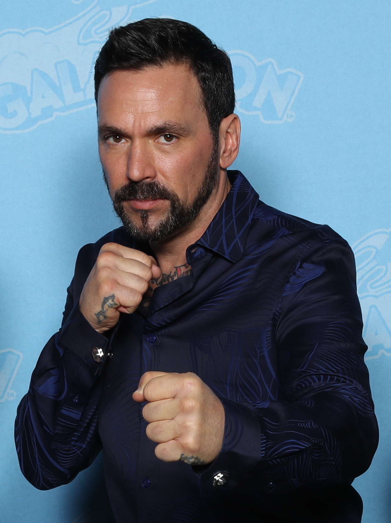
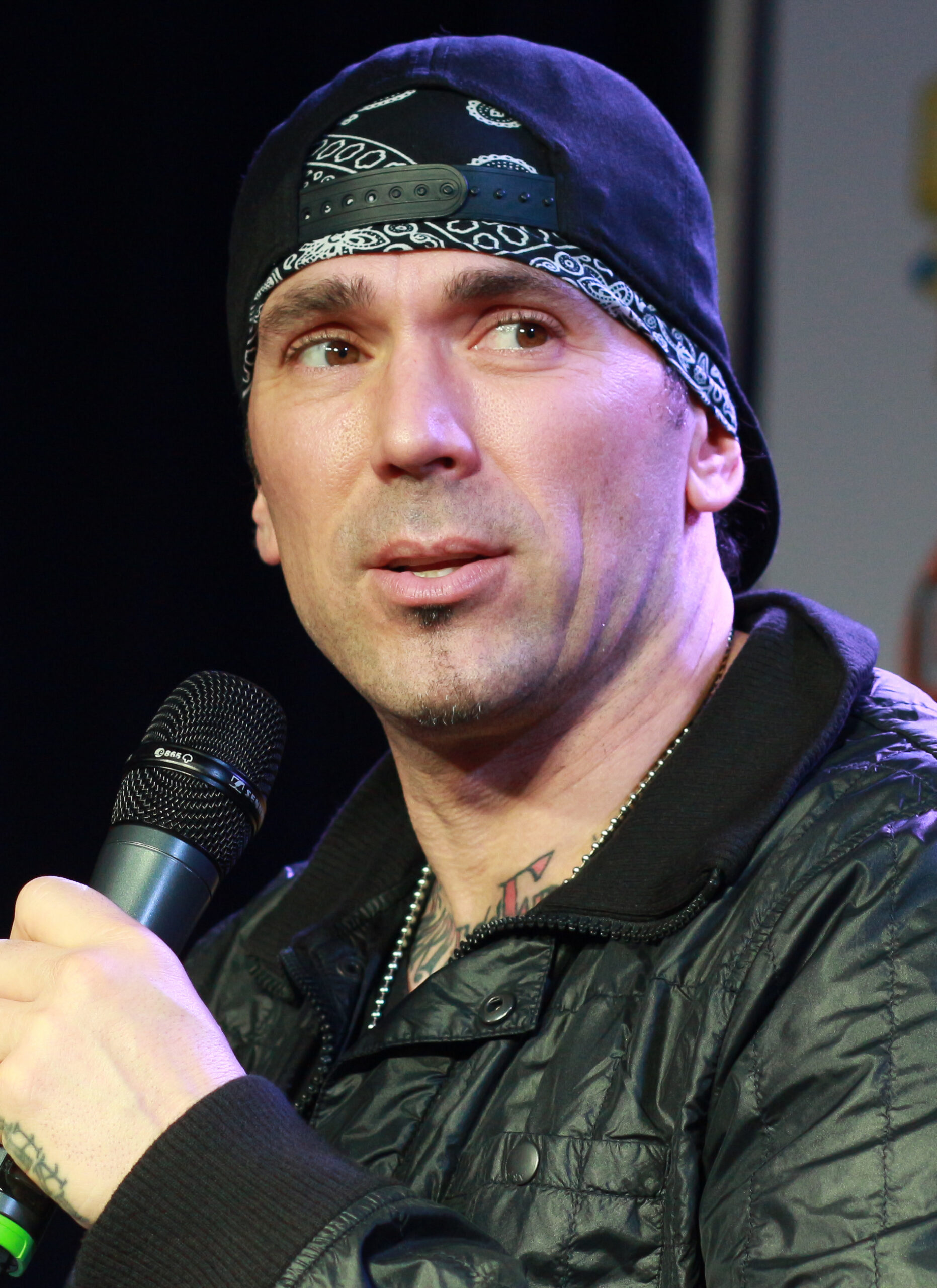
When a symbol has a difficult history, its meaning matters as much as its appearance. Researching a design before it goes on your skin can help you avoid wearing an image that communicates something you never intended.

Her tattoos balance personal history with a strong visual style

Bella Poarch tattoos: winged back tattoo from a second angle

Across the collection, the visual choices repeat: large black-and-gray shapes, open feather lines, flowing script and smaller symbols. The subjects differ, but the softness and movement help the pieces sit together.

The back tattoo anchors the collection. The chest lettering brings the eye to the front, and the feathers connect the areas. Smaller designs add history without competing with the main piece. You can build several tattoos over time without filling every area at once.

The stories differ too. The winged ship refers to military service and deployment; the heart and key marks an early personal choice. The script carries a direct message, while the cover-up reflects what changed after Poarch learned more about the design’s cultural meaning.

For your own tattoo, decide which part of the story needs the most room. A person, place or life chapter might call for a larger back piece; a short reminder could fit as chest lettering or a small symbol. Match the placement to the space the idea needs.

Bella Poarch’s tattoos range from Navy memories to an early symbol and a redesigned cover-up. The winged ship and feather work dominate visually, while the heart and key and the snake add other parts of her story. If you like this style, start with one clear centrepiece, choose an artist who understands how designs move with the body, and learn the context behind each symbol.

More musician tattoo guides