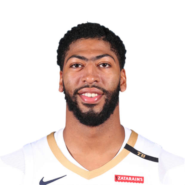
Anthony Davis’s tattoos can be hard to see under a compression shirt, but they stand out when his arms are bare. Script, portraits, stars, symbols and dates run across both arms. The collection feels less like decoration than a record of people, places and moments he wants to keep close.
Anthony Davis tattoos offer ideas for meaningful sports ink without copying a whole sleeve. Large lettering gives the arm a focal point, while smaller symbols and shaded images fill in around it. The designs have stories behind them, but still work as shapes on the body.
The placement helps carry that meaning. Chicago references sit on the arm he raises during a shot; portrait work has room to show its detail. The tattoos connect to his life and take the body’s shape and movement into account.
Chicago lettering gives Anthony Davis’s arm a clear centre
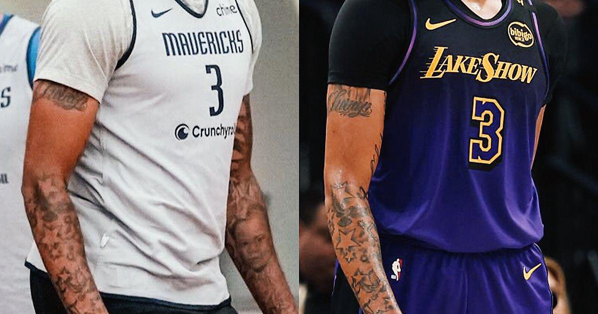
“Chicago” is one of the first details people notice in Davis’s arm tattoos. The script runs across his bicep, with the year 1993 worked into the design. It’s a hometown reference that combines a place with a date instead of leaving the numbers on their own.
The upper arm gives the word a long path to follow. It isn’t squeezed near the elbow or hidden right under the shoulder. The lettering runs with the arm, so it remains visible when he lowers it, lifts it or reaches toward the basket.
For a hometown tattoo, decide what feeling you want the piece to hold before choosing its extras. A city name can sit beside a year or a small symbol. Ask to see the lettering on the arm from a few angles. Good script follows the body instead of fighting it.
His forearm tattoos mix script with smaller symbols
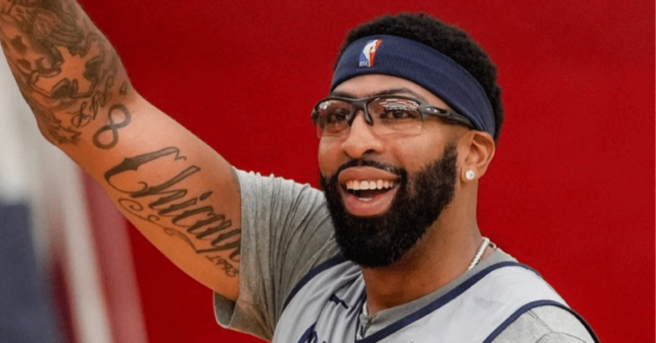
A practice photo shows the forearm tattoos beside the larger lettering on Davis’s bicep. Flowing script, smaller shapes and darker details become easier to see when he lifts his arm. The variety keeps the area from relying on one repeated pattern.
A mixed arm needs some planning. Letters need open space to stay legible, while small symbols can help bridge larger designs. Davis’s collection uses darker marks as anchors and lighter areas to stop the arm feeling crowded.
Choose the piece you want people to notice first when they see the outside of your arm. That design can guide what comes next. Smaller stars, dates or symbols can connect it to the inside, as long as there’s enough space around the lettering for it to stay clear.
Script can also make use of direction. A city name might follow the arm’s length; a shorter date can sit below it as a quieter detail. Try several layouts on paper, then check how they sit against your skin. The version that looks good on a screen may not fit your arm as naturally.
Stars and Olympic rings add a different rhythm
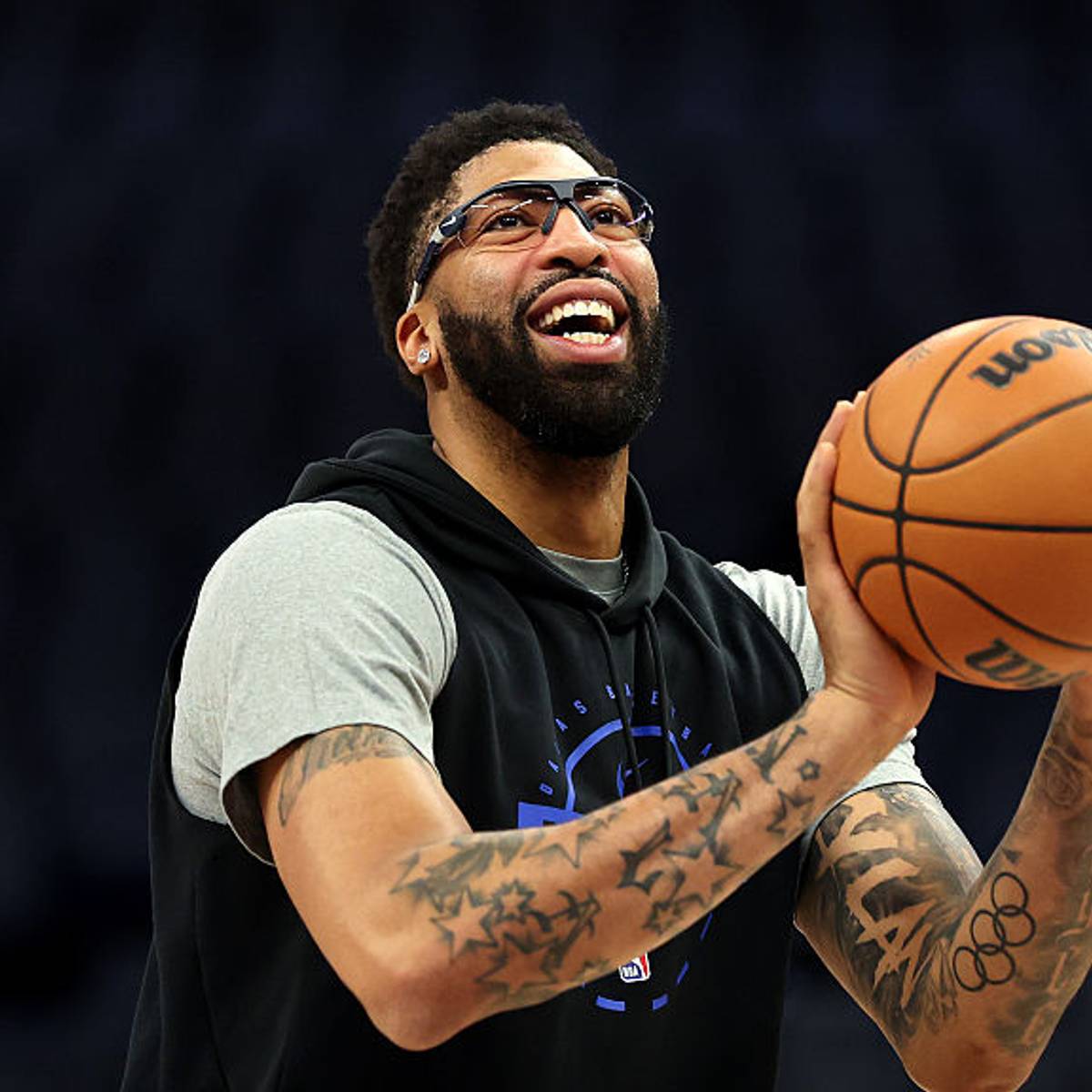
Stars and Olympic rings add a more graphic element to Davis’s arm. The stars repeat across the space, while the rings give the lower section a clean symbol with open circles. Both bring a different texture from the larger script.
Repeating a shape can tie tattoos together even when they were added at different times. Stars can fill a sleeve or work as small accents around a portrait. The rings create open centres that give the eye a break from the darker ink nearby.
When you combine symbols, consider line weight before colour. Outlines of similar strength tend to sit well together, even if their subjects differ. A repeated shape can make a collection feel planned without making every tattoo match.
The open rings also show how a simple outline can bring balance to a busy arm. A compass, number or another personal emblem can serve the same role. Not every tattoo needs heavy shading to hold its place.
The Chicago 1970 tattoo uses a wider canvas
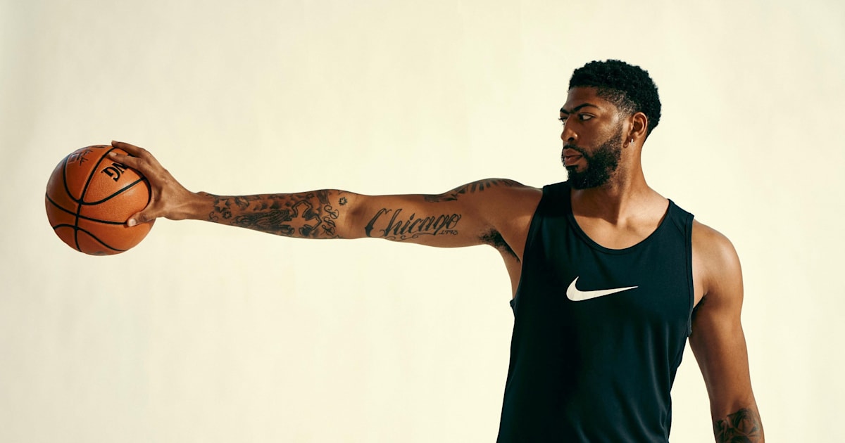
A Red Bull portrait shows another Chicago reference on Davis’s forearm. The script spans the arm with enough room for the letters to stay bold; nearby tattoos add texture above and below. His extended arm shows how the design reads when the wrist and elbow are straight.
Forearm writing changes as the wrist turns. A word may look balanced from the front but compressed from the side. Check the stencil with your arm relaxed, bent and extended, so you can see how the lettering follows the movement.
Large script can stay readable without filling the whole arm. Give the word a clear direction and clean edges; smaller surrounding designs can add detail without crowding it.
Before choosing a long phrase, check how many letters fit comfortably across the arm. A font that looks elegant in a sketch may need more space or a simpler shape once it wraps around the body. Your artist can help the text age legibly while fitting the rest of the tattoos.
The arm collection carries identity without hiding the skin
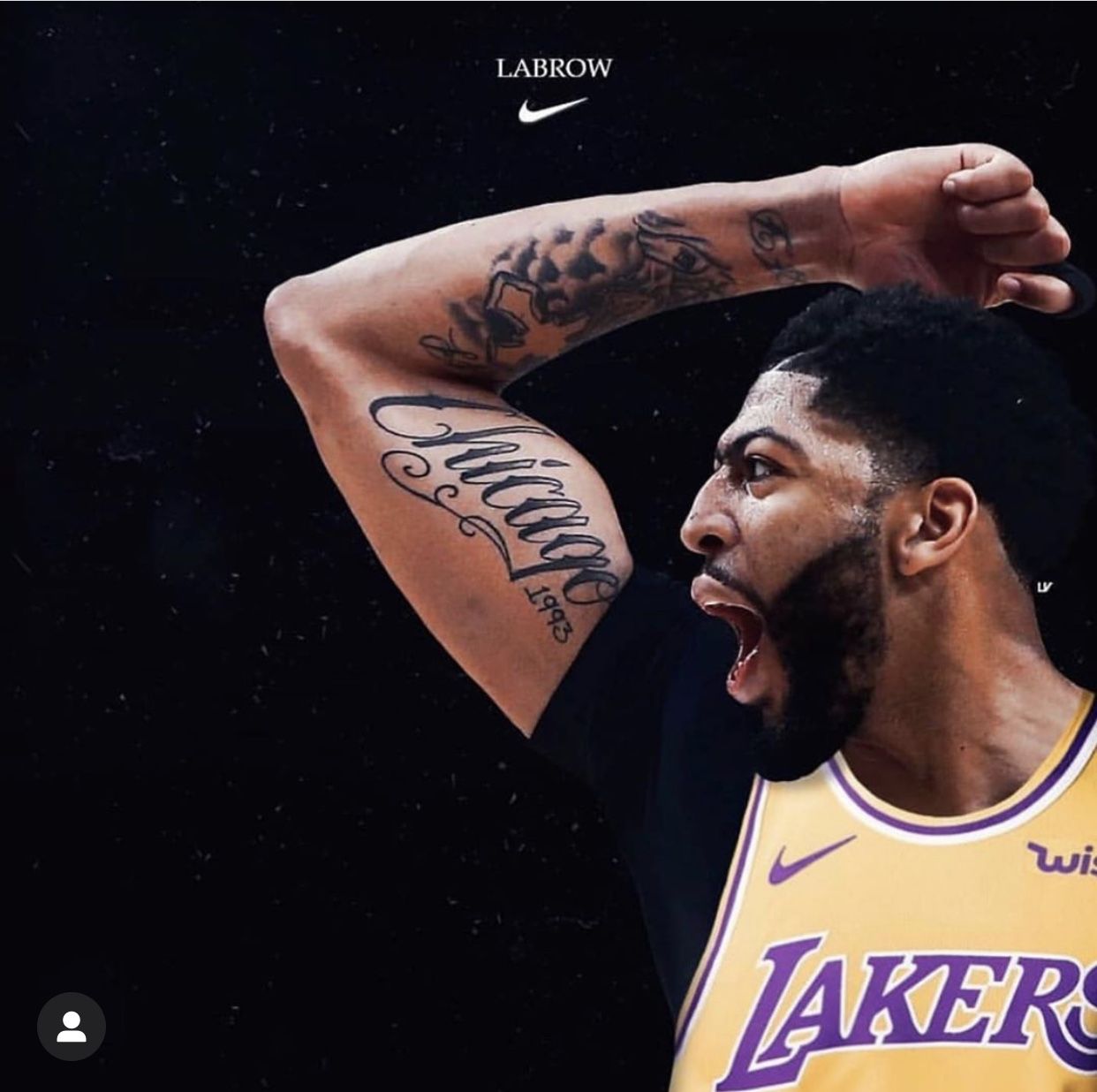
A Lakers portrait shows some of the smaller tattoos around Davis’s larger pieces. Script, a portrait and compact symbols share the arm, but patches of skin between them keep each design distinct. That breathing room helps the collection feel considered.
The portrait sits on the upper arm, where there’s room for a larger image. Nearby writing follows the limb’s length. The face can show when he wears a sleeveless jersey without needing to cover the whole shoulder.
If you’re planning a portrait, choose an area with enough space for the eyes, mouth and shadows to stay clear. Keep nearby lettering simple, and agree on a size that can hold the detail. A portrait needs visual space around it, even when it’s part of a sleeve.
A useful reference photo has clear light and shadow, which helps the artist shape the face. Choose an image that feels true to the person rather than one that’s famous or widely used. That choice can make the finished design feel more like a memory than a copied picture.
How to plan an Anthony Davis inspired tattoo sleeve
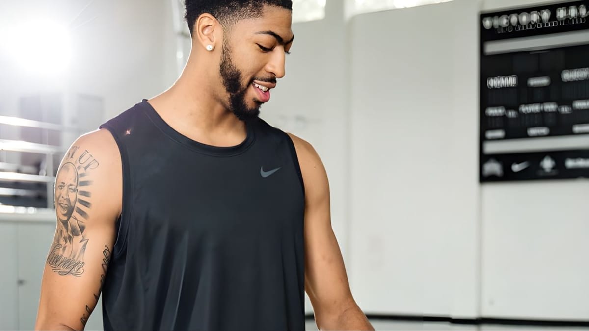
A practice photo shows Davis’s upper-arm portrait and script with a training top. The shoulder remains open around the larger image, letting it stand apart. The sleeve is made from different ideas rather than a row of matching designs from wrist to shoulder.
Begin with the tattoo that matters most. It might be a family portrait, a hometown date or a symbol connected to your own work. Give it space, then use script and smaller marks to build a link to the rest. Davis’s arm shows how words and dates can connect a larger image to the collection.
Think about work and clothing as well. A forearm tattoo will show most days, while an upper-arm piece is easier to cover. If you play sports, lift or spend time outdoors, ask how movement and sun might affect the placement. Practical choices can help the tattoo fit your life.
Davis’s tattoos each play a role: Chicago lettering anchors the arm, stars and rings add a pattern, and portrait work carries a more personal subject. The collection doesn’t need every patch of skin filled. Start with a story, then give the tattoo space to tell it.
Anthony Davis’s tattoos connect his city, personal symbols and portrait work without filling every part of the arm. Chicago script gives the collection a focal point; stars and rings add a different rhythm, and the larger images carry their own weight.
Anthony Davis explains one tattoo and talks about his career in the interview below.