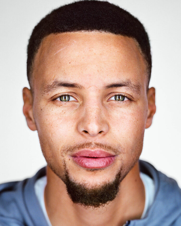
Stephen Curry’s tattoos are easy to miss when he’s moving down the court. There’s no full sleeve or large chest piece; most of the visible ink sits around his wrists and arms, flashing into view when he shoots, points or raises his hands after a play.
That makes Stephen Curry tattoos a useful reference if you like smaller designs with a clear reason behind them. His collection leans on short lettering, compact symbols and faith-related marks. The pieces have space around them and don’t get in the way of how he uses his arms.
The ideas are personal without being loud. Hebrew script carries words he has chosen to keep close; matching ink links him to Ayesha; and other marks bring in work, family, basketball and pop culture. None of those needs a large image to register.
Game photos show the tattoos in motion. A wrist turns toward the camera, the forearm flexes as he raises the ball, and an inner-arm mark can appear for only a second. Those changing views tell you more about placement than a flat reference shot.
There’s a practical point here, too. Small lettering can stay meaningful when it’s clear and placed around real habits. Curry’s tattoos show during basketball, but still feel personal rather than made just for photographs.
Stephen Curry’s Hebrew wrist tattoos keep faith close
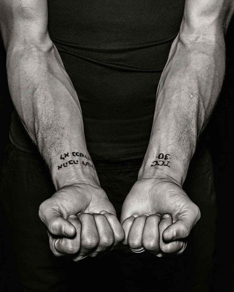
The Hebrew lettering on Curry’s wrist is the design people recognize first. It refers to “Love Never Fails,” from First Corinthians 13:8. The compact line sits where it shows when he lifts his hands, without turning the wrist into a large statement.
Wrist lettering is naturally visible in Curry’s shooting motion. The inside of his arm can face the camera on a follow-through, and the words appear briefly as he moves. It’s also a place he can see himself, which suits a phrase used as a reminder.
There isn’t much flat space on the wrist, so the letters have to follow its curve and remain legible when the hand bends. Here, the spacing keeps the Hebrew from looking crowded and helps it read in a game photo.
If you’re considering a wrist phrase, settle the scale before choosing the wording. Ask to see it at the size your wrist can handle, with enough room between letters. Check it with your hand open and closed; even a short line can carry plenty of meaning.
The matching Curry and Ayesha ink makes the story personal
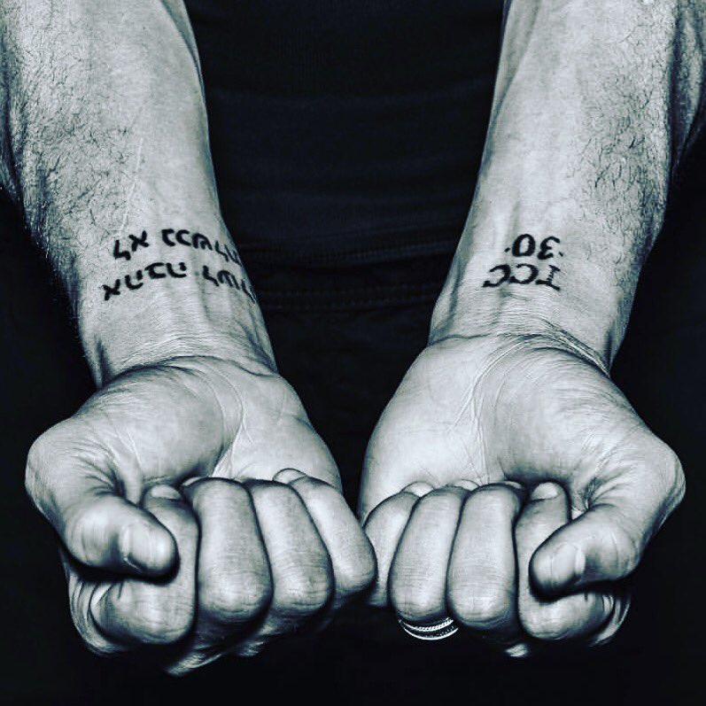
Curry and Ayesha have matching tattoos, a small shared element in an otherwise restrained collection. The design connects to their relationship without using a portrait or a long name. A simple mark can stay personal and still sit cleanly on the skin.
Matching tattoos work best when each person can wear the idea in a way that suits them. They don’t have to be identical photographs; the point is the link between them. Curry’s wrist ink stays close to the body but appears naturally in daily movement.
A close-up of both hands shows open skin around the lettering. That space lets the two tattoos read as a pair without merging into a dark patch. The design feels deliberate without being overworked.
A matching tattoo should still make sense when you’re on your own. Choose a mark that belongs to both people, then place it where each of you will be comfortable wearing it. A small symbol, short word or shared date can be easier to live with than a large image that only works side by side.
WOE and the small arm tattoos turn reminders into routine
The WOE tattoo on Curry’s arm is commonly described as “Working on Excellence.” It’s a short phrase tied to how he approaches basketball. Three letters are enough to serve as a cue through training, games and daily life.
Block lettering holds its shape at a distance, and the brief word follows the curve of the arm without taking over. It also leaves open skin for the other tattoos around it, rather than turning the whole area into one panel.
Court photos show how the inner-arm tattoo changes as Curry bends his elbow. With the arm relaxed, the word sits in a clear patch of skin; as the muscle tightens, it becomes part of the movement. It’s a reminder to check an arm tattoo in motion as well as at rest.
A short phrase works best when it connects to something you actually do. Start with the words you return to, then see if a few letters can bring the thought back. Keep the final wording short enough to fit cleanly and easy to read at a glance.
TCC, Martin and the basketball tattoos add another layer
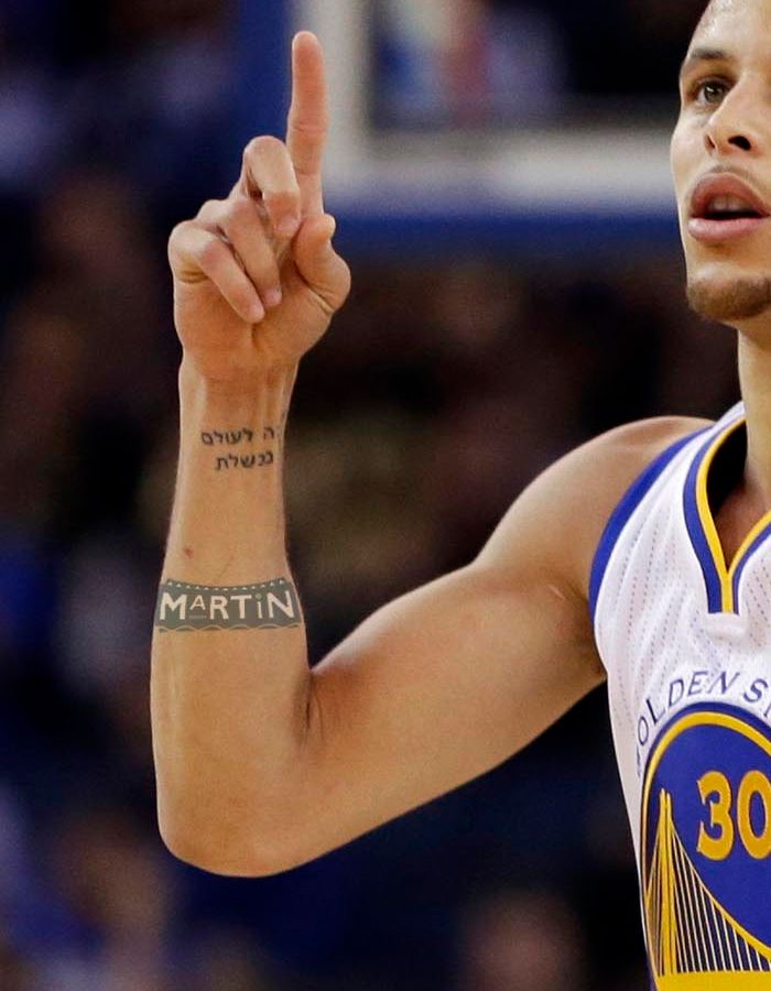
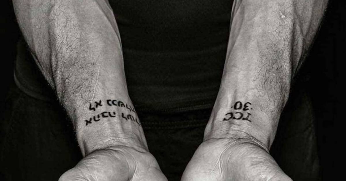
The smaller tattoos add variety without changing the collection’s clean look. TCC is often read as “Trust, Commitment, Care,” while another photo shows Martin written across Curry’s forearm. One points to values; the other brings in a pop-culture reference.
The Martin tattoo shows that a collection can include a lighter choice alongside faith-based lettering. A reference to a show doesn’t need to match every other tattoo; it can simply record something Curry enjoys alongside the more serious faith-based lettering.
Basketball photos show how the same word changes with the pose. The forearm lettering looks casual when his arm is down, then becomes part of a gesture when he points or signals. The tattoo is small, but movement gives it more presence.
Let serious and playful ideas differ in scale rather than crowding them together. Give the main phrase some open skin, then place a smaller reference or initials nearby. The mix can record different interests without crowding the arm.
Why Stephen Curry tattoos stay simple and easy to read
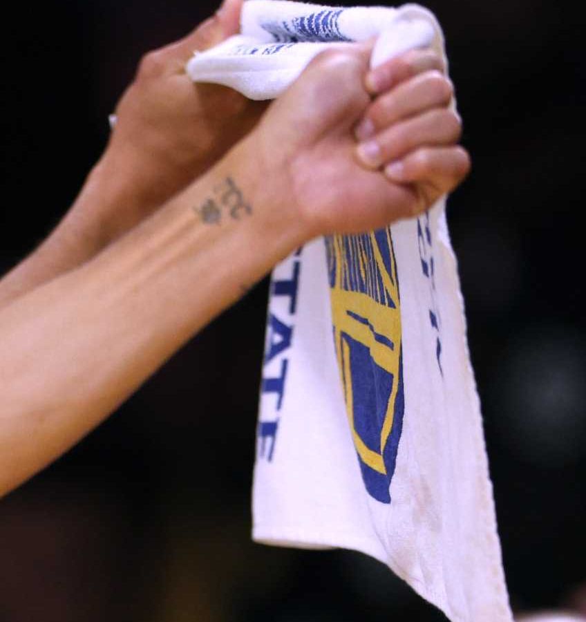
Curry’s tattoos stay easy to read because they use clear marks and considered placements. The wrist carries the phrases people notice first, the inner arm holds short reminders, and the forearm leaves room for a name or reference. Each spot has a purpose; none needs to compete with the others.
That restraint also makes the collection easy to wear with a uniform, a suit or casual clothes. The ink appears when his hands move, which gives it a lived-in feel rather than making it look like it was added for close-ups.
If you want a similar approach, start with the piece that matters most to you: perhaps a line of faith-based lettering, a family symbol or a short reminder. Put it somewhere you’ll actually see it, then add smaller designs only when they earn a place.
Leave room for the collection to change. A wrist or forearm doesn’t need to be filled in at the first session. Open skin keeps the letters clear and leaves space for later ideas; it also lets each tattoo hold its own meaning as life changes.
Curry’s tattoos show in quick moments during games but don’t dominate his appearance. That fits designs he carries through basketball, work and family life.
His collection is a compact mix of faith, family, work and personality. The Hebrew wrist phrase carries the clearest message, matching tattoos with Ayesha add a shared story, and the arm lettering turns short reminders into part of his routine. TCC and Martin keep the mix from feeling too serious.
If you’re taking inspiration from Curry, study the placement as closely as the words. Notice how the wrist lettering follows the arm, how a small mark appears in a shot, and how open skin keeps each design distinct. The spacing, as much as the words, keeps the collection from looking crowded.
Here’s a short video looking at Curry’s tattoos and the meanings people associate with them: